Tetra Pak Graphic Guidelines - Logoblink · Tetra Pak is placed below the housemark, giving this...
56
Tetra Pak Graphic Guidelines ®
Transcript of Tetra Pak Graphic Guidelines - Logoblink · Tetra Pak is placed below the housemark, giving this...
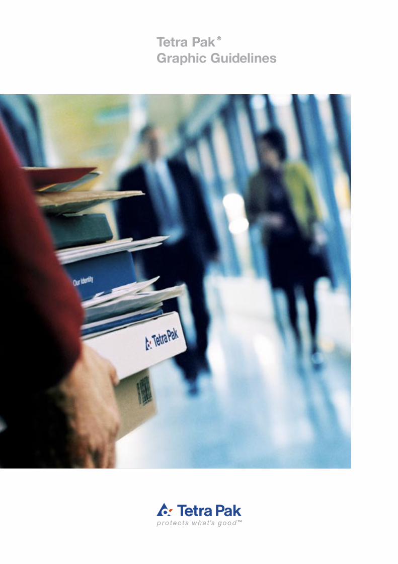
Tetra PakGraphic Guidelines
®
2
The Basics
5 One logotype – three fixed combinations
8 Colours
10 Typography
12 Trademarks
14 Correspondence
Communication structure
21 Our message levels
22 Tone of voice
Printed matter and advertisements
24 Printed matter
25 Consistently Tetra Pak
25 The Tetra Pak brochure layout principle
28 Corporate information, layout examples
30 System information, layout examples
32 Product information, layout examples
34 Advertisements
34 Additional campaign material
Other applications
37 Presentation material
40 Signs on buildings
42 Supporting signs
44 Product and package signs
48 Exhibitions
50 Vehicles and transport
52 Clothing and gifts
Contents
3
Introduction
Our graphic presentation is an important part of our corporate
identity. Therefore, great attention should be paid to the way we
present ourselves to outsiders, be they customers, consumers,
retailers or authorities. In order to strengthen our corporate
image, all our company symbols – such as our house mark
and logotype, the design of our stationery and printed matter
– must be applied consistently in a manner which clearly
identifi es Tetra Pak as being the communicator.
Tetra Pak is our most important trademark and, together
with our product trademarks, it constitutes one of our most
valuable assets. It represents the external image, economic
value and goodwill which has been built up over many years.
The Tetra Pak logotype is seen and identifi ed all over the world,
on buildings, vehicles, presentation material, business cards
and of course, billions of food packages. The visual presen tation
of it must be the same everywhere. It enables all the individual
products and materials circulating in the global market to send
identical signals in their role as representatives of the Tetra Pak
brand name.
The purpose of this manual is to help in creating and pre-
serving a common, international Tetra Pak visual language. It
can only cover the most common applications of our graphic
presentation, please contact Tetra Pak Corporate Communi-
cations if you have any questions related to issues that are
not covered here.
Sincerely,
Nick Shreiber
Lausanne, March 2005
4
The Basics
This manual contains a lot of helpful guidelines. It also
contains a few strict rules. The basic rules are the very
foundation of our corporate graphic identity. Each of
these basic areas forms a part of it.
5 One logotype – three fixed combinations
8 Colours
10 Typography
12 Trademarks
14 Correspondence
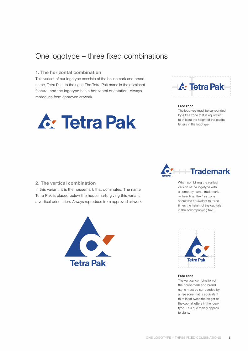
5ONE LOGOTYPE – THREE FIXED COMBINATIONS
One logotype – three fixed combinations
Free zoneThe vertical combination of the housemark and brand name must be surrounded by a free zone that is equivalent to at least twice the height of the capital letters in the logo-type. This rule mainly applies to signs.
2. The vertical combinationIn this variant, it is the housemark that dominates. The name
Tetra Pak is placed below the housemark, giving this variant
a vertical orientation. Always reproduce from approved artwork.
Free zoneThe logotype must be surrounded by a free zone that is equivalent to at least the height of the capital letters in the logotype.
1. The horizontal combinationThis variant of our logotype consists of the housemark and brand
name, Tetra Pak, to the right. The Tetra Pak name is the dominant
feature, and the logotype has a horizontal orientation. Always
reproduce from approved artwork.
TrademarkTTTWhen combining the vertical version of the logotype with a company name, trademark or headline, the free zone should be equivalent to three times the height of the capitals in the accompanying text.

6 ONE LOGOTYPE – THREE FIXED COMBINATIONS ONE LOGOTYPE – THREE FIXED COMBINATIONS
Note! The language variants above are approved versions that are available as artwork. Please contact Corporate Communications, if you want to have a new language version made.
3. The combination with the mottoOur most widely used variant of our logotype is the combination with the
motto, which consists of the housemark, brand name, and our motto,
“protects what’s good” (or the approved equivalent in other languages).
This combination is the core of our graphic identity. All material used for
international marketing communication, e.g. brochures, ads, posters,
vehicles, slides etc should carry the housemark and brand name com-
bined with the motto.
In cases where the material is used in a local market, the text “protects
what’s good™” can be translated into the local language.
Free zoneThis combination must be surrounded by a free zone that is equivalent to at least the height of the capital letters in the logotype.
7
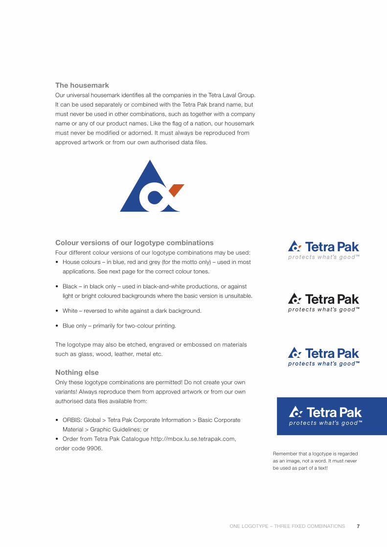
Remember that a logotype is regarded as an image, not a word. It must never be used as part of a text!
Colour versions of our logotype combinationsFour different colour versions of our logotype combinations may be used:
• House colours – in blue, red and grey (for the motto only) – used in most
applications. See next page for the correct colour tones.
• Black – in black only – used in black-and-white productions, or against
light or bright coloured backgrounds where the basic version is unsuitable.
• White – reversed to white against a dark background.
• Blue only – primarily for two-colour printing.
The logotype may also be etched, engraved or embossed on materials
such as glass, wood, leather, metal etc.
Nothing elseOnly these logotype combinations are permitted! Do not create your own
variants! Always reproduce them from approved artwork or from our own
authorised data files available from:
• ORBIS: Global > Tetra Pak Corporate Information > Basic Corporate
Material > Graphic Guidelines; or
• Order from Tetra Pak Catalogue http://mbox.lu.se.tetrapak.com,
order code 9906.
ONE LOGOTYPE – THREE FIXED COMBINATIONS ONE LOGOTYPE – THREE FIXED COMBINATIONS
The housemarkOur universal housemark identifies all the companies in the Tetra Laval Group.
It can be used separately or combined with the Tetra Pak brand name, but
must never be used in other combinations, such as together with a company
name or any of our product names. Like the flag of a nation, our housemark
must never be modified or adorned. It must always be reproduced from
approved artwork or from our own authorised data files.

8
Colours
Just as important as the design of our housemark are the colours
we use. By creating special colours for our company, we can adapt
the Tetra Pak image to nearly every application, while maintaining high
recognition value.
Our house colours are PMS Reflex Blue and PMS Warm Red. In com-
bination with white they suggest hygiene and universality. A good
example of their combined effect is the logotype in house colours
on a white page.
Colours for printingThe specified colours for our housemark and brand name are PMS
Reflex Blue and PMS Warm Red. The specified colour for our motto
“protects what’s goodTM” is PMS Cool Grey 7.
They are standard colours with the majority of printers around the world.
PMS Warm RedCMYK C:0 M:100 Y:100 K:0Euro Colour Red: XX00NCS Red: S 0580-Y80R
PMS Cool Grey 7CMYK C:0 M:0 Y:0 K:40Euro Colour 40% blackNCS Grey: S 4000-N
PMS Reflex BlueCMYK C:100 M:70 Y:0 K:0Euro Colour Blue: 07X0 NCS Blue: S 4055-R70B
COLOURS COLOURS
9
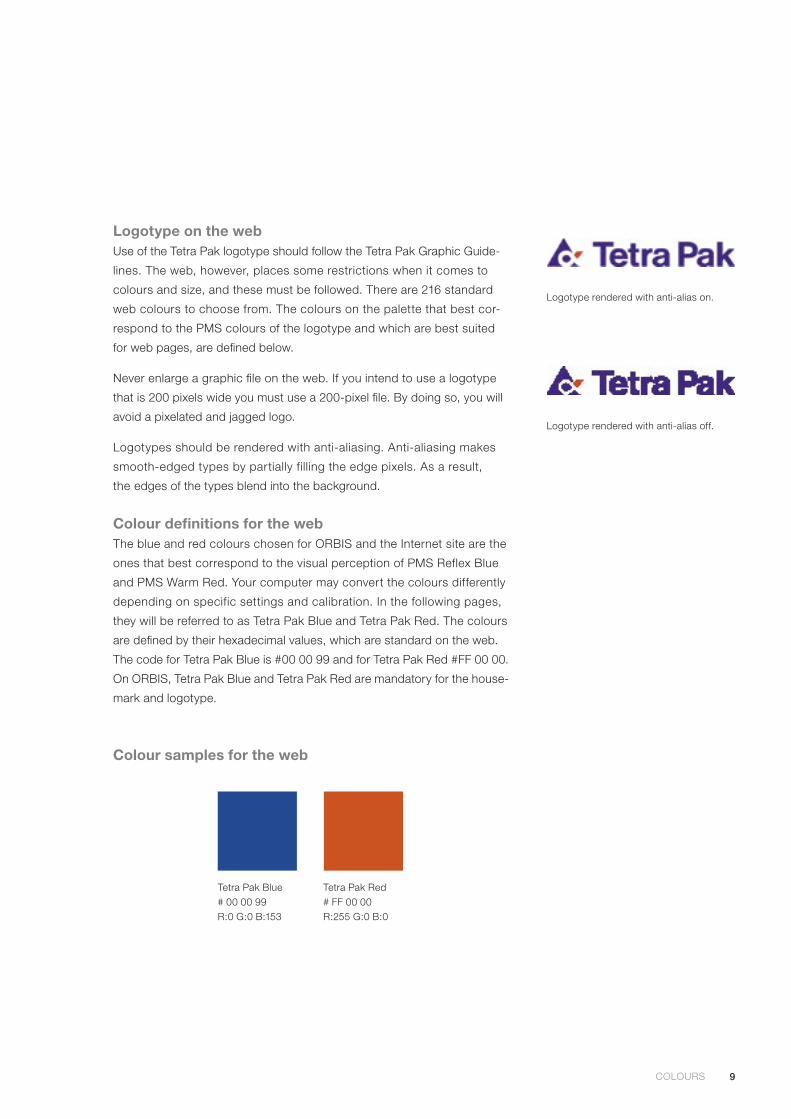
Logotype on the webUse of the Tetra Pak logotype should follow the Tetra Pak Graphic Guide-
lines. The web, however, places some restrictions when it comes to
colours and size, and these must be followed. There are 216 standard
web colours to choose from. The colours on the palette that best cor-
respond to the PMS colours of the logotype and which are best suited
for web pages, are defined below.
Never enlarge a graphic file on the web. If you intend to use a logotype
that is 200 pixels wide you must use a 200-pixel file. By doing so, you will
avoid a pixelated and jagged logo.
Logotypes should be rendered with anti-aliasing. Anti-aliasing makes
smooth-edged types by partially filling the edge pixels. As a result,
the edges of the types blend into the background.
Colour definitions for the webThe blue and red colours chosen for ORBIS and the Internet site are the
ones that best correspond to the visual perception of PMS Reflex Blue
and PMS Warm Red. Your computer may convert the colours differently
depending on specific settings and calibration. In the following pages,
they will be referred to as Tetra Pak Blue and Tetra Pak Red. The colours
are defined by their hexadecimal values, which are standard on the web.
The code for Tetra Pak Blue is #00 00 99 and for Tetra Pak Red #FF 00 00.
On ORBIS, Tetra Pak Blue and Tetra Pak Red are mandatory for the house-
mark and logotype.
Colour samples for the web
Tetra Pak Blue# 00 00 99R:0 G:0 B:153
Tetra Pak Red# FF 00 00R:255 G:0 B:0
Logotype rendered with anti-alias on.
Logotype rendered with anti-alias off.
COLOURS COLOURS
10
Typography
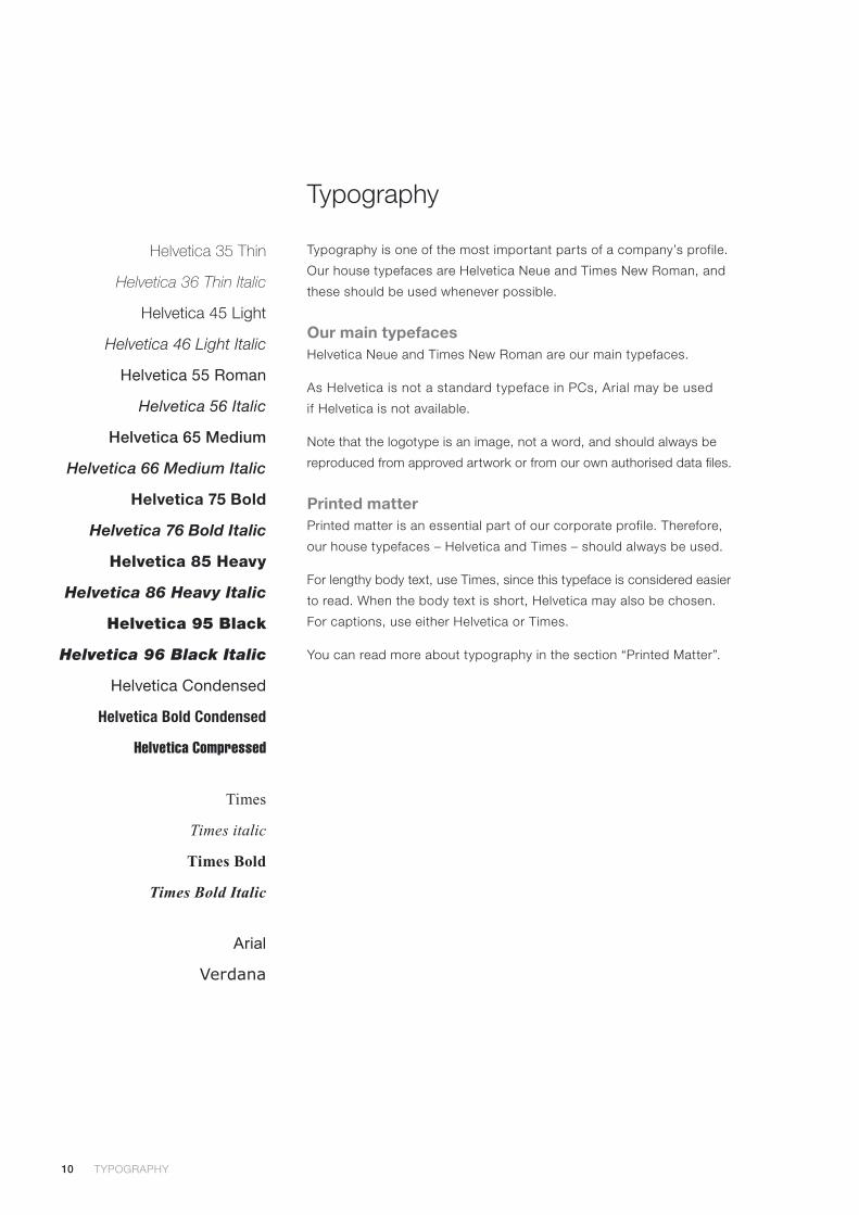
Typography is one of the most important parts of a company’s profile.
Our house typefaces are Helvetica Neue and Times New Roman, and
these should be used whenever possible.
Our main typefacesHelvetica Neue and Times New Roman are our main typefaces.
As Helvetica is not a standard typeface in PCs, Arial may be used
if Helvetica is not available.
Note that the logotype is an image, not a word, and should always be
reproduced from approved artwork or from our own authorised data files.
Printed matterPrinted matter is an essential part of our corporate profile. Therefore,
our house typefaces – Helvetica and Times – should always be used.
For lengthy body text, use Times, since this typeface is considered easier
to read. When the body text is short, Helvetica may also be chosen.
For captions, use either Helvetica or Times.
You can read more about typography in the section “Printed Matter”.
Helvetica 35 Thin
Helvetica 36 Thin Italic
Helvetica 45 Light
Helvetica 46 Light Italic
Helvetica 55 Roman
Helvetica 56 Italic
Helvetica 65 Medium
Helvetica 66 Medium Italic
Helvetica 75 Bold
Helvetica 76 Bold Italic
Helvetica 85 Heavy
Helvetica 86 Heavy Italic
Helvetica 95 Black
Helvetica 96 Black Italic
Helvetica Condensed
Helvetica Bold Condensed
Helvetica Compressed
Times
Times italic
Times Bold
Times Bold Italic
Arial
Verdana
TYPOGRAPHY TYPOGRAPHY
11
Typography on the webVerdana and Helvetica should be used on ORBIS and the Internet.
Helvetica is the preferred typeface for headings.
The typeface for the body text and html text is Verdana, a standard web
typeface common to most computers.
In the digital world, and especially on the Internet, a serif typeface (such
as Times) does not work well. As serifs often become blurred in small
sizes, a sans serif is preferable. Another important factor is that the type-
face specified in an html tag must be installed on the computer to be seen
correctly. Otherwise the computer will choose a typeface of its own.
Please note that the choice of typeface Verdana for the main body text
does not comply with the Tetra Pak Graphic Guidelines. It is an exception
and applies only to the main body text in communications on the Internet
and ORBIS.
Local Internet sitesWhen creating local Internet sites, please use the special tool for this.
Read more about this on ORBIS at http://ism.tetrapak.com.
You can find more guidelines on ORBIS under the following address:
Global > Tetra Pak Corporate Information > Basic Corporate Material >
Graphic Guidelines.
Typography as picturesHow the viewer sees a web page depends on the configuration of the
reader’s computer. When it comes to typography, in order to ensure that
headings and special elements will keep the right font and size, make
a picture of your text.
Contact [email protected] for advice and guidance.
TYPOGRAPHY TYPOGRAPHY
12
Trademarks
Our trademarks represent significant economic value and goodwill,
and are important for the positioning of our company.
What is a trademark?Basically, a trademark can be any sign capable of being graphically repre-
sented and capable of distinguishing goods or services. This includes
three-dimensional trademarks as well as slogans, sounds and smells.
A trademark is often simply a word or a device and sometimes a combina-
tion of both.
Trademarks are physical or perceptual and can be legally registered.
Brands, on the other hand, cannot be registered. A brand has a much
wider meaning, while trademarks are the building blocks on which the
brand feelings are constructed.
Tetra Pak trademarksIf a trademark is misused, even by ourselves, it can rapidly degenerate
and become generic – a common word for a certain product. As soon as
this occurs, the company that owns the trademark has lost its right to it.
If this should happen to Tetra Pak, anyone, including our competitors,
could – without any legal sanctions – use our trademarks. In order to
prevent such problems, all employees within Tetra Pak must use our trade-
marks correctly and it is our responsibility to make sure that we do.
Correct useImproper use of our trademarks may lead to degeneration, and in order
to avoid this, we need to use our trademarks correctly and follow some
general principles:
• Always use the full and proper name of our trademarks.
• Short versions of our trademarks, like TBA, may be used under certain
conditions. However, Tetra Pak must never be abbreviated TP.
• Since a trademark is not a noun, it should never be used with only
an article (the, a, an), in plural or in genitive.
• All trademarks should be used with the generic name of the product
and it is the generic name that should be inflected. Some examples:
Never say or write: Instead say or write:
“…the Tetra Prismas” “…the Tetra Prisma packages”
“…a Rex” “…a Tetra Rex machine”
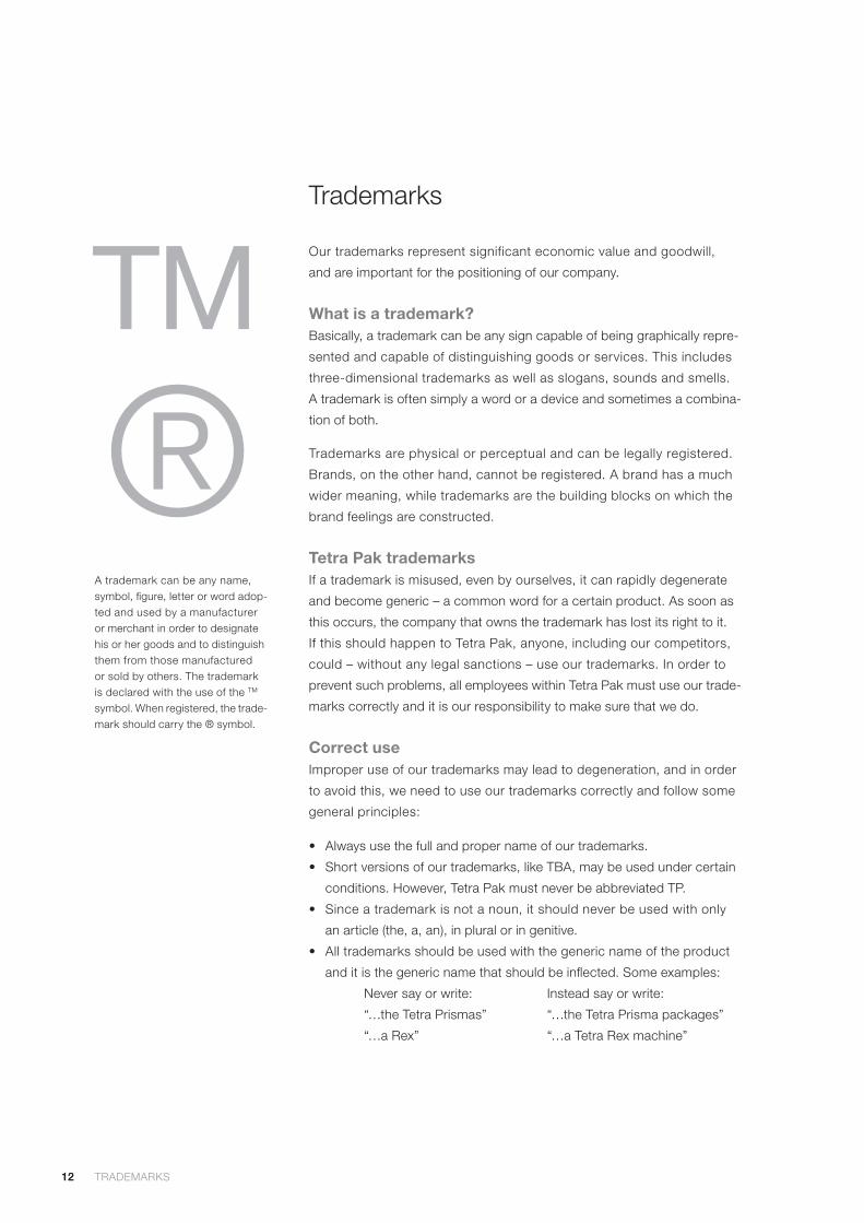
A trademark can be any name, symbol, figure, letter or word adop-ted and used by a manufacturer or merchant in order to designate his or her goods and to distinguish them from those manufactured or sold by others. The trademark is declared with the use of the TM
symbol. When registered, the trade-mark should carry the ® symbol.
12 TRADEMARKS TRADEMARKS
13
• Trademarks are special features and should stand out in a distinct
manner. Always write the initial letters in capital, e.g. “Tetra Top”.
• Our trademarks should be provided with the designation ® (to indicate
legal registration) or ™ (to indicate intent to defend), when used
on machines, packages, brochure covers and in applications in other
media (see pages 44 - 47). In bodytext and advertisements, the desig-
nations should not be used.
• Each trademark is to be regarded as a unit. Avoid splitting them on two
lines. Adjust the sentence and/or margins accordingly.
• Never use a hyphen to link the trademark to another word and never
make a new compound word that includes the trademark.
Tetra Pak is both a trade name, i.e. our corporate or business name,
and a trademark. When it is being used as a trade name it can be used
in genitive form (Tetra Pak’s). However, please avoid this if possible and
use other wording, instead.
It is important that our trademarks are used correctly both internally and
externally. Therefore, please check your local newspapers for misuse or
possible infringements of our trademarks. Also check dictionaries to see if
and in what context our trademarks appear. If you see any misuse, please
contact our Trademark Department at AB Tetra Pak in Lund.
Trademark credit linesWe use the ® or ™ marks, as appropriate, together with product names
in the headlines of our product brochures. It is otherwise not necessary
to use these marks, provided we use our trademarks correctly at all times.
Instead we use a trademark credit line in all our printed matter and adver-
tisements. The trademark credit line starts with Tetra Pak, our housemark
and motto, and is followed by the trademarks used in the production in
question, in alphabetical order (see example). Note that the trademark
credit line is not a list of all trademarks owned by Tetra Pak – only those
mentioned in that brochure, ad, etc.
Trademark credit lineThe trademark credit line should be placed on the back of our printed material in the lower right-hand corner.
ExampleTetra Pak, , protects what’s good, AAA, BBB, CCC, DDD and EEE are trade-marks belonging to the Tetra Pak Group.
Disclaimer lineThis line should be included in printed matter relating to our products.
ExampleWe reserve the right to introduce design modifications without prior notice.
For more information on trademarks, please visit the Trademark Department website http://trademarks.tetrapak.com
TRADEMARKS TRADEMARKS
14
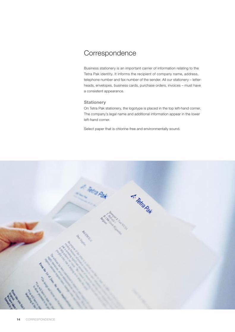
Correspondence
Business stationery is an important carrier of information relating to the
Tetra Pak identity. It informs the recipient of company name, address,
telephone number and fax number of the sender. All our stationery – letter-
heads, envelopes, business cards, purchase orders, invoices – must have
a consistent appearance.
StationeryOn Tetra Pak stationery, the logotype is placed in the top left-hand corner.
The company’s legal name and additional information appear in the lower
left-hand corner.
Select paper that is chlorine-free and environmentally sound.
CORRESPONDENCE CORRESPONDENCE
15
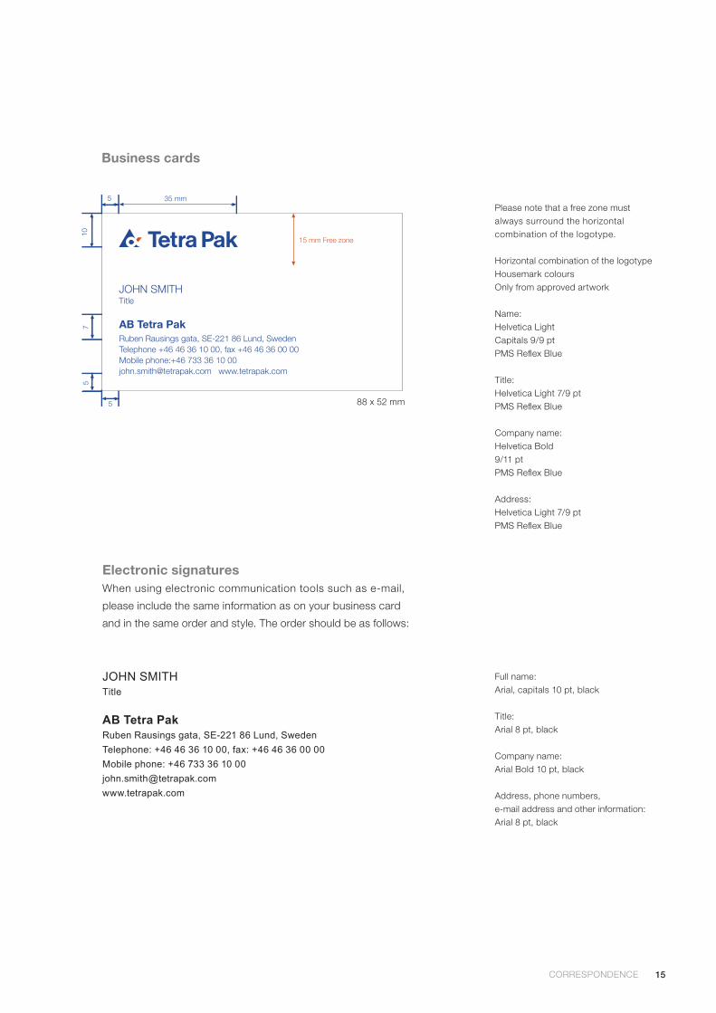
15 mm Free zone
JOHN SMITHTitle
AB Tetra PakRuben Rausings gata, SE-221 86 Lund, SwedenTelephone +46 46 36 10 00, fax +46 46 36 00 00Mobile phone:+46 733 36 10 [email protected] www.tetrapak.com
88 x 52 mm
Please note that a free zone must always surround the horizontal combination of the logotype.
Horizontal combination of the logotypeHousemark coloursOnly from approved artwork
Name:Helvetica LightCapitals 9/9 ptPMS Reflex Blue
Title:Helvetica Light 7/9 ptPMS Reflex Blue
Company name:Helvetica Bold9/11 ptPMS Reflex Blue
Address:Helvetica Light 7/9 ptPMS Reflex Blue
Electronic signaturesWhen using electronic communication tools such as e-mail,
please include the same information as on your business card
and in the same order and style. The order should be as follows:
Full name:Arial, capitals 10 pt, black
Title:Arial 8 pt, black
Company name:Arial Bold 10 pt, black
Address, phone numbers,e-mail address and other information:Arial 8 pt, black
JOHN SMITHTitle
AB Tetra PakRuben Rausings gata, SE-221 86 Lund, Sweden
Telephone: +46 46 36 10 00, fax: +46 46 36 00 00
Mobile phone: +46 733 36 10 00
www.tetrapak.com
CORRESPONDENCE CORRESPONDENCE
Business cards
16
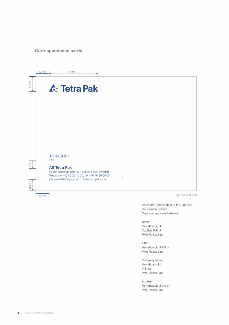
Correspondence cards
JOHN SMITHTitle
AB Tetra PakRuben Rausings gata, SE-221 86 Lund, SwedenTelephone +46 46 36 10 00, fax +46 46 36 00 [email protected] www.tetrapak.com
Sample shows A6 (148 x 105 mm)
Horizontal combination of the logotypeHousemark coloursOnly from approved artwork
Name:Helvetica LightCapitals 9/9 ptPMS Reflex Blue
Title:Helvetica Light 7/9 ptPMS Reflex Blue
Company name:Helvetica Bold9/11 ptPMS Reflex Blue
Address:Helvetica Light 7/9 ptPMS Reflex Blue
CORRESPONDENCE CORRESPONDENCE
A6, (148 x 105 mm)
17
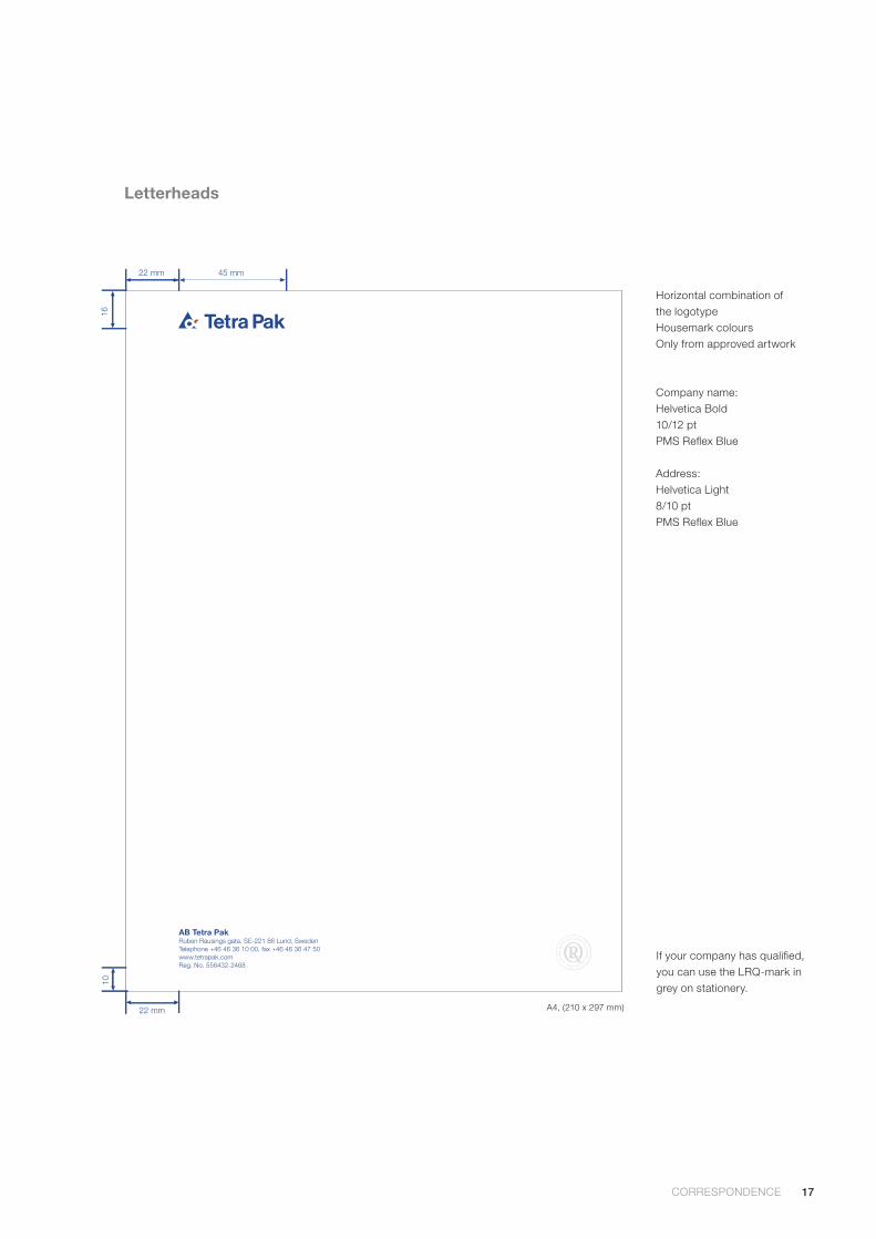
Horizontal combination of the logotypeHousemark coloursOnly from approved artwork
Company name:Helvetica Bold10/12 ptPMS Reflex Blue
Address:Helvetica Light8/10 ptPMS Reflex Blue
AB Tetra PakRuben Rausings gata, SE-221 86 Lund, SwedenTelephone +46 46 36 10 00, fax +46 46 36 47 50www.tetrapak.comReg. No. 556432-2468
Letterheads
If your company has qualified, you can use the LRQ-mark in grey on stationery.
CORRESPONDENCE CORRESPONDENCE
A4, (210 x 297 mm)

18
Envelopes
Horizontal combination of the logotypeHousemark coloursOnly from approved artwork
Company name:Helvetica Bold10/12 ptPMS Reflex Blue
Address:Helvetica Light 8 ptPMS Reflex Blue
AB Tetra Pak
As with business papers, all envelopes used by Tetra Pak companies should have the same graphic appearance.
This design makes it possible to place a window in either the left-hand or the right-hand side of the envelope.
CORRESPONDENCE CORRESPONDENCE
C5, (229 x 162 mm)
19
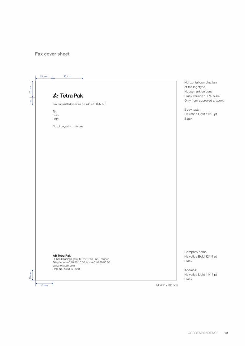
Fax cover sheet
Horizontal combination of the logotypeHousemark coloursBlack version 100% blackOnly from approved artwork
Body text:Helvetica Light 11/16 ptBlack
Company name:Helvetica Bold 12/14 ptBlack
Address:Helvetica Light 11/14 ptBlack
AB Tetra PakRuben Rausings gata, SE-221 86 Lund, SwedenTelephone +46 46 36 10 00, fax +46 46 36 00 00www.tetrapak.comReg. No. 556335-0668
Fax transmitted from fax No +46 46 36 47 50
To:From:Date:
No. of pages incl. this one:
CORRESPONDENCE CORRESPONDENCE
A4, (210 x 297 mm)
20
Communication structure
Good brand-building requires that all of our communications
– whether at the corporate, business area, product or service
levels – can be easily identified as coming from Tetra Pak.
It is also important to bear in mind that good communication
means getting the right messages to the right people. In order
to do so, the producer of such communications must have a
clear picture of Tetra Pak, what we are offering, and to whom.
Only when this is clear can the appropriate ”tone of voice”
– in images as well as words – be adopted.
21 Our message levels
22 Tone of voice
OUR MESSAGE LEVELS
21
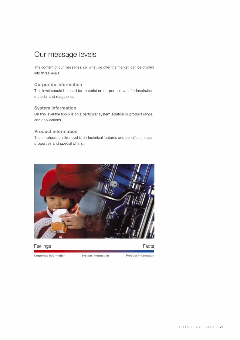
Our message levels
The content of our messages, i.e. what we offer the market, can be divided
into three levels:
Corporate informationThis level should be used for material on corporate level, for inspiration
material and magazines.
System informationOn this level the focus is on a particular system solution or product range,
and applications.
Product informationThe emphasis on this level is on technical features and benefits, unique
properties and special offers.
OUR MESSAGE LEVELS
Feelings Facts
Corporate information Product informationSystem information
22
Tone of voice
Producers of printed matter, advertising etc, working on behalf of
Tetra Pak, need to convey the Tetra Pak brand. The Tetra Pak brand tone
of voice should be recognised in all our messages.
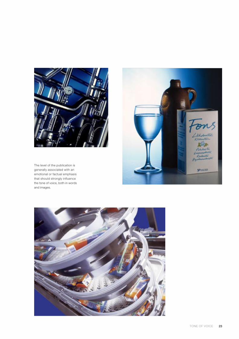
Each level has its own tone of voice in words as well as images, as
exemplified on pages 28 - 33. There will obviously be some overlap
between the levels, just as there is among the target groups, but the
examples help to point to where the emphasis should be placed.
The corporate level has a greater emotional content or appeal than the
product level, which will also be reflected in the choice of words and
images. The appropriate tone of voice for each level should permeate
the copy and images of brochures and other printed matter.
Useful remindersWe must always bear in mind that our communication is an interface
with people in one or more of our target groups. Although it is easy to
dwell upon the technical features of our products in a product brochure,
for example, the reader will always want to know “What’s in it for me?”
In other words, remember to focus on the benefits our products offer.
Product data sheets will, however, give a more stick-to-the-facts, non-
emotional impression than product brochures. On every level, make sure
that everything you say is absolutely correct.
It can also be desirable, on every level, to mention possible facts that are
relevant to Tetra Pak’s environmental commitment. No environmental
claims should be made, however, that cannot be substantiated and that
truly reflect performance that is beyond what is compulsory.
Note! The official language of Tetra Pak is British English.
TONE OF VOICE TONE OF VOICE
23TONE OF VOICE TONE OF VOICE
The level of the publication is generally associated with an emotional or factual emphasis that should strongly influence the tone of voice, both in words and images.
24 CONSISTENTLY TETRA PAK
Printed matter
Printed matter is an essential part of our corporate profile,
generating goodwill and business opportunities. This is the
simple logic behind a graphic identity programme. By ad-
hering to a respected form and identity, each new item inherits
credibility from its forerunners – and adds the strength of the
whole corporate profile.
24 Printed matter
25 Consistently Tetra Pak
25 The Tetra Pak brochure layout principle
28 Corporate information, layout examples
30 System information, layout examples
32 Product information, layout examples
34 Advertisements
34 Additional campaign material
25CONSISTENTLY TETRA PAK
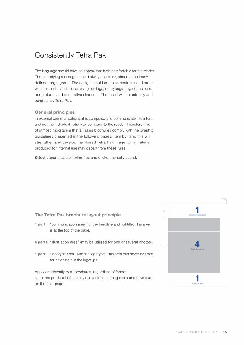
The language should have an appeal that feels comfortable for the reader.
The underlying message should always be clear, aimed at a clearly
defined target group. The design should combine neatness and order
with aesthetics and space, using our logo, our typography, our colours,
our pictures and decorative elements. The result will be uniquely and
consistently Tetra Pak.
General principlesIn external communications, it is compulsory to communicate Tetra Pak
and not the individual Tetra Pak company to the reader. Therefore, it is
of utmost importance that all sales brochures comply with the Graphic
Guidelines presented in the following pages. Item by item, this will
strengthen and develop the shared Tetra Pak image. Only material
produced for internal use may depart from these rules.
Select paper that is chlorine-free and environmentally sound.
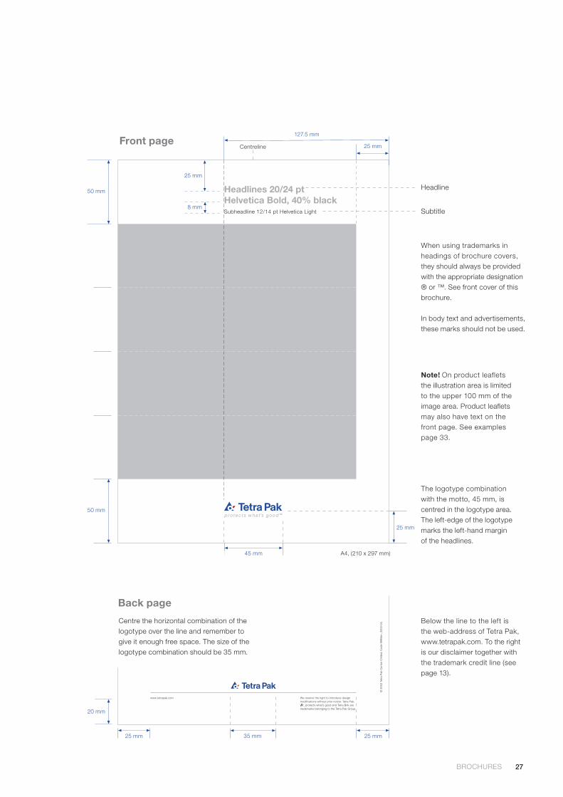
The Tetra Pak brochure layout principle
1 part “communication area” for the headline and subtitle. This area
is at the top of the page.
4 parts “illustration area” (may be utilised for one or several photos).
1 part “logotype area” with the logotype. This area can never be used
for anything but the logotype.
Apply consistently to all brochures, regardless of format.
Note that product leaflets may use a different image area and have text
on the front page.1
Logotype area
1Communication area
4Illustration area
x
x/2
Consistently Tetra Pak
26
Brochures
Front page The front page design of our brochures is defined by
the principle on page 25.
Inside pages Creative freedom is allowed, provided the basic
principles are followed.
Back page The lower part must be designed as shown on page 27.
NewslettersNote that other solutions may be used in newsletters. Consult Corporate
Communications for advice and approval.
TypographyThe typography used in brochures and other printed matter should be
Helvetica or Times. Helvetica is our primary typeface. Helvetica Bold is
recommended for headlines and publication titles. Helvetica can also be
used in tables, charts, captions and subheadings. Helvetica Light can be
used for body text, but Times is often considered more readable in leng-
thy copy. If space is limited, you can use Helvetica Condensed.
Times is our secondary typeface and can be used for body text, captions
and subheadings. Times Italic provides extra emphasis where needed.
Kerning and leadingNote! When making printed productions, keep the spacing between
letters (kerning or tracking) tight but not touching. Be sure that the space
between “T” and “e” in Tetra Top corresponds to the spacing in our
logotype. This is especially important in headlines. The horizontal scaling
should be 100% for all sizes.
The space between lines (leading) should be well balanced, making text
easy to read.
LanguageThe corporate language at Tetra Pak is British English, i.e. we use the
spelling litre, behaviour and organisation, just to mention a few examples.
BROCHURES BROCHURES
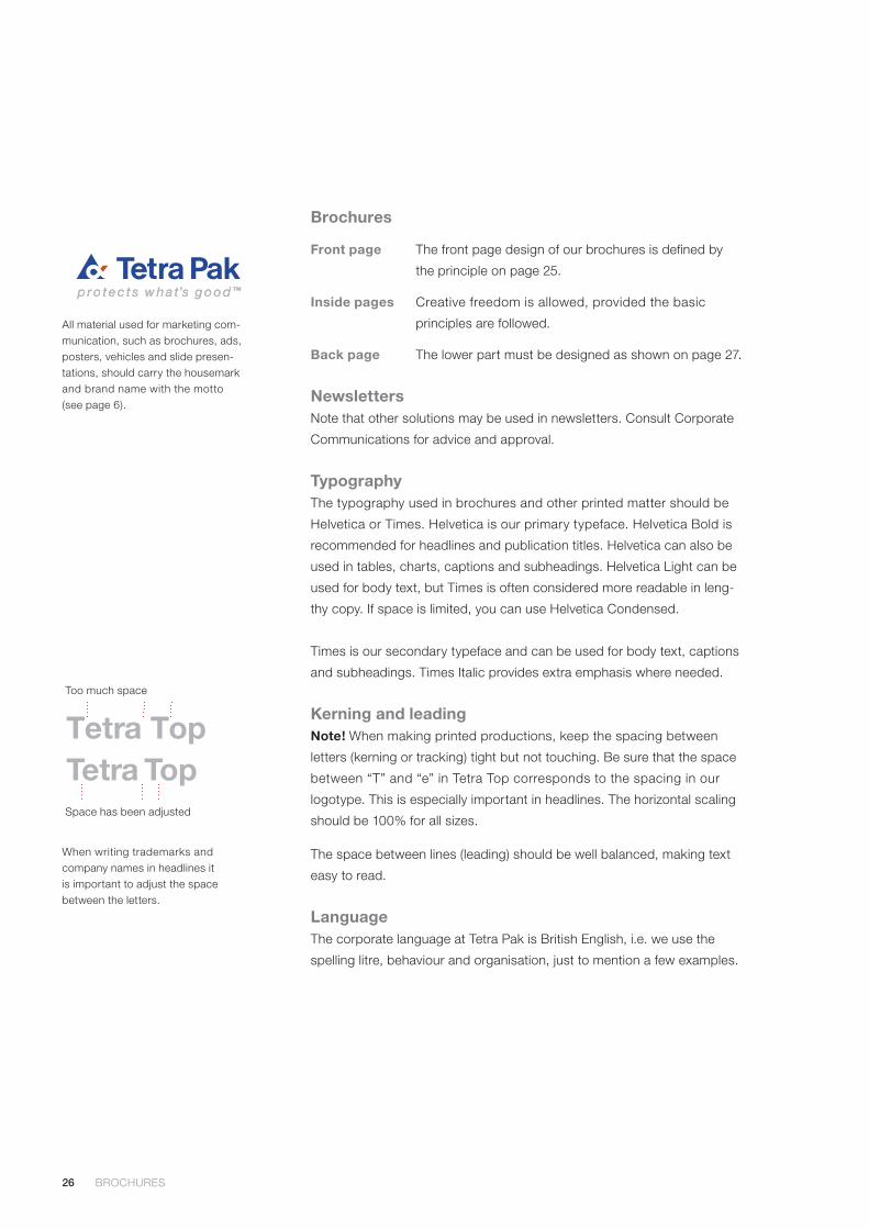
All material used for marketing com-munication, such as brochures, ads, posters, vehicles and slide presen-tations, should carry the housemark and brand name with the motto (see page 6).
Too much space
Space has been adjusted
Tetra TopTetra Top
When writing trademarks and company names in headlines it is important to adjust the space between the letters.
27BROCHURES BROCHURES
Below the line to the left is the web-address of Tetra Pak, www.tetrapak.com. To the right is our disclaimer together with the trademark credit line (see page 13).
The logotype combination with the motto, 45 mm, is centred in the logotype area. The left-edge of the logotype marks the left-hand margin of the headlines.
Front page
When using trademarks in headings of brochure covers, they should always be provided with the appropriate designation ® or ™. See front cover of this brochure.
In body text and advertisements, these marks should not be used.
Headline
Subtitle
Headlines 20/24 ptHelvetica Bold, 40% blackSubheadline 12/14 pt Helvetica Light
25 mmCentreline
Lorem ipsum dolor sit amet, consectetuer adipiscing elit,sed diam nonummy nibh euismod tincidunt ut laoreetdolore magna aliquam erat volutpat. Ut wisi enim ad minimveniam, quis nostrud exerci tation ullamcorper suscipitlobortis nisl ut aliquip ex ea commodo consequat. Duisautem vel eum iriure dolor in hendrerit in vulputate velit
esse molestie consequat, vel illum dolore eu feugiatnulla facilisis at vero eros et accumsan et iusto odiodignissim qui blandit praesent luptatum zzril delenit augueduis dolore te feugait nulla facilisi.
Lorem ipsum dolor sit amet, consectetuer adipiscingelit, sed diam nonummy nibh euismod tincidunt ut laoreetdolore magna aliquam erat volutpat. Ut wisi enim adminim veniam, quis nostrud exerci tation ullamcorpersuscipit lobortis nisl ut aliquip ex ea commodo consequat.
Duis autem vel eum iriure dolor in hendrerit in vulputatevelit esse molestie consequat, vel illum dolore eu feugiatnulla facilisis at vero eros et accumsan et iusto odiodignissim qui blandit praesent luptatum zzril delenit augueduis dolore te feugait nulla facilisi. Nam liber tempor cumsoluta nobis eleifend option congue nihil imperdiet doming
© 2
003
Tetr
a P
ak C
arto
n C
hille
d.
Cod
e 99
99en
. 20
03-0
4.
www.tetrapak.com We reserve the right to introduce designmodifications without prior notice. Tetra Pak,
, protects what’s good and Tetra Brik aretrademarks belonging to the Tetra Pak Group.
Centre the horizontal combination of the logotype over the line and remember to give it enough free space. The size of the logotype combination should be 35 mm.
Back page
20 mm
25 mm
25 mm
8 mm
Note! On product leaflets the illustration area is limited to the upper 100 mm of the image area. Product leaflets may also have text on the front page. See examples page 33.
50 mm
35 mm 25 mm
A4, (210 x 297 mm)
50 mm
45 mm
25 mm
127.5 mm
28
Layout examples, corporate information
CORPORATE INFORMATION, LAYOUT EXAMPLES CORPORATE INFORMATION, LAYOUT EXAMPLES
Headlines 20/24 ptHelvetica Bold, 40% blackSubheadline 12/14 pt Helvetica Light
A4, (210 x 297 mm)
29CORPORATE INFORMATION, LAYOUT EXAMPLES CORPORATE INFORMATION, LAYOUT EXAMPLES
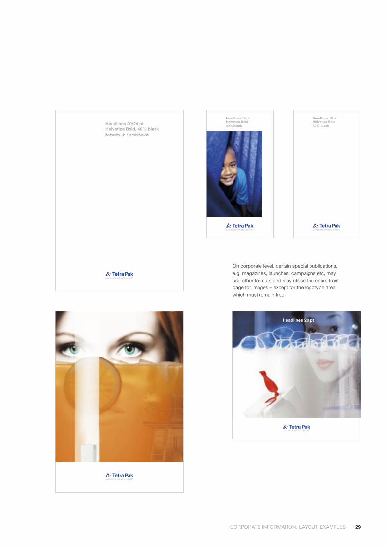
On corporate level, certain special publications, e.g. magazines, launches, campaigns etc, may use other formats and may utilise the entire front page for images – except for the logotype area, which must remain free.
Headlines 20 pt
Headlines 20/24 ptHelvetica Bold, 40% blackSubheadline 12/14 pt Helvetica Light
Headlines 15 ptHelvetica Bold40% black
Headlines 15 ptHelvetica Bold40% black

30
Layout examples, system information
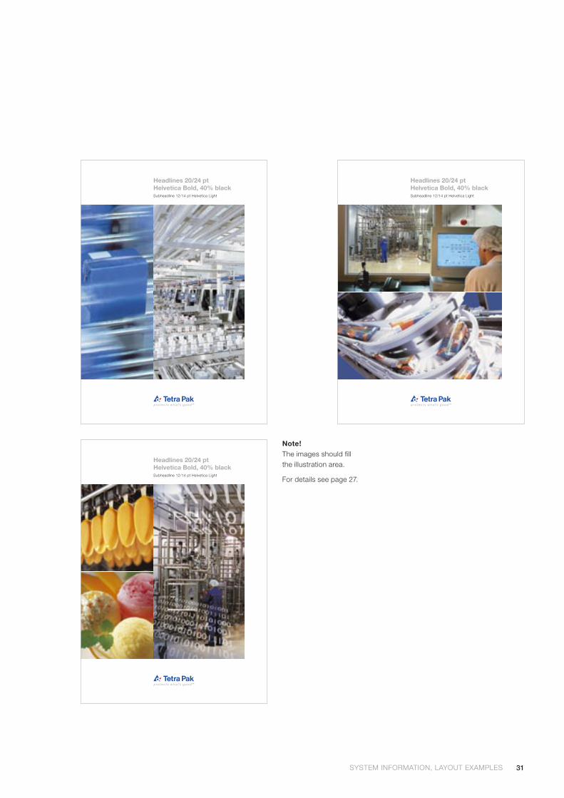
All front covers of machine descriptions should carry the full name of the machine system. For system information only A4-format (US format) may be used.
SYSTEM INFORMATION, LAYOUT EXAMPLES SYSTEM INFORMATION, LAYOUT EXAMPLES
Headlines 20/24 ptHelvetica Bold, 40% blackSubheadline 12/14 pt Helvetica Light
31SYSTEM INFORMATION, LAYOUT EXAMPLES SYSTEM INFORMATION, LAYOUT EXAMPLES
Note!The images should fill the illustration area.
Headlines 20/24 ptHelvetica Bold, 40% blackSubheadline 12/14 pt Helvetica Light
Headlines 20/24 ptHelvetica Bold, 40% blackSubheadline 12/14 pt Helvetica Light
Headlines 20/24 ptHelvetica Bold, 40% blackSubheadline 12/14 pt Helvetica Light
For details see page 27.
32
Layout examples, product information
PRODUCT INFORMATION, LAYOUT EXAMPLES PRODUCT INFORMATION, LAYOUT EXAMPLES
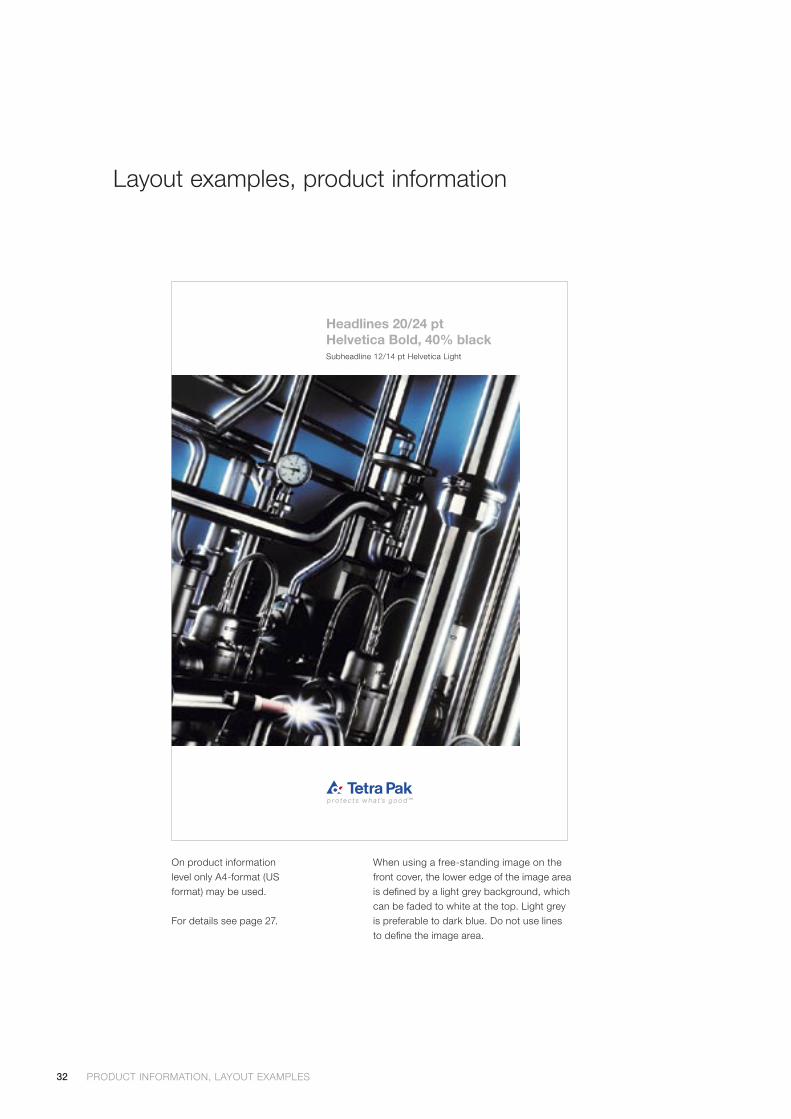
On product information level only A4-format (US format) may be used.
For details see page 27.
Headlines 20/24 ptHelvetica Bold, 40% blackSubheadline 12/14 pt Helvetica Light
When using a free-standing image on the front cover, the lower edge of the image area is defined by a light grey background, which can be faded to white at the top. Light grey is preferable to dark blue. Do not use lines to define the image area.
33PRODUCT INFORMATION, LAYOUT EXAMPLES PRODUCT INFORMATION, LAYOUT EXAMPLES
Lorem ipsum dolor sit ametconsectetuer adipiscing elit, sed diam nonummy nibh euismod tincidunt utlaoreet dolore magna aliquam erat volutpat. Ut wisi enim ad minim veniam,quis nostrud exerci tation ullamcorper suscipit lobortis nisl ut aliquip ex eacommodo consequat. Duis autem vel eum iriure dolor.
sse molestie consequat, vel illum dolore eu feugiat nulla facilisis at vero eroset accumsan et iusto odio dignissim qui blandit praesent luptatum zzril delenitaugue duis dolore te feugait nulla facilisi.
Lorem ipsum dolor sit amet, consectetuer adipiscing elit, sed diam nonummynibh euismod tincidunt ut laoreet dolore magna aliquam erat volutpat. Ut wisienim ad minim veniam, quis nostrud exerci tation ullamcorper suscipit lobortisnisl ut aliquip ex ea commodo consequat.
Headlines 20/24 ptHelvetica Bold, 40% blackSubheadline 12/14 pt Helvetica Light
Lorem ipsum dolor sit amet, consectetueradipiscing elit, sed diam nonummy nibheuismod tincidunt ut laoreet dolore magnaaliquam erat volutpat. Ut wisi enim ad minimveniam, quis nostrud exerci tation ullam-corper suscipit lobortis nisl ut aliquip ex eacommodo consequat. Duis autem vel eumiriure dolor in hendrerit in vulputateesse molestie consequat, vel illum doloreeu feugiat nulla facilisis at vero eros etaccumsan et iusto odio dignissim qui blanditpraesent luptatum zzril delenit augue duisdolore te feugait nulla facilisi.
Lorem ipsum dolor sit ametconsectetuer adipiscing elit, sed diam nonummy nibheuismod tincidunt ut laoreet dolore magna aliquam eratvolutpat. Ut wisi enim ad minim veniam, quis nostrudexerci tation ullamcorper suscipit lobortis nisl ut aliquipex ea commodo consequat. Duis autem vel eum iriuredolor in hendrerit in vulputate velit sse molestie consequat,vel illum dolore eu feugiat nulla facilisis at vero eros etaccumsan et iusto odio duis dolore te feugait nulla facilisi.
• Lorem ipsum dolor sit amet, consectetuer adipiscingelit, sed diam nonummy nibh euismod tincidunt ut
• laoreet dolore magna aliquam erat volutpat. Ut wisienim ad minim veniam, quis nostrud exerci tationullamcorper suscipit lobortis nisl ut aliquip ex eacommodo consequat.
• Duis autem vel eum iriure dolor in hendrerit in vulputatevelit esse molestie consequat, vel illum dolore eu.
Consectetuer adipiscing elit, sed diam nonummy nibh euismod tincidunt ut laoreet doloremagna aliquam erat volutpat. Ut wisi enimad minim veniam, quis nostrud exerci tationullamcorper suscipit lobortis nisl ut aliquipex ea commodo consequat.
Lorem ipsum dolor sit ametconsectetuer adipiscing elit, sed diam nonummy nibheuismod tincidunt ut laoreet dolore magna aliquam eratvolutpat. Ut wisi enim ad minim veniam, quis nostrudexerci tation ullamcorper suscipit lobortis nisl ut aliquipex ea commodo consequat.
Duis autem vel eum iriure dolor in hendrerit in vulputatevelit esse molestie consequat, vel illum dolore eu feugiatnulla facilisis at vero eros et accumsan et iusto odiodignissim qui blandit praesent luptatum zzril delenit augue
Headlines 20/24 ptHelvetica Bold, 40% blackSubheadline 12/14 pt Helvetica Light
Lorem ipsum dolor sit amet, consectetuer adipiscing elit,sed diam nonummy nibh euismod tincidunt ut laoreetdolore magna aliquam erat volutpat. Ut wisi enim ad minimveniam, quis nostrud exerci tation ullamcorper suscipitlobortis nisl ut aliquip ex ea commodo consequat. Duisautem vel eum iriure dolor in hendrerit in vulputate velit
esse molestie consequat, vel illum dolore eu feugiatnulla facilisis at vero eros et accumsan et iusto odiodignissim qui blandit praesent luptatum zzril delenit augueduis dolore te feugait nulla facilisi.
Lorem ipsum dolor sit amet, consectetuer adipiscingelit, sed diam nonummy nibh euismod tincidunt ut laoreetdolore magna aliquam erat volutpat. Ut wisi enim adminim veniam, quis nostrud exerci tation ullamcorpersuscipit lobortis nisl ut aliquip ex ea commodo consequat.
Duis autem vel eum iriure dolor in hendrerit in vulputatevelit esse molestie consequat, vel illum dolore eu feugiatnulla facilisis at vero eros et accumsan et iusto odiodignissim qui blandit praesent luptatum zzril delenit augueduis dolore te feugait nulla facilisi. Nam liber tempor cumsoluta nobis eleifend option congue nihil imperdiet doming
© 2
003
Tetr
a P
ak C
arto
n C
hille
d.
Cod
e 99
99en
. 20
03-0
4.
www.tetrapak.com We reserve the right to introduce designmodifications without prior notice. Tetra Pak,
, protects what’s good and Tetra Brik aretrademarks belonging to the Tetra Pak Group.
Lorem ipsum dolor sit ametconsectetuer adipiscing elit, sed diam nonummy nibheuismod tincidunt ut laoreet dolore magna aliquam eratvolutpat. Ut wisi enim ad minim veniam, quis nostrud exercitation ullamcorper suscipit lobortis nisl ut aliquip ex eacommodo consequat.
Duis autem vel eum iriure• dolor in hendrerit in vulputate velit esse molestie consequat, vel illum dolore eu feugiat• nulla facilisis at vero eros et accumsan et iusto odio
dignissim qui blandit praesent luptatum zzril delenitaugue duis dolore te feugait nulla facilisi.
• Lorem ipsum dolor sit amet, consectetuer
Adipiscing elit, sed diam• nonummy nibh euismod tincidunt ut laoreet dolore
magna aliquam erat volutpat.• Ut wisi enim ad minim veniam, quis nostrud exerci
tation ullamcorper suscipit lobortis. nisl ut aliquip exea commodo consequat.
• nonummy nibh euismod tincidunt ut laoreet doloremagna aliquam erat volutpat.
• Ut wisi enim ad minim veniam, quis nostrud exercitation ullamcorper suscipit lobortis. nisl ut aliquip ex
Lorem ipsum dolorsit amet, consectetuer adipiscing elit, sed diam nonummynibh euismod tincidunt ut laoreet dolore magna aliquamerat volutpat. Ut wisi enim ad minim
Veniam, quis nostrudexerci tation ullamcorper suscipit lobortis nisl ut aliquip exea commodo consequat. Duis autem vel eum iriure dolorin hendrerit in vulputate velit
esse molestie consequat, vel illum dolore eu feugiatnulla facilisis at vero eros et accumsan et iusto odio dignissimqui blandit praesent luptatum zzril delenit augue duis dolorete feugait nulla facilisi.
Lorem ipsumdolor sit amet, consectetuer adipiscing elit, sed diamnonummy nibh euismod tincidunt ut laoreet dolore magnaaliquam erat volutpat. Ut wisi enim ad minim veniam, quisnostrud exerci tation ullamcorper suscipit lobortis nisl utaliquip ex ea commodo consequat.Duis autem vel eum iriure dolor in hendrerit in vulputate velitesse molestie consequat, vel illum dolore eu feugiat nullafacilisis at vero eros et accumsan et iusto odio dignissimqui blandit praesent luptatum zzril delenit augue duis dolorete feugait nulla facilisi. Nam liber tempor cum soluta nobis
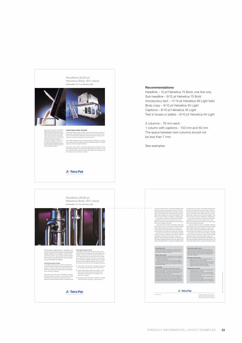
RecommendationsHeadline – 12 pt Helvetica 75 Bold, one line onlySub headline – 9/12 pt Helvetica 75 BoldIntroductory text – 11/14 pt Helvetica 46 Light ItalicBody copy – 9/12 pt Helvetica 45 LightCaptions – 8/10 pt Helvetica 45 LightText in boxes or plates – 8/10 pt Helvetica 45 Light
2 columns – 76 mm each1 column with captions – 103 mm and 50 mmThe space between text columns should not be less than 7 mm.
See examples.
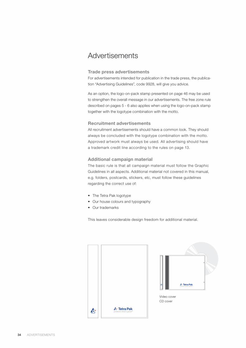
34
Video cover CD cover
Advertisements
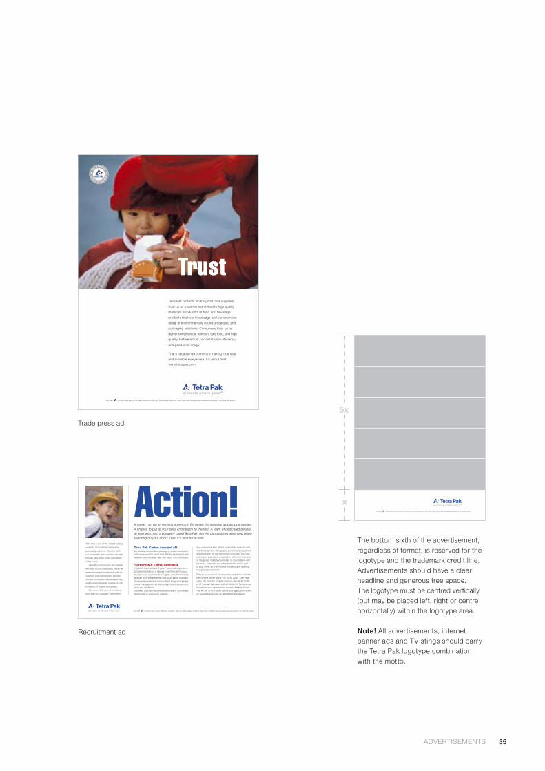
Trade press advertisementsFor advertisements intended for publication in the trade press, the publica-
tion “Advertising Guidelines”, code 9928, will give you advice.
As an option, the logo-on-pack stamp presented on page 46 may be used
to strengthen the overall message in our advertisements. The free zone rule
described on pages 5 - 6 also applies when using the logo-on-pack stamp
together with the logotype combination with the motto.
Recruitment advertisementsAll recruitment advertisements should have a common look. They should
always be concluded with the logotype combination with the motto.
Approved artwork must always be used. All advertising should have
a trademark credit line according to the rules on page 13.
Additional campaign materialThe basic rule is that all campaign material must follow the Graphic
Guidelines in all aspects. Additional material not covered in this manual,
e.g. folders, postcards, stickers, etc, must follow these guidelines
regarding the correct use of:
• The Tetra Pak logotype
• Our house colours and typography
• Our trademarks
This leaves considerable design freedom for additional material.
ADVERTISEMENTS ADVERTISEMENTS
35ADVERTISEMENTS ADVERTISEMENTS
Tetra Pak, , protects what’s good, Tetra Brik, Tetra Rex, Tetra Top, Tetra Wedge, Tetra Fino, Tetra Therm and Tetra Alex are trademarks belonging to the Tetra Pak Group.
Your respective jobs will be to develop, evaluate andmaintain prepress / flexography process and equipmentspecifications for our converting factories. You’ll beworking on projects in cooperation with other membersof the group. Validation activities in coordination withfactories, suppliers and other partners will be partof your work, so it will involve travelling and workingin a global environment.
Time to take action? For more info, check our website,then phone Javier Maria +46 46 36 22 24. Get tradeunion info from SIF, Lisbeth Larsson +46 46 36 23 20or CF, Lennart Bensefelt +46 46 36 30 94. For informa-tion about your application, contact Helena Erixon,+46 46 36 14 33. Please submit your application onlineon www.tetrapak.com no later than December 3.
Tetra Pak Carton Ambient ABWe develop and produce packaging systems and distri-bution solutions for liquid food. We are located in Lund,Sweden, and Modena, Italy, with about 900 employees.
1 prepress & 1 flexo specialistYou both have at least 3 years’ practical experience(possibly backed by a degree in printing technology).You also have a command of English, are self-motivated,and can work independently and/or as a part of a team.Our prepress specialist knows digital image processing,colour management as well as high-end prepress soft-ware and workflows.Our flexo specialist knows densitometers, dot metersand hands-on presswork analysis.
Tetra Pak is one of the world’s leading
suppliers of food processing and
packaging systems. Together with
our customers and suppliers, we help
provide safe foods to the consumers
of the world.
Operating in more than 165 markets
with over 20,000 employees, Tetra Pak
works in strategic partnership with its
suppliers and customers to provide
efficient, innovative solutions and high
quality, environmentally sound products
to millions of people world-wide.
Our vision: We commit to making
food safe and available, everywhere
A career can be an exciting adventure. Especially if it includes global opportunities.A chance to put all your skills and talents to the test. A team of dedicated peopleto work with. And a company called Tetra Pak. Are the opportunities described belowknocking on your door? Then it’s time for action!
Action!
Tetra Pak, , protects what’s good, Tetra Brik, Tetra Rex, Tetra Top, Tetra Wedge, Tetra Fino, Tetra Therm and Tetra Alex are trademarks belonging to the Tetra Pak Group.
Tetra Pak protects what’s good. Our suppliers
trust us as a partner committed to high quality
materials. Producers of food and beverage
products trust our knowledge and our extensive
range of environmentally sound processing and
packaging solutions. Consumers trust us to
deliver convenience, nutrition, safe food, and high
quality. Retailers trust our distribution efficiency
and good shelf image.
That’s because we commit to making food safe
and available everywhere. It’s about trust.
www.tetrapak.com
Trust
Trade press ad
Recruitment ad
The bottom sixth of the advertisement, regardless of format, is reserved for the logotype and the trademark credit line. Advertisements should have a clear headline and generous free space. The logotype must be centred vertically (but may be placed left, right or centre horizontally) within the logotype area.
Note! All advertisements, internet banner ads and TV stings should carry the Tetra Pak logotype combination with the motto.
x
5x
Tetra Pak, , protects what’s good, Tetra Brik, Tetra Rex, Tetra Top, Tetra Wedge, Tetra Fino, Tetra Therm and Tetra Alex are trademarks belonging to the Tetra Pak Group.
36
Other Applications
The theoretical applications of our graphic identity are virtually
unlimited. We only mention the most common applications
here and rely on the good judgement and common sense of our
people to apply these guidelines wherever our name is used.
When in doubt, contact Corporate Communications!
37 Presentation material
40 Signs on buildings
42 Supporting signs
44 Product and package signs
48 Exhibitions
50 Vehicles and transport
52 Clothing and gifts
37
Presentation material
Presentation material is used as digital files (PowerPoint, pdf) as well
as transparency slides. In both cases, the presentations meet a large
audience and are important carriers of our united graphic style.
Templates You can choose white, light blue or dark blue as background colour.
Templates in PowerPoint can be downloaded from ORBIS Global >
Tetra Pak Corporate Information > Basic Corporate Material > Graphic
Guidelines.
The following rules apply to all presentation material:
• Background colours: We have three to choose from:
White (R:255 G:255 B:255) – use black or blue text
Light blue (R:208 G:232 B:248) – use black or blue text
Dark Blue (R:0 G:0 B:153) – use white text
• Typeface: Always use Arial, preferably 40 pt for headlines but minimum
32 pt, and minimum 20 pt for body text (our house typeface Helvetica
is not standard on PCs, and thus not suitable for digital presentations).
When using blue text, use the correct shade (R:0 G:0 B:153).
• Logotype: All on-screen presentation slides should carry our combina-
tion logotype with the motto (see page 6).
• Resolution: Images used in screen presentations should have a resolu-
tion of 72 dpi and for print the resolution is 150 dpi. The size should
always be 100%.
• Creator: Always put the name of the information owner and the date
when the slide was created or updated in the lower right-hand corner
of each slide. This text should be 9 pt Arial, black or reversed out.
PRESENTATION MATERIAL
38
TipsWhen creating presentation material there are a few things to keep in mind
for a better and more professional result. Don’t consider these tips as
absolute rules, but an aid when making your own presentation material:
• Avoid combining the colours red and green as most colour-blind people
can’t distinguish these colours.
• Do not mix presentations made for screen and print as they differ too
much in size, proportion and resolution.
• Do not mix presentations with different backgrounds.
• Use jpg images for photographs.
• Make all your slides in landscape format.
• Keep the text amount to a maximum of 6 lines per slide as more text
becomes hard to read.
• Use keywords or expressions. The slide should not be a manuscript
to read from, but only to highlight what you are saying.
• Use the PowerPoint note pages for your manuscript and for handouts.
• Use a proper tool (such as Adobe Photoshop or similar) when editing
your images.
MultimediaFor multimedia and video productions, the housemark may be used three-
dimensionally, but it may never be changed in shape or adorned.
InternetWhen creating local homepages, please use the special tool and contact
[email protected] for advice and guidance.
PRESENTATION MATERIAL PRESENTATION MATERIAL

39PRESENTATION MATERIAL PRESENTATION MATERIAL
40
Signs on buildings
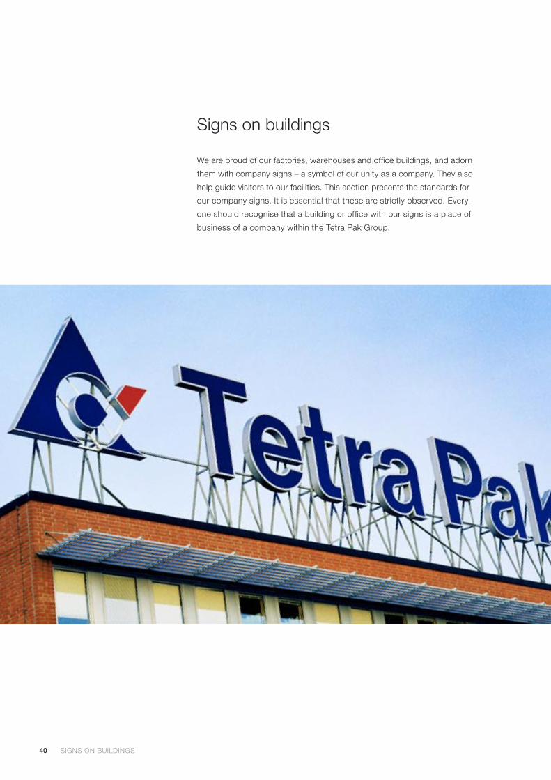
We are proud of our factories, warehouses and office buildings, and adorn
them with company signs – a symbol of our unity as a company. They also
help guide visitors to our facilities. This section presents the standards for
our company signs. It is essential that these are strictly observed. Every-
one should recognise that a building or office with our signs is a place of
business of a company within the Tetra Pak Group.
SIGNS ON BUILDINGS SIGNS ON BUILDINGS

41SIGNS ON BUILDINGS SIGNS ON BUILDINGS
Examples1. Neon horizontal combination of the logotype on the front of a building.
2. Illuminated horizontal combination of the logotype in a light-box or on a metal plate centred above a main entrance.
3. Neon horizontal combination of the logotype centred at the top of a building that is dark or brick-faced.
4. Illuminated vertical combination logo- type above a main entrance.
5. Illuminated sign with company name above a main entrance.
6. Double-faced pole sign, recommended for viewing at a great distance or from a highway.
7. Custom-built roof sign. Material: light-box. (In countries where laws may require that signs in the local language should be presented in a bigger size and in a special location, it might be impossible to keep the free zone around the logotype.) Material: metal (pole), light-box (sign).
8. Flags, whether full size or table flags, should feature the vertical combination logotype in PMS Reflex Blue and PMS Warm Red against a white background.
Logotypes must always be reproduced from approved artwork or from our own authorised data files. Download from ORBIS: Global > Tetra Pak Corporate Information > Basic Corporate Material > Graphic Guidelines.
Height
Distance
0.5 m
150 m
1 m
300 m
2 m
600 m
Visibility chartThis chart helps to define the optimum size of the housemark in signage appli-cations. The figures along the top line denote the best size for the housemark when viewed from the distance along the bottom line.
8
42
Supporting signs
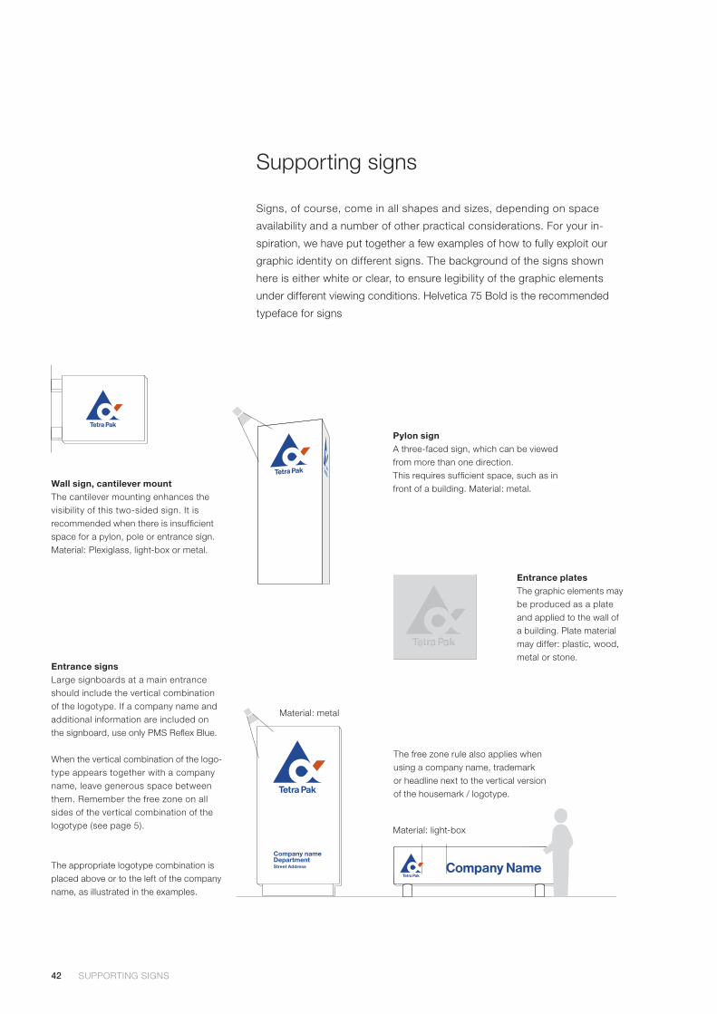
Signs, of course, come in all shapes and sizes, depending on space
availability and a number of other practical considerations. For your in-
spiration, we have put together a few examples of how to fully exploit our
graphic identity on different signs. The background of the signs shown
here is either white or clear, to ensure legibility of the graphic elements
under different viewing conditions. Helvetica 75 Bold is the recommended
typeface for signs
Wall sign, cantilever mountThe cantilever mounting enhances the visibility of this two-sided sign. It is recommended when there is insufficient space for a pylon, pole or entrance sign. Material: Plexiglass, light-box or metal.
Pylon signA three-faced sign, which can be viewed from more than one direction.This requires sufficient space, such as in front of a building. Material: metal.
Entrance signsLarge signboards at a main entrance should include the vertical combination of the logotype. If a company name and additional information are included on the signboard, use only PMS Reflex Blue.
When the vertical combination of the logo-type appears together with a company name, leave generous space between them. Remember the free zone on all sides of the vertical combination of the logotype (see page 5).
The appropriate logotype combination is placed above or to the left of the company name, as illustrated in the examples.
Material: light-box
Material: metal
SUPPORTING SIGNS SUPPORTING SIGNS
Entrance platesThe graphic elements may be produced as a plate and applied to the wall of a building. Plate material may differ: plastic, wood, metal or stone.
The free zone rule also applies when using a company name, trademark or headline next to the vertical version of the housemark / logotype.
43SUPPORTING SIGNS SUPPORTING SIGNS
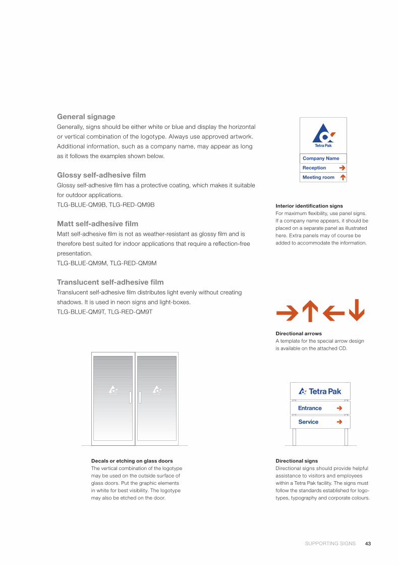
General signageGenerally, signs should be either white or blue and display the horizontal
or vertical combination of the logotype. Always use approved artwork.
Additional information, such as a company name, may appear as long
as it follows the examples shown below.
Glossy self-adhesive film Glossy self-adhesive film has a protective coating, which makes it suitable
for outdoor applications.
TLG-BLUE-QM9B, TLG-RED-QM9B
Matt self-adhesive film Matt self-adhesive film is not as weather-resistant as glossy film and is
therefore best suited for indoor applications that require a reflection-free
presentation.
TLG-BLUE-QM9M, TLG-RED-QM9M
Translucent self-adhesive film Translucent self-adhesive film distributes light evenly without creating
shadows. It is used in neon signs and light-boxes.
TLG-BLUE-QM9T, TLG-RED-QM9T
Decals or etching on glass doorsThe vertical combination of the logotype may be used on the outside surface of glass doors. Put the graphic elements in white for best visibility. The logotype may also be etched on the door.
Directional signsDirectional signs should provide helpful assistance to visitors and employees within a Tetra Pak facility. The signs must follow the standards established for logo-types, typography and corporate colours.
Interior identification signsFor maximum flexibility, use panel signs. If a company name appears, it should be placed on a separate panel as illustrated here. Extra panels may of course be added to accommodate the information.
Directional arrowsA template for the special arrow design is available on the attached CD.

44
➔
Product and package signs
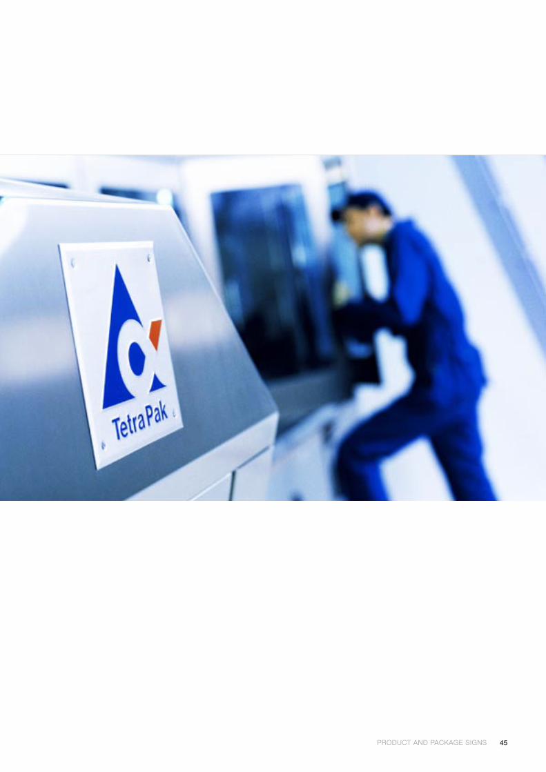
Our machines are permanent representatives of our company at our
customers’ sites. They serve as constant reminders of our company,
and tell people visiting our customers who supplied the equipment.
This is one reason why all of our equipment is fitted with a product
sign located in a highly visible place on the machine.
Every day, millions of Tetra Pak packages are consumed around the
world. With this in mind, it is easy to understand the importance our
packages play, as they carry our Tetra Pak logotype and housemark.
They serve as constant reminders of our company and can create
goodwill.
Product equipment signsA Tetra Pak machine installed at a customer’s site acts as a powerful
reminder to staff and visitors alike of our corporate name. Hence, each
item of equipment displays a highly visible product sign that includes
our logotype.
The name of the machine below is “Tetra Pak® A3/Flex”. Tetra Pak®
is displayed on the platform of the machine, whereas the full name
“Tetra Pak® A3/ Flex”, can be printed on a smaller sign on the machine
door (optional). All trademarks should always be written in our house
typeface, Helvetica. Never use anything but approved artwork.
On machines, the PMS or white colour versions of the logotype may
be displayed. They can also be etched. Trademarks should be provided
with the appropriate designation ® or ™ when used on machines.
PRODUCT AND PACKAGE SIGNS PRODUCT AND PACKAGE SIGNS
45PRODUCT AND PACKAGE SIGNS PRODUCT AND PACKAGE SIGNS
46
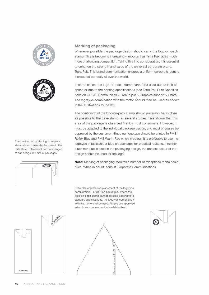
Marking of packagingWhenever possible the package design should carry the logo-on-pack
stamp. This is becoming increasingly important as Tetra Pak faces much
more challenging competition. Taking this into consideration, it is essential
to enhance the strength and value of the universal corporate brand,
Tetra Pak. This brand communication ensures a uniform corporate identity
if executed correctly all over the world.
In some cases, the logo-on-pack stamp cannot be used due to lack of
space or due to the printing specifications (see Tetra Pak Print Specifica-
tions on ORBIS: Communities > Free to join > Graphics support > Share).
The logotype combination with the motto should then be used as shown
in the illustrations to the left.
The positioning of the logo-on-pack stamp should preferably be as close
as possible to the date-stamp, as several studies have shown that this
area of the package is observed first by most consumers. However, it
must be adapted to the individual package design, and must of course be
approved by the customer. Since our logotype should be printed in PMS
Reflex Blue and PMS Warm Red when in colour, it is preferable to use the
logotype in full black or blue on packages for practical reasons. If neither
black nor blue is used in the packaging design, the darkest colour of the
design should be used for the logo.
Note! Marking of packaging requires a number of exceptions to the basic
rules. When in doubt, consult Corporate Communications.
Examples of preferred placement of the logotype combination. For portion packages, where the logo-on-pack stamp cannot be used according to standard specifications, the logotype combination with the motto shall be used. Always use approved artwork from our own authorised data files.
PRODUCT AND PACKAGE SIGNS PRODUCT AND PACKAGE SIGNS
The positioning of the logo-on-pack stamp should preferably be close to the date stamp. Placement can be arranged to suit design and size of packages.
47PRODUCT AND PACKAGE SIGNS PRODUCT AND PACKAGE SIGNS
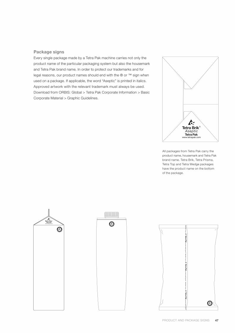
Package signsEvery single package made by a Tetra Pak machine carries not only the
product name of the particular packaging system but also the housemark
and Tetra Pak brand name. In order to protect our trademarks and for
legal reasons, our product names should end with the ® or ™ sign when
used on a package. If applicable, the word “Aseptic” is printed in italics.
Approved artwork with the relevant trademark must always be used.
Download from ORBIS: Global > Tetra Pak Corporate Information > Basic
Corporate Material > Graphic Guidelines.
All packages from Tetra Pak carry the product name, housemark and Tetra Pak brand name. Tetra Brik, Tetra Prisma, Tetra Top and Tetra Wedge packages have the product name on the bottom of the package.
Tetra Fino A
septic
®Tetra Fino
Asep
tic ®
Tetra Fino A
septic
®
48
Exhibitions
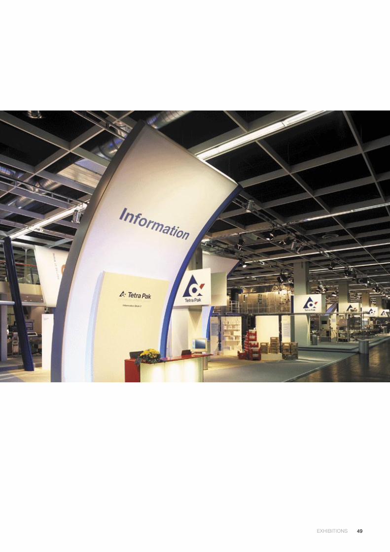
Exhibitions provide an excellent opportunity for meeting customers and
suppliers, and acquainting them with our products and services. For this
reason, it is essential that all exhibitions should be developed according
to a uniform graphic style.
For exhibitions, it is recommended to consider the following:
• White is always pleasing and fresh-looking as a background colour.
It conveys a clean image, in keeping with a company working in the
food business. The addition of two house colours, PMS Reflex Blue
and PMS Warm Red, will make an attractive impression.
• Ensure that all machines on display have their proper trademarks
attached.
• If packaging material has been developed specifically for the
exhibition, give it a design to match the stand both in colour and
graphics.
• Make sure that all packages made for the exhibition have the correct
product sign and trademark according to the graphic guidelines on
pages 46 - 47.
• All housemarks and logotypes should be made from approved artwork.
EXHIBITIONS EXHIBITIONS
49EXHIBITIONS EXHIBITIONS
50
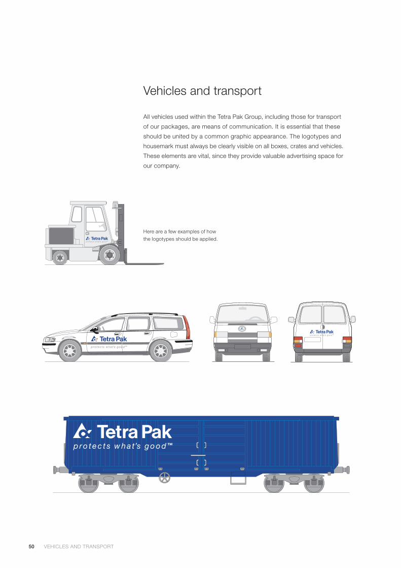
Vehicles and transport
All vehicles used within the Tetra Pak Group, including those for transport
of our packages, are means of communication. It is essential that these
should be united by a common graphic appearance. The logotypes and
housemark must always be clearly visible on all boxes, crates and vehicles.
These elements are vital, since they provide valuable advertising space for
our company.
Here are a few examples of how the logotypes should be applied.
VEHICLES AND TRANSPORT VEHICLES AND TRANSPORT
51VEHICLES AND TRANSPORT VEHICLES AND TRANSPORT
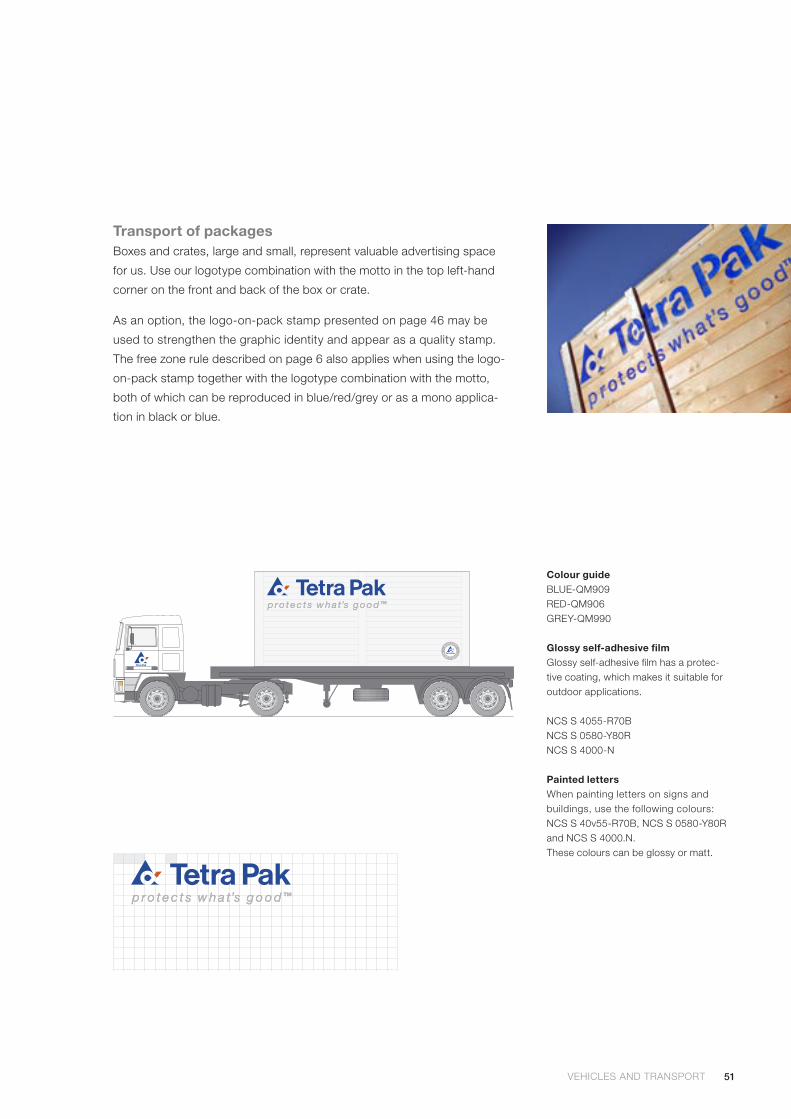
Transport of packagesBoxes and crates, large and small, represent valuable advertising space
for us. Use our logotype combination with the motto in the top left-hand
corner on the front and back of the box or crate.
As an option, the logo-on-pack stamp presented on page 46 may be
used to strengthen the graphic identity and appear as a quality stamp.
The free zone rule described on page 6 also applies when using the logo-
on-pack stamp together with the logotype combination with the motto,
both of which can be reproduced in blue/red/grey or as a mono applica-
tion in black or blue.
Colour guideBLUE-QM909 RED-QM906GREY-QM990
Glossy self-adhesive filmGlossy self-adhesive film has a protec-tive coating, which makes it suitable for outdoor applications.
NCS S 4055-R70B NCS S 0580-Y80RNCS S 4000-N
Painted lettersWhen painting letters on signs and buildings, use the following colours: NCS S 40v55-R70B, NCS S 0580-Y80R and NCS S 4000.N.These colours can be glossy or matt.
52
Clothing and gifts
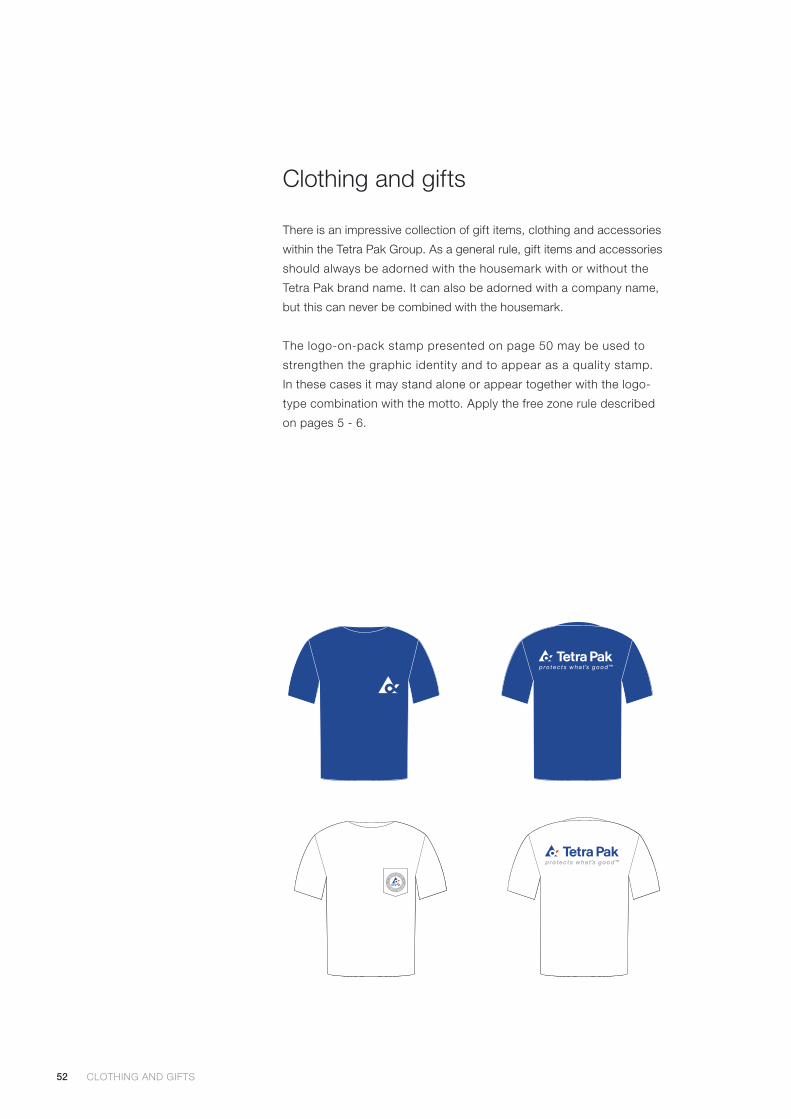
There is an impressive collection of gift items, clothing and accessories
within the Tetra Pak Group. As a general rule, gift items and accessories
should always be adorned with the housemark with or without the
Tetra Pak brand name. It can also be adorned with a company name,
but this can never be combined with the housemark.
The logo-on-pack stamp presented on page 50 may be used to
strengthen the graphic identity and to appear as a quality stamp.
In these cases it may stand alone or appear together with the logo-
type combination with the motto. Apply the free zone rule described
on pages 5 - 6.
CLOTHING AND GIFTS CLOTHING AND GIFTS
53CLOTHING AND GIFTS CLOTHING AND GIFTS
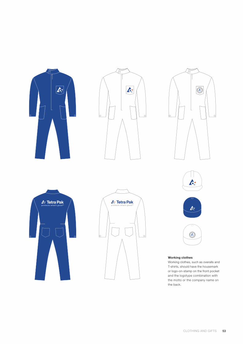
Working clothesWorking clothes, such as overalls and T-shirts, should have the housemark or logo-on-stamp on the front pocket and the logotype combination with the motto or the company name on the back.
54
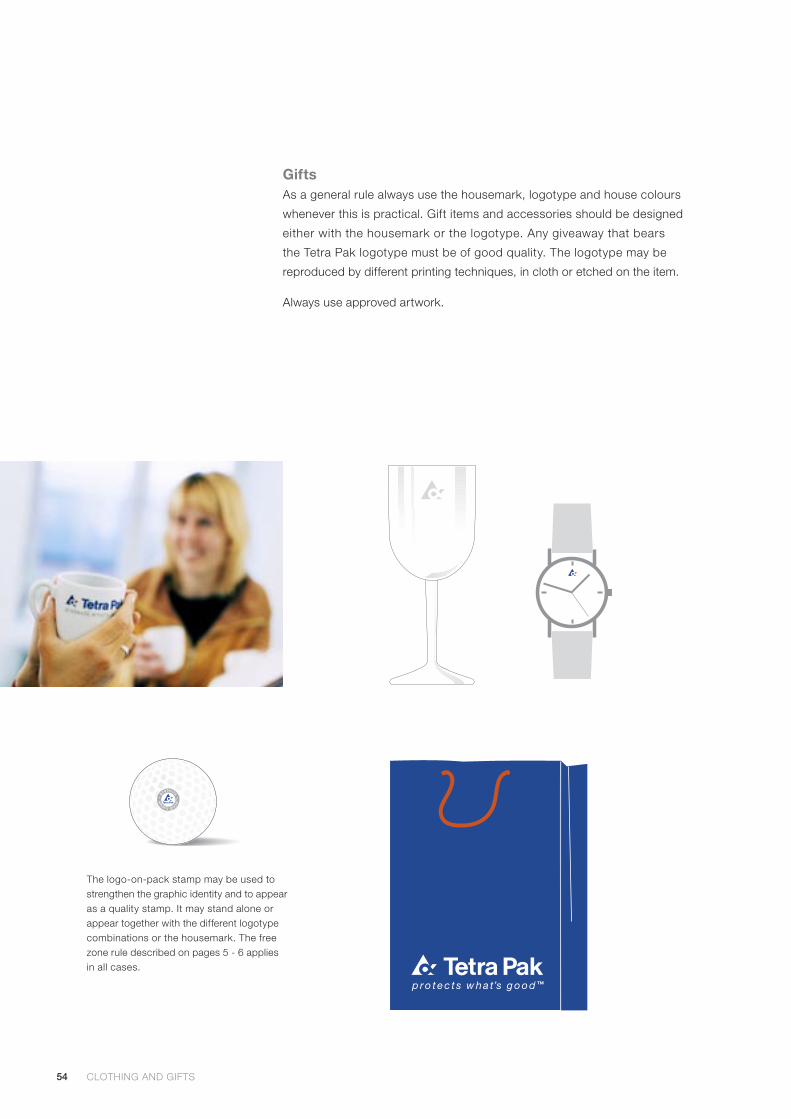
GiftsAs a general rule always use the housemark, logotype and house colours
whenever this is practical. Gift items and accessories should be designed
either with the housemark or the logotype. Any giveaway that bears
the Tetra Pak logotype must be of good quality. The logotype may be
reproduced by different printing techniques, in cloth or etched on the item.
Always use approved artwork.
The logo-on-pack stamp may be used to strengthen the graphic identity and to appear as a quality stamp. It may stand alone or appear together with the different logotype combinations or the housemark. The free zone rule described on pages 5 - 6 applies in all cases.
CLOTHING AND GIFTS

CLOTHING AND GIFTS

200
5 Te
tra
Pak
Inte
rnat
iona
l cod
e 9
90
6en
. 20
05
-03
We reserve the right to introduce design modifications without prior notice. Tetra Pak, , protects what’s good, Tetra Alex, Tetra Brik, Tetra Classic, Tetra Fino, Tetra Prisma, Tetra Rex, Tetra Top and Tetra Wedge are trademarks belonging to the Tetra Pak Group.
www.tetrapak.com