Terry watsonpresentationamericangraffiti
23
Weltons American Graffiti ale Campaign By Terry Watson
-
Upload
terry-watson -
Category
Art & Photos
-
view
17 -
download
0
Transcript of Terry watsonpresentationamericangraffiti

Weltons American Graffiti ale Campaign
By Terry Watson

Concept
bar runner Advert T-shirt
“An American style campaign that tells comical general story about the flavour”
pump clip poster
Terry Watson
It is primarily going to package American Pale Ale as a story that aims to entertain. It primarily describes the flavour using imagery and typography. This campaign should not focus too much on the movie.
Terry Watson
The more visual aspect of the campaign
Terry Watson
A 20-30 second clip
Terry Watson
Entice the target audience to explore Weltons through websites and pubs.
Terry Watson
This describes the flavour
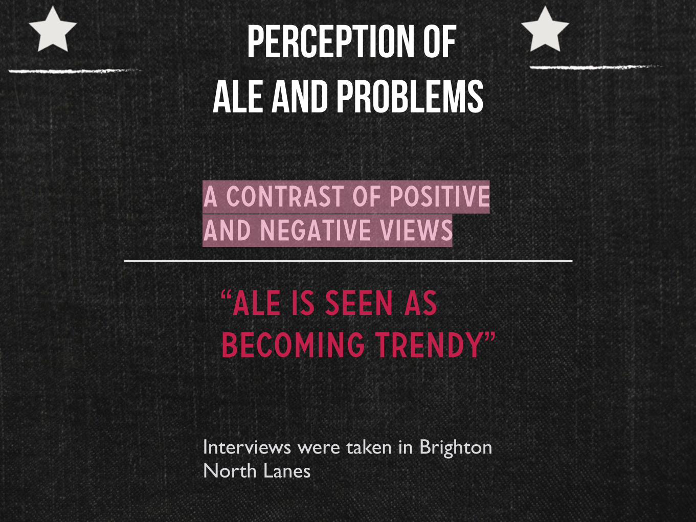
Perception of Ale and problems
A contrast of positive
and negative views
Interviews were taken in Brighton North Lanes
“Ale is seen as
becoming trendy”
Terry Watson
The response from people were quite interesting. It was surprising that people interviewed do drink Ale. People interviewed were below and above 30

Ale market share is increasing
The guardian report of
ale in recent years
“Retail analyst Nielsen reports that sales of golden ale have soared by 26% in the last year across all retailers”
Guardian article on Tesco performance in selling Golden Ale

Weltons values analysts
My understanding
•Comical
•Looks quirky and
unique
•Feels welcoming
Terry Watson
I aim for the campaign to portray Weltons in this manner. It needs to maintain its very good brand identity. The visual language in this case should not be serious.
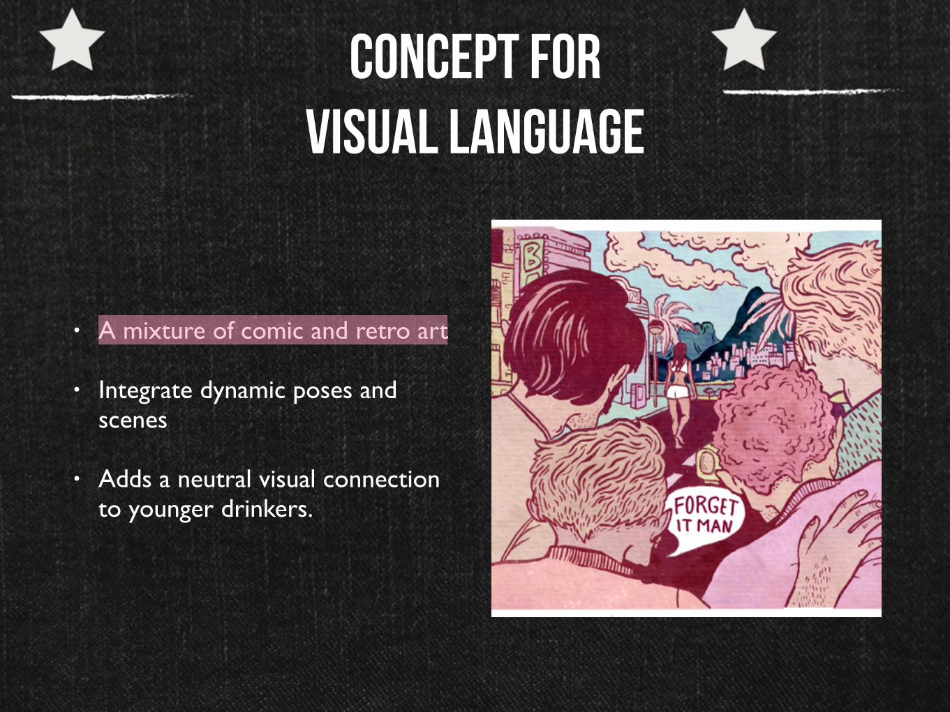
Concept for visual language
• A mixture of comic and retro art
• Integrate dynamic poses and scenes
• Adds a neutral visual connection to younger drinkers.
Terry Watson
The visual language needs to appeal to a broader audience within the drinking age. Soft colour should not make it too dynamic to put off the 30+. Keeping it 1960’s theme can be achieve by applying a comic theme as well

American graffiti movie
✦ A mixture of comic and retro art
✦ Integrate dynamic poses and scenes
✦ Adds a neutral visual connection to younger drinkers.

Narrative
Aim:Convey a compelling story on
how the the American Pale Beer is strong. Naughtiness
Visual language: A vintage and retro art style that
shows a montage
Story:Focuses on the police car and
drag race scenes

Kristen Rothbar and Tom Hugomat
✦ Both designers typography and retro art to create compelling stories
Terry Watson
http://www.misterretro.com is another key aspect of my graphic style. I intend to use more artistic graphics to make the brand stand out. Use speech bubbles to make the content feel engaging.

T-shirt
Terry Watson
T-shirt (front left) is generally telling the audience that there is a new drink arriving in 2015T-shirt back aims to inform people about the flavour and where they can get the products. It is more about discovering the Weltons brand. It is going to use imagery associated with Ale, the hops. The imagery should tell a story that this American inspired uses clean hops that causes it to be very different.

Bar runner
✦ A more concise design. Still the same style
Terry Watson
Bar runners will be in the pubs. This will need to feature visuals that entices the audience to explore the drink. It informs how it uses fresh American hops.It informs the audience about the ale being based on George Lucas’ movie. In terms of imagery, I wanted to recreate the police car scene. As you can see, there are only the wheels. The far right of the design should feature smoke. An American Diner woman should also give a keyword of its flavour. This is inspired by many old HollyWood movie posters.

poster
✦ A printable product
Terry Watson
This should be another visual representation of American Graffiti. In contrast to the bar runner, the police car acts as the focal point. Keeping with the retro theme, I have kept the same landscape, sky and composition. The only difference is how the car is chained to the car to signify that the American Pale is strong. On the left, there is a brewing factor to show that this ale is fresh and passionate. It should not be word heavy. The design of the character is shown in the mock ups page later on.

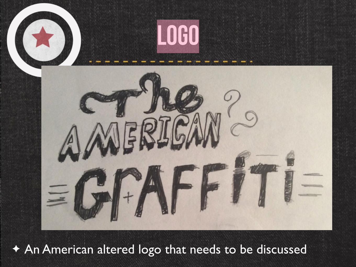
logo
✦ An American altered logo that needs to be discussed
Terry Watson
I intend to keep the same logo but its style a bit. It may be decided to use the pump clip shape as the the letter 0 to make it interesting. Patterns, artistic brushes and retro banners should be integrated into the design to make the viewing experience feel coherent. Tagline is still included
logo
✦ An American altered logo that needs to be discussed
Terry Watson
This was the concept for the American Graffiti logo. I placed the word the on movie name to save space. I aim to use the american Graffiti Pale Ale so that it reduces the reading time.

pumpclipA comical description of the pale American Beer
Terry Watson
The aim for this is to tell a story about the flavour. In this, I am open to reduced the space of the american diner and the sign section. This will increase the space for the American Graffiti and flavour description. For the description, I going to write’I see a goddess, it is an pale ale with a citrus bitter taste and the smell of aroma. An intense beverage made from American hops’

branding
Terry Watson
As mentioned in the logo, I aim to reduce reading times. This will prevent the overall campaign from feeling over whelming. The designs are influence from artistic images and old American products. Made the type more simple to make the visual language to also appeal to people above 30.I also want the characters’ design to be very simple. I was inspired by Tom Hugomat, Wacky Races, and Mister Retro to create a retro themed character. Keeping it interesting is aim for leaving a stroke out off his face
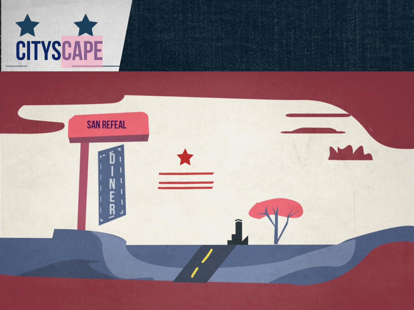
CityscapeA landscape inspired by the town of San Rafael
Terry Watson
I aim to play with a retro colour scheme that is simple and dynamic. Flat colours are the best of achieving this. Adding simple detail adds a nice appeal to the campaign style. It should be very warm. At the moment, I am thinking of using wood texture to make it feel very American. This is a mock up of a scene

StoryboardA persuasive story that explains the story and the flavour within 30 seconds. Should be simple
Terry Watson
A simple video that aims to promote the flavour in a comical way. It simply gives a summary of what the American Graffiti and how it influenced Weltons to create a pale American ale. The animation should feature a lot of collisions to make the overall feeling feel comical. It aims to persuade people to explore the drink through the use of American inspired flavour. This video can be used as a format to expose the drink on Social media and television screens in pubs. The format will be HD. It uses images of America but still uses the illustrations present on other mediums.

Storyboard

Type and colour choices
A non
stereotypical
American colours
Old american product fonts with a twist
Terry Watson
Just keep the colours and text feel vintage. The style should convey freshness. Keep feel modern as well
Terry Watson
Softer colours associated with American landscape is the preferred colour scheme

Expanding your audience
✦ The integration of text and character should convey a comical story
✦ Interesting compositions that makes the designs stand out
✦ The branding of this needs still convey Weltons’ values

Outcomes
• A campaign that will be available on
digital and print platforms
• Spreading the message about the
unique drink range

That is all folks
Thank you