Tc user group-2_24_15
24
Oracle Marketing Cloud User Group Minneapolis | February 24, 2015
-
Upload
ron-corbisier -
Category
Marketing
-
view
114 -
download
1
Transcript of Tc user group-2_24_15
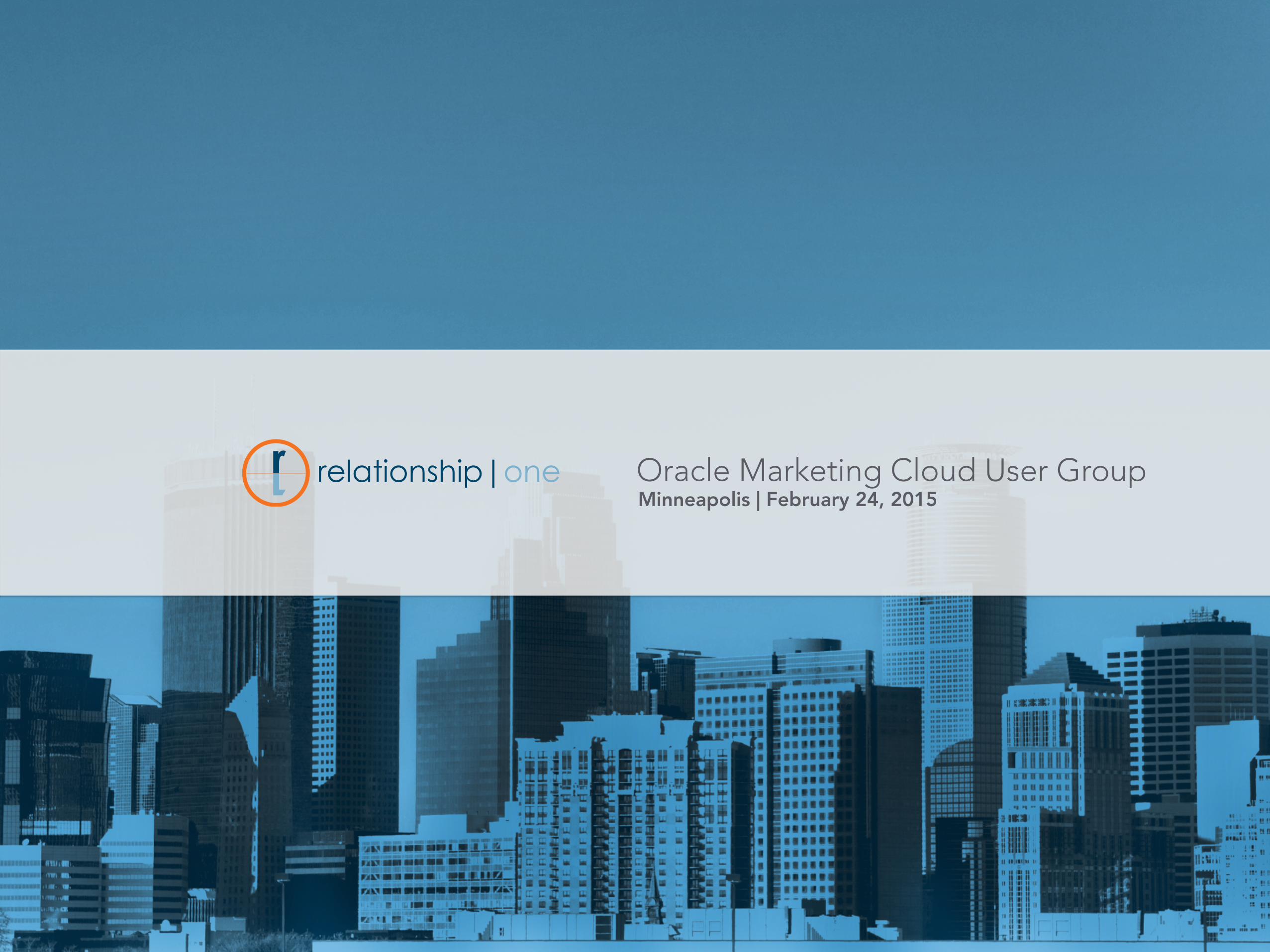
Oracle Marketing Cloud User GroupMinneapolis | February 24, 2015
2/27/15
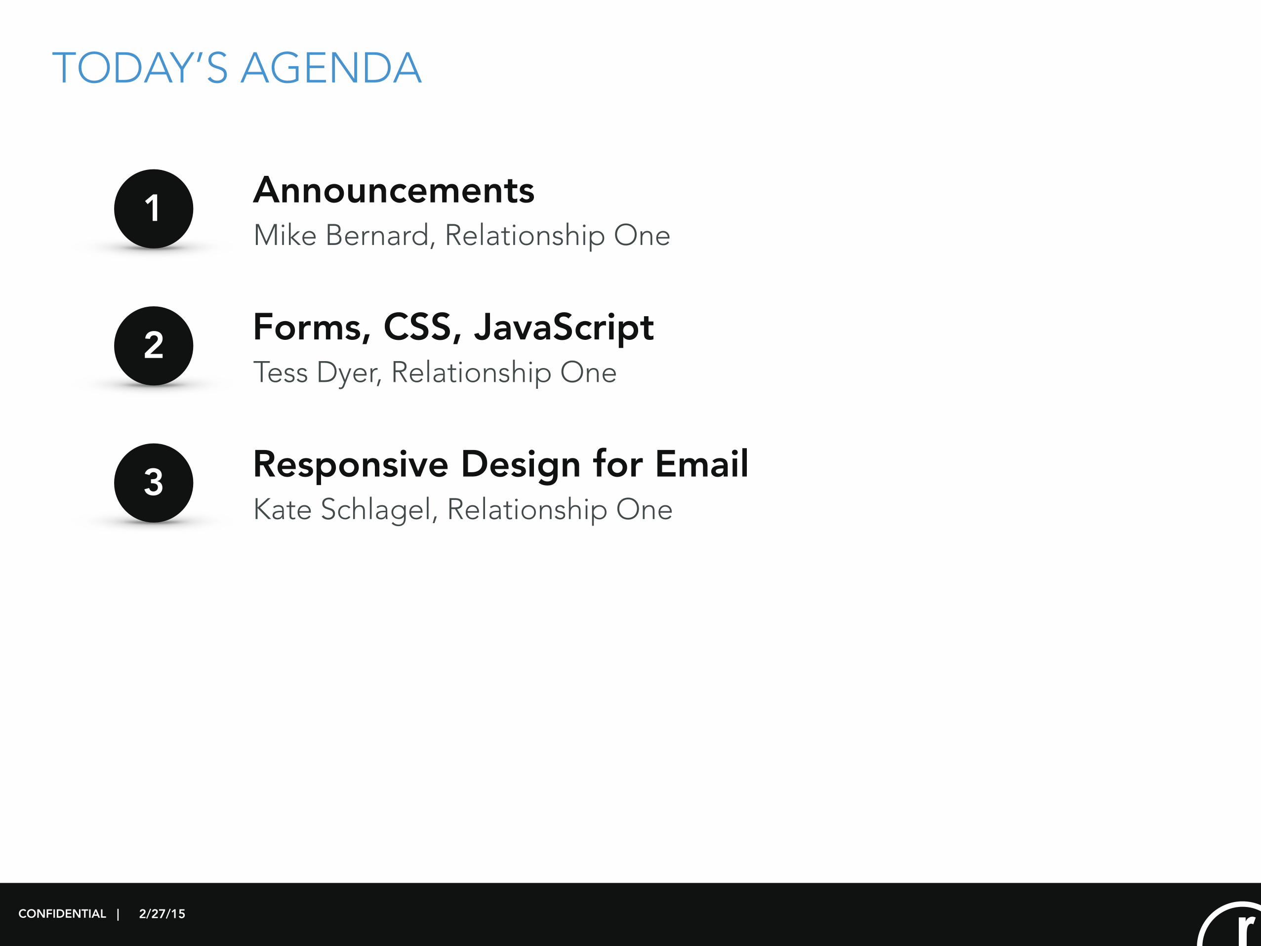
TODAY’S AGENDA
Tess Dyer, Relationship One
1
2
3
Forms, CSS, JavaScript
Kate Schlagel, Relationship OneResponsive Design for Email
Mike Bernard, Relationship One Announcements
CONFIDENTIAL |

2/27/15
ANNOUNCEMENTS February 2015
Modern Marketing Mashup
‣ March 5th 5:30 - 8:00
‣ Walker Art Center - Free
Modern Marketing Experience
‣ March 31 - April 2
‣ Get a discount - use our code: RLTNSHP1_75
469 Release
‣ In the middle of it currently - we will send out notes
Hiring
‣ 2 new consultants starting on Monday - Anna and Paige
‣ Looking for an internCONFIDENTIAL |

2/27/15
RESPONSIVE DESIGN
What is it?
CONFIDENTIAL |
2/27/15
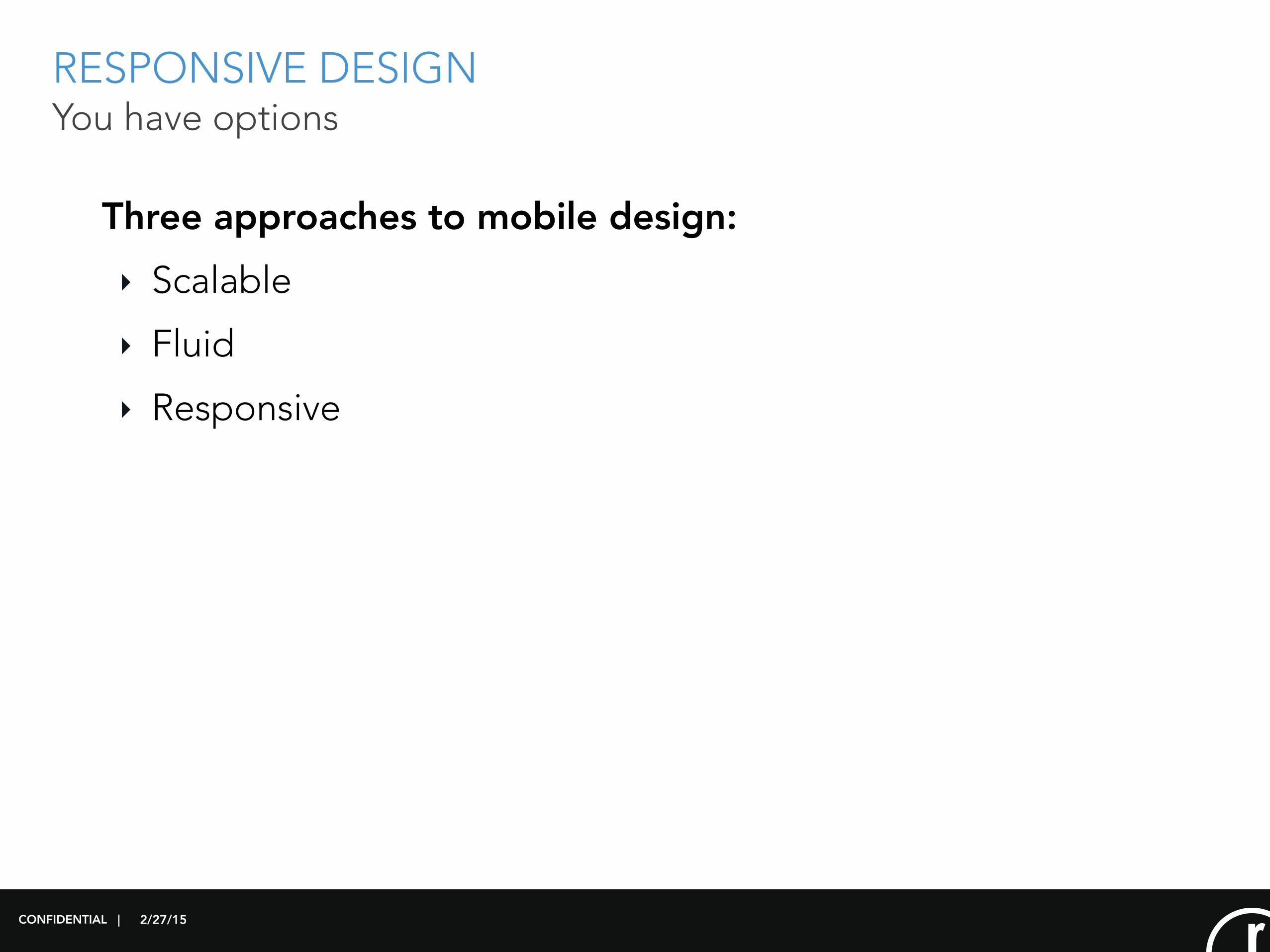
RESPONSIVE DESIGN You have options
Three approaches to mobile design:
‣ Scalable
‣ Fluid
‣ Responsive
CONFIDENTIAL |
2/27/15
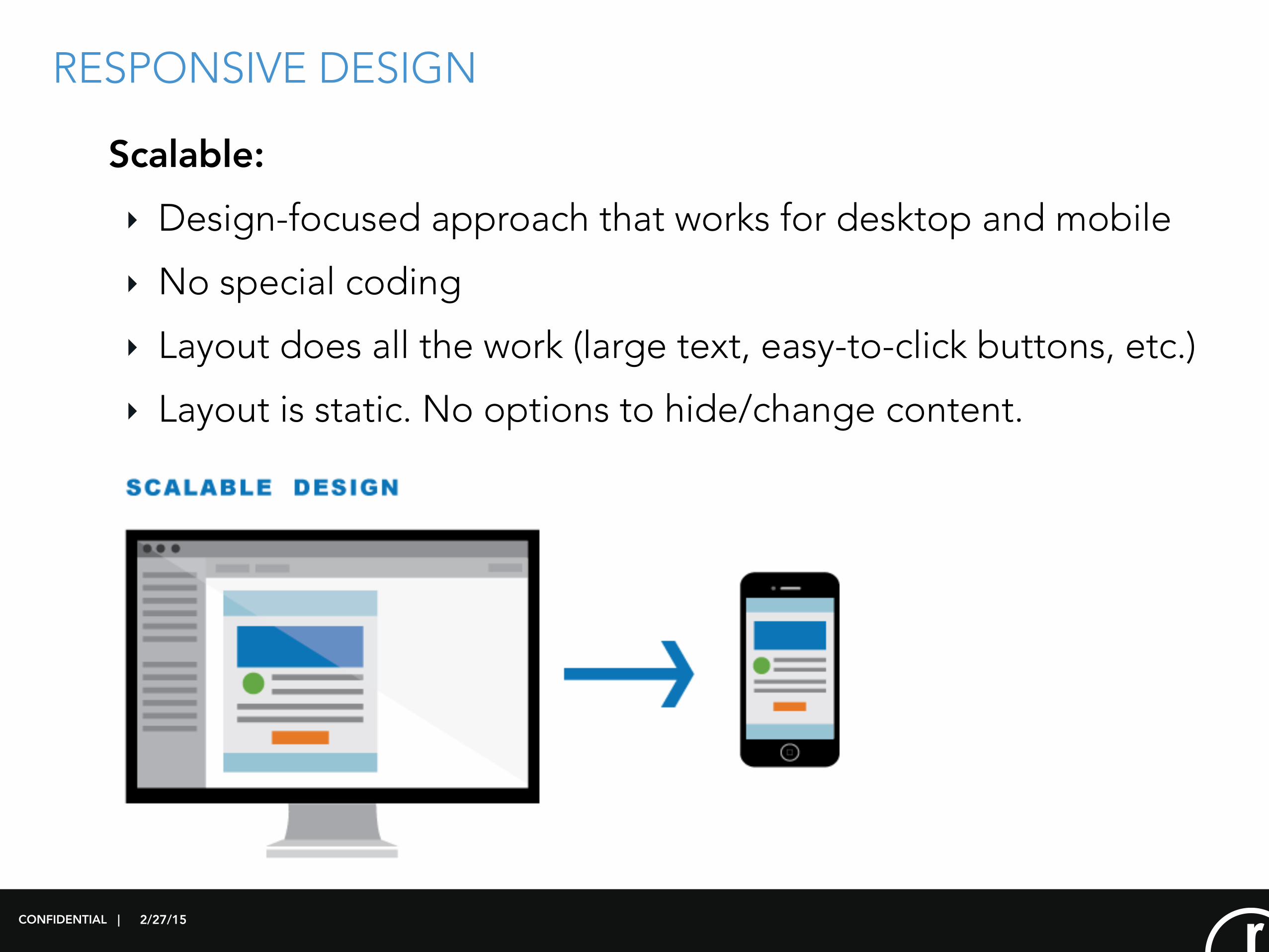
RESPONSIVE DESIGN
Scalable:
‣ Design-focused approach that works for desktop and mobile
‣ No special coding
‣ Layout does all the work (large text, easy-to-click buttons, etc.)
‣ Layout is static. No options to hide/change content.
CONFIDENTIAL |

2/27/15
RESPONSIVE DESIGN
Fluid:
‣ Content “flows” from desktop to mobile, but doesn’t change
‣ Usually limited to one-column layouts
‣ Minimal use of customized code
‣ Best suited for text-heavy designs
CONFIDENTIAL |
2/27/15
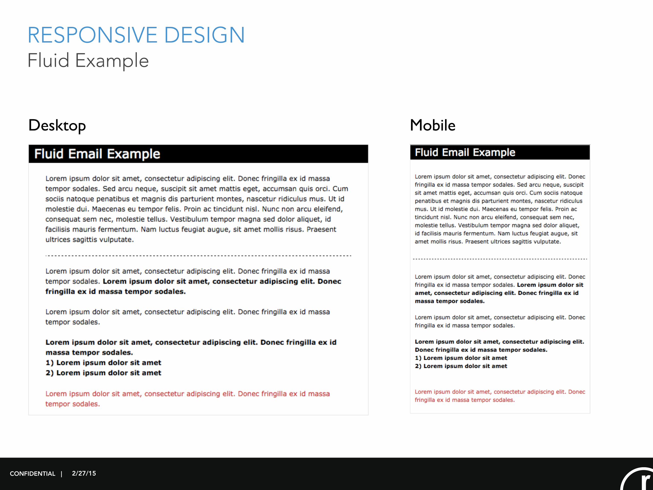
RESPONSIVE DESIGN Fluid Example
CONFIDENTIAL |
Desktop Mobile
2/27/15
RESPONSIVE DESIGN What is it?
What is responsive design?
CONFIDENTIAL |
‣ Responsive design is an approach to design that seeks to
provide an optimal viewing experience across a wide
range of devices.
‣ A responsive email or web page can detect the size of
your browser or viewing screen and adjust the layout/
design accordingly.
2/27/15
RESPONSIVE DESIGN
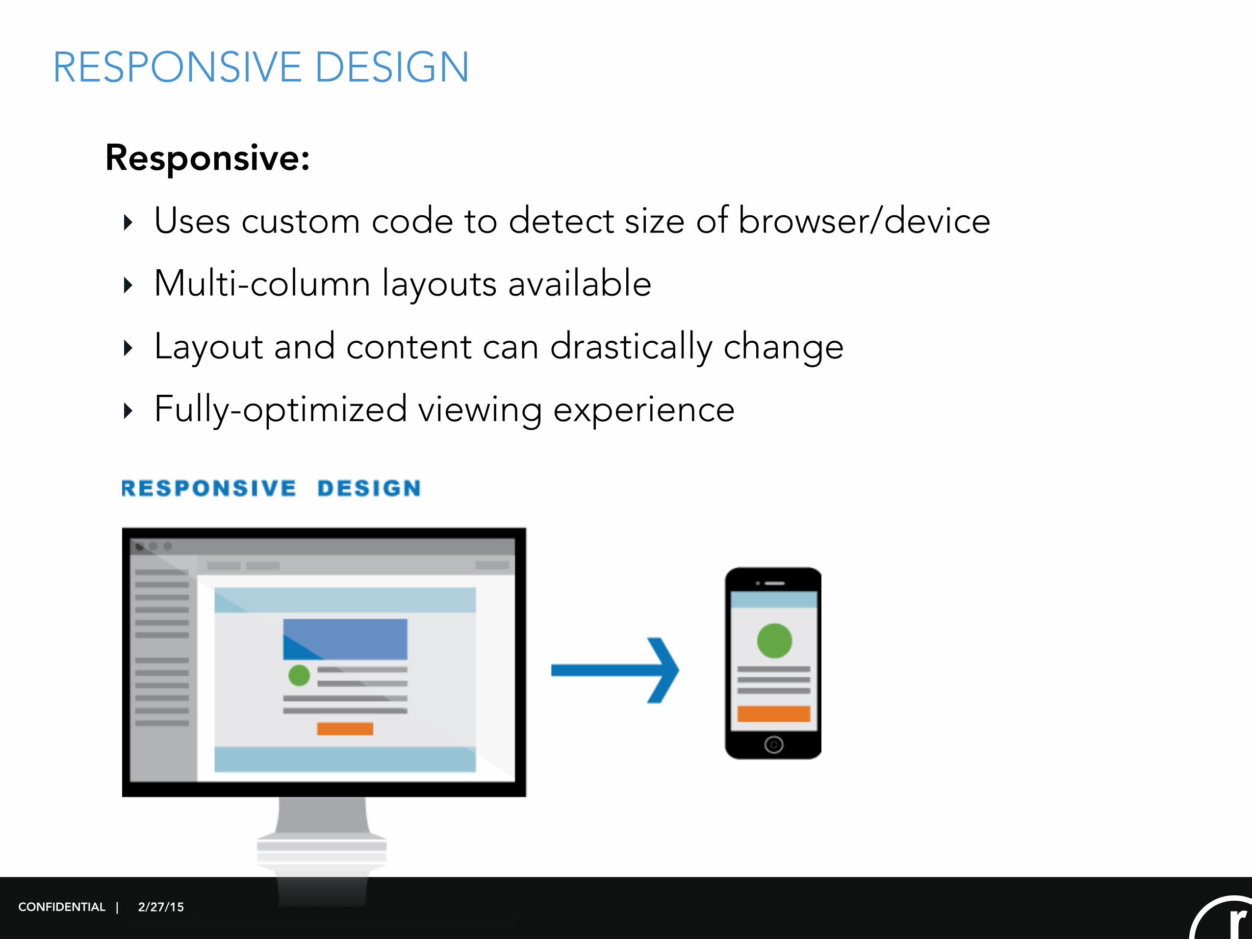
Responsive:
‣ Uses custom code to detect size of browser/device
‣ Multi-column layouts available
‣ Layout and content can drastically change
‣ Fully-optimized viewing experience
CONFIDENTIAL |
2/27/15
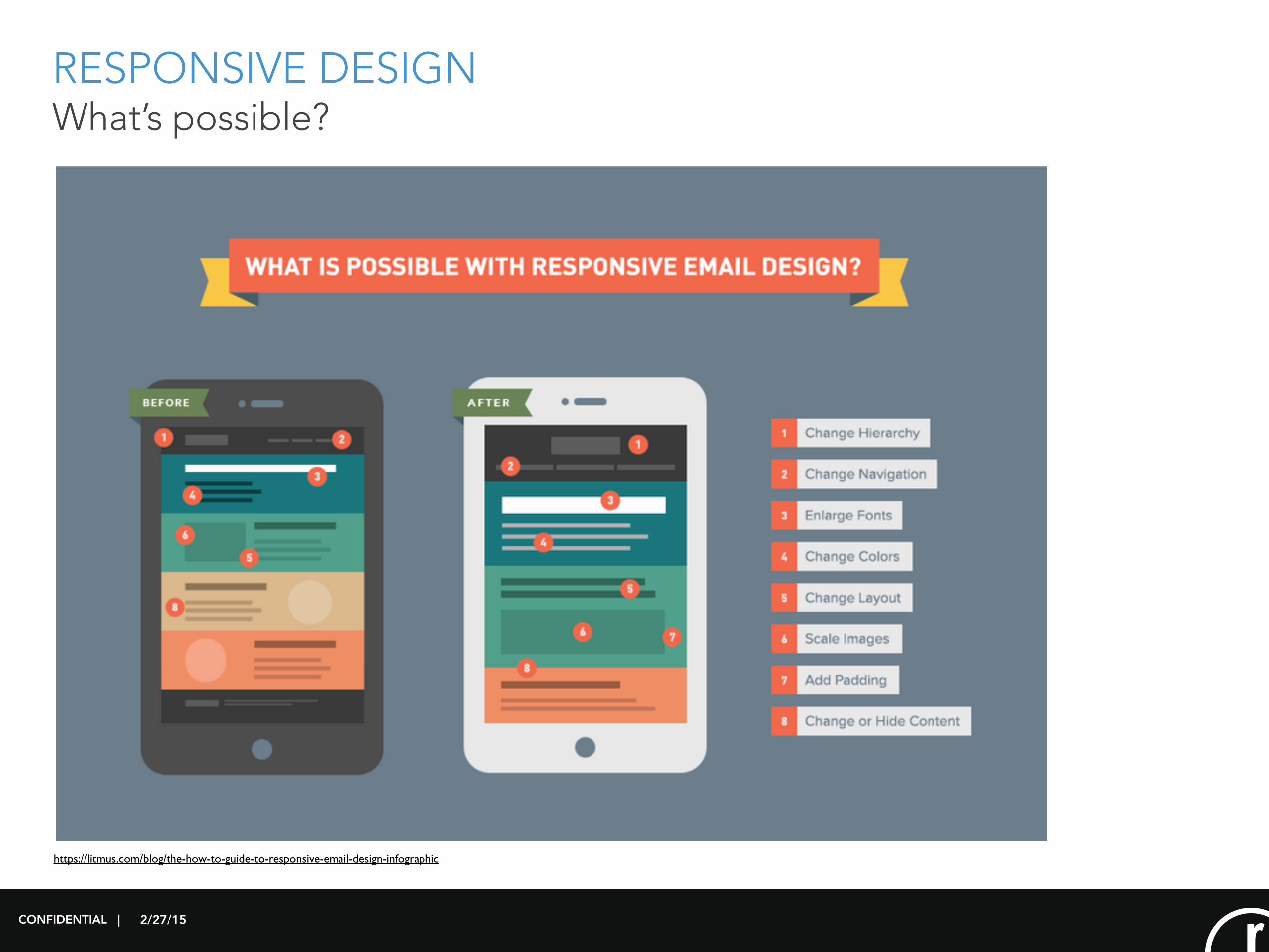
RESPONSIVE DESIGN What’s possible?
CONFIDENTIAL |
https://litmus.com/blog/the-how-to-guide-to-responsive-email-design-infographic
2/27/15
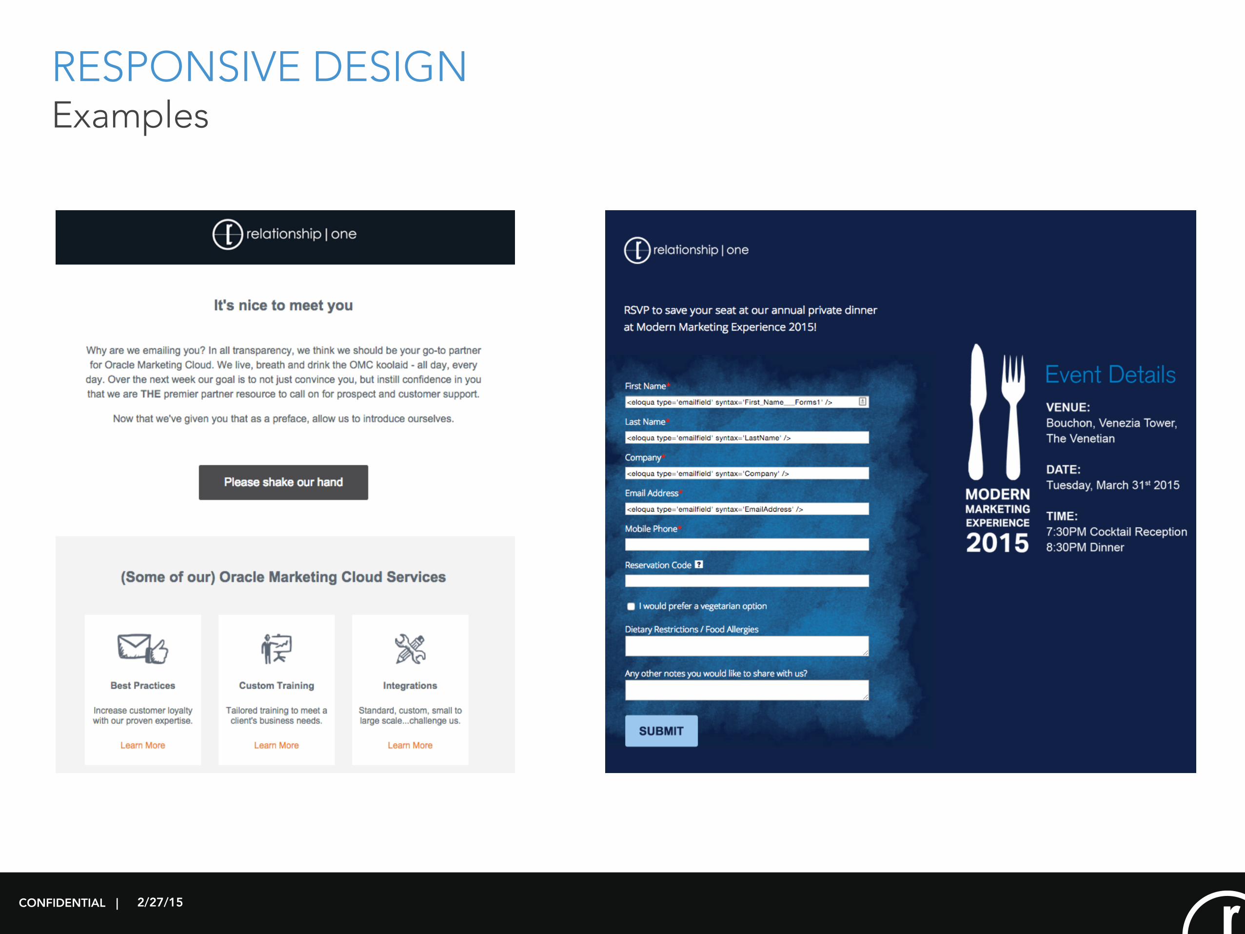
RESPONSIVE DESIGN Examples
CONFIDENTIAL |
2/27/15
RESPONSIVE DESIGN
How does it work?
CONFIDENTIAL |
2/27/15
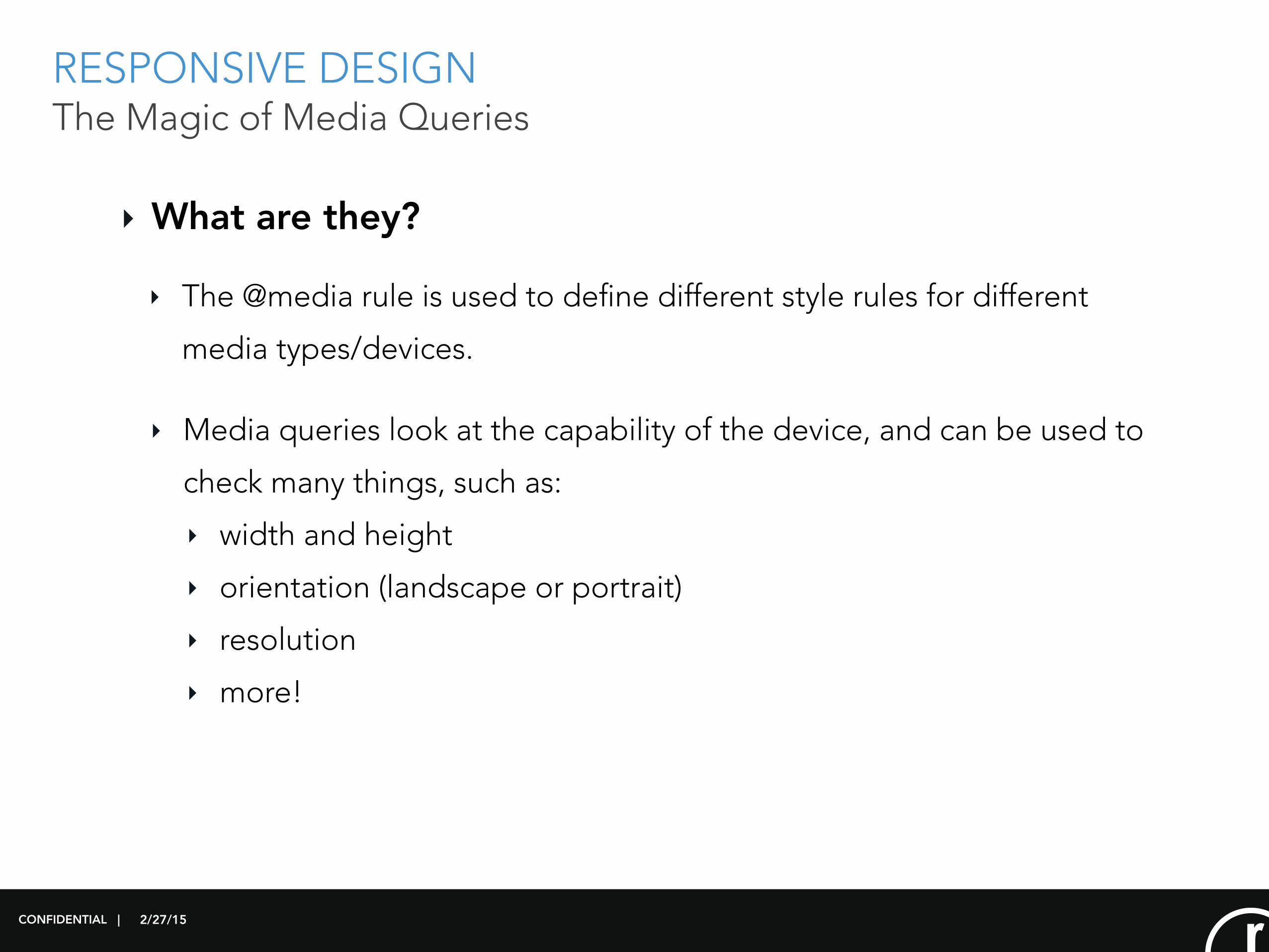
RESPONSIVE DESIGN The Magic of Media Queries
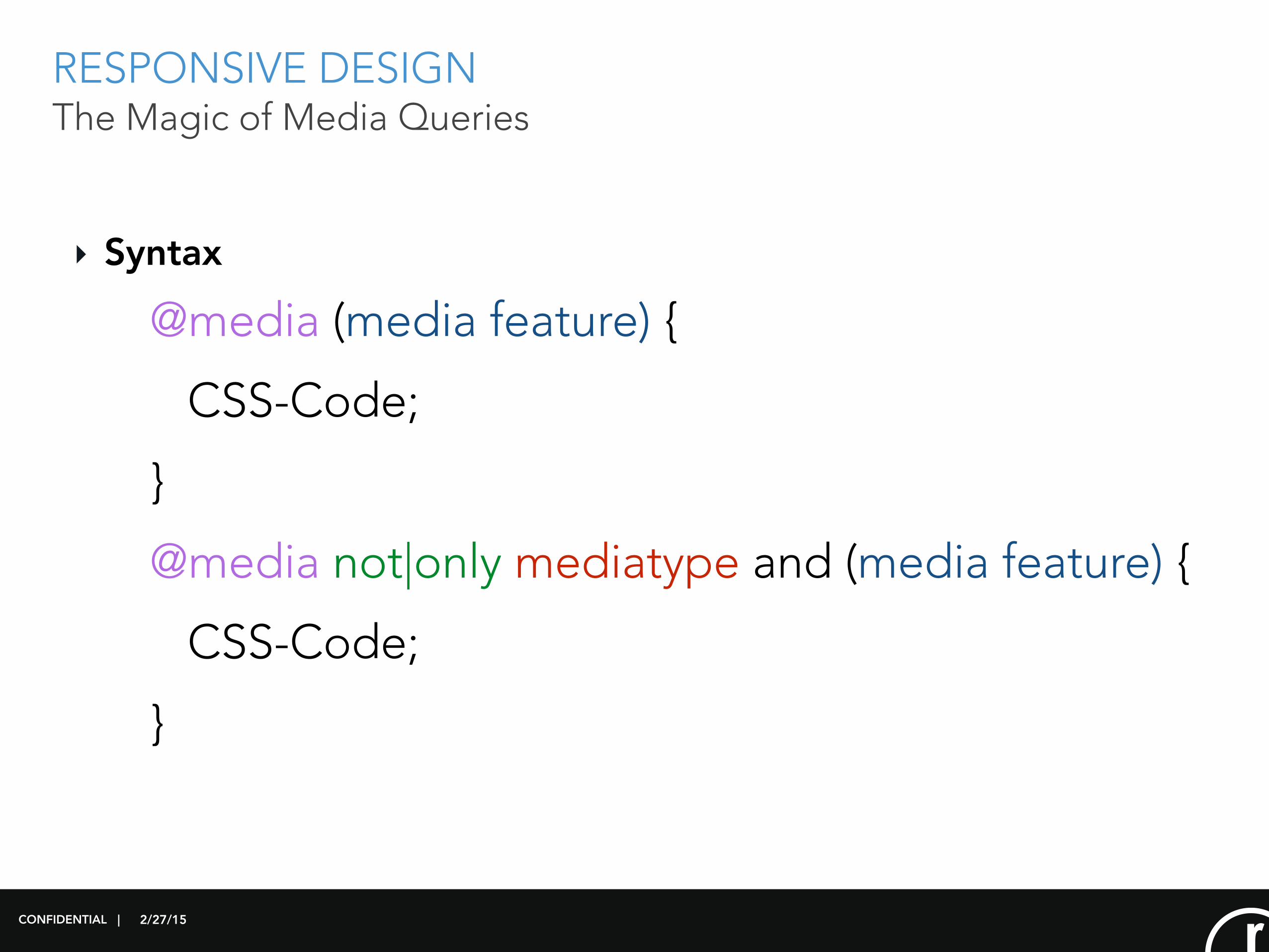
‣ What are they?
CONFIDENTIAL |
‣ Media queries look at the capability of the device, and can be used to
check many things, such as:
‣ width and height
‣ orientation (landscape or portrait)
‣ resolution
‣ more!
‣ The @media rule is used to define different style rules for different
media types/devices.
2/27/15
RESPONSIVE DESIGN The Magic of Media Queries
CONFIDENTIAL |
‣ Syntax
@media (media feature) {
CSS-Code;
}
@media not|only mediatype and (media feature) {
CSS-Code;
}
2/27/15
RESPONSIVE DESIGN The Magic of Media Queries
CONFIDENTIAL |
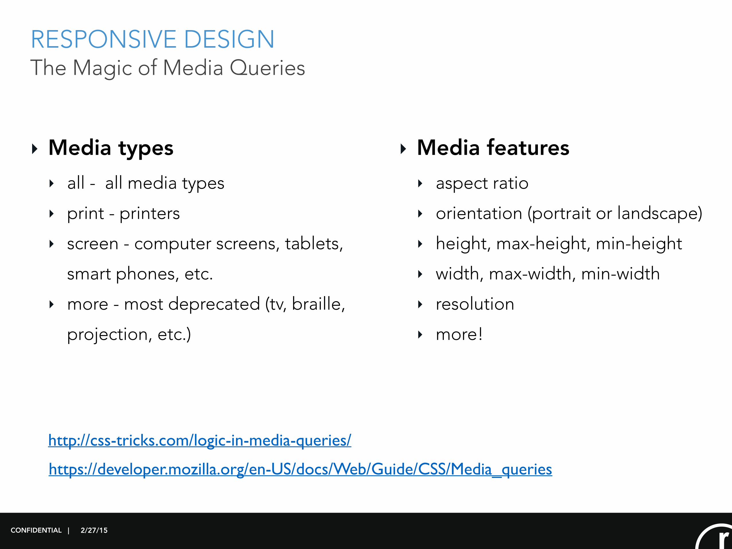
‣ Media types ‣ all - all media types
‣ print - printers
‣ screen - computer screens, tablets,
smart phones, etc.
‣ more - most deprecated (tv, braille,
projection, etc.)
‣ Media features ‣ aspect ratio
‣ orientation (portrait or landscape)
‣ height, max-height, min-height
‣ width, max-width, min-width
‣ resolution
‣ more!
http://css-tricks.com/logic-in-media-queries/
https://developer.mozilla.org/en-US/docs/Web/Guide/CSS/Media_queries
2/27/15
RESPONSIVE DESIGN The Magic of Media Queries
CONFIDENTIAL |
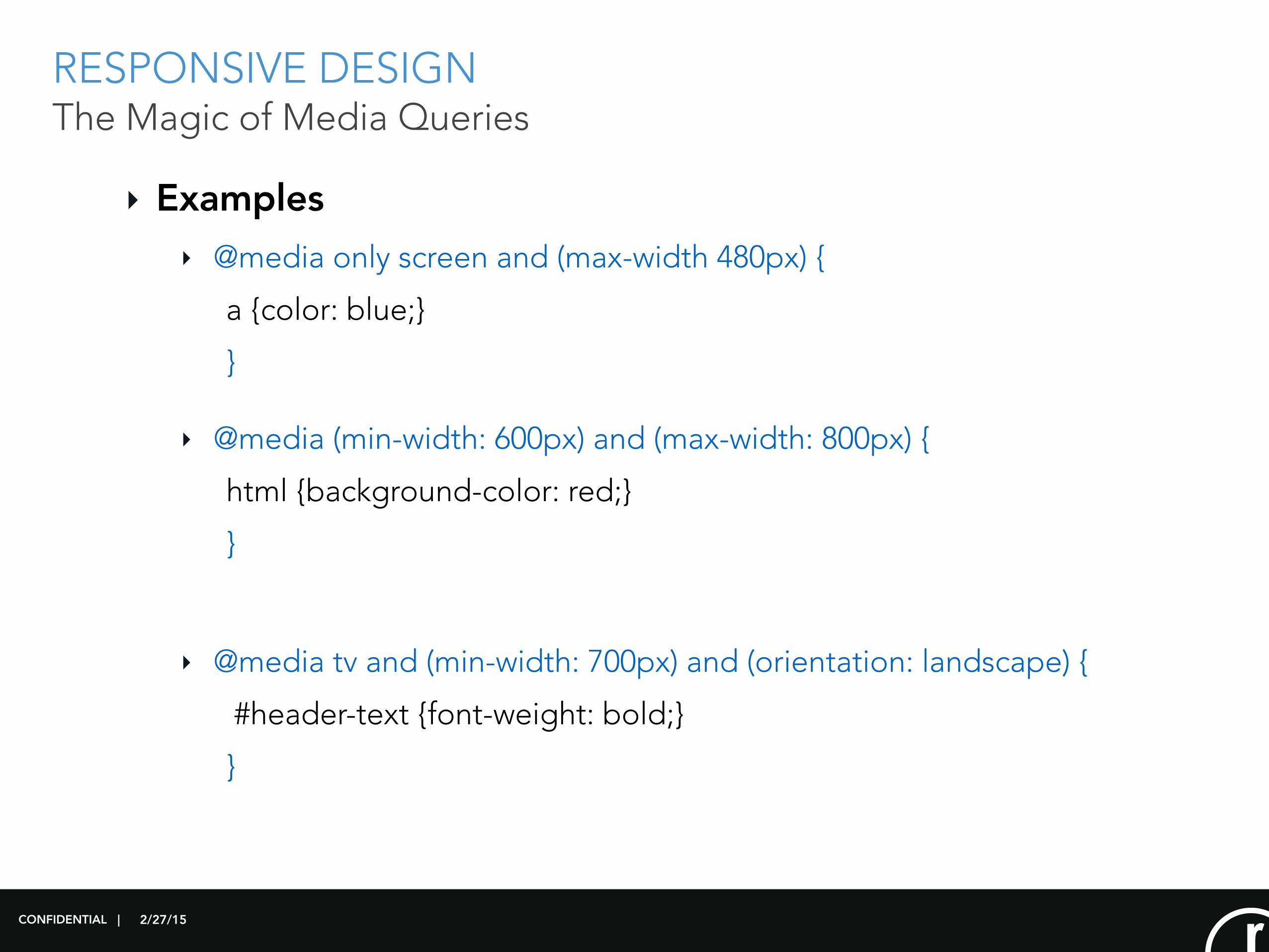
‣ Examples‣ @media only screen and (max-width 480px) {
a {color: blue;}
}
‣ @media (min-width: 600px) and (max-width: 800px) {
html {background-color: red;}
}
‣ @media tv and (min-width: 700px) and (orientation: landscape) {
#header-text {font-weight: bold;}
}
2/27/15
RESPONSIVE DESIGN The Magic of Media Queries
CONFIDENTIAL |
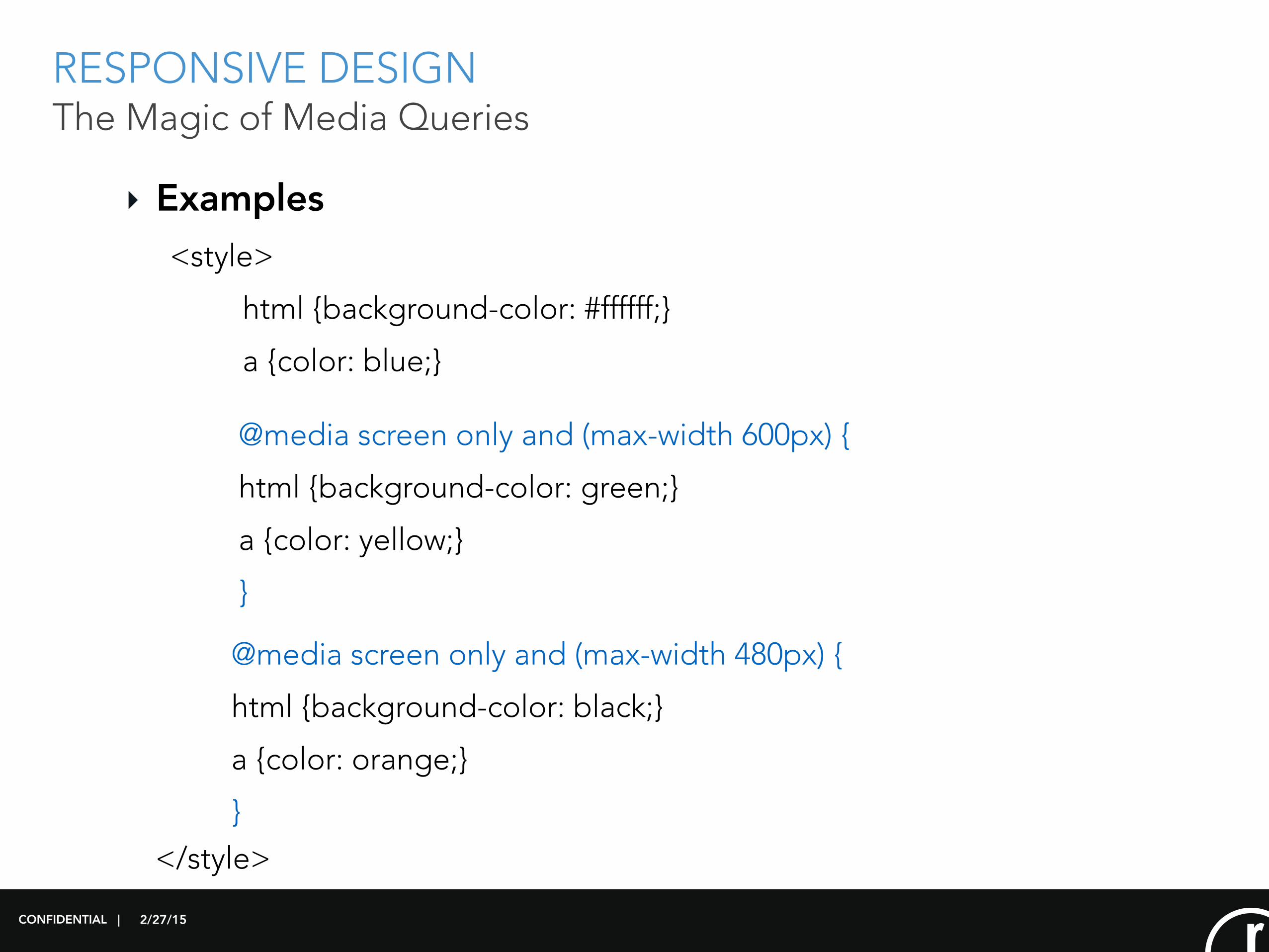
‣ Examples<style>
html {background-color: #ffffff;}
a {color: blue;}
@media screen only and (max-width 600px) {
html {background-color: green;}
a {color: yellow;}
}
@media screen only and (max-width 480px) {
html {background-color: black;}
a {color: orange;}
}</style>
2/27/15
MEDIA QUERY DEMO
CONFIDENTIAL |

2/27/15
RESPONSIVE DESIGN
Is it right for you?
CONFIDENTIAL |
2/27/15
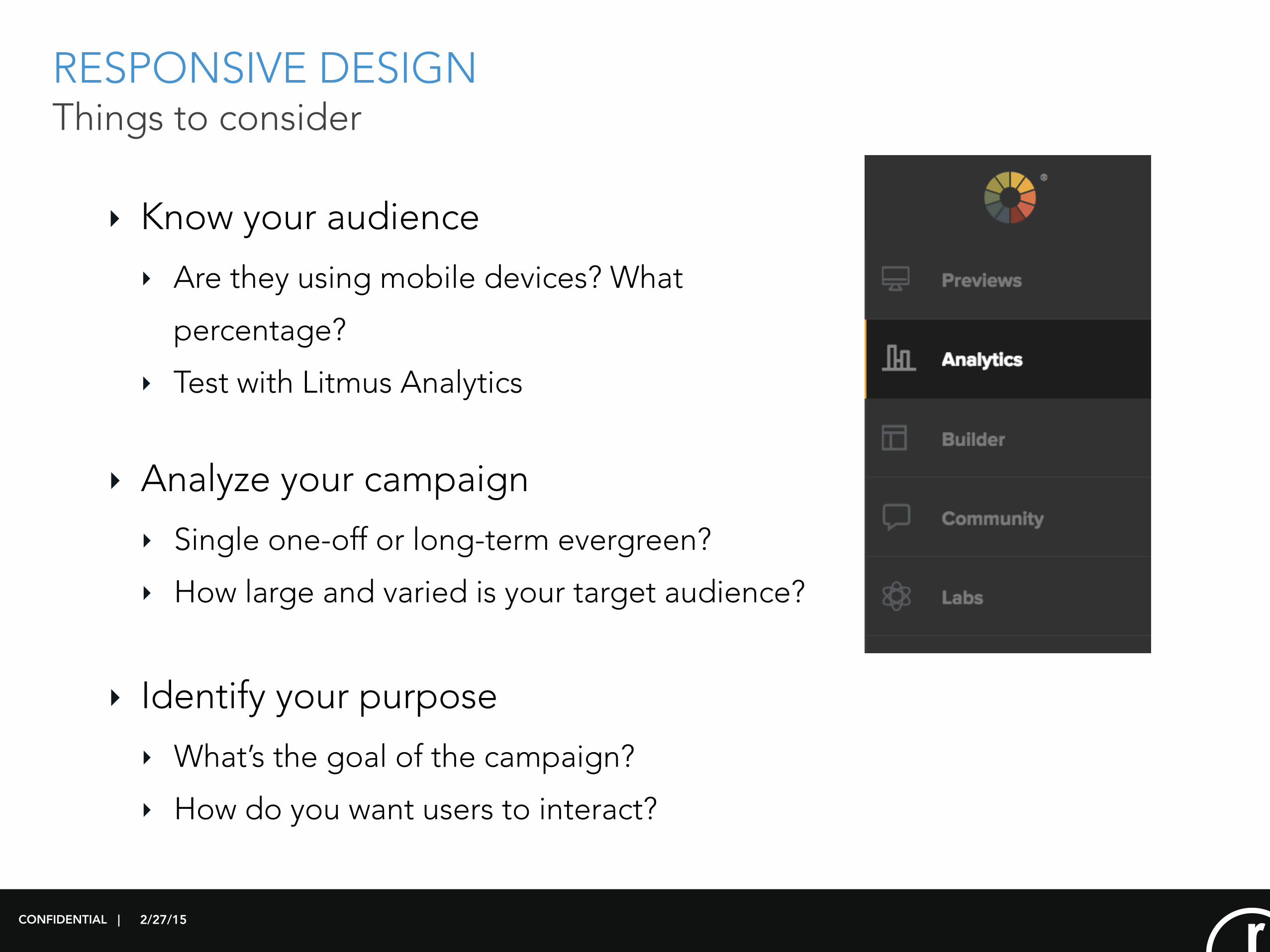
RESPONSIVE DESIGN Things to consider
‣ Know your audience ‣ Are they using mobile devices? What
percentage?
‣ Test with Litmus Analytics
CONFIDENTIAL |
‣ Analyze your campaign ‣ Single one-off or long-term evergreen?
‣ How large and varied is your target audience?
‣ Identify your purpose ‣ What’s the goal of the campaign?
‣ How do you want users to interact?
2/27/15
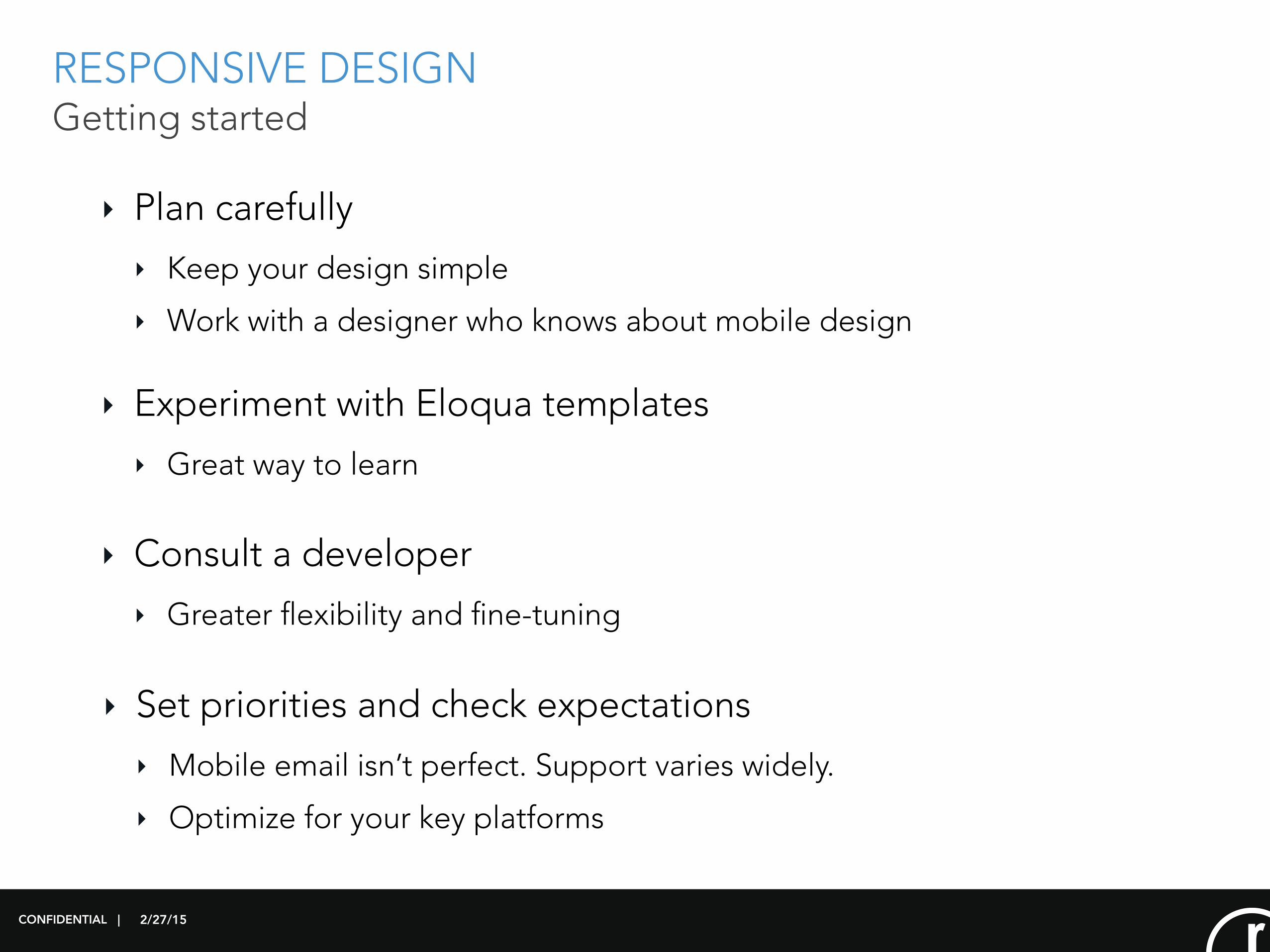
RESPONSIVE DESIGN Getting started
‣ Plan carefully ‣ Keep your design simple
‣ Work with a designer who knows about mobile design
CONFIDENTIAL |
‣ Experiment with Eloqua templates ‣ Great way to learn
‣ Consult a developer ‣ Greater flexibility and fine-tuning
‣ Set priorities and check expectations ‣ Mobile email isn’t perfect. Support varies widely.
‣ Optimize for your key platforms
2/27/15
QUESTIONS?
CONFIDENTIAL |