Task Two - Detailed Analysis of Music Magazine
7
Task Two – Detailed Analysis of Music Magazine – Peta Searle Typography: The masthead on this magazine cover is in a serif font which contrasts to the image of serious males from Muse because serif is quite a feminine font. This appeals to an audience of young adult females because attractive males are on the cover and the feminine font is appealing to females. This masthead is large so that the audience may know what the music magazine is and so know what it contains. The font of the cover story is large, bold and sans serif to make sure it is eye-catching and ensures the audience sees it. It is in a sans serif font to make it look masculine and link in to the male artists in the image on the cover. This also makes the audience think that the audience think that the artists are very bold and masculine themselves which makes them more appealing to the female audience and creates a male power fantasy by connoting the artists are dominant because the name of their band is very large and dominates the page - this sometimes appeals to females making them more likely to want to buy the magazine. The large-ness of the band’s name is to make it eye- catching and to also emphasise that there is an exclusive interview with Muse inside. The serif font which is just above the title of the band insinuates that they are broadening their horizons – so to speak – because the flicks of the serif font are reaching out to “where no band has gone before”. This also links to the text underneath the band name that says “Boldly go where no band has gone before” which links to the band broadening their horizons and this also links to the fact that this text is bold because they are “boldly” going places. This is appealing to the audience because people who really like Muse will buy the magazine because of the exclusive interview material – they will know about this because of their band name being really large – and the fonts are appealing to the audience because they want to reach far and are encouraged to do so as Muse are suggested to be reaching new heights. The fonts of the rest of the coverlines are sans serif and bold. This is to link th em all into the magazine and to each other (they are all bold). This makes the magazine seem more planned and appealing.
-
Upload
searle9085 -
Category
Social Media
-
view
112 -
download
1
Transcript of Task Two - Detailed Analysis of Music Magazine

Task Two – Detailed Analysis of Music Magazine – Peta Searle
Typography:
The masthead on this magazine cover
is in a serif font which contrasts to the
image of serious males from Muse
because serif is quite a feminine font.
This appeals to an audience of young
adult females because attractive
males are on the cover and the
feminine font is appealing to females.
This masthead is large so that the
audience may know what the music
magazine is and so know what it
contains.
The font of the cover story is large,
bold and sans serif to make sure it is
eye-catching and ensures the
audience sees it. It is in a sans serif
font to make it look masculine and
link in to the male artists in the image
on the cover. This also makes the
audience think that the audience
think that the artists are very bold
and masculine themselves which
makes them more appealing to the
female audience and creates a male
power fantasy by connoting the
artists are dominant because the
name of their band is very large and
dominates the page - this sometimes
appeals to females making them
more likely to want to buy the
magazine. The large-ness of the
band’s name is to make it eye-
catching and to also emphasise that
there is an exclusive interview with Muse inside. The serif font which is just above the title of the band insinuates
that they are broadening their horizons – so to speak – because the flicks of the serif font are reaching out to “where
no band has gone before”. This also links to the text underneath the band name that says “Boldly go where no band
has gone before” which links to the band broadening their horizons and this also links to the fact that this text is bold
because they are “boldly” going places. This is appealing to the audience because people who really like Muse will
buy the magazine because of the exclusive interview material – they will know about this because of their band
name being really large – and the fonts are appealing to the audience because they want to reach far and are
encouraged to do so as Muse are suggested to be reaching new heights.
The fonts of the rest of the coverlines are sans serif and bold. This is to link them all into the magazine and to each other (they are all bold). This makes the magazine seem more planned and appealing.

Layout:
- Route of the eye:
At the primary optical area there is the masthead of the magazine. This is placed
here so that the first thing the first thing the audience sees is the masthead of
the magazine and allows them time to presuppose the contents of the magazine.
Along the top of the route of the eye there is an intentional ripped image of a
section of what’s inside the magazine. This is placed at the top of the route of
the eye to intrigue the audience and show them what they will get/ or will be
missing if they (don’t) buy the magazine. This encourages the audience to buy
the magazine because they have been shown a snippet of what they will be
missing.
Down the diagonal of the route of the eye, the main artist of Muse is shown.
The effect of this image placement is the band Muse is recognised by the audience (who like Muse) and this allows
them to be introduced into the magazine slowly. This also allows people to get to know Muse if they do not know
who they are. This is because after the image of Muse is introduced, their band name is also introduced onto the
diagonal of the route of the eye. The effect of this on the audience is they know that they are and know what they will be getting when they buy the magazine.
At the bottom of the diagonal route of the eye, there is an image in the corner of a man with a microphone. He is in
the corner because he is a minor musician compared to Muse (who are imaged largely). This placement is effective
because people who do not like Muse might like this musician. After the diagonal of the route of the eye, the straight
route of the eye at the bottom of the eye leads you from this musician to the coverline that is talking about him –
this is effective because now the audience know who this artist is and will want to read more of the magazine cover
and eventually buy the magazine.
Throughout the route of the eye at the bottom of the cover, there is lots of coverlines for the articles inside the
magazine. These are placed here to effectively lead the audience to read the magazine because they have been
intrigued by the coverlines on the cover. There are placed at the end of the route of the eye so that the audience
remember what the magazine contains and whether they want to read/buy the magazine.
In the terminal area of the route of the eye, the cover is advertising some new artists that have articles inside the
magazine and also the barcode which contains the price of the magazine. This placement is effective because the
audience will remember what artists are inside the magazine because it’s one of the last things they saw which
means they will be more likely to buy the magazine and also the price is in the terminal area as a final encouragement to the audience to buy the magazine.
- Principle of thirds:
In the first square, there is the masthead of the magazine which takes up the
entirety of the square along with the strapline. This strapline establishes the
brand identity by telling the audience that it is the top music magazine – this
gives it a good reputation and means the audience will want to read it because it’s so good.
The cover story is placed on the lower hotspots of the principle of thirds. This
placement is effective due to the hotspots being places that your eyes will tend
to find first when looking at magazine covers and so the audience will
immediately know who is on the front cover and want to buy the magazine to read the exclusive interview from them.
The lead singer is in the vertical centre third and the other band members are
placed either side in the outer vertical thirds. This makes the composition of the

image more aesthetically pleasing to the audience and so means they are more likely to buy the magazine and want to know all about the interesting band on the cover with the cool composition.
The images and coverlines have been divided into the grid to make the cove r look more organised, clear and thus
appealing to the audience.
Colour:
The red colour on this cover is bold and eye-catching which makes the masthead of the magazine stand out because
it is white. White is a neutral colour which makes the magazine’s brand identity (through the masthead) inviting and
appeals to both genders. This is effective because this creates a wider audience and thus sells more copies of the
magazine.
The mostly dark, muted tones of the starry background link to the dark undertones of the band’s image. They are
wearing black/dark clothing which makes them seem dangerous and appealing to their predominantly young adult target audience.
In the top right corner of the magazine, the image looks as if it has been ripped and is revealing the page of the
magazine beneath. This is white because conventionally magazine pages are white and also white makes this corner
of the magazine stand out. This means the audience are more likely to look at it and be more intrigued about what is inside the magazine; because of this it makes them want to buy the magazine to read more.
All of the text that is on the cover (excluding the text on the ripped out bit) is either red or white. This allows the text to stand out and be clear and easily read.
Images (shot types, mise-en-scene):
The background of this magazine cover is an image of a dark starry sky. This image links to the name of the band
because Muse means: to think or meditate in silence, as on some subject; to gaze meditatively or wonderingly; to
meditate on; to comment thoughtfully or ruminate upon. This links to the night sky image in the background
because normally when people muse they do it at night or they look up to the sky. The band Muse are also said to be
going where no band has gone before and so the image of the night sky implies they are reaching out far and into space, metaphorically.
The members of Muse are imaged on the front of this magazine cover and they are each aligned with the vertical
thirds of the principle of thirds. The effect of this is the audience look at the members individually as well as
collectively and they are connected together. This allows the band members to have more individuality in the image
and thus in their band’s identity. Also in this image, the main man in the band is in the forefront of the image to make him look more dominant and powerful and make him more appealing to the target audience.
The edited images in the ripped out part of the magazine cover have been edited so that only the artist’s faces are
seen because this makes it humorous and the audience laugh. This also links to the topic of this ripped out section
that says: “Punk Pig-Out!” which connotes the bad habits of the artists wh ich is humorous. This relates to the audience and makes them want to read the magazine.
Language:
“Punk Pig-Out!”; “Stadium Rocked”; “Cat Power”; “The XX” – these are some of the coverlines that are on the cover
of the magazine. The informal lexis used appeals to the target audience because they are young adults and so they talk informally most of the time; this makes the magazine more relatable and the audience want to buy it.
Conventions:
This magazine is conventional because the masthead is at the top of the route of the eye and stands out so that it is
eye-catching and appealing to the audience. It is also conventional because the image is large and appeals to the audience because they are familiar with the band on the cover.

Typography:
The font used for all the artists
marketed on this contents
page is the same font of the
coverlines on the cover of this
magazine. This is known as the
house style. This connects the
cover to the contents page on
the inside and lets you know
that they are actually the same magazine.
The serif font of the Q in the
masthead in the primary
optical area is used to appeal
to both males and females by
connoting the magazine is
unique and fun because they
can flick off the side if they want to (metaphorically).
The text that introduces artists
and topics into the contents
page are in uppercase letters
to make them easy to read
and remember so that the
audience are more likely to
remember what is offered
inside the magazine and then
buy the magazine.
The serif font of the title of
the contents page (Contents)
connotes a casual approach to
what is inside the magazine;
this encourages the audience
to read the magazine because
they can relate to being casual and relaxed and it connotes that if people read this magazine they will be relaxed.
Layout:
- Route of the eye
In the primary optical area of the route of the eye there is the masthead of the magazine. This is in the primary
optical area to remind the audience that they are reading Q magazine and this means that the audience will keep in
mind that it is Q that they are looking at and so if they find something they like, they will know that Q is a good magazine to buy and they should buy it more.
At the top of the route of the eye, across the top of the page, it says “Contents”. This is at the top of the page
because it is the second thing that the audience see in their route of the eye and so this introduces what the page has on it so the audience know what to expect.
The diagonal of the route of the eye goes through the image of the artists and also halfway down to the contents list.
This placement of the image encourages the audience to explore the image and then look at the contents list to
discover who the artist is and what the magazine will potentially say about them. This intrigues the audience and

mystifies them so that they want to continue reading and buy the magazine. Also, the page number on the image is
on the diagonal of the route of the eye and so tells the audience which page to go to so that they may find out mo re
about these particular artists. The floating red circle on the image is not in line with any of the route of the eye to
make the audience feel they should explore and be rebellious (because they’re not following the route of the eye); this makes it more appealing to them because it feels slightly forbidden.
At the bottom of the route of the eye, there is the Q logo/masthead, the page number and the date. This reminds
the audience what magazine they are reading and also what the date is. This allows them to date artists and particular issues of the magazine because they all have different dates on.
In the terminal area of the route of the eye there is an image of an artist. This intrigues the audience and makes the want to turn the page and find out more about this artist and why he is there.
- Principle of Thirds
In the first vertical third of the principle of thirds, the contents list is displayed. This is in the first third because th is is
the side that people read from so they will immediately look at the left side of the page to start reading.
The image is sorted into the different grids of the principle of thirds. The effect of this is the page looks organised and appealing which means the audience will buy the magazine and look further into it.
The red lines beneath the every listed piece of contents breaks up the contents list so that the audience may relax
and think about what they just read before moving on to the next piece of contents. This links to the fact that the contents font is encouraging the audience to relax and have fun while reading.
Colour:
The house colours have been used: red, black and white. This further links the contents page to the cover of the
magazine because the same colours have been used. This means the magazine looks more inviting and thematic – which is appealing to the target audience.
The red makes the masthead stand out and also the circle on the image. It is eye-catching and connotes importance which intrigues the audience to read on.
Images:
The image of the man and the cow link to the listed point underneath it about a festival and there being livestock
there this time. This is a humorous image to add in to the magazine and makes the audience laugh and think that it’s
a bit strange. This encourages them to relax and feel comfortable with the magazine (the perhaps they have never read before or are trying to re-familiarise themselves with).
The large close up image of the artists faces opposite each other connote competition which appeal to the target
audience because they are probably very competitive and enjoy watching/being involved in competitions; it gets the
audience involved in the competitive aspect of music and encourages them to move on. This links to the circle on the
image which is marketing a competition to win Glastonbury tickets. This connotes this because you can see the two
artists facial expressions (due to the close up) and they look very serious and like they are determined to win. In this
image, the males are wearing modern clothes which appeals to the young adult target audience because they like to keep with the trends.
Language:
“The year’s success story. Has anger issues” The language used for this is alliterative and the sentences have a lot
impact because they are short and almost incomplete constructions. This makes it sound like they are telling a secret
and so they have to say it really quickly or in code so that they are not found out. This relates to the young adults
that make up the target audience because when you are young there is always something scandalous and gossipy
going on. This excites the audience and makes them feel connected to the magazine because they’re interested in
what it is saying.
Conventions:
This contents page is conventional because the contents list is in the first vertical third of the principle of thirds and it
is also conventional that it introduces the page with “Contents” at the top of the page. As well as this, it is
conventional because it has its logo/masthead on the contents page to remind the audience what magazine they are reading.
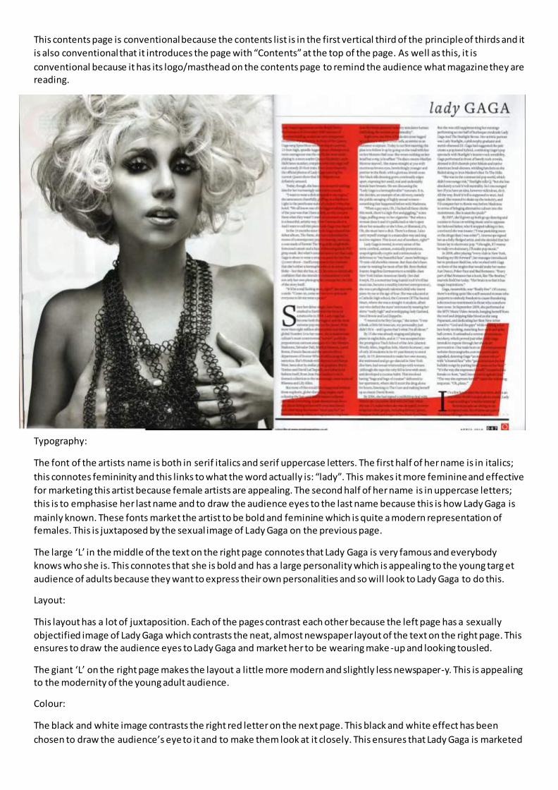
Typography:
The font of the artists name is both in serif italics and serif uppercase letters. The first half of her name is in italics;
this connotes femininity and this links to what the word actually is: “lady”. This makes it more feminine and effective
for marketing this artist because female artists are appealing. The second half of her name is in uppercase letters;
this is to emphasise her last name and to draw the audience eyes to the last name because this is how Lady Gaga is
mainly known. These fonts market the artist to be bold and feminine which is quite a modern representation of females. This is juxtaposed by the sexual image of Lady Gaga on the previous page.
The large ‘L’ in the middle of the text on the right page connotes that Lady Gaga is very famous and everybody
knows who she is. This connotes that she is bold and has a large personality which is appealing to the young targ et
audience of adults because they want to express their own personalities and so will look to Lady Gaga to do this.
Layout:
This layout has a lot of juxtaposition. Each of the pages contrast each other because the left page has a sexually
objectified image of Lady Gaga which contrasts the neat, almost newspaper layout of the text on the right page. This ensures to draw the audience eyes to Lady Gaga and market her to be wearing make -up and looking tousled.
The giant ‘L’ on the right page makes the layout a little more modern and slightly less newspaper-y. This is appealing to the modernity of the young adult audience.
Colour:
The black and white image contrasts the right red letter on the next page. This black and white effect has been
chosen to draw the audience’s eye to it and to make them look at it closely. This ensures that Lady Gaga is marketed

to be wearing make-up and encouraging the audience to wear make-up and also she is introducing a sexual theme into the article and to the young adults who are also being introduced to it, in their life.
The bright red letter in the middle of the right page is coloured red because this is the house colour. This means that
this double page spread is linked to the magazine cover and the contents page because the house colour has been used.
Images (images; mise-en-scene):
The large image of the artist juxtaposes the newspaper layout of the next page through the sexual objectification.
This appeals to the audience because it is addressing a part of their lives that is sort of taboo and not really talked
about but represented in the media a lot of the time. Lady Gaga has been sexually objectified through her nudity,
make-up, tousled hair and bulky jewellery. This relates to the target audience because they are exploring all these things and being marketed them all the time.
Language:
“It’s be a real fucking story, right? She says with a smile. “Come on; come see me try to persuade everyone to let me
wear a penis.” The language that Lady Gaga uses relates to the young adult audience because they stereotypically
say a lot of profane language and try to joke and rebel against things. This is appealing to the target audience
because it’s revealing that actually Lady Gaga is exactly like them and ‘maybe I should listen to her music to see what else she agrees with me on?’.
“...how the entertainment industry simulates human trafficking, the women as a commodity”. Here, Lady Gaga is
talking about how one of her videos explores how women are represented to be a commodity through kidnapping.
This language is appealing to the mainly female audience who like Lady Gaga because they will feel strongly about
how women are represented. It is also ironic because on the previous page Lady Gaga is representing herself to be a
commodity through sexual objectification.
Conventions:
Sexual objectification of women is conventional for double page spreads of women artists. Also, the use of a black
and white image to make the image eye-catching and not really relate to the text at the side of it is a conventionality
of music magazines. These conventions have been used because they have creates the presupposed image of a
music magazine and also the representation of women.