Unit 9: Photography Techniques - Task 11 – Evaluation by Rory Giddings
Upload
alansmith96Category
view
91download
0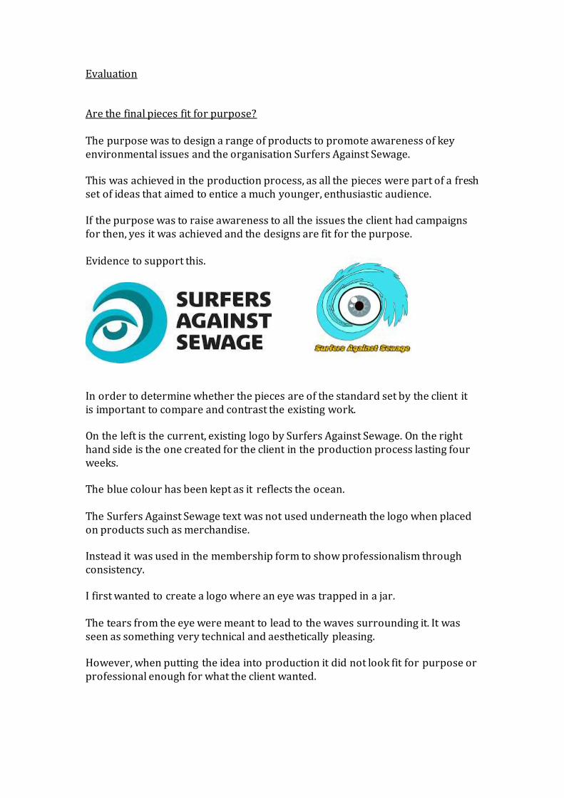
Evaluation Are the final pieces fit for purpose? The purpose was to design a range of products to promote awareness of key environmental issues and the organisation Surfers Against Sewage. This was achieved in the production process, as all the pieces were part of a fresh set of ideas that aimed to entice a much younger, enthusiastic audience. If the purpose was to raise awareness to all the issues the client had campaigns for then, yes it was achieved and the designs are fit for the purpose. Evidence to support this.
In order to determine whether the pieces are of the standard set by the client it is important to compare and contrast the existing work. On the left is the current, existing logo by Surfers Against Sewage. On the right hand side is the one created for the client in the production process lasting four weeks. The blue colour has been kept as it reflects the ocean. The Surfers Against Sewage text was not used underneath the logo when placed on products such as merchandise. Instead it was used in the membership form to show professionalism through consistency. I first wanted to create a logo where an eye was trapped in a jar. The tears from the eye were meant to lead to the waves surrounding it. It was seen as something very technical and aesthetically pleasing. However, when putting the idea into production it did not look fit for purpose or professional enough for what the client wanted.

As you can see it is not visually appealing like the final piece. I feel without going through this process of over complicating the logo design, I would not have realised the slickness of the simplicity. Having ‘SAS’ in teardrops and a plain font made the organisation look bland and nothing special. In stark contrast the final design uses a bright shade to strike a vibrant look to Surfers Against Sewage. The eye is much improved when looking at technical qualities. Being circular fits in with the round shape of the logo. This work shows the thought process and development. When I consulted the brief I realised that the logo was to be used in other products and needed to be smaller. It needed to stand out on its own. The shape of the previous design when made smaller did not look appealing, as you could not see the smaller pieces. I used brighter colours and took the negativity off the full logo. The eye was made to a much more professional looking standard. I created various logos during the one week I allocated myself. This below was one I looked at without imagery. Having something basic with just text. When comparing with all the previous creations the client had made and the alternative I had I decided against it. The look was something I did not feel was appropriate for the audience.

When exploring the possible merchandise I could create, I looked into the popular and most common, t-shirt. In order to know if the work was fit for purpose I had to research into existing products from the client. This would be a safe approach as there would be a strong chance the client would approve. I did not want to copy previous designs as it was made clear the organisation was in desperate need of fresh ideas and designs they could use. I just wanted to base an idea of something already created. Simplicity was the word looked at most in terms of the original target audience. Using the logo on the products made it very clear and simple. It did not over complicate the merchandise. I explored different ways of presenting the logo, whether it was through a campaign used in the poster creation of #WaveAwayWaste or just a clear and lighter logo across the full t-shirt.
The shirt on the right would work in terms of a poster to advertise the organisation. For a t-shirt design it does not work. It is not attractive enough for someone to buy. There is too much text and the colour is off putting.
These t-shirts I feel are not at the standard I feel they should be. The audience should have been properly researched. As well as Ripcurl, other existing surf brands should have been explored in order to understand what the audience would wear and what they wouldn’t.

The simple design of the logo on the shirt was not by chance, it was judged to be the best out of many designs.
As well as the vibrant selection of shirts I created, I wanted to produce a selection of merchandise. In the planning stages I had decided on different products including a hat and badge collection. After exploring Ripcurl, a Surfing merchandise brand I realised the possibilities were endless.
The phone case was something I did not look at in depth before the production process. However, after exploring existing merchandise aimed at the Surfing community I realised that it would be perfect for the young audience looked upon. Instead of badges and stickers, which offer less value to the customer, having a much more visually pleasing piece would entice people more. Along with the iPod or Phone case, I printed the design created from the logo onto a variety of merchandise.
This was to cover all bases and make sure everyone was looked into. Using RedBubble.com to import the designs in, I was able to place them on a pillow, a travel mug, a cup and a bag. This covered all ages. As the merchandise was to be used on the membership form for the ‘Perks of Membership’ it was important to include something of value. When looking at the merchandise created I would say that the work is all fit for purpose. It meets the requirements set and has a slick, clean professional look to them. They could be seen as too simple, however I feel having more simplistic designs are better than over done. I wanted to focus on advertising through the merchandise. It does look very ordinary and basic, however the logo was a must and to have it large, printed on

products people could buy, this could prove to be a cheaper form of getting the message out the audience. The poster was again something I wanted to keep in tact with the client’s current theme. I felt the beach clean series was something well thought through. However, I felt it needed fresh ideas and a new take on the activity. During the research process I realised that the ‘beach clean’ had been used on several coactions.
When looking into the existing pieces I found that they didn’t have enough information or it was not clear enough. I kept to the style already created and made it more interesting.
I felt that in order to attract new members, and young ones of that, I had to include images of what existing members had done in order to motivate them. The previous beach clean posters did not have information and they were too bright, I wanted to add a small piece of negativity to the work. Using a dark green background adds the nature and environmental theme. It makes the audience aware of the issues. The previous beach clean was made to look too exciting and this could be seen to gloss over the serious issues.
Using the darker fonts and having it well structured showed the professionalism and therefore made it fit for purpose. The final poster was not created in one attempt, in there were over 10 different creations made in the one week of poster creation.

During this process I explored various colours and shades as well as the compositional features. I experimented with shapes and the position of the logo. It was by going through this process I got to a design I felt was suitable to both the client and audience. The reasons I feel the poster is fit for purpose is that there is not one feature that isn’t in something of a professional comparison.
Comparing my beach clean designs with this previous one shows a great difference in approach. Mine focuses on detail and putting in large amounts of information with a colourful background. This focuses on being slick, clean and easy to read. The sponsor has been incorporated in the final poster, the date and all the required information are included and I have added additional features to make it look of the standard set. In other designs I have tried to use too many colours for the text. Looking at this above, it keeps to clear shades. This can be much more professional. The image covers all the areas looked at in a poster. Where it is held, what it is and how you can help. It uses social media to connect to another poster I have created and relates to the young audience targeted.
Before I started creating the Beach clean posters I looked into a design and idea I came up in the planning stages before production. #Wave AwayWaste. After exploring various campaigns Surfers Against Sewage had created, in particular the ‘Break The Bag Habit’ I realised that I should at least attempt to do something similar and use social media to create an online poster as well as a paper hand out for the beach clean.
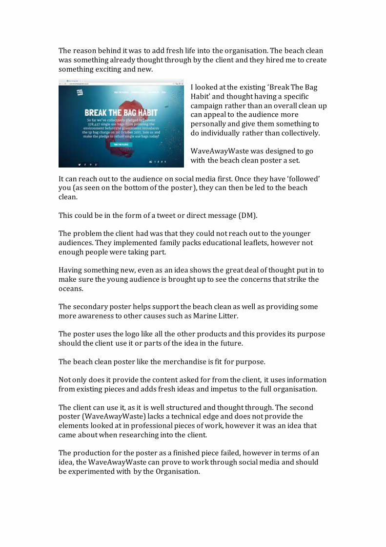
The reason behind it was to add fresh life into the organisation. The beach clean was something already thought through by the client and they hired me to create something exciting and new.
I looked at the existing ‘Break The Bag Habit’ and thought having a specific campaign rather than an overall clean up can appeal to the audience more personally and give them something to do individually rather than collectively. WaveAwayWaste was designed to go with the beach clean poster a set.
It can reach out to the audience on social media first. Once they have ‘followed’ you (as seen on the bottom of the poster), they can then be led to the beach clean. This could be in the form of a tweet or direct message (DM). The problem the client had was that they could not reach out to the younger audiences. They implemented family packs educational leaflets, however not enough people were taking part. Having something new, even as an idea shows the great deal of thought put in to make sure the young audience is brought up to see the concerns that strike the oceans. The secondary poster helps support the beach clean as well as providing some more awareness to other causes such as Marine Litter. The poster uses the logo like all the other products and this provides its purpose should the client use it or parts of the idea in the future. The beach clean poster like the merchandise is fit for purpose. Not only does it provide the content asked for from the client, it uses information from existing pieces and adds fresh ideas and impetus to the full organisation. The client can use it, as it is well structured and thought through. The second poster (WaveAwayWaste) lacks a technical edge and does not provide the elements looked at in professional pieces of work, however it was an idea that came about when researching into the client. The production for the poster as a finished piece failed, however in terms of an idea, the WaveAwayWaste can prove to work through social media and should be experimented with by the Organisation.

The beach clean poster I felt was one of the few successful pieces in the production process, it had a clean look to it which some of the merchandise and other posters did not have. I feel the same in relation to the Membership form. Out of the four pieces, I feel this is the least strongest but still holds value when looking at how and if it could be used.
The reason behind being uncertain over the fitness for purpose is that I changed the audience before the creation. I wanted to create something for a younger audience than what it looks like, however I decided that images would take away from the text and I wanted something much structured. To make it readable I wanted add colour to the text, this I felt would replace the small images. This is in fact fit for purpose but for an older audience than first thought. The front page has a hint of negativity to it like the poster. The use of the levels to make the image a darker shade provided this look.
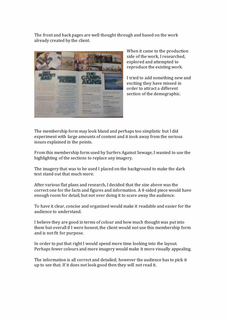
The front and back pages are well thought through and based on the work already created by the client.
When it came to the production side of the work, I researched, explored and attempted to reproduce the existing work. I tried to add something new and exciting they have missed in order to attract a different section of the demographic.
The membership form may look bland and perhaps too simplistic but I did experiment with large amounts of content and it took away from the serious issues explained in the points. From this membership form used by Surfers Against Sewage, I wanted to use the highlighting of the sections to replace any imagery. The imagery that was to be used I placed on the background to make the dark text stand out that much more. After various flat plans and research, I decided that the size above was the correct one for the facts and figures and information. A 4-sided piece would have enough room for detail, but not over doing it to scare away the audience. To have it clear, concise and organised would make it readable and easier for the audience to understand. I believe they are good in terms of colour and how much thought was put into them but overall if I were honest, the client would not use this membership form and is not fit for purpose. In order to put that right I would spend more time looking into the layout. Perhaps fewer colours and more imagery would make it more visually appealing. The information is all correct and detailed; however the audience has to pick it up to see that. If it does not look good then they will not read it.

As I was working for a client, in professional practice, their message is my message. In the brief, they wanted something modern, fresh and relevant to its audience and the wider world. The audience was a younger, more energetic person that wants to add new ideas to the organisation. They all add new life and content. They are all colourful and keep to the intentions decided upon. The client can use them as they fill the criteria they were after. The message before these products were created was to raise awareness to the issues, now I have produced this work; it raises awareness but starts to educate people at a young age. This new message of education to the younger audience can reduce some of the concerns raised. The target audience is a young age range of 15-21. The use of social media, negative colours and a change in merchandise suggested that the age range was getting older throughout the production process. I feel even though the target audience may have risen higher, the work produced is still suitable for them. All of the pieces have some technical aspects to them, some more than others and the planning provides that stability in the structure of the work.
I feel the merchandise may look very simplistic, however it did have a great deal of effort put into it. In the ‘Task 8’ PowerPoint it becomes clear the amount of time spent on the shirt creation. The gradient, magic eraser, shapes tool, opacity and Rotoscope were the initial pieces to the creation of the t-shirt.
Adding effects on later such as the different coloured stroke or the inner glow made it look something wearable. As the message was to reach out to a younger audience, I feel this has been achieved. The target audience was thought about throughout the production process, with each design created it was looked upon as if it would appeal to the audience.

Here is a poster aimed at preventing drinking and taking drugs whilst driving. It is not the same topic as the poster and membership form, but has the same purpose and techniques in order to grab the reader’s attention and educate. The campaign poster uses images of the topic to go with the title or text. Here it is the same; this uses a person at the wheel with facts and figures supporting the image. The facts and figures are used in the membership
form. This is to educate the younger reader. If you can shock them into something they had been unaware of, it is one step closer to preventing them from doing or stopping it. Here, the poster is clear and concise and makes it easily readable for the young audience. When educating them it is important to not have too much detail in the work as they can lose concentration very quickly. When exploring media campaigns aimed at the same age range, you can see and understand how appropriate the work you have created is. When looking at the poster I created, it has the target audience actually in the piece. This is the first indication given to the reader about who it is aimed towards.
Here it has the teenagers in the image walking away from the rubbish, whereas the second image from the left on the poster I created for the client has a ‘typical’ member of the demographic aimed towards. The original intension of the work was to create something educational and fun for a younger age range to enjoy. Merchandise was meant to be of the interactive nature. Having stickers or badges such as here on the left would be a way to incorporate the merchandise and the membership form.

The membership was to have areas to place the stickers, concerning each topic such as a sticker of an industry to go next to the piece about waste pumped into the oceans. This was not created as I felt the audience had to be older in order to include much more text. Also, targeting children would mean that you are relying on the parents or guardians to pay for the membership or merchandise. Having a slightly older audience would allow to use both the educational theme and use merchandise but to a more professional manner.
The hat was something I based the mind map and planning stages on. It was seen as a necessity. Surfers need hats and it is beachwear. However, I felt if the products were made they must appeal to all ages. Having a t-shirt can be suitable to the specific audience, which is important, but also can branch out to the mass market. This will allow development for the client.
This product for example, did not appeal to the audience I wanted to aim towards. It was very child like and not professional enough. I later incorporated the logo idea thanks to this process of trial and error.
My original intention for merchandise changed and as did the poster. I wanted to have some very negative imagery in order to shock the young reader. This would educate them and perhaps entice them to sign up to the organisation.

Something like this image already created by Surfers Against Sewage. I decided against it and stuck to negative colours rather than imagery. I wanted to contrast the images with the theme. Having negative images can often put the young audience off. Using pictures of people the same age helping the organisation was a tool to attract them.
My original idea of using existing images to attract the audience was not used as I felt it was too similar. Instead I chose a font that would do the same but keep it unique. The membership form was the same, however instead of a dark theme it was meant to be something very simple. With the use of images to help digest the text it was to be aimed at a young audience to be signed up to the family membership package.
This on the left was the first idea for the membership form, something exciting and for a young age range. I decided against it as it was restricting the possible market. Without any text or anything about what the client is and what they do, it is missing the point and instead looking at
what the audience wants to see, such as colours and images. I wanted to produce something that helped the client expand and attract a much large audience. Having just text was the way I saw this. It can be suitable to a young audience, with the use of different fonts and background imagery, but it is acceptable for mass-market use also.

The colour alterations through levels and hue saturation added to the quality of the work and gave a professional look to the pieces. Having a good mixture of light and dark shades made the work intriguing to look at and gave it a unique edge. The client stated in the brief that they wanted something fresh. I could have created the generic merchandise and bright, colourful posters with images in membership forms, however I wanted to go above and beyond and look to a different audience. I was more concerned with education over appearance. To add the content of what the organisation does rather than pretty colours or images. I feel that when someone is going to pay money for a membership, they will want to know what they get from it and what the organisation does. That is exactly what the membership form does. In a technical point of view the tools used have been minimalistic, however the main concern was the content. People wan to know what they are spending money on. This is why the audience was raised slightly higher than first thought. The client would benefit more from an informative piece of text. I feel when looking at the creativity in the work and technical skills, I could have used much more and there is room for improvement. However, with the work I did create the tools were effective enough to make it correspondent with the target audience. When looking at one product of the 4 that had the most technical techniques used it would have to be the logo.

Various different types were created, using the Rotoscope tool to its full effect. Once I had decided on the final logo and how it was to be created I had to look at the waves. It was more complex to create than it looks, making it surround the eye was important and to have other shades of colour inside needed more Rotoscoping and developing of layers. The techniques for the eye were to use the shape tool. The star and circular shapes made it look much better than the first design.
The techniques for the poster were also a tricky process. The levels tool to choose the correct background colour had to be correct. The use of the green was something planned in the early production stages. I would consider the layout of the text across the page as a technique that required a rather lot of planning and other creations. To get the size and colour right was hard. This has been effective as it contains fewer colours and is more attractive than the design’s made earlier.
The merchandise required techniques such as the Rotoscope as well. The opacity was also manipulated The design need intricate cutting out. Further techniques were to add gradient on the shirts. After experimenting without it was vital something was added to the work. I would consider the content to be effective as it appeals to the audience and a large mass market. It has all the information required, perhaps it goes above what is needed, however it also has a good balance between content and visual clarity. The products have a much more professional look to them. They are simple yet effective. This reflects the content throughout. It does not have anything over the top; it keeps the boundaries set with the chosen target market. The impact my advertising campaign will have will be minimal. The Beach clean will be as successful as the previous ones and will attract previous members, perhaps persuade them to join but in terms of impact to the oceans and the issues such as marine litter, there will be little change. The large industries will keep doing what they are doing. The poster WaveAwayWaste and this beach clean will educate people at a younger age and

perhaps in the long term, the waste in the sea will be less, but in the short term the sad reality is more people will need to be involved and voices from high places will need to be contacted. Surfers Against Sewage, the client have had petitions before where they have reached out to members of the government, however with the issues here being of industry and general littering, there is little the government can do to help in the short term. Like mentioned before, the best way to get through and make a change is to start at a young age (which is why I chose a young audience for the products). Starting at a young age can raise awareness to them of the problems polluting can do. The public overall will not change as dramatically as hoped but the targeted audience on the social media sites that are given the chance to read the hashtag or status by Surfers Against Sewage would perhaps stop before littering in future. The technical qualities of my work would be the products being made to a good standard on Photoshop, using tools and adjustments to manipulate an image I wanted to create from the planning stages. They look fit for purpose and keep to the target audience. The bright colours are similar to that of previous logos by the client and therefore show consistency in the products and research to look in to the background of Surfers Against Sewage. The colours on the logo represent those commonly seen near the ocean or beach. This can visually support what is being said in the work produced. The overall look of the poster and membership has a good use of different fonts and sizes, a good respect for the composition and layout of the piece as well as looking into the colours that would best reflect the audience and the client’s organisation. The ways in how I could improve my work would be to look into the target market much more. I should take part in further research into what they would wear and then perhaps recreate the merchandise. The merchandise I feel could be taken to a higher level. With the client paying money for the service, as slick as the designs are, something more complex could
be better to raise the standard. It has been created well but in terms of high technical quality it is limited.

I feel looking back; more time could be spent looking at the target audience closer.
The aesthetical qualities of the merchandise on the right are the way they look as something you would purchase from the client. The difference in size and orientation such as with the bag and iPhone case shows how flexible the design is. It is bright, clean and professional. It does not over complicate the merchandise creation
process, however there are elements of detail, which suggest effort through the right software. When looking into work that could be improved. I feel the inside of the membership form brings the professional level of the work down. I did not allocate myself enough time to plan and create the form. I did not realise the efforts needed. If the contingency time given was longer I could have been able to create something stronger.
The problems that lie with the piece are that it does not correspond with the front cover created. The colours do not reflect each other. It lacks the professional edge that the front has. The use of the heavy colour indicates a different age range to that of the reverse side.
I feel the membership form should be the most attractive piece of production created. This is what will stand between the successes of the organisation. People need to join in order to make a difference. I feel this piece does not entice the reader. It includes everything I needs to; it adds information that could grab attention, however it does not look visually appealing.

Are the final pieces fit for purpose? The logo: This is of a professional standard. It meets the requirements and compares to the existing logo. It is bright, vibrant and stands out. The colours used reflect the organisation. It is fit for purpose and I could see it be ing used by the client. Like many good logo’s it can be split up and separate pieces used. The font from the name, the name by itself, the eye as seen on the merchandise phones case or just the image. The merchandise: It looks simplistic and basic however it is art, and with art as long as you can explain the reasoning and the background to why it was created, then it must be accepted. The designs only use the logo, however this was the idea. In order to entice the young audience, it was important to not over do the imagery. Having plain white text made the logo stand out that much more than it would with circles or shapes surrounding it. I can see the client using the work; therefore I could consider it fit for purpose. I feel it I am not just giving them the few merchandise products created there. I want to give them the idea. Before the Surfers Against Sewage logo as plain, dull and lacked life. It was printed on several t-shirts, however it did not have any colour. I wanted to advertise whilst making money through selling the products. Seeing someone wearing a logo can be much more affective than a piece of text. In my t-shirt designs I kept to a simple yet clean style. They look like something the audience would consider wearing. Being made in a variety of colours allows the mass market to be reached. I feel the merchandise is fit for purpose. Poster: The poster was one of the products I felt needed the most time to spend on. Previous production tasks explained to me that I lacked the detail when creating the type of media. In the planning stages I gave myself enough time to create several designs and work my way to one design that is suitable for the client. It is suitable due to the colours used (They link to the naturalistic theme and saving the environment), the content (All the information needed is on the piece), the typography (a consistent text is kept in the membership form and poster) and the layout.

Feedback given from previous projects allowed me to produce something of much more quality this time around. I feel this is fit for purpose. I can see the client using this instead of the plain posters they have now.
This looked exciting to look at but is that what is needed? The audience needs to be shocked into looking at the issues surrounding waste in the UK’s beaches. The poster explains when it is and how the sponsors are but it fails to give motivation to come. This was of the reason why the client wanted someone to come in and bring new life to the organisation.
This is exactly was in needed in a poster. It provides a reason to come, it provides information on how to come, it provides previous work to convince them and it explains what it is. When looking at the poster above, not in one area does it have contact information. There is no text sending the reader to a website or phone number. This piece adds much more professionalism to the work and takes the audience into account much more.
The poster, like the merchandise and logo are fit for purpose. The membership form: When asking for feedback, it was clear this was the piece that lacked the least technical qualities. It was basic and did the minimum in relation to the brief given by the client.

Like many projects, the deadline can be very tight. This was exactly the case with this project. Schedules and contingency plans are given for this reason, and I did create both. I underestimated how long the membership form creation would take, and did not realise the content that needed to be thought about in detail. The last piece I created was the inside of the membership form. This is the weakest piece. There is a reason for this. I ran out of time. I produced too many experimental pieces instead of focusing on one. I ate in the contingency time given at the end of the last week and managed to achieve something I feel is adequate. Some aspects from the pieces can be incorporated by the client in future creation, however I feel I could have created something much more appealing. I thought about images and large amounts of colour in the planning stages. This was to aim towards a much younger audience. I felt that when it came to adding content to the work, the images were taking too much space up. The information included is explaining about Surfers Against Sewage, it is explaining about what they do and what they campaign for. As a membership form asking for payment, I felt that having information on what you are paying for is much more important than pretty images or colour. Now looking back I feel that perhaps more colours were needed to entice the reader. They cannot absorb the information if they do not pick it up. When taking part in further research, I realised that you can have all the best content in the world, if the reader does not feel like they want to pick it up , and then the membership form does not work. This is why the inside of the membership form is not fit for purpose. It fails to grab the reader’s attention. I used different coloured text with larger headings in order to make it easier to read and digest for the audience, however it lacks a technical edge. The work is too basic and lacks the ‘fresh ideas’ that the client was after. The cover of the membership form was the polar opposite. This oozed in enthusiasm and grabbed the reader’s attention. It included technical aspects
such as the Levels tool and the Saturation to manipulate the colour of the back and front. The direct debit and content on the reverse side had the exact information needed for the audience to pick it up and

know what to do if they were interested. It was clear and concise and used the organisation and inside to speak for itself. Placing an extra layer over the existing one and reducing the opacity created the white shade on the back. This was created in order to make all the text stand out. This piece is fit for purpose as it includes content and is visually appealing. It uses the same typography and uses size to grab the reader’s attention. The ‘JOIN’ being larger makes it impossible not to recognise what the form is about. This is supported by the inclusion of the logo and the name of the organisation. If the reader then still wasn’t sure about what or who the organisation was, there is a clear image covering the full page. Having the surfboards makes it that much more clear. This piece instantly tells you what it is. A membership form aimed to attract new members to the organisation. My original intensions are reflected by the inside of the membership form. First, I wanted to make four pieces of work that aimed to attract new, young people to the organisation and educate them to the issues. Starting from a young age can tackle these problems long term. I realised that in order to make the work more suitable for the client I had to produce pieces that worked for mass market. Such as, develop merchandise that everyone can use. A pillow, a phone case, travel mugs and a bag. All of which cover the areas surrounding each age group. In the planning stages I wanted to develop headwear, a necessity all surfers can get. This one type of product started to limit the market. Having products that may not be worn by the surfer themselves but people wanting to look after the coastal environment was a better way to go. Having the basic logo on t-shirts I what I took from the images of previous Surfers Against Sewage beach cleans.
This is something I wanted to look at in my shirt creation, a type of design that every age group can wear. After looking through more research I realised that focusing on a young market however slightly older would be a better approach.

When exploring the techniques I have used I feel they were effective, but there was room for further use of more advanced tools.
Here you can see the detail put in to make the wave-like object. The eye was more complex than the wave. This required research concerning how to make it more realistic and a clear eyeball when seen from far away or made smaller on posters for example. I looked at previous ways of creation and I felt that having different shapes would make it much more detailed. The circular and custom shape tool was used to develop the inner circles and the star shape inside the pupil. Colours had to be selected right. Sticking to a blue would keep the house style intact and not make it stand out as much. The Rotoscoping had to be created well in order for the wave to look realistic. To cut away from a blue background and develop this was much harder than it looks.

The wave creation was something I wanted to experiment with. This was seen in the possible merchandise. This includes a large amount of technical detail to produce something so wave-like. The different colours were something I wanted to look. This helped me find the correct t-shirts. The techniques I used did not work too well and this confirmed the ‘over doing’ of the work which I covered before. Simplicity was key.
In terms of looking at the poster and the technical qualities, the background imagery I felt was effective. It made it look much more as if it was underwater. The Rotoscoping of the Turtle and hand were good but they could have a lot more work done to them. My original intensions were to have a red and green to symbolise well and bad. The bad being the marine litter and the hand being the person who follows surfers against sewage and offering a ‘helping hand’. This relates to ‘Wave’ in the title.

The rulers, which are found by pressing Command and ‘R’, allowed me to make all the work in line and professional looking. The rulers allowed me to make the text in line and make it more appealing to the audience.
I feel the majority of my work is effective in enticing a new audience. It has been created through large amounts of trial and error and done to a professional standard. All the content had to include information about the organisation in one-way or another, if it is text, logo or through merchandise. The poster and merchandise are effective enough in terms of explanation to join the organisation. The logo explains what they are concerned about and what they do. The logo is effective as you can clearly see that the waves and eye represent what they cover and how they go about it (They are in place to watch out for those who litter and destroy the beaches)
The logo must be effective as it contains similarities to the existing one. From all of what the organisation has achieved since its creation of the design,

this must mean that the new one created for the client, is of the same standard.
Is the poster effective? In this poster used by the client in the past, it explored shocking the reader into making a change. This approach was used in the membership form, however it was in the shape of factoids. Having useful facts and figures to replace the imagery was my intension. In my poster, I wanted to keep the dark element that surrounded the client’s posters as this was a very successful theme and still is.
The dark background was kept, however the content was different to every single one of client’s previous posters. They focused on letting the imagery do the talking. In my beach clean poster I understood and respected that, however it is important that of the audience is to be on board, they must have information. Information about where it is happening and why but also what they can do to help. This is why the poster’s content is effective. It includes reasons for joining, something which other posters do not offer. They assume that people will join after being shocked through imagery. Here it gives clear instructions on what to do and how you can help the organisation.

In terms of textual content this work is effective as it does similar to the existing membership form. However, it lacks the imagery. Images can be just as effective in persuading the audience and this previous membership form recognises it. In order for mine to be more effective in terms of content and how it can appeal to the audience looked upon, there needs to be much more imagery as well thought concerning the layout. Having the text vertically in columns could work better in making it clear for the reader. As well as this it could be easier to split the text up by having sections in smaller sentences. The advertising campaign’s of previous years by the client have lacked detail and replaced them with imagery. As the brief stated they wanted new, fresh ideas I did exactly this and it will have a positive impact to towards the public. The social media aspect is something covered earlier, however it is a vital part in the media now. The inclusion of hashtags or adding a person as a friend can allow you to see and interact with the audience. Incorporating this into the poster was important to make it better known. Surfers Against Sewage does marvelous work across several beaches across the UK, however with the use of Twitter, the market can be stretched globally.
The use of social media has been growing and the client has started to explore into further by creating Facebook and Twitter sites. It is from this that they can share images of what people have done for the organisation. In terms of what impact social media can have, it can be huge. One simple hashtag can get worldwide support. It is important to not underestimate the power online support can receive. By incorporating this onto a poster makes it suitable for print and online use.

Technical qualities have been discussed throughout however I feel it is important to touch upon the detail put into the merchandise that might get overlooked through its simple design.
The logo was created through large amounts of trial and error. Once it was decided it was then time to place it onto the merchandise. I did experiment having the logo in a variety of positions. I felt that covering the full merchandise would be more beneficial.
This did not blend in with what I wanted to create. The logo is the focal point of the organisation and needs to be seen. Having it in the corner and small suggests its importance is less significant. I imported the logo onto the t-shirt template from a previous topic. I then used the warp tool to adjust it in a suitable position across the product.
Once it was in a position I liked, I then selected the layer and chose the grain to blend it within the surroundings. The Rotoscope tool was again used to remove the unwanted part of the logo that spread across the t-shirt. The opacity tool was used to make it easier to know where to cut.
The aesthetical aspects concerning the merchandise are that they look suitable for the audience. They look professional through the simplicity and the clean-cut design. The phone cover is very visually pleasing as it looks in more detail to the eye. The eye can relate to the ‘looking’ aspect. The designs on the travel mugs and cups surround the full product, which offers significant value.