Number Grid Task Task 1Task 2Task 3Task 4 Task 5Task 6Task 7Task 8 Task 9Task 10 NC Level 5 to 8.
Upload
alansmith96Category
view
73download
0
Task 8Alan Smith

Logo production This logo will be used as the final design. This was created by
the ideas in the planning stages and through the trial and error of
the experimental stage respectively.
It was transformed from the initial idea of the eye and wave. This
being behind the overall theme of looking after the oceans and
the eye symoblising this.
There were multiple editions of the
eye idea, starting off from a jar with
the acronym SAS in the tear drops.
As the design changed the colours
set out in the planning stages
remained as it was still aimed
towards a young audience.
Other ideas. These products have been created to show my understanding on the task and have reserve logo’s that I
can return to at a later date.
These products explore a large range of colours and
fonts. The idea on the right with the surf boards crossing
over was produced as it was in the planning stage.
The oval shaped emblem explores a difference in colour
to show that I have experimented with other shades
instead of keeping to the green and blue.
It also is looking on the text instead of objects. It is from
this experiment where I incorporated the font to the final
logo design.
The last logo design wanted to look at simplicity and make the logo more clear.
The eye is a good way to show how the organisation is watching over the
oceans, however by using an actual surfer in the logo can make this much more
clear.

Merchandise planning (Products)
Here I am exploring possible merchandise products aimed towards a younger audience. The products chosen are
important as they play a huge part in interacting with the younger demographic which ultimately makes the sales.
Something the audience will want to wear can be a great way of enticing them. The use of stickers or badges to
have on their shirts or coats, or even clothing such as quirky t-shirts or hats.
It is important that the merchandise created is of a cheap enough standard. Keeping the t-shirts white for example
can save money and keeping to a basic design or colour can allow more to be created.
Aiming towards a younger audience means that
the products should be simplistic.
The badges and stickers is something that can
be created to minimal cost, be the best to
multiply and allow the audience to use the
stickers on the membership form.
The products will have the logo or parts of the
logo incorporated in the design. Should the
campaign poster and membership forms be
created to a good standard and to the suitable
audience then the success of the merchandise
will be determined by this.
Offering some of the merchandise in the deal
with the membership can be an idea that is
used in the future. The clothing could also be
given out free in a beach clean to the
volunteers.
This should be advertised in the poster. This
gives the person much more incentive to
participate.

Merchandise planning (Mind Maps)
Here I am going to produce a mind map for each of the products chosen. (Stickers/badges, T-shirts and a Hat).
These will help me explore all the ideas that are associated with the products and assist in the creation of them. All
the merchandise is gender neutral to allow much more of the targeted audience to purchase the products.
Stickers/
Badges
Simplisti
c
Young
audience
Colourfu
l
Loud
Clear
Concis
e
Education
Prime
Vibrant
T-shirts
Design
Hat/head
wear
The stickers are aimed towards the young audience,
the T-shirts start to belong to a much older
demographic and the hat is more of a simplistic
product worn by all ages.
Having products that all ages can wear or place on
clothing is a great way of keeping the audience as
wide as possible and not just targeting one section.
Patter
n
Stripe
s
Dots
Colours
Dark
Light
Image
s
Text
when
needed
Good selling
point
Use with
membershi
p form
Makes
logo stand
out
Audience
Young
Not gender
specific
Different
sizes
Eye
catching
Wide
audience
Room
to
expand
Differen
t
colours
Easy to
replicate
If successful,
create male
and female
products in
the future.
Positive
s Financia
l
More
sales

Merchandise (Mood Boards)

Here is a brief moodboard to explore
all the planned merchandise and the
overall theme of protecting the oceans
from marine litter and other harmful
substances.
This was created to gather more
understanding on the products before I
go into production.
Looking at existing products can give
me inspiration when producing my
own.
The font was looked upon at an earlier
stage, I have narrowed it down to two
styles taken from dafont.
The collection of words are to express
the concerns surrounding surfers
against sewage and how the
merchandise created must show that
buying them can help the cause.
Perhaps having text on the shirts with
information may allow this.The shirts gathered are to show existing t-shirts with eyes and waves on. Both of which are featured in my logo which will be
produced on the shirt in the later planning stages. The merchandise above is to show other things that can be created should the
early merchandise be a success. Creating pens, wristbands and bags can appeal to a much older audience.
There are many hats that could be used for the production, but again I have chosen two to look at. Mainly as they appeal best to
the audience I am targeting. Bobble and beach hats are suitable for the young demographic plus they have very low production
costs should the print on them be successful for the client.
The stickers and badges chosen on the right hand side are used to illustrate the age of the audience again, the use of the actual
Surfers against sewage merchandise package on the top left shows that the products such as t-shirts and badges can be a good
way in spreading the message as well as enticing more people to come, as part of a membership deal.
The colours kept throughout the planning stage are blue and green, this is because not only are they representing the
environment and the ocean but they are very clear and suitable for all age groups.


Rip Curl is a major Australian designer, manufacturer, and retailer of surfing sportswear. Looking into their products
can give me a greater knowledge on how to design my three items. It is clear they make a large amount of items
stretching from wallets, watches and stickers, to shoes, t-shirts and surfboards.
With all the products, the name ‘Rip Curl’ is featured. This can be replicated in mine. As my products are that of T-
shirts, badges/stickers and hats, I wanted to look at how a professional designer approached them.
There are three hats in this small
collection of images. Two flat caps, with
different patterns and different font styles
for the name. There is also one for a
more older audience seen on the left
hand side.
All have the name ‘Rip Curl’ on, however
it is portrayed in a different manner each
time.
House style is not something that
concerns itself with the design process,
however the colours used most are that
of black, blue, yellow and white.
This can prove to be valuable when
choosing the shades for mine. The
badges on the top right is something I
want to replicate.
Having many colours and varieties of the
same design. This can be easy to create
and distribute as well as working well in
terms of going with membership forms
and being a cheap alternative for
merchandise for the audience.
When researching into this designer, the products that caught my eye were that of the phone cases. This is
something I could create for Surfers Against Sewage. The wallet design is also something that could be created in
production stage. It would be something for all ages. The T-shirts looked at are similar to the hats. The idea that they
have the brand incorporated in, however it does differ in design. The image above of the dark t-shirt has only the
emblem, whereas the white t-shirt uses the same stripes as the hat on the right hand side does. These are all
aspects I can consider before the production process.

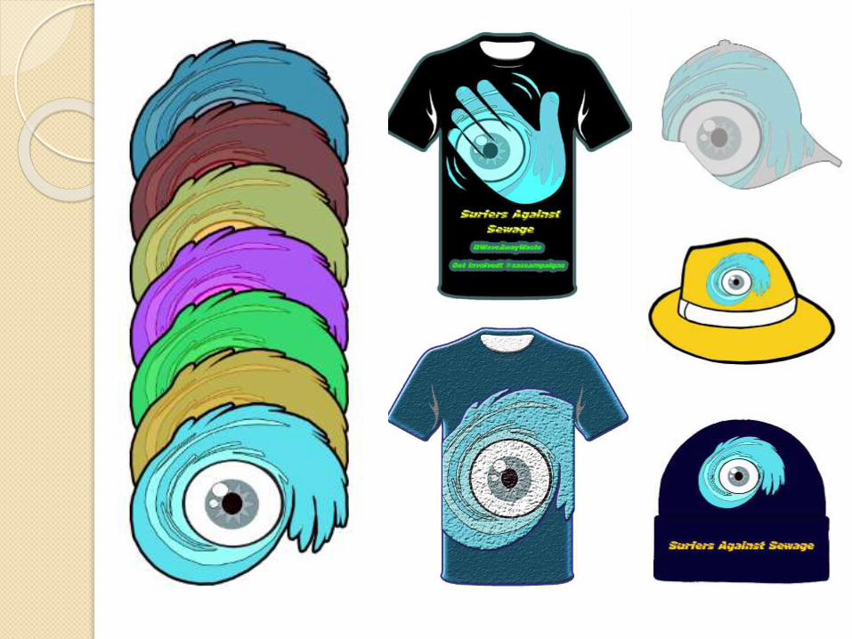
Merchandise (Experiments)
Here I have been experimenting with the
products. This is the first stage of production
and this is important to determine how I
approach the products separately.
The top right and bottom right are my initial
thoughts on how I plan to create the badge
and stickers. They will be adapted upon and
a variety of colours and shapes will be
created. The hat is created using the same technique as the others.
Incorporating the main logo as the full image. That hat was chosen
ahead of the others as it best expressed the ocean theme. With it
looking like an old detective, this added to the eye ball and that of
looking out for the sea and being part of Surfers Against Sewage.
The T-Shirt again uses this idea of the logo as the full shirt, as this is
just an idea stage, in the later production task the size and position of
the logo can be altered and adjusted accordingly.
The make the stickers much more believable I used the ‘Turn page’
effect making it look like it was pealing. This can be used in later
production and taken to an advanced level.
The text on the hat is just to show the position of it within the
overall composition. The colours of the merchandise has remained
the same as the logo, however when in production many versions
will be created to appeal to everyone, of all ages and genders.
The badges can be adapted upon, perhaps just using the logo and
the same with the stickers. The background is to make it stand out.
The hats can be of different size and style to appeal to each
audience aimed towards.

Here I am experimenting further with possible designs for t-shirts. The idea of using a hand to demonstrate
the ‘wave’ can be a good way in enticing the person to both buy the product and sign up to Surfers Against
Sewage.
I wanted to incorporate the logo into all the designs so there would be less need for text. The hashtag
‘WaveAwayWaste’ was designed in planning and is meant to be placed on the paper based products,
however in the experimental stage I wanted to gather a greater understanding on what the shirts would
look like with text on.
This use of social media as well the colours tie in with the targeted young audience. The vibrant green and
bright blue were the colours looked upon in the planning. The shirt on the right was all about simplicity and
position of the logo before I used redbubble.com to take the work further.
Having the logo on the work but in a corner can make it more appealing to those who want to support the
cause but don’t want to wear something loud and bold.
The logo on the next page looks good on the variety of products and is a step In the right direction. After
exploring existing surfing products by Rip Curl, I wanted to see how many products the logo would look
good on.

Here I have taken screenshots of the variety of products that can be produced and sold that contain the logo design
created in the first week of production. This includes the final logo (on the left) as well as one idea created upon in the
merchandise task (right) the hand is representing a wave and can be used in the membership form.
It is to go with the hashtag ‘WaveAwayWaste’ and producing it through a t-shirt could be a good way of advertising the
hashtag and the twitter page. The logo being designed into the hand is to allow the shirt to be more clear.
This hand with the logo in can almost replace the actual logo in some pieces of work and can act as an house style.


Here I wanted to develop designs and explore Redbubble further. Producing a variety
of colours for the background image in good time can allow more room for
improvement in terms of position and size.
In the planning stage I identified the young audience as one to produce the 4 items for,
The logo, the merchandise, the membership form and the campaign poster.
The logo is clean, slick and very eye catching. It entices the young audience through its
shape and bright colour as well as being slightly unusual.
In terms of merchandise, I want to keep this same simplicity. Less is more. I want the
logo to feature on the merchandise because it can save including text and can prove to
be a source of advertising when people are walking through their local town’s or cities
wearing the logo.
Since exploring Redbubble in more detail, I have found that there is large amount of
room to have multiple products. In the planning stages I wanted to create the minimum
of three, however the possibilities are endless, especially for this young age range.
Phone cases and travel mugs can provide much more money to the cause.The logo can provide the design for the clothing
and merchandise.As the audience is of a young
age range, wearing expensive clothes with
exciting designs is not associated with them.
Experimenting with many t-shirt designs can
allow me to demonstrate the reasons for
choosing one design, for its colour or style.
It shows development and understanding of the
task. Page 11 is made up of the original ideas in
the planning and the developed pieces put
together. It also has room for my thoughts,
including the badge and stickers.
This was inspired by Rip Curl and the variety of
colours for the same product.


Final Shirts

Final products

Campaign Poster (Mind Maps)
Campaig
n Poster
Negative
Positive
Colourful
Promotion
Informativ
e
Concise
Dark
Awarenes
s
Warning
Educational
Clear
Detailed
Right for
audience
Imagery
Children
Adults
Serious
Humorous
Attractive
Emotional
Location
Bright
shades
Facts and
figures
Black text
Basic fontBasic
Layout
Different text sizes
Details

Campaig
n Poster
Ideas
Beach clean up
Online
Social media
Petition
Interact with
audience
Start a Hashtag
#WaveAwayWaste
Advantage
s
Audience
together
Can sell
merchandis
e and
membership
s
Reach out to
more people
Good chance of
success as it
has been done
before
collection
of posters
Will give an incentive
to gather more of them
Younger audience
Surfers Against Sewage
has an existing twitter
account
Show negative
imagery
Entice the audience
through emotion
Telling a story

Campaign Poster
The poster will be keeping to the audience of the young age range, therefore it will be
created in an online advertisement style, this will include the hashtag created in the
planning stages, the twitter handle of Surfers Against Sewage and essential
requirements.
The poster will be created as one and not as a story. It will be in a negative
presentation, meaning the colours will be darker and the text will be more formal
looking.
It will remain professional as well as enticing the younger audience. Ways in doing so
are creative imagery and something eye catching, this would replace the need for
bright colours.
Using lighter shades of colour makes me feel I takes away from the serious issues
surrounding marine litter and the sewage in the oceans.
I will aim to create something that reflects the current work so far. By this I mean
something fresh and vibrant that gets the younger audience who might not know as
much about the issues surrounding the waste in the seas and educate them.
Looking at a younger audience to aim to products at will be somewhat of a risk as
they may not find it appealing, however for new life into the campaign it is important
some enthusiastic people to support the cause.

Campaign Posters (Experimental stage)
Here I wanted to explore the use of having
negative imagery and how it would persuade
the reader.
The screenshots above explain how the
background was created. When using an
image off the internet and once it was
manipulated using the magic eraser tool,
there would pieces of the original background
leftover.
From this I enlarged one section (Top right)
and stretched it over on side of the full page.
Then it was later duplicated and flipped to
create a very unusual looking image. This
blended in well with the text and I feel was a
good way to start the poster creation.
In this poster I wanted to focus on Twitter and
getting people to follow the campaign so at a
later date they can be asked to buy
merchandise or sign up for a membership
with their families.

Here I wanted to show some creativity in the colour.
The idea of the Turtle being saved by the hand which
represents the audience helping needed to be much
more clear, as did the hand.
This Is why I wanted to chose the colours seen on the
right. These were not chosen at random. These
colours represent good and bad. With a young
audience viewing this, psychologically they will
understand that the marine litter is bad whereas the
hand is helping.
The use of social media makes it much more clear
that the audience is of an younger audience than
before.

Here I wanted to create another campaign
poster that can tie in with the previous one.
I wanted to make something simplistic yet
keeps to the negative style theme looked upon
in the last poster.
As it was a serious topic and aimed towards
young people I needed to alter the levels and
make the background image much more of a
darker shade.
In order to keep the attention of the reader, a
variety of fonts, colours and text sizes were
spread across the A3 poster.
A bright yellow custom shape was put in to
bring out the Beach clean title and make it
stand out that much more.
Using the yellow there allowed me to remove
the shade from the background and still have
the beach colours.
The importance of the poster had to be seen. It
was not one of advertisement for a product and
I just wanted to bring out the detail to convince
the audience.
Using the hashtag created in the previous
poster makes it look that much more
professional. The date being large in size made
it impossible not to know when it was on. This
colour was decided upon to reflect the logo.
Having a shade of blue at the top of the image.


Final Campaign Poster

Membership Form
Flat
plans
This flatplan is designed for
the younger audience. It is
will be full of information on
why to join and will aim
educate the reader.
It is for new members
rather than existing
customers so it must be
detailed, however must be
careful it does not scare the
audience away with too
much information.
It will be full of colour and
imagery to make the
learning that much easier.
Facts and figures about
marine litter and other
concerns will be featured to
keep the reader engaged.
DID YOU KNOW?
-A plastic bottle may persist
in the marine environment for
more than 450 years if left on
a beach.
-37.4 percent of marine litter
comes directly from the
public.
-Over 30,000 combined
sewer overflows discharge
untreated sewage into UK
rivers and beaches.
Include many facts and
figures around the
membership form to retain
the attention of the reader.
Have negative
imagery to shock and
raise awareness.
Include information about
who SAS are and what
joining them can do.
Have images in between
text and nearby to split the
text and make it easier to
digest.
Back
Include contact details and direct debit on the back of the membership form. This is
so there is room and it is clear enough to see rather than being squished.
The back of the membership form will have a
front cover. This will have the logo created and
the name Surfers Against Sewage.
To entice the young audience, this
membership form will use colourful shades.
Additional information and a brief explanation
of what SAS is to be on the back.
This side will be full of
educational writing.
Explaining a detailed yet
understandable piece of
text.

Flat plan (2)
In contrast this second flat plan is just one page. The idea is to have all the information packed into one piece so it can be digested easier.
When the membership is looking at new, young members it is important to have an attractive looking form for them to pick up. Having one
full page with facts, figures, images, different colours, a variety of fonts and text sizes.
Facts
-A plastic
bottle may
persist in
the marine
environme
nt for
more than
450 years
if left on a
beach.
This flat plan on the left is one side of the
form whereas underneath is the back of it.
The reverse side will have contact
information, small piece about surfers
against sewage and direct debit details.
This makes it that much more clear and
easier to read rather than have everything
dotted around.
Having facts down one side can make the
piece look much more appealing.
The back will be similar to this of the
existing one from surfers against sewage.
To have name, address and contact
information on the left hand side, and
payment on the right.
Clearly separate the two and have enough
room so it is easy to read and understand.
Again the colour will be of a bright shade
to entice the younger audience and make
the text stand out more more.
The images used with be of a negative
approach, using them combined with facts
can shock the reader and make them
want to help change the issues.
The name Surfers Against Sewage needs
to stand out from the rest of the text,
meaning a different font colour and size,
perhaps orientation.

This existing membership form is not one I want to emulate in terms of content, however the layout of the logo on
the far right and size of the form is something I can emulate in my work.
It is of a good enough size to be distributed well. The content on the page will be limited when compared to the one
below, which is also a previous membership form from the client.
The one below is what I will be looking at in terms
content as it approaches the same new members
rather than existing which is seen in the image
above.
The way the images are used surrounding the text
and supporting what is said was in the thoughts on
flat plan 1.
The difference in fonts and colour helps split the text
up and makes it easier to read and understand.
The white background and darker font is somewhat
simplistic and more formal. In relation to my form I
will want something bright and energetic.
This image below is perfect in terms of content and
imagery, however having a more exciting layout can
appeal to the younger audience.
Having researched into other membership forms,
this one on the left can be the best approach for
attracting ‘new members’.
A further flatplan taking this existing one into account
will be a good idea.
The last flatplan will be the final layout as it has been
thought about and developed upon through trial and

Flat plan (3)- Final Layout
This last flatplan was inspired by the
existing membership forms used by
SAS.
It was decided by exploring a variety of
layouts and in terms of content, this was
the best idea.
Having a fold out allows 4 sides of text
whereas the last flatplan was of similar
size, however only gave two sides of
text.
This can make it spacious like the first
flat plan, but it keeps it together better
rather than on 6 sections.
The first flatplan (Below) made the text
all small and the images would not have
been together. It would also have meant
to keep flicking across side to side. This
keeps it all compact and together.
Front page.
This will have a
large image with
the name of the
organisation.
Back.
This will have
contact details
and payment
information.
The inside
will have
much
more room
for
informatio
n
Images can be kept separate rather than
underneath text and it can be much more
clear.
There will still
be room for
facts and
figures
however, they
will be merged
within the text.
The layout is
much more
formal however it
needs to be in
order to give
educational
information.
The image on
the right is what
I have based
this decision on.
It is clear and
easily readable.
The inside is
organised and well
structured, this will
reflect SAS and their
organisation.

Membership Form creation
Front and back cover