Task 7 flat plans
12
Task 7- Flat Plans
Transcript of Task 7 flat plans
Task 7- Flat Plans
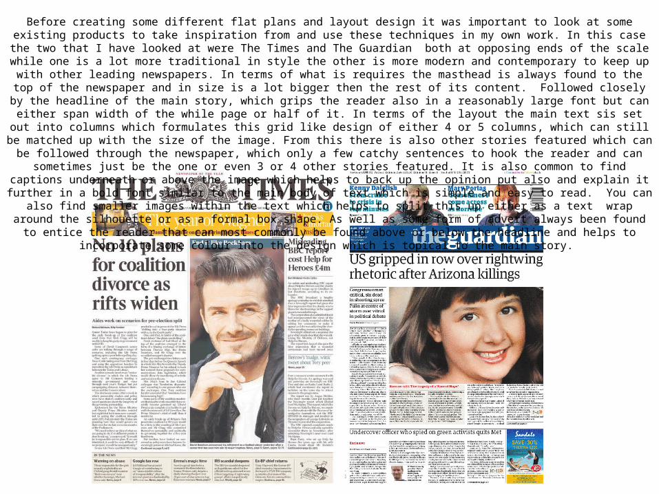
Before creating some different flat plans and layout design it was important to look at some existing products to take inspiration from and use these techniques in my own work. In this case the two that I have looked at were The Times and The Guardian both at opposing ends of the scale while one is a lot more traditional in style the other is more modern and contemporary to keep up with other leading newspapers. In terms of what is requires the masthead is always found to the top of the newspaper and in size is a lot bigger then the rest of its content.
Followed closely by the headline of the main story, which grips the reader also in a reasonably large font but can either span width of the while page or half of it. In terms of the layout the main text sis set out into columns which formulates this grid like design of either 4 or 5 columns,
which can still be matched up with the size of the image. From this there is also other stories featured which can be followed through the newspaper, which only a few catchy sentences to hook the reader and can sometimes just be the one or even 3 or 4 other stories featured. It is also common to find captions underneath or above the image which helps to back up the opinion put also and explain it further in a bold font similar to the main body of text which is simple and easy to read. You can also find smaller images within the text which helps to split this up either as a text wrap around the silhouette or as a formal box shape. As well as some form of advert always been found to entice the reader that can most commonly be found above or below the headline and helps to incorporate some colour into the design which is topical to the
main story.
MASTHEADADVERT/OFFER
MAIN STORYMAIN STORY IMAGE
FEATURED STORY 1
HEADLINE
FEATURED STORY 2 FEATURED STORY 3 FEATURED STORY 4
PULL QUOTE
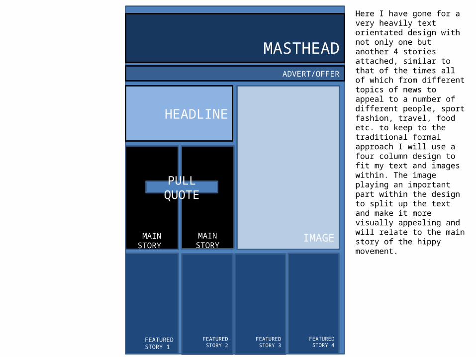
Here I have gone for a very heavily text orientated design with not only one but another 4 stories attached, similar to that of the times all of which from different topics of news to appeal to a number of different people, sport fashion, travel, food etc. to keep to the traditional formal approach I will use a four column design to fit my text and images within. The image playing an important part within the design to split up the text and make it more visually appealing and will relate to the main story of the hippy movement.
MASTHEADADVERT/OFFER
MAIN STORY IMAGE
FEATURED STORY
HEADLINE
FEATURED STORYFEATURED STORY
FEATURED STORY 2
PULL QUOTE
PULL QUOTE
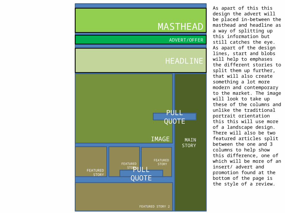
As apart of this this design the advert will be placed in-between the masthead and headline as a way of splitting up this information but still catches the eye. As apart of the design lines, start and blobs will help to emphases the different stories to split them up further, that will also create something a lot more modern and contemporary to the market. The image will look to take up these of the columns and unlike the traditional portrait orientation this this will use more of a landscape design. There will also be two featured articles split between the one and 3 columns to help show this difference, one of which will be more of an insert/ advert and promotion found at the bottom of the page is the style of a review.
MASTHEAD
ADVERT/OFFER
FEATURED STORY 1
IMAGE
MAIN STORY
HEADLINE
FEATURED STORY 2
PULL QUOTE
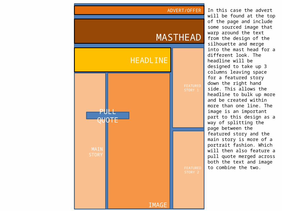
In this case the advert will be found at the top of the page and include some sourced image that warp around the text from the design of the silhouette and merge into the mast head for a different look. The headline will be designed to take up 3 columns leaving space for a featured story down the right hand side. This allows the headline to bulk up more and be created within more than one line. The image is an important part to this design as a way of splitting the page between the featured story and the main story is more of a portrait fashion. Which will then also feature a pull quote merged across both the text and image to combine the two.
MASTHEADADVERT/
OFFER
MAIN STORY
IMAGEMAIN STORY
HEADLINE
MAIN STORY
CAPTION
MAIN STORY
FEATURED STORY
PULL QUOTE
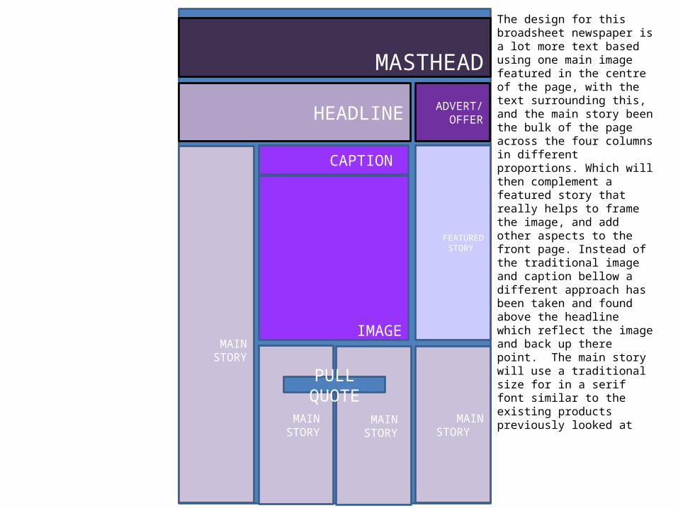
The design for this broadsheet newspaper is a lot more text based using one main image featured in the centre of the page, with the text surrounding this, and the main story been the bulk of the page across the four columns in different proportions. Which will then complement a featured story that really helps to frame the image, and add other aspects to the front page. Instead of the traditional image and caption bellow a different approach has been taken and found above the headline which reflect the image and back up there point. The main story will use a traditional size for in a serif font similar to the existing products previously looked at
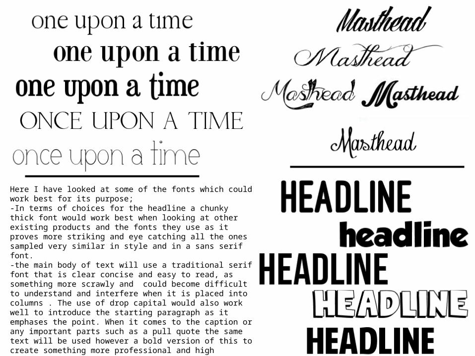
Here I have looked at some of the fonts which could work best for its purpose; -In terms of choices for the headline a chunky thick font would work best when looking at other existing products and the fonts they use as it proves more striking and eye catching all the ones sampled very similar in style and in a sans serif font. -the main body of text will use a traditional serif font that is clear concise and easy to read, as something more scrawly and could become difficult to understand and interfere when it is placed into columns . The use of drop capital would also work well to introduce the starting paragraph as it emphases the point. When it comes to the caption or any important parts such as a pull quote the same text will be used however a bold version of this to create something more professional and high quality. - The masthead of the newspaper will look to be a lot more decorative in style compared to the other fonts needed that give you the illusion of it been hand drawn. This very embellished design has been inspired by the other products I have looked at such as the logo for the times. That is also very similar and contrast well against the headline.
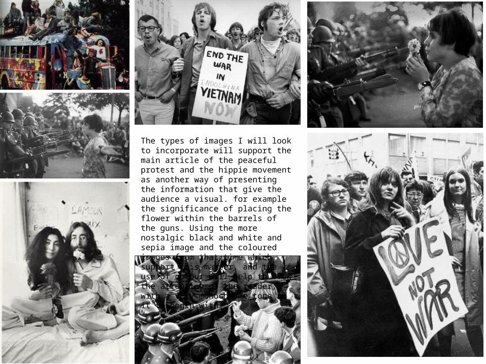
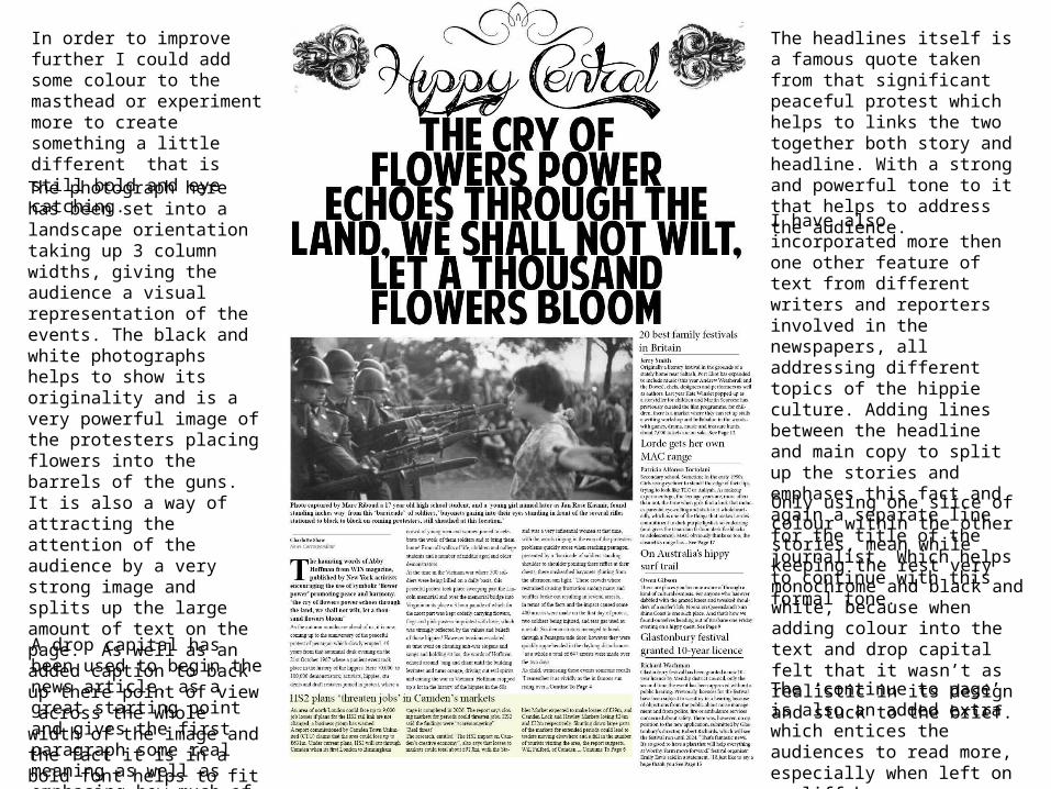
The types of images I will look to incorporate will support the main article of the peaceful protest and the hippie movement as another way of presenting the information that give the audience a visual. for example the significance of placing the flower within the barrels of the guns. Using the more nostalgic black and white and sepia image and the coloured images from that time which support this matter, and the use of colour will help to draw the attention of the reader, with a very monochrome tone to it to begin with.
The headlines itself is a famous quote taken from that significant peaceful protest which helps to links the two together both story and headline. With a strong and powerful tone to it that helps to address the audience.
I have also incorporated more then one other feature of text from different writers and reporters involved in the newspapers, all addressing different topics of the hippie culture. Adding lines between the headline and main copy to split up the stories and emphases this fact and again a separate line for the title of the journalist. Which helps to continue with this formal tone.
Only using one slice of colour within the other stories, mean while keeping the rest very monochrome and black and white, because when adding colour into the text and drop capital felt that it wasn’t as realistic in its design and stuck to the brief. A drop capital has been used to
begin the news article, as a great starting point and gives the first paragraph some real meaning as well as emphasing how much of a traditional newspaper it is.
The photograph here has been set into a landscape orientation taking up 3 column widths, giving the audience a visual representation of the events. The black and white photographs helps to show its originality and is a very powerful image of the protesters placing flowers into the barrels of the guns. It is also a way of attracting the attention of the audience by a very strong image and splits up the large amount of text on the page. As well as an added caption to back up there point of view across the whole width of the image and the fact it is in a bold font helps to fit with the look of a broad sheet newspaper and highlights it further.
The ‘continue to page’ is also an added extra which entices the audiences to read more, especially when left on a cliff hanger.
In order to improve further I could add some colour to the masthead or experiment more to create something a little different that is still bold and eye catching.
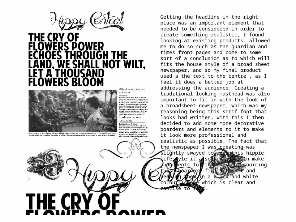
Getting the headline in the right place was an important element that needed to be considered in order to create something realistic, I found looking at existing products allowed me to do so such as the guardian and times front pages and come to some sort of a conclusion as to which will fits the house style of a broad sheet newspaper, and so my final product used a the text to the centre , as I feel it does a better job at addressing the audience. Creating a traditional looking masthead was also important to fit in with the look of a broadsheet newspaper, which was my reasoning being this serif font that looks had written, with this I then decided to add some more decorative boarders and elements to it to make it look more professional and realistic as possible. The fact that the newspaper I was creating was slightly swayed towards this hippie lifestyle it also helped me in make judgements for this design, sourcing these boarders from internet and keeping them in a black and white colour scheme which is clear and concise to read.
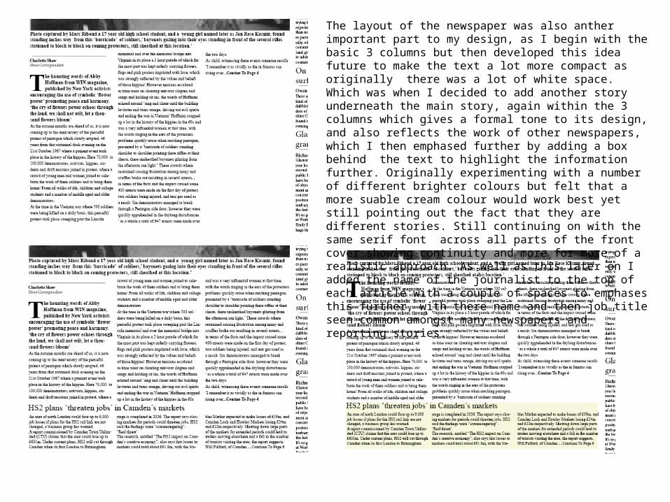
The layout of the newspaper was also anther important part to my design, as I begin with the basic 3 columns but then developed this idea future to make the text a lot more compact as originally there was a lot of white space. Which was when I decided to add another story underneath the main story, again within the 3 columns which gives a formal tone to its design, and also reflects the work of other newspapers, which I then emphased further by adding a box behind the text to highlight the information further. Originally experimenting with a number of different brighter colours but felt that a more suable cream colour would work best yet still pointing out the fact that they are different stories. Still continuing on with the same serif font across all parts of the front cover showing continuity and more for more of a realistic approach. As well as this later on I added the name of the journalist to the top of each article with a couple of spaces to emphases this further, with there name and then job title seen common amongst many newspapers and reporting stories.
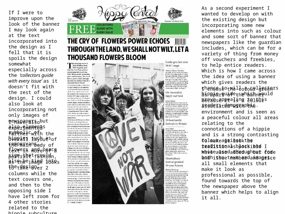
As a second experiment I wanted to develop on with the existing design but incorporating some new elements into such as colour and some sort of banner that newspapers like the guardian includes, which can be for a variety of thing from money off vouchers and freebies, to help entice readers. Which is how I came across the idea of using a banner which gives readers the chance to will a collectors hippie guide, which would prove appealing to this readers demographic.
I choose the colour green as apart of the banner because it is a colour associated with the environment and is seen as a peaceful colour all areas relating to the connotations of a hippie and is a strong contrasting colour against the traditional black and white used throughout for both the text and images.
To make it look as realistic as possible I have also added a bar code and issue number and price all small elements that make it look as professional as possible, found towards the top of the newspaper above the banner which helps to align it all.
If I were to improve upon the look of the banner I may look again at the text incorporated into the design as I fell that it is spoils the design somewhat especially across the ‘collectors guide with every issue’ as it doesn’t fit with the rest of the design. I could also look at incorporating not only images of newspapers but also elements symbolic of hippies such as campervans, flowers and peace sign that could also be tied into the design.
I have also experimented further with the overall layout of the main body of text in more of a portrait fashion, as the image looks to take over 2 columns while the text covers one, and then to the opposing side I have left room for 4 other stories related to the hippie subculture. Using the same layout from my previous design, and a feel that wrapping the text round the image helps to frame the photograph.