Task 5
4
Task 5 Representation Analysis
-
Upload
emmagower101 -
Category
Career
-
view
113 -
download
0
Transcript of Task 5
Task 5Representation Analysis
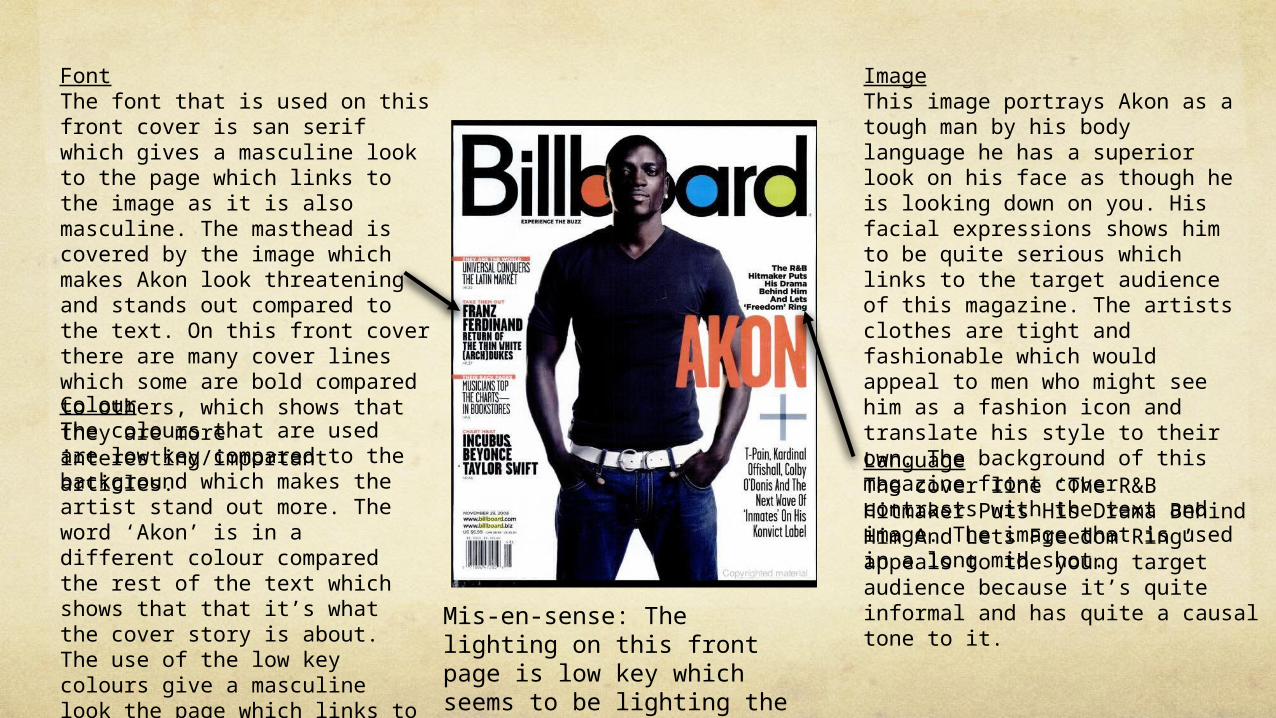
ImageThis image portrays Akon as a tough man by his body language he has a superior look on his face as though he is looking down on you. His facial expressions shows him to be quite serious which links to the target audience of this magazine. The artists clothes are tight and fashionable which would appeal to men who might see him as a fashion icon and translate his style to their own. The background of this magazine front cover contrasts with the text and image. The image that is used in a long mid shot.
FontThe font that is used on this front cover is san serif which gives a masculine look to the page which links to the image as it is also masculine. The masthead is covered by the image which makes Akon look threatening and stands out compared to the text. On this front cover there are many cover lines which some are bold compared to others, which shows that they are more interesting/important articles.ColourThe colours that are used are low key compared to the background which makes the artist stand out more. The word ‘Akon’ is in a different colour compared the rest of the text which shows that that it’s what the cover story is about. The use of the low key colours give a masculine look the page which links to the artist.
LanguageThe cover line ‘The R&B Hitmaker Puts His Drama Behind Him And Lets Freedom Ring’ appeals to the young target audience because it’s quite informal and has quite a causal tone to it.
Mis-en-sense: The lighting on this front page is low key which seems to be lighting the right of the artist.
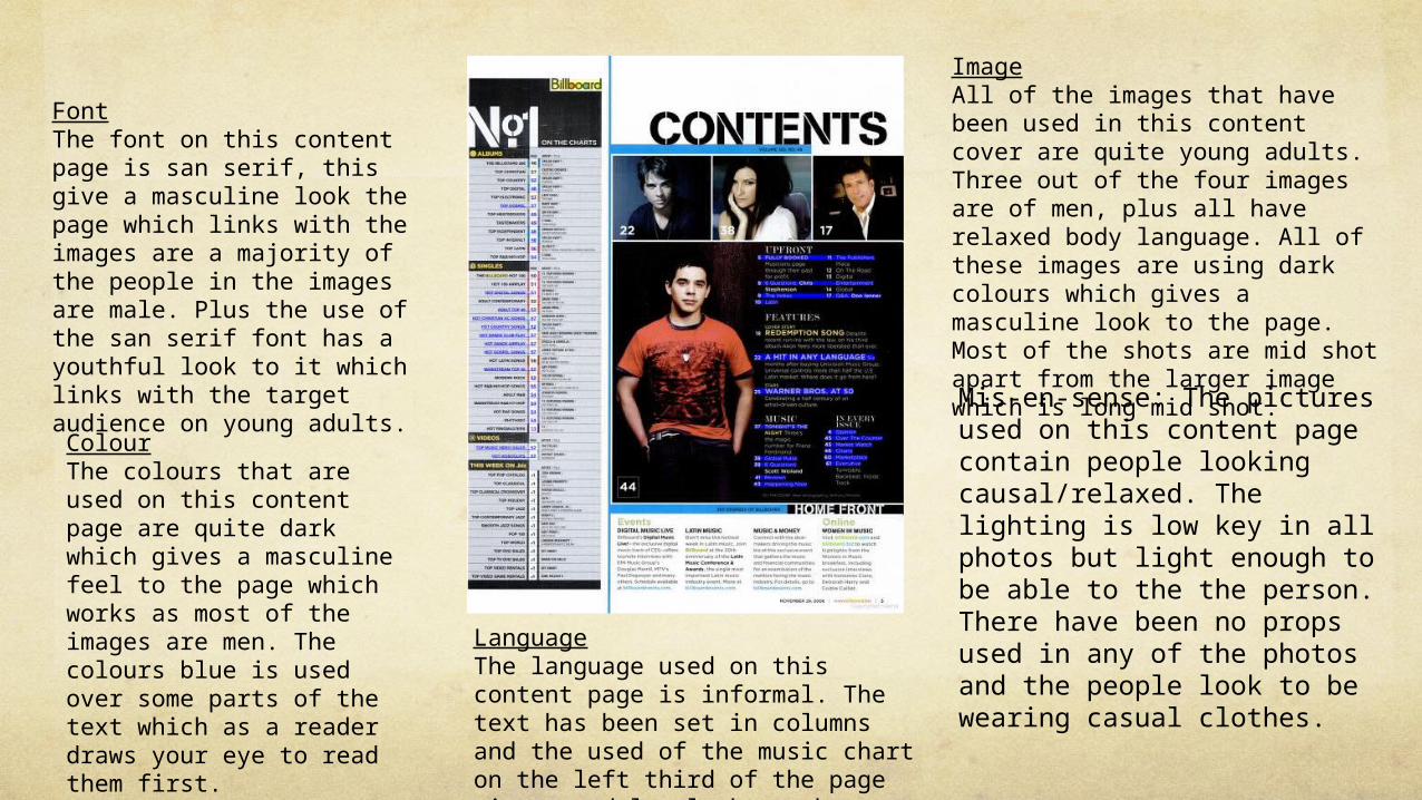
FontThe font on this content page is san serif, this give a masculine look the page which links with the images are a majority of the people in the images are male. Plus the use of the san serif font has a youthful look to it which links with the target audience on young adults.
ColourThe colours that are used on this content page are quite dark which gives a masculine feel to the page which works as most of the images are men. The colours blue is used over some parts of the text which as a reader draws your eye to read them first.
ImageAll of the images that have been used in this content cover are quite young adults. Three out of the four images are of men, plus all have relaxed body language. All of these images are using dark colours which gives a masculine look to the page. Most of the shots are mid shot apart from the larger image which is long mid shot.
LanguageThe language used on this content page is informal. The text has been set in columns and the used of the music chart on the left third of the page gives a adults look to the page.
Mis-en-sense: The pictures used on this content page contain people looking causal/relaxed. The lighting is low key in all photos but light enough to be able to the the person. There have been no props used in any of the photos and the people look to be wearing casual clothes.

FontThe font that is used on this double page spread is san serif, which gives the page a young look. This l The use of the headline of this page states the name of the artist and
ImageThe only image used on this double page spread is of Rita Ora. The image its self is bright but not very colourful this give gives a young adult appearance to the page. An her body language is quite laid back and relaxed, this also links with the target audience been young adults as they are stereotyped as been lazy and relaxed. The youthful clothes that she is wearing represents that she is young like the magazines target audience.
ColourThe page its self don’t have much colour which links to the target audience. The only colour that is really used is red. This is quite a dominant, sexy female colour. It make the page more visually appealing and draws the eye, once you have read the headline the eye is drawn down the page to the other red text where Rita is interviewed.
Language The language that is used in the double page spread is informal. The text is of an interview. One of the questions asked involved the sentence, ‘Did you get to hang with them?’ this is informal which has a youthful feel to it which links to the target audience of young females and males.
Mis-en-sence: The lighting of this double page spread is quite dark but lighter around the artist, this gives a dangerous/ mysterious look to the page which reflects on the artist. The outfit that the artist is wearing is quite casual/street ware. This gives a youthful and informal impression.