
Tablet Friendly Web Design - Best Practices for Financial Services
33
T ABLET -FRIENDLY WEB DESIGN Best Practices for Financial Services September 2013
-
Upload
corporate-insight -
Category
Economy & Finance
-
view
631 -
download
1
Transcript of Tablet Friendly Web Design - Best Practices for Financial Services

TABLET-FRIENDLY WEB DESIGN
Best Practices for Financial Services
September 2013

ABOUT CORPORATE INSIGHT
2
Corporate Insight provides competitive intelligence and user experience research to the nation’s leading financial
institutions. For over 20 years, the firm has tracked technological developments in the financial services industry,
identifying best practices in online banking and investing, online insurance, mobile finance, active trading
platforms, social media and other emerging areas. There are no assumptions in Corporate Insight’s work – we use
live accounts at all of the firms we research, providing our clients with unparalleled, unbiased intelligence on the
competition.
Corporate Insight welcomes the opportunity to speak with the media. If you are interested in citing our research
or would like to schedule an interview with one of our analysts, please contact Intermarket Communications at
212-888-6115 or [email protected].
Media Inquiries
Connect With Us
DAN WIEGAND
Senior Analyst,
Mobile Research & Consulting
646-432-5483
ALAN MAGINN
Director,
User Research
646-454-2661

TABLE OF CONTENTS
Introduction
o Accessing the Web on Tablets
o Understanding Responsive Web Design
o Tablet-Friendly Design Across Financial Services
Case Studies
o Banking and Credit Cards: Wells Fargo
o Brokerage: Vanguard
o Insurance: Nationwide
o Asset Management: Royce Funds
Three Tips for Financial Services Firms
CI’s User Research Services
Corporate Insight Thought Leadership
About the Authors
3
INTRODUCTION
4
4

ACCESSING THE WEB ON TABLETS
Since Apple introduced the iPad in 2010, the tablet product class it launched has seen
unprecedented growth and adoption among consumers. In under four years, more than 100
million iPads have been sold, reaching that benchmark faster even than Apple’s ground-
breaking iPods and iPhones. Competitors such as Google, Samsung, Amazon and Microsoft
have also launched similar tablets as the technology has changed how many consumers go
about their lives.
With the newfound popularity of the devices, many companies have rushed to add their own
tablet-optimized apps to iTunes or other app stores. Native apps may best offer the sleek,
modern experience that consumers expect, but, due to the multitude of operating systems,
they pose a challenge in terms of development.
In the meantime, a significant portion of tablet traffic still comes via a browser. According to
comScore, consumers spend more than twice as much time on iPad apps than on the device’s
browser – but this still leaves a significant portion of their time there, much higher than on a
smartphone. Whether or not companies currently offer or are developing a tablet app, there
are routine enhancements they should make to their websites that contribute to a tablet-
friendly experience.
5

UNDERSTANDING RESPONSIVE WEB DESIGN
One relatively new approach to building mobile-friendly websites is Responsive Web Design
(RWD). A responsive website will detect what device is being used and fluidly adapt to a layout
optimized for that screen size. RWD promises to minimize the burden of designing and
updating websites for multiple screen sizes by rearranging and re-sizing content modules by
pre-set order. The benefits apply as much to smartphones – typically the smallest screen size –
as to tablets, which can be a middle case, leaving the richest possible experience for a full-size
desktop monitor.
6
As the examples in this study will
show, financial services firms are
beginning to experiment with
responsive websites, although at
the largest firms capabilities are
limited at best.

TABLET-FRIENDLY DESIGN ACROSS FINANCIAL SERVICES
Corporate Insight has kept a close eye on mobile developments in the financial services
industry. Since the iPad’s introduction, more than 30 firms we track have added tablet-
optimized apps. However, that still leaves dozens of firms without a dedicated app, and even
those that have one likely see significant traffic to their main websites via tablet browsers. A
poor experience there can alienate current as well as prospective clients. All firms should be
keeping tablet-friendly design principles in mind when making changes to their websites.
7
But what specifically are those principles? We decided to look
at the industry today and see what positive examples we could
find and share. This study looks at recent updates to four firms’
public websites with features suited for tablet use – although
some shortcomings may remain. We chose the four firms at
right for a cross-industry perspective, covering the different
financial services sectors Corporate Insight tracks – bank and
card, brokerage, insurance and asset management.

CASE STUDIES
Banking and Credit Cards: Wells Fargo
Brokerage: Vanguard
Insurance: Nationwide
Asset Management: Royce Funds
8
8

BANKING & CREDIT CARDS
WELLS FARGO
9
Advantages
Sizable “finger-friendly” linkable sections allow for easy selection
Increase in scrollable content allows for additional information with less clutter
Larger font size and line height makes for easy viewing on tablets and smartphones
Disadvantages
Public site only partially updated; many pages still feature old, cumbersome design
Site lacks Responsive Web Design, making viewing difficult across different resolutions
Key Facts
Wells Fargo rolled out a partial tablet-friendly public site revamp in June 2013
Key public site pages with new designs include the public homepage, bank and credit card product pages, and select corporate and consumer information pages
Redesigned pages feature larger text, more images and “swipeable” image displays
Wells Fargo offers an iPad app that is focused on current clients
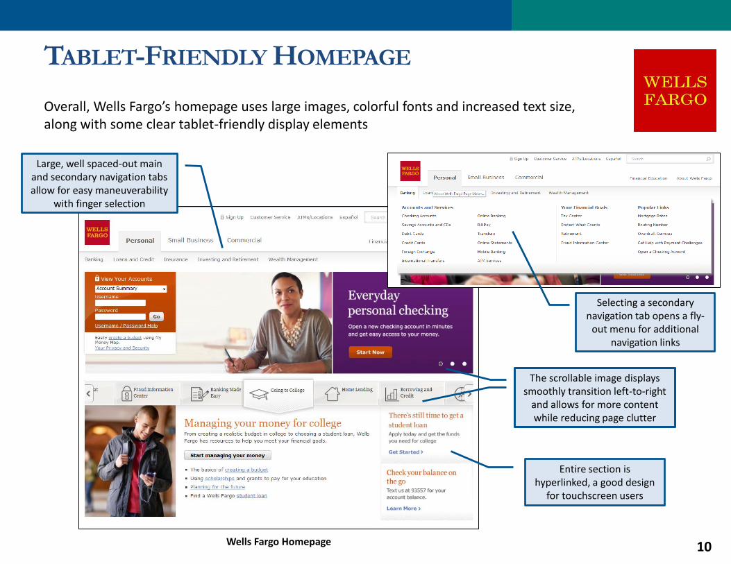
TABLET-FRIENDLY HOMEPAGE
Overall, Wells Fargo’s homepage uses large images, colorful fonts and increased text size, along with some clear tablet-friendly display elements
10
Entire section is hyperlinked, a good design
for touchscreen users
Wells Fargo Homepage
Selecting a secondary navigation tab opens a fly-
out menu for additional navigation links
Large, well spaced-out main and secondary navigation tabs allow for easy maneuverability
with finger selection
The scrollable image displays smoothly transition left-to-right
and allows for more content while reducing page clutter
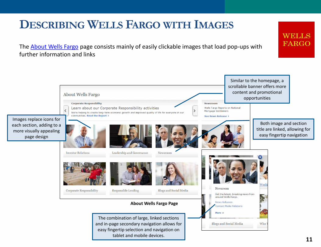
DESCRIBING WELLS FARGO WITH IMAGES
The About Wells Fargo page consists mainly of easily clickable images that load pop-ups with further information and links
11
About Wells Fargo Page
Both image and section title are linked, allowing for
easy fingertip navigation
Similar to the homepage, a scrollable banner offers more
content and promotional opportunities
Images replace icons for each section, adding to a more visually appealing
page design
The combination of large, linked sections and in-page secondary navigation allows for
easy fingertip selection and navigation on tablet and mobile devices.

SITE IS NOT COMPLETELY TABLET-FRIENDLY
1212
Significant portions of the public site have not been updated to feature tablet-
friendly design
Wells Fargo Homepage
Online Banking with Wells Fargo Online Page
The lack of Responsive Web Design is a drawback
despite several tablet-friendly features

BROKERAGE
VANGUARD
13
Advantages
Large, well-spaced clickable boxes and images
Very simple and clean looking interface
Navigation controls are obvious and rarely hidden
Disadvantages
Majority of website – including the homepage – has not been updated to be tablet-friendly
Some navigation still relies on small text links
Key Facts
Starting in May of 2013, Vanguard has redesigned certain pages and sections to be tablet-friendly
New features include rotating banners, large clickable graphics, and category navigation divided into large boxes
Clickable elements now feature subtle gradient that make them look “pressable” and emphasize the usability of the site for a touchscreen
Vanguard offers an iPad app, but it is focused on current clients

HOMEPAGE NOT YET TABLET-FRIENDLY
Although several pages have been recently revamped with tablet-friendly features, Vanguard’s homepage is still PC-oriented
14Vanguard Homepage
Main banner display cannot be swiped on a
touchscreen, but images can be tapped anywhere to access linked content
Much of the homepage content is presented in
small-font plain text hyperlinks

IMPROVEMENTS DEEPER IN THE SITE
The What We Offer overview page exemplifies Vanguard’s solution for trying to balance a vast amount of information with a simple, clean, tablet-friendly design
15
Well-spaced, hyperlinked images
and text
What We Offer Overview Page
Large, clickable boxes utilize gradient to make
it look “pressable”
Banners are not yet “swipeable”

MOVING TO TABLET-FRIENDLY DESIGN
Other newly redesigned tablet-friendly pages are also noticeably different from Vanguard’s desktop-based counterparts
The 401(k) Rollovers page is more spacious than before, with new tablet-friendly navigation
16
This section uses large clickable boxes
and no hidden navigation elements
Content is presented with large, well-spaced images and text, although none of these elements are linked
Vanguard 401(k) Rollovers Overview Page

INSURANCE
NATIONWIDE
17
Advantages
Majority of the website has been redesigned to fit a tablet-friendly experience
Large, well-spaced clickable boxes and images
Disadvantages
Difficult vertical scrolling on areas with left-to-right swiping capabilities.
Portrait orientation sometimes clutters information and links
Not optimized for smaller mobile platforms such as smartphones
Key Facts
Starting mid-2012, Nationwide began a multi-phase public and advisor website redesign that incorporated tablet-friendly features
Redesigned site includes streamlined navigation, large and easy-to-read links, and “swipeable” image displays that can be swiped on tablets
Landscape orientation provides the best overall browsing experience by displaying content in a larger view
Nationwide does not currently offer a tablet-optimized app

SPACIOUS, IMAGE-CENTRIC HOMEPAGE
Following a recent redesign, Nationwide’s homepage features more visually-engaging, tablet-friendly image displays and other useful enhancements
1818
All rotating image displays throughout the
public site can be swiped on a tablet touchscreen; in some cases, though,
this makes vertical scrolling more difficult
Entire area is hyperlinked for easy
touchscreen “clicking”
Large fly-out navigational
menus
Nationwide Public Homepage

FLY-OUTS CONTRIBUTE TO CLEAN,
USABLE DESIGN
Nationwide’s fly-out login and advisor locator features are available on all public website pages
19Nationwide Public Life Insurance Overview Page
Fly-outs help keep these elements from cluttering
the initial screen while still making key features
easily accessible via large, finger-friendly buttons

LIMITED RESPONSIVE WEB DESIGN
EXPERIMENTATION
Although the homepage does not use Responsive Web Design, the firm is starting to make subsequent pages responsive including Investment Outlook & Commentary
20
Some elements get cut off on
narrower displays
Nationwide Public Investment Outlook & Commentary Page
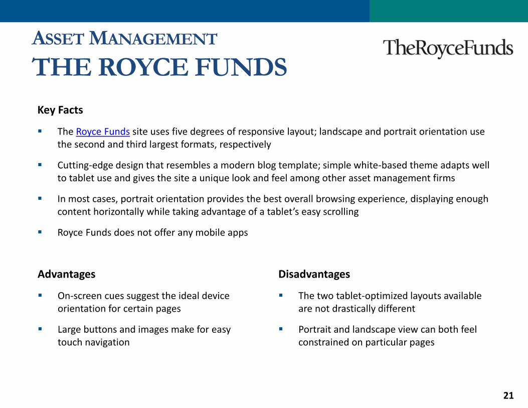
ASSET MANAGEMENT
THE ROYCE FUNDS
21
Advantages
On-screen cues suggest the ideal device orientation for certain pages
Large buttons and images make for easy touch navigation
Disadvantages
The two tablet-optimized layouts available are not drastically different
Portrait and landscape view can both feel constrained on particular pages
Key Facts
The Royce Funds site uses five degrees of responsive layout; landscape and portrait orientation use the second and third largest formats, respectively
Cutting-edge design that resembles a modern blog template; simple white-based theme adapts well to tablet use and gives the site a unique look and feel among other asset management firms
In most cases, portrait orientation provides the best overall browsing experience, displaying enough content horizontally while taking advantage of a tablet’s easy scrolling
Royce Funds does not offer any mobile apps

RESPONSIVE WEB DESIGN IN ACTION
22
Royce Funds’ responsive website adjusts to one of five layouts depending on the device and width of screen
Content areas are modular and are rearranged in a set order
Royce Funds Homepage – Full-Size Screen
Feature commentary and navigation are still at the
top of the screen, but users can swipe vertically and
horizontally to view more
Homepage elements are prioritized in the shown
order – as the layout becomes smaller they are
rearranged vertically
The smallest possible layout on the iPhone compresses content but arranges in the
same order
Royce Funds Homepage –Smartphone Screen

DIFFERENT TABLET LAYOUTS
DEPENDING ON ORIENTATION
The iPad 2 uses the second and third-largest formats in portrait and landscape mode, respectively
Neither layout is ideal for all content, though
23Royce Funds Homepage – Landscape & Portrait Layouts
Portrait view uses a different two-column layout that feels natural for some pages, but
sometimes is not wide enough to accommodate content such as fund profiles (see next slide)Landscape view shows all
content horizontally, but can feel too vertically
constrained (depending on tablet resolution)

OTHER PAGES ALSO BENEFIT FROM
SENSING SCREEN SIZE
Since it can sense the device being used and the width of the screen, Royce’s site also recommends the appropriate orientation or swiping options for mobile browsing
o Royce seems to be updating its site to address these layout challenges and in some cases, users might not see this sort of message
24
Content continues to the right, available by
swiping or switching to landscape
In the narrower portrait orientation, the site
recommends that users switch to landscape to fit all page content on the screen
Royce Funds Prices & Performance Table

MOBILE-FRIENDLY SITE, ASIDE FROM
RESPONSIVE ELEMENTS
Some areas of the Royce Funds site utilize a secondary navigation menu that remains fixed to the top of the screen as the user scrolls down, and it works generally better and smoother on a tablet than similar features on other sites
25
Royce Funds Portfolio Managers
Image and name are hyperlinked, but not
other plain-black text or the surrounding space
Secondary menus track on screen relatively well for tablets, and the links
are large enough for easy touch navigation

SUMMARYBased on observations of these firms and more in CI’s coverage groups, financial services firms
are gradually rolling out new websites with clear, tablet-friendly features in mind. The prime
examples include both firms with tablet-optimized apps on the market as well as firms relying
on their websites as their main mobile presence. Key tactics include making overall design more
spacious, with fewer, larger, more image-centric elements and “swipeable” rotating
promotional displays. As such, homepages and other overviews tend to be the first pages
converted, while more content-heavy pages deeper in the sites are often yet to be upgraded.
26
Other firms not reviewed in this study take related approaches to tablet-
friendly design. Charles Schwab’s revamped website features a
Windows-like homepage with touchscreen-friendly images and boxes.
Capital One uses Responsive Web Design, albeit a simpler two-size
layout than Royce Funds. Alliance Bernstein’s fund profiles are sized to a
tablet screen and feature user-friendly and space-efficient tabbed
browsing. These types of features should become more prevalent as
firms enhance their sites with growing tablet use in mind.

THREE TIPS FOR
FINANCIAL SERVICES FIRMS
27
27

#1 ADOPT A MORE SPACIOUS, IMAGE-CENTRIC DESIGN
Tablets have ushered in a new visual Web design aesthetic. Users expect an image-centric –and
even rich-media – experience, and are frustrated by small, closely-packed text and hyperlinks.
Tablet-friendly pages should reflect this new usability standard. They should use more images
and larger text that is easy to read and click.
While promotional imagery is already ubiquitous on financial services websites, firms should
be wary of cluttering homepages with too much varied content. Screen real estate is more
precious on a tablet, whether it uses a smaller responsive layout or simply zooms out to fit the
full page width on screen. It calls for a more measured touch in terms of what images to
promote and links to include.
28
DESIGN

#2 MAKE INTERFACES FRIENDLY TO TOUCH CONTROLS
Tablets’ touchscreen controls are fundamentally different from navigating with a computer
mouse. Fingers are bigger and less precise than a mouse cursor, and do not have the benefit of
hovering to reveal hidden navigation elements. However, they do offer some advantageous,
intuitive controls. Users can swipe horizontally to advance image displays, use two fingers to
zoom and rotate the device to change the screen length and width.
As firms add images to their sites, they should make sure they are tablet-friendly functionally,
not just visually. Tablet users should be able to tap anywhere to proceed to the linked content,
not just on a text label or caption. Rotating image displays should likewise be controlled by
swiping, not just small arrow keys. In addition to making sure these controls function properly
(e.g., don’t interfere with vertical scrolling), firms should also make sure to leave visual cues for
tablet users. Shading and gradients can make buttons and images clearly “pressable.”
29

#3 RESPONSIVE WEBSITES SHOULD USE MORE THAN TWO SIZES
Websites using Responsive Web Design can offer a streamlined, consistent cross-platform
experience, but designing in just two sizes – full-size screens and smartphones – may overlook
tablets. The best experience on those devices comes through an optimized display that may be
narrower or more compact than on a full monitor, but would not require users to zoom in to
view any page elements. Designers should even be conscious of the difference between
tablets’ portrait and landscape modes and make sure key content is not cut off horizontally or
vertically.
30

CI’S USER RESEARCH SERVICES
User Testing is a powerful research tool that can help you:
• Understand the needs and expectations of your clients
• Prioritize improvements to your interface
• Discover design flaws
• Improve customer satisfaction
Corporate Insight is here to help with all of your User Testing needs. Our User Research team can:
• Design studies that test key features of your website or mobile app, as well as those of key competitors
• Recruit participants that represent your target audience
• Provide you with a detailed analysis of test sessions
• Assist you with your existing usability efforts by moderating tests you have designed or hosting tests at our facility, conveniently located above Grand Central Station in Midtown Manhattan
CI’s User Research services also include:
• Expert Reviews – Focused assessment of your website or mobile offerings based on established usability heuristics, design principles and industry best practices by one of CI’s usability professionals.
• Website Audits – Benchmark your customer website and mobile platform against peers in terms of design, functionality, usability, etc. and provide actionable recommendations for improvement.
31
To learn more about our User Research services, please contact Alan Maginn, Director, User Research, at 646-454-2661 or [email protected].

CORPORATE INSIGHT THOUGHT LEADERSHIP
Next-Generation Investing: Financial Startups and the Future of Financial AdviceCorporate Insight currently tracks over 100 startups that represent a wide range of new ideas when it
comes to financial advice and investing. This study, due out this October, will focus on each new idea,
analyze how it compares to what established financial institutions offer and examine the potential
impact on the investment industry. Download the study preview!
Alternative Investments: How Asset Management Firms Frame Their FundsThis white paper examines how asset management firms are promoting and positioning alternative
investments on their websites by assessing the online product and educational content and outreach
efforts of four leading firms in the space: BlackRock, CNL Securities, Deutsche Asset & Wealth
Management and Eaton Vance. Our goal is to provide a comparison of website content and marketing
efforts aimed at educating investors and preparing advisors for alternative fund conversations.
Facebook Marketing Campaigns - Social Media Initiatives in the Insurance IndustryThis slide deck highlights some of the engaging Facebook marketing campaigns initiated by P&C
Insurance Monitor firms this year and offers a few Facebook marketing tips for insurers.
2013 Mobile Finance Trends and InnovationsThis slide deck includes commentary on mobile developments, key takeaways for financial services
firms and thoughts on what’s next for mobile finance.
32
http://www.corporateinsight.com/blog/2844-2013-mobile-finance-trends-and-innovations-slide-deck.html
http://www.corporateinsight.com/blog/2844-2013-mobile-finance-trends-and-innovations-slide-deck.html

ABOUT THE AUTHORS
LEAD AUTHORS
DAN WIEGAND
SENIOR ANALYST
CONSULTING & MOBILE RESEARCH
646-432-5483
ALAN MAGINN
DIRECTOR, USER RESEARCH
646-454-2661
@AlanMaginn
CONNECT WITH US
CONTRIBUTORS
MATTHEW VAN WAGENEN
BANKING & CREDIT CARDS
CRAIG SILVERMAN
BROKERAGE
JOSÉ SANTANA
INSURANCE
NICK FOSTER
ASSET MANAGEMENT