Table of Contents - International Association of Business …€¦ · · 2015-09-30Table of...
52
3 Table of Contents Executive Summary 4 Introduction 5 Chapter 1: How Companies Address the Information Overload Challenge 6 Chapter 2: Why New Approaches Are Necessary: Evidence from corporate surveys 16 Chapter 3: Recommendations: Shaping messages to reduce overload 21 Chapter 4: The Causes of Information Overload: A review of the literature 28 Chapter 5: Visual Communication to Reduce Overload: Results from a survey of IABC members 35 Conclusion 41 References 42 Biographies 44 Appendices 45 Table of Contents
Transcript of Table of Contents - International Association of Business …€¦ · · 2015-09-30Table of...

3
Table of Contents
Executive Summary 4
Introduction 5
Chapter 1: How Companies Address the Information Overload Challenge 6
Chapter 2: Why New Approaches Are Necessary: Evidence from corporate surveys 16
Chapter 3: Recommendations: Shaping messages to reduce overload 21
Chapter 4: The Causes of Information Overload: A review of the literature 28
Chapter 5: Visual Communication to Reduce Overload: Results from a survey of IABC members 35
Conclusion 41
References 42
Biographies 44
Appendices 45
Table of Contents

4
Executive Summary
There are numerous surveys that show that information overload
is a huge problem for the productivity of most employees in or-
ganizations. Overload is caused by quantitative (i.e., intensity) and
qualitative (i.e., ambiguity) characteristics of information.
This report presents 16 real-life examples of how to reduce
information overload in communication. It presents six simple
principles (based on eight documented overload reduction strate-
gies) to reduce information overload in business communication.
The report also summarizes key insights from previous stud-
ies on the topic and translates them into action items. Business
communicators should use this actionable advice to reduce and
transform their messages in order to accommodate for the time
and attention constraints of their readers.
A particularly useful way to do so is via information visualiza-
tion. The survey conducted among IABC members supports this
argument and shows that visualized information helps to syn-
thesize and aggregate information and make it more quickly and
easily understandable.
Readers pressed for time should have a look at the main
examples in Chapter 1, study the six communication principles
in Chapter 3, and look at the action implications and Table 6 in
Chapter 4.
Executive Summary

5
Introduction
The situation is all too familiar: 50 new e-mail messages in your
inbox, four reports that await your attention, a new intranet sec-
tion you should review, an interesting web site to check out, plus
the new issue of a trade journal that you should read and pass on
to colleagues. Not to mention the two business books you have put
aside. And all of this while preparing for and attending numerous
meetings and workshops, answering phone calls from colleagues
and clients, and thinking about solutions to pressing problems.
When your information processing needs exceed your infor-
mation processing capacity, you are experiencing information
overload—a state where more information actually reduces your
reasoning and decision quality. You feel overwhelmed by informa-
tion and often unable to make the right decision.
So far this topic has been mainly addressed from the receiver’s
point of view. Our report, however, looks at it in terms of the
sender’s side and his or her role in reducing information overload
for receivers.
Our report is structured by what we and the IABC research
foundation assume are your priorities, namely seeing examples
(Chapter 1), getting evidence from corporate surveys (Chapter 2),
hearing our advice (Chapter 3), knowing the state-of-the-art (Chap-
ter 4), and gaining insights from a survey among IABC members
on one specific technique to reduce information overload—visual
communication (Chapter 5).
We start out by showing how different organizations address
the issue of information overload from a communicator’s point of
view, through proven or new approaches to make communication
concise and captivating. Next, we give you evidence (through a
compilation of survey results) that information overload is indeed
an issue that needs to be addressed by communicators. We then
present our key recommendations in the form of six communi-
cation principles, derived from the examples and the literature
review, which is presented in the last section of our report. In
Chapter 5 you will find the results of our IABC survey regarding
the role of visuals in business communication and their potential
to reduce information overload.
If you prefer to read the report not in terms of the salience of
its content, but in its logical order and the way it was originally
developed, then start at the back with the literature review (Chap-
ter 4), move to the recommendations that build on the reviewed
literature (Chapter 3), and see how these recommendations can be
applied in an organization in Chapter 1.
We hope that this report and its mix of examples, evidence,
recommendations, and survey findings is useful for your daily
practice as a communicator and not only makes you more aware
of the problem of information overload, but also of the many ways
communicators can contribute to reducing this silent productivity
and motivation killer.
Introduction

6
Chapter 1
Chapter Summary
In this first chapter, we focus on real-life
examples of overload-aware communica-
tion. Through six short case studies and
10 snapshots of intelligent solutions to
reduce information overload, we give
practical insights on how business com-
municators can optimize the information
intensity (i.e., communication timing) and
enhance the information quality (i.e., in-
creasing the fitness for use of information
through improved format and content).
The presented solutions take the cognitive
constraints of their target groups into ac-
count and reduce information complexity
intelligently. Each solution presented in
the mini cases is described in terms of its
communication context, main idea, and
implementation details, such as a screen-
shot and caveats or risks to consider when
applying the solution to other contexts.
We emphasize visual solutions because
the IABC member survey showed a huge
implementation gap in this area.
1.1 Solution Examples in Overview
Figure 1 provides an overview of the 16 ex-
emplary solutions to information overload
we are going to present below (see: Appen-
dix 1 for an overview on the criteria with
which we have selected the examples). The
How Companies Address the Information Overload Challenge
six in-depth solutions (dark circles in the
chart below) are the vasp Strategy Tube
Map, the Hand Drawing Library of UBS,
Procter & Gamble’s memo template, the
Bashiba Panorama, the Trainiac Learn-
ing Map, and the Information Mapping
method. The briefly described methods
(light circles) are Bayer’s multiple intranet
site map, Bill Gate’s e-mail template, the
reflact visual conversation templates,
the Crealogix intranet page typology,
Xplane informative cartoons, the British
Telecom Strategy Chart, Grove workshop
templates, IBM’s strategy jams, Nokia’s
pictorial employee survey, and Gartner’s
technology diagrams. Figure 1 groups the
cases according to the format that they
employ (i.e., pure text, text and image, and
inter active/online formats) and according
to their level of implementation difficulty
(i.e., the degree of effort required).
Throughout the description of the
examples, we indicate (with forward
arrows dd) which information reduction
and transformation mechanisms (dis-
cussed in Chapter 4, Table 6) are addressed
and how they are implemented in these
cases.
Figure 1: Overload solution
examples in overview

7
stations (dd aggregate, dd compress).
Each tube line represents a different
strategic initiative with its own or joint
intermediate goals. The poster is placed
in prominent locations, such as in
front of the elevator, cafeteria or in
other open areas.
Implementation
Already in the development phase, the
tube map strategy poster fostered collabo-
ration and clarifying strategic conversa-
tions among the managers who developed
it. It helped them to surface areas of
disagreement and to negotiate (in the ex-
ecutive team) a sequence of their strategic
actions. Once the poster was published, it
received a lot of attention: People stopped
1.2 Overload-aware Communication Solutions: Short Case Studies
Example 1: The Strategy Tube Map—Communicating an Organization’s Strategy to Employees
From boring and difficult Gantt charts to an
engaging, metaphor-based strategy poster
Context
One of the most crucial tasks of employee
communication is to inform employees
about an organization’s goals and the
chosen ways of achieving these goals—the
organization’s strategy. Studies, as the one
conducted by Kaplan and Norton, have
shown repeatedly that business communi-
cators often fail at this task and are unable
to effectively inform employees about their
organization’ strategy. The Tube map,
developed and implemented repeatedly by
vasp.ch (a communication agency), is an
effective way to solve this communication
challenge through surprising aggregation
and visualization.
Main Idea
Instead of e-mails, strategy presentations
or management road shows, an organiza-
tion’s strategy is visualized as a graphic
metaphor on a large-scale poster that
depicts the strategy’s milestones and final
goal as, for example, underground metro
Chapter 1How Companies Address the Information Overload Challenge
in front of it, initially puzzled by the tube
map design and the strategic content.
They gathered in front of the poster to
discuss it. In doing so, they found incon-
sistencies or inaccurate elements and
reported them back to the designers. In
this way, the strategy poster was updated
and improved in regular intervals. More
important, however, the strategy became
part of people’s conversations. The strat-
egy poster was subsequently evaluated
through a questionnaire: Two months
after the publication of the poster, 91
questionnaires were sent out to employ-
ees, and 45 were completed and returned.
Seventy-eight percent of the respondents
stated that the tube map gave them a good
overview on their strategy. Sixty percent
of the respondents were attracted (38 per-
cent = true) or very attracted (22 percent =
very true) by the tube map visualization.
Forty percent indicated that the tube map
provided additional motivation for the
strategy projects.
Caveat
In some cultures, this playful approach
may not be perceived as serious and thus
may provoke a cynical or negative reaction
on behalf of employees. The metaphor has
to fit the local context.
Before: Overloaded
Gantt charts
After: Engaging strategy tube
map posters in public areas

8
Chapter 1How Companies Address the Information Overload Challenge
Example 2: The UBS Hand Drawing Library—a Communication Tool for Client Advisers
From slide presentations to joint
interactive sketching
Context
UBS (www.ubs.com), one of the world’s
largest wealth management institutions
in terms of assets under management,
has realized that it is often overloading its
affluent banking clients with presentation
slides in advisory and sales meetings. As
part of its global initiative to improve the
client experience, the universal bank, or
rather its strategy and development unit,
has developed a new tool for sales and
advisory conversations. The tool personal-
izes and stages communication through
ad-hoc visualization.
Main Idea
To reduce the problem of slide overload,
UBS has created a hand-drawing library
that instructs its private banking advisers
on how to draw—in real-time and in front
of the client—helpful diagrams and simple
visual metaphors that explain UBS’s prod-
ucts in a personal and engaging way (and
replace the slide presentations). In this
manner, the adviser’s presentation speed
matches the client’s comprehension speed
(dd sequence). By inviting the customer
to add his or her views or questions to
the drawing, the information intensity,
and ultimately the client experience, can
be further optimized (dd contextualize,
personalize).
Implementation
The drawing approach has been well
received by UBS clients and has replaced
slide presentations almost entirely. Client
advisers can add their own sketching
templates to the collection provided in the
Hand Drawing Library according to their
own experiences. An important element
of the implementation regards the simple
tools that are used: pen and paper. This
informal style signals provisionality and
flexibility to the client.
Caveat
Again, cultural aspects should be taken
into account: The informal approach of
drawing images may not resonate with all
types of employees, especially those used
to a more formal way of communicating.
After: Engaging step-by-step, joint sketching
Before: Standard Bullet
Point Slides

9
Example 3: The Procter & Gamble Memo Template
Ensuring efficient and concise
proposal structures
Context
Procter & Gamble (www.pg.com) is one of
the largest consumer goods companies in
the world (with products ranging from
soap to aftershave to snacks). It is widely
known for its analytical approaches to
marketing and considered an excellent
starting place for a business career. P&G
has developed various methods to improve
the efficiency of its operations, some of
which also regard internal communica-
tion. One such method is the one- or
two-page memo based on dd compression
and dd standardization.
Main Idea
A consistent standard structure (and
scope) of business memos helps to im-
prove communication effectiveness and
efficiency. A proven generic structure
(dd standardize) can be flexible enough to
capture a great variety of business issues.
If everybody adheres to this structure,
then the processing of information can be
significantly improved, as people spend
less time making sense of a document’s
structure.
Implementation
P&G has used memo standards for many
years. The following two examples show
typical structures of such memos. If a
proposal does not adhere to this structure
or exceeds two pages, it is likely to be
returned to the originator without having
been read by the target group.
1. The Idea: a one-sentence description of
the main message.
2. Background: generally accepted back-
ground information on the idea.
3. How it Works: the details of the solu-
tion, including the what, who, when,
and where.
4. Key Benefits: This section gives the mo-
tivation for the solution (such as aiding
the strategy, being validated and
delivering results)
5. Next Steps: What needs to be done
by when and by whom to achieve the
stated benefits.
Here’s a slightly different version, typi-
cally used for project proposals:
1. Background: a description of the
context and history of the project pro-
posal, which should include
prior “learnings” on the subject.
2. Objective: a one-sentence statement
that outlines the main purpose of the
proposed project.
3. Rationale: a paragraph that describes
the reasons why the project is strategi-
cally and financially right, the ration-
ale behind its premise.
4. Plan: The plan paragraph outlines
the necessary organization (steps and
infrastructure needed) for the project,
as well as its timing and costs.
5. Open for Discussion: This segment of
the document lists open issues and
questions to be answered.
6. Next Steps: This last paragraph of the
proposal document lists the subse-
quent phases of the project, if the
proposal were to be accepted.
Caveat
During one of the author’s work with P&G
in a market research project, we noted
that the template’s main idea of focus was
undermined in a subtle way: font sizes
kept getting smaller and margins wider
in many reports, both of which did not
improve the legibility of documents. Also,
clarity might suffer because of the rigid
space constraints. Nevertheless, other com-
panies, such as Toyota, have adopted such
strict size constraints for their memos or
reports.
Chapter 1How Companies Address the Information Overload Challenge

10
Example 4: Information Awareness through Mood Maps
Signaling changes in real-time data through
a weather metaphor
Context
Employees in many professional contexts
need a great volume of transactional or fi-
nancial data while performing other tasks.
However, the monitoring of such real-
time information should not take up all
of a person’s cognitive resources, thereby
distracting him or her from the main work
tasks if special attention is actually needed.
So called ambient visualizations that make
use of one’s peripheral visual awareness
are one elaborate way to approach this
problem.
Main Idea
The idea behind the Panorama solution is
to express the overall “mood” of evolving,
complex data (such as the development of
the stock market) in rendered 3-D anima-
tions that can be perceived and interpreted
with little cognitive effort (dd visualize,
elaborate). The software application maps
variables of a data set (e.g., bonds, shares,
overall trading intensity, or fluctuation of
the stock market or any other real-time
data) to graphic parameters in a 3-D simula-
tion, such as ocean waves, sun strength,
wind speed, cloud particles, etc. Develop-
ments in the stock market, for example,
become perceivable by cloud transforma-
tions, wave precipitations and changes in
sunlight. The result is a beautiful, develop-
ing scene in which observers (e.g., traders)
can monitor several streams of background
information without effort in their pe-
ripheral vision. Whenever this background
information signals particular relevance in
a given context, it moves to the observer’s
foreground. In this way, information
can become functional art instead of just a
burden.
Implementation
The data panorama from BASHIBA (www.
bashiba.com) is a customizable, real-time,
ambient data visualization engine that can
be installed on ceilings, walls or terminals.
It can be connected to any type of data
stream, such as financial data, call center
data, survey data or data from sensor
devices.
Caveat
There have been no longitudinal user tests
on this kind of ambient display. It is thus
not clear how employees react to it, how it
improves productivity or how such a screen
will be used once the novelty wears off.
Before: Overloaded
screens
Chapter 1How Companies Address the Information Overload Challenge
After: A peripheral, evolving,
ambient data metaphor

11
Example 5: The Trainiac Learning Map
Making training a collective, active
and engaging experience
Context
A great degree of employee communica-
tion aims at getting staff to understand
and use new processes, rules or systems.
Trainiac (www.trainiac.co.za) is a South
African consultancy that offers picture
based training and communication
solutions for medium and large-sized
organizations. Its main focus is to reach
employees with crucial learning contents
in an engaging and sustainable way.
Main Idea
One of Trainiac’s key methods is the
Learning Map, a visual representation of a
work environment. It provides an elevated
view of a specific organization, illustrating
its departments, actions and job functions
by drawing actual buildings, requisites
and characters.
Implementation
The Learning Map is designed for an
interactive and playful method of group
training. Instead of usual lecture-style
teaching, a facilitator gathers the learners
around the visual and encourages them
to engage with it. Through activities such
as identifying objects, drawing on the
map, playing games, arranging competi-
tions, role playing and storytelling, people
connect with the content and link the
information to their personal experience
(dd personalize). Since the informa-
tion is contextualized in literally a “big
picture,” understanding, remembering
and applying the information is further
enhanced (dd contextualize). Whereas
a Learning Map might at first sight be
visually over-stimulating, the actual
information is dispersed and—under the
guidance of the facilitator—gradually
explored(dd sequence). Discussion around
the visual is essential to the successful
use of the Learning Map because it is
through debate that the learners share
existing knowledge and collectively create
new knowledge. Trainiac believes the best
training results are achieved by making it
a fun experience; leading South African
as well as international corporations such
as Standard Bank, Tiger Brands, Daim-
ler South Africa or Holcim have already
bought in to their philosophy.
Caveat
Learning maps can initially cause a feeling
of overload as they tend to be very rich
in detail and content. However, a clear
dramaturgy and cue cards with questions
that are discussed and placed on the map
ease the cognitive load significantly and
make the map more memorable. Another
risk might be that the map is perceived as
too playful or that the business processes
of an organization are too abstract to be
mapped with the Trainiac methodology.
Before: Overloaded process charts
Chapter 1How Companies Address the Information Overload Challenge
After: Visualized and enacted
business interactions (excerpt)

12
Example 6: The Information Mapping MethodWriting for easy browsing and rapid orientation
Context
Robert E. Horn developed the Information
Mapping method (www.infomap.com) in
the late 1960’s to “enable people to pro-
duce better communication documents in
business, industry, government, tech-
nology and science through a common
standard.” He based his methods mainly
on cognitive science and learning theory.
The method has been widely applied in
many large private and public organi-
zations where it has proved especially
helpful in the area of technical documen-
tation. Several evaluation studies have
shown that the method saves considerable
time in reading and improves recall of key
contents.
Main Idea
One of the key features of a document in
overload environments should be its easy
browsability. By labeling each paragraph
(dd standardize, elaborate, contextualize),
the usability of print and online docu-
ments can be significantly improved.
Implementation
Information Mapping is essentially a way
to structure documents systematically to
improve their readability. It is based on
the following four main principles:
1. The Chunking Principle: Group all
information into small, manageable
units, called blocks (= paragraphs) and
maps ( 7 blocks).
Chapter 1How Companies Address the Information Overload Challenge
Before: Only paragraphs
After: A clearly
structured and labeled
document design
2. The Relevance Principle: Include in
one chunk only information that re-
lates to one main point based on that
information’s purpose or function for
the reader.
3. The Labeling Principle: Label every
chunk and group of chunks accord-
ing to specific criteria (clear, brief,
consistent, familiar, appropriate and
independent labels).
4. The Consistency Principle: For simi-
lar subject matter, use similar words,
labels, format, organization and
sequences.
Next to these principles, the mapping
method also includes a pre-screening
content analysis and sequencing method
and a format to display written informa-
tion (see after figure below) and.
Caveat
Although the key principles of informa-
tion mapping are simple, using the entire
method involves considerable investment
in training. This may be worthwhile
for high-impact information such as
technical or safety instructions, quality
manuals, strategic guidelines, executive
memos, etc.

13
1.3 Overload-Aware Communication Solutions: 10 Companies—10 Ideas
In this section, we provide snapshot
views of other communication overload
solutions and refer interested readers to
sources for further information on these
solutions. We present these 10 cases in a
table format, illustrating how the previ-
ously discussed principles are applied
to ease cognitive load on employees. The
cases are listed alphabetically by company
name below.
Company Communication Approach Further Information
Bayer Bayer is a Germany-based, international pharmaceutical and life sciences com-pany. Bayer’s intranet contains a comprehensive site map that can be explored using different structuring schemes, namely: by alphabet, chronologically, func-tionally, organizationally and geographically (dd contextualize, personalize). In this way, the information available on the site becomes more easily accessible to employees.
www.bayer.com
www.nngroup.com/reports/sitemaps/
British Telecom British Telecom has employed graphic metaphors to visualize its strategy and strategic context for employees. The colorful hand-drawn painting serves as the basis for joint strategy discussions among employees and managers (dd con-textualize, personalize, elaborate). Another company that uses a similar ap-proach for its clients is rootlearning.com.
www.bt.co.uk
www.rootlearning.com
Crealogix Crealogix, a Swiss web agency, has developed a typology of web page tem-plates that can be easily adapted to different purposes (dd standardize). The relatively small set of web layouts enables companies to develop training or communication pages quickly.
www.crealogix.com
developer.yahoo.com/ypatterns/pattern.php?pattern=grid
Gartner The world’s largest information technology analysis company has developed two simple (branded) standard diagrams for the communication of its analyses (dd visualize, standardize). The two branded and widely used diagrams are called magic quadrant and hype curve. They can be used to map key players or technologies in an industry. The diagrams have become part of the visual language used.
www.gartner.com
/www.gartner.com/pages/story.php.id.8795.s.8.jsp
www.gartner.com/mq/understanding_mq.jsp
Grove Grove, a U.S. visual facilitation consultancy, specializes in graphic templates that visually facilitate employee workshops on issues such as strategy implemen-tation or process improvements. The standardized set of hand-drawn visual metaphors provides flexible formats to structure content visually (dd elaborate, visualize, standardize).
www.grove.com
www.bizjournals.com/austin/gen/ company.html?gcode=152F20A5928D42 C388188CB3B7FDF493
Table 1: 10 examples of
overload-aware employee
communication
Chapter 1How Companies Address the Information Overload Challenge
Ì

14
IBM IBM has pioneered an interactive approach to communicating with its employ-ees about its strategy through so-called strategy jams. These global virtual hap-penings invite employees to propose ideas for strategic initiatives that are then combined and clustered in an online forum. Instead of being bombarded with one-way information from management, employees are asked to contribute to the ideas of management (dd personalize, elaborate).
www.ibm.com
https://www.collaborationjam.com/
http://www.research.ibm.com/ SocialComputing/WorldJam.htm
Microsoft Microsoft realized early on that e-mail is not just a technical issue but a commu-nication challenge that needs structure. The following e-mail structure, allegedly devised by Bill Gates himself, closely resembles the P&G memo style discussed earlier. Parts one and two deal with the problem at hand and the parts three and four with the solution:
1. Background2. Conclusion3. Proposal4. Rational
There are also various companies (such as Carl Zeiss) that use simple codes for the subject header of e-mails to help receivers in answering or sorting them (such as FYI=information, Q=question, A=action needed, etc.) (dd standardize).
www.microsoft.com
www1.umn.edu/umcf/resource/ emailguide.html
Nokia Nokia used pictures of cars and of animals as answer options to make its em-ployee survey more concise, seamless and entertaining. Employees were asked to indicate which car or animal was, for them, most representative of Nokia’s current strategy. In this way, Nokia’s internal communication team hoped to get more honest and unfiltered answers from Nokia’s staff (dd visualize).
www.nokia.com
www.cuttingedgepr.com/articles/ empcomm_employee_surveys.asp
reflact
The German multimedia company reflact has developed a set of interactive graphic discussion templates, many of which are based on visual metaphors (such as an iceberg, bridge, scale, stairs, etc). These templates let employees organize information spatially and capture their contributions in an interactive digital format that can be replayed at later points in time. Instead of slide pre-sentations, these sessions involve employees and enable managers to engage their staff in joint sense making (dd visualize, personalize, contextualize).1
en.lets-focus.com
www.reflact.com
Xplane
Xplane, a U.S.-based communication consultancy, develops easy-to-under-stand, comics-like visualizations that inform employees and customers about the functioning of a business or product or about a difficult business process. This approach is similar to the Trainiac learning map, yet uses more diverse vi-sualization formats. Several other companies have also begun to use comics to inform their employees about key initiatives, as they communicate information quickly and in an entertaining and intuitive format (dd visualize, aggregate, compress).
www.xplane.Com
Chapter 1How Companies Address the Information Overload Challenge
1Full disclosure: This is the only solution presented in this
survey to which the authors of this report have actively
contributed as external collaborators.
Company Communication Approach Further Information

15
1.4 Conclusion: Innovating Employee Communication to Reduce Overload
The examples in this part of the report
have shown that there are many creative
ways in which the cognitive load on em-
ployees can be reduced intelligently with-
out compromising on clarity or accuracy.
The solutions presented in this chapter rep-
resent a variety of approaches used today to
make messages fit the cognitive constraints
of employees. Some of these solutions (such
as the use of cartoons, maps, photo survey,
or visual metaphors) require courage and
a corporate culture that is open to innova-
tion, while others require a certain degree
of discipline (such as memo, report or e-
mail templates). Not all of the solutions are
easy to implement in terms of the required
know-how or time. Adequate know-how
(for example, visualization skills), tools (for
example, to create templates), and time
were identified as key barriers to imple-
menting visual strategies against overload
in our IABC member survey (see Chapter
5). The next chapter provides a synopsis on
previous corporate surveys on information
overload.
Chapter 1How Companies Address the Information Overload Challenge

16
Chapter 2
Chapter Summary
In this brief second chapter we summarize
10 years of information overload surveys
conducted by companies from 1997
through 2007. The surveys show that in-
formation overload has come to be one of
the central communication challenges in
most organizations and leads to numerous
negative effects.
The table below summarizes 10 years of
corporate surveys related to information
overload in organizations, and it presents
central findings from each survey as well
as key information on its methodology.
While earlier surveys focused on providing
clear evidence that information over-
load is a key communication problem in
today’s organizations, more recent surveys
give specific indications on the counter-
productive consequences of information
overload and provide a more complete
picture of its drivers. In an overloaded
environment, for example, it becomes
difficult to find relevant information,
which leads to frustration and search
fatigue. Causes of information overload
have to be located not only on the level of
the quantity of information but on other
information attributes as well, such as the
quality of information (e.g., non-indexed
information, prioritized information) and
the process of information distribution
(e.g., frequent interruptions of work tasks).
Why New Approaches Are Necessary: Evidence from Corporate Surveys
Table 2: Overview of 10 years of
corporate surveys on information
overload (1997–2007)
Study Year Central Findings Methodology
Institute for the Future, Gallup, University of San Jose:
Managing Corporate Communi-cations in The Information Age
1997 n The average office worker sends 37 mes-sages a day per paper.
n He/she sends 57 messages via electronic media.
n Administrative assistants send over 102 mes-sages per day.
n The average worker deals with an average of 178 messages and documents per day.
972 phone interviews + focus groups and eth-nographic interviews with office workers (ex-ecutives, managers, professionals and admin-istrative assistants) in Fortune 1000 companies during August/September 1996.
Ì
17
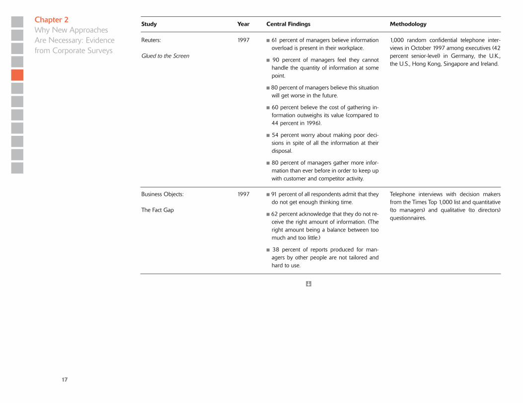
Reuters:
Glued to the Screen
1997 n 61 percent of managers believe information overload is present in their workplace.
n 90 percent of managers feel they cannot handle the quantity of information at some point.
n 80 percent of managers believe this situation will get worse in the future.
n 60 percent believe the cost of gathering in-formation outweighs its value (compared to 44 percent in 1996).
n 54 percent worry about making poor deci-sions in spite of all the information at their disposal.
n 80 percent of managers gather more infor-mation than ever before in order to keep up with customer and competitor activity.
1,000 random confidential telephone inter-views in October 1997 among executives (42 percent senior-level) in Germany, the U.K., the U.S., Hong Kong, Singapore and Ireland.
Business Objects:
The Fact Gap
1997 n 91 percent of all respondents admit that they do not get enough thinking time.
n 62 percent acknowledge that they do not re-ceive the right amount of information. (The right amount being a balance between too much and too little.)
n 38 percent of reports produced for man-agers by other people are not tailored and hard to use.
Telephone interviews with decision makers from the Times Top 1,000 list and quantitative (to managers) and qualitative (to directors) questionnaires.
Chapter 2Why New Approaches Are Necessary: Evidence from Corporate Surveys
Ì
Study Year Central Findings Methodology

18
Reuters:
Out of the Abyss
1998 n 48 percent of all questioned managers be-lieve that the situation with regard to in-formation overload will get worse (in com-parison to 56 percent giving that answer in 1996 and 80 percent in 1997).
n 67 percent of all questioned telecommunica-tions managers indicated that they think the situation with regard to information overload will get worse for them.
n Women seem to suffer more of a heavy information load than men. 41 percent of all questioned female managers indicated that the amount of information that they have to process affects their health and well-being negatively, compared to only 30 percent of male managers who indicated such a nega-tive impact on their health.
1,072 confidential telephone interviews in September and October of 1998 with man-agers in 11 countries (i.e., Germany, the U.K., the U.S., Hong Kong, Singapore, Ireland and Russia), of whom 42 percent were senior managers.
KPMG:
Knowledge Management Re-search Report
1999 n 65 percent of organizations with a knowl-edge management program complained of information overload—the creation of a knowledge glut or an overwhelming col-lection of information for information’s sake that can be difficult and painstaking to use.
n 67 percent of respondents claimed they were suffering from information overload.
n 56 percent respectively complained that employees duplicate processes and activities and have difficulty locating information.
A survey of 423 organizations across the U.K., mainland Europe, and the U.S. The enterpris-es reported at least US$300 million in rev-enue and were distributed across a number of industries including financial services, indus-trial products, consumer markets, technology, government, transportation, and others
Chapter 2Why New Approaches Are Necessary: Evidence from Corporate Surveys
Ì
Study Year Central Findings Methodology

19
Gartner:
Managing Information Survey
2001 n Nearly 90 percent of respondents said their enterprise’s competitiveness was affected by problems handling information.
n Almost 90 percent indicated a problem in at least one of four areas: “siloed” information, too much information, unindexed information, ineffective/inefficient searching procedures.
n The perception of information overload was more than 20 percent greater (over 60 percent) among knowledge management-enabled en-terprises than those that did not have a knowl-edge management program (40 percent).
n Managers spent approximately 20 percent more time on knowledge sources than non-managerial staff, with e-mail and personal net-works taking up the majority of that time. Non-managerial staff spent more time on explicit sources, notably the Internet and intranets.
The survey, among participants of Gartner conferences, received 316 responses: 81 from Brazil, 96 from Europe and 139 from the U.S. Approximately 70 percent were managers, 21 percent technical or support staff, and 10 per-cent left their position unspecified.
Economist Intelligence Unit:
Know-how: Managing Knowl-edge for Competitive Advantage
2005 n Over half (55 percent) of executives say that IT’s failure to prioritize information is the main barrier to effective decision mak-ing. Consolidating information and provid-ing consistent performance indicators are regarded as the most important step firms can take to improve the speed and quality of decision making.
n When asked where IT needs to improve most to help managers make better decisions, the top two priorities are to make it easier to analyze and drill down into information (40 percent) and improve the quality of data (31 percent). Only 12 percent of executives see ensuring access to information anywhere as a priority for improvement.
n 39 percent of the respondents complained about too much information being available as a major drawback of knowledge sharing and an impediment to decision making.
Online survey of 122 senior executives in western Europe, 68 of whom were based in the UK. Participants were selected from large organizations with over $1bn in annual sales revenue, and from a cross-section of indus-tries, with a particular emphasis on financial services, healthcare and pharmaceuticals, telecommunications and professional services companies
Chapter 2Why New Approaches Are Necessary: Evidence from Corporate Surveys
Ì
Study Year Central Findings Methodology

20
Basex:
Information Overload Strategies
2006/ 2007
n Interruptions occupy 28 percent of the work-day of a typical knowledge worker.
n On average, employees loose 2.1 hours per day thanks to unnecessary interruptions.
A survey of 1,000 knowledge workers.
Autobytel / Kelton Research:
The State of Search
2007 n Three out of four online users leave their computers without finding the piece of in-formation they were looking for.
n 72 percent of online searchers are experi-encing “search engine fatigue,” meaning they become impatient or frustrated when they are unable to quickly find the exact in-formation they need.
n 86 percent of consumers feel big search en-gines have limitations or drawbacks
Study conducted in May 2007, which involved a representative sample of 1,001 Americans, all aged 18 or older with Internet access.
Chapter 2Why New Approaches Are Necessary: Evidence from Corporate Surveys
Study Year Central Findings Methodology

21
Chapter 3
Chapter Summary
In this third chapter we provide six sub-
stantiated, relevant and practical recom-
mendations about how to shape commu-
nication to reduce overload for receivers.
We phrase these principles as paradoxes
that stimulate communicators to apply
message reduction and transformation
mechanisms in a balanced manner and
reduce overload. These six communication
principles are: familiar surprise, detailed
overview, flexible stability, simple complex-
ity, concise redundancy and unfinished
completeness. The recommendations help
communicators to get attention, compre-
hension and retention of their messages.
3.1 Resolving the Information Paradox—a Balanced Approach to Communication
The problem with communication is the illusion
that it has been accomplished.
— George Bernard Shaw
In overload situations, communicators
face what we call an information paradox:
The more information you convey, the less
your messages are informative (because of
the cognitive constraints of your audience
and the mental shortcuts that they will
inevitably take).
In order to overcome this paradox,
we require, so to speak, counter paradoxes
that help us deal with the dilemmas and
trade-offs of business communication. The
information reduction and transforma-
tion mechanisms that we have identified
from our literature review (discussed in
depth in Chapter 4, Table 6) inevitably
lead to such trade-offs: How can you com-
press your messages (making them more
concise) while simultaneously elaborating
them (making them more understand-
able)? How can you standardize your
messages, while trying to adapt them
to personal preferences and individual
information needs (personalization)? To
deal with these dilemmas we present six
recommendations in this chapter that
help communicators find a balanced
approach to communicating in overload
environments.
These recommendations help to
achieve three distinct goals that commu-
nicators must achieve with regard to their
audience: They must get their attention
and interest, they must enable compre-
hension or insight for their messages,
and their messages should be retained
or remembered (or even applied) by their
audiences.
Below, we explain how the reduction
(compress, aggregate, stage) and trans-
formation mechanisms (contextualize,
standardize, personalize, elaborate, visual-
ize) can be applied through six communi-
cation principles. Examples that contain
a backward (jj ) sign have been shown in
the first chapter of the report.
Applying these principles carefully,
communicators can avoid the typical fate
of many messages in overload environ-
ments, namely being ignored, being mis-
understood or being quickly forgotten.
3.2 Six Communication Principles for Overload Environments
To apply the information reduction and
transformation mechanisms (see Chap-
ter 4 for an in-depth discussion of these
mechanisms) adequately in a communica-
tion process, we have structured them into
six communication principles. We phrase
these principles as paradoxes in order to
motivate communicators to apply those
mechanisms carefully, e.g., balancing
reduction and transformation based on
the specific communication context. Their
sequence follows the aforementioned
goals of:
1. Getting attention.
2. Ensuring comprehension.
3. Fostering retention.
Recommendations: Shaping Messages to Reduce Overload

22
For each principle, we provide examples
and point to the reduction or transforma-
tion mechanisms to apply them in busi-
ness communication (for their scientific
background, see the appendix).
Recommendation 1
In overload environments, there is a risk
that your message will be ignored; hence
the first task is to intrigue your receivers by
communicating in a novel, yet understand-
able and unobtrusive manner—commu-
nicating in a way that resonates with your
audience, but is also pleasantly surpris-
ing to them. We call this the principle of
Familiar Surprise.
Examples
For an e-mail, use an unusual but clear ■n
subject header (i.e., a question).
For an intranet, provide an intriguing ■n
graphic that represents information in a
new way (jj Bashiba Panorama).
For a report, visualize content in an un-■n
usual visual metaphor (jj vasp strategy
metro map).
For a meeting, instead of using a slide ■n
presentation, revert to alternative media
such as a flip chart, napkins or sketch
pads (jj UBS Hand Drawing Library).
Mechanisms
transform: elaborate, visualize
Recommendation 2
Before diving into the details of a message,
employees want to know what they can
expect from it and what it will provide to
them (without being overly general). Hav-
ing caught your audience’s attention, you
must provide them with an overview of
what they will learn from your communica-
tion. You will ideally do this by providing
pointers to the details that are discussed in
your report, web site, presentation or e-mail
attachment. We call this the principle of
Detailed Overview.
Examples
For a report, include an executive sum-■n
mary.
For an intranet, use a site map (■n jj
Bayer) or a tag cloud.
For a meeting/presentation, use a graphic ■n
navigator or conceptual framework as a
basis for group discussions (jj reflact).
Mechanisms
reduce: compress, aggregate
Recommendation 3
One of the causes of overload is a high
degree of novelty of message format and
content. To ease the cognitive load of new
information on your audience, standard for-
mats, structures and terminology that are
already known by receivers should be used.
These, however, should allow for enough
flexibility and personalization. We call this
the principle of Flexible Stability.
Examples
For e-mail and reports, use standard-■n
ized memo structure (jj P&G memo
template).
For intranets, use a set of standardized ■n
web page layouts (jj Information Map-
ping method).
Mechanisms
transform: standardize, personalize
Recommendation 4
The main driver of information overload
is information quantity. A key mechanism
against overload is thus to reduce mes-
sages to their essential elements. By leav-
ing out unessential elements and relating
new information to already known facts
(for example, through visual metaphors)
complexity can be reduced (but without
distorting or oversimplifying it). We call
this the principle of Simple Complexity.
Examples
In training meetings, use large-scale ■n
maps to discuss complex issues in
groups (jj Trainiac learning map).
For e-mail, call instead of writing an ■n
e-mail.
For the intranet and presentations, use ■n
step-by-step animation to develop com-
plex topics visually (jj UBS).
Mechanisms
reduce: compress; transform: visualize,
contextualize
Recommendation 5
In overload environments, important
messages need to be provided in multiple
formats to ensure that different informa-
tion consumers can understand them
equally well. This redundancy, however,
should remain concise. We call this princi-
ple Concise Redundancy.
Chapter 3Recommendations: Shaping Messages to Reduce Overload

23
Examples:
For an intranet, provide multiple views ■n
on intranet content (jj Bayer, UBS).
For reports and meetings, present ■n
things through facts and numbers,
models and diagrams, and stories and
vivid images (jj Trainiac).
Mechanisms
transform: elaborate, personalize
Recommendation 6
Information should stimulate and lead
to action. It should invite readers to
think further and fill the gaps of how to
implement the information. Although the
provided information should be complete,
it should still leave opportunities for
recipients to elaborate on it. We call this
principle Unfinished Completeness.
Examples:
For the intranet,■n use Web 2.0 function-
alities such as the talk-back function
(jj IBM).
For e-mail, write e-mails with tick boxes ■n
at the end to speed up the answering
process.
For meetings, use polling, voting or ■n
open questions to involve participants;
provide empty thinking templates
(jj Grove).
For reports, provide springboard ques-■n
tions for readers (things to think about).
Mechanism
transform: elaborate, personalize
3.3 Summary and Implementation Aids
In the following visual metaphor of a light
house, we have summarized these six
principles, as well as their basis, namely
the eight message mechanisms and the
seven information attributes identified in
our literature review. The light house be-
low also contains, as three small icebergs,
the three communication goals that the
mechanisms and principles should help to
achieve.
Business communicators can use the
six communication principles as simple
checkpoints in the following manner:
1. Familiar Surprise: How can I convey
my message in a motivating and origi-
nal, yet accessible way?
2. Detailed Overview: How can I put de-
tails into context and give my audience
an overview and preview?
3. Flexible Stability: Which recurring,
efficient format or structure can I use
in my communication that is easily rec-
ognized but also sufficiently flexible?
Figure 2: The six principles
and their context in overview
Chapter 3Recommendations: Shaping Messages to Reduce Overload

24
4. Simple Complexity: What does my
target group really need to know? What
can I leave out? How can I relate my
message to what people already know
(leverage previous knowledge)?
5. Concise Redundancy: How can I
make my message accessible to differ-
ent people in different ways? How can
I provide different gateways to under-
standing?
6. Unfinished Completeness: How can
I involve, stimulate and engage my
audience? How can I get them to apply
the information and transfer it to their
own context?
We can also view the principles as a
shift in the way that communication is
conceived in business. In the table below,
we contrast this principled approach of
overload-aware communication (on the
right) with some of the more traditional
assumptions regarding employee commu-
nication (see Table 3, left column).
Standard Employee Communication Overload-aware Employee Communication
I will use the same style and bureaucratic tone to inform employees so that they recognize the message is coming from me.
From novel annoyance...
I will try to reframe my message in an unex-pected way that helps employees to under-stand the topic because it lets people connect what they already know with the new infor-mation I provide.
....to familiar surprise
I should get right to the point and provide the necessary details.
From detail overload....
I must first provide a context and an overview before I present the details.
...to detailed overview
I should vary my communication and always choose a new format, structure and style in order not to bore my audience.
From arbitrary variation...
I should ease the cognitive burden on my audience by communicating in a flexible but standardized structure so that they become familiar with the logic of my messages.
...to flexible stability
I should try to simplify things as much as pos-sible in order not to confuse people.
From complex simplifications...
I should try to transform the complex mes-sage into something intuitive that is accessible to my audience, for example, through meta-phors, analogies or images.
...to simple complexity
The more I communicate the same message, the more likely my audience is to get the message I want to convey.
From mindless repetition...
I should communicate my messages when the audience is most receptive to them and in a way that makes them accessible to different people.
...to concise redundancy
I must avoid ambiguity or missing elements at all cost and answer up front every conceivable question that my audience might have.
From definitive sterility...
I should make my messages somewhat open to multiple interpretations and stimulate my audience to adapt the content to their own context.
...to unfinished completeness
Table 3: Regular versus
overload-aware business
communication
Chapter 3Recommendations: Shaping Messages to Reduce Overload

25
It goes without saying that overload-aware
communication requires extra effort by
communicators (in the short run) when
preparing their messages. In the long run,
however, these efforts will become seam-
less and part of an established commu-
nication routine. Consequently, business
communicators will profit from greater at-
tention, deeper understanding and longer
retention of their messages. In the short
run they need the support of their organi-
zation to implement the mechanisms and
principles discussed in this report. They
need to overcome the implementation gap
in overload-aware communication.
3.4 Scientific Background of the Six Communication Principles
The following table compiles some of
the scientific background behind the six
communication principles outlined in this
chapter.
Table 4: The scientific
underpinning of the six
communication principles
Principle Background Rationale and Findings Select References
Familiar Surprise Surprise Enhances Attention and Learning Novelty and the feeling of surprise lead us to reallocate our attention-related resources to the unexpected event and provides an initial moti-vational impetus for reviewing our current ways of knowing. Neurologi-cal research finds that surprise and novelty are instrumental for memory formation and associative learning.
Meyer, W., Reisenzein, R. & Schützwohl, A. (1997). Toward a process analysis of emo-tions: The case of surprise. Motivation and Emotion, 21(3), 251–274.Ranganath, C., & Rainer, G. (2003). Neural mechanisms for detecting and remembering novel events. Nature Reviews Neuroscience, 4 (3), 193–202.
Familiarity Reduces Information Overload The more novel a piece of information to a person, the more effort he/she needs to retrieve its relevant aspects and to understand and incor-porate it. This is why more experienced people suffer less from informa-tion overload. Novel information can be understood more easily if it is presented in a structure and language (e.g., importance of analogies) that is already known to its audience.
Schneider, S.C. (1987). Information overload: Causes and consequences.Human Systems Management, 7(2), 143–153. Swain, M. R., & Haka, S. F. (2000). Effects of information load on capital budgeting decisions. Behavioral Research in Accounting, 12(1), 171–199.
Detailed Overview Overview Requires Interconnecting Details Communicators, who aim to convey an overview on a complex issue, often cannot start top-down by explaining the broad concepts and then moving to details. Instead, they have to weave in details and examples and relate them to broader categories to make the latter meaningful.
Ringach, D. L. (2003). Look at the big picture (details will follow). Nature Neuroscience, 6(1). Shneiderman, B. (1996). The eyes have it: A task by data type taxonomy for information visualizations. Visual Languages, 1996. Pro-ceedings. IEEE Symposium, 3(6): 336–343.
Ì
Chapter 3Recommendations: Shaping Messages to Reduce Overload

26
Flexible Stability Stability Through Standard Representation Facilitates Quick Orientation Uncertainty, ambiguity and variety of information increase the per-ceived information load. To better cope with this, information and information processes should be standardized. In a report with a standardized structure, the general orientation is easier and relevant information can be more quickly located. In relation to this insight, Ber-ghel proposed to promote information brands for specific standardized forms of information.
Bawden, D., Holtham, C., & Courtney, N. C. (1999). Perspectives on information overload. ASLIB Proceedings 51(8): 249–255. Berghel, H. (1997). Cyberspace 2000: Deal-ing with information overload.Communications of the ACM, 40(2), 19–24.
Standardized but Flexible Information Objects Enable Inter-disciplinary Communication Flat organizations, teamwork and interdisciplinary collaboration are key causes of information overload. Research has found that in order to facilitate communication and collaboration in multidisciplinary teams, information objects need to be characterized both by flexibility and sta-bility. Flexibility enables the various specialists to make the information meaningful in their specific context, while stability allows for a structure that is common to the various fields of expertise and that can thus serve as a means for translation and mediation.
Star, S. L., & Griesemer, J. R. (1989). Insti-tutional ecology, “translations” and bound-ary objects: Amateurs and professionals in Berkley’s Museum of Vertebrate Zoology, 1907–39. Social Studies of Science, 19(3): 389–420. Carlile, P. R, (2002) A pragmatic view of knowledge and boundaries: Boundary objects in new product development. Organization Science, 13(4), 442–455.
Simple Complexity
Activating Previous Knowledge Reduces Complexity and Cognitive Load Extraneous information load can be reduced by representing complex information in a way that activates previous relevant knowledge. In this way the amount of communicated information can be considerably reduced. Previous knowledge can be activated through comparisons, analogies or metaphors. Researchers have demonstrated the positive effects of such methods for learning experimentally.
Newby, T. J., Ertmer, P.A., & Stepich, D.A. (1995). Instructional analogies and the learning of concepts. Educational Technology Research and Development 43(1), 5–18. Ortony, A. (Ed.). (1993). Metaphor and thought. Cambridge: Cambridge University Press.
Adequate Representation Reduces Cognitive Effort Schneider has found that complexity of information adds to informa-tion overload. The simpler a piece of information can be represented (without distorting it), the less cognitive effort is needed to understand it. Unessential elements or repetitions should be eliminated. In addition, using schemas or categorizations also helps to absorb complexity.
Schneider, S.C. (1987). Information overload: Causes and consequences. Human Systems Management, 7(2), 143–153.
Pollock, E., Chandler, P., & Sweller, J. (2002). Assimilating complex information. Learning and Instruction, 12(1), 61–86.
Ì
Chapter 3Recommendations: Shaping Messages to Reduce Overload
Principle Background Rationale and Findings Select References

27
Concise Redundancy
Alternative Representation Formats can Foster Understanding if They Are Not Competing for Cognitive Resources Multi-modal (i.e., visual and verbal information) representations of the same information content can be beneficial to understanding and conducive to learning and remembering. This, however, is only the case if the redundancies in information presentation are not overly complex and remain concise.
Moreno, R. & Mayer, R. E. (1999a). Cognitive principles of multimedia learning: The role of modality and contiguity. Journal of Educational Psychology, 91(2), 358–368. Sweller, J., Van Merriënboer, J., & Paas, F. (1998). Cognitive architecture and instruc-tional design. Educational Psychology Review, 10(3), 251–296.
Unfinished Com-pleteness
Incompleteness Forces Audiences to Make their Own Representations Explicit and Facilitates Sense Making and Learning By consciously leaving gaps or raising questions about an issue, readers or viewers have to activate their prior knowledge of an issue and make their own implicit representations explicit. This fosters understanding and recall. Audiences are encouraged to reconstruct knowledge rather than simply consume information.
Valcke, M. (2002). Cognitive load: Updating the theory? Learning and Instruction, 12(1), 147–154. Van Merrienboer, J. J. G., & Sweller, J. (2005). Cognitive load theory and complex learning: Recent developments and future directions. Educational Psychology Review, 17(2), 147–177.
Chapter 3Recommendations: Shaping Messages to Reduce Overload
Principle Background Rationale and Findings Select References

28
Chapter 4
Chapter Summary
The existing literature on information
overload is fragmented and dispersed and
often emphasizes only a specific aspect of
the topic (such as the role of information
technology). This report, by contrast, re-
views the various insights into the academ-
ic and management-oriented literature to
present a comprehensive view of overload
symptoms, causes and countermeasures.
We then focus on information (or the
message dimension) and review seven
attributes of information that contribute
to overload, namely message intensity,
quantity, uncertainty, ambiguity, diversity,
novelty and complexity. These characteris-
tics should be taken into consideration in
business communication through message
reduction and transformation mecha-
nisms. Based on existing research and this
distinction, we present eight information-
focused strategies to reduce overload in
business communication: information
compression, aggregation, sequencing,
contextualizing, personalization, elabora-
tion, standardization, and visualization.
4.1 Introduction: An Overview of the Effects and Root Causes of Information Overload
Information overload is one of the pressing
issues of today’s increasingly fast- paced,
complex and communication-intensive
business world. Diverse, complex and
often ambiguous information reaches
receivers with high intensity and through
a multitude of channels (Hallowell, 2005).
As a consequence, employees experience
information fatigue (Wurman, 2001),
lose sight of the big picture (Schick et al.,
1990), are paralyzed by analysis (Bawden,
2001), confused about the value and im-
portance of information or simply refuse
to receive communication, and develop
radical filter strategies (Milgram, 1970).
Figure 3 gives a more systematic over-
view of the problematic consequences or
symptoms of information overload. First,
we can observe that because of informa-
tion overload, active information search
and retrieval practices may become
unsystematic and excessively focused
(Swain & Haka, 2000, Cook, 1993). Second,
information analysis and organization
become more arbitrary as peripheral cues
are overestimated and the relationship
between details and overall perspective
is lost (Owen, 1992). As a consequence,
decisions become less accurate (Chewn-
ing & Harrel, 1990; Hwang & Lin, 1999;
Pennington Tuttle, 2007), are frequently
delayed, and work is generally conducted
less effectively (Bawden, 2001). Finally,
on a personal level, people feel cognitive
strain, stress, and become gradually more
dissatisfied and de-motivated (Baldacchino
et al., 2002; Schick, 1990).
In order to counteract these various
problematic consequences of information
overload, several studies have addressed
the drivers or root causes of information
overload (Edmunds & Morris, 2000; Eppler
& Mengis, 2004). The most obvious driver
is the amount and intensity of received
information, but—as we will see—other,
more qualitative characteristics of infor-
mation also cause information overload.
In addition, it is not only information it-
self but also the characteristics of informa-
tion technology, work processes or tasks;
forms of organizing; and personality
traits (including skills), that contribute to
whether or not, metaphorically speaking,
the sea (or better lake) of information will
overspill its banks (see Figure 3).
Regarding the characteristics of work
tasks, for example, several studies have
found that if tasks are complex and inter-
dependent, and processes are often novel
or require constant modification, infor-
mation processing requirements increase
and information overload is more likely to
occur (Tushman & Nadler, 1975; Grise &
Gallupe, 1999, 2000).
The Causes of Information Overload—A Review of the Literature

29
Chapter 4The Causes of Information Overload—A Review of the Literature
Forms of organizing also contribute to in-
formation overload: With more interdisci-
plinary teams, coordination and commu-
nication needs rise, and employees—and
even more so managers—spend a consid-
erable percentage of their work time in
meetings (49–65 percent for managers;
Mintzberg, 1973; Tengblad & Jönsson,
2002) a phenomenon also referred to as
meeting overload (Rogelberg et al., 2007).
While Figure 3 provides an overview of
all types of causes of information over-
load, we will focus—in the following part
of this review—on information itself. The
rationale for this choice is that informa-
tion is the most readily changeable factor
contributing to overload. While not every-
one can change the organizational design,
the task characteristics, the personality
profiles, or the information technology in
an organization, each individual commu-
nicator can use mechanisms to make his
or her information more usable, informa-
tive and memorable.
In this way, we hope to give the readers
of this report practical information about
how to reduce information overload by
addressing information characteristics for
optimal reception and processing.
Symptoms of Information Overload
Limited Search & Retrieval
Highly selective search: omission ■■
(Edmunds & Morris, 2000)
Less systematic search strategies ■■
(Swain & Haka, 2000)
Arbitrary Information Analysis & Organization
Peripheral cues are overestimated (Owen, 1992).■■
There is a lack of critical evaluation (Shenk, 1997; ■■
Pennington & Tuddle, 2007).
Strenuous Personal Situation
Greater tolerance of error ■■
(Sparrow, 1999)
Confusion & cognitive strain (Jones, 1997)■■
Suboptimal Decisions
Decision quality lowered (Jacoby, 1984)■■
Potential paralysis and delay of decisions (e.g., ■■
Bawden, 2001)
Causes of Information Overload
Information Characteristics
Complexity of information (Miller, 2008)■■
Ambiguity of information (Sparrow, 1999)■■
Information Technology Properties
Push systems like e-mail (Bawden, 2001)■■
One message on multiple channels (Edmunds and ■■
Morris, 2000)
Personal Routines, Attitudes and Expertise
Poor motivation or skills (Muller, 1984)■■
Task Characteristics
Complex tasks (Speier et al, 1999)■■
High task interdependence (Tushman & Nadler, 1975)■■
Forms of Organizing
Disintermediation (Schneider, 1987)■■
Cross-disciplinary teams and high coordination needs ■■
(Grise & Gallupe, 1999)
Frequent task interruptions (Speier et al., 1999)■■
Figure 3: Symptoms
and causes of information
overload

30
4.2 Insights on Information Overload based on Existing Studies
Analyzing dozens of seminal studies on
overload from the last 40 years, we have
found four key insights on how to prepare
messages for overload environments.
These insights are reviewed below and
converted into action items for business
communicators.
Insight 1: Overload should not only be addressed by the receiver, but also by the communicator
Employees experience information
overload regularly in their daily work
practices (Edmunds & Morris, 2000). They
receive information through a multitude
of media devices; spend an average of
two hours each day to check, respond
and write e-mails (see: Thomas and King,
2006, on e-mail overload); skim through
mountains of lengthy reports; and try to
find the relevant and pertinent piece of
information in the over 165 million web
sites of the Internet (as of May 2008, see
netcraft.com). In order not to get lost in
this mass of information, employees use
and develop a variety of coping strategies:
They block out sources, delegate informa-
tion processing tasks to others, focus only
on confirming evidence, or use filtering
devices and automated clustering tools
(intelligent agents) for incoming e-mails
(Schuff et al., 2007; Edmunds & Morris,
2000). When using the Internet, they
may use social bookmarking sites and
other rankings to guide them in finding
valuable and helpful information. But in
addition to fighting information overload
as a consumer of information, the phe-
nomenon can also be addressed from the
side of the information producer. Com-
munication professionals play a decisive
role in the production side and are able to
influence future standards of communica-
tion formats and processes (IfF & Gallup,
1996). Because of their key role in fighting
information overload, the remainder of
this review focuses on how communica-
tors can shape and organize messages and
communication processes so that informa-
tion overload can be contained.
Action Implication: Business communicators
should critically review their own contribution
to the information overload problem.
Insight 2: Overload is not just caused by too much information: information characteristics determine the degree of cognitive load
Contrary to the widespread belief that
information overload is simply the result
of too much information, research on the
phenomenon has consistently shown that
it is not only the amount of information
that contributes to information overload
but also more qualitative information
attributes or characteristics (Keller &
Staehlin, 1987; Owen, 1992; Schneider,
1987, Simpson & Prusak, 1995). In other
words, reducing overload is both a ques-
tion of how much information is provided
and what kind of information is commu-
nicated.
Table 5 outlines the various character-
istics of information that affect informa-
tion overload. Next to the amount of
information items and their intensity, five
other information characteristics contrib-
ute to overload. These include the level of
uncertainty (or reliability) of information,
its novelty, its complexity, the ambigu-
ity associated with the interpretation of
a piece of information, and the diversity
among various information items (for
example, with regard to format or style).
Regarding novelty, for example, the
more the format or content of a message
is unfamiliar to a reader, the less quickly
he or she can compare these ideas with
already acquired knowledge. Additional
time for elaboration is required, which
can easily lead to a feeling of overload.
Relating novel information to already
known contents is thus a key mechanism
to reduce overload. The same is true if the
format, structure, and style of the report
are unfamiliar to the reader or if such
formats constantly change (the diversity
attribute).
The practical lesson from this insight
is that business communicators must
reflect and act on these attributes of
information—e.g., by using a consistent
format and thus reducing novelty and
diversity, contextualizing messages to
reduce ambiguity, sequencing messages to
Chapter 4The Causes of InformationOverload—A Reviewof the Literature

31
reduce intensity and complexity, indicat-
ing sources or methods of a finding to
reduce uncertainty—and thus enhance
their audience’s capacity of processing
information (Simpson & Prusak, 1995;
Sparrow 1999).
Action Implication: Business communicators
should critically examine the information char-
acteristics of their own communication products
and evaluate them regarding key information
characteristics that contribute to overload, such
as diversity, complexity, ambiguity or intensity.
Information Attributes References
How much?
Intensity: Number of messages per time unit Schick et al., 1990 ; Simpson & Prusak ,1995
Quantity: Number of messages and amount of information per message. Bawden, 2001; Herbig & Kramer, 1994; Ja-coby, 1977, 1984; Malhotra, 1982; Schneider, 1987; Sparrow, 1999
What kind?
Uncertainty of information: The value of information is unclear as its sources are questionable, evidence is contradicting and the validity period uncertain.
Schneider, 1987; Sparrow, 1999; Tushman & Nadler, 1978
Ambiguity of information: On the basis of a piece of information, multiple interpretations are possible and equally likely.
Schneider, 1987; Sparrow, 1999; Sutcliffe, 2005; Lesca & Lesca, 1995; Mulder et al. 2006
Diversity of information: Contradicting information is at hand (e.g., studies with different findings, different sources), and similar information is present-ed in different styles and presentation formats.
Bawden, 2001; Iselin, 1988; Schroder et al., 1967; Speier, Valacich, Vessey, 1999
Novelty of information: Information entails new and unknown insights and is represented in unusual style or format.
Schneider, 1987; Miller, 2008; Herbig & Kramer, 1994
Complexity of information: The number of information items and their (types of) interrelations are high.
Schneider, 1987; Schroder et al., 1967; Miller, 2008
Table 5: Key attributes
of information contributing
to information overload
Chapter 4The Causes of InformationOverload—A Reviewof the Literature

32
Medium
Mechanism
Guidelines for Reducing Information Overload
E-mail Intranet Report Meeting
Red
uce
Compress Compress individual infor-mation items by eliminating redundancies or digres-sions (Grise & Gallupe, 1999/2000; Hiltz & Turoff, 1985; Iselin, 1988; Koniger & Janowitz, 1995).
Limit e-mail to one topic per message.
Adjust content to screen size to avoid scrolling.
Provide an executive sum-mary.
Keep statements short and iterate contributions.
Aggregate
Aggregate, categorize and structure sets of information or their sources for easier overview (Ackoff, 1967; Grise & Gallupe, 1999/2000; Iselin, 1988; Koniger & Janowitz, 1995; Scammon, 1977; Meg-lio & Kleiner 1990; Nelson, 2001; Minto, 1995).
Provide digests of group discussions via e-mail.
Provide a dis-cussion thread (newsgroup) instead of e-mail conversations.
Provide a site map/portal and tag clouds if applicable.
Pyramid prin-ciple: Show the main implica-tion, key find-ings and under-lying facts as a report summary.
Clustering: Use ”war room”-like metaplan techniques to ag-gregate discussed information visually; use graphic facilita-tion tools such as lets-focus.com
Sequence/Bundle
Sequence information so that it arrives at the moment of need (Berghel, 1997; Eppler & Will 2001).
E-mail digests (summary mails)
Periodic notification services (RSS)
Just-in-time delivery instead of just-in-case
Jour fixe (set meet-ing day and time).
Insight 3: Communicative countermeasures against information overload must address key information characteristics through reduction and transformation mechanisms
Information overload is caused by both
quantity and quality of information
(Davenport & Prusak, 1998; Eppler, 2006;
Thomas & King, 2006). Quantity should,
whenever possible, be reduced, while
quality should be increased by trans-
forming information into a more useful
format (Ackoff, 1967).
Table 6 provides an overview of such
reduction and transformation mecha-
nisms focusing on information attributes.
These suggestions deal with the timing,
content and form of information (O’Brien
& Marakas, 2008). They help communica-
tors to get attention for their messages,
to enable quick and easy comprehension,
and generally to create information that is
remembered and acted upon.
Table 6: Message mechanisms
that help to reduce information
overload
Chapter 4The Causes of Information Overload—A Reviewof the Literature
Ì

33
Tran
sfor
m
Contextualize Embed information in the overall situation/environment; relate new information to pre-vious information (Davenport & Prusak, 1998; Eppler, 2006; Mulder et al., 2005).
Relate answer to previously sent e-mail sections.
Provide current position in navi-gation tree.
State target groups and goal of report; indicate related reports.
Show prior meet-ing results and time line; dialogues, not presentations.
Personalize Personalize and customize information, e.g., develop various versions of a message with various levels of detail for different target groups (Ansari & Mela 2003; Ber-ghel, 1997; Denning, 1982; Meglio & Kleiner, 1990).
Personal e-mail opening and closure
Customizable portal as starting page
Targeted sec-tions, stating implications for different target groups
Break-out sessions, one-on-one meetings
Elaborate Create value-added informa-tion, such as action items, ratings and rankings by the community on the useful-ness/value of provided infor-mation, stories, metaphors, etc. (Denning, 1982; Simpson & Prusak, 1995).
Flags on urgency and importance of message; informative subject header
Tags, rankings, indicators of page views, comment sec-tions
Examples or case boxes, illustrative anecdotes, analogies, etc.
Permanently visible meeting agenda (items to discuss and their sequence) and to-do list.
Standardize Define standards, e.g., set guidelines for information and communication formats, such as e-mail or report-ing etiquette (Allert, 2001; Bawden, 2001; Keller & Stae-lin, 1987; Meglio & Kleiner, 1990; Simpson & Prusak, 1995).
Standard e-mail structure (i.e., context, fact, implications, actions needed)
Web page templates and defined page typology
Memo structure (i.e., situation, complication, implication, pro-posal, rationale, alternatives)
Use standard meeting agenda and standardized meeting minutes.
Visualize
Visualize information: Use graphs and diagrams but also qualitative visualization methods like metaphors or sketches) (Shimoijma, 1996; Larkin & Simon, 1987; Lurie & Mason, 2007; Meyer, 1998; Tversky, 2005; Chan, 2001).
Visualize e-mail trail.
Graphic site-map or visual site navigator
Summary and overview diagrams, sum-marize numeric tables through graphs
Graphic facilitation: framework-based discussions and instant visual meet-ing minutes
Medium
Mechanism
Guidelines for Reducing Information Overload
E-mail Intranet Report Meeting
Chapter 4The Causes of InformationOverload—A Reviewof the Literature

34
Reduction and transformation mecha-
nisms thus aim at changing the format,
timing or scope of information to make it
more usable and informative. Specifically,
reduction processes either reduce the
complexity of a single message (informa-
tion compression) or of a set of messages
(information aggregation). Another type
of reduction strategy aims to reduce the
pace at which new information is commu-
nicated—for example, by communicating
information at the moment the receiver
can actually apply it. Transformation
mechanisms, by contrast, modify messag-
es to make them more valuable, reliable,
understandable and usable. They thus
reduce novelty, uncertainty, diversity and
ambiguity. Such transformation might
consist of adding contextual cues (such as
stating target groups); adapting informa-
tion to personal preferences or needs
(i.e., by stating implications for different
roles); elaborating its content through
metaphors or stories; adapting it to a well-
known, standard format; or enriching it
with intuitively understandable graphics.
Action Implication: Business communicators
should examine whether they systematically
integrate reduction and value-adding transfor-
mation mechanisms into their communication
work. They should look for ways to compress
or aggregate information (i.e., categorize);
improve the timing of their communication
(i.e., bundle); and add value to information
through contextualization (i.e., relate message
to prior information), personalization (i.e., filter-
ing), standardization (e.g., recurring structure),
elaboration (i.e., storytelling), and visualization
(i.e., diagrams).
Insight 4: These mechanisms can be implemented and scaled through standards, training, tools, roles, and processes
While the above mechanisms can be used
by any individual business communica-
tor, only their organizationwide adoption
will reduce overload consistently (Mulder
et al., 2006). Thus, the reduction and
transformation mechanisms compiled
above require some degree of collective
effort and as such cannot be implemented
easily. They require standards that define
how communication can be optimized,
which in turn may require formal train-
ing (Allert, 2001) and supporting tools
(Alessandrini, 1992; Winston, 1994), and
in some cases even new communication
roles or processes (such as communication
quality officers, information aggregators
or information compression or overload
monitoring processes).
Action Implication: Business communicators
should devise ways to institutionalize reduction
and transformation mechanisms for informa-
tion and make them compatible with their
established practices. They should frequently
measure the perceived information overload
through surveys.
4.3 Conclusion: Overcoming the Implementation Gap
As we have seen from this chapter, reduc-
ing information overload is also the
responsibility of communicators and not
just of those receiving information. Com-
municators should address the informa-
tion characteristics that drive the overload
problem, and they should do this in an
orchestrated manner. Message reduction
and transformation mechanisms are well
known, but their implementation still
remains a challenge. The literature review
we have conducted has also shown that
reasons for insufficient deployment of
such strategies have not been researched
thoroughly. Hence, reasons for insufficient
use will be addressed by our IABC survey
in the next chapter.
Chapter 4The Causes of Information Overload—A Reviewof the Literature

35
Chapter 5
Chapter Summary
In June and July 2008 we surveyed 568
IABC members, mostly active in internal
or external communication, regarding
their views on visualization as a counter-
strategy against information overload. The
results of the survey show that these expe-
rienced professionals see great potential in
this approach, especially for aggregating
or synthesizing information and relating
it to make it more comprehensible. They
see their own limited time and knowledge,
and the lack of adequate visualization
tools, as the biggest implementation bar-
riers.
5.1 Objectives of the Survey
The survey presented in this chapter had
three main objectives with regard to the
implementation gap in reducing overload
in business communication:
1. Explore the potential of visual formats
to effectively reduce information over-
load in internal communication.
2. Shed light on the actual use of concep-
tual diagrams and visuals metaphors in
meetings, presentations, reports or in
e-mail communication.
3. Gain an understanding of the major
benefits, but also challenges and draw-
backs, when using visual formats in
internal communication.
5.2 Results
5.2.1 Demographics: Who Participated in the Survey?
A total of 568 IABC members responded
to the survey, of which 293 answered the
questionnaire version on visual metaphors
and 275 the one on conceptual diagrams.
Of the respondents, 77.7 percent (432)
were female, while 22.3 percent (124)
were male (see Figure 4). On average, the
respondents were 43 years old; half of all
respondents were younger than 44 years
old (see: Figure 5).
Visual Communication to Reduce Overload—Results from a Survey of IABC Members
2Information on the method with which we have conduct-
ed the survey can be found in Appendix 1. The question-
naire distributed for the survey can be found in Appendix
2. It shows the version dedicated to conceptual diagrams
as it was distributed to half of the sample. For the other
half of the sample, the same questionnaire was distributed,
yet the questions regarded visual metaphors. The example
visual metaphors provided are depicted in Appendix 3.
Figure 5: Age distribution among
respondents
Figure 4: Gender distribution
among respondents
77.7%
22.3%
femalemale
What is your gender?
80706050403020
How old are you?
50
40
30
20
10
0
Freq
uenc
y
Mean =43.48 Std. Dev. =9.344
N =556

36
The largest percentage of the respond-
ents works in internal communication
(24.7 percent), followed by corporate com-
munication (20.8 percent), advertising/
marketing communication (8.3 percent),
external communication (6.2 percent), and
public relations (6.2 percent) (see Figure
6). Respondents indicated that they have
on average 13 years of experience in their
current job profile.
The industries in which the respond-
ents work vary greatly. The greatest
percentage work in the following four
industries:
1. Consulting (9.7 percent of all respond-
ents)
2. Finance/banking (9.5 percent)
3. Education (7.9 percent)
4. Government/military (7 percent)
5.2.2 Familiarity: Are Visualization Methods such as Conceptual Diagrams and Visual Metaphors Known by Communications Managers?
The short answer: The IABC members
indicate that they are quite familiar with
visualization methods, such as conceptual
diagrams or visual metaphors.
Figure 7 gives a first overview on
respondents’ expressed familiarity. While
they seem to know visual metaphors and
conceptual diagrams rather well (if asked
generally) and indicate also a rather good
understanding of the contexts in which
these visuals can be used, they express
less confidence when asked if they know
the conventions used to build such visuals
and whether they could develop them
themselves.
When comparing means across
individual familiarity and organization-
wide familiarity, we see that respondents
indicate higher familiarity with visual
forms of communication for themselves
rather than for the other members of
their organization. In addition, they be-
lieve that their colleagues might be more
familiar with conceptual diagrams than
with visual metaphors, yet they say they
are equally familiar with both types of
visualization.
34
77.7%
22.3%
femalemale
What is your gender?
Figure 4: Gender distribution among respondents
80706050403020
How old are you?
50
40
30
20
10
0
Freq
uenc
y
Mean =43.48 Std. Dev. =9.344
N =556
Figure 5: Age distribution among respondents
The largest percentage of the respondents works in internal communication (24.7 percent), followed by corporate communication (20.8 percent), advertising/marketing communication (8.3 percent), ex-ternal communication (6.2 percent), and public relations (6.2 percent) (see Figure 6). Respondents indicated that they have on average 13 years of experience in their current job.
Figure 6: Job functions of the respondents
other (20.25%)technology (0.18%)
strategic planning (1.23%)
public relations (6.16%)
public information (1.23%)
public affairs (1.41%)
new media/electronic (0.7%)
media relations (1.58%)marketing (5.81%)
issues management (0.35%)
investors relations (0.18%)
corporate communication (20.77%)
community relations (1.06%)
advertising/marketing communication (8.27%)
external communication (6.16%)
internal communication (24.65%)
What is your function in your organization?
Chapter 5Visual Communication to Reduce Overload—Results from a Survey of IABC Members
Figure 6: Job functions
of the respondents
Figure 7: Familiarity with conceptual
diagrams and visual metaphors
I am familiar with visual formats such as the ones shown before (although I might not know the specific ones shown here)
I know in which contexts it is suitable to use such visual formats
I know in which contexts it is suitable to use such visual formats
I am familiar with visual formats such as the ones shown before (although I might not know the specific ones shown here)
I know in which contexts it is suitable to use such visual formats
I know in which contexts it is suitable to use such visual formats
internal communication (24.65%)
corporate communication (20.77%)
advertising/marketing communication (8.27%)
external communication (6.16%)
marketing (5.81%)
public relations (5.16%)
media relations (1.58%)
public affairs (1.41%)
public information (1.23%)
strategic planning (1.23%)
community relations (1.06%)
new media/electronic (0.7%)
issues management (0.35%)
investors relations (0.18%)
technology (0.18%)
other (20.25%)

37
5.2.3 Use: Are Visual Methods Used in Employee Communication?
The short answer: Visual communication
does not seem to be highly used for inter-
nal communication, and there is a rather
clear gap between the familiarity with
visuals and their actual use.
Visual metaphors were reported to be
used more often than conceptual dia-
grams for internal communications (see
Figure 8). This is not true when asking
for respondents’ individual use of visual
communication as opposed to the visual
communication practices of their organi-
zation in general. One can interpret this
finding to indicate that communication
professionals perceive themselves, as the
arbiters of organizational communica-
tion, to be more innovative and creative in
their ways of communicating than their
colleagues.
If we look at the use of visual com-
munication for specific media channels
(see Figure 9), we see that both conceptual
diagrams and visual metaphors are most
frequently used in presentations, fol-
lowed by reports and meetings. The more
analytic and number-driven conceptual
diagrams are said to be more important
for reports than visual metaphors.
Figure 8: Use of visual formats
(i.e., conceptual diagrams,
visual metaphors) for internal
communication
Figure 9: Media-specific use
of visual communication
Chapter 5Visual Communication to Reduce Overload—Results from a Survey of IABC Members
How often do you use visual metaphors/conceptual diagrams?
Visual M
etaphors
Conceptual Diagram
s
1.84
2.9
2.95
3.54
in presentations
as e-mail attachments
in reports
in meetings
1.82
2.73
3.03
3.21
1 2 3 4 5
in presentations
as e-mail attachments
in reports
in meetings
never extremely often
* mean values
*
Do you personally use.. ..visual metaphors.. ..conceptual diagrams..
..in your communication?
When you prepare workshops, meetings, presentations, reports, or other documents, do you use ..
.. visual metaphors? .. conceptual diagrams?
Are..
.. visual metaphors.. ..conceptual diagrams.. .. part of your normal communication toolbox?

38
5.2.4 Benefits: Why Should Visual Formats Be Used in Internal Communication?
The short answer: Visuals seem to be
most beneficial for 1) aggregating differ-
ent types of information and showing
their interconnections; 2) compressing
and synthesizing information; 3) making
information more easily understandable;
and 4) making information more quickly
understandable (as emphasized by arrows
in Figure 10). Figure 10 shows the mean
values for the various potential benefits of
visualization. Respondents rated visuals
to be in between “rather effective” and
“effective,” and for some areas even to be
above “effective.” Overall, IABC members
appreciate visuals as an effective way of
communicating within the organization.
Regarding the question whether using
visualization brings benefits that are said
to reduce information overload, we see
that visualization is said to be beneficial
for compressing and aggregating informa-
tion. For other aspects relevant to reduc-
ing information overload, visualization is
deemed to be less effective: With regard
to standardizing, bundling or adjusting
information to the preferences of your
audience, visualization is not the most
effective method. Finally, if asked directly
whether the use of visualization is an
effective way to reduce information over-
load, people responded rather positively
with an average of 3.66 (between “rather
effective” and “effective”).
Figure 10: Benefits of using visual formats
in internal communication
Table 7: Major Benefits of Visual Metaphors and Conceptual Diagrams (mean values
in parenthesis, ranging from 1 = “not effective at all” to 5 = “very effective”)
Visual Metaphors Conceptual Diagrams
1. Make information more easily understand-able (4.21)
2. Make information more quickly under-standable (4.21)
3. Compress and synthesize information (4.18)
4. Make information more easily memorable (4.13)
5. Aggregate different types of information and show their interconnections (4.11)
1. Aggregate different types of information and show their interconnections (4.02)
2. Compress and synthesize information (3.93)
3. Make information quickly understandable (3.79)
4. Make information more easily understand-able (3.76)
5. Add value to the message you aim to convey (3.76)
Chapter 5Visual Communication to Reduce Overload—Results from a Survey of IABC Members
Rate the Effectiveness of Conceptual Diagrams/Visual Metaphors
3.35
3.44
3.53
3.66
3.78
3.81
3.87
3.99
4.01
4.07
4.07
1 2 3 4 5
to standarize the way with which you can convey information
to better bundle and time your messages in the communication
to adjust your message to the knowledge and preferences of your audience
to reduce information overload
to embed information in a context that is meaningful to your recipient
to make people remember my messages better
to add value to the message you aim to convey
to make information more quickly understandable
to make information more easily understandable
to aggregate different types of information and show their interconnections
to compress and synthesize information
Not effective at all
very effective
*
* M
ean
valu
es

39
A further interesting finding is that
visual metaphors are perceived as signifi-
cantly more beneficial than conceptual
diagrams with regard to involving emo-
tions in one’s communications, making
people remember one’s communications
better and making information more
quickly understandable.
5.2.5 Barriers: What Challenges Need to Be Addressed to Exploit Visual Formats?
The short answer: The major impediments
to using visuals—such as visual metaphors
or conceptual diagrams—are that employ-
ees do not have enough time to develop
them and that they lack simple tools
to quickly develop them. They also lack
design and visualization know-how, and
find that visuals are often difficult to use.
Instead, little problems cause organiza-
tional barriers, such as a lacking accept-
ance by the organization in using visual
formats for internal communication. It
also does not seem to be the case that the
use of visuals goes against current organi-
zational practices, values or routines.
Thus, visualization has great potential
for internal communication, but because
of a lack of know-how and access to time-
efficient tools, they are not yet widely
used. Figure 11 shows potential reasons
why visuals might not be used more often
(both in terms of personal and organiza-
tionwide use).
When comparing the results for visual
metaphors and conceptual diagrams,
we find little difference. It is interesting
to note, however, that conceptual dia-
grams are perceived as more problematic
than visual metaphors with regard to
their complexity and thus are perceived
to be difficult to use. The use of visual
metaphors, instead, is believed to be more
problematic for the costs involved in pro-
ducing them.
Figure 11: Challenges in the use of visuals
(mean values represented, range from: 1 = “com-
pletely disagree” to 5 = “completely agree”)
Chapter 5Visual Communication to Reduce Overload—Results from a Survey of IABC Members
If you occasionally find it problematic to use conceptual diagrams/visual metaphors, why may this be the case?
2.6
2.605
2.72
2.885
2.99
3.13
3.24
3.595
3.79
3.88
1 2 3 4 5
It is not compatible with our existing practices, values and/or routines
Visualizations are too simplistic to communicate one's ideas
There is a lacking acceptance by other members of the organization to use visualizations
Visualizations are too costly to produce
Visualizations do not provide enough value added
Visualizations are difficult to use
Visualizations are often too complex to be understood quickly
The necessary design and visualization know-how is missing
There is a lack of simple tools to quickly develop and adapt visuals
There is not enough time to develop a visual
completely disagree
completely agree
* M
ean
valu
es
*

40
5.3 Conclusion: Over coming the Implementation Gap Regarding Visual Solutions against Overload
The results from the survey on the use of
visualization in internal communication
and its potential for reducing informa-
tion overload indicate that visualization
is deemed as particularly important for
synthesizing and aggregating information
by showing the interconnections of vari-
ous types of information, and thus mak-
ing information more easily and quickly
understandable. For other aspects, which
are important for reducing information
overload—such as personalization or
standardization—visualization is consid-
ered to be a less effective instrument.
The major impediments for the imple-
mentation and use of visual methods—
such as visual metaphors or conceptual
diagrams—is not only the lack of time to
develop them, but also the lack of knowl-
edge in which contexts to use which types
of visualization and how to construct
them. In addition, their relative complex-
ity represents a further difficulty both in
producing and in using them. This is why
IABC members believe that there is poten-
tial in more frequently using simple visual
tools for internal communication.
Chapter 5Visual Communication to Reduce Overload—Results from a Survey of IABC Members

41
Conclusion
While many studies on information
overload are limited to assessing the level
of information overload in organizations,
this report took information overload as
a given and aimed to propose practical
principles, mechanisms and examples how
business communicators can contain infor-
mation overload as information producers.
A fundamental insight from the cur-
rent research on information overload is
that it is not only the amount of informa-
tion that makes us feel overloaded, but
also qualitative aspects of information,
such as its ambiguity, diversity, novelty
or its complexity. For example, the more
complex a message, the quicker I feel
overloaded. Because of these two main
causes of information overload (quantity
and quality), we have focused our recom-
mendations both on how communication
professionals can reduce and transform
their messages. We have to know both
means for compressing, aggregating, or
sequencing (bundling) information (to re-
duce the amount of information), and for
standardizing, elaborating, personalizing,
and contextualizing information (to re-
duce its complexity, ambiguity, etc.). Based
on these considerations, we have proposed
six practical recommendations business
communicators can use in overload-aware
communication. We have framed these
recommendations as paradoxes and have
called them:
1. Familiar surprise
2. Detailed overview
3. Flexible stability
4. Simple complexity
5. Concise redundancy
6. Unfinished completeness
We have started the report not by burden-
ing you with causes, mechanisms and
principles, but by presenting—what we
believe are—compelling examples that
make you understand intuitively the six
principles that help you to contain infor-
mation overload. For example, by learning
about the Learning Map and how it is used
during group trainings, the advantages of
a detailed overview are easily understood:
The map provides both a bird’s-eye view of
an organization (i.e., by showing intercon-
nections of work processes), and it allows
groups to zoom in to specific “scenes” and
“rooms” to understand details of their
work.
At the end of the report, we were left
with one major challenge in dealing with
information overload: the implementation
gap. While we are often quite aware of the
techniques to counter overload, we still do
not use them. As an information users, we
know, for example, that we should check
our e-mails only during clearly dedicated
times in order not to be interrupted
constantly. However most of us check the
inbox almost constantly. How can we start
closing this gap between knowing and
doing? We have aimed at answering this
question specifically for one technique
that seems particularly promising for
reducing information overload: informa-
tion visualization (as it is used in dia-
grams or visual metaphors). Visualization
is said to be a useful technique to reduce
information load as it helps to aggregate
information, show the interconnections
of the various types of information, make
information more easily understandable
and finally make it more memorable. We
have conducted an online survey of IABC
members, and from the 568 respondents,
we have learned that the major impedi-
ments to using visualization for internal
communication are a perceived lack of
visualization skills, a need for simple tools
to use visualizations effectively, and an
insufficient amount of time to develop
visuals. This is a call for organizations to
provide more training and tools for their
employees so that they can engage in
communication practices (such as the use
of visualizations) that reduce overload on
their employees.
We would like to point to one major
limitation of this report. Our recommen-
dations are focused on how business com-
municators can shape information itself;
the report does not address other aspects
that also contribute to overload (i.e., forms
of organizing work, the characteristics
of the task at hand or the properties of
information technology used to process in-
formation). Yet because information is the
element communication professionals can
influence directly, we hope that this re-
port can give you actionable ideas to shape
the information landscape, so that we can
see the forest in spite of all the trees.
Conclusion

42
Ackoff, R. L. (1967). Management misinfor-
mation systems. Management Science, 14(4),
147–156.
Alesandrini, K. (1992). Survive Information
Overload. Homewood: Irwin Professional
Publishing: .
Allert, J. L. (2001). A 12-step (or so) program
for information junkies. Training & Develop-
ment, 55(2), 32–37.
Ansari, A., & Mela, C. F. (2003). E-customi-
zation. Journal of Marketing Research, 40(2),
131–145.
Baldacchino, C., Armistead, C., & Parker,
D. (2002). Information overload: It’s time to
face the problem. Management Services, 46(4),
18–19
Bawden, D. (2001). Information overload.
Library & Information Briefings, 92, 1–15.
Berghel, H. (1997). Cyberspace 2000: Dealing
with information overload. Communications
of the ACM, 40(2), 19–24.
Chan, S. Y. (2001). The use of graphs as deci-
sion aids in relation to information overload
and managerial decision quality. Journal of
Information Science, 27 (6), 417–426.
Chewning, E. C., Jr., & Harrell, A. M. (1990).
The effect of information load on decision
makers‘ cue utilization levels and decision
quality in a financial distress decision task.
Accounting, Organizations and Society, 15(6),
527–542.
Cook, G. J. (1993). An empirical investigation
of information search strategies with impli-
cations for decision support system design.
Decision Sciences, 24(3), 683–699.
Davenport, T. H., & Prusak, L. (1998). Working
knowledge: How organizations manage what they
know. Boston: Harvard Business School Press.
Denning, P. J. (1982). Electronic junk. Com-
munications of the ACM, 25(3), 163–168.
Denton, D. K. (2001). Better decisions with
less information. Industrial Management,
43(4), 21–25.
Edmunds, A., & Morris, A. (2000). The prob-
lem of information overload in business
organizations: A review on the literature.
International Journal of Information Manage-
ment, 20(1), 17–28.
Eppler, M., & Will, M. (2001). Branding
knowledge: Brand building beyond product
and service brands. The Journal of Brand Man-
agement, 8(6), 445–457.
Eppler, M. & Mengis, J. 2004. The concept of
information overload: A review of literature
from organization science, marketing ac-
counting, MIS, and related disciplines. The
Information Society—an International Journal,
20(5), 1–20.
Eppler, M. J. (2006). Managing information
quality. Increasing the value of information in
knowledge-intensive products and processes. (2nd
ed.). New York: Springer.
Grise, M., & Gallupe, R. B. (1999/2000).
Information overload: Addressing the pro-
ductivity paradox in face-to-face electronic
meetings. Journal of Management Information
Systems, 16(3), 157–185.
Hallowell, E.M. (2005). Overloaded circuits:
Why smart people underperform. Harvard
Business Review, 83(1), 54–62.
Herbig, P. A., & Kramer, H. 1994. The effect
of information overload on the innovation
choice process. Journal of Consumer Marketing,
(11), 45–54.
Hiltz, S., & Turoff, M. (1985). Structur-
ing computer-mediated communication
systems to avoid information overload.
Communications of the ACM, 28(7), 680–689.
Hwang, M. I., & Lin, J. W. 1999. Information
dimension, information overload and de-
cision quality. Journal of Information Science,
25(3), 213–218.
Institute for the Future & Gallup Or-
ganization. (1996). Managing corporate
communications in the information age. Menlo
Park, California, U.S.: Institute for the
Future.
Iselin, E. R. (1988). The effects of informa-
tion load and information diversity on
decision quality in a structured decision
task. Accounting, Organizations and Society,
13(2), 147–164.
Jacoby, J. (1977). Information load and deci-
sion quality: Some contested issues. Journal
of Marketing Research, 14(4), 569–573.
Jacoby, J. (1984). Perspectives on informa-
tion overload. Journal of Consumer Research,
10(4), 432–436.
Jones, B. (1986). Dying for information?
Management Review, 86(7), 9-10.
Keller, K. L., & Staelin, R. (1987). Effects of
quality and quantity of information on
decision effectiveness. Journal of Consumer
Research, 14(2), 200–213.
Koniger, P., & Janowitz, K. (1995). Drown-
ing in information, but thirsty for knowl-
edge. International Journal of Information
Management, 15(1), 5–16.
Larkin, J. H. & Simon, H. (1987). Why a dia-
gram is (sometimes) worth ten thousand
words. Cognitive Science, 11(1), 65–99.
References References

43
Lesca, H. & Lesca, E. (1995). Gestion de
l’information, qualité de l’information et
performances de l’entreprise. Paris: Litec.
Lurie, N.H., & Mason, C.H. (2007). Visual
representation: Implications for decision
making. Journal of Marketing, 71(1), 160–177.
Malhotra, N. K. (1984). Reflections on the in-
formation overload paradigm in consumer
decision making. Journal of Consumer Research,
10(4), 436–441.
Meglio, C. E., & Kleiner, B. E. (1990). Manag-
ing information overload. Industrial Manage-
ment & Data Systems, 90(1), 23–5.
Meyer, J. (1998). Information overload in mar-
keting management. Marketing Intelligence &
Planning, 16(3), 200–209.
Milgram, S. (1970). The experience of living
in the cities: Science 13: 1461-1468
Miller, C.C. (2008). Decisional comprehen-
siveness and firm performance: Towards
a more complete understanding. Journal of
Behavioral Decision Making, 21(5), 598-620.
Minto, B. (1995). The pyramid principle: Logic in
writing and thinking. London: Pitman.
Mintzberg, H. (1973). The nature of managerial
work. New York: Harper & Row.
Muller, T.E. (1984). Buyer response to varia-
tions in product information load. Psychologi-
cal Review, 69(2), 300-306.
Mulder, I., de Poot, H., Verwijs, C., Janssen,
R., & Bijlmsa, M. (2006). An information
overload study: Using design methods for
understanding. In Proceedings of OZCHI 2006
(245–252). Sydney: CHISIG.
Nelson, M. R. (2001). We have the informa-
tion you want, but getting it will cost you:
Being held hostage by information overload.
Crossroads, 1(1), 11–15.
O’Brien, J. & Marakas, G. (2008). Introduction to in-
formation systems (14th ed.). New York: McGraw Hill.
Owen, R. S. (1992). Clarifying the simple
assumption of the information load para-
digm. Advances in Consumer Research, 19(10),
770–776.
Pennington, R., & Tuttle, B. (2007). The ef-
fects of information overload on software
project risk assessment. Decision Sciences,
38(3), 489–526.
Rogelberg, S.G., Scott, C., & Kello, J.
(2007). The science and fiction of meet-
ings. MIT Sloan Management Review, 48(2),
17–21.
Scammon, D. L. (1977). ‘Information
load’ and consumers. Journal of Consumer
Research, 4(3), 148–156.
Schick, A.G., Gorden, L.A., & Haka, S.
(1990). Information overload: A temporal
approach. Accounting Organizations and
Society, 15(3), 199–220.
Schneider, S.C. 1987. Information over-
load: Causes and consequences. Human
Systems Management, 7(2), 143–153.
Schroder, H. M., Driver, M. J., & Streufert,
S. (1967). Human information processing—
Individuals and groups functioning in complex
social situations. New York: Holt, Rinehart.
Schuff, D., Turetken, O., D’Arcy, J., Cro-
son, D. (2007). Managing e-mail overload
and future challenges. IEEE Computer
Society, 40(2), 31-36.
Shenk, D. (1997). Data smog. Surviving the
information glut. London: Abacus.
Shimoijma, A. (1996). On the efficacy of repre-
sentations. (Ph.D. Thesis, Indiana University,
1996).
Simpson, C. W., & Prusak, L. (1995). Trou-
bles with information overload—Moving
from quantity to quality in information
provision. International Journal of Informa-
tion Management, 15(6), 413-425.
Sparrow, P. R. (1999). Strategy and cogni-
tion: Understanding the role of manage-
ment knowledge structures, organiza-
tional memory and information overload.
Creativity and Innovation Management, 8(2),
140–149.
Speier, C., Valacich, J. S., & Vessey, I.
(1999). The influence of task interrup-
tion on individual decision making: An
information overload perspective. Decision
Sciences, 30(2), 337–359.
Sutcliffe, K. M. (2005). Information
handling challenges in complex systems.
International Public Management Journal, 8(3),
417–24.
Swain, M. R., & Haka, S. F. (2000). Effects
of information load on capital budgeting
decisions. Behavioral Research in Accounting,
12, 171–199.
Tengblad, S., & Jönsson, S. (2002). Pres-
entation from IFSAM 2002 Conference: Is
the nature of managerial work a stable one? A
replication of Henry Mintzberg’s classic study 30
years later. Queensland, Australia.
Thomas, G.F. & King, C.L. (2006). Recon-
ceptualizing e-mail overload. Journal of
Business and Technical Communication, 20(3),
252–287.
Tversky, B. (2005). Visuospatial reason-
ing. In K. Holyoak and R. Morrison, (Eds.).
Handbook of reasoning (209–249). Cam-
bridge: University Press.
Tushman, M. L., & Nadler, D. A. (1978).
Information processing as an integrating
concept in organizational design. Academy
of Management Review, 3(3), 613–625.
Winston, S. (1994). The organized executive.
London: Kogan Page.
Wurman, R.S. (2001). Information anxiety 2.
Indianapolis, Indiana, U.S.: Macmillan.
References

44
Martin J. Eppler is a chaired professor of
information and communication manage-
ment at the University of Lugano (USI),
Switzerland where he teaches managerial
communication and knowledge manage-
ment, and conducts research on strategic
decision making and strategy communica-
tion. He has published over 80 academic
papers and eight books on knowledge
communication. He teaches strategic com-
munication in the graduate programs of
several European and Chinese universities.
He has been an adviser to organizations
such as KPMG, Ernst & Young, Daim-
ler, the United Nations, UBS, the Swiss
Government, Swiss Re, and others. He is a
fellow of Cambridge University (U.K.) and
guest professor at the Central Univer-
sity of Finance and Economics (CUFE) in
Beijing. He is on the scientific board of
the International Institute of Education
Research of Germany and the Institute for
Communication Research (Switzerland).
He is a member of several editorial boards,
including Studies in Communication Sci-
ences and Information & Management.
Jeanne Mengis is a senior researcher at
the University of Warwick, Warwick Busi-
ness School, U.K. In addition to this engage-
ment, she is a lecturer at the University of
Lugano (USI), Switzerland, at the faculty of
communication sciences where she teaches
decision making. She publishes and con-
ducts research on knowledge integration in
interdisciplinary collaboration and works
on a communication approach to the man-
agement of knowledge in organizations.
During 2007/2008, she was a post-doctoral
fellow at Boston University’s School of
Management and in 2004/2005 a visiting
fellow at the Kennedy School of Govern-
ment at Harvard University. She completed
her Ph.D. at the University of Lugano on
the integration of expertise in decision
making. She has teaching experiences
at the universities of Lugano, St. Gallen,
Lausanne, Freiburg, and the Swiss Federal
Institute of Technology, Zurich. She further
conducted executive training for organiza-
tions as the United Nations, the Chamber
of Judges and Attorneys of Ticino, UBS, and
the St. Gallen Cantonal Bank.
Biographies Biographies

45
Appendices
Appendix 1: Our Research Methodology
In this report, we rely on three sources
of information: 1. previous research on
information overload (as presented in our
literature review in Chapter 4); 2. mini
case studies from 16 corporate contexts,
in which we present interesting solu-
tions for overload-aware communication
(see Chapter 1); 2. a survey among IABC
members specifically on visual methods
and how they can reduce information
overload (see Chapter 5).
Literature Review
We based our review on over 100 scientific
articles. To screen the relevant articles
within the literature on information over-
load between 1970 and 2008, we used the
electronic database provided by EBSCO-
host (limited to Business Premier Source).
We conducted a keyword search (key-
words: information overload, information
load, cognitive overload, cognitive load,
e-mail overload, meeting overload, com-
munication overload) and then verified
that information overload is a dominant
theme in the article and systematically
addressed the issue. We further gained
focus in our data set through additional
selection criteria (the topic is addressed in
a corporate context, e.g., marketing, MIS,
accounting, organization studies, and the
article is peer reviewed).
Mini Case Studies
For the selection of the examples from
the 16 corporate contexts, we relied on a
variety of criteria. First, their communica-
tion solutions effectively reduce cognitive
load on employees through a simple, but
powerful idea. Second, these solutions
represent, taken together, an informative
mix of traditional, long-tested solutions
and emergent solutions that are novel
and innovative. Third, the examples illus-
trate the current diversity of media and
communication contexts for overload-
conscious communication. In addition
to these criteria of commonality among
the 16 cases, we also selected the cases
based on difference: It was important
that the examples stem from different
industries (e.g., finance: UBS, consumer
goods: Procter & Gamble, information
technology: Microsoft), have different
sizes (e.g., from SMEs such as Crealogix,
reflact and Trainiac to large corporations
such as Microsoft and IBM)), and are based
in different geographical locations (such
as South Africa, Germany, the U.S. and
the U.K.). With this diversity, the reader
can gain a better sense of the practices of
overload-aware communication that are
not specific to a specific industry, type of
organization or geographical area.
IABC Survey
The online survey was conducted from 11
June to 18 July 2008, and was sent out to
5,000 members of IABC. The selection of
these members took place in a random-
ized fashion. The survey was published in
two versions: half of the sample received
a version of the survey focused on graphic
metaphors (the key question being are vis-
ual metaphors such as icebergs, temples,
bridges, etc., known and used, and what
are the challenges and advantages when
using them?) The second half received a
version of the survey that focused on con-
ceptual diagrams, such as Venn diagrams,
matrices, time lines, etc. The conceptual
diagram version of the questionnaire can
be seen in Appendix 2. For the analysis,
we relied both on descriptive analysis of
the questionnaire and means comparison
through ANOVA.
Appendices

46
Appendix 2: Questionnaire (Version on Conceptual Diagrams)
Thank you for taking this survey.
With the following questions we aim to
gain a better understanding of your prac-
tices in using visual support in your daily
communications within your organiza-
tion. In particular, we are interested in:
1. How you value certain visualization
techniques for making information
more digestible and reducing informa-
tion load.
2. What difficulties arise in using them.
Filling out this questionnaire will not take
more than 15 minutes of your valuable
time. We would like to emphasize that all
questionnaires will be treated anonymous-
ly, and there will be no trace between your
person and your answers.
In advance, thank you very much for your
time!
We start by showing you three examples
of conceptual diagrams. We would like
to know how familiar you are with them,
what the main difficulties in using them
are and how you assess them for your
communication. Have a look at them with-
out trying to understand their content in
detail.
Appendices
49
Appendix 2: Questionnaire (Version on Conceptual Diagrams)
Thank you for taking this survey.
With the following questions, we aim to gain a better understanding of your practices in using visual support in your daily communications within your organization. In particular, we are interested in:
1. How you value certain visualization techniques for making information more digestible and reducing in-formation load.
2. What difficulties arise in using them.
Filling out this questionnaire will not take more than 15 minutes of your valuable time. We would like to emphasize that all questionnaires will be treated anonymously, and there will be no trace between your person and your answers.
In advance, thank you very much for your time!
We start by showing you three examples of conceptual diagrams. We would like to know how familiar you are with them, what the main difficulties in using them are and how you assess them for your communication. Have a look at them without trying to understand their content in detail.
Example of a conceptual diagram: Venn diagram
50
Example of a conceptual diagram: Time Line
Example of a conceptual diagram: Matrix
1. Please rate the extent to which you agree with the following statements.
Comple-tely
disagree
Comple-tely
agree
Noanswer
I am familiar with conceptual diagrams such as the ones shown before (although I might not know the specific ones shown here).
I know in which contexts it is suitable to use such con-ceptual diagrams.
I know the conventions used when building such con-ceptual diagrams and can construct them myself.
These conceptual diagrams are well-known in my or-ganization.
People in my organization are well aware of the con-texts in which it is suitable to use such conceptual diagrams.
The members of my organization know how to use and construct such visual diagrams.
I don’t know conceptual diagrams that well, but I use something similar, namely:
Example of a conceptual
diagram: Venn diagram
Example of a
conceptual diagram:
Time Line
Example of a conceptual
diagram: Matrix

47
1. Please rate the extent to which you agree with the following statements.
Completely disagree
Completely agree
No answer
I am familiar with conceptual diagrams such as the ones shown before (although I might not know the specific ones shown here).
I know in which contexts it is suitable to use such conceptual diagrams.
I know the conventions used when building such conceptual diagrams and can con-struct them myself.
These conceptual diagrams are well-known in my organization.
People in my organization are well aware of the contexts in which it is suitable to use such conceptual diagrams.
The members of my organization know how to use and construct such visual dia-grams.
I don’t know conceptual diagrams that well, but I use something similar, namely:
AppendicesQuestionnaire

48
2. Please indicate how frequently you or other members of your organization use conceptual diagrams.
NeverExtermely
oftenNo answer
Are conceptual diagrams used in your or-ganization for internal communications?
Have you encountered such conceptual diagrams in internal reports in your orga-nization or during presentations and work-shops or on web sites?
Are conceptual diagrams considered to be a part of the communication toolbox that is used in your organization?
Do you personally use conceptual diagrams in your communications with your col-leagues?
When you prepare workshops, meetings, presentations, reports or other documents, do you use conceptual diagrams?
Are conceptual diagrams a part of your normal communication toolbox?
AppendicesQuestionnaire
49
AppendicesQuestionnaire
3. If you have used conceptual diagrams, in what contexts and how frequently?
NeverExtermely
oftenNo answer
In meetings
In presentations
In reports
As e-mail attachments
If you have used conceptual diagrams in other contexts, please tell us which ones.

50
4. How would you rate the effectiveness of conceptual diagrams...
Not effective at all
Very effective
No answer
to compress and synthesize information?
to aggregate different types of information and show their interconnections?
to adjust your message to the knowledge and preferences of your audience?
to add value to the message you aim to convey?
to embed information in a context that is meaningful to your recipient?
to standardize the way with which you convey information?
to better bundle and time your messages in the communication process?
to reduce information overload for the people receiving it?
to make information more easily under-standable?
to also involve emotions in your communication?
to make information more quickly understandable?
to make people remember my communications better?
AppendicesQuestionnaire

51
5. Please consider your personal use of conceptual diagrams. If you occasionally find it problematic to use conceptual diagrams,
why may this be the case? (Please rate to which extent you agree with the following statements.)
If there are other reasons, please tell us.
AppendicesQuestionnaire
Completely disagree
Completely agree
No answer
They are often difficult to use.
They are often too costly to produce.
They are often too simplistic to communicate one’s ideas.
They are often too complex to be understood quickly.
They often do not provide enough added value.
I often do not have enough time to develop them.
I often lack design and visualization know-how.
There is a lack of simple tools to quickly develop or adapt the diagram.
It is not compatible with our existing practices, values, and/or routines.

52
6. Now, we ask you to consider the use of conceptual diagrams in your organization. In your opinion, why might your organizati-
on sometimes be reluctant to use conceptual diagrams in its internal communication? (Please rate to which extent you agree with the
following statements.)
If there are other reasons, please tell us.
AppendicesQuestionnaire
Completely disagree
Completely agree
No answer
They are often difficult to use.
They are often too costly to produce.
They are often too simplistic to communicate one’s ideas.
They are often too complex to be understood quickly.
They often do not provide enough added value.
The employees in our organization do not have enough time to develop them.
The employees in our organization lack design and visualization know-how.
There is a lack of simple tools to quickly develop or adapt the diagram.
There is often a lacking acceptance by other members of the organization.
It is not compatible with our existing prac-tices, values, and/or routines.

53
AppendicesQuestionnaire
7. Please rate to which extent you agree with the following statements.
Completely disagree
Completely agree
No answer
I consider myself a visual thinker.
I generally like working with images.
I feel I am rather gifted at working with images.
In my organization, there is often a lacking acceptance by other members of the organization when someone uses visualization techniques.
In my organization, it is not compatible with our existing practices and/or routines to use visualization techniques.
In my organization, it is not compatible with our existing values to use visualization techniques.
In my organization, there are very tight standards about how to communicate, and there are thus rigid restrictions for the use of visualization.
Thank you for sharing your insights on your knowledge and experience with conceptual diagrams. We would like to end this questionnaire by as-
king you some questions about your person and about the organization for which you work. These will uniquely help us to better understand your
earlier answers but will in no way threaten the anonymity of the questionnaire.
How old are you?
What is your gender?
Male
Female
How many years of experience do you
have in your current job?
In which industry are you active?
What is your function in your
organization?

54
Appendix 3: Visual Metaphors Used in the Questionnaire
The visual metaphors we have used in the
second version of the questionnaire (sent
out to 2,500 IABC members) are shown
below.
Appendices
54
Appendix 3: Visual Metaphors Used in the Questionnaire
The visual metaphors we have used in the second version of the questionnaire (sent out to 2,500 IABC members) are shown below.
54
Appendix 3: Visual Metaphors Used in the Questionnaire
The visual metaphors we have used in the second version of the questionnaire (sent out to 2,500 IABC members) are shown below.
55 55