Supporting Figure S1A Scatter plots of MSH6 expression against the café-au-lait macule burden...
8
Supporting Figure S1A Scatter plots of MSH6 expression against the café-au-lait macule burden (CALM) phenotype. The upper panel of plots represents the microarray experiment, and the lower panel represents qPCR validation results. Plots on the left represent data for all affecteds, while the plots in the middle and on the right represent data for affected females or affected males, respectively. Expression values are plotted on the X-axis, corresponding NF1-phenotype values are plotted on the Y-axis.
-
Upload
baldwin-dixon -
Category
Documents
-
view
225 -
download
0
Transcript of Supporting Figure S1A Scatter plots of MSH6 expression against the café-au-lait macule burden...
Supporting Figure S1A Scatter plots of MSH6 expression against the café-au-lait macule burden (CALM) phenotype. The upper panel of plots represents the microarray experiment, and the lower panel represents qPCR validation results. Plots on the left represent data for all affecteds, while the plots in the middle and on the right represent data for affected females or affected males, respectively. Expression values are plotted on the X-axis, corresponding NF1-phenotype values are plotted on the Y-axis.
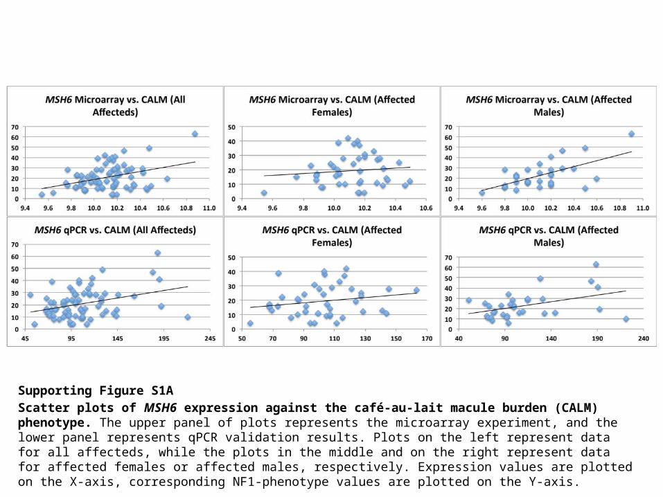
Supporting Figure S1B Scatter plots of DPH2 expression against the café-au-lait macule burden (CALM) phenotype. The upper panel of plots represents the microarray experiment, and the lower panel represents qPCR validation results. Plots on the left represent data for all affecteds, while the plots in the middle and on the right represent data for affected females or affected males, respectively. Expression values are plotted on the X-axis, corresponding NF1-phenotype values are plotted on the Y-axis.

Supporting Figure S1CScatter plots of MED21 expression against the café-au-lait macule (CALM) burden phenotype. The upper panel of plots represents the microarray experiment, and the lower panel represents qPCR validation results. Plots on the left represent data for all affecteds, while the plots in the middle and on the right represent data for affected females or affected males, respectively. Expression values are plotted on the X-axis, corresponding NF1-phenotype values are plotted on the Y-axis.
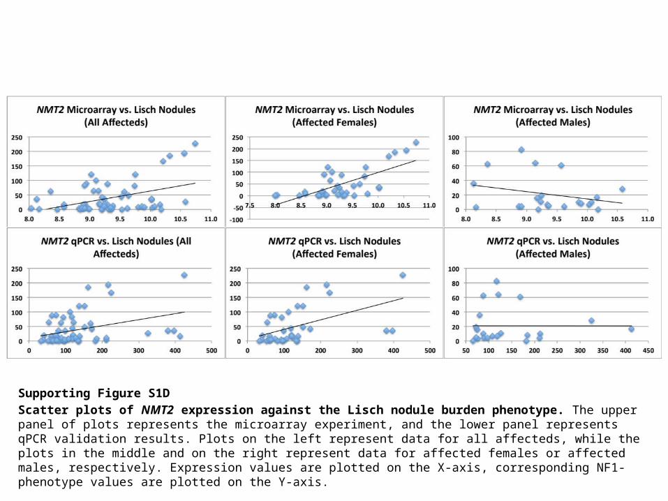
Supporting Figure S1D Scatter plots of NMT2 expression against the Lisch nodule burden phenotype. The upper panel of plots represents the microarray experiment, and the lower panel represents qPCR validation results. Plots on the left represent data for all affecteds, while the plots in the middle and on the right represent data for affected females or affected males, respectively. Expression values are plotted on the X-axis, corresponding NF1-phenotype values are plotted on the Y-axis.

Supporting Figure S1E Scatter plots of TMEM109 expression against the Lisch nodule burden phenotype. The upper panel of plots represents the microarray experiment, and the lower panel represents qPCR validation results. Plots on the left represent data for all affecteds, while the plots in the middle and on the right represent data for affected females or affected males, respectively. Expression values are plotted on the X-axis, corresponding NF1-phenotype values are plotted on the Y-axis.
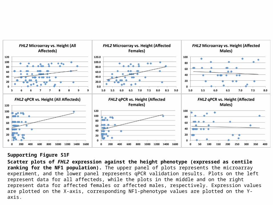
Supporting Figure S1FScatter plots of FHL2 expression against the height phenotype (expressed as centile ranking for the NF1 population). The upper panel of plots represents the microarray experiment, and the lower panel represents qPCR validation results. Plots on the left represent data for all affecteds, while the plots in the middle and on the right represent data for affected females or affected males, respectively. Expression values are plotted on the X-axis, corresponding NF1-phenotype values are plotted on the Y-axis.
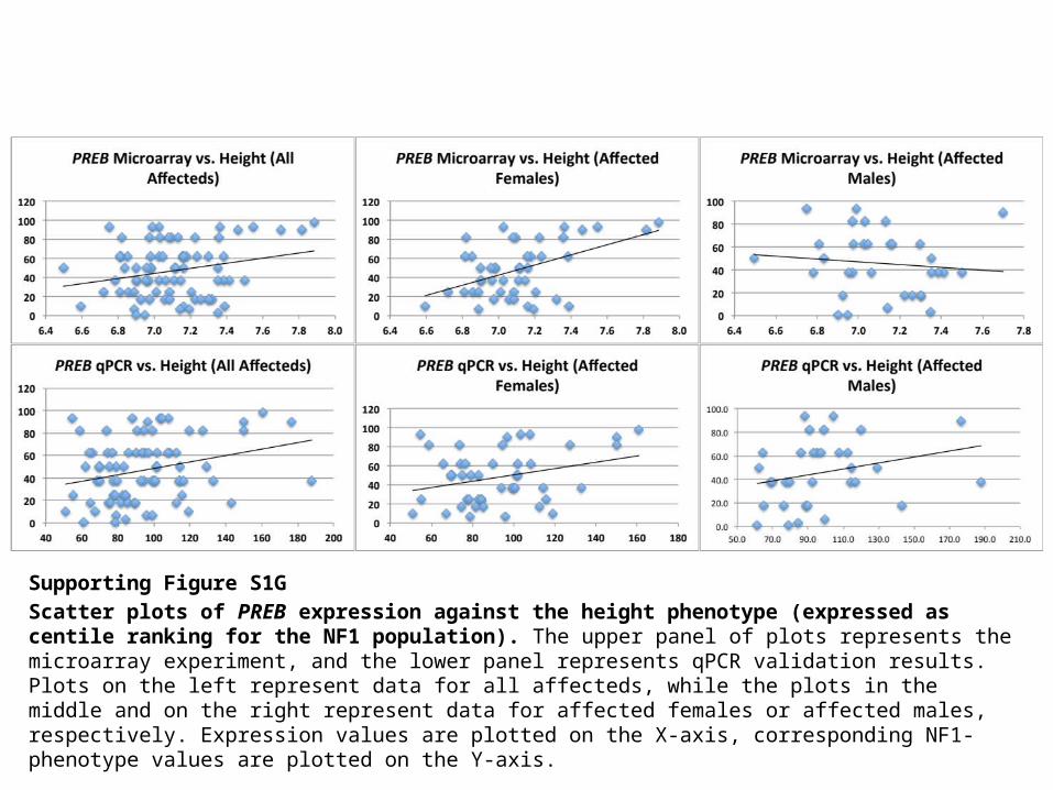
Supporting Figure S1G Scatter plots of PREB expression against the height phenotype (expressed as centile ranking for the NF1 population). The upper panel of plots represents the microarray experiment, and the lower panel represents qPCR validation results. Plots on the left represent data for all affecteds, while the plots in the middle and on the right represent data for affected females or affected males, respectively. Expression values are plotted on the X-axis, corresponding NF1-phenotype values are plotted on the Y-axis.
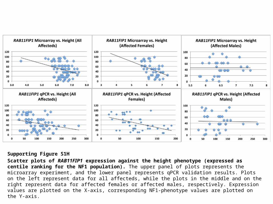
Supporting Figure S1H Scatter plots of RAB11FIP1 expression against the height phenotype (expressed as centile ranking for the NF1 population). The upper panel of plots represents the microarray experiment, and the lower panel represents qPCR validation results. Plots on the left represent data for all affecteds, while the plots in the middle and on the right represent data for affected females or affected males, respectively. Expression values are plotted on the X-axis, corresponding NF1-phenotype values are plotted on the Y-axis.