Superior Type Vegan Sans Specimen · Superior Type Copyright © Superior Type 2019 ˘˝ ˆ ˆ ˜,...
25
Superior Type Vegan Sans Copyright © Superior Type 2019 www.superiortype.com typeface vegan sans — specimen 1 / 25 description • Designer: Vojtěch Říha • 12 styles in Font family • 428 glyphs in Basic Font package • 843 glyphs in Premium Font package • 17 Features in Premium Font family • Release year: 2016 details This modernist grotesque was originally drawn by Stanislav Maršo in the 1960s. Vojtěch Říha redesigned the font in 2014 with aim for more contemporary feel. The new styles include energetic italics and many alternative characters, for example the lowercase ‘a’, ‘j’ and ‘g’. The font combines drawn details with calligraphic contrasts. Not exactly geometric or humanist, but always blending any boundaries with bold aitude. It also works in almost any size thanks to a neutral medium weight. Vegan is a workhorse with light, surprising details. It is crystal clear in large headlines, functional in text and tiny footnotes. • OTF (Open Type) • TTF (True Type) • WOFF (Web Open Font Format) • WOFF 2 (Web Open Font Format) fonts formats
Transcript of Superior Type Vegan Sans Specimen · Superior Type Copyright © Superior Type 2019 ˘˝ ˆ ˆ ˜,...

Superior Type
Vegan Sans
Copyright © Superior Type 2019 www.superiortype.com
typeface
vegan sans — specimen 1 / 25
description
• Designer: Vojtěch Říha
• 12 styles in Font family
• 428 glyphs in Basic Font package
• 843 glyphs in Premium Font package
• 17 Features in Premium Font family
• Release year: 2016
details
This modernist grotesque was originally drawn by Stanislav Maršo in the 1960s.
Vojtěch Říha redesigned the font in 2014 with aim for more contemporary feel.
The new styles include energetic italics and many alternative characters,
for example the lowercase ‘a’, ‘j’ and ‘g’.
The font combines drawn details with calligraphic contrasts. Not exactly geometric
or humanist, but always blending any boundaries with bold aitude. It also works
in almost any size thanks to a neutral medium weight.
Vegan is a workhorse with light, surprising details. It is crystal clear in large
headlines, functional in text and tiny footnotes.
• OTF (Open Type)
• TTF (True Type)
• WOFF (Web Open Font Format)
• WOFF 2 (Web Open Font Format)
fonts formats
Superior Type
Copyright © Superior Type 2019 www.superiortype.com
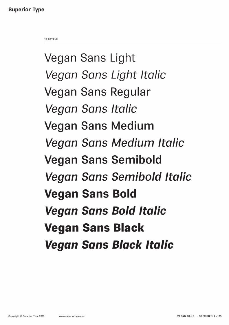
12 styles
vegan sans — specimen 2 / 25
Vegan Sans LightVegan Sans Light ItalicVegan Sans RegularVegan Sans ItalicVegan Sans MediumVegan Sans Medium ItalicVegan Sans SemiboldVegan Sans Semibold ItalicVegan Sans BoldVegan Sans Bold ItalicVegan Sans BlackVegan Sans Black Italic

Superior Type
Copyright © Superior Type 2019 www.superiortype.com
vegan sans light — 100/90 pt
vegan sans — specimen 3 / 25
Ham&Burgers!316vegan sans light — 40/42 pt
This modernist gro-tesque was originally drawn by Stanislav Maršo in the 1960s.Vojtěch Říharedesigned the font in

Superior Type
Copyright © Superior Type 2019 www.superiortype.com
vegan sans light italic — 100/90 pt
vegan sans — specimen 4 / 25
Ham&Burgers!316vegan sans light italic — 40/42 pt
This modernist gro-tesque was originally drawn by Stanislav Maršo in the 1960s.Vojtěch Říharedesigned the font in

Superior Type
Copyright © Superior Type 2019 www.superiortype.com
vegan sans light, vegan sans light italic — 18/22 pt
vegan sans — specimen 5 / 25
This modernist grotesque was originally drawn by Stanislav Maršo in the 1960s. Vojtěch Říha rede-signed the font in 2014 with aim for morecontemporary feel. The new styles include energetic italics and many alternative characters, for example the lowercase ‘a’, ‘j’ and ‘g’. The font combines drawn details with calligraphic contrasts.Not exactly geometric or humanist, but always blending any boundaries with bold aitude. It also
vegan sans light, vegan sans light italic — 12/16 pt
This modernist grotesque was originally drawn by Stanislav Maršo inthe 1960s. Vojtěch Říha redesigned the font in 2014 with aim for morecontemporary feel. The new styles include energetic italics and many alterna-tive characters, for example the lowercase ‘a’, ‘j’ and ‘g’. The font combines drawn details with calligraphic contrasts. Not exactly geometric or humanist, but always blending any boundaries with bold aitude. It also works in almost any size thanks to a neutral medium weight. Vegan is a workhorse with light, surprising details. It is crystal clear in large headlines, functional in text and tiny footnotes.
vegan sans light, vegan sans light italic — 8/12 pt
This modernist grotesque was originally drawn by Stanislav Maršo in the 1960s. Vojtěch Říha redesigned the font in
2014 with aim for more contemporary feel. The new styles include energetic italics and many alternative characters,
for example the lowercase ‘a’, ‘j’ and ‘g’. The font combines drawn details with calligraphic contrasts. Not exactly
geometric or humanist, but always blending any boundaries with bold aitude. It also works in almost any size
thanks to a neutral medium weight. Vegan is a workhorse with light, surprising details. It is crystal clear in large
headlines, functional in text and tiny footnotes.
Superior Type
Copyright © Superior Type 2019 www.superiortype.com
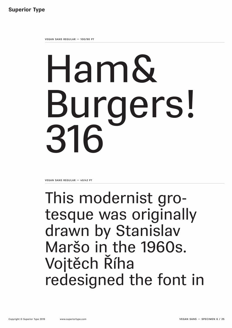
vegan sans regular — 100/90 pt
vegan sans — specimen 6 / 25
Ham&Burgers!316vegan sans regular — 40/42 pt
This modernist gro-tesque was originally drawn by Stanislav Maršo in the 1960s.Vojtěch Říharedesigned the font in

Superior Type
Copyright © Superior Type 2019 www.superiortype.com
vegan sans italic — 100/90 pt
vegan sans — specimen 7 / 25
Ham&Burgers!316vegan sans italic — 40/42 pt
This modernist gro-tesque was originally drawn by Stanislav Maršo in the 1960s.Vojtěch Říharedesigned the font in

Superior Type
Copyright © Superior Type 2019 www.superiortype.com
vegan sans regular, vegan sans italic — 18/22 pt
vegan sans — specimen 8 / 25
This modernist grotesque was originally drawnby Stanislav Maršo in the 1960s. Vojtěch Říha rede-signed the font in 2014 with aim for morecontemporary feel. The new styles include energet-ic italics and many alternative characters,for example the lowercase ‘a’, ‘j’ and ‘g’.The font combines drawn details with calligraphic contrasts. Not exactly geometric or humanist, but always blending any boundaries with bold aitude.
vegan sans regular, vegan sans italic — 12/16 pt
This modernist grotesque was originally drawn by Stanislav Maršo inthe 1960s. Vojtěch Říha redesigned the font in 2014 with aim for morecontemporary feel. The new styles include energetic italics and many alterna-tive characters, for example the lowercase ‘a’, ‘j’ and ‘g’. The font combines drawn details with calligraphic contrasts. Not exactly geometric or humanist, but always blending any boundaries with bold aitude. It also worksin almost any size thanks to a neutral medium weight. Vegan is a workhorse with light, surprising details. It is crystal clear in large headlines, functionalin text and tiny footnotes.
vegan sans regular, vegan sans italic — 8/12 pt
This modernist grotesque was originally drawn by Stanislav Maršo in the 1960s. Vojtěch Říha redesigned the font in
2014 with aim for more contemporary feel. The new styles include energetic italics and many alternative characters,
for example the lowercase ‘a’, ‘j’ and ‘g’. The font combines drawn details with calligraphic contrasts. Not exactly
geometric or humanist, but always blending any boundaries with bold aitude. It also works in almost any size
thanks to a neutral medium weight. Vegan is a workhorse with light, surprising details. It is crystal clear in large
headlines, functional in text and tiny footnotes.

Superior Type
Copyright © Superior Type 2019 www.superiortype.com
vegan sans medium — 100/90 pt
vegan sans — specimen 9 / 25
Ham&Burgers!316vegan sans medium — 40/42 pt
This modernist gro-tesque was originally drawn by Stanislav Maršo in the 1960s.Vojtěch Říharedesigned the font in

Superior Type
Copyright © Superior Type 2019 www.superiortype.com
vegan sans medium italic — 100/90 pt
vegan sans — specimen 10 / 25
Ham&Burgers!316vegan sans medium italic — 40/42 pt
This modernist gro-tesque was originally drawn by Stanislav Maršo in the 1960s.Vojtěch Říharedesigned the font in

Superior Type
Copyright © Superior Type 2019 www.superiortype.com
vegan sans medium, vegan sans medium italic — 18/22 pt
vegan sans — specimen 11 / 25
This modernist grotesque was originally drawnby Stanislav Maršo in the 1960s. Vojtěch Říha rede-signed the font in 2014 with aim for morecontemporary feel. The new styles includeenergetic italics and many alternative characters, for example the lowercase ‘a’, ‘j’ and ‘g’. The font combines drawn details with calligraphiccontrasts. Not exactly geometric or humanist,but always blending any boundaries with bold
vegan sans medium, vegan sans medium italic — 12/16 pt
This modernist grotesque was originally drawn by Stanislav Maršo inthe 1960s. Vojtěch Říha redesigned the font in 2014 with aim for morecontemporary feel. The new styles include energetic italics and manyalternative characters, for example the lowercase ‘a’, ‘j’ and ‘g’. The font combines drawn details with calligraphic contrasts. Not exactly geometric or humanist, but always blending any boundaries with bold aitude. It also works in almost any size thanks to a neutral medium weight. Vegan isa workhorse with light, surprising details. It is crystal clear in largeheadlines, functional in text and tiny footnotes.
vegan sans medium, vegan sans medium italic — 8/12 pt
This modernist grotesque was originally drawn by Stanislav Maršo in the 1960s. Vojtěch Říha redesigned the font
in 2014 with aim for more contemporary feel. The new styles include energetic italics and many alternative
characters, for example the lowercase ‘a’, ‘j’ and ‘g’. The font combines drawn details with calligraphic contrasts.
Not exactly geometric or humanist, but always blending any boundaries with bold aitude. It also works in almost
any size thanks to a neutral medium weight. Vegan is a workhorse with light, surprising details. It is crystal clear in
large headlines, functional in text and tiny footnotes.
Superior Type
Copyright © Superior Type 2019 www.superiortype.com
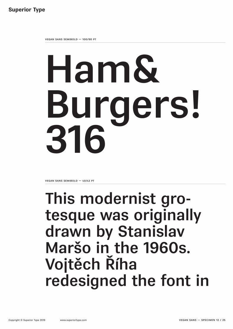
vegan sans semibold — 100/90 pt
vegan sans — specimen 12 / 25
Ham&Burgers!316vegan sans semibold — 40/42 pt
This modernist gro-tesque was originally drawn by Stanislav Maršo in the 1960s.Vojtěch Říharedesigned the font in

Superior Type
Copyright © Superior Type 2019 www.superiortype.com
vegan sans semibold italic — 100/90 pt
vegan sans — specimen 13 / 25
Ham&Burgers!316vegan sans semibold italic — 40/42 pt
This modernist gro-tesque was originally drawn by Stanislav Maršo in the 1960s.Vojtěch Říharedesigned the font in
Superior Type
Copyright © Superior Type 2019 www.superiortype.com
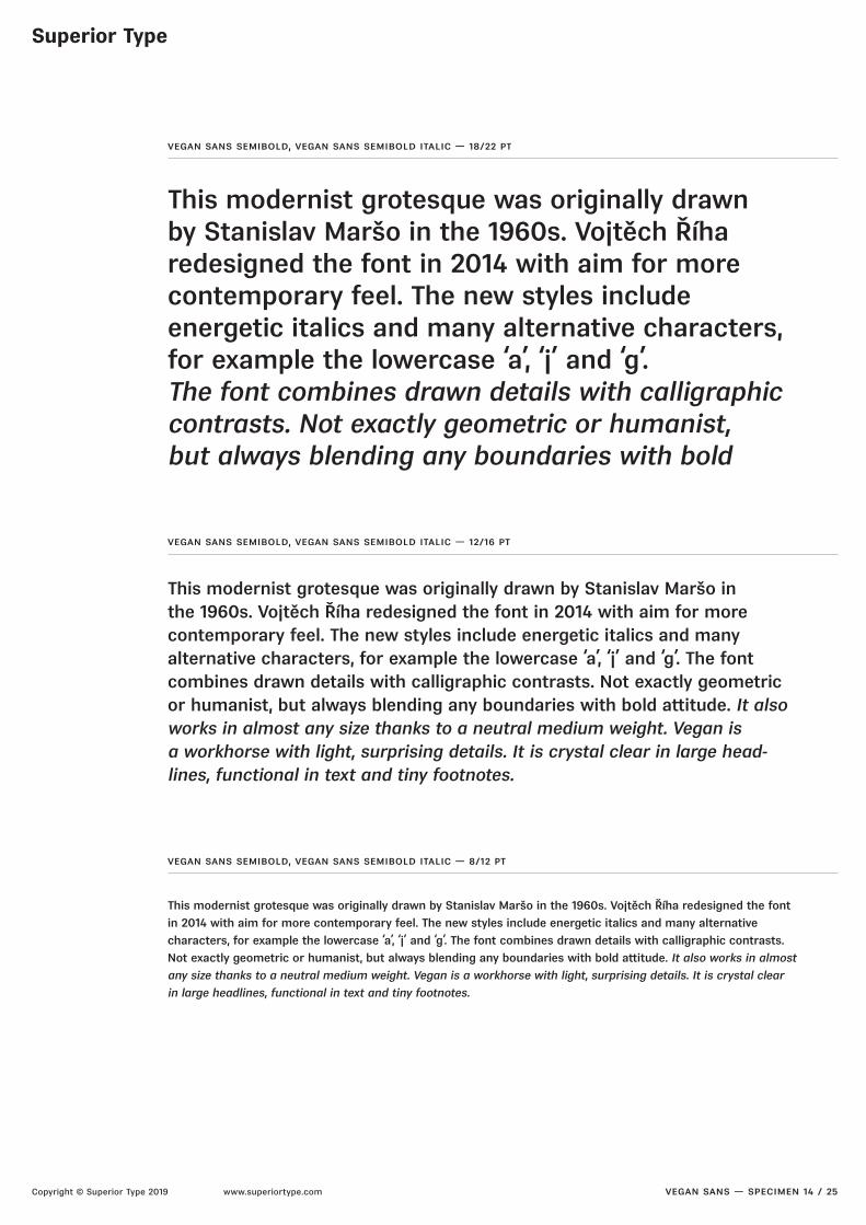
vegan sans semibold, vegan sans semibold italic — 18/22 pt
vegan sans — specimen 14 / 25
This modernist grotesque was originally drawnby Stanislav Maršo in the 1960s. Vojtěch Říharedesigned the font in 2014 with aim for morecontemporary feel. The new styles includeenergetic italics and many alternative characters, for example the lowercase ‘a’, ‘j’ and ‘g’.The font combines drawn details with calligraphic contrasts. Not exactly geometric or humanist,but always blending any boundaries with bold
vegan sans semibold, vegan sans semibold italic — 12/16 pt
This modernist grotesque was originally drawn by Stanislav Maršo inthe 1960s. Vojtěch Říha redesigned the font in 2014 with aim for morecontemporary feel. The new styles include energetic italics and manyalternative characters, for example the lowercase ‘a’, ‘j’ and ‘g’. The font combines drawn details with calligraphic contrasts. Not exactly geometricor humanist, but always blending any boundaries with bold aitude. It also works in almost any size thanks to a neutral medium weight. Vegan isa workhorse with light, surprising details. It is crystal clear in large head-lines, functional in text and tiny footnotes.
vegan sans semibold, vegan sans semibold italic — 8/12 pt
This modernist grotesque was originally drawn by Stanislav Maršo in the 1960s. Vojtěch Říha redesigned the font
in 2014 with aim for more contemporary feel. The new styles include energetic italics and many alternative
characters, for example the lowercase ‘a’, ‘j’ and ‘g’. The font combines drawn details with calligraphic contrasts.
Not exactly geometric or humanist, but always blending any boundaries with bold aitude. It also works in almost
any size thanks to a neutral medium weight. Vegan is a workhorse with light, surprising details. It is crystal clear
in large headlines, functional in text and tiny footnotes.

Superior Type
Copyright © Superior Type 2019 www.superiortype.com
vegan sans bold — 100/90 pt
vegan sans — specimen 15 / 25
Ham&Burgers!316vegan sans bold — 40/42 pt
This modernist gro-tesque was originally drawn by Stanislav Maršo in the 1960s.Vojtěch Říharedesigned the font in

Superior Type
Copyright © Superior Type 2019 www.superiortype.com
vegan sans bold italic — 100/90 pt
vegan sans — specimen 16 / 25
Ham&Burgers!316vegan sans bold italic — 40/42 pt
This modernist gro-tesque was originally drawn by Stanislav Maršo in the 1960s.Vojtěch Říharedesigned the font in
Superior Type
Copyright © Superior Type 2019 www.superiortype.com
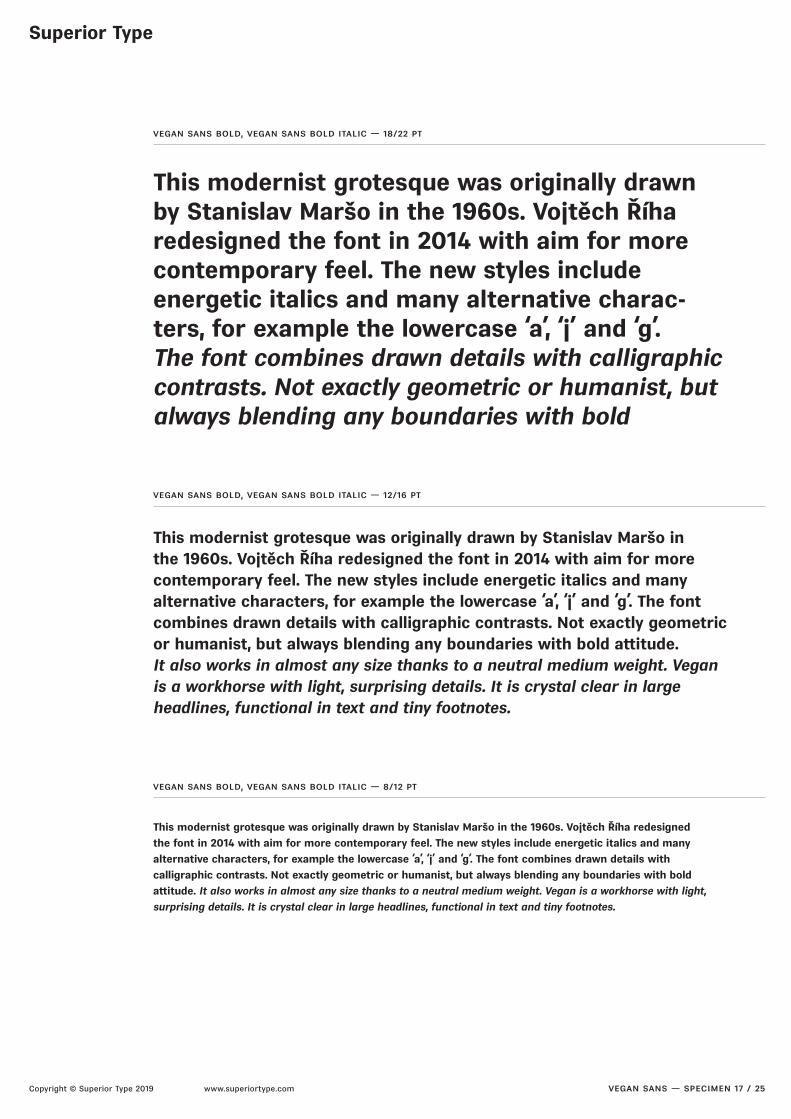
vegan sans bold, vegan sans bold italic — 18/22 pt
vegan sans — specimen 17 / 25
This modernist grotesque was originally drawn by Stanislav Maršo in the 1960s. Vojtěch Říharedesigned the font in 2014 with aim for more contemporary feel. The new styles includeenergetic italics and many alternative charac-ters, for example the lowercase ‘a’, ‘j’ and ‘g’.The font combines drawn details with calligraphic contrasts. Not exactly geometric or humanist, but always blending any boundaries with bold
vegan sans bold, vegan sans bold italic — 12/16 pt
This modernist grotesque was originally drawn by Stanislav Maršo inthe 1960s. Vojtěch Říha redesigned the font in 2014 with aim for morecontemporary feel. The new styles include energetic italics and many alternative characters, for example the lowercase ‘a’, ‘j’ and ‘g’. The font combines drawn details with calligraphic contrasts. Not exactly geometric or humanist, but always blending any boundaries with bold aitude.It also works in almost any size thanks to a neutral medium weight. Vegan is a workhorse with light, surprising details. It is crystal clear in large headlines, functional in text and tiny footnotes.
vegan sans bold, vegan sans bold italic — 8/12 pt
This modernist grotesque was originally drawn by Stanislav Maršo in the 1960s. Vojtěch Říha redesigned
the font in 2014 with aim for more contemporary feel. The new styles include energetic italics and many
alternative characters, for example the lowercase ‘a’, ‘j’ and ‘g’. The font combines drawn details with
calligraphic contrasts. Not exactly geometric or humanist, but always blending any boundaries with bold
aitude. It also works in almost any size thanks to a neutral medium weight. Vegan is a workhorse with light,
surprising details. It is crystal clear in large headlines, functional in text and tiny footnotes.

Superior Type
Copyright © Superior Type 2019 www.superiortype.com
vegan sans black — 100/90 pt
vegan sans — specimen 18 / 25
Ham&Burgers!316vegan sans black — 40/42 pt
This modernist gro-tesque was originally drawn by Stanislav Maršo in the 1960s.Vojtěch Říharedesigned the font

Superior Type
Copyright © Superior Type 2019 www.superiortype.com
vegan sans black italic — 100/90 pt
vegan sans — specimen 19 / 25
Ham&Burgers!316vegan sans black italic — 40/42 pt
This modernist gro-tesque was originally drawn by Stanislav Maršo in the 1960s.Vojtěch Říharedesigned the font in

Superior Type
Copyright © Superior Type 2019 www.superiortype.com
vegan sans black, vegan sans black italic — 18/22 pt
vegan sans — specimen 20 / 25
This modernist grotesque was originally drawn by Stanislav Maršo in the 1960s. Vojtěch Říha redesigned the font in 2014 with aim for more contemporary feel. The new styles includeenergetic italics and many alternativecharacters, for example the lowercase ‘a’, ‘j’and ‘g’. The font combines drawn details with cal-ligraphic contrasts. Not exactly geometric or hu-manist, but always blending any boundaries with
vegan sans black, vegan sans black italic — 12/16 pt
This modernist grotesque was originally drawn by Stanislav Maršoin the 1960s. Vojtěch Říha redesigned the font in 2014 with aim for morecontemporary feel. The new styles include energetic italics and many alternative characters, for example the lowercase ‘a’, ‘j’ and ‘g’.The font combines drawn details with calligraphic contrasts. Not exactly geometric or humanist, but always blending any boundaries with bold aitude. It also works in almost any size thanks to a neutral medium weight. Vegan is a workhorse with light, surprising details. It is crystal clear in large headlines, functional in text and tiny footnotes.
vegan sans black, vegan sans black italic — 8/12 pt
This modernist grotesque was originally drawn by Stanislav Maršo in the 1960s. Vojtěch Říha redesigned
the font in 2014 with aim for more contemporary feel. The new styles include energetic italics and many
alternative characters, for example the lowercase ‘a’, ‘j’ and ‘g’. The font combines drawn details with
calligraphic contrasts. Not exactly geometric or humanist, but always blending any boundaries with bold
aitude. It also works in almost any size thanks to a neutral medium weight. Vegan is a workhorse with light,
surprising details. It is crystal clear in large headlines, functional in text and tiny footnotes.

small caps
Superior Type
Copyright © Superior Type 2019 www.superiortype.com
off
Emotionsall small caps Ham & Dogs (123)?case sensitiveforms
Ham & Dogs (123)?
¡¿A–B?! E@Nstandardligatures
¡¿A–B?! E@N
ff fi fl ffi ffllining figures
0123456oldstyle figures
0123456
0123456tabular figures
0123456
0123456tabular oldstylefigures
0123456
0123456fractions
0123456
1/2 3/4scientificinferiors
1⁄2 3⁄4
H2Osuperscript
H2O
Menu123stylistic set 1
Menu123
Madamestylistic set 2
Madame
Gogolstylistic set 3
Gogol
jamstylistic set 4
jam
J. Nautstylistic set 5
J. Naut
EQUINOXstylistic set 10
EQUINOX
120 × 350 120 × 350
Emotions
on
vegan sans — specimen 21 / 25
17 features in premium
Superior Type
Copyright © Superior Type 2019 www.superiortype.com
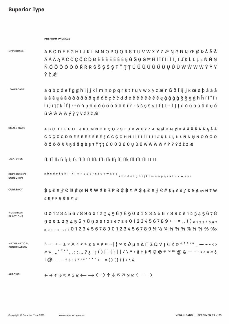
uppercase
premium package
vegan sans — specimen 22 / 25
A B C D E F G H I J K L M N O P Q Q R S T U V W X Y Z Æ Ŋ ẞ Ð IJ Œ Ø Þ Á Ă Â
Ä À Ā Ą Ã Ć Č Ç Ĉ Ċ Ď Đ É Ĕ Ě Ë Ė È Ē Ę Ğ Ĝ Ģ Ġ Ħ Ĥ Í Ĭ Î Ï İ Ì Ī Į Ĩ Ĵ Ķ Ĺ Ľ Ļ Ŀ Ń Ň Ņ
Ñ Ó Ŏ Ö Ő Ō Õ Ŕ Ř Ŗ Ś Š Ş Ŝ Ș Ŧ Ť Ţ Ț Ú Ŭ Û Ü Ù Ű Ū Ų Ů Ũ Ẃ Ŵ Ẅ Ẁ Ý Ŷ Ÿ
Ỳ Ż Ǽ
a a b c d e f g g h i j j k l m n o p q r s t t u v w x y z æ ŋ ß ð ſ ij ij ĸ œ ø þ á ă â
ä à ā ą å ã á ă â ä à ā ą å ć č ç ĉ ċ ď đ é ĕ ě ê ë ė è ē ę ğ ĝ ģ ġ ğ ĝ ģ ġ ħ ĥ í ĭ î ï ı
ì ī į ĩ ĵ ĵ ķ ĺ ľ ļ ŀ ł ń ň ņ ñ ó ŏ ô ö ò ő ō õ ŕ ř ŗ ś š ş ŝ ș ŧ ť ţ ț ŧ ť ţ ț ú ŭ û ü ù ű ū ų ů
ũ ẃ ŵ ẅ ẁ ý ŷ ÿ ỳ ź ž ż ǽ
a b c d e f g h i j k l m n o p q q r s t u v w x y z æ ŋ ø ð ij ø þ á ă â ä à ā ą å ã
ć č ç ĉ ċ ď đ é ĕ ě ê ë ė è ē ę ğ ĝ ģ ġ ħ ĥ í ĭ î ï İ ì ī į ĩ ĵ ķ ĺ ľ ļ ŀ ł ń ň ņ ñ ó ŏ ô ö
ò ő ō õ ŕ ř ŗ ś š ş ŝ ș ŧ ť ţ ț ú ŭ û ü ű ū ų ů ũ ẃ ŵ ẅ ẁ ý ŷ ÿ ỳ ź ž ż ǽ
þ ~ | [ \ ] ^ _ ` @ ? > = < ; : / .
a b c d e f g h i j k l m n o p q r s t u v w x y z a b c d e f g h i j k l m n o p q r s t u v w x y z
$ ¢ £ ¥ ƒ € ₪ ₡ ₥ ₦ ₨ ₩ ₫ ₭ ₮ ₱ ₴ ₵ ฿ ¤ # $ ¢ £ ¥ ƒ € # $ ¢ £ ¥ ƒ € ₪ ₡ ₥ ₦ ₨ ₩
₫ ₭ ₮ ₱ ₴ ₵ ฿ ¤ #
0 0 1 2 3 4 5 6 7 8 9 0 0 1 2 3 4 5 6 7 8 9 0 0 1 2 3 4 5 6 7 8 9 0 0 1 2 3 4 5 6 7 8
9 0 0 1 2 3 4 5 6 7 8 9 0 0 1 2 3 6 7 8 9 0 1 2 3 4 5 6 7 8 9 + − = , . ( ) 0 1 2 3 4 5 6 7
8 9 + − = , . ( ) 0 1 2 3 4 5 6 7 8 9 0 1 2 3 4 5 6 7 8 9 ¼ ½ ¾ ⅛ ⅜ ⅝ ⅞ ⅓ ⅔ % ‰
^ ~ · + − ± × × ÷ < > ≤ ≥ = ≠ ≈ ¬ | ¦ ∞ ◊ ∂ µ π ∆ ∏ ∑ Ω √ ∫ ℓ ∅ ° ª º ' " _ — – - ‹ ›
« » ‚ „ ’ ” ‘ “ , . : ; … ? ¿ ! ¡ ( ) [ ] 〚 〛 / \ * • § † ‡ ¶ © ® ™ @ & — – - ‹ › « » ¿
¡ @ — – - ? ¿ ! ¡ ° ' " ’ ” ‘ “ + − = ( ) [ ] / \ &
← → ↑ ↓ ⟵ ⟶ ← → ↑ ↓ ⟵ ⟶
lowercase
small caps
ligatures
superscriptsubscript
currency
mathematicalpunctuation
numeralsfractions
arrows
Superior Type
Copyright © Superior Type 2019 www.superiortype.com
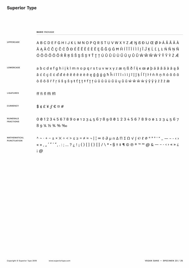
basic package
vegan sans — specimen 23 / 25
uppercase
lowercase
ligatures
currency
numeralsfractions
mathematicalpunctuation
A B C D E F G H I J K L M N O P Q R S T U V W X Y Z Æ Ŋ ẞ Ð IJ Œ Ø Þ Á Ă Â Ä À
Ā Ą Ã Ć Č Ç Ĉ Ċ Ď Đ É Ĕ Ě Ë Ė È Ē Ę Ğ Ĝ Ģ Ġ Ħ Ĥ Í Ĭ Î Ï İ Ì Ī Į Ĩ Ĵ Ķ Ĺ Ľ Ļ Ŀ Ń Ň Ņ Ñ
Ó Ŏ Ö Ő Ō Õ Ŕ Ř Ŗ Ś Š Ş Ŝ Ș Ŧ Ť Ţ Ț Ú Ŭ Û Ü Ù Ű Ū Ų Ů Ũ Ẃ Ŵ Ẅ Ẁ Ý Ŷ Ÿ Ỳ Ż Ǽ
a b c d e f g h i j k l m n o p q r s t u v w x y z æ ŋ ß ð ſ ij ĸ œ ø þ á ă â ä à ā ą å
ã ć č ç ĉ ċ ď đ é ĕ ě ê ë ė è ē ę ğ ĝ ģ ġ ħ ĥ í ĭ î ï ı ì ī į ĩ ĵ ĵ ķ ĺ ľ ļ ŀ ł ń ň ņ ñ ó ŏ ô ö
ò ő ō õ ŕ ř ŗ ś š ş ŝ ș ŧ ť ţ ț ŧ ť ţ ț ú ŭ û ü ù ű ū ų ů ũ ẃ ŵ ẅ ẁ ý ŷ ÿ ỳ ź ž ż ǽ
~ | ] ? ;
$ ¢ £ ¥ ƒ € ¤ #
0 0 1 2 3 4 5 6 7 8 9 0 0 1 2 3 4 5 6 7 8 9 0 0 1 2 3 4 5 6 7 8 9 0 0 1 2 3 4 5 6 7
8 9 ¼ ½ ¾ % ‰
^ ~ · + − ± × × ÷ < > ≤ ≥ = ≠ ≈ ¬ | ¦ ∞ ◊ ∂ µ π ∆ ∏ ∑ Ω √ ∫ ℓ ∅ ° ª º ' " _ — – - ‹ ›
« » ‚ „ ’ ” ‘ “ , . : ; … ? ¿ ! ¡ ( ) [ ] 〚 〛 / \ * • § † ‡ ¶ © ® ™ @ & — – - ‹ › « » ¿
¡ @

Superior Type
Copyright © Superior Type 2019 www.superiortype.com
languages
vegan sans — specimen 24 / 25
Afar
Afrikaans
Albanian
Aranese
Aromanian
Aymara
Basque
Bemba
Bislama
Bosnian
Breton
Catalan
Chamorro
Chichewa
Chuukese
Cofán
Croatian
Czech
Dutch
English
Esperanto,
Estonian
Faroese
Fijian
Finnish
French
Frisian
Friulian
Galician
Ganda
German
Gikuyu
Greenlandic
Gwich’in
Haitian
Hawaiian
Hungarian
Icelandic
Ido
Indonesian
Interlingua
Irish Gaelic
Italian
Javanese
Kashubian
Kinyarwanda
Kiribati
Kirundi
Kituba
Kurdish (Latin)
Ladin
Latvian
Lithuanian
Luxemburgish
Malagasy
Malay
Maltese
Manx
Māori
Marshallese
Náhuatl
Nauruan
Ndebele (Northern)
Ndebele (Southern)
Norfuk
Norn
Norwegian (Bokmål)
Norwegian (Nynorsk)
Nyanja
Occitan
Oromo
Otomi
Palauan
Papiamento
Polish
Portuguese
Quechua
Rarotongan
Rhaeto-Romanic
Romaji
Romani
Romanian
Sámi (Inari)
Sámi (Lule)
Sámi (Northern)
Sámi (Southern)
Samoan
Sango
Sardinian
Scoish Gaelic
Serbian (Latin)
Seychelles Creole
Shona
Silesian
Slovak
Slovene
Somali (Latin)
Sorbian
Sotho
Spanish
Swahili
Swati
Swedish
Tagalog (Filipino)
Tahitian
Tetum
Tok Pisin
Tokelauan
Tongan
Tsonga
Tswana
Turkish
Tuvalu
Ulithian
Veps
Welsh
Wolof
Xhosa
Zulu
Superior Type
Copyright © Superior Type 2019 www.superiortype.com vegan sans — specimen 25 / 25
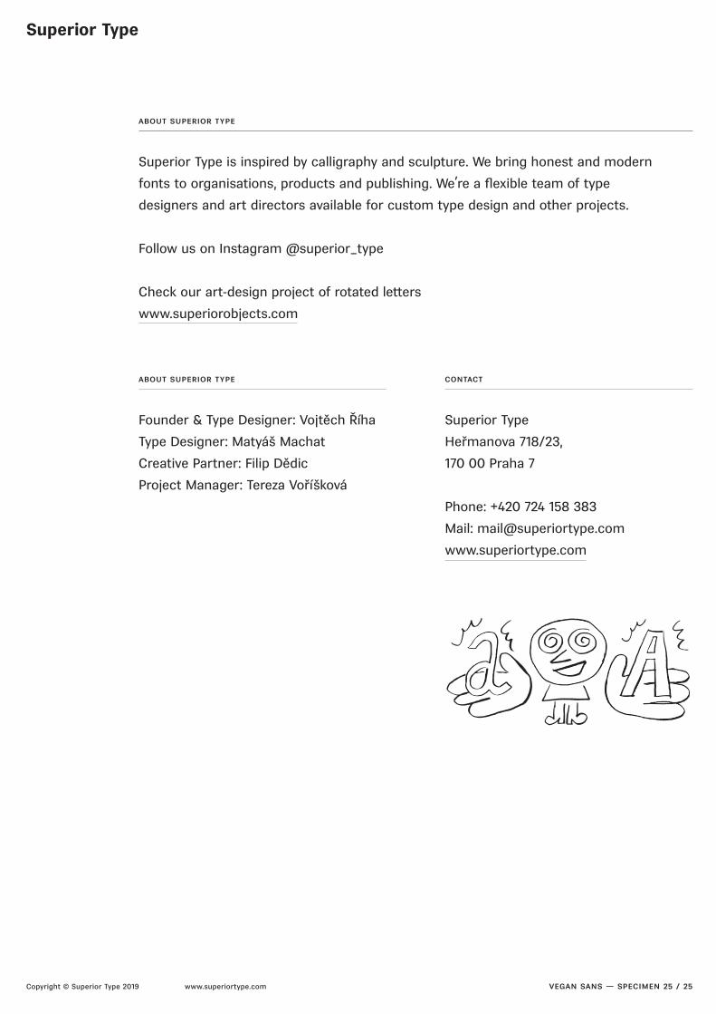
about superior type
Superior Type is inspired by calligraphy and sculpture. We bring honest and modern
fonts to organisations, products and publishing. We’re a ]exible team of type
designers and art directors available for custom type design and other projects.
Follow us on Instagram @superior_type
Check our art-design project of rotated leers
www.superiorobjects.com
about superior type
Founder & Type Designer: Vojtěch Říha
Type Designer: Matyáš Machat
Creative Partner: Filip Dědic
Project Manager: Tereza Voříšková
contact
Superior Type
Heřmanova 718/23,
170 00 Praha 7
Phone: +420 724 158 383
Mail: [email protected]
www.superiortype.com