SubStance Volume 40 issue 1 2011
21
Some Medium-Specific Qualities of Graphic Sequences Pascal Lefèvre SubStance, Volume 40, Number 1, 2011 (Issue 124), pp. 14-33 (Article) Published by University of Wisconsin Press DOI: 10.1353/sub.2011.0007 For additional information about this article Access provided by University Of Southern California (6 Apr 2014 07:52 GMT) http://muse.jhu.edu/journals/sub/summary/v040/40.1.lefevre.html
-
Upload
omega-zero -
Category
Documents
-
view
9 -
download
0
description
Some medium-specific qualities of graphic sequences - Pascal Lefévre
Transcript of SubStance Volume 40 issue 1 2011

Some Medium-Specific Qualities of Graphic Sequences
Pascal Lefèvre
SubStance, Volume 40, Number 1, 2011 (Issue 124), pp. 14-33 (Article)
Published by University of Wisconsin PressDOI: 10.1353/sub.2011.0007
For additional information about this article
Access provided by University Of Southern California (6 Apr 2014 07:52 GMT)
http://muse.jhu.edu/journals/sub/summary/v040/40.1.lefevre.html
SubStance #124, Vol. 40, no. 1, 2011SubStance #124, Vol. 40, no. 1, 2011 SubStance #124, Vol. 40, no. 1, 2011SubStance #124, Vol. 40, no. 1, 2011
© Board of Regents, University of Wisconsin System, 2011
14
Some Medium-Specific Qualitiesof Graphic Sequences
Pascal Lefèvre
The role of the chosen medium in the creation and reception of a work has been explored by various disciplines, including aesthetics, com-munication, and narratology. While some scholars defend a doctrine of medium purity (Greenberg), even arguing that “the medium is the mes-sage” (McLuhan), others deny the influence of a particular medium, like the structuralist narratologists who consider fabula or story as a mental construct that is completely independent of the medium used. In contrast to these rather extreme positions, and like some other scholars (Herman, Davies, Ryan), I would argue for a position that acknowledges variable degrees of influence of media on the process of telling a story. In other words, though stories told in various media may use a common stock of narrative design principles, they exploit them in different, media-specific ways (Herman 51).
In what follows I shall focus on some narrative opportunities and constraints in the medium of comics, as compared to those of other nar-rative media such as printed texts and cinema. Graphic narratives, a term that in my usage encompasses the comic book, bande dessinée [comic strip], and Japanese manga, constitute a spatio-temporal medium that can combine two channels, a visual and a verbal one. Further, this medium is associated with well known narrative traditions and publication formats, such as American superhero comics, Japanese shojo manga, graphic nov-els and many others.1 As a hybrid medium, the graphic narrative shares many features with other media, but uses those features in unique ways; think of drawing styles, the mise en scène in panels, the way verbal and visual elements are combined (e.g., in speech or thought balloons), the breakdown (or “découpage”) of story elements into distinct panels, and the interaction between individual panels and page layouts. It will not be feasible for me to analyze here all these aspects of comics as a medium for storytelling. Hence I will limit myself to just three aspects of graphic narration: drawing styles, the temporal dimensions of individual panels, and the interpretation of sequences of panels.

SubStance #124, Vol. 40, no. 1, 2011SubStance #124, Vol. 40, no. 1, 2011 SubStance #124, Vol. 40, no. 1, 2011SubStance #124, Vol. 40, no. 1, 2011
15Medium-Specific Qualities of Graphic Narratives
Graphic Narrative Style I will approach issues of graphic narration via the broader phe-
nomenon of style, which involves in the case of the comics medium the graphic style, as well as the composition (mise en scène, framing) and sequencing of panels. Style is for the Russian Formalists (and for theo-rists like Bordwell [see Narration]) the reader’s gateway to the fabula and the sjuzhet—that is, the chronological sequence of events recounted in a narrative, on the one hand, and the sequentially arranged discourse cues that allow the reader to construct a time-line for those events, on the other hand. These terms—style, sjuzhet, and fabula—provide an entry point for the study of the influence of a medium on narration, because they allow the analyst to differentiate between three levels or aspects of the interface between narrative and medium. Only the first level—style—can be directly perceived by the reader of graphic narratives; this level encompasses the lines and colors that form images and the letters that form words and sentences. In turn, the level of style provides access to the sjuzhet, or the actual composition or emplotment of events in the work. Via the sjuzhet the reader/spectator then constructs the fabula or story—the chronological sequence of events as they are supposed to have occurred in the time-space universe of the narrative being interpreted.
But though this theoretical framework is widely shared among nar-ratologists, film scholar Torben Grodal (“The PECMA Flow” 6) questions its applicability to cinema, thereby shedding light on the medium-specific qualities of graphic narratives. For Grodal, watching a film does not fore-ground the process of reconstructing an independently existing fabula, because “The viewer primarily experiences the film as a simulation of real life events that come into evidence as the film progresses.” Thus Grodal considers discourse elements not as ways of presenting a story or fabula, but as modifications to the canonical story form that create different emotional modes. To differentiate between story and plot is, for Grodal, only useful when the narrative presents a very scrambled temporal order. Hence Grodal stresses that film viewers use interpretive procedures that are similar—or even identical—to the ones they use to build models of reality from their real-world perceptions (“Moving Pictures” 29).2 But storyworlds can be physically or logically impossible (Alber, Iversen, Nielsen, and Richardson speak of “unnatural narratives”), and there are some striking differences between cinematic and drawn images. In con-trast to the photorealistic images of live-action film that deliver a realistic impression, drawings in comics are static and strongly stylized, so that the spectator becomes aware of their handmade quality.3 In drawings, unlike in real life or in photographic images, lines are almost always clearly pres-ent. Furthermore, efficient handmade pictures will leave out unnecessary

Pascal Lefèvre
SubStance #124, Vol. 40, no. 1, 2011SubStance #124, Vol. 40, no. 1, 2011
16 Pascal Lefèvre
SubStance #124, Vol. 40, no. 1, 2011SubStance #124, Vol. 40, no. 1, 2011
details and capture salient characteristics of represented objects in ways that reflect general perceptual mechanisms and processes—e.g., through simplicity of shape, orderly grouping, clear overlapping, distinction be-tween figure and ground, and strategic deformations of objects (Arnheim 149). Stylized images may be less visually analogous to reality than filmed images, but they can very effectively capture the essence of an object or a person. Each image delivers a specific view on reality, in the process expressing a philosophy or visual ontology (Rawson 19).
In the course of their evolution, comics have developed some domi-nant graphic styles, such as the round, simplified cartoon style (Disney, Tezuka, Peyo), the stylized clear line style (McManus, Kabashima, Hergé), or the more realistic approach that respects proportions (Foster, Raymond, Otomo, Taniguchi, Bellamy, Kresse). All these popular styles in comics have something in common, because to varying degrees they are all meant to be “communicative,” to tell a story visually. Traditionally comics are designed to be read quickly, which explains the preference for stereotypical elements that are easily recognized. Thus the main characters are usually dressed in a typical, familiar outfit, and are rendered with typified body and facial features: think of Superman and Batman in superhero comics, Mickey Mouse in animal comics, Tintin in classic bande dessinée, and Astro Boy in shonen manga. The ease of identification is not limited to the main characters, for the complete design of a canonical comic must be clear and accessible, especially those for young children. Only in a minority of comics—for example, in graphic novels—do artists deviate from these strict standards.
A graphic style creates the fictive world, giving a certain perspec-tive on the diegesis.4 Unlike an average photographic image, a draw-ing is literally and figuratively “signed” (Groensteen, “l’inventaire des singularités” 23; Marion 101). The artist not only depicts something, but expresses at the same time a visual interpretation of the world, with every drawing style implying an ontology of the representable or visualizable. The viewer is obliged to share this figurative view of the maker (Peters 14), since he or she cannot look at the object in the picture from any other point of view. Nevertheless, the reader is not just a passive agent: he or she looks at images with prior knowledge, and uses that context to make sense of visual styles. The contextual knowledge the reader can draw on, including his or her familiarity with the range of visual styles used in comics, is thus important when it comes to studying drawing styles. Indeed, how a particular reader reacts to a particular style may be quite personal, since it will be influenced by previous experiences with similar styles (Lefèvre, “Recovering Sensuality”). An average reader has seen thousands of images and has learned to associate a cartoon style with
Pascal Lefèvre
SubStance #124, Vol. 40, no. 1, 2011SubStance #124, Vol. 40, no. 1, 2011
Pascal Lefèvre
SubStance #124, Vol. 40, no. 1, 2011SubStance #124, Vol. 40, no. 1, 2011
17Medium-Specific Qualities of Graphic Narratives
humorous content. Thanks to the rounded, simplified, and “gentle” style of Tom and Jerry cartoons, for example, the depicted violence becomes bearable and acceptable, for the cartoon style signals that it should not be taken literally. Research has shown that even young children make such associations and are very consistent in linking photographs with “real” things, while connecting the cartoon style to “pretend” things (Ramsey).
To further examine the role of drawing styles in graphic storytell-ing, we can compare different renderings of the same plot. It should be easier to study the influence of one variable (such as drawing style) if other variables (mise en scène, decoupage or parceling out of the action in panels, page layout, etc.) remain constant. Unlike in cinema, however, remakes of comics are unfortunately quite rare (with the exception of short homages, as in the catalogue of the recent Angoulême Cent pour cent, bande dessinée exhibition). It seems that plot and style form a more intricate knot in comics than in films, and certainly more than in theatre or opera. There are nevertheless two practices that are relevant for a comparative analysis of this sort: first, the redesign of older comics (think of Hergé’s Tintin, or Tezuka’s New Treasure Island), and second, the various graphic adaptations of classic novels such as Frankenstein or Moby Dick.
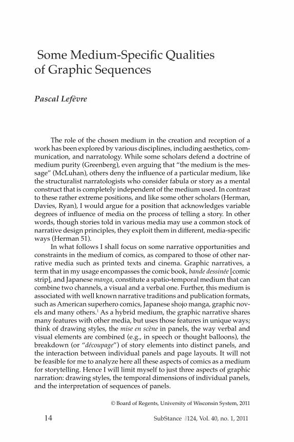
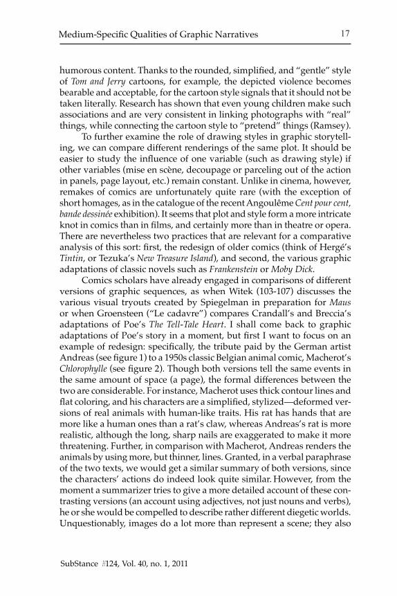
Comics scholars have already engaged in comparisons of different versions of graphic sequences, as when Witek (103-107) discusses the various visual tryouts created by Spiegelman in preparation for Maus or when Groensteen (“Le cadavre”) compares Crandall’s and Breccia’s adaptations of Poe’s The Tell-Tale Heart. I shall come back to graphic adaptations of Poe’s story in a moment, but first I want to focus on an example of redesign: specifically, the tribute paid by the German artist Andreas (see figure 1) to a 1950s classic Belgian animal comic, Macherot’s Chlorophylle (see figure 2). Though both versions tell the same events in the same amount of space (a page), the formal differences between the two are considerable. For instance, Macherot uses thick contour lines and flat coloring, and his characters are a simplified, stylized—deformed ver-sions of real animals with human-like traits. His rat has hands that are more like a human ones than a rat’s claw, whereas Andreas’s rat is more realistic, although the long, sharp nails are exaggerated to make it more threatening. Further, in comparison with Macherot, Andreas renders the animals by using more, but thinner, lines. Granted, in a verbal paraphrase of the two texts, we would get a similar summary of both versions, since the characters’ actions do indeed look quite similar. However, from the moment a summarizer tries to give a more detailed account of these con-trasting versions (an account using adjectives, not just nouns and verbs), he or she would be compelled to describe rather different diegetic worlds. Unquestionably, images do a lot more than represent a scene; they also

Pascal Lefèvre
SubStance #124, Vol. 40, no. 1, 2011SubStance #124, Vol. 40, no. 1, 2011
18 Pascal Lefèvre
SubStance #124, Vol. 40, no. 1, 2011SubStance #124, Vol. 40, no. 1, 2011
Figure 1: This is Andreas’ early 1980s homage to a 1950s classic Belgian comic, Chlorophylle contre les rats noirs, by Macherot. In contrast with the original version, the Andreas rat is more analogous to a real rat. (Andreas, Chlorophylle contre les rats noirs. (tribute page). Tintin, Special 35th Anniversary Issue. 29 September 1981.) Courtesy of the author, Andreas Martens.
Pascal Lefèvre
SubStance #124, Vol. 40, no. 1, 2011SubStance #124, Vol. 40, no. 1, 2011
Pascal Lefèvre
SubStance #124, Vol. 40, no. 1, 2011SubStance #124, Vol. 40, no. 1, 2011
19Medium-Specific Qualities of Graphic Narratives
Figure 2: The original version of the Chlorophylle contre les rats noirs comic dates from the 1950s. With the artist using thick contour lines and flat coloring, Macherot simplifies, styl-izes, and thereby deforms the look of real animals, to which he also gives human-like traits. (Macherot, Raymond. Chlorophylle contre les rats noirs. Brussels: Lombard, 1956.) Courtesy of the widow of the author, Macherot.
Pascal Lefèvre
SubStance #124, Vol. 40, no. 1, 2011SubStance #124, Vol. 40, no. 1, 2011
20 Pascal Lefèvre
SubStance #124, Vol. 40, no. 1, 2011SubStance #124, Vol. 40, no. 1, 2011
offer an interpretation of the storyworld, as picture book researcher J. H. Schwarcz concluded in his comparison of various visualizations of the same fairy tale. In a picture book, the style of illustration gives the fairy tale a specific feeling, reflecting a particular interpretation of the text.
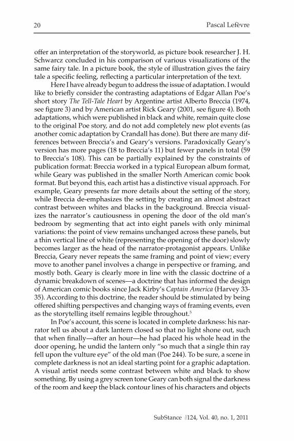
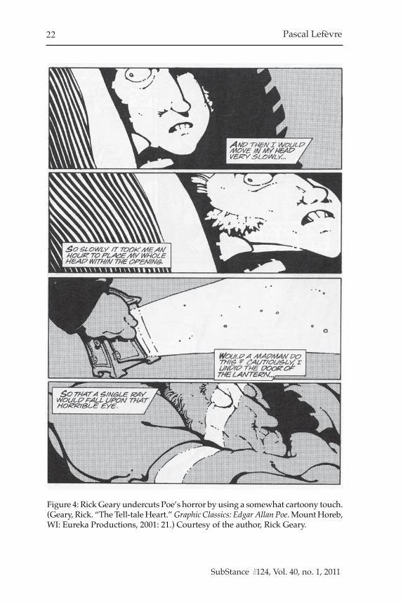
Here I have already begun to address the issue of adaptation. I would like to briefly consider the contrasting adaptations of Edgar Allan Poe’s short story The Tell-Tale Heart by Argentine artist Alberto Breccia (1974, see figure 3) and by American artist Rick Geary (2001, see figure 4). Both adaptations, which were published in black and white, remain quite close to the original Poe story, and do not add completely new plot events (as another comic adaptation by Crandall has done). But there are many dif-ferences between Breccia’s and Geary’s versions. Paradoxically Geary’s version has more pages (18 to Breccia’s 11) but fewer panels in total (59 to Breccia’s 108). This can be partially explained by the constraints of publication format: Breccia worked in a typical European album format, while Geary was published in the smaller North American comic book format. But beyond this, each artist has a distinctive visual approach. For example, Geary presents far more details about the setting of the story, while Breccia de-emphasizes the setting by creating an almost abstract contrast between whites and blacks in the background. Breccia visual-izes the narrator’s cautiousness in opening the door of the old man’s bedroom by segmenting that act into eight panels with only minimal variations: the point of view remains unchanged across these panels, but a thin vertical line of white (representing the opening of the door) slowly becomes larger as the head of the narrator-protagonist appears. Unlike Breccia, Geary never repeats the same framing and point of view; every move to another panel involves a change in perspective or framing, and mostly both. Geary is clearly more in line with the classic doctrine of a dynamic breakdown of scenes—a doctrine that has informed the design of American comic books since Jack Kirby’s Captain America (Harvey 33-35). According to this doctrine, the reader should be stimulated by being offered shifting perspectives and changing ways of framing events, even as the storytelling itself remains legible throughout.5
In Poe’s account, this scene is located in complete darkness: his nar-rator tell us about a dark lantern closed so that no light shone out, such that when finally—after an hour—he had placed his whole head in the door opening, he undid the lantern only “so much that a single thin ray fell upon the vulture eye” of the old man (Poe 244). To be sure, a scene in complete darkness is not an ideal starting point for a graphic adaptation. A visual artist needs some contrast between white and black to show something. By using a grey screen tone Geary can both signal the darkness of the room and keep the black contour lines of his characters and objects

Pascal Lefèvre
SubStance #124, Vol. 40, no. 1, 2011SubStance #124, Vol. 40, no. 1, 2011
Pascal Lefèvre
SubStance #124, Vol. 40, no. 1, 2011SubStance #124, Vol. 40, no. 1, 2011
21Medium-Specific Qualities of Graphic Narratives
Figure 3: Breccia exploits the contrasts between white and black for narrative purposes in his 1970s adaptation of Poe’s short story The Tell-Tale Heart. (Breccia, Alberto. Le Cœur révélateur et autres histories extraordinaires d’Edgar Poe. Paris: Les Humanoïdes Associés, 1995.)
Pascal Lefèvre
SubStance #124, Vol. 40, no. 1, 2011SubStance #124, Vol. 40, no. 1, 2011
22 Pascal Lefèvre
SubStance #124, Vol. 40, no. 1, 2011SubStance #124, Vol. 40, no. 1, 2011
Figure 4: Rick Geary undercuts Poe’s horror by using a somewhat cartoony touch. (Geary, Rick. “The Tell-tale Heart.” Graphic Classics: Edgar Allan Poe. Mount Horeb, WI: Eureka Productions, 2001: 21.) Courtesy of the author, Rick Geary.

Pascal Lefèvre
SubStance #124, Vol. 40, no. 1, 2011SubStance #124, Vol. 40, no. 1, 2011
Pascal Lefèvre
SubStance #124, Vol. 40, no. 1, 2011SubStance #124, Vol. 40, no. 1, 2011
23Medium-Specific Qualities of Graphic Narratives
visible. In Breccia’s version, the strong contrast between the whites and blacks may not refer at all to a contrast between light and darkness—ex-cept for the white that represents the ray of light from the lantern. While the vertical white line may suggest that a light source is located behind the narrator-protagonist (probably in the hall), the handle on the inside of the dark room also lights up. This is of course not a realistic use of light; rather, Breccia exploits the contrasts between white and black for narrative purposes: the vertical light and the slanted white handle both indicate the slow opening of the door. If there were no white, the reader would not see the black door opening; nor would one see the handle. In turn, these elements are crucial for highlighting the narrator’s extremely (perhaps obsessively) careful and slow opening of the door. The black and white zones of the image thus do not necessary coincide with presence or absence of light; instead the artist uses them as expressive and narrative tools. Furthermore, breaking down the narrator’s actions into a series of almost identical panels, Breccia uses the repeated individual images to suggest the repetition of this action for seven nights.
Beyond this, there is a remarkable difference in the way Breccia and Geary have drawn the characters. The narrator in Poe’s version does not describe the physical attributes of the characters, beyond mentioning that his master is an old man with a pale blue eye, which he compares to that of a vulture. So the two artists had a considerable amount of freedom to visualize the characters. Except for the age difference between the servant and the old man (in both versions the master is bald), the characters look quite different in the two versions. While both artists use broadly real-ist techniques, Breccia exploits expressionist elements and Geary draws in a more humorous, cartoon style. In fact, Geary deforms not only the characters, but also their surroundings: all lines that trace furniture or architecture are bent, giving the objects a look of elasticity. Geary’s cartoon approach seems to take the horror of the story less seriously than do Poe or Breccia. Furthermore, not only do the characters and the backgrounds differ in the two adaptations, but so does the rhythm of the action, in its breakdown into panels.
Temporal Aspects of Individual PanelsAnother crucial aspect of graphic narratives is the way it handles
time, and how this influences the narration process. Panels reduce the chronological timeline of the fabula to selected and fragmented units. However, each panel can comprise not only a moment (a very brief period of time), but also a longer temporal stretch. And panels can even combine multiple distinct moments. While the shutter speed of a photo can tell us the precise time period recorded by the camera, there is no objective way

Pascal Lefèvre
SubStance #124, Vol. 40, no. 1, 2011SubStance #124, Vol. 40, no. 1, 2011
24 Pascal Lefèvre
SubStance #124, Vol. 40, no. 1, 2011SubStance #124, Vol. 40, no. 1, 2011
to determine the time period encapsulated by a handmade picture. Though thick contour lines seem to fixate objects and characters at a particular moment of the diegetic time, other visual devices (patterns of oscillation or pictorial runes like speed lines) can suggest the passing of time over a longer period than just a split second. In addition, verbal elements such as speech balloons also imply a short period of time—just enough time for the words in the balloon to be uttered by the characters. An individual panel can even include a short dialogue between two characters (A and B), where the text in balloon B is a response to what A has said in balloon A. Since these dialogue balloons are combined with a static representa-tion of characters A and B in a particular position, various interpretations are possible: does the panel focus on a precise moment of time, which corresponds to a precise moment during the speech of A or B? Is it being used to represent the entire period of the dialogue (balloon A plus B)? Or is the panel meant to evoke several distinct moments of time, such as a precise moment during which A is speaking, plus a precise, later moment during which B is speaking?
Though this temporal ambiguity and flexibility seems complex on a theoretical level, in practice readers will seldom linger over such questions about the temporal dimensions of individual panels. As long as the reader has no problem in understanding the temporal order of a series of panels, questions like the ones just raised are not likely to give the reader pause. Only exceptionally will the temporal flexibility, or multi-temporality, of an individual panel demand the reader’s explicit attention. For instance in the French comic strip Le Café de la Plage, by Régis Franc (see figure 5), one sequence includes panels featuring a character as both an adult in the present and as a child in the past; moreover, the decor shown in the panels combines elements of the present with elements of the past. The purpose of this mixing of two time periods within the confines of a single panel is to offer an ironic contrast between what the adult says he remembers and how his past really was. The child is much more negative about what happens than the adult seems to remember. Arguably, an effect of this sort would be much more difficult to achieve in cinema, because the viewer would have to follow different focus points at the same moment. In a graphic narrative this multi-tracking of time does not cause major problems, because the reader can spend all the time he needs on one picture. He can linger on a panel, scan the complete page, or return to panels or whole sequences at will. A film projection, by contrast, obliges the viewer to follow its constant forward movement. Whereas in film the shots are arranged in a linear time sequence, in comics the panels are placed not only in a linear sequence, but also in a larger space, namely the page. In this sense, comics are much more a spatial medium than film,

Pascal Lefèvre
SubStance #124, Vol. 40, no. 1, 2011SubStance #124, Vol. 40, no. 1, 2011
Pascal Lefèvre
SubStance #124, Vol. 40, no. 1, 2011SubStance #124, Vol. 40, no. 1, 2011
25Medium-Specific Qualities of Graphic Narratives
Figure 5: In these panels various time periods are fluidly combined: the same character is shown both as an adult in the present and as a child in past. Frag-ment from the album Le Café de la Plage (1989: 94) by Régis Franc, © Casterman, courtesy of the author and Editions Casterman.
Pascal Lefèvre
SubStance #124, Vol. 40, no. 1, 2011SubStance #124, Vol. 40, no. 1, 2011
26 Pascal Lefèvre
SubStance #124, Vol. 40, no. 1, 2011SubStance #124, Vol. 40, no. 1, 2011
with the different spatial relationships between elements in and across panels cueing readers to trace out the multiple time-lines at work in a given narrative.
Panel Sequences
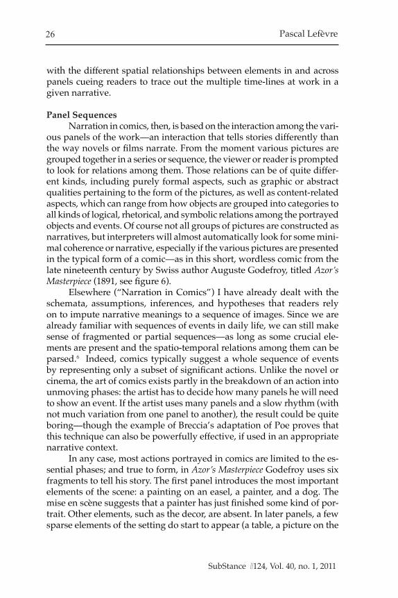
Narration in comics, then, is based on the interaction among the vari-ous panels of the work—an interaction that tells stories differently than the way novels or films narrate. From the moment various pictures are grouped together in a series or sequence, the viewer or reader is prompted to look for relations among them. Those relations can be of quite differ-ent kinds, including purely formal aspects, such as graphic or abstract qualities pertaining to the form of the pictures, as well as content-related aspects, which can range from how objects are grouped into categories to all kinds of logical, rhetorical, and symbolic relations among the portrayed objects and events. Of course not all groups of pictures are constructed as narratives, but interpreters will almost automatically look for some mini-mal coherence or narrative, especially if the various pictures are presented in the typical form of a comic—as in this short, wordless comic from the late nineteenth century by Swiss author Auguste Godefroy, titled Azor’s Masterpiece (1891, see figure 6).
Elsewhere (“Narration in Comics”) I have already dealt with the schemata, assumptions, inferences, and hypotheses that readers rely on to impute narrative meanings to a sequence of images. Since we are already familiar with sequences of events in daily life, we can still make sense of fragmented or partial sequences—as long as some crucial ele-ments are present and the spatio-temporal relations among them can be parsed.6 Indeed, comics typically suggest a whole sequence of events by representing only a subset of significant actions. Unlike the novel or cinema, the art of comics exists partly in the breakdown of an action into unmoving phases: the artist has to decide how many panels he will need to show an event. If the artist uses many panels and a slow rhythm (with not much variation from one panel to another), the result could be quite boring—though the example of Breccia’s adaptation of Poe proves that this technique can also be powerfully effective, if used in an appropriate narrative context.
In any case, most actions portrayed in comics are limited to the es-sential phases; and true to form, in Azor’s Masterpiece Godefroy uses six fragments to tell his story. The first panel introduces the most important elements of the scene: a painting on an easel, a painter, and a dog. The mise en scène suggests that a painter has just finished some kind of por-trait. Other elements, such as the decor, are absent. In later panels, a few sparse elements of the setting do start to appear (a table, a picture on the

Pascal Lefèvre
SubStance #124, Vol. 40, no. 1, 2011SubStance #124, Vol. 40, no. 1, 2011
Pascal Lefèvre
SubStance #124, Vol. 40, no. 1, 2011SubStance #124, Vol. 40, no. 1, 2011
27Medium-Specific Qualities of Graphic Narratives
Figure 6: A typical silent comic from late 19th century. (Godefroy, Auguste Vio-llier. Het meesterstuk van Azor. [Azor’s Masterpiece]. De Vlaamsche Patriot 4.24 (13 December 1891): 284.).

Pascal Lefèvre
SubStance #124, Vol. 40, no. 1, 2011SubStance #124, Vol. 40, no. 1, 2011
28 Pascal Lefèvre
SubStance #124, Vol. 40, no. 1, 2011SubStance #124, Vol. 40, no. 1, 2011
wall, a door frame), but they do not play a prominent role; instead, they remain literally and figuratively background elements. Every panel shows clearly essential phases of or kernel events in the story, as when the dog takes the canvas from the easel when the painter dozes off in his chair. Godefroy does not provide explicit reasons for the characters’ actions (the reader may infer that the painter is tired after completing the portrait, but the actions of the dog, in taking the painting from the easel and licking it, at first seem unmotivated). However, the elements that are included provide enough of a skeleton for the reader to flesh out.
This wordless comic is thus an example of a canonical story, featuring unmoving events arranged in a chronological order that enables inferences about the logical and temporal (and in some cases causal) relationships among those events.7 Verbally one could summarize this as story about a painter who has finished a realistic portrait, and whose dog takes the canvas and starts licking the wet paint when the artist takes a nap. When the artist awakes, he finds a completely changed painting on the floor. Later, when another man comes to the workshop and pays a lot of money for the painting, we see the irony: the dog has made the painting more valuable by deranging the artist’s original design.8 A filmic or animated adaptation might show the same events in one long unbroken shot of, say, twenty minutes, or the adaptation might be broken down into six short shots that show the most important phases (more or less like the comic did) in the time span of just two minutes. While verbal summaries of the long, unedited and the short, edited filmic version might be similar, the viewing experience would be quite different, not least because the viewer would have different temporal experiences. Moreover, the edited filmic version with six short shots would offer a somewhat different ex-perience to the spectator than to the reader of the graphic narrative. For instance, a conventional film would treat space in a completely different way: elements of the setting (such as the table or door frame) would not suddenly appear or disappear as they do in the comic. And while a film obliges the viewer to follow the rhythm of the sequences, in a comic the reader sets the pace—lingering on a panel, scanning the complete page, or returning to particular panels as desired (Lefèvre, “Incompatible Visual Ontologies?” 5).
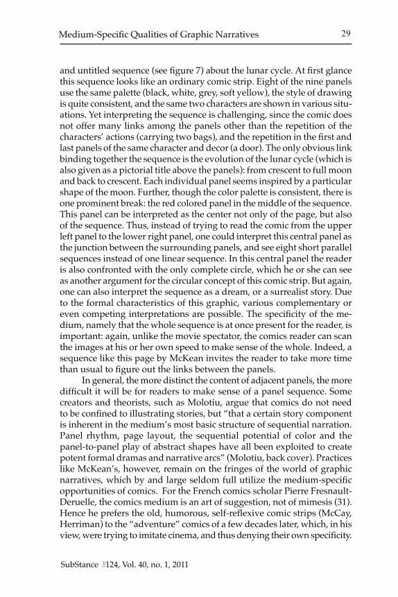
In contrast to Godefroy’s short silent comic, in a longer graphic narrative the link between the panels can be quite complex. For instance, in a work like Here, by Richard McGuire, where events are narrated in a massively scrambled order, every fragment is nonetheless explicitly linked to a particular year by a date. Only rarely is the temporal organization of a comic so complicated that not even academic study can solve all the mysteries or paradoxes—as in the case of Andreas’s Cyrrus, explored by Sohet, Lacroix, and Ratier. A shorter example is Dave McKean’s wordless
Pascal Lefèvre
SubStance #124, Vol. 40, no. 1, 2011SubStance #124, Vol. 40, no. 1, 2011
Pascal Lefèvre
SubStance #124, Vol. 40, no. 1, 2011SubStance #124, Vol. 40, no. 1, 2011
29Medium-Specific Qualities of Graphic Narratives
and untitled sequence (see figure 7) about the lunar cycle. At first glance this sequence looks like an ordinary comic strip. Eight of the nine panels use the same palette (black, white, grey, soft yellow), the style of drawing is quite consistent, and the same two characters are shown in various situ-ations. Yet interpreting the sequence is challenging, since the comic does not offer many links among the panels other than the repetition of the characters’ actions (carrying two bags), and the repetition in the first and last panels of the same character and decor (a door). The only obvious link binding together the sequence is the evolution of the lunar cycle (which is also given as a pictorial title above the panels): from crescent to full moon and back to crescent. Each individual panel seems inspired by a particular shape of the moon. Further, though the color palette is consistent, there is one prominent break: the red colored panel in the middle of the sequence. This panel can be interpreted as the center not only of the page, but also of the sequence. Thus, instead of trying to read the comic from the upper left panel to the lower right panel, one could interpret this central panel as the junction between the surrounding panels, and see eight short parallel sequences instead of one linear sequence. In this central panel the reader is also confronted with the only complete circle, which he or she can see as another argument for the circular concept of this comic strip. But again, one can also interpret the sequence as a dream, or a surrealist story. Due to the formal characteristics of this graphic, various complementary or even competing interpretations are possible. The specificity of the me-dium, namely that the whole sequence is at once present for the reader, is important: again, unlike the movie spectator, the comics reader can scan the images at his or her own speed to make sense of the whole. Indeed, a sequence like this page by McKean invites the reader to take more time than usual to figure out the links between the panels.
In general, the more distinct the content of adjacent panels, the more difficult it will be for readers to make sense of a panel sequence. Some creators and theorists, such as Molotiu, argue that comics do not need to be confined to illustrating stories, but “that a certain story component is inherent in the medium’s most basic structure of sequential narration. Panel rhythm, page layout, the sequential potential of color and the panel-to-panel play of abstract shapes have all been exploited to create potent formal dramas and narrative arcs” (Molotiu, back cover). Practices like McKean’s, however, remain on the fringes of the world of graphic narratives, which by and large seldom full utilize the medium-specific opportunities of comics. For the French comics scholar Pierre Fresnault-Deruelle, the comics medium is an art of suggestion, not of mimesis (31). Hence he prefers the old, humorous, self-reflexive comic strips (McCay, Herriman) to the “adventure” comics of a few decades later, which, in his view, were trying to imitate cinema, and thus denying their own specificity.

Pascal Lefèvre
SubStance #124, Vol. 40, no. 1, 2011SubStance #124, Vol. 40, no. 1, 2011
30 Pascal Lefèvre
SubStance #124, Vol. 40, no. 1, 2011SubStance #124, Vol. 40, no. 1, 2011
Figure 7: A complex sequence by the British artist Dave McKean. McKean, Dave. Silkscreen without title. Leuven: Beeld Beeld, 2003.
Courtesy of the publisher, Beeld Beeld.
Pascal Lefèvre
SubStance #124, Vol. 40, no. 1, 2011SubStance #124, Vol. 40, no. 1, 2011
Pascal Lefèvre
SubStance #124, Vol. 40, no. 1, 2011SubStance #124, Vol. 40, no. 1, 2011
31Medium-Specific Qualities of Graphic Narratives
The Constraints of the MediumAs David Davies has noted, “in appreciating a work, we must always
attend to how an ‘artistic statement’ has been articulated in a particular artistic medium, and how the articulation exploits the qualities of the ve-hicle that realizes that artistic medium” (190). An artist has to make many choices within the framework of a given medium, and in this article I have sketched out just some of the more salient choices facing the comic artist.. The comic’s formal options are constrained and constructed by design principles, practices of production and consumption, and other aspects of the social context. As I have demonstrated, the choice of a graphic style implies a particular visual ontology, and consequently will suggest to the reader a particular way of interpreting the storyworld. (Unfortunately, few studies explore just how readers are affected by factors such as drawing style; exceptions to this include Ramsey and Wang; see also Jared Gard-ner’s contribution to this special issue). Another constitutive element and constraint of the comics medium is the use of a series of drawn panels. As we have seen, it is possible to convey complicated temporal relation-ships even at the level of the individual panel. A sequence of panels offers even more possibilities, as in the case of Régis Franc’s Le Café de la Plage or McGuire’s Here. Thus graphic narratives feature complex interactions among all these formal aspects (drawing style, mise en scène, framing, typography, page layout) that together constitute an overall style. And style is crucial since it is the reader’s only gateway, in a first phase, to the sjuzhet/plot (actual emplotment of events), and in a subsequent phase, to the fabula or story (hypothetical chronological sequence of events as constructed by the reader). Paraphrasing film scholar David Bordwell, one could say that the form of a comic consists of materials—subject mat-ter, themes—shaped and transformed by the overall composition (plot structure) and stylistic patterning (Ozu 1).
In conclusion, I would like to simply reiterate that when it comes to comics, we must bear in mind how the medium itself offers unique possibilities for storytelling, even as it imposes limitations on how the story can be told.
University of Leuven, Belgium
Notes1. For more on issues of publication format, see Lefèvre, “The Importance of Being Published.”2. Cognitive psychologists Cutting and Massironi (163) likewise stress the similarity between look-
ing at images and online perception of the world.3. For further discussion, see Jared Gardner’s contribution to this special issue.4. Arnheim (143) makes the connection between drawing in a certain style and evoking a particular
musical theme in a composition.5. Joe Kubert, a comic book artist and director of a school for comic book artists, explains:
“In fact, point of view is a device used to pull the reader into the story. If you can do

Pascal Lefèvre
SubStance #124, Vol. 40, no. 1, 2011SubStance #124, Vol. 40, no. 1, 2011
32 Pascal Lefèvre
SubStance #124, Vol. 40, no. 1, 2011SubStance #124, Vol. 40, no. 1, 2011
that then the story becomes effective [....] What the artist is trying to do, consciously or subconsciously, is create still images which will give the impression of movement and validity. And if the reader loses track of the story, then he’s looking at pretty pictures, and that’s only a small part of the cartoonist’s job. Drawing is the easy part. The tough part is putting those drawings in a fascinating, exciting and, most importantly, legible context. Storytelling is the most important aspect” (31; 29).
6. However we have to keep in mind that unnatural features are “a constituent, important, and challenging feature of most narratives, and that the synthetic and the mimetic, or the unnatural and the natural, often dovetail” (Alber, Iversen, Nielsen, and Richardson 130).
7. As in this early comic, most creators of contemporary graphic narratives still arrange their panels in a chronological, linear order. Usually if a work interrupts the main time-line with jumps to the past or to the future (as in Watchmen or Jimmy Corrigan), such jumps are signaled by visual or verbal indications. When a reader opens a comic, he or she expects that there is not only a dominant chronological order for the main story line, but also an orienting chronological sequence in every flashback or flashforward.
8. Of course not all these actions are literally shown; for example, we don’t see the man paying the artist, but in the final panel several elements suggest that the painting has been sold: in the background we see the man leaving with the canvas, while in the foreground the easel is empty and the artist is smiling with a lot of money in his hands, and is petting his dog. Hence we can reasonably conclude that a sale has taken place. The painter’s nonverbal expressions (smiling and petting the dog) evoke his interior emotional state as well as the inferences he has drawn (he understands that it is thanks to his dog that he has acquired a lot of money). The point of this comic is nevertheless not this bare series of actions, but rather what Godefroy wanted to communicate—that the new artistic currents and tastes of the late nineteenth century deviated from former, realistic traditions, but not necessarily in ways that merited praise or respect. Implicitly, the author hopes that readers share his ironic view, or else the humor will not be very effective. So, a reader of the comic not only has to understand the story, but also must come to a conclusion about its intent.
Works CitedComicsAndreas. “Chlorophylle contre les rats noirs.” (2 tribute pages). Tintin, Special 35th Anni-
versary Issue. 29 September 1981.Breccia, Alberto. Le Cœur révélateur et autres histories extraordinaires d’Edgar Poe. Paris: Les
Humanoïdes Associés, 1995.Crandall, Reed and A. Goodwin. “The Tell-Tale Heart.” (Edgar Allan Poe adaptation) Creepy
3, June 1965, 13-20.Franc, Régis. Le Café de la Plage. Tournai: Casterman, 1989.Geary, Rick. “The Tell-tale Heart.” Graphic Classics: Edgar Allan Poe. Mount Horeb, WI:
Eureka Productions, 2001.Godefroy, Auguste Viollier. “Het meesterstuk van Azor.” [Azor’s Masterpiece]. De Vlaamsche
Patriot 4.24 (13 December 1891): 284.Macherot, Raymond. Chlorophylle contre les rats noirs. Brussels: Lombard, 1956.McKean, Dave. Silkscreen without title. Leuven: Beeld Beeld, 2003.CriticismAlber, Jan, Stefan Iversen, Henrik Skov Nielsen, and Brian Richardson. “Unnatural Narra-
tives, Unnatural Narratology: Beyond Mimetic Models.” Narrative 18.2 (2010): 113-36.Arnheim, Rudolf. Art and Visual Perception, a Psychology of the Creative Eye. Berkeley: U of
California P, 1971.Bordwell, David. Narration in the Fiction Film. London: Methuen, 1986.——-. Ozu and the Poetics of Cinema. London: BFI, 1988.Cent pour cent, bande dessinée. Angoulême / Paris: La cité internationale de la bande dessinée
et de l’image / Paris bibliothèques, 2010.

Pascal Lefèvre
SubStance #124, Vol. 40, no. 1, 2011SubStance #124, Vol. 40, no. 1, 2011
Pascal Lefèvre
SubStance #124, Vol. 40, no. 1, 2011SubStance #124, Vol. 40, no. 1, 2011
33Medium-Specific Qualities of Graphic Narratives
Cutting, James E., and Manfredo Massironi. “Pictures and Their Special Status in Perceptual and Cognitive Inquiry.” Perception and Cognition at Century’s End. Ed. Julian Hochberg. San Diego: Academic Press, 1998. 137-68.
Davies, David. “Medium in Art” The Oxford Handbook of Aesthetics. Ed. Jerrold Levinson. Oxford: Oxford UP, 2005. 181-91.
Fresnault-Deruelle, Pierre. “La bande dessinée, ersatz de cinéma?” Lecture et Bande Dessinée. 1er colloque international éducation et BD, La Roque d’Antheron, 15-16 janvier 1977. Edisud, 1977 : 25-31.
Grodal, Torben. “The PECMA Flow: A General Model of Visual Aesthetics.” Film Studies 8, summer 2006. Web 4 January 2010 <www.manchesteruniversitypress.co.uk/uploads/.../FS801.pdf >
——-. Moving Pictures: A New Theory of Film Genres, Feelings, and Cognition. Oxford: Clar-endon P, 1997.
Groensteen, Thierry. “Le cadavre tombé de rien ou la troisième qualité du scénariste.” Aut-our du scenario. Ed. Benoît Peeters. Revue de l’Université de Bruxelles. 1986/1-2: 111-18.
——-. “Du 7e au 9e art: l’inventaire des singularités.” In: CinémAction HS: cinéma et bande dessinée. Paris: Corlet – Télérama, 1990: 16-28.
Harvey, Robert C. The Art of the Comic Book: An Aesthetic History. Jackson: UP of Mississippi, 1996.
Herman, David. “Toward a Transmedial Narratology.” Narrative across Media: The Languages of Storytelling. Ed. Marie-Laure Ryan. U of Nebraska P, 2004. 47-75.
Lefèvre, Pascal. “The Importance of Being ‘Published’. A Comparative Study of Different Comics Formats.” Comics & Culture. Eds. Anne Magnussen and Hans-Christian Christian-sen. Copenhagen: Museum Tusculanum at the University of Copenhagen, 2000. 91-105.
——-. “Narration in Comics.” Image (&) narrative. Online magazine 1.1. (2000). Web. 30 May 2010. <www.imageandnarrative.be/narratology/pascallefevre.htm>.
——-. “Incompatible Visual Ontologies? The Problematic Adaptation of Drawn Images.” Film and Comic Books. Eds. Ian Gordon, Mark Jancovich, Mathew McAllister. Jackson: UP of Mississippi, 2007. 1-12.
——-. “Recovering Sensuality in Comics Theory.” International Journal of Comic Art 1.1 (1990): 140-49.
Marion, Philippe. Traces en cases. Travail graphique, figuration narrative et participation du lecteur. Essai sur la bande dessinée. Louvain-la-Neuve: Academia, 1993.
Molotiu, Andrei, ed. Abstract Comics. Seattle: Fantagraphic Books, 2009.Peters, Jan-Marie. Pictorial Signs and the Language of Film. Amsterdam: Rodopi, 1981.Poe, Edgar Allan. The Complete Illustrated Stories and Poems of Edgar Allan Poe. London:
Chancellor Press, 1988.Ramsey, Inez L. “Effect of Art Style on Children’s Picture Preferences.” The Journal of Edu-
cational Research 75.4 (Mar. - Apr. 1982): 237-240. Web 2 May 2010. <http://www.jstor.org/stable/27539901>
Rawson, Philip. Drawing. Philadelphia: U of Pennsylvania P, 1987.Ryan, Marie-Laure. “On the Theoretical Foundations of Transmedial Narratology.” Nar-
ratology beyond Literary Criticism: Mediality, Disciplinarity. Berlin: de Gruyter, 2003. 1-23.Schwarcz, J.H. Ways of the Illustrator. Visual Communication in Children’s Literature. Chicago:
American Library Association, 1982.Sohet, Philippe, Yves Lacroix, Gilles Ratier and Andreas. Andreas, Une Monographie. St-
Egrève: Mosquito, 1997.Van Hise, James. How to Draw Art for Comic Books: Lessons from the Masters. Las Vegas:
Pioneer Books, 1989.Wang, Meng-Huei. The Preference Trend of Illustration Style of Children’s Picture Book to Senior
High Students in Taiwan. Unpublished Master’s Thesis, Graduate School of Design, Taiwan, 2004.
Witek, Joseph. Comic Books as History: The Narrative Art of Jack Jackson, Art Spiegelman and Harvey Pekar. Jackson: UP of Mississippi, 1989.