
![[XLS]memberfiles.freewebs.commemberfiles.freewebs.com/25/11/77221125/documents... · Web viewSheet3 Sheet2 Sheet1 3601391 SHAIK KHAJAMOINUDDIN 203783 3621021 AMEERA YASMEEN MOHAMMED](https://static.fdocuments.in/doc/165x107/5b08aef07f8b9abe5d8b85b0/xls-viewsheet3-sheet2-sheet1-3601391-shaik-khajamoinuddin-203783-3621021-ameera.jpg)
Style sheet2
7
Style Sheet
-
Upload
mel-kala -
Category
Entertainment & Humor
-
view
28 -
download
1
Transcript of Style sheet2

Style Sheet
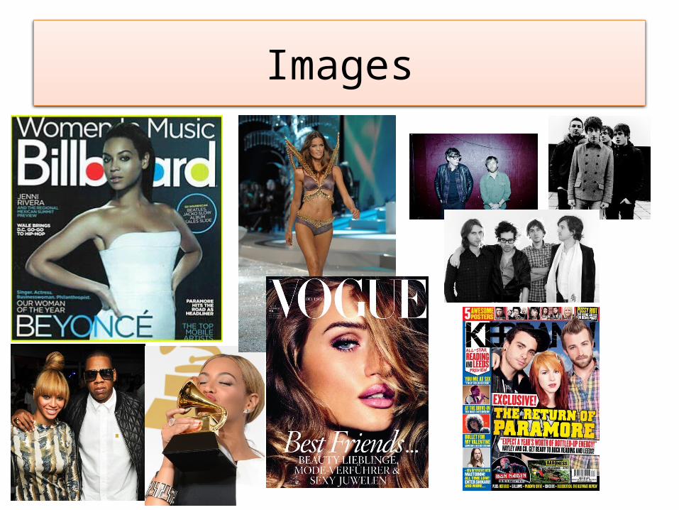
Images

My mood board consists of different bands, celebrities and magazine covers. Personally, I am a huge Beyoncé fan, so anything she is involved in, interests me. For example, the Billboard magazine cover is representing her in as a idol of music by her posture and being feminine and confident, then naming her the ‘woman of the year’ next to the image. This would particularly appeal to female audiences to see how she has got to where she is and how she has gained all this success especially to Beyoncé fans like me. I also have two pictures of models, one is on Vogue magazine, and one is on the Victoria's secret runway. These two images communicate with the principle of the Billboard magazine as they are showing confident women with in music. This again appeals to women and could encourage them to look healthy and take pride in what they look as the models are fairly well looked after which promotes a positive image for this genre of music. I have also included bands on the top right hand side of the page, including Arctic Monkeys and the Black Keys. These two bands in particular are very popular for their music and not necessarily for their exposure in magazines. Therefore I’m going to imitate non mainstream bands being within my magazine. All the studio photos have at least one model having direct address at the camera which establishes a connection with the audience.

Font
I chose these fonts because personally to me they came across as Unisex. Although my magazine is a fashion/music magazine that is aimed mainly at women, I don’t want the layout to be extremely girly and cliché. However, the ‘Budmo’ font seems really appealing and has a burlesque twist from America which is obviously aimed at female audiences.
The ‘Riesling’ font at the top is like a 1920’s Theatre billboard font, which could connote plays with women dancing. Alongside this it’s quite a curvaceous font suggesting femininity.

Colour SchemeMost of the colours I have chosen are gender neutral despite the fact that my magazine is aimed at a female audience. However, all the colours in general still give off a female view. When using the colours I can link them with the mise en scene on my magazine and relate to the photographs which could give it a good structure.


![[XLS]fsulawrc.comfsulawrc.com/excelVBAfiles/142batch16B.xls · Web viewSheet3 Sheet2 Sheet1 142scan16B0001 142scan16B0002 142scan16B0003 142scan16B0004 142scan16B0005 142scan16B0006](https://static.fdocuments.in/doc/165x107/5b0145f27f8b9ab9598c10e8/xls-viewsheet3-sheet2-sheet1-142scan16b0001-142scan16b0002-142scan16b0003-142scan16b0004.jpg)


![[XLS]services.iriskf.orgservices.iriskf.org/FCKeditor/_samples/asp/excel/IFA... · Web viewSheet3 Sheet2 Sheet1 gandhiprasant723@rediffmail.com montu_net@hotmail.com rejeshdedhia@hotmail.com](https://static.fdocuments.in/doc/165x107/5ab070417f8b9a6b308e7f71/xls-viewsheet3-sheet2-sheet1-gandhiprasant723rediffmailcom-montunethotmailcom.jpg)

![[XLS]images.nature.com · Web viewSheet3 Sheet2 Sheet1 IHIHJGHHGEFB?EGGJJIIJJJJIIJIHJJJHHHHHFFFFFCCC HWI-1KL140:55:C20PMACXX:7:1202:12155:176874 1S28M CATATTTTCTTGTTGCTTCTTAACTAGCT](https://static.fdocuments.in/doc/165x107/5b024b8c7f8b9a6a2e8f9246/xls-viewsheet3-sheet2-sheet1-ihihjghhgefbeggjjiijjjjiijihjjjhhhhhfffffccc-hwi-1kl14055c20pmacxx7120212155176874.jpg)


