STUDY SERIES (Survey Methodology #2015-04) - Census.gov · The 2014 Census Test Internet instrument...
36
Report Issued: September 29, 2015 Disclaimer: This report is released to inform interested parties of research and to encourage discussion. The views expressed are those of the authors and not necessarily those of the U.S. Census Bureau. STUDY SERIES (Survey Methodology #2015-04) Usability Testing of the 2014 Census Test Online English Instrument Elizabeth Nichols Erica Olmsted-Hawala Rebecca Keegan Center for Survey Measurement Research and Methodology Directorate U.S. Census Bureau Washington, D.C. 20233
Transcript of STUDY SERIES (Survey Methodology #2015-04) - Census.gov · The 2014 Census Test Internet instrument...

Report Issued: September 29, 2015
Disclaimer: This report is released to inform interested parties of research and to encourage discussion. The views expressed are those of the authors and not necessarily those of the U.S. Census Bureau.
STUDY SERIES
(Survey Methodology #2015-04)
Usability Testing of the 2014 Census Test Online English Instrument
Elizabeth Nichols
Erica Olmsted-Hawala Rebecca Keegan
Center for Survey Measurement
Research and Methodology Directorate
U.S. Census Bureau Washington, D.C. 20233


1
EXECUTIVE SUMMARY
In April 2014, the Human Factors and Usability Research Group, part of the U.S. Census
Bureau’s Center for Survey Measurement, conducted a usability evaluation of a proposed online
instrument to be used by respondents selected for the 2014 Census Test who chose to report
online. The instrument would also be used to collect information from respondents who called
the Census Bureau’s telephone call center and completed the survey with an interviewer.
This usability evaluation had several objectives:
- to conduct usability testing of both the Spanish and English versions of the instrument
and to determine if there were any issues in the instrument in either language;
- to obtain feedback on the different race screen designs and edit messages used in the
different versions of the 2014 online instrument, and the new relationship categories,
which included the distinction between “same-sex” and “opposite-sex” spouses and
unmarried partners; and
- to obtain feedback on the draft email message, which would be sent to people in a 2014
Census Test panel.
This report presents only the results from testing the English version of the instrument. Results
from the usability testing of the 2014 Census Test online Spanish instrument are reported
elsewhere (Goerman and Meyer, forthcoming.)
Overall, the English version of the 2014 Census Test instrument worked well for the 11 English-
speaking participants. We did find two places for improvement within the survey:
- We uncovered a repetitiveness in the questions asking about other places lived, i.e., the
overcount questions.
- There was also a usability issue related to logging into the survey and making duplicate
entries by mistake.
The feedback received on the different race screen designs and edit messages suggested no
specific changes for the production test. The new relationship categories were understood, with
only one participant spontaneously commenting on the categories. Participants understood the
email message, suggesting no need for change. These and other findings are discussed in this
report.
2
1. Introduction
As part of the planning for the 2020 Decennial Census, the U.S. Census Bureau established
the Optimizing Self-Response Team, charged with looking at ways to maximize self-
response for the next census. As members of this team, staff from the Center for Survey
Measurement’s Human Factors and Usability Group was responsible for conducting usability
testing of the proposed 2014 Census Test online instrument. The focus of the usability
evaluation was to determine what, if any, changes needed to be made to the instrument prior
to 2014 Census Test in June of that year.
Testing included an assessment of the following:
Objective 1: Document any usability issues with the online instrument that caused the
user to enter incorrect information, become frustrated with the instrument, or prevent a
submission.
Objective 2: Collect user feedback on the new screens for the 2014 Census Test –
specifically the login, address collection screens, the three race screen versions, the three
race edit messages, and the relationship screen.
Objective 3: Determine if the users understood the proposed content of 2014 Census Test
email, whether they had any concerns with the Census Bureau emailing them, and collect
any user comments on the format of the email.
2. 2014 Census Test Internet Instrument Background
The 2014 Census Test online instrument included two ways to start the survey – 1) a user
could enter a 14-digit identification number included in the sampled household’s mailing
materials, or 2) a user could enter the survey without a number. The questions differ slightly
depending upon the way the user accesses the survey. Within this report, we refer to the first
situation as an “ID” path and the second situation as a “nonID” path.
Figure 1 is a screen shot of the first screen for the 2014 Census Test instrument. Respondents
in the ID path entered their User ID number and then continued by clicking “Login.”
Respondents in the nonID path clicked the “click here” link and proceeded to additional
address collection screens. Those address screens had been previously tested and
respondents found them satisfactory. Additionally, the address information collected on
those screens could be map-spotted and geocoded, which is important in order to tabulate
respondent-provided addresses accurately (Nichols, Childs, and King, 2014a, 2014b).

3
Figure 1: First or login screen for the 2014 Census Test online instrument
The 2014 Census Test Internet instrument ID path included different experimental panels for
the relationship, race and Hispanic origin questions, and the edit messages. The nonID path
only included one panel for each of the questions tested.
The relationship question was tested using two treatments. The first treatment used nearly
the same relationship question as the 2010 Decennial Census and the 2012 National Census
Test. The only difference was the addition of the Foster child response option. A second
treatment added two same-sex relationship options (Figure 2). All participants in this
usability testing received the second version with the same-sex relationship response options
because this version had not received as much testing as the other version.

4
Figure 2: New relationship question
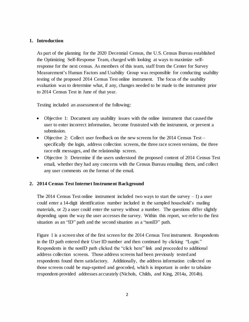
There were three race and Hispanic origin treatments – Version 1 is a combined race and
Hispanic origin option with checkboxes and write-ins on the same screen (Figure 3), Version
2 is a combined race and Hispanic origin option with checkboxes and write-ins on separate
screens (Figure 4 and Figure 5), and Version 3 includes separate Hispanic origin and race
questions, similar to questions used in the past (Figure 6 and Figure 7).

5
Figure 3: Version 1 - Combined race question with checkboxes and write-ins on same screen
Figure 4: Version 2 - Combined question with checkboxes and write-ins on separate screens- first of 2-part question
6
Figure 5: Version 2 - Combined question with checkboxes and write-ins on separate screens –second of 2-part question
Figure 6: Version 3 - Hispanic origin question used in prior censuses – first of 2-part question

7
Figure 7: Version 3 - Race question used in prior censuses – second of 2-part question
Three experimental edit messages for the race/Hispanic origin item were also tested. The
messages were shown when a respondent did not provide any race or ethnicity details in at
least one write-in field. Edit flag 1 was in green and included a message indicating that the
respondent should select the next button if they did not identify with an origin (Figure 8).
Edit flag 2 was identical to the previous version but was red instead of green (Figure 9). Edit
flag 3 was identical to the first but did not include a message indicating that the respondent
should select the next button if they did not identify with an origin (Figure 10). In all
versions of the survey, there was also a short red message that would appear if no response
was selected.

8
Figure 8: Edit flag 1 - "Green long" edit message
Figure 9: Edit flag 2 - "Red long" edit message

9
Figure 10: Edit flag 3 - "Green short" edit message
3. Method
3.1. Participants
Between April 2 and April 10, 2014, Census Bureau usability staff conducted a usability
evaluation of the English version of the 2014 Census Test online instrument. Eleven
participants took part. Participants were recruited through advertisements on Craigslist, in
local newspapers, and personal connections. One participant was a new hire at the Census
Bureau. All respondents lived in the Washington, D.C. metropolitan area. Participants had
at least one-year Internet experience.
The mean age of the participants was 41 years (range 22-56 years), and the mean education
level was 16 years of schooling (range 12 -18 years). See Table 1 for details about the
characteristics of the participants, including demographics and Internet use.

10
Table 1. Participant characteristics
Participants n=11
Gender Female
Male
7
4 Mean age in years (Standard Deviation) 41 (10.2) Education
< Some college Bachelors degree Post Bachelors degree
3 4 4
Race White
Black White/Black
7
2 2
Hispanic origin
Yes No
1 10
Mean weekly Internet usage in hours (Standard Deviation) 21 (15.8)
3.2. Study design
The 11 participants were assigned to complete the 2014 Census Test using either the ID or
the nonID path. The assignment order was based upon when the instrument path was
functional. Six participants were provided an identification number and completed the ID
path of the 2014 Census online instrument. Five participants were not provided a number
and completed the nonID path. The nonID path included the new relationship question, race
Version 2 (combined question with write-ins on a separate screen, and Edit flag 3 (green
short). For the six participants who completed the ID path questionnaire, three received race
Version 3 (two had Edit flag 3 and one had Edit flag 1); and three received race Version 1
(two had Edit flag 1 and one had Edit flag 2).
Each usability test session consisted of the participant completing the 2014 Census Test
online instrument while being observed by a test administrator (TA). Each participant was
instructed to answer the questions using his or her real life information, with the exception of
the address information for participants assigned to the ID path. Those participants were
instructed to pretend the preloaded address was their address. Participants were not
instructed to think aloud while completing the survey.
All but one of the tests took place at the Census Bureau’s usability lab. The lab uses desktop
computers with either an X120 or T120 Tobii eye tracking hardware and software. Camtasia
was used to record video and audio. Participants accessed the online survey through a
Windows 7 operating system with version 10 of the IE browser. The externally tested

11
participant accessed the online survey via a laptop with an X260 Tobii eye tracker and IE
browser version 10. All testing occurred one-on-one; one participant completed the survey
and one TA observed and interacted with the participant.
3.3. Test Procedure
Each usability session lasted between 60 and 90 minutes. Upon arriving at the usability lab
(or at the remote location), the participant signed a consent form that referenced the 0607-
0725 OMB control number for this study, the confidentiality of the session, the volunteer
nature of the study, and what will be recorded during the session. Once the consent form was
signed, the audio/video recorder was started. Then, the TA read to the participant a set of
instructions about the session. The participant completed a paper demographic questionnaire
and the online questionnaire about their computer and Internet experience. Once that was
complete, the participants’ eyes were calibrated for the eye tracking.
With eye tracking “on,” the TA asked the participant to read over an email message. Once
they were finished reading the email, eye tracking was stopped. The TA then asked the
participant questions about the email. With eye tracking “on,” the participant completed the
online 2014 Census Test online instrument. Halfway through the survey, the TA interrupted
the participant and asked him/her to exit the survey. After the participant saved and logged
out of the survey, the participant was asked to resume. After completing the survey, eye
tracking was stopped and the participant answered a satisfaction questionnaire about the
online Census survey they had just completed.
During the last part of the session, the TA showed the participant power point slides with
screen shots of specific screens of interest from the 2014 Census Test instrument and asked
debriefing questions about them. With eye tracking “on,” the TA showed the participant
power point slides with the race edit messages and then asked debriefing questions about the
race edit messages. At the end of the session the participant was asked for any final
comments on the survey as a whole. The TA stopped the video recording, and with the
exception of the new Census Bureau hire, the participant received the $40 honoraria and was
escorted from the building.
4. Results
This section provides detailed findings on accuracy, subjective satisfaction ratings, and
observational, debriefing and other usability results with the 2014 Census Test instrument.

12
4.1. Participant Accuracy
In this usability testing, participant accuracy is defined as the successful completion of
tasks using the application. All participants completed the survey during the usability
test and all participants could log out and log back into the survey. However, one
participant completed the survey twice, which indicated a usability problem. The first
time she was assigned to the ID path and completed part of the survey. Then, after
logging out, she logged back in using the nonID path and had to complete the entire
survey from the beginning. This error is described in Section 4.3.4.
4.2. Participant Satisfaction
After completing the online survey, participants completed a subjective satisfaction
questionnaire to assess different aspects of the survey. Table 2 contains the distribution
of satisfaction ratings for each topic. Overall, respondents rated the survey positively on
the characteristics measured.
Table 2. Participants’ Satisfaction ratings with specific aspects of the instrument
Source: 2014 Census Test Usability Testing - English
Distribution of responses Mean
Scale labels 1 2 3 4 5 6 7 NR
Screen layout
Confusing (1) – Clear (7) 0 0 0 0 2 3 5 1 6.3
Use of terminology through the survey
Inconsistent (1) – Consistent (7) 0 0 0 2 2 6 1 6.2
Instructions displayed on the screens.
Inadequate (1) – Adequate (7) 0 0 0 0 3 1 6 1 6.3
Questions displayed on the screens.
Confusing (1) – Clear (7) 0 0 0 1 1 1 4 3 6.3
Questions can be answered in a
straightforward manner
Never (1) – Always (7)
0 0 0 1 4 5 1 6.3
Organization of questions, instructions, and response categories in the survey
Confusing (1) – Clear (7)
0 0 0 0 1 4 5 1 6.4
Forward navigation
Impossible (1) – Easy (7) 0 0 0 0 0 1 9 1 6.9
Overall experience of completing the
survey
Difficult (1) – Easy (7)
0 0 0 0 1 2 7 1 6.6
Technical/Specialized Terminology
Too frequent (1) – Appropriate (7) 0 0 0 1 1 8 1 6.5
Overall reaction to the survey
Confusing (1) – Clear (7)
Frustrating (1) – Satisfying (7)
Difficult (1) – Easy (7)
0
0
0
0
0
0
0
0
0
1
1
0
2
2
2
4
1
0
3
3
6
1
1
1
5.9
5.9
6.4

13
4.3.Usability Issues and Recommendations
In this section, we discuss the observational and debriefing results from the usability test
sessions. We present the issues and the recommendations for improvement along with
the priority of the issue and the objective the issue was tied to.
As a reminder, there were three objectives of the testing:
Objective 1: Document any usability issues with the online instrument which caused
the user to enter incorrect information, become frustrated with the instrument, or
prevent a submission.
Objective 2: Collect user feedback on the new screens for the 2014 Census Test –
specifically the login, address collection screens, the three race screen versions, the
three race edit messages, and the relationship screen.
Objective 3: Determine if the users understood the proposed content of 2014 Census
Test email, whether they had any concerns with the Census Bureau emailing them,
and collect any user comments on the format of the email.
We classified the usability issues into the following categories:
High priority: These issues can prevent users from accomplishing their goals – they
might lead to errors while accomplishing their tasks or they might lead to excessive
amount of user time to accomplish the task. They are critical and should be addressed
quickly.
Medium priority: These issues reduce the efficiency with which tasks can be
completed. They slow down and frustrate the user, but do not necessarily halt the
interaction.
Low priority: These issues are minor, but significant enough to warrant user
comments. They negatively impact user satisfaction with the application, but do not
directly affect performance.
Positive finding: There are no usability issues with the design.
Issues are ordered by objective and then priority.
4.3.1.Overcount screen order and wording lead to errors. (Objective 1 and High priority)
Description of issue: Users experienced some usability issues with the questions that
asked if a household member lived any place else (besides the sample address). We
refer to this section within the questionnaire as the overcount screens. Four
participants responded that someone in their household had somewhere else to live.

14
All four participants initially said yes to the first question (about the seasonal or
second residence; see Figure 11) and yes to one of the subsequent questions about
another place to live because of work, college, or child custody arrangements. These
participants were asked to supply two addresses, but in each case there was only one
other address, not two. For example, the seasonal address was also the person’s
college address.
Due to the current instrument design, participants could not specify that these
addresses were the same place without typing them twice. Participants had some
usability problems when they were asked to type the address in a second time. For
example, one participant, when prompted a second time for the address, realized that
she had incorrectly answered the initial question and navigated back to click “no” to
the first question and then moved forward again. The next participant typed the same
address twice.
The third participant misunderstood the two questions. She entered the address where
the person stayed while working in the first address screen. She then attempted to
enter the address of the job location in the second address screen. (However, she said
she did not know the actual job address.) This was an incorrect interpretation of the
question. At the bottom of the screen, there is an open-text box to enter more
information about the location (see Figure 12), but she interpreted the instruction
above the box as telling her to enter the description of the job: “please also provide a
name or description of the job….” She typed, “[Name] is retired. He is an economist
and has contracts. …”). The gaze plot for this participant is in Figure 13. This plot
shows how her gaze honed in on the words “description of the job.”
One participant did not reveal his daughter’s mother’s address even though the
daughter stays very frequently at this address. He said he did not want to involve the
mother in something that he was unclear about, indicating that he did not understand
why we wanted the mother’s address and he did not know whether we would involve
the mother directly in his census response. In this particular situation, the child spent
most of the time with him, but he also said the situation changes in the summer when
it is a 50-50 split. He said he would always put his daughter down on his form. He
added that the census is about his household and the mother is not involved in his
household. He contrasted the census situation to his daughter’s school, saying that
school information does involve the mother and that the school has both addresses
(his and the mother’s).

15
Figure 11: First question in overcount question series
Figure 12: Job address overcount question

16
Figure 13: Gaze plot of one participant who understood that she needed to write in the description of the job since
she did not know the job address
Analysis: There are several problems with the overcount question series. First, users
do not understand that each alternate address only needs to be recorded once for each
person who stayed there. Instead, users answer “yes” to the first question because the
broad category of “sometimes living or staying at another home” seems to fit, and
then they answer “yes” again to a subsequent question because it fits the specific
situation. In two of the observed cases, the person stayed elsewhere because of a
“job” and answered “yes” to that question. As the heatmap in Figure 14 shows, on
the initial question, participants’ eyes hover over the part of the sentence that includes
the words “live or stay at another home,” and skip over the example that is listed,
missing the “seasonal,” and only very lightly noting the words “second residence.”

17
Figure 14: Eye tracking heatmap of initial overcount screen
A second problem with the current overcount series is that there is no way to identify
the same residence for a second time without retyping the address. In the usability
test sessions observed, one participant retyped the address again. Retyping the
address could lead to errors if the address is not entered in the same way, making the
same address appear to be a second address. Additionally, for large households
where everyone stays at the same address, retyping the address is burdensome.
A third problem with the instrument is that the write-in instructions are ambiguous. If
someone lives somewhere else because of a job, the Census needs the address where
that person lived or slept - not the address of the place of employment. The write-in
instruction in Figure 12 can be interpreted to mean the address either of the place of
employment or the place of residence.
A fourth problem is that participants did not know why we collect the other
addresses, which was illustrated by the one participant’s reluctance to put his child’s
mother’s address on his form.

18
Recommendations:
1. To encourage respondents to report an address only once, reorder the overcount
questions so that the questions go from specific address questions (such as college) to
more general address questions. A good example of this reordering is what was used
in the automated 2010 Census Coverage Measurement (CCM) instrument. That
survey instrument used a similar series of questions collecting other addresses where
a person stayed. In that series, the problematic question about the other home was
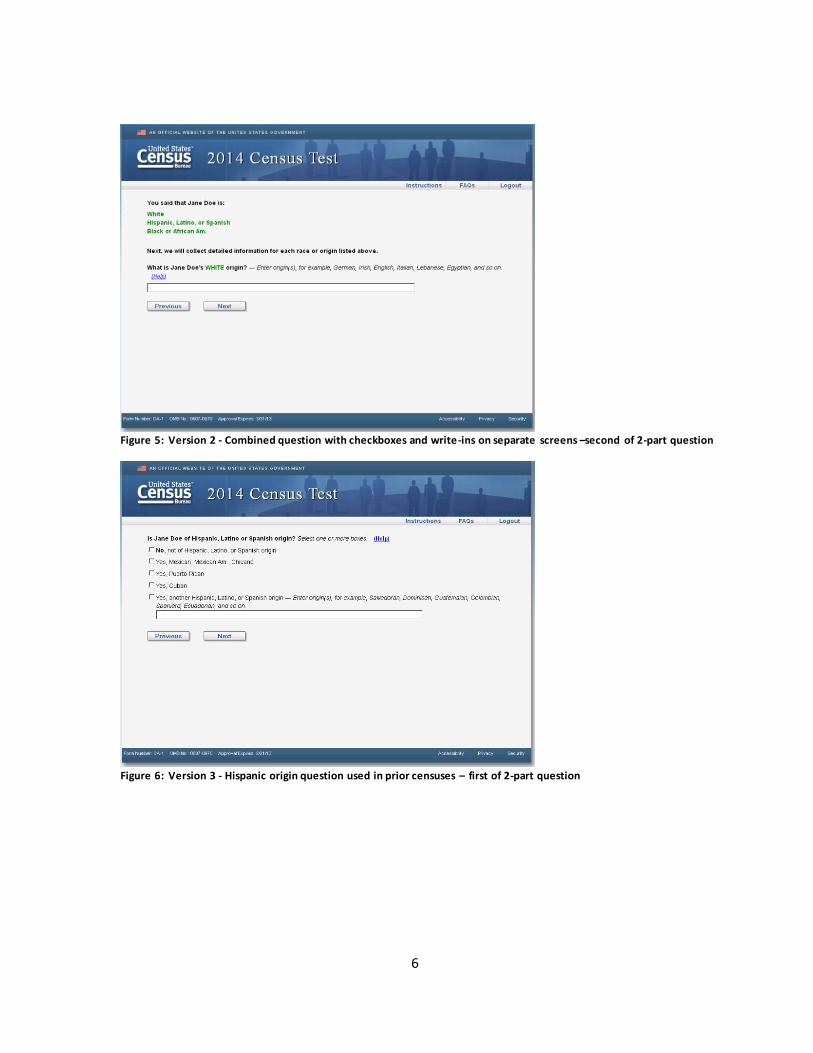
next to last (see Appendix A for order of the questions.) Even with a reordering, it is
difficult to make each question completely unique. Data analysts should expect
duplication of the address within the survey as was found in the CCM (Linse and
Argarin, 2012).
2. To reduce burden, modify the question to clarify for the respondent that a second
address should only be given if the other address is a different location.
3. To minimize burden, allow respondents to select any address previously reported
for themselves or other family members. This design was used in the CCM and the
survey used in the third round of the RTI, Inc. cognitive and usability testing. Both
these data collections allowed a user to select an address later in the interview if it
was mentioned again instead of retyping it (Linse, 2010; Geisen et al., 2012; Geisen
et al., 2013).
4. To clarify the intent of the questions, re-word the screen that asks for the job
address. One possible example is: “If you don't know the address of the place where
<name> stayed while working, please enter as much information as you can. For
example, enter the city and state, landmarks or cross streets, hotel name (if
applicable) and so on.”
4.3.2.Content issues (Objective 1 and Medium priority)
Description of the issue: During the actual 2014 Census Test, one of the authors of
this report observed an older adult completing the online form. The older adult had
difficulty with the origin question, the verification question and the reference person
question. These findings are found in Appendix B as they were not discovered
during the usability testing sessions described in this report.
Recommendation: Make corrections to rectify these issues prior to the 2015 Census
Test.

19
4.3.3.Initial roster question content issue (Objective 1 and Low priority)
Description of the issue: One participant did not initially add his baby to the roster.
He was able to add the child on the follow-up screen that mentions babies.
Another participant did not initially add his wife and two children to the roster. He
was able to add them on the follow-up screen which asked for other relatives. During
the debriefing, he said that he was thinking the roster question would first ask for
immediate family members and then ask for other relatives.
Analysis: In both of these instances where family members were initially left off the
roster, the subsequent screens that asked for specific yes/no answers for additional
persons appeared to catch the missing people.
Recommendation: None
4.3.4.Login issues and creating duplicate returns (Objective 2 and High priority)
Description of the issue: One task included in the usability test was to stop the
participant mid-way through the online survey and ask them to suspend the survey.
Once they had logged out, we then asked them to resume the online survey. The goal
was to see if they could save and log out and then resume a session. This task
required the participant to use a PIN. One participant who originally had been given
an identification number attempted to re-enter the survey but inadvertently navigated
to the nonID path. During the task, the TA told her to imagine she had forgotten her
PIN. She entered her identification number and then correctly clicked the “Forgot
PIN” link. She answered the security question correctly and received the new PIN.
She clicked the link to login and entered her new PIN but did not reenter her ID.
(The screen had not kept the ID from her previous entry.) Without an ID, but with a
PIN, the “non-ID” path started. This participant then completed the nonID path of the
instrument. She completed all the screens in the nonID version, including the screens
she had previously completed in the ID path. This created two returns for her, the
original partially completed return with the ID and the fully completed nonID return.
Analysis: This participant inadvertently completed two census forms. If not
addressed, this issue could result in data errors, as it is not clear if the first unfinished

20
interview would take precedence and be completed during nonresponse follow-up, or
if the first interview and subsequent nonID interview would be unduplicated.
Recommendation: There are at least two possible solutions to this problem. One is to
keep the identification number on the screen if the respondent has entered it and
clicks on the “Forgot PIN” link. Another solution is to remind users to enter their
identification number again, if they enter a PIN but do not have an identification
number entered.
4.3.5.Race edits were not noticed when activated and during the debriefing these edits
caused some confusion (Objective 2 and High priority)
Description of the issue: Generally, very few race edits were invoked during the
actual sessions. Only three participants received them. Eye tracking data was
collected from two of the three participants.
One participant, after receiving the long red edit on Version 1 of the race screen,
mistook the edit to mean she could not select more than one race. This participant
originally selected White and Hispanic, but did not write in an origin for the White
race (she had written a Hispanic origin). After she received the edit, she navigated
back and unselected the White response option. This participant identified herself as
White, Black, and Hispanic on the paper demographic questionnaire, but we never
gathered that information during the session, only that she was Hispanic. During the
debriefing, she commented on the edit that she had seen: “In the first one I was a little
nervous, the error that came up. The red box…. that made me feel insecure so the
only thing I could do was check Hispanic.”
The red short and the red long messages appeared to work for one of the participants.
This participant with Version 3 of the race screen initially did not select a race and
received the short red message. He then selected one category (Black) and did not
enter an origin. He then received the red long edit and then he typed in African
American after looking at the categories. However, during the debriefing, this
participant used the word “confusion” to describe how he was feeling after seeing the
different edit messages.
The green long message also appeared to work for a participant. This participant,
interacting with the Version 3 of the race screen selected a race (White) but then did

21
not specify an origin. He then received the green long edit and said that he did not
really know what ethnicity to put because in his family history there were so many
different ethnicities. In the end, he typed in “English.”
All participants were asked about the color of the edit messages during the debriefing
portion of the study. One participant said that the color did not mean anything to him
although a few other participants reported that the green color meant that they could
ignore it. Most participants commented that the red icon of the “x” was off-putting.
Participants had these comments on the red color:
Use the red color but change the icon to the exclamation point.
The red long message was, “kind of a conflicting image. Red tells you,
you skipped something, but the message says it’s okay to go on. [I’d] most
likely fill something in on this one.”
“It’s in red. [It] alerted me there is an issue. I’ve made an error. I clicked
too many, perhaps there is something I am missing. Red means: Warning.
Re-do. It means mistake.” When the test administrator asked if she could
ignore the message, the participant responded, “I feel this is mandatory. It
probably won’t let go any further. If you did you might be thrown out.”
Participants had these comments on the green color:
“The green I could tell meant, read me and I also know that it’s positive
and I haven’t done an error but I knew I had to read that. My sense is that I
cannot proceed without filling out the page, I have to fill it out or the
process is stopped.”
On the long green edit: “Hey we’d appreciate it but not end of the world
[if it was ignored].”
On the short green edit:
“I liked it - was simpler with less to read, but I would feel more
compelled to put in my origin.”
“Makes it easier to bypass the specifics. [I] prefer for it to be more
direct. People might choose not to get more specific.”
“A mixture because it says to provide a response but the green
makes it seem less angry. I don’t think you could skip.”
“This is my favorite one. I like that it’s larger. It looks easier.
Just ahh it’s less wordy. It’s visually more pleasing.”

22
One participant, when asked to compare the two colors said, “Red might make you
think you did something wrong. I like green better.”
Analysis: It appears from the eye tracking data that the two users who received edits
while completing their census forms did not actually read the entire message –
especially when it was the longer message. As shown in Figure 15 and Figure 16,
only the first few words of the edits were read. In the gaze plot in Figure 17, the
participant appeared to read the entire short message. During debriefing discussions
with the participants, responses were mixed about what the message was telling them
to do. While many participants said that the two long messages means they can
ignore them if they want (particularly if it is green), the instruction may not be clear
enough to tell the participant what they have to do. One participant said it needed to
clarify that the first sentence indicates something needs to be written in the box. She
said she thought she had already provided a specific response.
Figure 15: Gaze plot of one participant who received the red long edit message on Version 3 of the Race question

23
Figure 16: Gaze plot of one participant who received the green long edit message on Version 3 of the Race
question

24
Figure 17: Gaze plot of one participant who received the default short red edit message on the race question because he/she did not choose a race.
Recommendation: Use the design of the online version of the American Community
Survey (ACS) to highlight the write-in box on the race screen. The ACS design
draws attention to the write-in field by highlighting it in a cream color and placing
thick borders around the box. It also adds a black arrow pointing to the box as soon
as the respondent selects a race choice, as shown in Figure 18. This design informs
users which fields need to be completed. Combined with the edit message appearing
at the top of the screen, this technique of highlighting the write-in box could aid users
in understanding what still needs to be completed before moving onto the next screen.
Also, consider changing the long edit message to say something more specific about
what needs to be done, such as “type in the highlighted box below the specific ethnic
origin of NAME OF PERSON.”

25
Figure 18: Screen shot of the online ACS where the fill is highlighted in an off-white color, outlining it in bold
and pointing to it with a black arrow when the selection is made
4.3.6.Race screens caused some confusion (Objective 2 and Low priority)
Description of the issue: In general, most participants said they understood what the
race screens were asking. A few participants did not fill in the ethnic origin. One
participant (not of Hispanic Origin) who received the separate Hispanic origin and
race questions in Version 3 said she was offended when asked for the Hispanic Origin
because she said that Census had no interest in her ethnic background, they only had
interest in Hispanics.
One participant did not realize he could select more than one race on Version 3 of the
race screen. That participant wrote in the some other race category “half white and
African American.” For the participant who answered the Census survey twice by
mistake (see Section 4.3.4), she provided different answers to the race question in
each of her Census submissions. She did not enter the specific Hispanic origin using
Version 1 of the race screen, but entered the specific Hispanic origin when using
Version 2 of the race screen. In this case, it appeared that Version 2 collected more
detailed race information.
One participant commented about Version 3 of the race screen during the debriefing,
“My question for example if you select White… you enter the country. But, why

26
when you select Asian you don’t give the option to enter the country? Instead to have
all those options? If you are Asian, you know that you are Chinese, Filipino,
wherever, as the same way that White people are from Australia or Europe.”
The TA then asked her how she would answer this screen. The participant responded,
“This is so difficult, I am White and Black. How can I explain? I have to write White
Italian, Black African American but it doesn’t include Hispanic, Yes Dominican.”
Analysis: Version 3 of the race screen is problematic for some users because they
cannot see ahead that they will be asked for race after the Hispanic origin question.
This version appears to give priority to one origin over the other by the order of the
question. The other versions of the race screen are less problematic in that regard.
Recommendation: For the 2014 Census Test, we have no recommendations.
4.3.7.Relationship question had no usability problems (Objective 2 and Positive finding)
Description of the issue: During the debriefing, participants were asked to comment
on the relationship question. Participants did not appear to have problems with the
new relationship question, though some commented that it was long and it took them
a little longer than they expected to find the category they were looking for.
The one parent with an adopted child said she found the category and was not
offended to see it listed as adopted because her child was Chinese and she was White.
To her, it made sense to see the distinction between biological or adopted, but in other
surveys or other instances she would just say it is her child (not her adopted child).
Participants understood opposite sex to mean a heterosexual couple and same sex to
mean a gay couple. Participants understood the distinction between married and
unmarried partner. Most participants said they approved of the way the Census was
asking about same sex and opposite sex. An older woman of Spanish/Hispanic
descent said that she was slightly surprised by the new categories, indicating that the
relationships mentioned were not always openly discussed by her generation or
culture. She was surprised by how open it was.
Test administrator: You said you were taken aback?
Participant: I didn’t expect that this is so positive. So, I thought wow.

27
Test administrator: If at home would you continue with the survey?
Participant: Yes
One participant did not know what was meant by foster child.
And a few participants did not understand the distinction between roomer and boarder
from housemate and roommate, though all understood it to be another person living
or staying at the home, whether helping out with rent or not.
Analysis: We found no misreporting using the new relationship categories and no
negative feedback on the categories.
Recommendation: For the 2014 Census Test, we have no recommendations.
4.3.8.Address screen for nonID path had no usability problems (Objective 2 and Positive
finding)
Description of the issue: The participants had no problems entering their addresses.
However, separating address number from street name is not a typical design (see
Figure 19).
Figure 19: Address screen for nonID path

28
Analysis: Because of the atypical design, we suspect users will enter their address
number and street name in the address number field. However, most users will be
able to self-correct and separate the two pieces of data once they see a separate field
for street name.
Recommendation: For the 2014 Census Test, we have no recommendations.
4.3.9.Email message had no usability problems (Objective 3 and Positive finding)
Description of the issue: Most users appeared to read the email that contained the
link to the census form (contained in Figure 20) and there were no usability problems
identified with it.
Figure 20: Email tested for pre-registered 2014 Census Test respondents
The heatmap in Figure 21 shows that users did read most of the sentences in the main
body of the email. The heatmap also shows that participants did not notice the
subject line at the top of the page or the social media links at the bottom of the page.
Participants said they noticed the Spanish sentence at the bottom but stopped reading
at that point because they knew it was not directed at them.

29
Participants had mostly positive feedback about the content of the email, saying they
liked that it mentioned saving money and conserving natural resources. When asked
about the survey link in the email, most participants said they would click on the link
and answer the survey. One participant said he would like it all to be automated. He
gave the example of when he gets medicine prescriptions re-filled and it is a seamless
automated system that takes care of it. He said he would like to have a number to call
to do it that way.
During the debriefing, we asked participants what email address they entered into the
survey. Most participants said they typed in the email they checked most often or
quite frequently. Only one participant said they would give their junk email address
in the survey.
Figure 21: Heatmap of the email message. Red areas indicate more fixations on those areas
Analysis: We found no misunderstanding with the email message content.
Recommendations: Continue to use the information that resonated well with
participants: saving money and natural resources.

30
5. Conclusion Although everyone completed the survey, we uncovered several issues during usability
testing. One of the highest priority issues was that we discovered an easy way for a user to
inadvertently create a duplicate census response. This path had not been noticed during user
acceptance testing. Secondly, the overcount series had some question wording and usability
issues. Participants entered incorrect address information based on the job address question
wording. Depending upon how they answered, the survey participants were asked to enter
the same address multiple times – and at least one participant did not answer accurately
because he did not know the intent of the address questions. The race and ethnicity screens
were difficult to answer and some participants answered inaccurately. Not everyone
understood they could enter more than one race and many participants did not initially enter
an origin. We did not find a pattern with one type of edit message helping more than another
edit message, and in fact, the edit message did not always convey what the respondent
needed to do. Participants understood and answered the new relationship question
accurately. Participants also understood the content of the email message that contained the
link to the census form.
6. References
Geisen, E., Sha, M., Richards, A., Cook, S., Olmsted, M. Gerber, E., and Kenward, K. (2012)
Cognitive Testing of Roster, Coverage, Household Count, and Address Questions for the 2020
Census (2020 Census): Round 1 Cognitive/Usability Testing Results. U.S. Census Bureau:
Internal Memorandum. RTI Project Number 0212349.007
Geisen, E., Sha,M., Olmsted, M. Gerber, E., Kenward, K., and Alisú Schoua-Glusberg. (2013)
Cognitive Testing of Roster, Coverage, Household Count, and Address Questions for the 2020
Census 2020 Census) Round 3 Cognitive & Usability Testing Final Report U.S. Census Bureau:
Internal Memorandum. RTI Project Number 0212349.007
Goerman, P. and Meyer, M. (forthcoming) A Usability Evaluation of the 2014 Census Test
Online Spanish Instrument U.S. Census Bureau. Survey Methodology #<year>-<#>
Linse, K., (2010) Summary of the 2010 Census Coverage Measurement Person Interview
Instrument U.S. Census Bureau: DSSD 2010 Census Coverage Measurement Memorandum
Series #2010-D8-04

31
Linse, K., and Argarin, A., (2012) 2010 Census Coverage Measurement Person Interview
Operation Assessment. U.S. Census Bureau: DSSD 2010 Census Coverage Measurement
Memorandum Series #2010-I-16
Nichols, E., King, R., and Childs, J. (2014a) Memorandum For Burton Reist Subject: Small-
Scale Testing Pilot Test Results: Testing email subject lines and address collection screens and
Census opinion questions using a nonprobability panel . March 27, 2014.
Nichols, E., King, R., and Childs, J. (2014b) Memorandum For Burton Reist Subject: 2014
March Small-Scale Testing Results: Testing email subject lines, email formats, address
collection screens and Census opinion questions using a nonprobability panel. May 27, 2014.
Appendix A: Order of Alternative Place to Live from the CCM
1
ORDER OF ALTERNATIVE PLACE TO LIVE FROM THE CCM
Introduction to module: Some people have more than one place to live or stay and could be
counted in more than one place. The Census Bureau would like to make sure
everyone you mentioned was only counted once.
College alternate address:
During March or April, were you or was NAME attending college?
(If yes) Who was attending college?
What is the address where you were staying in March and April?
Other Relative address:
During March or April did you or NAME live or stay part of the time somewhere
else with a parent, grandparent, son, daughter, or some other relative?
(If yes) Who stayed somewhere else?
What is the address of the other place you stayed?
Military address:
During March or April, were you or was NAME away because of military service?
(If yes) Who was away because of military service?
Were you gone for two weeks or less or for more than two weeks in March
or April?
(If more than two weeks) Were you staying in the US or outside the US?
(If in US) What is the address where you stayed?
Job address:
During March or April, did you or NAME have a job that involved living or staying
someplace else?
(If yes) Who stayed someplace else?
Did you stay at one place or more than one place while working?
(If one place) What is the address where you stayed/stayed the most?
Seasonal address:
Do you or does NAME have a seasonal or second home?
(If yes) Who does?
What is the address of your other home?
Other place:

Appendix A: Order of Alternative Place to Live from the CCM
2
In the past year, was there any other place you, or NAME stayed often?
(If yes) Who stayed often at another place?
What is the address where you stayed?

Appendix B: Post-usability testing observation
1
During the actual 2014 Census Test, one of the authors of this report observed an older adult
completing the online form. Three issues were discovered during this observation.
- The reference person question (“Of the people who lived at ADDRESS, who owns the
house…?”) appeared even though the older adult lives alone. The question was
confusing, as it asked about the people who lived at the address. She was confused by
the question as did not make sense given she had reported that she lived alone.
- She sighed when she read the instruction for the verification question (“Please enter a
verification question for your PIN.”). She stated that we were making this too difficult;
she initially assumed after reading “please enter” that she had to make up a question,
instead of selecting a verification question. She eventually figured out she had to select a
question.
- Finally, this older adult received Version 2 of the race question and was confused when
asked about her “origin.” She orally asked if she should put “American” as she was born
in America. It was confusing as her parents were born in Germany and she was
conflating “national origin” with “ethnicity.”
These issues had not appeared during the initial usability testing.