
Store Editor Variables Guide
14
57 Chapter Getting Started Guide Merchant Solutions 6 EDITING PAGE LAYOUT AND NAVIGATION This chapter explains how to change the look and feel of your site using the Variables page, including changes to Page Layout and to Button Properties. We also examine the Config and Controls pages. Note: The following pages represent chapter 6 of the Yahoo! Merchant Solutions Getting Started Guide. While you can read this chapter as a stand-alone introduction to using variables, the chapter makes ref- erences to the steps performed in preceding chapters 4 & 5--setting up an item page and setting up a section page. The instructions in this chapter will be more helpful if you have completed those steps. Chapter Contents
Transcript of Store Editor Variables Guide

57
Chapter
Getting Started GuideMerchant Solutions
6EDITING PAGE LAYOUT AND NAVIGATION
This chapter explains how to change the look and feel of your site using the Variables page, including changes to Page Layout and to Button Properties. We also examine the Config and Controls pages.
Note: The following pages represent chapter 6 of the Yahoo! Merchant Solutions Getting Started Guide. While you can read this chapter as a stand-alone introduction to using variables, the chapter makes ref-erences to the steps performed in preceding chapters 4 & 5--setting up an item page and setting up a section page. The instructions in this chapter will be more helpful if you have completed those steps.
Chapter Contents

58
Getting Started GuideMerchant Solutions
You have created your first product and section page. Now let's look at methods of changing page layouts and modifying the nav bar using the Variables page in Store Editor.
Introduction to the Variables PageYou're already familiar with properties such as the Caption field. Every item in your Yahoo! Merchant Solutions site has multiple properties, some of which are unique to that item, and some of which are shared with all items in Store Editor. These two categories of properties are called Item properties and Variables.
Item Properties
Item properties are the fields associated with a particular item. For example, if you edit the text in the Caption field for item wt01 (which you can do either in Catalog Manager or in Store Editor), it updates the appearance of the Caption area on the wt01 product page in Store Editor. The important concept is that you are changing the Caption field only on the wt01 page. The changes you make here do not affect the Caption field of any other item.
Item properties are divided into four sub-categories which display as sections on the Edit Item page in Catalog Manager. These sub-categories are: Mandatory Fields, Store Fields, Shopping Fields, and Cus-tom Fields. Here's a brief description of these types of fields, as shown on the Edit Items page in Figure 6.1:
Mandatory Fields: These are the essential required properties for any product, including ID, Code, Name, and Price.Store Fields: These are optional properties used for additional product information, such as Image, Caption, or Options.Shopping Fields: These optional properties are used to list product information for online marketplaces such as Yahoo! Shopping. Examples of Shopping Fields include Product-url, Merchant-category, and Model-number. Shopping Fields are deactivated in “default-table,” but they can be easily added to “default-table” or to any custom table in the Tables section.Custom Fields: These are optional properties you can use in conjunction with custom templates in Store Editor. Although we don't cover them in this book, you should know that your Merchant Solutions site can accommodate a variety of custom data fields if necessary.
Variables
These properties differ significantly from Item properties. Variables are special properties that apply to all the pages in Store Editor, allowing you to customize the look and feel of your site. In short, Variables are global settings that affect all pages, while Item Properties affect only the active page. Variables are accessed from their own page in Store Editor, as shown in Figure 6.1. Note that the Variables page is much larger than the Edit Items page.
NoteThese settings are used in conjunction only with Store Editor, not Web Hosting.

59
Getting Started GuideMerchant Solutions
Figure 6.1: In this example, the table in the Edit Item page includes the Shopping Fields and Custom Fields sections. These two sections on a “default-table” Edit Item page are usually empty, so if you want to display Shopping or Custom fields, you must add these fields to the table by editing it in the Tables page. In contrast, the Variables page in Store Editor always has the same number of fields.
Mandatory fields
Store fields
Shopping fields
Custom fields
Colors and
Image dimensions
Button Properties
Page Properties
Store Properties
Typefaces section
section
Page layoutsection
section
section
section

60
Getting Started GuideMerchant Solutions
In general, Variables are organized in sections that let you alter the appearance of your pages, including:
Colors and Typefaces: The colors, sizes, and typefaces in the nav bar, display text, and screen textImage Dimensions: The dimensions of all images uploaded into any page's Image, Icon, or Inset fieldPage Layout: The overall page architecture, including the position of the nav bar and the elements in the head and in the contents areas of the pageButton Properties: The composition of the nav bar, including the ability to upload custom button imagesPage Properties: The area at the very top and bottom of each pageStore Properties: Commerce-related fields such as the display style of currency and decimal points, and the default text prefacing a product's Price or Sales-price data
Let's look at each of the six Variables sections in closer detail, and then we'll step through a few exercises to introduce you to some Page Layout and Button Properties edits.
To get to the Variables page (if you are not already signed in):
1. Sign in to your Merchant Solutions account. This takes you to the Manage My Services page.2. Click “Store Manager.” This takes you to the Store Manager page.3. Click “Store Editor.” This takes you to the home page in Store Editor.4. Switch to the Advanced edit mode by clicking the red triangle on the right side of the Editor
Toolbar.5. Click [Variables] in the Editor Toolbar.
At the top of the Variables page, you'll find two special properties:
Title: This is the display text used in the Head area of every page on your site. (See Figure 6.2 for more information about display text.) The Title field should contain the official name of your web site or online business.Email: This is your official customer contact email address. It displays on your Info page (described in Chapter 9). It also appears as the “Mail-to” address used in the “Edit” button in the nav bar (if your home page's Buttons edit list is configured to include Email).
The first main Variables section begins immediately below the Email field (as seen earlier in Figure 6.1).
NoteThey may have similar names, but the Store Properties section on the Variables page is not the same as the Store Fields section on the Edit Item page in Catalog Manager. See Figure 6.1 above to compare the two.
NoteIf you are using this guide to build your Yahoo! Merchant Solutions site, your Store Editor currently has one section page and one product page. However, to demonstrate the effect of changes to Variables, many of the figures in this section show examples of pages that contain multiple product pages (also called child items). You will create additional section pages in Chapter 7 and additional product pages in Chapter 8, so don't worry if your current pages don't contain many items yet.

61
Getting Started GuideMerchant Solutions
Variables Section 1: Colors and TypefacesThe Variables in the Colors and Typefaces section regulate the display of page backgrounds, nav bar buttons, screen text fonts, and display text fonts:
Variables such as Text-color, Text-font, and Text-size control the way all screen text looks. Screen text is text that is rendered using fonts (as opposed to images with display text).Variables such as Display-color, Display-font, and Display-font-size control the way all display text looks. Display text is text that is converted into GIF format images which allows you to use more decorative fonts that a visitor might not have installed on their computer and thus would not display in the correct font.
Variables such as Button-color, Button-font, and Button-padding control the appearance of nav bar buttons.Background-color and Background-image control the background color and optional image for use as page background.
There are two ways to change the color Variables that control page element colors:
You can type an RGB (Red-Green-Blue) color value in its text box. For instance, 255 255 255 makes the color black, while 0 0 0 makes it white. You can click “choose a color” next to the text box to open a pop-up window with a color palette, as shown in Figure 6.3. When you click a color on the palette, the text box for the color field on the Variables page updates to the correct RGB value, and the pop-up window disappears.
Figure 6.3: The colors available from the pop-up palette are the 216 “web safe” colors that usually display correctly across a variety of browsers. Note that it's possible for a color Variable (such as Text-color in this example) to be blank.
NoteDisplay text is a special GIF image version of text that Store Editor creates from certain properties such as Headline on an Edit page or Title on the Variables page, as shown in Figure 6.2.
Figure 6.2: The “Wooden Widgets” section page contains two examples of display text and one example of screen text.
Screen text from the Caption field in the Edit page for woodenwidgets
Display text from the Headline field in the Edit page for woodenwidgets
Display text from the Title field on the Variables page
62
Getting Started GuideMerchant Solutions
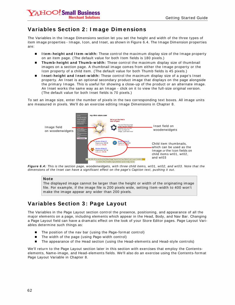
Variables Section 2: Image DimensionsThe Variables in the Image Dimensions section let you set the height and width of the three types of item image properties - Image, Icon, and Inset, as shown in Figure 6.4. The Image Dimension properties are:
Item-height and Item-width: These control the maximum display size of the Image property on an item page. (The default value for both Item fields is 180 pixels.)Thumb-height and Thumb-width: These control the maximum display size of thumbnail images on a section page. A thumbnail image comes from either the Image property or the Icon property of a child item. (The default value for both Thumb fields is 45 pixels.)Inset-height and Inset-width: These control the maximum display size of a page's Inset property. An Inset is an optional secondary product image that displays on the page alongside the primary Image. This is useful for showing a close-up of the product or an alternate image. An Inset works the same way as an Image - click on it to view the full-size original version. (The default value for both Inset fields is 70 pixels.)
To set an image size, enter the number of pixels in the two corresponding text boxes. All image units are measured in pixels. We'll do an exercise editing Image Dimensions in Chapter 8.
Figure 6.4: This is the section page, woodenwidgets, with three child items, wt01, wt02, and wt03. Note that the dimensions of the Inset can have a significant effect on the page's Caption text, pushing it out.
Variables Section 3: Page LayoutThe Variables in the Page Layout section control the presence, positioning, and appearance of all the major elements on a page, including elements which appear in the Head, Body, and Nav Bar. Changing a Page Layout field can have a dramatic effect on the look of your Store Editor pages. Page Layout Vari-ables determine such things as:
The position of the nav bar (using the Page-format control)The width of the page (using Page-width control)The appearance of the Head section (using the Head-elements and Head-style controls)
We'll return to the Page Layout section later in this section with exercises that employ the Contents-elements, Name-image, and Head-elements fields. We'll also do an exercise using the Contents-format Page Layout Variable in Chapter 8.
NoteThe displayed image cannot be larger than the height or width of the originating image file. For example, if the image file is 200 pixels wide, setting Item-width to 400 won't make the image appear any wider than 200 pixels.
Image field on woodenwidgets
Inset field onwoodenwidgets
Child item thumbnails, which can be used as the Image or the Icon fields on child items wt01, wt02, and wt03
63
Getting Started GuideMerchant Solutions
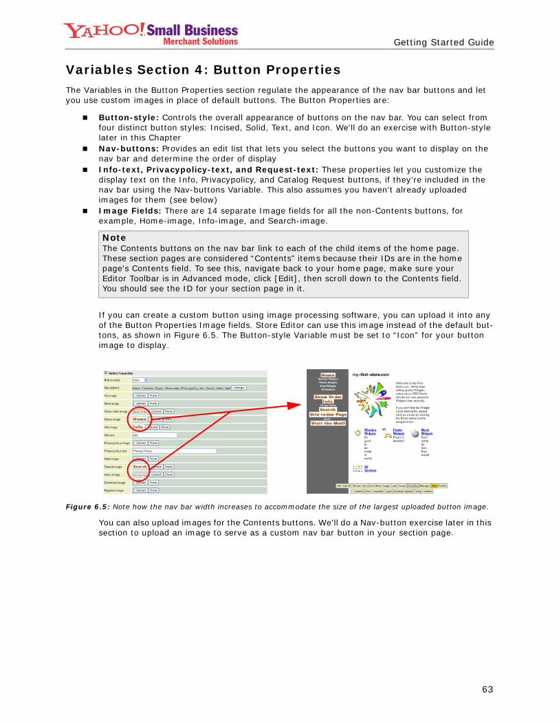
Variables Section 4: Button PropertiesThe Variables in the Button Properties section regulate the appearance of the nav bar buttons and let you use custom images in place of default buttons. The Button Properties are:
Button-style: Controls the overall appearance of buttons on the nav bar. You can select from four distinct button styles: Incised, Solid, Text, and Icon. We'll do an exercise with Button-style later in this ChapterNav-buttons: Provides an edit list that lets you select the buttons you want to display on the nav bar and determine the order of displayInfo-text, Privacypolicy-text, and Request-text: These properties let you customize the display text on the Info, Privacypolicy, and Catalog Request buttons, if they're included in the nav bar using the Nav-buttons Variable. This also assumes you haven't already uploaded images for them (see below)Image Fields: There are 14 separate Image fields for all the non-Contents buttons, for example, Home-image, Info-image, and Search-image.
If you can create a custom button using image processing software, you can upload it into any of the Button Properties Image fields. Store Editor can use this image instead of the default but-tons, as shown in Figure 6.5. The Button-style Variable must be set to “Icon” for your button image to display.
Figure 6.5: Note how the nav bar width increases to accommodate the size of the largest uploaded button image.
You can also upload images for the Contents buttons. We'll do a Nav-button exercise later in this section to upload an image to serve as a custom nav bar button in your section page.
NoteThe Contents buttons on the nav bar link to each of the child items of the home page. These section pages are considered “Contents” items because their IDs are in the home page's Contents field. To see this, navigate back to your home page, make sure your Editor Toolbar is in Advanced mode, click [Edit], then scroll down to the Contents field. You should see the ID for your section page in it.

64
Getting Started GuideMerchant Solutions
Variables Section 5: Page PropertiesTwo of the four Variables in the Page Properties section apply to every page on the site; the other two only affect the home page:
Head-tags: Any text or HTML typed into this Variable is placed into the HEAD tag area of every page on the site (see note below). By default, the Head-tags field is empty. We'll do an exercise using Head-tags in Chapter 7.
Final-text: Any text or HTML typed into this Variable appears at the bottom of every page on the site. This is a good place for entering copyright and additional contact information, for example:
©2003 My-First-Store.com, Inc. | 10 Widget Way, Burlington, VT 05401 | 888.888.8888
Address-phone: This Variable displays on the home page only, immediately above the Final-text. It can be used for your business' contact information.Keywords: Any text typed into this Variable is used in the META Keywords tag on the home page only. Some search engines refer to this META tag to help index and rank your home page. We'll look at the META tags more closely in the Head-tags exercise in Chapter 7.
Variables Section 6: Store PropertiesThe 23 Variables in the Store Properties section regulate specific aspects of the ordering and checkout process. Some examples:Variables such as Regular-price-text, Sale-price-text, and Show-order-text let you enter the words to display in front of any product price and on the product order button.Variables such as Minimum-Order and Minimum-Quantity let you set up the minimum amount or minimum number of items a customer needs to have in their shopping cart before they can check out.Variables such as Currency, Thousands-mark, Decimal-mark, and Quantity-text let you adjust the display of product prices.
NoteAn HTML page is divided into two areas defined by two tags, HEAD and BODY:
The HEAD tag is located at the top of the page, just before the BODY tag. The HEAD tag contains the page's TITLE tag, which is automatically created for you in Store Editor from an item's Name field. The contents of the TITLE tag are displayed in the program bar of the end user's web browser. The HEAD tag can also contain optional META tags. META tag content is not displayed on the browser, rather it is used by some search engines to index and rank web pages. You can type META tags into the Head-tags field, as we'll see in the Head-tags exercise in Chapter 7.The area within the BODY tag contains all the HTML needed to display everything on the web page.
65
Getting Started GuideMerchant Solutions
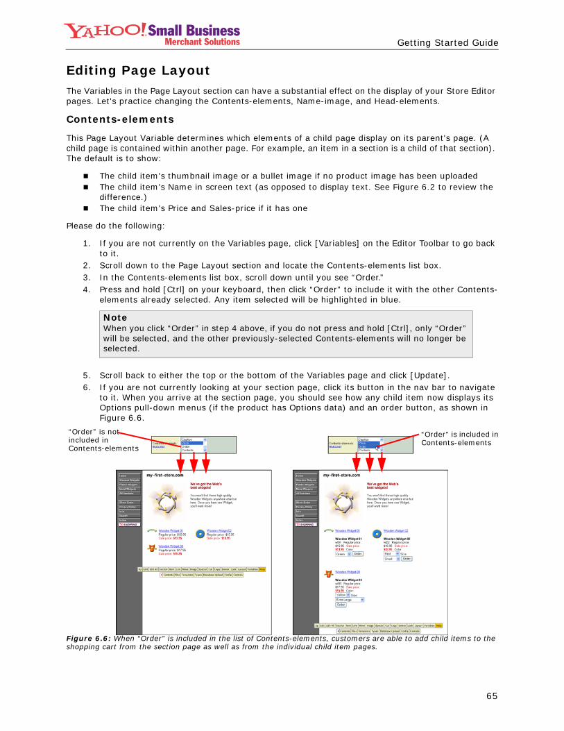
Editing Page LayoutThe Variables in the Page Layout section can have a substantial effect on the display of your Store Editor pages. Let's practice changing the Contents-elements, Name-image, and Head-elements.
Contents-elements
This Page Layout Variable determines which elements of a child page display on its parent's page. (A child page is contained within another page. For example, an item in a section is a child of that section). The default is to show:
The child item's thumbnail image or a bullet image if no product image has been uploadedThe child item's Name in screen text (as opposed to display text. See Figure 6.2 to review the difference.)The child item's Price and Sales-price if it has one
Please do the following:
1. If you are not currently on the Variables page, click [Variables] on the Editor Toolbar to go back to it.
2. Scroll down to the Page Layout section and locate the Contents-elements list box.3. In the Contents-elements list box, scroll down until you see “Order.”4. Press and hold [Ctrl] on your keyboard, then click “Order” to include it with the other Contents-
elements already selected. Any item selected will be highlighted in blue.
5. Scroll back to either the top or the bottom of the Variables page and click [Update].6. If you are not currently looking at your section page, click its button in the nav bar to navigate
to it. When you arrive at the section page, you should see how any child item now displays its Options pull-down menus (if the product has Options data) and an order button, as shown in Figure 6.6.
Figure 6.6: When “Order” is included in the list of Contents-elements, customers are able to add child items to the shopping cart from the section page as well as from the individual child item pages.
NoteWhen you click “Order” in step 4 above, if you do not press and hold [Ctrl], only “Order” will be selected, and the other previously-selected Contents-elements will no longer be selected.
“Order” is not included in Contents-elements
“Order” is included inContents-elements

66
Getting Started GuideMerchant Solutions
Now return to the Variables page to experiment with the remaining Contents-elements. If you want to return Contents-elements to its original settings, you can refer to the following list of default Contents-elements:
ImageBulletScreen-text-titlePrice
Name-image
This Page Layout Variable lets you replace the display text in the Head section of each page with an im-age you have uploaded. Recall that the text at the top of each page comes from the Title Variable.
Please do the following:
1. Once again, if you are not currently in the Variables page, click [Variables] on the Editor Toolbar to go there.
2. Scroll down to the Page Layout section and locate the Name-image field.3. Click [Upload]. This brings you to the Image Upload page.4. Click [Browse…]. This produces the Choose File window.5. Navigate to the location of your site logo on your computer. (If you haven't created this image
yet, feel free to use a product image, just for this exercise.) Select the image by clicking it, then click [Open]. This places the full address of the image file into the Image Upload page.
6. Click [Send]. This takes you back to the Variables page. If you scroll back down to the Name-image field, you see a thumbnail version of the image you just uploaded.
7. Scroll to the top or bottom of the page and click [Update]. This takes you back to the page you were on when you clicked [Variables]. You should see your Name-image in the Head area of the page, as shown in Figure 6.7.
Figure 6.7: The new Store logo was created in an image editing application such as Adobe® Photoshop®. Compare the Head section of this page with Figure 6.2.
To change the Head section back to its original default display text, return to Name-image in Variables and click [None].
Head-elements
This Page Layout Variable lets you choose what to display directly beneath the Name-image: the page's Headline property, its Image property, or both. Please do the following:
1. If you are not currently in the Variables page, click [Variables] on the Editor Toolbar to go there.2. Scroll down to the Page Layout section and locate the Head-elements field. By default, both
Image and Display-text-title are selected. Try clicking just Image, then update the page. Your item page should no longer display a Headline, just an image and the Caption text underneath the name of your site, as shown in the middle screen in Figure 6.8.

67
Getting Started GuideMerchant Solutions
Figure 6.8: Notice that omitting one of the Head-elements creates more white space on a page or makes the page appear more compact, depending on the size of the element being omitted or the amount of text in the Caption.
3. Return to the Head-elements field on the Variables page, and this time click on Display-text-title only, then update the page. Your item page should show only the Headline and Caption text underneath the name of your site, without the Image, as shown in the right screen in Figure 6.8.
4. Return to the Head-elements field on the Variables page, and this time hold the [Ctrl] key down and click Image. Now both Image and Display-text-title should be highlighted.
5. Update the page. Your item page should now display both the Headline and the Image next to the Caption text, as shown in the left screen in Figure 6.8. This is the default setting for Head-elements.
Editing Button PropertiesThe Button Properties Variables determine the composition and design of your nav bar. Button-style con-trols the overall appearance of buttons on the nav bar, letting you select from four distinct button styles: Incised, Solid, Text, and Icon. The default is Incised.
To practice changing Button-style, please do the following:
1. If you are not currently looking at the Variables page, click [Variables] on the Editor Toolbar to go there.
2. Scroll down to the Button Properties section and locate the Button-style pull-down list box.3. In the Button-style list box, click Text, then scroll to the top or bottom of the page and click
[Update]. Your nav bar buttons should now resemble those in the first screen in Figure 6.9.
Figure 6.9: The Solid and Incised options have identical button shapes, but the text for Incised has a 3D beveled look. For Icon, notice how uploading wide Icon images for the Contents items pushes the remaining page elements down.
4. Now return to Variables and change Button-style to Solid, then update the page. Your nav bar button should resemble the second screen in Figure 6.9.
5. Once more, return to Variables. Change Button-style to Incised, then update the page. Your nav bar buttons should resemble the third screen in Figure 6.9.
6. Return to Variables and change Button-style to Icon, then update the page. Your nav bar buttons will probably resemble the Solid style with the names center-aligned instead of left-aligned. Don't worry, you're not done yet!
7. If you created a custom store logo previously in the Name-image exercise, try creating a logo image for your section page now. Make the image no more than 200 pixels wide if possible. (Feel free to use any available small image for this exercise).
Head-elements has both Headine and Display-text-title selected
Head-elements has only Headine selected
Head-elements has only Display-text-title selected
Border style set to text Border style set to solid Border style set to incised Border style set to icon

68
Getting Started GuideMerchant Solutions
8. Upload the image into the Icon property of your section page:
a. Navigate to your section page by clicking its button on the nav bar.b. Click [Edit] on the Editor Toolbar.c. Scroll down to the Icon property.d. Click [Upload]. This brings you to the Image Upload page.e. Click [Browse…]. This produces the Choose File window.f. Navigate to the location of the icon file on your computer.g. Select the image file by clicking it, then click [Open]. This places the full address
of the icon file into the Image Upload page.h. Click [Send]. This brings you back to the Edit page, where you should see a
thumbnail version of the image you just uploaded.i. Scroll to the bottom of the page and click [Update].Now you should see the nav bar button for your section page replaced by the Icon image you just uploaded. You can see the uploaded icon images for my-first-store.com section pages in the fourth screen in Figure 6.9.
9. Once more, return to Variables. Change Button-style back to the default value of Incised, then update the page. Your nav bar buttons should once again resemble the third screen in Figure 6.9.
Additional Properties on Controls and Config PagesNow that you have some experience working with Item Properties and Variables, you're ready to learn about some additional properties available on the Controls and Config pages. The properties on these pages do not affect your site layout or any page elements, so they exist on their own pages. These two pages are accessible from [Controls] and [Config] on the Advanced mode Editor Toolbar.
Using the Config Page
The Config page provides tools for setting up (configuring) the Store Editor. It's unlikely that you'll need to change any Config properties, but there is one property that's useful when you have long pages.
Changing Edit-button-position from Bottom to Top moves the Editor Toolbar to the top of the page, as shown in Figure 6.10. If your Store Editor pages have so much content that you find you're always scroll-ing down to use the Editor Toolbar, change this Config property to save time and avoid scrolling.
Figure 6.10: When you change Edit-button-position to Top, it appears as though the page elements have been pushed down. However, recall that the Editor Toolbar doesn't appear on the live site, so the page elements will still look fine there.
Editor set to bottomm Editor set to topm

69
Getting Started GuideMerchant Solutions
Using the Controls Page
The Controls page is similar to the Config page in that it provides some additional configuration proper-ties. It also includes some useful properties for organizing and publishing Store Editor. The page is di-vided into three sections:
Store Editor Setting: These are configuration properties for Editor functions. For example, if you find that you frequently use your Store Editor in Advanced mode, you can change Default Editor Mode to Advanced, and the Editor Toolbar will appear in Advanced mode every time you open the Store Editor.Message Logs: This section shows you when your Store Editor was last published. If there are error messages related to the last Publish, they will show up here. The section also includes the Generate and Publish buttons.Clicking [Publish] publishes the site, and clicking [Generate] makes Store Editor re-create all your Store's pages using the latest template information. This is only useful when you are cre-ating custom templates and want to ensure that they look right before you commit to publishing the site.
Functions: These are tools for finding or editing an item quickly, as well as for editing and reviewing numerous items simultaneously. Included are links to documentation for RTML, the proprietary language used to create and edit Store Editor templates.
One very useful tool in the Functions section is Search. Clicking “Search” takes you to the Controls Search page, as shown in Figure 6.11. The form contains three fields:
The first field is a pull-down list box for selecting the name of the field to search: Name, Code, Caption, Abstract, Contents, Headline, or Ship-weightThe second field is another pull-down list box with four options: contains, =, is_empty, and is_nonempty. Selecting “contains” will yield the largest number of resultsThe third field is a text box for entering the text or value you're trying to find
For example, if you want to find all the products which have “plastic” in their Name fields, you select “Name” in the first field, select “contains” in the second field, type “plastic” in the third field, then click [Search]. The page then refreshes with the search results underneath the search form, and you can nav-igate to any of the items in the search results by clicking their links.
Figure 6.11: Notice that the Search results highlight the text you're searching for in the results.
We will also do an exercise in Chapter 8 using the Multiple Image Upload tool in the Functions section of the Controls page.

70
Getting Started GuideMerchant Solutions
In this chapter you learned the following:
What the Variables page does and how it is organized into six sections: Colors and Typefaces, Image Dimensions, Page Layout, Button Properties, Page Properties, and Store PropertiesHow to edit your page layout using the Contents-elements, Name-image, and Head-elements VariablesHow to edit your nav bar buttons using the Button-style VariableWhat the Config page does and how to use Edit-button-position to switch the Editor Toolbar's locationWhat the Controls page does and how to use the Search tool to locate items quickly.
In the next chapter, you will continue building your site in Store Editor, adding additional section pages, and performing more sophisticated edits to the pages, including overriding Variables on individual pages.
Summary


![STORE DESIGN- Template - lazadaMY] Store design... · STORE DESIGN- Template. 2 1. ... Editor”. Then click on “Page Template”. 13 Page Template The Page Template displays the](https://static.fdocuments.in/doc/165x107/5acf73f67f8b9a4e7a8ca67c/store-design-template-lazada-my-store-designstore-design-template-2-1.jpg)

![Appendix A Important Java Programming Concepts978-3-030-24094...Java programming, or on the relevant sections in the Java Tutorial [10]. A.1 Variables and Types Variables store values.](https://static.fdocuments.in/doc/165x107/6051d5a8327bcb2374169b02/appendix-a-important-java-programming-concepts-978-3-030-24094-java-programming.jpg)

