Stephen Lowe - ePortfolio
7
STEPHEN LOWE GRAPHIC DESIGN
-
Upload
stephen-lowe -
Category
Documents
-
view
253 -
download
0
description
My Portfolio 2012
Transcript of Stephen Lowe - ePortfolio

STEPHEN LOWEGRAPHIC DESIGN
DMU DESIGN SOCIETY
S E L E C T
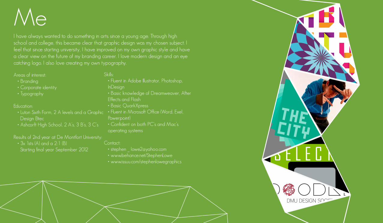
MeI have always wanted to do something in arts since a young age. Through high school and college, this became clear that graphic design was my chosen subject. I feel that since starting university, I have improved on my own graphic style and have a clear view on the future of my branding career. I love modern design and an eye catching logo. I also love creating my own typography.
Areas of interest: • Branding • Corporate identity • Typography
Education: • Luton Sixth Form, 2 A levels and a Graphic Design Btec • Ashcorft High School, 2 A’s, 3 B’s, 3 C’s
Results of 2nd year at De Montfort University: • 3x 1sts (A) and a 2:1 (B) Starting final year September 2012
Skills:• Fluent in Adobe Illustrator, Photoshop, InDesign• Basic knowledge of Dreamweaver, After Effects and Flash• Basic QuarkXpress• Fluent in Microsoft Office (Word, Exel, Powerpoint)• Confident on both PC’s and Mac’s operating systems
Contact: • stephen _ [email protected] • www.behance.net/StephenLowe • www.issuu.com/stephenlowegraphics
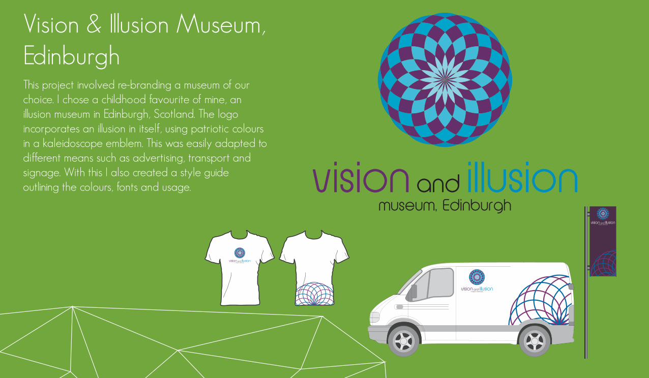
Vision & Illusion Museum, EdinburghThis project involved re-branding a museum of our choice. I chose a childhood favourite of mine, an illusion museum in Edinburgh, Scotland. The logo incorporates an illusion in itself, using patriotic colours in a kaleidoscope emblem. This was easily adapted to different means such as advertising, transport and signage. With this I also created a style guide outlining the colours, fonts and usage. vision and illusion
museum, Edinburgh
vision and illusion museum, Edinburgh
vision and illusion museum, Edinburgh
vision and illusion museum, Edinburgh
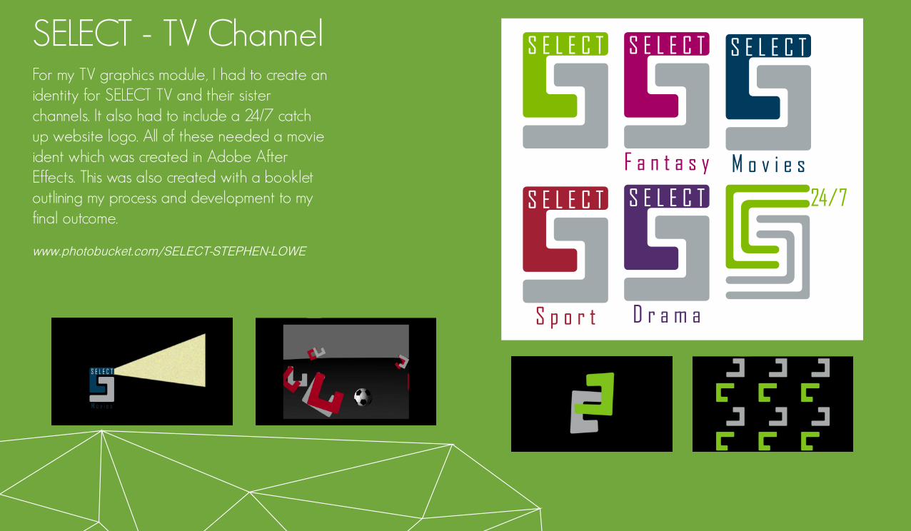
SELECT - TV ChannelFor my TV graphics module, I had to create an identity for SELECT TV and their sister channels. It also had to include a 24/7 catch up website logo. All of these needed a movie ident which was created in Adobe After Effects. This was also created with a booklet outlining my process and development to my final outcome.
www.photobucket.com/SELECT-STEPHEN-LOWE
S p o r t
S E L E C T
F a n t a s y
S E L E C T
M o v i e s
S E L E C T
D r a m a
S E L E C T
S E L E C T
24/7
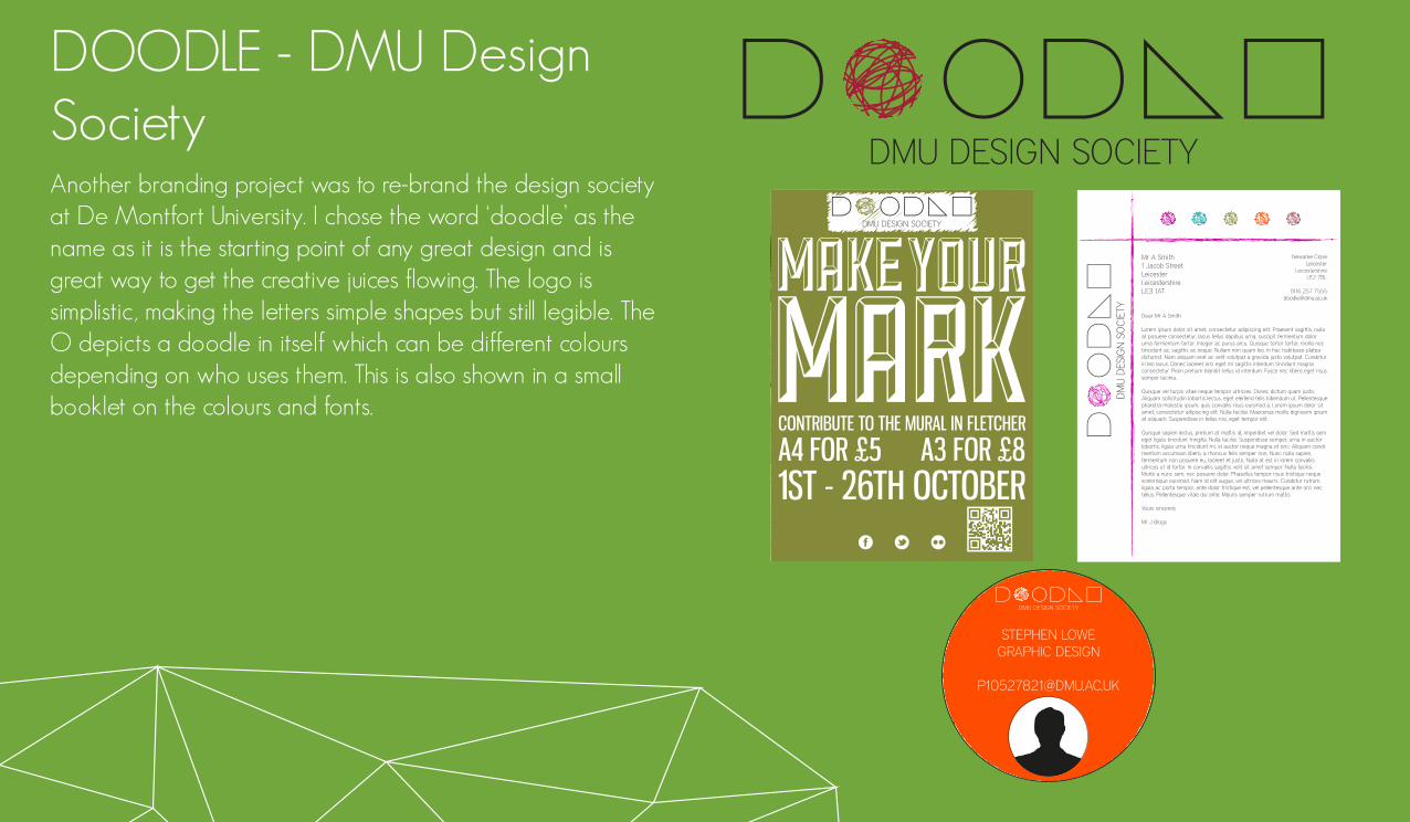
DOODLE - DMU Design SocietyAnother branding project was to re-brand the design society at De Montfort University. I chose the word ‘doodle’ as the name as it is the starting point of any great design and is great way to get the creative juices flowing. The logo is simplistic, making the letters simple shapes but still legible. The O depicts a doodle in itself which can be different colours depending on who uses them. This is also shown in a small booklet on the colours and fonts.
DMU DESIGN SOCIETY
DM
U D
ESIG
N S
OC
IETY
Mr A Smith1 Jacob StreetLeicesterLeicestershireLE3 1AT
Dear Mr A Smith
Lorem ipsum dolor sit amet, consectetur adipiscing elit. Praesent sagittis, nulla at posuere consectetur, lacus tellus dapibus urna, suscipit fermentum dolor urna fermentum tortor. Integer ac purus arcu. Quisque tortor tortor, mollis nec tincidunt ac, sagittis ac neque. Nullam non quam leo. In hac habitasse platea dictumst. Nam aliquam erat ac velit volutpat a gravida justo volutpat. Curabitur in leo lacus. Donec laoreet orci eget mi sagittis interdum tincidunt magna consectetur. Proin pretium blandit tellus id interdum. Fusce nec libero eget risus semper lacinia.
Quisque vel turpis vitae neque tempor ultricies. Donec dictum quam justo. Aliquam sollicitudin lobortis lectus, eget eleifend felis bibendum ut. Pellentesque pharetra molestie ipsum, quis convallis risus euismod a. Lorem ipsum dolor sit amet, consectetur adipiscing elit. Nulla facilisi. Maecenas mollis dignissim ipsum at aliquam. Suspendisse in tellus nisi, eget tempor elit.
Quisque sapien lectus, pretium at mattis id, imperdiet vel dolor. Sed mattis sem eget ligula tincidunt fringilla. Nulla facilisi. Suspendisse semper, urna in auctor lobortis, ligula urna tincidunt mi, id auctor neque magna et orci. Aliquam condi-mentum accumsan libero, a rhoncus felis semper non. Nunc nulla sapien, fermentum non posuere eu, laoreet et justo. Nulla at est in lorem convallis ultrices ut id tortor. In convallis sagittis velit sit amet semper. Nulla facilisi. Morbi a nunc sem, nec posuere dolor. Phasellus tempor risus tristique neque scelerisque euismod. Nam id elit augue, vel ultrices mauris. Curabitur rutrum, ligula ac porta tempor, ante dolor tristique est, vel pellentesque ante orci nec tellus. Pellentesque vitae dui ante. Mauris semper rutrum mattis
Yours sincerely
Mr J Blogs
Newarke CloseLeicester
LeicestershireLE2 7BL
0116 257 [email protected]
A4 FOR £5 A3 FOR £8CONTRIBUTE TO THE MURAL IN FLETCHER
1ST - 26TH OCTOBER
DMU DESIGN SOCIETY
DMU DESIGN SOCIETY
STEPHEN LOWEGRAPHIC DESIGN
DMU DESIGN SOCIETY
DM
U D
ESIGN
SOC
IETY
DM
U D
ESIGN
SOC
IETY
DM
U D
ESIGN
SOC
IETY
DM
U D
ESIGN
SOC
IETY
DMU DESIGN SOCIETY
DM
U D
ESIG
N S
OC
IETY
DM
U D
ESIG
N S
OC
IETY
DM
U D
ESIG
N S
OC
IETY
DM
U D
ESIG
N S
OC
IETY
DMU DESIGN SOCIETY
STEPHEN LOWEGRAPHIC DESIGN

The City - d&adFor 2012’s d&ad project, I chose the branding section supported by venturethree. Their brief was to re-invent the city of London’s image and create a brand for it. I focused on the fact the area is just over a square mile and used the square theme through my designs. The logo comes in a variety of colours and is meant to bring new life to the district, making it a fun and social place to be, incorporating QR codes and a what’s on guide. This was shown in the simple style guide.

Folded FontAnother passion of mine is typography. I experimented in creating fonts back in the summer of 2011 and found it to be really exciting with variety of different ideas. I liked looking at making art fonts, even illegible but all keeping to a constraint as it makes the process more challenging and fun. I was lucky enough to have my font ‘folded’ used on a creative typography website. It is based on folded paper strips and included numbers and punctuation.
www.handmadefont.com/folds.php