Stem and-leaf-diagram-ppt.-dfs
20
STATISTICS STEM-AND-LEAF DIAGRAM/LINE CHARTS DR. FARHANA SHAHEEN
-
Upload
farhana-shaheen -
Category
Education
-
view
206 -
download
2
Transcript of Stem and-leaf-diagram-ppt.-dfs

STATISTICSSTEM-AND-LEAF DIAGRAM/LINE CHARTS
DR. FARHANA SHAHEEN

SYLLABUS
FOR Wk-II Statistics
Stem and Leaf diagram
Line Charts and Scatter Diagrams
Stem and Leaf Diagram
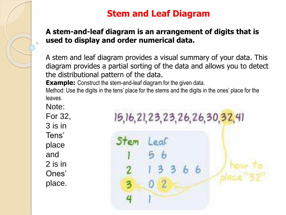
A stem-and-leaf diagram is an arrangement of digits that is used to display and order numerical data.
A stem and leaf diagram provides a visual summary of your data. This diagram provides a partial sorting of the data and allows you to detect the distributional pattern of the data.Example: Construct the stem-and-leaf diagram for the given data.
Method: Use the digits in the tens’ place for the stems and the digits in the ones’ place for the
leaves.
Note:
For 32,
3 is in
Tens’
place
and
2 is in
Ones’
place.

STEM-AND-LEAF
Write the data from the stem-and-leaf
diagram.

Constructing Stem and Leaf Diagrams:
1. Sort the data from low to high
2. Analyze the data for the variable of interest to determine how you wish to split the values into a stem and a leaf.
3. List all possible stems in a single column between the lowest and highest values in the data.
4. For each stem, list all leaves associated with the stem.

Example:
Note: First make a KEY for the data.

Exercise: 1
The given data is the age of 27 residents of Yanbu. Make a stem-and-leaf diagram to display the data.
45 1 52 42 10 40 50 40 7
46 19 35 3 11 31 6 41 12
43 37 8 41 48 42 55 30 58
Method: First Arrange the data in order. Then Use the digits in the tens’ place for the stems and the digits in

Exercise 2:
Write the data from the stem-and-leaf
diagram.

Line Charts and Scatter Diagrams

Line ChartA two-dimensional chart showing time on the horizontal axis and
the variable of interest on the vertical axis. It is used when a time-series data is given.

Constructing Line Charts
1. Identify the time-series variable of interest and determine the maximum value and the range of time periods covered in the data.
2. Construct the horizontal axis for the time periods using equal spacing between each time period. Construct the vertical axis with a scale appropriate for the range of values of the time-series variable.
3. Plot the points on the graph and connect the points with straight line.

Example: 1
The table below shows daily temperatures for New York City, recorded for 6 days, in degrees Fahrenheit.
Temperatures In NY City Day Temperature 1 43° F 2 53° F 3 50° F 4 57° F 5 59° F 6 67° F


Example 2:
Sarah bought a new car in 2001 for $24,000. The dollar value
of her car changed each year as shown in the table below.

Scatter Diagrams
A two dimensional graph of plotted points in which the vertical axis represents values of one quantitative variable and the horizontal axis represents values of the other quantitative variable. Each plotted point has coordinates whose values are obtained from the respective variables.
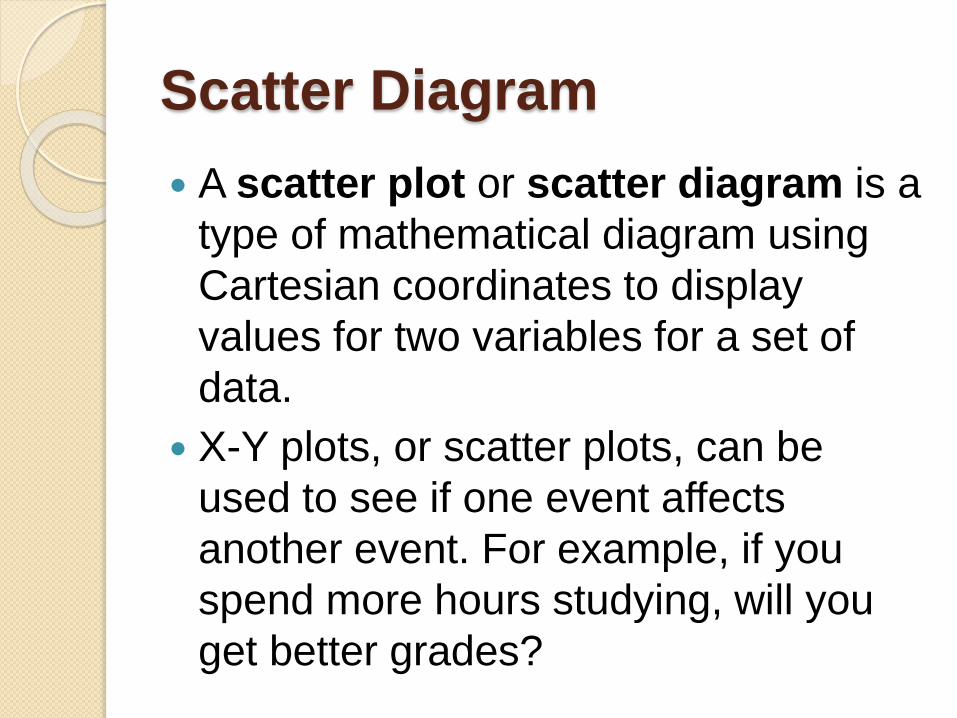
Scatter Diagram
A scatter plot or scatter diagram is a
type of mathematical diagram using
Cartesian coordinates to display
values for two variables for a set of
data.
X-Y plots, or scatter plots, can be
used to see if one event affects
another event. For example, if you
spend more hours studying, will you
get better grades?

Examples of Scatter Plot
The scatter plot shows the hours of
study and test scores of 20 students.
As the number of hours of study
increases, the marks scored tend to
increase.
So, the scatter plot describes a
positive trend.


Constructing Scatter Diagrams
1. Identify the two quantitative variables and collect paired responses for the two variables.
2. Determine which variable will be placed on the vertical axis and which variable will be placed on the horizontal axis. Often the vertical axis can be considered the dependent variable (y) and the horizontal axis can be considered the independent variable (x).
3. Define the range of values for each variable and define the appropriate for the x and y axes.
4. Plot the joint values for the two variables by placing a point in the x,y space. Do not connect the points.
http://www.icoachmath.com/math_dicti
onary/Scatter_Plot.html
http://www.mathgoodies.com/lessons/
graphs/line.html