Static Authority
44
STATIC AUTHORITY PUBLIC TYPOGRAPHY
-
Upload
caleb-newberg -
Category
Documents
-
view
215 -
download
1
description
This book documents the intricacies of typography and design on public signage, focusing specifically on 'don't do that' signs. To the untrained eye these signs are mundane and often overlooked, but when examined closely, these signs take on an unintentional personality through their environmental, syntactical and typographical characteristics. They have character after all.
Transcript of Static Authority

S TAT I C A U T H O R I T YP U B L I C T Y P O G R A P H Y


P U B L I C T Y P O G R A P H Y
C A L E B N E W B E R G

P R E FA C E
I . T H E M E S S A G E : T H E G U A R D
I I . E N V I R O N M E N T A L I N F L E C T I O N
I I I . A R T I C U L A T I O N T H R O U G H D E S I G N
C O N C L U S I O N
1
4
14
24
34
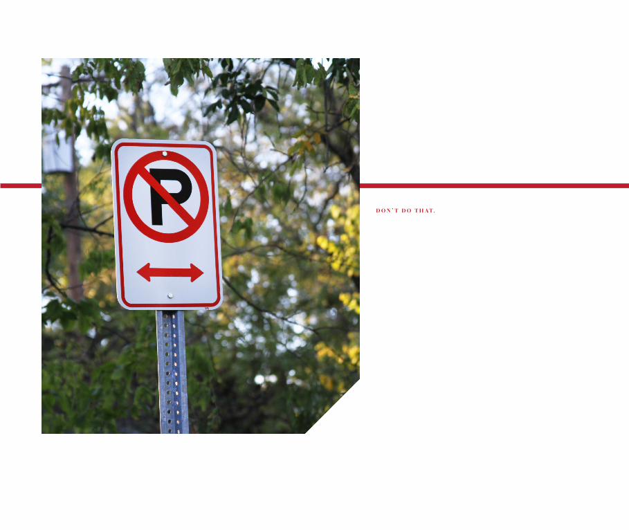
D O N ’ T D O T H A T.

1
E V E R Y D AY, we encounter messages and instruc-
tion from a number of sources, some more lasting than
others, some more important than others. We live in an
era of information overload, where we encounter more
meaningless than meaningful information. Our public
spaces are packed with signs telling us to stop here, go
there, park here, look there. It comes as no surprise that
we’re a society who gets easily irritated and pissed off...
and I’m not even touching on the plethora of advertising
and media clutter present in our everyday lives.
Humans are driven by instruction, but motivated to choose our own path, to be inde-
pendent. Don’t Do That signs can be appreciated for their importance in regulating the
public, but there’s an interesting scope of levels of importance each sign inherently has.
Some of these signs have serious consequences if not obeyed and others are basically
inviting you to risk it. Are we motivated enough to obey messages telling us what not
to do? What if these messages are as impersonal as they are abundant? One might think
public signage is emotionless, impartial and boring, but when examined closely, these
signs take on an unintentional personality through their environmental, syntactical,
and typographic characteristics. They have character after all.
2
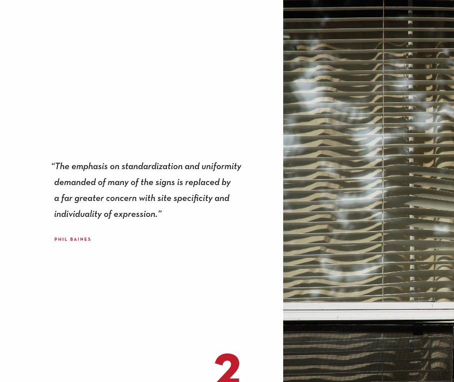
“The emphasis on standardization and uniformity
demanded of many of the signs is replaced by
a far greater concern with site specificity and
individuality of expression.”
P H I L B A I N E S

3

C H A P T E R I
T H E M E S S A G E : T H E G U A R D

6
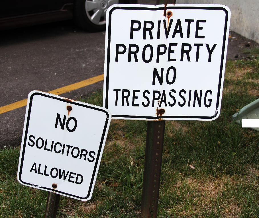
C O N S I S T E N C Y.
Public signage is remarkably consistent in appearance and tone, and even more so when it comes to Don’t Do That signs.
The consistency comes as no surprise, because we need to be able to easily recognize something of importance. This con-
sistency trains us to link caution and importance with loud, capitalized, sans-serif type and bold design elements–those
that are commonly seen with these signs. Don’t Do That signs overlook a public space and have an important purpose: to
warn and intimidate people in attempt to prevent them from doing something they shouldn’t be doing.

7
Find me the words no, don’t, or only in a serif font on the street and I’ll give you a Snickers.

8
This laundromat at the corner
of 19th & Louisiana in Lawrence,
Kansas has an awesome, vintage
appearance but is littered with
Don’t Do That signs.

9
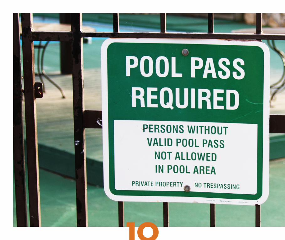
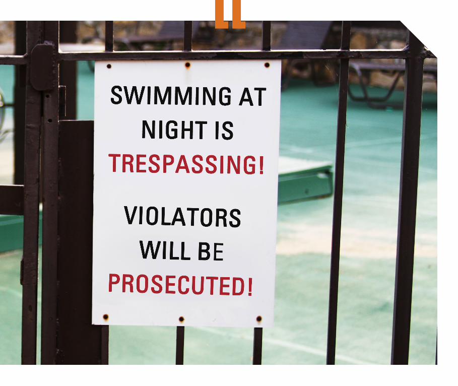
T H E G U A R D .
Don’t Do That signs serve as the protectors of their territory, unafraid and unwilling to back down. Their
personified, hardknock attitude forms an interesting dynamic with their flat, stagnant and unreactive real-
ity. After reading the sign, it’s up to the person to decide whether or not they can prove the sign wrong.
10
11
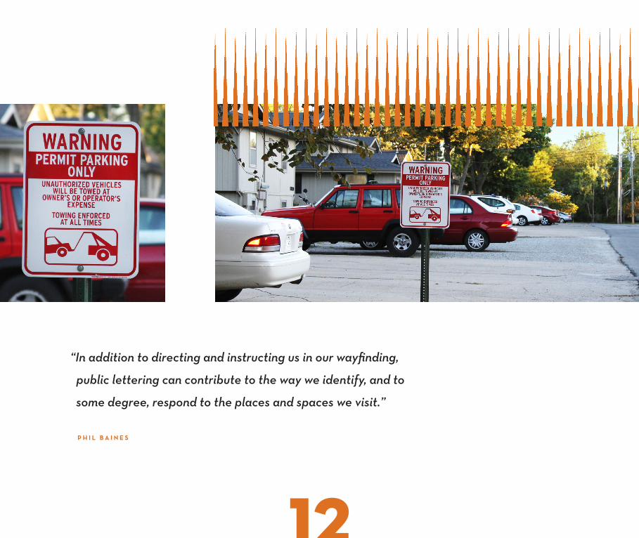
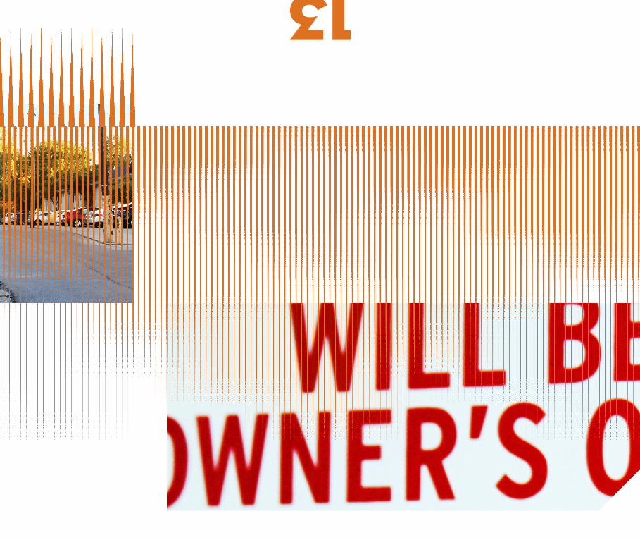
“In addition to directing and instructing us in our wayfinding,
public lettering can contribute to the way we identify, and to
some degree, respond to the places and spaces we visit.”
P H I L B A I N E S
12
13

C H A P T E R I I
E N V I R O N M E N T A L I N F L E C T I O N


16
H O N E S T Y : T H E B E S T P O L I C Y.
Don’t Do That signs are interesting through their consistency, formality, and candor. They’re also interesting in
their disguise as boring, oft-ignored, and one-dimensional messengers. At first lifeless, their character awakens
through the environmental wear-and-tear they endure. A sign with battle scars and age marks stands proud
and gives its message a hint of emotion. The added texture acts as confirmation that the sign exists as part of its
environment. There’s a certain appeal to the infinite possibilities of deterioration a sign can go through, whether
it be from mother-nature or mankind, making each sign as unique as a fingerprint.
17
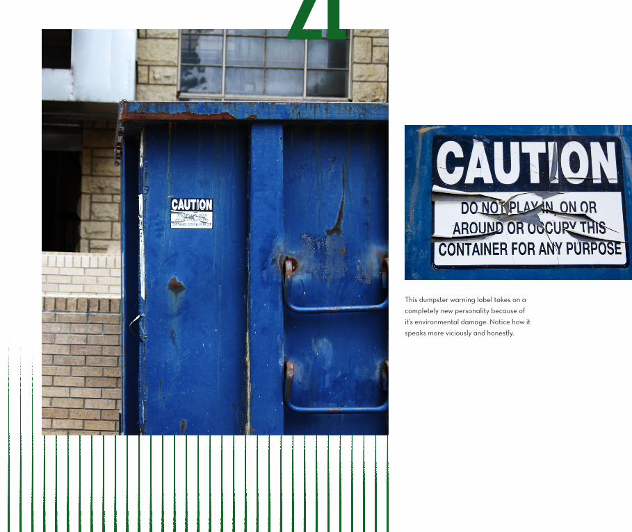
This dumpster warning label takes on a
completely new personality because of
it’s environmental damage. Notice how it
speaks more viciously and honestly.


“Textures in our environment help us
understand the nature of things.”
E L L E N L U P T O N
20

21
L O C A L E .
The message of the sign is also influenced by its location: whether it’s attached to a post, a wall, a dumpster, or the ground, the context and sta-
tioning of a Don’t Do That sign matters. It’s interesting to note whether the environment intrudes on the sign’s space, allowing the sign to be part
of its environment rather than appearing as intruder. There’s something hip about finding interest in things most don’t. So call me a hipster.
22
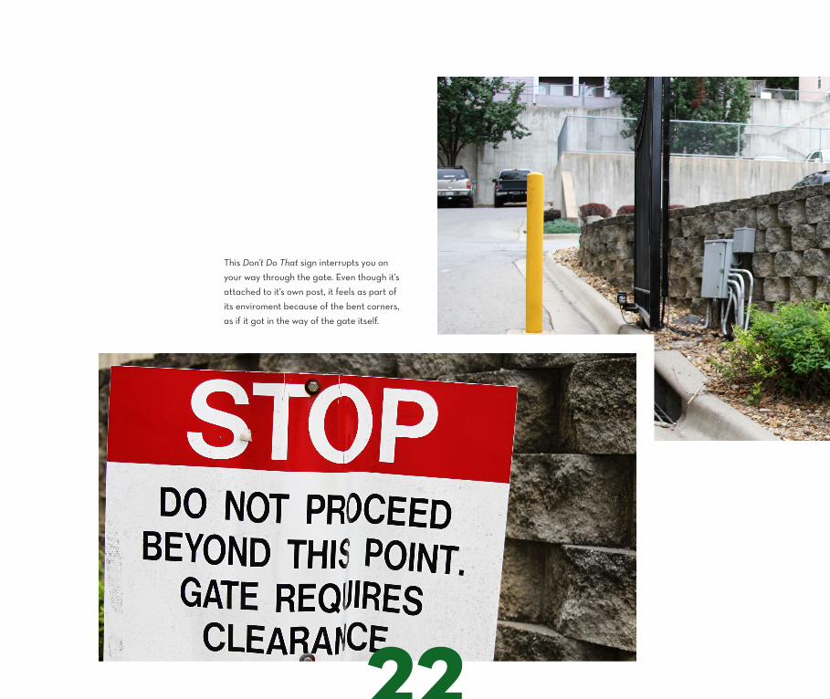
This Don’t Do That sign interrupts you on
your way through the gate. Even though it’s
attached to it’s own post, it feels as part of
its enviroment because of the bent corners,
as if it got in the way of the gate itself.
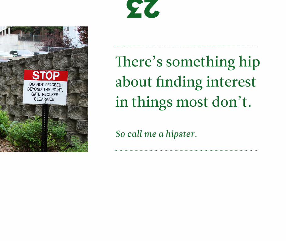
There’s something hip about finding interest in things most don’t.
So call me a hipster.
23

C H A P T E R I I I
A R T I C U L A T I O N T H R O U G H D E S I G N

K E E P I N ’ I T S I M P L E .
The physical nature of the sign to the designer can be likened to a canvas to the painter. It has fundamental qualities of
composition, line, texture, and shape. Many signs speak through symbolic language, such as no parking signs, no smok-
ing signs, pedestrian crossing signs, and so forth. There’s an interesting limitation to these symbolic Don’t Do That signs
in that they’re confined to the “crossed circle” when speaking as symbol. It’s a universally understood representation
meaning no, and certainly succeeds in doing so. Will this symbol live on forever? Could it be changed or modified?
26

Notice how the signs read differently when they’re in all caps compared to lowercase. All caps shouts at the
reader, is less friendly and more demanding. Lowercase speaks in a voice more contained, polished, and polite.
27

28

29
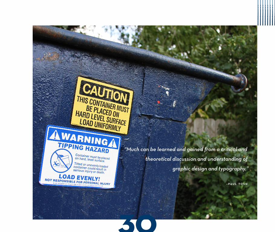
“Much can be learned and gained from a critical and
theoretical discussion and understanding of
graphic design and typography.”
– P A U L T O S H
30

There are many subtle characteristics that typography,
design, and language give these signs that the average
person wouldn’t think twice about. Yes, most people
notice that these signs have big, bold, capital letters, but
they might not understand why. There are conscious
decisions that come into play for the way these signs are
treated typographically and in a sense of design.
Most of these signs utilize bold lines to compliment the bold all-caps letters, as it’s
more striking and more noticeable. All of the elements are centered positionally on
the sign as a means to keep it balanced. There isn’t much attention paid to the spacing
of elements and nitpicky organizational details since they’re not intended to be ana-
lyzed for longer than a glance. As mentioned earlier, symbol and shape are arguably
the most important fundamental aspect of these signs because they’re universally
understood and recognizable without any extra input.
31

We see a recurring theme of reds and blacks dominating the
color scheme of Don’t Do That signs. In their surrounding envi-
ronment, these colors help the sign stand out, distinguishing it
from nature and emphasizing its importance.
The physical nature of the sign to the designer can be likened to a canvas to the painter.
32

33
34

35
T H R O U G H O U T history, mankind has used letter and symbol to share and com-
municate their messages. Things are no different today, as public signage remains a
prominent example of the strategy behind symbol and language. Public signage and
especially Dont Do That signs have become a distraction in a society overflowing with
information. These signs serve a purpose but are often neglected to the average viewer.
People dont seem to have time anymore to appreciate subtle humor and beauty found in
mundane, everyday objects. Don’t Do That signs have an intriguing interplay between
being boring in their design and purpose but charismatic and interesting based on their
typographic, environmental, and syntactical characteristics.
Maybe next time you’ll look at that road sign differently.

S O U R C E S
E L L E N L U P T O N & J E N N I F E R N I C O L E P H I L L I P S , G r a p h i c D e s i g n : T h e N e w B a s i c s
PA U L T O S H , T h e U n c u l t u r e d Wo r d : Ve r n a c u l a r T y p o g r a p h y & I m a g e
P H I L B A I N E S & C A T H E R I N E D I X O N , S i g n s : L e t t e r i n g t h e E n v i r o n m e n t
W R I T T E N , D E S I G N E D & P H O T O G R A P H E D B Y : C A L E B N E W B E R G
S H O T W I T H : C A N O N 4 0 D , 2 8 - 1 3 5 M M L E N S
T Y P E FA C E S U S E D : L E I T U R A & N E U T R A
Created for Professor Patrick Dooley’s class, Designer As Author, at the University of Kansas, Fall 2012


![welfarepunjab.gov.inwelfarepunjab.gov.in/Static/PDF/Archieves/ReservtnCell/...42 ] Published by Authority CHANDIGARH, FRIDAY, OCTOBER 17, 2003 (ASVINA 25, 1925 SAKA) PART IV Republication](https://static.fdocuments.in/doc/165x107/5ab4b9d97f8b9a6e1c8c3069/-published-by-authority-chandigarh-friday-october-17-2003-asvina-25-1925-saka.jpg)