Starting SPSS Creating a New Data File Defining Variables...
89
The Allegheny College has standardized on SPSS (version 11.5) for Windows). The following instructions provide both an introduction to this software as well as details on various procedures that you might need to analyze and understand the data from your research project. Contents An Introduction to SPSS • Starting SPSS • Creating a New Data File • Defining Variables • More on Defining Variables • Entering Data (numeric vs. non-numeric) • Saving Your Data • Exiting SPSS Transformations • Change the Number of Categories for a Categorical Variable • Change a Continuous Variable to a Categorical Variable Descriptive Statistics • Frequency Counts • Numerical Summaries of Data • Bar Charts & Histograms • Visual Association • Bivariate Correlation Non-Parametric Inferential Statistics • Chi-square: One-Way or Two-Way • Kruskal-Wallis (k independent samples) • Wilcoxon (2 related samples) • Mann-Whitney U (2 independent samples) • Friedman (k related samples) Parametric Statistics with Two Conditions • Simple between subjects t-tests • Simple within subjects t-tests Parametric Statistics with More than Two Conditions • One-way between analysis of variance • Two-way between subjects analysis of variance
Transcript of Starting SPSS Creating a New Data File Defining Variables...

The Allegheny College has standardized on SPSS (version 11.5) for Windows). The following instructions provide both an introduction to this software as well as details on various procedures that you might need to analyze and understand the data from your research project.
Contents
An Introduction to SPSS
• Starting SPSS • Creating a New Data File • Defining Variables • More on Defining Variables • Entering Data (numeric vs. non-numeric) • Saving Your Data • Exiting SPSS
Transformations
• Change the Number of Categories for a Categorical Variable • Change a Continuous Variable to a Categorical Variable
Descriptive Statistics
• Frequency Counts • Numerical Summaries of Data • Bar Charts & Histograms • Visual Association • Bivariate Correlation
Non-Parametric Inferential Statistics
• Chi-square: One-Way or Two-Way • Kruskal-Wallis (k independent samples) • Wilcoxon (2 related samples) • Mann-Whitney U (2 independent samples) • Friedman (k related samples)
Parametric Statistics with Two Conditions
• Simple between subjects t-tests • Simple within subjects t-tests
Parametric Statistics with More than Two Conditions
• One-way between analysis of variance • Two-way between subjects analysis of variance
• One-way within subjects analysis of variance • Mixed Designs
Introduction
Starting SPSS
To start SPSS just double-click (left mouse button) the SPSS icon from the desktop. After you double-click on the SPSS icon, the computer will load the SPSS software. You will know that SPSS is loading when the Windows hourglass replaces pointer on your screen. When the loading process is completed, the SPSS Data Editor window will be on your screen. This is the main SPSS screen. There are a number of pull-down menus across the top and a toolbar with various icons that appear below the menu bar. In order to operate the menus, you must use the mouse to point and then single-click (left mouse button) on the menu to which you have pointed. In order to activate a procedure represented by an icon, just point to the icon and single-click (left mouse button) on it.

Creating a New Data File
In many cases, you will begin your work on SPSS by creating a data file with the information that you want to analyze. SPSS should come to the Data View screen seen above. If not, simply click the Data View tab (bottom left).
Defining Variables
The first step in creating a new data file is to define the variables you want to use in your project. As part of this introduction we are going to use the following data set.
ID STUDY HOURS GPA SEX
-- -------------------- ------ ------
1 32 3.6 M 2 16 3.5 F 3 21 2.8 M 4 23 3.7 F 6 8 3.5 F 7 4 3.7 F 8 10 2.5 M 10 15 2.3 F 11 31 3.0 F 12 40 3.9 M

13 5 3.1 F 14 28 2.7 M 15 15 2.3 F
To define our first variable (ID number); click on the Variable View tab at the bottom of the Data Editor window. Your screen should now look like this.
First, we will want to give the variable a name that is useful to us. Click on the Name column, and type id (see figure below). Then press the Enter key.

In addition to giving our variable a name, we usually want to specify some of its characteristics. In the case of id we want the entries to be whole numbers, without decimal places and either one or two numerals in length. To do this click, click the small square with three dots in the Type column next to the word Numeric. The panel seen below will appear.
We want to treat this data as a number, so leave the dot next to Numeric. But we want just two digits maximum and no decimal places. Make those changes in the appropriate boxes and then press OK. Notice that the Width and Decimals designations for id have changed on the Variable View page.

This is all we need to do with this variable.
Using these procedures, name the second column StudyHr. It should also be numeric with a format of 2.0.
Note: Even if you type the variable name StudyHr SPSS changes it to studyhr. And remember that the maximum length of a variable name is 8 characters. It is possible to provide more information about a variable and we will learn how to do that next.
More on Defining Variables
The next variable we want to define is grade point average (GPA). Call this new variable GPA (or gpa) and set it for a width of two digits with one place after the decimal.
But what does GPA stand for? To provide more information about a variable, we can add a Variable Label.
Type Grade Point Average in the Label column and press the Enter key (see figure above). Now when statistical analyses are done on this variable, the extended label, Grade Point Average, will be included to remind us what this variable is all about.
Now for our final variable, Sex. Although it is possible to use M and F for this variable, it is best to "code" the variable numerically such as 1 for male and 2 for female (or 0 for male, 1 for female, etc.).
Begin by defining the variable (using either method we have learned). Define its type as Numeric1.0.
Provide a more complete description of the variable by typing Sex of Subjects in the Label column. But remember that we are going to type 1 or 2 for this variable. How do we remember what 1 stands for?
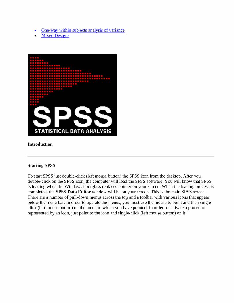
Click on the small box with the three dots in the Values column to get this box.
In the the Value cell type 1 and in the Value Label cell type male. Now click the Add button. Notice that our entry is moved down to the open box at the bottom.
Now enter 2 and female (and click Add). We now have a complete definition of our variable sex. Click OK to complete this entry.
Entering the Data
Now that the characteristics of each variable have been specified, you will need to enter the data from the table on Page 2 into the spreadsheet. Just click on the first empty cell for the variable ID and press 1 and the Enter key.
One of the advantages of defining your variables before you begin entering data is that it provides some checks on the data that you enter. For example, try to enter a 4-digit number in the ID column. Rather than entering an incorrect number, SPSS just puts ** in the cell to remind you that incorrect data has been entered.

Entering Non-Numeric Data
In addition to being to do computations with numeric data (numbers), SPSS can also deal with labels, what are often called string data. In the data set shown below, Major, is a string variable.
1998 Graduates of Allegheny College, Listed by Major
Major Number of 1998 graduates
Art 10
Biology 51
Chemistry 12
Classics 0
Communication Arts 21
Computer Science 8
Economics 26
English 21
Environmental Science/Studies 54
Geology 6
History 15
International Studies 4
Mathematics 6
Modern Languages 6
Music 2
Neuroscience 12
Philosophy 3

Physics 6
Political Science 28
Psychology 46
Religious Studies 4
Sociology/Anthropology 9
Student-Designed Majors 2
Women’s Studies 1
Total: 353
Note: This procedure assumes that you have gone through the material in the Introduction to SPSS. If not, you should review that material before proceeding.
First, we need to define our first variable – the majors. Using the Variable View screen, give the variable the name "major"; remember that in SPSS variable names cannot be more than 8 characters long. Click on the three small dots in the Type column (next to Numeric) and change the variable to "string" (a "string" variable is one that is characterized by a word or set of letters (that is, not numbers). In the Labels column, call this variable "Allegheny College Major" – this command allows us to give a fuller description of the variable than we can give with just the name.
When you have entered the data into the Data View screen, your data editor should now look like this:
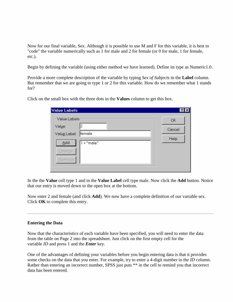
Now we need to enter the actual number of students in each major for 1998. Follow the same procedure using the second column, except that this variable name should be "grad98" (note: you cannot begin a variable name with numbers, so we have to start with letters). This variable is a numeric variable, and since it is the number of graduates, it is always going to be a whole number, and we can type 0 as the number of decimal places. Give it the label "1998 graduates", and when you are finished, begin to type in the second column of data.
Be careful to check your numbers after you have entered them, though – entering the data is where most errors occur.
Saving Your Data
After the data has been entered into the spreadsheet you should save the data, even if you plan to do all your analyses before you log off. Things can go wrong and you do not want to enter the data twice.
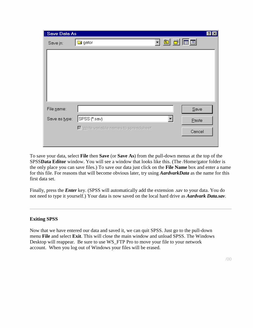
To save your data, select File then Save (or Save As) from the pull-down menus at the top of the SPSSData Editor window. You will see a window that looks like this. (The /Home/gator folder is the only place you can save files.) To save our data just click on the File Name box and enter a name for this file. For reasons that will become obvious later, try using AardvarkData as the name for this first data set.
Finally, press the Enter key. (SPSS will automatically add the extension .sav to your data. You do not need to type it yourself.) Your data is now saved on the local hard drive as Aardvark Data.sav.
Exiting SPSS
Now that we have entered our data and saved it, we can quit SPSS. Just go to the pull-down menu File and select Exit. This will close the main window and unload SPSS. The Windows Desktop will reappear. Be sure to use WS_FTP Pro to move your file to your network account. When you log out of Windows your files will be erased.
/00
Transformations
Changing the number of categories
Let's say that you have some data that includes the variable origin for the country of origin of the cars in the data set. This variable is coded 1 for American cars, 2 for European cars, and 3 for Japanese cars. However, you want to do an analysis that requires just two categories, 0 for American and 1 for Other.
The following steps provide the procedure for creating a new variable, country, which will have just two categories, 0 or 1.
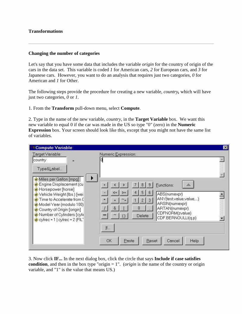
1. From the Transform pull-down menu, select Compute.
2. Type in the name of the new variable, country, in the Target Variable box. We want this new variable to equal 0 if the car was made in the US so type "0" (zero) in the Numeric Expression box. Your screen should look like this, except that you might not have the same list of variables.
3. Now click IF... In the next dialog box, click the circle that says Include if case satisfies condition, and then in the box type "origin = 1". (origin is the name of the country or origin variable, and "1" is the value that means US.)
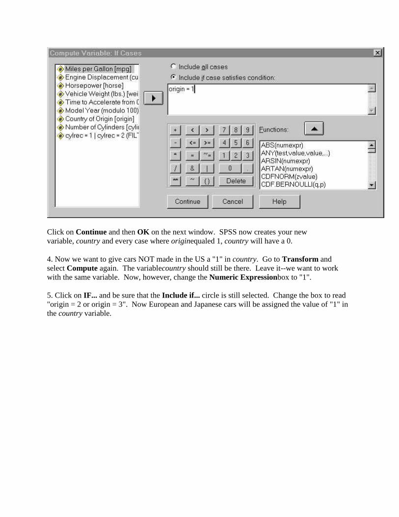
Click on Continue and then OK on the next window. SPSS now creates your new variable, country and every case where originequaled 1, country will have a 0.
4. Now we want to give cars NOT made in the US a "1" in country. Go to Transform and select Compute again. The variablecountry should still be there. Leave it--we want to work with the same variable. Now, however, change the Numeric Expressionbox to "1".
5. Click on IF... and be sure that the Include if... circle is still selected. Change the box to read "origin = 2 or origin = 3". Now European and Japanese cars will be assigned the value of "1" in the country variable.

Click Continue and then OK on the main screen. You will be asked
Click OK to update the variable country.
6. Finally, if you have any missing values in your data, you need to take care of those. For example, if origin includes some missing values coded as -9, go back to Transform/Compute and enter -9 in the Numeric Expression box and "origin = -9" in the If Cases box. You will again be asked if you want to change the existing variable. Indicate OK.
One final step before your new variable is ready to use. Go to Variable View. The new variable will be the last one in the list. Click on the Missing option and enter -9 in the Discrete Missing Values box. You are now ready to do the analysis.
Transforming a continuous variable into categories
Sometimes you have a continuous variable that you want to transform into categories to use as the independent variable in an analysis. For example, let's say that we have collected the heights (in inches) of a large pool of subjects (height) but now we want to put the participants into one of four equal groups based on their height. The procedures for doing this are outlined here.
1. If we want to divide the cases into four equal groups based on height, we first need to find the quartiles. UseAnalyze/Descriptive/Frequencies. Select Quartiles among the Statistics provided. Suppose that the output indicates that 64 inches is the first quartile, 66 the second, and 69 the third. We can now divide our cases into four groups: Group 1, less than 64 inches; Group 2, 64 to 66 inches; Group 3, 66 to 69 inches; and Group 4, greater than 69 inches.
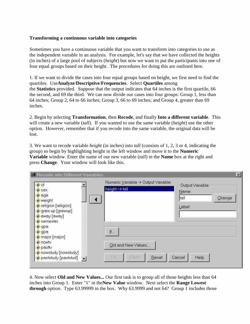
2. Begin by selecting Transformation, then Recode, and finally Into a different variable. This will create a new variable (tall). If you wanted to use the same variable (height) use the other option. However, remember that if you recode into the same variable, the original data will be lost.
3. We want to recode variable height (in inches) into tall (consists of 1, 2, 3 or 4, indicating the group) so begin by highlighting height in the left window and move it to the Numeric Variable window. Enter the name of our new variable (tall) in the Name box at the right and press Change. Your window will look like this.
4. Now select Old and New Values... Our first task is to group all of those heights less than 64 inches into Group 1. Enter "1" in theNew Value window. Next select the Range Lowest through option. Type 63.99999 in the box. Why 63.9999 and not 64? Group 1 includes those
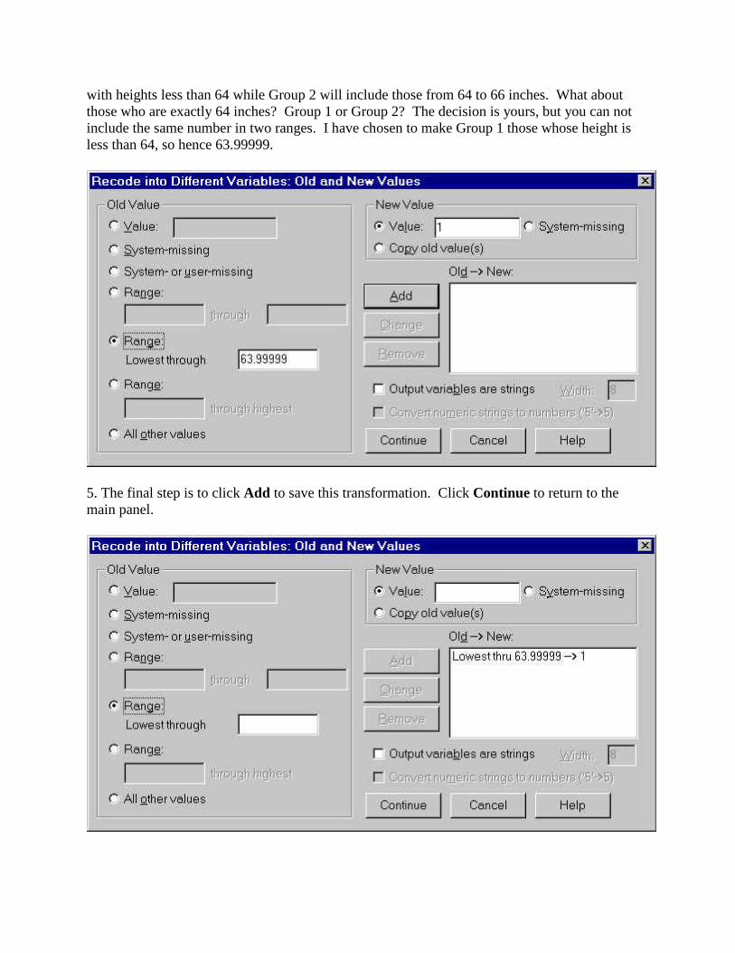
with heights less than 64 while Group 2 will include those from 64 to 66 inches. What about those who are exactly 64 inches? Group 1 or Group 2? The decision is yours, but you can not include the same number in two ranges. I have chosen to make Group 1 those whose height is less than 64, so hence 63.99999.
5. The final step is to click Add to save this transformation. Click Continue to return to the main panel.

6. Our task now is to repeat this for the other groups. Again select Old and New Values. To enter the criteria for Group 2, begin with "2" in the New Value box. Group 2 will include those with heights from 64 to 66 inches so select the Range option and enter 64 and 66.
Then click Add to enter that value.
7. Use the same process to define the third category (66 to 69). But as with the first category, we need to be concerned with overlapping categories. Therefore, you should define category 3's range as 66.00001 to 68.9999.
8. The final category (category 4) includes all scores 69 or greater. Select the Range through highest option and enter 69 in the box (along with 4 in the Value box). Before you click Add you screen will look like this:
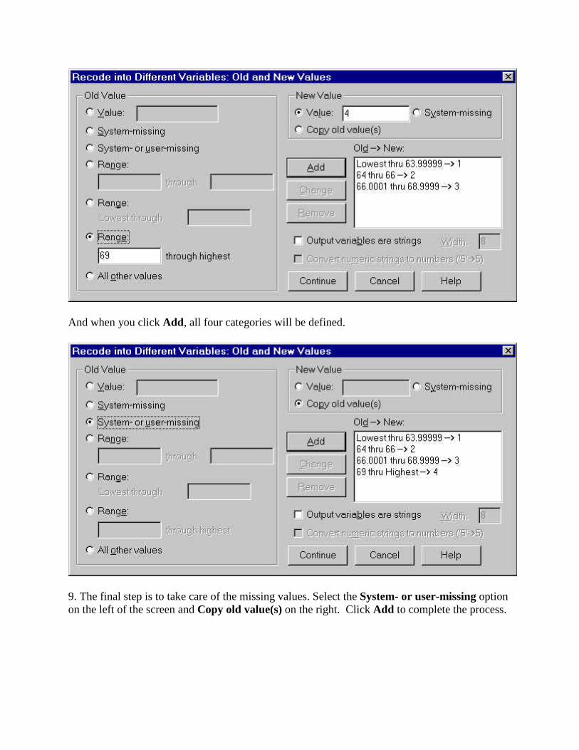
And when you click Add, all four categories will be defined.
9. The final step is to take care of the missing values. Select the System- or user-missing option on the left of the screen and Copy old value(s) on the right. Click Add to complete the process.

Continue will return you to the main page. One final step before your new variable is ready to use. Go to Variable View. The new variable will be the last one in the list. Click on the Missing option and enter -9 in the Discrete Missing Values box. You are now ready to do the analysis.

Descriptive Statistics
There are variety of ways that can be used to compare distributions, including dot plots (to get an idea of the spread of the data) as well as the more traditional summary statistics (mean, median, etc.). Moreover, descriptive statistics include bar charts and histograms, as well as finding relationships between variables using visual association &correlation.
Let's begin by assuming that we have a data set that contains hypothetical scores on an exam for 11 different introductory psychology classes. There were 100 points possible on the exam, and there were 50 students in each class. We want to compare the performance across classes.
Frequency Counts Using Dot Plots
Dot Plots can be used to provide a simple frequency chart for each class thus enabling us to compare the resulting distributions to each other. Creating these simple frequency charts is very easy and is best done using the Interactive Graphs menu.
To begin, simply click on the Graphs menu and choose Interactive. In that sub menu, choose Dot. The kind of chart we are going to create is called a "dotplot", in which each dot represents a number (or several numbers, if they happen to be the same) in the distribution. When the Create Dots panel appears, you will see a list of all the variables (the classes in our case) in the left window and spaces representing the vertical and horizontal axes in the right window.
All of the Interactive Graphs are done with a drag-and-drop technique (see the description of preparing

histograms for more details). Simply highlight the class that you want to examine (Class A, in this case), and drag it into the box for the horizontal axis. When you have done that, click OK, and the chart will pop up in the Output window. The window also provides a number of options for adding titles, lines, and various other accessories to your chart.
Now do the same thing for Classes B and C. (Notice that when you choose another variable to plot, it automatically replaces the one in the horizontal axis box.) Fortunately, SPSS makes it extremely easy for you to examine these charts and compare them. To do so, simply locate the small icon in the left panel that represents each of the charts. When you single-click on one, you will see it in the Output window.
Numerical Summaries of Distributions
To produce numerical summaries of any distribution just go to the Analyze menu, choose Descriptive Statistics, and then choose Frequencies. When you get the Frequencies dialogue box, simply highlight each variable name, and then click on the arrow to put it in the right side of the box. You can do the variables one at a time or all at once. Then click on the box labeled Statistics. This will take you to a dialogue box labeled Frequencies: Statistics, where you can decide which descriptive statistics you would like to have calculated.. When you selected the statistics you want, click Continue. Then click Ok, and SPSS will calculate the descriptive statistics.
Bar Charts
One of the best ways to present data is by using a bar chart or a histogram. Bar charts are appropriate when you have discrete sets of data (males, females) while histograms should be used when you have a continuous variable (grade point average). Below are instructions on how to produce each type using SPSS.
Consider a situation where we have data on Allegheny graduates in various majors for 1998 and we want to be able to compare the numbers of graduates from the various majors. The easiest way to do that graphically is to create a bar chart. To do that, follow the following steps.
First, select Bar… under the Graphs menu. When the Bar Charts panel comes up, you will see that you have several selections of the kind of bar chart you want. (We have selected Simple.)
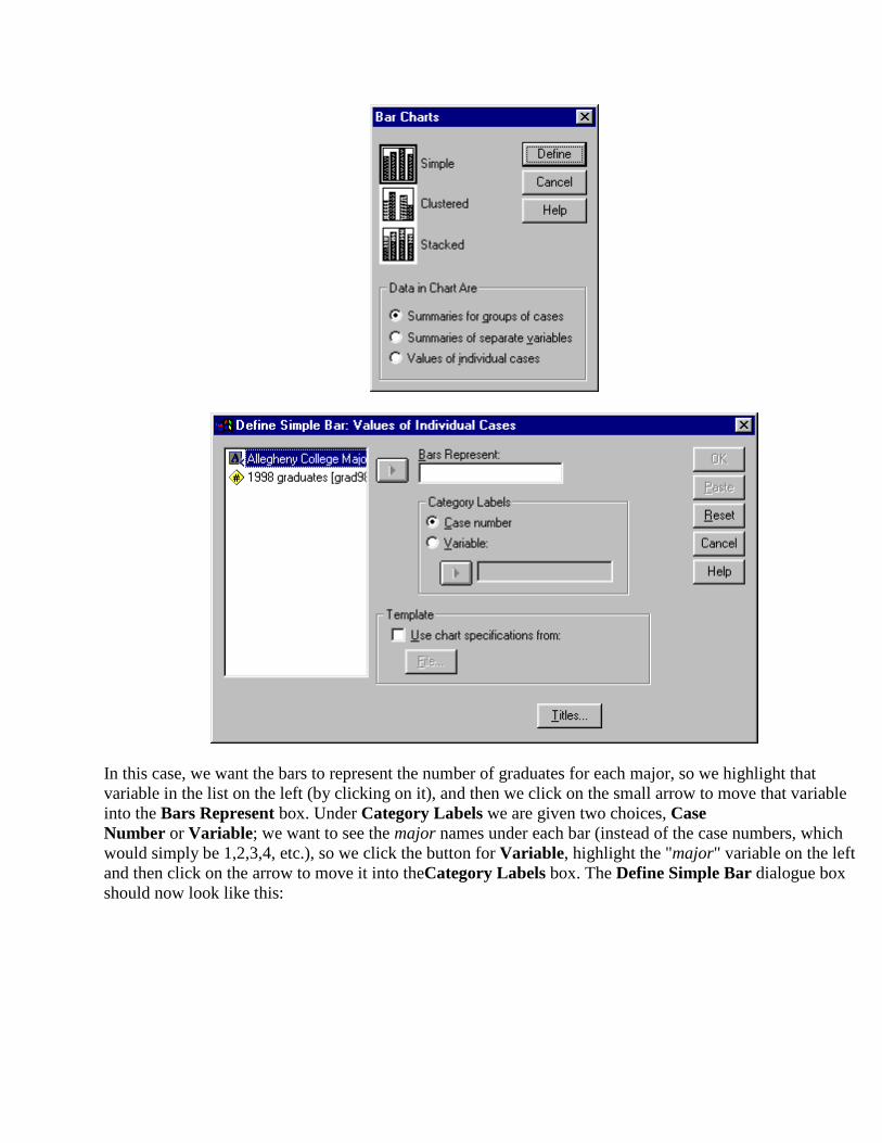
In this case, we want the bars to represent the number of graduates for each major, so we highlight that variable in the list on the left (by clicking on it), and then we click on the small arrow to move that variable into the Bars Represent box. Under Category Labels we are given two choices, Case Number or Variable; we want to see the major names under each bar (instead of the case numbers, which would simply be 1,2,3,4, etc.), so we click the button for Variable, highlight the "major" variable on the left and then click on the arrow to move it into theCategory Labels box. The Define Simple Bar dialogue box should now look like this:

We have now finished defining our bar chart. Click OK on the upper right corner of the panel, and in a few moments, your finished graph should pop up on to your screen!
There are a few things you should know about the SPSS output file that you have created. The information comes in an Output window, and it has two parts. On the right is the output from whatever procedures you have just completed. On the left is the Outline – an outline representation of all the recent SPSS procedures that you have run. You can explore this panel as you want, but the main thing to remember is that it can be a good way of helping to keep track of the procedures that you have run. You can also edit, rearrange, and delete items in your output file using this feature.
Histograms
In situations where the variable of concern is continuous, a histogram (bar will touch) is more appropriate. Consider a situation where we can to examine the lengths of the reigns of British rulers since 1066. Here is the data
Reigns of British Rulers since 1066
Ruler Reign (in years) Ruler Reign (in years)
William I 21 Edward VI 6
William II 13 Mary 1 5

Henry I 35 Elizabeth I 44
Stephen 19 James I 22
Henry II 35 Charles I 24
Richard I 10 Charles II 25
John 17 James II 3
Henry III 56 William III 13
Edward I 35 Mary II 6
Edward II 20 Anne 12
Edward III 50 George I 13
Richard II 22 George II 33
Henry IV 13 George III 59
Henry V 9 George IV 10
Henry VI 39 William IV 7
Edward IV 22 Victoria 63
Edward V 0 Edward VII 9
Richard III 2 George V 25
Henry VII 24 Edward VIII 1
Henry VIII 38 George VI 15
Rather than simply presenting a figure where each king or queen is represented by a bar, we want a histograms that summarizes the data by grouping the information together into categories. In this case, the categories will be ranges of lengths of reigns.
To begin, open a new Data Editor in SPSS. We are going to enter in all of the lengths of the reigns. However, since we are not going to use the individual kings’ and queens’ names in this analysis (since we are going to group the data together into categories), we only need one column, which you should name reign and label as "Reigns of British Rulers." Define that variable (it is numerical, and we don’t need any decimal places), and enter the data into the data editor.

Once you have entered the data, we need to tell SPSS to create a histogram that displays it. There are two ways to do this, and we will try both.
First, down towards the bottom of the Graphs menu you will find an item called Histogram … Click on this item. In the left portion of the panel you should see the description of the "reign" variable.
Simply highlight that variable label and then click on the arrow to insert it under Variable. Then click OK, and in a few moments, you should have a histogram.
Changing the Look of Histograms
One thing that you may have noticed is that SPSS decided how many intervals to create for your histogram and what the width of those intervals should be. However, you can change that if you want, and changing the interval width can change the look of the histogram significantly. To change the interval width we will use a slightly different feature of SPSS, which is called "Interactive Graphs". This part of SPSS will do much the same thing as the histogram program that we used above; the only difference is that with an interactive graph, we can control more of how the histogram will eventually look.
Select Graphs, then Interactive, and Histogram to get the panel seen below.

This panel works on the principle of "drag and drop"; instead of typing in the variable names that you want, you can simply highlight the one you want and drag it to its proper place. For example, you see in the panel two arrows, representing the vertical and horizontal axes of the histogram. The vertical axis is already labeled "count," since it will simply show how many of the reigns fall into each interval. Now highlight the variable "reign" and drag it into the open space on the horizontal axis, since that is where we want it.
To customize the look of the histogram, we now simply click on the tab labeled Histogram. There are all kinds of things we can do at this point, such as superimposing a normal curve over the histogram, or giving it a 3-D look; you can experiment with those when you want. For now, the most important feature is the Interval Size box. Here you can either ask SPSS to set the interval size, or you can specify a particular number of intervals or width of intervals. To see how different the histogram might look with a different number of intervals, count how many intervals were in your original histogram, and use half that number here. Then click on the Titles tab, and type in a title for your histogram in the top space. Then click OK to create the histogram. Now choose a different interval width, and create a histogram.
Visual Association
The relationships between a number of variables are often best examined by looking at some type of scatter plot of pairs of variables. By looking at these plots not only can relationships be oberved but outliers,

problems of limited range, etc. can become obvious.
To prepare scatter plots, simply enter the data into SPSS, one variable per column of data. To make the output more readable, make sure that you have provided labels for the variables. Then pull down the Graphs menu and chooseInteractive > Scatter. Put the one variable on the Y (vertical) axis and another variable on the X-axis.
The Interactive graphs make use a drag-and-drop technique. Highlight the variable you want to be on the Y-axis and drag it to the vertical box. So the same for the X axis (drag the name of the variable to the horizontal box. The Create Scatterplot box should look something like this.
Unless you are doing a plot with more than two variables you will not need to make use of the Legend Variablesoptions.
Bivariate Correlation
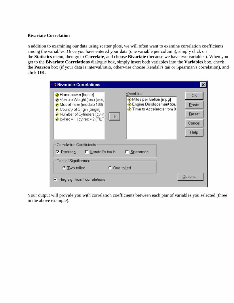
n addition to examining our data using scatter plots, we will often want to examine correlation coefficients among the variables. Once you have entered your data (one variable per column), simply click on the Statistics menu, then go to Correlate, and choose Bivariate (because we have two variables). When you get to the Bivariate Correlations dialogue box, simply insert both variables into the Variables box, check the Pearson box (if your data is interval/ratio, otherwise choose Kendall's tau or Spearman's correlation), and click OK.
Your output will provide you with correlation coefficients between each pair of variables you selected (three in the above example).

In addition, a measure of significance of each correlation (is the correlation significantly different from zero) is included. Note that the correlation between a particular set of variables is given twice (Miles per Gallon vs. Time to Accelerate as well as Time to Accelerate vs. Miles per Gallon). Correlations between a variable and itself are shown as being 1.000.
Non-Parametric
When our data consists of only the frequencies of various events, the most commonly used statistics is the chi square (X2). Below are the procedures for doing both one-way and two-way chi square analyses. Other non-parametric statistics are appropriate when the variable being measured is at an ordinal rather than at an interval or ratio level of measurement. Below are instructions for using SPSS to anlayze data when you have 2 independent samples (Mann-Whitney U test), k independent samples (Kruskal-Wallis test), 2 related samples (Wilcoxon test) and k related samples (Friedman analysis of variance by ranks).
One-Way Chi Square
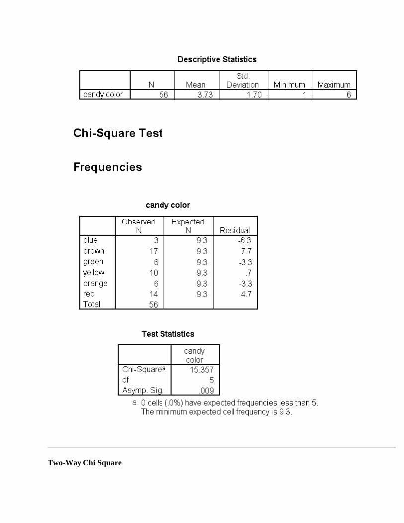
I just bought a bag of M&Msâ containing 56 candies. The maker of the candy claims to put an equal number of each color of candy in every bag. To test this claim we can use the following data:
Color Number

Blue 3
Brown 17
Green 6
Yellow 10
Orange 6
Red 14
We enter the data using the following format. Note that the colors are given numbers rather than their original names. Use the Define Labels option when you create the variable color to provide value labels for alternative, e.g., 1 = Blue, 2 = Brown, etc.
Unlike previous procedures, the Chi-Square requires that variables be weighted. From the Data menu, select Weight Cases. This window is shown below.

Select Weight Cases by and highlight the variable number and click the arrow button to the left of the "Frequency Variable" window. The text at the bottom of the window serves as a check for you to see if you weight the variables in the desired way.
Select Analyze/Nonparametric Tests/Chi-Square to see this window:
Highlight the categorical variable and click the arrow to the left of the "Test Variable List" window and then select Options.In the options window, select Descriptive, Exclude cases test-by-test, and click theContinue button.
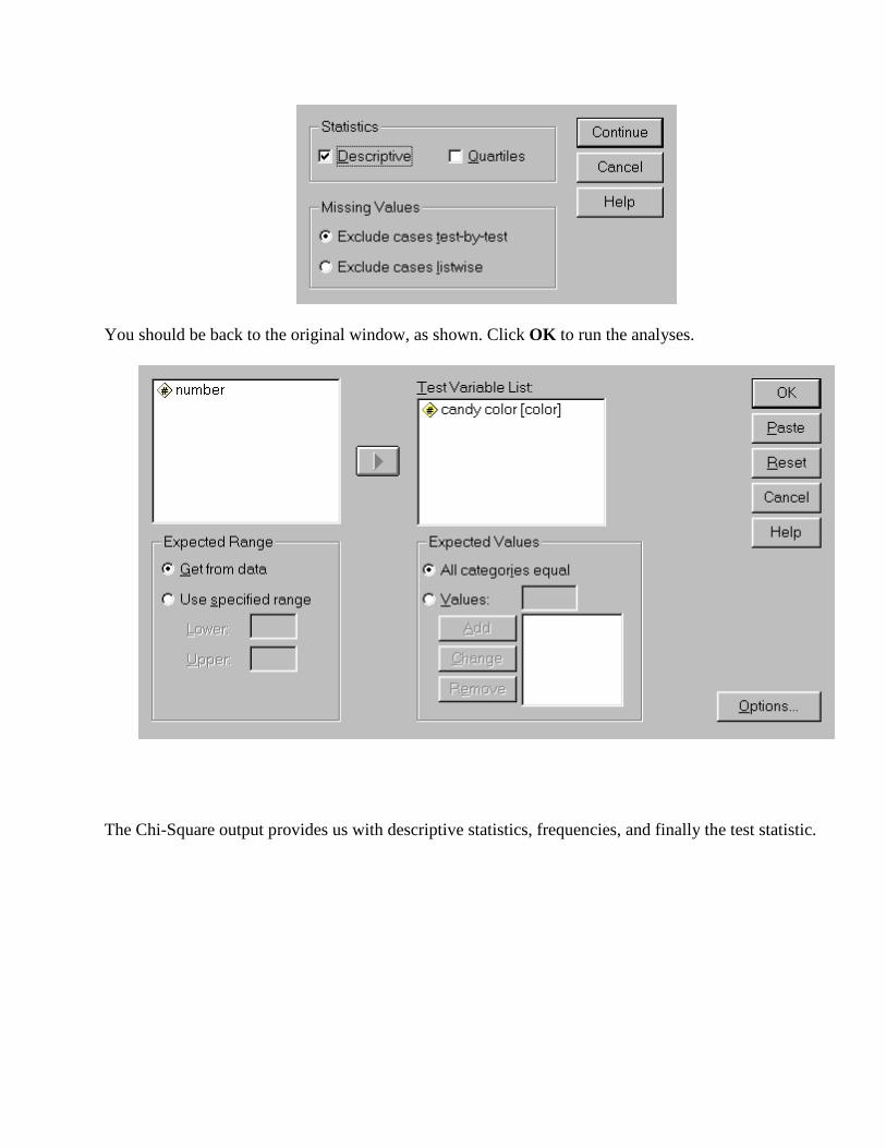
You should be back to the original window, as shown. Click OK to run the analyses.
The Chi-Square output provides us with descriptive statistics, frequencies, and finally the test statistic.
Two-Way Chi Square
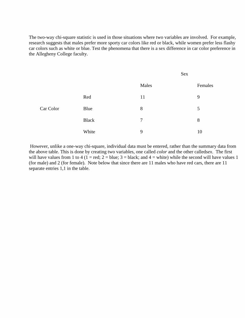
The two-way chi-square statistic is used in those situations where two variables are involved. For example, research suggests that males prefer more sporty car colors like red or black, while women prefer less flashy car colors such as white or blue. Test the phenomena that there is a sex difference in car color preference in the Allegheny College faculty.
Sex
Males Females
Red 11 9
Car Color Blue 8 5
Black 7 8
White 9 10
However, unlike a one-way chi-square, individual data must be entered, rather than the summary data from the above table. This is done by creating two variables, one called color and the other calledsex. The first will have values from 1 to 4 (1 = red; 2 = blue; 3 = black; and 4 = white) while the second will have values 1 (for male) and 2 (for female). Note below that since there are 11 males who have red cars, there are 11 separate entries 1,1 in the table.

After the data are entered, chose the option Analyze/Descriptive/Crosstabs. Move the variable color to the Row(s) area and the variable sex to the Column(s) section as indicate below.

Press the Statistics option and choose Chi-square. You may also want some additional statistics such as the Contingency coefficient (a measure of relationship in nominal data). Press Continue to return to the main panel.

Pressing OK will produce the results, including a frequency cross tabulation table, chi-square results, and the contingency coefficient noted below.
Kruskal-Wallis Test (k independent samples)
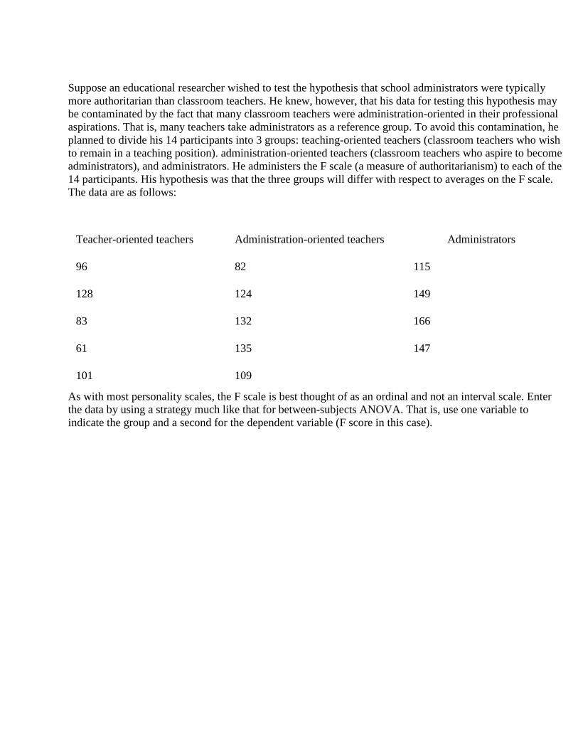
Suppose an educational researcher wished to test the hypothesis that school administrators were typically more authoritarian than classroom teachers. He knew, however, that his data for testing this hypothesis may be contaminated by the fact that many classroom teachers were administration-oriented in their professional aspirations. That is, many teachers take administrators as a reference group. To avoid this contamination, he planned to divide his 14 participants into 3 groups: teaching-oriented teachers (classroom teachers who wish to remain in a teaching position). administration-oriented teachers (classroom teachers who aspire to become administrators), and administrators. He administers the F scale (a measure of authoritarianism) to each of the 14 participants. His hypothesis was that the three groups will differ with respect to averages on the F scale. The data are as follows:
Teacher-oriented teachers Administration-oriented teachers Administrators
96 82 115
128 124 149
83 132 166
61 135 147
101 109
As with most personality scales, the F scale is best thought of as an ordinal and not an interval scale. Enter the data by using a strategy much like that for between-subjects ANOVA. That is, use one variable to indicate the group and a second for the dependent variable (F score in this case).

To do the analysis select Analyze/Nonparametric Tests/K Independent Samples to see the following window.
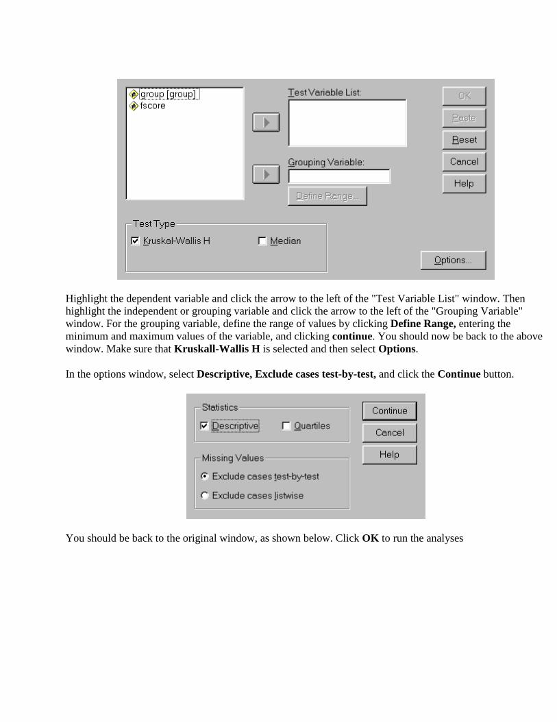
Highlight the dependent variable and click the arrow to the left of the "Test Variable List" window. Then highlight the independent or grouping variable and click the arrow to the left of the "Grouping Variable" window. For the grouping variable, define the range of values by clicking Define Range, entering the minimum and maximum values of the variable, and clicking continue. You should now be back to the above window. Make sure that Kruskall-Wallis H is selected and then select Options.
In the options window, select Descriptive, Exclude cases test-by-test, and click the Continue button.
You should be back to the original window, as shown below. Click OK to run the analyses

The Kruskall-Wallis output provides us with descriptive statistics, cell size, mean rank, and finally the test statistic.
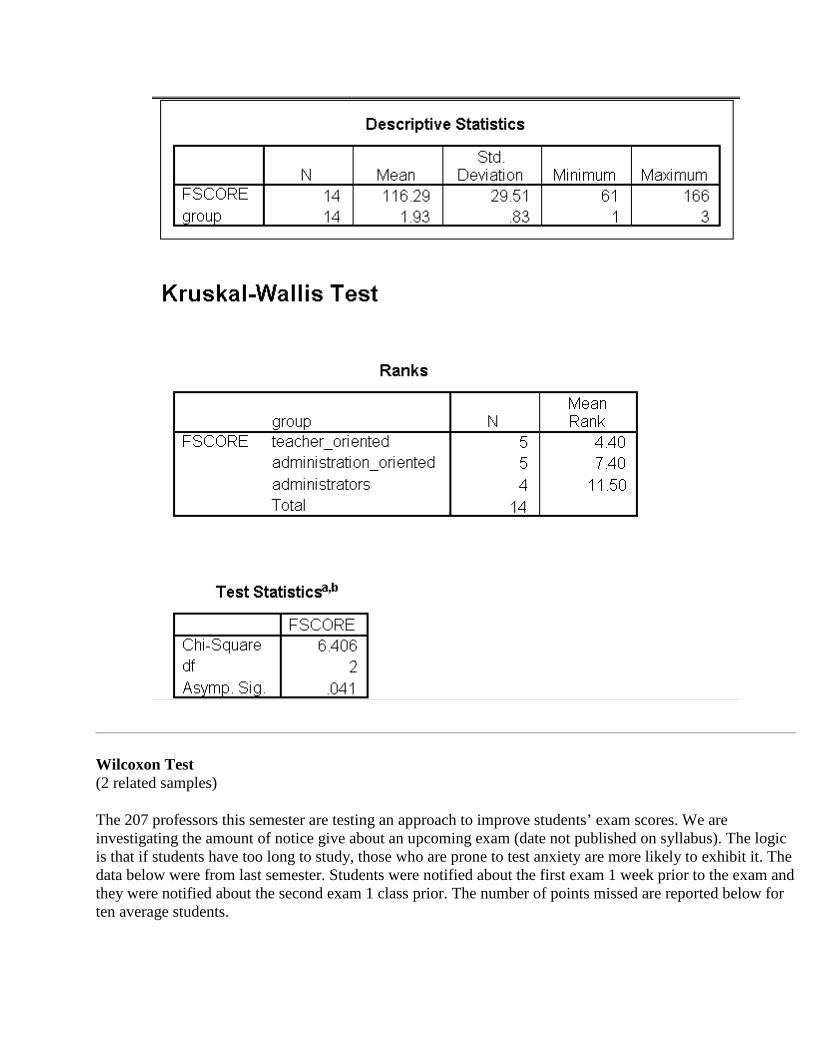
Wilcoxon Test (2 related samples)
The 207 professors this semester are testing an approach to improve students’ exam scores. We are investigating the amount of notice give about an upcoming exam (date not published on syllabus). The logic is that if students have too long to study, those who are prone to test anxiety are more likely to exhibit it. The data below were from last semester. Students were notified about the first exam 1 week prior to the exam and they were notified about the second exam 1 class prior. The number of points missed are reported below for ten average students.

1 Week 1 Class
8 13 10 35 7 12 3 11 12 10 17 29 8 9 14 38 5 21 13 9
The dependent variable is probably not normally distributed.
Enter the data in two columns (one for the data where the instructor announced the exam 1 week before and one for the data when he announced the exam just one class before.
Select Analyze/Nonparametric Tests/2 Related Samples to see the following window:
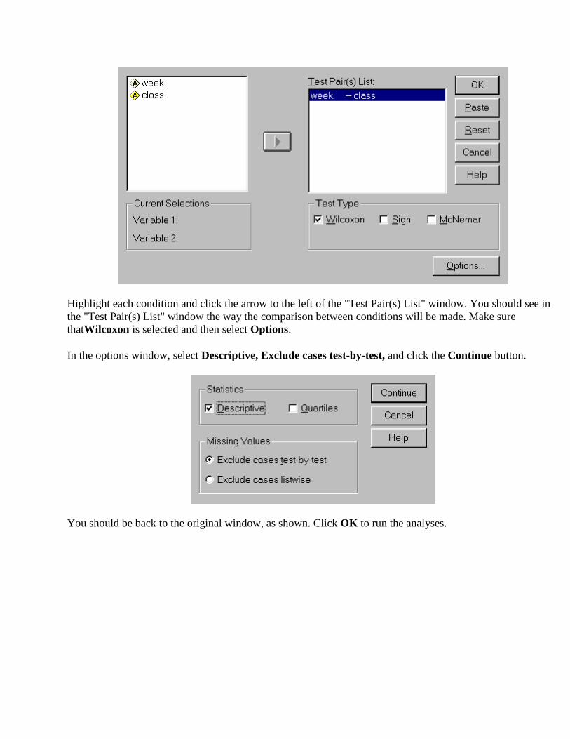
Highlight each condition and click the arrow to the left of the "Test Pair(s) List" window. You should see in the "Test Pair(s) List" window the way the comparison between conditions will be made. Make sure thatWilcoxon is selected and then select Options.
In the options window, select Descriptive, Exclude cases test-by-test, and click the Continue button.
You should be back to the original window, as shown. Click OK to run the analyses.

The Wilcoxon output provides us with descriptive statistics, information about ranks, and finally the test statistic.
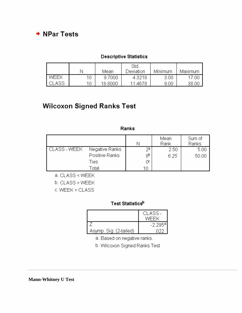
Mann-Whitney U Test

(2 independent samples)
Lepley compared the serial learning of 9 seventh-grade students with the serial learning of 10 eleventh-grade students. His hypothesis was that the primacy effect should be less prominent in the learning of the younger participants. (The primacy effect is the tendency for the material learned early in a series to be remembered more efficiently than the material learned later in a series.) He tested this hypothesis by comparing the percentage of errors made by the two groups in the first half of the series of learned material. The data are as follows.
Eleventh-Grade Students: 32.2, 39.2, 40.9, 38.1, 34.4, 29.1, 41.8, 24.3, 32.4, 34.6
Seventh-Grade Students: 39.1, 41.2, 45.2, 46.2, 48.4, 48.7, 55.0, 40.6, 52.1
Just as is often the case with time, percentage of correct responses is rarely normally distributed. In situations such as serial learning, the underlying distribution is definitely not normal.
Enter your data using the same format that you have used for other between analyses (i.e., one variable for the group (1 = 11th graders; 2 = 7th graders) and a second variable for the error scores).
Select Analyze/Nonparametric Tests/2 Independent Samples and follow the same process that you used for the Kruskall-Wallis.
Friedman Analysis of Variance by Ranks (k related samples)
In a bottle cap factory there are three identical machines for making bottle caps. On several days selected at random, their output is recorded.
Machine
A B C
Day 1 340 339 347
Day 2 345 333 343
Day 3 330 344 349
Day 4 342 348 355
Day 5 338 351 321

Day 6 320 347 344
Day 7 331 345 314
Day 8 328 359 342
Day 9 313 352 345
Day 10 321 358 349
Given the size of the sample and the potential range of numbers, the daily output of machines in this factory is not normally distributed.
Enter your data using the same format that you have used for other within analyses, that is, there should be one column for each of the three machines (day data need not be entered unless you want to use it much like an ID number). Select Analyze/Nonparametric Tests/k Related Samples and follow the same process that you used for the Wilcoxon with one exception. After you put the variables in the "Test Variables" window, click on Statistics. In this window, select Descriptives and then Continue, which will return you to the original window and click OK.
Parametric Statistics with Two Conditions Simple t-Tests Data from experiment with two conditions where the level of measurement of the dependent variable is at the interval or ratio level can be analyzed using one of two variations of the student's t statistic, one for between subject's designs and another for within or repeated subject's designs. t-Tests for Between Subjects Designs Burke and Greenglass (1989) have concluded that, "It may be lonely at the top but it's less stressful." These authors found a significant difference between teachers and principals on a measure of burnout (burnout is an extreme form of stress), with teachers exhibiting higher levels of burnout than principals did. Below are some hypothetical data for a further test of this hypothesis. Burnout Scores:
Teachers: 42, 38, 44, 33, 49, 42, 40 Principals: 28, 35, 40, 38, 30, 24
Bring up SPSS and using what you learned in An Introduction to SPSS for Windows, create two variables.

Use the following specifications for the variables:
- first variable: - Variable Name: job - Type: Numeric1.0 - use the Define Label feature to indicate that 1 = teachers and 2 = principals - second variable: - Variable Name: burnout - Type: Numeric8.2 (default value) - Variable Label: Burnout Scores
Now enter the data in the SPSS Data Editor. The first column will contain a 1 or a 2 that indicates whether the score is for a teacher (enter 1) or a principal (enter 2). The second column contains the burnout score. For example, the first row of our data would have a 1 in job and a 40 in burnout. Repeat this procedure for all 13 scores. Once all of the data is entered, use the main menu Analyze/ Compare Means/ Independent-Sample T Test to do the analysis. The screen you will see looks like this. The two variables in the data are noted in the left panel. The variable burnout is the variable we want to test. Highlight this variable and click the arrowhead to move burnout to the Test Variable(s) section. Now highlight job and click the arrow to move this variable to Grouping Variable window. Your panel should look like this:
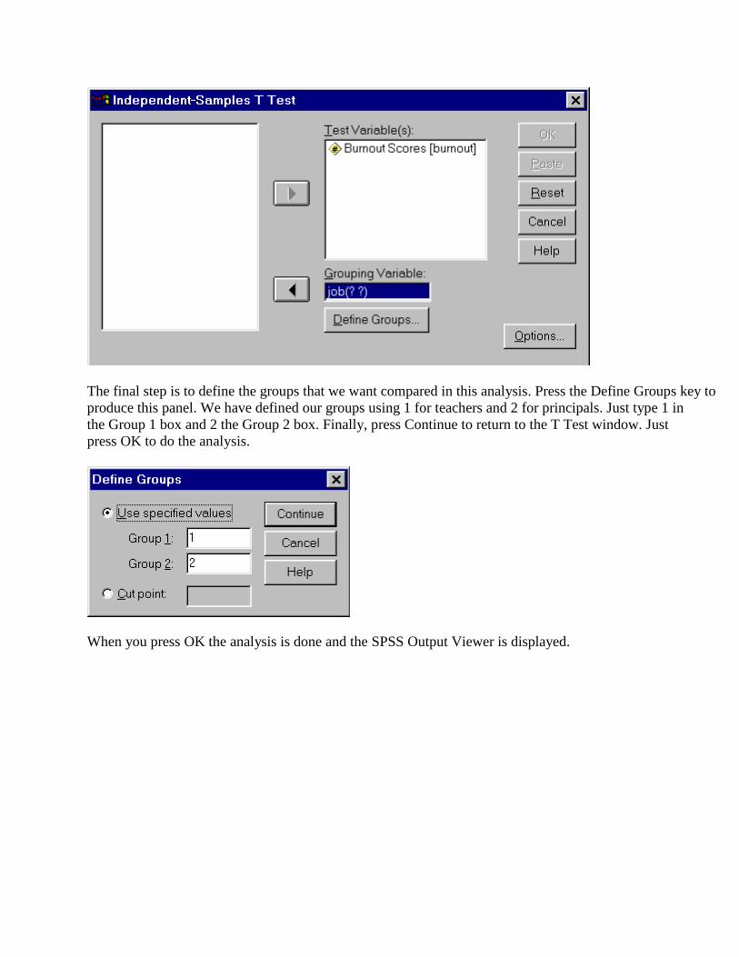
The final step is to define the groups that we want compared in this analysis. Press the Define Groups key to produce this panel. We have defined our groups using 1 for teachers and 2 for principals. Just type 1 in the Group 1 box and 2 the Group 2 box. Finally, press Continue to return to the T Test window. Just press OK to do the analysis.
When you press OK the analysis is done and the SPSS Output Viewer is displayed.

The left panel is referred to as the Output Outline box and contains an outline of the type of SPSS procedures that have been performed. The left window contains the output file. (You may need to use the up/down or left/right scroll bars to see all of the output.) In the case of a t-test, in the top box we are given the N, means, standard deviations, and standard error of the mean for each group (Group Statistics box). The bottom box provides two sets of results, one when the variances are assumed equal and one when they are not equal. To determine which set to use, look at the results marked Levene’s Test for Equality of Variances. If the value in the Sig column is greater than .05, we conclude that the variances are equal so we use the first set of results. If this value is less than .05, we conclude that the variances are not equal and use the second set. In our case, the value .337 is greater than .05 so we use the Equal variances assumed results.
t-Tests for Within Subjects Designs
Ruth, Mosatche, and Kramer (1989) tested the hypothesis that people would state a preference for purchasing a liquor product if the product were advertised with sexual symbolism. Six participants were shown advertisements with and without sexual symbolism. In each condition, the participants were asked to indicate their likelihood of purchasing the product. Sexual symbolism was defined psychoanalytically. For example,
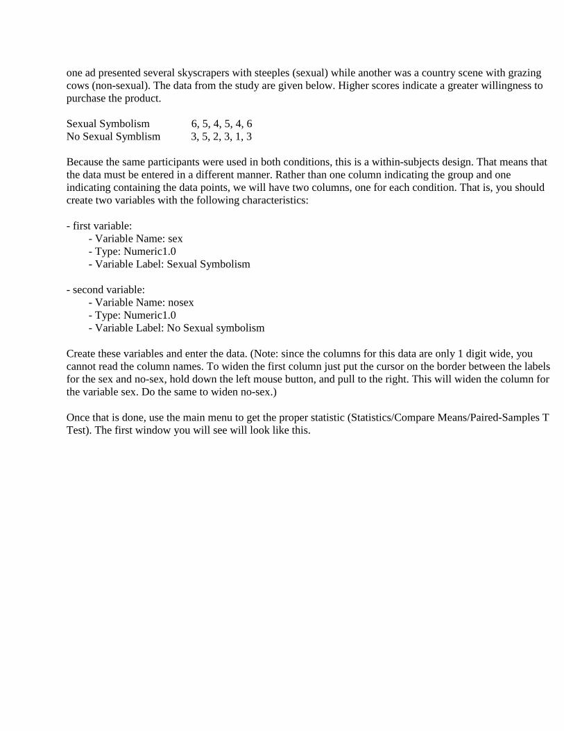
one ad presented several skyscrapers with steeples (sexual) while another was a country scene with grazing cows (non-sexual). The data from the study are given below. Higher scores indicate a greater willingness to purchase the product. Sexual Symbolism 6, 5, 4, 5, 4, 6 No Sexual Symblism 3, 5, 2, 3, 1, 3 Because the same participants were used in both conditions, this is a within-subjects design. That means that the data must be entered in a different manner. Rather than one column indicating the group and one indicating containing the data points, we will have two columns, one for each condition. That is, you should create two variables with the following characteristics:
- first variable: - Variable Name: sex - Type: Numeric1.0 - Variable Label: Sexual Symbolism
- second variable: - Variable Name: nosex - Type: Numeric1.0 - Variable Label: No Sexual symbolism
Create these variables and enter the data. (Note: since the columns for this data are only 1 digit wide, you cannot read the column names. To widen the first column just put the cursor on the border between the labels for the sex and no-sex, hold down the left mouse button, and pull to the right. This will widen the column for the variable sex. Do the same to widen no-sex.)
Once that is done, use the main menu to get the proper statistic (Statistics/Compare Means/Paired-Samples T Test). The first window you will see will look like this.

We need to indicate which two variables we want included in this analysis. Highlight the Sexual Symbolism variable and then No Sexual Symbolism. Note that the names are now shown in the Current Selections panel at the bottom left of the panel. Press the large arrow in the middle of the screen to indicate that these are the variables you want in the analysis. Your screen should look like this.
Press OK to do the analysis. Your output will look like this:

The top right box gives the summary statistics for the individual variables while the second provides the correlation between the two variables. The bottom box gives us the t value. Use this value and the associated df to determine if the difference is significant.
Parametric Statistics with More than Two Conditions
One-Way Between Subjects ANOVA
In situations where there are more than two groups, Analysis of Variance rather than the t test is the statistic of choice. The following experiment involves the use of different participants in each experiment condition or group, hence it is a between subjects design. Experiments in which more than one measure is taken from participants are called within subjects designs and are described in another section.
A social psychologist interested in self-fulfilling prophecies conducted an experiment in which college students were asked to interview a female student in her freshman year on the general topic of how she was adjusting to college life. (In each pair, the persons were in a different room and communicated by telephone). One third of the students were told that a previously

administered personality test indicated that the young woman they would interview was a quite anxious and depressed person. One third were told that the test indicated that she was happy and self-confident. The remaining third of the students were given no information. (In actuality, all the women scored in the middle range on the personality test). After the experiment, raters who were blind to the experimental conditions listened to tape recordings of the women's responses and made a judgment about how confident and well-adjusted each woman was. On the rating scale low scores indicated better adjustment. The investigator hypothesized that the interviewer's expectations about the women they interviewed would influence how they interviewed her in a way that would produce the kind of behavior they expected.
The data for this experiment are as follows:
Control Group Happy Group Depressed Group
8.18 4.81 13.22 7.37 6.39 11.71 7.80 6.27 16.32 6.51 8.08 15.30 9.63 2.18 17.19
To enter the data, begin by launching SPSS. Although the data set is small, it is a good idea to keep track of each individual (or as SPSS calls them, cases) with an ID. So the person who rated the confidence as 8.18 would be ID 1 while the person who rated the confidence 7.37 would be ID 2.
The data for a one-way between subjects ANOVA is entered much the same as that for the between-subjects t test. That is, a column indicates the group (in this case 1, 2, or 3) and one column contains the dependent variable. And, of course, we are going to add a third column with the ID number.
Create three variables with the following specifications:
- first variable: - Variable Name: id - Type: Numeric 2.0 - Variable Label: ID #
- second variable: - Variable Name: group - Type: Numeric1.0 - Variable Label: Experimental Groups - Value Labels: - 1 Control - 2 Happy - 3 Depressed
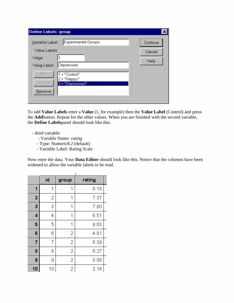
To add Value Labels enter a Value (1, for example) then the Value Label (Control) and press the Addbutton. Repeat for the other values. When you are finished with the second variable, the Define Labelspanel should look like this.
- third variable: - Variable Name: rating - Type: Numeric8.2 (default) - Variable Label: Rating Scale
Now enter the data. Your Data Editor should look like this. Notice that the columns have been widened to allow the variable labels to be read.
Once all of the data has been entered, double check to make sure that it has been entered correctly.
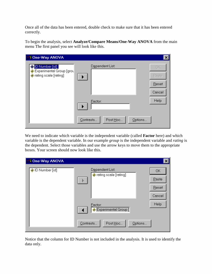
To begin the analysis, select Analyze/Compare Means/One-Way ANOVA from the main menu The first panel you see will look like this.
We need to indicate which variable is the independent variable (called Factor here) and which variable is the dependent variable. In our example group is the independent variable and rating is the dependent. Select those variables and use the arrow keys to move them to the appropriate boxes. Your screen should now look like this.
Notice that the column for ID Number is not included in the analysis. It is used to identify the data only.

Before we do the computations we need to specify some details for the analysis.
First click Options to get this panel:
We want to specify Descriptive Statistics and Homogeneity of Variance.
Press Continue to return to the One-Way ANOVA panel. Our final set of parameters is revealed when you click PostHoc (see below). On this panel select the Tukey option to produce the Tukey HSD statistic. Again, press Continue to return to the main panel. Now press OK on the One-Way ANOVA panel to do the analysis.
The results of this analysis are quite extensive. Let’s look at them one part at a time.
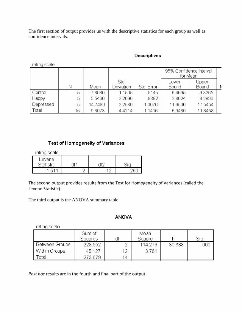
The first section of output provides us with the descriptive statistics for each group as well as confidence intervals.
The second output provides results from the Test for Homogeneity of Variances (called the Levene Statistic).
The third output is the ANOVA summary table.
Post hoc results are in the fourth and final part of the output.

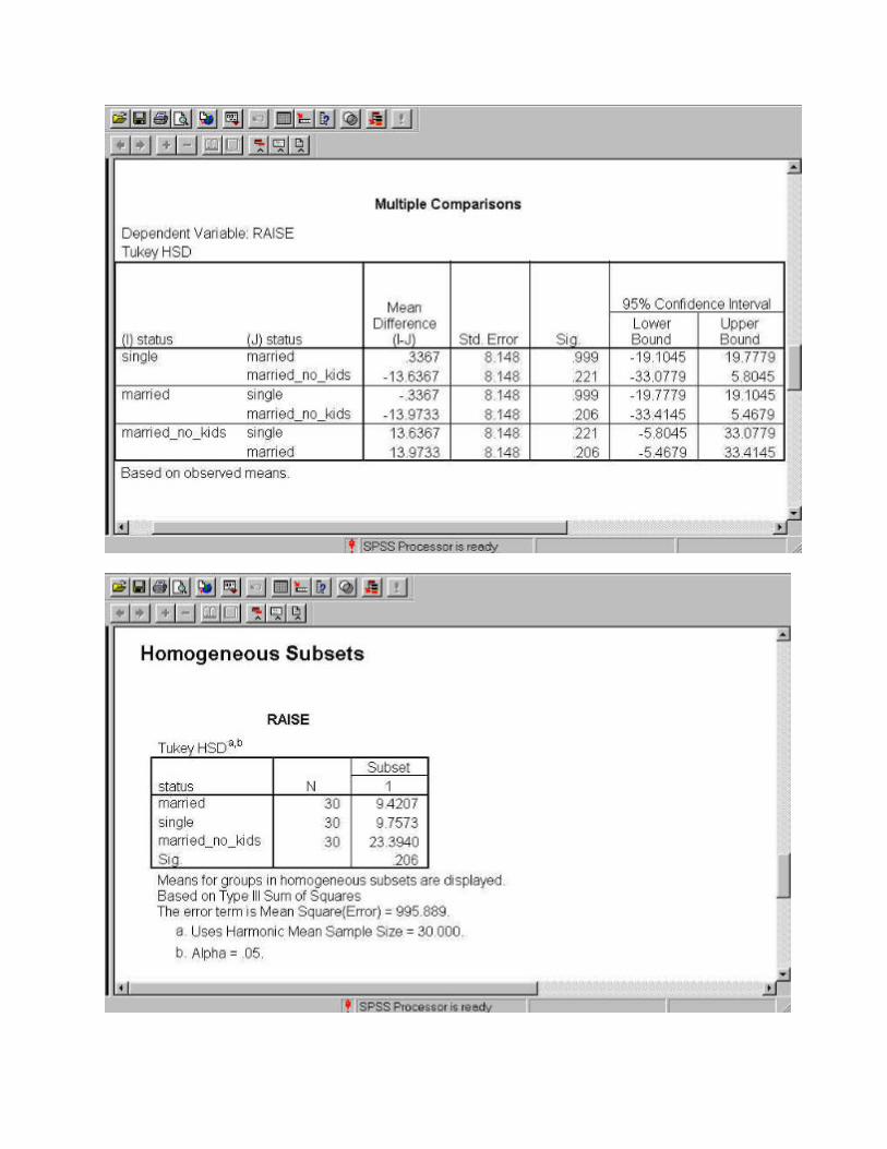
Recall that we selected to have the Tukey HSD results calculated. Examine the output carefully. All possible combinations are means are compared. For example, The Control group is compared with the Happygroup, and then the Control group is compared with the Depressed group. In each case a mean difference, a standard error and a significance level is provided. If the difference is significant (alpha = .05) then that difference is stared. Although this output includes enough for us to make a conclusion about the results, a second set of output is provided to help us understand what is happening with the data.

The Homogeneous Subsets attempts to combine non-significant groups together. If you look carefully at the results from the Post Hoc Tests results you can see that Happy and Control are not different from each other but each is different from Depressed. It is this summary of results that are presented in the Homogeneous Subsets table.
Two-Way Between Subjects ANOVA
If you have two independent variables and both are between subject variables, then this is the statistical routine that you need.
To illustrate the procedures involved in this type of experiment, let's imagine that six groups of male students in a business administration program were presented with one of six descriptions of a 28-year-old mid-level manager containing both personal and job relevant information. The students were told that next year, salary increases for persons at this level would be 5 to 15 percent, with an average of 10 percent. They were asked to recommend a raise for the manager. In three descriptions the manager was a man and in the other three the manager was a women. Within each sex, one version described the person as single, in another the person was married but childless, and in the third they were married with two children. The score obtained for each participant was the percent raise recommended by the student.
Begin by creating three variables, one for the variable gender (will have values 1 for male or 2 for female), one for the variable status (will have three values 1 single; 2 married but childless; and 3 married with children), and one for the percent of raise given. You can get a idea of how
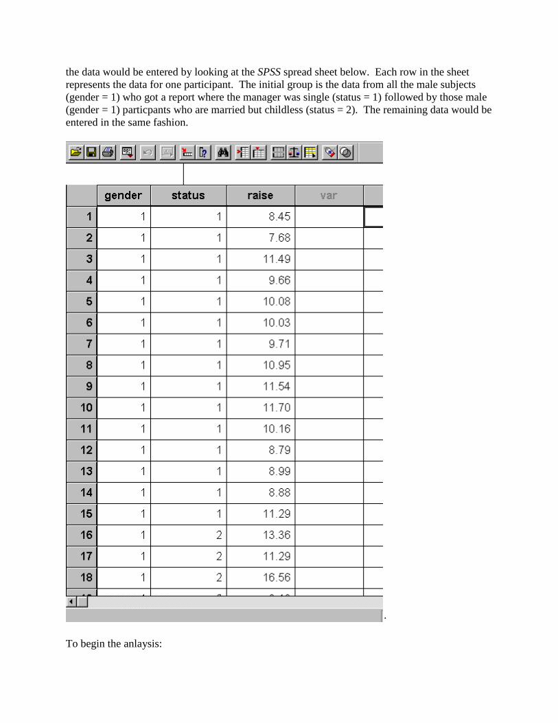
the data would be entered by looking at the SPSS spread sheet below. Each row in the sheet represents the data for one participant. The initial group is the data from all the male subjects (gender = 1) who got a report where the manager was single (status = 1) followed by those male (gender = 1) particpants who are married but childless (status = 2). The remaining data would be entered in the same fashion.
·
To begin the anlaysis:
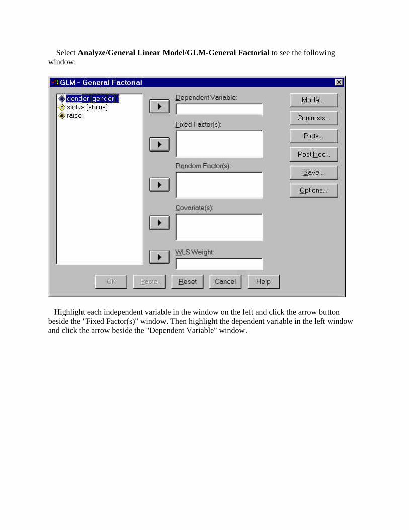
Select Analyze/General Linear Model/GLM-General Factorial to see the following window:
Highlight each independent variable in the window on the left and click the arrow button beside the "Fixed Factor(s)" window. Then highlight the dependent variable in the left window and click the arrow beside the "Dependent Variable" window.
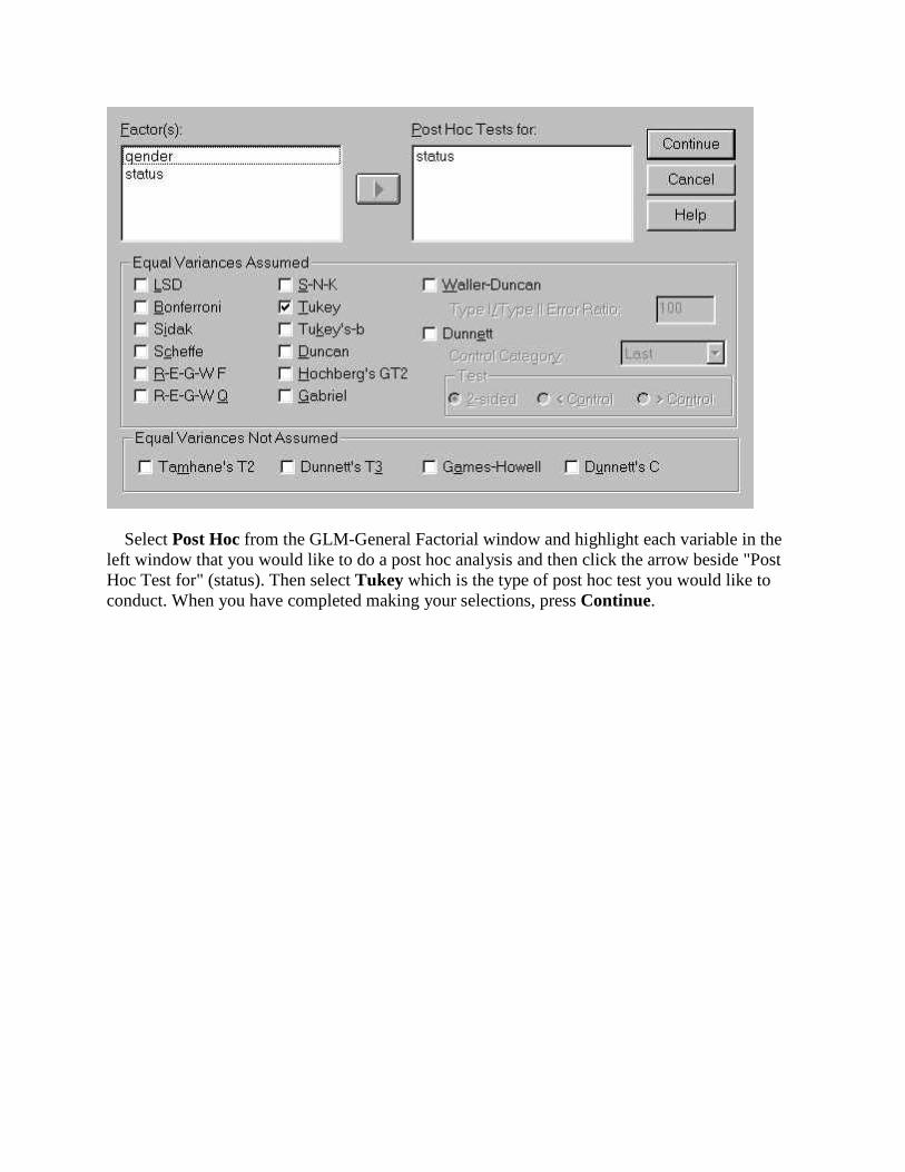
Select Post Hoc from the GLM-General Factorial window and highlight each variable in the left window that you would like to do a post hoc analysis and then click the arrow beside "Post Hoc Test for" (status). Then select Tukey which is the type of post hoc test you would like to conduct. When you have completed making your selections, press Continue.
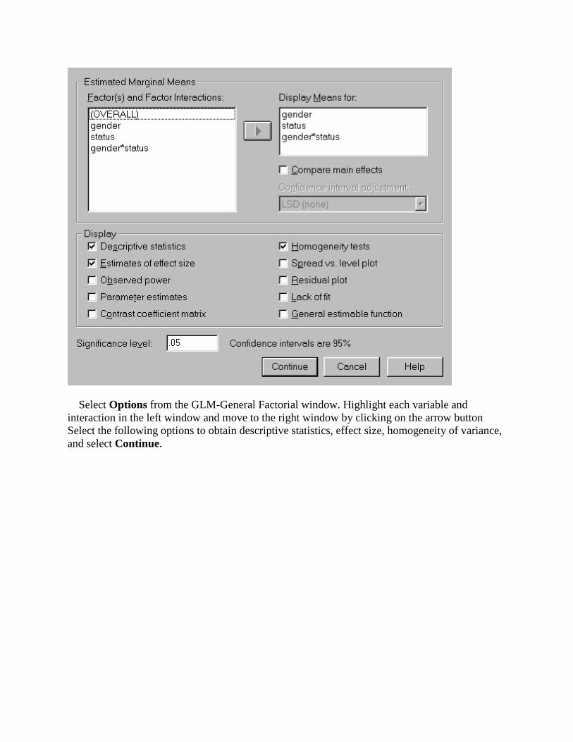
Select Options from the GLM-General Factorial window. Highlight each variable and interaction in the left window and move to the right window by clicking on the arrow button Select the following options to obtain descriptive statistics, effect size, homogeneity of variance, and select Continue.

Select Plots from the GLM-General Factorial window. To obtain a line graph of the interaction, highlight gender and click the arrow beside "Separate Lines" and highlight status and click the arrow beside "Horizontal Axis" then press Add. Press Continue in order to return to the GLM-General Factorial window.
The completed GLM-General Factorial window should look like the following window. If it does, click OK to run the requested analyses.
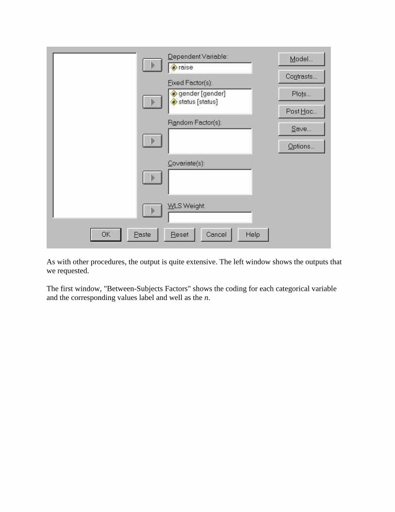
As with other procedures, the output is quite extensive. The left window shows the outputs that we requested.
The first window, "Between-Subjects Factors" shows the coding for each categorical variable and the corresponding values label and well as the n.

The next section contains the descriptive statistics for each condition.
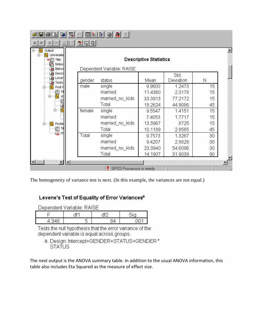
The homogeneity of variance test is next. (In this example, the variances are not equal.)
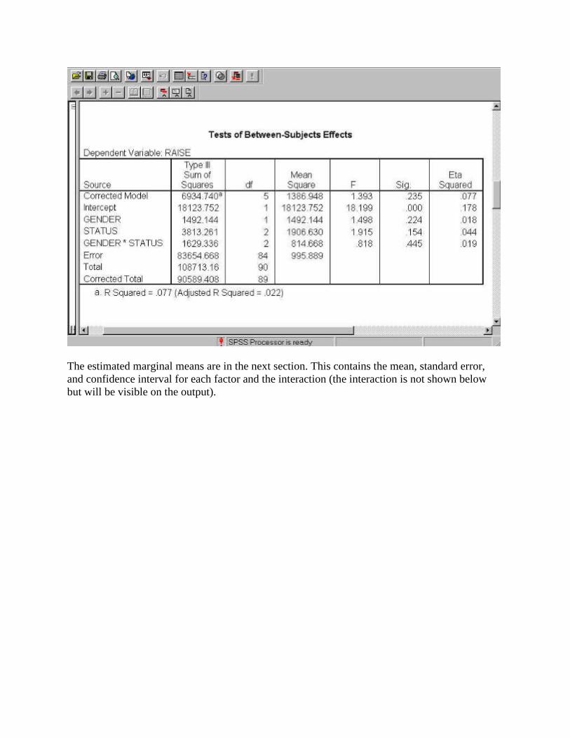
The next output is the ANOVA summary table. In addition to the usual ANOVA information, this table also includes Eta Squared as the measure of effect size.
The estimated marginal means are in the next section. This contains the mean, standard error, and confidence interval for each factor and the interaction (the interaction is not shown below but will be visible on the output).

· The next section contains the post hoc test and it is followed by the homogeneous subsets.

The last section consists of a graph of the interaction to help you interpret it. Remember that this is not how to formally graph an interaction.
One-Way Within Subjects ANOVA
When the participants in an expeirment are involved in all the levels of the independent variable (assuming that there are three or more levels of the independent variable), it is called a "within subjects" or "repated measures" design and calls for a within subjects ANOVA. Using an example looking at the effects of drugs on behavior, the procedures for doing this type of design using SPSS are outlined below.
The purpose of the experiment was to study the effects of four drugs upon reaction time to a series of standardized tasks. All participants were given extensive training on these tasks prior to the experiment. The ten participants used in the experiment could be considered a random sample from a population of interest to the experimenter.
Each participant was observed under each of the drugs; the order in which a participant was administered a given drug was randomized. A sufficient time was allowed between the administration of the drugs to avoid the effect of one drug upon the effects of subsequent drugs.
On the data sheet below note the way data was entered: Each row represents the data from each participant with each of the drug conditions labeled. ID numbers are assigned to each subject just to help keep track of the data.
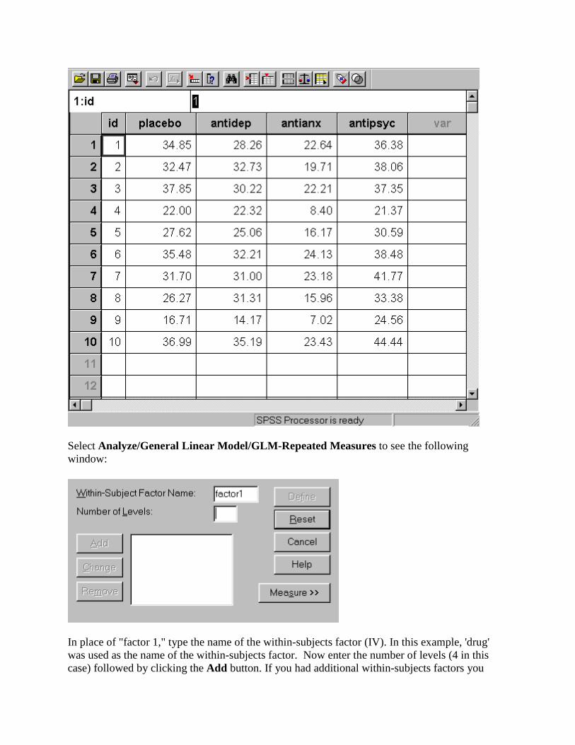
Select Analyze/General Linear Model/GLM-Repeated Measures to see the following window:
In place of "factor 1," type the name of the within-subjects factor (IV). In this example, 'drug' was used as the name of the within-subjects factor. Now enter the number of levels (4 in this case) followed by clicking the Add button. If you had additional within-subjects factors you
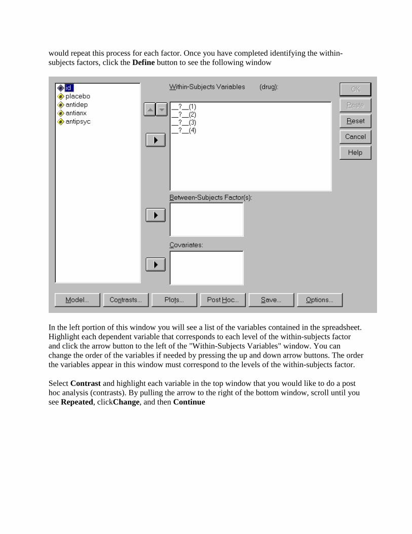
would repeat this process for each factor. Once you have completed identifying the within-subjects factors, click the Define button to see the following window
In the left portion of this window you will see a list of the variables contained in the spreadsheet. Highlight each dependent variable that corresponds to each level of the within-subjects factor and click the arrow button to the left of the "Within-Subjects Variables" window. You can change the order of the variables if needed by pressing the up and down arrow buttons. The order the variables appear in this window must correspond to the levels of the within-subjects factor.
Select Contrast and highlight each variable in the top window that you would like to do a post hoc analysis (contrasts). By pulling the arrow to the right of the bottom window, scroll until you see Repeated, clickChange, and then Continue
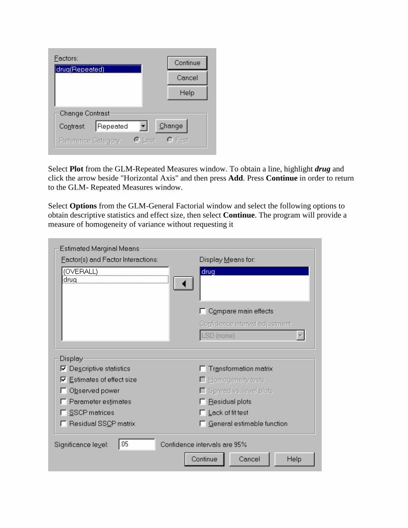
Select Plot from the GLM-Repeated Measures window. To obtain a line, highlight drug and click the arrow beside "Horizontal Axis" and then press Add. Press Continue in order to return to the GLM- Repeated Measures window.
Select Options from the GLM-General Factorial window and select the following options to obtain descriptive statistics and effect size, then select Continue. The program will provide a measure of homogeneity of variance without requesting it

The completed GLM-Repeated Measures window should look like the following window. If it does, clickOK to run the requested analyses.
The output from this procedure is quite extensive. Below is a summary of the key bits of output that are essential to understanding the results.
The first window, "Within-Subjects Factors" shows the coding for each categorical variable and the corresponding values. The second window contains the descriptive statistics for each condition.
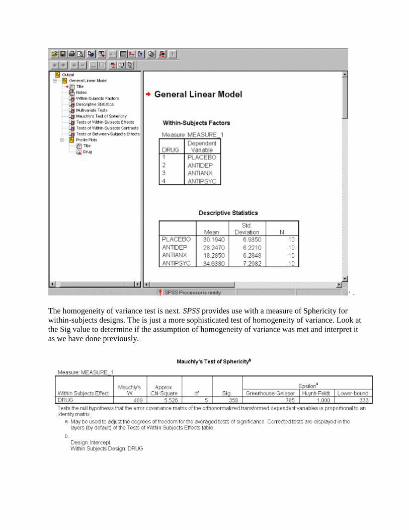
· .
The homogeneity of variance test is next. SPSS provides use with a measure of Sphericity for within-subjects designs. The is just a more sophisticated test of homogeneity of variance. Look at the Sig value to determine if the assumption of homogeneity of variance was met and interpret it as we have done previously.

The next two outputs are the ANOVA summary table. In addition to the usual ANOVA information, these tables also include Eta Squared as the measure of effect size. Because the output can be confusing, it might be helpful to take the material from these tables and convert it into a simplier ANOVA summary table.
The next section contains the contrasts as shown below. The contrasts are comparing each level of the factor to each other level of the factor and testing for significance. Contrasts are a more sophisticated type of post hoc test used with within-subjects designs.

The next table contains the estimated marginal means for each variable. In a One-way Within ANOVA the same information can be found in the descriptive statistics window. This series of tables will become more important for us for Two-Way Within ANOVAs. For Two-Way Within ANOVAs, there will be a table for factor A, factor B, and the A x B interaction.
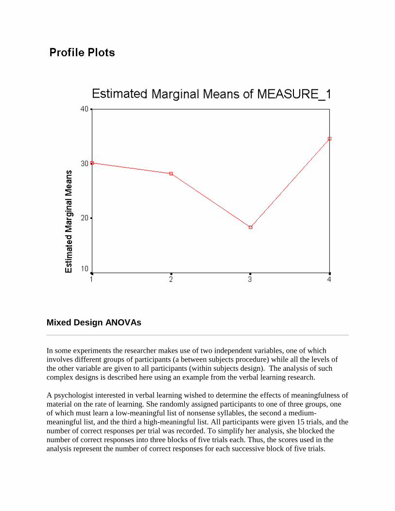
· The last section consists of a graph of the within-subjects factor to help you interpret the results.
Mixed Design ANOVAs
In some experiments the researcher makes use of two independent variables, one of which involves different groups of participants (a between subjects procedure) while all the levels of the other variable are given to all participants (within subjects design). The analysis of such complex designs is described here using an example from the verbal learning research.
A psychologist interested in verbal learning wished to determine the effects of meaningfulness of material on the rate of learning. She randomly assigned participants to one of three groups, one of which must learn a low-meaningful list of nonsense syllables, the second a medium-meaningful list, and the third a high-meaningful list. All participants were given 15 trials, and the number of correct responses per trial was recorded. To simplify her analysis, she blocked the number of correct responses into three blocks of five trials each. Thus, the scores used in the analysis represent the number of correct responses for each successive block of five trials.

The entry of data in this type of design combines that for within and between subjects procedures. The levels of the between-subject variable, meaning, is represented as 1, 2, and 3. While the within-subject variable (trial block) is presented in three separate columns, one for each block of trials. Also note the format for the variables id and meaning.
We begin our analysis by selecting Analyze, General Linear Model and finally, GLM -Repeated Measures.
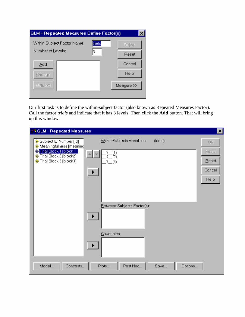
Our first task is to define the within-subject factor (also known as Repeated Measures Factor). Call the factor trials and indicate that it has 3 levels. Then click the Add button. That will bring up this window.

Indicate the variables that represent the three levels of the within-subject IV by highlighting each and then pressing the arrow button. Your panel should look like this.
Now for the between-subject factor. Highlight meaning and insert in into the Between-Subjects Factor(s)window. This is what you should see on your screen.
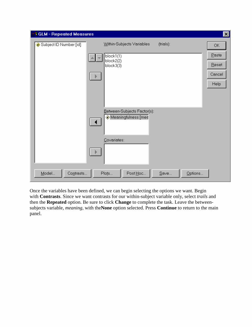
Once the variables have been defined, we can begin selecting the options we want. Begin with Contrasts. Since we want contrasts for our within-subject variable only, select trails and then the Repeated option. Be sure to click Change to complete the task. Leave the between-subjects variable, meaning, with theNone option selected. Press Continue to return to the main panel.

Now choose Plots. This is a complex design so we want lots of plots, including plots of each main effect as well as both interaction plots (trials as a function of meaning and meaning as a function of trials).
To get a plot of the main effects, select a variable (meaning, for example) and then click the arrow to add it to the Horizontal Axis box. The click the Add option near the bottom of the screen. Do this for bothmeaning and trials.
To get an interaction of meaning by trials, with levels of trials on the horizontal axis, begin just as you would to make a plot of the main effect for trials. But before you 'add' the plot,
highlight meaning and use the arrow button to put it in the Separate Lines box. Then 'add' it to the plot list.
Follow the same procedure to get an interactive plot with levels of meaning on the horizontal axis. Your final panel should look like the one above. (Press Continue to return to the main panel.)
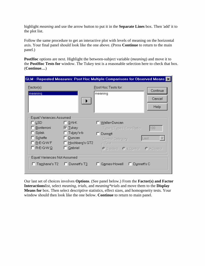
PostHoc options are next. Highlight the between-subject variable (meaning) and move it to the PostHoc Tests for window. The Tukey test is a reasonable selection here to check that box. (Continue…)
Our last set of choices involves Options. (See panel below.) From the Factor(s) and Factor Interactionslist, select meaning, trials, and meaning*trials and move them to the Display Means for box. Then select descriptive statistics, effect sizes, and homogeneity tests. Your window should then look like the one below. Continue to return to main panel.

To begin the analysis, press OK on the main panel.