SPSS Statistics Training - University of California, San Diego
16
SPSS Statistics Training Session 8 Exploring Data • Factor analysis and principal component analysis The great challenge of data analysis is finding a meaningful signal hidden amid the noise or the random variation that is not important to your question. One interesting way of dealing with this is to get rid of some data, or specifically, to reduce the number of dimensions that you have to deal with, by combining the individual pieces of data from the different variables. The idea here is that if you have, for instance, 10 variables that are measuring approximately the same thing, then you don't really need all 10, and besides, each one of them has its own idiosyncratic error variance, but if you are able to find how the variables go together, then maybe you can combine those 10 and get a single larger score, a factor or a component, that's more useful, more informative for what you're trying to do than the individual variables with their own error variance. This is the goal of factor analysis and principal components analysis (PCA). To see this in practice: 1. Go to Analyze > Come down to “Dimension Reduction”. (Dimension means variables or fields) 2. Click on Factor. 3. Pick a collection of variables that may have something in common. Those are the Google correlate variables about search terms on a state by state basis. We have 12 of them going from Instagram to Modern Dance. It'd be nice if we didn't have to deal with 12 variables every time. But they might fall into a smaller number of groups or they have common components or factors behind them. 4. Now start with just a default analysis. Select those 12 variables and hit OK.
Transcript of SPSS Statistics Training - University of California, San Diego

SPSS Statistics Training Session 8 Exploring Data
• Factor analysis and principal component analysis The great challenge of data analysis is finding a meaningful signal hidden amid the noise or the random variation that is not important to your question. One interesting way of dealing with this is to get rid of some data, or specifically, to reduce the number of dimensions that you have to deal with, by combining the individual pieces of data from the different variables. The idea here is that if you have, for instance, 10 variables that are measuring approximately the same thing, then you don't really need all 10, and besides, each one of them has its own idiosyncratic error variance, but if you are able to find how the variables go together, then maybe you can combine those 10 and get a single larger score, a factor or a component, that's more useful, more informative for what you're trying to do than the individual variables with their own error variance. This is the goal of factor analysis and principal components analysis (PCA). To see this in practice: 1. Go to Analyze > Come down to “Dimension Reduction”.
(Dimension means variables or fields) 2. Click on Factor. 3. Pick a collection of variables that may have something in common.
Those are the Google correlate variables about search terms on a state by state basis. We have 12 of them going from Instagram to Modern Dance. It'd be nice if we didn't have to deal with 12 variables every time. But they might fall into a smaller number of groups or they have common components or factors behind them.
4. Now start with just a default analysis. Select those 12 variables and hit OK.

What we get first is a table with Commonalities. When each variable is standardized, it has one unit of variance, and that's the initial value of 1.000 here. The Extraction has to do with how much they have in common with each other and that feeds into the rest of the analysis.

In the next table, we get Total Variance Explained. If each of the 12 variables has one unit of variance, there's 12 units of variance in total. But if the variables run parallel to each other, then you can find a single factor that accounts for more than one unit of variance. And that's exactly what we have here. We have a component that accounts for 4.195 units of variance, then the next one accounts for 2.001, then 1.714, 1.287, and so on. These are called eigenvalues.
When we look at those four listed components on the right side of the table, those four factors account for over 3/4 of the variance in the original 12 variables. So, we're able to go from 12 to 4, and that's a benefit for us, since there are fewer things that we have to deal with and they're probably going to be more stable, more reliable, and more generalizable than the individual variables would be.
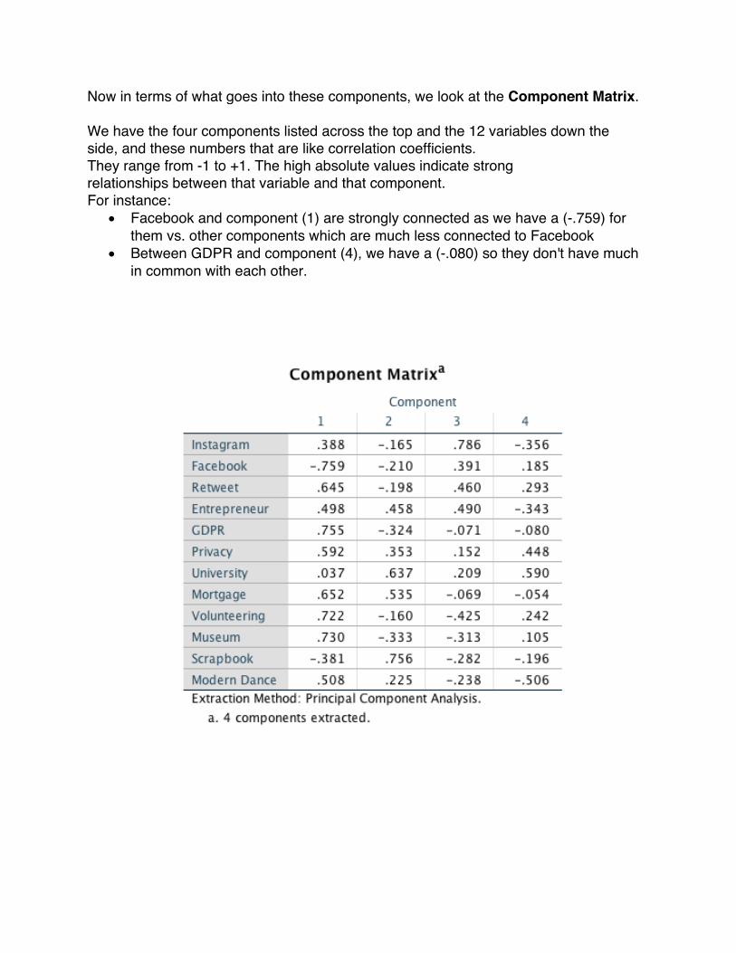
Now in terms of what goes into these components, we look at the Component Matrix.
We have the four components listed across the top and the 12 variables down the side, and these numbers that are like correlation coefficients. They range from -1 to +1. The high absolute values indicate strong relationships between that variable and that component. For instance:
• Facebook and component (1) are strongly connected as we have a (-.759) for them vs. other components which are much less connected to Facebook
• Between GDPR and component (4), we have a (-.080) so they don't have much in common with each other.

Fortunately, there are options within the factor command that make both the output easier to read and make the underlying factors much easier to deal with.
1. Go back to Factor Analysis 2. Go to Descriptives > Uncheck the initial solution > Hit Continue.
3. Click on Extraction > we have several different choices here. 4. Select Principal Components, which is a theoretically distinct way of looking at the
relationships between variables from factor analysis. They approach the relationship between these meta-factors and the individual variables in opposite directions, but functionally, they have a lot in common. I don't need to see the unrotated factor solution, but I'd like to get a scree plot. The idea here under Extract is how many components or factors should it get, and this one rule here based on eigenvalues says that your larger component should explain at least one unit of variance. It's a rudimentary one, maybe not the best, but it's good enough for getting an idea of what's in your information. I'm going to change the 25 iterations to 100.

5. Go to Rotation 6. One important choice when dealing with rotation methods is whether you want to
have an Orthogonal Rotation, where the factors are all independent and unrelated to each other, or an Oblique Rotation, where they can be correlated. Usually, the interpretation of Oblique Rotation is a little easier > so select “Direct Oblimin”.
7. Select “Rotated Solution” and “Loading Plot” > Then change the “Maximum Iterations for Convergence” to 100

8. Go to scores > Here you can save the factor scores as variables here, but that might really capitalizes on the quirks of the particular data set. Instead, use the output as a recommendation on creating scores.
9. Select “Display factor score coefficient matrix 10. Go to Options:
in terms of getting our last table easy to read. • Sort things by size. So that the biggest absolute values go at the top, the
smallest ones go at the bottom, • Then suppress the small coefficient, so you don't even see the small
numbers. > Set “Absolute value below” to 0.3 frequently 11. Hit “Continue” > Then Hit “Ok”
Now let’s analyze the output:
It starts by showing a Scree plot, which is an indication of how many components we probably need by using the eigenvalues, which is how many units of variance in the original variables are counted. The first 4 components which have higher eigenvalues are factors or components that are accounting for more variance than the individual variables. Therefore, those 4 components are extracted.
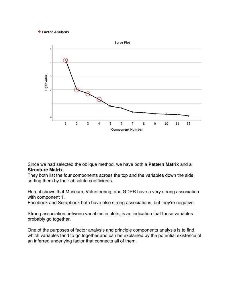
Since we had selected the oblique method, we have both a Pattern Matrix and a Structure Matrix. They both list the four components across the top and the variables down the side, sorting them by their absolute coefficients.
Here it shows that Museum, Volunteering, and GDPR have a very strong association with component 1. Facebook and Scrapbook both have also strong associations, but they're negative. Strong association between variables in plots, is an indication that those variables probably go together. One of the purposes of factor analysis and principle components analysis is to find which variables tend to go together and can be explained by the potential existence of an inferred underlying factor that connects all of them.
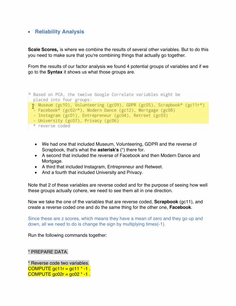
• Reliability Analysis Scale Scores, is where we combine the results of several other variables. But to do this you need to make sure that you're combining things that actually go together. From the results of our factor analysis we found 4 potential groups of variables and if we go to the Syntax it shows us what those groups are.
• We had one that included Museum, Volunteering, GDPR and the reverse of Scrapbook, that's what the asterisk's (*) there for.
• A second that included the reverse of Facebook and then Modern Dance and Mortgage.
• A third that included Instagram, Entrepreneur and Retweet. • And a fourth that included University and Privacy.
Note that 2 of these variables are reverse coded and for the purpose of seeing how well these groups actually cohere, we need to see them all in one direction. Now we take the one of the variables that are reverse coded, Scrapbook (gc11), and create a reverse coded one and do the same thing for the other one, Facebook. Since these are z scores, which means they have a mean of zero and they go up and down, all we need to do is change the sign by multiplying times(-1). Run the following commands together: * PREPARE DATA. * Reverse code two variables. COMPUTE gc11r = gc11 * -1 . COMPUTE gc02r = gc02 * -1 .
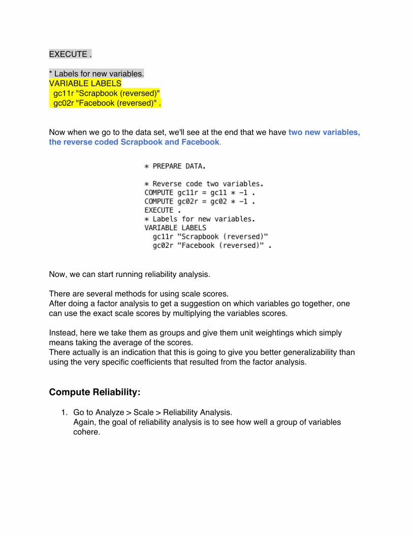
EXECUTE . * Labels for new variables. VARIABLE LABELS gc11r "Scrapbook (reversed)" gc02r "Facebook (reversed)" . Now when we go to the data set, we'll see at the end that we have two new variables, the reverse coded Scrapbook and Facebook.
Now, we can start running reliability analysis. There are several methods for using scale scores. After doing a factor analysis to get a suggestion on which variables go together, one can use the exact scale scores by multiplying the variables scores. Instead, here we take them as groups and give them unit weightings which simply means taking the average of the scores. There actually is an indication that this is going to give you better generalizability than using the very specific coefficients that resulted from the factor analysis. Compute Reliability:
1. Go to Analyze > Scale > Reliability Analysis. Again, the goal of reliability analysis is to see how well a group of variables cohere.

2. Pick the first set of suggested variables based on the factor analysis. Museum, Volunteering, GDPR and the reverse scaled Scrapbook variable.

3. Go to Statistics > select “Descriptives for” > “Scale” and “Scale if item deleted”
4. Let’s do a basic analysis which gives us Cronbach's Alpha which is like an average correlation coefficient between the items in the scale.
5. Hit OK.

Here’s the output: We have 48 valid cases, and no missing data. The critical result is Cronbach's Alpha, which is 0.791. It's like a correlation coefficient. It goes from (-1 to +1), and what we want is the high absolute value. It should be positive and the rule of thumb is it should be above .7. Which here is almost 0.8 and it's based on four items.
Next output is Item-Total Statistics table, which tells us what the Cronbach's Alpha would be if we removed a particular item.

For instance, if we remove “Museum”, it'd fall down. In fact, for each of these first three variables, if we remove them, Alpha would go down. The last one, the reversed scale on Scrapbook, if we remove it, Alpha would go up a little bit, but because of the factor analysis we are going to leave it in there. This is where you get to exercise a little bit of judgment in doing your analysis and decide whether it makes sense to have a particular variable included in a possible scale score or not.
6. Here, based on Cronbach's Alpha, the connection between these four variables is sufficient to justify combining them into a single scale score.
7. Now to do that, go to the Syntax window and now you have to pick a name based on what these four things have in common.
Here we are just going to call it Engaged, since it involves people who are looking at museums and are volunteering who actually are searching for GDPR, which indicates they're doing something with international online commerce, and a reversed scale on scrapbook. This is again a judgment call.
8. Run the following command: * COMPUTE SCALE SCORE. COMPUTE Engaged = MEAN(gc10, gc09, gc05, gc11r) . EXECUTE .

9. F or further analysis, run the following commands to get a graph, a histogram, and a box plot of the newly created Variable. * Histogram of scale score. GRAPH /HISTOGRAM(NORMAL)=Engaged. * Boxplot to compare personality regions on score. EXAMINE VARIABLES=Engaged BY per_reg /PLOT=BOXPLOT /STATISTICS=NONE /NOTOTAL /ID=State.

Next, we have a box plot which is broken it down by the three Personality Regions. We see an interesting pattern here between Engaged and these personality areas. The nice thing about it is, now we're dealing with a single measure, Engaged, as opposed to four separate measures, one of which goes backwards from the others. This is in a way of reducing the clutter in data, reducing the noise and allowing you to focus on the signal and the meaning in it.