
Spring 2010 Self-Explanation Diagram Workbook Ch. 11-12
73
Self-Explanation Diagram Workbook Ch. 11-12 Spring 2010
Transcript of Spring 2010 Self-Explanation Diagram Workbook Ch. 11-12

Self-Explanation Diagram Workbook Ch. 11-12
Spring 2010

Explain It to Yourself
One strategy to understand diagrams better is to create an explanation in your mind
about what is happening in the diagram. In many cases, you already do this. You
automatically “fill in the gaps” of a diagram with what you already know and make
inferences or logical guesses in order to make sense of the diagram. With complicated
diagrams and unfamiliar material, this process can be more difficult. One of the purposes of
this workbook is to help you practice this skill.
We can improve our ability to explain diagrams by sharing them with each other.
This requires you to do two things: (1) create and share your explanations and (2) listen to
others’ explanations. By creating explanations with a partner, sharing them with the rest of
the class, and listening to others’ explanations, you can learn what makes a good explanation
and how you can make yours even better. For this reason, the activities in this workbook
allow you to work with a partner and then share your explanations with the class.
We’ve enlisted the help of a friend to assist you in this project. Meet Mr. T, short for
Mr. Turtle. Mr. T has—What’s the expression?—a bit of a thick shell. That is to say, Mr. T is a
little slow, if you catch my drift. But Mr. T is eager to learn, a good listener and very
inquisitive (and that, as you know, goes a long way). What Mr. T needs are explanations
from you, explanations that “fill in the gaps” and make sense of the diagrams in your
textbook. The opposite page will show you an example.
In Need of a Name
That “T” stands for Turtle is more than a little unimaginative! Please help us find a better name that uses the initial “T”. After you’ve completed this workbook, you’ll be asked for your best name. There’s a prize for the winning name.

Read the following passage
Flies have often been viewed as pesky creatures. Most people are too busy trying to get rid of them to even think
about studying them. In the middle of the seventeenth century, however, the Italian scientist Francesco Redi (1626-1697)
noticed and described the different developmental forms of flies. Redi observed that tiny wormlike maggots turned into
sturdy oval cases, from which flies eventually emerge. He observed that maggots seemed to appear where adult flies had
previously landed. These observations led him to question the commonly held belief that flies were generated
spontaneously from rotting meat.
Figure 14-1 shows an experiment that Redi conducted in 1668 to test his hypothesis that meat kept away from
flies would remain free from maggots. The experimental group consisted of netting covered jars that contained meat.
The control group consisted of uncovered jars that also contained meat. The netting allowed air to enter and prevented
flies from landing on the meat. After a few days, maggots swarmed over the meat in the open jars, while the net-covered
jars remained free from maggots. Redi’s experiment showed convincingly that flies come only from eggs laid by other flies.
Redi’s hypothesis was confirmed, and a major blow was struck against the hypothesis of spontaneous genesis. _
Explain what’s happening. Self-explanation for the diagram above might sound like this:
Let’s see, I see some jars and the jars have something in them. It looks like meat…and there’s flies on
some of the meat…hum…let me read the caption…says maggots are only found in the control jar…oh,
they’re maggots.…Which are the control jars? Okay, the ones on the left…oh, wait, there’s an arrow, so
it’s really one control jar showing before and after…okay, I see the maggots…cause there’s nothing
protecting the meat…it’s just in the open air…and the jar that is called “experimental group” is covered
so flies can’t lay their eggs in the meat…so I guess the point of this
diagram is to show how Redi designed an experiment that proved that
maggots don’t just come from anywhere, they come from flies.
Don’t be surprised if Mr. T becomes confused by a diagram. The comment
here exemplifies Mr. T’s thinking. You’ll be asked to create an explanation
like the one above that will help Mr. T understand the diagram more
clearly. Then, you will discuss your explanations as a class.
Redi actually only needed to use the covered jar to prove his point. The open jar is a waste of good meat!
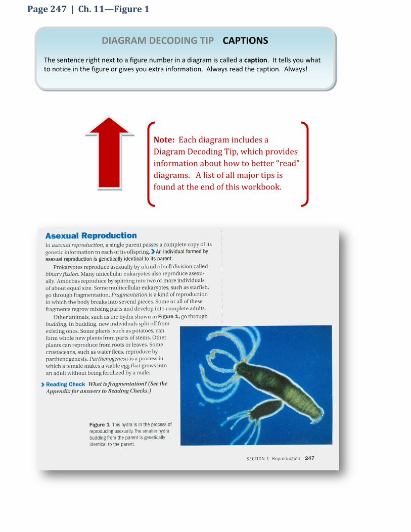
Page 247 | Ch. 11—Figure 1
DIAGRAM DECODING TIP CAPTIONS
The sentence right next to a figure number in a diagram is called a caption. It tells you what to notice in the figure or gives you extra information. Always read the caption. Always!
Note: Each diagram includes a
Diagram Decoding Tip, which provides
information about how to better “read”
diagrams. A list of all major tips is
found at the end of this workbook.

Exercise 1
1. Summarize in your own words the key points found in the caption.
2. If someone did not read the caption, how might the photograph be interpreted differently?
Partner A: Partner B:
3. Provide an explanation that better captures what two characteristics are unique to asexual
production.
It takes only one organism, and the off-spring are identical to the parent.
This isn’t very different from
humans or turtles, right?
Mothers give birth to babies.

DIAGRAM DECODING TIP COLOR
It is important to be aware of how color is used in photographs. Photographs often capture
real color to show you what things look like in real life. You should be aware, however, that
the colors that are photographed may not be the colors of the objects as they naturally
appear. Scientists often dye objects, especially very small objects, so they can be better
viewed under a microscope.
Page 248 | Ch. 11—Figure 2 `

Exercise 2
1. Is the photograph illustrating the true color of sperms and eggs? How can you tell?
2. A _______________________ is formed when two ____________________ combine during fertilization.
3. Provide an explanation that clarifies Mr. T’s understanding.
The photograph shows two gametes, an egg and a sperm, fusing together. The cell that results will be called a zygote.
That’s what a zygote looks
like: an egg with a sperm
sticking out it?
Partner A: Partner B:

DIAGRAM DECODING TIP TABLES
Tables are used to organize information. Tables have various parts: titles, rows, row labels, columns, column labels and boxes. Table titles tell you what the table is about. Rows are read from left to right. Rows have row labels that describe the contents of the row. Columns are read from top to bottom. Columns have column labels that describe the contents below it. Each intersection between a row and a column is called a box. Be sure to read the title and column labels before reading down each column and across each row when you see a table.
Page 249 | Ch. 11—Figure 3

Exercise 3
1. What is the title of the table in Figure 3?
2. What are the two column labels in Figure 3?
3. How many rows are present in Figure 3?
4. Explain why you agree or disagree with Mr. T’s interpretation of the table.
The table is not organized in any clearly discernible order. Numbers generally (but not consistently)
increase from top to bottom. Organism complexity—or smartness, as Mr. T put it—do not
correspond simply to number of chromosomes.
Box turtles like me have 44 (2n) chromosomes. That makes me just about as smart as you humans, according to the table!
Partner A: Partner B:
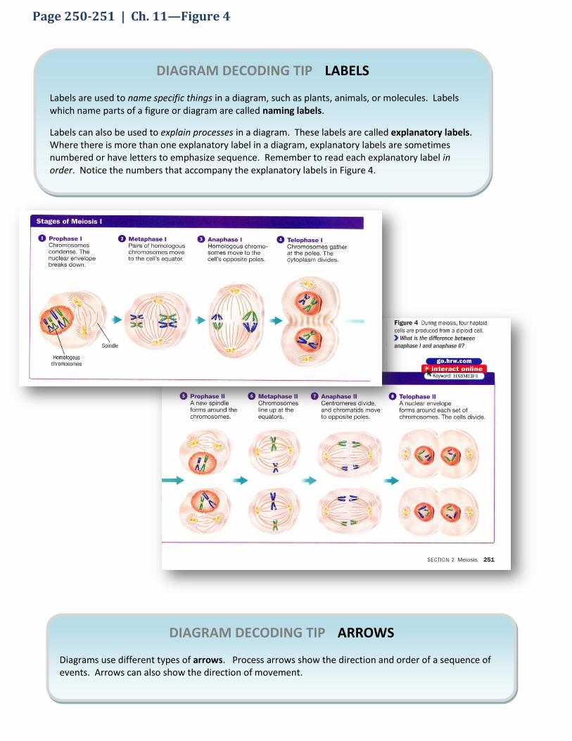
DIAGRAM DECODING TIP LABELS
Labels are used to name specific things in a diagram, such as plants, animals, or molecules. Labels which name parts of a figure or diagram are called naming labels.
Labels can also be used to explain processes in a diagram. These labels are called explanatory labels. Where there is more than one explanatory label in a diagram, explanatory labels are sometimes numbered or have letters to emphasize sequence. Remember to read each explanatory label in order. Notice the numbers that accompany the explanatory labels in Figure 4.
DIAGRAM DECODING TIP ARROWS
Diagrams use different types of arrows. Process arrows show the direction and order of a sequence of events. Arrows can also show the direction of movement.
Page 250-251 | Ch. 11—Figure 4

Exercise 4
1. Write the two naming labels below.
2. Circle each of the process arrows in Figure 4. Then, in your own words describe what the arrows mean in this diagram.
3. Color helps illustrate differences. What parts of this diagram might be difficult to understand if it were in black and white? Why?
4. Explain why the haploid cells are unique.
The process of crossing-over, illustrated in Prophase 1, involves swapping alleles between
chromosomes. Therefore, while much of the genetic information may be similar, they are not
exactly the same. The diagram notes these differences by small color band on some of the
chromatids.
It says the haploid cells are different
but I don’t see why. They both have
one blue and one green chromatid.
Partner A: Partner B:

DIAGRAM DECODING TIP FALSE COLOR
Sometimes biologists use colors in a diagram that are not the actual color of the thing shown in the diagram. This is called false color. False color can help you see how one part of the diagram is related to another part. In Figure 5, false color helps you see the difference between the two pairs of homologous chromosomes. One pair is green, the other blue. They are not this color in real life.
Page 252 | Ch. 11—Figure 5

Exercise 5
1. What process is labeled but not shown in Figure 5?
2. Put a star next to all of the labels is Figure 5.
3. Why are some chromosomes green and others blue?
It says that mitosis is used for
repair and asexual reproduction
among other things. It seems to
me that Meiosis I and II would be
a more efficient process because
you get twice as many cells.
4. Provide an explanation that supports or refutes Mr. T’s thinking.
Mitosis produces identical diploid cells while Meiosis produces four non-identical haploid cells.
Their non-identical nature would prove problematic for asexual production and repair.
Partner A: Partner B:

DIAGRAM DECODING TIP PROCESS ARROWS
Arrows are frequently used in diagrams to illustrate sequence. When two arrows diverge (go in different directions), several meanings may apply. Divergent arrows might explain that two processes occur simultaneously. Alternatively, it could mean that two possibilities exist, but only one will actually occur.
Page 254 | Ch. 11—Figure 6

Exercise 6
1. Place a star next to each explanatory label (those that explain processes).
2. Circle naming labels (those that name specific things or stages).
3. How is color used to illustrate the concept of “crossing over”?
4. Do the arrows in Possibilities 1 show sequences that occur simultaneously or do they represent possible sequences. Explain your answer.
Slow down. What’s different
in the two possibilities and
why does this lead to different
gametes?
5. Provide an explanation that highlights the differences between the two possibilities. Hint: Color will
help you see the difference.
In the possibility on the left, the bottom set of chromosomes are switched (compared to the possibility
on the right), thereby creating a different pairing of chromatids during metaphase of meiosiss II.
Partner A: Partner B:

DIAGRAM DECODING TIP TITLES
Pay attention to the title of a diagram, if they have one. It’s a good way to identify the key idea of the diagram. Of course, the caption is another great place to look.
Page 256 | Ch. 11—Figure 7

Exercise 7
1. Circle the naming labels that indicate things.
2. Put a star next to each of the labels that indicate processes.
3. Why is the mitosis arrow facing up? Why are the images arranged as they are instead of from top to bottom as in the previous diagram?
To emphasize/demonstrate the cyclic nature of the topic.
Call me thick-shelled, but I don’t
understand why this is called the
“Diploid Life Cycle.” What’s
diploid about it and how is it a
cycle?
4. Provide an explanation that addresses Mr. T’s confusion.
A diploid germ cell in the reproductive organs of the parents produce haploid gametes, which
after meeting and fusing, become a diploid zygote.
Partner A: Partner B:

DIAGRAM DECODING TIP ARROWS
Remember that when two arrows diverge (go in different directions), several
meanings may apply. Divergent arrows might explain that two processes occur
simultaneously. Alternatively, it could mean that two possibilities exist, but only
one will actually occur.
Page 257 | Ch. 11—Figure 8

Exercise 8
1. Do the arrows in spermatogenesis show sequences that occur simultaneously or do they represent possible sequences, only one of which will actually occur? Explain your answer.
2. In _________________ animals, three _________________________ and an ______________________ are produced in a process called __________________________. In ____________________ animals, on the other hand, four _________________________ are produced in a process called _______________________. All cells that are produced in both processes are_____________________.
Call me slow, but I don’t
understand why females only
produce one ovum compared to
four sperm in males. What’s the
advantage?
3. Provide an explanation that will help Mr. T understand this point.
By having the lion’s share of the cytoplasm, the ovum that is produced has more nutrients with which
to sustain the young organism than it would if the cytoplasm was distributed evenly across four ova.
Partner A: Partner B:

DIAGRAM DECODING TIP SYMBOLS
Abbreviations and symbols commonly used in science are sometimes used in diagrams. In
Figure 9, n and 2n represent haploid and diploid cells, respectively.
Page 258 | Ch. 11—Figure 9
DIAGRAM DECODING TIP ARROWS
Arrows, like those in Figure 9, can illustrate a cycle. In a cycle, there is not a beginning or an end. You can start “reading” the diagram anywhere (since there is no beginning) and follow the arrows.

Exercise 9
1. Summarize the caption in your own words.
2. How does the diagram illustrate the idea that more time is spent having haploid cells than diploid cells?
The caption mentions fungi, but
isn’t the process depicted in
Figure 9 the same one that
humans go through?
3. Provide an explanation that addresses the point Mr. T raises.
The process is basically similar, though the percentage of the life cycle differs
Partner A: Partner B:

DIAGRAM DECODING TIP LABELS
Labels that explain processes, like those shown in Figure 1, are sometimes numbered. Reading the explanatory labels in order will help you better understand the sequence that is being described.
Page 267 | Ch. 12—Figure 1

Exercise 10
1. Summarize the caption in your own words.
2. Which flower has had its male parts removed?
3. What do the arrows in Figure 1 demonstrate?
4. Is this an example of true color or false color? Explain your answer.
Partner A: Partner B:
Why did the male parts of the
purple flower need to be
removed?
5. Provide an explanation for Mr. T that will clear things up.
The male parts of the purple flower produce pollen that contains different genetic material. In order to
artificially manipulate the fertilization process, the male parts were removed.

DIAGRAM DECODING TIP TABLES
Tables like Figure 2 are often included in science textbooks. Tables organize information. Tables
can include six parts (though not all parts are present in every table): titles, rows, row labels,
columns, column labels and boxes. Table titles tell you what the table is about. Rows are read
left to right. Rows have row labels that describe the contents of the row. Columns are read top
to bottom. Columns have column labels that describe the contents below it. Each place where a
column and a row meet is called a box.
Be sure to read the title and column labels before reading down each column and across each
row when you see a table. The colors or shading on the table can help show you where to look in
the table.
Page 268 | Ch. 12—Figure 2

Exercise 11
1. Put an “X” in the box at the intersection of the second row, fourth column
2. Put a “/” in the box at the intersection of the first row, seventh column
3. Circle the box at the intersection of the second row, first column
4. Which one of the six parts of tables is missing in Figure 2 according to the Diagram Decoding Tip on the opposite page?
5. Provide an explanation of why it would be difficult to not duplicate images in Figure 2
Pods and peas contain various phenotypic characteristics. Peas, for instance, have both a texture and
color. Placing them in the table helps us pay attention to one characteristic at a time.
Somebody quick call the
Redundant Office of
Redundancy! Figure 2 shows
two green, round peas and two
smooth, green pods. Why the
duplication?
Partner A: Partner B:

DIAGRAM DECODING TIP SYMBOLS & ABBREVIATIONS
As we learned earlier, letters can symbolize ideas or longer words. Letters are sometimes shown with subscripts, small letters or numbers to the lower right of the letter, as in “F1”. 0ther symbols have different meanings depending on the context. For example the colon (“:”) as it appears in Figure 3 indicates a ratio.
Page 269 | Ch. 12—Figure 3

Exercise 12
1. Underline all of the explanatory labels in Figure 3.
2. Circle all of the naming labels in Figure 3.
3. How many generations are illustrated in Figure 3?
4. If F2 produced “705 purple : 224 white” flowers, why does the diagram only show 1 white flower?
5. Please provide a scientific explanation that will shake G.P.’s belief in magical color-changing plants.
A recessive trait was “hidden” in the F1 generation. The same phenotype may be the expression of
differing genotypes.
What? Is this some kind of plant magic? How can it be that two purple-flowered plants from the F1 generation produce a white-flowered plant in F2?
Partner A: Partner B:

DIAGRAM DECODING TIP SYMBOLS
Remember that letters are sometimes used in diagrams as symbols for something. In this diagram, letters are symbols that show whether the allele is dominant (capital) or recessive (lowercase). Pay close attention, since “Y” and “y” look very similar.
Page 272 | Ch. 12—Figure 4

Exercise 13
1. Is Figure 4 illustrating seed color or seed shape? How do you know?
2. What does the purple part of the allele represent?
3. What does the arrow pointing downward from the parents represent?
So, is this the same process that
Figure 3 demonstrates on the
previous page?
4. Provide an explanation to Mr. T that helps him make the connection between Figure 3 and 4.
It is the same process that is respresented in the P to F1 generation in that diagram.
Partner A: Partner B:

DIAGRAM DECODING TIP ARROWS
The lines that are used in Figure 5 between generations are similar to arrows. They illustrate a possible passing of an allele from one generation to the next. The color of each line in this diagram represents the phenotype of the allele.
Page 274 | Ch. 12—Figure 5

Exercise 14
1. Circle all of the heterozygous flowers in Figure 5.
2. Put a star next to each of the homozygous dominant flowers in Figure 5.
3. Put an X through each of the homozygous recessive flowers in Figure 5.
4. What do the purple lines between generations indicate?
5. Notice that there are four purple lines connecting the purple flower in P generation with the flowers are the F1 generation. Why, then, are there eight lines (four purple and four white) connecting the flower in the F1 generation to the F2 generation flowers.
Is it possible for an F1 generation
flower to produce all purple
flowers in the F2 generation?
6. Provide an explanation for Mr. T that explains the conditions under which this could occur.
If a heterozygous plant was crossed with a homozygous dominant, the offspring would all have the
dominant phenotype.
Partner A: Partner B:

DIAGRAM DECODING TIP CAPTIONS
Don’t forget to read the captions. They are the best place to start when reading a diagram.
Page 275 | Ch. 12—Figure 6

Exercise 15
1. How many naming labels are there in Figure 6?
2. What percentage of the offspring are wrinkled?
Independently assort this! If
instead of a heterozygous
parent, there was a homozygous
dominant parent, would Mendel
have evidence that the
inheritance of one characteristic
does not affect the inheritance of
other characteristics?
3. Explain how the offspring would look and whether you would have the evidence Mr. T is looking
for?
All of offspring would be heterozygous (YyRr). No, there would not be enough evidence since all
offspring have the dominant phenotype for both characteristics.
Partner A: Partner B:

DIAGRAM DECODING TIP SYMBOLS
Remember that letters are sometimes used in diagrams as symbols for something. In this diagram, letters are symbols that show whether the allele is dominant (capital) or recessive (lowercase). A Punnett square is a type of table that always uses letter symbols. Remember that tables have rows, row labels, columns, column labels and boxes. In this diagram, color is also used to show phenotypes.
Page 276 | Ch. 12—Figure 7

Exercise 16
1. In a ________________________ cross, approximately three-quarters of the plants will have
_______________________ colored seeds. These plants may be either
_________________________ dominant or _______________________________.
2. Circle the column labels in each of the Punnett squares.
3. What do the arrows in Figure 7 tell you?
I’m not usually a betting turtle,
but I know that if there were four
offspring, two of them will be
heterozygous. It’s a sure bet.
4. Explain why you think Mr. T’s bet is solid or not.
Over time, the ratio of homozygous dominant to heterozygous to homozygous recessive will be 1:2:1,
but this may not be the case with small numbers of offspring. The ratios and fractions reported in
Figure 7 are only probabilities.
Partner A: Partner B:

Page 280 | Ch. 12—Figure 8
DIAGRAM DECODING TIP LABELS
The labels below describe how organizational tree diagrams should be read. Be sure to
pay attention to the key that is provided.

Exercise 17
1. One of the explanatory labels states that “horizontal lines connect parents.” Is this true of all horizontal lines in the diagram? Why or why not?
2. Draw the symbol for a. male:
b. female:
3. How are individuals with the trait represented?
4. Assuming that the diagram describes the koalas in the photograph, consider the following questions:
a. Is the albino koala male? Why or why not?
b. Is the albino koala the first-born? Why or why not?
What? Are you trying to
crack my shell? An albino
koala from two normal
parents? Ha! I doubt it.
5. Explain how such an offspring can result from non-albino parents and what you can deduce about
the parents’ genotypes.
Both parents were heterozygous for the characteristic. There is 1 in 4 chance that an albino offspring
will result from two parents who are heterozygous for the trait.
Partner A: Partner B:

DIAGRAM DECODING TIP CAPTIONS
Captions provide helpful information about how photographs should be interpreted.
Page 282 | Ch. 12—Figure 9

Exercise 18
1. Summarize the caption in your own words.
I might be sticking my neck out
here, but I think the authors ran
out of things to write. Why else
would they include this photo?
2. Provide an explanation for why the authors may have chosen to include this photograph.
It demonstrates the variety and gradations of features such as hair color, build, height, etc.
Partner A: Partner B:

DIAGRAM DECODING TIP—TABLE & KEYS
Remember that tables have columns (vertical) and rows (horizontal), and where they meet are called boxes. Notice that Figure 10 also contains a key, which gives you information about the meaning of symbols, shapes and colors.
Page 283 | Ch. 12—Figure 10

Exercise 19
1. Place the following marks on Figure 10:
a. Put an “X” in the 2nd row, 3rd column.
b. Circle the boxes (where columns intersect with rows) that contain the label “Type A”.
2. How many phenotypes are displayed in the table?
3. How many genotypes are displayed in the table?
4. How does the key in Figure 10 differentiate between molecules A and B?
5. How do the figures for IAIA and IAi look different?
6. What are two ways in which boxes labeled Type B differ?
I’m not sure I understand
this correctly. So, the
parent has three alleles,
but only two are passed to
the off-spring.
Don’t forget that
I need a better
name! I hope
you’re working
on one.
7. Provide an explanation that will help Mr. T understand what the table is showing.
The table shows possible phenotypes from the possible allele combinations. In actuality, each parent
would have only two of the possible three alleles.
Partner A: Partner B:

DIAGRAM DECODING TIP—CAPTION
The caption is always a good place to start when looking at a photograph. It will give you information about what the authors think is important.
Page 284 | Ch. 12—Figure 11

Exercise 20
1. Summarize the caption in your own words.
I wonder if these foxes have the
same genotype for coat color.
2. Explain how this photograph changes the relationship between phenotype and genotype as it
has been previously discussed in the textbook.
In the case of the Arctic foxes, one genotype may manifest different phenotypes depending on
how the genes interact with the environment.
Partner A: Partner B:

DIAGRAM DECODING TIP CAPTIONS
Don’t forget to read the caption.
Page 293 | Ch. 13—Figure 1

Exercise 21
1. Summarize the caption in your own words.
2. Is this an example of true or false color?
You humans all look the same.
What’s so special about the girls
in this picture?
3. Explain as many similarities and differences as you can between the sisters shown in Figure 1.
Similarities: Hair color (all), eye color (girls on right and left), skin tone (esp. girls on right and left);
lip shape (girls on left and middle)
Differences: Eye shape (differences between middle and right girl), eye brow shape (middle girl
unique), skin color (middle girl has more red tones)
Partner A: Partner B:

DIAGRAM DECODING TIP EXPLANATORY LABELS
Explanatory labels describe processes that are illustrated in a figure. Sometimes, explanatory labels are numbered to illustrate steps in a sequence or, as in Figure 2, identify different cases.
Page 195 | Ch. 13—Figure 2

Exercise 22
1. Complete the following table
2. In Figure 2, what does each of the following colors represent?
a. Purple
b. Beige
c. Blue
Explanatory label #
Injected material Fate of the mouse
3 Heat-killed S bacteria Mouse lives!
1 S bacteria Mouse dies!
2 R bacteria Mouse lives!
4 R bacteria & heat-killed S bacteria Mouse dies!
If you ask me, the middle two
mice are not an important part
of the experiment.
3. Provide an explanation of why each of the four cases shown in Figure 2 contributes to Griffith’s
discovery of transformation.
The first case shows that S bacteria kill mice. The middle two mice are necessary to demonstrate
that, alone, neither R bacteria nor heat-killed S bacteria will kill a mouse. Finally, the last case
demonstrates that something must change when R bacteria and heat-killed S bacteria are together,
because the pair is fatal to the mouse.
Partner A: Partner B:

DIAGRAM DECODING TIP LABELS & ARROWS
Numbered explanatory labels explain what occurs in each step of a process. Notice in Figure 3, there are three explanatory labels (1, 2, and 3). In the text, steps 1, 2, and 3 also correspond to these labels.
Page 295 | Ch. 13—Figure 3

5. Provide an explanation that addresses Mr. T’s question.
Scientists knew that bacteriophages were made up of proteins and DNA. They also knew that proteins
contained sulfur but no phosphorous and that DNA contained phosphorous and no sulfur. Therefore,
when Hershey and Chase observed the radioactive phosphorous in the bacteria, they were able to
conclude that the DNA carried the hereditary information in viruses.
Exercise 23
1. Find, read and underline each of the naming labels.
2. Find, read and circle each of the explanatory labels. Hint: There are 7.
3. What does the red glow around the test tubes in step 3 signify?
4. Describe two ways in which color is used in Figure 2 to illustrate the difference between Experiment 1 and Experiment 2.
This is tricky. I get that the 32P
radioactivity entered the bacteria
cells. But why does this prove
that DNA and not protein is the
genetic material in viruses?
Partner A: Partner B:

DIAGRAM DECODING TIP FALSE COLOR
False color is sometimes used in diagrams to help you identify similar parts. In Figure 4, each of
the four nitrogen-containing bases is represented by a specific color. For example, you’ll notice
that Guanine is represented by yellow in this diagram and in other diagrams in this chapter.
Page 296 | Ch. 13—Figure 4

Exercise 24
1. Mark the following on Figure 4:
a. Circle the naming labels
b. Star each of the explanatory labels
c. Draw an arrow from each purine and pyrimidine in the box in the upper right to a corresponding part of the double helix.
2. What does the “C” in the purple nitrogen-containing base mean?
3. What do the dotted lines mean?
4. What do you notice about how the purines and pyrimidines are arranged in Figure 4?
Hydrogen, Smydrogen! What’s
the big deal about hydrogen
bonds?
5. Convince G.P. of the importance of hydrogen bonds by explaining what would happen if they
weren’t there.
Hydrogen bonds between purines and pyrimidines maintain the double-helix structure. The two
strands would separate without them.
Partner A: Partner B:

DIAGRAM DECODING TIP SHAPES
Diagrams sometimes depict the shape of an object in a certain way in order to demonstrate the relationship it has with another object. The schematic at the bottom of Figure 5 does this by portraying the nitrogen-containing bases as puzzle pieces that fit together with their complementary pair.
Page 298 | Ch. 13—Figure 5

Exercise 25
1. Describe how the shape of the nitrogen-containing bases shown in the schematic differs from the shape of those in the double helix.
2. Which color and letter is always paired with a red nitrogen-containing base?
3. The hydrogen bonds between one complementary pair are different than for the other pair. What’s the pattern?
You know, when you really
think about it, the total
number of each of the
nitrogen-containing bases
should be exactly the same
in a strand of DNA.
4. Explain why you think Mr. T is right or wrong.
The number of Guanine will be equal to the number of Adenine; the same for Thymine and
Cytosine. However, there are not necessarily the same number of A-T and G-C pairs.
Partner A: Partner B:

DIAGRAM DECODING TIP CAPTIONS
Don’t forget to read the caption!
Page 299 | Ch. 13—Figure 6
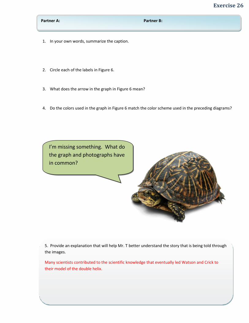
Exercise 26
1. In your own words, summarize the caption.
2. Circle each of the labels in Figure 6.
3. What does the arrow in the graph in Figure 6 mean?
4. Do the colors used in the graph in Figure 6 match the color scheme used in the preceding diagrams?
I’m missing something. What do
the graph and photographs have
in common?
5. Provide an explanation that will help Mr. T better understand the story that is being told through
the images.
Many scientists contributed to the scientific knowledge that eventually led Watson and Crick to
their model of the double helix.
Partner A: Partner B:

DIAGRAM DECODING TIP FALSE COLOR
Before photographing microscopic objects, scientists sometimes use dyes so that structures become
easier to view. This is the case in Figure 7.
Pages 300 | Ch. 13—Figure 7

Exercise 27
1. Summarize the caption in your own words.
2. Is this an example of true or false color? Why do you think so?
3. Provide an explanation that will address Mr. T’s question.
When the point of separation occurs somewhere in the middle of the double helix structure, this
shape occurs because the stands are still intertwined on either side of the separation.
Why would a double helix
unravel to form this shape?
Partner A: Partner B:

DIAGRAM DECODING TIP LABELS
Remember that labeled processes in a diagram are sometimes numbered. These numbers often correspond to descriptions found in the caption, labels and/or the text.
Page 301 | Ch. 13—Figure 8

Exercise 28
1. How is color used to differentiate (show the difference between) the old and new DNA strands?
2. List all of the different labels in Figure 8 (if a label repeats, list it only once).
3. Read the caption, then, in your own words summarize in a sentence what is occurring in parts 1, 2, and 3 in Figure 8.
4. What do the arrows between sections 1, 2 and 3 of the figure tell you?
I suppose it’s all fine and good
that polymerase and helicase
have their own cute names but
basically they have the same
function.
5. Clearly, Mr. T fails to see the difference between the two enzymes. Provide an explanation that
will help clarify the different roles played by each.
Helicase separates the chains while Polymerase is involved in constructing the complementary chain
for each strand.
Partner A: Partner B:

DIAGRAM DECODING TIP LABELS
When a label refers to a part of an object that appears various times in a
diagram, not all of these parts may be labeled. This is the case, for example,
with “New DNA” in Figure 9.
Page 302 | Ch. 13—Figure 9

Exercise 29
1. What color are new DNA strands? Is this the same color scheme from the preceding diagrams?
2. Circle the naming label that does not appear in both processes.
3. How many new strand of DNA are being created from the Prokaryotic DNA?
4. How many replication forks are shown in Figure 9?
5. How many strands of DNA are being created from the Eukaryotic DNA?
Why is it that Eukaryotic DNA
reproduce more new stands than
Prokaryotic DNA?
6. Provide an explanation that responds to Mr. T’s question.
Eukaryotic DNA contain more reproduction forks than Prokaryotic DNA. Each fork produces a new
strand of DNA.
Partner A: Partner B:

DIAGRAM DECODING TIP CROSS SECTION
A cross section is a view in a diagram that shows an object “cut in half,” allowing the
viewer to observe the inside of an object that in real life is closed.
Page 304 | Ch. 13—Figure 10

Exercise 30
1. Draw an arrow to the part of the diagram that suggests that you are looking at a cross section.
2. Circle each of the naming labels that refer to parts of the cell or its contents.
3. Circle the labels that refer to processes.
4. What color is used to represent DNA?
5. What color is used to represent RNA?
Slow down! I’m confused. What does
each of the arrows in Figure 10 mean?
And what in the world does this have to
do with gene expression?
6. Provide a one sentence explanation for each of arrow in Figure 10.
Arrow 1 = RNA is made from the DNA in the cell nucleus in a process called transcription.
Arrow 2 = The RNA moves from the cell nucleus to the cytoplasm.
Arrow 3 = The information encoded in the RNA is used to create proteins.
This is considered gene expression because the process explains how the genes in the DNA are
expressed in the creation of specific proteins.
Partner A: Partner B:

DIAGRAM DECODING TIP COLOR KEY
Remember that color keys tell what different colors represent. They can
also give you clues as to what the authors want to emphasize in the
diagram.
Page 305 | Ch. 13—Figure 11

Exercise 31
1. Is Figure 11 using the same color coding for DNA and RNA as the previous diagram?
2. According to the color key, which two colors cannot appear together in a strand of DNA or RNA?
3. Underline all of the naming labels in Figure 11.
4. True or False: Hydrogen bonds (depicted by dashed-lines) are present in DNA but not in RNA.
Oh, I get it! RNA is just half of
DNA.
5. As best you can, explain all of the similarities and differences between RNA and DNA
Both RNA and DNA are strings of nucleic acids made of repeating nucleotides. Both involve helix
structures.
RNA varies in its function (e.g., protein synthesis), has Uracil instead of Thymine, has ribose instead of
deoxyribose, and is usually a single strand.
Partner A: Partner B:

DIAGRAM DECODING TIP EXPLANATORY LABELS
Remember to read each of the numbered explanatory labels in order.
Page 306 | Ch. 13—Figure 12

Exercise 32
1. Underline the naming labels in Figure 12.
2. Circle the explanatory labels in Figure 12.
3. Put a star next to the explanatory label that describes the role of the light blue blob-like form.
4. Name all of the conventions of diagrams that are present in Figure 12. (See the back of this workbook for a complete list of conventions)
What would happen if
polymerase did not bond
with promoter?
5. Explain to Mr. T the function of polymerase and what would happen if it was unable to bind to the
promoter.
The function of polymerase is to allow for the unbinding and separation of the two strands of DNA. If this
binding did not occur, the process of transcription would be blocked.
Partner A: Partner B:

DIAGRAM DECODING TIP TABLES
As we’ve mentioned previously, tables have rows and columns. In almost all tables,
each box has exactly one row and one column. The table in Figure 13 is not typical:
the column “Third base” does not function like columns normally do. Read the
explanatory labels to understand how this table should be read.
Page 307 | Ch. 13—Figure 13

Exercise 33
1. Which amino acids are formed when the first and second base are U?
2. What amino acid is formed when the first and second base are G?
3. What are the first and second base involved with a “start” codon?
4. What first base is involved in a “stop” codon?
5. What two second bases are involved in “stop” messages?
6. What base (first, second or third) makes Histidine different than Glutamine?
7. How is Cysteine different than Tryptophan?
This table is for the squirrels! I
don’t understand why the
column labeled “third base” is a
part of the table.
8. Help G.P. understand the table by providing an explanation of how the information about the
first, second and third bases are organized.
The first and second bases function the way rows and columns (respectively) normally function.
The third base column actually functions as a second set of rows that provides information about
the third amino acid in each codon. This table could be conceptualized in three dimensions (x =
first base, y = second base, z = third base), though presumably for reasons of clarity, the authors
chose to design this non-traditional table.
Partner A: Partner B:

DIAGRAM DECODING TIP ARROWS
Recall that arrows sometimes show movement in diagrams. Movement can also be implied by
showing objects with a “ghost trail,” a lighter, blurred image of the object where it would have
appeared “a moment earlier.” In Figure 14, you can see this type of movement in the tRNA in
Step 3. The ghost trails illustrate that the tRNA is moving in the opposite direction as the
ribosome.
Page 308-9 | Ch. 13—Figure 14

Exercise 34
1. Underline each naming label. When you do, spend a couple of seconds considering what is being labeled.
2. Read each of the explanatory labels and summarize each in briefly in your own words:
a. Step 1:
b. Step 2:
c. Step 3:
d. Step 4:
e. Step 5:
3. Find and circle the first amino acid that forms the polypeptide chain. Then, circle each time it is shown in the growing chain of amino acids.
4. How many tRNA molecules are depicted in Figure 14? (If the same tRNA is depicted twice, count it only once).
5. List as many conventions of diagrams as you can identify in Figure 14. (A complete list of the conventions of diagrams is found at the end of this workbook)
I like pretty colors as much as the
next turtle, but don’t you think
the authors included too many
different colors. There’s not
even that many different amino
acids.
6. Explain why Mr. T is wrong about the number of proteins.
Students should refer to the table of amino acids on the previous page (Figure 13). The “3-lettered”
codon can produce more amino acids than are shown in Figure 14.
Partner A: Partner B:

Conventions of Diagrams Crib Sheet
CAPTION
Captions appear next to the figure number. They tell you what to notice in the figure and give you more information about the figure. Always, always, always read the caption. Always!
COLOR
Color is used different ways in a diagram. Photographs and life-like drawings usually use real color to show you what things look like in real life. False color is used in some diagrams to help you see how different parts of the diagram are different from one another. Other times, false color is used to show how some parts are alike or different from other parts. When false color is used, a color key is sometimes provided to explain what each color represents.
ABBREVIATIONS & SYMBOLS
Abbreviations and symbols commonly used in science appear is some diagrams. If you encounter a symbol you are unfamiliar with, look in the caption and the text to find what the context. For instance “+” may can mean addition in one diagram and “a positive charge” in another. Also some diagrams use numbering to let you know the order of the steps in a process.
ZOOM-INS
Text books use zoom-ins in diagrams to show you a magnified part of an object in a diagram. This is sort of like what a biologist might see under a magnifying glass or microscope. Keep in mind that the zoomed-in portion is part of a bigger picture represented elsewhere in the diagram.
ARROWS
Diagrams use different types of arrows. Process arrows show the direction and order of a sequence of events. Arrows can also show the direction of movement. Two parallel arrows facing different directions indicate that what is on the left can be transformed into what is on the right.
LABELS
Labels are used to name specific things or structures in a diagram, such as plants, animals, or molecules. Labels which name parts of a figure or diagram are called naming labels. Labels can also be used to explain processes in the diagram. These labels are called explanatory labels. Remember to read each explanatory label in order. Since there is also a corresponding picture with each number, be sure to identify the corresponding picture.

TABLES
Tables are used to organize information. Tables have various parts: titles, rows, row labels, columns, column labels and boxes. Table titles tell you what the table is about. Rows are read left to right. Columns are read top to bottom. Columns have column labels that describe the contents below it. Each intersection between a row and a column is called a box. Be sure to read the title and column labels before reading down each column and across each row when you see a table. Colors or shading on the table can help show you where to look in the table.
astaslkjl
Title of Table
Column Label
Column Label
Column Label
Row Label Box Box Box
Row Label Box Box Box
Row Label Box Box Box
SELF-EXPLANATION
Of course, you don’t need me to explain
something to yourself. Just remember to
keep in mind a couple of key questions:
What’s really happening in this
diagram?
If the diagram illustrates a sequence
or a process, ask yourself, What is
changing from one step to the next?
and How do the different parts relate
to each other?
How are individual parts of a
process/sequence similar to and
different from each other?
Why did the author include this
diagram?
Now, go forth and explain!
Artist credit
I was photographed in my
home in Jacksonville, Florida,
by Jonathan Zander, who has
licensed this imagine under
creative commons (without
my permission, I might add)
A Better Name?
What’s your best suggestion for what the “T” in Mr. T really stands for? A prize goes to the best nomination!
Mr. T__________________________
Your names: