
Splunk 4.3.4 Developer
426
Splunk 4.3.4 Developing Dashboards, Views, and Apps for Splunk Web Generated: 9/10/2012 12:21 pm Copyright © 2012 Splunk, Inc. All Rights Reserved
-
Upload
cokeaddict56 -
Category
Documents
-
view
1.117 -
download
10
Transcript of Splunk 4.3.4 Developer
Splunk 4.3.4
Developing Dashboards, Views, and Apps forSplunk Web
Generated: 9/10/2012 12:21 pm
Copyright © 2012 Splunk, Inc. All Rights Reserved

Table of ContentsOverview...............................................................................................................1
What's in this manual................................................................................1 Use cases for this manual.........................................................................1
Build dashboards.................................................................................................4 Dashboards: An introduction.....................................................................4 Saved searches and dashboards..............................................................6 Step 1: Create a dashboard......................................................................9 Step 2: Add rows.....................................................................................13 Step 3: Add panels..................................................................................14 Add a chart..............................................................................................18Add a table...............................................................................................20 Add a list.................................................................................................21 Add HTML...............................................................................................22 Add a single value and gauges...............................................................23 Add an event listing.................................................................................26 Build a real-time dashboard....................................................................27 Dashboard example................................................................................28
Build forms.........................................................................................................32 Forms: An introduction............................................................................32 Create a simple form search...................................................................36 Define inputs to a form............................................................................40 Display form search results.....................................................................43 Create a dynamic form search with radio buttons...................................46 Create a dynamic form search using drop-downs...................................48 Drive multiple panels in a form................................................................50 Form search examples............................................................................53
Build advanced views........................................................................................59 About Advanced XML.............................................................................59 Build a search view using Advanced XML..............................................64 Build a dashboard using Advanced XML................................................69 Build a form search using Advanced XML..............................................75 Use XML schemas..................................................................................80 Advanced charting options......................................................................81 Customize drilldown options...................................................................90 Build a real-time dashboard....................................................................96 Turn off autopause..................................................................................98
i
Table of ContentsBuild advanced views
Switcher modules....................................................................................98 Lister modules.......................................................................................102 Use lookups with a view........................................................................106 Use one search for a whole dashboard................................................108
Customize Splunk Web...................................................................................113 Customization options...........................................................................113 Customize the login screen...................................................................114 Customize the login screen...................................................................114 Embed Splunk dashboard elements in third party software..................114 Customize event display.......................................................................117 Add Web resources to your view..........................................................121 Customize CSS.....................................................................................125 Translate Splunk...................................................................................128 Plot search results on a map.................................................................131
Build apps.........................................................................................................137 Apps and add-ons: an introduction.......................................................137 Step 1: Getting started..........................................................................142 Step 2: Create your app........................................................................145 Step 3: Add configurations....................................................................146 Step 4: Add objects...............................................................................148 Step 5: Set permissions........................................................................150 Step 6: Build navigation for your app....................................................152 Step 7: Configure a setup screen..........................................................159 Step 8: Package your app or add-on....................................................167 Files and directories for apps and add-ons...........................................172 Setup screen example..........................................................................178 Setup screen example using a custom endpoint..................................182 Setup screen example with user credentials.........................................186 How to migrate 3.X apps to 4.1.X.........................................................188 What's changed for app developers in 4.2............................................190 How to restrict your users to one app...................................................195
Build scripted inputs.......................................................................................197 Scripted inputs overview.......................................................................197 Setting up a scripted input.....................................................................198Writing reliable scripts............................................................................201
ii
Table of ContentsBuild scripted inputs
Example script that polls a database....................................................207
Extend Splunk..................................................................................................212 Extend Splunk.......................................................................................212Splunk SDKs..........................................................................................212 Custom search commands...................................................................213 Splunk's API is RESTful........................................................................219
View reference material...................................................................................221 Panel reference for Simplified XML.......................................................221Module Reference..................................................................................228 setup.xml...............................................................................................300
Custom charting configuration reference.....................................................305 Overview of the custom chart configuration reference..........................305 Chart and legend properties..................................................................308 Axis and grid line properties..................................................................341 Tooltip properties..................................................................................353 Font, color, brush, shape and related palette properties.......................355 Advanced configuration - Layout and data table properties..................405 Advanced configuration - textBlock, layoutSprite, and sprite
properties...............................................................................................411
iii
Overview
What's in this manual
Prior to Splunk 4.3, this manual was titled Splunk Developer Manual. However,with the introduction of the Splunk Developer Portal , which covers materialrelated to development on Splunk using the Splunk SDKs and the Splunk AppFramework, the Splunk Developer Manual is now more accurately titledDeveloping Dashboards, Views, and Apps for Splunk Web.
The content of this manual for Splunk 4.2.5 or earlier remains the same. Thechange in title does not affect any links or bookmarks to previous content. ForSplunk 4.3, the manual contains updated content to reflect new featuresintroduced with that release.
This manual contains information for building dashboards, forms, and advancedviews. It also provides an introduction to building apps and add-ons for SplunkWeb.
This manual no longer covers leveraging Splunk SDKs in your applications.Developers who want to use the Splunk SDKs or build and customize apps usingthe Splunk App Framework should visit the Splunk Developer Portal.
Use cases for this manual
Here's an overview of the topics in this manual and why you'd want to use them.
Build dashboards
A dashboard is a view within Splunk Web that allows you to customize thevisualization of data returned from searches. Using Splunk access controlfeatures, you can specify permissions to target specific dashboards for specificusers.
You can create simple dashboards interactively from the editing tools availablewith Splunk Web. For details on using the Splunk Dashboard Editor, SearchEditor, and Visualization Editor, see "Create and edit simple dashboards" and"Edit dashboard panel visualizations" in the Splunk User Manual. You can addadditional functionality to a dashboard by editing the XML upon which the
1

dashboard is configured. This manual shows how to create and edit dashboardsby editing the XML upon which a dashboard is based.
Build forms
A form is a view within Splunk Web that guides a user to enter specific data for asearch. You can think of a form as a simplified version of Splunk's default searchinterface. Forms can contain multiple text inputs, drop-down menus, and radiobuttons that specify the search. You can use forms to hide search terms that auser doesn't need to see, thus simplifying the user interface.
For example, consider a helpdesk team that always searches for serial numbersin a specific index on a given host. You can present a simplified interface thatsearches for a serial number selected from a drop-down list within a timeframealso selected from drop-down lists.
You cannot create forms from the Splunk interactive dashboard editing tools.This manual shows how to create and edit the XML code that implements forms.
Build advanced views
Splunk's uses its own Simplified XML syntax to create basic dashboards, views,and forms. Simplified XML is a layer that sits on top of an Advanced XMLimplementation. Many advanced features in views are based on modules thatrequire Advanced XML syntax. The Splunk module reference lists all modulesavailable for building advanced views.
This manual describes how to start out with Simplified XML syntax fordashboards, forms, and views, and then convert them to Advanced XML syntaxto implement the more advanced features. It discusses some of the mostcommonly used modules with examples.
Customize Splunk Web
There are many ways to customize views in Splunk Web. This manual discusses:
Customizing the Splunk Web login screen• Embedding Splunk dashboard elements into a Web application usingIFrame
•
Customizing event display using HTML and JavaScript• Using CSS to customize the look of a view or app• Localizing text using GetText technology•
2
The Splunk Developer Portal provides additional information on extending andcreating Splunk modules.
Build apps
A Splunk app is a collection of configurations, objects, and knowledge built withinSplunk's app framework. A user installs an app either from a file or directly fromSplunkbase (assuming the app has been made available from Splunkbase by theapp author).
Splunk Web provides App Builder, which you can use to create apps that arebased on Splunk app templates. This manual walks you through creating an appusing App Builder. It also shows you how to prepare your app for uploading toSplunkbase.
Splunk also provides SDKs which you can use to create apps in third partysoftware. Refer to Overview of the Splunk SDKs at the Splunk Developer Portalfor information on creating apps using the Splunk SDKs.
Build scripted inputs
You can use scripts to feed data to Splunk for indexing, or to prepare data from anon-standard source so Splunk can properly parse events and extract fields.
This manual shows how you can set up and write reliable scripts to input data.
Extend Splunk using the REST API and Splunk SDKs
Splunk provides a REST API that provides access to Splunk from otherapplications. Any application that can make an HTTP request can configure andmanage a Splunk instance, and also create and run searches and access theresults returned.
Splunk provides various SDKs that use the REST API for access to a Splunkinstance. This allows developers access to a Splunk instance using aprogramming language familiar to them. Refer to Overview of the Splunk SDKsat the Splunk Developer Portal for details on using the Splunk SDKs.
The Splunk REST API Reference lists all publicly available endpoints withexamples of return values. It also contains examples and conceptual informationto help you get started.
3
Build dashboards
Dashboards: An introduction
A dashboard is a view containing one or more panels that display visualizationsof data, such as tables, charts, and graphs. Dashboard panels typically retrievedata from an inline search or a saved search.
Dashboards live within apps, which means you can set permissions on adashboard the same way you can with a saved search, event type, or otherobject. Once you build a dashboard you can navigate directly to it. For example,
http://localhost:8000/en-US/<app>/<app_name>/<dashboard_name>
Why build a dashboard?
Dashboards are useful for customizing the display of data to a user. You can usedashboards to highlight interesting and useful aspects of your data, link toimportant searches, and display common reports.
For example, you can create a console for network operations console thatprovides an overview of the entire network, highlights which machines are down,and sends notifications of firewall violations.
How to build a dashboard
A dashboard contains panels organized by rows. Each row can contain one, two,or three panels. Each panel contains a search and a visual summary of thatsearch.
Splunk provides tooling that lets you interactively create and edit basicdashboards without having to write a single line of XML code upon which thedashboard is based.
Use the Splunk Dashboard Editor to create a dashboard and layout its panels.Use the Search Editor to specify the search for each panel. Use the VisualizationEditor to modify how to display the data in a panel. "Create and edit simpledashboards" and "Edit dashboard panel visualizations", both in the Splunk Usermanual, describe how to interactively create a dashboard.
4
Searches and dashboards
Panels within a dashboard are based on searches and reports. Much of the workin building a dashboard is designing searches and reports that highlightinteresting data for your users.
You can specify a saved search or an inline search for a panel. If you specify asaved search, Splunk uses the most recent results from that search. If you set upa search to run on a schedule, the panel displays cached results form the search.Use saved searches if you have many long running searches or you expectmany users to use the dashboard simultaneously.
Use an inline search to display results in real time. You specify an inlinesearches directly in the implementation of a panel.
To learn more about using saved searches in dashboards, read the next section:Saved searches and dashboards.
Create and edit dashboards using Simplified XML
Often you need to edit the underlying Simplified XML to go beyond the basicdashboards created with the editing tools. Splunk provides an XML editor to helpyou edit the underlying XML. You can also use any XML editor of your choice.
Here are a few reasons you may want to go beyond basic dashboardimplementation to edit the underlying Simplified XML:
Specify color values for Single Values• Customize the appearance of charts, tables, lists, and other visualizations• Add radio buttons, drop-down menus, and other UI items•
You can also create a dashboard from scratch, coding the implementation usingSimplified XML.
Panels available for dashboards
With Simplified XML, you can specify the type of visualization to display in apanel. The visualizations available include the following:
Charts• Tables• Lists• Single button•
5
Events• HTML•
The panel reference lists all visualizations plus includes examples of theunderlying Simplified XML.
Advanced XML
Most of the documentation in this manual describes creating and editingdashboards using Simplified XML. Simplified XML sits on top of Splunk'sAdvanced XML implementation. Complex dashboards and apps might need toleverage functionality only available from Advanced XML. For example, if youwant to create a single search that is used by all panels in a dashboard, youhave to implement the dashboard in Advanced XML.
You can always convert Simplified XML to Advanced XML. However, you cannotlater go back to Simplified XML. Splunk recommends that you start advancedprojects in Simplified XML, and then convert them later to Advanced XML to addthe more complex features.
"Introduction to advanced views" in this manual provides details on editingAdvanced XML.
For example, if you want to create a single search for a whole dashboard, youcan implement postProcess search in Advanced XML, as described in How touse one search for a whole dashboard.
To convert Simplified XML to Advanced XML use the showsource URI:
http://localhost:8000/en-US/app/<app_name>/<dashboard_name>?showsource=true
Saved searches and dashboards
Before building a dashboard, you may want to create some saved searches.Familiarize yourself with Splunk's search language, create some searches thathighlight the important aspects of your data, and then integrate them intodashboards. Dashboards allow you to then visualize data returned from searchesin the form of charts, graphs and links. If you are creating Dashboards withSplunk's Dashboard Editor tools, you can run a search to see the results beforeyou save it to the panel you are editing.
6
Resources for creating searches
If you've never worked with Splunk's search language before, read the UserManual section "Search and investigate." Create searches to highlight the mostrelevant aspects of your data and support your user's goals. The SearchReference Manual provides additional information on searching with Splunk,including a section on "Best practices", a "Search command cheat sheet", and acomplete "Reference to Splunk search commands."
Saved searches and permissions
You can save searches a number of ways:
Splunk Web• Splunk Manager• Search Editor (for saving inline searches using Splunk's Dashboard Editortools)
•
savedsearches.conf in your app or user directory•
After saving a search, make sure permissions for the search allow access byusers of the dashboard.
You can specify the following for a search:
Private Only you have access to the search• Available in an app The search is available only from the app in which itwas created
•
Available in all apps' Essentially, the search is public.•
You can also specify Read and Write permissions, based on user roles.
Save searches from Splunk Web
When saving the search from Splunk Web, specify permissions for the search.You can keep the search private or share the search with other users of the app.
7

Save searches from Splunk Manager
When creating searches with Splunk Manager, by default the search is private.After creating the search, in Splunk Manager, edit the permissions so usersaccessing your dashboard can run the search.
1. Select Manager > Searches and reports > New.
2. In the Add new screen, create your search and select Save.
3. In the list of searches, find your newly created search and selectPermissions.
4. Specify the following:
Specify:
Private• Available in the app in which it was created• Available in all apps•
Also specify Read and Write permissions for user roles.
8

5. Click Save.
Save searches from the Search Editor
"Create and edit simple dashboards" in the Splunk User Manual describes howto add panels and searches to a dashboard. You can select either a savedsearch or an inline search for a panel in a dashboard.
If you select an inline search, edit permissions for the dashboard to setpermissions for the search. See "Change dashboard permissions" in the UserManual for details.
Saved searches configuration file
When you save a search, Splunk writes information about the search to thesavedsearches.conf file.
For private searches, Splunk places savedsearches.conf in your user directory:
$SPLUNK_HOME/etc/users/<user_name>/search/local/savedsearches.conf
For searches saved to an app, Splunk places savedsearches.conf in thefollowing app directory:
$SPLUNK_HOME/etc/apps/<app_name>/local/savedsearches.conf)
Step 1: Create a dashboard
There are several ways to create a Splunk dashboard:
Use the Splunk Dashboard Editor to interactively create a dashboard(recommended)
•
Use the Splunk Manager to create a dashboard from a new view• Use the Splunk Manager to clone an existing dashboard which you canthen modify
•
Create a dashboard from an XML file•
All three of these options leverage Splunk's Simplified XML. Once you create adashboard, you can always edit the Simplified XML upon which the dashboard isbased.
9

Dashboard owners and permissions
Splunk dashboards are either private to a user, available to users of an app, oravailable to all users.
Splunk places private dashboards in the following location:
$SPLUNK_HOME/etc/users/<user>/<app>/local/data/ui/views/<dashboard_name.xml>
Splunk places dashboards available to users of an app (or available to all users)in the following location:
$SPLUNK_HOME/etc/<app>/local/data/ui/views/<dashboard_name.xml>
You can change the read and write permissions to a dashboard for users, basedon their Splunk user roles.
Splunk Dashboard Editor
Use the Splunk Dashboard Editor to interactively create and edit dashboards.From the Dashboard Editor you add panels, create and edit searches for eachpanel, modify the visualizations representing the returned data, and specifypermissions for the dashboard.
When using the Dashboard Editor, you do not have to edit any XML code.However, to enhance the dashboard you can always edit the Simplified XMLupon which the dashboard is based.
To read more about the Dashboard Editor, see "Create and edit simpledashboards" and "Edit dashboard visualizations", both in the User Manual.
Use Splunk Manager to create a dashboard
You can create a dashboard directly from Splunk Manager.
1. Go to Manager > User interface > Views.
2. Click New and specify the following:
Destination app Select an app from the dropdown list of all availableapps in your Splunk instance.
•
10

View name Specify a name for the dashboard. The name you specifybecomes a node in the path to the dashboard. Only alphanumericcharacters and '-' and '_' can be used.
•
View XML Specify the Simplified XML to create your dashboard. Thefollowing is the minimal XML to create a blank dashboard:
•
<?xml version='1.0' encoding='utf-8'?><dashboard> <label>Minimal Dashboard</label></dashboard>
Click Save.•
3. (Optional) Modify permissions.
By default, the dashboard you create from Splunk Manager is private. In theViews page of Splunk manager, click Permissions for your dashboard to specifyan app (or all apps) for the dashboard and to set permissions for users of thedashboard.
Create a dashboard from an XML file
You can create dashboards directly in an XML file and place the file in theappropriate directory in your Splunk installation. Use Simplified XML asdescribed in this chapter. See "Dashboard owner and permissions" in thismanual for the location of source dashboard files.
After copying the dashboard file to the appropriate directory, refresh Splunk asfollows:
Go to the following URL and click EAI object refresh. Then refresh theapp page from which your dashboard is available. The new dashboardthen appears from the Dashboard & Views menu.
•
http://<Splunk Host>:<Splunk User Port>/info
OR
Restart Splunk•
11

Splunk's Simplified XML syntax
Splunk's Simplified XML syntax allows you to create basic dashboards. Thefollowing sections of this chapter walk you through the steps of developing adashboard using Simplified XML. However, here are some of the basics ofSimplified XML:
<dashboard> is the base tag of a dashboard. XML files implementingdashboards are wrapped in these tags.
•
Use the refresh attribute to set how frequently, in seconds, to refresh thedashboard. For example, <dashboard refresh="30"> sets the refresh rateto 30 seconds.
<label> is a child tag of <dashboard>. It specifies the display name of thedashboard.
•
Dashboards present panels in rows, designated by the <row> tag. Eachrow can contain up to three panels.
•
Each panel is a visualization of data returned by the panel's search. Hereare common visualizations for panels:
•
<event>: Displays a list of events.<table>: Displays data in a table.<chart>: Displays returned data in a chart. <option> tags define the typeand layout of the chart.
Child tags to a panel include:•
<searchName>: specifies a saved search.<searchString>: specifies an inline search specific to that panel.<title>: Display name for the panel.<earliestTime>, <latestTime>: specifies the time range for the search.
<option> tags to a panel that define the type and properties of the panelvisualization. For example:
•
<option name="charting.chart"></option> defines the type ofvisualization, such as pie or radialGuage<option name="count"></option> defines the number of rows to display.
12
See the Splunk Panel Reference for details on specifying visualizations forpanels.
Use HTML entities for special characters
Simplified XML does not support the following five characters. Use HTML entitiesto display these characters:
Character HTMLEntitiy
" "
' '
< <
> >
& &
Step 2: Add rows
Dashboards contain rows. Each row can contain up to three panels. Each paneltypically contains a single search and displays a visualization of that search.However, you can group two or more panel visualizations into a single columnwithin a row.
This step shows how to add rows and also how to add rows that contain panelgroups. "Step 3: Add Panels" shows how to add panels to the rows.
Add rows to a dashboard
Add two rows to a dashboard using the <row> tag. Rows can accommodate up tothree panels.
<dashboard> <label>My dashboard</label> <row> . . .
. . . </row> <row> . . .
13
. . . </row></dashboard>
Create a panel group for a row
Group panels together within a row by adding a grouping attribute to the <row>tag. The following example groups two panels into a single column:
<dashboard> <label>My dashboard</label> <row grouping="2"> . . .
. . . </row></dashboard>
You can group panels into columns on the left or right sides within a single row.The following example creates a single row of panels, separated into twocolumns, with 3 panels grouped in the left column and 2 panels grouped in theright column:
<dashboard> <label>My dashboard</label> <row grouping="3,2"> . . .
. . . </row></dashboard>
Note: Panel groups affect the Splunk Dashboard Editor. The DashboardEditor cannot add or edit panels for a dashboard containing groupedpanels. All additional edits must be done in the underlying XML code.
Step 3: Add panels
Each row in a dashboard can contain up to three panels. Each panel contains asearch (a saved search or an inline search specific to that panel) and avisualization of the results returned from that search. There's no limit to howmany rows you can have in a dashboard.
The visualization can be any of the following:
14
A table• An event listing• A list• A chart• A single value• A gauge representing a single value•
Panels can also display information coded for HTML. These panels do not havesearches and visualizations associated with them.
See Visualization Reference, available in the Splunk User Manual, for details ontables, charts, single values, and gauges that you can use in a panel.
See Panel Reference for Simplified XML for details on implementation of variouspanels.
Add panels to rows
To add a panel to a row in a dashboard, add the tags defining the type of panel.The following example adds three panels: an event listing, a table, and a chart.
<dashboard> <label>My dashboard</label> <row> <event> . . . </event> <table> . . . </table> <chart> . . . </chart> </row></dashboard>
Configure panels
Configure panels by specifying the following:
Search for the panel• Properties available to all panels• Properties specific to types of panels•
15
Add a search
Searches can be a saved search or an inline search specific to that panel. Savedsearches run on the schedule for the search. Inline searches run when the panelloads.
Saved search Use the <searchName> tag to specify a saved search. Savedsearches must be shared with all users and roles who access the dashboard.Any saved search for a panel must contain an entry in savedsearches.conf in theapp's default or local directory, or the search must be shared globally with allapps.
Inline search Use the <searchString> tag to specify an inline search. Inlinesearches run every time the dashboard is accessed. If you have a long runningsearch, or there are many users accessing a dashboard, an inline search maycreate a high load on your Splunk instance. For inline searches you canoptionally specify a time range for the search.
The following example shows a dashboard with two panels showing a savedsearch and an inline search. The inline search displays results from the lastweek. "Build a real-time dashboard" shows how to build a search with a real-timedashboard.
<dashboard> <label>My dashboard</label> <row>
<chart> <searchName>My saved report</searchName> </chart>
<chart> <searchString>host=production | top users</searchString> <earliestTime>-7d</earliestTime> <latestTime>now</latestTime> </chart>
</row></dashboard>
Properties available to all panels
Simplified XML provides a set of tags that define properties that can be applied toall panels. The following table summarizes some of these tags.
16
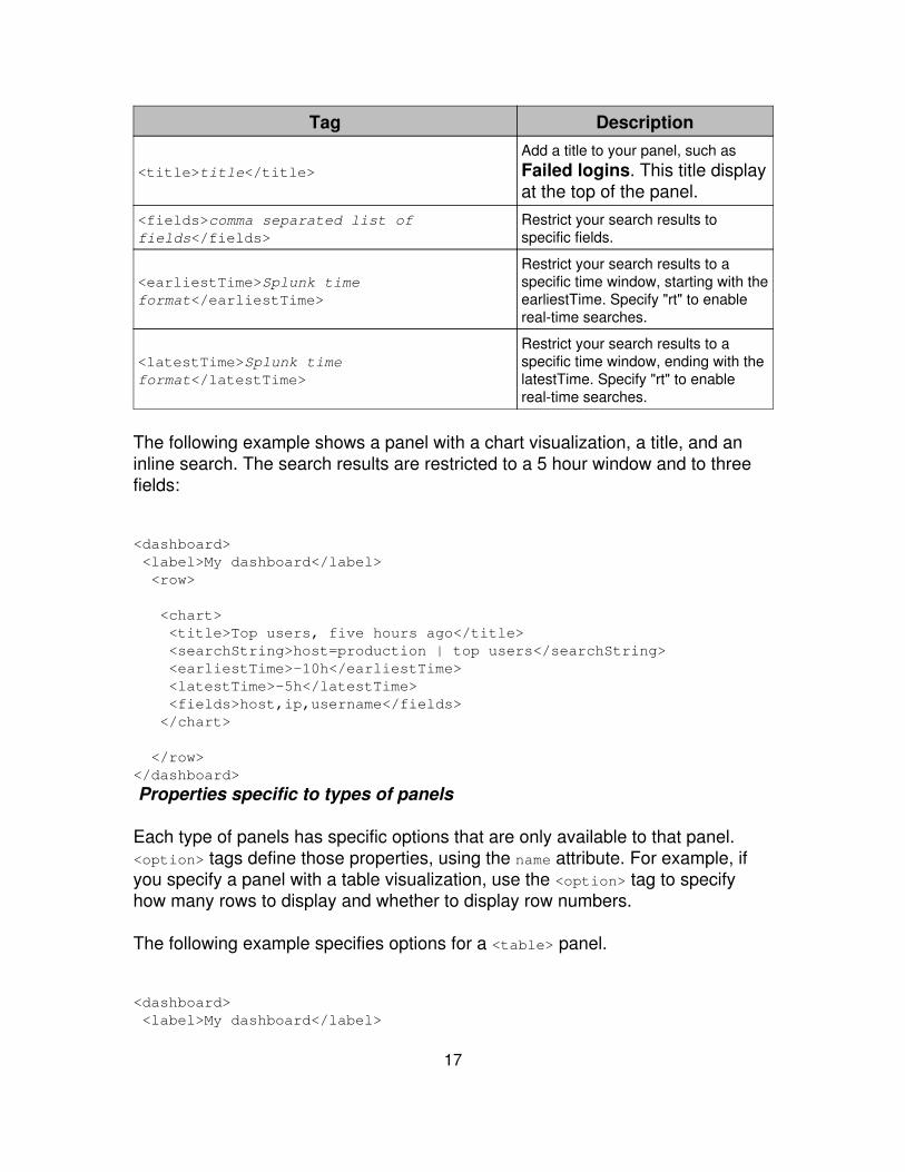
Tag Description
<title>title</title>
Add a title to your panel, such asFailed logins. This title displayat the top of the panel.
<fields>comma separated list offields</fields>
Restrict your search results tospecific fields.
<earliestTime>Splunk timeformat</earliestTime>
Restrict your search results to aspecific time window, starting with theearliestTime. Specify "rt" to enablereal-time searches.
<latestTime>Splunk timeformat</latestTime>
Restrict your search results to aspecific time window, ending with thelatestTime. Specify "rt" to enablereal-time searches.
The following example shows a panel with a chart visualization, a title, and aninline search. The search results are restricted to a 5 hour window and to threefields:
<dashboard> <label>My dashboard</label> <row>
<chart> <title>Top users, five hours ago</title> <searchString>host=production | top users</searchString> <earliestTime>-10h</earliestTime> <latestTime>-5h</latestTime> <fields>host,ip,username</fields> </chart>
</row></dashboard>
Properties specific to types of panels
Each type of panels has specific options that are only available to that panel.<option> tags define those properties, using the name attribute. For example, ifyou specify a panel with a table visualization, use the <option> tag to specifyhow many rows to display and whether to display row numbers.
The following example specifies options for a <table> panel.
<dashboard> <label>My dashboard</label>
17
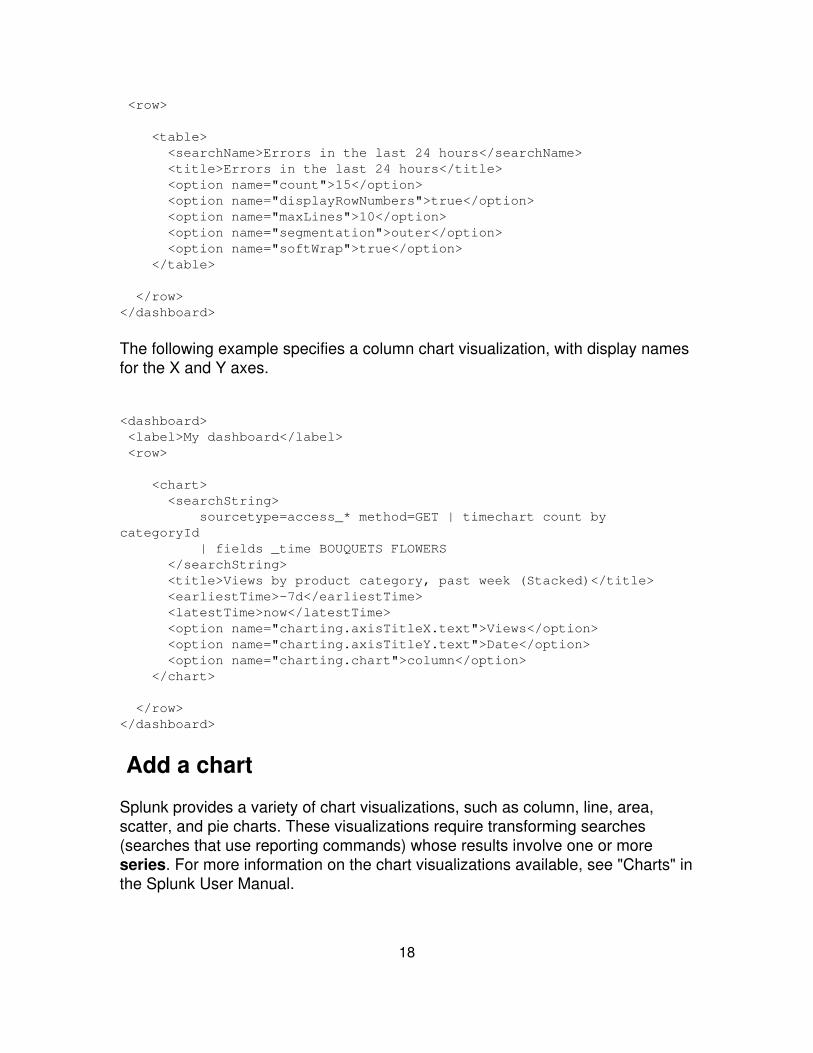
<row>
<table> <searchName>Errors in the last 24 hours</searchName> <title>Errors in the last 24 hours</title> <option name="count">15</option> <option name="displayRowNumbers">true</option> <option name="maxLines">10</option> <option name="segmentation">outer</option> <option name="softWrap">true</option> </table>
</row></dashboard>
The following example specifies a column chart visualization, with display namesfor the X and Y axes.
<dashboard> <label>My dashboard</label> <row>
<chart> <searchString> sourcetype=access_* method=GET | timechart count bycategoryId | fields _time BOUQUETS FLOWERS </searchString> <title>Views by product category, past week (Stacked)</title> <earliestTime>-7d</earliestTime> <latestTime>now</latestTime> <option name="charting.axisTitleX.text">Views</option> <option name="charting.axisTitleY.text">Date</option> <option name="charting.chart">column</option> </chart>
</row></dashboard>
Add a chart
Splunk provides a variety of chart visualizations, such as column, line, area,scatter, and pie charts. These visualizations require transforming searches(searches that use reporting commands) whose results involve one or moreseries. For more information on the chart visualizations available, see "Charts" inthe Splunk User Manual.
18
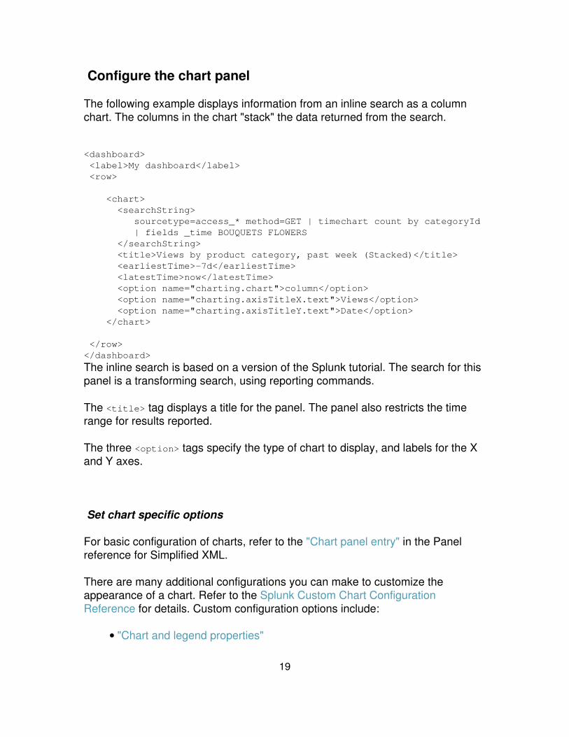
Configure the chart panel
The following example displays information from an inline search as a columnchart. The columns in the chart "stack" the data returned from the search.
<dashboard> <label>My dashboard</label> <row>
<chart> <searchString> sourcetype=access_* method=GET | timechart count by categoryId | fields _time BOUQUETS FLOWERS </searchString> <title>Views by product category, past week (Stacked)</title> <earliestTime>-7d</earliestTime> <latestTime>now</latestTime> <option name="charting.chart">column</option> <option name="charting.axisTitleX.text">Views</option> <option name="charting.axisTitleY.text">Date</option> </chart>
</row></dashboard>
The inline search is based on a version of the Splunk tutorial. The search for thispanel is a transforming search, using reporting commands.
The <title> tag displays a title for the panel. The panel also restricts the timerange for results reported.
The three <option> tags specify the type of chart to display, and labels for the Xand Y axes.
Set chart specific options
For basic configuration of charts, refer to the "Chart panel entry" in the Panelreference for Simplified XML.
There are many additional configurations you can make to customize theappearance of a chart. Refer to the Splunk Custom Chart ConfigurationReference for details. Custom configuration options include:
"Chart and legend properties"•
19
"Axes and grid line properties"• "Tooltip properties"• "Font, color, brush, shape, and related palette properties"• "Layout and data table properties"• "textBlock, layoutSprite, and sprite properties"•
Add a table
The table panel displays search results in a sortable table. You can displayresults in a table from just about any search, but the most interesting tables aregenerated from searches that include transform operations. For example, asearch that uses reporting commands such as stats, chart, timechart, top, orrare. Any fields you want to display in your table should be explicitly added toyour search.
For more information on table visualizations, refer to "Tables" in the SplunkVisualization Reference.
Configure the table panel
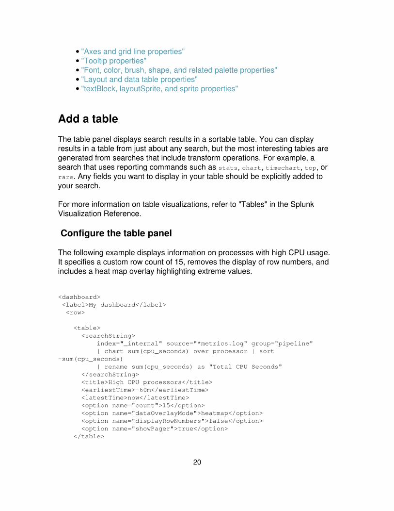
The following example displays information on processes with high CPU usage.It specifies a custom row count of 15, removes the display of row numbers, andincludes a heat map overlay highlighting extreme values.
<dashboard> <label>My dashboard</label> <row>
<table> <searchString> index="_internal" source="*metrics.log" group="pipeline" | chart sum(cpu_seconds) over processor | sort-sum(cpu_seconds) | rename sum(cpu_seconds) as "Total CPU Seconds" </searchString> <title>High CPU processors</title> <earliestTime>-60m</earliestTime> <latestTime>now</latestTime> <option name="count">15</option> <option name="dataOverlayMode">heatmap</option> <option name="displayRowNumbers">false</option> <option name="showPager">true</option> </table>
20
</row></dashboard>
For basic configuration of charts, refer to the "Table panel entry" in the Panelreference for Simplified XML.
Add a list
The list panel displays search results in a list. It's particularly useful if you have asearch that generates a set of fields you want to link to.
Configure the list panel
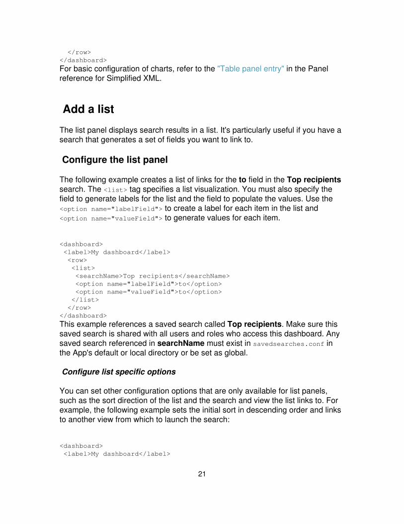
The following example creates a list of links for the to field in the Top recipientssearch. The <list> tag specifies a list visualization. You must also specify thefield to generate labels for the list and the field to populate the values. Use the<option name="labelField"> to create a label for each item in the list and<option name="valueField"> to generate values for each item.
<dashboard> <label>My dashboard</label> <row> <list> <searchName>Top recipients</searchName> <option name="labelField">to</option> <option name="valueField">to</option> </list> </row></dashboard>
This example references a saved search called Top recipients. Make sure thissaved search is shared with all users and roles who access this dashboard. Anysaved search referenced in searchName must exist in savedsearches.conf inthe App's default or local directory or be set as global.
Configure list specific options
You can set other configuration options that are only available for list panels,such as the sort direction of the list and the search and view the list links to. Forexample, the following example sets the initial sort in descending order and linksto another view from which to launch the search:
<dashboard> <label>My dashboard</label>
21
<row> <list> <title>Top users</title> <searchString>host=production | top users</searchString> <option name="labelField">users</option> <option name="valueField">users</option> <option name="initialSortDir">desc</option> <option name="labelFieldTarget">My custom search view</option> </list> </row></dashboard>
For basic configuration of lists, refer to the "List panel entry" in the Panelreference for Simplified XML.
Add HTML
The HTML panel displays inline HTML. Splunk display the contents between theHTML tags according to any specified HTML formatting. The HTML panel is agreat way to add documentation, links, images, and other Web content to yourdashboard.
Relative link references are relative to the current view location.
Configure the HTML panel
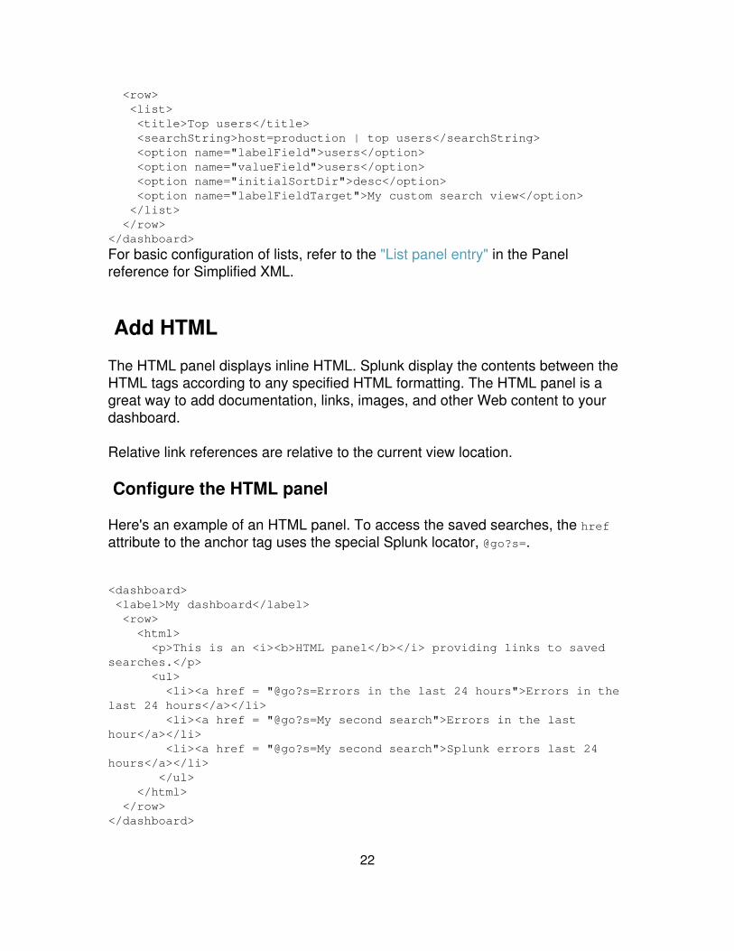
Here's an example of an HTML panel. To access the saved searches, the hrefattribute to the anchor tag uses the special Splunk locator, @go?s=.
<dashboard> <label>My dashboard</label> <row> <html> <p>This is an <i><b>HTML panel</b></i> providing links to savedsearches.</p> <ul> <li><a href = "@go?s=Errors in the last 24 hours">Errors in thelast 24 hours</a></li> <li><a href = "@go?s=My second search">Errors in the lasthour</a></li> <li><a href = "@go?s=My second search">Splunk errors last 24hours</a></li> </ul> </html> </row></dashboard>
22
The HTML panel does not use any of the other general panel options and thereare no specific options to set for HTML. All the configuration goes into the HTMLitself.
For basic configuration of HTML panels, refer to the "HTML panel entry in thePanel reference for Simplified XML.
Add a single value and gauges
The single value panel displays a single value from search data as text onbutton. If you base the visualization on a real-time search that returns a singlevalue, the number displayed changes as the search interprets incoming data.
You can also specify single values as gauges, as described below.
Note: The single value visualization is best used with a search that returns asingle value. If your search specifies multiple values, the single valuevisualization takes its number from the first row or first column of the search data.
You can change the color of the button depending on the value of the number itdisplays, creating a green/yellow/red visualization.
Configure a single value panel
The following example shows how to add a single value to a dashboard,recording the total number of logging events. It also displays text before and afterthe displayed value.
<dashboard> <label>My dashboard</label> <row> <single> <searchString> index=_internal source="*splunkd.log" ( log_level=ERROR OR log_level=WARN* OR log_level=FATAL OR log_level=CRITICAL) | stats count as log_events </searchString> <title>Log events</title> <earliestTime>-1d</earliestTime> <latestTime>now</latestTime> <option name="afterLabel">total logging events</option> <option name="beforeLabel">Found</option>
23
</single> </row></dashboard>
Set the color of the panel
You can change the background color of the single value panel depending on thevalues returned from the search. To change colors on your single results paneldo the following:
Set up your search to use the rangemap command.• Add the classField option, setting the value to range.•
Here is the same single value panel in the previous example, but setting colorranges for green, yellow, and red.
<dashboard> <label>My dashboard</label> <row> <single> <searchString> index=_internal source="*splunkd.log" ( log_level=ERROR OR log_level=WARN* OR log_level=FATAL OR log_level=CRITICAL) | stats count as log_events | rangemap field=log_events low=1-100 elevated=101-300default=severe </searchString> <title>Log events</title> <earliestTime>-1d</earliestTime> <latestTime>now</latestTime> <option name="classField">range</option> <option name="afterLabel">total logging events</option> <option name="beforeLabel">Found</option> </single> </row></dashboard>
Configure button specific options
For basic configuration of single value panels, refer to the "Single value panelentry" in the Panel reference for Simplified XML.
Panels displaying gauges
Gauge visualizations map a single numerical value against a range of colors thatmay have particular business meaning or logic. As the value changes over time,
24

the gauge marker changes position within this range. Gauges provide a dynamicvisualization for real-time searches – the fluctuating returned values cause thegauge marker to visibly bounce back and forth within the range.
Splunk provides three types of gauge visualizations: radial, filler, and marker. Formore information, see "Gauges" in the Splunk Visualizaton Reference.
Gauges are a type of chart visualization. You use the <option> tag to specify thetype of gauge. Gauges by default are displayed with a rich set of graphics(shiny). You can specify a minimal version of a gauge, which uses less graphics.
The following example illustrates all three gauges in a row on a dashboard. Thefirst gauge is a radial gauge that displays minimal graphics. The others use thedefault shiny graphics. The gauges in this example use the same search forlogging events that was used for a single value panel above. Typically, you use areal-time search for gauges.
<dashboard> <label>Gauges</label> <row> <chart> <option name="charting.chart">radialGauge</option> <option name="charting.chart.style">minimal</option> <optionname="charting.chart.rangeValues">[0,100,300,500]</option> <optionname="charting.gaugeColors">[0x84e900,0xffe800,0xbf3030]</option> <searchString> index=_internal source="*splunkd.log" ( log_level=ERROR OR log_level=WARN* OR log_level=FATAL OR log_level=CRITICAL) | stats count as log_events </searchString> <title>Splunk server log events</title> <earliestTime>-1d</earliestTime> <latestTime>now</latestTime> </chart>
<chart> <option name="charting.chart">fillerGauge</option> <optionname="charting.chart.rangeValues">[0,100,300,500]</option> <optionname="charting.gaugeColors">[0x84e900,0xffe800,0xbf3030]</option> <searchString> index=_internal source="*splunkd.log" ( log_level=ERROR OR log_level=WARN* OR log_level=FATAL OR log_level=CRITICAL) | stats count as log_events
25
</searchString> <title>Splunk server log events</title> <earliestTime>-1d</earliestTime> <latestTime>now</latestTime> </chart>
<chart> <option name="charting.chart">markerGauge</option> <optionname="charting.chart.rangeValues">[0,100,300,500]</option> <optionname="charting.gaugeColors">[0x84e900,0xffe800,0xbf3030]</option> <searchString> index=_internal source="*splunkd.log" ( log_level=ERROR OR log_level=WARN* OR log_level=FATAL OR log_level=CRITICAL) | stats count as log_events </searchString> <title>Splunk server log events</title> <earliestTime>-1d</earliestTime> <latestTime>now</latestTime> </chart> </row></dashboard>
Add an event listing
An event visualization is essentially a raw list of events. You can get eventvisualizations from any search that does not include a transform operation.Transform operations use reporting commands such as stats, chart, timechart,top, or rare.
Configure the event listing panel
The following example displays access errors as a list of events. The search forthe panel is from a saved search.
This panel specifies the following:
Display 15 rows of returned data• Do not include the row numbers• Include a maximum of 10 lines of data for each event• Wrap long lines of returned data•
<dashboard> <label>Event Listing Dashboard</label> <row>
26
<event> <searchName>Errors in the last 24 hours</searchName> <title>Errors in the last 24 hours</title> <option name="count">15</option> <option name="displayRowNumbers">false</option> <option name="maxLines">10</option> <option name="softWrap">true</option> </event> </row></dashboard>
Configure event listing specific options
For basic configuration of event listings, refer to the "Event panel entry" in thePanel reference for Simplified XML.
Build a real-time dashboard
You can build a real-time dashboard using the Splunk Dashboard Editor, codingthe dashboard using Simplified XML, or using Splunk's Advanced XML. Thistopic provides an example of creating a real-time dashboard using SimplifiedXML.
For information on building a dashboard using Advanced XML, see "How to builda real-time dashboard" in the Advanced Web customization section of thismanual.
Enable real-time searching
Use the <earliestTime> and <latestTime> params to enable real-timesearching. For example, if you want to enable real-time searching and display thedata in a table, specify the following:
<table> <title>Look here for errors that you need to care about</title> <searchName>Errors in the last 24 hours</searchName> <fields>host, source, errorNumber</fields> <earliestTime>rt</earliestTime> <latestTime>rt</latestTime></table>
You can also set a window for your real-time dashboard. For example, if youwant to show real-time events but only from the last 5 minutes.
27

<table> <title>Look here for errors that you need to care about</title> <searchName>Errors in the last 24 hours</searchName> <fields>host, source, errorNumber</fields> <earliestTime>rt-5m</earliestTime> <latestTime>rt</latestTime></table>
For more information on setting a search window, see "The real-time searchtopic" in the User Manual.
Dashboard example
This dashboard example contains several rows illustrating various panels youcan create with SimplifiedXML.
Note: Because this dashboard illustrates grouping of panels, you cannotedit this dashboard in the Splunk Dashboard Editor.
First row
HTML panel Displays a basic message and lists a few links to savedsearches.
•
Table panel Displays high CPU usage in the past hour, specifying 10rows of data, no row numbers, and overlaying a heat map to highlight highvalues.
•
Event panel Displays results of a saved search as a listing of events.Displays 5 rows of results at a time, and wrapping of events is off.
•
<dashboard> <label>Dashboard example</label> <row>
<html> <p>This is an <i><b>HTML panel</b></i> providing links to savedsearches.</p> <ul> <li><a href = "@go?s=Errors in the last 24 hours">Errors in thelast 24 hours</a></li> <li><a href = "@go?s=My second search">Errors in the lasthour</a></li> <li><a href = "@go?s=My second search">Splunk errors last 24
28

hours</a></li> </ul> </html>
<table> <title>High CPU processors in the last hour</title> <searchString> index="_internal" source="*metrics.log" group="pipeline" | chart sum(cpu_seconds) over processor | sort -sum(cpu_seconds) | rename sum(cpu_seconds) as "TotalCPU Seconds" </searchString> <earliestTime>-60m</earliestTime> <latestTime>now</latestTime> <option name="count">10</option> <option name="dataOverlayMode">heatmap</option> <option name="displayRowNumbers">false</option> <option name="showPager">true</option> </table>
<event> <searchName>Errors in the last 24 hours</searchName> <title>Errors in the last 24 hours</title> <option name="count">5</option> <option name="displayRowNumbers">true</option> <option name="maxLines">10</option> <option name="segmentation">outer</option> <option name="softWrap">false</option> </event>
</row>
. . .
Second row
Column chart panel Displays a chart as stacked columns, providinglabels for the X and Y axes. The inline search is derived from a version ofthe Splunk tutorial.
•
Pie chart panel Displays the same search as the column chart panel, butas a pie chart.
•
. . .
<row> <chart> <searchString> sourcetype=access_* method=GET | timechart count by categoryId | fields _time BOUQUETS FLOWERS
29
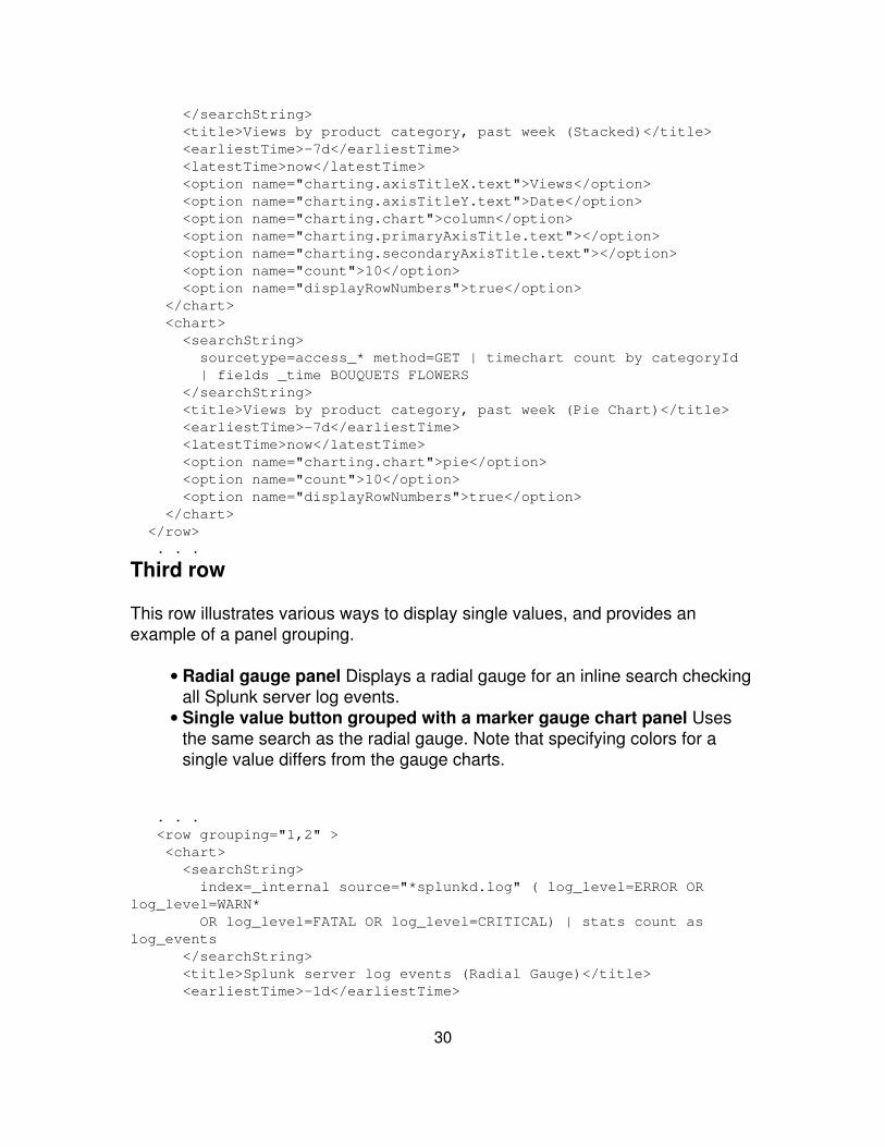
</searchString> <title>Views by product category, past week (Stacked)</title> <earliestTime>-7d</earliestTime> <latestTime>now</latestTime> <option name="charting.axisTitleX.text">Views</option> <option name="charting.axisTitleY.text">Date</option> <option name="charting.chart">column</option> <option name="charting.primaryAxisTitle.text"></option> <option name="charting.secondaryAxisTitle.text"></option> <option name="count">10</option> <option name="displayRowNumbers">true</option> </chart> <chart> <searchString> sourcetype=access_* method=GET | timechart count by categoryId | fields _time BOUQUETS FLOWERS </searchString> <title>Views by product category, past week (Pie Chart)</title> <earliestTime>-7d</earliestTime> <latestTime>now</latestTime> <option name="charting.chart">pie</option> <option name="count">10</option> <option name="displayRowNumbers">true</option> </chart> </row> . . .
Third row
This row illustrates various ways to display single values, and provides anexample of a panel grouping.
Radial gauge panel Displays a radial gauge for an inline search checkingall Splunk server log events.
•
Single value button grouped with a marker gauge chart panel Usesthe same search as the radial gauge. Note that specifying colors for asingle value differs from the gauge charts.
•
. . . <row grouping="1,2" > <chart> <searchString> index=_internal source="*splunkd.log" ( log_level=ERROR ORlog_level=WARN* OR log_level=FATAL OR log_level=CRITICAL) | stats count aslog_events </searchString> <title>Splunk server log events (Radial Gauge)</title> <earliestTime>-1d</earliestTime>
30
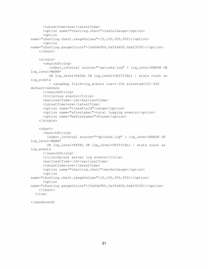
<latestTime>now</latestTime> <option name="charting.chart">radialGauge</option> <optionname="charting.chart.rangeValues">[0,100,300,500]</option> <optionname="charting.gaugeColors">[0x84e900,0xffe800,0xbf3030]</option> </chart>
<single> <searchString> index=_internal source="*splunkd.log" ( log_level=ERROR ORlog_level=WARN* OR log_level=FATAL OR log_level=CRITICAL) | stats count aslog_events | rangemap field=log_events low=1-100 elevated=101-300default=severe </searchString> <title>Log events</title> <earliestTime>-1d</earliestTime> <latestTime>now</latestTime> <option name="classField">range</option> <option name="afterLabel">total logging events</option> <option name="beforeLabel">Found</option> </single>
<chart> <searchString> index=_internal source="*splunkd.log" ( log_level=ERROR ORlog_level=WARN* OR log_level=FATAL OR log_level=CRITICAL) | stats count aslog_events </searchString> <title>Splunk server log events</title> <earliestTime>-1d</earliestTime> <latestTime>now</latestTime> <option name="charting.chart">markerGauge</option> <optionname="charting.chart.rangeValues">[0,100,300,500]</option> <optionname="charting.gaugeColors">[0x84e900,0xffe800,0xbf3030]</option> </chart> </row>
</dashboard>
31

Build forms
Forms: An introduction
A form is a Splunk view similar to a dashboard, but provides an interface forusers to supply values to one or more search terms, typically using text boxes,dropdown menus, or radio buttons. A form shields users from the details of theunderlying search – it allows users to focus only on the terms for which they aresearching and the results. The results can be displayed in tables, event listings,or any of the visualizations available to dashboards.
For example, consider a help desk support team that searches on a serialnumber and user name for every support case. You can create a form searchthat shows a dropdown list for a serial number and a text box for a user name. Asupport engineer can then easily search for the relevant data for a support case.
Forms live within apps, which means you can set permissions on a form thesame way you can with a saved search, event type, or other object. Once youbuild a form you can navigate directly to it. For example,
http://localhost:8000/en-US/<app>/<app_name>/<form_name>
This section describes the various types of forms and how to build a form search.It includes basic examples that you can use to get started. You can findadditional examples in the Sample app available from your Splunk installationand the UI Examples app available from [Splunkbase].
Form owners and permissions
Forms are either private to a user, available to users of an app, or available to allusers. In this respect, they are much like dashboards.
Splunk places private forms in the following location:
$SPLUNK_HOME/etc/users/<user>/<app>/local/data/ui/views/<form_name.xml>
Splunk places forms available to users of an app (or available to all users) in thefollowing location:
$SPLUNK_HOME/etc/<app>/local/data/ui/views/<form_name.xml>
32
You can change the read and write permissions to a form for users, based ontheir Splunk user roles.
About form searches
Form searches are built on fields or other identifiable parts of your data.Typically, you first build a search that fits your data and use case. Then, identifythe parts of this search that can be specified by the user. Finally, build a formsearch view (or embed your form search in a dashboard).
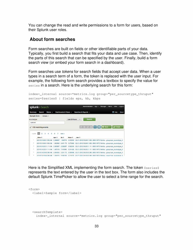
Form searches use tokens for search fields that accept user data. When a usertypes in a search term of a form, the token is replaced with the user input. Forexample, the following form search provides a textbox to specify the value forseries in a search. Here is the underlying search for this form:
index=_internal source=*metrics.log group="per_sourcetype_thruput"
series=$series$ | fields eps, kb, kbps
Here is the Simplified XML implementing the form search. The token $series$represents the text entered by the user in the text box. The form also includes thedefault Splunk TimePicker to allow the user to select a time range for the search.
<form> <label>Sample form</label>
<searchTemplate> index=_internal source=*metrics.log group="per_sourcetype_thruput"
33
series=$series$ | fields eps, kb, kbps </searchTemplate>
<fieldset>
<input type="text" token="series"> <label>sourcetype</label> <default></default> <seed>splunkd</seed> <suffix>*</suffix> </input>
<input type="time" />
</fieldset>
<row>
<table> <option name="showPager">true</option> <option name="count">20</option> </table>
</row>
</form>
The Splunk sample app contains several example form searches. An examplesimilar to this example, plus two others that contain dynamically populated radiobuttons and drop downs. The dynamic form search views present differentoptions in the radio buttons and drop downs depending on your data. Adaptthese examples to fit your use case.
Types of form search views
There are three different types of form views:
Simple form search The most basic form, a simple form search containsone or more text input boxes. Simple form searches use Splunk'sSimplified XML, which is also used to create dashboards described in the
•
34

previous section.
Dynamic form search Form searches contain drop-down lists or radiobuttons that display choices created by different searches. The availablechoices are dynamically populated from these searches. Use SimplifiedXML to create dynamic form searches.
•
Advanced form search Use Splunk's Advanced XML to build complexform searches. The ExtendedFieldSearch module documentationdescribes features available in advanced form searches. Splunkrecommends that you start with the Simplified XML and move on to theadvanced only if there are options you cannot enable. To learn moreabout building an advanced form search, see the topic How to build anadvanced form search.
•
Simplified XML and Advanced XML
Most of the documentation in this section describes creating and editing formsusing Simplified XML. Simplified XML sits on top of Splunk's Advanced XMLimplementation. Complex forms might need to leverage functionality onlyavailable from Advanced XML.
You can always convert Simplified XML to Advanced XML. However, you cannotlater go back to Simplified XML. Splunk recommends that you start advancedprojects in Simplified XML, and then convert them later to Advanced XML to addthe more complex features. "Introduction to advanced views" in this manualprovides details on editing Advanced XML.
To convert Simplified XML to Advanced XML use the showsource URI:
http://localhost:8000/en-US/app/<app_name>/<dashboard_name>?showsource=true
Use HTML entities for special characters
XML does not support the following five characters. Use HTML entities to displaythese characters:
Character HTMLEntitiy
" "
' '
35

< <
> >
& &
Create a simple form search
You create a simple form search much the same way you create a dashboard, asdescribed in "Create a dashboard" earlier in this manual. You can do any of thefollowing:
Create a dashboard using the Splunk Dashboard Editor, then modify theXML to create a form search.
•
Use the Splunk Manager to create a form search from a new view.• Clone an existing form search and modify it.• Create a form search from an XML file.•
Refer to "Create a dashboard from an XML file" for information on how to createa form search directly from an XML file. The process is the same.
This topic first shows how to create and modify a dashboard to create a formsearch. It then shows how to create a form search using Splunk Manager.Subsequent topics show various steps for creating a form search using SimplifiedXML.
Modify a dashboard to create a form search
"Create and edit simple dashboards" in the Splunk User Manual details how tocreate dashboards using the Splunk Dashboard Editor. This topic walks youthrough creating a basic dashboard that you later convert to a form search.
1. In Splunk Web Search app, go to Dashboards & Views > Create dashboard.
Provide an ID and Name for the dashboard.
2. Enable editing and click New panel. Specify the following:
Title: My Form Search• Search command: Inline search string• Earliest time: -7d• Latest time: now• Search:•
36

index=_internal source=*metrics.log
group="per_sourcetype_thruput" | fields eps, kb, kbps
3. Click Save to view the new dashboard. The dashboard lists the results of thesearch.
Use this search as the base result of a form search. This dashboard has ahardcoded search and a hardcoded time range for results.
In the following steps, you convert the dashboard to a form search that uses thespecified search as the base of a form search, with the user adding an additionalsearch term to the search query. The user can also modify the time range byadding a TimePicker to the search.
4. Enable editing for dashboard and click Edit XML. This is the generatedSimplified XML for the dashboard:
<dashboard> <label>Dashboard to convert to Form Search</label> <row> <table> <searchString> index=_internal source=*metrics.loggroup="per_sourcetype_thruput" | fields eps, kb, kbps </searchString> <title></title> <earliestTime>-7d</earliestTime> <latestTime>now</latestTime> </table> </row></dashboard>
5. Change the <dashboard> tags to <form> tags. Move the search from a<searchString> element in the dashboard to a <searchTemplate> element in theform.
<form> <label>Dashboard to convert to Form Search</label> <searchTemplate> index=_internal source=*metrics.log group="per_sourcetype_thruput"
| fields eps, kb, kbps </searchTemplate>
<row> <table>
37
<title></title> <earliestTime>-7d</earliestTime> <latestTime>now</latestTime> </table> </row></form>
6. Modify the search to include a series field token ($series$). Add a text box forthe user to specify the series field.
The field set in this example specifies a label for the text box, a seed value forthe text box, and a suffix value to append to each user-supplied value.
<form> <label>Dashboard to convert to Form Search</label> <searchTemplate> index=_internal source=*metrics.log group="per_sourcetype_thruput" series=$series$ | fields eps, kb, kbps </searchTemplate>
<fieldset> <input type="text" token="series"> <label>sourcetype</label> <default></default> <seed>splunkd</seed> <suffix>*</suffix> </input> </fieldset>
<row> <table> <title></title> <earliestTime>-7d</earliestTime> <latestTime>now</latestTime> </table> </row></form>
7. Remove the hardcoded time fields from the <table> element, and add thedefault Splunk TimePicker to the field set. Also, add the pager and count optionsto the table.
<form> <label>Dashboard to convert to Form Search</label> <searchTemplate> index=_internal source=*metrics.log group="per_sourcetype_thruput" series=$series$ | fields eps, kb, kbps </searchTemplate>
38
<fieldset> <input type="text" token="series"> <label>sourcetype</label> <default></default> <seed>splunkd</seed> <suffix>*</suffix> </input>
<input type="time" /> </fieldset>
<row> <table> <option name="showPager">true</option> <option name="count">20</option> </table> </row></form>
Use Splunk Manager to create a form
This topic shows how to create a form search directly from a new view created inSplunk Manager. Subsequent topics illustrate the various steps in creating theform search.
1. Go to Manager > User interface > Views.
2. Click New and specify the following:
Destination app Select an app from the dropdown list of all availableapps in your Splunk instance.
•
View name Specify a name for the dashboard. The name you specifybecomes a node in the path to the dashboard. Only alphanumericcharacters and '-' and '_' can be used.
•
View XML Specify the Simplified XML to create your dashboard. Thefollowing is the minimal XML to create a form search. It specifies a samplesearch command with a token, uses a text field to specify values for thetoken, and displays the results in a table:
•
<form> <label>Sample form search</label> <searchTemplate>index=sample from="$from$"</searchTemplate> <fieldset> <input type="text" token="from" />
39
</fieldset> <row> <event> <title>Results</title> <option name="count">50</option> </event> </row></form>
Click Save.•
3. (Optional) Modify permissions.
By default, the form you create from Splunk Manager is private. In the Viewspage of Splunk manager, click Permissions for your form to specify an app (orall apps) for the dashboard and to set permissions for users of the dashboard.
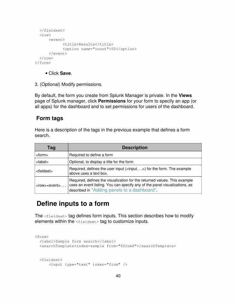
Form tags
Here is a description of the tags in the previous example that defines a formsearch.
Tag Description<form> Required to define a form
<label> Optional, to display a title for the form.
<fieldset> Required, defines the user input (<input. . .>) for the form. The exampleabove uses a text box.
<row><event>. . .Required, defines the visualization for the returned values. This exampleuses an event listing. You can specify any of the panel visualizations, asdescribed in "Adding panels to a dashboard".
Define inputs to a form
The <fieldset> tag defines form inputs. This section describes how to modifyelements within the <fieldset> tag to customize inputs.
<form> <label>Sample form search</label> <searchTemplate>index=sample from="$from$"</searchTemplate>
<fieldset> <input type="text" token="from" />
40
</fieldset>
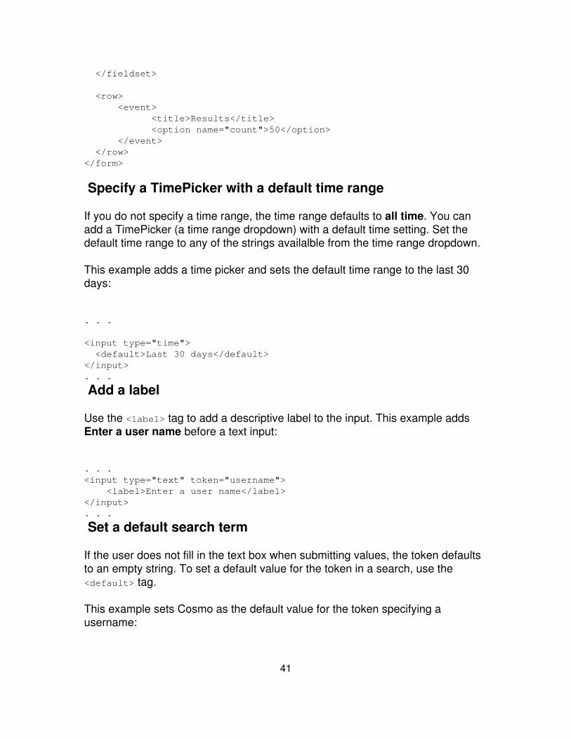
<row> <event> <title>Results</title> <option name="count">50</option> </event> </row></form>
Specify a TimePicker with a default time range
If you do not specify a time range, the time range defaults to all time. You canadd a TimePicker (a time range dropdown) with a default time setting. Set thedefault time range to any of the strings availalble from the time range dropdown.
This example adds a time picker and sets the default time range to the last 30days:
. . .
<input type="time"> <default>Last 30 days</default></input>. . .
Add a label
Use the <label> tag to add a descriptive label to the input. This example addsEnter a user name before a text input:
. . .<input type="text" token="username"> <label>Enter a user name</label></input>. . .
Set a default search term
If the user does not fill in the text box when submitting values, the token defaultsto an empty string. To set a default value for the token in a search, use the<default> tag.
This example sets Cosmo as the default value for the token specifying ausername:
41
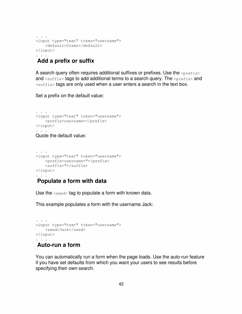
. . .<input type="text" token="username"> <default>Cosmo</default></input>. . .
Add a prefix or suffix
A search query often requires additional suffixes or prefixes. Use the <prefix>and <suffix> tags to add additional terms to a search query. The <prefix> and<suffix> tags are only used when a user enters a search in the text box.
Set a prefix on the default value:
. . .<input type="text" token="username"> <prefix>username=</prefix></input>. . .
Quote the default value:
. . .<input type="text" token="username"> <prefix>username="</prefix> <suffix>"</suffix></input>. . .
Populate a form with data
Use the <seed> tag to populate a form with known data.
This example populates a form with the username Jack:
. . .<input type="text" token="username"> <seed>Jack</seed></input>. . .
Auto-run a form
You can automatically run a form when the page loads. Use the auto-run featureif you have set defaults from which you want your users to see results beforespecifying their own search.
42
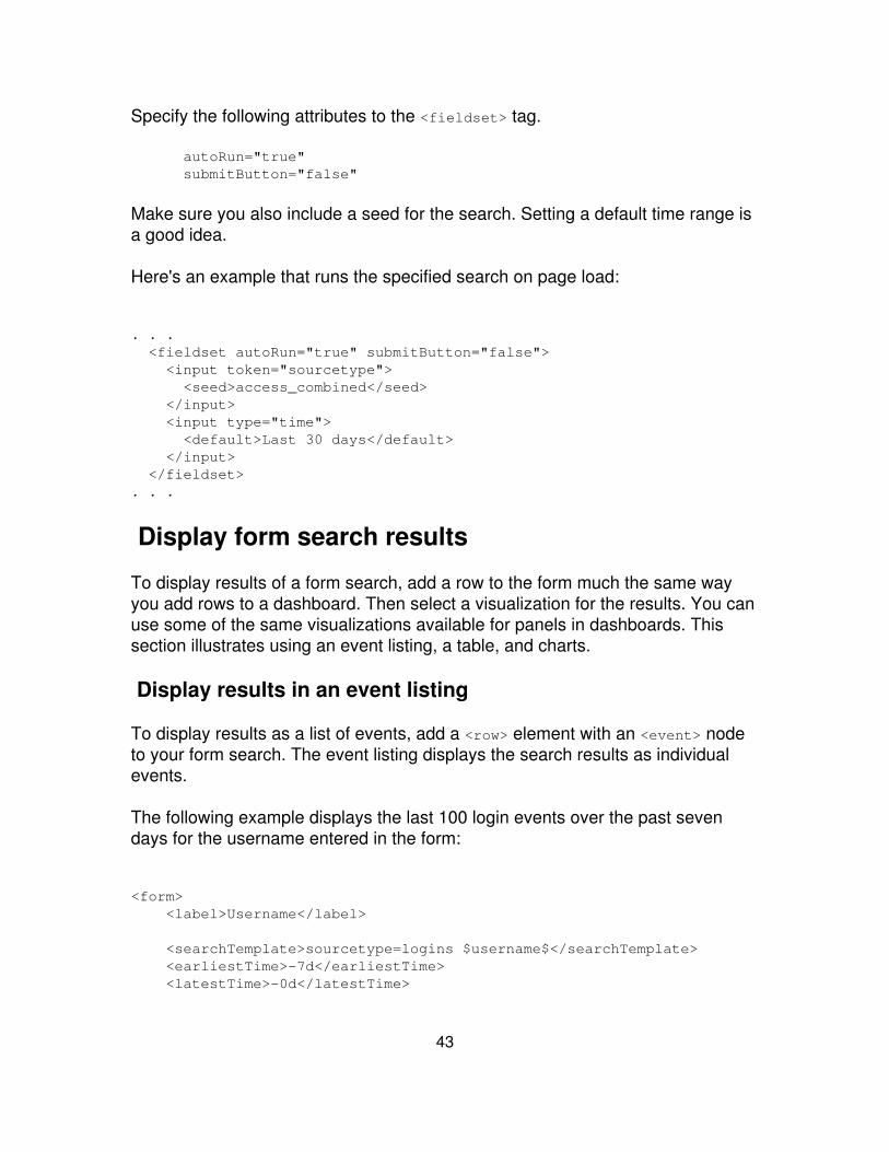
Specify the following attributes to the <fieldset> tag.
autoRun="true"submitButton="false"
Make sure you also include a seed for the search. Setting a default time range isa good idea.
Here's an example that runs the specified search on page load:
. . . <fieldset autoRun="true" submitButton="false"> <input token="sourcetype"> <seed>access_combined</seed> </input> <input type="time"> <default>Last 30 days</default> </input> </fieldset>. . .
Display form search results
To display results of a form search, add a row to the form much the same wayyou add rows to a dashboard. Then select a visualization for the results. You canuse some of the same visualizations available for panels in dashboards. Thissection illustrates using an event listing, a table, and charts.
Display results in an event listing
To display results as a list of events, add a <row> element with an <event> nodeto your form search. The event listing displays the search results as individualevents.
The following example displays the last 100 login events over the past sevendays for the username entered in the form:
<form> <label>Username</label>
<searchTemplate>sourcetype=logins $username$</searchTemplate> <earliestTime>-7d</earliestTime> <latestTime>-0d</latestTime>
43
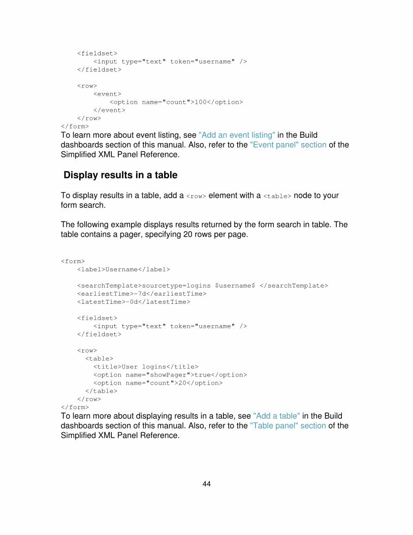
<fieldset> <input type="text" token="username" /> </fieldset>
<row> <event> <option name="count">100</option> </event> </row></form>
To learn more about event listing, see "Add an event listing" in the Builddashboards section of this manual. Also, refer to the "Event panel" section of theSimplified XML Panel Reference.
Display results in a table
To display results in a table, add a <row> element with a <table> node to yourform search.
The following example displays results returned by the form search in table. Thetable contains a pager, specifying 20 rows per page.
<form> <label>Username</label>
<searchTemplate>sourcetype=logins $username$ </searchTemplate> <earliestTime>-7d</earliestTime> <latestTime>-0d</latestTime>
<fieldset> <input type="text" token="username" /> </fieldset>
<row> <table> <title>User logins</title> <option name="showPager">true</option> <option name="count">20</option> </table> </row></form>
To learn more about displaying results in a table, see "Add a table" in the Builddashboards section of this manual. Also, refer to the "Table panel" section of theSimplified XML Panel Reference.
44

Display results in a chart
To display results in a chart, add a <row> element with a <chart> node to yourform search. Use the chart's <option> tags to specify the type of chart and anychart properties. Chart types include bar, column, area, line, pie, scatter, andbubble. Charts require transforming searches (searches that use reportingcommands) whose results involve one or more series. For more information onthe chart visualizations available, see "Charts" in the Splunk User Manual.
The following example creates a form search displaying results in a column chartThe search has includes reporting commands (timechart count).
<form> <label>Username</label>
<searchTemplate>sourcetype=logins $username$ | timechartcount</searchTemplate> <earliestTime>-7d</earliestTime> <latestTime>-0d</latestTime>
<fieldset> <input type="text" token="username" /> </fieldset>
<row> <chart> <title>User logins, last 7 days</title> <option name="charting.chart">column</option> <option name="charting.primaryAxisTitle.text">User</option> <option name="charting.secondaryAxisTitle.text">Totallogins</option> <option name="charting.legend.placement">none</option> </chart> </row></form>
In this example, Splunk's chart formatting controls specify the axis titles andremoves the chart legend (you really don't need a legend when only one series isdisplayed). The primaryAxisTitle and secondaryAxisTitle elements are similarto the axisTitleX and axisTitleY elements described in the charting controlsdocumentation. For more information see the Custom chart configurationreference chapter in this manual.
To learn more about charts, see "Add a chart" in the Build dashboards sectionof this manual.
45

Create a dynamic form search with radio buttons
You can create a dynamic form search that is populated using radio buttons. Youspecify a search to populate radio button choices. A user selects a radio buttondrive the search results.
Dynamic form search example
1. Use a simple form search to get started.
<form> <label>Username</label> <searchTemplate>sourcetype=logins $username$</searchTemplate> <fieldset> <input type="text" token="username" /> </fieldset>
<row> <event> <option name="count">100</option> </event> </row></form>
2. Change the input from a text box to radio buttons. Add a <populatingSearch>to generate the options for the radio buttons
. . .<input type="radio" token="username"> <label>Select Name</label> <populatingSearch fieldForValue="suser" fieldForLabel="suser"> <![CDATA[sourcetype=p4change | rex "user=(?<suser>\w+)@" | stats count by suser]]> </populatingSearch></input>. . .
3. Display the results in a table. The following is the complete dynamic formsearch.
<form> <label>Username</label> <searchTemplate>sourcetype=logins $username$</searchTemplate>
<fieldset> <input type="radio" token="username"> <label>Select Name</label>
46
<populatingSearch fieldForValue="suser" fieldForLabel="suser"> <![CDATA[sourcetype=p4change | rex "user=(?<suser>\w+)@" | stats count by suser]]> </populatingSearch> </input></fieldset>
<row> <table> <title>Users</title> <option name="showPager">true</option> </table></row></form>
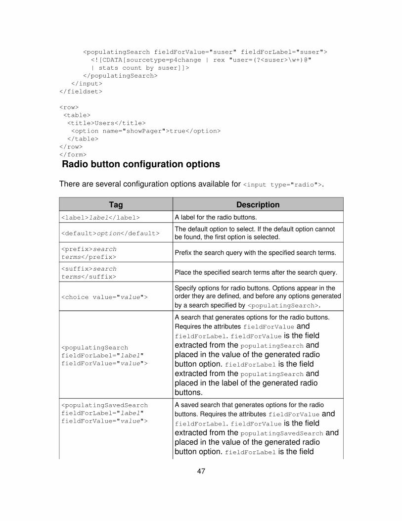
Radio button configuration options
There are several configuration options available for <input type="radio">.
Tag Description<label>label</label> A label for the radio buttons.
<default>option</default>The default option to select. If the default option cannotbe found, the first option is selected.
<prefix>searchterms</prefix>
Prefix the search query with the specified search terms.
<suffix>searchterms</suffix>
Place the specified search terms after the search query.
<choice value="value">Specify options for radio buttons. Options appear in theorder they are defined, and before any options generatedby a search specified by <populatingSearch>.
<populatingSearchfieldForLabel="label"fieldForValue="value">
A search that generates options for the radio buttons.Requires the attributes fieldForValue andfieldForLabel. fieldForValue is the fieldextracted from the populatingSearch andplaced in the value of the generated radiobutton option. fieldForLabel is the fieldextracted from the populatingSearch andplaced in the label of the generated radiobuttons.
<populatingSavedSearchfieldForLabel="label"fieldForValue="value">
A saved search that generates options for the radiobuttons. Requires the attributes fieldForValue andfieldForLabel. fieldForValue is the fieldextracted from the populatingSavedSearch andplaced in the value of the generated radiobutton option. fieldForLabel is the field
47
extracted from the populatingSavedSearch andplaced in the label of the generated radiobuttons.
<earliestTime>Splunk timeformat</earliestTime>
Restrict your search results to a specific time window,starting with the earliestTime. Specify "rt" to enablereal-time searches.
<latestTime>Splunk timeformat</latestTime>
Restrict your search results to a specific time window,ending with the latestTime. Specify "rt" to enablereal-time searches.
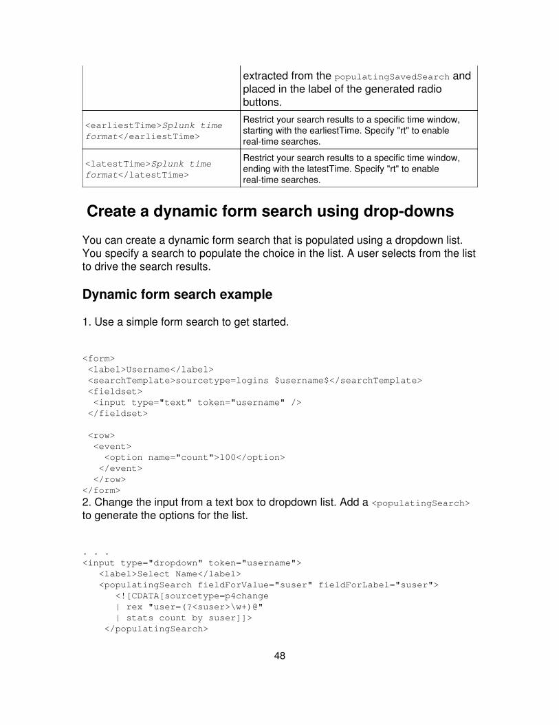
Create a dynamic form search using drop-downs
You can create a dynamic form search that is populated using a dropdown list.You specify a search to populate the choice in the list. A user selects from the listto drive the search results.
Dynamic form search example
1. Use a simple form search to get started.
<form> <label>Username</label> <searchTemplate>sourcetype=logins $username$</searchTemplate> <fieldset> <input type="text" token="username" /> </fieldset>
<row> <event> <option name="count">100</option> </event> </row></form>
2. Change the input from a text box to dropdown list. Add a <populatingSearch>to generate the options for the list.
. . .<input type="dropdown" token="username"> <label>Select Name</label> <populatingSearch fieldForValue="suser" fieldForLabel="suser"> <![CDATA[sourcetype=p4change | rex "user=(?<suser>\w+)@" | stats count by suser]]> </populatingSearch>
48
</input>. . .
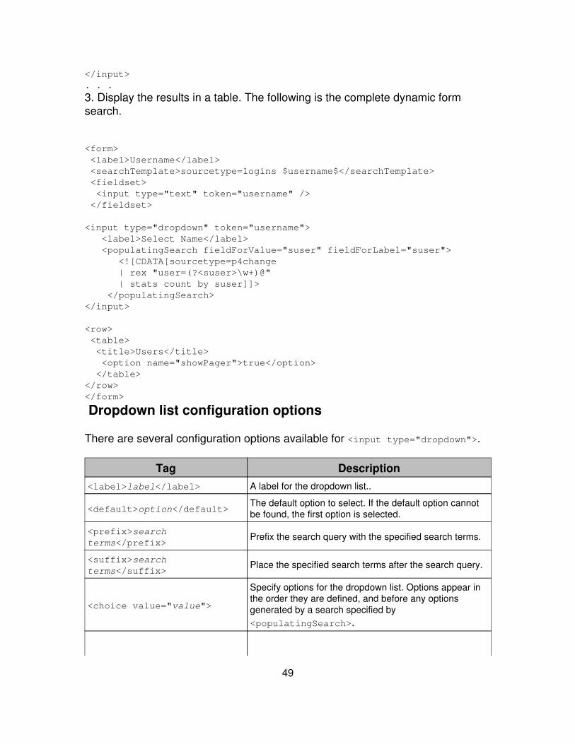
3. Display the results in a table. The following is the complete dynamic formsearch.
<form> <label>Username</label> <searchTemplate>sourcetype=logins $username$</searchTemplate> <fieldset> <input type="text" token="username" /> </fieldset>
<input type="dropdown" token="username"> <label>Select Name</label> <populatingSearch fieldForValue="suser" fieldForLabel="suser"> <![CDATA[sourcetype=p4change | rex "user=(?<suser>\w+)@" | stats count by suser]]> </populatingSearch></input>
<row> <table> <title>Users</title> <option name="showPager">true</option> </table></row></form>
Dropdown list configuration options
There are several configuration options available for <input type="dropdown">.
Tag Description<label>label</label> A label for the dropdown list..
<default>option</default>The default option to select. If the default option cannotbe found, the first option is selected.
<prefix>searchterms</prefix>
Prefix the search query with the specified search terms.
<suffix>searchterms</suffix>
Place the specified search terms after the search query.
<choice value="value">
Specify options for the dropdown list. Options appear inthe order they are defined, and before any optionsgenerated by a search specified by<populatingSearch>.
49
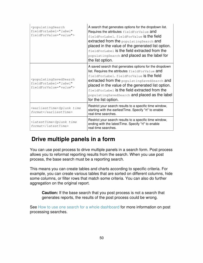
<populatingSearchfieldForLabel="label"fieldForValue="value">
A search that generates options for the dropdown list.Requires the attributes fieldForValue andfieldForLabel. fieldForValue is the fieldextracted from the populatingSearch andplaced in the value of the generated list option.fieldForLabel is the field extracted from thepopulatingSearch and placed as the label forthe list option.
<populatingSavedSearchfieldForLabel="label"fieldForValue="value">
A saved search that generates options for the dropdownlist. Requires the attributes fieldForValue andfieldForLabel. fieldForValue is the fieldextracted from the populatingSavedSearch andplaced in the value of the generated list option.fieldForLabel is the field extracted from thepopulatingSavedSearch and placed as the labelfor the list option.
<earliestTime>Splunk timeformat</earliestTime>
Restrict your search results to a specific time window,starting with the earliestTime. Specify "rt" to enablereal-time searches.
<latestTime>Splunk timeformat</latestTime>
Restrict your search results to a specific time window,ending with the latestTime. Specify "rt" to enablereal-time searches.
Drive multiple panels in a form
You can use post process to drive multiple panels in a search form. Post processallows you to reformat reporting results from the search. When you use postprocess, the base search must be a reporting search.
This means you can create tables and charts according to specific criteria. Forexample, you can create various tables that are sorted on different columns, hidesome columns, or filter rows that match some criteria. You can also do furtheraggregation on the original report.
Caution: If the base search that you post process is not a search thatgenerates reports, the results of the post process could be wrong.
See How to use one search for a whole dashboard for more information on postprocessing searches.
50
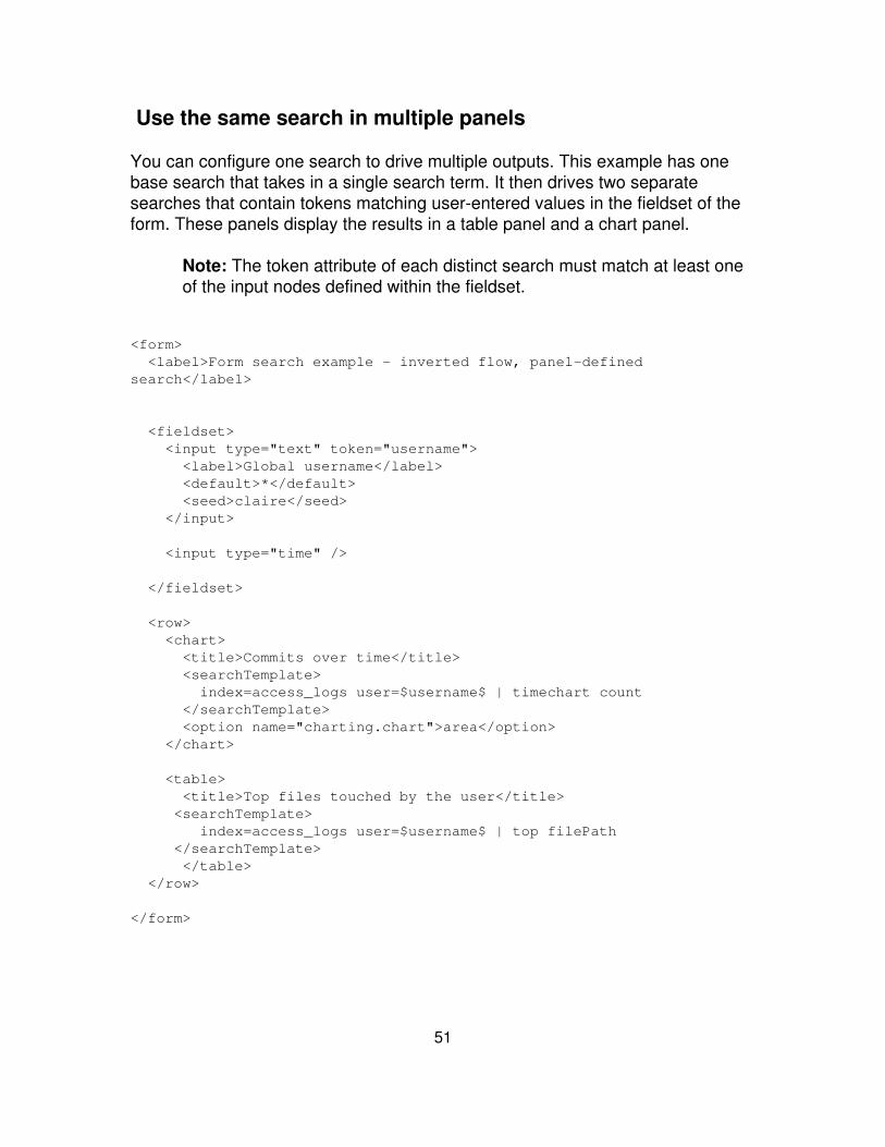
Use the same search in multiple panels
You can configure one search to drive multiple outputs. This example has onebase search that takes in a single search term. It then drives two separatesearches that contain tokens matching user-entered values in the fieldset of theform. These panels display the results in a table panel and a chart panel.
Note: The token attribute of each distinct search must match at least oneof the input nodes defined within the fieldset.
<form> <label>Form search example - inverted flow, panel-definedsearch</label>
<fieldset> <input type="text" token="username"> <label>Global username</label> <default>*</default> <seed>claire</seed> </input>
<input type="time" />
</fieldset>
<row> <chart> <title>Commits over time</title> <searchTemplate> index=access_logs user=$username$ | timechart count </searchTemplate> <option name="charting.chart">area</option> </chart>
<table> <title>Top files touched by the user</title> <searchTemplate> index=access_logs user=$username$ | top filePath </searchTemplate> </table> </row>
</form>
51
Single-search, multi-post process
This example takes a single search and displays different facets of that searchthrough post-processing. It combines the searches in the previous example intoone search.
The form search returns one result set. The searchPostProcess node inside eachpanel takes the results and runs (post processes) them through a separatesearch pipeline.
The basic model is:
Create a base search seeded in the searchTemplate node thatreturns a report with a superset of data.
1.
Create searchPostProcess nodes to filter or aggregate the basereport.
2.
<form> <label>Form search example - inverted flow, panel-definedpost-process</label>
<searchTemplate> sourcetype=p4change OR sourcetype=jira user=$username$ | head 10000 </searchTemplate>
<fieldset> <input type="text" token="username"> <label>Global username</label> <default>NON_EXISTENT</default> <seed>johnvey*</seed> </input> <input type="time" /> </fieldset>
<row> <chart> <title>Commits over time</title> <searchPostProcess>timechart count</searchPostProcess> <option name="charting.chart">area</option> </chart>
<table> <title>Top files touched by the user</title>
52
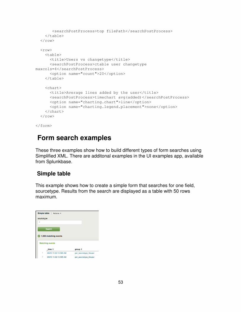
<searchPostProcess>top filePath</searchPostProcess> </table> </row>
<row> <table> <title>Users vs changetype</title> <searchPostProcess>ctable user changetypemaxcols=4</searchPostProcess> <option name="count">20</option> </table>
<chart> <title>Average lines added by the user</title> <searchPostProcess>timechart avg(added)</searchPostProcess> <option name="charting.chart">line</option> <option name="charting.legend.placement">none</option> </chart> </row>
</form>
Form search examples
These three examples show how to build different types of form searches usingSimplified XML. There are additonal examples in the UI examples app, availablefrom Splunkbase.
Simple table
This example shows how to create a simple form that searches for one field,sourcetype. Results from the search are displayed as a table with 50 rowsmaximum.
53

1. Create the form, give it a label, and specify the searchTemplate -- the searchthat is the basis for the form:
<form> <label>Simple table</label> <searchTemplate> index=_internal source=*metrics.log group=per_sourcetype_thruput series="$sourcetype$" | head 1000 </searchTemplate> <earliestTime>-30d</earliestTime> <latestTime>-0d</latestTime>...
2. (Optional) Add an HTML panlel to display useful information &endash;instructions on how to create a search:
. . . <html> Enter a <code>sourcetype</code> in the field below.
This view returns the most recent 1000 events from the metrics log referring to that <code>sourcetype</code>. </html> . . .
3. Set up an input. This example creates an input box that replaces the$sourcetype$ token in the searchTemplate above.
. . . <fieldset> <input token="sourcetype" /> </fieldset> . . .
4. Display the results in a table.
. . . <row> <table> <title>Matching events</title> <option name="count">50</option> </table> </row></form>
54

Multiple inputs
This example shows how to take multiple inputs to build a form search. It alsoshows how to add a time range picker, which allows users to pick a time rangefor their search.
1. Set up a searchTemplate that creates two tokens:
$series$$otherFilter$
The search does not include time specifications – users can select from the timerange picker:
<form> <label>Multiple inputs</label> <searchTemplate> index=_internal source=*metrics.log group="per_sourcetype_thruput" series=$series$ $otherFilter$ | fields eps, kb, kbps </searchTemplate>
2. Create a text box; upon first load, the box populates with 'splunkd'. If the userleaves the box empty, then the search uses '*'. This example always prefixes thetoken 'otherFilter' with 'eps>' – if no value is entered, 'eps>-1' is inserted. Specifythe timerange picker.
<fieldset> <input type="text" token="series"> <label>sourcetype</label> <default></default> <seed>splunkd</seed> <suffix>*</suffix>
55
</input> <input type="text" token="otherFilter"> <label>events per second greater than:</label> <prefix>eps></prefix> <default>-1</default> <seed>0</seed> </input> <input type="time" /> </fieldset>
3. Display the results in a table showing 20 rows per page. A pager allows usersto navigate through the results.
<row> <table> <option name="showPager">true</option> <option name="count">20</option> </table> </row></form>
Inverted flow
This form search is built backwards -- the input comes first and then feeds twoseparate charts and one table. The charts and table are built from a separatesearch, each with a searchTemplate that uses the 'sourcetypeToken' text boxinput.
This example is useful for rendering pages that collate disparate searches thatshare a common search keyword/token.
56

1. Define a common form search input that all panels use:
<form> <label>inverted flow, panel-defined search</label> <fieldset> <input type="text" token="sourcetypeToken"> <label>sourcetype</label> <default>*</default> <seed>splunkd</seed> </input>
<input type="time" />
</fieldset>
. . .
2. Create two separate charts, each with a searchTemplate that uses the inputfrom the form search above with the $sourcetypeToken$.
<row> <chart> <title>KB Indexed over time</title> <searchTemplate> index=_internal source=*metrics.log Component=metrics
57

group="per_sourcetype_thruput" series="$sourcetypeToken$" | timechart sum(kb) </searchTemplate> <option name="charting.chart">column</option> <optionname="charting.primaryAxisTitle.text">Sourcetype</option> <option name="charting.secondaryAxisTitle.text">KBIndexed</option> <option name="charting.legend.placement">none</option> </chart>
<chart> <title>Average events per second over time</title> <searchTemplate> index=_internal source=*metrics.log Component=metrics group="per_sourcetype_thruput" series="$sourcetypeToken$" | timechart avg(eps) </searchTemplate> <option name="charting.chart">area</option> <option name="chart.stackMode">stacked</option> <optionname="charting.primaryAxisTitle.text">Sourcetype</option> <option name="charting.secondaryAxisTitle.text">Events persecond</option> <option name="charting.legend.placement">none</option> </chart> </row>
3. Display further results in a table, also using the searchTemplate that takesinput from form search using the $sourcetypeToken$:
<row> <table> <title>average kbps over time</title> <searchTemplate> index=_internal source=*metrics.log Component=metrics group="per_sourcetype_thruput" series="$sourcetypeToken$" | timechart avg(kbps) </searchTemplate> <option name="count">20</option> </table> </row>
</form>
58

Build advanced views
About Advanced XML
This section provides an introduction to building views using Splunk's AdvancedXML. It describes basic concepts and provides some example views. Thedocumentation in this chapter is enough to get you started using Advanced XML.For additional information:
Splunk App Framework: Refer to the Splunk App Framework sectionavailable from the Splunk Developer Portal.
•
UI Examples app: Additional examples and documentation are availablefrom the UI Examples app, available from Splunkbase.
•
Advanced XML from the Splunk Wiki Cookbook The Advanced XMLsection provides some useful examples on getting started.
•
Simplified XML and Splunk's Dashboard Editor
Before building a view using Splunk's Advanced XML, you may want to start withSplunk's Dashboard Editor, which uses Simplified XML. To add features notavailable with Simplified XML. convert views from Simplified XML to AdvancedXML using the following URI from Splunk Web:
http://localhost:8000/en-US/app/<app_name>/<view_name>?showsource=true
Views
Splunk builds views from XML files stored in an App's view directory. Views aremade out of a library of modules. A module is actually a directory of CSS,JavaScript, HTML and, in some cases, Python and Flash files.
You can create and edit views according to your needs. Use Simplified XML forbasic views. Use Advanced XML for features not available from Simplified XML.For example, if you want to build a search view, or you want to use modules thataren't available in Simplified XML.
59
Modules
Every element in a Splunk view, from the search bar to the results, derives froma Splunk module. Some invisible elements, such as searches running in thebackground, derive from modules as well. You build and configure views byselecting the appropriate modules and linking them together.
For example, the search bar is one module. Graphs and charts, text entry boxes,links, drop-down menus, and other components are also modules. The ModuleReference in this manual lists all available modules, sorted by category. SplunkWeb also displays modules sorted alphabetically at the following URL:
http://localhost:8000/modules
Module implementation is available in the following directory of a Splunkinstallation:
$SPLUNK_HOME/share/splunk/search_mrsparkle/modules/
Module parameters
Modules use parameters to specify module-specific configurations, such as thesize of a graph or chart, or the number of events to display per view. Use the<param> tag within a <module> tag to specify parameters, as indicated below.For example:
<module name="Message"> <param name="filter">*</param></module>
The Module Reference lists the parameters available for each module. Someparams are required, while others are optional. Some params have defaultsettings.
Module hierarchy
Modules in a view pass information through a tree structure. For example, in asearch view, search information passes from a parent module to child modules.Each child module can modify the search in some way. Finally, the searchreturns events or is transformed into results. For dashboard views, each panel inthe dashboard is likely built from a separate search. In this case, you have moremodules with smaller trees than a dashboard built from a single search.
60
The top-level module in a hierarchy uses the layoutPanel attribute to specify itslocation within the view. Child modules in the tree that do not specify thelayoutPanel attribute inherit the attribute from their parent. Multiple panels in aview specify their position on the page using the layoutPanel attribute. Forexample:
<module name="SearchBar" layoutPanel="mainSearchControls">
Append ?showsource=true to any view's URL to see the hierarchy of modules inthe page. For example,http://localhost:8000/en-US/app/search/charting?showsource=true
Intentions
You can use intentions to pass search language modifications down the moduletree hierarchy. Specifically, modules pass searches down the hierarchy,modifying the searches by adding intentions. Once a series of intentions reachesa special type of module -- a dispatching module -- the intentions are composedinto a search that is run in Splunk.
Most results modules are dispatching modules -- if a results module doesn't haveany results from a search by the time they are invoked in a view, the resultsmodule compiles the intentions and runs the resulting search.
Layout templates
There are two types of views: dashboards and search views. A Mako layouttemplate defines each of these types of views. Mako templates are HTML fileswith support for Python. Splunk's layout templates define page layout; basically,how each element fits into a page. Splunk stores layout templates in the followinglocation:
$SPLUNK_HOME/share/splunk/search_mrsparkle/templates/view/
Dashboards use a series of rows and columns in their layout. Search viewscontain a search bar at the top, an events view area, and a few other areas forcustomization.
Dashboards display results from a variety of different searches, typically usingresults modules. A search view contains a set of search modules. The searchpasses through any number of modules, displaying results in one or more resultsmodules. You can add other modules to dashboard views and search views asnecessary.
61
You can use a views CSS to modify the appearance of a view. For example, tofloat a module next to another module, or move one module below anothermodule. For more information about how to change CSS for a view, seeCustomize CSS in this manual.
Basic steps for configuring a view
Here's a general outline of the basic steps for configuring views:
1. Decide which modules to include in your view.
2. Configure each module in <view_name>.xml.
3. Put <view_name>.xml in the views directory, inside your app directory. Useeither of the following two locations:
$SPLUNK_HOME/etc/apps/<app_name>/local/data/ui/views/$SPLUNK_HOME/etc/apps/<app_name>/default/data/ui/views/
Note: Be careful about using the defaultdirectory.
If you are creating your own app, then use the default directory.
If you are customizing an app shipped with Splunk (for example, thesearch app), or an app you installed from another source, use the localdirectory. If you used the default directory in this case, your changescould be overwritten by an update to the app.
4. If you have more than one view for your app, arrange them in the UI byfollowing the instructions in Build navigation.
5. To change the CSS for a view, Customize CSS.
Useful URIs for view building
Here are some URIs that provide useful information about your system whenbuilding a view. These are especially useful when building views through the filesystem, and not using Splunk Manager.
62
Tools available with info
By far, the most useful toolset for building views for Splunk is the info endpointavailable. This page offers a list of all available modules, RelaxNG schemas forview building, and many other utilities.
http://localhost:8000/info
Show source
http://localhost:8000/en-US/app/<app_name>/<view_name>?showsource=true
Use this endpoint to view the implementation of the underlying Advanced XMLfor a view. The Advanced XML is available in a tree view and as source code.You use this endpoint to convert Simplified XML to Advanced XML.
Module reference
This endpoint provides a list of all Advanced XML modules, sorted alphabetically.Compare with the Module Reference, available in this manual, sorted byfunctionality.
http://localhost:8000/modules
Display a new view
Use this endpoint to a view newly added to a Splunk instance.
https://localhost:8089/services/apps/local?refresh=true
Reload a specific view
Use this endpoint to refresh a specific view in Splunk Web.
https://localhost:8089/services/apps/local/<appname>?refresh=true
Use this endpoint to refresh a specific view in Splunk Web.
Reload all views
Reload all views for the specified app.
http://localhost:8000/app/<appname>/
Reload nav
Reload the navigation menu in Splunk Web.
https://localhost:8089/servicesNS/admin/<appname>/data/ui/nav?refresh=1
63

About editing XML
Here are a few suggestions about editing XML files for Splunk views.
Use HTML entities for special characters
XML does not support the following five characters. Use HTML entities to displaythese characters:
Character HTMLEntitiy
" "
' '
< <
> >
& &
Schemas and editors
Splunk recommends that you use an XML editor that understands XML schemas.Schemas are useful for validating XML and also provide guidelines for buildingan XML file.
Many XML editors let you load a schema -- DTD, XSD, Relax, RelaxNG are justa few different types of schemas. Splunk contains RelaxNG formatted schemasfor views, from dashboards to form searches to advanced XML views.
Read more about how to use Splunk's schemas in the Use XML schemas topic inthis manual.
Nesting modules
With Advanced XML, you often nest child modules several levels deep. It is agood idea to use consistent indentation and commenting to make sure youproperly close parent modules.
Build a search view using Advanced XML
Search views in Splunk are similar to the view in Splunk's default Search app. Asearch view presents a search bar to users, and displays events or search
64
results. Search views also have a specific layout. This topic provides astep-by-step procedure showing how to use Advanced XML to build a searchview and introduces the search view layout.
Configure the search view
1. Decide which modules you want to include in your view. Use the ModuleReference in this manual.
2. Create a view XML file <view_name>.xml, either through Splunk Manager, or inthe views directory, inside your app directory:
$SPLUNK_HOME/etc/apps/<app_name>/local/data/ui/views/
Note: Use the app's local directory to avoid overwriting your changeswhen an app is updated. When creating your own app, you might want touse the app's default directory.
3. Configure each module in your view's XML file. Set parameters for eachmodule and layoutPanels for parent modules.
4. If you have more than one view for your app, arrange them in the UI byfollowing the instructions in Build navigation for your app in this manual.
Open the view.xml file for editing
If you are creating a new view XML file, <view_name>.xml, add the following tags:
<view></view>
Name your view
Use the label tag to give the view a descriptive name.
<view> <label>Basic Search View</label>
Add chrome
Typically, you add the top navigation modules AccountBar and AppBar.
<view>
65
<label>Basic Search View</label>
<module name="AccountBar" layoutPanel="appHeader"/> <module name="AppBar" layoutPanel="navigationHeader"/>
</view>
Set params
Modify module parameters to customize your view. For example, you canremove the app drop-down by setting a param for the AccountBar. The followingXML creates a view that doesn't have the link to Manager or the app drop-downmenu in the upper right-hand corner:
<view>
<module name="AccountBar" layoutPanel="appHeader"> <param name="mode">lite</param> <module name="AppBar" layoutPanel="navigationHeader"/>
</view>
Each module recognizes a specific set of parameters, as listed in the ModuleReference.
Specify layout panels
The layoutPanel attribute to <module> defines where to display a module in aview. There are different layout panels for each part of the view, and differentlayout panels for different types of views. It's a good idea to familiarize yourselfwith the different layout panels to understand how to best display modules in aview.
Chrome layout panels
Here are the layout panels for chrome:
Module Description
messaging Use this layoutPanel for messaging modules.
appHeader appHeader contains all the overall links for Splunk AccountBar.navigationHeader
66
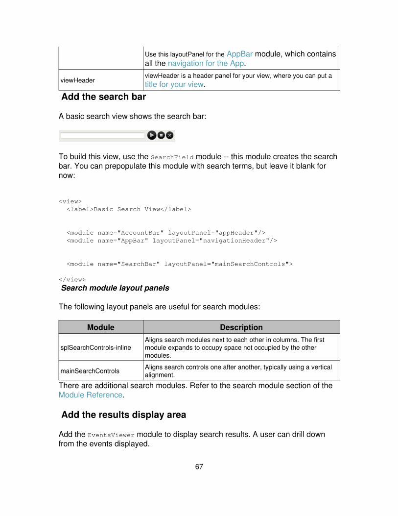
Use this layoutPanel for the AppBar module, which containsall the navigation for the App.
viewHeaderviewHeader is a header panel for your view, where you can put atitle for your view.
Add the search bar
A basic search view shows the search bar:
To build this view, use the SearchField module -- this module creates the searchbar. You can prepopulate this module with search terms, but leave it blank fornow:
<view> <label>Basic Search View</label>
<module name="AccountBar" layoutPanel="appHeader"/> <module name="AppBar" layoutPanel="navigationHeader"/>
<module name="SearchBar" layoutPanel="mainSearchControls">
</view>
Search module layout panels
The following layout panels are useful for search modules:
Module Description
splSearchControls-inlineAligns search modules next to each other in columns. The firstmodule expands to occupy space not occupied by the othermodules.
mainSearchControls Aligns search controls one after another, typically using a verticalalignment.
There are additional search modules. Refer to the search module section of theModule Reference.
Add the results display area
Add the EventsViewer module to display search results. A user can drill downfrom the events displayed.
67
<view> <label>Basic Search View</label>
<module name="AccountBar" layoutPanel="appHeader"/> <module name="AppBar" layoutPanel="navigationHeader"/>
<module name="SearchBar" layoutPanel="mainSearchControls">
<module name="EventsViewer"/>
</module>
</view>
The SearchBar module contains the EventsViewer module, which meansEventsViewer is a child of SearchBar – EventsViewer can access the search fromthe search bar. Child modules inherit the layoutPanel settings, as well.
Tip: Using Advanced XML, you often nest child modules several levelsdeep. It is a good idea to use consistent indentation and commenting tomake sure you properly close parent modules.
Results layout panels
Splunk provides a number of results modules. See the results modules section ofthe Module Reference.
Results modules look best when placed in the following layout panels:
Module Description
fullWidthControls Use this layout panel for results that take up the whole width of theview, such as serverSideInclude or other web resources.
graphArea Use this panel for the FlashTimeline module.
sidebarUse this panel to display the FieldPicker, MultiFieldViewerand SuggestedFieldViewer modules.
resultsHeaderPanel Add a header to your results with the ResultsHeader module.
pageControls Put Paginator and other page controls modules here.
resultsAreaLeft Display your results here with the EventsViewer module.
resultsAreaRight Add a secondary area to display results to the right ofresultsAreaLeft.
68

resultsOptionsThis is a pop-up layer and shows up as a link to Options fromwithin pageControls.
Add pagination
Add a Paginator module to allow users to page through results spread over twoor more pages.
<module name="Paginator"> <param name="entityName">events</param>
The entityName parameter is required for the Paginator module. This modulealso accept several optional parameters.
The Paginator module completes the example. Here is a listing of the completesearch view.
<view> <label>Basic Search View</label>
<module name="AccountBar" layoutPanel="appHeader"/> <module name="AppBar" layoutPanel="navigationHeader"/>
<module name="SearchBar" layoutPanel="mainSearchControls">
<module name="Paginator"> <param name="entityName">events</param>
<module name="EventsViewer"/> </module> </module></view>
Build a dashboard using Advanced XML
Use Advanced XML to add features to dashboards that are not available usingSimplified XML. This topic provides an example of building a dashboard usingAdvancedXML.
Splunk recommends that you start building a dashboard with Simplified XML, andthen convert to Advanced XML to add advanced features. However, this exampleshows how to create a dashboard using Advanced XML only within the file
69
system.
Here's a general overview of how to build a dashboard:
Decide how to visualize and display your data. For example, you maywant to showcase your search results in a graph or you may want topresent a list of links to search results.
1.
Construct searches and optionally save them.2. Build panels for each search.3. Construct a dashboard from the panels.4. Finally, lay out the dashboard panels.5.
Begin your dashboard
In an XML editor, create a minimal dashboard file, listed below in the followingdirectory:
$SPLUNK_HOME/etc/apps/<your_app>/default/data/ui/views/
Minimal XML file:
<view template="dashboard.html">. . .</view>
Dashboard views always specify dashboard.html for the dashboard template.Dashboard views use a different Mako template than the default template usedby search views, so you must specify this template at the beginning of yourdashboard's XML file.
You can set the refresh rate for a dashboard using the refresh=<seconds>attribute, as indicated below. This attribute specifies how often to rerunHiddenSearches or get any new HiddenSavedSearch results.
This example sets the dashboard to refresh every 30 minutes:
<view refresh="1800" template="dashboard.html">. . .
Name a dashboard
Use the <label> tag to provide a name to a dashboard:
70
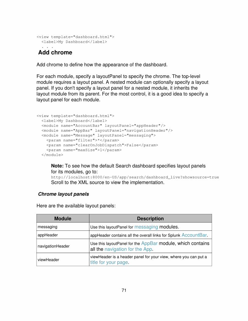
<view template="dashboard.html"> <label>My Dashboard</label> . . .
Add chrome
Add chrome to define how the appearance of the dashboard.
For each module, specify a layoutPanel to specify the chrome. The top-levelmodule requires a layout panel. A nested module can optionally specify a layoutpanel. If you don't specify a layout panel for a nested module, it inherits thelayout module from its parent. For the most control, it is a good idea to specify alayout panel for each module.
<view template="dashboard.html"> <label>My Dashboard</label> <module name="AccountBar" layoutPanel="appHeader"/> <module name="AppBar" layoutPanel="navigationHeader"/> <module name="Message" layoutPanel="messaging"> <param name="filter">*</param> <param name="clearOnJobDispatch">False</param> <param name="maxSize">1</param> </module>
Note: To see how the default Search dashboard specifies layout panelsfor its modules, go to:http://localhost:8000/en-US/app/search/dashboard_live?showsource=true
Scroll to the XML source to view the implementation.
Chrome layout panels
Here are the available layout panels:
Module Description
messaging Use this layoutPanel for messaging modules.
appHeader appHeader contains all the overall links for Splunk AccountBar.
navigationHeaderUse this layoutPanel for the AppBar module, which containsall the navigation for the App.
viewHeaderviewHeader is a header panel for your view, where you can put atitle for your page.
71

Add panels
A panel typically displays results of a search as a table, event listing, or othervisualization such as a chart or graph. When building a dashboard, decide howyou want to showcase your data with the available modules. The results modulesare the most useful modules to display search results.
Here's an example panel:
And here's the XML behind this panel:
<module name="HiddenSearch" layoutPanel="panel_row1_col1" group="Messages per minute last hour" autoRun="True"> <param name="search"> search index=_internal eps group=per_source_thruput NOTfiletracker Metrics | eval events=eps*kb/kbps | timechart sum(events) </param> <param name="earliest">-1h</param>
<module name="ResultsHeader"> <param name="entityName">scanned</param> <param name="entityLabel">Events</param>
<module name="FlashChart"> <param name="height">180px</param> <param name="width">100%</param> </module>
</module> </module>
Each panel typically has only one search associated with it, usually with theHiddenSearch or HiddenSavedSearch module. Display results from the search ina results module, such as a chart or a link list. The panel from the previousexample has three modules: HiddenSearch, ResultsHeader and FlashChart.HiddenSearch generates the search results while FlashChart displays them.
72
ResultsHeader displays a header showing the amount of events searched byHiddenSearch.
HiddenSearch is the parent module and therefor specifies the layoutPanel,group, and autoRun settings. LayoutPanel denotes where to place the panel onthe dashboard. Group is a header for the panel. AutoRun indicates that thesearch in the panel should be run upon loading the page. Typically, you setautoRun = true.
Searches and dashboard panels
A search for a panel can be either a saved search or an inline search.
Saved search: Create the search, save it and run it on a schedule. Thenreference the search results from your dashboard with the HiddenSavedSearchmodule. Saved searches are best for dashboards that are accessed by manyusers or the search is a long-running search.
Inline search: Specify the search query directly in the dashboard panel with theHiddenSearch module. The HiddenSearch module runs the search every timethe dashboard loads. Inline searches are best for dashboards that have only afew users and the search results return quickly.
Lay out your panels
Panels in a dashboards use a coordinate system to specify their position on thedashboard. The parent module in a panel specifies what coordinate to use.Coordinates specify the row and column position using the layoutPanel attributeto a <module> tag. For example:
<module layoutPanel="panel_rowX_rowY"> . . .
You can specify any number of rows, but you can only specify three columns. Forexample, here are two parent modules of panels in a dashboard:
<view>. . . <module name="HiddenSearch" layoutPanel="panel_row1_col1" group="Messages per minute last hour" autoRun="True"> . . . <module name="HiddenSearch"
73

layoutPanel="panel_row1_col2" group="KBps indexed per hour last 2 hours" autoRun="True"> . . .
You can also set up a group of panels within a larger panel using a single parentmodule. The following example uses StaticContentSample to set a header forthe entire group of panels. Each panel has one parent module to specify thelayoutPanel with the addition of the grp attribute for placement within a group.
<module name="StaticContentSample" layoutPanel="panel_row2_col1" group="All Indexed Data" autoRun="True"> <param name="text"> This will show you all of the data you have loaded into index=main over all time. </param> <module name="GenericHeader" layoutPanel="panel_row2_col1_grp1"> <param name="label">Sources</param> . . . <module name="GenericHeader" layoutPanel="panel_row2_col1_grp2"> <param name="label">Sourcetypes</param> . . . <module name="GenericHeader" layoutPanel="panel_row2_col1_grp3"> <param name="label">Hosts</param>. . .
Add a search bar
You can add a search bar to a dashboard using the same panels you use for thesearch bar in a search view:
Module Description
splSearchControls-inlineAligns search modules next to each other in columns. The firstmodule expands to occupy space not occupied by the othermodules.
mainSearchControls Aligns search controls one after another, typically using a verticalalignment.
The following example shows a search bar with a ViewRedirector module tolaunch searches in a different view.
<module name="SearchBar" layoutPanel="mainSearchControls"> <param name="useAssistant">true</param>
74

<param name="useTypeahead">true</param> <module name="TimeRangePicker"> <param name="selected">This month</param> <module name="ViewRedirector"> <param name="viewTarget">simple_search_view</param> </module> </module> </module>
Build a form search using Advanced XML
You can add a form search to any view using the Advanced XML. Advanced formsearches use the ExtendedFieldSearch module in the search view template. Toread more about search views, see Introduction to advanced views.
Add chrome
Start out your form search view by adding the chrome:
<view onunloadCancelJobs="False" autoCancelInterval="100">
<label>Sample search</label> <module name="AccountBar" layoutPanel="appHeader"/> <module name="AppBar" layoutPanel="navigationHeader"/> <module name="Message" layoutPanel="messaging"> <param name="filter">*</param> <param name="clearOnJobDispatch">False</param> <param name="maxSize">1</param> </module>
Add a form search pattern
All form searches include a form search pattern, which are available from thefollowing modules:
Module Description
HiddenSearchSpecifies the base search for your form search. Make sure youspecify tokens correctly. For example, $mytoken$
ExtendedFieldSearch Maps the term for replacement from your search. There areseveral parameters to set with this module.
EventsViewer (or othermodule to display results) Specify a module to display the results.
The following example is a basic configuration of the ExtendedFieldSearchmodule. The parent module is a HiddenSearch. The intention and
75
replacementMap parameters each take additional parameters to set up the forminput.
<module name="HiddenSearch" layoutPanel="mainSearchControls"> <param name="search">sourcetype=$st$</param>
<module name="ExtendedFieldSearch"> <param name="intention"> <param name="name">stringreplace</param> <param name="arg"> <param name="st"> <param name="default">apache_error</param> </param> </param> </param>
<param name="replacementMap"> <param name="arg"> <param name="st"> <param name="value"></param> </param> </param> </param>
<param name="field">Sourcetype</param>
<module name="EventsViewer" layoutPanel="resultsAreaLeft"> <param name="segmentation">full</param> </module> </module> </module>
Advanced examples
There are many ways to configure a form search using Advanced XML. Here area few examples to get you started.
Use wildcards
This example shows how to use wildcards with a token.
... <module name="HiddenSearch" layoutPanel="mainSearchControls"> <param name="search">sourcetype=apache_error *$target$*</param>
<module name="ExtendedFieldSearch"> <param name="intention"> <param name="name">stringreplace</param>
76
<param name="arg"> <param name="target"> <param name="default">500</param> </param> </param> </param>
<param name="replacementMap"> <param name="arg"> <param name="target"> <param name="value"></param> </param> </param> </param>
<param name="field">Wildcard search</param>
<module name="EventsViewer" layoutPanel="resultsAreaLeft"> <param name="segmentation">full</param> </module>
</module> </module>
Use two variables
The following example takes two separate tokens as input.
<module name="HiddenSearch" layoutPanel="mainSearchControls"> <param name="search">sourcetype=apache_error $error$$hours_ago$</param>
<module name="ExtendedFieldSearch"> <param name="intention"> <param name="name">stringreplace</param> <param name="arg"> <param name="error"> <param name="fillOnEmpty">True</param> </param> </param> </param>
<param name="replacementMap"> <param name="arg"> <param name="error"> <param name="value"></param> </param> </param> </param>
<param name="field">Multiple replace (apache search)</param>
77
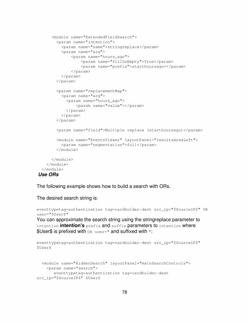
<module name="ExtendedFieldSearch"> <param name="intention"> <param name="name">stringreplace</param> <param name="arg"> <param name="hours_ago"> <param name="fillOnEmpty">True</param> <param name="prefix">starthoursago=</param> </param> </param> </param>
<param name="replacementMap"> <param name="arg"> <param name="hours_ago"> <param name="value"></param> </param> </param> </param>
<param name="field">Multiple replace (starthoursago)</param>
<module name="EventsViewer" layoutPanel="resultsAreaLeft"> <param name="segmentation">full</param> </module>
</module> </module> </module>
Use ORs
The following example shows how to build a search with ORs.
The desired search string is:
eventtypetag=authentication tag=cardholder-dest src_ip="$SourceIP$" ORuser="$User$"
You can approximate the search string using the stringreplace parameter tointention intention's prefix and suffix parameters to intention where$User$ is prefixed with OR user=" and suffixed with ":
eventtypetag=authentication tag=cardholder-dest src_ip="$SourceIP$"$User$
<module name="HiddenSearch" layoutPanel="mainSearchControls"> <param name="search"> eventtypetag=authentication tag=cardholder-destsrc_ip="$SourceIP$" $User$
78
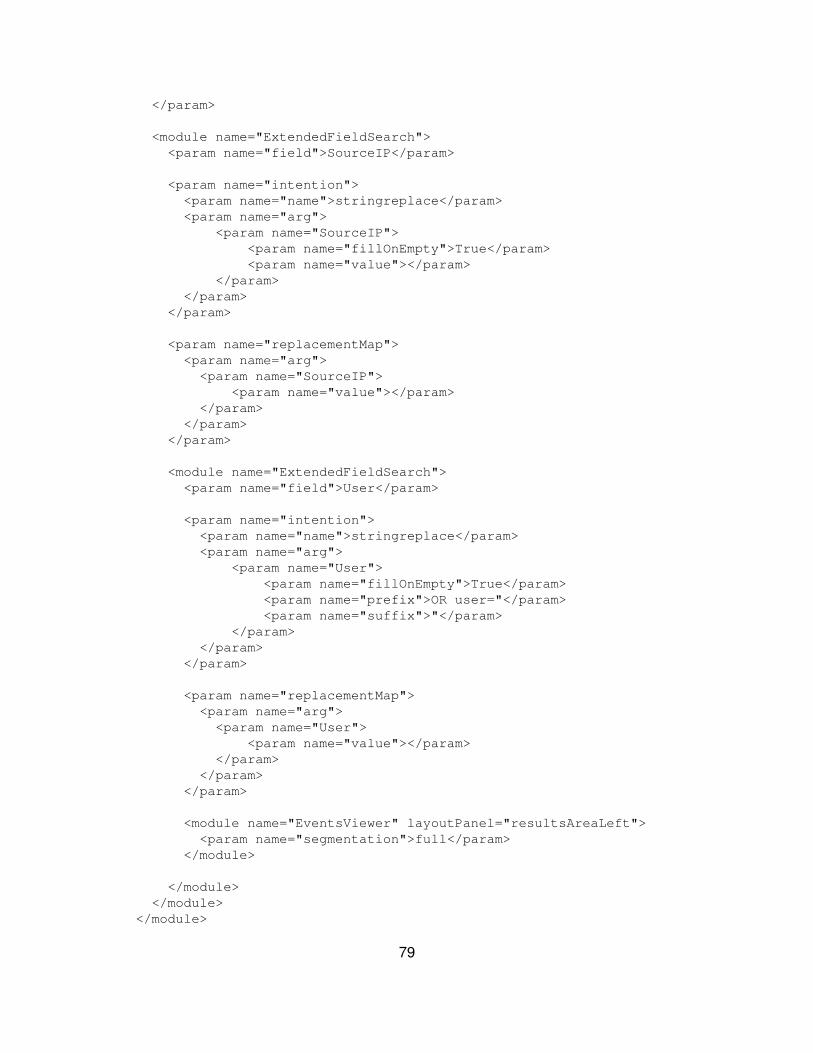
</param>
<module name="ExtendedFieldSearch"> <param name="field">SourceIP</param>
<param name="intention"> <param name="name">stringreplace</param> <param name="arg"> <param name="SourceIP"> <param name="fillOnEmpty">True</param> <param name="value"></param> </param> </param> </param>
<param name="replacementMap"> <param name="arg"> <param name="SourceIP"> <param name="value"></param> </param> </param> </param>
<module name="ExtendedFieldSearch"> <param name="field">User</param>
<param name="intention"> <param name="name">stringreplace</param> <param name="arg"> <param name="User"> <param name="fillOnEmpty">True</param> <param name="prefix">OR user="</param> <param name="suffix">"</param> </param> </param> </param>
<param name="replacementMap"> <param name="arg"> <param name="User"> <param name="value"></param> </param> </param> </param>
<module name="EventsViewer" layoutPanel="resultsAreaLeft"> <param name="segmentation">full</param> </module>
</module> </module> </module>
79
Reuse the same token
This example reuses the same token for two different parts of the search:
... <module name="HiddenSearch" layoutPanel="mainSearchControls"> <param name="search">eventtypetag=config_file source=$File$ OR$File$</param> <module name="ExtendedFieldSearch"> <param name="field">File</param> <param name="intention"> <param name="name">stringreplace</param> <param name="arg"> <param name="File"> <param name="value"></param> </param> </param> </param> <param name="replacementMap"> <param name="arg"> <param name="File"> <param name="value"></param> </param> </param> </param> <module name="EventsViewer" layoutPanel="resultsAreaLeft"> <param name="segmentation">full</param> </module> </module> </module>...
Use XML schemas
Starting with version 4.1, Splunk provides RelaxNG formatted schemas for theview XML, including the simplified dashboards, simplified form searches,advanced dashboards and views. Also, there are schemas available for thenavigation XML, the setup XML and manager pages XML. You can find all ofthese schemas off the info endpoint:
http://localhost:8000/info
These schema files are in RelaxNG compact syntax (*.rnc). But you can convertto other formats with Trang. Trang is an open source tool that lets you convertbetween different XML schema formats.
80

Here's an example of using Trang to convert from Relax to RelaxNG
java -jar trang.jar -O rng all.rnc all.rng
Files
Here's a descriptive list of all the files available from the info endpoint:
File Description
all.rnc
Serves as a single entry point for all of the registered RelaxNGschemas. All of the schemas are written in RelaxNG compactsyntax and are automatically converted to the full RelaxNGschema using Trang.
view.rnc Covers all 3 forms of view XML.
nav.rnc Covers the app nav XML,
manager.rnc Placeholder schemas for management XML files.
setup.rnc Covers the app setup XML.
Validation
Splunk provides a validation script, validate_all.py, locatedat:$SPLUNK_HOME/share/splunk/search_mrsparkle/exposed/schema/
This script inspects the UI XML files present here in Splunk installation:
$SPLUNK_HOME/etc/
To validate your XML files, first navigate to the location listed below and then runthe script:
cd $SPLUNK_HOME/share/splunk/search_mrsparkle/exposed/schema/$SPLUNK_HOME/bin/splunk cmd python validate_all.py
Advanced charting options
Splunk charts in dashboards and other views are highly customizable. You canmake a wide variety of customizations through the Splunk Web UI with the PanelEditor, which enables you to change chart axis labels, define color ranges forgauges, configure stacking modes for column and bar charts, and much more.
81

When the basic customization options offered by the Panel Editor aren't enough,you can go "under the hood" and edit the panel XML directly to customize theappearance and behavior of your charts in additional ways. You can change axislabel text styles, reverse chart axes, define specific color palettes for chartresults, and much more.
You can customize the appearance of charts using either Simplified XML orAdvanced XML. The syntax for charts differs slightly between Simplified andAdvanced XML. For example, in Simplified XML syntax, charting controls arespecified with option attributes. In Advanced XML, you specify the same thingusing params to a HiddenChartFormatter module. For code examples, see the"Chart colors" section, below, as well as the sections that follow.
This topic provides a few common customizations using both Simplified andAdvanced XML. For more information on building charts in simplified XML, referto adding a chart to your dashboard. Refer to the Custom Chart ConfigurationReference in this manual for a complete list of chart customizations available.
Chart customization and non-Flash chart displays
Dashboards built from Simplified XML use the JSChart module to rendergraphics. JSChart uses JavaScript to build the graphics for a chart. This providescharting support on platforms such as iOS mobile devices that cannot displayFlash-based graphics. The JSChart module also provides better printing quality.
Any chart that you create and edit through Splunk Web (for example, using theReport Builder, the Add to Dashboard dialog, and the Dashboard and PanelEditors) use Simplified XML. Thus the JSChart module renders the graphics for achart using JavaScript – Flash is not required.
Unsupported JSChart properties
Caution: Splunk offers a wide array of dashboard chart customization propertiesthat are not currently supported by the JSChart module. Using any of theseproperties with JSChart affects how dashboards are displayed:
Dashboard using Simplified XML To render a chart using unsupportedproperties for JSChart, Splunk uses FlashChart, the Flash-based chartingmodule. This means that the chart displays incorrectly in platforms that donot support Flash.
•
Dashboard using Advanced XML In Advanced XML you need to specifythe charting module (JSChart or FlashChart) for each chart in the
•
82

dashboard. For a chart that uses the JSChart module Splunk simplyignores unsupported properties.
For example, consider a dashboard created using Simplified XML that contain apanel with a line chart. If you edit the seriesColors chart customization property,which is unsupported by the JSChart module, Splunk renders the line chart withFlashChart. The line chart displays correctly in browsers that support Flash, butthe chart won't show up on platforms that do not support Flash, such as an iPad.
Splunk applies charting modules in dashboards on a panel by panel basis. It ispossible to have a dashboard where some charts use the JSChart module whileothers use FlashChart.
Note: All of the charting customizations described in the following topics (seriescolors, brushes, palettes, and so on) are not supported by the JavaScript-basedcharting module. If you implement them using Simplified XML, the resultingcharts display only on platforms supporting Flash.
For more information about what charting parameters are supported by theJava-script charting module and what charting parameters are not, see theCustom Charting Configuration Reference in this manual.
JSChart display issues
The JSChart charting module has some display issues that may be resolved inupcoming releases.
Non-transforming searches
The JSChart module cannot render charts based on searches that do not include(or properly use) transforming search commands such as chart, timechart,stats, or eval.
The FlashChart module will attempt to chart the results of non-transformingsearches, but charts won't revert to FlashChart automatically whennon-transforming searches are used. You will need to explicitly specify thatSplunk use the FlashChart module in the charting XML.
Time Charting
JSChart can only plot time-based data using the timechart command. If you tryto plot a time-based series using any other transforming search command,JSChart treats the timestamp data as a series of strings.
83
FlashChart can plot time-based data with other transforming search commands.
Search result truncation
For performance reasons, the JSChart module truncates search result data setsthat are too large. The exact limits that trigger this truncation depend on thebrowser being used as well as the charting configuration. When the JSChartmodule is caused to truncate data sets, it displays an error message below thechart. To remove the error message you can:
Switch to a chart type that involves drawing only one shape per series (inother words, move from a column chart to a line chart).
•
Reduce the number of fields that are being plotted.• For time charts, use a longer time-span between data points.•
There are additional conditions that can cause truncation:
Searches that return too many results per series can cause JSChartto hang the browser. Splunk employs a throttling strategy that restrictsthe number of results returned per series to 500 by default. You canconfigure this value by going to JSChart.conf and changing themaxResultsCount parameter to something other than 500.
•
JSChart can only plot the first 50 series that are returned. Additionalseries will not be plotted.
•
Object rendering limits by charting module. Both charting moduleshave rendering limits if the total number of objects plotted in the chartexceeds a certain number. If you run into this limit you'll want to changeeither the search string or search time range so that the results returnedfall under the limit.
For the FlashChart module, the rendering limit in all cases is 2000objects. If you hit this limit, the chart stops rendering.
♦
The JSChart module has a 2000 object limit for line charts, a 1200object limit for other chart types, and a 1000 object limit for chartsbuilt in Internet Explorer. If you hit the limit with a chart that usesJSChart, Splunk provides an error message.
♦
•
Category limit
In JSChart, when you are plotting data on a categorical axis, no more than 80categories can be displayed. When there are more than 80 categories Splunkdoesn't truncate the data but instead hides the labels and tick marks. This is not
84
configurable; Splunk runs into performance issues if you go higher than this. Ifyou need to display a large number of axis categories, use FlashChart. It has amuch higher limit.
Chart rendering limits
Both charting modules have limits as to the full number of objects/pixels that theycan render.
Chart colors
You may want to set a specific set of colors for a series in a chart. To changechart colors, use the seriesColors property charting.seriesColors. TheseriesColors property is the simplest way to adjust the colors of series in aSplunk chart. It is represented as a list of hexadecimal color values (0xRRGGBBvalues separated by commas and surrounded by brackets).
For example, in a Simplified XML dashboard:
<dashboard> <label>My dashboard</label> <row> <chart> <searchName>My saved report</searchName> <option name="charting.seriesColors"> [0xFF0000,0xFFFF00,0x00FF00] </option> </chart> </row></dashboard>
In an Advanced XML dashboard, use the charting options withHiddenChartFormatter:
...<module name="HiddenChartFormatter"> <param name="charting.seriesColors"> [0xFF0000,0xFFFF00,0x00FF00] </param>...
Series colors for Splunk charts are index-based, which means that a color isassigned to a particular series based on its index among all other seriesassigned to legend labels in a specific order. (This usage of "index" does notrefer to Splunk event indexes or indexers). Given the seriesColors list definedabove, the first series of a chart is assigned color 0xFF0000 (red), the second
85
series 0xFFFF00 (yellow), and so on.
For example, in a Simplified XML dashboard:
<dashboard> <label>My dashboard</label> <row> <chart> <searchName>My saved report</searchName> <option name="charting.legend.labels">[error,warn,info]</option> <optionname="charting.seriesColors">[0xFF0000,0xFFFF00,0x00FF00]</option> </chart> </row></dashboard>
In an Advanced XML dashboard, use the charting options withHiddenChartFormatter:
...<module name="HiddenChartFormatter"> <param name="charting.legend.labels">[error,warn,info]</param> <paramname="charting.seriesColors">[0xFF0000,0xFFFF00,0x00FF00]</param>...
This assigns the series named error to the color 0xFF0000 (red) and the seriesnamed warn to the color 0xFFFF00 (yellow) (and so on) from the seriesColors listabove.
However, if there are other charts in a view, this mapping is not necessarily beguaranteed. That's because all legends for all charts in a view are connected to acommon "master legend" by default to synchronize their colors. The masterlegend determines the final label/series index mapping from the mergedmappings of its "slave" legends. The first slave legend to be processed by themaster legend (typically the first one in a view) has its labels placed before thelabels of the next legend to be processed (minus duplicates). Therefore, error atseries index 0 in the labels list above is not necessarily at series index 0 in themaster list. To alleviate this problem, you can exclude a legend fromsynchronization by assigning its masterLegend property to null or an empty string.
For example, in a Simplified XML dashboard:
<dashboard> <label>My dashboard</label> <row>
86

<chart> <searchName>My saved report</searchName> <option name="charting.legend.labels">[error,warn,ok]</option> <optionname="charting.seriesColors">[0xFF0000,0xFFFF00,0x00FF00]</option> <option name="charting.legend.masterLegend"></option> </chart> </row></dashboard>
This guarantees a one-to-one mapping between the labels and seriesColorslists above.
But what if you want to assign a color to a particular series based on its nameinstead of its series index? In that case use the fieldColors property to mapspecific colors to particular fields. The fieldColors property is represented as amap of field/color pairs surrounded by curly braces:
<option name="charting.fieldColors"> {"error":0xFF0000,"warn":0xFFFF00,"info":0x00FF00}</option>
This example assigns the series named error to the color 0xFF0000 (red), theseries named warn to the color 0xFFFF00 (yellow), and the series named info tothe color 0x00FF00 (green). Although not required in this case, double quotesmust surround field names containing any of these characters []{}(),:".Existing double quotes or backslashes in the field name must be escaped with apreceding backslash.
Brushes and palettes
The entire concept of a series "color" is a drastic simplification of how a series, orany other visual element in Splunk charts, is actually styled. For example, thedefault style of all series in Splunk charts is not a solid color at all--it's a gradientof two colors. The seriesColors property described earlier is actually aconvenience property to simplify the complexity of how chart styles are reallydefined. If you're only interested in changing the default series color mappings ofa chart, while keeping the rest of the default styling, then the seriesColorsproperty will suffice. If, however, you want more elaborate styling beyond thedefault gradients or even beyond colors, you need to become familiar with theunderlying brush and palette architecture.
All visual elements in Splunk charts, with the exception of text, are "painted"using brushes. A brush can paint fills, strokes, gradients, images, and evenvideo. Some brushes can combine and layer these methods. For example, aSolid Fill Brush paints solid color fills, while a Solid Stroke Brush paints solid
87
color strokes. There is also a Group Brush that paints with a group of brushessimultaneously. You might use the Group Brush to paint a solid color fillsurrounded by a solid color stroke, for example.
Here's an example of how a custom brush with a solid red fill and 50%transparency might be defined:
<dashboard> <label>My dashboard</label> <row> <chart> <searchName>My saved report</searchName> <option name="charting.myBrush">solidFill</option> <option name="charting.myBrush.color">0xFF0000</option> <option name="charting.myBrush.alpha">0.5</option> </chart> </row></dashboard>
Charts often have several series to plot, which means they usually need severalbrushes, one for each series. But spending your time designing unique brushesfor individual series for all the different chart visualization options doesn't scale,especially if you have views that include dozens of series. Instead, charts usebrush palettes. A brush palette maps a series index to a brush. There are avariety of brush palettes for Splunk charts. The simplest brush palette is the SolidFill Brush Palette, which generates a solid fill brush for each series in a chart.
To determine the color of each brush it generates, the Solid Fill Brush Paletteuses another type of palette - a color palette. Similar to a brush palette, a colorpalette maps a series index to a color. For example, a List Color Palette maps aseries index directly to a color from a specified list of colors. By default, if anindex is out of range of the list of colors, it wraps around to the beginning of thelist, essentially repeating the colors. The List Color Palette can optionallyinterpolate between the list of colors, instead of wrapping, to produce a range ofcolors that spans over the total number of series. The following examplespecifies a color palette that interpolates between red, green, and blue:
<dashboard> <label>My dashboard</label> <row> <chart> <searchName>My saved report</searchName> <option name="charting.myColorPalette">list</option> <optionname="charting.myColorPalette.colors">[0xFF0000,0x00FF00,0x0000FF]</option> <option name="charting.myColorPalette.interpolate">true</option>
88
</chart> </row></dashboard>
Property references
In order to use the color palette defined above to generate Solid Fill Brushes fora chart, reference it from the appropriate property of a Solid Fill Brush Palette. Toreference a property to use as the value of another property, use the "@" symbolfollowed by the property name to reference (minus the "charting" prefix). TheSolid Fill Brush Palette has a colorPalette property that expects a color paletteas its value:
<option name="charting.myBrushPalette">solidFill</option><optionname="charting.myBrushPalette.colorPalette">@myColorPalette</option>
Again use a property reference to create a Column Chart whose columns arepainted using the brushes generated from myBrushPalette. The Column Charthas a columnBrushPalette property designed specifically for this purpose:
<option name="charting.chart">column</option><optionname="charting.chart.columnBrushPalette">@myBrushPalette</option>
You can also use a property reference in the original definition of myColorPaletteto reference another property defining the list of colors. This is exactly how thesimple seriesColors property described earlier is wired up to the underlyingdefault set of brushes and palettes in Splunk charts:
<option name="charting.myColorPalette.colors">@seriesColors</option>
Create chart options on the fly
You can define your own properties on the fly by simply declaring them. Forexample, the following declares a custom brush with a red solid fill:
<option name="charting.myBrush">solidFill</option> <option name="charting.myBrush.color">0xFF0000</option>
You can assign a property to another property either by reference or copy. The"@" symbol denotes a property reference and the "#" symbol denotes a propertycopy (or clone). For example, to use the custom brush defined above as thebackground of the tooltip, you can use a property reference:
<option name="charting.tooltip.backgroundBrush">@myBrush</option>
89
However, if you would like to use a brush that's the same as the custom brushdefined above except it has an alpha transparency of 50%, you can clone it thenmodify the alpha property of the clone.
<option name="charting.tooltip.backgroundBrush">#myBrush</option> <option name="charting.tooltip.backgroundBrush.alpha">0.5</option>
If you need to use either the "@" or "#" symbols as the first character of a string(for example, an axis title), you can escape it with a second symbol:
<option name="charting.axisTitleY.text">## Of Downloads</option> <option name="charting.axisTitleX.text">@@Foo</option>
Customize drilldown options
By default, all tables and charts provide drilldown capability into the relevantevents. In views created with the Splunk Dashboard Editor or Simplified XML,you can set up a few options for drilldown search. Learn more about the basicoptions for table chart drilldown in the User Manual.
However, if the basic table and chart drilldown configurations don't suit yourneeds, you can configure additional behavior using Advanced XML. For example,to send your drilldowns to views other than the timeline or to generate a chartfrom one search and drilldown to run a separate search. You can change thedefault drilldown behavior for any table or chart in your dashboard. You first needto create an advanced dashboard, as described earlier in this manual.
This topic includes a few examples of advanced drilldown configurations. Thereare many customization options available with Advanced XML – use theseexamples to get started. For more examples, see the UI examples app posted onSplunkbase.
Add chrome
Start out your view by adding the chrome and nav:
<view onunloadCancelJobs="False" autoCancelInterval="100">
<label>Drilldown view</label> <module name="AccountBar" layoutPanel="appHeader"/> <module name="AppBar" layoutPanel="navigationHeader"/> <module name="Message" layoutPanel="messaging"> <param name="filter">*</param>
90
<param name="clearOnJobDispatch">False</param> <param name="maxSize">1</param> </module>
Add a drilldown pattern
Next, decide what kind of drilldown to build and pick one or more of the followingconfigurations.
All table and chart drilldowns start with the basic drilldown pattern, which is builtwith the following modules:
Module Description
HiddenSearch Use this module to specify the search that populates your chart ortable.
SimpleResultsTable Display your results.
ConvertToDrilldownSearch Enables drilldown with all the defaults.
ViewRedirector Specify what view to send your users to when they click on thechart or table.
<module name="HiddenSearch" layoutPanel="panel_row2_col1"autoRun="True"> <param name="search">host=foo OR bar</param> <param name="earliest">-1h</param> <module name="SimpleResultsTable"> <param name="displayRowNumbers">False</param> <param name="drilldown">row</param> <param name="entityName">results</param> <module name="ConvertToDrilldownSearch"> <module name="ViewRedirector"> <param name="viewTarget">flashtimeline</param> </module> </module> </module></module>
This basic pattern sets up a drilldown search on a table. When a user clicks arow within the table, they are redirected to relevant search results in the timelineview.
Advanced examples
Here are a few examples of the customized drilldown actions that you can createusing Advanced XML.
91

Change the default click behavior
You can use the advanced XML to change the behavior when a user clicks on atable or chart. You may want to send them to another view besides the timeline,or you may want to display another chart below the first table or chart.
Launch a search in a new view
With a small edit to the default drilldown configuration, you can open a search ina view other than timeline. Just change the viewTarget param oftheViewRedirector module. If a user clicks to drilldown, the new view opens inthe same window. To open in a new window, ctrl-click (or command-click on aMac).
This example opens up drilldown click searches in a view called MyCustomView.
<module name="HiddenSearch" layoutPanel="panel_row2_col1"autoRun="True"> <param name="search">host=foo OR bar</param> <param name="earliest">-1h</param>
<module name="JobProgressIndicator"></module>
<module name="SimpleResultsTable"> <param name="displayRowNumbers">False</param> <param name="drilldown">row</param> <param name="entityName">results</param>
<module name="ConvertToDrilldownSearch">
<module name="ViewRedirector"> <param name="viewTarget">MyCustomView</param> </module>
</module> </module></module>Drilldown to a new chart
Here's an example that opens a new chart below when a user clicks to drilldownon the initial chart. This example includes a bar chart that displays the top tensourcetypes by total volume indexed. A click on a bar causes a second chart toopen below the initial one. The second drilldown chart displays the average epsover time for the sourcetype that was clicked, over the same period of time usedto collect the sums in the original search.
92

And here's the XML behind this example:
<module name="HiddenSearch" layoutPanel="panel_row3_col1"autoRun="True"> <param name="search"> index=_internal source=*metrics.log group=per_sourcetype_thruput | chart sum(kb) over series | sort -sum(kb) | head 10 </param> <param name="earliest">-1h</param>
<module name="HiddenChartFormatter"> <param name="charting.chart">bar</param> <param name="charting.primaryAxisTitle.text">Sourcetype</param> <param name="charting.secondaryAxisTitle.text">KB Indexed</param> <param name="charting.legend.placement">none</param>
<module name="JobProgressIndicator"/>
<module name="FlashChart"> <param name="width">100%</param> <param name="height">160px</param>
<module name="HiddenSearch"> <param name="search"> index=_internal source=*metrics.loggroup=per_sourcetype_thruput | timechart avg(eps) </param> <param name="earliest">-1h</param>
93
<module name="ConvertToIntention"> <param name="intention"> <param name="name">addterm</param> <param name="arg"> <param name="series">$click.value$</param> </param> </param>
<module name="JobProgressIndicator"></module>
<module name="SimpleResultsHeader"> <param name="entityName">results</param> <param name="headerFormat"> EPS over time for sourcetype=$click.value$ $time$ </param> </module>
<module name="HiddenChartFormatter"> <param name="chart">line</param> <param name="primaryAxisTitle.text">Time</param> <param name="secondaryAxisTitle.text">events persecond</param> <param name="legend.placement">none</param>
<module name="FlashChart"> <param name="width">100%</param> <param name="height">160px</param> </module>
</module> </module> </module> </module> </module> </module>
Swap out the underlying search
You can configure a drilldown to launch a different search than the search thatgenerates the data in the table or chart. There are a couple of reasons to do this:
To build charts and tables on searches of a summary index.• To build charts and tables on metadata searches.•
94

If you keep the default drilldown behavior, these searches don't really result in auseful set of events. So it's best to swap out the drilldown search. You do this byadding another HiddenSearch or HiddenSavedSearch module between the chartor table and the ConvertToDrilldownSearch module.
For example, if you have a dashboard timechart based on this summary indexsearch:
index=summary report=firewall_top100_sources_hourly | timechart count by host
Use Advanced XML to configure the dashboard panel so a drilldown initiates asearch that matches the events returned by the original summary index search,such as:
sourcetype=cisco sourcetypetag=production | timechart count by host
Here's what the XML looks like:
<module name="HiddenSearch" layoutPanel="panel_row2_col1"autoRun="True"> <param name="search"> index=summary report=firewall_top100_sources_hourly | timechart count by host </param> <param name="earliest">-1h</param>
<module name="HiddenChartFormatter"> <param name="chart">line</param> <param name="primaryAxisTitle.text">Time</param> <param name="secondaryAxisTitle.text">events per second</param> <param name="legend.placement">none</param>
<module name="FlashChart"> <param name="width">100%</param> <param name="height">160px</param>
<module name="HiddenSearch" layoutPanel="panel_row2_col1"autoRun="True"> <param name="search"> sourcetype=cisco sourcetypetag=production | timechart count by host </param>
<module name="ConvertToDrilldownSearch"> <module name="ViewRedirector">
95
<param name="viewTarget">flashtimeline</param> </module> </module> </module>
</module> </module></module>
Build a real-time dashboard
You can use Splunk's real-time reporting capability to show streaming results indashboards. First, construct a real time search, as described in the real-timesearch and reporting topic in the User Manual. Save this search and add it toyour dashboard using the HiddenSavedSearch module.
To enable real-time on your dashboard, add the EnablePreview module to yourview XML. For example:
...<module name="EnablePreview"> <param name="enable">true</param> <param name="display">false</param>...
If you're building an inline search with the HiddenSearch module, you can specifya sliding window for real-time results by setting the earliest and latest paramson your HiddenSearch module. For example, the following sets a five minutewindow, therefore showing streaming results from the most recent five minutes:
...<module name="HiddenSearch" autoRun="True"> <param name="search">host=foo OR bar | top IP</param> <param name="earliest">rt-5m</param> <param name="latest">rt</param>...
Example
Here is a complete example. This example sets the real-time window to 30seconds.
<?xml version="1.0"?><view template="dashboard.html"> <label>Real time example</label>
96
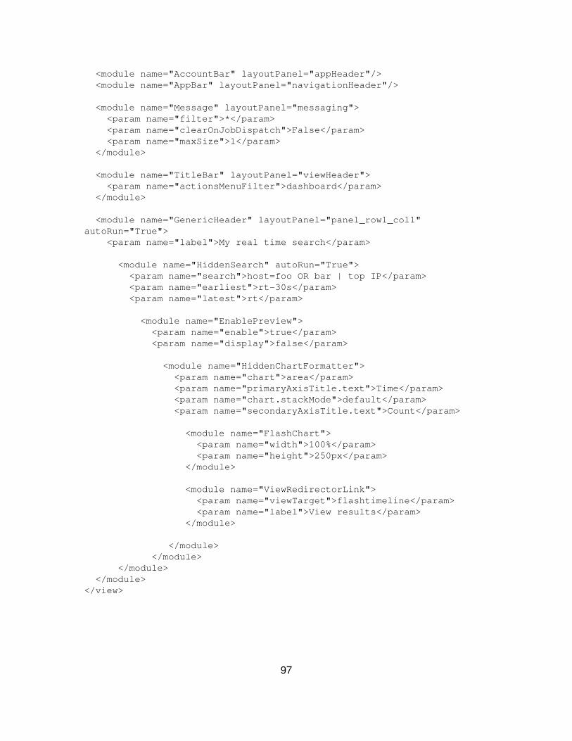
<module name="AccountBar" layoutPanel="appHeader"/> <module name="AppBar" layoutPanel="navigationHeader"/>
<module name="Message" layoutPanel="messaging"> <param name="filter">*</param> <param name="clearOnJobDispatch">False</param> <param name="maxSize">1</param> </module>
<module name="TitleBar" layoutPanel="viewHeader"> <param name="actionsMenuFilter">dashboard</param> </module>
<module name="GenericHeader" layoutPanel="panel_row1_col1"autoRun="True"> <param name="label">My real time search</param>
<module name="HiddenSearch" autoRun="True"> <param name="search">host=foo OR bar | top IP</param> <param name="earliest">rt-30s</param> <param name="latest">rt</param>
<module name="EnablePreview"> <param name="enable">true</param> <param name="display">false</param>
<module name="HiddenChartFormatter"> <param name="chart">area</param> <param name="primaryAxisTitle.text">Time</param> <param name="chart.stackMode">default</param> <param name="secondaryAxisTitle.text">Count</param>
<module name="FlashChart"> <param name="width">100%</param> <param name="height">250px</param> </module>
<module name="ViewRedirectorLink"> <param name="viewTarget">flashtimeline</param> <param name="label">View results</param> </module>
</module> </module> </module> </module></view>
97

Turn off autopause
Searches in views pause automatically if all three of the following conditions aremet:
The view contains a JobStatus module (for example flashtimeline,charting).
•
The view has configured JobStatus with a valid autoPauseIntervalparameter (defaults to 30 seconds).
•
The URI of the view contains an auto_pause=true parameter, for example:•
http://localhost:8000/app/search/flashtimeline?auto_pause=true&q=searchfoo bar
The best way to build a URI with auto_pause=true is to send searches to a viewusing the ViewRedirector in another view. Use the ViewRedirector module toinsert the URI params in your redirect. For example:
<module name="ViewRedirector"> <param name="viewTarget">flashtimeline</param> <param name="uriParam.auto_pause">true</param></module>
Specifically, set:
<param name="uriParam.auto_pause">true</param>
Switcher modules
Switchers are useful for creating navigation within a view. You can use tabs orpulldown menus to switch between content. Switchers create a fork betweendifferent branches of XML, but the choice doesn't influence any individual searchin the child branches. This is similar to lister modules, but lister modules allow forinput that affects the searches in the child branches.
The Switcher modules that are most useful are:
PulldownSwitcher• TabSwitcher• LinkSwitcher•
98
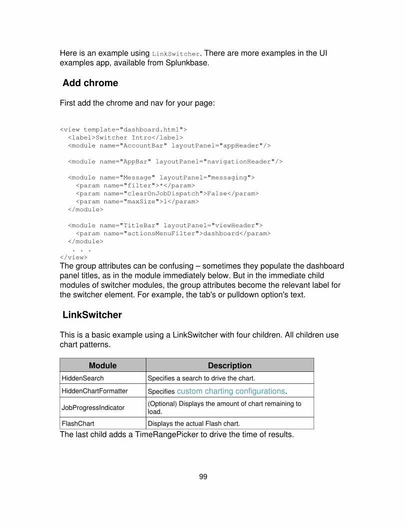
Here is an example using LinkSwitcher. There are more examples in the UIexamples app, available from Splunkbase.
Add chrome
First add the chrome and nav for your page:
<view template="dashboard.html"> <label>Switcher Intro</label> <module name="AccountBar" layoutPanel="appHeader"/>
<module name="AppBar" layoutPanel="navigationHeader"/>
<module name="Message" layoutPanel="messaging"> <param name="filter">*</param> <param name="clearOnJobDispatch">False</param> <param name="maxSize">1</param> </module>
<module name="TitleBar" layoutPanel="viewHeader"> <param name="actionsMenuFilter">dashboard</param> </module> . . .</view>
The group attributes can be confusing – sometimes they populate the dashboardpanel titles, as in the module immediately below. But in the immediate childmodules of switcher modules, the group attributes become the relevant label forthe switcher element. For example, the tab's or pulldown option's text.
LinkSwitcher
This is a basic example using a LinkSwitcher with four children. All children usechart patterns.
Module DescriptionHiddenSearch Specifies a search to drive the chart.
HiddenChartFormatter Specifies custom charting configurations.
JobProgressIndicator (Optional) Displays the amount of chart remaining toload.
FlashChart Displays the actual Flash chart.
The last child adds a TimeRangePicker to drive the time of results.
99
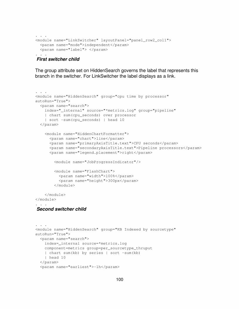
. . .<module name="LinkSwitcher" layoutPanel="panel_row2_col1"> <param name="mode">independent</param> <param name="label"> </param>. . .
First switcher child
The group attribute set on HiddenSearch governs the label that represents thisbranch in the switcher. For LinkSwitcher the label displays as a link.
. . .<module name="HiddenSearch" group="cpu time by processor"autoRun="True"> <param name="search"> index="_internal" source="*metrics.log" group="pipeline" | chart sum(cpu_seconds) over processor | sort -sum(cpu_seconds) | head 10 </param>
<module name="HiddenChartFormatter"> <param name="chart">line</param> <param name="primaryAxisTitle.text">CPU seconds</param> <param name="secondaryAxisTitle.text">Pipeline processors</param> <param name="legend.placement">right</param>
<module name="JobProgressIndicator"/>
<module name="FlashChart"> <param name="width">100%</param> <param name="height">300px</param> </module>
</module></module>. . .
Second switcher child
. . .<module name="HiddenSearch" group="KB Indexed by sourcetype"autoRun="True"> <param name="search"> index=_internal source=*metrics.log component=metrics group=per_sourcetype_thruput | chart sum(kb) by series | sort -sum(kb) | head 10 </param> <param name="earliest">-1h</param>
100
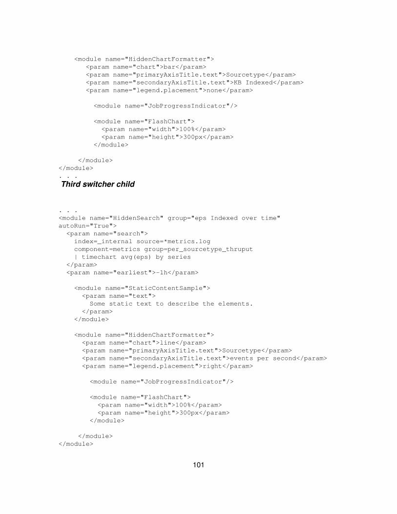
<module name="HiddenChartFormatter"> <param name="chart">bar</param> <param name="primaryAxisTitle.text">Sourcetype</param> <param name="secondaryAxisTitle.text">KB Indexed</param> <param name="legend.placement">none</param>
<module name="JobProgressIndicator"/>
<module name="FlashChart"> <param name="width">100%</param> <param name="height">300px</param> </module>
</module></module>. . .
Third switcher child
. . .<module name="HiddenSearch" group="eps Indexed over time"autoRun="True"> <param name="search"> index=_internal source=*metrics.log component=metrics group=per_sourcetype_thruput | timechart avg(eps) by series </param> <param name="earliest">-1h</param>
<module name="StaticContentSample"> <param name="text"> Some static text to describe the elements. </param> </module>
<module name="HiddenChartFormatter"> <param name="chart">line</param> <param name="primaryAxisTitle.text">Sourcetype</param> <param name="secondaryAxisTitle.text">events per second</param> <param name="legend.placement">right</param>
<module name="JobProgressIndicator"/>
<module name="FlashChart"> <param name="width">100%</param> <param name="height">300px</param> </module>
</module></module>
101

. . .
Fourth switcher child
This pattern uses HiddenSearch driven by a TimeRangePicker. Even thoughautoRun is set, (autoRun=true), the search does not run until given user input.
<module name="TimeRangePicker" group="Bucket Distribution"> <param name="searchWhenChanged">True</param> <param name="selected">All time</param>
<module name="HiddenSearch" autoRun="True"> <param name="search">| dbinspect bins=400</param>
<module name="HiddenChartFormatter"> <param name="chart">line</param> <param name="primaryAxisTitle.text">Time</param> <param name="chartTitle">Distribution of index buckets overtime</param>
<module name="JobProgressIndicator"/>
<module name="FlashChart"/>
</module> </module></module>
Lister modules
Use lister modules to add lists to your dashboards. There are two types of listers:
Entity listers Entity listers build lists from REST endpoints. Use entitylisters to create lists of users, saved searches or other objects withinSplunk.
•
Search listers Search listers build lists from searches run in the module.All search listers essentially work the same -- they only differ cosmetically.If prefer to have have radio buttons, use SearchRadioLister.
•
Add chrome and nav
First add the chrome and nav for your view:
<view template="dashboard.html">
102
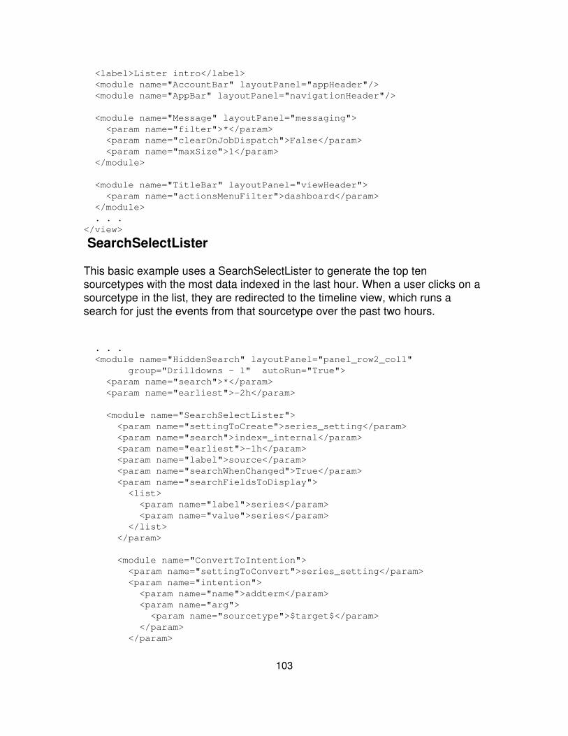
<label>Lister intro</label> <module name="AccountBar" layoutPanel="appHeader"/> <module name="AppBar" layoutPanel="navigationHeader"/>
<module name="Message" layoutPanel="messaging"> <param name="filter">*</param> <param name="clearOnJobDispatch">False</param> <param name="maxSize">1</param> </module>
<module name="TitleBar" layoutPanel="viewHeader"> <param name="actionsMenuFilter">dashboard</param> </module> . . .</view>
SearchSelectLister
This basic example uses a SearchSelectLister to generate the top tensourcetypes with the most data indexed in the last hour. When a user clicks on asourcetype in the list, they are redirected to the timeline view, which runs asearch for just the events from that sourcetype over the past two hours.
. . . <module name="HiddenSearch" layoutPanel="panel_row2_col1" group="Drilldowns - 1" autoRun="True"> <param name="search">*</param> <param name="earliest">-2h</param>
<module name="SearchSelectLister"> <param name="settingToCreate">series_setting</param> <param name="search">index=_internal</param> <param name="earliest">-1h</param> <param name="label">source</param> <param name="searchWhenChanged">True</param> <param name="searchFieldsToDisplay"> <list> <param name="label">series</param> <param name="value">series</param> </list> </param>
<module name="ConvertToIntention"> <param name="settingToConvert">series_setting</param> <param name="intention"> <param name="name">addterm</param> <param name="arg"> <param name="sourcetype">$target$</param> </param> </param>
103
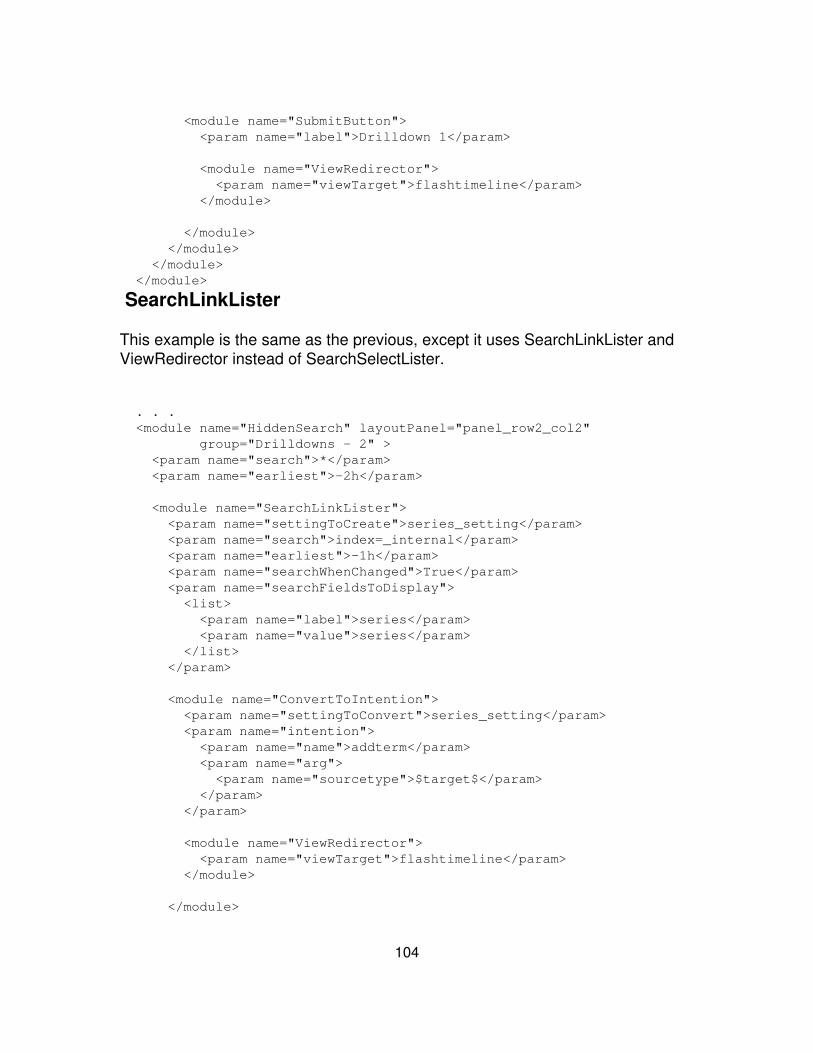
<module name="SubmitButton"> <param name="label">Drilldown 1</param>
<module name="ViewRedirector"> <param name="viewTarget">flashtimeline</param> </module>
</module> </module> </module> </module>
SearchLinkLister
This example is the same as the previous, except it uses SearchLinkLister andViewRedirector instead of SearchSelectLister.
. . . <module name="HiddenSearch" layoutPanel="panel_row2_col2" group="Drilldowns - 2" > <param name="search">*</param> <param name="earliest">-2h</param>
<module name="SearchLinkLister"> <param name="settingToCreate">series_setting</param> <param name="search">index=_internal</param> <param name="earliest">-1h</param> <param name="searchWhenChanged">True</param> <param name="searchFieldsToDisplay"> <list> <param name="label">series</param> <param name="value">series</param> </list> </param>
<module name="ConvertToIntention"> <param name="settingToConvert">series_setting</param> <param name="intention"> <param name="name">addterm</param> <param name="arg"> <param name="sourcetype">$target$</param> </param> </param>
<module name="ViewRedirector"> <param name="viewTarget">flashtimeline</param> </module>
</module>
104
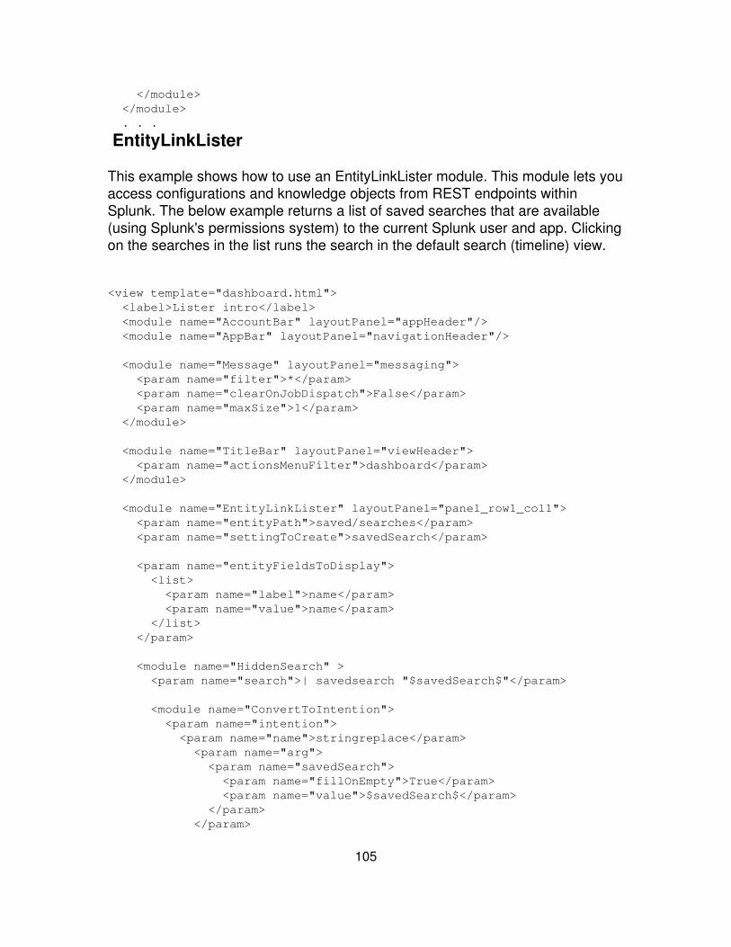
</module> </module> . . .
EntityLinkLister
This example shows how to use an EntityLinkLister module. This module lets youaccess configurations and knowledge objects from REST endpoints withinSplunk. The below example returns a list of saved searches that are available(using Splunk's permissions system) to the current Splunk user and app. Clickingon the searches in the list runs the search in the default search (timeline) view.
<view template="dashboard.html"> <label>Lister intro</label> <module name="AccountBar" layoutPanel="appHeader"/> <module name="AppBar" layoutPanel="navigationHeader"/>
<module name="Message" layoutPanel="messaging"> <param name="filter">*</param> <param name="clearOnJobDispatch">False</param> <param name="maxSize">1</param> </module>
<module name="TitleBar" layoutPanel="viewHeader"> <param name="actionsMenuFilter">dashboard</param> </module>
<module name="EntityLinkLister" layoutPanel="panel_row1_col1"> <param name="entityPath">saved/searches</param> <param name="settingToCreate">savedSearch</param>
<param name="entityFieldsToDisplay"> <list> <param name="label">name</param> <param name="value">name</param> </list> </param>
<module name="HiddenSearch" > <param name="search">| savedsearch "$savedSearch$"</param>
<module name="ConvertToIntention"> <param name="intention"> <param name="name">stringreplace</param> <param name="arg"> <param name="savedSearch"> <param name="fillOnEmpty">True</param> <param name="value">$savedSearch$</param> </param> </param>
105
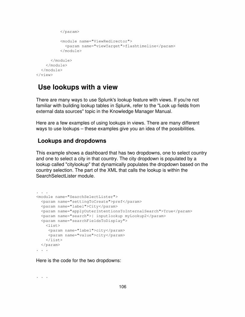
</param>
<module name="ViewRedirector"> <param name="viewTarget">flashtimeline</param> </module>
</module> </module> </module></view>
Use lookups with a view
There are many ways to use Splunk's lookup feature with views. If you're notfamiliar with building lookup tables in Splunk, refer to the "Look up fields fromexternal data sources" topic in the Knowledge Manager Manual.
Here are a few examples of using lookups in views. There are many differentways to use lookups – these examples give you an idea of the possibilities.
Lookups and dropdowns
This example shows a dashboard that has two dropdowns, one to select countryand one to select a city in that country. The city dropdown is populated by alookup called "citylookup" that dynamically populates the dropdown based on thecountry selection. The part of the XML that calls the lookup is within theSearchSelectLister module.
. . .<module name="SearchSelectLister"> <param name="settingToCreate">pref</param> <param name="label">City</param> <param name="applyOuterIntentionsToInternalSearch">True</param> <param name="search">| inputlookup myLookup2</param> <param name="searchFieldsToDisplay"> <list> <param name="label">city</param> <param name="value">city</param> </list> </param>. . .
Here is the code for the two dropdowns:
. . .
106
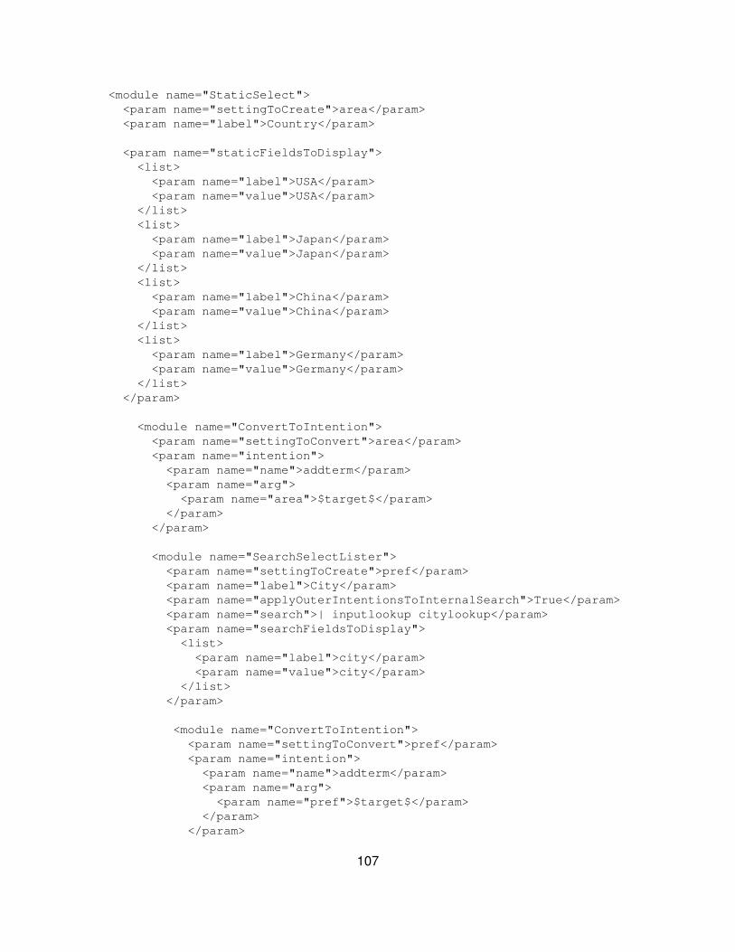
<module name="StaticSelect"> <param name="settingToCreate">area</param> <param name="label">Country</param>
<param name="staticFieldsToDisplay"> <list> <param name="label">USA</param> <param name="value">USA</param> </list> <list> <param name="label">Japan</param> <param name="value">Japan</param> </list> <list> <param name="label">China</param> <param name="value">China</param> </list> <list> <param name="label">Germany</param> <param name="value">Germany</param> </list> </param>
<module name="ConvertToIntention"> <param name="settingToConvert">area</param> <param name="intention"> <param name="name">addterm</param> <param name="arg"> <param name="area">$target$</param> </param> </param>
<module name="SearchSelectLister"> <param name="settingToCreate">pref</param> <param name="label">City</param> <param name="applyOuterIntentionsToInternalSearch">True</param> <param name="search">| inputlookup citylookup</param> <param name="searchFieldsToDisplay"> <list> <param name="label">city</param> <param name="value">city</param> </list> </param>
<module name="ConvertToIntention"> <param name="settingToConvert">pref</param> <param name="intention"> <param name="name">addterm</param> <param name="arg"> <param name="pref">$target$</param> </param> </param>
107

</module> . . . </module> </module></module>. . .
Use one search for a whole dashboard
Sometimes you end up with a dashboard running various searches that are verysimilar. You can save search resources by creating a dashboard in AdvancedXML that feeds all downstream panels with one single search. This topic showshow to use one base search for a dashboard, and use the HiddenPostProcessmodule to process the search differently for each panel.
The HiddenPostProcess module allows you to reformat reporting results from asearch. When you use post process, the base search must be a reportingsearch. Post process allows you to reformat reporting results from the search.This means you can create tables and charts according to specific criteria. Forexample, you can create various tables that are sorted on different columns, hidesome columns, or filter rows that match some criteria. You can also do furtheraggregation on the original report.
Note: Post process does not work for all modules. Currently it is supportedfor SingleValue, SimpleResultsTable, EventsViewer, and FlashChart. It isnot supported in MultiFieldViewer, ResultsHeader, SimpleResultsHeader,FlashTimeline and SuggestedFieldViewer.
Caution: Only use post process on a base search that is a reportingsearch. You can mangle your results if you do not construct your basesearch correctly. Some primary reporting commands are:
chart◊ top◊ rare◊ stats◊
"Use reporting commands" in the User manual provides additionalreporting commands with examples.
Construct your base search
When you build your base search, it is tempting to build a simple search that youpipe to the post process search in downstream panels. However, this does notwork. Downstream panels must know about the fields you want to do statistics on
108
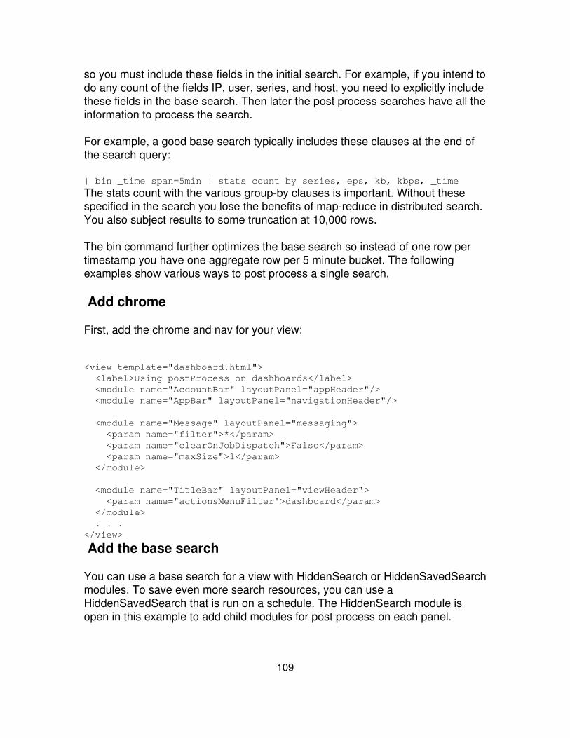
so you must include these fields in the initial search. For example, if you intend todo any count of the fields IP, user, series, and host, you need to explicitly includethese fields in the base search. Then later the post process searches have all theinformation to process the search.
For example, a good base search typically includes these clauses at the end ofthe search query:
| bin _time span=5min | stats count by series, eps, kb, kbps, _time
The stats count with the various group-by clauses is important. Without thesespecified in the search you lose the benefits of map-reduce in distributed search.You also subject results to some truncation at 10,000 rows.
The bin command further optimizes the base search so instead of one row pertimestamp you have one aggregate row per 5 minute bucket. The followingexamples show various ways to post process a single search.
Add chrome
First, add the chrome and nav for your view:
<view template="dashboard.html"> <label>Using postProcess on dashboards</label> <module name="AccountBar" layoutPanel="appHeader"/> <module name="AppBar" layoutPanel="navigationHeader"/>
<module name="Message" layoutPanel="messaging"> <param name="filter">*</param> <param name="clearOnJobDispatch">False</param> <param name="maxSize">1</param> </module>
<module name="TitleBar" layoutPanel="viewHeader"> <param name="actionsMenuFilter">dashboard</param> </module> . . .</view>
Add the base search
You can use a base search for a view with HiddenSearch or HiddenSavedSearchmodules. To save even more search resources, you can use aHiddenSavedSearch that is run on a schedule. The HiddenSearch module isopen in this example to add child modules for post process on each panel.
109
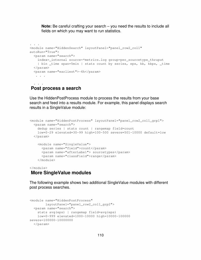
Note: Be careful crafting your search – you need the results to include allfields on which you may want to run statistics.
. . .<module name="HiddenSearch" layoutPanel="panel_row2_col1"autoRun="True"> <param name="search"> index=_internal source=*metrics.log group=per_sourcetype_thruput | bin _time span=5min | stats count by series, eps, kb, kbps, _time </param> <param name="earliest">-6h</param> . . .
. . .
Post process a search
Use the HiddenPostProcess module to process the results from your basesearch and feed into a results module. For example, this panel displays searchresults in a SingleValue module:
<module name="HiddenPostProcess" layoutPanel="panel_row2_col1_grp1"> <param name="search"> dedup series | stats count | rangemap field=count low=0-29 elevated=30-99 high=100-500 severe=501-10000 default=low </param>
<module name="SingleValue"> <param name="field">count</param> <param name="afterLabel"> sourcetypes</param> <param name="classField">range</param> </module>
</module>
More SingleValue modules
The following example shows two additional SingleValue modules with differentpost process searches.
<module name="HiddenPostProcess" layoutPanel="panel_row2_col1_grp2"> <param name="search"> stats avg(eps) | rangemap field=avg(eps) low=0-999 elevated=1000-10000 high=10000-100000severe=100000-10000000 </param>
110

<module name="SingleValue"> <param name="field">avg(eps)</param> <param name="afterLabel">avg eps</param> <param name="classField">range</param> <param name="format">decimal</param> </module>
</module>
<module name="HiddenPostProcess" layoutPanel="panel_row2_col1_grp3"> <param name="search"> stats sum(kb) | rename sum(kb) as K | eval MB=K/1024 | rangemap field=MB low=0-99.99 elevated=100-499.99 high=500-4999.99 severe=5000-100000 </param>
<module name="SingleValue"> <param name="field">MB</param> <param name="afterLabel">MB</param> <param name="classField">range</param> </module>
</module>
Display post process searches in a chart
The following post process searches display results in a chart, using theHiddenChartFormatter and FlashChart modules.
<module name="HiddenPostProcess" layoutPanel="panel_row3_col1"> <param name="search">timechart avg(eps)</param>
<module name="HiddenChartFormatter"> <param name="chart">line</param> <param name="primaryAxisTitle.text">time</param> <param name="secondaryAxisTitle.text">overall eps</param> <param name="legend.placement">none</param>
<module name="FlashChart"> <param name="width">100%</param> <param name="height">400px</param> </module>
</module>
</module>
111
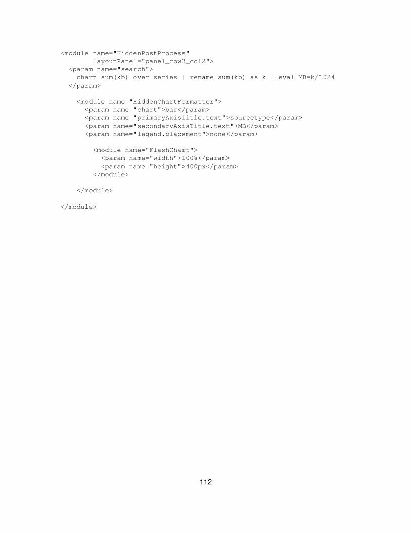
<module name="HiddenPostProcess" layoutPanel="panel_row3_col2"> <param name="search"> chart sum(kb) over series | rename sum(kb) as k | eval MB=k/1024 </param>
<module name="HiddenChartFormatter"> <param name="chart">bar</param> <param name="primaryAxisTitle.text">sourcetype</param> <param name="secondaryAxisTitle.text">MB</param> <param name="legend.placement">none</param>
<module name="FlashChart"> <param name="width">100%</param> <param name="height">400px</param> </module>
</module>
</module>
112
Customize Splunk Web
Customization options
Building dashboards, form searches, and other views in Splunk aren't the onlyways to customize Splunk Web. There are more options, including:
Customize the login screen Add a custom greeting to the login screen,letting users know important information about this Splunk instance.Requires minimal knowledge of HTML.
•
Embed Splunk dashboard elements in third party software Build areport or a dashboard and then IFrame it into a different Web application.Requires some knowledge of HTML and Splunk's view system, as well asa customized login or SSO.
•
Customize event display Change the way events display in Splunk, forexample build a Twitter-like interface to display events as they stream intoSplunk in real time. Requires some knowledge of HTML, Splunk's viewsystem, and possibly JavaScript.
•
Customize CSS Add custom CSS to a view or app. You can alsooverwrite the CSS for specific elements or modules in a view. Requiresknowledge of CSS. We also recommend you use Firebug, or some otherCSS inspector when working with CSS development.
•
Translate Splunk Add a set of localizations for a Splunk instance.Requires a PO editor, and it may be helpful to understand how to use aPO editor for translations.
•
Clear Splunk-related cache after customization
If you've made changes to an app's static content while customizing Splunk Web,you can reload that content for all the users of your app using this URI:
http://localhost:8000/_bump
The _bump endpoint clears out the Splunk-related cached items in clientbrowsers, allowing new static content to load.
113
Customize the login screen
As of Splunk 4.1, you can add a custom message to Splunk's login screen. Justadd an attribute to web.conf to set a custom message. You can use HTML toformat your message or add links. You must restart the splunkweb process afteryou make the change.
Customize the login screen
Beginning with Splunk 4.1, you can add a custom message to Splunk's loginscreen. Just add an attribute to web.conf to set a custom message. You can useHTML markup to format your message and add links. Restart the splunkwebprocess after editing web.conf to make your message visible.
Note: Make sure your message appears in a single line in web.conf, asshown in the example below.
Example
Add the following key to the [settings] stanza in web.conf located at:$SPLUNK_HOME/etc/system/local/web.conf
[settings]login_content = This is a <b>production server</b>.<br />For expensivesearches try: <a href="http://server2:8080">server2</a>
Embed Splunk dashboard elements in third partysoftware
Using HTML IFrames, you can embed Splunk views containing graphs andcharts in another web application.
Starting with version 4.1, Splunk supports single sign-on (SSO). Using a URI of aview configured for SSO, you can embed Splunk views in HTML documents bypassing the URI as the src attribute to the <iframe> tag of a third partydocument.
<iframe src ="http://myhostthroughproxy:8000/en-US/app/foo/myview"width="100%" height="300">
114
This topic illustrates the basic steps for embedding a Splunk view in a third partyHTML document. The example uses insecure login to simplify the explanation.For security reasons, you should implement this feature using SSO.
1. Enable insecure login
Caution: The example below uses insecure login. Anyone with access tothe page can get the user credentials by viewing the link url.
To enable access to the view you want to embed, configure web.conf forinseceure longin. Add the following stanza to a local version of web.conf:
[settings]enable_insecure_login = true...
Restart Splunk to enable the configuration setting.
If you're unfamiliar with how Splunk configuration files work, read the Adminmanual topic "About configuration files."
2. Create the view in Splunk
Create the view you want to embed. The view should contain only the modulesyou want to display in your portal. Strip out any of the Splunk chrome.
Note: Splunk only supports Advanced XML for embedding views in thirdparty HTML pages. You cannot use Simplified XML.
Save the view here:
$SPLUNK_HOME/etc/apps/<app_name>/local/data/ui/views/<view_name>.xml
Example view
Here's an example view with the Splunk chrome stripped out. It shows only achart driven by a hidden search.
<view template="dashboard.html"> <module name="HiddenSearch" autoRun="True"layoutPanel="panel_row1_col1"> <param name="search">sourcetype=access_common | timechart span=5mcount</param> <param name="earliest">-24h</param>
115
<module name="HiddenChartFormatter"> <param name="chart">line</param> <param name="primaryAxisTitle.text">Time</param> <param name="legend.placement">bottom</param> <param name="chartTitle">Stuff past 24 hours</param>
<module name="JobProgressIndicator"/> <module name="FlashChart"/>
</module> </module></view>
After editing the view, refresh it by loading this URI:
https://localhost:8089/servicesNS/<user_name>/<app_name>/data/ui/views?refresh=1
3. Create an IFrame in an HTML document
Embed the view in an IFrame of the HTML document using the insecureloginendpoint as the src attribute to the <iframe> tag. The endpoint containsparameters for username, password, return_to. Replace username and passwordwith the appropriate login values. URI escape the value of the return_toparameter. Here's a link to a third party URI encoder.
http://splunkserver:8000/account/insecurelogin?username=admin&password=changeme&return_to=/app/foo/myview
Example HTML
Here's an example of adding an IFrame into an HTML document:
<!DOCTYPE HTML PUBLIC "-//W3C//DTD HTML 4.01 Transitional//EN" "http://www.w3.org/TR/html4/loose.dtd"><html><head><title>Splunk Stuff</title></head><body>
<h1>Hey Look At My Pretty Pictures!</h1>
<iframe src="http://myhost:8000/account/insecurelogin?username=test_user&password=changeme&return_to=%2Fapp%2Fmy_test_app%2Fmy_view" width="100%" height="300"> <p>Your browser does not support IFrames.</p></iframe>
116
</body></html>
Customize event display
There are several ways you can customize how events appear and behave in aview:
Change formatting and add icons or decorations to the text• Use JavaScript to change behavior of displayed events• Use CSS to change the presentation• Use HTML to change the structure•
For example, use custom event renderers to flag all compliance events as NOTOK and display a red exclamation point next to them.
If you're not familiar with event types, you can read about them in the Event typesand transactionsl chapter of the Splunk Knowledge Manager manual.
Configuration
This section shows you several ways to customize the appearance of events.
1. Create an event type that includes the data to which you want to apply acustom renderer. For information on building event types, see "defining eventtypes" in the Knowledge Manager Manual.
Place the event type in the app directory in which you areworking:$SPLUNK_HOME/etc/apps/<app_name>/local/eventtypes.conf 2. Add amapping to event_renderers.conf, located here:$SPLUNK_HOME/etc/apps/<app_name>/local/event_renderers.conf
3. Add custom CSS, HTML or JavaScript to your app to determine thepresentation, structure or behavior of events.
Place CSS and JavaScript here:
$SPLUNK_HOME/etc/apps/<app_name>/appserver/static
Place HTML here:
$SPLUNK_HOME/etc/apps/<app_name>/appserver/event_renderers/
117
event_renderers.conf
Add an event_renderers.conf file to the following location to link your HTMLtemplate to the event type you want to style:
$SPLUNK_HOME/etc/apps/<app_name>/local/event_renderers.conf
Here's an example event_renderers.conf file that creates three different eventrenderers.
[event_renderer_1]eventtype = hawaiian_typepriority = 1css_class = EventRenderer1
[event_renderer_2]eventtype = french_food_typepriority = 1template = event_renderer2.htmlcss_class = EventRenderer2
[event_renderer_3]eventtype = japan_typepriority = 1css_class = EventRenderer3
To write your own event renderers, add stanzas to event_renderers.conf:
Name Description[<stanza_name>] Unique name for the stanza, which can be anything you want.
eventtype =eventtype Specify the event type name from eventtypes.conf.
template =valid html
Write the template and place it into the app's event_renderers directory:
($SPLUNK_HOME/etc/apps/<app_name>/appserver/event_renderers).
priority =positiveinteger
Set the priority for this event renderer to show on this event type.
An event can have multiple event types, use the priority key tocontrol load ordering. Highest number takes precedence. Thedefault renderer has a priority of 100.
css_class = CSSclass name
CSS class name suffix to apply to the parent event element class attribute. Thiscan be any valid css class value.
118
The value is appended to a standard suffix string of splEvent-. Acss_class value of foo results in the parent element of the eventhaving an html attribute class with a value of splEvent-foo(class="splEvent-foo").
You can externalize css style rules for this in:
$SPLUNK_HOME/<app_name>/appserver/static/application.css.
For example, to make the text red add the following to your app'sapplication.css:
.splEvent-foo { color:red; }
Add custom HTML
Add custom HTML to set up a new event renderer -- specifically, to change theorder and structure of events displayed in a view. Add your HTML file to thefollowing directory:
$SPLUNK_HOME/etc/apps/<app_name>/appserver/event_renderers.
Make sure you reference your HTML file by name in event_renderers.conf, withthe template attribute.
The custom HTML you build inherits from the default template. The defaulttemplate for displaying search results is located here:
$SPLUNK_HOME/share/splunk/search_mrsparkle/modules/results/EventsViewer_default_renderer.html.
To inherit the default file, add this to your HTML:
<%inherit file="//results/EventsViewer_default_renderer.html" />
Customize the display structure of events by overriding the settings from thedefault renderer and creating a custom layout. For example:
## override<%def name="event_raw(job, event, request, options, xslt)"> <ahref="http://www.yelp.com/search?find_desc=french&find_loc=San+Francisco%2C+CA&ns=1&rpp=10"target="_blank">French restaurants in San Francisco</a> <img src="${make_url('/static/app/stubby/event_renderer2.jpg')}" /></%def>
119

## remove<%def name="event_fields(job, event, request, options)">
</%def>
## parent<%def name="event_time(job, event, request, options)"> ${parent.event_time(job, event, request, options)}</%def>
Here is the stanza in event_renderers.conf for this event renderer:
[event_renderer_2]eventtype = french_food_typepriority = 1template = event_renderer2.htmlcss_class = EventRenderer2
Add a custom CSS file
Create an application.css file for an app at the following location:
$SPLUNK_HOME/etc/apps/<app_name>/appserver/static
The rules in this CSS file apply only to the app in which the CSS file is located.For more information about adding CSS to Splunk apps in general, see theCreate custom CSS topic in this section.
Here's an example application.css file that inserts a background picture andchanges the size of the events:
.splEvent-EventRenderer1 { background:url(event_renderer1.jpg) 100px 0px no-repeat; height:60px;}.splEvent-EventRenderer1 .event, .splEvent-EventRenderer1 .fields { display:none;}
Here is the stanza in event_renderers.conf for the CSS class defined inapplication.css:
[event_renderer_1]eventtype = hawaiian_typepriority = 1css_class = EventRenderer1
120

Add custom JavaScript
Add JavaScript to a view to specify custom actions additional functionality onspecific events.
To add JavaScript, create an application.js file in the following location:
$SPLUNK_HOME/etc/apps/<app_name>/appserver/static
This file contains custom JavaScript to apply to an app. Bind the JavaScript tothe CSS class in the event_renderers.conf file:
$(document).bind("splEvent-<css_class_name>", <js function name>);
The following JavaScript code creates a link to search Google in Japanese fromevents in Splunk.
function eventRenderer3Handler(event, options){ var type = options.nativeEvent.type; var target = options.nativeEvent.target;
//cancel all mouse hover behavior if(type=="click"){ var q = encodeURIComponent($(options.nativeEvent.target).html()) window.location.href = "http://www.google.co.jp/search?hl=ja&source=hp&q="+q+"&btnG=Google+%E6%A4%9C%E7%B4%A2&lr=&aq="+q+"&oq=;" options.nativeEvent.preventDefault(); }}$(document).bind("splEvent-EventRenderer3", eventRenderer3Handler);
Here is the stanza in event_renderers.conf for the custom JavaScript eventbehavior:
[event_renderer_3]eventtype = japan_typepriority = 1css_class = EventRenderer3
Add Web resources to your view
You can use Splunk's Web resource modules to add IFrames or HTML to a view.
121

Add HTML
Use the ServerSideInclude module to add HTML to a view.
1. Create an HTML file, for example foo.html here:
$SPLUNK_HOME/etc/apps/<appname>/appserver/static
2. Add the Web content into the file.
3. Update the Advanced XML for the view to include the ServerSideIncludemodule:
<view> <module name="ServerSideInclude"> <param name="src">foo.html</param> </module></view>
Note: The Advanced XML implementing the view should be located here:
$SPLUNK_HOME/etc/apps/<appname>/default/data/ui/views/<view_name>.xml
4. Access the view in a browser
http://<hostname>:<port>/app/<appname>/<view_name>
Add images
To add an image use the Mako template utility function make_url in the HTML:
<img src="${make_url('/static/app/<app_name>/<image>.png')}" />
Add links
You can create dynamic and static links from the HTML template included usingthe ServerSideInclude.
Dynamic: <a href=?${make_url(?/manager/foo/bar?)}?>click me</a>•
Static: <a href=?/manager/foo/bar?>click me</a>•
122
The dynamic version uses the make_url method, which properly qualifies theURL to the current locale and inserts relevant modifiers for static content orproxied instances. You can also use make_urlto insert runtime information (suchas the app name).
In the following example, you pass a list as the first argument, not a plain string.
<a href=?${make_url([?manager?, APP[?id?], ?foo?, ?bar?])}?>clickme</a>
Here are some common variables available from the HTML template system:
current namespace: APP[?id?]•
current app friendly label: APP[?label?]•
current view id (what appears in the URI): VIEW[?id?]•
current view label: VIEW[?label?]•
These variables are available if you link to a view with an s= saved search name:
current saved search name: SAVED['name']•
current viewstate ID associated with saved search: SAVED['vsid']•
Style your HTML document
Use CSS to style your HTML document. Once you've created an HTMLdocument, you can create a corresponding CSS file to specify its style.
Splunk's CSS implementation is not scoped. If you add CSS to a page, makesure you scope the class names. Splunk does not recommend applying styles toglobal selectors. Instead, use class selectors to control scope and possiblecollisions.
Global selectors: body {background:pink;}•
Class selectors (recommended): .myclass {background:pink;}•
Here are some steps you can follow to learn more about CSS and apply them to
123

an HTML document in Splunk.
1. Familiarize yourself with CSS.
If you're not familiar with CSS, check out this CSS resource. Specifically,familiarize yourself with how a CSS class selector works. In an HTML document,a class selector is the XHTML element to which you apply CSS styles.
For example:
<div class="bar"> w00t!</div>
Define a class selector in CSS using the "." sign followed by the value of theclass attribute (no space between the "." and the name of the class). Forexample:
.bar { background:pink;}
You can use the same class name within an XHTML document multiple times.
2. Create a CSS file, for example foo.css, at the following location:
$SPLUNK_HOME/etc/apps/<appname>/appserver/static
3. Add a rule to the CSS file:
.bar { background:pink;}
Any element with a matching class attribute of bar now has a pink background.
<div class="bar"> <h1>I have a pink background now!</h1></div>
Add an IFrame
Use the IFrameInclude module to add an IFrame into a view.
1. Determine the URI you want to load into an IFrame.
124
2. Update the view XML to include the IFrameInclude module, with a link to theURI:
<view> <module name="IFrameInclude"> <param name="src">myawesomewebsite.com</param> </module></view>
3. (Optional) set the height.
This example sets the height to 42 pixels.
<view> <module name="IFrameInclude"> <param name="src">myawesomewebsite.com</param> <param name="height">42/param> </module></view>
4. (Optional) Add a parameter to IFrameInclude that tests if the URI exists:
<view> <module name="IFrameInclude"> <param name="src">myawesomewebsite.com</param> <param name="check_exists">True</param> </module></view>
Customize CSS
You can make any number of changes to Splunk Web's appearance bycustomizing the CSS. You can change display options such as backgroundcolors, buttons, navigation, menus, and so on. To change the layout of a page,build a view. Start with the simple dashboard described in the Build dashboardssection of this manual. To change which elements are displayed in a page, adddifferent modules to your view.
Splunk's default CSS is defined in default.css, which is located here:
$SPLUNK_HOME/share/splunk/search_mrsparkle/exposed/css/skins/default/
You can make changes to the CSS for your entire app, for a specific view, or forany HTML you have added to your view. If you want to update a given style orclass for your app, look for it in default.css. This file is thoroughly commented
125
and organized to serve as a reference for Splunk Web's default classes.
You can also use a web inspection tool to find the class you want to change.Splunk recommends using Firebug in Firefox. Firebug lets you inspect theelements of a page and pinpoint the classes whose style you want to change.Using Firebug, you can also try out different CSS settings before making anychanges.
Configure CSS for an app
Each app's directory can contain an application.css file that defines the CSSfor the entire app. The application.css file has a higher priority than any ofSplunk's other CSS files – anything defined in application.css overwrites thedefault settings. Each module has its own CSS file that defines its layout andother properties. Within application.css you can overwrite CSS specificationsfor several modules simultaneously.
1. Create application.css in the following location:
$SPLUNK_HOME/etc/apps/<appname>/appserver/static/
2. Look for the style to override in default.css or by using a web inspection tool(such as Firebug).
3. Add an entry to your application.css indicating the class you want to changeand the style you want to set.
4. Save your file. Restart Splunk Web, then refresh the browser page in whichyou are you viewing your app. The CSS changes are picked up on refresh.
Note: For subsequent changes to application.css, you do not have to restartSplunk Web. You can just refresh the browser page in which you are viewingyour app.
Configure CSS for a view
You can include any CSS file in a view by referencing the CSS file in the <view>tag at the beginning of the view's XML. Place the CSS file in the app's staticdirectory:
$SPLUNK_HOME/etc/apps/<appname>/appserver/static/
126
For example, add the following to a dashboard's view XML file to import themystyles.css style sheet:
<view template="dashboard.html" stylesheet="mystyles.css">
Or you can add the view name before any class you want to style in the CSS file.
If you've added a web resource, import the CSS file into your HTML.
Add images
To add images, place them in the ../appserver/static/ directory alongside theapplication.css file. You can reference them directly in the CSS file.
The following example adds a new header, myHeader.png, and a new logo,myLogo.png. These files are in the folloing location:
$SPLUNK_HOME/etc/apps/<app_name>/appserver/static
If you want to reference an image file in a different directory, the path is relativeto the ../appserver/static directory.
.appHeaderWrapper { background: url(myHeader.png) repeat-x;}
.appLogo { background: url(myLogo.png) no-repeat 0 0;}
Example
The samples app provided with your Splunk installation overwrites the built-inCSS with the following styles from its application.css:
/* * Top app banner section */.AccountBar { background-image: url(/static/app/samples/samples_header.png); background-repeat: no-repeat; background-color: #79a60b; height: 140px;
127
}
.AccountBar .appLogo,
.AccountBar p.appName { display: none;}
.AccountBar .accountBarItems { background-color: #000; opacity: .5; filter: alpha(opacity=50);}
/* * view menu system */.AppBar { font-family: Arial Black, Arial, sans-serif; font-size: 18px; font-variant: small-caps;}
.AppBar a { color: #f3df00 !important;}
.AppBar a:hover { color: #6ad7ff !important;}
/* * Body content */body { background-image: url(/static/app/samples/body_bg.png); background-repeat: repeat-x repeat-y;}
Translate Splunk
Splunk supports the internationalization and localization of strings within theproduct. Use Splunk's localization tools to:
Translate text generated by Python code, JavaScript code, views, menusand Mako templates.
•
Set language/locale specific alternatives for static resources such asimages, CSS, other media.
•
Create new languages or locales.• Format times, dates and other numerical strings.•
128
When you log in to Splunk, Splunk uses the language that your browser is set to.If you'd want to switch languages, change your browser settings.
Splunk detects locale strings. A locale string contains two components: alanguage specifier and a localization specifier. This is usually presented as twolowercase letters and two uppercase letters linked by an underscore. Forexample, en_US means US English while en_GB means British English.
When looking for a suitable translation, Splunk first tries to find an exact matchfor the whole locale, but falls back to just the language specifier if the entiresetting is not available. For example, translations for fr answer to requests forfr_CA and fr_FR (French, Canada and France respectively). The user's localealso affects the formatting of dates, times, numbers, and other localized settings.Different countries have differing standards on how to format these entities.
Configuration
Splunk uses the gettext internationalization and localization system. When usinggettext, you typically use an editor to create, generate, and edit the files used tolocalize strings in an application. Splunk recommends Poedit, a free, opensource editor for localization.
To translate Splunk, follow these directions:
1. Create a directory for the locale. For example, to create the fictional locale mz,create the following directory:
$SPLUNK_HOME/lib/python2.6/site-packages/splunk/appserver/mrsparkle/locale/mz_MZ/LC_MESSAGES/
2. Load the following messages.pot file into your PO editor.
$SPLUNK_HOME/lib/python2.6/site-packages/splunk/appserver/mrsparkle/locale/messages.pot
3. Use the PO editor to translate any strings you want to localize. Save the file asmessages.po in the directory you created in step 2. The PO editor also saves amessages.mo file, which is the machine readable version of the PO file.
4. Restart Splunk. There are no other configuration files to edit. Splunk detectsthe new language files when it restarts.
129
Localization files
Splunk stores localization information at the following location:
$SPLUNK_HOME/lib/python<version>/site-packages/splunk/appserver/mrsparkle/locale/...
messages.pot: Holds the strings to translate. Use a PO editor to edit thesefiles.
•
<locale_string>: The directory containing localization files for the localespecified by <locale_string> (for example, ja_JP).
•
<locale_string>/LC_MESSAGES/messages.po: Contains the source stringsspecified for localization in messages.pot. Using a PO editor, provide thetranslations for these strings.
•
<locale_string>/LC_MESSAGES/messages.mo: A machine readable versionof messages.po that Splunk uses to find translated strings. The PO editorcreates this for you when it creates the messages.po file.
•
Localize dates and numbers
You can format numbers and dates to the standards of a locale without having totranslate any text. For this scenario, copy the contents of the en_US directory tothe target locale directory.
For example, to enable localization of numbers and dates for the it_IT locale(Italian – Italy), copy the contents of the following directory:
$SPLUNK_HOME/lib/python2.7/site-packages/splunk/appserver/mrsparkle/locale/en_US
and place them here:
$SPLUNK_HOME/lib/python2.7/site-packages/splunk/appserver/mrsparkle/locale/it_IT
Translate Apps
You can also use gettext to translate apps. However, most apps must betranslated in their own locale subdirectory. Apps that ship with Splunk areautomatically extracted and their text included in Splunk's core messages.pot file.There's no need to handle them separately.
130
To extract the strings from an installed application, ready to be translated in a POeditor, run the following command from Splunk's command line:
splunk extract i18n -app <appname>
This creates a locale/ subdirectory in the app's root directory and populates itwith a messages.pot file. Then, follow the steps above to translate the stringswithin the app. When using views from a different app, the new messages.pot filecontains the strings for these views.
Locale-specific resources
Splunk stores static resources such as images, CSS files, and other media assubdirectories at the following location:
$SPLUNK_HOME/share/splunk/search_mrsparkle/exposed/
When serving these resources, Splunk checks to see whether a locale-specificversion of the resource is available before falling back to the default resource.For example, if your locale is set to fr_FR, Splunk searches for the logo imagefile in the following order:
exposed/img/skins/default/logo-mrsparkle-fr_FR.gif• exposed/img/skins/default/logo-mrsparkle-fr.gif• exposed/img/skins/default/logo-mrsparkle.gif•
Splunk follows the same path to load HTML templates (including any views) thatdefine each page in the UI. This can be useful for languages that require amodified layout that CSS alone can't accommodate (right to left text for example).
Plot search results on a map
Use these instructions to add a map to your view. You must first download andinstall the Ammap app from Splunkbase to get this working.
These are the basic steps for building a map view:
1. Install the Ammap app: this contains all the supporting libraries you'll need tobuild your own map.
2. Make a search with the fields required to build the map.
3. Invoke the mapit script.
131

4. Put your map into Splunk Web by building a view.
Install the Ammap app
The app can be found on Splunkbase here. Install the app the same way youinstall any other app -- either download it through Launcher, or unzip it into$SPLUNK_HOME/etc/apps/. Also, you will need to install the supporting MAXMINDapp.
Make a search
Once you've installed the app, you'll notice an empty map on the default landingpage of this app. That map is set to be populated by your data on an hourlybasis, mapping the top 100 public IP addresses in your instance that arerecorded in the last hour. If you are running Splunk Free you will need tomanually populate this map. To make sure everything is working correctly, runthe following search:
* | rex "(?<ip>\d+\.\d+\.\d+\.\d+)"| search ip!=192.168* ip!=0.0.*ip!=10.* | stats count by ip | head 100 | eval count_label="Event" |eval iterator="ip" | eval iterator_label="IP" | evalmovie_color="#FF0000" | eval output_file="home_threat_data.xml" | eval
app="amMap" | lookup geoip clientip as ip | mapit
If you get back a result count from the above search you should see a populatedmap. If you do not see anything remove the | mapit part of the search and run itagain to make sure you are getting back a results table with populated geo info. Ifa table is returning but the geo fields are empty you have most likely do not haveany public IPs addresses in your data for the ip2geo translation to operate on.
Build your own search
Now, you can build your own search and save it to run on a schedule, or whenyou load the view.
First, make sure you have a field called IP. You can either do this by creating afield extraction to save your field, or use the rex expression to extract the field onthe fly. It's best practice to create an IP field, either client_ip, src_ip, dest_ip orsome other field containing only IP address data. This example searches apachedata then applies a filter to remove any internal IP addresses from the search:
sourcetype=apache ip!=192.168* ip!=0.0.* ip!=10.*
This part of the search represents the results you are interested in. You maywant to add additional values to have results that represent a particular threat,
132

web traffic or any other data you would like to see represented geographically onthe flash map.
Next, create a stats table for that IP field. For example:
| stats count by ip
The next step is to create the required fields necessary for the map_results.pyscript to run. For example:
| eval count_label="Event" | eval iterator="ip" | eval iterator_label="IP" | evalmovie_color="#FF0000" | eval output_file="home_threat_data.xml" | evalapp="amMap"
These eval statements create the REQUIRED fields for the map to work:
count_label: what to display upon mouseover (i.e. Security Events,BotNet events, etc.). In the example above, this is set to "Event."
•
iterator: what the script should iterate on. In the example above, this is setto "ip," meaning the script will count all the unique IP addresses for eachlocation.
•
iterator_label: give a pretty print name to the iterator. In the exampleabove, this is "IP." This label appears in the mouseover for a location asUnique IP(s).
•
movie_color: this is the color of the marker on the map. The exampleabove uses eval and sets the marker to one static color. If you'd like to seta dynamic range of colors, use the rangemap command.
•
app: specify an app to write the map data to.• output_file: name the XML file where the map data will be written to. Theoutput file will go into the$SPLUNK_HOME/etc/apps/<app_name>/appserver/static/xml_out.
•
Invoke the script
Now that you have the search down there are a couple of ways to get the mapoutput.
Set up an alert action
If you have a Splunk Enterprise License you can schedule a search and use thealert action map_results.sh. You will need to copy the sh file from thebin/alert_scripts directory of this app into $SPLUNK_HOME/bin/scripts/
133
Use a search command
Another option to map things on the fly is to use the mapit search command thatships with the Ammap app. The command is exported globally and can be calledfrom any app. Construct a search as described above, and then pipe it to mapitto generate a map on the fly. You can also schedule this search.
Add your map to Splunk Web
You must first copy over various assets from the Ammap app into your appdirectory.
Copy:
$SPLUNK_HOME/etc/apps/amMap/appserver/static/ammap/
to
$SPLUNK_HOME/etc/apps/<your_app>/appserver/static/ammap/
Create an empty xml_out directory within the static/ directory to store theresults of your search.
Copy:
$SPLUNK_HOME/etc/apps/amMap/appserver/static/ammap.html
to
$SPLUNK_HOME/etc/apps/<your_app>/appserver/static/ammap.html
Next, edit the HTML. You only need to specify what app you want to generateyour map in by setting the correct app in the appropriate HTML file. If you'remaking a threat map, use threat_map.html, if you're creating a traffic map, usetraffic_map.html. Set any instance of /static/app/ammap/ to the path of the appyou're working in. For example, change /static/app/ammap/ammap/ to your app'spath. The code you're interested in is below:
var so = new SWFObject("/static/app/ammap/ammap/ammap.swf", "ammap","100%", "350", "8", "#FFFFFF"); so.addVariable("path", "/static/app/ammap/ammap/"); so.addVariable("data_file",escape("/static/app/ammap/xml_out/home_threat_data.xml")); so.addVariable("path", "/static/app/ammap/ammap/");
134
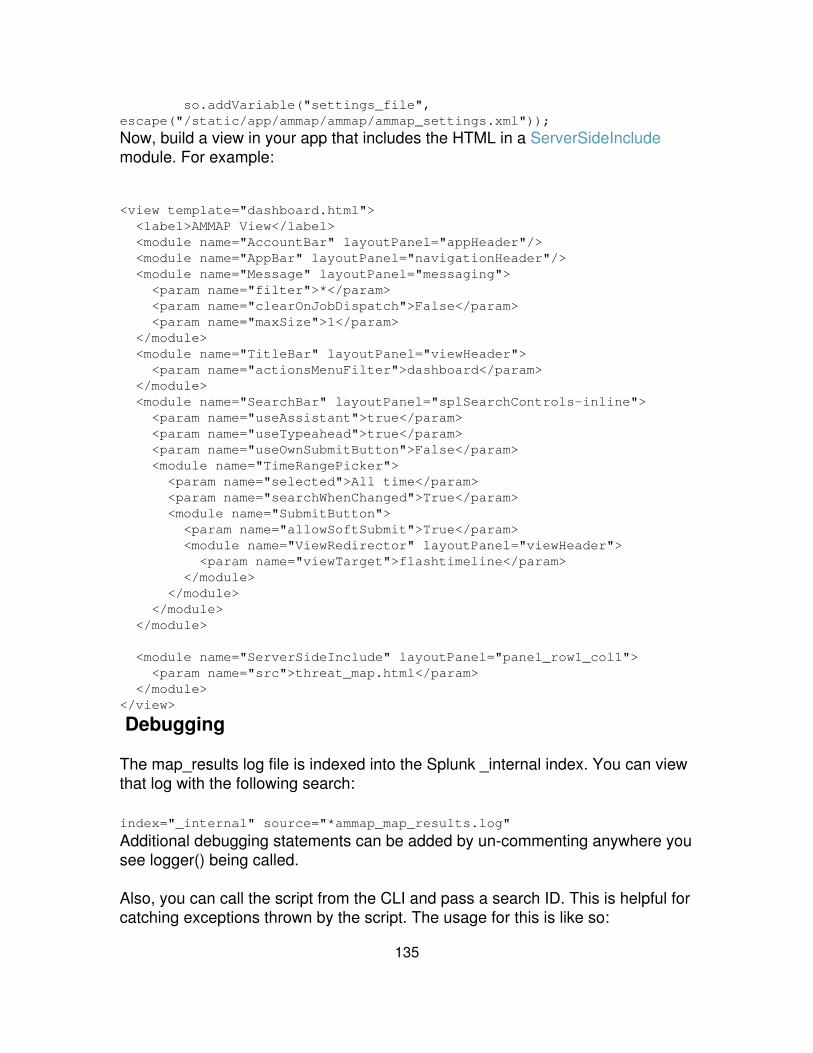
so.addVariable("settings_file",escape("/static/app/ammap/ammap/ammap_settings.xml"));
Now, build a view in your app that includes the HTML in a ServerSideIncludemodule. For example:
<view template="dashboard.html"> <label>AMMAP View</label> <module name="AccountBar" layoutPanel="appHeader"/> <module name="AppBar" layoutPanel="navigationHeader"/> <module name="Message" layoutPanel="messaging"> <param name="filter">*</param> <param name="clearOnJobDispatch">False</param> <param name="maxSize">1</param> </module> <module name="TitleBar" layoutPanel="viewHeader"> <param name="actionsMenuFilter">dashboard</param> </module> <module name="SearchBar" layoutPanel="splSearchControls-inline"> <param name="useAssistant">true</param> <param name="useTypeahead">true</param> <param name="useOwnSubmitButton">False</param> <module name="TimeRangePicker"> <param name="selected">All time</param> <param name="searchWhenChanged">True</param> <module name="SubmitButton"> <param name="allowSoftSubmit">True</param> <module name="ViewRedirector" layoutPanel="viewHeader"> <param name="viewTarget">flashtimeline</param> </module> </module> </module> </module>
<module name="ServerSideInclude" layoutPanel="panel_row1_col1"> <param name="src">threat_map.html</param> </module></view>
Debugging
The map_results log file is indexed into the Splunk _internal index. You can viewthat log with the following search:
index="_internal" source="*ammap_map_results.log"
Additional debugging statements can be added by un-commenting anywhere yousee logger() being called.
Also, you can call the script from the CLI and pass a search ID. This is helpful forcatching exceptions thrown by the script. The usage for this is like so:
135

$SPLUNK_HOME/bin/splunk cmd python$SPLUNK_HOME/etc/apps/amMap/bin/map_results.py <sid>
136
Build apps
Apps and add-ons: an introduction
Apps and add-ons extend Splunk with pre-built knowledge and new capabilities.Apps contain a user interface that you often customize according to thecapabilities of the app and the needs of your users. Add-ons are smaller,reusable components much like an app, but do not contain a navigable UI.
Any member of the Splunk community can build an app or add-on and share itwith other Splunk users, usually by uploading it to Splunkbase.
Before you build an app or add-on, it's a good idea to familiarize yourself with theSplunk app mental model. Splunk apps and add-ons are made of objects andconfigurations. Read on for a description of these data types, as well asinformation about app structure and Splunk's permissions system.
Why apps and add-ons?
Apps and add-ons let you construct and maintain different environments on topof one Splunk instance. One Splunk installation can run multiple apps. This way,any number of different groups can use the same Splunk instance withoutrunning into each other.
For example, you can make an app for all your helpdesk employees and adifferent app for your marketing department. When a user in the helpdesk rolelogs into Splunk, they see a customized environment that helps track supportcases. When a user from the marketing group logs in, they see the businessanalytics app, where they can run reports on business trends and web activity.Meanwhile, the Splunk admin can maintain all the installed apps, as well as buildand install apps.
You can build apps, to create separate contexts for different groups of Splunkusers within an organization: one app for troubleshooting email servers, one appfor analyzing business trends, and so on. This way, everyone uses the sameSplunk instance, but sees only data that is relevant to their interests. Somegroups can access multiple apps while others may see only one. apps are highlycustomizable, so you get to decide who sees what and how it works.
137
What is an app?
At a high level, you can think of an app as a workspace that solves a specific usecase. An app can extend Splunk with new navigable views that report onparticular kinds of data, can provide tools for specific use cases and technology,and are often developed for a specialized user role. For example, a helpdesk appcan contain customized views and dashboards to track and diagnose supportcases. Apps can range in complexity from new views or dashboards to anentirely new program using Splunk's REST API.
A single Splunk installation typically contains several apps, such as the Searchapp provided with Splunk, an OS app (such as *nix) downloaded fromSplunkbase, and custom apps that you build.
Apps:
Contain at least one navigable view.• Can be opened from the Splunk Home Page, from the Splunk App menu,or from the Apps section of the Splunk Manager.
•
Focus on aspects of your data.• Are built around use cases.• Support diverse user groups and roles.• Run in tandem.• Contain any number of Splunk configurations and knowledge objects.• Are completely customizable, from front to back end.• Can include Web assets, such as HTML, CSS and JavaScript.•
What is an add-on?
An add-on is a reusable Splunk component much like an app, but does notcontain a navigable view. You cannot open an add-on from the Splunk HomePage or the Splunk App menu.
Add-ons can include any combination of custom configurations, scripts, datainputs, custom reports or views, and themes that can change the look and feel ofSplunk. A single add-on can be used in multiple apps, suites, or solutions.
What's in an app?
Apps are made up of knowledge objects and configuration, anything from customUI to custom input scripts.
138
Customizable UI
Use Splunk's app framework to make custom UIs for different users and usecases. Splunk's UI (Splunk Web) is completely customizable, so you can makesmall changes to a single page in Splunk Web or completely redesign Splunk'sUI.
Change Splunk's appearance
Change everything from the menu layout to background images, build your owncustom HTML and JavaScript into your app. Learn more about what you can dowith customization options.
Build your own pages in Splunk
There are several option for building your own custom pages in Splunk:
Build a dashboard Dashboards are useful for presenting visualsummaries of various searches. Learn more about dashboards.
•
Build a form search Form searches let you restrict the search interface topresent one or more search boxes with more complex searches runningbehind the scenes. There's more information at Introduction to forms.
•
Build an advanced view Advanced views give you view customizationoptions in Splunk Web beyond what is available in the simplified XMLsyntax. Learn more about advanced views.
•
Customizable back-end
Customize your app further by collecting and managing specific types of data.Add knowledge to your data to facilitate your users and use cases. Most ofSplunk's configurations are now available through Splunk Web's Managerinterface. Through Splunk Manager, you can:
Add inputs and indexes to collect and store your data.• Add knowledge through objects such as saved searches, reports andfields.
•
Set permissions on apps and objects.• Create and edit new views and navigation menus.• Add users and roles and scope them to your app.• And more.•
139
Knowledge objects
Knowledge objects are all configurations within Splunk that are permissionableand controlled via Splunk's access control layer. Splunk knowledge objectsinclude:
Saved searches• Event types• Dashboards, form searches and other views• Fields• Tags• Apps• Field extractions• Lookups• Search commands•
To learn more about knowledge objects in general, see the Knowledge ManagerManual. To learn more about how to use knowledge objects in your app, seeStep 4: add objects. To learn more about setting permissions on objects, seeStep 5: set permissions.
Configurations
Configurations are global in scope and do not have permissions applied to them.All configurations are available at the system level. They can be managedthrough Manager and are only available to users with admin privileges.Configurations include:
Users• Roles• Authentication• Distributed search• Inputs• Outputs• Deployment• License• Server settings (for example: host name, port, and other settings)•
To learn more about configurations in general, see the Splunk Admin Manual. Tolearn more about how to use configurations in your app, see Step 3: addconfigurations.
140
App directory structure
All apps live in a custom directory, within $SPLUNK_HOME/etc/apps. Typically, youdo most of your work within the Default/ directory, and its subdirectories:
Default/•
Put all the Splunk configuration files your app needs in Default. All Apps musthave an app.conf. Some may also contain savedsearches.conf, inputs.conf, orother relevant configuration files. Read more about configuration files in Step 3:add configurations.
Within the Default/ directory, there are more subdirectories for configuring theUI. These are contained within$SPLUNK_HOME/etc/apps/<App_name>/default/data/UI/, and include:
Nav/•
This directory contains only default.xml. Use this file to build navigation for yourapp.
Views/•
Put all the views you create in this directory. Use views to build dashboards, formsearches and other advanced views.
The other subdirectories in your app are:
Appserver/•
Add images, CSS or HTML to your app in the appserver/static directorieswithin your app's directory. Use the static directory to store any Web resourcesyour app requires, or if you're customizing Splunk Web.
Bin/•
Store any custom scripts for your app in the bin directory. For example, anysearch scripts you may write.
Local/•
Developers don't configure anything within the local dir. It is there for app usersand admins to overwrite any default configurations. Local/ mimics the same
141

structure as Default/
Metadata/•
Store app objects permissions here in the local.meta or default.meta files. Learnmore about these files in Step 5: set permissions.
Step 1: Getting started
You have a lot of options when building your app. First and foremost, decide onyour app's scope and use case. To get you started, here's a high level view ofhow to build an app for Splunk. For more specifics, read through each step andthe how-tos in this section.
What you need
You can jump right into building an app with the app builder in Splunk'sManager interface, but you may also want to carefully plan out and build yourapp. If so, here are a few things you might want to set up before you get started.
An editor for XML, CSS, and HTML filesYou can build apps entirely within Splunk Web, but if you want tocreate custom XML, CSS or HTML you may want to use an editordesigned for those formats.
♦
Starting with Splunk 4.3, Splunk provides an XML editor availablefrom Splunk Web. This editor provides syntax highlighting andauto-indent features. This editor opens when you edit XML filesfrom Splunk Web.
♦
For all formats, Splunk recommends Komodo Edit -- it's free,cross-platform, and supports text highlighting for a variety ofstandard formats.
♦
•
Useful, relevant dataIndex some data to showcase in your app.♦ Build knowledge around this data and present this knowledgethrough your app's UI.
♦
For example, if you're building an app for your custom firewall data,set up a data input to index this data. You can optionally set up acustom index to keep this data segregated from the rest of yourSplunk install.
♦
•
142

Splunk knowledge objectsObjects include data visualization components, like saved searchesand reports, as well as UI components to display these, such asviews and dashboards.
♦ •
Web development toolsThese browser dependent tools help you troubleshoot yourJavaScript, CSS and HTML.
♦
If you're doing advanced customization, we strongly suggest youuse one of these tools.
♦
If you're using Firefox, you'll want to check out Firebug.♦ IE8 has a built-in console in the Tools menu, under DeveloperTools.
♦
Chrome has an Inspect Element option that is useful for inspectingCSS, HTML, JavaScript, and other resources.
♦
Safari 4 also has a built-in console. First you have to enable thedevelop menu for the menu bar under Preferences > AdvancedTab. Check Show Developer Menu in menu bar. Then selectDevelop > Show web inspector.
♦
•
App building overview
From a high level, app building follows these steps.
1. Get started:
What is your use case and how do you want to solve it?• Decide what data you want to work with and how you're going to get it intoSplunk.
•
Storyboard your app so you know who will use it and how they'll navigatearound.
•
2. Create your app workspace:
Use app builder to create your app workspace.• A more in-depth description of this step is located in this manual as Step2: create your app.
•
3. Add configurations to your app:
Add custom configurations to index and process your data.• App configurations include data inputs, indexes, users and roles.•
143
A more in-depth description of this step is located in this manual as Step3: add configurations.
•
4. Create objects for your app:
Add saved searches and reports that display the information you'reinterested in.
•
Add dashboards and other views, and put your saved searches andreports in your dashboards.
•
A more in-depth description of this step is located in this manual as Step4: add objects.
•
5. Set access controls and permissions for your app users:
Set permissions to allow your app users to add knowledge objects to yourapp.
•
Learn more about how object permissions work.• Optionally add users and roles for your app. Create a role for the usersyou want to access your app.
•
For example, if you're building an app for your web developer team, createa role called "Web_Developer" and add all your users into this role.
•
A more in-depth description of this step is located in this manual as Step5: set permissions.
•
Read more about how to create roles•
6. Build navigation
Build navigation for your app so users can easily navigate to dashboards,reports, saved searches and other views.
•
A more in-depth description of this step is located in this manual as Step6: build navigation
•
7. Optionally add a setup screen for your app.
If your app requires user input to be configured, add a setup screen.• Read more about this in Configure app setup screen.•
8. Optionally package your app for distribution on Splunkbase.
Splunkbase, Splunk's community for app developers is located here.• You can package your app for distribution on Splunkbase.• A more in-depth description of this step is located in this manual asPackage your app.
•
144
Step 2: Create your app
Splunk's app framework works from a specific directory structure. You can createthe directory structure by hand within your $SPLUNK_HOME/etc/apps directory.However, you can also use Splunk's app builder to create and customize yourapp workspace. App builder creates the directory structure for you, as well as theapp.conf configuration file that registers your app with your Splunk server.
Use app builder
App builder is available from Splunk Manager. To use app builder in Splunk Web,follow these instructions:
1. Log in to Splunk Web and navigate to Manager > Apps.
2. Click Create app.
3. Specify the following in the Add new panel.
Name: The name for your app. The name maps to the label setting inapp.conf and is the name that appears in Launcher and the Appdrop-down menu in Splunk Web.
•
Folder name: The name to use for the directory in $SPLUNK_HOME.•
Visible: Apps containing views should be marked visible.•
Description: A description of the app that appears on the Splunk Homepage.
•
Template: Splunk provides the sample_app and barebones app templates.sample_app includes sample views and saved searches. barebones justprovides the app directory structure and an app.conf file. You can addadditional customized templates.
•
Upload asset: Add any image, HTML, JavaScript, CSS, or other asset toyour app. You can only upload one file from this panel.
•
3. Save your app. You do not have to restart Splunk before your app is available,but you may need to restart Splunk to load configurations.
9. Continue building out your app in Step 3: add configurations.
145
Step 3: Add configurations
Configurations specify behavior for your app. For example, what kind of data doyou want to input into your app? What kind of access controls do you want to setup for your app? Configurations include any Splunk config files that structure howyour app interacts with the Splunk server. To set up how your app looks (that is,specify app knowledge), proceed to Step 4: add objects.
This section is an overview of the major configuration options available. You canfind additional information on configurations in the Splunk Admin Manual andSplunk Getting Data In Manual. Once you've set up custom configurations, youmay want to configure an app setup screen to expose relevant appconfigurations to users setting up your app.
Configurations set up the data layer of your app. The data layer includes datainputs and other configurations that specify how Splunk should treat your data.This way, you can customize what data is available to your app, how it gets intoyour Splunk instance, and how Splunk stores it.
Many, but not all, apps for Splunk contain back-end configurations. You can useany configuration from the set of configuration files, described in Aboutconfiguration files in the Admin manual. Put the configuration files in your app'sdirectory to package them with your app.
Note that all configurations are global, meaning they are by default available toall apps. You may segregate configurations by placing them in your app'sdirectory. However, any data inputs indexed into Splunk are always available toother apps.
App settings
The most important configuration file for app developers is app.conf. This file iscreated by app builder, but you may need to edit it to customize your app.
Basic configuration
To enable your app and make it in Splunk Web add the following stanza to theapp.conf file here:
$SPLUNK_HOME/etc/apps/<app_name>/default/app.conf:
[ui]
146
is_visible = truelabel = <name>
The stanza must have the [ui] header.• Set is_visible to true if you want your app to appear in the drop-downmenu in Splunk Web.
•
Set label to the name of your app.•
Add your app to the app launcher
Add the following stanza to app.conf to add your app into the app launcher. Fillout each attribute as described.
[launcher]author=<author of app>description=<textual description of app>version=<version of app>
Make sure you add an the following images to your app's ../appserver/static/directory:
appIcon.png: This icon appears in the launcher to the left of the app name.App icons must be 36x36 pixels, in PNG format.
•
screenshot.png: This screenshot appears in launcher above your appdescription. Screenshots should be a minimum of 623 x 350 pixels in PNGformat. If they are larger, they are automatically cropped.
•
Update content for a new version
Splunk's appserver caches all static assets in your app (such as images, CSSand Javascript). If you release a new version of your app, you can set app.confto make your updated assets available to users. Add the install stanza attributeto your app.conf file, and specify a build number. For example:
[install]build = 2
The stanza must have the [install] header.• Set the build number to a unique ID. This way, when someones installs anew version of the app, they get the new assets you package with yourapp.
•
147
Inputs
Configure inputs for your app. Do you want to index a specific type of data justfor your app? For example, you may just want to index your Web logs so yourWeb developers can look at them in one place -- your Web app. Read moreabout getting data into Splunk in the Getting Data In manual.
Indexes
Configure custom indexes to store the data for your app. This is the best way tomake sure your app users can only search through specific data. Learn moreabout how to set up multiple indexes in the Admin manual.
Props and transforms
Splunk has rules for processing most data types. But if you have a custom datatype you can set segmentation, character set or other custom data processingrules. Create rules for data processing in props.conf and link it to your data viatransforms.conf. You can package these configurations with your app, but theywill be applied on a source, sourcetype or host basis. Learn more about howSplunk's data processing rules work in the Getting Data In manual.
Users and roles
You can create a custom user or role to access your app and the content withinyour app. This is a good way to restrict different teams to different content. Learnmore About users and roles in the Admin Manual.
Step 4: Add objects
Objects are configurations within your app that are local in scope andpermissionable. This means that objects can be scoped to an app and can haveread and write permissions set. For example, saved searches are objects thatonly show up within a given app (unless configured to be global). Users can begranted read only or read/write permissions on any saved search.
When you build an app, you typically add a number of objects that addknowledge to your app, making it more useful. The Knowledge Manager Manualcovers the objects available from Splunk, and also covers their configurationdetails.
148
Available object types
Here's a list of object types available in Splunk:
Saved searches• Event types• Dashboards, form searches, and other views• Fields• Tags• Field extractions• Lookups• Search commands•
Each of these object types has a use within your app. Use this page as areference to figure out which objects you want to use, then refer to the topic inthe Knowledge Manager Manual to learn more about how to configure the objectyou want.
Saved searches and reports
Saved searches and reports are the building block of most Splunk apps. Usesaved searches and reports to dynamically capture important pieces of yourdata. Display them in your app on a dashboard, or add them to a drop-downmenu in Splunk Web to run as needed. Use saved searches as a shortcut tolaunch interesting and relevant searches into whatever data you've loaded intoyour app. Saved searches are useful when building dashboards as you canschedule your saved search to run and collect data so that when your dashboardloads, the search results are already available.
Event types
Configure event types to capture and share knowledge in your app. Learn moreabout event types in the Knowledge Manager manual.
Fields
Splunk automatically extracts fields from your data. You may want to add in yourown custom fields to your app, however. For example, you may have somecustom data in your app that you want to showcase in your results by creating anew field. Read more about fields in the Knowledge Manager manual.
149
Tags
Tags are another way to add metadata to your data. Any tags you create you canadd to your app. Read more about tags in the Knowledge Manager Manual.
Views
Customize Splunk's UI by building views. Views include dashboards and searchviews and present the knowledge objects you've built in your app. Dashboardsgenerally contain links to relevant searches, as well as any reports you want todisplay upon loading your app. Search views let you run searches on an ad-hocbasis.
Permissions for objects
Set default permissions for objects in your app in Step 5: set permissions.
Step 5: Set permissions
Every app and object within the app is governed by a set of permissions.Splunk's permissions work much like the *nix filesystem permissions: objects andapps can be set to read only or read and write for every role within Splunk. Usepermissions to govern what users can see and interact with. For example, youcan create a business stats view that is only available to your executive team anda set of views reporting application errors that are only available to yourapplication development team. You can also specify which apps can beaccessed by different teams in your organization. For example, you may have abusiness analytics app that is the only thing your executive team can see whenthey log into Splunk. Furthermore, since you can set read and write permissions,you can enable certain users to create new objects, or edit existing objects withinan app while other users can only create new objects or edit objects within theiruser directory.
Every user has their own user directory, so if they create a saved search, forexample, it lives in their user directory. Users can promote objects from theirusers level to the app level -- but only if they have write permissions on the app.When a user shares an object by promoting it, Splunk actually moves the objecton the filesystem from the user directory to the app directory. For example, if amember of the Ops team creates a saved search, it lives in their user directoryunless they specifically share it with a given app. Then, it is available to all userswho have read access within that app.
150
You can set permissions through Splunk Manager or through the file system.Splunk recommends that you use Splunk Manager first, but if you need to makesome tweaks, this page explains how to edit the metadata file in your app.
If you'd like to know more about users and roles, refer to About users and roles inthe Admin manual.
Set permissions in Splunk Manager
You can set permissions on a per-object and per-app basis in Splunk Manager.Follow these instructions:
Navigate to Splunk Manager.1. In the Knowledge panel, select a category containing the object you wantto edit permissions for. For example, to change permissions on a savedsearch, click Searches and reports. You can also select Allconfigurations to access all the configurations in a given app.
2.
Once you've found the object you want to set permissions for, click thepermissions link next to the object.
3.
Set permissions to read and/or write for all the roles listed.4. Click Save.5.
Set permissions in the filesystem
Use default.meta to set read and write permissions for all the objects in yourapp. Follow these instructions:
Add default.meta to your app's default directory:$SPLUNK_HOME/etc/apps/<app_name>/metadata/default.meta
1.
Then, edit this file to set permissions for any object in the app.2. Add an entry for each object, or all objects of a type:3.
[<object_type>/<object_name>]access = read : [ <comma-separated list of roles>], write : [comma-separated list of roles>]
Object type can be any of the objects listed in step 4: add objects,including saved searches, event types, views, and apps.
•
The object name is whatever name you gave to your saved search, view,event type, or other object. If you don't specify an object name, thenpermissions apply to all objects of that type.
•
151
Set permissions per object
You can set permissions on a per-object basis by explicitly naming the object.For example, in default.meta, this entry gives the admin role read and writepermissions for the "Splunk errors in the last 24 hours" saved search:
[savedsearches/Splunk%20errors%20last%2024%20hours]access = read : [ admin ], write : [ admin ]
Set permissions for all objects of a type
You can set permissions for all objects of a given type. In default.meta, thisentry grants read permissions to everyone and write permissions to admin andpower roles for all event types in the app:
[eventtypes]access = read : [ * ], write : [ admin, power ]
Make objects globally available
By default, objects are only visible within the app in which they were created. Soif you create an event type in your business analytics app, it is available onlywithin that app. To make an object available to all apps, add the following line tothe object's entry in default.meta:
export = system
For example, add the following entry to:
$SPLUNK_HOME/etc/apps/business_analytics/metadata/default.meta
[eventtypes]access = read : [ * ], write : [ admin, power ]export = system
This makes all event types in your business analytics app viewable in every appin your Splunk installation.
Step 6: Build navigation for your app
Once you've built views for your app, specify how to arrange them in thenavigation bar in Splunk Web. You can customize this navigation to work as youwish, using the instructions below. Specify the order to display your views, andwhich menu you want to display them in. For example, the UI Examples app
152

includes this navigation:
Follow the instructions on this page to gather together all the views, searchesand reports in your app. Also, use these instructions to specify a default view --the first view users see upon launching your app and the view that is loadedwhen users click the logo in the upper left-hand corner.
Create your navigation file
Create and edit your navigation menu either through Splunk Manager or throughthe file system. The navigation menu is built on a custom XML structure that isstored as default.xml in your app's nav directory.
If you created your app using App Builder, default.xml exists at this location:
$SPLUNK_HOME/etc/apps/<app_name>/default/data/ui/nav/default.xml
You can edit the file with an editor of your choice or you can use SplunkManager.
Splunk Manager
If you used the sample_app template with App Builder, you can edit this filethrough Splunk Manager.
1. Launch your app.
You launch the app from the Splunk Web App menu, or you can navigate toManager > Apps and click the Launch app action for your app.
2. After your app is launched, click Manager > User interface > NavigationMenus.
Note: The Splunk Manager page for Navigation Menus displays navigation withrespect to the context of the current app.
153

3. Click default to open the Splunk XML Editor.
[screenshot]
Edit the file as described in Build the navigation XML below. Click Save.
File system
If you are not using App Builder, create a file named default.xml in your app'snav directory:
$SPLUNK_HOME/etc/apps/<app_name>/default/data/ui/nav/default.xml
Edit the file in an editor of your choice, as described in Build the navigation XMLbelow.
To edit in Splunk manager, refresh the page located at Manager > Userinterface > Navigation menus. Click default under Nav name for your app.
Build the navigation XML
Now, set up your navigation menu. This maps to your app's drop-down menus inSplunk Web.
<nav> <collection label="Dashboards"> <view name="mydashboard" /> </collection> <collection label="Search views"> <view name="mysearchview" /> <a href="http://google.com">Google</a> </collection></nav>
This example adds one view named "mydashboard" to the Dashboardsdrop-down in Splunk Web, another view named "mysearchview" and a link toGoogle in the Searches drop-down.
Customize menus
You can change the drop-down menu titles to whatever you want. For example,change the Dashboards menu to Ponies:
<nav>
154
<collection label="Ponies"> <view name="mydashboard" /> </collection> <collection label="Search views"> <view name="mysearchview" /> </collection></nav>
Set a default view
Specify a default view, which is the view users land on when loading your app.This is also the view users are directed to upon clicking on the logo in the upperleft hand corner.
To specify a view as default, add the default="true" tag:
<nav> <collection label="Ponies"> <view name="mydashboard" /> </collection> <collection label="Search views"> <view name="mysearchview" default="true" /> </collection></nav>
If no view is marked as default, then the first one listed in default.xml becomesthe default. If no view is listed in default.xml, then the app users see the firstview (in alphabetical order) they have read permissions for.
Dynamically include all views
Include all unlisted views in a view collection, without explicitly listing them. Usethe view source="unclassified" tag:
<nav> <collection label="Dashboard"> <view name="mydashboard" /> </collection> <collection label="Search views"> <view name="mysearchview" default="true" /> <view name="anothersearchview" default="true" /> </collection> <collection label="Others"> <view source="unclassified" /> </collection></nav>
Now all the views that have not been explicitly listed in default.xml show up in
155

the Others drop-down in Splunk Web.
To include all available views (even ones that have been listed), specify:
<view source="all" />
Automatic lists can be restricted by a substring match. For example, if you wantall views that include the word "dashboard" in their name to appear in acollection, specify the following:
<collection label="Dashboards"> <view source="unclassified" match="dashboard"/></collection>
Nested menus
To create a nested menu, add a view collection as a child to an existing view:
<nav> <collection label="Dashboard"> <view name="helloworlddash" /> </collection> <collection label="Views"> <view name="helloworldview" default="true" /> <collection label="Others"> <view source="unclassified" /> </collection> </collection></nav>
Note: The Splunk user interface currently does not support more than two levelsof nesting.
Link directly to a view
Link directly to a view from the navigation menu. The view appears as a link inthe navigation menu instead of being listed in a drop-down menu. Add the viewname=mychart" right underneath nav:
<nav> <view name="mychart" /> <collection label="Dashboard"> <view name="mydashboard" /> </collection> <collection label="Searches"> <view name="mysearchview" default="true" />
156
</collection> <collection label="Others"> <view source="unclassified" /> </collection></nav>
Hide views
If you want to hide a view from being picked up in the navigation menu, edit theview's XML. Make sure you edit the top-level <view> tag, not a <view> tagcontained within the <nav> tag.
<view isVisible="false">...</view>
Add saved searches and reports
Add saved searches and reports into your navigation menu, too. This exampleadds the following saved search into the saved searches drop-down menu:
<saved name="MySavedSearch" />
<nav> <collection label="Dashboard"> <view name="mydashboard" /> </collection> <collection label="Searches"> <view name="mysearchview" default="true" /> </collection> <collection label="Others"> <view source="unclassified" /> </collection> <collection label="Saved Searches"> <saved name="MySavedSearch" /> </collection></nav>
Now the saved search MySavedSearch shows up in the Saved Searchesdrop-down.
You can specify what view to load the saved search by adding a view= tag to thesaved tag:
<nav>...
157
<collection label="Saved Searches"> <saved name="MySavedSearch" view="mychart" /> </collection></nav>
Splunk checks for a 'view' property attached to the savedsearches.conf stanza. Ifnone is specified, the saved search launches in the Search app's 'timeline' view.
Saved searches can also be nested, just like views:
<nav>... <collection label="Saved Searches"> <saved name="Daily indexing volume by server" view="charting" /> <collection label="Errors"> <saved source="unclassified" match="error" /> </collection> <saved source="unclassified" /> </collection></nav>
Dynamically include saved searches
You can automatically include unnamed saved searches just the same asdynamically adding views. Just specify saved source="unclassified":
<nav> <collection label="Dashboard"> <view name="mydashboard" /> </collection> <collection label="Searches"> <view name="mysearchview" default="true" /> </collection> <collection label="Others"> <view source="unclassified" /> </collection> <collection label="Saved Searches"> <saved source="unclassified" /> </collection></nav>
This example now loads all unclassified saved searches in your App into thesaved search menu, sorted alphabetically.
Restrict automatic lists with a substring match
Automatic lists can be restricted by a substring match. For example, if you wantall unclassified searches that include the word "match" in their name to appear ina collection, use saved source="unclassified" match="<term>".
158

On the other hand, if you want to set up an automatic list that includes allsearches and reports available to the app with a specific term in their name, usesaved source="all" match="<term>".
Matching is case insensitive.
<nav>... <collection label="Errors"> <saved source="all" match="error" /> </collection></nav>
This example creates an "Errors" search collection, which automatically lists allsaved searches with the substring "error" in their name, including searches thatmay already appear elsewhere in the nav menu.
Step 7: Configure a setup screen
You can make life easier for your users by creating a setup screen for your appor add-on. Setup screens make it easier to distribute apps to differentenvironments, or to customize an app for a particular usage. When the user firstruns the app, the setup screen displays that allows the user to specifyconfigurations for the app without having to edit the configuration files directly.The user can later run the setup screen from Splunk > Manager > Apps >Actions.
A setup screen uses the Splunk REST API to manage the app?s configuration.For example, you can use the setup screen to enable or disable a scripted inputor set the frequency and alerting for a saved search. The setup screen canconfigure REST endpoints available from the Splunk API or custom endpointsthat you create for your app.
This topic walks you through creating a setup screen. You can jump ahead toview the following examples:
159
Setup screen example• Setup screen example using a custom endpoint•
Create a setup screen
To create a setup screen:
Create a setup.xml file in your app's default directory:$SPLUNK_HOME/etc/apps/<AppName>/default/setup.xml.
1.
Supply initial values for the fields in your app's configuration files. Thesetup screen uses these values to populate the input fields in the setupscreen.
2.
See setup.xml syntax below for information on creating setup.xml.
View the setup.xml spec file.
Endpoints, entities, and fields
Splunk uses its REST API to update configurations specified in a setup screen.In setup.xml, you specify the endpoints, entities, and fields which Splunkaccesses when updating a configuration.
Here are summary descriptions of endpoint, entities and fields to help youunderstand how they are used in setup.xml:
endpoint
Directly or indirectly indicates which configuration file to update. Most of theconfiguration files within Splunk have one or more corresponding endpoints. Forexample, inputs.conf has a number of corresponding endpoints,including data/inputs/monitor (for monitored files) anddata/inputs/script (for scripted inputs).
Navigate to the following location to see the endpoints available toall apps in your Splunk installation.
https://localhost:8089/servicesNS/nobody/
entity
The object ID listed by the endpoint. Typically maps to a stanza in a configurationfile.
Use URI encoding to specify paths to entities.
field Maps to an attribute of an entity. Typically, this is a setting in the stanza of aconfiguration files. The user specifies values for the attribute in the setup screen.
160

See About configuration files to learn more about how Splunk uses configurationfiles to manage apps and Splunk.
See Splunk's API is RESTful to learn more about Splunk's REST API.
REST endpoints and configuration file settings
Splunk uses REST endpoints to interact with other Splunk resources, both inmemory and on disk. For setup screens, you typically access configuration filesto allow a user to easily configure an app for their specific circumstances withouthaving to manually update the configuration files.
The name of Splunk REST endpoint parameters usually, but not always, mapdirectly to the name of the setting in a configuration file. For example, thefollowing stanza in savedsearches.conf enables a scheduled search:
[MySearch]search = sourcetype=access_combined ( 404 OR 500 OR 503 )dispatch.earliest_time = -1dcron_schedule = */5 * * * *enableSched = 1
You can view the corresponding REST endpoints here:
https://localhost:8089/servicesNS/nobody/<AppName>/saved/searches/WebSearch
At this REST endpoint, the names search, dispatch.earliest_time, andcron_schedule match the names of the attributes in savedsearches.conf. But theREST endpoint parameter for enableSched is is_scheduled. In the setup.xml,you reference is_scheduled to modify the setting for enableSched.
Example settings for endpoint, entity, and field
For example, in setup.xml for an app called sampleApp:
endpoint saved/searches•
Maps to the configuration file savedsearches.conf. You can view theREST destination from a web browser at:https://localhost:8089/servicesNS/nobody/sampleApp/saved/searches)
entity sample_scheduled_search•
In savedsearches.conf, refers to the stanza, [sample_scheduled_search].
161

field cron_schedule•
Maps to the setting in [sample_scheduled_search] to update. In the setupscreen, the user could specify a value, such as */5 * * * *.
Providing credentials to access scripts
If your app contains scripted inputs that require a user name and password, youcan capture the credentials for the script in your setup screen. In setup.xml, youcan provide username and password fields to capture the user credentials.
See Setup screen example with user credentials for an example on how toprovide fields for user credentials.
The password field masks input with a ?*? character. Splunk encrypts thecredentials and stores them in a stanza in the app?s app.conf configuration file.app.conf is at:
$SPLUNK_HOME/etc/apps/local/app.conf
Here is the stanza, which is generated by splunkd, that contains the encryptedcredentials. <realm> is optional:
[credential:<realm>:<username>]password = $1$<encrypted-password>
Caution: security implicationsSplunk stores the encrypted password and encryption key on the samemachine. This is because the script needs access to the decryptedpassword from Splunk.
For more information see:
app.conf spec file• setup.xml syntax• Setup screen example with user credentials•
162
Running the setup screen
If your app contains a setup.xml file, when the user first runs the app the setupscreen opens, displaying default configuration values for items listed on the setupscreen. The user can choose to accept the default configuration, or specify newvalues.
The user can later run the setup screen from the Splunk Manager > Apps >Actions. Click on the Set up link for your app to open the setup screen.
Note: The setup screen writes changes made to the app?s configuration to the$SPLUNK_HOME/etc/apps/<app>/local directory. The local directory overrides anysettings in the app?s default directory.
Creating setup screens for custom endpoints
For more complex setups, you can write your own Python scripts. For example,the setup screen for the WebSphere® app (available from Splunkbase) takes asingle user input, the path to profileRegistry.xml for a WebSphere ApplicationServer instance. From this registry file, the app extracts the locations of the WASlog files and configures inputs.conf to monitor all of them.
To use a custom endpoint in your setup:
Create your custom configuration file with the initial values for the fields inthe stanzas. (Alternately, you could initialize the values for the fields in apython script.)
1.
Create a stanza in$SPLUNK_HOME/etc/apps/<AppName>/default/restmap.conf that maps yourendpoint to your custom configuration file.
2.
Write a python script for your endpoint and place it in:$SPLUNK_HOME/etc/<AppName>/bin/
3.
Write setup.xml.4.
See Setup screen example using a custom endpoint for a detailed example.
setup.xml syntax
setup.xml defines the setup screen that prompts users for configuration settings.You place setup.xml in your app?s default directory:
163
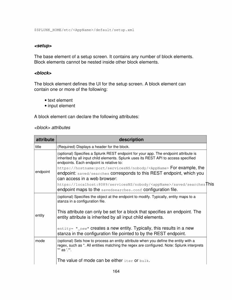
$SPLUNK_HOME/etc/<AppName>/default/setup.xml
<setup>
The base element of a setup screen. It contains any number of block elements.Block elements cannot be nested inside other block elements.
<block>
The block element defines the UI for the setup screen. A block element cancontain one or more of the following:
text element• input element•
A block element can declare the following attributes:
<block> attributes
attribute descriptiontitle (Required) Displays a header for the block.
endpoint
(optional) Specifies a Splunk REST endpoint for your app. The endpoint attribute isinherited by all input child elements. Splunk uses its REST API to access specifiedendpoints. Each endpoint is relative to:https://hostname:port/servicesNS/nobody/<AppName> For example, theendpoint: saved/searches corresponds to this REST endpoint, which youcan access in a web browser:https://localhost:8089/servicesNS/nobody/<appName>/saved/searchesThisendpoint maps to the savedsearches.conf configuration file.
entity
(optional) Specifies the object at the endpoint to modify. Typically, entity maps to astanza in a configuration file.
This attribute can only be set for a block that specifies an endpoint. Theentity attribute is inherited by all input child elements.
entity= "_new" creates a new entity. Typically, this results in a newstanza in the configuration file pointed to by the REST endpoint.
mode (optional) Sets how to process an entity attribute when you define the entity with aregex, such as *. All entities matching the regex are configured. Note: Splunk interprets'*' as '.*'.
The value of mode can be either iter or bulk.
164
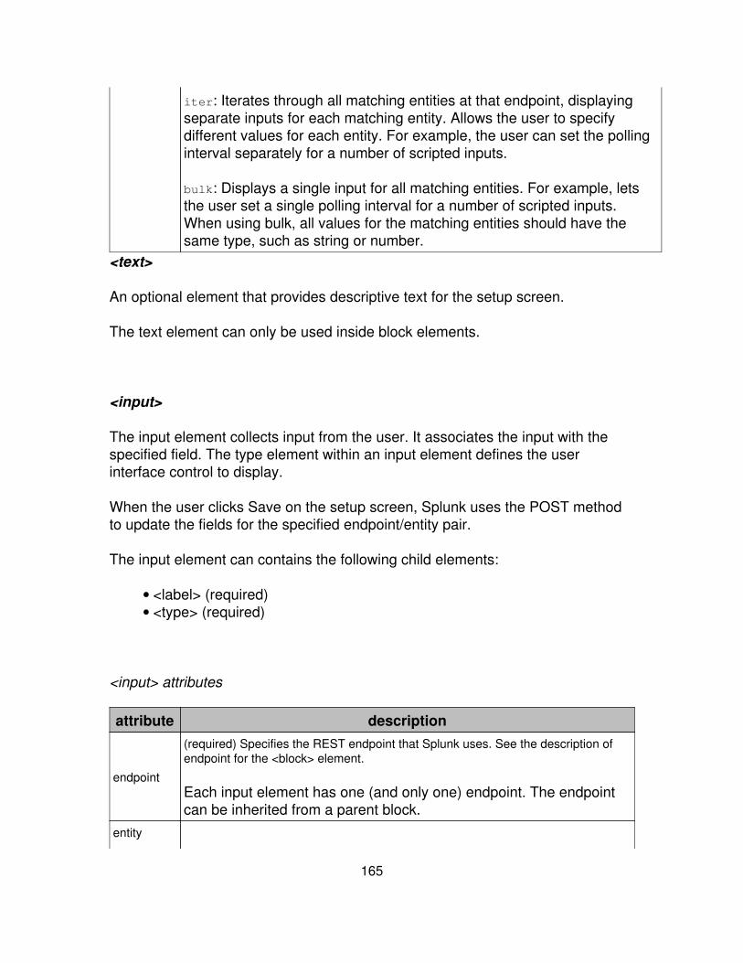
iter: Iterates through all matching entities at that endpoint, displayingseparate inputs for each matching entity. Allows the user to specifydifferent values for each entity. For example, the user can set the pollinginterval separately for a number of scripted inputs.
bulk: Displays a single input for all matching entities. For example, letsthe user set a single polling interval for a number of scripted inputs.When using bulk, all values for the matching entities should have thesame type, such as string or number.
<text>
An optional element that provides descriptive text for the setup screen.
The text element can only be used inside block elements.
<input>
The input element collects input from the user. It associates the input with thespecified field. The type element within an input element defines the userinterface control to display.
When the user clicks Save on the setup screen, Splunk uses the POST methodto update the fields for the specified endpoint/entity pair.
The input element can contains the following child elements:
<label> (required)• <type> (required)•
<input> attributes
attribute description
endpoint
(required) Specifies the REST endpoint that Splunk uses. See the description ofendpoint for the <block> element.
Each input element has one (and only one) endpoint. The endpointcan be inherited from a parent block.
entity
165
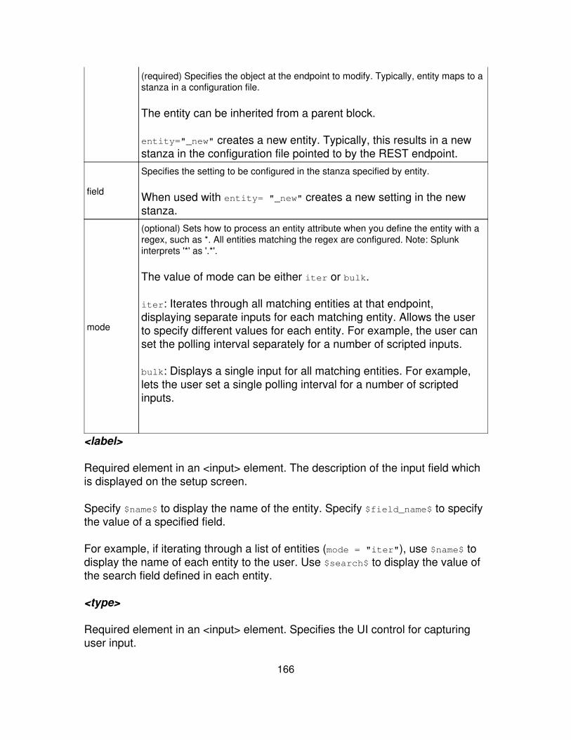
(required) Specifies the object at the endpoint to modify. Typically, entity maps to astanza in a configuration file.
The entity can be inherited from a parent block.
entity="_new" creates a new entity. Typically, this results in a newstanza in the configuration file pointed to by the REST endpoint.
field
Specifies the setting to be configured in the stanza specified by entity.
When used with entity= "_new" creates a new setting in the newstanza.
mode
(optional) Sets how to process an entity attribute when you define the entity with aregex, such as *. All entities matching the regex are configured. Note: Splunkinterprets '*' as '.*'.
The value of mode can be either iter or bulk.
iter: Iterates through all matching entities at that endpoint,displaying separate inputs for each matching entity. Allows the userto specify different values for each entity. For example, the user canset the polling interval separately for a number of scripted inputs.
bulk: Displays a single input for all matching entities. For example,lets the user set a single polling interval for a number of scriptedinputs.
<label>
Required element in an <input> element. The description of the input field whichis displayed on the setup screen.
Specify $name$ to display the name of the entity. Specify $field_name$ to specifythe value of a specified field.
For example, if iterating through a list of entities (mode = "iter"), use $name$ todisplay the name of each entity to the user. Use $search$ to display the value ofthe search field defined in each entity.
<type>
Required element in an <input> element. Specifies the UI control for capturinguser input.
166
Allowed values for the type element:
bool: Displays a checkbox that allows the user to choose true or falsevalues.
•
text: Displays a text field to input string values.• password: Creates a password text field that masks passwords with the?*? character. The UI displays a second password text field to ensure thatthe user types the same password twice.
•
list: Displays values from a comma separated list, allowing the user toselect a single value.
•
Step 8: Package your app or add-on
You can share your extensions to Splunk on Splunkbase and make themavailable to everyone in the Splunk community. You can show off anything youhave done to make Splunk easier or more universal -- not just views,dashboards, and saved searches, but also scripted inputs, field extractions,workflow actions, lookups, event types and more. All you have to do is place yourwork in a dedicated directory and make sure everything is clean and worksoutside your special environment. Then add or update your app.conf file, icon,and screenshot to show off your extension in Launcher. Package, tar, or zip yourwork and upload it.
Prepare your app or add-on
Before you package your app or add-on, make sure you have all the componentsand that they work:
1. If you have not already done so, create a dedicated directory for your app oradd-on under $SPLUNK_HOME/etc/apps/ (for example:$SPLUNK_HOME/etc/apps/<app_name>). If you created an app using appbuilder, this has been created for you. This directory is denoted by $APP_HOMEfor the rest of this topic.
2. Create or edit your $APP_HOME/default/app.conf file. If you created an appusing app builder, app.conf has been created for you but you still need to add astanza to have a description of your app show up in Launcher. If you arepackaging an add-on, you need to create your app.conf file.
3. Review the app.conf.spec documentation to ensure your app can be uploadedto Splunkbase.
167
Splunkbase requires an App ID, version string, and a description definedin app.conf.
•
By default, Splunk checks for updates to an app. If you do not want Splunkto check for updates, include the following in app.conf:
•
[package]check_for_updates = 0
Splunkbase validates app.conf and other app files and does not allow youto upload if there are errors.
•
3. (Optional) If you want an icon or screenshot on Splunkbase or in the Launcher,create an icon and put it in $APP_HOME/appserver/static. If you are packagingan app, you can create a screenshot and place it in the same location. See Filesand directories for apps and add-ons for requirements.
4. Place any scripts in the $APP_HOME/bin directory and make sure$APP_HOME/default/inputs.conf is set up correctly. If your app or add-onincludes scripted inputs, scripted searches, or scripted lookups, you should followgeneral best practices for writing and testing the scripts. For example:
Include any dependencies your app or add-on needs to run outside ofyour environment. You may want to test it on a different system to makesure it works out of the box.
•
Splunk recommends that you make sure fields, event types, or otherinformation tags adhere to the Splunk Common Information Model. Thisensures that your app works with other Splunk instances.
•
Scripts that serve their own webpage and need a new REST endpointmust be specified in restmap.conf.
•
On *nix platforms, you can use environment variables to set locations inany scripts within your app or add-on so that they only have to be setonce. If you do so, make sure to include this information in yourREADME.txt.
•
(Optional) Write a setup screen to allow your users to configure localsettings.
•
Provide instructions to test your scripts outside of Splunk.• If your app is intended to run cross-platform, include both .sh and .bat filesfor scripted inputs and include an inputs.conf that can enable either one.You can enable both options by default (only one will run), write a setupscript to allow the user which option to enable, or give the user manualinstructions on how to enable the option they want. An example with bothinput types enabled:
•
168

[script://./bin/my_input.sh]interval = 60sourcetype = my_sourcetypedisabled = 0
[script://.\bin\my_input.bat]interval = 60sourcetype = my_sourcetypedisabled = 0
5. Make sure you have the correct configuration files, views, and navigations foryour app or add-on. Objects created prior to the development of the app oradd-on may be in $SPLUNK_HOME/etc/apps/search/local or$SPLUNK_HOME/etc/system/local. For example, if you are packaging fieldextractions, they may be defined in stanzas in props.conf and/ortransforms.conf in the Search app. Wherever you make use of a stanza in a.conf file, you need to:
(a) create a blank version of each relevant .conf file in your $APP_HOME/defaultdirectory.
(b) copy the stanza heading and the relevant lines from the original .conf file tothe version in $APP_HOME/default. Do not copy lines or stanzas that are notdirectly relevant to your app.
Where it's hiding Move to$SPLUNK_HOME/etc/system/local/ $APP_HOME/default/
$SPLUNK_HOME/etc/apps/search/local/ $APP_HOME/default/
$SPLUNK_HOME/etc/users/admin/<app_name>/ $APP_HOME/default/
$APP_HOME/metadata/local.meta $APP_HOME/metadata/default.meta
See Files and directories for apps and add-ons for the correct file structure youneed to share an app.
See About configuration files for an overview of Splunk configuration files, and alist and description of all configuration files.
6. Verify permissions for each object in your app or add-on and change anypermissions that aren't set correctly. You can set permissions using SplunkManager or by editing default.meta. If you are creating an add-on that is notVisible, you must make each object globally available. For an explanation ofpermissions, see Curate Splunk knowledge with Manager in the KnowledgeManager manual for instructions on setting permissions, see Step 5: set
169
permissions in the Developer manual. If you set permissions through Manager,make sure that the permissions end up in default.meta and not local.meta.
7. Validate the XML for your views and navigation by running validate_all.py.See Use XML Schemas in this manual for more information.
8. Document your app. You can distribute your documentation in any of thefollowing ways:
A README.txt file in your $APP_HOME directory• Documentation directly on your Splunkbase page. We recommend youdocument your app or add-on first and then cut and paste thedocumentation into the Splunkbase page.
•
A PDF file in $APP_HOME/appbuilder/static/•
9. If your app needs user-supplied information (for example, an app that requiresa Twitter account to analyze Twitter data), make sure to remove the informationfor your test account before tarring the final version.
10. Tar and zip your app as described in the next section.
11. Test your package.
Extract your package in a clean Splunk install in a different location andenvironment than the one where you built your app or add-on.
•
Log in as a different Splunk user from the one you used to create the app.• You may also want to test it with earlier versions of Splunk.•
Packaging your app for Splunkbase
The final step before uploading your app to Splunkbase is packaging. Thismeans taking your app's directory and turning it into a single compressed filewhich can be uploaded to Splunkbase.
Splunkbase uploads are required to have the .spl file extension, e.g. myapp.spl.SPL format is identical to .tar.gz format (also known as a "tarball"). The onlydifference is the file extension.
Make sure you have placed all the app's components in the correct location,have moved all customizations from /local to /default, and have tested your appbefore you package it.
170
You can use your preferred file-compression utility to create the .tar.gz-formatfile, or you can follow the OS-specific instructions below.
Packaging on Unix/Linux/Mac
On Linux/Unix systems, creating a .tar.gz is straightforward because tools forcreating .tar.gz archives are packaged with almost all *nix OS distributions. Firstyou need to tar your app's folder, which creates a .tar file. Then you need togzip the folder into a .tar.gz file. Finally, rename the file extension from .tar.gzto .spl. Example commands are below:
$: tar cv appdirpath/ > appname.tar$: gzip appname.tar$: mv appname.tar.gz appname.spl
OS X users: You may need to set COPYFILE_DISABLE=true tar --exclude=".*"before using tar to avoid unwanted metadata files being added to your .spl file,which may cause your upload to fail.
Packaging on Windows
Unlike ZIP files which Windows handles natively, creating .tar.gz-format filesrequires using a third-party compression utility not packaged with the WindowsOS.
Using WinACE
The following is an example procedure that uses WinACE, a shareware product.compression/decompression tool that supports all modern versions of Windows.To package your app using WinACE, follow these steps:
Download and install WinACE from winace.com.1. Open WinACE.2. Navigate to your $SPLUNK_HOME\etc\apps directory.3. Highlight your app's directory.4. Click the Create button in the upper toolbar.5. In the Add Files / Create Archive dialog, select the Options tab.6. Under Archive type select GZipTar.7. Click Add.8. Congratulations, your package is ready for upload Splunkbase!9.
171
Using 7-Zip
Following is an example procedure that uses 7-Zip, a freecompression/decompression tool that supports all modern versions of Windows.To package your app using 7-Zip, follow these steps:
Install 7-Zip from http://www.7-zip.org/.1. Open 7-Zip.2. Navigate 7-Zip's file explorer to the parent directory of your app (forexample c:\Program Files\Splunk\etc\apps).
3.
Select your app's folder in the left pane of 7-Zip.4. Click "Add" (the green plus sign) on 7-Zip's toolbar.5. An "Add to Archive" dialog box will come up.6. Choose "tar" from the "Archive Format" dropdown box. The filenameshown in the "Archive" textbox should change to have a ".tar" fileextension.
7.
Click the "..." button in the upper-right-corner to choose a location for yourtemporary tar file outside Splunk's Program Files folders, since you won'twant these files cluttering up your actual Splunk install.
8.
Click OK to create the .tar file9. Now it's time to zip up the .tar file into a .tar.gz. Back in 7-Zip's main UI,select the .tar file you created in the previous step
10.
Click the "Add" button in the toolbar11. An "Add to Archive" dialog box will come up.12. Choose "GZip" from the "Archive Format" dropdown box. The filenameshown in the "Archive" textbox should change to have a ".tar.gz" fileextension.
13.
Click OK to create the new .tar.gz file14. To test your new package, double-click on the new .tar.gz file in 7-Zip todrill into it. You should see a single .tar file inside it. Double-click again,and you'll see a single folder which contains your app content.
15.
Finally, assuming you're satisfied that your app has been packagedproperly, rename your package file from a .tar.gz extension to an .spl fileextension.
16.
Congratulations, your package is ready for upload to Splunkbase!17.
Files and directories for apps and add-ons
You can share any extension to Splunk - not just the views and navigation youfind in an app, but saved searches, scripted inputs, and Splunk knowledge. Todo this, place the necessary files in a directory for distribution to the recipient's$SPLUNK_HOME/etc/apps directory. You can share an extension even if it doesn't
172

have a UI environment of its own.
Apps vs. add-ons
You can add views and navigation along with other extensions to make aseparate app, but this is not necessary. Extensions such as field extractions orscripted inputs may not necessarily benefit from a separate UI with a distinct URLand a collection of views and dashboards. You can provide the benefits withoutcreating a full-blown app that shows up on the App menu. In this case, youpackage the extension as an add-on. An add-on is essentially an app that hasno UI of its own and exists only as a container for other things (such as savedsearches or scripted inputs) that are shared globally.
What can an app or add-on do?
Apps and add-ons can both include:
scripted inputs or other input types• field extractions for a specific source type (often implemented with aninput method)
•
scripted lookups or searches• saved searches that can be accessed from the Search app• views and navigation• event types• tags• workflow actions•
What is the difference?
apps are set to Visible and must have a navigation file. Apps have aseparate URL and appear on the App menu. Apps are not restricted todashboards and searches, although in practice, they are oftenview-intensive.
•
add-ons are set to Not Visible. They do not have a separate URL and donot show up on the App menu. An add-on can have views, but they showup under an existing app (for example, the Search app). Every object in anadd-on -- views, saved searches, navigations, etc. -- must be globallyavailable in order to be accessible. See App architecture and objectownership in the Admin manual.
•
Apps vs. add-ons are something of a marketing distinction. From the point ofview of the code, apps and add-ons are created and administered as apps. Allapps and add-on have a separate folder in $SPLUNK_HOME/etc/apps/ and an
173
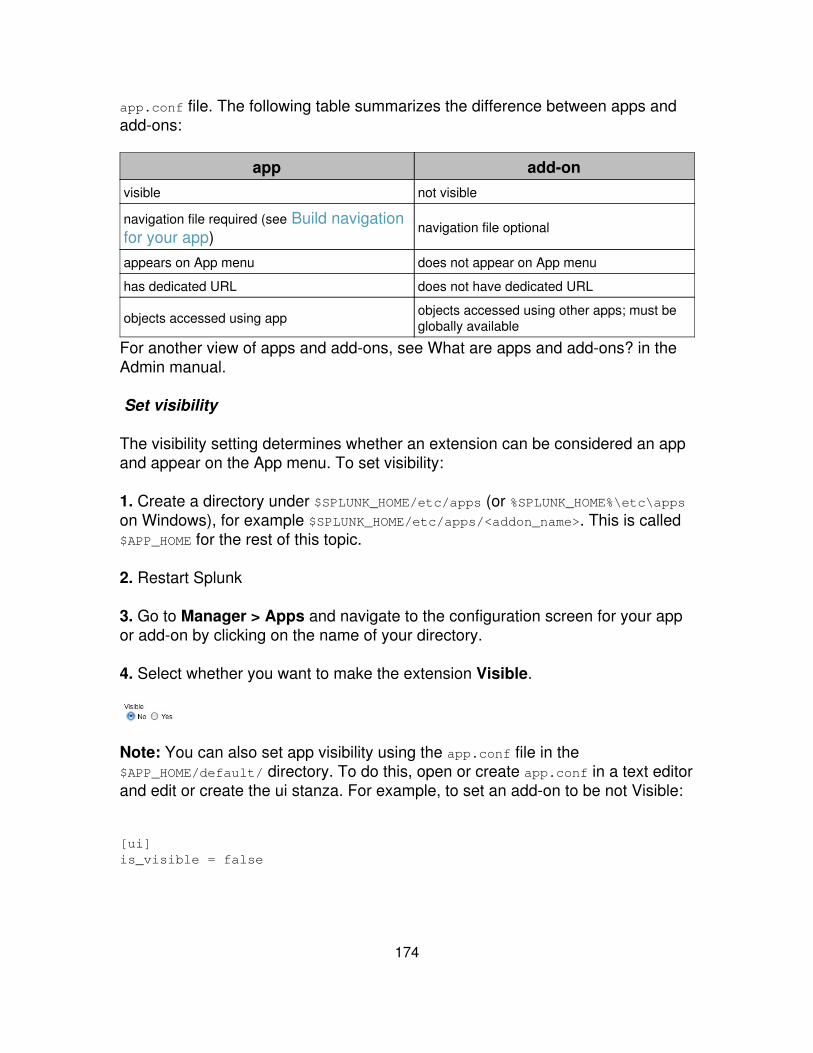
app.conf file. The following table summarizes the difference between apps andadd-ons:
app add-onvisible not visible
navigation file required (see Build navigationfor your app)
navigation file optional
appears on App menu does not appear on App menu
has dedicated URL does not have dedicated URL
objects accessed using app objects accessed using other apps; must beglobally available
For another view of apps and add-ons, see What are apps and add-ons? in theAdmin manual.
Set visibility
The visibility setting determines whether an extension can be considered an appand appear on the App menu. To set visibility:
1. Create a directory under $SPLUNK_HOME/etc/apps (or %SPLUNK_HOME%\etc\appson Windows), for example $SPLUNK_HOME/etc/apps/<addon_name>. This is called$APP_HOME for the rest of this topic.
2. Restart Splunk
3. Go to Manager > Apps and navigate to the configuration screen for your appor add-on by clicking on the name of your directory.
4. Select whether you want to make the extension Visible.
Note: You can also set app visibility using the app.conf file in the$APP_HOME/default/ directory. To do this, open or create app.conf in a text editorand edit or create the ui stanza. For example, to set an add-on to be not Visible:
[ui]is_visible = false
174

Files and directories for apps and add-ons
If you are sharing your app or add-on, make sure you have all the files you needin the correct location under the home directory for your app ($APP_HOME). Toallow users to make their own customizations without being clobbered by laterupdates of your app, you move all the files in $APP_HOME/local/ to$APP_HOME/default/. Also check for files and stanzas that may be scatteredaround the system outside of the app's directory. Depending on the functionalityyou have implemented, the followings file may show up:
file or directory app add-on comments$SPLUNK_HOME/etc/apps/<app_directory>($APP_HOME) required required dedicated directory under
$SPLUNK_HOME/etc/apps/
$APP_HOME/appserver/static/Directory for web resources - suchas images, CSS, or HTML - used byyour app or add-on
$APP_HOME/appserver/static/appIcon.png recommended recommended
Icon for app or add-on displayed inLauncher and Splunkbase. Iconshould be in PNG format and 36pxx 36px in size. NB: Note thepunctuation of appIcon.png.Specifically, the capital "I".
$APP_HOME/appserver/static/screenshot.png recommended not required
Screenshot or splash screen forapp or add-on displayed inLauncher. Image must be in PNGformat. Display dimensions are623px x 350px - will be extendedwith white if smaller, scaled if larger.For best results, make sure theimage size is in the 98:55 ratio anddo not include browser chrome inyour image.
$APP_HOME/appserver/static/documentation.pdf optional optional Downloadable PDF documentationfor your app or add-on.
$APP_HOME/bin/ Directory for custom scripts for searches or scripted inputs.$APP_HOME/bin/*.sh, *.bat, *.py, *.pl, etc. optional optional
$APP_HOME/default/ Directory for configuration files specific to your app or add-on$APP_HOME/default/app.conf required required File that sets app name, author,
description; app visibility (app vs.add-on); and any customconfiguration file settings for theapp. See configure app.conf inthe Developer manual and
175
app.conf in the Admin manualfor more information.
[ui]is_visible=true
[ui]is_visible=false
Visibility setting in app.conf thatdetermines whether package has aseparate UI (app) or not (add-on).
$APP_HOME/default/*.conf optional optional
Additional configuration filesrequired by your app or add-on.Pretty much any .conf can show uphere, except for those files thatdefine global settings. See Step 3:add configurations in theDeveloper manual and Aboutconfiguration files in theAdmin manual for moreinformation aboutconfiguration files.
$APP_HOME/default/setup.xml optional optional File for custom setup window foryour app or add-on.
$APP_HOME/default/data/ui/ Directory for navigation and views
$APP_HOME/default/data/ui/nav/default.xml optional optional
Navigation specific to your app oradd-on. See build navigation foryour app in the Developermanual for more information.
$APP_HOME/default/data/ui/views/*.xml required optional
Views specific to your app oradd-on; an app must have one ormore views. See builddashboards, form searchesand advanced views in theDeveloper manual for moreinformation.
$APP_HOME/local/ Directory for user-generated configuration filesrequired required Include an empty local
directory when you distributeyour app or add-on. If theuser makes any configurationchanges via Manager, theywill be stored here. Thedeveloper of an app or add/onshould never place anyshipping configurations inlocal, as subsequent revisions
176
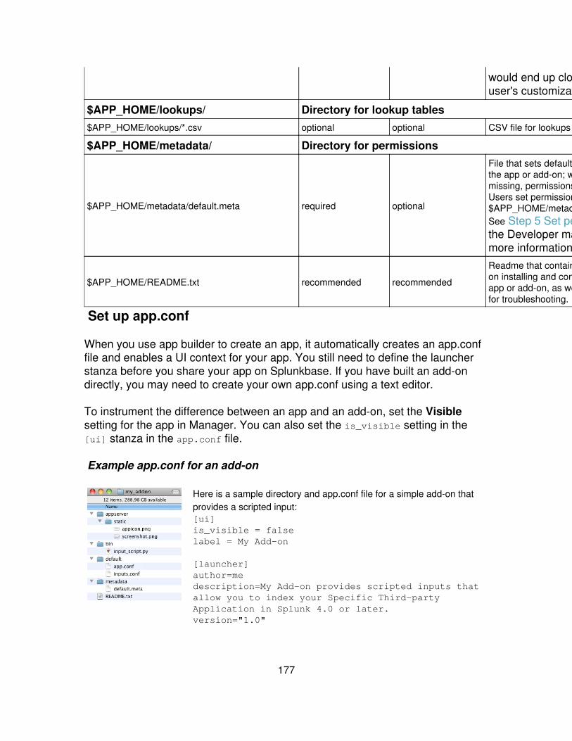
would end up clobbering theuser's customizations.
$APP_HOME/lookups/ Directory for lookup tables$APP_HOME/lookups/*.csv optional optional CSV file for lookups
$APP_HOME/metadata/ Directory for permissions
$APP_HOME/metadata/default.meta required optional
File that sets default permissions forthe app or add-on; when file ismissing, permissions are private.Users set permission overrides in$APP_HOME/metadata/local.meta.See Step 5 Set permissions inthe Developer manual formore information.
$APP_HOME/README.txt recommended recommended
Readme that contains instructionson installing and configuring yourapp or add-on, as well as any hintsfor troubleshooting.
Set up app.conf
When you use app builder to create an app, it automatically creates an app.conffile and enables a UI context for your app. You still need to define the launcherstanza before you share your app on Splunkbase. If you have built an add-ondirectly, you may need to create your own app.conf using a text editor.
To instrument the difference between an app and an add-on, set the Visiblesetting for the app in Manager. You can also set the is_visible setting in the[ui] stanza in the app.conf file.
Example app.conf for an add-on
Here is a sample directory and app.conf file for a simple add-on thatprovides a scripted input:[ui]is_visible = falselabel = My Add-on
[launcher]author=medescription=My Add-on provides scripted inputs thatallow you to index your Specific Third-partyApplication in Splunk 4.0 or later. version="1.0"
177
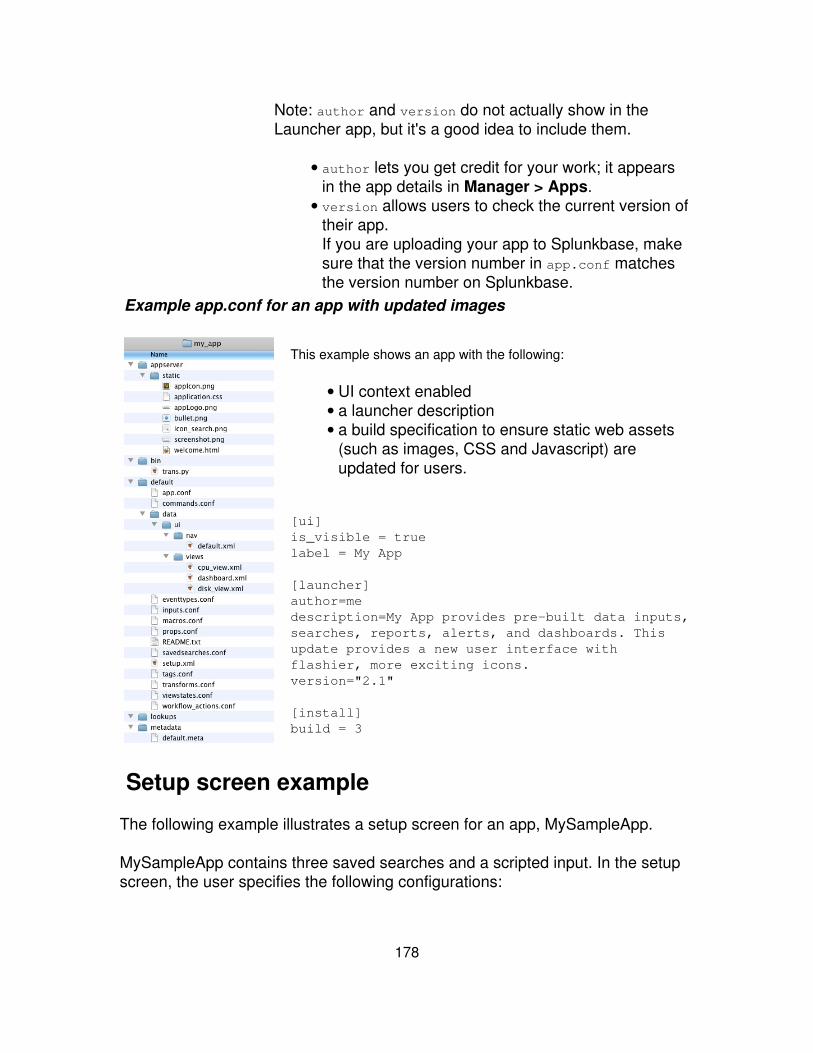
Note: author and version do not actually show in theLauncher app, but it's a good idea to include them.
author lets you get credit for your work; it appearsin the app details in Manager > Apps.
•
version allows users to check the current version oftheir app.If you are uploading your app to Splunkbase, makesure that the version number in app.conf matchesthe version number on Splunkbase.
•
Example app.conf for an app with updated images
This example shows an app with the following:
UI context enabled• a launcher description• a build specification to ensure static web assets(such as images, CSS and Javascript) areupdated for users.
•
[ui]is_visible = truelabel = My App
[launcher]author=medescription=My App provides pre-built data inputs,searches, reports, alerts, and dashboards. Thisupdate provides a new user interface withflashier, more exciting icons. version="2.1"
[install]build = 3
Setup screen example
The following example illustrates a setup screen for an app, MySampleApp.
MySampleApp contains three saved searches and a scripted input. In the setupscreen, the user specifies the following configurations:
178
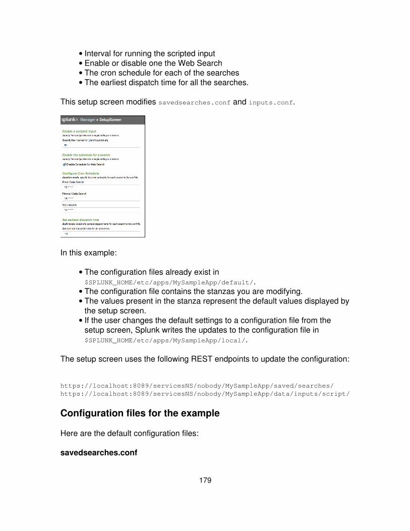
Interval for running the scripted input• Enable or disable one the Web Search• The cron schedule for each of the searches• The earliest dispatch time for all the searches.•
This setup screen modifies savedsearches.conf and inputs.conf.
In this example:
The configuration files already exist in$SPLUNK_HOME/etc/apps/MySampleApp/default/.
•
The configuration file contains the stanzas you are modifying.• The values present in the stanza represent the default values displayed bythe setup screen.
•
If the user changes the default settings to a configuration file from thesetup screen, Splunk writes the updates to the configuration file in$SPLUNK_HOME/etc/apps/MySampleApp/local/.
•
The setup screen uses the following REST endpoints to update the configuration:
https://localhost:8089/servicesNS/nobody/MySampleApp/saved/searches/https://localhost:8089/servicesNS/nobody/MySampleApp/data/inputs/script/
Configuration files for the example
Here are the default configuration files:
savedsearches.conf
179
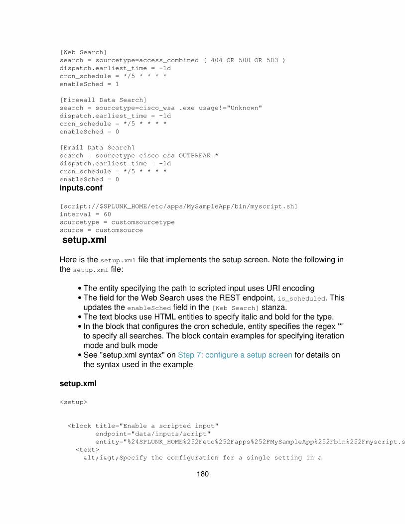
[Web Search]search = sourcetype=access_combined ( 404 OR 500 OR 503 )dispatch.earliest_time = -1dcron_schedule = */5 * * * *enableSched = 1
[Firewall Data Search]search = sourcetype=cisco_wsa .exe usage!="Unknown"dispatch.earliest_time = -1dcron_schedule = */5 * * * *enableSched = 0
[Email Data Search]search = sourcetype=cisco_esa OUTBREAK_*dispatch.earliest_time = -1dcron_schedule = */5 * * * *enableSched = 0
inputs.conf
[script://$SPLUNK_HOME/etc/apps/MySampleApp/bin/myscript.sh]interval = 60sourcetype = customsourcetypesource = customsource
setup.xml
Here is the setup.xml file that implements the setup screen. Note the following inthe setup.xml file:
The entity specifying the path to scripted input uses URI encoding• The field for the Web Search uses the REST endpoint, is_scheduled. Thisupdates the enableSched field in the [Web Search] stanza.
•
The text blocks use HTML entities to specify italic and bold for the type.• In the block that configures the cron schedule, entity specifies the regex '*'to specify all searches. The block contain examples for specifying iterationmode and bulk mode
•
See "setup.xml syntax" on Step 7: configure a setup screen for details onthe syntax used in the example
•
setup.xml
<setup>
<block title="Enable a scripted input" endpoint="data/inputs/script" entity="%24SPLUNK_HOME%252Fetc%252Fapps%252FMySampleApp%252Fbin%252Fmyscript.sh"> <text> <i>Specify the configuration for a single setting in a
180
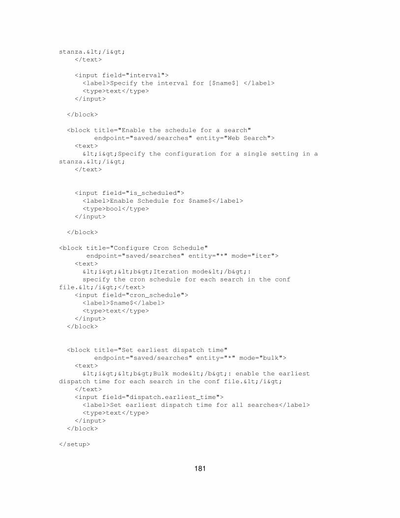
stanza.</i> </text>
<input field="interval"> <label>Specify the interval for [$name$] </label> <type>text</type> </input>
</block>
<block title="Enable the schedule for a search" endpoint="saved/searches" entity="Web Search"> <text> <i>Specify the configuration for a single setting in astanza.</i> </text>
<input field="is_scheduled"> <label>Enable Schedule for $name$</label> <type>bool</type> </input>
</block>
<block title="Configure Cron Schedule" endpoint="saved/searches" entity="*" mode="iter"> <text> <i><b>Iteration mode</b>: specify the cron schedule for each search in the conffile.</i></text> <input field="cron_schedule"> <label>$name$</label> <type>text</type> </input> </block>
<block title="Set earliest dispatch time" endpoint="saved/searches" entity="*" mode="bulk"> <text> <i><b>Bulk mode</b>: enable the earliestdispatch time for each search in the conf file.</i> </text> <input field="dispatch.earliest_time"> <label>Set earliest dispatch time for all searches</label> <type>text</type> </input> </block>
</setup>
181

Setup screen example using a custom endpoint
This example shows how to create a setup screen that uses Splunk?s REST APIto configure a custom endpoint. The custom endpoint maps to a configuration fileyou create at $SPLUNK_HOME/etc/apps/<myApp>/default/myappsetup.conf.
To update a custom endpoint, do the following:
Create your custom configuration file with the initial values for your setupscreen.
1.
Create a stanza in restmap.conf that maps your endpoint to your customconfiguration file.
2.
Write a python script that initializes your setup screen and handles theuser-entered values.
3.
Write setup.xml.4.
1. Create a custom configuration file with default values
This example uses a configuration file to initialize the default values for thestanza [setupentity]. The entity attribute in setup.xml refers to this stanza.
However, you can also initialize the default values in your python script.
myappsetup.conf
[setupentity]field_1 =field_3 = 60field_2_boolean = 0
182
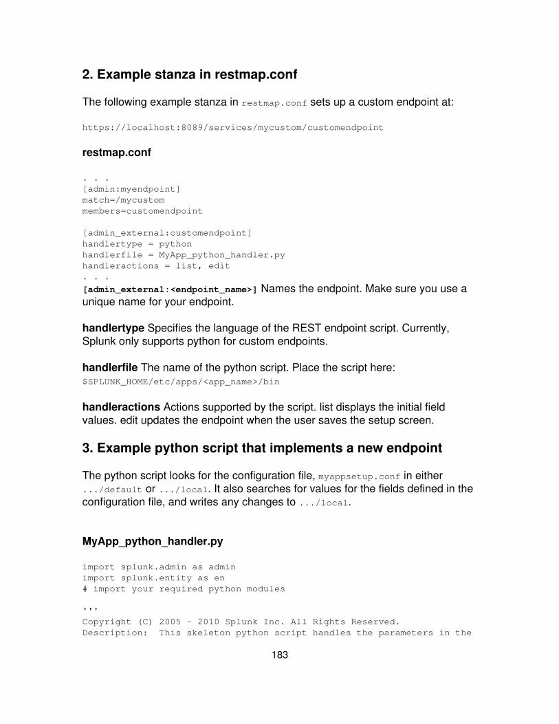
2. Example stanza in restmap.conf
The following example stanza in restmap.conf sets up a custom endpoint at:
https://localhost:8089/services/mycustom/customendpoint
restmap.conf
. . .[admin:myendpoint]match=/mycustommembers=customendpoint
[admin_external:customendpoint]handlertype = pythonhandlerfile = MyApp_python_handler.pyhandleractions = list, edit. . .
[admin_external:<endpoint_name>] Names the endpoint. Make sure you use aunique name for your endpoint.
handlertype Specifies the language of the REST endpoint script. Currently,Splunk only supports python for custom endpoints.
handlerfile The name of the python script. Place the script here:$SPLUNK_HOME/etc/apps/<app_name>/bin
handleractions Actions supported by the script. list displays the initial fieldvalues. edit updates the endpoint when the user saves the setup screen.
3. Example python script that implements a new endpoint
The python script looks for the configuration file, myappsetup.conf in either.../default or .../local. It also searches for values for the fields defined in theconfiguration file, and writes any changes to .../local.
MyApp_python_handler.py
import splunk.admin as adminimport splunk.entity as en# import your required python modules
'''Copyright (C) 2005 - 2010 Splunk Inc. All Rights Reserved.Description: This skeleton python script handles the parameters in the
183
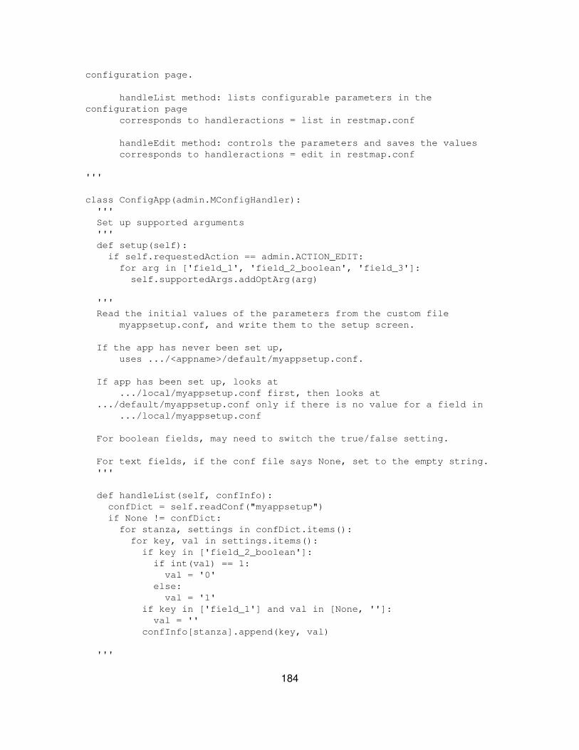
configuration page.
handleList method: lists configurable parameters in theconfiguration page corresponds to handleractions = list in restmap.conf
handleEdit method: controls the parameters and saves the values corresponds to handleractions = edit in restmap.conf
'''
class ConfigApp(admin.MConfigHandler): ''' Set up supported arguments ''' def setup(self): if self.requestedAction == admin.ACTION_EDIT: for arg in ['field_1', 'field_2_boolean', 'field_3']: self.supportedArgs.addOptArg(arg)
''' Read the initial values of the parameters from the custom file myappsetup.conf, and write them to the setup screen.
If the app has never been set up, uses .../<appname>/default/myappsetup.conf.
If app has been set up, looks at .../local/myappsetup.conf first, then looks at .../default/myappsetup.conf only if there is no value for a field in .../local/myappsetup.conf
For boolean fields, may need to switch the true/false setting.
For text fields, if the conf file says None, set to the empty string. '''
def handleList(self, confInfo): confDict = self.readConf("myappsetup") if None != confDict: for stanza, settings in confDict.items(): for key, val in settings.items(): if key in ['field_2_boolean']: if int(val) == 1: val = '0' else: val = '1' if key in ['field_1'] and val in [None, '']: val = '' confInfo[stanza].append(key, val)
'''
184
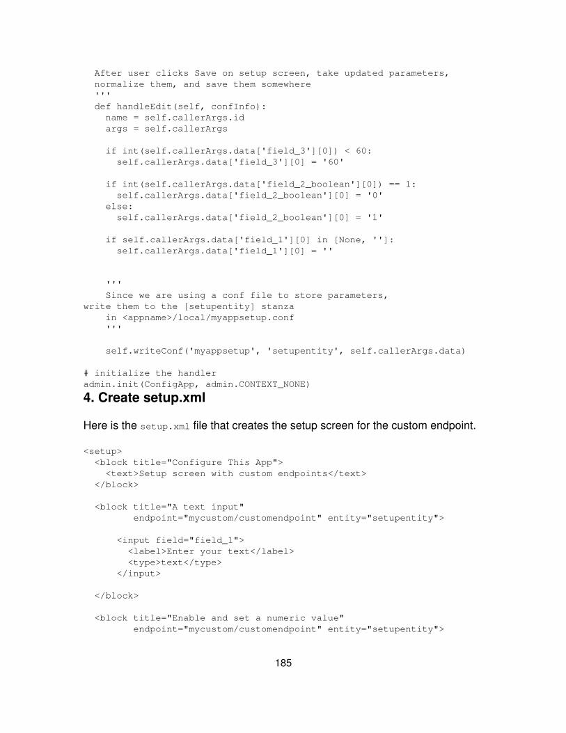
After user clicks Save on setup screen, take updated parameters, normalize them, and save them somewhere ''' def handleEdit(self, confInfo): name = self.callerArgs.id args = self.callerArgs
if int(self.callerArgs.data['field_3'][0]) < 60: self.callerArgs.data['field_3'][0] = '60'
if int(self.callerArgs.data['field_2_boolean'][0]) == 1: self.callerArgs.data['field_2_boolean'][0] = '0' else: self.callerArgs.data['field_2_boolean'][0] = '1'
if self.callerArgs.data['field_1'][0] in [None, '']: self.callerArgs.data['field_1'][0] = ''
''' Since we are using a conf file to store parameters,write them to the [setupentity] stanza in <appname>/local/myappsetup.conf '''
self.writeConf('myappsetup', 'setupentity', self.callerArgs.data)
# initialize the handleradmin.init(ConfigApp, admin.CONTEXT_NONE)
4. Create setup.xml
Here is the setup.xml file that creates the setup screen for the custom endpoint.
<setup> <block title="Configure This App"> <text>Setup screen with custom endpoints</text> </block>
<block title="A text input" endpoint="mycustom/customendpoint" entity="setupentity">
<input field="field_1"> <label>Enter your text</label> <type>text</type> </input>
</block>
<block title="Enable and set a numeric value" endpoint="mycustom/customendpoint" entity="setupentity">
185

<input field="field_2_boolean"> <label>Enable This Input</label> <type>bool</type> </input>
<input field="field_3" endpoint="mycustom/customendpoint"entity="setupentity"> <label>Set this number (minimum value=60)</label> <type>text</type> </input>
</block>
</setup>
Setup screen example with user credentials
This example shows the steps needed to create a set up screen that acceptsuser/password credentials for a python script. The python script uses thecredentials supplied in the setup screen.
Create the block in your setup screen that accepts user credentials.1. Write a python script that uses the credentials2. Create a stanza in inputs.conf for your script.3.
1. Create a block in setup.xml that accepts user credentials
Add the following block to setup.xml to create the User input fields for yourscripts.
<block title="Add new credentials" endpoint="admin/passwords"entity="_new"> <input field="name"> <label>Username</label> <type>text</type> </input>
<input field="password"> <label>Password</label> <type>password</type> </input>
<input field="realm"> <label>Realm</label> <type>text</type> </input>
186
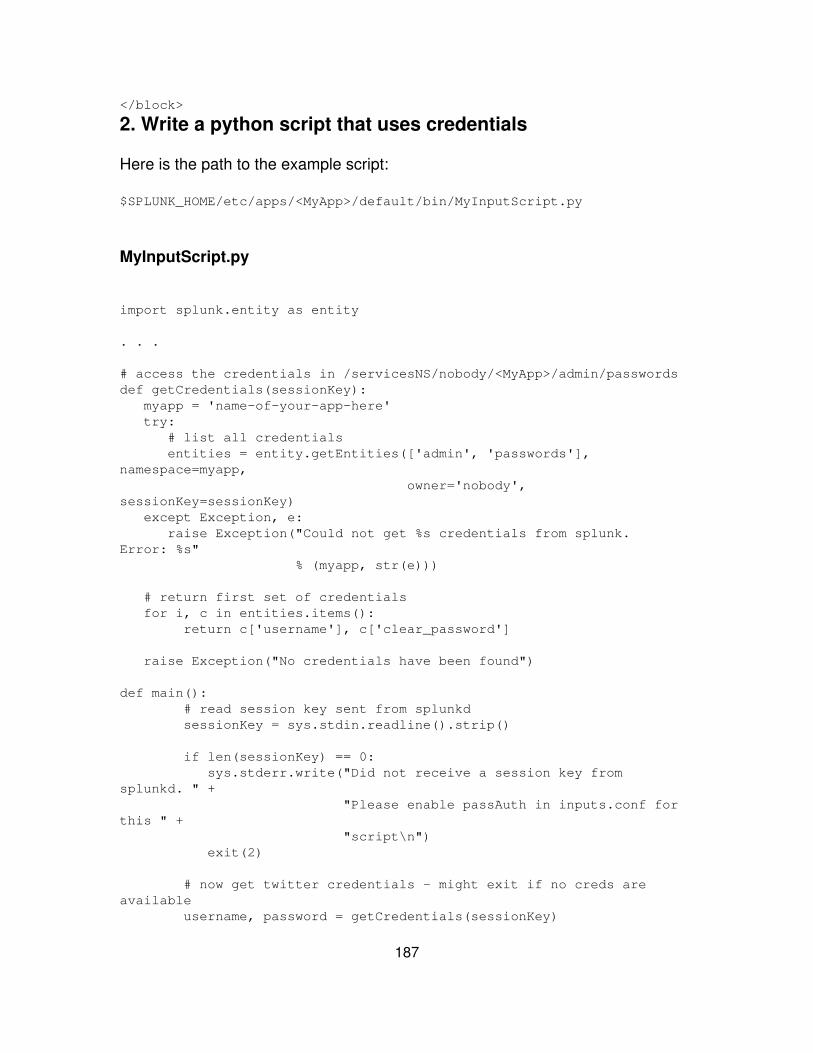
</block>
2. Write a python script that uses credentials
Here is the path to the example script:
$SPLUNK_HOME/etc/apps/<MyApp>/default/bin/MyInputScript.py
MyInputScript.py
import splunk.entity as entity
. . .
# access the credentials in /servicesNS/nobody/<MyApp>/admin/passwordsdef getCredentials(sessionKey): myapp = 'name-of-your-app-here' try: # list all credentials entities = entity.getEntities(['admin', 'passwords'],namespace=myapp, owner='nobody',sessionKey=sessionKey) except Exception, e: raise Exception("Could not get %s credentials from splunk.Error: %s" % (myapp, str(e)))
# return first set of credentials for i, c in entities.items(): return c['username'], c['clear_password']
raise Exception("No credentials have been found")
def main(): # read session key sent from splunkd sessionKey = sys.stdin.readline().strip()
if len(sessionKey) == 0: sys.stderr.write("Did not receive a session key fromsplunkd. " + "Please enable passAuth in inputs.conf forthis " + "script\n") exit(2)
# now get twitter credentials - might exit if no creds areavailable username, password = getCredentials(sessionKey)
187
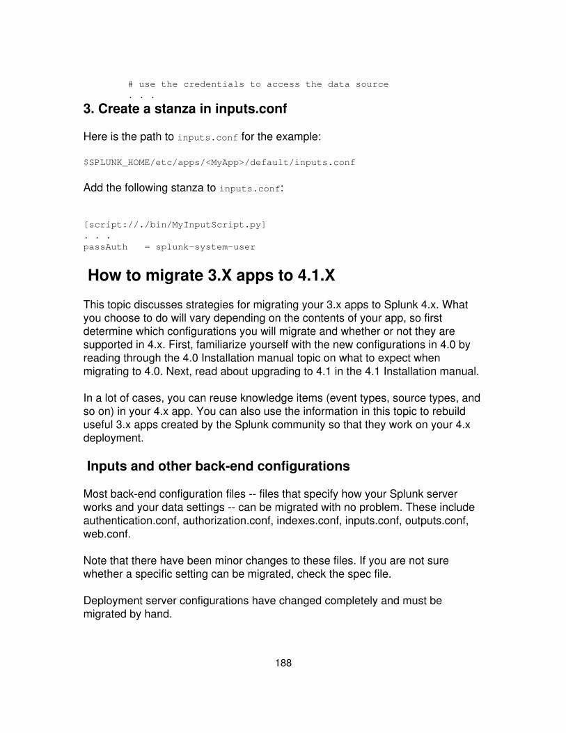
# use the credentials to access the data source . . .
3. Create a stanza in inputs.conf
Here is the path to inputs.conf for the example:
$SPLUNK_HOME/etc/apps/<MyApp>/default/inputs.conf
Add the following stanza to inputs.conf:
[script://./bin/MyInputScript.py]. . .passAuth = splunk-system-user
How to migrate 3.X apps to 4.1.X
This topic discusses strategies for migrating your 3.x apps to Splunk 4.x. Whatyou choose to do will vary depending on the contents of your app, so firstdetermine which configurations you will migrate and whether or not they aresupported in 4.x. First, familiarize yourself with the new configurations in 4.0 byreading through the 4.0 Installation manual topic on what to expect whenmigrating to 4.0. Next, read about upgrading to 4.1 in the 4.1 Installation manual.
In a lot of cases, you can reuse knowledge items (event types, source types, andso on) in your 4.x app. You can also use the information in this topic to rebuilduseful 3.x apps created by the Splunk community so that they work on your 4.xdeployment.
Inputs and other back-end configurations
Most back-end configuration files -- files that specify how your Splunk serverworks and your data settings -- can be migrated with no problem. These includeauthentication.conf, authorization.conf, indexes.conf, inputs.conf, outputs.conf,web.conf.
Note that there have been minor changes to these files. If you are not surewhether a specific setting can be migrated, check the spec file.
Deployment server configurations have changed completely and must bemigrated by hand.
188
Knowledge and presentation settings
Most configuration changes from 3.X to 4.0 are to the knowledge (event types,saved searches, etc.) and presentation (Splunk Web appearance) layers.However, the following files can typically be migrated with no problems:
props.conf, transforms.conf, eventtypes.conf, and tags.conf.
If you'd just like to copy over your knowledge from a 3.X app to a 4.0 app, youcan clone the Search app, and then copy in your event types, tags, props,transforms and other knowledge settings. Note that you must migrate savedsearches by hand (as described below).
Saved searches and form searches
Saved searches and form searches have been modified significantly and must bemigrated by hand. You can copy over your savedsearches.conf, or copy in thesearch string through Splunk Manager. Splunk will migrate these searches, butthere are a few things you will need to edit, such as any leftover :: in fields anddeprecated search commands. If you want your saved search to be displayed ina dashboard, you will have to add the search to the dashboard, this will create aview state for your new search. Form searches must be created through the newview system -- you cannot migrate your old form search over throughsavedsearches.conf. Read more about Forms: an introduction in this manual.
Set permissions
4.0 introduces a new object model that sets permissions for all apps and objects(saved searches, reports, views, event types, etc). Once you've migrated your3.X App to 4.0, set permissions on your app either through Splunk Manager or byadding a default.meta file by hand to your app's directory. Find furtherinstructions on how to set app permissions in this manual.
Note: If you've copied in configurations to Splunk by hand (without using SplunkWeb) then you must set permissions so the configurations will show up in SplunkWeb.
If your application is simply a data provider for use in other applications such anfirewall scraper app, you may want to just export its configuration globally.
189

Example
This example takes the Web Activity app from SplunkBase (located here).
This app contains a savedsearches.conf and a bundle.conf. The saved searchescan be migrated into a new app for 4.0 but the bundle.conf is deprecated. Useapp.conf instead. Here are step-by-step instructions for migrating this app:
1. Create a new app directory. You can use App Builder, which will automaticallycreate a default.meta, app.conf and other files for you, as well as the entire appdirectory structure. If you prefer, you can also create a directory by hand in$SPLUNK_HOME/etc/apps/. For example, create a directory$SPLUNK_HOME/etc/apps/web_activity_4. Make sure you add the requisite files(app.conf, default.meta).
2. Copy the old savedsearches.conf into your new app's default directory:$SPLUNK_HOME/etc/apps/web_activity_4/default/savedsearches.conf. You canalso copy all the saved searches search strings into Splunk Manager by hand.
3. Edit your saved searches to make sure they work in 4.0, specifically changeany instances of :: to =. For example sourcetype::access becomessourcetype=access. Note that there may be some other issues with your savedsearches. Splunk Web will alert you of any issues and you can edit yoursearches directly through Splunk Manager.
4. Save your edited saved searches. You may need to restart Splunk for yournew app to show up.
5. Create new dashboards or edit existing dashboards to showcase your newlymigrated saved searches.
What's changed for app developers in 4.2
App ID, version string, and description
An App ID, version string, and a description of an app are required to upload anapp or add-on to Splunkbase. Splunk uses the App ID to notify users of updatesto an app when the update becomes available on Splunkbase. Splunkbase usesthe version string to make sure the latest version is available. The descriptionhelps users find apps that fit their needs.
190

Note: Apps uploaded to Splunkbase prior to September, 2010 did not require anApp ID. Splunk recommends that you update these apps with an App ID, versionstring, and description. For these apps, manually update the app configurationfile, and then upload the new version of the app to Splunkbase. The followingsection, Updating a legacy Splunk application on Splunkbase, describes theprocedure.
Updating a legacy Splunk application on Splunkbase
Here are the steps to update an app on Splunkbase to a new version. Splunkrecommends you perform this update, even if there are no other changes in theapp.
Define an App ID in the package stanza of app.conf
app.conf is found at $SPLUNK_HOME/etc/apps/<MyApp>/default/.• The App ID must be unique on Splunkbase.• The App ID must be the same name as the folder containing the app at:$SPLUNK_HOME/etc/apps/
•
App IDs can contain only letters, numbers, and the dot '.' and underscore'_' characters. App IDs cannot end with a dot character.
•
App IDs cannot be words that indicate a network location, such as CON,PRN, or LPT1.
•
Define a version string and description in the launcher stanza of app.conf
Version numbers are a number followed by a sequence of numbers ordots.
•
Pre-release versions can append a space and a single-word suffix like"beta2."
•
Descriptions are limited to 200 characters of text.•
Package and upload the new version of the app to Splunkbase
See "Uploading a new version of the app to Splunkbase" below for details.•
Example app.conf file for UI Examples app
## Splunk app configuration file#
191
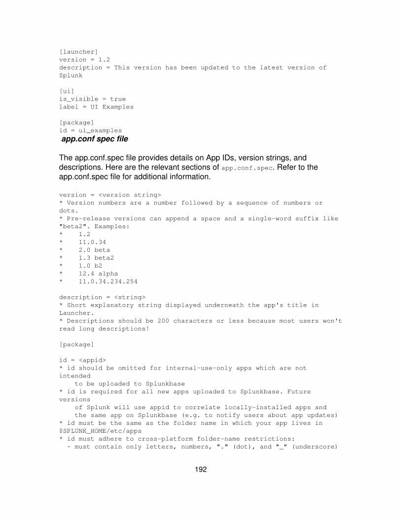
[launcher]version = 1.2description = This version has been updated to the latest version ofSplunk
[ui]is_visible = truelabel = UI Examples
[package]id = ui_examples
app.conf spec file
The app.conf.spec file provides details on App IDs, version strings, anddescriptions. Here are the relevant sections of app.conf.spec. Refer to theapp.conf.spec file for additional information.
version = <version string>* Version numbers are a number followed by a sequence of numbers ordots.* Pre-release versions can append a space and a single-word suffix like"beta2". Examples:* 1.2* 11.0.34* 2.0 beta* 1.3 beta2* 1.0 b2* 12.4 alpha* 11.0.34.234.254
description = <string>* Short explanatory string displayed underneath the app's title inLauncher.* Descriptions should be 200 characters or less because most users won'tread long descriptions!
[package]
id = <appid>* id should be omitted for internal-use-only apps which are notintended to be uploaded to Splunkbase* id is required for all new apps uploaded to Splunkbase. Futureversions of Splunk will use appid to correlate locally-installed apps and the same app on Splunkbase (e.g. to notify users about app updates)* id must be the same as the folder name in which your app lives in$SPLUNK_HOME/etc/apps* id must adhere to cross-platform folder-name restrictions: - must contain only letters, numbers, "." (dot), and "_" (underscore)
192
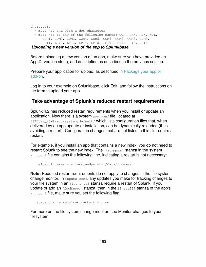
characters - must not end with a dot character - must not be any of the following names: CON, PRN, AUX, NUL, COM1, COM2, COM3, COM4, COM5, COM6, COM7, COM8, COM9, LPT1, LPT2, LPT3, LPT4, LPT5, LPT6, LPT7, LPT8, LPT9
Uploading a new version of the app to Splunkbase
Before uploading a new version of an app, make sure you have provided anAppID, version string, and description as described in the previous section.
Prepare your application for upload, as described in Package your app oradd-on.
Log in to your example on Splunkbase, click Edit, and follow the instructions onthe form to upload your app.
Take advantage of Splunk's reduced restart requirements
Splunk 4.2 has reduced restart requirements when you install or update anapplication. Now there is a system app.conf file, located at$SPLUNK_HOME/etc/system/default/ which lists configuration files that, whendelivered by an app update or installation, can be dynamically reloaded (thusavoiding a restart). Configuration changes that are not listed in this file require arestart.
For example, if you install an app that contains a new index, you do not need torestart Splunk to see the new index. The [triggers] stanza in the systemapp.conf file contains the following line, indicating a restart is not necessary:
reload.indexes = access_endpoints /data/indexes
Note: Reduced restart requirements do not apply to changes in the file systemchange monitor. In inputs.conf, any updates you make for tracking changes toyour file system in an [fschange] stanza require a restart of Splunk. If youupdate or add an [fschange] stanza, then in the [install] stanza of the app'sapp.conf file, make sure you set the following flag:
state_change_requires_restart = true
For more on the file system change monitor, see Monitor changes to yourfilesystem.
193

Custom configuration files
If your app contains custom configuration files, then by default Splunkrequires a restart.
•
If the custom configuration changes do not require a restart, modify the[triggers] stanza in your app's app.conf file.
•
If your custom configuration requires custom code to reload theconfiguration state change, specify the endpoint for the custom code inyour app's app.conf file.
•
The app's app.conf file is located at$SPLUNK_HOME/etc/app/<MyApp>/default/app.conf
For example:
[triggers] # Do not force a restart of Splunk for state changes of MyApp # Do not run special code to tell MyApp to reload myconffile.conf reload.myconffile = simple
# Do not force a restart of Splunk for state changes of MyApp. # Splunk calls the /admin/myendpoint/_reload method in my customEAI handler. # Use this advanced option only if MyApp requires custom code toreload # the configuration for state change reload.myotherconffile = access_endpoints /admin/myendpoint
State change requires restart flag
The [install] stanza of an app's app.conf file now contains astate_change_requires_restart flag with a default value of false. Set this flagto true only when changes to an app's state always require a restart. Typically,you accept the default value of false.
Note: state_change_requires_restart = false does NOT prevent an app fromrequiring a restart. Setting this flag to false simply means that Splunk determineswhether a restart is required according to the system app.conf file describedabove and any settings you may have indicated in the [triggers] stanza in theapp's app.conf file.
System app.conf file
$SPLUNK_HOME/etc/system/default/app.conf
194
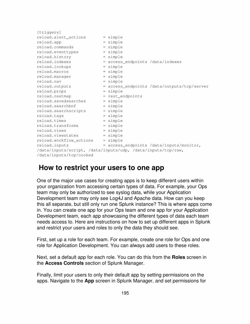
[triggers]reload.alert_actions = simplereload.app = simplereload.commands = simplereload.eventtypes = simplereload.history = simplereload.indexes = access_endpoints /data/indexesreload.lookups = simplereload.macros = simplereload.manager = simplereload.nav = simplereload.outputs = access_endpoints /data/outputs/tcp/serverreload.props = simplereload.restmap = rest_endpointsreload.savedsearches = simplereload.searchbnf = simplereload.searchscripts = simplereload.tags = simplereload.times = simplereload.transforms = simplereload.views = simplereload.viewstates = simplereload.workflow_actions = simplereload.inputs = access_endpoints /data/inputs/monitor,/data/inputs/script, /data/inputs/udp, /data/inputs/tcp/raw,/data/inputs/tcp/cooked
How to restrict your users to one app
One of the major use cases for creating apps is to keep different users withinyour organization from accessing certain types of data. For example, your Opsteam may only be authorized to see syslog data, while your ApplicationDevelopment team may only see Log4J and Apache data. How can you keepthis all separate, but still only run one Splunk instance? This is where apps comein. You can create one app for your Ops team and one app for your ApplicationDevelopment team, each app showcasing the different types of data each teamneeds access to. Here are instructions on how to set up different apps in Splunkand restrict your users and roles to only the data they should see.
First, set up a role for each team. For example, create one role for Ops and onerole for Application Development. You can always add users to these roles.
Next, set a default app for each role. You can do this from the Roles screen inthe Access Controls section of Splunk Manager.
Finally, limit your users to only their default app by setting permissions on theapps. Navigate to the App screen in Splunk Manager, and set permissions for
195

each app. You can make the Ops app read only for the Ops team and theApplication Development app read only for the Application Development team.Roles can only see the apps they have read permissions to see.
Optionally, place more restrictions on the views in each app by removing optionsfrom the AccountBar, like the app drop-down and the manager link. You can dothis by editing the XML for your view and setting the following configuration forAccountBar:
<module name="AccountBar" layoutPanel="appHeader"> <param name="mode">lite</param></module>
Note that this is only available in the Advanced XML. If you're using theSimplified XML, translate it to Advanced XML by accessing the showsourceendpoint:
http://localhost:8000/en-US/app/<app_name>/<view_name>?showsource=true
196
Build scripted inputs
Scripted inputs overview
Splunk understands many types of data and can immediately index these datasources to make the data available for searching. See What Splunk can index inthe Getting Data In manual.
Splunk uses line termination characters and timestamps to parse the data intoevents. It then extracts fields which each event shares, such as host, source,sourcetype, eventtype, timestamp, linecount and others. Splunk also extractscustom per-event fields, such as username and transactionId.
However, there are times when you want to use scripts to feed data to Splunk forindexing, or prepare data from a non-standard source so Splunk can properlyparse events and extract fields. You can use shell scripts, python scripts,Windows batch files, PowerShell, or any other utility that can format and streamthe data that you want Splunk to index. You can stream the data to Splunk orwrite the data from a script to a file.
Streaming data to Splunk In the streaming model, Splunk starts the script at aspecified interval. Splunk indexes the stdout data stream from the script. BeforeSplunk starts a script, it checks to see if the script is already running. If the scriptis running Splunk does not restart the script.
Writing data to a file for Splunk to index In this model, you configure a scriptto write to a log file. Then configure Splunk to monitor and index the log file. Thisscenario is basically file input into Splunk. However, you can configure Splunk tolaunch the program at specific intervals, rather than configure an external method(such as cron or Windows scheduled task) for launching the script.
Get data from APIs and other remote data interfaces through scripted inputs inthe Getting Data In manual details how to add a scripted input using Splunk Weband how to manually edit the inputs.conf file to add a scripted input. Thissection focuses on the structure of a script, and provides tips and examples tohelp you create your own scripts.
Use cases for scripted inputs
Typical use cases for scripted inputs are:
197

Whenever data is not available as an ordinary file, or the data cannot besent using TCP or UDP.
•
Stream data from command-line tools, such as vmstat and iostat.• Poll a database, web service, or API for specific data, and process theresults with Splunk.
•
Reformat complex data so Splunk can more easily parse the data intoevents and fields.
•
Maintain data sources with slow or resource-intensive startup procedures.• Provide special or complex handling for transient or unstable inputs.• Scripts that manage passwords and credentials.• Wrapper scripts for command line inputs that contains special characters(see "Using a wrapper script" in the Getting Data In manual)
•
Setting up a scripted input
This section describes how to set up a scripted input for an app. To illustrate thesetup, it uses an example script that polls a database and writes the results to afile. A more detailed version of this example is in Example script that polls adatabase. That topic provides details on the example, including code examples inPython and Java.
Note: You can write any number and types of scripts in various scriptinglanguages that perform various functions. This example shows the framework fora commonly found script. Adapt this framework according to your needs.
Script to poll a database
This example script does the following:
Runs at a regular interval• Queries a database• Writes the output to a file in a format optimized for Splunk indexing• Splunk indexes the file containing the results of the queries.•
Directory structure
Place scripts in the bin directory of your app:
$SPLUNK_HOME/etc/apps/<myApp>/bin/
Here is the directory structure of the example script for this example. The
198

directory structure for your app might differ.
+ . . ./<myApp>/bin | | | + last_eventid | | | + key | | | + output.txt | | | + starter_script.sh | | | + my_db_poll.py | | | + ip2int.py | | + . . ./<myApp>/default | + inputs.conf | + app.conf
Script files
my_db_poll.py
This is the script that retrieves information from the database. This script doesthe following:
Queries the database and writes the query result to file• Defines the format of output data• Accesses a database using credentials stored in key• Reads last_eventid to determine the next event to read from the database• Queries the database at the next event and writes the output to a file•
starter_script.sh
Wrapper script that calls the my_db_poll.py script. In this example, it callsmy_db_poll.py with the arguments needed to query the database.
In .../etc/apps/<appName>/default/inputs.conf, create a stanza thatreferences this wrapper script. In this example, the stanza specifies how often tocall the starter script to poll the database.
ip2int.py
199

A helper script to convert IP addresses from integer format to dotted format, andback. This is a type of helper script that formats data better for Splunk to index.You often have helper scripts that aid the main script.
key
Text file containing username and password encoded in base64 using the pythonfunction base64.b64encode(). The Splunk user has read and write access to thisfile.
Security for passwords is an issue when running scripts.
last_eventid
File containing a number for the last event received from the database.my_db_poll.py writes the last_eventid after querying the database. The Splunkuser has read and write access to this file.
output.txt
A single event from the script, for reference. my_db_poll.py writes the actualoutput from querying the database to another directory.
. . ./default/inputs.conf
Configure scripted data input in $SPLUNK_HOME/etc/myApp/default/inputs.conf.Use the local directory for the app to overwrite behavior defined in the defaultdirectory. Here is an example:
[script://$SPLUNK_HOME/etc/apps/<scripted_input_name>/bin/my_db_poll.sh]disabled = true # change to false to start the input, requires restarthost = # enter hostname hereindex = maininterval = 30 #frequency to run the scriptsource = my_dbsourcetype = my_db_data
$SPLUNK_HOME/etc/system/default/props.conf
Configure properties for the script in the Splunk system props.conf:
[my_db]TIME_PREFIX=^[^\|]+\|TIME_FORMAT=%QMAX_TIMESTAMP_LOOKAHEAD=10 #look ahead 10 characters
200
SHOULD_LINEMERGE=false
$SPLUNK_HOME/etc/system/default/transforms.conf
Define field transforms in transforms.conf:
[my_db_extractions]DELIMS = "|"FIELDS ="EventID","AlertTime","UserName",. . ."
Writing reliable scripts
Here are some tips for creating reliable input scripts:
Environment variables
Clear environment variables that can affect your script's operation. Oneenvironment variable that is likely to cause problems is the library path. Thelibrary path is most commonly known as LD_LIBRARY_PATH on Linux, Solaris,and FreeBSD. It is DYLD_LIBRARY_PATH on OS X, and LIBPATH on AIX.
If you are running external python software or using other python interpreters,consider clearing PYTHONPATH.
Caution: Changing PYTHONPATH may affect other installations ofpython.
On Windows platforms, the SPLUNKHOME environment variable is set for you.Avoid changing this environment variable. Changing this variable may interferewith the functioning of Splunk services.
Python version
For best results, use the version of Python available from your Splunkinstallation. Splunk uses this version to execute system scripts, so you shouldtest your script using that version of Python.
Some Python libraries your script requires may not be available in Splunk'sversion of Python. In this case, you can copy the libraries to the same directoryas the scripted input.
To run a script using the version of Python available from Splunk:
201
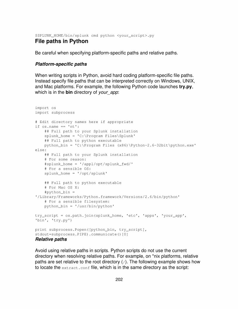
$SPLUNK_HOME/bin/splunk cmd python <your_script>.py
File paths in Python
Be careful when specifying platform-specific paths and relative paths.
Platform-specific paths
When writing scripts in Python, avoid hard coding platform-specific file paths.Instead specify file paths that can be interpreted correctly on Windows, UNIX,and Mac platforms. For example, the following Python code launches try.py,which is in the bin directory of your_app:
import osimport subprocess
# Edit directory names here if appropriateif os.name == 'nt': ## Full path to your Splunk installation splunk_home = 'C:\Program Files\Splunk' ## Full path to python executable python_bin = 'C:\Program Files (x86)\Python-2.6-32bit\python.exe'else: ## Full path to your Splunk installation # For some reason: #splunk_home = '/appl/opt/splunk_fwd/' # For a sensible OS: splunk_home = '/opt/splunk'
## Full path to python executable # For Mac OS X: #python_bin ='/Library/Frameworks/Python.framework/Versions/2.6/bin/python' # For a sensible filesystem: python_bin = '/usr/bin/python'
try_script = os.path.join(splunk_home, 'etc', 'apps', 'your_app','bin', 'try.py')
print subprocess.Popen([python_bin, try_script],stdout=subprocess.PIPE).communicate()[0]
Relative paths
Avoid using relative paths in scripts. Python scripts do not use the currentdirectory when resolving relative paths. For example, on *nix platforms, relativepaths are set relative to the root directory (/). The following example shows howto locate the extract.conf file, which is in the same directory as the script:
202
import osimport os.path
script_dirpath = os.path.dirname(os.path.join(os.getcwd(), __file__))
config_filepath = os.path.join(script_dirpath, 'extract.conf')
Format script output
Format the output of a script so Splunk can easily parse the data. Also, considerformatting data so it is more human-readable as well.
Use the Common Information Model
The Common Information Model is based on the idea that you can break downmost log files into three components: fields, event type tags, and host tags.
With these three components you can set up log files in a way that makes themeasily processable by Splunk and that normalizes noncompliant log files, forcingthem to follow a similar schema. The Common Information model details thestandard fields, event type tags, and host tags that Splunk uses when itprocesses most IT data.
For more information, see Understand and use the Common Information Model.
Timestamp formats
Time stamp the beginning of an event. There are several options for timestampformats:
RFC-822, RFC-3339 These are standard timestamp formats for email headersand internet protocols. These formats provide an offset from GMT, and thus areunambiguous and more human-readable.
RFC-822 Tue, 15 Feb 2011 14:11:01 -0800
RFC-3339 2011-02-15 14:11:01-08:00
Note: RFC-822 and RFC-3339 formats can be handled with %z in aTIME_FORMAT setting.
UTC UTC formatting may not be as human-readable as some of the otheroptions. If the timestamp is epoch time, no configuration is necessary. Otherwise,requires a configuration in props.conf that declares the input as TZ=UTC.
203

UTC2011-02-15T14:11:01-05:002011-02-15T14:11:01Z
UTC converted to epoch time1297738860
Multi-line data and field names
For multi-line data, find a way to separate events.
Write a distinctive initial line for a multi-line event.•
Use a special end of event string to separate events. For example, usethree newline characters to specify an end of an event. The event wouldthen include any single or double newline characters.
•
For multi-line field values, place the field data inside quotes.•
Use an equals (=) sign or other separator to expose name/value pairs. Forexample, key=value.
•
Configure Splunk to use other tokens that might already exist in the data.•
Field names are case sensitive. For example the field names ?message?and ?Message? represent different fields. Be consistent when namingfields.
•
Write a setup screen to configure scripted inputs.
If you are packaging an app or add-on for distribution, consider creating a setupscreen that allows users to interactively provide configuration settings for accessto local scripted input resources. Include an input stanza for your script sosetup.xml doesn?t require a custom endpoint. See Configure a setup screen foryour app.
Refer to the *Nix and Windows apps for examples on using setup.xml pages tocreate a setup screen. These apps are available for download from Splunkbase.
204

Save state across invocations of the script
Scripts often need to checkpoint their work so subsequent invocations can pickup from where they left off. For example, save the last ID read from a database,mark the line and column read from a text file, or otherwise note the last inputread. (See Example script that polls a database.)
You can check point either the Splunk index or the script. When check pointingdata, keep in mind that the following things are not tied together as a transaction:
Writing out checkpoint files• Fully writing data into the pipe between the script and splunkd• splunkd completely writing out the data into the index•
Thus, in the case of hard crashes, it?s hard to know if the data the script hasacquired has been properly indexed. Here are some of the choices you have:
Search Splunk index One strategy is to have the scripted input search in thesplunk index to find the last relevant event. This is reasonable in aninfrequently-launched script, such as one that is launched every 5 or 10 minutes,or at launch time for a script which launches once and stays running indefinitely.
Maintain independent check point Because there is some delay between databeing fed to splunk and the data becoming searchable, a frequently run scriptedinput must maintain its own checkpoint independent of the index.
Choose a scenario If the script always believes its own checkpoint, data maynot be indexed on splunkd or system crash. If the index search is believed, somedata may be indexed multiple times on splunkd or system crash. You need tochoose which scenario you best fits your needs.
Accessing secured services
Use proper security measures for scripts that need credentials to access securedresources. Here are a few suggestions on how to provide secure access.However, no method is foolproof, so think carefully about your use case anddesign secure access appropriately:
Restrict which users can access the app or add-on on disk.• Create and use credentials specific to the script, with the minimumpermissions required to access the data.
•
Avoid putting literal passwords in scripts or passing the password as acommand line argument, making it visible to all local processes with
•
205

operating system access.Use Splunk to encrypt passwords. You can create an app set up page thatallows users to enter passwords. (See Providing credentials to accessscripts.) The user can enter a password in plain text, which Splunk storesin the credential stanza in apps.conf. Alternatively, you can specify apython script to securely provide access.
•
Caution: Splunk assembles a secret using locally available random seedsto encrypt passwords stored in configuration files. This method providesmodest security against disclosure of passwords from admins with localdisk read capability. However, it is not an adequate protection forprivileged accounts.
Concurrency issues for scripted inputs
Be careful scheduling two copies of a script running at any given time. Splunkdetects if another instance of the script is running, and does not launch a newinstance if this is the case. For example, if you have a script scheduled toexecute every 60 seconds, and a particular invocation takes 140 seconds,Splunk detects this and does not launch a new instance until after thelong-running instance completes.
At times you may want to run multiple copies of a script, for example to pollindependent databases. For these cases, design your scripts so they can handlemultiple servers. Also, design your script so that multiple copies can exist (forexample, use two app directories for script).
Alternatively, you could have separate scripts using the same sourcetype.
Troubleshooting scheduled scripts
Splunk logs exceptions thrown by scheduled scripts to the splunkd.log file,located here:
$SPLUNK_HOME/var/log/splunk/splunkd.log
Check splunkd.log first if expected events do not appear in the expected indexafter scheduling the scripted input.
Shutdown and restart issues
Keep these shutdown and restart issues in mind when designing your scripts:
206

Output at least one event at a time
This makes it easier to avoid reading a partial event if the script is terminated orcrashes. Splunk expects events will complete in a timely manner, and has built-intime-outs to prevent truncated or incomplete events.
Configure the pipe fd as line-buffered, or write() full events at once. Be sure theevents are flushed: line buffered/unbuffered/fflush()
Output relatively small batches of events
Fetching thousands of event over a few minutes and then outputting them all atonce increases the risk of losing data due to a restart. Additionally, outputtingsmall batches of events means your data is searchable sooner and improvesscript transparency.
Example script that polls a database
Here is an example of a scripted input that polls a database. In the configurationfor the script, you specify the interval at which the script runs.
Note: No script can be a "one size fits all." The purpose of this example is toprovide a basic framework that you modify and customize for your specificpurposes. This script polls a database and writes the records retrieved to stdout.The data queries, connection, authentication, and processing of the query havebeen simplified.
This example script does the following:
Builds a query to extract 1000 records from a database• Connects to a database• Stores the key to the database as an eventID.• Writes the last eventID retrieved from the database to file to track whichevents have been indexed.
•
Executes the query and writes the results to stdout for Splunk to index.•
Pseudo-code for the example script
# Script to poll a database## Reads 1000 records from a database,# writes them to stdout for indexing by splunk,
207
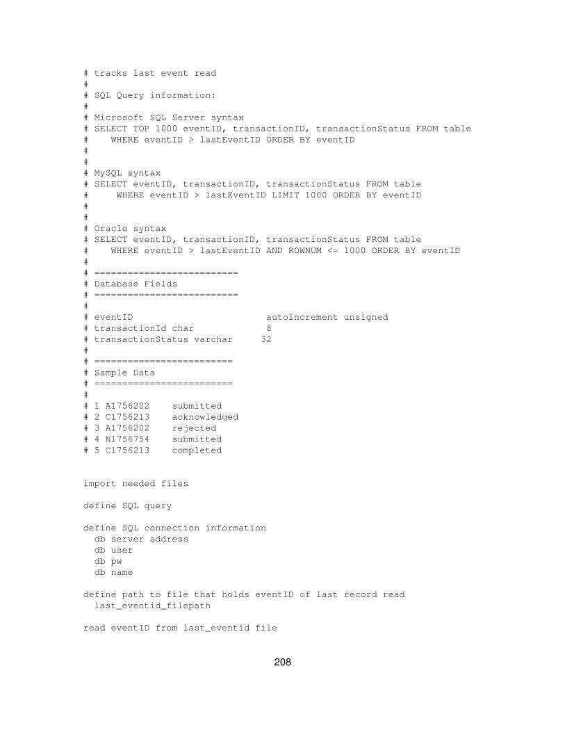
# tracks last event read## SQL Query information:## Microsoft SQL Server syntax# SELECT TOP 1000 eventID, transactionID, transactionStatus FROM table# WHERE eventID > lastEventID ORDER BY eventID### MySQL syntax# SELECT eventID, transactionID, transactionStatus FROM table# WHERE eventID > lastEventID LIMIT 1000 ORDER BY eventID### Oracle syntax# SELECT eventID, transactionID, transactionStatus FROM table# WHERE eventID > lastEventID AND ROWNUM <= 1000 ORDER BY eventID## ==========================# Database Fields# ==========================## eventID autoincrement unsigned# transactionId char 8# transactionStatus varchar 32## =========================# Sample Data# =========================## 1 A1756202 submitted# 2 C1756213 acknowledged# 3 A1756202 rejected# 4 N1756754 submitted# 5 C1756213 completed
import needed files
define SQL query
define SQL connection information db server address db user db pw db name
define path to file that holds eventID of last record read last_eventid_filepath
read eventID from last_eventid file
208
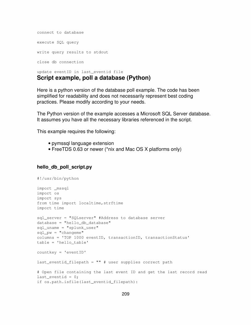
connect to database
execute SQL query
write query results to stdout
close db connection
update eventID in last_eventid file
Script example, poll a database (Python)
Here is a python version of the database poll example. The code has beensimplified for readability and does not necessarily represent best codingpractices. Please modify according to your needs.
The Python version of the example accesses a Microsoft SQL Server database.It assumes you have all the necessary libraries referenced in the script.
This example requires the following:
pymssql language extension• FreeTDS 0.63 or newer (*nix and Mac OS X platforms only)•
hello_db_poll_script.py
#!/usr/bin/python
import _mssqlimport osimport sysfrom time import localtime,strftimeimport time
sql_server = "SQLserver" #Address to database serverdatabase = "hello_db_database"sql_uname = "splunk_user"sql_pw = "changeme"columns = 'TOP 1000 eventID, transactionID, transactionStatus'table = 'hello_table'
countkey = 'eventID'
last_eventid_filepath = "" # user supplies correct path
# Open file containing the last event ID and get the last record readlast_eventid = 0;if os.path.isfile(last_eventid_filepath):
209
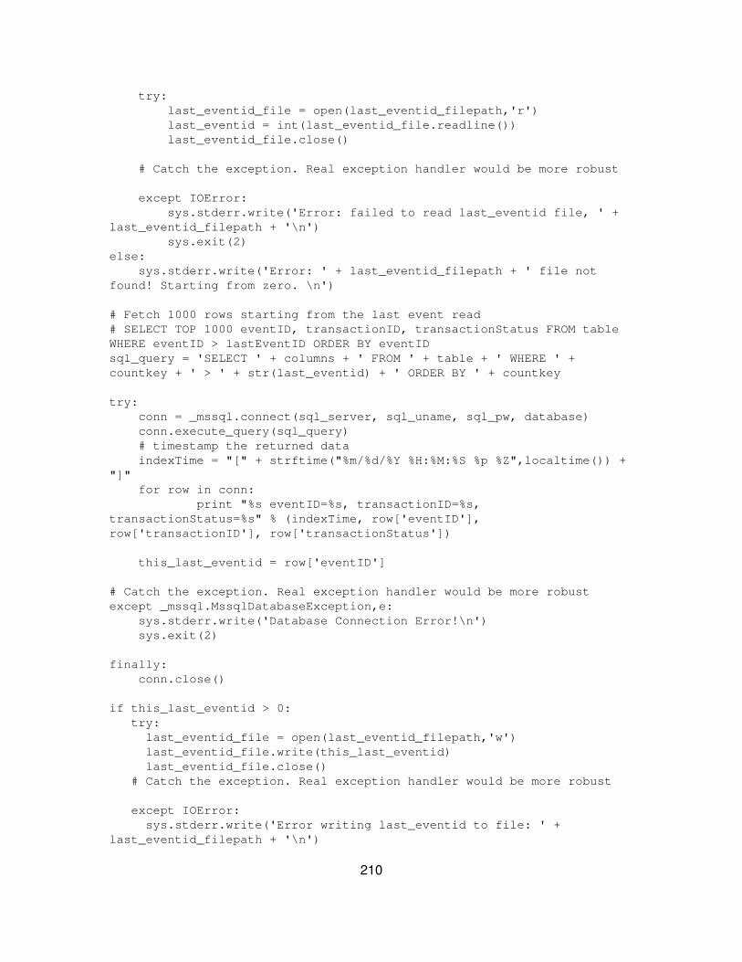
try: last_eventid_file = open(last_eventid_filepath,'r') last_eventid = int(last_eventid_file.readline()) last_eventid_file.close()
# Catch the exception. Real exception handler would be more robust
except IOError: sys.stderr.write('Error: failed to read last_eventid file, ' +last_eventid_filepath + '\n') sys.exit(2)else: sys.stderr.write('Error: ' + last_eventid_filepath + ' file notfound! Starting from zero. \n')
# Fetch 1000 rows starting from the last event read# SELECT TOP 1000 eventID, transactionID, transactionStatus FROM tableWHERE eventID > lastEventID ORDER BY eventIDsql_query = 'SELECT ' + columns + ' FROM ' + table + ' WHERE ' +countkey + ' > ' + str(last_eventid) + ' ORDER BY ' + countkey
try: conn = _mssql.connect(sql_server, sql_uname, sql_pw, database) conn.execute_query(sql_query) # timestamp the returned data indexTime = "[" + strftime("%m/%d/%Y %H:%M:%S %p %Z",localtime()) +"]" for row in conn: print "%s eventID=%s, transactionID=%s,transactionStatus=%s" % (indexTime, row['eventID'],row['transactionID'], row['transactionStatus'])
this_last_eventid = row['eventID']
# Catch the exception. Real exception handler would be more robust except _mssql.MssqlDatabaseException,e: sys.stderr.write('Database Connection Error!\n') sys.exit(2)
finally: conn.close()
if this_last_eventid > 0: try: last_eventid_file = open(last_eventid_filepath,'w') last_eventid_file.write(this_last_eventid) last_eventid_file.close() # Catch the exception. Real exception handler would be more robust
except IOError: sys.stderr.write('Error writing last_eventid to file: ' +last_eventid_filepath + '\n')
210

sys.exit(2)
211
Extend Splunk
Extend Splunk
There are several ways you can extend Splunk using the Splunk SDKs, theSplunk REST API, and custom search commands.
Splunk SDKs
Splunk provides a growing list of SDKs that you can use to write applications inthird party software that access the Splunk REST API. [Splunk for Developers],the Splunk developer portal, provides details on the available SDKs plusdocumentation on how to build applications using the SDKs. The SDKs that arecurrently available include:
Python SDK• Java SDK• JavaScript SDK•
Splunk REST API
You can use the Splunk REST API to run searches or manage Splunkconfigurations and objects without accessing Splunk through Splunk Web.
Custom search commands
Splunk ships with a wide variety of search commands. However, you may wantto build your own custom search command to parse and present data in a newway. Custom search commands requires a moderate understanding of Python.
Note: Search commands are not recursive -- they only act on the datathey receive back from the search.
Splunk SDKs
In Splunk 4.2.3, Splunk introduced Splunk for Developers, a portal for Splunkdevelopers. Splunk for Developers contains information on the available SplunkSDKs. The SDKs provide wrapper functions, methods and modules for theSplunk REST API. These provide access to a Splunk server environment in a
212
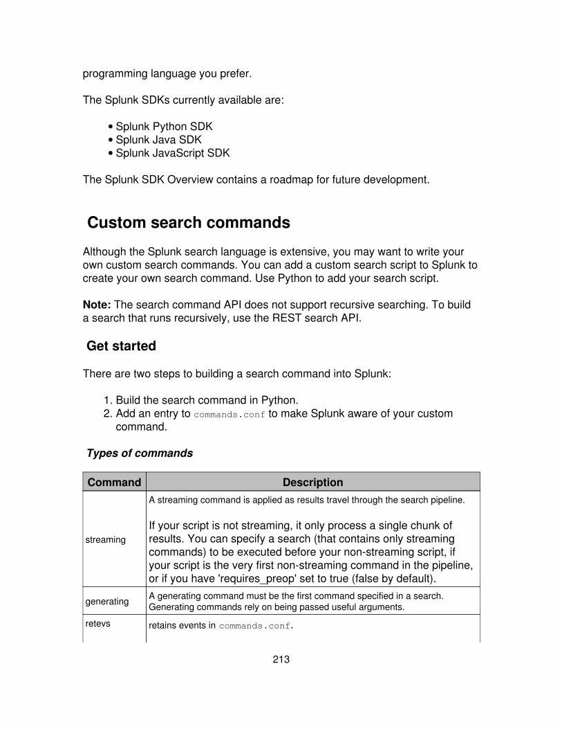
programming language you prefer.
The Splunk SDKs currently available are:
Splunk Python SDK• Splunk Java SDK• Splunk JavaScript SDK•
The Splunk SDK Overview contains a roadmap for future development.
Custom search commands
Although the Splunk search language is extensive, you may want to write yourown custom search commands. You can add a custom search script to Splunk tocreate your own search command. Use Python to add your search script.
Note: The search command API does not support recursive searching. To builda search that runs recursively, use the REST search API.
Get started
There are two steps to building a search command into Splunk:
Build the search command in Python.1. Add an entry to commands.conf to make Splunk aware of your customcommand.
2.
Types of commands
Command Description
streaming
A streaming command is applied as results travel through the search pipeline.
If your script is not streaming, it only process a single chunk ofresults. You can specify a search (that contains only streamingcommands) to be executed before your non-streaming script, ifyour script is the very first non-streaming command in the pipeline,or if you have 'requires_preop' set to true (false by default).
generating A generating command must be the first command specified in a search.Generating commands rely on being passed useful arguments.
retevs retains events in commands.conf.
213
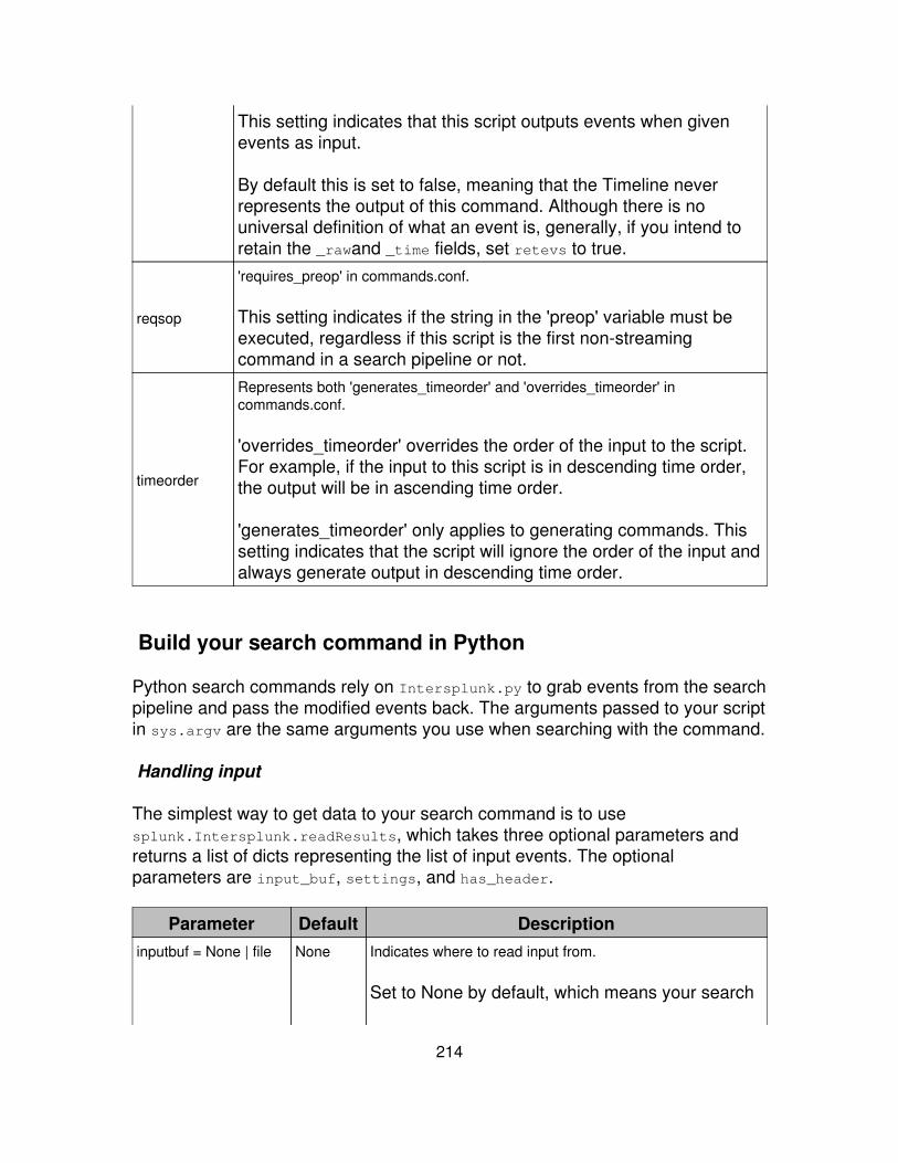
This setting indicates that this script outputs events when givenevents as input.
By default this is set to false, meaning that the Timeline neverrepresents the output of this command. Although there is nouniversal definition of what an event is, generally, if you intend toretain the _rawand _time fields, set retevs to true.
reqsop
'requires_preop' in commands.conf.
This setting indicates if the string in the 'preop' variable must beexecuted, regardless if this script is the first non-streamingcommand in a search pipeline or not.
timeorder
Represents both 'generates_timeorder' and 'overrides_timeorder' incommands.conf.
'overrides_timeorder' overrides the order of the input to the script.For example, if the input to this script is in descending time order,the output will be in ascending time order.
'generates_timeorder' only applies to generating commands. Thissetting indicates that the script will ignore the order of the input andalways generate output in descending time order.
Build your search command in Python
Python search commands rely on Intersplunk.py to grab events from the searchpipeline and pass the modified events back. The arguments passed to your scriptin sys.argv are the same arguments you use when searching with the command.
Handling input
The simplest way to get data to your search command is to usesplunk.Intersplunk.readResults, which takes three optional parameters andreturns a list of dicts representing the list of input events. The optionalparameters are input_buf, settings, and has_header.
Parameter Default Descriptioninputbuf = None | file None Indicates where to read input from.
Set to None by default, which means your search
214
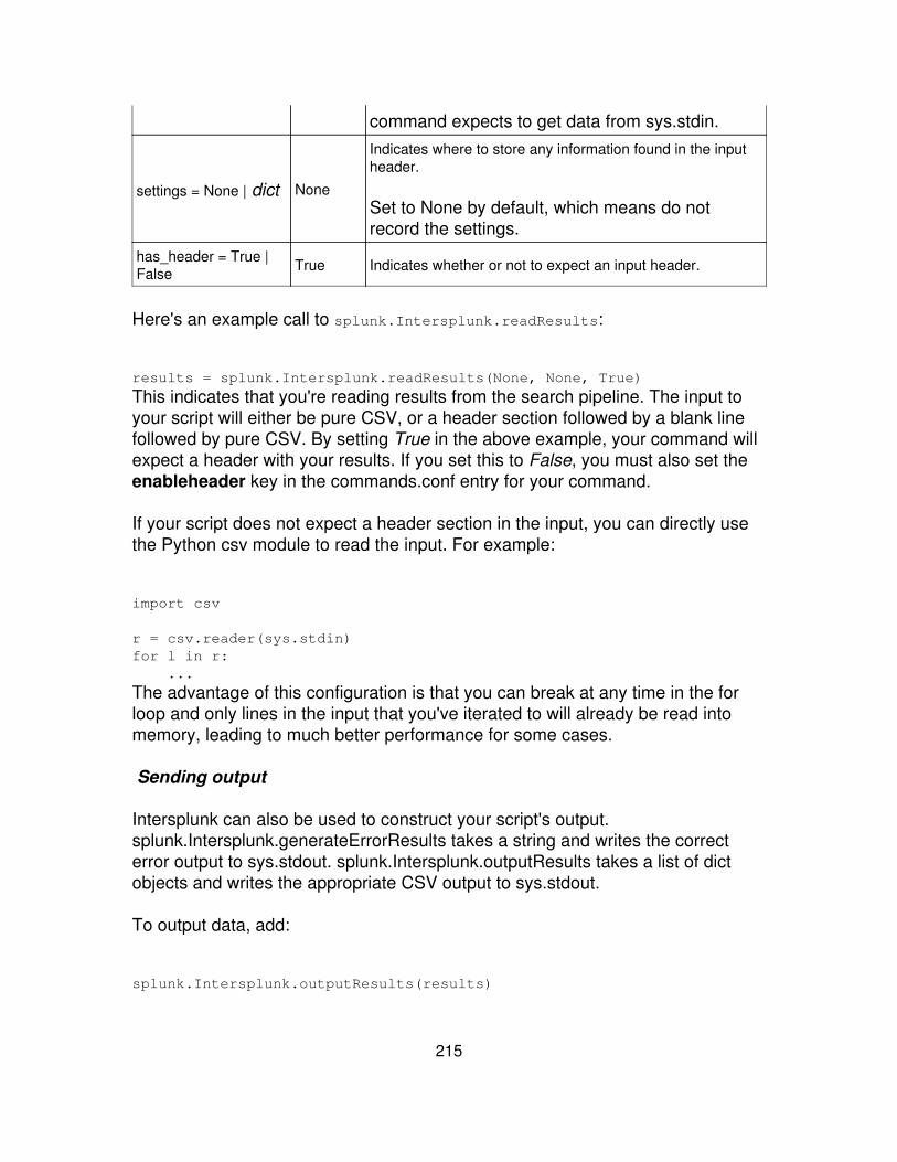
command expects to get data from sys.stdin.
settings = None | dict None
Indicates where to store any information found in the inputheader.
Set to None by default, which means do notrecord the settings.
has_header = True |False True Indicates whether or not to expect an input header.
Here's an example call to splunk.Intersplunk.readResults:
results = splunk.Intersplunk.readResults(None, None, True)
This indicates that you're reading results from the search pipeline. The input toyour script will either be pure CSV, or a header section followed by a blank linefollowed by pure CSV. By setting True in the above example, your command willexpect a header with your results. If you set this to False, you must also set theenableheader key in the commands.conf entry for your command.
If your script does not expect a header section in the input, you can directly usethe Python csv module to read the input. For example:
import csv
r = csv.reader(sys.stdin)for l in r: ...
The advantage of this configuration is that you can break at any time in the forloop and only lines in the input that you've iterated to will already be read intomemory, leading to much better performance for some cases.
Sending output
Intersplunk can also be used to construct your script's output.splunk.Intersplunk.generateErrorResults takes a string and writes the correcterror output to sys.stdout. splunk.Intersplunk.outputResults takes a list of dictobjects and writes the appropriate CSV output to sys.stdout.
To output data, add:
splunk.Intersplunk.outputResults(results)
215
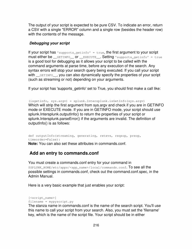
The output of your script is expected to be pure CSV. To indicate an error, returna CSV with a single "ERROR" column and a single row (besides the header row)with the contents of the message.
Debugging your script
If your script has 'supports_getinfo' = true, the first argument to your scriptmust either be __GETINFO__ or __EXECUTE__. Setting 'supports_getinfo' = trueis a good tool for debugging as it allows your script to be called with thecommand arguments at parse time, before any execution of the search. Anysyntax errors will stop your search query being executed. If you call your scriptwith __GETINFO__, you can also dynamically specify the properties of your script(such as streaming or not) depending on your arguments.
If your script has 'supports_getinfo' set to True, you should first make a call like:
(isgetinfo, sys.argv) = splunk.Intersplunk.isGetInfo(sys.argv)
Which will strip the first argument from sys.argv and check if you are in GETINFOmode or EXECUTE mode. If you are in GETINFO mode, your script should usesplunk.Intersplunk.outputInfo() to return the properties of your script orsplunk.Intersplunk.parseError() if the arguments are invalid. The definition ofoutputInfo() is as follows:
def outputInfo(streaming, generating, retevs, reqsop, preop,timeorder=False):
Note: You can also set these attributes in commands.conf.
Add an entry to commands.conf
You must create a commands.conf entry for your command in$SPLUNK_HOME/etc/apps/<app_name>/local/commands.conf. To see all thepossible settings in commands.conf, check out the command.conf.spec, in theAdmin Manual.
Here is a very basic example that just enables your script:
[<script_name>]filename = mypyscript.py
The stanza name in commands.conf is the name of the search script. You'll usethis name to call your script from your search. Also, you must set the 'filename'key, which is the name of the script file. Your script should be in either
216
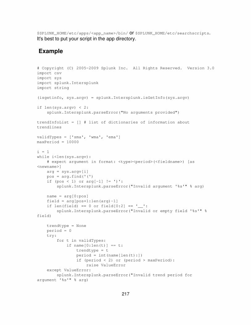
$SPLUNK_HOME/etc/apps/<app_name>/bin/ or $SPLUNK_HOME/etc/searchscripts.It's best to put your script in the app directory.
Example
# Copyright (C) 2005-2009 Splunk Inc. All Rights Reserved. Version 3.0import csvimport sysimport splunk.Intersplunkimport string
(isgetinfo, sys.argv) = splunk.Intersplunk.isGetInfo(sys.argv)
if len(sys.argv) < 2: splunk.Intersplunk.parseError("No arguments provided")
trendInfoList = [] # list of dictionaries of information abouttrendlines
validTypes = ['sma', 'wma', 'ema']maxPeriod = 10000
i = 1while i<len(sys.argv): # expect argument in format: <type><period>(<fieldname>) [as<newname>] arg = sys.argv[i] pos = arg.find('(') if (pos < 1) or arg[-1] != ')': splunk.Intersplunk.parseError("Invalid argument '%s'" % arg)
name = arg[0:pos] field = arg[pos+1:len(arg)-1] if len(field) == 0 or field[0:2] == '__': splunk.Intersplunk.parseError("Invalid or empty field '%s'" %field)
trendtype = None period = 0 try: for t in validTypes: if name[0:len(t)] == t: trendtype = t period = int(name[len(t):]) if (period < 2) or (period > maxPeriod): raise ValueError except ValueError: splunk.Intersplunk.parseError("Invalid trend period forargument '%s'" % arg)
217

if trendtype is None: splunk.Intersplunk.parseError("Invalid trend type for argument'%s'" % arg)
newname = arg; if (i+2<len(sys.argv)) and (string.lower(sys.argv[i+1]) == "as"): newname = sys.argv[i+2] i += 3 else: i += 1
trendInfoList.append({'type' : trendtype, 'period' : period, 'field' : field, 'newname' : newname, 'vals': [], 'last': None})
if isgetinfo: splunk.Intersplunk.outputInfo(False, False, True, False, None,True) # outputInfo automatically calls sys.exit()
results = splunk.Intersplunk.readResults(None, None, True)
for res in results: # each res is a dict of fields to values for ti in trendInfoList: if ti['field'] not in res: continue
try: ti['vals'].append(float(res[ti['field']])) except ValueError: continue # ignore non-numeric values
if len(ti['vals']) > ti['period']: ti['vals'].pop(0) elif len(ti['vals']) < ti['period']: continue # not enough data yet
newval = None
if ti['type'] == 'sma': # simple moving average newval = sum(ti['vals']) / ti['period'] elif ti['type'] == 'wma': # weighted moving average Total = 0 for i in range(len(ti['vals'])): Total += (i+1)*(ti['vals'][i]) newval = Total / (ti['period'] * (ti['period']+1) / 2)
218
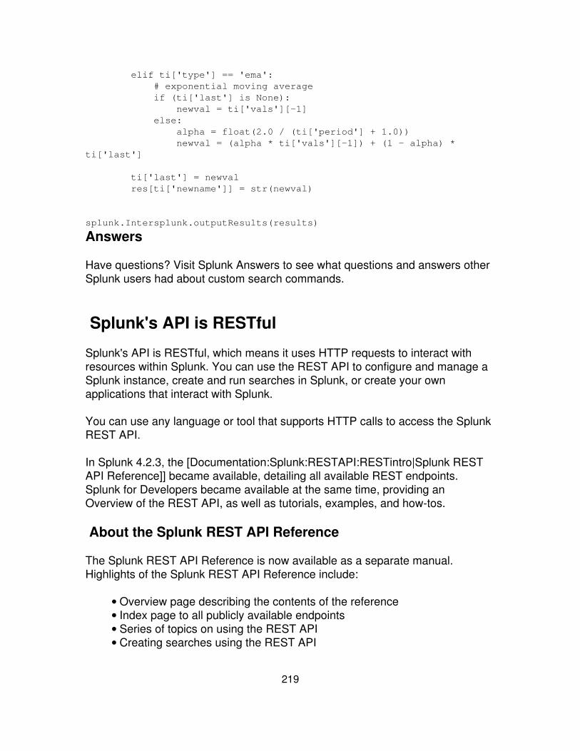
elif ti['type'] == 'ema': # exponential moving average if (ti['last'] is None): newval = ti['vals'][-1] else: alpha = float(2.0 / (ti['period'] + 1.0)) newval = (alpha * ti['vals'][-1]) + (1 - alpha) *ti['last']
ti['last'] = newval res[ti['newname']] = str(newval)
splunk.Intersplunk.outputResults(results)
Answers
Have questions? Visit Splunk Answers to see what questions and answers otherSplunk users had about custom search commands.
Splunk's API is RESTful
Splunk's API is RESTful, which means it uses HTTP requests to interact withresources within Splunk. You can use the REST API to configure and manage aSplunk instance, create and run searches in Splunk, or create your ownapplications that interact with Splunk.
You can use any language or tool that supports HTTP calls to access the SplunkREST API.
In Splunk 4.2.3, the [Documentation:Splunk:RESTAPI:RESTintro|Splunk RESTAPI Reference]] became available, detailing all available REST endpoints.Splunk for Developers became available at the same time, providing anOverview of the REST API, as well as tutorials, examples, and how-tos.
About the Splunk REST API Reference
The Splunk REST API Reference is now available as a separate manual.Highlights of the Splunk REST API Reference include:
Overview page describing the contents of the reference• Index page to all publicly available endpoints• Series of topics on using the REST API• Creating searches using the REST API•
219

The Splunk REST API Reference also includes several examples:
Authenticating yourself to the Splunk server to access Splunk endpoints• Accessing and updating Splunk configurations• Some basic examples using the Splunk REST API• Create a search and retrieve the results• The REST API Overview at Splunk for Developers provides additionaltutorials and examples
•
220

View reference material
Panel reference for Simplified XML
Use the panel reference when building simple dashboards or from searches fromSplunk's Simplified XML. It lists configuration options for the various types ofpanels you can use, plus includes an example configuration for each.
There are general settings that can be applied to all panels. Different types ofpanels have specific configuration options.
General panel configuration
Options for all panels
Tag Description
<title>title</title>
Add a title to your panel, such asFailed logins. This title displayat the top of the panel.
<searchName>saved search</searchName>
Specify a saved search to load inyour panel. Make sure the savedsearch is shared with all users androles who access the dashboard. Thesaved search must exist insavedsearches.conf in theApp's default or local directory,the user's directory for privateapps, or be set as global.
<searchString>search string</searchString>Specify an inline search to runwhenever the dashboard loads.
<fields>comma separated list offields</fields>
Restrict your search results tospecific fields.
<earliestTime>Splunk timeformat</earliestTime>
Restrict your search results to aspecific time window, starting with theearliestTime. Specify "rt" to enablereal-time searches.
<latestTime>Splunk timeformat</latestTime>
Restrict your search results to aspecific time window, ending with thelatestTime. Specify "rt" to enablereal-time searches.
221
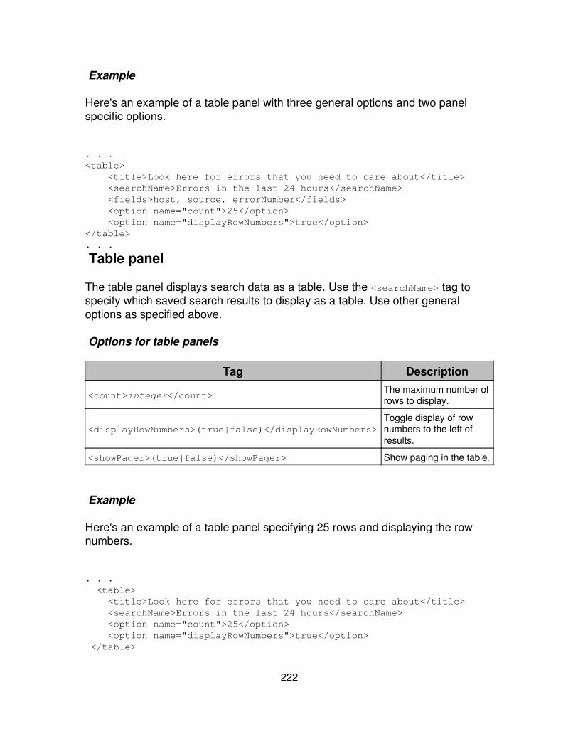
Example
Here's an example of a table panel with three general options and two panelspecific options.
. . .<table> <title>Look here for errors that you need to care about</title> <searchName>Errors in the last 24 hours</searchName> <fields>host, source, errorNumber</fields> <option name="count">25</option> <option name="displayRowNumbers">true</option></table>. . .
Table panel
The table panel displays search data as a table. Use the <searchName> tag tospecify which saved search results to display as a table. Use other generaloptions as specified above.
Options for table panels
Tag Description
<count>integer</count>The maximum number ofrows to display.
<displayRowNumbers>(true|false)</displayRowNumbers>Toggle display of rownumbers to the left ofresults.
<showPager>(true|false)</showPager> Show paging in the table.
Example
Here's an example of a table panel specifying 25 rows and displaying the rownumbers.
. . . <table> <title>Look here for errors that you need to care about</title> <searchName>Errors in the last 24 hours</searchName> <option name="count">25</option> <option name="displayRowNumbers">true</option> </table>
222
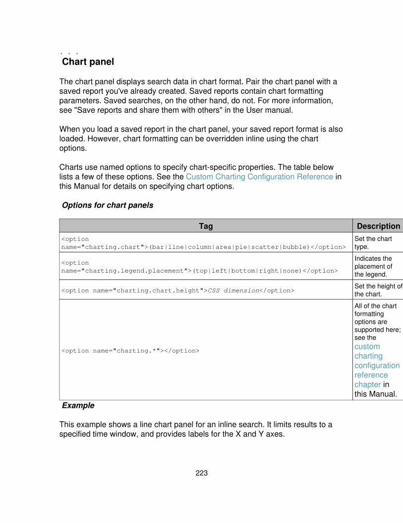
. . .
Chart panel
The chart panel displays search data in chart format. Pair the chart panel with asaved report you've already created. Saved reports contain chart formattingparameters. Saved searches, on the other hand, do not. For more information,see "Save reports and share them with others" in the User manual.
When you load a saved report in the chart panel, your saved report format is alsoloaded. However, chart formatting can be overridden inline using the chartoptions.
Charts use named options to specify chart-specific properties. The table belowlists a few of these options. See the Custom Charting Configuration Reference inthis Manual for details on specifying chart options.
Options for chart panels
Tag Description<optionname="charting.chart">(bar|line|column|area|pie|scatter|bubble)</option>
Set the charttype.
<optionname="charting.legend.placement">(top|left|bottom|right|none)</option>
Indicates theplacement ofthe legend.
<option name="charting.chart.height">CSS dimension</option>Set the height ofthe chart.
<option name="charting.*"></option>
All of the chartformattingoptions aresupported here;see thecustomchartingconfigurationreferencechapter inthis Manual.
Example
This example shows a line chart panel for an inline search. It limits results to aspecified time window, and provides labels for the X and Y axes.
223
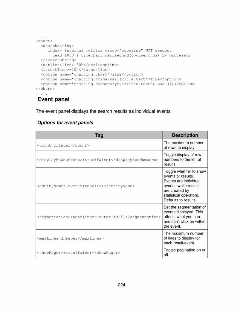
. . .<chart> <searchString> index=_internal metrics group="pipeline" NOT sendout | head 1000 | timechart per_second(cpu_seconds) by processor </searchString> <earliestTime>-30h</earliestTime> <latestTime>-10h</latestTime> <option name="charting.chart">line</option> <option name="charting.primaryAxisTitle.text">Time</option> <option name="charting.secondaryAxisTitle.text">Load (%)</option></chart>. . .
Event panel
The event panel displays the search results as individual events.
Options for event panels
Tag Description
<count>integer</count>The maximum numberof rows to display.
<displayRowNumbers>(true|false)</displayRowNumbers>Toggle display of rownumbers to the left ofresults.
<entityName>(events|results)</entityName>
Toggle whether to showevents or results.Events are individualevents, while resultsare created bystatistical operators.Defaults to results.
<segmentation>(none|inner|outer|full)</segmentation>
Set the segmentation ofevents displayed. Thisaffects what you canand can't click on withinthe event.
<maxLines>Integer</maxLines>The maximum numberof lines to display foreach result/event.
<showPager>(true|false)</showPager>Toggle pagination on oroff.
224
Example
The following example shows an event panel specifying which fields to display,showing the pager, display 20 rows per page, and do not display row numbers.
. . .<event> <title>Event view</title> <searchString>changelist | head 1000 | dedupchangelist</searchString> <fields>added deleted changed</fields> <option name="showPager">true</option> <option name="count">20</option> <option name="displayRowNumbers">false</option></event>. . .
Single value panel
The single value panel displays the result of a search that returns a single value.If you specify a search that returns multiple values, the single value paneldisplays the value from either the first row or first column of returned search data.
You can change the color of the panel by specifying a rangemap for the returnedvalues.
Options for single value panels
Tag Description
<additionalClass>CSS class name</additionalClass>An optional additional css class nameto add to the result container.
<code><linkView>view</linkView>Specify which view to execute thelinked search against. Defaults todashboard.
<field>field</field>Field to display. Defaults to first fieldreturned.
<linkFields>(result|beforeLabel|afterLabel)</linkFields>
Set which part of the text in the singlevalue to use as a link. To link the resultand both labels, set asresult,beforeLabel,afterLabel.Defaults to result
<classField>("class"|severe|elevated|low|None|)</classField> Adds the value of the classField of thefirst result as an additional CSS classto the result container. Pre-defined
225

classes include severe, elevated,low, and None. Default is None.
<beforeLabel>text</beforeLabel> Label to display before the result.
<afterLabel>text</afterLabel> Label to display after the result.
<linkSearch> search query</linkSearch>Specify a valid complete search queryto turn the result into a clickable link.
Example
The following example specifies a single value to display with a label after thevalue.
. . .<single> <searchString>| metadata type="sources" | stats count</searchString> <option name="afterLabel">sources</option></single>
To change colors of the single results display, specify a range map in yoursearch. Also, add range for the classField option.
<pre><single> <searchString>index=_internal 404 source="*web_access.log"earliest=-1h |stats count | rangemap field=count low=0-0 elevated=1-100default=severe</searchString> <title>404s this hour</title> <option name="classField">range</option></single>. . .
HTML panel
The HTML panel displays inline HTML. The panel interpets the entire contentsbetween the HTML tags literally, displayed HTML formatted text in the panel.
Any relative link references, such as images, are relative to the current viewlocation. The HTML panel does not accept any options.
Example
. . .<html> This lists all of the data you have loaded into
226
<strong>your</strong> default indexes over all time.</html>. . .
List panel
The list panel displays data in a list. Use this panel to display information fromsaved searches or search results. This panel supports the following options.
Required options for list
Tag Description
<labelField>field name</labelField>The field you want to use to generatelabels for your list.
<valueField>field name</valueField>The field you want to use to generatevalues for the labels in your list.
Optional options for list
Tag Description
<initialSortDir>(asc|desc)</initialSortDir>The direction to sort the resultsbased on the initialSort field.
<labelFieldSearch>searchstring</labelFieldSearch>
The search string to generatewhen the user clicks on the labelfield. RequireslabelFieldTarget to bedefined to a valid view. Thevalue of the label field isautomatically added to thesearch.
<valueField></valueField>
Required. The name of the resultfield whose value should bedisplayed in the label part of thelink list. Link lists are generally acombination of a descriptive labeland a numeric count or other(value) field.
<labelFieldTarget></labelFieldTarget>
(Optional) The view to target if thelabel field is setup to generate aclickable link that dispatches asearch.
<initialSort></initialSort> (Optional) The field in the result setto sort on when the link list is first
227
rendered.
Example
The following example shows a list panel listing the sourcetype for errors,followed by host name for the error:
. . .<list> <searchName>Errors in the last 24 hours</searchName> <option name="labelField">sourcetype</option> <option name="valueField">host</option></list>. . .
Module Reference
Base class
Splunk.Module
This is the abstract base class for all modules.
required params
(none)
optional params
(none)
DM_IFrame
(extends IFrameInclude) This module provides the Deployment Monitor app withthe ability to load a custom controller without a priori knowledge of the appnamespace
required params
(none)
228
optional params
check_exists = False | TrueDEPRECATED This checks to see if the remote or local src exists.It defaults to false. NOTE: Local app static files are skipped ifcheck_exists is set to True.
♦
defaults to: False♦
•
heightThe numeric pixel value constraint of your iframe or defaults toauto. NOTE: Remote URI's require the appropriate JavaScriptdocument.domain setting for fluid height to work correctly (seehttp://msdn.microsoft.com/en-us/library/cc196989(VS.85).aspx andhttps://developer.mozilla.org/en/DOM/document.domain)
♦
defaults to: auto♦
•
srcNot required by this module♦
•
DispatchingModule
(extends Splunk.Module) This is the abstract base class for all modules that canonly work with dispatched searches.
required params
(none)
optional params
(none)
UnixDrilldown
(extends Splunk.Module) This module handles custom drilldown for the Unix app
required params
(none)
optional params
drilldownKeySpecify the field name for the drilldown, or omit to use just theevent search for drilldown
♦ •
229
Unix_FTR
(extends Splunk.Module) This module provides the facility to check if the unixapp has been configured, as well as if the ta-unix add-on is concurrentlyinstalled, which represents a potential collision
required params
configLinkThis parameter is the relative URL that admins should be redirectedto
♦ •
optional params
(none)
Unix_IFrame
(extends IFrameInclude) This module provides the Splunk *nix App with theability to load a custom controller without a priori knowledge of the appnamespace
required params
(none)
optional params
check_exists = False | TrueDEPRECATED This checks to see if the remote or local src exists.It defaults to false. NOTE: Local app static files are skipped ifcheck_exists is set to True.
♦
defaults to: False♦
•
heightThe numeric pixel value constraint of your iframe or defaults toauto. NOTE: Remote URI's require the appropriate JavaScriptdocument.domain setting for fluid height to work correctly (seehttp://msdn.microsoft.com/en-us/library/cc196989(VS.85).aspx andhttps://developer.mozilla.org/en/DOM/document.domain)
♦
defaults to: auto♦
•
srcNot required by this module♦
•
230
Converters
ConvertToDrilldownSearch
(extends Splunk.Module) EXPERIMENTAL.
required params
(none)
optional params
drilldown.direction = up | downEXPERIMENTAL - this determines whether drilldown intentions aresend to downstream modules or to upstream modules.
♦
defaults to: down♦
•
drilldownPrefixNot required. Since this defaults to 'click', by default the module willlook for the keys 'click.name', 'click.value', 'click.name2','click.value2'. In cases where you are nesting multiple drilldownpatterns in the same view, this key is available to look for keys like'click2.name', or 'hostClick.value' instead.
♦
defaults to: click♦
•
enableDebugOutput = True | Falsewhen on, there will be some fields that output the args to thedrilldown intention, as well as the timerange and underlying baseSearch
♦
defaults to: False♦
•
ConvertToIntention
(extends Splunk.Module) Converts a setting value to an intention, which it addsto its context and passes to its children.
required params
intentionThis is the intention to add to the current search context. If'settingToConvert' is defined, use the "$target$" keyword within theintention somewhere to specify which value in the intention toreplace. If 'settingToConvert' is omitted, you do not use "$target$"but instead specify the setting name or names directly , ie"$selectedHost$".
♦ •
231
optional params
preserveParentIntentionsLEGACY. Has no function. this module was changed to *always*preserve existing intentions @62089 in june 2009, but thisassociated param was never removed.
♦
defaults to: False♦
•
settingToConvertWhen set, this defines the name of a single setting value that willbe set the intention, and which is then specified with a special"$target$" syntax. It's easier to not set this parameter, in which caseyou're allowed to specify the keys directly like "selectedHost" or"$foo.bar$";
♦ •
ConvertToRedirect
(extends Splunk.Module)
required params
settingToConvert• type•
optional params
(none)
Form elements
StaticRadio
(extends AbstractStaticFormElement)
required params
name• settingToCreate• staticFieldsToDisplay•
optional params
checked• label• searchWhenChanged•
232

defaults to: True♦
StaticSelect
(extends AbstractStaticFormElement)
required params
settingToCreate• staticFieldsToDisplay•
optional params
label• searchWhenChanged
defaults to: True♦ •
selected•
Include
AjaxInclude
(extends Splunk.Module) EXPERIMENTAL. A simple wrapper for integratingexternal content via XMLHTTPRequest within the module framework. Note this islimited to same domain constraints. Emulates iframe like behavior (page is notrefreshed on clicks) and binds an ajaxForm handler to all forms.
required params
endpointThis determines the initial endpoint.♦
•
optional params
dataThe associated query string name/value pairs to add to thePOST/GET request.
♦ •
focusAn optional element selector to apply form element focus on. Seehttp://docs.jquery.com/Selectors for selector syntax. Defaults to anauto-focus algorithm if undefined. To disable auto-focus provide aninvalid selector such as "foobar"
♦ •
hrefattributes•
233
The regular expression attributes for anchor element href attributevalues that should not refresh the page on click/keydown. Defaultsto no attributes excluding anchor elements with target or rel values.
♦
hrefpatternThe regular expression pattern for anchor element href attributevalues that should not refresh the page on click/keydown. Defaultsto matching everything excluding anchor elements with target or relvalues.
♦
defaults to: .*♦
•
method = GET | POSTThe type of initial request to make "POST" or "GET".♦ defaults to: GET♦
•
IFrameInclude
(extends Splunk.Module) This simple module uses an inline frame (iframe) toshow content from another URL.
required params
srcThis is the URL to a remote resource to be displayed in the module.Supports remote URI's (ie., http://foobar.com/hello), local app staticfiles (ie., hello.html found in$SPLUNK_HOME/etc/apps/$APPNAME/appserver/static) andrelative locations (ie., /manager).
♦ •
optional params
check_exists = False | TrueDEPRECATED This checks to see if the remote or local src exists.It defaults to false. NOTE: Local app static files are skipped ifcheck_exists is set to True.
♦
defaults to: False♦
•
heightThe numeric pixel value constraint of your iframe or defaults toauto. NOTE: Remote URI's require the appropriate JavaScriptdocument.domain setting for fluid height to work correctly (seehttp://msdn.microsoft.com/en-us/library/cc196989(VS.85).aspx andhttps://developer.mozilla.org/en/DOM/document.domain)
♦
defaults to: auto♦
•
234
ServerSideInclude
(extends Splunk.Module) This module supports the concept of server sideincludes for custom content. Additionally, the Mako (see:http://www.makotemplates.org/) template language is supported.
required params
srcThis specifies the static html file that should be displayed in thegiven view. When you give it a filename, Splunk attempts to fetchthe file from the current application static folder:/etc/apps/<app_name>/appserver/static/* (Note: absolute URI's notsupported). If the resource can't be found, a simple message inlineis displayed.
♦ •
optional params
(none)
Jobs
JobManager
(extends Splunk.Module) This large module dominates the page and is intendedto supply management functionality for many previously dispatched searches.
required params
jobStatusSetting• namespaceSetting• ownerSetting•
optional params
countdefaults to: 10♦
•
offsetdefaults to: 0♦
•
sortDirdefaults to: desc♦
•
sortKeydefaults to: dispatch_time♦
•
235
JobStatus
(extends DispatchingModule) This module is intended to supply basic searchmanagement functionality and information/general status information.
required params
(none)
optional params
actionsMenuFilterSets the filter on which action menu items to show.♦ defaults to: False♦
•
autoPauseIntervalNumber of seconds to wait before automatically pausing therunning job; only active when the Search.Context object contains a'auto_pause' setting = true.
♦
defaults to: 30♦
•
enableWizards = True | FalseControls the display of wizard work flows.♦ defaults to: True♦
•
hideOnJobDone = True | Falsein certain cases (notably in Report Builder), the JobStatus moduleis only visible while the search is running, and when the search hasfinished, it dissappears and a different module takes its place.
♦
defaults to: False♦
•
resultsLinkThis param itself contains nested params. It is a dictionary of configvalues that specifies behaviour for a link that should only be shownto the user when the search has completed. The link sends theuser to the configured view (within the same app), and Splunkloads that view with these search results. Contains a required'viewTarget' sub-param that is the view to which the user should besent. And also an optional 'popup' sub-param that when True willmake the link open a new popup window.
♦ •
showCreateMenuSet a bool to determin if the Create menu should be displayed♦ defaults to: True♦
•
showSaveMenuSet a bool to determin if the Save menu should be displayed♦ defaults to: True♦
•
236
Lister
EntityLinkLister
(extends AbstractEntityLister)
required params
entityPathThis should be a valid entity path such as saved/searches.♦
•
optional params
countThe number of list elements to list. This value only pertains to thedynamically generated list elements, not to the static elements. Insome concrete implementations, this value can be provided by aPaginator module and provide paging behavior.
♦ •
delimiterThe character to use to separate each listed field. Some concreteimplementations of lists do not use the delimiter, such as theoptions lister.
♦
defaults to: |♦
•
entityFieldsToDisplayThe entity fields to display. These are specified as <list> objects ina view xml specification and must contain at least a "label"definition or a "multiLabel" definition. If "label" is defined it should beset to the name of a field in the entity listing that will become thelabel of the generated list. If "multiLabel" is defined it must bespecified as a Python sprintf string where the tokens should map tofields in the entity list. The <list> object may also contain thefollowing options: "value" definition which is used by child classesto define the lister's behavior.
♦ •
namespaceThe namespace to use when requesting the list of entities.Normally this defaults to the current application's name.
♦ •
offsetThe starting offset for the dynamically generated list elements.♦
•
outputModeThis is set to li by default so it need not be declared in a viewconfiguration file. DO NO CHANGE THIS (unless you really knowwhat you're doing).
♦
defaults to: li♦
•
237
ownerThe owner to use when requesting the list of entities. Normally thisdefaults to the current user.
♦ •
postProcessThe post process search to apply to the entity request.♦
•
searchWhenChangedUsually the concrete Lister modules push their changes to theirchildren when a user has acted on the list of elements. In somecases this is not desirable, such as in the simplified formconfigurations.
♦
defaults to: True♦
•
settingToCreateThe setting to generate and pass down to child modules.♦
•
sortDir = asc | descThe direction to sort the results. This option may only be defined ifthe sortKey option is also defined.
♦ •
sortKeyThe field on which to sort the results. This is often deferred toPython's default sort algorithm and will observe Python's sortbehavior.
♦ •
staticFieldsToDisplayA set of <list> objects which define static list elements to add to thedynamically generated list elements. For example a static optionwith a label of "Any" and a value of "*" might be desired in additionto a list of saved searches generated by the entity lister. Staticfields are defined in much the same way as entity fields, as <list>objects with a "label" definition that is set to the explicit label (i.e."Any") and an optional value definition set to the value (i.e. "*").
♦ •
EntityRadioLister
(extends AbstractEntityLister)
required params
entityPathThis should be a valid entity path such as saved/searches.♦
•
nameThe name of the form to create.♦
•
settingToCreate•
238
optional params
checkedThe radio button to select after rending the options from a search.♦
•
countThe number of list elements to list. This value only pertains to thedynamically generated list elements, not to the static elements. Insome concrete implementations, this value can be provided by aPaginator module and provide paging behavior.
♦ •
delimiterThe character to use to separate each listed field. Some concreteimplementations of lists do not use the delimiter, such as theoptions lister.
♦
defaults to: |♦
•
entityFieldsToDisplayThe entity fields to display. These are specified as <list> objects ina view xml specification and must contain at least a "label"definition or a "multiLabel" definition. If "label" is defined it should beset to the name of a field in the entity listing that will become thelabel of the generated list. If "multiLabel" is defined it must bespecified as a Python sprintf string where the tokens should map tofields in the entity list. The <list> object may also contain thefollowing options: "value" definition which is used by child classesto define the lister's behavior.
♦ •
labelThe label to apply to the set of radio buttons.♦
•
namespaceThe namespace to use when requesting the list of entities.Normally this defaults to the current application's name.
♦ •
offsetThe starting offset for the dynamically generated list elements.♦
•
outputModeThis is set to radio by default so it need not be declared in a viewconfiguration file. DO NO CHANGE THIS (unless you like
♦
s as radio buttons).♦ defaults to: radio♦
•
ownerThe owner to use when requesting the list of entities. Normally thisdefaults to the current user.
♦ •
postProcessThe post process search to apply to the entity request.♦
•
searchWhenChanged•
239
Usually the concrete Lister modules push their changes to theirchildren when a user has acted on the list of elements. In somecases this is not desirable, such as in the simplified formconfigurations.
♦
defaults to: True♦ sortDir = asc | desc
The direction to sort the results. This option may only be defined ifthe sortKey option is also defined.
♦ •
sortKeyThe field on which to sort the results. This is often deferred toPython's default sort algorithm and will observe Python's sortbehavior.
♦ •
staticFieldsToDisplayA set of <list> objects which define static list elements to add to thedynamically generated list elements. For example a static optionwith a label of "Any" and a value of "*" might be desired in additionto a list of saved searches generated by the entity lister. Staticfields are defined in much the same way as entity fields, as <list>objects with a "label" definition that is set to the explicit label (i.e."Any") and an optional value definition set to the value (i.e. "*").
♦ •
EntitySelectLister
(extends AbstractEntityLister)
required params
entityPathThis should be a valid entity path such as saved/searches.♦
•
settingToCreate•
optional params
countThe initial number of entity items to load.♦
•
delimiterThe character to use to separate each listed field. Some concreteimplementations of lists do not use the delimiter, such as theoptions lister.
♦
defaults to: |♦
•
entityFieldsToDisplayThe entity fields to display. These are specified as <list> objects ina view xml specification and must contain at least a "label"
♦ •
240

definition or a "multiLabel" definition. If "label" is defined it should beset to the name of a field in the entity listing that will become thelabel of the generated list. If "multiLabel" is defined it must bespecified as a Python sprintf string where the tokens should map tofields in the entity list. The <list> object may also contain thefollowing options: "value" definition which is used by child classesto define the lister's behavior.
label• namespace
The namespace to use when requesting the list of entities.Normally this defaults to the current application's name.
♦ •
offsetThe starting offset for the dynamically generated list elements.♦
•
outputModeThis is set to options by default so it need not be declared in a viewconfiguration file. DO NO CHANGE THIS (unless you like
♦
s in your <select>s).♦ defaults to: options♦
•
ownerThe owner to use when requesting the list of entities. Normally thisdefaults to the current user.
♦ •
postProcessThe post process search to apply to the entity request.♦
•
searchWhenChangedUsually the concrete Lister modules push their changes to theirchildren when a user has acted on the list of elements. In somecases this is not desirable, such as in the simplified formconfigurations.
♦
defaults to: True♦
•
selectedThe option to show as selected. This is based on the label value,for example "selected = Edit" looks for an option whose label valueis also "Edit".
♦ •
sortDir = asc | descThe direction to sort the results. This option may only be defined ifthe sortKey option is also defined.
♦ •
sortKeyThe field on which to sort the results. This is often deferred toPython's default sort algorithm and will observe Python's sortbehavior.
♦ •
staticFieldsToDisplayA set of <list> objects which define static list elements to add to thedynamically generated list elements. For example a static option
♦ •
241
with a label of "Any" and a value of "*" might be desired in additionto a list of saved searches generated by the entity lister. Staticfields are defined in much the same way as entity fields, as <list>objects with a "label" definition that is set to the explicit label (i.e."Any") and an optional value definition set to the value (i.e. "*").
SearchLinkLister
(extends AbstractSearchLister)
required params
(none)
optional params
applyOuterIntentionsToInternalSearchif set to True, any intentions passed down from an upstreammodule will be used to drive the internal search of this module. Thisshould be used with caution, but when used carefully allows formelements to drive each others searches in interesting ways.
♦ •
applyOuterTimeRangeToInternalSearchif set to True, any timeRange passed down from an upstreammodule like TimeRangePicker, in addition to being used to effectthe main searches in the page, will also be used to drive theinternal search of this module.
♦ •
delimiterdefaults to: |♦
•
earliestThe earliest time to bound the search results by.♦
•
entityName = events | resultsThe type of search result data the module would like to work with.When entityName == results statusBuckets is set to 0, whichcannot be overridden, in an attempt to significantly speed up thesearch.
♦
defaults to: results♦
•
latest• namespace• outputMode
This is set to li by default so it need not be declared in a viewconfiguration file. DO NO CHANGE THIS.
♦
defaults to: li♦
•
owner•
242

postProcessThe post process search to apply to the search request.♦
•
savedSearchA valid saved search name.♦
•
searchA valid Splunk search string used to power the internalrepresentation of the module.
♦ •
searchFieldsToDisplay• searchWhenChanged
Usually the Lister modules should push their changes to theirchildren. In some cases this is not desirable, such as in thesimplified form configurations.
♦
defaults to: True♦
•
settingToCreate• sortDir• sortKey• staticFieldsToDisplay• statusBuckets
defaults to: 300♦ •
tokenPrefixdefaults to: click♦
•
useHistoryWhen "savedSearch" is defined, this dictates whether a new jobbased on a saved search should be dispatched (useHistory ==False), a cached job from a saved search's history should be used(useHistory == True) or if no job is cached in the saved search'shistory, dispatch a new job (useHistory == auto).
♦
defaults to: Auto♦
•
SearchRadioLister
(extends AbstractSearchLister)
required params
nameThe name of the form to create.♦
•
optional params
applyOuterIntentionsToInternalSearchif set to True, any intentions passed down from an upstreammodule will be used to drive the internal search of this module. This
♦ •
243

should be used with caution, but when used carefully allows formelements to drive each others searches in interesting ways.
applyOuterTimeRangeToInternalSearchif set to True, any timeRange passed down from an upstreammodule like TimeRangePicker, in addition to being used to effectthe main searches in the page, will also be used to drive theinternal search of this module.
♦ •
checkedThe radio button to select after rending the options from a search.♦
•
delimiterdefaults to: |♦
•
earliestThe earliest time to bound the search results by.♦
•
entityName = events | resultsThe type of search result data the module would like to work with.When entityName == results statusBuckets is set to 0, whichcannot be overridden, in an attempt to significantly speed up thesearch.
♦
defaults to: results♦
•
labelThe label to apply to the set of radio buttons.♦
•
latest• namespace• outputMode
This is set to radio by default so it need not be declared in a viewconfiguration file. DO NO CHANGE THIS (unless you like
♦
s as radio buttons).♦ defaults to: radio♦
•
owner• postProcess
The post process search to apply to the search request.♦ •
savedSearchA valid saved search name.♦
•
searchA valid Splunk search string used to power the internalrepresentation of the module.
♦ •
searchFieldsToDisplay• searchWhenChanged
Usually the Lister modules should push their changes to theirchildren. In some cases this is not desirable, such as in thesimplified form configurations.
♦
defaults to: True♦
•
settingToCreate•
244

sortDir• sortKey• staticFieldsToDisplay• statusBuckets
defaults to: 300♦ •
tokenPrefixdefaults to: click♦
•
useHistoryWhen "savedSearch" is defined, this dictates whether a new jobbased on a saved search should be dispatched (useHistory ==False), a cached job from a saved search's history should be used(useHistory == True) or if no job is cached in the saved search'shistory, dispatch a new job (useHistory == auto).
♦
defaults to: Auto♦
•
SearchSelectLister
(extends AbstractSearchLister)
required params
(none)
optional params
applyOuterIntentionsToInternalSearchif set to True, any intentions passed down from a parent module willbe used to drive the internal search of this module. This should beused with caution, but when used carefully allows form elements todrive each others searches in interesting ways.
♦ •
applyOuterTimeRangeToInternalSearchif set to True, any timeRange passed down from an upstreammodule like TimeRangePicker, in addition to being used to effectthe main searches in the page, will also be used to drive theinternal search of this module.
♦ •
countThe initial number of entity items to load.♦
•
delimiterdefaults to: |♦
•
earliestThe earliest time to bound the search results by.♦
•
entityName = events | results•
245
The type of search result data the module would like to work with.When entityName == results statusBuckets is set to 0, whichcannot be overridden, in an attempt to significantly speed up thesearch.
♦
defaults to: results♦ label• latest• namespace• outputMode
This is set to options by default so it need not be declared in a viewconfiguration file. DO NO CHANGE THIS (unless you like
♦
s in your <select>s).♦ defaults to: options♦
•
owner• postProcess
The post process search to apply to the search request.♦ •
savedSearchA valid saved search name.♦
•
searchA valid Splunk search string used to power the internalrepresentation of the module.
♦ •
searchFieldsToDisplay• searchWhenChanged
Usually the Lister modules should push their changes to theirchildren. In some cases this is not desirable, such as in thesimplified form configurations.
♦
defaults to: True♦
•
selectedThe option to show as selected. This is based on the label value,for example "selected = Edit" looks for an option whose label valueis also "Edit".
♦ •
settingToCreate• sortDir• sortKey• staticFieldsToDisplay• statusBuckets
defaults to: 300♦ •
tokenPrefixdefaults to: click♦
•
useHistoryWhen "savedSearch" is defined, this dictates whether a new jobbased on a saved search should be dispatched (useHistory ==False), a cached job from a saved search's history should be used
♦ •
246

(useHistory == True) or if no job is cached in the saved search'shistory, dispatch a new job (useHistory == auto).defaults to: Auto♦
Messaging
Message
(extends DispatchingModule) This module can display all messages to the user,or can be configured to display just a certain class of messages. Messages mightcome from searches, from alerts firing, from misconfiguration on the backend,from information about indexing status etc. The simplest configuration is a singleMessage instance with filter set to '*' -- meaning it will display all the messagesbroadcast. However, you can use multiple Message modules with different 'filter'params displayed in separate layout panels throughout a view. Messages arepassed with a defined class, such as splunk.search.error. So if you have twoMessage instances, one configured with a filter of '*', and another with a filter ofsplunk.search, the latter will receive the splunk.search.error events, and the "*"instance will not. However when an unexpected message is passed down withthe class of splunk.indexing.warn, the splunk.search instance will not display itbut the the '*' instance will.
required params
clearOnJobDispatchSet to True to clear messages whenever a new search isdispatched.
♦ •
filterSpecify a filter to listen to only certain classes of messages. Whenblank, the module displays all the messages broadcast.
♦ •
maxSizeSet the number of messages to display before throwing away theoldest ones.
♦ •
optional params
defaultWhen present, the module loads with this value showing.♦
•
levelWhen set, will only emit messages equal to or higher than thespecified level.
♦
defaults to: *♦
•
247
Nav
AccountBar
(extends Splunk.Module) The bar at the top of most views, that contains the logo,says logged in as <user>, and contains the logout and admin links.
required params
(none)
optional params
cancelJobsOnLogoClick = True | FalseControls if a click on the app logo cancels all jobs or not.♦ defaults to: True♦
•
mode = popup | full | liteWhen this is set to 'popup,' there are no links, the logo cannot beclicked, the view name is displayed instead of the app name, andthere is a close button in the upper right. 'lite' mode displays onlythe account links and a back link, no logo or app menu.
♦
defaults to: full♦
•
popupTitleTitle shown next to the Splunk logo on AccountBar in popup mode♦
•
AppBar
(extends Splunk.Module) This is the bar second from the top in most views. Itcontains the top level view categories (by default Dashboards Views SavedSearches), and the auxiliary links section (help | preferences | about).
required params
(none)
optional params
(none)
BreadCrumb
(extends Splunk.Module) Simple navigation breadcrumb for a multi-view flow.
248
required params
(none)
optional params
goBackOnJobCancelled = True | FalseIf True, whenever any job on the current page is cancelled themodule will take the user away from the current view. If the modulehas no 'earlier' links, it will go to the default view in the current app.If the module does have a link to an 'earlier' view then it will gothere. At that point it will make an effort to commit outstandingviewstate changes, swap out the (now dead) 'sid' for acorresponding 'q' arg in the permalink, and preserve any otherexisting querystring arguments.
♦
defaults to: False♦
•
optionsThis is a list of views to link to as well as labels for the links. Whenabsent, the Breadcrumb module can still print out the saved searchname, or saved report name.
♦ •
DashboardTitleBar
(extends DispatchingModule) A simple dashboard title bar with edit controls forsimple xml dashboards.
required params
(none)
optional params
(none)
ManagerBar
(extends Splunk.Module) This is a header bar that shows up at the top of theview. Used specifically in Splunk Manager. When present in any view, it willdisplay a header of "Manager: <view name>".
required params
(none)
249

optional params
(none)
TitleBar
(extends DispatchingModule) Control menu/actions menu. This module ispersistent, and contains information such as the name of the dashboard, thename of the view, or the name of the view and associated saved search. Thetitlebar functions as a place for contextual actions, like saving a new search thathas been run after loading a view.
required params
(none)
optional params
actionsMenuFilterSets the filter on which action menu items to show.♦ defaults to: False♦
•
showActionsMenu = True | FalseToggle whether or not to show the actions menu.♦ defaults to: True♦
•
Report builder
AdvancedModeToggle
(extends Splunk.Module) this is a class that wont be used outside of reportbuilder, documentation for which is TBD.
required params
(none)
optional params
(none)
250

BaseReportBuilderField
(extends Splunk.Module) This is the abstract base class of all of thereport_builder modules that effect the underlying search.
required params
(none)
optional params
(none)
ReportBuilderSearchField
(extends BaseReportBuilderField) this is a class for report builder, that hassignificantly more complex behaviour than SearchField, and is useful only in thereport_builder view
required params
(none)
optional params
(none)
ReportSubType
(extends BaseReportBuilderField) This module contains a pulldown that allowsyou to split 'trend over time' and 'correlation' searches by a single field, split themby multiple series, or not split them at all.
required params
(none)
optional params
(none)
251

ReportType
(extends BaseReportBuilderField) This module contains a pulldown that allowsyou to select the general type of report that you are trying to build. Examples ofits options are 'trend over time', 'correlation', 'top values of a given field' etc..
required params
(none)
optional params
(none)
SingleFieldChooser
(extends BaseReportBuilderField) This module contains a pulldown that allowsyou to select the field that you wish to use on the y-axis. This is generally used inconjunction with StatChooser which specifies the aggregator function for this fieldchosen here. Eg. if this module is set to 'kbps', and StatChooser is set to 'max',then the overall y-axis value will be max(kbps)
required params
(none)
optional params
(none)
SplitByChooser
(extends BaseReportBuilderField) This module contains a pulldown that allowsyou to select the field that you wish to split by, when doing a 'trend over time' or'correlation' search, and when youve chosen to split by a single field.
required params
(none)
optional params
(none)
252
StatChooser
(extends BaseReportBuilderField) This module contains a pulldown that allowsyou to select the aggregator function that you wish to apply to your y-axis field.Its options include functions like 'sum', 'average', 'count' and 'distinct count', .
required params
(none)
optional params
(none)
TimeRangeBinning
(extends BaseReportBuilderField) This module contains a text field and apulldown, that together the user can use to set the size of buckets in 'trend overtime' searches. The first field takes an integer, and the pulldown contains optionsof 'month, day, hour, minute, second'
required params
(none)
optional params
(none)
Paginator
Paginator
(extends DispatchingModule) This module displays a series of links to pagearound in your data. It must be configured to page either through the 'events' orthe 'results' of your search.
required params
entityName = events | results | settingsThis determines whether the paginator builds links based on thenumber of events, the number of final results, or a settings mapchange. (While these are often the same, in searches withtransforming commands these numbers are generally different.)
♦ •
253
optional params
countThis determines the number of items to be shown per page.♦ defaults to: 10♦
•
maxPagesThis determines the maximum number of page links that themodule will display on the page at a time.
♦
defaults to: 10♦
•
Results
AddTotals
(extends DispatchingModule) This module contains a checkbox that toggleswhether or not results are previewable.
required params
(none)
optional params
enableThis determines whether the control should be checked initially.♦ defaults to: false♦
•
AxisScaleFormatter
(extends BaseChartFormatter) This module contains a pulldown that allows youto choose whether you want the y-axis scale to be scaled logarithmically orlinearly. When any other module has set the 'stacked' option, any log scalingbecomes meaningless and so this module will both become invisible and revertto 'linear'.
required params
(none)
optional params
defaultthe selected axis scale type♦ defaults to: ""♦
•
254
BaseChartFormatter
(extends Splunk.Module) this is an abstract base class for other chart formattingmodules. This module should never itself be configured within a view.
required params
(none)
optional params
(none)
ChartTitleFormatter
(extends BaseChartFormatter) This module contains a text field that you can useto set the overall title of your chart.
required params
(none)
optional params
defaultCan be used to specify the default value for the module.♦
•
labelThis is the string it displays. If not present, it defaults to 'Chart Title'(and it passes it through gettext for localization)
♦ •
ChartTypeFormatter
(extends BaseChartFormatter) this module contains a pulldown that you can useto change between 'column', 'line', 'area' and various other chart types.
required params
(none)
optional params
defaultSpecifies the chart type that should be initially selected♦ defaults to: column♦
•
255

ensureCompatibleTypeEnsures that the chart types are compatible with the search.♦ defaults to: false♦
•
Count
(extends DispatchingModule) This module allows the user to determine thenumber of events that should be displayed at a time.
required params
optionsThis is a list whose items have two required keys, 'text' and 'value'.♦
•
optional params
countDEPRECATED. use 'default' instead. If both default and count arespecified, count will be ignored.
♦ •
defaultIndicates the starting count value to broadcast to modules that arelistening.
♦ •
DataOverlay
(extends DispatchingModule) This module allows the user to determine the dataoverlay mode for results
required params
(none)
optional params
dataOverlayModeDEPRECATED. use 'default'. If both dataOverlayMode and defaultare specified, dataOverlayMode will be ignored.
♦
defaults to: none♦
•
default = none | heatmap | highlowIndicates the data overlay mode with values of heatmap, highlowand none.
♦
defaults to: none♦
•
256

EnablePreview
(extends DispatchingModule) This module contains a checkbox that toggleswhether or not results are previewable.
required params
(none)
optional params
display = true | falseThis is used to control whether or not the module is visible to theuser. It was originally implemented to allow simple dashboards tohave previewable results.
♦
defaults to: true♦
•
enableThis determines whether the control should be checked initially.♦ defaults to: false♦
•
EventsViewer
(extends AbstractPagedModule) The EventsViewer module displays eventsresulting from the search that it's ancestor modules combined to specify. Thismodule is very similar to SimpleEventsViewer, and one of these two modules willin the future be folded into the other.
required params
(none)
optional params
countThis determines the number of events to display per page. Notethis is almost always overridden by other modules that can set thisfrom above.
♦
defaults to: 10♦
•
displayRowNumbers = True | Falsethis determines if row numbers are displayed or not.♦ defaults to: False♦
•
enableBehavior = True | FalseThis determines if mouseover, click, etc.. behavior is on or off.♦ defaults to: True♦
•
257

enableEventActions = True | FalseThis determines if event actions are enabled or not. NOTE: SettingenableEventActions to False will hide all field actions.
♦
defaults to: True♦
•
enableFieldActions = True | FalseThis determines if field actions are enabled or not. NOTE: SettingenableFieldActions to False will hide all field actions.
♦
defaults to: True♦
•
enableTermSelection = True | FalseThis determines if term selection is enabled for time, raw and fieldname/value pairs.
♦
defaults to: True♦
•
entityName = events | results_previewIndicates the job data feed to use♦ defaults to: events♦
•
fieldsThis determines the fields that the module should be configured toshow. It is commonly overridden by modules above like FieldPickerand HiddenFieldPicker.
♦ •
maxLinesThis determines the number of lines to display per event. Set to 0 toremove the explicit number of lines to display (usemaxLinesConstraint instead). Other modules, such as theMaxLines module, override this property unless you set it explicitlyin this module.
♦
defaults to: 10♦
•
maxLinesConstraintBrowser crash control for the maximum lines displayed.♦ defaults to: 500♦
•
offsetThis determines the offset to use when retrieving results for thepaged module.
♦
defaults to: 0♦
•
reportFieldLinkWhen this is present, a field dropdown link enabling a report actionis presented.
♦ •
scrollerEnable = True | FalseWhen present, this module param enables the scroller.♦ defaults to: False♦
•
scrollerMaxHeightWhen scrollerEnable is True, this controls the scroller maximumpixel height constraint.
♦
defaults to: 10000♦
•
258
scrollerMinHeightWhen scrollerEnable is True, this controls the scroller minumumpixel height constraint.
♦
defaults to: 0♦
•
segmentation = raw | inner | outer | fullthis determines the segmentation with which the events should berendered.
♦
defaults to: outer♦
•
Export
(extends DispatchingModule) Displays a link that launches the job export utility.
required params
exportType•
optional params
(none)
FancyChartTypeFormatter
(extends ChartTypeFormatter) this module contains a styled pulldown that youcan use to change between 'column', 'line', 'area' and various other chart types.
required params
(none)
optional params
defaultThe type of chart to render♦ defaults to: column♦
•
ensureCompatibleTypeEnsures that the chart types are compatible with the search.♦ defaults to: false♦
•
FieldViewer
(extends AbstractPagedModule) This simple module shows the top N values fora given field, along with a number in parentheses showing the number of eventsthat had the given value.
259
required params
fieldThis is the name of the search-time or index-time field for which themodule will display the top values.
♦ •
optional params
countThis is the number of most common values that the module shoulddisplay.
♦
defaults to: 10♦
•
fieldsnot used by this module (but technically it gets inherited from theabstract parent class).
♦ •
linkIf this option is present, the module will present a link to a view. Onclick will pass that view the ' | top <field>' search that wouldgenerate the corresponding chart. Values are a dictionary of keys:'viewTarget', 'label'
♦ •
maxLinesThis determines the number of lines to display per event. Othermodules, such as the MaxLines module, override this propertyunless you set it explicitly in this module.
♦
defaults to: 10♦
•
offsetThis determines the offset to use when retrieving results for thepaged module.
♦
defaults to: 0♦
•
FlashChart
(extends FlashWrapper) This module contains a Flash object that is capable ofcharting almost any search results that the Splunk backend can generate.
required params
(none)
optional params
drilldownPrefixNot required. Since this defaults to 'click', by default the keys willcome down in the context as 'click.name', 'click.value',
♦ •
260
'click.name2', 'click.value2'. In cases where you are nesting multipledrilldown patterns in the same view, this key is used so that thesecond set of keys does not collide with the first. For example if youhave a nested config you might set the first to "userClick", and thesecond to "applicationClick".defaults to: click♦
enableResize = True | FalseControl whether the flash movies display the vertical resize handle.♦ defaults to: True♦
•
heightThis specifies the height of the module. It can be a percentage or anumber of pixels.
♦
defaults to: 210px♦
•
maxResultCountThis specifies the maximum number of results to render per series.For a single-series chart, this creates up to <maxResultCount> datapoints; for a multi-series chart with m series, this creates up to (m *<maxResultCount>) data points. In general, the practical limitshould be set to the number of horizontal pixels available to thechart. For example, setting this to a value like 5000, when theavailable space for the chart on an average screen is around 500pixels, will have an adverse performance effect on the UI with novisible difference in the chart.
♦
defaults to: 1000♦
•
maxRowsForTopThis specifies how many rows of the data should be rendered for'top' and 'rare' results. This value overrides maxResultCount whenrendering results from the special-cased results.
♦ •
swfFileThis is the path, relative to$SPLUNK_HOME/share/splunk/search_mrsparkle/exposed/flash,that specifies the swf to load. The swf must conform to a very strictand thus-far undocumented spec that is not for externalconsumption.
♦
defaults to: charting.swf♦
•
widthThis specifies the width of the module. It can be a percentage or anumber of pixels. Typically this is set to "100%" meaning it shouldfill all available space. It can also be set to a number of pixels byusing a value like "500px".
♦
defaults to: 100%♦
•
261

FlashTimeline
(extends DispatchingModule) This module contains a JavaScript object that iscapable of displaying a chart of number of events over time. This chart will beupdated asynchronously while the search is running.
required params
heightThis specifies the height of the module. It can be a percentage or anumber of pixels.
♦ •
widthThis specifies the width of the module. It can be a percentage or anumber of pixels. Typically this is set to "100%" meaning it shouldfill all available space. It can also be set to a number of pixels byusing a value like "500px".
♦ •
optional params
enableResize = True | FalseControl whether the module displays the vertical resize handle.♦ defaults to: True♦
•
maxBucketCountSpecifies the maximum number of buckets to render. This is mostlya failsafe mechanism to prevent the browser from crashing if theserver returns an excessive number of buckets.
♦
defaults to: 1000♦
•
minimized = True | Falsewhen set to True, the timeline will be in a collapsed or minimizedstate. The user is free to open it or minimize it at any point, and anychange they make will be remembered when they return to thegiven view.
♦
defaults to: False♦
•
renderer = auto | canvas | flashSpecifies the renderer to use for the timeline. When set to auto, themodule will use canvas if available, otherwise it will use flash.
♦
defaults to: auto♦
•
statusBucketsThis is the maximum number of time buckets that the backend iscan persist while it runs the search. When present, it overrides thedefault of 300. Values lower than 300 will result in slightly fastersearch times, but displays less information to the user.
♦
defaults to: 300♦
•
262

swfFileThis is the path, relative to$SPLUNK_HOME/share/splunk/search_mrsparkle/exposed/flash,that specifies the swf to load. The swf must conform to a very strictand thus-far undocumented spec that is not for externalconsumption.
♦
defaults to: timeline.swf♦
•
FlashWrapper
(extends DispatchingModule) This is the base class for all Flash modules. UnlikeFlashChart and FlashTimeline, this simple module makes no assumptions aboutthe swf it is asked to load.
required params
heightThis specifies the height of the module. It can be a percentage or anumber of pixels.
♦ •
swfFileThis is the path, relative to$SPLUNK_HOME/share/splunk/search_mrsparkle/exposed/flash,that specifies the swf to load.
♦ •
widthThis specifies the width of the module. It can be a percentage or anumber of pixels. Typically this is set to "100%" meaning it shouldfill all available space. It can also be set to a number of pixels byusing a value like "500px".
♦ •
optional params
enableResize = True | FalseControl whether the flash movies display the vertical resize handle.♦ defaults to: True♦
•
Gimp
(extends Splunk.Module) Listens to all instructions and says nothing.
required params
(none)
263
optional params
(none)
HiddenChartFormatter
(extends Splunk.Module) this module contains a pulldown that you can use tochange between 'column', 'line', 'area' and various other chart types.
required params
(none)
optional params
chart = area | bar | column | line | pie | scatterUse this to change the overall type of chart you wish to generate.♦
•
chart.nullValueMode = connect | gaps | zeroUse this to that control how 'line' and 'area' charts should behavewhen there are gaps in the data. You can either treat null values as'0', leave an explicit gap, or interpolate between the values.
♦ •
chart.stackMode = default | stacked | stacked100Use this to make bar and area charts display in 'stacked' mode.♦
•
chartTitleUse this to set the overall HTML title for the Flashchart module.♦
•
charting.*This is a wildcard handler for dynamic charting properties; all mustbe prefixed by 'charting.'
♦ •
legend.placement = right | bottom | left | top | noneUse this to change where the chart's legend is displayed relative tothe chart itself
♦ •
primaryAxisTitle.textUse this to set the X-axis title. Note: in Bar chart this currently thissets the Y-axis title.
♦ •
secondaryAxis.scale = log |Use this to make the y-axis scale logarithmically or linearly. Valuescan be 'log' or (empty string).
♦ •
secondaryAxisTitle.textUse this to set the Y-axis title. Note: in Bar chart this currently thissets the X-axis title.
♦ •
264
HiddenSoftWrap
(extends DispatchingModule) This module is the SoftWrap module that has noHTML component, and thus it is hidden.
required params
(none)
optional params
enableThis determines whether the control should be checked initially.♦ defaults to: true♦
•
JSChart
(extends DispatchingModule) This module contains a Javascript-based objectthat is capable of charting almost any search results that the Splunk backend cangenerate.
required params
(none)
optional params
drilldownPrefixNot required. Since this defaults to 'click', by default the keys willcome down in the context as 'click.name', 'click.value','click.name2', 'click.value2'. In cases where you are nesting multipledrilldown patterns in the same view, this key is used so that thesecond set of keys does not collide with the first. For example if youhave a nested config you might set the first to "userClick", and thesecond to "applicationClick".
♦
Defaults to: click♦
•
enableResize = True | FalseControl whether the chart displays the vertical resize handle.♦ Defaults to: True♦
•
heightThis specifies the height of the module. It can be a percentage or anumber of pixels.
♦
Defaults to: 210px♦
•
maxResultCount•
265

This specifies the maximum number of results to render per series.For a single-series chart, this creates up to <maxResultCount> datapoints; for a multi-series chart with m series, this creates up to (m *<maxResultCount>) data points. In general, the practical limitshould be set to the number of horizontal pixels available to thechart. For example, setting this to a value like 5000, when theavailable space for the chart on an average screen is around 500pixels, will have an adverse performance effect on the UI with novisible difference in the chart.
♦
Defaults to: 500♦ maxRowsForTop
This specifies how many rows of the data should be rendered for'top' and 'rare' results. This value overrides maxResultCount whenrendering results from the special-cased results.
♦
Defaults to: 20 rows♦
•
widthThis specifies the width of the module. It can be a percentage or anumber of pixels. Typically this is set to "100%" meaning it shouldfill all available space. It can also be set to a number of pixels byusing a value like "500px".
♦
Defaults to: 100%♦
•
LegendFormatter
(extends BaseChartFormatter) this module contains a pulldown that you can useto change how the chart legend is displayed relative to the chart itself.
required params
(none)
optional params
defaultSpecifies the legend position that should be initially selected.♦ defaults to: right♦
•
LineMarkerFormatter
(extends BaseChartFormatter)
266
required params
(none)
optional params
defaultSpecifies the line marker behavior that should be initially selected.♦ defaults to: false♦
•
LinkList
(extends DispatchingModule) DEPRECATED. This module is no longersupported, and should be replaced with one of the *Lister modules in the /listssubdirectory.
required params
labelFieldThis is the name of the result field whose value should be displayedin the label part of the link list. Link lists are generally a combinationof a descriptive label and a numeric count or other (value) field.
♦ •
valueFieldThis is the name of the result field whose value should be displayedin the value part of the link list. This is often a count or numericvalue relevant to the "label" portion of the link list.
♦ •
optional params
initialSortThe field in the result set to sort on when the link list is firstrendered.
♦ •
initialSortDir = asc | descThe direction to sort the results based on the initialSort field.♦ defaults to: asc♦
•
labelFieldSearchThis is the search string to generate when the user clicks on thelabel field. It requires labelFieldTarget to be defined to a valid view.The value of the label field is automatically added to the search.
♦ •
labelFieldTargetThis is the view to target if the label field is setup to generate aclickable link that dispatches a search.
♦ •
valueFieldSearch•
267
This is the search string that is generated when the user clicks onthe value field. It requires valueFieldTarget to be defined to a validview. The value of the label field is automatically added to thesearch.
♦
valueFieldTargetThis is the view to target if the value field is setup to generate aclickable link that dispatches a search.
♦ •
MaxLines
(extends DispatchingModule) This module creates a control that allows the userto set the maximum number of lines to display per event.
required params
optionsThis is a list whose items have two required keys, 'text' and 'value'♦
•
optional params
defaultIndicates the default setting for max lines per event. The value heremust match one of the values in the options param.
♦
defaults to: 10♦
•
maxLinesDEPRECATED. use 'default' instead. if both default and maxLinesare specified, maxLines will be ignored.
♦
defaults to: 10♦
•
MultiFieldViewer
(extends AbstractPagedModule) This module is typically for use within thesidebar, and shows a set of field names, with distinct counts next to them inparentheses. When the user clicks on the field names, a popup layer will openshowing the top 10 values for that field. Clicking then on one of those values willadd the proper field=value term and re run the search.
required params
(none)
268
optional params
countThis determines the number of events to display per page. Notethis is almost always overridden by other modules that can set thisfrom above.
♦
defaults to: 10♦
•
fieldThis field was a parameter on the parent class, but is not requiredfor this class.
♦ •
fieldsThis determines the fields that the module should be configured toshow. It is commonly overridden by modules above like FieldPickerand HiddenFieldPicker.
♦ •
linkIf this option is present, a link will be presented. This is used forthings like 'see top values over time' in the individual layers.
♦ •
maxDisplayLengthIndicates the maximum number of characters of the field name toshow in the main view. Excess characters will be stripped from themiddle of the string. The tooltip on the field name will display the fullfield name value.
♦
defaults to: 25♦
•
maxLinesThis determines the number of lines to display per event. Othermodules, such as the MaxLines module, override this propertyunless you set it explicitly in this module.
♦
defaults to: 10♦
•
offsetThis determines the offset to use when retrieving results for thepaged module.
♦
defaults to: 0♦
•
NotReporting
(extends Splunk.Module) Displayed when your search does not include acommand to generate statistical results.
required params
(none)
269
optional params
(none)
NullValueFormatter
(extends BaseChartFormatter) This module contains a pulldown that controlshow 'line' and 'area' charts should behave when there are gaps in the data. Youcan either treat null values as '0', leave an explicit gap, or interpolate between thevalues.
required params
(none)
optional params
defaultThis specifies the null value behavior that should be initiallyselected.
♦
defaults to: gaps♦
•
ResultsActionButtons
(extends Splunk.Module) Implements a set of buttons with which the user cansave, print, export and share the results of their search or report.
required params
(none)
optional params
editViewWhen this is present, and when the module is displaying a savedsearch or saved report, it allows the module to present an 'edit' linkthat launches the given 'editing' view in a popup window.
♦ •
eventsViewWhen this is present, and when the module has loaded a specificset of results, it allows the module to present a 'view events' linkthat will take the user to the specified view to run the portion of theirsearch before the first transforming command.
♦ •
270
ResultsHeader
(extends SimpleResultsHeader) This module displays a header like '23,420events' and is for placement generally above a FlashTimeline or above a set ofmodules implementing paging controls
required params
entityLabelThis specifies what should appear after the displayed number.Typically this will be a value like 'events', or 'results', but for verynarrowly defined views it could be 'pages edited'.
♦ •
entityName = events | results | scannedThis specifies how the module should get the number that itdisplays.
♦ •
optional params
entityLabelSingularThis is the singular form of the 'entityLabel' parameter. It isdisplayed when there is 1 result row returned from the search.
♦ •
headerFormatThis is used by SimpleResultsHeader but it is not used here wherewe have different containers and possibly different styles for thecount, the 'label' and the time header.
♦ •
linkThis is a dictionary of config values specifying behaviour for a linkthat the module can display. This link sends the user to a differentview where this search result is displayed instead. It contains a'label' key that is the link text, and a 'viewTarget' key that is thesearch result view to which the user should be sent, and a 'popup'key that, when set to True, makes the link open the search resultview in a new popup window.
♦ •
prefixWhen this option is present, the value of this key will be displayedbefore the number displayed. For example you can set it to 'Found',for the overall display to come out as 'Found 23,420 events'
♦ •
RowNumbers
(extends DispatchingModule) This module allows the user to determine if rownumbering is enabled/disabled
271
required params
(none)
optional params
defaultThis determines whether the control should be checked initially.♦ defaults to: true♦
•
displayRowNumbersDEPRECATED. use 'default' instead. if both default anddisplayRowNumbers are specified, displayRowNumbers will beignored.
♦
defaults to: true♦
•
SavedSearches
(extends Splunk.Module) this module has a custom python implementation that ituses to display the list of saved searches for the current user.
required params
(none)
optional params
(none)
SearchTextSetting
(extends TextSetting) A search text input field that passes its contents down to itschildren as part of the settings map, styled to have a mag glass icon.
required params
elementNameThe name of the input element to be added to the UI.♦
•
settingNameThis is the name of the setting to be added to a settings map andpassed to a module's children.
♦ •
272
optional params
labelAn html label element that can be set for the given input textelement.
♦ •
Segmentation
(extends DispatchingModule) This module allows the user to determine thesegmentation type to be displayed for events.
required params
optionsThis is a list whose items have two required keys, 'text' and 'value'.'value can be one of raw,inner,outer,full.
♦ •
optional params
defaultIndicates the segmentation value to broadcast to modules that arelistening.
♦
defaults to: full♦
•
segmentationDEPRECATED. Use default instead. If both default andsegmentation are specified, segmentation will be ignored.
♦
defaults to: full♦
•
Selector
(extends Splunk.Module) Creates a selction list from a set of options. Optionscan either be configured manually or by defining an entity endpoint from which togenerate its options.
required params
nameThe name of the html select element generated.♦
•
optional params
labelThe test to appear to the left of the selector form element.♦
•
listEndpoint•
273

This is required if mode=list. Relatively defined list endpoint tocommunicate with in order to generate the options list. For exampleif you want a list of all the local applications set listEndpoint to"entities/apps/local".
♦
mode = static | listThis is the mode in which the Select should work. "static" impliesthat it will only use the list of options provided to it to render this list."list" designates the use of a listing endpoint to generate the optionelements.
♦
defaults to: static♦
•
optionsThis is the list of options that Splunk displays in the dropdownselector. When in 'list' mode, Splunk displays the options definedhere first and then displays options received from the listEndpointbeneath them. Each option includes a text key which is the text ofthe option, a value key which is the value of the option and anoptional selected key which, when set to True sets the currentoption to selected. Selected should NOT be set manually whenmode=list unless no selected option has been defined for the list.
♦ •
selectedIf the selected value is present in the option results, this sets thatoption to selected. This is optional in list mode. Note, settingselected manually in the options param may conflict with thissetting.
♦ •
textThis is the name of the field in the list endpoint's results that shouldbe used to generate the text of the option elements. It is required inlist mode. For example, if the list returns a field called name, settingtext = name means that the name field will be used to generate thevisible text of the option.
♦ •
valueThe name of the field from the list endpoint's results that should beused to set the value of an option element. It is required in listmode.
♦ •
ShowSource
(extends DispatchingModule) This module waits for the search to complete andthen renders a single field from the first row of the results
274

required params
(none)
optional params
maxLinesConstraintBrowser crash control for the maximum lines displayed.♦ defaults to: 500♦
•
SimpleResultsHeader
(extends DispatchingModule) This module displays a header like '23,420 events'and is for placement generally above a FlashTimeline or above a set of modulesimplementing paging controls
required params
entityName = events | results | scannedThis specifies how the module should get the number that itdisplays.
♦ •
headerFormatThis specifies how the module should get the number that itdisplays.
♦ •
optional params
(none)
SimpleResultsTable
(extends AbstractPagedModule) this module waits for the search to complete,and then renders its final results in a tabular format.
required params
(none)
optional params
allowTransformedFieldSelectThis indicates whether or not Splunk should observe any field listsetting while it renders transformed results. It is generally only usedin fixed configuration situations like dashboards. It defaults to false,
♦ •
275

which results in all fields in a transforming search being displayed.defaults to: false♦
countThis determines the number of events to display per page. Notethis is almost always overridden by other modules that can set thisfrom above.
♦
defaults to: 10♦
•
dataOverlayModeThis indicates the default data overlay mode with values ofheatmap, highlow and none.
♦
defaults to: none♦
•
displayMenuThis controls whether table cells have a dropdown menu withsearch suggestions when clicked on.
♦
defaults to: False♦
•
displayRowNumbersIf this is set to true then row numbers are displayed alongside eachrow in the table.
♦
defaults to: on♦
•
drilldown = all | row | noneThis indicates whether the module allows the user to select aparticular cell. The behaviour is abstract though, and the specificsare determined by the child modules in the view.
♦
defaults to: none♦
•
drilldownPrefixNot required. Since this defaults to 'click', by default the keys willcome down in the context as 'click.name', 'click.value','click.name2', 'click.value2'. In cases where you are nesting multipledrilldown patterns in the same view, this key is used so that thesecond set of keys does not collide with the first. For example if youhave a nested config you might set the first to "userClick", and thesecond to "applicationClick".
♦
defaults to: click♦
•
entityName = events | results | autoThis determines whether the viewer should build table row/columnsbased on events, results or auto detect.
♦
defaults to: auto♦
•
fieldFormatsOverride presentation options for specific fields. This is currentlyused to specify display options for sparklines.
♦
defaults to: none♦
•
fields•
276

This determines the fields that the module should be configured toshow. It is commonly overridden by modules above like FieldPickerand HiddenFieldPicker.
♦
maxLinesThis determines the number of lines to display per event. Othermodules, such as the MaxLines module, override this propertyunless you set it explicitly in this module.
♦
defaults to: 10♦
•
offsetThis determines the offset to use when retrieving results for thepaged module.
♦
defaults to: 0♦
•
SingleValue
(extends DispatchingModule) This module waits for the search to complete andthen renders a single field from the first row of the results
required params
(none)
optional params
additionalClassAn optional additional css class name to add to the result container♦
•
afterLabelLabel to display after the result♦
•
beforeLabelLabel to display before the result♦
•
classFieldAdds the value of the classField of the first result as an additionalcss class to the result container. Pre-defined classes include'severe', 'elevated', 'low', and 'None' (default).
♦ •
fieldField to display - Defaults to first field returned♦
•
format = number | decimal | percent | unixtime | noneSpecifies the data formatting method to apply to the value. Localeaware. Defaults to none.
♦ •
linkFieldsSpecify whether to just link the result, or include labels. To link theresult and both labels, specify "result,beforeLabel,afterLabel"
♦
defaults to: result♦
•
277

linkSearchSpecify a valid complete search query to turn the result into aclickable link
♦ •
linkViewSpecify which view to execute the linked search against♦ defaults to: dashboard♦
•
SoftWrap
(extends DispatchingModule) This module contains a checkbox that toggleswhether or not events are soft-wrapped. When off, event text will break in thepage only where there is a linebreak in the actual data, and scrollbars will appearas necessary. When on, the event text will also break at the edge of the window.
required params
(none)
optional params
enableThis determines whether the control should be checked initially.♦ defaults to: true♦
•
Sorter
(extends Splunk.Module) Sorter displays a list of fields that can be sorted upon.Given a list of field names, Sorter will create a set of delimited links which theuser can click on. Clicking on these links will pass a "sort" setting down toSorter's child modules which can iterpret how to preform the sort on their own.
required params
(none)
optional params
delimiterThe delimiter used to seperate each displayed field label.♦ defaults to: |♦
•
fieldsThis is a list of comma delimited field labels which are displayed. Ifthe optional param field_values isn't provided, clicking a field labelpasses the field label as the field value. Order is preserved in the
♦ •
278
field label list display.sortDir = asc | desc
This provides the direction to push a sort when a Sorter module isinitiated.
♦
defaults to: asc♦
•
sortKeyIf this is provided, it initiates the Sorter with the defined label. Whenundefined, this defaults internally to the first field name defined inthe view config.
♦ •
SplitModeFormatter
(extends BaseChartFormatter) This module contains a pulldown that indicateswhether or not to show multi-series data on a single combined plot vs. a separateplot for every series. For example, a search like "search error | timechart countby host" would render a separate chart for every "host" found.
required params
(none)
optional params
default = true | falseSpecifies if the chart is to be split on series♦ defaults to: false♦
•
StackModeFormatter
(extends BaseChartFormatter) This module contains a pulldown that can be usedto make bar and area charts display in 'stacked' mode. When the chart type is setto a value other than 'area' or 'column', this module becomes invisible and turnsoff the stacked mode if it was on.
required params
(none)
optional params
defaultThis specifies the default stack mode♦ defaults to: default♦
•
279

SuggestedFieldViewer
(extends MultiFieldViewer) This module shows fields that are not selected byFieldPicker (and thus not displayed in MultiFieldViewer or other modules) butwhich look like they might be interesting to the user.
required params
(none)
optional params
countThis determines the number of events to display per page. Notethis is almost always overridden by other modules that can set thisfrom above.
♦
defaults to: 10♦
•
exclude• field
This field was a parameter on the parent class, but is not requiredfor this class.
♦ •
fieldsThis determines the fields that the module should be configured toshow. It is commonly overridden by modules above like FieldPickerand HiddenFieldPicker.
♦ •
linkIf this option is present, a link will be presented. This is used forthings like 'see top values over time' in the individual layers.
♦ •
maxDisplayLengthIndicates the maximum number of characters of the field name toshow in the main view. Excess characters will be stripped from themiddle of the string. The tooltip on the field name will display the fullfield name value.
♦
defaults to: 25♦
•
maxFieldsdefaults to: 20♦
•
maxLinesThis determines the number of lines to display per event. Othermodules, such as the MaxLines module, override this propertyunless you set it explicitly in this module.
♦
defaults to: 10♦
•
minDistinctCountdefaults to: 1♦
•
280
minFrequencydefaults to: 0.2♦
•
offsetThis determines the offset to use when retrieving results for thepaged module.
♦
defaults to: 0♦
•
TextSetting
(extends AbstractFormSettingModule) A text input field that passes its contentsdown to its children as part of the settings map.
required params
elementNameThis is the name of the input element to be added to the UI.♦
•
settingNameThis is the name of the setting to be added to a settings map andpassed to a module's children.
♦ •
optional params
labelAn html label element that can be set for the given input textelement.
♦ •
ViewstateAdapter
(extends Splunk.Module) Injects settingsMap settings contained within aviewstate set into the current module branch
required params
(none)
optional params
savedSearch• suppressionList• viewstateId•
281
XAxisTitleFormatter
(extends BaseChartFormatter) this module contains a text field that you can useto change the title for the x-axis of your chart.
required params
(none)
optional params
defaultCan be used to specify the default value for the module.♦
•
YAxisRangeMaximumFormatter
(extends BaseChartFormatter) this module contains a text field that takes aninteger, that determines the maximum y-axis value that should be displayed.
required params
(none)
optional params
defaultSpecifies the default for the module♦ defaults to: ""♦
•
YAxisRangeMinimumFormatter
(extends BaseChartFormatter) This module contains a text field that takes aninteger, that determines the minimum y-axis value that should be displayed.
required params
(none)
optional params
defaultThis specifies the module default.♦ defaults to: ""♦
•
282
YAxisTitleFormatter
(extends BaseChartFormatter) this module contains a text field that you can useto change the title for the y-axis of your chart.
required params
(none)
optional params
defaultCan be used to specify the default value for the module.♦
•
Search
DisableRequiredFieldsButton
(extends Splunk.Module) EXPERIMENTAL
required params
(none)
optional params
enabledThe intention to add to the Search, for downstream modules.♦ defaults to: True♦
•
ExtendedFieldSearch
(extends FieldSearch) The basis for the form elements that add or removeintentions.
required params
fieldUse this to specify a field (such as a sourcetype, clientip, or anyother valid field) to scope results.
♦ •
283
optional params
defaultThis is the default value that will appear in the text field.♦
•
intentionThe intention to add to the Search, for downstream mdoules.♦
•
labelThis sets alternate text to display next to the input field. If it isomitted, the text defaults to the field parameter
♦ •
qDEPRECATED. use the 'default' param instead. If both q anddefault are specified, the q value will be ignored.
♦ •
replacementMapThis is a map to the shortest path to values in an intention thatshould be replaced with the user added value.
♦ •
FieldPicker
(extends HiddenFieldPicker) This module launches the field picker, a list of allavailable fields from which a user can select the fields to display. Descendants ofthis module that display events and summary information will pick up the field listspecified or chosen here.
required params
fieldsThis provides a space-separated list of fields that are selected bydefault when the page loads.
♦ •
optional params
linkThis enables the display of links such as 'see top values over time'in the individual layers.
♦ •
sidebarDisplay = True | FalseIndicates if the sidebar is open or closed provided it is available inthe layout.
♦
defaults to: True♦
•
strictMode"This indicates whether the list provided in the 'fields' param shouldbe interpreted literally. When set to true, no additional fields arepassed along. When set to false, standard fields like _time and_raw are automatically appended to the outgoing 'fields' setting.
♦ •
284

defaults to: false♦
FieldSearch
(extends Splunk.Module) Restrict searches to a specific field. Use this module toconfigure a form search with only one form field. To configure form searches withmultiple forms, use ExtendedFieldSearch.
required params
fieldUse this to specify a field (such as a sourcetype, clientip, or anyother valid field) to scope results.
♦ •
optional params
defaultSpecify a default value to display when the page loads.♦
•
labelThis sets alternate text to display next to the input field. If it isomitted, the text defaults to the field parameter.
♦ •
qDEPRECATED. use the 'default' param instead. If both q anddefault are specified, the q value will be ignored.
♦ •
HiddenFieldPicker
(extends DispatchingModule) This module implements an invisible control thathardwires which fields the user will see and what order those fields are in. Whenthey are descendants of this module, other modules that display events andsummary information will pick up the field list specified or chosen here.
required params
(none)
optional params
fieldsThis is a space-separated list of the fields that are displayed withevents by default when the page loads.
♦ •
strictMode"This indicates whether the list provided in the 'fields' param shouldbe interpreted literally. When set to true, no additional fields are
♦ •
285
passed along. When set to false, standard fields like _time and_raw are automatically appended to the outgoing 'fields' setting.defaults to: false♦
HiddenIntention
(extends Splunk.Module) Adds the given intention to any search it receives fromupstream modules. There are several kinds of intentions, 'addterm', 'negateterm','stringreplace', and 'plot' are the main ones. A complete reference is beyond thescope of this description but one will hopefully be added to the documentationsoon.
required params
intentionThis layers an intention on top of the base search. If no moduleupstream has specified a base search, the intention will layer ontop of 'search *'.
♦ •
optional params
(none)
HiddenPostProcess
(extends DispatchingModule) Adds a post-process search into the data tree.
required params
searchSet a post processing query.♦
•
optional params
(none)
HiddenSavedSearch
(extends Splunk.Module) Given a saved search name, either finds the last runsearch for that saved search or runs a new search depending on itsconfiguration.
286
required params
savedSearchThis is the name of the saved search to use when looking up asearches from the saved search's history or when dispatching anew search.
♦ •
optional params
useHistory = Auto | None | True | FalseuseHistory defines the savedSearch module's saved searchdispatch method. The default useHistory method is None, whichmeans that savedSearch first tries to find a previously run job if oneexists in the saved search's history. If it can't find a previously runjob, savedSearch dispatches a new job based on the saved searchand returns that job's sid. If useHistory is set to True, savedSearchlooks only for previously run jobs dispatched by the saved search. IfuseHistory is set to False, savedSearch dispatches a new jobbased on the saved search and returns that job's sid, regardless ofthe presence of jobs within the saved search's history.
♦
defaults to: Auto♦
•
HiddenSearch
(extends Splunk.Module) Runs a search behind the scenes. Passes results on toany children. You must set autoRun to true so that the search actually runs.
required params
(none)
optional params
earliestThis is used to define a beginning time range. It is expected if'latest' is also defined. It sets the start point of the time range tosearch within.
♦ •
latestThis is used to define an ending time range. It is expected if'earliest' is also defined. It sets the ending point of the time range tosearch within.
♦ •
maxCountUse this when you have a search that never reports more than10,000 events or results, and you want it to report a higher number.
♦ •
287
Specifically, this overrides the default value which is specified pergenerating search command in limits.conf. NOTE: when you'reusing the 'search' command as your generating command, and thesearch is being dispatched with status_buckets>=1, theresultCount/eventCount numbers were never bounded to beginwith, and this setting will be equally ignored by the API.
maxEventsThis will set the auto_finalize_ec property in the Splunkd SearchAPI when the search is dispatched. See REST API reference onsplunk.com for more details.
♦ •
searchThe literal search string HiddenSearch passes onto its childmodules.
♦ •
PostProcessBar
(extends FieldSearch) This module lets you add a post-process search on anyresults you have returned. It doesnt re-run any search, but it will use that searchlanguage to do post-processing filtering on the results data.
required params
(none)
optional params
defaultSet a default post processing query to appear in the search bar.♦
•
fieldOverwrites default settings for field in the abstract class.♦
•
labelThis sets alternate text to display next to the input field. If it isomitted, the text defaults to the field parameter.
♦ •
qDeprecated. Use the 'default' param instead. If both 'default' and 'q'are specified, 'q' will be ignored.
♦ •
PostProcessFilter
(extends FieldSearch) This module lets you add a post-process search on anyresults you have returned. It doesnt re-run any search, but it will use that searchlanguage to do post-processing filtering on the results data.
288

required params
(none)
optional params
beforeLabelLabel to display before the searchfilter♦ defaults to: Filter:♦
•
defaultSet a default post processing query to appear in the search filter.♦
•
fieldOverwrites default settings for field in the abstract class.♦
•
friendlySearch = True | FalseIf 'True' and the post-process search string does not start with"search" or "|", prefix the search with "search "
♦
defaults to: True♦
•
labelThis sets alternate text to display next to the input field. If it isomitted, the text defaults to the field parameter.
♦ •
prefixSearchString to prefix the post search with. For example "eval_raw=source" to allow user to search source rather than _raw.
♦ •
qDEPRECATED. use the 'default' param instead. If both q anddefault are specified, the q value will be ignored.
♦ •
RadioButtonSearch
(extends FieldSearch) This module creates a set of radio buttons with submit andcancel buttons.
required params
labelThis appears next to the radio buttons, as the overall label for thewhole control.
♦ •
optionsThis is a list of two items: text and value. "Text" is the text to displaynext to the radio button. "Value" is the value that is selected uponclicking the radio button. You can optionally add selected to specifywhich button should be checked upon page load.
♦ •
289
optional params
defaultNOT supported. In the 'options' param, if you given an item a'selected' param with True as the value it will be selected on pageload.
♦ •
fieldWhen present, this module adds key value searchTerms in the form<field>=<radioButtonValue> to the search. When absent, themodule adds just <radioButtonValue> to the search.
♦ •
qNOT supported♦
•
SearchBar
(extends FieldSearch) This module creates a search bar with submit and cancelbuttons.
required params
(none)
optional params
assistantDelayNumber of milliseconds to wait after a user keystroke to update theassistant
♦
defaults to: 200♦
•
autoOpenAssistant = true | falseIndicates if the search assistant will open automatically when typingin the search bar
♦
defaults to: true♦
•
defaultSpecify a default search to display upon page load.♦
•
fieldOverwrites default settings for field in the abstract class.♦
•
labelThis sets alternate text to display next to the input field. If it isomitted, the text defaults to the field parameter.
♦ •
qDEPRECATED. use the 'default' param instead. If both q anddefault are specified, the q value will be ignored.
♦ •
showCommandHelp = true | false•
290

Indicates if search command help is shown♦ showCommandHistory = true | false
Indicates if search command history is shown♦ •
showFieldInfo = true | falseIndicates if interesting field information should be calculated andshown
♦ •
useAssistant = true | falseIndicates if the search assistant is active♦
•
useAutoFocusWill autofocus the input box so you can type your search keywordswithout having to position the cursor in the search box.
♦
defaults to: False♦
•
useOwnSubmitButton = True | Falsedefaults to: True♦
•
useTypeahead = true | falseIndicates if typeahead content is rendered inside the searchassistant
♦ •
SubmitButton
(extends Splunk.Module) Creates a submit button that collects changes from itsparent modules, and runs them when the user clicks the button.
required params
(none)
optional params
allowSoftSubmit = True | FalseWhen this is present and set to 'True', any upstream modules caneffectively submit the search by calling pushContextToChildren.When this is present and set to 'False' (or omitted) the user has toclick the SubmitButton to submit the search.
♦
defaults to: False♦
•
labelThis is the button label. If the button label is blank, you'll get a smallgreen button in the normal search view. Note that its design maychange slightly in different layoutPanels and different views.
♦ •
updatePermalink = True | FalseWhen this is present and set to 'True', any search context will bepersisted to the URL and the back button will work.
♦
defaults to: False♦
•
291
TimeRangePicker
(extends Splunk.Module) This module creates a drop-down menu that users canuse to change the timerange. Timerange values and labels are pulled from theconfiguration in times.conf.
required params
(none)
optional params
defaultWhen this is set to one of the time range labels in times.conf, thesystem sets that time range option when the page loads.
♦ •
labelOptional label to display above time range picker♦
•
searchWhenChanged = True | FalseLaunch search whenever the time range is changed.♦ defaults to: True♦
•
selectedDEPRECATED. use 'default' instead. When both default andselected are specified, selected will be ignored.
♦ •
ViewRedirector
(extends Splunk.Module) This module takes the context and settings informationprovided by its ancestors, dispatches the search and redirects the user to seethat search in the specified view. When ViewRedirector receives a new context,and onContextChange() is called, it WILL REDIRECT to the specified view.
required params
viewTargetSet the view that the module should redirect the user's search to.♦
•
optional params
dispatchBeforeRedirect = True | FalseThis sets whether to dispatch a search before redirecting. When setto True, the system redirects to a 'sid' url. When set to False thesystem redirects to a 'q' url and the other view then dispatches thesearch.
♦
defaults to: False♦
•
292
popupSet as a boolean to determine whether to launch the view in apopup window, or use the same window. If set to a value besidesTrue/False, we assume True and we pass the literal value as theoptional arguments to window.open().
♦
defaults to: False♦
•
sendBaseSID = True | FalseToggle whether to send a base search ID.♦ defaults to: False♦
•
uriParam.*Wildcard parameter setting to allow additional URI GET parametersto be specified on redirect. As of this writing short of custom wiringyou might be doing in application.js, 'earliest', 'latest' and'auto_pause' are the only arguments that will have any effect.
♦
defaults to: False♦
•
ViewRedirectorLink
(extends ViewRedirector) This module puts a link in the view with the given label.When clicked it will take the context information provided by its ancestors,dispatch the search and redirects the user to see that search in the specifiedview.
required params
viewTargetSet the view that the module should redirect the user's search to.♦
•
optional params
dispatchBeforeRedirect = True | FalseThis sets whether to dispatch a search before redirecting. When setto True, the system redirects to a 'sid' url. When set to False thesystem redirects to a 'q' url and the other view then dispatches thesearch.
♦
defaults to: False♦
•
labelIn link and button modes, this is the label of the link or button. If it isomitted, the link or button label says 'View results.'
♦ •
popupSet as a boolean to determine whether to launch the view in apopup window, or use the same window. If set to a value besidesTrue/False, we assume True and we pass the literal value as the
♦ •
293
optional arguments to window.open().defaults to: False♦
sendBaseSID = True | FalseToggle whether to send a base search ID.♦ defaults to: False♦
•
uriParam.*Wildcard parameter setting to allow additional URI GET parametersto be specified on redirect. As of this writing short of custom wiringyou might be doing in application.js, 'earliest', 'latest' and'auto_pause' are the only arguments that will have any effect.
♦
defaults to: False♦
•
Static
GenericHeader
(extends Splunk.Module) This simple module just displays the configured text asa header element on the page.
required params
labelthis is the text of the header♦
•
optional params
(none)
NullModule
(extends Splunk.Module) This is just a null module, used when we need aplaceholder. Takes up no space and tries to remain inconspicuous.
required params
(none)
optional params
(none)
294

Switchers
ButtonSwitcher
(extends TabSwitcher) This is a subclass of AbstractSwitcher, and whenconfigured to have N children (and thus N subtrees of descendant modules), itwill display the a button for each child. The button style is determined by a classset on the group name. When the user clicks a different button, thecorresponding child and its descendant modules will be shown on screen and allother child modules (and descendants thereof) will be hidden.
required params
mode = independent | serializeAllThe mode can be one of two values: 'independent', and'serializeAll'. Independent is the most common setting. Inindependent mode, the module's N subtrees are all distinct andindependent child branches. SerializeAll mode lets you switchbetween different aspects of a single shared search or report. Inthis mode, the last child is not represented in the switcher's optionsand the last child tree is always visible.
♦ •
optional params
disableOnNull = True | FalseWhen this is present, the module is disabled until it is given anexplicit search, or when its search is cancelled.
♦
defaults to: False♦
•
hideChildrenOnLoad = True | FalseIndicates if child modules are hidden via CSS by default♦ defaults to: False♦
•
selectedThis specifies the group of the child that is selected when the pageloads. (Group name is the group = name attribute set on the parentmodule.) When absent, the first child module and its ancestor treeare shown initially.
♦ •
ConditionalSwitcher
(extends TabSwitcher) This is a subclass of AbstractSwitcher. When the givencondition is true, it will display the first child tree. When false it will display thesecond child tree.
295
required params
conditionthis is the expression (written in Javascript, executed by themodule), that will determine which child is present.
♦ •
mode = independent | serializeAllThe mode can be one of two values: 'independent', and'serializeAll'. Independent is the most common setting. Inindependent mode, the module's N subtrees are all distinct andindependent child branches. SerializeAll mode lets you switchbetween different aspects of a single shared search or report. Inthis mode, the last child is not represented in the switcher's optionsand the last child tree is always visible.
♦ •
optional params
disableOnNull = True | FalseWhen this is present, the module is disabled until it is given anexplicit search, or when its search is cancelled.
♦
defaults to: False♦
•
hideChildrenOnLoad = True | FalseIndicates if child modules are hidden via CSS by default♦ defaults to: False♦
•
requiresDispatch = False | Trueif True, the module framework will force a search to be kicked off atthat point in the view hierarchy, (unless the search has alreadybeen dispatched by an upstream module). This determination isnormally made automatically but with ConditionSwitchers you oftenwant to make the conditional determination based on a running job.
♦
defaults to: False♦
•
selectedThis specifies the group of the child that is selected when the pageloads. (Group name is the group = name attribute set on the parentmodule.) When absent, the first child module and its ancestor treeare shown initially.
♦ •
LinkSwitcher
(extends TabSwitcher) This is a subclass of AbstractSwitcher, and whenconfigured to have N children (and thus N subtrees of descendant modules), itwill display the a link for each child. When the user clicks a different link, thecorresponding child and its descendant modules will be shown on screen and allother child modules (and descendants thereof) will be hidden.
296

required params
labelThis specifies the text that should appear to the left of the links.♦
•
mode = independent | serializeAllThe mode can be one of two values: 'independent', and'serializeAll'. Independent is the most common setting. Inindependent mode, the module's N subtrees are all distinct andindependent child branches. SerializeAll mode lets you switchbetween different aspects of a single shared search or report. Inthis mode, the last child is not represented in the switcher's optionsand the last child tree is always visible.
♦ •
optional params
disableOnNull = True | FalseWhen this is present, the module is disabled until it is given anexplicit search, or when its search is cancelled.
♦
defaults to: False♦
•
hideChildrenOnLoad = True | FalseIndicates if child modules are hidden via CSS by default♦ defaults to: False♦
•
selectedThis specifies the group of the child that is selected when the pageloads. (Group name is the group = name attribute set on the parentmodule.) When absent, the first child module and its ancestor treeare shown initially.
♦ •
PulldownSwitcher
(extends AbstractSwitcher) Creates a pull-down menu populated with resultsfrom its children. Shows one set of child modules at a time. Children can beserialized -- they pass results on -- or independent.
required params
labelThis specifies the text that should appear to the left of the pulldown.♦
•
mode = independent | serializeAllThe mode can be one of two values: 'independent', and'serializeAll'. Independent is the most common setting. Inindependent mode, the module's N subtrees are all distinct andindependent child branches. SerializeAll mode lets you switch
♦ •
297
between different aspects of a single shared search or report. Inthis mode, the last child is not represented in the switcher's optionsand the last child tree is always visible.
optional params
disableOnNull = True | FalseWhen this is present, the module is disabled until it is given anexplicit search, or when its search is cancelled.
♦
defaults to: False♦
•
hideChildrenOnLoad = True | FalseIndicates if child modules are hidden via CSS by default♦ defaults to: False♦
•
selectedThis specifies the group of the child that is selected when the pageloads. (Group name is the group = name attribute set on the parentmodule.) When absent, the first child module and its ancestor treeare shown initially.
♦ •
ShowHideHeader
(extends AbstractSwitcher) This is a somewhat restrictive switcher class, in that itshould only ever have two children, and the second child tree should be either anull module, or in theory some short text like '(click the link above to showformatting options)'
required params
labelSpecify the text that should appear in the header.♦
•
mode = independent | serializeAllThe mode can be one of two values: 'independent', and'serializeAll'. Independent is the most common setting. Inindependent mode, the module's N subtrees are all distinct andindependent child branches. SerializeAll mode lets you switchbetween different aspects of a single shared search or report. Inthis mode, the last child is not represented in the switcher's optionsand the last child tree is always visible.
♦ •
optional params
disableOnNull = True | FalseWhen this is present, the module is disabled until it is given an♦
•
298
explicit search, or when its search is cancelled.defaults to: False♦
headerType = primary | secondaryThis sets whether or not the header should be the large or thesmaller version. Currently only the two existing styles are possible.
♦
defaults to: primary♦
•
hideChildrenOnLoad = True | Falsedefaults to: False♦
•
selectedThis specifies the group of the child that is selected when the pageloads. (Group name is the group = name attribute set on the parentmodule.) When absent, the first child module and its ancestor treeare shown initially.
♦ •
TabSwitcher
(extends AbstractSwitcher) This is a subclass of AbstractSwitcher, and whenconfigured to have N children (and thus N subtrees of descendant modules), itwill display the 'group' params of those modules in a set of tabs. LikePulldownSwitcher, this module shows only one child at a time. Displays theresults of its child modules in a set of tabs. When the user clicks a different tab,the corresponding child and its descendant modules are shown on screen and allother child modules (and descendants thereof) are hidden.
required params
mode = independent | serializeAllThe mode can be one of two values: 'independent', and'serializeAll'. Independent is the most common setting. Inindependent mode, the module's N subtrees are all distinct andindependent child branches. SerializeAll mode lets you switchbetween different aspects of a single shared search or report. Inthis mode, the last child is not represented in the switcher's optionsand the last child tree is always visible.
♦ •
optional params
disableOnNull = True | FalseWhen this is present, the module is disabled until it is given anexplicit search, or when its search is cancelled.
♦
defaults to: False♦
•
hideChildrenOnLoad = True | FalseIndicates if child modules are hidden via CSS by default♦
•
299

defaults to: False♦ selected
This specifies the group of the child that is selected when the pageloads. (Group name is the group = name attribute set on the parentmodule.) When absent, the first child module and its ancestor treeare shown initially.
♦ •
setup.xml
The following is the spec file for setup.xml.
setup.xml.spec
This file describes the setup XML config and provides some examples.
setup.xml provides a Setup Screen that you provide to users to specifyconfigurationsfor an app. The Setup Screen is available when the user first runs theapp or from theSplunk Manager: Splunk > Manager > Apps > Actions > Set up
Place setup.xml in the app's default directory:
$SPLUNK_HOME/etc/apps/<app>/default/setup.xml
The basic unit of work is an <input>, which is targeted to a triplet(endpoint, entity, field) and other information used to model the data.For exampledata type, validation information, name/label, etc.
The (endpoint, entity, field attributes) identifies an object where theinput isread/written to, for example:
endpoint=saved/searches entity=MySavedSearch field=cron_schedule
The endpoint/entities addressing is relative to the app beingconfigured. Endpoint/entity canbe inherited from the outer blocks (see below how blocks work).
Inputs are grouped together within a <block> element:
(1) blocks provide an iteration concept when the referenced REST entityis a regex
300

(2) blocks allow you to group similar configuration items
(3) blocks can contain <text> elements to provide descriptive text tothe user.
(4) blocks can be used to create a new entry rather than edit analready existing one, set the entity name to "_new". NOTE: make sure to add the required field'name' as an input.
(5) blocks cannot be nested
See examples below.
Block Node attributes:
endpoint - The REST endpoint relative to"https://hostname:port/servicesNS/nobody/<app-name>/" of entities/object the block/input addresses. Generally, anendpoint maps to a Splunk configuration file.
entity - An object at the endpoint. Generally, this maps to a stanzaname in a configuration file. NOTE: entity names should be URI encoded.
mode - (bulk | iter) used if the entity attribute is a regularexpression:
o iter - (default value for mode) Iterate over all matchingentities and provide a separate input field for each. o bulk - Update all matching entities with the same value.
NOTE: splunk interprets '*' as the regex '.*'
eai_search - a search to filter entities returned by an endpoint. If notspecified the following search is used: eai:acl.app="" OReai:acl.app="<current-app>" This search matches only objects defined in the app which the setup page isbeing used for.
NOTE: if objects from another app are allowed to beconfigured, any changes to those objects will be stored in the current app.
enabled - (true | false | in-windows | in-unix | in-linux) whetherthis block is enabled or not
301
o true - (default) this block is enabled o false - block disabled o in-windows - block is enabled only in windowsinstallations o in-linux/unix - block is enabled in non-windowsinstallations
Input Node Attributes:
endpoint - see description above (inherited from block)
entity - see description above (inherited from block)
field - <string> the field which is being configured
old_style_disable - <bool> whether to perform entity disabling bysubmiting the edited entity with the following field set: disabled=1. (This is only relevant forinputs whose field=disabled|enabled). Defaults to false.
Nodes within an <input> element can display the name of the entity andfield values within the entityon the setup screen. Specify $name$ to display the name of the entity.Use $<field_name>$ to specifythe value of a specified field.
<setup> <block title="Basic stuff" endpoint="saved/searches/"entity="foobar"> <text> some description here </text>
<input field="is_scheduled"> <label>Enable Schedule for $name$</label> <type>bool</type> </input>
<input field="cron_scheduled"> <label>Cron Schedule</label> <type>text</type> </input> <input field="actions"> <label>Select Active Actions</label> <type>list</type> </input>
<input entity="*" field="is_scheduled" mode="bulk"> <label>Enable Schedule For All</label> <type>bool</type> </input> </block>
302

<block title="Configure search" endpoint="saved/eventypes/"entity="*" mode="iter"> <input field="search"> <label>$name$ search</label> <type>string</type> </input> <input field="disabled"> <label>disable $name$</label> <type>bool</type> </input> </block>
<block title="Create a new eventtype" endpoint="saved/eventtypes/"entity="_new"> <input target="name"> <label>Name</label> <type>text</type> </input> <input target="search"> <label>Search</label> <type>text</type> </input> </block>
<block title="Add Account Info" endpoint="admin/passwords"entity="_new"> <input field="name"> <label>Username</label> <type>text</type> </input> <input field="password"> <label>Password</label> <type>password</type> </input> </block>
<block title="Collect local event logs"endpoint="admin/win-eventlogs/" eai_search="" > <text> Splunk for Windows needs at least your local event logs todemonstrate how to search them. You can always add more event logs after the initial setup inSplunk Manager. </text>
<input entity="System" field="enabled" old_style_disable="true"> <label>Enable $name$</label> <type>bool</type> </input>
303
<input entity="Security" field="enabled" old_style_disable="true"> <label>Enable $name$</label> <type>bool</type> </input> <input entity="Application" field="enabled" old_style_disable="true"> <label>Enable $name$</label> <type>bool</type> </input> </block>
<block title="Monitor Windows update logs"endpoint="data/inputs/monitor"> <text> If you monitor the Windows update flat-file log, Splunk forWindows can show your patch history. You can also monitor other logs if you have them, such as IIS orDHCP logs, from Data Inputs in Splunk Manager </text> <input entity="%24WINDIR%5CWindowsUpdate.log" field="enabled"> <label>Enable $name$</label> <type>bool</type> </input> </block></setup>
304
Custom charting configuration reference
Overview of the custom chart configurationreference
We've designed the default look and feel of Splunk charts to combine simplicityof design with strong usability. We want you to be able to easily generate yourcharts, incorporate them into dashboards, and share them with interested partieswithout needing to spend time "tinkering under the hood" to make things look justright.
But we also understand that the default chart design options in the Panel Editorwon't fit everyone's needs all of the time. This is why we've also made it possiblefor you to customize just about every aspect of the charting UI, from the choice ofchart colors, fonts, and line thicknesses to the formatting of legends and axislabels and controlling the way chart elements are laid out in the dashboard panel.All you have to do is adjust the properties for the charting elements in theunderlying panel XML.
The topics in this reference chapter provide details on the various Splunkcharting elements and properties that you can use to customize just about everyaspect of your dashboard charts. Use this reference to customize charts whetherthey are built using the simplified or advanced dashboard XML. (For moreinformation about the two kinds of XML, see "About Advanced XML" in thismanual.)
Chart customization introduction and tutorial
While the topics in this reference chapter provide numerous small examples ofhow chart customization can be managed in simple dashboard XML with theSplunk charting controls, elsewhere in this manual you can find a comprehensiveintroduction to advanced chart customization. It includes:
longer and more detailed chart customization examples, with someadditional background on how they work.
•
coverage of the slight syntax differences for chart customization insimple and advanced view XML.
•
information about Splunk's two charting modules, JSChart andFlashChart. Splunk uses JSChart, a JavaScript-based charting library, tosupport graphics displays on iOS mobile devices. Charts in dashboards
•
305
that use simple XML are displayed with JSChart by default. If yourdashboard uses advanced XML, you need to manually specify whichcharting module each chart uses (JSChart or FlashChart).
Note: Certain chart customization properties are not supported by JSChart. Ifyou use one of these unsupported chart customization properties with a chart ina dashboard that uses simpleXML, Splunk will use FlashChart to render thechart, which means that the chart will not display correctly in devices that do notsupport Flash. If you do the same thing with a chart that uses the JSChartmodule in an advanced XML dashboard, Splunk ignores the unsupportedproperty setting.
For more information, see "Advanced charting options".
To learn more about adding charts to your dashboard see the "Add a chart" topicin this manual.
What you'll find in this reference
The topics in this reference provide tables for the Splunk charting elements thatyou can customize. The tables contain definitions of the properties available forthose elements. They also tell you which properties are supported by JSChart,the JavaScript-based charting module mentioned above.
There are also tables for elements whose properties are either referred to byother elements (for example, a chart element might refer to a particular brushpalette element, which in turn refers to a set of brush elements) or inherited bycertain elements (for example, all chart elements inherit properties from thelayoutSprite element, which in turn inherits a base set of properties from thesprite element).
This reference provides details on the following Splunk charting elements:
Charts - The chart element controls properties specific to individual charttypes. For example, when chart has a value of line, you can specifyproperties for a line chart, such as lineStyle or stackMode.
•
Legends - You use the legend element to control aspects of the visualappearance of chart legends, including legend placement, label text, andtext formatting.
•
Axes - The axis element controls how data is mapped to the chart grid(but not how it appears--for that see the axisLabels element). It is set upto handle three types of chart axes: category axes (which map categoricalvalues), numeric axes (which plot data along a numeric range), and time
•
306
axes (which plot data along a range of time).Axis labels - The axisLabels element controls the visualization of chartaxes. It places tick marks and labels at locations along chart axes that areappropriate depending upon the state of those axes.
•
Axis titles - The axisTitle element is mainly used for Cartesian (dualaxis) charts such as bar, column, area, and line charts. It enablesplacement of the x- and y-axis titles within the chart layout.
•
Grid lines - The gridLines element is used to control the display andappearance of chart grid lines in cartesian (dual axis) chart types, such asbar, column, area, and line charts. Grid lines correspond to axis tick marksfrom axis labels and extend across the span of the chart.
•
Tool tips - Tool tips are the visual elements that appear on chartmouseover, displaying information that corresponds to the chart datasprite underneath the mouse pointer.
•
Fonts - Font properties enable you to set a number of characteristics forthe fonts used in the charts, such as the font size and style.
•
Colors - Color properties enable you to set basic chart colorcharacteristics, such as the color of the chart background.
•
Brushes - You can apply a variety of different brushes for the purpose ofrendering chart lines and fills in different ways. For example, if you want aline chart to render its lines with a dashed stroke instead of a solid one,you can use a brush element of the dashedStroke variety.
•
Color palettes - The color palette element is used to control the colorsused by brushes, which in turn are used to paint things like chart lines andseries swatches in legends. You can define a set list of colors that thepalette applies to series, or you can arrange to have the palette generatecolors by interpolating between a range of colors (from red to yellow toblue for example).
•
Brush palettes - Brush palettes match a series index to a brush type.This can come in handy for things like line charts, where you might want adifferent type of dashed or solid line for each series represented in thechart.
•
Shapes and shape palettes - Shapes are used for markers in severalcart types. You can have one shape be used throughout a chart, or youcan use a shape palette to assign different shapes to different series.
•
Layouts - The layout element controls the layout of all visual chartelements in a dashboard. In most cases you won't need to work with it, butyou might use it to set up something like two charts that share the same x-or y-axis.
•
Data - The data element enables you to tweak the tabular format thatcontains the reporting data from which the chart is generated. In mostcases you won't need to adjust the data settings.
•
307
Text blocks - textBlock elements control text display in legend and axislabels as well as axis title and message text.
•
Layout sprites and sprites - The layoutSprite and sprite elements areformatting elements that feed Flash display properties to many otherelements throughout the charting system. In most cases you won't need toadjust these settings.
•
Chart and legend properties
This section covers properties for chart and legend, two of the more commonlymodified flash charting elements.
Chart
Usage: charting.chart.*
Use chart to define properties specific to the type of chart being displayed. Foran overview of the charts and other visualization options offered by Splunk, seethe "Visualization reference" topic in the User Manual. For more informationabout the data structures required by the various visualizations, see "Datastructure requirements for visualizations" in the User Manual.
Note: All charts have data and legend properties. There are also properties thatare specific to single axis charts, and properties that are particular to Cartesiancharts (charts with two axes, in other words). See the table below for details.
Values
The chart object has 12 possible values:
area• bar• bubble• column• fillerGauge• histogram• line• markerGauge• pie• radialGauge• rangeMarker• ratioBar• scatter• valueMarker•
308
See the table below for detail on the parameters available for each chart type.
Example 1 - Forcing categories for a column chart
<option name="charting.chart">column</option><option name="charting.chart.useAbsoluteSpacing">true</option><option name="charting.chart.columnSpacing">5</option><optionname="charting.axisX.categories">[pine,beech,mahogany,white,black]</option>
This example sets up a column chart with five preset categories to plot on thex-axis, and a space of five pixels between each column (useAbsoluteSpacing =true ensures that the columnSpacing values are measured in terms of pixels).
Example 2 - Changing colors and color order in a gauge
With gauge charts there are certain customizations that you can only make byediting the dashboard panel xml. This example exposes the parameters that youwould use to both pick the colors used and indicate the order in which theydisplay. It also exposes the parameter you would use to make the minimalversion of the gauge display if you desired ("shiny" is the default).
Note: When you specify range values in the xml, they override range values thatare specified through the search upon which the dashboard panel is based.
<param name="charting.chart">radialGauge</param><param name="charting.chart.style">shiny</param><param name="charting.chart.rangeValues">[0,30,70,100]</param><param name="charting.gaugeColors">[0xBF3030,0xFFE800,0x84E900]</param>
In this example, the default colors are reversed (the order is red-yellow-greenrather than the other way around).
You can specify any number of colors with gaugeColors. If your gauge has moreor less range intervals than the number of colors you specify, Splunk willinterpolate the colors as necessary.
Also used by
layout.charts.•
Enables you to specify chart layouts. See "Advanced configuration - Layout anddata table properties" for more information.
309
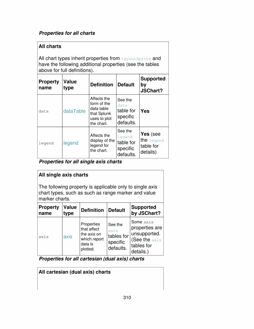
Properties for all charts
All charts
All chart types inherit properties from layoutSprite andhave the following additional properties (see the tablesabove for full definitions).
Propertyname
Valuetype Definition Default
SupportedbyJSChart?
data dataTable
Affects theform of thedata tablethat Splunkuses to plotthe chart.
See thedata
table forspecificdefaults.
Yes
legend legend
Affects thedisplay of thelegend forthe chart.
See thelegend
table forspecificdefaults.
Yes (seethe legendtable fordetails)
Properties for all single axis charts
All single axis charts
The following property is applicable only to single axischart types, such as such as range marker and valuemarker charts.
Propertyname
Valuetype Definition Default Supported
by JSChart?
axis axis
Propertiesthat affectthe axis onwhich reportdata isplotted.
See theaxis
tables forspecificdefaults.
Some axis
properties areunsupported.(See the axistables fordetails.)
Properties for all cartesian (dual axis) charts
All cartesian (dual axis) charts
310
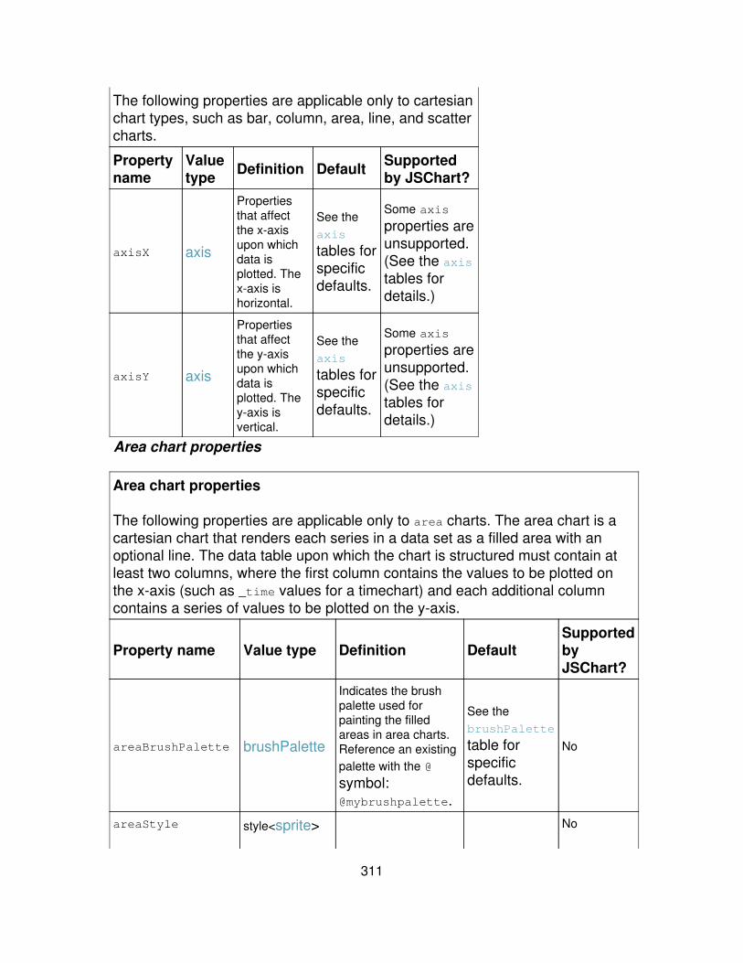
The following properties are applicable only to cartesianchart types, such as bar, column, area, line, and scattercharts.
Propertyname
Valuetype Definition Default Supported
by JSChart?
axisX axis
Propertiesthat affectthe x-axisupon whichdata isplotted. Thex-axis ishorizontal.
See theaxis
tables forspecificdefaults.
Some axis
properties areunsupported.(See the axistables fordetails.)
axisY axis
Propertiesthat affectthe y-axisupon whichdata isplotted. They-axis isvertical.
See theaxis
tables forspecificdefaults.
Some axis
properties areunsupported.(See the axistables fordetails.)
Area chart properties
Area chart properties
The following properties are applicable only to area charts. The area chart is acartesian chart that renders each series in a data set as a filled area with anoptional line. The data table upon which the chart is structured must contain atleast two columns, where the first column contains the values to be plotted onthe x-axis (such as _time values for a timechart) and each additional columncontains a series of values to be plotted on the y-axis.
Property name Value type Definition DefaultSupportedbyJSChart?
areaBrushPalette brushPalette
Indicates the brushpalette used forpainting the filledareas in area charts.Reference an existingpalette with the @
symbol:@mybrushpalette.
See thebrushPalette
table forspecificdefaults.
No
areaStyle style<sprite> No
311
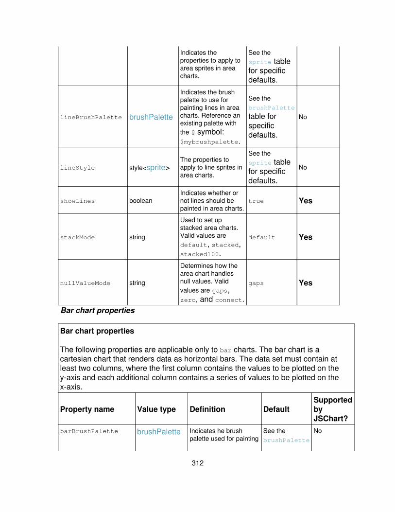
Indicates theproperties to apply toarea sprites in areacharts.
See thesprite tablefor specificdefaults.
lineBrushPalette brushPalette
Indicates the brushpalette to use forpainting lines in areacharts. Reference anexisting palette withthe @ symbol:@mybrushpalette.
See thebrushPalette
table forspecificdefaults.
No
lineStyle style<sprite>The properties toapply to line sprites inarea charts.
See thesprite tablefor specificdefaults.
No
showLines booleanIndicates whether ornot lines should bepainted in area charts.
true Yes
stackMode string
Used to set upstacked area charts.Valid values aredefault, stacked,stacked100.
default Yes
nullValueMode string
Determines how thearea chart handlesnull values. Validvalues are gaps,zero, and connect.
gaps Yes
Bar chart properties
Bar chart properties
The following properties are applicable only to bar charts. The bar chart is acartesian chart that renders data as horizontal bars. The data set must contain atleast two columns, where the first column contains the values to be plotted on they-axis and each additional column contains a series of values to be plotted on thex-axis.
Property name Value type Definition DefaultSupportedbyJSChart?
barBrushPalette brushPalette Indicates he brushpalette used for painting
See thebrushPalette
No
312
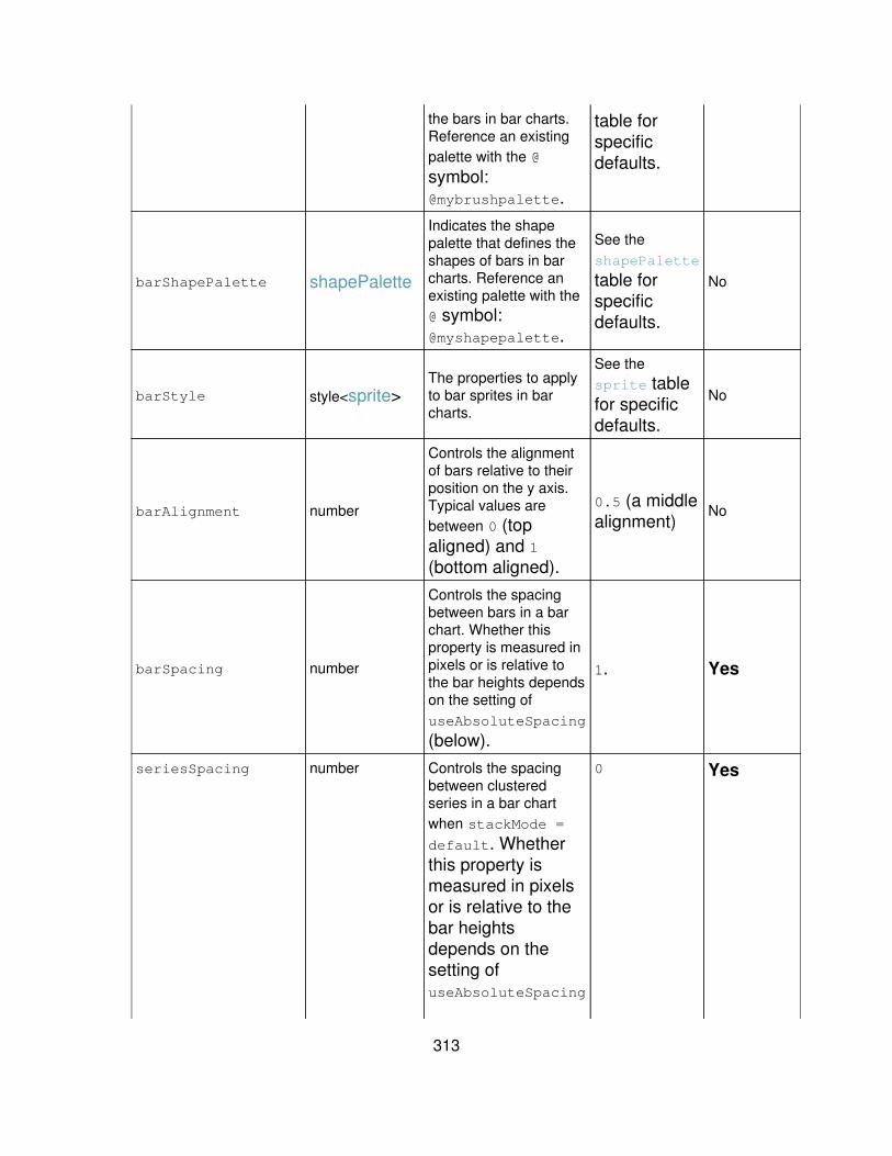
the bars in bar charts.Reference an existingpalette with the @
symbol:@mybrushpalette.
table forspecificdefaults.
barShapePalette shapePalette
Indicates the shapepalette that defines theshapes of bars in barcharts. Reference anexisting palette with the@ symbol:@myshapepalette.
See theshapePalette
table forspecificdefaults.
No
barStyle style<sprite>The properties to applyto bar sprites in barcharts.
See thesprite tablefor specificdefaults.
No
barAlignment number
Controls the alignmentof bars relative to theirposition on the y axis.Typical values arebetween 0 (topaligned) and 1(bottom aligned).
0.5 (a middlealignment)
No
barSpacing number
Controls the spacingbetween bars in a barchart. Whether thisproperty is measured inpixels or is relative tothe bar heights dependson the setting ofuseAbsoluteSpacing
(below).
1. Yes
seriesSpacing number Controls the spacingbetween clusteredseries in a bar chartwhen stackMode =
default. Whetherthis property ismeasured in pixelsor is relative to thebar heightsdepends on thesetting ofuseAbsoluteSpacing
0 Yes
313

(below).
useAbsoluteSpacing boolean
Determines whether thevalues of barSpacingand seriesSpacingare pixels (true) orrelative to the barheights (false)
false No
stackMode string
Sets up stacked barcharts. Valid values aredefault, stacked,and stacked100.
default Yes
Bubble chart properties
Bubble chart properties
The following properties are applicable only to bubble charts. The bubble chart is acartesian chart that renders data as scattered "bubbles" whose size is determinedby a third dimension of data. There are two possible forms for the data set uponwhich the chart is based:
1. A single series structure that contains 3 columns. The first column (column 0)contains the values to be plotted on the x-axis. The second column (column 1)contains the values to be plotted on the y-axis. And the third column (column 2)contains the values to be plotted on the z-axis.
2. A multiple series structure with 4 columns. Column 0 contains the series names,and the next 3 columns contain the values to be plotted on each axis (as in the firstform, above).
Property name Value type Definition DefaultSupportedbyJSChart?
axisZ axisA third axis used forplotting the bubblevalues.
See the axis
table forspecificdefaults.
No
bubbleBrushPalette brushPalette Indicates the brushpalette used forpainting the bubblesin bubble charts.Reference an existingpalette with the @
See thebrushPalette
table forspecificdefaults.
No
314
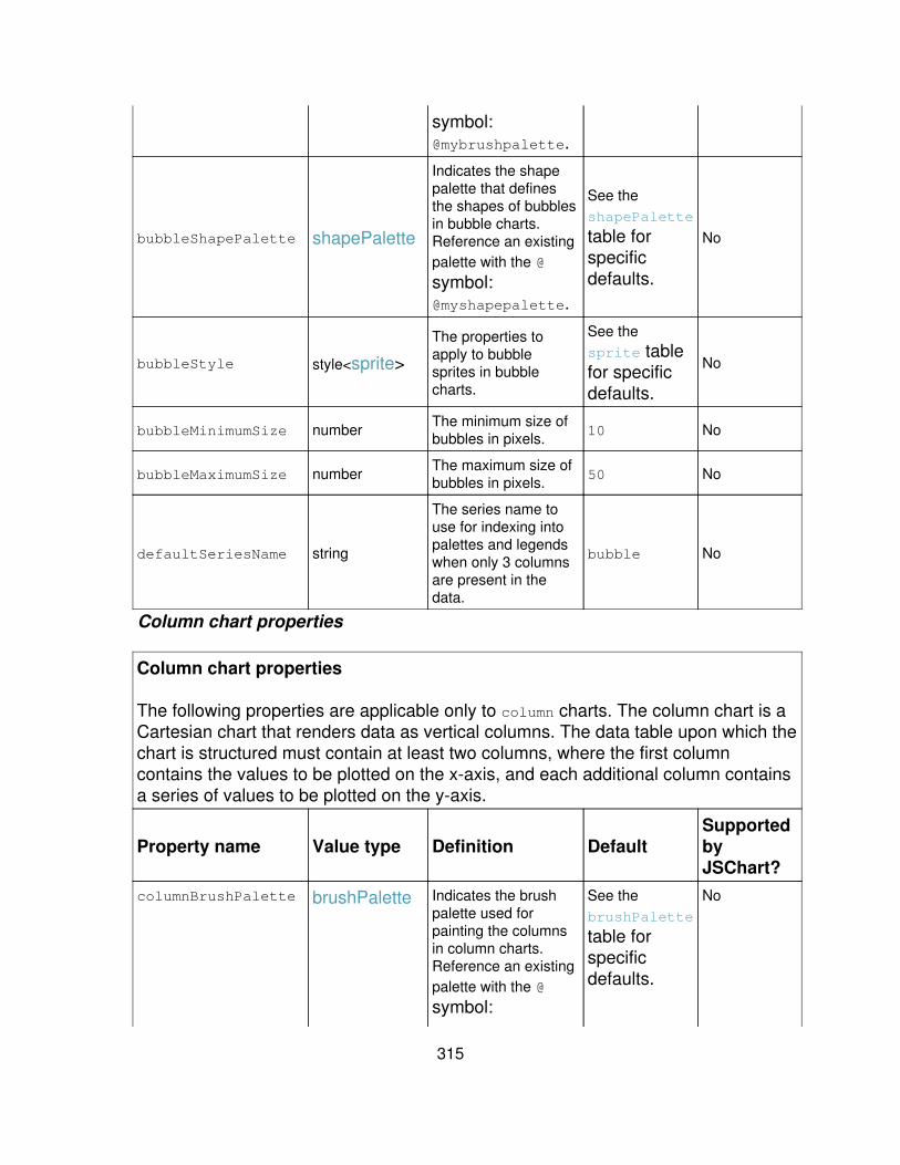
symbol:@mybrushpalette.
bubbleShapePalette shapePalette
Indicates the shapepalette that definesthe shapes of bubblesin bubble charts.Reference an existingpalette with the @
symbol:@myshapepalette.
See theshapePalette
table forspecificdefaults.
No
bubbleStyle style<sprite>
The properties toapply to bubblesprites in bubblecharts.
See thesprite tablefor specificdefaults.
No
bubbleMinimumSize number The minimum size ofbubbles in pixels. 10 No
bubbleMaximumSize number The maximum size ofbubbles in pixels. 50 No
defaultSeriesName string
The series name touse for indexing intopalettes and legendswhen only 3 columnsare present in thedata.
bubble No
Column chart properties
Column chart properties
The following properties are applicable only to column charts. The column chart is aCartesian chart that renders data as vertical columns. The data table upon which thechart is structured must contain at least two columns, where the first columncontains the values to be plotted on the x-axis, and each additional column containsa series of values to be plotted on the y-axis.
Property name Value type Definition DefaultSupportedbyJSChart?
columnBrushPalette brushPalette Indicates the brushpalette used forpainting the columnsin column charts.Reference an existingpalette with the @
symbol:
See thebrushPalette
table forspecificdefaults.
No
315
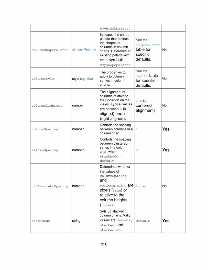
@mybrushpalette.
columnShapePalette shapePalette
Indicates the shapepalette that definesthe shapes ofcolumns in columncharts. Reference anexisting palette withthe @ symbol:@myshapepalette.
See theshapePalette
table forspecificdefaults.
No
columnStyle style<sprite>
The properties toapply to columnsprites in columncharts.
See thesprite tablefor specificdefaults.
No
columnAlignment number
The alignment ofcolumns relative totheir position on thex-axis. Typical valuesare between 0 (leftaligned) and 1(right aligned).
0.5 (acenteredalignment)
No
columnSpacing numberControls the spacingbetween columns in acolumn chart
1 Yes
seriesSpacing number
Controls the spacingbetween clusteredseries in a columnchart whenstackMode =default
0 Yes
useAbsoluteSpacing boolean
Determines whetherthe values ofcolumnSpacing
andseriesSpacing arepixels (true) orrelative to thecolumn heights(false)
false No
stackMode string
Sets up stackedcolumn charts. Validvalues are default,stacked, andstacked100.
default Yes
316

Filler gauge properties
Filler gauge properties
The following properties are applicable only to fillerGauge charts. The filler gauge, like the other gauge chart types,enables the visualization of a single numerical value mapped against a range of colors that may have particular businessmeaning or logic. The filler gauge is similar in appearance to a thermometer, with a liquid-like filler indicator that changescolor as it rises or lowers and passes range boundaries. The gauge range can be provided in the search or hardcodedusing the rangeValues property (which overrides any range values present in the data). At least two range values arerequired to define a minimum and maximum range; additional values can be supplied to define intervals between theminimum and maximum. By default Splunk assigns colors to each defined interval within the range; the filler gauge takeson the color of the interval that the gauge value belongs to. For more information, see the "Chart gallery" topic in theUser Manual.
Property name Value type Definition DefaultSupportedbyJSChart?
orientation stringSets the gauge orientation. Validvalues are x (horizontal) and y(vertical).
y Yes
style string
Enables the choice between twobasic gauge appearances. Theshiny style is a graphicallystylized version of the gaugewith with chrome, shading, andso on so that it mimics those inthe real world. The minimalstyle is a stripped-down "justthe basics" version of thegauge.
shiny Yes
fillerBrushPalette brushPalette
Indicates the brush palette to use fordrawing the variable colored fill withinthe indicator. If null, a solid black fill isdrawn. Reference an existing palettewith the @ symbol:@myfillerbrushpalette.
See the brushPalette table forspecific defaults.
No
fillerStyle style<sprite> The style to apply to the filler.See the sprite table for specificdefaults.
No
fillerPlacement1 numberThe starting placement of the fillerindicator, in pixels centered aroundthe orientation axis.
-20 No
fillerPlacement2 number The ending placement of the fillerindicator, in pixels centered around
20 No
317

the orientation axis.
rangeValues array<number>
A numeric array that represents theoverall numerical range representedby the gauge, and the relative size ofthe color-coded subranges within thatoverall range. For example, a rangeof [0,30,70,100] wouldindicate that the gauge starts atzero, ends at 100, and hasthree subranges that are eachidentified by another filler color.If the search returns a value of71, the filler rises to that valueon the gauge and takes on thecolor assigned to the middlerange (61-85).Note: When you specify rangevalues in the xml, they overriderange values that are specifiedthrough the search upon whichthe dashboard panel is based.
Not assigned. Yes
rangePadding Number The padding to place on either end ofthe range, in pixels. 20 No
gaugeColors array<number>
A list of hexadecimal color valuesfrom which the range band colors aregenerated. Colors display in the orderindicated in the array. For example,you can reverse the defaultgreen-yellow-red sequence bychanging the gaugeColors valueto[0xBF3030,0xFFE800,0x84E900].You can specify any number ofcolors. If your gauge has moreor less range intervals (eitherspecified via the searchlanguage or the rangeValuesparameter) than the number ofrangeColors, Splunk willinterpolate the colors asnecessary.
[0x84E900,0xFFE800,0xBF3030] Yes
majorTickBrush brush The brush that is used to draw themajor tick marks.
See the brush table for specificdefaults.
No
318
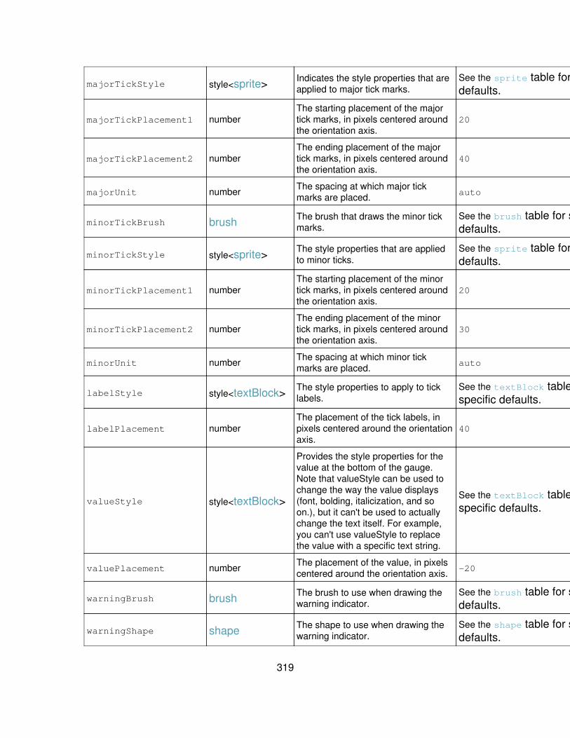
majorTickStyle style<sprite> Indicates the style properties that areapplied to major tick marks.
See the sprite table for specificdefaults.
No
majorTickPlacement1 numberThe starting placement of the majortick marks, in pixels centered aroundthe orientation axis.
20 No
majorTickPlacement2 numberThe ending placement of the majortick marks, in pixels centered aroundthe orientation axis.
40 No
majorUnit number The spacing at which major tickmarks are placed. auto Yes
minorTickBrush brush The brush that draws the minor tickmarks.
See the brush table for specificdefaults.
No
minorTickStyle style<sprite> The style properties that are appliedto minor ticks.
See the sprite table for specificdefaults.
No
minorTickPlacement1 numberThe starting placement of the minortick marks, in pixels centered aroundthe orientation axis.
20 No
minorTickPlacement2 numberThe ending placement of the minortick marks, in pixels centered aroundthe orientation axis.
30 No
minorUnit number The spacing at which minor tickmarks are placed. auto No
labelStyle style<textBlock> The style properties to apply to ticklabels.
See the textBlock table forspecific defaults.
No
labelPlacement numberThe placement of the tick labels, inpixels centered around the orientationaxis.
40 No
valueStyle style<textBlock>
Provides the style properties for thevalue at the bottom of the gauge.Note that valueStyle can be used tochange the way the value displays(font, bolding, italicization, and soon.), but it can't be used to actuallychange the text itself. For example,you can't use valueStyle to replacethe value with a specific text string.
See the textBlock table forspecific defaults.
No
valuePlacement number The placement of the value, in pixelscentered around the orientation axis. -20 No
warningBrush brush The brush to use when drawing thewarning indicator.
See the brush table for specificdefaults.
No
warningShape shape The shape to use when drawing thewarning indicator.
See the shape table for specificdefaults.
No
319
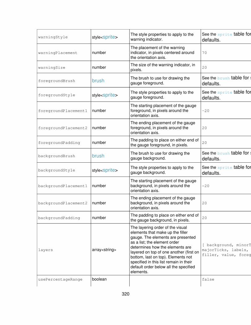
warningStyle style<sprite> The style properties to apply to thewarning indicator.
See the sprite table for specificdefaults.
No
warningPlacement numberThe placement of the warningindicator, in pixels centered aroundthe orientation axis.
70 No
warningSize number The size of the warning indicator, inpixels. 20 No
foregroundBrush brush The brush to use for drawing thegauge foreground.
See the brush table for specificdefaults.
No
foregroundStyle style<sprite> The style properties to apply to thegauge foreground.
See the sprite table for specificdefaults.
No
foregroundPlacement1 numberThe starting placement of the gaugeforeground, in pixels around theorientation axis.
-20 No
foregroundPlacement2 numberThe ending placement of the gaugeforeground, in pixels around theorientation axis.
20 No
foregroundPadding number The padding to place on either end ofthe gauge foreground, in pixels. 20 No
backgroundBrush brush The brush to use for drawing thegauge background.
See the brush table for specificdefaults.
No
backgroundStyle style<sprite> The style properties to apply to thegauge background.
See the sprite table for specificdefaults.
No
backgroundPlacement1 numberThe starting placement of the gaugebackground, in pixels around theorientation axis.
-20 No
backgroundPlacement2 numberThe ending placement of the gaugebackground, in pixels around theorientation axis.
20 No
backgroundPadding number The padding to place on either end ofthe gauge background, in pixels. 20 No
layers array<string>
The layering order of the visualelements that make up the fillergauge. The elements are presentedas a list; the element orderdetermines how the elements arelayered on top of one another (first onbottom, last on top). Elements notspecified in this list remain in theirdefault order below all the specifiedelements.
[ background, minorTicks,majorTicks, labels, warning,filler, value, foreground ]
No
usePercentageRange boolean false Yes
320

Determines whether the range valuesshould be formatted as percentages.
usePercentageValue boolean Determines whether to format thegauge value as a percentage. false Yes
showMajorTicks boolean Determines whether the gaugeshould display major tick marks. true Yes
showMinorTicks boolean Determines whether the gaugeshould display minor tick marks. true Yes
showLabels boolean Determines whether the gaugeshould display labels. true Yes
showValue boolean Determines whether the gaugeshould show its value. true Yes
Histogram properties
Histogram properties
The following properties are applicable only to histogram charts. The histogramchart is a cartesian chart that renders data as vertical columns whose width isdetermined by separate start and end values. The data table upon which the chart isstructured must contain at least three columns, where column 0 contains the startingvalues to be plotted on the x-axis, column 1 contains the ending values to be plottedon the x-axis, and column 2 contains the values to be plotted on the y-axis. Multipleseries are currently unsupported and additional columns are ignored.
Property name Value type Definition DefaultSupportedbyJSChart?
columnBrushPalette brushPalette
Indicates the brushpalette used forpainting the columnsin histogram charts.Reference an existingpalette with the @
symbol:@mybrushpalette.
See thebrushPalette
table forspecificdefaults.
No
columnShapePalette shapePalette
Indicates the shapepalette that definesthe shapes ofcolumns in histogramcharts. Reference anexisting palette withthe @ symbol:@myshapepalette.
See theshapePalette
for specificdefaults.
No
321
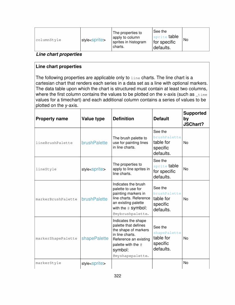
columnStyle style<sprite>
The properties toapply to columnsprites in histogramcharts.
See thesprite tablefor specificdefaults.
No
Line chart properties
Line chart properties
The following properties are applicable only to line charts. The line chart is acartesian chart that renders each series in a data set as a line with optional markers.The data table upon which the chart is structured must contain at least two columns,where the first column contains the values to be plotted on the x-axis (such as _timevalues for a timechart) and each additional column contains a series of values to beplotted on the y-axis.
Property name Value type Definition DefaultSupportedbyJSChart?
lineBrushPalette brushPaletteThe brush palette touse for painting linesin line charts.
See thebrushPalette
table forspecificdefaults.
No
lineStyle style<sprite>The properties toapply to line sprites inline charts.
See thesprite tablefor specificdefaults.
No
markerBrushPalette brushPalette
Indicates the brushpalette to use forpainting markers inline charts. Referencean existing palettewith the @ symbol:@mybrushpalette.
See thebrushPalette
table forspecificdefaults.
No
markerShapePalette shapePalette
Indicates the shapepalette that definesthe shape of markersin line charts.Reference an existingpalette with the @
symbol:@myshapepalette.
See theshapePalette
table forspecificdefaults.
No
markerStyle style<sprite> No
322
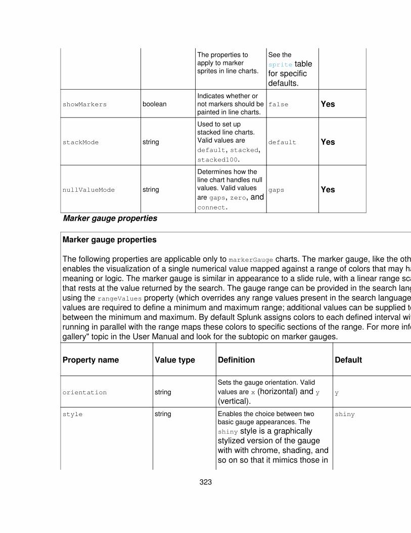
The properties toapply to markersprites in line charts.
See thesprite tablefor specificdefaults.
showMarkers booleanIndicates whether ornot markers should bepainted in line charts.
false Yes
stackMode string
Used to set upstacked line charts.Valid values aredefault, stacked,stacked100.
default Yes
nullValueMode string
Determines how theline chart handles nullvalues. Valid valuesare gaps, zero, andconnect.
gaps Yes
Marker gauge properties
Marker gauge properties
The following properties are applicable only to markerGauge charts. The marker gauge, like the other gauge chart types,enables the visualization of a single numerical value mapped against a range of colors that may have particular businessmeaning or logic. The marker gauge is similar in appearance to a slide rule, with a linear range scale and a sliding markerthat rests at the value returned by the search. The gauge range can be provided in the search language or hardcodedusing the rangeValues property (which overrides any range values present in the search language). At least two rangevalues are required to define a minimum and maximum range; additional values can be supplied to define intervalsbetween the minimum and maximum. By default Splunk assigns colors to each defined interval within the range. A bandrunning in parallel with the range maps these colors to specific sections of the range. For more information, see the "Chartgallery" topic in the User Manual and look for the subtopic on marker gauges.
Property name Value type Definition DefaultSupportedbyJSChart?
orientation stringSets the gauge orientation. Validvalues are x (horizontal) and y(vertical).
y Yes
style string Enables the choice between twobasic gauge appearances. Theshiny style is a graphicallystylized version of the gaugewith with chrome, shading, andso on so that it mimics those in
shiny Yes
323

the real world. The minimalstyle is a stripped-down "justthe basics" version of thegauge.
markerBrush brush The brush to use for drawing thegauge marker.
See the brush table for specificdefaults.
No
markerShape shape The shape to use when drawing thegauge marker.
See the shape table for specificdefaults.
No
markerStyle style<sprite> The properties to apply to the gaugemarker.
See the sprite table for specificdefaults.
No
markerPlacement1 numberThe placement of the base of thegauge marker, in pixels centeredaround the orientation axis.
-20 No
markerPlacement2 numberThe placement of the tip of the gaugemarker, in pixels centered around theorientation axis.
20 No
markerThickness number The thickness of the gauge marker, inpixels. 5 No
rangeValues array<number>
A numeric array that represents theoverall numerical range representedby the gauge, and the relative size ofthe color-coded subranges within thatoverall range. For example, a rangeof [0,30,70,100] wouldindicate that the gauge starts atzero, ends at 100, and hasthree subranges that are eachidentified by a different color onthe range band. If the searchreturns a value of 71, thegauge marker moves to thespot where 71 would be on thegauge, and where the rangeband has the color assigned tothe middle range (61-85).Note: When you specify rangevalues in the xml, they overriderange values that are specifiedthrough the search upon whichthe dashboard panel is based.
Not assigned. Yes
rangePadding Number The padding to place on either end ofthe range, in pixels. 20 No
324
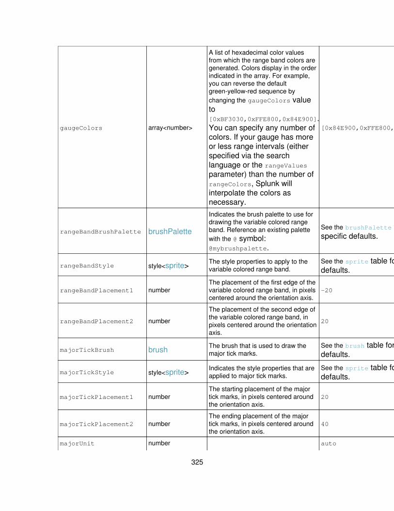
gaugeColors array<number>
A list of hexadecimal color valuesfrom which the range band colors aregenerated. Colors display in the orderindicated in the array. For example,you can reverse the defaultgreen-yellow-red sequence bychanging the gaugeColors valueto[0xBF3030,0xFFE800,0x84E900].You can specify any number ofcolors. If your gauge has moreor less range intervals (eitherspecified via the searchlanguage or the rangeValuesparameter) than the number ofrangeColors, Splunk willinterpolate the colors asnecessary.
[0x84E900,0xFFE800,0xBF3030] Yes
rangeBandBrushPalette brushPalette
Indicates the brush palette to use fordrawing the variable colored rangeband. Reference an existing palettewith the @ symbol:@mybrushpalette.
See the brushPalette table forspecific defaults.
No
rangeBandStyle style<sprite> The style properties to apply to thevariable colored range band.
See the sprite table for specificdefaults.
No
rangeBandPlacement1 numberThe placement of the first edge of thevariable colored range band, in pixelscentered around the orientation axis.
-20 No
rangeBandPlacement2 number
The placement of the second edge ofthe variable colored range band, inpixels centered around the orientationaxis.
20 No
majorTickBrush brush The brush that is used to draw themajor tick marks.
See the brush table for specificdefaults.
No
majorTickStyle style<sprite> Indicates the style properties that areapplied to major tick marks.
See the sprite table for specificdefaults.
No
majorTickPlacement1 numberThe starting placement of the majortick marks, in pixels centered aroundthe orientation axis.
20 No
majorTickPlacement2 numberThe ending placement of the majortick marks, in pixels centered aroundthe orientation axis.
40 No
majorUnit number auto Yes
325

The spacing at which to place majortick marks.
minorTickBrush brush The brush that is used to draw theminor tick marks.
See the brush table for specificdefaults.
No
minorTickStyle style<sprite> Indicates the style properties that areapplied to minor tick marks.
See the sprite table for specificdefaults.
No
minorTickPlacement1 numberThe starting placement of the minortick marks, in pixels centered aroundthe orientation axis.
20 No
minorTickPlacement2 numberThe ending placement of the minortick marks, in pixels centered aroundthe orientation axis.
30 No
minorUnit number The spacing at which to place minortick marks. auto No
labelStyle style<textBlock> The style properties to apply to ticklabels.
See the textBlock table forspecific defaults.
No
labelPlacement numberThe placement of the tick labels, inpixels centered around the orientationaxis.
40 No
valueStyle style<textBlock>
Provides the style properties for thevalue at the bottom of the gauge.Note that valueStyle can be used tochange the way the value displays(font, bolding, italicization, and soon.), but it can't be used to actuallychange the text itself. For example,you can't use valueStyle to replacethe value with a specific text string.
See the textBlock table forspecific defaults.
No
valuePlacement number The placement of the value, in pixelscentered around the orientation axis. -20 No
warningBrush brush The brush to use when drawing thewarning indicator.
See the brush table for specificdefaults.
No
warningShape shape The shape to use when drawing thewarning indicator.
See the shape table for specificdefaults.
No
warningStyle style<sprite> The style properties to apply to thewarning indicator.
See the sprite table for specificdefaults.
No
warningPlacement numberThe placement of the warningindicator, in pixels centered aroundthe orientation axis.
70 No
warningSize number The size of the warning indicator, inpixels. 20 No
326

foregroundBrush brush The brush to use for drawing thegauge foreground.
See the brush table for specificdefaults.
No
foregroundStyle style<sprite> The style properties to apply to thegauge foreground.
See the sprite table for specificdefaults.
No
foregroundPlacement1 numberThe starting placement of the gaugeforeground, in pixels around theorientation axis.
-20 No
foregroundPlacement2 numberThe ending placement of the gaugeforeground, in pixels around theorientation axis.
20 No
foregroundPadding number The padding to place on either end ofthe gauge foreground, in pixels. 20 No
backgroundBrush brush The brush to use for drawing thegauge background.
See the brush table for specificdefaults.
No
backgroundStyle style<sprite> The style properties to apply to thegauge background.
See the sprite table for specificdefaults.
No
backgroundPlacement1 numberThe starting placement of the gaugebackground, in pixels around theorientation axis.
-20 No
backgroundPlacement2 numberThe ending placement of the gaugebackground, in pixels around theorientation axis.
20 No
backgroundPadding number The padding to place on either end ofthe gauge background, in pixels. 20 No
layers array<string>
The layering order of the visualelements that make up the fillergauge. The elements are presentedas a list; the element orderdetermines how the elements arelayered on top of one another (first onbottom, last on top). Elements notspecified in this list remain in theirdefault order below all the specifiedelements.
[ background, rangeBand,minorTicks, majorTicks,labels, warning, marker,value, foreground ]
No
usePercentageRange boolean Determines whether the range valuesshould be formatted as percentages. false Yes
usePercentageValue boolean Determines whether to format thegauge value as a percentage. false Yes
showRangeBand booleanDetermines whether the gaugeshould display the variable coloredrange band.
true Yes
showMajorTicks boolean Determines whether the gaugeshould display major tick marks. true Yes
327

showMinorTicks boolean Determines whether the gaugeshould display minor tick marks. true Yes
showLabels boolean Determines whether the gaugeshould display labels. true Yes
showValue boolean Determines whether the gaugeshould show its value. true Yes
Pie chart properties
Pie chart properties
The following properties are applicable only to pie charts. The pie chart is a basic chart thatrenders data as a circle divided into "slices." The data table upon which the chart is structuredmust contain at least two columns, where the first column contains the labels for each piechart slice, and the second column contains the values for those slices. Splunk pie charts donot currently support multiple series, and additional columns are not supported.
Property name Value type Definition DefaultSupportedbyJSChart?
sliceBrushPalette brushPalette
The brush palette touse for painting slicesin pie charts.Reference an existingpalette with the @
symbol:@mybrushpalette.
See thebrushPalette
table forspecificdefaults.
No
sliceStyle style<sprite>The properties toapply to slice spritesin line charts.
See thesprite tablefor specificdefaults.
No
sliceCollapsingThreshold number
The threshold atwhich smaller slicesshould be collapsedinto a consolidatedslice. Valid values arebetween 0 (nocollapsing) and 1(all slices arecollapsed into asingle pie).
0.01 (slicessmaller than1% of thewhole pie arecollapsed)
Yes
sliceCollapsingLabel string The label for theconsolidated slice. other Yes
labelStyle style<textBlock> No
328

Applies properties topie slice labels
See thetextBlock
table forspecificdefaults.
labelLineBrush brush
Indicates the brush touse for painting labellines. Reference anexisting palette withthe @ symbol:@mybrushpalette.
See the brush
table forspecificdefaults.
No
showLabels booleanDetermines whetheror not pie chart labelsare displayed.
true Yes
showPercent boolean
Determines whetherpercentage values areshown along with thelabels.
false Yes
Radial gauge properties
Radial gauge properties
The following properties are applicable only to radialGauge charts. The radialGauge, like the other gauge chart types,enables the visualization of a single numerical value mapped against a range of colors that may have particular businessmeaning or logic. The radial gauge is similar in appearance to a speedometer in appearance; it has an arced range scaleand a rotating needle. The gauge range can be provided in the search or hardcoded using the rangeValues property(which overrides any range values present in the data). At least two range values are required to define a minimum andmaximum range; additional values can be supplied to define intervals between the minimum and maximum. By defaultSplunk assigns colors to each defined interval within the range. For more information, see the "Chart gallery" topic in theUser Manual and look for the subtopic on radial gauges.
Property name Value type Definition DefaultSupportedbyJSChart?
style string Enables the choice between twobasic gauge appearances. Theshiny style is a graphicallystylized version of the gaugewith with chrome, shading, andso on so that it mimics those inthe real world. The minimalstyle is a stripped-down "justthe basics" version of the
shiny Yes
329
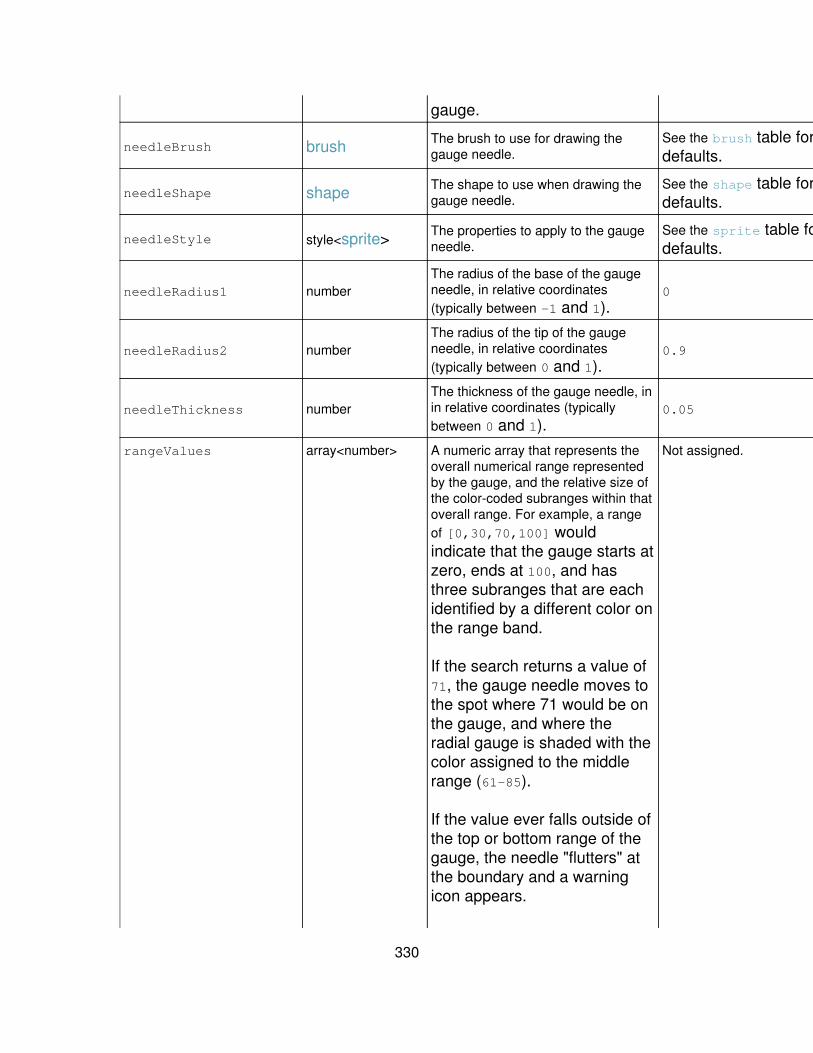
gauge.
needleBrush brush The brush to use for drawing thegauge needle.
See the brush table for specificdefaults.
No
needleShape shape The shape to use when drawing thegauge needle.
See the shape table for specificdefaults.
No
needleStyle style<sprite> The properties to apply to the gaugeneedle.
See the sprite table for specificdefaults.
No
needleRadius1 numberThe radius of the base of the gaugeneedle, in relative coordinates(typically between -1 and 1).
0 No
needleRadius2 numberThe radius of the tip of the gaugeneedle, in relative coordinates(typically between 0 and 1).
0.9 No
needleThickness numberThe thickness of the gauge needle, inin relative coordinates (typicallybetween 0 and 1).
0.05 No
rangeValues array<number> A numeric array that represents theoverall numerical range representedby the gauge, and the relative size ofthe color-coded subranges within thatoverall range. For example, a rangeof [0,30,70,100] wouldindicate that the gauge starts atzero, ends at 100, and hasthree subranges that are eachidentified by a different color onthe range band.
If the search returns a value of71, the gauge needle moves tothe spot where 71 would be onthe gauge, and where theradial gauge is shaded with thecolor assigned to the middlerange (61-85).
If the value ever falls outside ofthe top or bottom range of thegauge, the needle "flutters" atthe boundary and a warningicon appears.
Not assigned. Yes
330
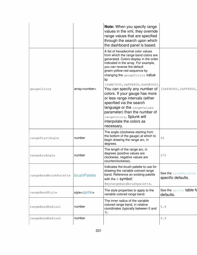
Note: When you specify rangevalues in the xml, they overriderange values that are specifiedthrough the search upon whichthe dashboard panel is based.
gaugeColors array<number>
A list of hexadecimal color valuesfrom which the range band colors aregenerated. Colors display in the orderindicated in the array. For example,you can reverse the defaultgreen-yellow-red sequence bychanging the gaugeColors valueto[0xBF3030,0xFFE800,0x84E900].You can specify any number ofcolors. If your gauge has moreor less range intervals (eitherspecified via the searchlanguage or the rangeValuesparameter) than the number ofrangeColors, Splunk willinterpolate the colors asnecessary.
[0x84E900,0xFFE800,0xBF3030] Yes
rangeStartAngle number
The angle (clockwise starting fromthe bottom of the gauge) at which tobegin drawing the range arc, indegrees.
45 Yes
rangeArcAngle number
The length of the range arc, indegrees (positive values areclockwise, negative values arecounterclockwise).
270 Yes
rangeBandBrushPalette brushPalette
Indicates the brush palette to use fordrawing the variable colored rangeband. Reference an existing palettewith the @ symbol:@myrangebandbrushpalette.
See the brushPalette table forspecific defaults.
No
rangeBandStyle style<sprite> The style properties to apply to thevariable colored range band.
See the sprite table for specificdefaults.
No
rangeBandRadius1 number
The inner radius of the variablecolored range band, in relativecoordinates (typically between 0 and1).
0.8 No
rangeBandRadius2 number 0.9 No
331
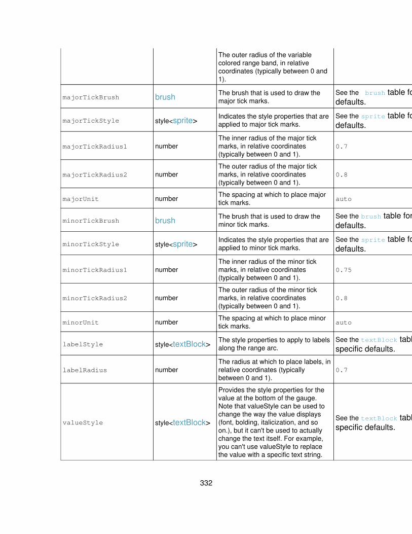
The outer radius of the variablecolored range band, in relativecoordinates (typically between 0 and1).
majorTickBrush brush The brush that is used to draw themajor tick marks.
See the brush table for specificdefaults.
No
majorTickStyle style<sprite> Indicates the style properties that areapplied to major tick marks.
See the sprite table for specificdefaults.
No
majorTickRadius1 numberThe inner radius of the major tickmarks, in relative coordinates(typically between 0 and 1).
0.7 No
majorTickRadius2 numberThe outer radius of the major tickmarks, in relative coordinates(typically between 0 and 1).
0.8 No
majorUnit number The spacing at which to place majortick marks. auto Yes
minorTickBrush brush The brush that is used to draw theminor tick marks.
See the brush table for specificdefaults.
No
minorTickStyle style<sprite> Indicates the style properties that areapplied to minor tick marks.
See the sprite table for specificdefaults.
No
minorTickRadius1 numberThe inner radius of the minor tickmarks, in relative coordinates(typically between 0 and 1).
0.75 No
minorTickRadius2 numberThe outer radius of the minor tickmarks, in relative coordinates(typically between 0 and 1).
0.8 No
minorUnit number The spacing at which to place minortick marks. auto No
labelStyle style<textBlock> The style properties to apply to labelsalong the range arc.
See the textBlock table forspecific defaults.
No
labelRadius numberThe radius at which to place labels, inrelative coordinates (typicallybetween 0 and 1).
0.7 No
valueStyle style<textBlock>
Provides the style properties for thevalue at the bottom of the gauge.Note that valueStyle can be used tochange the way the value displays(font, bolding, italicization, and soon.), but it can't be used to actuallychange the text itself. For example,you can't use valueStyle to replacethe value with a specific text string.
See the textBlock table forspecific defaults.
No
332

valueRadius numberThe radius at which to place thevalue, in relative coordinates(typically between 0 and 1).
0.8 No
warningBrush brush The brush to use when drawing thewarning indicator.
See the brush table for specificdefaults.
No
warningShape shape The shape to use when drawing thewarning indicator.
See the shape table for specificdefaults.
No
warningStyle style<sprite> The style properties to apply to thewarning indicator.
See the sprite table for specificdefaults.
No
warningRadius number
The radius at which to place thewarning indicator, in relativecoordinates (typically between 0 and1).
1 No
warningSize numberThe size of the warning indicator, inrelative coordinates (typicallybetween 0 and 1).
0.1 No
foregroundBrush brush The brush to use for drawing thegauge foreground.
See the brush table for specificdefaults.
No
foregroundStyle style<sprite> The style properties to apply to thegauge foreground.
See the sprite table for specificdefaults.
No
foregroundRadius numberThe radius of the gauge foreground,in relative coordinates (typicallybetween 0 and 1).
1 No
backgroundBrush brush The brush to use for drawing thegauge background.
See the brush table for specificdefaults.
No
backgroundStyle style<sprite> The style properties to apply to thegauge background.
See the sprite table for specificdefaults.
No
backgroundRadius numberThe radius of the gauge background,in relative coordinates (typicallybetween 0 and 1).
1 No
layers array<string>
The layering order of the visualelements that make up the radialgauge. The elements are presentedas a list; the element orderdetermines how the elements arelayered on top of one another (first onbottom, last on top). Elements notspecified in this list remain in theirdefault order below all the specifiedelements.
[ background, rangeBand,minorTicks, majorTicks,labels, value, warning,needle, foreground ]
No
usePercentageRange boolean Determines whether the range valuesshould be formatted as percentages. false Yes
333
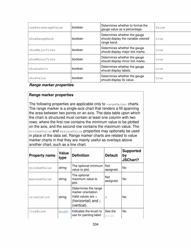
usePercentageValue boolean Determines whether to format thegauge value as a percentage. false Yes
showRangeBand booleanDetermines whether the gaugeshould display the variable coloredrange band.
true Yes
showMajorTicks boolean Determines whether the gaugeshould display major tick marks. true Yes
showMinorTicks boolean Determines whether the gaugeshould display minor tick marks. true Yes
showLabels boolean Determines whether the gaugeshould display labels. true Yes
showValue boolean Determines whether the gaugeshould display its value. true Yes
Range marker properties
Range marker properties
The following properties are applicable only to rangeMarker charts.The range marker is a single-axis chart that renders a fill spanningthe area between two points on an axis. The data table upon whichthe chart is structured must contain at least one column with tworows, where the first row contains the minimum value to be plottedon the axis, and the second row contains the maximum value. TheminimumValue and maximumValue properties may optionally be usedin place of the data set. Range marker charts are related to valuemarker charts in that they are mainly useful as overlays aboveanother chart, such as a line chart.
Property name Valuetype Definition Default
SupportedbyJSChart?
minimumValue string The optional minimumvalue to plot.
Notassigned. No
maximumValue stringThe optionalmaximum value toplot.
Notassigned. No
orientation string
Determines the rangemarker orientation.Valid values are x
(horizontal) and y(vertical).
x No
lineBrush brush Indicates the brush touse for painting label
See thebrush
No
334
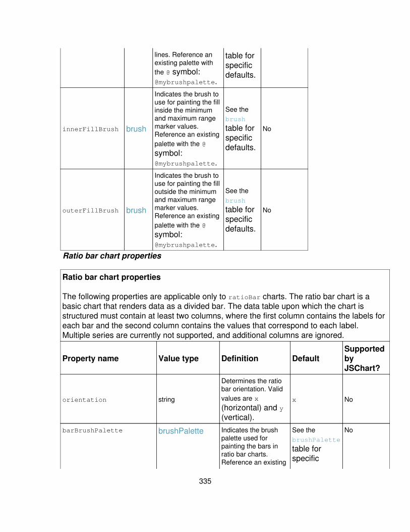
lines. Reference anexisting palette withthe @ symbol:@mybrushpalette.
table forspecificdefaults.
innerFillBrush brush
Indicates the brush touse for painting the fillinside the minimumand maximum rangemarker values.Reference an existingpalette with the @
symbol:@mybrushpalette.
See thebrush
table forspecificdefaults.
No
outerFillBrush brush
Indicates the brush touse for painting the filloutside the minimumand maximum rangemarker values.Reference an existingpalette with the @
symbol:@mybrushpalette.
See thebrush
table forspecificdefaults.
No
Ratio bar chart properties
Ratio bar chart properties
The following properties are applicable only to ratioBar charts. The ratio bar chart is abasic chart that renders data as a divided bar. The data table upon which the chart isstructured must contain at least two columns, where the first column contains the labels foreach bar and the second column contains the values that correspond to each label.Multiple series are currently not supported, and additional columns are ignored.
Property name Value type Definition DefaultSupportedbyJSChart?
orientation string
Determines the ratiobar orientation. Validvalues are x
(horizontal) and y(vertical).
x No
barBrushPalette brushPalette Indicates the brushpalette used forpainting the bars inratio bar charts.Reference an existing
See thebrushPalette
table forspecific
No
335
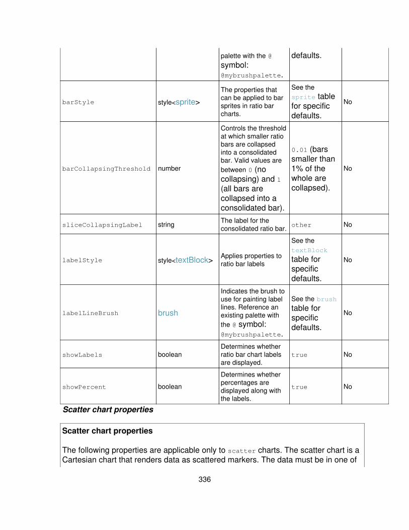
palette with the @
symbol:@mybrushpalette.
defaults.
barStyle style<sprite>
The properties thatcan be applied to barsprites in ratio barcharts.
See thesprite tablefor specificdefaults.
No
barCollapsingThreshold number
Controls the thresholdat which smaller ratiobars are collapsedinto a consolidatedbar. Valid values arebetween 0 (nocollapsing) and 1(all bars arecollapsed into aconsolidated bar).
0.01 (barssmaller than1% of thewhole arecollapsed).
No
sliceCollapsingLabel string The label for theconsolidated ratio bar. other No
labelStyle style<textBlock> Applies properties toratio bar labels
See thetextBlock
table forspecificdefaults.
No
labelLineBrush brush
Indicates the brush touse for painting labellines. Reference anexisting palette withthe @ symbol:@mybrushpalette.
See the brush
table forspecificdefaults.
No
showLabels booleanDetermines whetherratio bar chart labelsare displayed.
true No
showPercent boolean
Determines whetherpercentages aredisplayed along withthe labels.
true No
Scatter chart properties
Scatter chart properties
The following properties are applicable only to scatter charts. The scatter chart is aCartesian chart that renders data as scattered markers. The data must be in one of
336
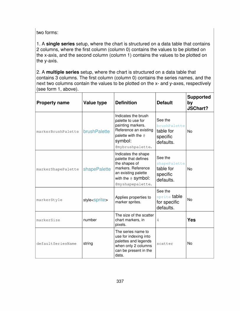
two forms:
1. A single series setup, where the chart is structured on a data table that contains2 columns, where the first column (column 0) contains the values to be plotted onthe x-axis, and the second column (column 1) contains the values to be plotted onthe y-axis.
2. A multiple series setup, where the chart is structured on a data table thatcontains 3 columns. The first column (column 0) contains the series names, and thenext two columns contain the values to be plotted on the x- and y-axes, respectively(see form 1, above).
Property name Value type Definition DefaultSupportedbyJSChart?
markerBrushPalette brushPalette
Indicates the brushpalette to use forpainting markers.Reference an existingpalette with the @
symbol:@mybrushpalette.
See thebrushPalette
table forspecificdefaults.
No
markerShapePalette shapePalette
Indicates the shapepalette that definesthe shapes ofmarkers. Referencean existing palettewith the @ symbol:@myshapepalette.
See theshapePalette
table forspecificdefaults.
No
markerStyle style<sprite> Applies properties tomarker sprites.
See thesprite tablefor specificdefaults.
No
markerSize numberThe size of the scatterchart markers, inpixels.
4 Yes
defaultSeriesName string
The series name touse for indexing intopalettes and legendswhen only 2 columnscan be present in thedata.
scatter No
337

Value marker properties
Value marker properties
The following properties are applicable only to valueMarkercharts. Value marker charts are are single-axis charts thatrender a line at a single point on an axis. The data table uponwhich the chart is structured must contain at least one columnwith one row, where the row contains the value to be plotted onthe axis, and the second row contains the maximum value. Thevalue property can optionally be used in place of the data set.Value marker charts are related to range marker charts in thatthey are mainly useful as overlays above another chart, such asa line chart.
Propertyname
Valuetype Definition Default
SupportedbyJSChart?
value string The optional value toplot.
Notassigned. No
orientation string
Determines the valuemarker orientation.Valid values are x
(horizontal) and y(vertical).
x No
lineBrush brush
Indicates the brush touse for painting thevalue marker line.Reference an existingpalette with the @
symbol:@mybrushpalette.
See thebrush
table forspecificdefaults.
No
Legend
Usage: charting.legend.*
The legend element controls the chart legend. It is used by all chart types.
Note: You can also take advantage of a predefined external legend elementcalled externalLegend. externalLegendis a non-visual object that connects to anexternal source responsible for synchronizing legends across multiple chartingmodules in a view. It has no additional properties. It is referenced by themasterLegend parameter (see below). You can also refer to it directly if necessary
338
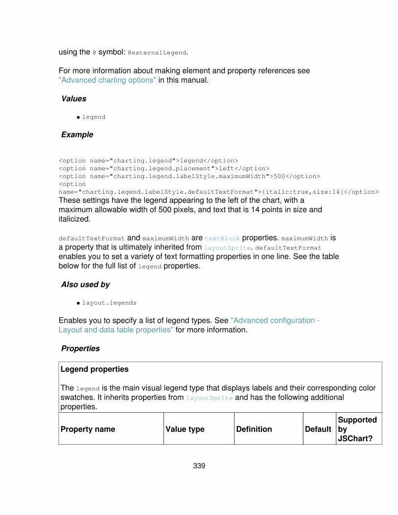
using the @ symbol: @externalLegend.
For more information about making element and property references see"Advanced charting options" in this manual.
Values
legend•
Example
<option name="charting.legend">legend</option><option name="charting.legend.placement">left</option><option name="charting.legend.labelStyle.maximumWidth">500</option><optionname="charting.legend.labelStyle.defaultTextFormat">{italic:true,size:14}</option>
These settings have the legend appearing to the left of the chart, with amaximum allowable width of 500 pixels, and text that is 14 points in size anditalicized.
defaultTextFormat and maximumWidth are textBlock properties. maximumWidth isa property that is ultimately inherited from layoutSprite. defaultTextFormatenables you to set a variety of text formatting properties in one line. See the tablebelow for the full list of legend properties.
Also used by
layout.legends•
Enables you to specify a list of legend types. See "Advanced configuration -Layout and data table properties" for more information.
Properties
Legend properties
The legend is the main visual legend type that displays labels and their corresponding colorswatches. It inherits properties from layoutSprite and has the following additionalproperties.
Property name Value type Definition DefaultSupportedbyJSChart?
339
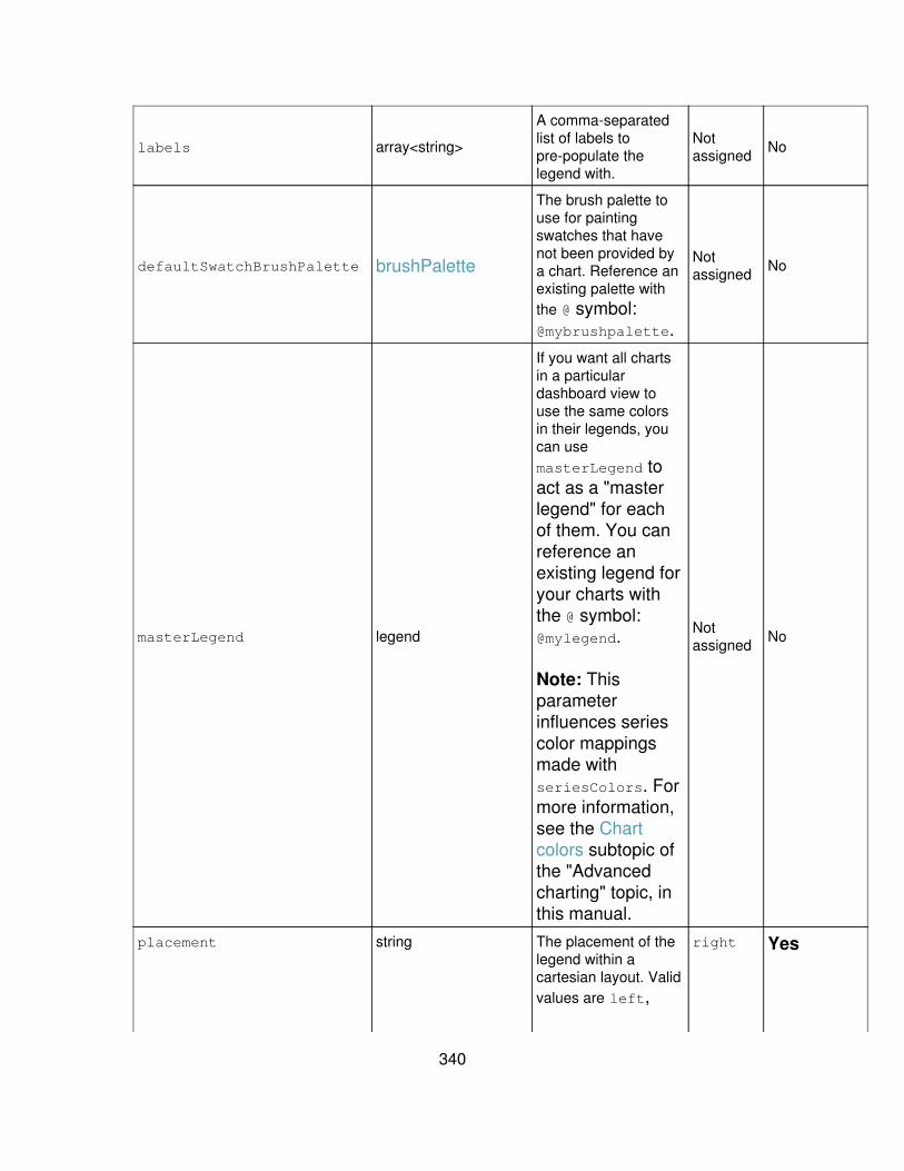
labels array<string>
A comma-separatedlist of labels topre-populate thelegend with.
Notassigned No
defaultSwatchBrushPalette brushPalette
The brush palette touse for paintingswatches that havenot been provided bya chart. Reference anexisting palette withthe @ symbol:@mybrushpalette.
Notassigned No
masterLegend legend
If you want all chartsin a particulardashboard view touse the same colorsin their legends, youcan usemasterLegend toact as a "masterlegend" for eachof them. You canreference anexisting legend foryour charts withthe @ symbol:@mylegend.
Note: Thisparameterinfluences seriescolor mappingsmade withseriesColors. Formore information,see the Chartcolors subtopic ofthe "Advancedcharting" topic, inthis manual.
Notassigned No
placement string The placement of thelegend within acartesian layout. Validvalues are left,
right Yes
340
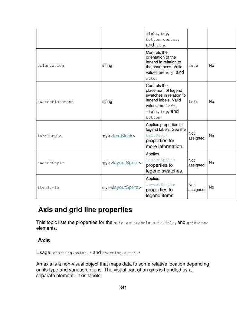
right, top,bottom, center,and none.
orientation string
Controls theorientation of thelegend in relation tothe chart axes. Validvalues are x, y, andauto.
auto No
swatchPlacement string
Controls theplacement of legendswatches in relation tolegend labels. Validvalues are left,right, top, andbottom.
left No
labelStyle style<textBlock>
Applies properties tolegend labels. See thetextBlock
properties formore information.
Notassigned No
swatchStyle style<layoutSprite>
ApplieslayoutSprite
properties tolegend swatches.
Notassigned No
itemStyle style<layoutSprite>
ApplieslayoutSprite
properties tolegend items.
Notassigned No
Axis and grid line properties
This topic lists the properties for the axis, axisLabels, axisTitle, and gridLineselements.
Axis
Usage: charting.axisX.* and charting.axisY.*
An axis is a non-visual object that maps data to some relative location dependingon its type and various options. The visual part of an axis is handled by aseparate element - axis labels.
341
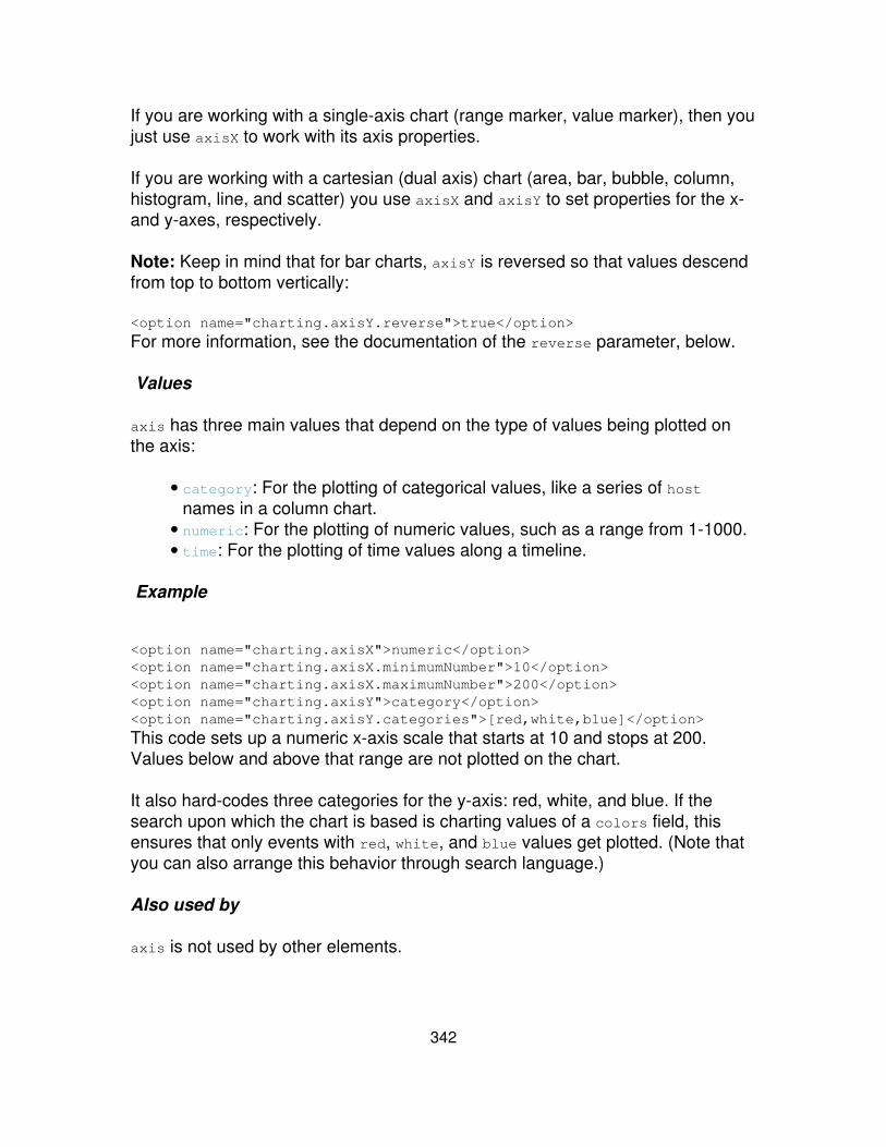
If you are working with a single-axis chart (range marker, value marker), then youjust use axisX to work with its axis properties.
If you are working with a cartesian (dual axis) chart (area, bar, bubble, column,histogram, line, and scatter) you use axisX and axisY to set properties for the x-and y-axes, respectively.
Note: Keep in mind that for bar charts, axisY is reversed so that values descendfrom top to bottom vertically:
<option name="charting.axisY.reverse">true</option>
For more information, see the documentation of the reverse parameter, below.
Values
axis has three main values that depend on the type of values being plotted onthe axis:
category: For the plotting of categorical values, like a series of hostnames in a column chart.
•
numeric: For the plotting of numeric values, such as a range from 1-1000.• time: For the plotting of time values along a timeline.•
Example
<option name="charting.axisX">numeric</option><option name="charting.axisX.minimumNumber">10</option><option name="charting.axisX.maximumNumber">200</option><option name="charting.axisY">category</option><option name="charting.axisY.categories">[red,white,blue]</option>
This code sets up a numeric x-axis scale that starts at 10 and stops at 200.Values below and above that range are not plotted on the chart.
It also hard-codes three categories for the y-axis: red, white, and blue. If thesearch upon which the chart is based is charting values of a colors field, thisensures that only events with red, white, and blue values get plotted. (Note thatyou can also arrange this behavior through search language.)
Also used by
axis is not used by other elements.
342
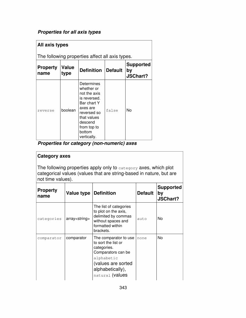
Properties for all axis types
All axis types
The following properties affect all axis types.
Propertyname
Valuetype Definition Default
SupportedbyJSChart?
reverse boolean
Determineswhether ornot the axisis reversed.Bar chart Yaxes arereversed sothat valuesdescendfrom top tobottomvertically.
false No
Properties for category (non-numeric) axes
Category axes
The following properties apply only to category axes, which plotcategorical values (values that are string-based in nature, but arenot time values).
Propertyname Value type Definition Default
SupportedbyJSChart?
categories array<string>
The list of categoriesto plot on the axis,delimited by commaswithout spaces andformatted withinbrackets.
auto No
comparator comparator The comparator to useto sort the list orcategories.Comparators can bealphabetic
(values are sortedalphabetically),natural (values
none No
343

are sortedaccording to theirnatural ordering),numeric (valuesare sortednumerically), orsequentialNumeric
(values are sortedaccording to thesequence ofnumberscontained withinthem--useful for IPaddresses, versionstrings, and similarnumericsequences).
Properties for numeric axes
Numeric axes
The following properties apply only to numeric axes, whichplot numeric values.
Propertyname
Valuetype Definition Default
SupportedbyJSChart?
scale scaleThe scale toapply to theaxis.
false Yes
includeZero boolean
When set totrue thisforces theaxis rangeto includezero.
false Yes
minimumNumber number
Sets theminimumnumber forthe visibleaxis range.
auto Yes
maximumNumber number Sets themaximum
auto Yes
344
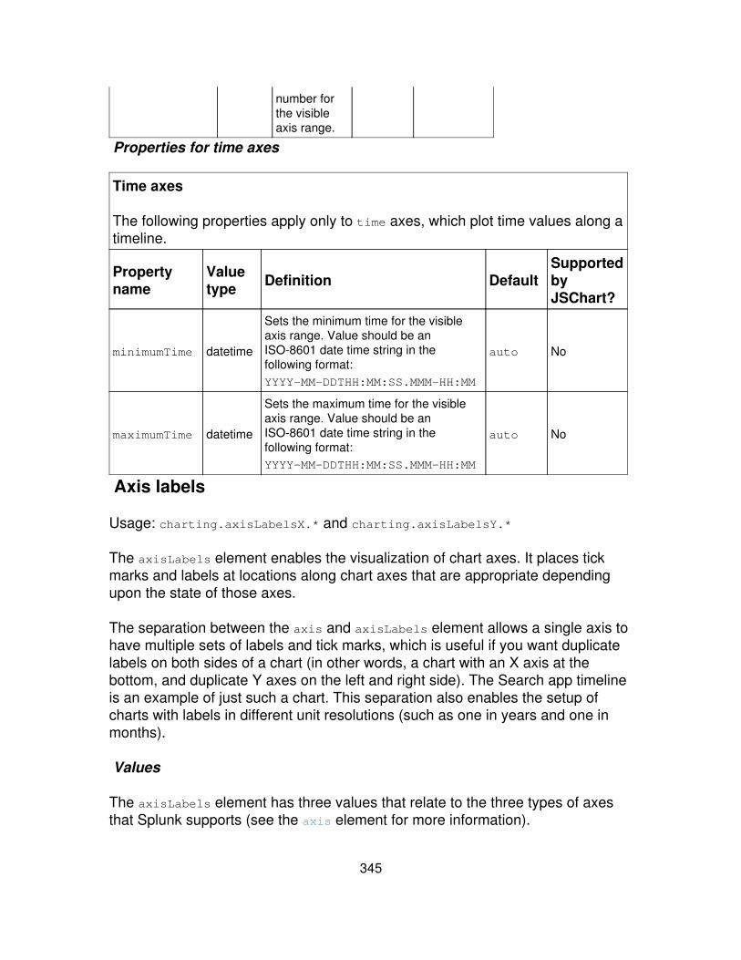
number forthe visibleaxis range.
Properties for time axes
Time axes
The following properties apply only to time axes, which plot time values along atimeline.
Propertyname
Valuetype Definition Default
SupportedbyJSChart?
minimumTime datetime
Sets the minimum time for the visibleaxis range. Value should be anISO-8601 date time string in thefollowing format:YYYY-MM-DDTHH:MM:SS.MMM-HH:MM
auto No
maximumTime datetime
Sets the maximum time for the visibleaxis range. Value should be anISO-8601 date time string in thefollowing format:YYYY-MM-DDTHH:MM:SS.MMM-HH:MM
auto No
Axis labels
Usage: charting.axisLabelsX.* and charting.axisLabelsY.*
The axisLabels element enables the visualization of chart axes. It places tickmarks and labels at locations along chart axes that are appropriate dependingupon the state of those axes.
The separation between the axis and axisLabels element allows a single axis tohave multiple sets of labels and tick marks, which is useful if you want duplicatelabels on both sides of a chart (in other words, a chart with an X axis at thebottom, and duplicate Y axes on the left and right side). The Search app timelineis an example of just such a chart. This separation also enables the setup ofcharts with labels in different unit resolutions (such as one in years and one inmonths).
Values
The axisLabels element has three values that relate to the three types of axesthat Splunk supports (see the axis element for more information).
345
category• numeric• time•
It's important to note that most axisLabels parameters belong to all axis types.
Example
<option name="charting.axisLabelsX">numeric</option><option name="charting.axisLabelsX.integerUnits">true</code><option name="charting.axisLabelsX.minorTickSize">10</option><option name="charting.axisLabelsX.majorTickSize">20</option><optionname="charting.axisLabelsX.majorLabelAlignment">afterTick</option> *<optionname="charting.axisLabelsX.minorLabelStyle.margin">(3,3,2,2)</option><optionname="charting.axisLabelsX.minorLabelStyle.alignmentX">0</option><optionname="charting.axisLabelsX.minorLabelAlignment">afterTick</option> *
This sets up a variety of parameters for numeric x-axis labels. It sets the smalland large tick size in pixels, defines the x-axis margins, and gives the labels analignment that places them after their corresponding tick mark. It also indicatesthat the major unit labels for the numeric x-axis should be rounded to the nearestinteger.
Also used by
layout.axisLabels.*•
See the "Layout properties" discussion for more details.
Axis label properties
all axis labels
The following properties apply to all three axis label types. All axis label types inherit properties from LayoutSprite as well.
Property name Value type Definition DefaultSupportedbyJSChart?
placement stringControls the placement of the axis labels within a cartesian chart layout. Validvalues are left, right, top, and bottom. bottom No
346
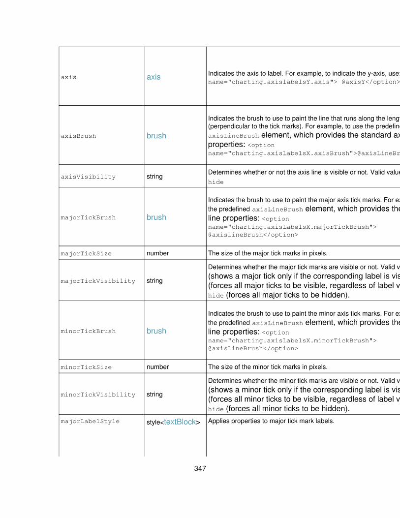
axis axis Indicates the axis to label. For example, to indicate the y-axis, use: <optionname="charting.axislabelsY.axis"> @axisY</option>
See theaxis
section forpropertiesanddefaults.
No
axisBrush brush
Indicates the brush to use to paint the line that runs along the length of the axis(perpendicular to the tick marks). For example, to use the predefinedaxisLineBrush element, which provides the standard axis line brushproperties: <optionname="charting.axisLabelsX.axisBrush">@axisLineBrush</option>
See thebrush
section forpropertiesanddefaults.
No
axisVisibility stringDetermines whether or not the axis line is visible or not. Valid values are show andhide
show Yes
majorTickBrush brush
Indicates the brush to use to paint the major axis tick marks. For example, to usethe predefined axisLineBrush element, which provides the standard axisline properties: <optionname="charting.axisLabelsX.majorTickBrush">@axisLineBrush</option>
See thebrush
section forpropertiesanddefaults.
No
majorTickSize number The size of the major tick marks in pixels. 6 Yes
majorTickVisibility string
Determines whether the major tick marks are visible or not. Valid values are auto
(shows a major tick only if the corresponding label is visible), show(forces all major ticks to be visible, regardless of label visibility), andhide (forces all major ticks to be hidden).
auto Yes
minorTickBrush brush
Indicates the brush to use to paint the minor axis tick marks. For example, to usethe predefined axisLineBrush element, which provides the standard axisline properties: <optionname="charting.axisLabelsX.minorTickBrush">@axisLineBrush</option>
See thebrush
section forpropertiesanddefaults.
No
minorTickSize number The size of the minor tick marks in pixels. 6 Yes
minorTickVisibility string
Determines whether the minor tick marks are visible or not. Valid values are auto
(shows a minor tick only if the corresponding label is visible), show(forces all minor ticks to be visible, regardless of label visibility), andhide (forces all minor ticks to be hidden).
auto Yes
majorLabelStyle style<textBlock> Applies properties to major tick mark labels. See thetextBlock
table forspecific
No
347
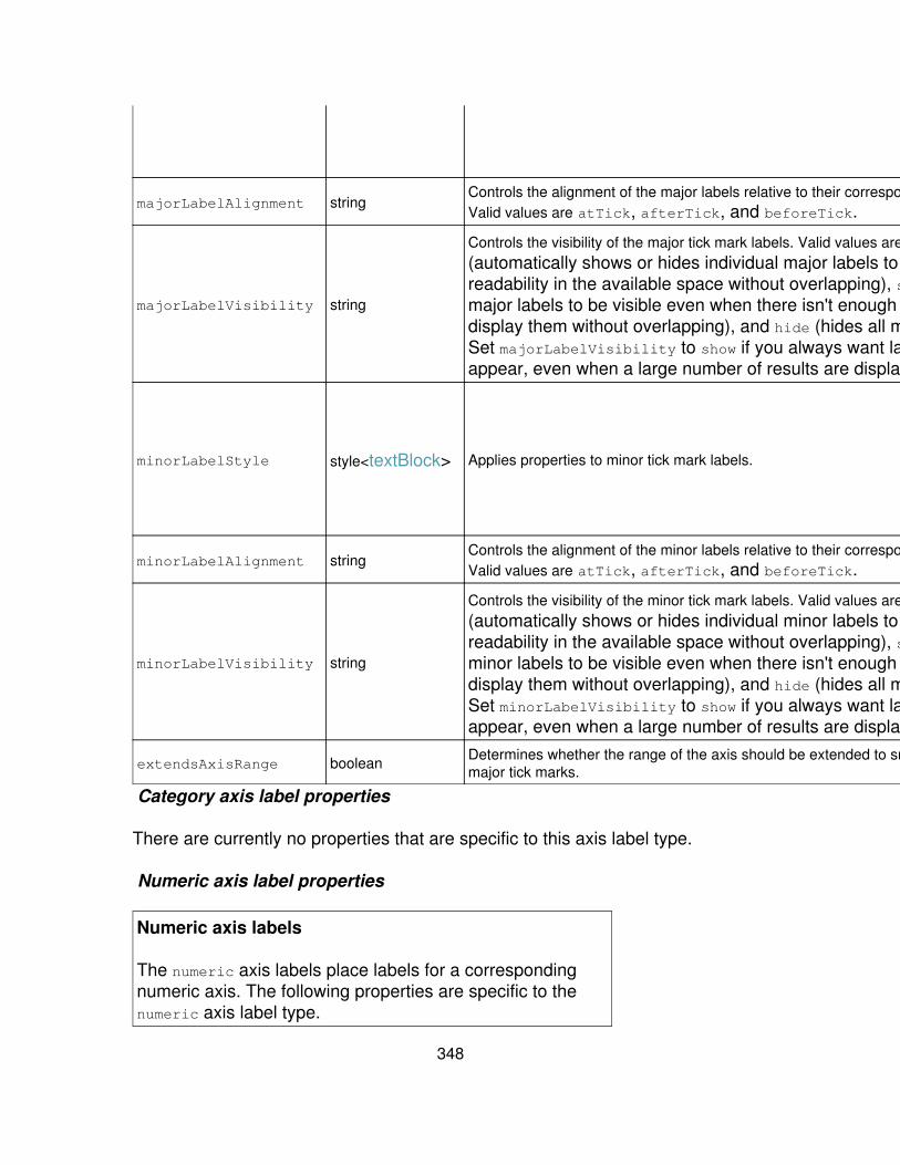
propertiesanddefaults.
majorLabelAlignment stringControls the alignment of the major labels relative to their corresponding tick mark.Valid values are atTick, afterTick, and beforeTick. atTick No
majorLabelVisibility string
Controls the visibility of the major tick mark labels. Valid values are auto
(automatically shows or hides individual major labels to maintainreadability in the available space without overlapping), show (forces allmajor labels to be visible even when there isn't enough space todisplay them without overlapping), and hide (hides all major labels).Set majorLabelVisibility to show if you always want labels toappear, even when a large number of results are displayed.
auto Yes
minorLabelStyle style<textBlock> Applies properties to minor tick mark labels.
See thetextBlock
table forspecificpropertiesanddefaults.
No
minorLabelAlignment stringControls the alignment of the minor labels relative to their corresponding tick mark.Valid values are atTick, afterTick, and beforeTick. atTick No
minorLabelVisibility string
Controls the visibility of the minor tick mark labels. Valid values are auto
(automatically shows or hides individual minor labels to maintainreadability in the available space without overlapping), show (forces allminor labels to be visible even when there isn't enough space todisplay them without overlapping), and hide (hides all minor labels).Set minorLabelVisibility to show if you always want labels toappear, even when a large number of results are displayed.
auto No
extendsAxisRange boolean Determines whether the range of the axis should be extended to snap to wholemajor tick marks. true Yes
Category axis label properties
There are currently no properties that are specific to this axis label type.
Numeric axis label properties
Numeric axis labels
The numeric axis labels place labels for a correspondingnumeric axis. The following properties are specific to thenumeric axis label type.
348
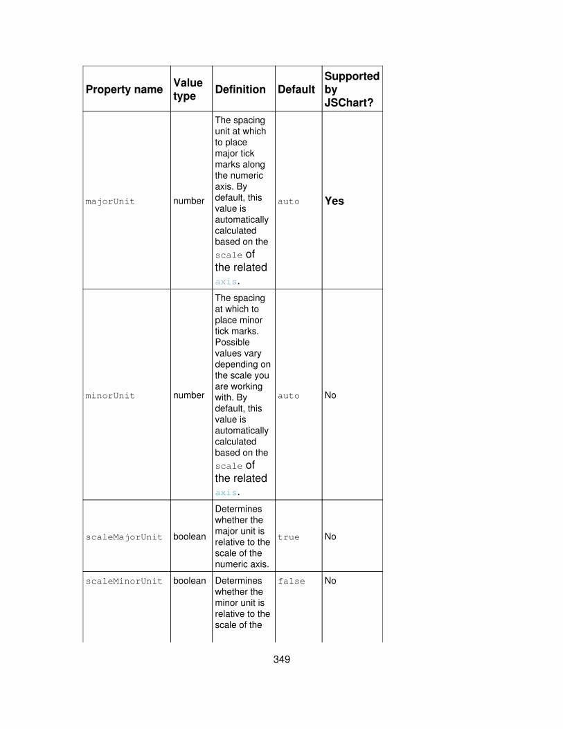
Property name Valuetype Definition Default
SupportedbyJSChart?
majorUnit number
The spacingunit at whichto placemajor tickmarks alongthe numericaxis. Bydefault, thisvalue isautomaticallycalculatedbased on thescale ofthe relatedaxis.
auto Yes
minorUnit number
The spacingat which toplace minortick marks.Possiblevalues varydepending onthe scale youare workingwith. Bydefault, thisvalue isautomaticallycalculatedbased on thescale ofthe relatedaxis.
auto No
scaleMajorUnit boolean
Determineswhether themajor unit isrelative to thescale of thenumeric axis.
true No
scaleMinorUnit boolean Determineswhether theminor unit isrelative to thescale of the
false No
349

numeric axis.(The minorunit of anumeric axisis usuallyrelative to themajor unit.)
integerUnits boolean
Indicateswhether themajor unitshould berounded tothe nearestinteger.
false Yes
Time axis label properties
Time axis labels
The time axis labels place labels for a corresponding time axis. The following properties arespecific to the time axis label type.
Propertyname
Valuetype Definition Default
SupportedbyJSChart?
timeZone timeZone
The time zone in which labels are computed. Canbe: 1) the character z or Z, indicating UTC time(constant offset 0); or 2) A numeric value,indicating the time zone offset in seconds,or 3) a string in serialized time zone format,indicating the offset changes for the timezone on the Splunk server. Any other valueis interpreted as the local time in whateverbrowser is being used to view the chart. Formore information see the zoneinfo (TZ)database.
By defaulttimeZone isassigned aserializedstring fromthe Splunkserver thatcontains alltheinformationaboutwhere thetime zoneoffsetchangesoccur.
No
majorUnit duration Determines the spacing at which to place major tickmarks, in terms of duration. By default this isdetermined automatically. To define a specificspacing, use an ISO-8601 duration string in thefollowing format: PnYnMnDTnHnMnS. Note:
auto No
350

Splunk will ignore your setting for thisproperty unless you force the chart todisplay in Flash. To do this, add a line foranother unsupported property such asscaleX to your chart definition. This forcesthe chart to display in Flash with yourmajorUnit setting displaying appropriatelyalong the time axis.
Example: You want to force the time axis tobe marked in 1 hour increments. If you justput in <optionname="charting.axisLabelsX.majorUnit">
P0Y0M0DT1H0M0S</option>, Splunk willignore the setting. But if you add <optionname="charting.scaleX>1</option>,Splunk will be forced to display the chart inFlash with the desired 1 hour unit setting onthe X axis.
minorUnit duration
Determines the spacing at which to place minor tickmarks, in terms of duration. By default this isdetermined automatically. To define a specificspacing, use an ISO-8601 duration string in thefollowing format: PnYnMnDTnHnMnS
auto No
Axis title
Usage: charting.axisTitleX.* and charting.axisTitleX.* The axisTitleelement is designed to enable the placement of the axis title within a cartesian(dual axis) chart layout.
Note: While axisTitle is mainly to be used for Cartesian charts, you couldcreate an axisTitle element and place it within the layout.axisTitles list for asingle-axis chart or pie chart.
Values
axisTitle•
Example
<option name="charting.axisTitleX.text">Source type</option> <optionname="charting.axisTitleY.text">KB indexed</option>
351
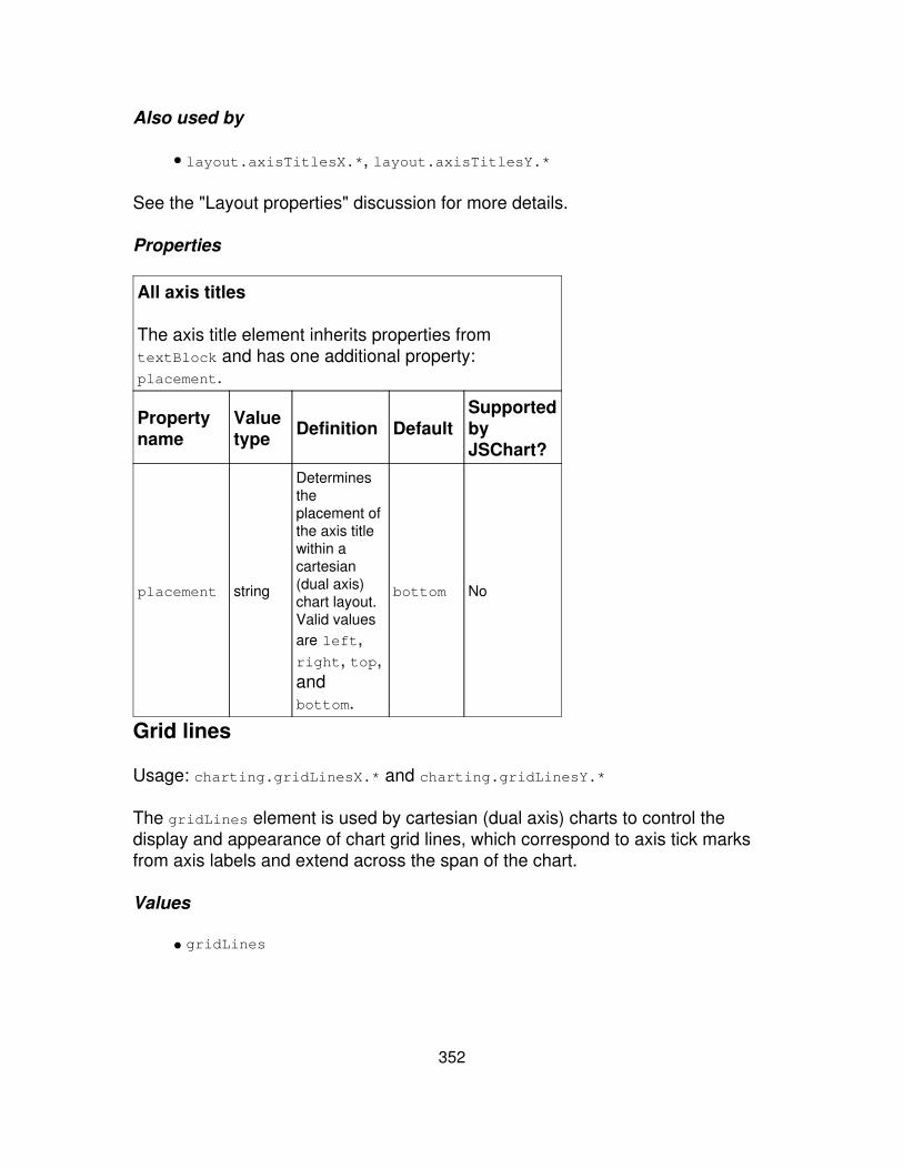
Also used by
layout.axisTitlesX.*, layout.axisTitlesY.*•
See the "Layout properties" discussion for more details.
Properties
All axis titles
The axis title element inherits properties fromtextBlock and has one additional property:placement.
Propertyname
Valuetype Definition Default
SupportedbyJSChart?
placement string
Determinestheplacement ofthe axis titlewithin acartesian(dual axis)chart layout.Valid valuesare left,right, top,andbottom.
bottom No
Grid lines
Usage: charting.gridLinesX.* and charting.gridLinesY.*
The gridLines element is used by cartesian (dual axis) charts to control thedisplay and appearance of chart grid lines, which correspond to axis tick marksfrom axis labels and extend across the span of the chart.
Values
gridLines•
352

Also used by
layout.gridLines.*•
See the "Layout properties" discussion for more details.
Properties
All grid lines
Grid lines inherit properties from layoutSprite and have the following additional properties as well.
Property name Valuetype Definition Default
SupportedbyJSChart?
axisLabels axisLabelsIndicates the axis labels for which to generate the gridlines. Axis labels should use the @ sign to referencethe axis labels. For example: @myAxisX.
Notassigned. No
majorLineBrush brush
Indicates the brush to use to paint the major grid lines(corresponds to the major tick marks). For example, to usethe predefined gridLineBrush element, whichprovides the standard grid line brush properties:<optionname="charting.gridLinesY.majorLineBrush">@gridLineBrush</option>
See thebrush
section forpropertiesanddefaults.
No
minorLineBrush brush
Indicates the brush to use to paint the minor grid lines(corresponds to the minor tick marks). For example, to usethe predefined gridLineBrush element, whichprovides the standard grid line brush properties:<optionname="charting.gridLinesY.minorLineBrush">@gridLineBrush</option>
See thebrush
section forpropertiesanddefaults.
No
showMajorLines boolean Determines whether major grid lines are visible. true Yes
showMinorLines boolean Determines whether minor grid lines are visible. false Yes
Tooltip properties
This topic covers the properties for the tooltip element.
353
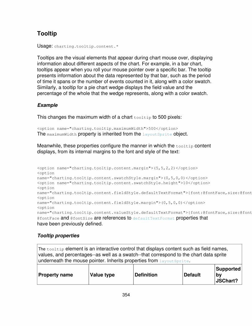
Tooltip
Usage: charting.tooltip.content.*
Tooltips are the visual elements that appear during chart mouse over, displayinginformation about different aspects of the chart. For example, in a bar chart,tooltips appear when you roll your mouse pointer over a specific bar. The tooltippresents information about the data represented by that bar, such as the periodof time it spans or the number of events counted in it, along with a color swatch.Similarly, a tooltip for a pie chart wedge displays the field value and thepercentage of the whole that the wedge represents, along with a color swatch.
Example
This changes the maximum width of a chart tooltip to 500 pixels:
<option name="charting.tooltip.maximumWidth">500</option>
The maximumWidth property is inherited from the layoutSprite object.
Meanwhile, these properties configure the manner in which the tooltip contentdisplays, from its internal margins to the font and style of the text:
<option name="charting.tooltip.content.margin">(5,5,2,2)</option><optionname="charting.tooltip.content.swatchStyle.margin">(0,5,0,0)</option><option name="charting.tooltip.content.swatchStyle.height">10</option><optionname="charting.tooltip.content.fieldStyle.defaultTextFormat">{font:@fontFace,size:@fontSize,color:0xCCCCCC}</option><optionname="charting.tooltip.content.fieldStyle.margin">(0,5,0,0)</option><optionname="charting.tooltip.content.valueStyle.defaultTextFormat">{font:@fontFace,size:@fontSize,color:0xFFFFFF}</option>
@fontFace and @fontSize are references to defaultTextFormat properties thathave been previously defined.
Tooltip properties
The tooltip element is an interactive control that displays content such as field names,values, and percentages--as well as a swatch--that correspond to the chart data spriteunderneath the mouse pointer. Inherits properties from layoutSprite.
Property name Value type Definition DefaultSupportedbyJSChart?
354

backgroundBrush brush
Indicates the brush touse for painting thetooltip background. Usethe @ symbol toreference anprexisting brush, likeso:@myBackgroundBrush
No brushassigned. Seethe brush
section forpropertiesand defaults.
No
content.swatchStyle style<layoutSprite> The properties to applyto the swatch sprite.
See thelayoutSprite
section forpropertiesand defaults.
No
content.fieldStyle style<textBlock> Affects the appearanceof the field label text.
See thetextBlock forpropertiesand defaults.
No
content.valueStyle style<textBlock> Affects the appearanceof the value label text.
See thetextBlock
section forpropertiesand defaults.
No
Font, color, brush, shape and related paletteproperties
This section covers properties for basic font, color, brush, shape, and palettes,which are used to design the appearance of the charting objects. For example,you use brushes to determine the line thickness of the lines in line charts, set upgradient fills for area charts, and paint pie chart wedges with images rather thancolors.
Splunk delivers a set of pre-configured brushes, color palettes, and brushpalettes with different standardized settings. You can adjust those settings ordefine brushes and palettes of your own and reference them.
For example, the predefined lineBrushPalette element inherits all of itsproperties from the brushPalette element, but the values of those propertieshave been set to paint a standardized line in Splunk line and area charts. Thepredefined areaBrushPalette element, on the other hand also inherits itsproperties from the brushPalette but has been designed to paint a standardized
355

fill for area charts.
When you set up a line chart, the lineBrushPalette is associated with it bydefault. But what if you want to use a line brush palette with settings that aredifferent than the standard one? You can create a new one--that you might callmyLineBrushPalette--and then reference it like so:
<option name="charting.chart">line</option><optionname="charting.chart.lineBrushPalette">@myLineBrushPalette</option>
For more information about designing custom brushes and palettes, see"Advanced charting options," in this manual.
Supported by JSChart?
It's important to note that currently none of the font, color, brush, shape, andrelated palette properties are supported by the JSChart module. For moreinformation, see the "Advanced charting options" topic in this manual.
Font and color
Usage: charting.fontFace, charting.foregroundColor, and so on.
Use the font and color properties to define the baseline font and color aspects ofyour chart.
Examples
Setting font properties:
<option name="charting.fontFace">_sans</option><option name="charting.fontSize">11</option><option name="charting.fontColor">0x000000</option>
Setting color properties:
<option name="charting.foregroundColor">0x000000</option><option name="charting.backgroundColor">0xFFFFFF</option><optionname="charting.seriesColors">[0x6CB8CA,0xFAC61D,0xD85E3D,0x956E96,0xF7912C,0x9AC23C,0x998C55,0xDD87B0,0x5479AF,0xE0A93B,0x6B8930,0xA04558,0xA7D4DF,0xFCDD77,0xE89E8B,0xBFA8C0,0xFABD80,0xC2DA8A,0xC2BA99,0xEBB7D0,0x98AFCF,0xECCB89,0xA6B883,0xC68F9B,0x416E79,0x967711,0x823825,0x59425A,
356
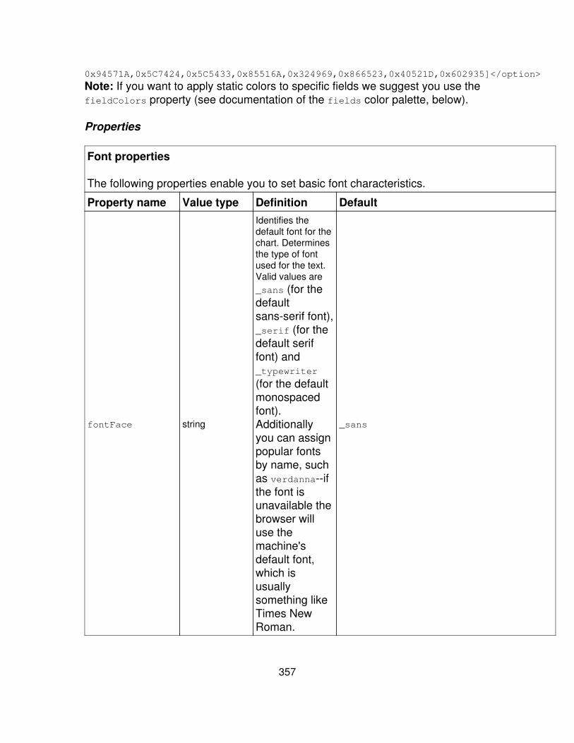
0x94571A,0x5C7424,0x5C5433,0x85516A,0x324969,0x866523,0x40521D,0x602935]</option>
Note: If you want to apply static colors to specific fields we suggest you use thefieldColors property (see documentation of the fields color palette, below).
Properties
Font properties
The following properties enable you to set basic font characteristics.
Property name Value type Definition Default
fontFace string
Identifies thedefault font for thechart. Determinesthe type of fontused for the text.Valid values are_sans (for thedefaultsans-serif font),_serif (for thedefault seriffont) and_typewriter
(for the defaultmonospacedfont).Additionallyyou can assignpopular fontsby name, suchas verdanna--ifthe font isunavailable thebrowser willuse themachine'sdefault font,which isusuallysomething likeTimes NewRoman.
_sans
357
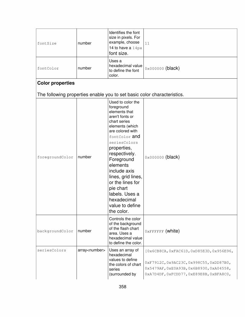
fontSize number
Identifies the fontsize in pixels. Forexample, choose14 to have a 14px
font size.
11
fontColor number
Uses ahexadecimal valueto define the fontcolor.
0x000000 (black)
Color properties
The following properties enable you to set basic color characteristics.
foregroundColor number
Used to color theforegroundelements thataren't fonts orchart serieselements (whichare colored withfontColor andseriesColors
properties,respectively.Foregroundelementsinclude axislines, grid lines,or the lines forpie chartlabels. Uses ahexadecimalvalue to definethe color.
0x000000 (black)
backgroundColor number
Controls the colorof the backgroundof the flash chartarea. Uses ahexadecimal valueto define the color.
0xFFFFFF (white)
seriesColors array<number> Uses an array ofhexadecimalvalues to definethe colors of chartseries(surrounded by
[0x6CB8CA,0xFAC61D,0xD85E3D,0x956E96,
0xF7912C,0x9AC23C,0x998C55,0xDD87B0,
0x5479AF,0xE0A93B,0x6B8930,0xA04558,
0xA7D4DF,0xFCDD77,0xE89E8B,0xBFA8C0,
358
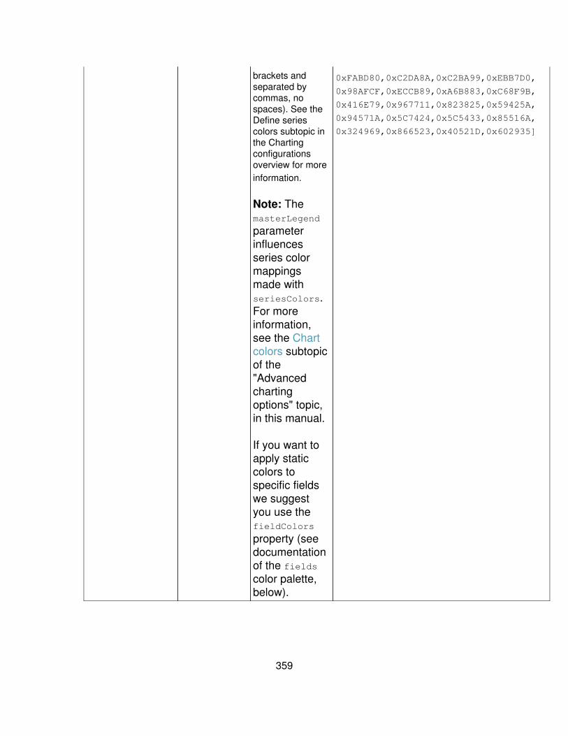
brackets andseparated bycommas, nospaces). See theDefine seriescolors subtopic inthe Chartingconfigurationsoverview for moreinformation.
Note: ThemasterLegend
parameterinfluencesseries colormappingsmade withseriesColors.For moreinformation,see the Chartcolors subtopicof the"Advancedchartingoptions" topic,in this manual.
If you want toapply staticcolors tospecific fieldswe suggestyou use thefieldColors
property (seedocumentationof the fieldscolor palette,below).
0xFABD80,0xC2DA8A,0xC2BA99,0xEBB7D0,
0x98AFCF,0xECCB89,0xA6B883,0xC68F9B,
0x416E79,0x967711,0x823825,0x59425A,
0x94571A,0x5C7424,0x5C5433,0x85516A,
0x324969,0x866523,0x40521D,0x602935]
359
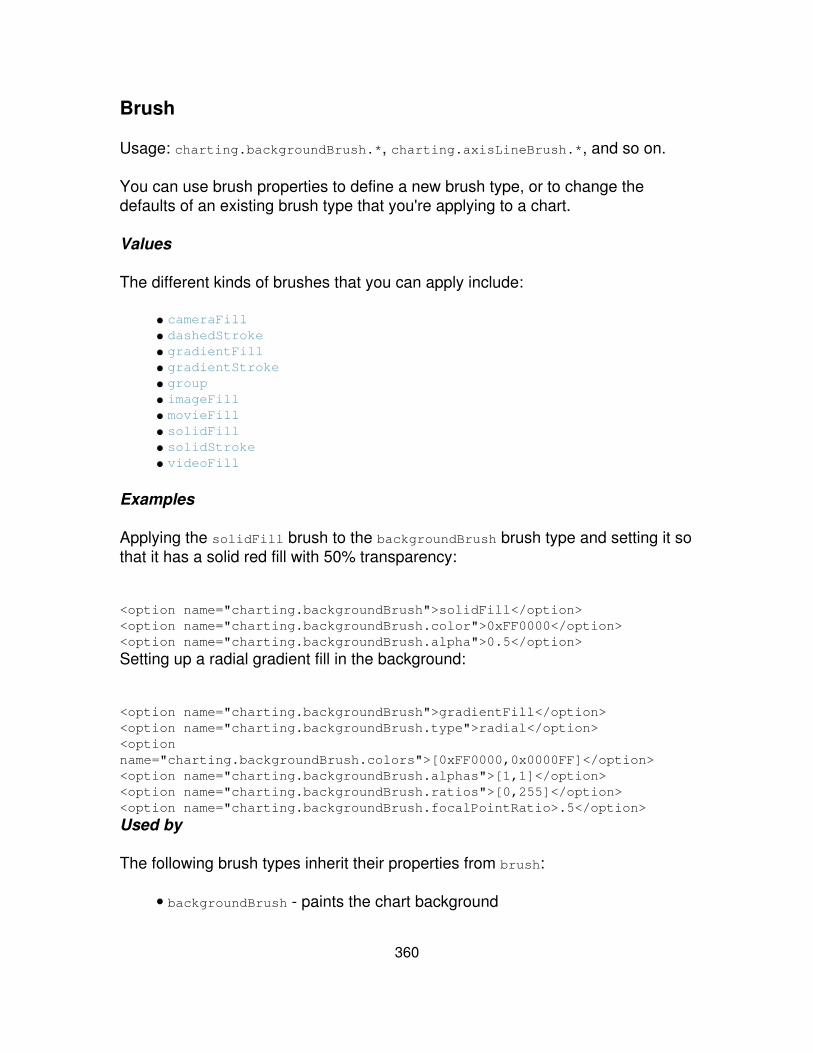
Brush
Usage: charting.backgroundBrush.*, charting.axisLineBrush.*, and so on.
You can use brush properties to define a new brush type, or to change thedefaults of an existing brush type that you're applying to a chart.
Values
The different kinds of brushes that you can apply include:
cameraFill• dashedStroke• gradientFill• gradientStroke• group• imageFill• movieFill• solidFill• solidStroke• videoFill•
Examples
Applying the solidFill brush to the backgroundBrush brush type and setting it sothat it has a solid red fill with 50% transparency:
<option name="charting.backgroundBrush">solidFill</option><option name="charting.backgroundBrush.color">0xFF0000</option><option name="charting.backgroundBrush.alpha">0.5</option>
Setting up a radial gradient fill in the background:
<option name="charting.backgroundBrush">gradientFill</option><option name="charting.backgroundBrush.type">radial</option><optionname="charting.backgroundBrush.colors">[0xFF0000,0x0000FF]</option><option name="charting.backgroundBrush.alphas">[1,1]</option><option name="charting.backgroundBrush.ratios">[0,255]</option><option name="charting.backgroundBrush.focalPointRatio>.5</option>
Used by
The following brush types inherit their properties from brush:
backgroundBrush - paints the chart background•
360

chart objects:
innerFillBrush - paints the inner fill of range marker charts• labelLineBrush - paints pie chart and ratio bar chart label lines• lineBrush - paints range marker and value marker chart lines• outerFillBrush - paints the outer fill of range marker charts•
axis label objects:
axisBrush - paints the line that runs the length of the axis• majorTickBrush - paints the major tick marks along the axis• minorTickBrush - paints the minor tick marks along the axis•
grid line objects:
majorLineBrush - paints the major grid lines (corresponds with major tickmarks)
•
minorLineBrush - paints the minor grid lines (corresponds with minor tickmarks)
•
Properties
Camera fill brush
The cameraFill brush paints with live video captured from acomputer-mounted camera.
Property name Value type Definition Default
cameraIndex number
The zero-based indexof the camera to use ifmultiple cameras areavailable.
auto
repeat boolean
Determines whetherthe image should berepeated when it istiled. Go here formore informationabout the repeat
parameter.
false
smooth boolean Determines whetherthe image issmoothed when it isscaled. Go here formore information
false
361

about the repeat
parameter.
stretchMode string
Determines how theimage tile is stretchedrelative to the drawingbounds. Valid valuesare none, fill,uniform,uniformToFill,uniformToWidth
anduniformToHeight.
fill
alignmentX number
The horizontalalignment of theimage tile within thedrawing bounds.Typical values arebetween 0
(left-aligned) and 1(right-aligned).
0.5
(centered)
alignmentY number
The vertical alignmentof the image tile withinthe drawing bounds.Typical values arebetween 0
(top-aligned) and1
(bottom-aligned).
0.5
(centered)
tileTransform matrix Defines thetransformation matrixto apply to the imagetile. This isrepresented as acomma-delimited listof six numeric valuesenclosed in aparenthesis,corresponding to a, b,c, d, tx, and tyrespectively:(a,b,c,d,tx,ty).
The resultingtransformation
No defaultdefined. Youmust set thisvalue
362
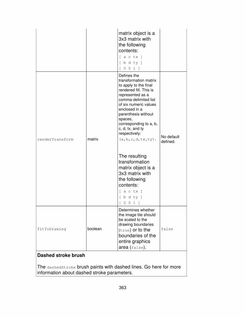
matrix object is a3x3 matrix withthe followingcontents:[ a c tx ]
[ b d ty ]
[ 0 0 1 ]
renderTransform matrix
Defines thetransformation matrixto apply to the finalrendered fill. This isrepresented as acomma-delimited listof six numeric valuesenclosed in aparenthesis withoutspaces,corresponding to a, b,c, d, tx, and tyrespectively:(a,b,c,d,tx,ty).
The resultingtransformationmatrix object is a3x3 matrix withthe followingcontents:[ a c tx ]
[ b d ty ]
[ 0 0 1 ]
No defaultdefined.
fitToDrawing boolean
Determines whetherthe image tile shouldbe scaled to thedrawing boundaries(true) or to theboundaries of theentire graphicsarea (false).
false
Dashed stroke brush
The dashedStroke brush paints with dashed lines. Go here for moreinformation about dashed stroke parameters.
363
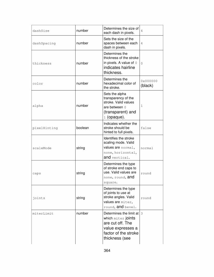
dashSize number Determines the size ofeach dash in pixels. 4
dashSpacing numberSets the size of thespaces between eachdash in pixels.
4
thickness number
Determines thethickness of the strokein pixels. A value of 0indicates hairlinethickness.
0
color numberDetermines thehexadecimal color ofthe stroke.
0x000000
(black)
alpha number
Sets the alphatransparency of thestroke. Valid valuesare between 0
(transparent) and1 (opaque).
1
pixelHinting booleanIndicates whether thestroke should behinted to full pixels.
false
scaleMode string
Identifies the strokescaling mode. Validvalues are normal,none, horizontal,and vertical.
normal
caps string
Determines the typeof stroke end caps touse. Valid values arenone, round, andsquare.
round
joints string
Determines the typeof joints to use atstroke angles. Validvalues are miter,round, and bevel.
round
miterLimit number Determines the limit atwhich miter jointsare cut off. Thevalue expresses afactor of the strokethickness (see
3
364
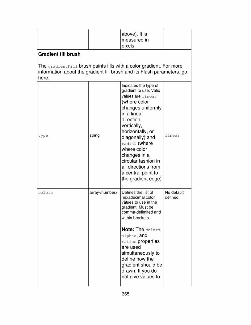
above). It ismeasured inpixels.
Gradient fill brush
The gradientFill brush paints fills with a color gradient. For moreinformation about the gradient fill brush and its Flash parameters, gohere.
type string
Indicates the type ofgradient to use. Validvalues are linear
(where colorchanges uniformlyin a lineardirection,vertically,horizontally, ordiagonally) andradial (wherewhere colorchanges in acircular fashion inall directions froma central point tothe gradient edge).
linear
colors array<number> Defines the list ofhexadecimal colorvalues to use in thegradient. Must becomma-delimited andwithin brackets.
Note: The colors,alphas, andratios propertiesare usedsimultaneously todefine how thegradient should bedrawn. If you donot give values to
No defaultdefined.
365
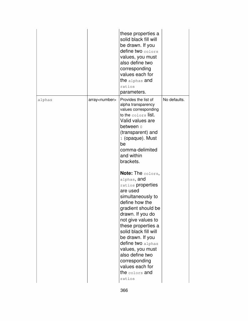
these properties asolid black fill willbe drawn. If youdefine two colorsvalues, you mustalso define twocorrespondingvalues each forthe alphas andratios
parameters.alphas array<number> Provides the list of
alpha transparencyvalues correspondingto the colors list.Valid values arebetween 0(transparent) and1 (opaque). Mustbecomma-delimitedand withinbrackets.
Note: The colors,alphas, andratios propertiesare usedsimultaneously todefine how thegradient should bedrawn. If you donot give values tothese properties asolid black fill willbe drawn. If youdefine two alphasvalues, you mustalso define twocorrespondingvalues each forthe colors andratios
No defaults.
366
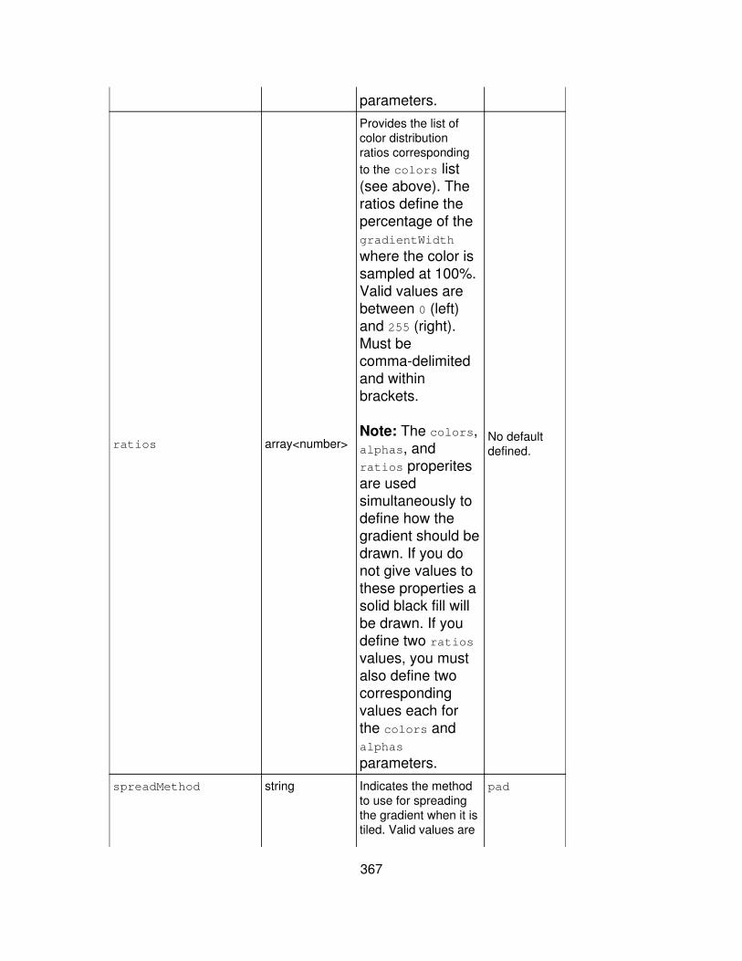
parameters.
ratios array<number>
Provides the list ofcolor distributionratios correspondingto the colors list(see above). Theratios define thepercentage of thegradientWidth
where the color issampled at 100%.Valid values arebetween 0 (left)and 255 (right).Must becomma-delimitedand withinbrackets.
Note: The colors,alphas, andratios properitesare usedsimultaneously todefine how thegradient should bedrawn. If you donot give values tothese properties asolid black fill willbe drawn. If youdefine two ratiosvalues, you mustalso define twocorrespondingvalues each forthe colors andalphas
parameters.
No defaultdefined.
spreadMethod string Indicates the methodto use for spreadingthe gradient when it istiled. Valid values are
pad
367
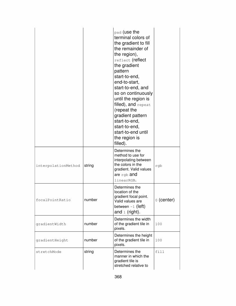
pad (use theterminal colors ofthe gradient to fillthe remainder ofthe region),reflect (reflectthe gradientpatternstart-to-end,end-to-start,start-to-end, andso on continuouslyuntil the region isfilled), and repeat(repeat thegradient patternstart-to-end,start-to-end,start-to-end untilthe region isfilled).
interpolationMethod string
Determines themethod to use forinterpolating betweenthe colors in thegradient. Valid valuesare rgb andlinearRGB.
rgb
focalPointRatio number
Determines thelocation of thegradient focal point.Valid values arebetween -1 (left)and 1 (right).
0 (center)
gradientWidth numberDetermines the widthof the gradient tile inpixels.
100
gradientHeight numberDetermines the heightof the gradient tile inpixels.
100
stretchMode string Determines themanner in which thegradient tile isstretched relative to
fill
368
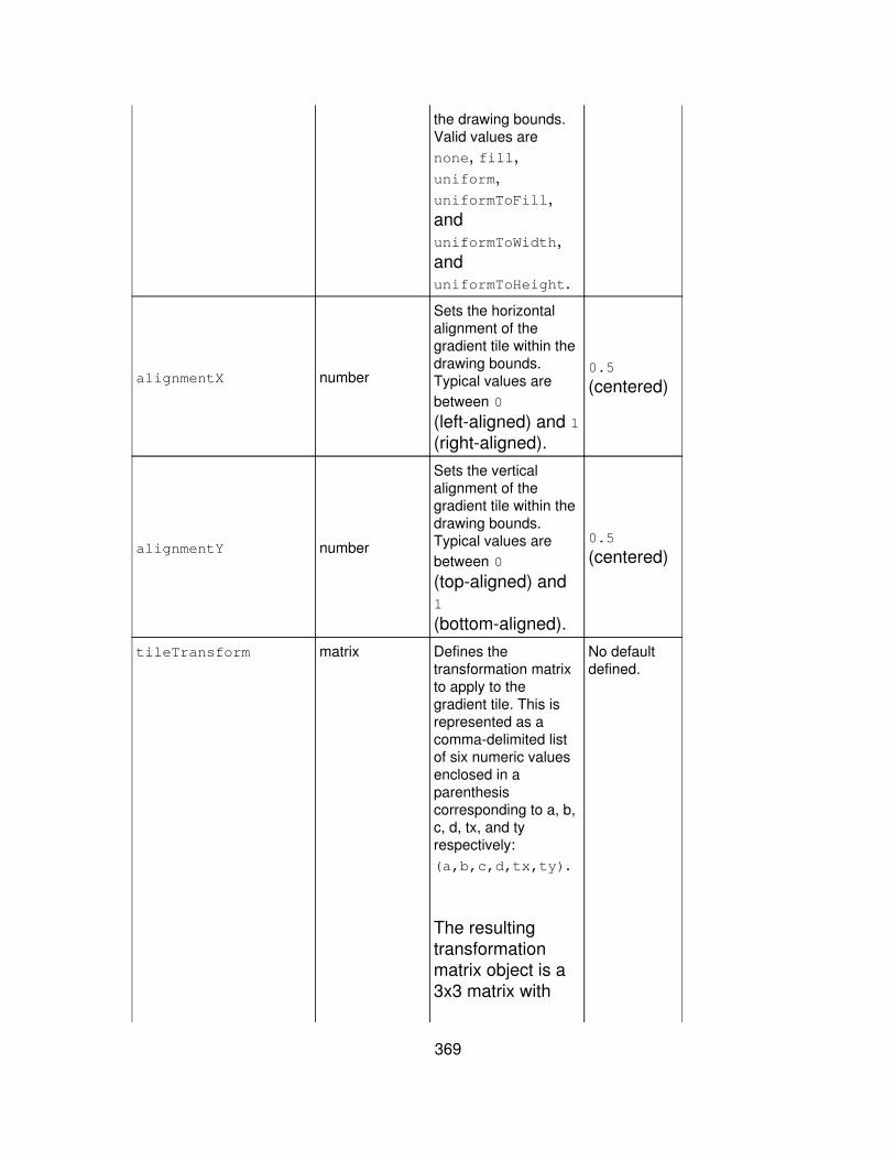
the drawing bounds.Valid values arenone, fill,uniform,uniformToFill,anduniformToWidth,anduniformToHeight.
alignmentX number
Sets the horizontalalignment of thegradient tile within thedrawing bounds.Typical values arebetween 0
(left-aligned) and 1(right-aligned).
0.5
(centered)
alignmentY number
Sets the verticalalignment of thegradient tile within thedrawing bounds.Typical values arebetween 0
(top-aligned) and1
(bottom-aligned).
0.5
(centered)
tileTransform matrix Defines thetransformation matrixto apply to thegradient tile. This isrepresented as acomma-delimited listof six numeric valuesenclosed in aparenthesiscorresponding to a, b,c, d, tx, and tyrespectively:(a,b,c,d,tx,ty).
The resultingtransformationmatrix object is a3x3 matrix with
No defaultdefined.
369
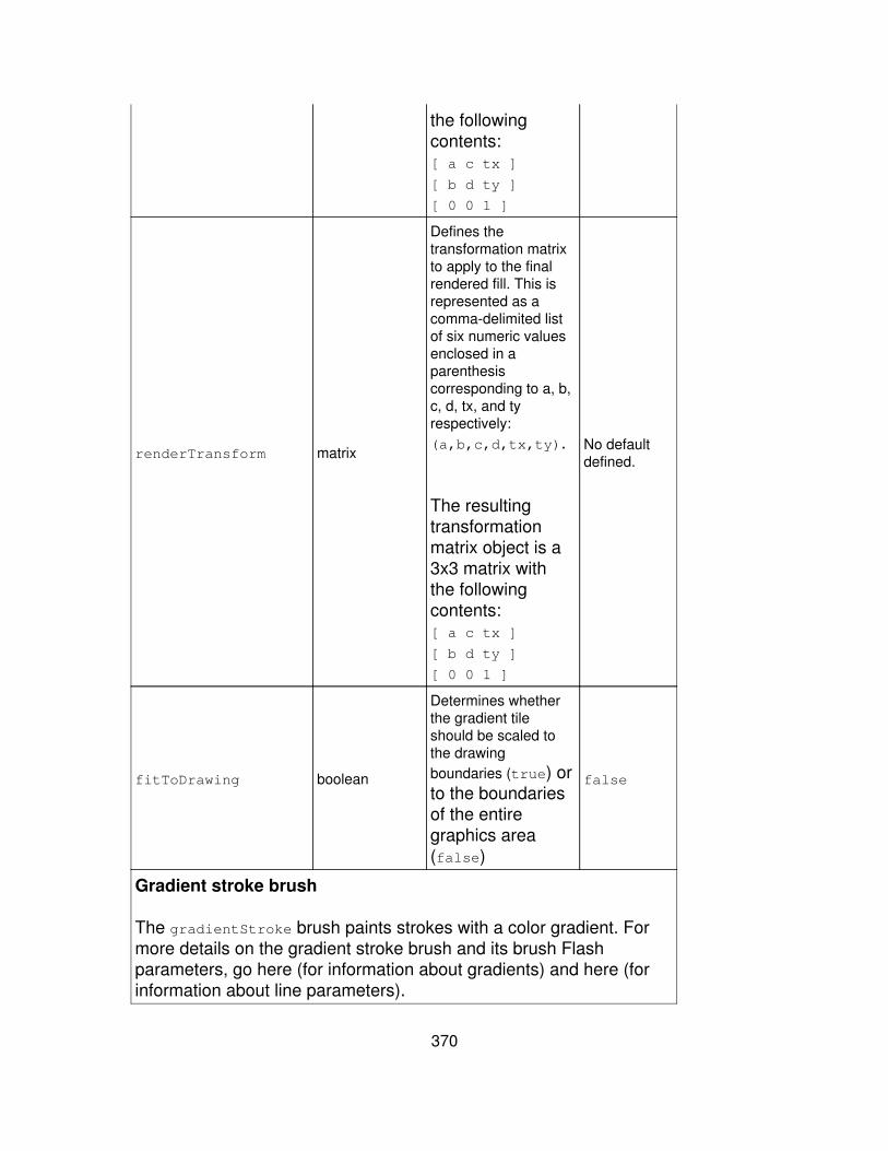
the followingcontents:[ a c tx ]
[ b d ty ]
[ 0 0 1 ]
renderTransform matrix
Defines thetransformation matrixto apply to the finalrendered fill. This isrepresented as acomma-delimited listof six numeric valuesenclosed in aparenthesiscorresponding to a, b,c, d, tx, and tyrespectively:(a,b,c,d,tx,ty).
The resultingtransformationmatrix object is a3x3 matrix withthe followingcontents:[ a c tx ]
[ b d ty ]
[ 0 0 1 ]
No defaultdefined.
fitToDrawing boolean
Determines whetherthe gradient tileshould be scaled tothe drawingboundaries (true) orto the boundariesof the entiregraphics area(false)
false
Gradient stroke brush
The gradientStroke brush paints strokes with a color gradient. Formore details on the gradient stroke brush and its brush Flashparameters, go here (for information about gradients) and here (forinformation about line parameters).
370
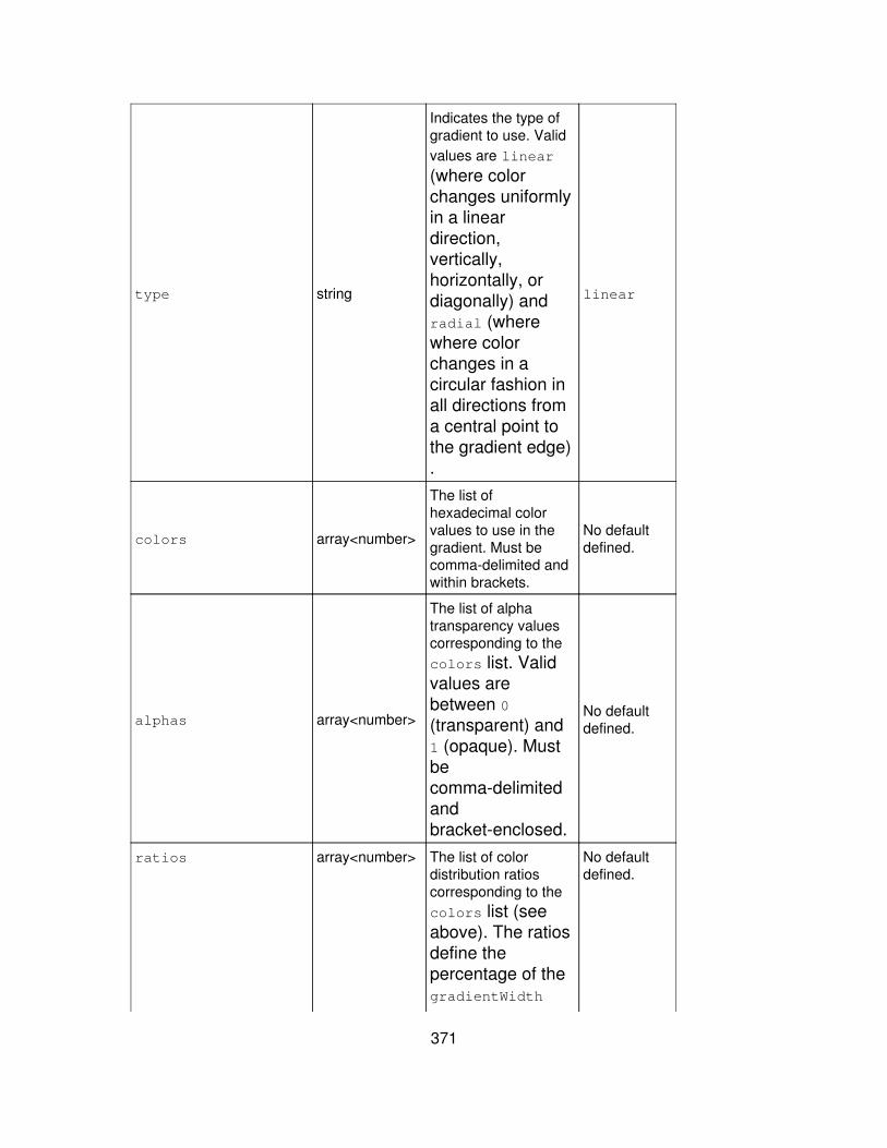
type string
Indicates the type ofgradient to use. Validvalues are linear
(where colorchanges uniformlyin a lineardirection,vertically,horizontally, ordiagonally) andradial (wherewhere colorchanges in acircular fashion inall directions froma central point tothe gradient edge).
linear
colors array<number>
The list ofhexadecimal colorvalues to use in thegradient. Must becomma-delimited andwithin brackets.
No defaultdefined.
alphas array<number>
The list of alphatransparency valuescorresponding to thecolors list. Validvalues arebetween 0(transparent) and1 (opaque). Mustbecomma-delimitedandbracket-enclosed.
No defaultdefined.
ratios array<number> The list of colordistribution ratioscorresponding to thecolors list (seeabove). The ratiosdefine thepercentage of thegradientWidth
No defaultdefined.
371

where the color issampled at 100%.Valid values arebetween 0 (left)and 255 (right).Must becomma-delimitedandbracket-enclosed.
spreadMethod string
The method to use forspreading the gradientwhen it is tiled. Validvalues are pad (usethe terminal colorsof the gradient tofill the remainderof the stroke),reflect (reflectthe gradientpatternstart-to-end,end-to-start,start-to-end, andso oncontinuously), andrepeat (repeat thegradient patternstart-to-end,start-to-end,start-to-end).
pad
interpolationMethod string
Determines themethod to use forinterpolating betweenthe colors in thegradient. Valid valuesare rgb andlinearRGB.
rgb
focalPointRatio number
Determines thelocation of thegradient focal point.Valid values arebetween -1 (left)and 1 (right).
0 (center)
372
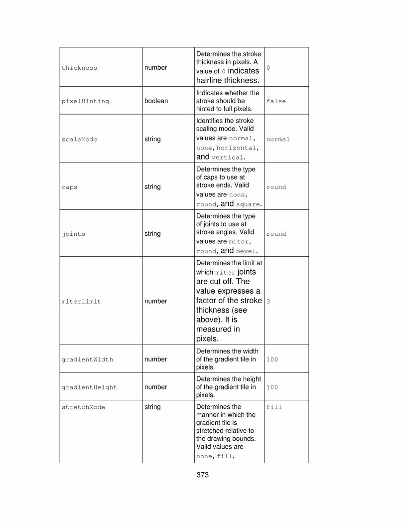
thickness number
Determines the strokethickness in pixels. Avalue of 0 indicateshairline thickness.
0
pixelHinting booleanIndicates whether thestroke should behinted to full pixels.
false
scaleMode string
Identifies the strokescaling mode. Validvalues are normal,none, horizontal,and vertical.
normal
caps string
Determines the typeof caps to use atstroke ends. Validvalues are none,round, and square.
round
joints string
Determines the typeof joints to use atstroke angles. Validvalues are miter,round, and bevel.
round
miterLimit number
Determines the limit atwhich miter jointsare cut off. Thevalue expresses afactor of the strokethickness (seeabove). It ismeasured inpixels.
3
gradientWidth numberDetermines the widthof the gradient tile inpixels.
100
gradientHeight numberDetermines the heightof the gradient tile inpixels.
100
stretchMode string Determines themanner in which thegradient tile isstretched relative tothe drawing bounds.Valid values arenone, fill,
fill
373
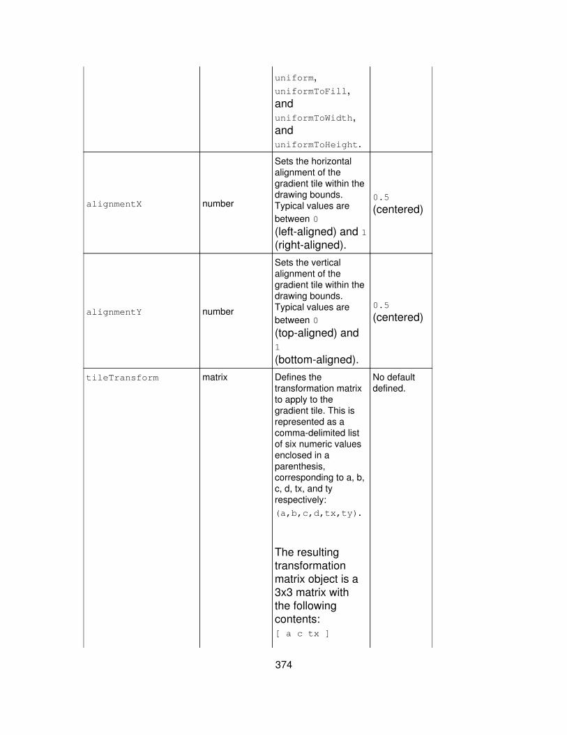
uniform,uniformToFill,anduniformToWidth,anduniformToHeight.
alignmentX number
Sets the horizontalalignment of thegradient tile within thedrawing bounds.Typical values arebetween 0
(left-aligned) and 1(right-aligned).
0.5
(centered)
alignmentY number
Sets the verticalalignment of thegradient tile within thedrawing bounds.Typical values arebetween 0
(top-aligned) and1
(bottom-aligned).
0.5
(centered)
tileTransform matrix Defines thetransformation matrixto apply to thegradient tile. This isrepresented as acomma-delimited listof six numeric valuesenclosed in aparenthesis,corresponding to a, b,c, d, tx, and tyrespectively:(a,b,c,d,tx,ty).
The resultingtransformationmatrix object is a3x3 matrix withthe followingcontents:[ a c tx ]
No defaultdefined.
374
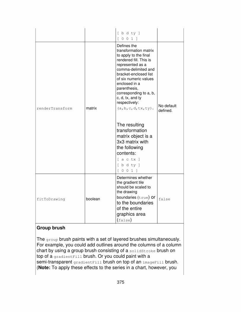
[ b d ty ]
[ 0 0 1 ]
renderTransform matrix
Defines thetransformation matrixto apply to the finalrendered fill. This isrepresented as acomma-delimited andbracket-enclosed listof six numeric valuesenclosed in aparenthesis,corresponding to a, b,c, d, tx, and tyrespectively:(a,b,c,d,tx,ty).
The resultingtransformationmatrix object is a3x3 matrix withthe followingcontents:[ a c tx ]
[ b d ty ]
[ 0 0 1 ]
No defaultdefined.
fitToDrawing boolean
Determines whetherthe gradient tileshould be scaled tothe drawingboundaries (true) orto the boundariesof the entiregraphics area(false)
false
Group brush
The group brush paints with a set of layered brushes simultaneously.For example, you could add outlines around the columns of a columnchart by using a group brush consisting of a solidStroke brush ontop of a gradientFill brush. Or you could paint with asemi-transparent gradientFill brush on top of an imageFill brush.(Note: To apply these effects to the series in a chart, however, you
375
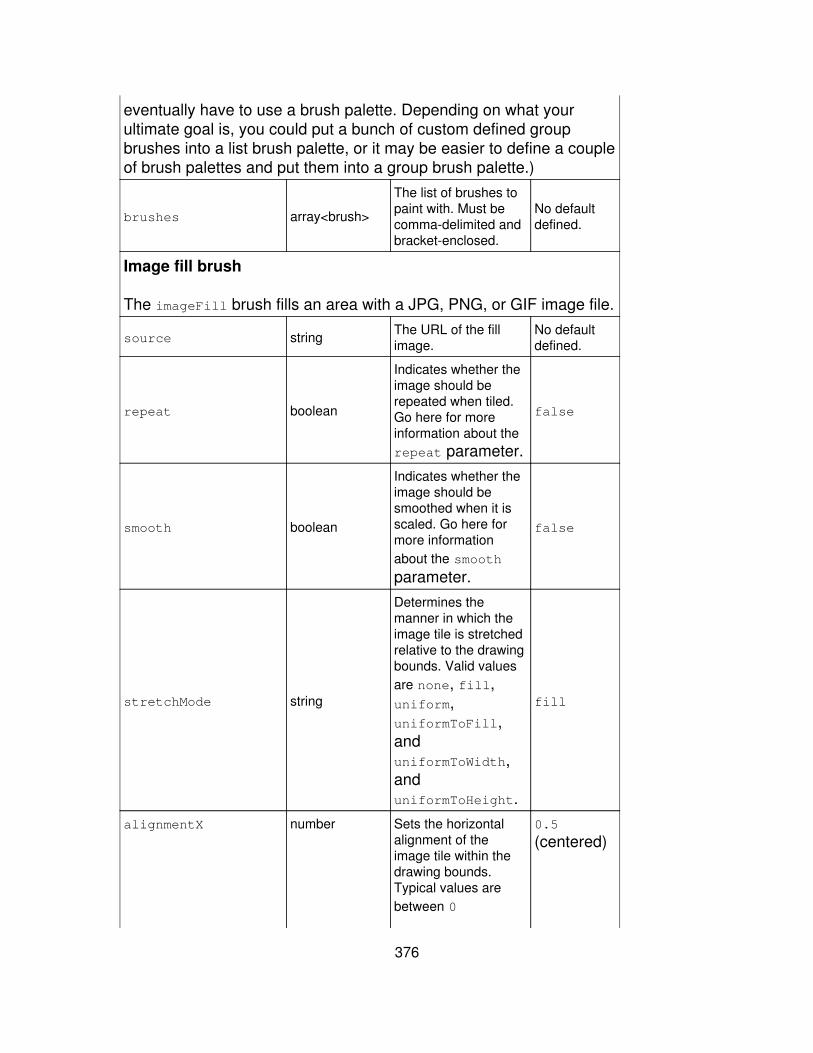
eventually have to use a brush palette. Depending on what yourultimate goal is, you could put a bunch of custom defined groupbrushes into a list brush palette, or it may be easier to define a coupleof brush palettes and put them into a group brush palette.)
brushes array<brush>
The list of brushes topaint with. Must becomma-delimited andbracket-enclosed.
No defaultdefined.
Image fill brush
The imageFill brush fills an area with a JPG, PNG, or GIF image file.
source string The URL of the fillimage.
No defaultdefined.
repeat boolean
Indicates whether theimage should berepeated when tiled.Go here for moreinformation about therepeat parameter.
false
smooth boolean
Indicates whether theimage should besmoothed when it isscaled. Go here formore informationabout the smooth
parameter.
false
stretchMode string
Determines themanner in which theimage tile is stretchedrelative to the drawingbounds. Valid valuesare none, fill,uniform,uniformToFill,anduniformToWidth,anduniformToHeight.
fill
alignmentX number Sets the horizontalalignment of theimage tile within thedrawing bounds.Typical values arebetween 0
0.5
(centered)
376
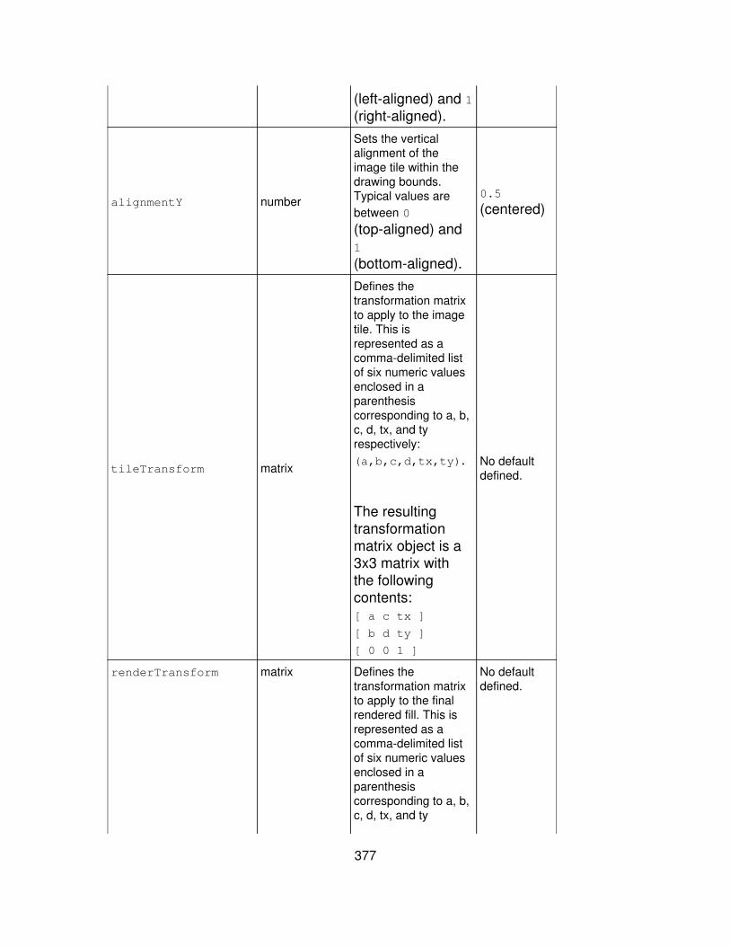
(left-aligned) and 1(right-aligned).
alignmentY number
Sets the verticalalignment of theimage tile within thedrawing bounds.Typical values arebetween 0
(top-aligned) and1
(bottom-aligned).
0.5
(centered)
tileTransform matrix
Defines thetransformation matrixto apply to the imagetile. This isrepresented as acomma-delimited listof six numeric valuesenclosed in aparenthesiscorresponding to a, b,c, d, tx, and tyrespectively:(a,b,c,d,tx,ty).
The resultingtransformationmatrix object is a3x3 matrix withthe followingcontents:[ a c tx ]
[ b d ty ]
[ 0 0 1 ]
No defaultdefined.
renderTransform matrix Defines thetransformation matrixto apply to the finalrendered fill. This isrepresented as acomma-delimited listof six numeric valuesenclosed in aparenthesiscorresponding to a, b,c, d, tx, and ty
No defaultdefined.
377
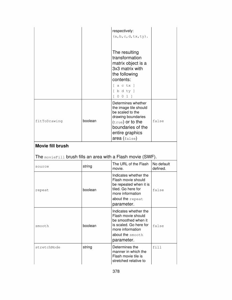
respectively:(a,b,c,d,tx,ty).
The resultingtransformationmatrix object is a3x3 matrix withthe followingcontents:[ a c tx ]
[ b d ty ]
[ 0 0 1 ]
fitToDrawing boolean
Determines whetherthe image tile shouldbe scaled to thedrawing boundaries(true) or to theboundaries of theentire graphicsarea (false)
false
Movie fill brush
The movieFill brush fills an area with a Flash movie (SWF).
source string The URL of the Flashmovie.
No defaultdefined.
repeat boolean
Indicates whether theFlash movie shouldbe repeated when it istiled. Go here formore informationabout the repeat
parameter.
false
smooth boolean
Indicates whether theFlash movie shouldbe smoothed when itis scaled. Go here formore informationabout the smooth
parameter.
false
stretchMode string Determines themanner in which theFlash movie tile isstretched relative to
fill
378

the drawing bounds.Valid values arenone, fill,uniform,uniformToFill,anduniformToWidth,anduniformToHeight.
alignmentX number
Sets the horizontalalignment of the Flashmovie tile within thedrawing bounds.Typical values arebetween 0
(left-aligned) and 1(right-aligned).
0.5
(centered)
alignmentY number
Sets the verticalalignment of the Flashmovie tile within thedrawing bounds.Typical values arebetween 0
(top-aligned) and1
(bottom-aligned).
0.5
(centered)
tileTransform matrix Defines thetransformation matrixto apply to the Flashmovie tile. This isrepresented as acomma-delimited listof six numeric valuesenclosed in aparenthesiscorresponding to a, b,c, d, tx, and tyrespectively:(a,b,c,d,tx,ty).
The resultingtransformationmatrix object is a3x3 matrix with
No defaultdefined.
379
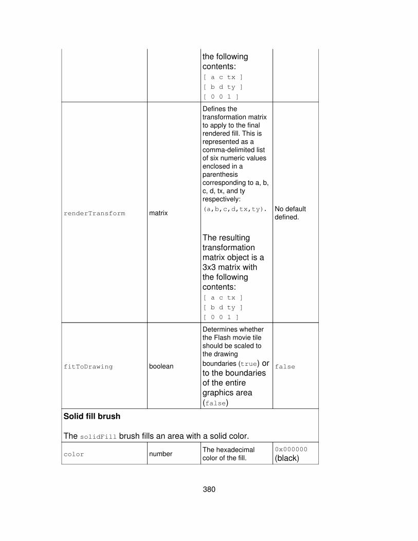
the followingcontents:[ a c tx ]
[ b d ty ]
[ 0 0 1 ]
renderTransform matrix
Defines thetransformation matrixto apply to the finalrendered fill. This isrepresented as acomma-delimited listof six numeric valuesenclosed in aparenthesiscorresponding to a, b,c, d, tx, and tyrespectively:(a,b,c,d,tx,ty).
The resultingtransformationmatrix object is a3x3 matrix withthe followingcontents:[ a c tx ]
[ b d ty ]
[ 0 0 1 ]
No defaultdefined.
fitToDrawing boolean
Determines whetherthe Flash movie tileshould be scaled tothe drawingboundaries (true) orto the boundariesof the entiregraphics area(false)
false
Solid fill brush
The solidFill brush fills an area with a solid color.
color number The hexadecimalcolor of the fill.
0x000000
(black)
380

alpha number
The alphatransparency of thefill. Valid values arebetween 0
(transparent) and1 (opaque).
1
Solid stroke brush
The solidStroke brush paints strokes with a solid color. Go here formore information about solid stroke parameters.
thickness number
Sets the thickness ofthe stroke in pixels. Avalue of 0 indicateshairline thickness.
0
color numberDetermines thehexadecimal color ofthe stroke brush.
0x000000
(black)
alpha number
The alphatransparency of thefill. Valid values arebetween 0
(transparent) and1 (opaque).
1
pixelHinting booleanIndicates whether thestroke should behinted to full pixels.
false
scaleMode string
Identifies the strokescaling mode. Validvalues are normal,none, horizontal,and vertical.
normal
caps string
Determines the typeof stroke end caps touse. Valid values arenone, round, andsquare.
round
joints string
Determines the typeof joints to use atstroke angles. Validvalues are miter,round, and bevel.
round
miterLimit number Determines the limit atwhich miter joints
3
381

are cut off. Thevalue expresses afactor of the strokethickness (seeabove). It ismeasured inpixels.
Video fill brush
The videoFill brush paints fills with video. It supports video filesderived from the standard MPEG-4 format, including F4V, MP4, M4A,MOV, MP4V, 3GP, and 3G2 (if they contain H.264 video and/orHEAAC v2 encoded audio.
source string The URL of the videoyou want to paint with.
A FlashPlayersecuritylimitationrequiresstatic videofiles to belocated in thesamedirectory asthe SWF fileor in asubdirectory.
repeat boolean
Indicates whether thevideo should berepeated when it istiled. Go here formore informationabout the repeat
parameter.
false
smooth boolean
Indicates whether thevideo should besmoothed when it isscaled. Go here formore informationabout the smooth
parameter.
false
stretchMode string Determines themanner in which thevideo is stretchedrelative to the drawingbounds. Valid values
fill
382
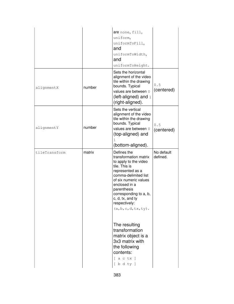
are none, fill,uniform,uniformToFill,anduniformToWidth,anduniformToHeight.
alignmentX number
Sets the horizontalalignment of the videotile within the drawingbounds. Typicalvalues are between 0
(left-aligned) and 1(right-aligned).
0.5
(centered)
alignmentY number
Sets the verticalalignment of the videotile within the drawingbounds. Typicalvalues are between 0
(top-aligned) and1
(bottom-aligned).
0.5
(centered)
tileTransform matrix Defines thetransformation matrixto apply to the videotile. This isrepresented as acomma-delimited listof six numeric valuesenclosed in aparenthesiscorresponding to a, b,c, d, tx, and tyrespectively:(a,b,c,d,tx,ty).
The resultingtransformationmatrix object is a3x3 matrix withthe followingcontents:[ a c tx ]
[ b d ty ]
No defaultdefined.
383
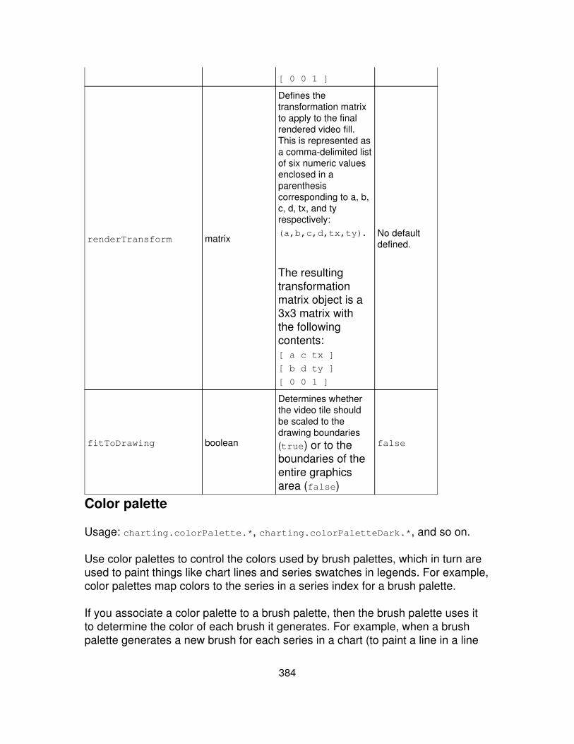
[ 0 0 1 ]
renderTransform matrix
Defines thetransformation matrixto apply to the finalrendered video fill.This is represented asa comma-delimited listof six numeric valuesenclosed in aparenthesiscorresponding to a, b,c, d, tx, and tyrespectively:(a,b,c,d,tx,ty).
The resultingtransformationmatrix object is a3x3 matrix withthe followingcontents:[ a c tx ]
[ b d ty ]
[ 0 0 1 ]
No defaultdefined.
fitToDrawing boolean
Determines whetherthe video tile shouldbe scaled to thedrawing boundaries(true) or to theboundaries of theentire graphicsarea (false)
false
Color palette
Usage: charting.colorPalette.*, charting.colorPaletteDark.*, and so on.
Use color palettes to control the colors used by brush palettes, which in turn areused to paint things like chart lines and series swatches in legends. For example,color palettes map colors to the series in a series index for a brush palette.
If you associate a color palette to a brush palette, then the brush palette uses itto determine the color of each brush it generates. For example, when a brushpalette generates a new brush for each series in a chart (to paint a line in a line
384
chart, fill a column in a column chart, or paint a swatch in a chart legend), it usesa color palette to determine the color of those lines, columns, and swatches.
While you can define colors at the individual brush level, this method enables youto set up one set of colors for all of the brushes used in each chart of adashboard.
For example, a list color palette maps a series index directly to a color from alist of colors defined in the palette. By default, if the series index contains moreitems than the list of colors in the color palette, it is wrapped around to thebeginning of the list, repeating the colors. If most of your charts present 10 seriesor less, then you might create a color palette with twice that number of specifiedcolors so that colors are repeated very infrequently.
However, the list color palette can be configured to interpolate between thecolors in its list, instead of wrapping, to produce a range of colors that span overthe total number of series in an index. With this setup, no colors will repeat.
Values
The different kinds of color palettes that you can apply include:
brightness - modifies the brightness of colors generated from anothercolor palette
•
field - provides colors from a specified field-->color map• list - generates brush colors from a specified list of colors• random</color> - generates random colors•
Example
This example provides properties for a new <code>list color palette called"myColorPalette," which interpolates between red, green, and blue:
<option name="charting.myColorPalette">list</option><optionname="charting.myColorPalette.colors">[0xFF0000,0x00FF00,0x0000FF]</option><option name="charting.myColorPalette.interpolate">true</option>
This example references the "myColorPalette" defined above and creates abrighter version of it called "myBriteColorPalette":
<option name="charting.myBriteColorPalette">brightness</option><optionname="charting.myBriteColorPalette.colorPalette">@myColorPalette</option>
385

<option name="charting.myBriteColorPalette.brightness">0.5</option>
And finally, this example uses the fieldColors parameter of the field colorpalette type to map specific colors to specific fields:
<option name="charting.fieldColors">{"UserIP":0x3399CC,"Referrer_URL":0x00F66, "Browser":0xFFFF33,"SKU":0xFF0000}</option>
Note: If you want to apply static colors to specific fields we suggest you use thefieldColors property (see documentation of the fields color palette type,below). For more information about using fieldColors, see the Chart colorssubtopic of the "Advanced charting options" topic, in this manual.
Used by
The following predefined palette types inherit their properties from colorPalette:
colorPalette - defines the standard range of colors used for seriesindexes in Splunk. charts.
•
colorPaletteDark - defines a range of colors that is the same as that ofcolorPalette, except darker.
•
Properties
Brightness
The brightness color palette modifies the brightness of colors generated from another colorpalette.
Property name Value type Definition Default
colorPalette colorPaletteReferences the color palette to use for base colorgeneration. Reference an existing color palette withthe @ symbol: @myColorPalette
No defaultdefined. SeethecolorPalette
element forpropertiesand defaults.
brightness numberThe brightness adjustment to apply to the basecolor. Valid values are between -1 (darkest) and1 (brightest).
0 (nobrightnesschange)
Field
The field color palette provides colors from a specified color-->field map.fieldColors map<number>
386

The map of hexadecimal color values to use foreach field. A map is a comma-delimited list ofkey/value pairs, enclosed in curly braces. Keys areseparated from their values by a colon. Example:{key1:value1,key2:value2,?,keyN:valueN}.If a key or string value in the map containsany of these special characters - []{}(),:"- the special character should besurrounded by double quotes. Existingdouble quotes or backslashes should beescaped with a preceding backslash.
Note: For more information about usingfieldColors, see the Chart colors subtopicof the "Advanced charting options" topic, inthis manual.
No defaultspecified.
defaultColorPalette colorPalette The color palette to use for unspecified fields. No defaultspecified.
List
The list color palette contains the list of color values that should be applied to chart series.
colors array<number>The list of hexadecimal color values from whichseries colors are generated. Should becomma-delimited, bracket-enclosed, without spaces.
No defaultdefined.
interpolate boolean
Determines whether Splunk should interpolatebetween the colors in the color list. When set totrue, Splunk will assign a series index for achart a continuous gradient of colorsbetween each color in the list.
So if you choose red and blue for thecolors list and have more than two seriesin your chart, the first series will be red, thelast series will be blue, and the interveningseries will be assigned colors on thegradient scale between red and blue. Setinterpolate to false to use only the colorsin the colors list without intermediategradients, repeating colors if necessary.
false
Random
387

The random color palette generates random colors.
minimumColor number The minimum (darkest) hexadecimal color value togenerate. 0x000000
maximumColor number The maximum (lightest) hexadecimal color value togenerate 0xFFFFFF
Brush palette
Usage: charting.lineBrushPalette.*, charting.myBrushPalette.*, and so on.
Use brush palettes to map a series index to a brush type. The brush palette thengenerates a brush for each series in that index when Splunk draws the chart. Forexample, if you are using a solidStroke brush to generate a line for a line chart,you would use a solidStroke brush palette to generate a solidStroke brush,which would in turn paint a solid color for the series (as determined by theassociated color palette).
Values
The different kinds of brush palettes that you can apply include:
field - provides brushes from a specified field->brush mapping.• fieldImageFill generates imageFill brushes based on field name.• gradientFill - generates gradientFill brushes• gradientStroke - generates gradientStroke brushes• group - generates group brushes from other brush palettes• imageFill - generates imageFill brushes from a list of source URLs.• listbp - provides brushes from a specified list• solidFill - generates solidFill brushes• solidStroke - generates solidStroke brushes•
Example
This example creates a brush palette called myBrushPalette that producessolidFill brushes for an area chart. It references a predefined color palette thatis essentially a darker version of the standard palette (colorPaletteDark) andarranges for the solidFill brushes that it generates to be partially transparent.
<option name="charting.myBrushPalette">solidFill</option><optionname="charting.myBrushPalette.colorPalette">@colorPaletteDark</option><option name="charting.myBrushPalette.alpha">0.6</option>
388

Predefined brush palettes
The following predefined brush palettes inherit their root properties frombrushPalette:
fillBrushPalette - generates brushes for color fills in charts, such as thesolidFill brush
•
lineBrushPalette - generates brushes for lines in charts, such as thesolidStroke
•
barBrushPalette - generates brushes for bar charts•
You can create other brush palletes of your own.
Properties
Field brush palette
The field brush palette provides brushes from a specified brush->field map.
Property name Value type Definition Default
fieldBrushes map<brush>
The map of brushes to use for each field. A map is acomma-delimited list of key/value pairs, enclosed incurly braces. Keys are separated from their valuesby a colon. Example:{key1:value1,key2:value2,?,keyN:valueN}.If a key or string value in the map containsany of these special characters - []{}(),:"- the special character should besurrounded by double quotes. Existingdouble quotes or backslashes should beescaped with a preceding backslash.
No defaultspecified.
defaultBrushPalette BrushPalette No defaultspecified.
Field image fill brush palette
The fieldImageFill brush palette generates imageFill brushes based on field name.fieldSources map<string> The explicit map of image source URLs for each
field. The final URL used for each image issourcePath + fieldSources[field] +
sourceExtension. A map is acomma-delimited list of key/value pairs,enclosed in curly braces. Keys areseparated from their values by a colon.
No defaultspecified.
389
Example:{key1:value1,key2:value2,?,keyN:valueN}.If a key or string value in the map containsany of these special characters - []{}(),:"- the special character should besurrounded by double quotes. Existingdouble quotes or backslashes should beescaped with a preceding backslash.
sourcePath <string> The common path shared among all image sources.This value is prepended to all source URLs.
No defaultspecified.
sourceExtension <string> The common file extension shared among all imagesources. This value is appended to all source URLs.
No defaultspecified.
useFieldAsSource boolean
Indicates whether to use the field name itself toconstruct each image source URL. When set totrue, any fields that have not beenassigned an image source in fieldSourceswill use the URL-encoded field name as thesource. The final URL used for each imageis sourcePath + fieldSources[field] +sourceExtension.
false
repeat booleanIndicates whether to repeat the image when it istiled. Go here for more information about therepeat parameter.
false
smooth booleanIndicates whether the image should be smoothedwhen it is scaled. Go here for more informationabout the smooth parameter.
false
stretchMode string
Indicates how to stretch the image tile relative to thedrawing bounds. Valid values are none, fill,uniform, uniformToFill, uniformToWidthand uniformToHeight.
fill
alignmentX numberThe horizontal alignment of the image tile within thedrawing bounds. Typical values are between 0
(left-aligned) and 1 (right-aligned).
0.5
(centered)
alignmentY numberThe vertical alignment of the image tile within thedrawing bounds. Typical values are between 0
(top-aligned) and 1 (bottom-aligned).
0.5
(centered)
tileTransform matrix Defines the transformation matrix to apply to theimage tile. This is represented as a comma-delimitedlist of six numeric values enclosed in a parenthesis,corresponding to a, b, c, d, tx, and ty respectively:(a,b,c,d,tx,ty). This produces a 3x3transformation matrix object.
No defaultdefined.
390
The resulting transformation matrix object isa 3x3 matrix with the following contents:[ a c tx ]
[ b d ty ]
[ 0 0 1 ]
renderTransform matrix
Defines the transformation matrix to apply to the finalrendered fill. This is represented as acomma-delimited list of six numeric values enclosedin a parenthesis, corresponding to a, b, c, d, tx, andty respectively: (a,b,c,d,tx,ty). Thisproduces a 3x3 transformation matrixobject.
The resulting transformation matrix object isa 3x3 matrix with the following contents:[ a c tx ]
[ b d ty ]
[ 0 0 1 ]
No defaultdefined.
fitToDrawing boolean
Determines whether the image tile should be scaledto the drawing boundaries (true) or to theboundaries of the entire graphics area(false).
defaultBrushPalette brush paletteThe brush palette to use for unspecified fields whenuseFieldAsSource is set to false.
No defaultspecified.
Gradient fill brush palette
The gradientFill brush palette generates gradientFill brushes.
type string
Indicates the type of gradient to use. Valid valuesare linear (where color changes uniformlyin a linear direction, vertically, horizontally,or diagonally) and radial (where wherecolor changes in a circular fashion in alldirections from a central point to thegradient edge) .
linear
colorPalettes array<colorPalette> The list of color palettes from which gradient colorsare retrieved. Must be comma-delimited withoutspaces, and within brackets.
No defaultdefined. Seethecolorpalette
element for
391
info onparametersand defaults.
alphas array<number>
The list of alpha transparency values correspondingto the colorPalettes list (see this parameterabove). Valid values are between 0(transparent) and 1 (opaque). Must becomma-delimited and bracket-enclosed.
No defaults.
ratios array<number>
The list of color distribution ratios corresponding tothe colorPalettes list (see this parameterabove). The ratios define the percentage ofthe gradientWidth (see below) where thecolor is sampled at 100%. Valid values arebetween 0 (left) and 255 (right). Must becomma-delimited and bracket-enclosed.
No defaultdefined.
spreadMethod string
The method to use for spreading the gradient whenit is tiled. Valid values are pad (use the terminalcolors of the gradient to fill the remainder ofthe region), reflect (reflect the gradientpattern start-to-end, end-to-start,start-to-end, and so on continuously untilthe region is filled), and repeat (repeat thegradient pattern start-to-end, start-to-end,start-to-end until the region is filled).
pad
interpolationMethod stringDetermines the method to use for interpolatingbetween the colors in the gradient. Valid values arergb and linearRGB.
rgb
focalPointRatio numberDetermines the location of the gradient focal point.Valid values are between -1 (left) and 1 (right). 0 (center)
gradientWidth number Determines the width of the gradient tile in pixels. 100
gradientHeight number Determines the height of the gradient tile in pixels. 100
stretchMode string
Determines the manner in which the gradient tile isstretched relative to the drawing bounds. Validvalues are none, fill, uniform,uniformToFill, and uniformToWidth, anduniformToHeight.
fill
aligmentX numberSets the horizontal alignment of the gradient tilewithin the drawing bounds. Typical values arebetween 0 (left-aligned) and 1 (right-aligned).
0.5
(centered)
alignmentY number Sets the vertical alignment of the gradient tile withinthe drawing bounds. Typical values are between 0
0.5
(centered)
392

(top-aligned) and 1 (bottom-aligned).
tileTransform matrix
Defines the transformation matrix to apply to thegradient tile. This is represented as acomma-delimited list of six numeric values enclosedin a parenthesis, corresponding to a, b, c, d, tx, andty respectively: (a,b,c,d,tx,ty).
The resulting transformation matrix object isa 3x3 matrix with the following contents:[ a c tx ]
[ b d ty ]
[ 0 0 1 ]
No defaultdefined.
renderTransform matrix
Defines the transformation matrix to apply to the finalrendered fill. This is represented as acomma-delimited list of six numeric values enclosedin a parenthesis, corresponding to a, b, c, d, tx, andty respectively: (a,b,c,d,tx,ty).
The resulting transformation matrix object isa 3x3 matrix with the following contents:[ a c tx ]
[ b d ty ]
[ 0 0 1 ]
No defaultdefined.
fitToDrawing boolean
Determines whether the gradient tile should bescaled to the drawing boundaries (true) or to theboundaries of the entire graphics area(false)
false
Gradient stroke brush palette
The gradientStroke brush palette generates gradientStroke brushes.
type string
Indicates the type of gradient to use. Valid valuesare linear (where color changes uniformlyin a linear direction, vertically, horizontally,or diagonally) and radial (where wherecolor changes in a circular fashion in alldirections from a central point to thegradient edge) .
linear
colorPalettes array<colorPalette> The list of color palettes from which gradient colorsare retrieved. Should be comma-delimited andbracket-enclosed.
No defaultdefined. Seethe
393
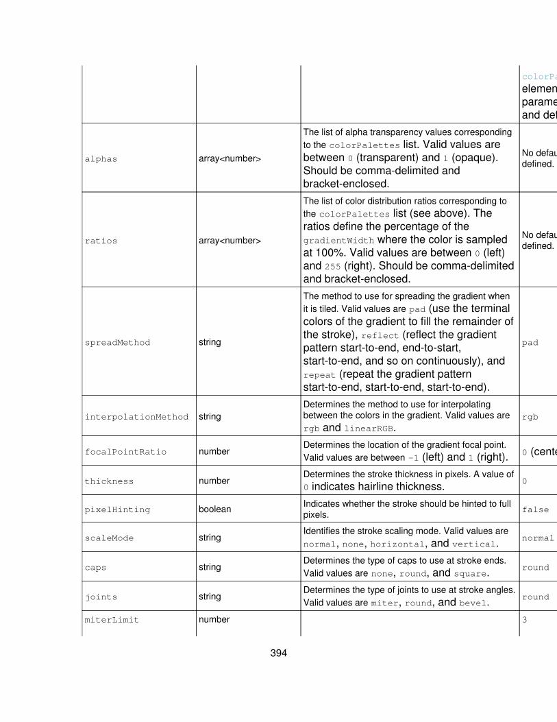
colorPalette
element forparametersand defaults.
alphas array<number>
The list of alpha transparency values correspondingto the colorPalettes list. Valid values arebetween 0 (transparent) and 1 (opaque).Should be comma-delimited andbracket-enclosed.
No defaultdefined.
ratios array<number>
The list of color distribution ratios corresponding tothe colorPalettes list (see above). Theratios define the percentage of thegradientWidth where the color is sampledat 100%. Valid values are between 0 (left)and 255 (right). Should be comma-delimitedand bracket-enclosed.
No defaultdefined.
spreadMethod string
The method to use for spreading the gradient whenit is tiled. Valid values are pad (use the terminalcolors of the gradient to fill the remainder ofthe stroke), reflect (reflect the gradientpattern start-to-end, end-to-start,start-to-end, and so on continuously), andrepeat (repeat the gradient patternstart-to-end, start-to-end, start-to-end).
pad
interpolationMethod stringDetermines the method to use for interpolatingbetween the colors in the gradient. Valid values arergb and linearRGB.
rgb
focalPointRatio numberDetermines the location of the gradient focal point.Valid values are between -1 (left) and 1 (right). 0 (center)
thickness numberDetermines the stroke thickness in pixels. A value of0 indicates hairline thickness. 0
pixelHinting boolean Indicates whether the stroke should be hinted to fullpixels. false
scaleMode stringIdentifies the stroke scaling mode. Valid values arenormal, none, horizontal, and vertical. normal
caps stringDetermines the type of caps to use at stroke ends.Valid values are none, round, and square. round
joints stringDetermines the type of joints to use at stroke angles.Valid values are miter, round, and bevel. round
miterLimit number 3
394
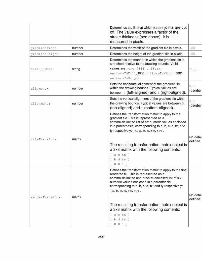
Determines the limit at which miter joints are cutoff. The value expresses a factor of thestroke thickness (see above). It ismeasured in pixels.
gradientWidth number Determines the width of the gradient tile in pixels. 100
gradientHeight number Determines the height of the gradient tile in pixels. 100
stretchMode string
Determines the manner in which the gradient tile isstretched relative to the drawing bounds. Validvalues are none, fill, uniform,uniformToFill, and uniformToWidth, anduniformToHeight.
fill
aligmentX numberSets the horizontal alignment of the gradient tilewithin the drawing bounds. Typical values arebetween 0 (left-aligned) and 1 (right-aligned).
0.5
(centered)
alignmentY numberSets the vertical alignment of the gradient tile withinthe drawing bounds. Typical values are between 0
(top-aligned) and 1 (bottom-aligned).
0.5
(centered)
tileTransform matrix
Defines the transformation matrix to apply to thegradient tile. This is represented as acomma-delimited list of six numeric values enclosedin a parenthesis, corresponding to a, b, c, d, tx, andty respectively: (a,b,c,d,tx,ty).
The resulting transformation matrix object isa 3x3 matrix with the following contents:[ a c tx ]
[ b d ty ]
[ 0 0 1 ]
No defaultdefined.
renderTransform matrix
Defines the transformation matrix to apply to the finalrendered fill. This is represented as acomma-delimited and bracket-enclosed list of sixnumeric values enclosed in a parenthesis,corresponding to a, b, c, d, tx, and ty respectively:(a,b,c,d,tx,ty).
The resulting transformation matrix object isa 3x3 matrix with the following contents:[ a c tx ]
[ b d ty ]
[ 0 0 1 ]
No defaultdefined.
395
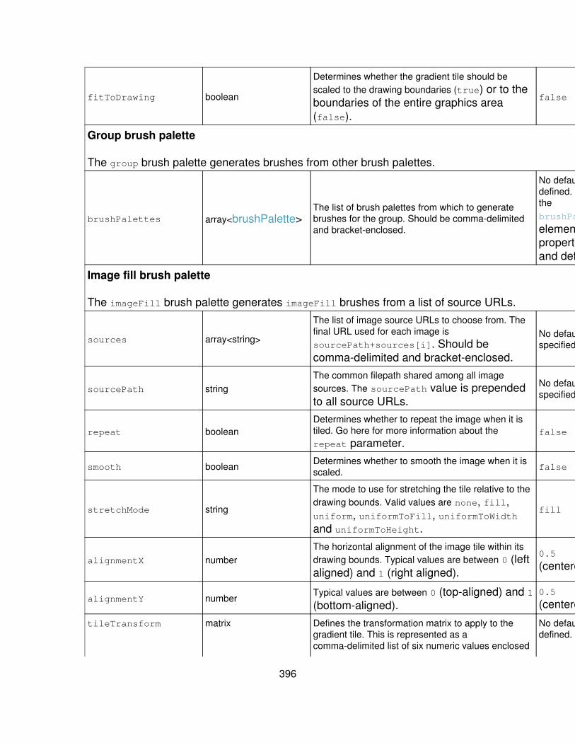
fitToDrawing boolean
Determines whether the gradient tile should bescaled to the drawing boundaries (true) or to theboundaries of the entire graphics area(false).
false
Group brush palette
The group brush palette generates brushes from other brush palettes.
brushPalettes array<brushPalette>The list of brush palettes from which to generatebrushes for the group. Should be comma-delimitedand bracket-enclosed.
No defaultdefined. SeethebrushPalette
element forpropertiesand defaults.
Image fill brush palette
The imageFill brush palette generates imageFill brushes from a list of source URLs.
sources array<string>
The list of image source URLs to choose from. Thefinal URL used for each image issourcePath+sources[i]. Should becomma-delimited and bracket-enclosed.
No defaultspecified.
sourcePath stringThe common filepath shared among all imagesources. The sourcePath value is prependedto all source URLs.
No defaultspecified.
repeat booleanDetermines whether to repeat the image when it istiled. Go here for more information about therepeat parameter.
false
smooth boolean Determines whether to smooth the image when it isscaled. false
stretchMode string
The mode to use for stretching the tile relative to thedrawing bounds. Valid values are none, fill,uniform, uniformToFill, uniformToWidthand uniformToHeight.
fill
alignmentX numberThe horizontal alignment of the image tile within itsdrawing bounds. Typical values are between 0 (leftaligned) and 1 (right aligned).
0.5
(centered)
alignmentY numberTypical values are between 0 (top-aligned) and 1(bottom-aligned).
0.5
(centered)
tileTransform matrix Defines the transformation matrix to apply to thegradient tile. This is represented as acomma-delimited list of six numeric values enclosed
No defaultdefined.
396
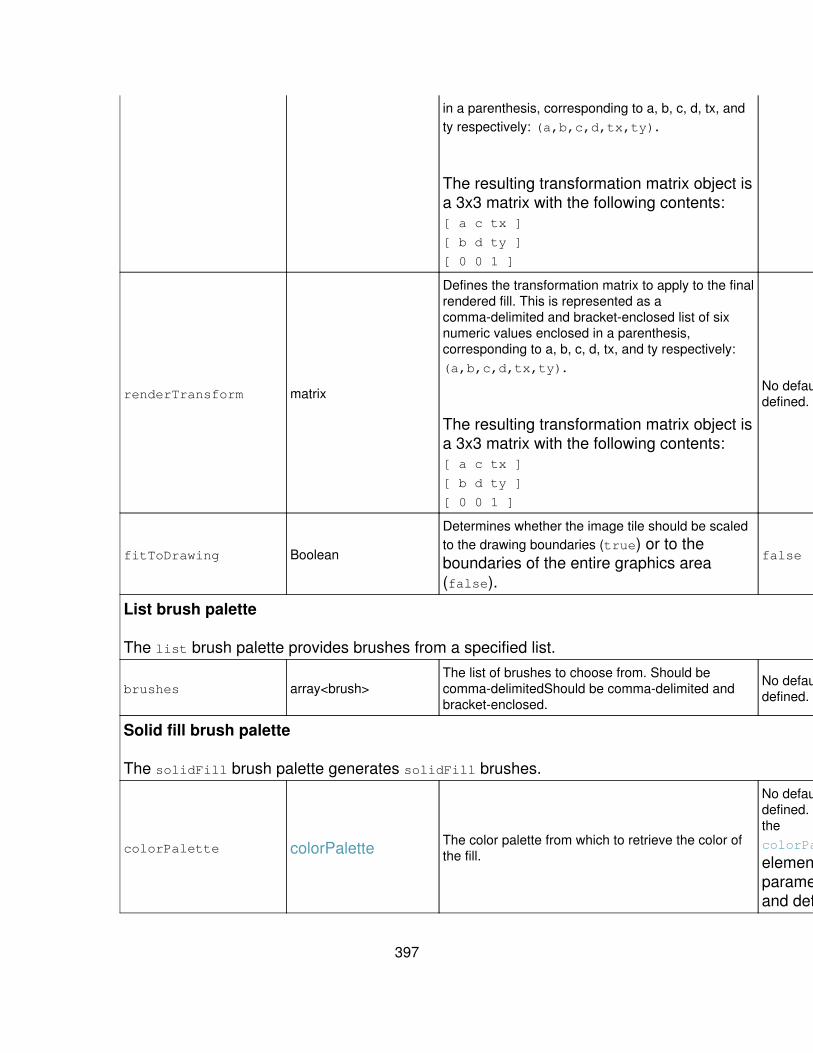
in a parenthesis, corresponding to a, b, c, d, tx, andty respectively: (a,b,c,d,tx,ty).
The resulting transformation matrix object isa 3x3 matrix with the following contents:[ a c tx ]
[ b d ty ]
[ 0 0 1 ]
renderTransform matrix
Defines the transformation matrix to apply to the finalrendered fill. This is represented as acomma-delimited and bracket-enclosed list of sixnumeric values enclosed in a parenthesis,corresponding to a, b, c, d, tx, and ty respectively:(a,b,c,d,tx,ty).
The resulting transformation matrix object isa 3x3 matrix with the following contents:[ a c tx ]
[ b d ty ]
[ 0 0 1 ]
No defaultdefined.
fitToDrawing Boolean
Determines whether the image tile should be scaledto the drawing boundaries (true) or to theboundaries of the entire graphics area(false).
false
List brush palette
The list brush palette provides brushes from a specified list.
brushes array<brush>The list of brushes to choose from. Should becomma-delimitedShould be comma-delimited andbracket-enclosed.
No defaultdefined.
Solid fill brush palette
The solidFill brush palette generates solidFill brushes.
colorPalette colorPalette The color palette from which to retrieve the color ofthe fill.
No defaultdefined. SeethecolorPalette
element forparametersand defaults.
397

alpha numberDetermines the alpha transparency of the fill. Validvalues are between 0 (transparent) and 1(opaque).
1
Solid stroke brush palette
The solidStroke generates solidStroke brushes.
thickness numberDefines the stroke thickness in pixels. A value of 0indicates hairline thickness.
0
colorPalette colorPalette Determines the color palette from which to retrievethe colors of the generated solid stroke brushes.
0x000000
(black) (SeethecolorPalette
element forparametersanddefaults.)
alpha numberDetermines the alpha transparency of the stroke.Valid values are between 0 (transparent) and 1(opaque).
1
pixelHinting boolean Indicates whether the stroke should be hinted to fullpixels. false
scaleMode stringIdentifies the stroke scaling mode. Valid values arenormal, none, horizontal, and vertical. normal
caps stringDetermines the type of stroke end caps to use. Validvalues are none, round, and square. round
joints stringDetermines the type of joints to use at stroke angles.Valid values are miter, round, and bevel. round
miterLimit number
Determines the limit at which miter joints are cutoff. The value expresses a factor of thestroke thickness (see above). It ismeasured in pixels.
3
Shape and shape palette
Usage: charting.shape.*
You use shape properties to define shape objects for shape palettes, which aredesigned primarily to enable the assignation of specific shapes to chart markers.For example, you could arrange for each series in a line chart to have markers ofdifferent shapes. To do this you would define a list shape palette that sets up aspecific shape object for each series, and then assign that to the
398
markerShapePalette property.
Note: By default the shape properties on charts that can use them are notassigned any value. In the case of no value, most chart types use the rectangleshape. The exception is the bubble chart type, which uses the ellipse shape.
Values
diamond• ellipse• group• line• polygon• rectangle• triangle• wedge•
Example
This defines a shape palette that contains ellipses.
<option name="charting.ellipseShapePalette">list</option><option name="charting.ellipseShapePalette.shapes">[ellipse]</option>
This assigns the new ellipseShapePalette to a bubble chart.
<option name="charting.chart">bubble</option><optionname="charting.chart.bubbleShapePalette">@ellipseShapePalette</option>
This creates an "upwards pointing" triangle defined as myShape:
<option name="charting.myShape">triangle</option><option name="charting.myShape.p1">(0.5,0)</option><option name="charting.myShape.p2">(1,1)</option><option name="charting.myShape.p3">(0,1)</option>
Used by
shape objects are referenced in shapePalettes of the list type. Or, to put itanother way, shapePalettes are populated by lists of shape objects.
Shape properties
Propertyname Value type Definition Default
399
Diamond shape
The diamond shape draws a diamond-shaped parallelogram.
snap booleanIndicates whether to snapthe shape to wholepixels.
false
Ellipse shape
The ellipse shape draws an ellipse.
snap booleanIndicates whether to snapthe shape to wholepixels.
false
Group shape
The group shape draws a group of shapes simultaneously.
shapes array<shape>
The list of shapes todraw. Should becomma-delimited andbracket-enclosed.
If a key or stringvalue in the mapcontains any of thesespecial characters -[]{}(),:" - thespecial charactershould besurrounded bydouble quotes.Existing doublequotes orbackslashes shouldbe escaped with apreceding backslash.
No defaultdefined. Seethe shape
element forpropertiesanddefaults.
brushes array<brush> An optional list ofbrushes that correspondto each shape in theshapes list. Shouldbe comma-delimitedandbracket-enclosed.
No defaultdefined. Seethe brush
element forinformationabout itspropertiesand
400

If a key or stringvalue in the mapcontains any of thesespecial characters -[]{}(),:" - thespecial charactershould besurrounded bydouble quotes.Existing doublequotes orbackslashes shouldbe escaped with apreceding backslash.
defaults.
Line shape
The line shape draws a line between two points.
p1 point
Sets the starting point ofthe line in relativecoordinates (0 to 1.Presented as acomma delimited listof two numericvalues(corresponding to xand y, respectively)enclosed inparenthesis.
(0,0.5)
p2 point
Sets the ending point ofthe line in relativecoordinates (0 to 1.Presented as acomma delimited listof two numericvalues(corresponding to xand y, respectively)enclosed inparenthesis.
(0,0.5)
snap booleanIndicates whether to snapthe shape to wholepixels.
false
401

Polygon shape
The polygon shape draws a polygon.
vertices array<point>
A list of points that definethe polygon. Each pointis presented as a commadelimited list of twonumeric values(corresponding to x andy, respectively) enclosedin parenthesis. Theseparenthesis-enclosedpoints should then be in acomma-delimited list andenclosed within brackets.These arrays can containother items that arearrays or nested lists ofvalues such as points,matrices, and so on. Forexample, you could use[(0,1),(1,1),(1,0)]
to describe a set ofvertices.
If a key or stringvalue in the mapcontains any of thesespecial characters -[]{}(),:" - thespecial charactershould besurrounded bydouble quotes.Existing doublequotes orbackslashes shouldbe escaped with apreceding backslash.
No defaultdefined.
snap booleanIndicates whether to snapthe shape to wholepixels.
false
Rectangle shape
The rectangle shape draws a rectangle.
402
snap booleanIndicates whether to snapthe shape to wholepixels.
false
Triangle shape
The triangle shape draws a triangle.
p1 point
Sets the first point of thetriangle in relativecoordinates (0 to 1.Presented as acomma delimited listof two numericvalues(corresponding to xand y, respectively)enclosed inparenthesis, withoutspaces.
(0.5, 0)
p2 point
Sets the second point ofthe triangle in relativecoordinates (0 to 1.Presented as acomma delimited listof two numericvalues(corresponding to xand y, respectively)enclosed inparenthesis, withoutspaces.
(1,1)
p3 point
Sets the third point of thetriangle in relativecoordinates (0 to 1.Presented as acomma delimited listof two numericvalues(corresponding to xand y, respectively)enclosed inparenthesis, withoutspaces.
(0,1)
403

snap booleanIndicates whether to snapthe shape to wholepixels.
false
Wedge shape
The wedge shape draws a portion of a circle.
startAngle number Indicates the start angleof the wedge in degrees. 0
arcAngle numberIndicates the arc (end)angle of the wedge indegrees.
360
snap booleanIndicates whether to snapthe shape to wholepixels.
false
Shape palette properties
There are three types of shape palettes: field shape palettes group shapepalettes, and list shape palettes.
Property name Value type Definition Default
Field shape palette
The field shape palette provides shapes from a specified field-->shape mapping.
fieldShapes map<shapePalette>
A field/shape mapping. A map is a comma-delimitedlist of key/value pairs, enclosed in curly braces. Keysare separated from their values by a colon. Example:{key1:value1,key2:value2,?,keyN:valueN}.
If a key or string value in the map containsany of these special characters - []{}(),:" -the special character should be surroundedby double quotes. Existing double quotes orbackslashes should be escaped with apreceding backslash.
No defaultspecified.
defaultShapePalette shapePalette The shape palette to use for unspecified fields. No defaultspecified.
Group shape palette
The group shape palette generates group shapes from other shape palettes.
shapePalettes array<shapePalette>The list of shape palettes from which to retrieveshapes for the group. Should be comma-delimited andbracket-enclosed.
No defaultdefined.
404
List shape palette
The list shape provides shapes from a specified list.
shapes array<shape> The list of shapes to choose from. Should becomma-delimited and bracket-enclosed.
No defaultdefined. Formoreinformationabout shapetypes,parameters,anddefaults, seethe shape
elementtable.
Advanced configuration - Layout and data tableproperties
Most basic charting requirements can be dealt with using the properties andelements discussed in the preceding chart reference topics. But advancedcharting configurations (such as the creation of multiple charts that share axes)it's necessary to control the layout of elements and the routing of data.
Layout
Usage: charting.layout.*
The layout element controls the layout of all visual chart elements. It consists oflists for the five main visual element types: charts, legends, axis labels, axistitles, and grid lines. Each list contains one or more references to predefinedelements.
By default, these lists are automatically configured depending on the value of thechart property.
Example
For example, if the chart property is set to a cartesian (dual axis) chart such asline, the default layout list configuration is:
405
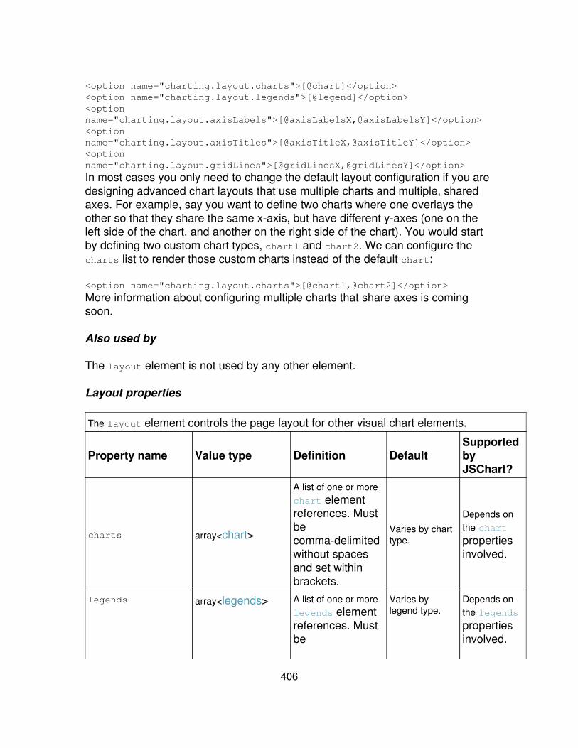
<option name="charting.layout.charts">[@chart]</option><option name="charting.layout.legends">[@legend]</option><optionname="charting.layout.axisLabels">[@axisLabelsX,@axisLabelsY]</option><optionname="charting.layout.axisTitles">[@axisTitleX,@axisTitleY]</option><optionname="charting.layout.gridLines">[@gridLinesX,@gridLinesY]</option>
In most cases you only need to change the default layout configuration if you aredesigning advanced chart layouts that use multiple charts and multiple, sharedaxes. For example, say you want to define two charts where one overlays theother so that they share the same x-axis, but have different y-axes (one on theleft side of the chart, and another on the right side of the chart). You would startby defining two custom chart types, chart1 and chart2. We can configure thecharts list to render those custom charts instead of the default chart:
<option name="charting.layout.charts">[@chart1,@chart2]</option>
More information about configuring multiple charts that share axes is comingsoon.
Also used by
The layout element is not used by any other element.
Layout properties
The layout element controls the page layout for other visual chart elements.
Property name Value type Definition DefaultSupportedbyJSChart?
charts array<chart>
A list of one or morechart elementreferences. Mustbecomma-delimitedwithout spacesand set withinbrackets.
Varies by charttype.
Depends onthe chart
propertiesinvolved.
legends array<legends> A list of one or morelegends elementreferences. Mustbe
Varies bylegend type.
Depends onthe legends
propertiesinvolved.
406

comma-delimitedwithout spacesand set withinbrackets.
axisLabels array<axisLabels>
A list of one or moreaxisLabels
elementreferences (onefor single-axischarts, two forcartesian charts,more for chartlayouts withshared axes).Must becomma-delimitedwithout spacesand set withinbrackets.
Varies by axislabel type.
Depends ontheaxisLabels
propertiesinvolved.
axisTitles array<axisTitle>
A list of one or moreaxisTitle
elementreferences (onefor single-axischarts, two forcartesian charts,more for chartlayouts withshared axes)Must becomma-delimitedwithout spacesand set withinbrackets.
Varies by axistitle reference.
Depends ontheaxisTitle
propertiesinvolved.
gridLines array<gridLines> A list of one or moregridLines
elementreferences. Mustbecomma-delimitedwithout spacesand set within
Varies by gridline reference.
Depends onthegridLines
propertiesinvolved.
407
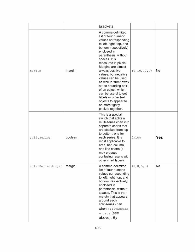
brackets.
margin margin
A comma-delimitedlist of four numericvalues correspondingto left, right, top, andbottom, respectively)enclosed inparenthesis, withoutspaces. It ismeasured in pixels.Margins are almostalways positivevalues, but negativevalues can be usedas well to "trim" awayat the bounding boxof an object, whichcan be useful to getlabels or other textobjects to appear tobe more tightlypacked together.
(0,10,10,0) No
splitSeries boolean
This is a specialswitch that splits amulti-series chart intoseparate charts thatare stacked from topto bottom, one foreach series. It ismost applicable toarea, bar, column,and line charts (itmay produceconfusing results withother chart types).
false Yes
splitSeriesMargin margin A comma-delimitedlist of four numericvalues correspondingto left, right, top, andbottom, respectively)enclosed inparenthesis, withoutspaces. This is themargin that appearsaround eachsplit-series chartwhen splitSeries
= true (seeabove). By
(0,0,5,5) No
408

default it places afive-pixel marginat the top andbottom of eachchart in order tospace them apartin their stack.
Data
Usage: charting.data.*
When Splunk generates a chart it requires that the data that the chart is basedupon be contained in a tabular format. Data tables organize reporting data intorows and columns that provide the x-axis values for single-axis chart types (suchas range marker and value marker charts) and the x- and y-axis values fordual-axis chart types (such as bar, column, line, and area charts).
The data element is used by all chart types.
Values
The data element has three possible values:
results• timeline• view•
Example
Sets up a chart that counts only the first 500 results and previews them.
<option name="charting.data">results</option><option name="charting.data.count">500</option><option name="charting.data.preview">true</option>
Also used by
charting.chart.data.*•
See the chart subtopic for more information.
409
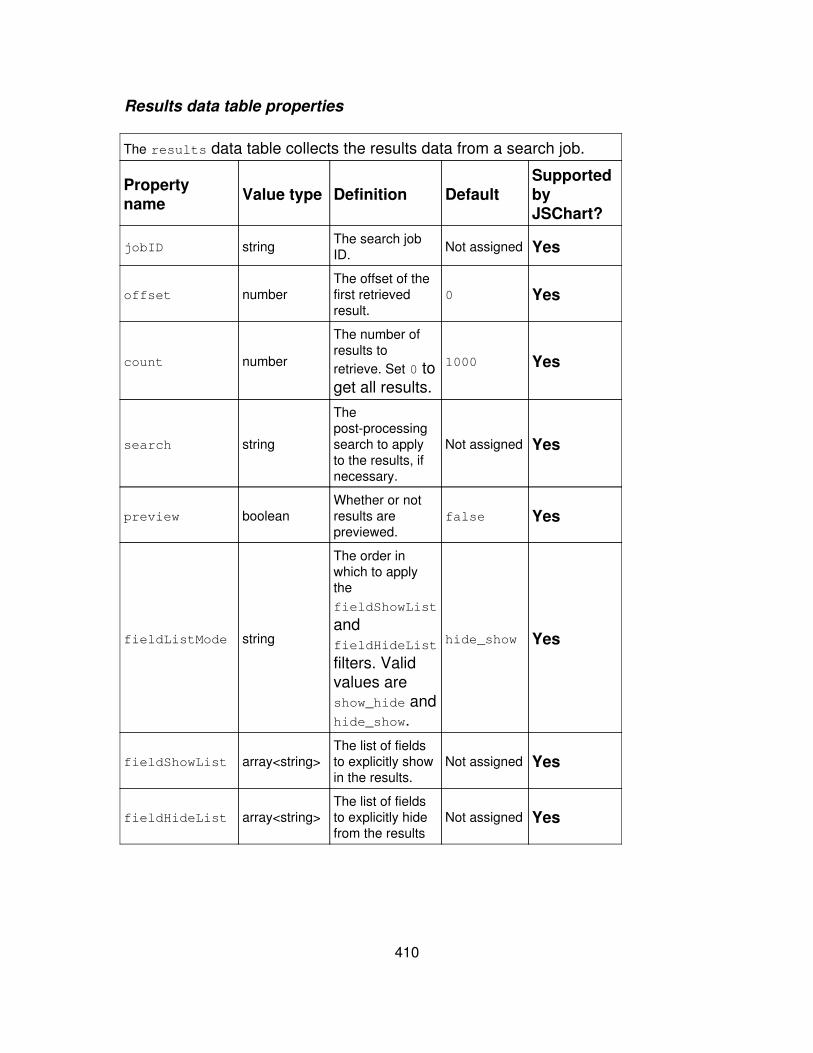
Results data table properties
The results data table collects the results data from a search job.
Propertyname Value type Definition Default
SupportedbyJSChart?
jobID string The search jobID. Not assigned Yes
offset numberThe offset of thefirst retrievedresult.
0 Yes
count number
The number ofresults toretrieve. Set 0 toget all results.
1000 Yes
search string
Thepost-processingsearch to applyto the results, ifnecessary.
Not assigned Yes
preview booleanWhether or notresults arepreviewed.
false Yes
fieldListMode string
The order inwhich to applythefieldShowList
andfieldHideList
filters. Validvalues areshow_hide andhide_show.
hide_show Yes
fieldShowList array<string>The list of fieldsto explicitly showin the results.
Not assigned Yes
fieldHideList array<string>The list of fieldsto explicitly hidefrom the results
Not assigned Yes
410
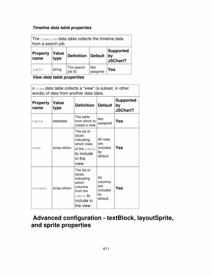
Timeline data table properties
The timeline data table collects the timeline datafrom a search job.
Propertyname
Valuetype Definition Default
SupportedbyJSChart?
jobID string The searchjob ID.
Notassigned Yes
View data table properties
A view data table collects a "view" (a subset, in otherwords) of data from another data table.
Propertyname
Valuetype Definition Default
SupportedbyJSChart?
table datatableThe tablefrom which tocreate a view
Notassigned Yes
rows array<slice>
The list ofslicesindicatingwhich rowsof the table
to includein theview.
All rowsareincludedbydefault.
Yes
columns array<slice>
The list ofslicesindicatingwhichcolumnsfrom thetable toinclude inthe view
Allcolumnsareincludedbydefault.
Yes
Advanced configuration - textBlock, layoutSprite,and sprite properties
411
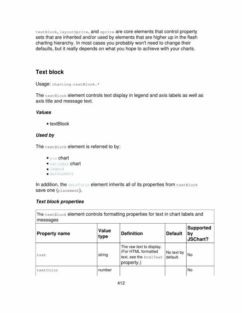
textBlock, layoutSprite, and sprite are core elements that control propertysets that are inherited and/or used by elements that are higher up in the flashcharting hierarchy. In most cases you probably won't need to change theirdefaults, but it really depends on what you hope to achieve with your charts.
Text block
Usage: charting.textBlock.*
The textBlock element controls text display in legend and axis labels as well asaxis title and message text.
Values
textBlock•
Used by
The textBlock element is referred to by:
pie chart• ratioBar chart• legend• axisLabels•
In addition, the axisTitle element inherits all of its properties from textBlocksave one (placement).
Text block properties
The textBlock element controls formatting properties for text in chart labels andmessages
Property name Valuetype Definition Default
SupportedbyJSChart?
text string
The raw text to display.(For HTML formattedtext, see the htmlText
property.)
No text bydefault. No
textColor number No
412
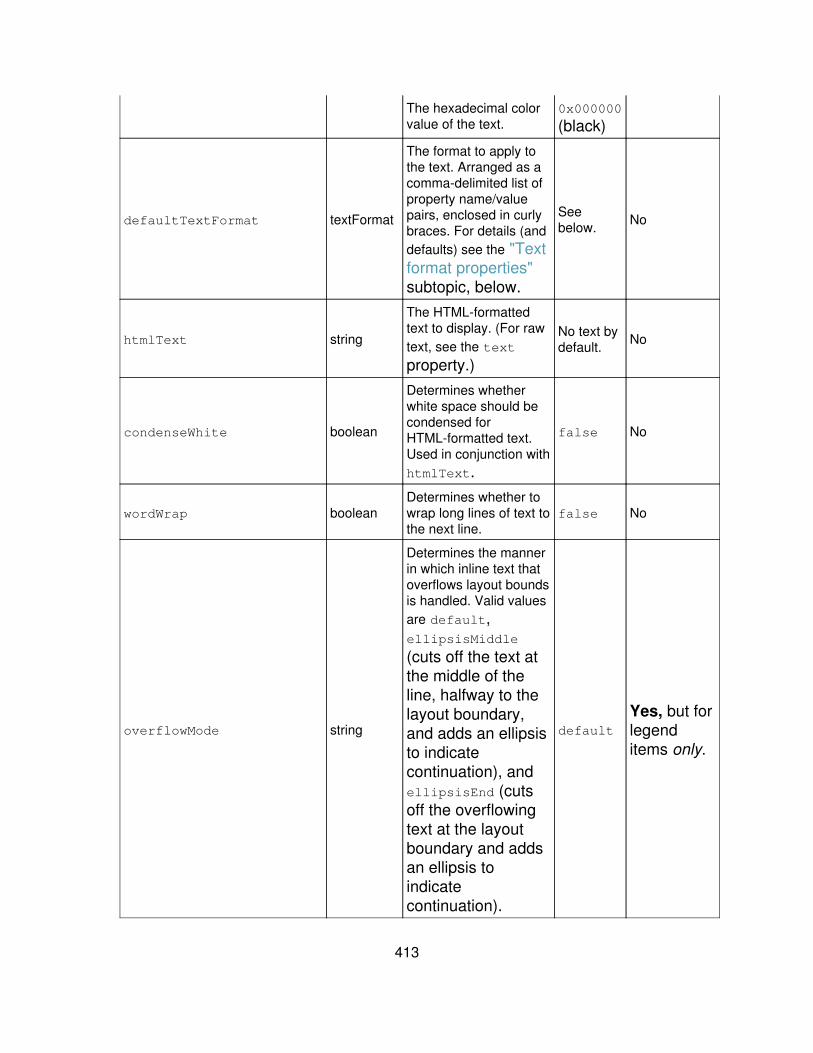
The hexadecimal colorvalue of the text.
0x000000
(black)
defaultTextFormat textFormat
The format to apply tothe text. Arranged as acomma-delimited list ofproperty name/valuepairs, enclosed in curlybraces. For details (anddefaults) see the "Textformat properties"subtopic, below.
Seebelow. No
htmlText string
The HTML-formattedtext to display. (For rawtext, see the text
property.)
No text bydefault. No
condenseWhite boolean
Determines whetherwhite space should becondensed forHTML-formatted text.Used in conjunction withhtmlText.
false No
wordWrap booleanDetermines whether towrap long lines of text tothe next line.
false No
overflowMode string
Determines the mannerin which inline text thatoverflows layout boundsis handled. Valid valuesare default,ellipsisMiddle
(cuts off the text atthe middle of theline, halfway to thelayout boundary,and adds an ellipsisto indicatecontinuation), andellipsisEnd (cutsoff the overflowingtext at the layoutboundary and addsan ellipsis toindicatecontinuation).
defaultYes, but forlegenditems only.
413
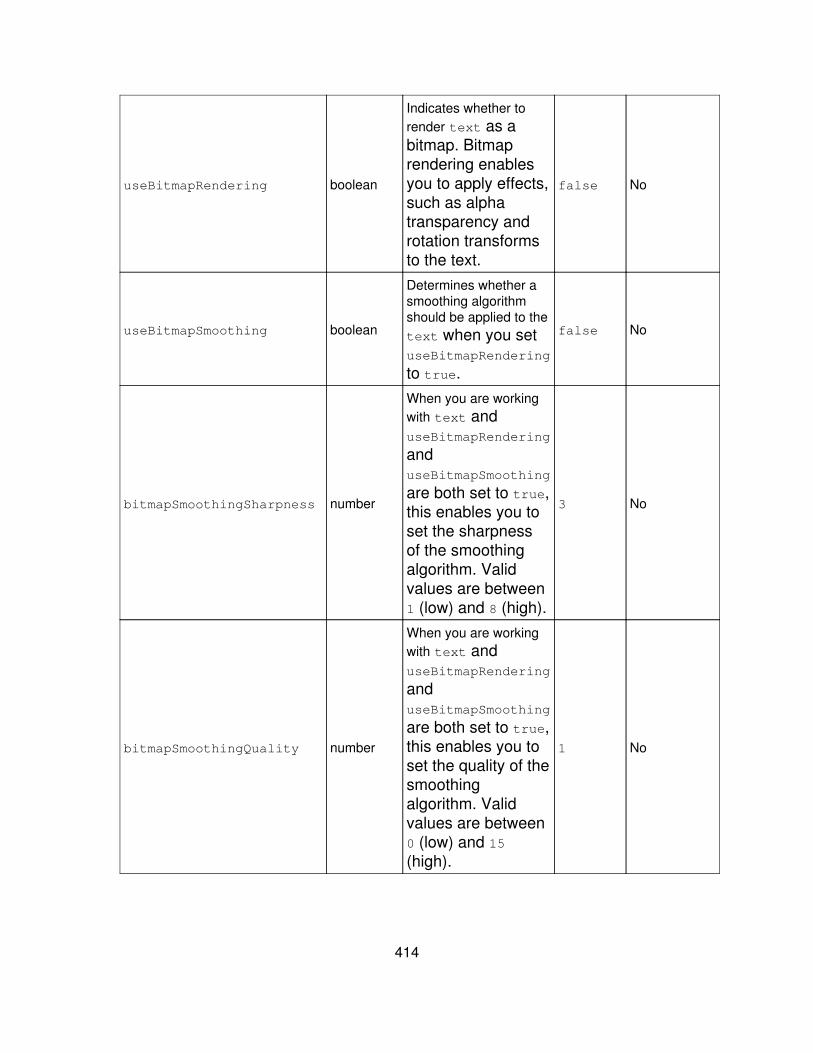
useBitmapRendering boolean
Indicates whether torender text as abitmap. Bitmaprendering enablesyou to apply effects,such as alphatransparency androtation transformsto the text.
false No
useBitmapSmoothing boolean
Determines whether asmoothing algorithmshould be applied to thetext when you setuseBitmapRendering
to true.
false No
bitmapSmoothingSharpness number
When you are workingwith text anduseBitmapRendering
anduseBitmapSmoothing
are both set to true,this enables you toset the sharpnessof the smoothingalgorithm. Validvalues are between1 (low) and 8 (high).
3 No
bitmapSmoothingQuality number
When you are workingwith text anduseBitmapRendering
anduseBitmapSmoothing
are both set to true,this enables you toset the quality of thesmoothingalgorithm. Validvalues are between0 (low) and 15(high).
1 No
414
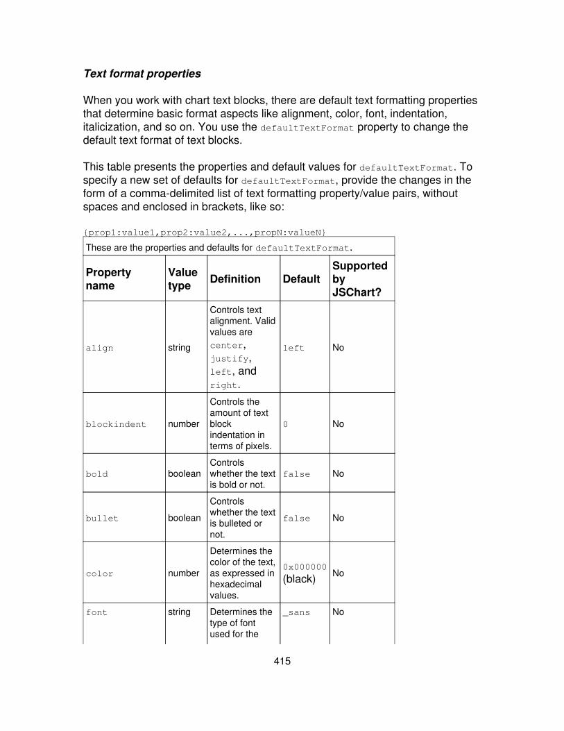
Text format properties
When you work with chart text blocks, there are default text formatting propertiesthat determine basic format aspects like alignment, color, font, indentation,italicization, and so on. You use the defaultTextFormat property to change thedefault text format of text blocks.
This table presents the properties and default values for defaultTextFormat. Tospecify a new set of defaults for defaultTextFormat, provide the changes in theform of a comma-delimited list of text formatting property/value pairs, withoutspaces and enclosed in brackets, like so:
{prop1:value1,prop2:value2,...,propN:valueN}
These are the properties and defaults for defaultTextFormat.
Propertyname
Valuetype Definition Default
SupportedbyJSChart?
align string
Controls textalignment. Validvalues arecenter,justify,left, andright.
left No
blockindent number
Controls theamount of textblockindentation interms of pixels.
0 No
bold booleanControlswhether the textis bold or not.
false No
bullet boolean
Controlswhether the textis bulleted ornot.
false No
color number
Determines thecolor of the text,as expressed inhexadecimalvalues.
0x000000
(black) No
font string Determines thetype of fontused for the
_sans No
415

text. Validvalues are_sans (for thedefaultsans-seriffont), _serif(for thedefault seriffont) and_typewriter
(for thedefaultmonospacedfont).Additionallyyou canassignpopular fontsby name,such asverdanna--ifthe font isunavailablethe browserwill use themachine'sdefault font,which isusuallysomethinglike TimesNew Roman.
indent number
Controls theindentation fromthe left marginto the firstcharacter in aparagraph, inpixels.
0 No
italic boolean
Controlswhether the textis italicized ornot.
false No
416
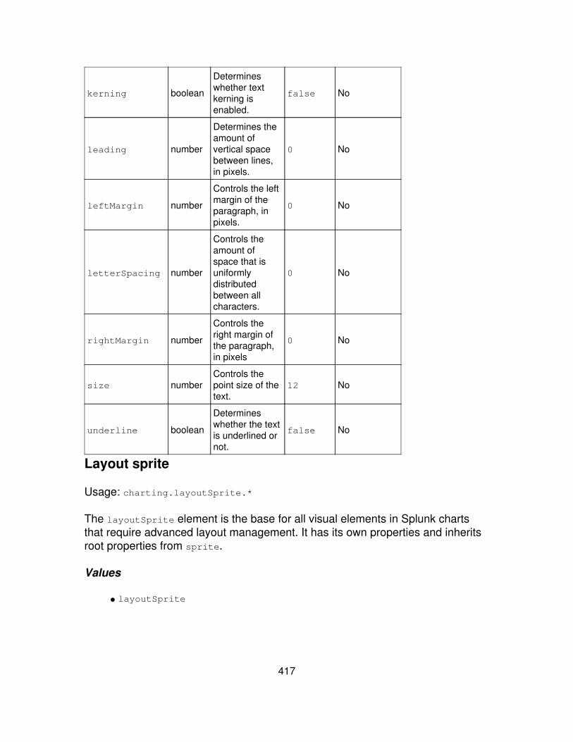
kerning boolean
Determineswhether textkerning isenabled.
false No
leading number
Determines theamount ofvertical spacebetween lines,in pixels.
0 No
leftMargin number
Controls the leftmargin of theparagraph, inpixels.
0 No
letterSpacing number
Controls theamount ofspace that isuniformlydistributedbetween allcharacters.
0 No
rightMargin number
Controls theright margin ofthe paragraph,in pixels
0 No
size numberControls thepoint size of thetext.
12 No
underline boolean
Determineswhether the textis underlined ornot.
false No
Layout sprite
Usage: charting.layoutSprite.*
The layoutSprite element is the base for all visual elements in Splunk chartsthat require advanced layout management. It has its own properties and inheritsroot properties from sprite.
Values
layoutSprite•
417

Used by
All values of the following elements have layoutSprite properties, along withtheir own individual properties:
chart• axisLabels• gridLines•
In addition, the legend element uses layoutSprite.
Properties
layoutSprite elements are the base for all charting elements that require advancedlayout management. They inherit properties from sprite and have the followingadditional properties.
Property name Valuetype Definition Default
SupportedbyJSChart?
visibility string
Controls the sprite visibilitymode. Valid values arevisible (sprite elementis displayed), hidden(sprite element ishidden, but layoutspace is reserved forit), and collapsed(sprite element ishidden, and space isnot reserved for it inthe layout).
visible No
clip boolean
Determines whether thesprite portions that falloutside its layout boundsare clipped.
false No
snap boolean Determines whether to snapthe sprite to whole pixels. false No
minimumWidth number The minimum allowablewidth of the sprite, in pixels. 0 No
minimumHeight numberThe minimum allowableheight of the sprite, inpixels.
0 No
418
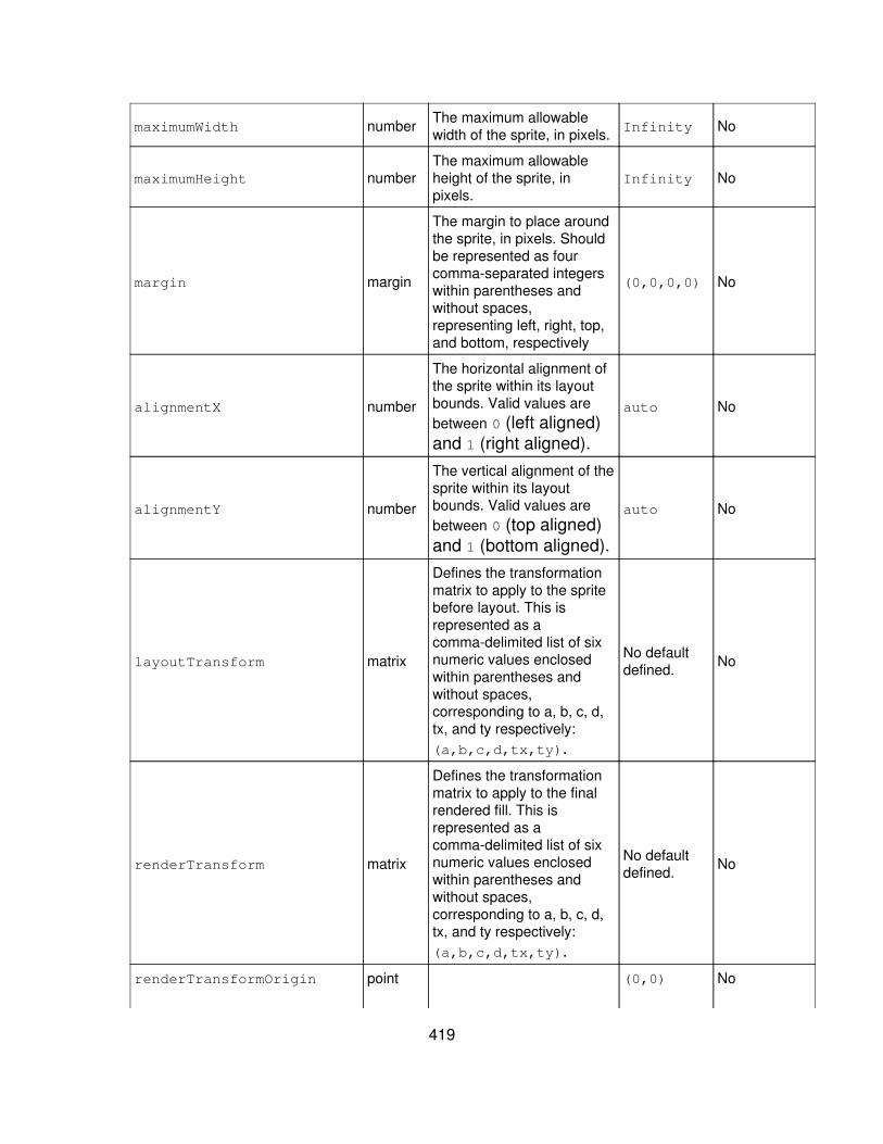
maximumWidth number The maximum allowablewidth of the sprite, in pixels. Infinity No
maximumHeight numberThe maximum allowableheight of the sprite, inpixels.
Infinity No
margin margin
The margin to place aroundthe sprite, in pixels. Shouldbe represented as fourcomma-separated integerswithin parentheses andwithout spaces,representing left, right, top,and bottom, respectively
(0,0,0,0) No
alignmentX number
The horizontal alignment ofthe sprite within its layoutbounds. Valid values arebetween 0 (left aligned)and 1 (right aligned).
auto No
alignmentY number
The vertical alignment of thesprite within its layoutbounds. Valid values arebetween 0 (top aligned)and 1 (bottom aligned).
auto No
layoutTransform matrix
Defines the transformationmatrix to apply to the spritebefore layout. This isrepresented as acomma-delimited list of sixnumeric values enclosedwithin parentheses andwithout spaces,corresponding to a, b, c, d,tx, and ty respectively:(a,b,c,d,tx,ty).
No defaultdefined. No
renderTransform matrix
Defines the transformationmatrix to apply to the finalrendered fill. This isrepresented as acomma-delimited list of sixnumeric values enclosedwithin parentheses andwithout spaces,corresponding to a, b, c, d,tx, and ty respectively:(a,b,c,d,tx,ty).
No defaultdefined. No
renderTransformOrigin point (0,0) No
419

The origin, or anchor point,of the renderTransform.A point is representedby two integersrepresenting x and ycoordinatesrespectively,comma-separatedwithin parentheses andwithout spaces.
renderTransformOriginMode string
The coordinate mode of theRenderTransformOrigin.Valid values arerelative (indicatingcoordinates arebetween 0 and 1) andabsolute (indicatingcoordinates are inpixels).
relative No
Sprite
sprite is the base visual element for Splunk charts. It provides properties to thelayoutSprite element, and also provides properties to visual elements in eachchart type.
Values
sprite•
Used by
layoutSprite• every chart type•
Properties
The sprite element provides root properties for severalcharting elements.
Propertyname
Valuetype Definition Default
SupportedbyJSChart?
420
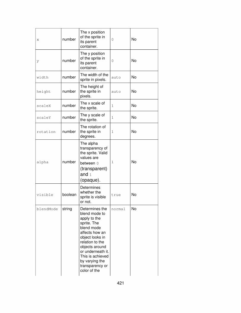
x number
The x positionof the sprite inits parentcontainer.
0 No
y number
The y positionof the sprite inits parentcontainer.
0 No
width number The width of thesprite in pixels. auto No
height numberThe height ofthe sprite inpixels.
auto No
scaleX number The x scale ofthe sprite. 1 No
scaleY number The y scale ofthe sprite. 1 No
rotation numberThe rotation ofthe sprite indegrees.
1 No
alpha number
The alphatransparency ofthe sprite. Validvalues arebetween 0
(transparent)and 1(opaque).
1 No
visible boolean
Determineswhether thesprite is visibleor not.
true No
blendMode string Determines theblend mode toapply to thesprite. Theblend modeaffects how anobject looks inrelation to theobjects aroundor underneath it.This is achievedby varying thetransparency orcolor of the
normal No
421
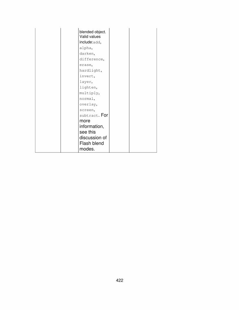
blended object.Valid valuesinclude:add,alpha,darken,difference,erase,hardlight,invert,layer,lighten,multiply,normal,overlay,screen,subtract. Formoreinformation,see thisdiscussion ofFlash blendmodes.
422