Solutions 5 Chapter - Home - Math - The University of Utahmacarthu/fall11/math1070/Chp5...I 1.26x,...
13
Chapter 5 Solutions 5.1. (a) The slope is 1.109. On average, highway mileage increases by 1.109 mpg for each 1 mpg change in city mileage. (b) The intercept is 4.62 mpg; this is the highway mileage for a nonexistent car that gets 0 mpg in the city. (c) With city mileage equal to 16 mpg, predicted highway mileage is 4.62 + 1.109 x 16 22.36 mpg. With city mileage equal to 28 mpg, predicted highway mileage is 4.62+ 1.109 x 28 35.67 mpg. (d) The graph is shown on the right. It can be drawn by drawing a line between any two points on the line; the two marked points are the two predictions computed in part (c). Because both variables are in units of mpg, the vertical and horizontal scales on this graph are the same. This is not a crucial detail, but it has the benefit of making the slope look “right”; that is, the line is slightly steeper than a line with a slope of 1. 5.2. The equation is weight = 80 — 6 x days; the intercept is 80 g (the initial weight), and the slope is —6 grams/day. 5.3. Note that the means, standard deviations, and correlation were previously computed in the solution to Exercise 4.10. (a)The means and standard deviations are I = 3.5 and 1.3784 ranges, andy = 31.3 and s,, 16.1328 days. The correlation is r 0.9623. Therefore, the slope and intercept of the regression line are (respectively) b=rfLzzll.26 and a=y—bi~—8.o88, sx so the regression equation is 9 —8.088 + 11.26x. (b) Obviously, the software result should be the same. 5.4. See also the solutions to Exercises 4.4 and 4.12. (a) The scatterplot is shown on the right. (b) The regression equation is 5 = 201.2 + 24.026x. (c) The slope a1300 tells us that on the average, metabolic rate 1200 increases by about 24 cal/day for each additional kilogram of body mass. (d) For -~ 1000 x = 45 kg, the predicted metabolic rate is 9 1282.3 cal/day. 5.5. A correlation close to 1 (or —1) means a strong linear relationship, so the points in the DMS/SRD scatterplot fall close to the regression line, so predictions based on the line are accurate. With a smaller correlation, the points are more widely spread around the line, so a prediction based on the line is less accurate. 10 15 20 25 30 35 40 45 50 City mileage (mpg) Lean body mass (kg) 95
Transcript of Solutions 5 Chapter - Home - Math - The University of Utahmacarthu/fall11/math1070/Chp5...I 1.26x,...
Chapter 5 Solutions
5.1. (a) The slope is 1.109. On average, highway mileageincreases by 1.109 mpg for each 1 mpg change in citymileage. (b) The intercept is 4.62 mpg; this is the highwaymileage for a nonexistent car that gets 0 mpg in the city.(c) With city mileage equal to 16 mpg, predicted highwaymileage is 4.62 + 1.109 x 16 22.36 mpg. With citymileage equal to 28 mpg, predicted highway mileage is4.62+ 1.109 x 28 35.67 mpg. (d) The graph is shownon the right. It can be drawn by drawing a line between anytwo points on the line; the two marked points are the twopredictions computed in part (c). Because both variablesare in units of mpg, the vertical and horizontal scales on this graph are the same. This isnot a crucial detail, but it has the benefit of making the slope look “right”; that is, the line isslightly steeper than a line with a slope of 1.
5.2. The equation is weight = 80 — 6 x days; the intercept is 80 g (the initial weight), and theslope is —6 grams/day.
5.3. Note that the means, standard deviations, and correlation were previously computed inthe solution to Exercise 4.10. (a)The means and standard deviations are I = 3.5 and
1.3784 ranges, andy = 31.3 and s,, 16.1328 days. The correlation is r 0.9623.Therefore, the slope and intercept of the regression line are (respectively)
b=rfLzzll.26 and a=y—bi~—8.o88,sx
so the regression equation is 9 —8.088 + 11.26x. (b) Obviously, the software result shouldbe the same.
5.4. See also the solutions to Exercises 4.4and 4.12. (a) The scatterplot is shownon the right. (b) The regression equationis 5 = 201.2 + 24.026x. (c) The slope a1300
tells us that on the average, metabolic rate 1200
increases by about 24 cal/day for eachadditional kilogram of body mass. (d) For -~ 1000
x = 45 kg, the predicted metabolic rate is9 1282.3 cal/day.
5.5. A correlation close to 1 (or —1) means a strong linear relationship, so the points in theDMS/SRD scatterplot fall close to the regression line, so predictions based on the line areaccurate. With a smaller correlation, the points are more widely spread around the line, so aprediction based on the line is less accurate.
10 15 20 25 30 35 40 45 50City mileage (mpg)
Lean body mass (kg)
95
96
5.6. (a) Scatterplot at right. Regression gives
9 = l32.45+0.402x (Minitab output below).The plot suggests a curved pattern, so alinear formula is not appropriate for makingpredictions. (b) r2 = 0.0182. This confirmswhat we see in the graph: this line does apoor job of summarizing the relationship.
Chapter 5 Regression
170160
a~, 1500.Co0)is(0
.0
~0a,
The regression equation is Yield = 132 + 0.402 Plants
PredictorConstantPlants
5 = 16.57
12 16 20 24 28
Coef132.450. 4020
R—sq 1.87.
Stdev14.91
0.7625
Plants per acre (thousands)
t—ratio8.890.53
p0.0000.606
I
R-sq(adj) = 0.07.
5.7. (a) Using the regression equation 9 —8.088 +I 1.26x, the predicted values and residuals are givenin the table on the right. (b) Depending on theamount of rounding, the sum is either 0 or very closeto 0. (c) The correlation between x and the residualsis no more than 0.00 17 regardless of the amount ofrounding.
Ranges Days Residual(x) (y) .9 y—9
1 4 3.1754 0.82463 2! 25.7018 —4.70184 33 36.9649 —3.96494 41 36.9649 4.03514 43 36.9649 6.03515 46 48.2281 —2.228]
5.8. (a) Below, left. (b) No; the pattern is curved, so a linear formula is not the appropriatechoice for prediction. (c) For x = 10, we estimate 9 = 11.058 — 0.01466(10) 10.91,sothe residual is 21.00— 10.91 = 10.09. The sum of the residuals is —0.01. (d) The first twoand last four residuals are positive, and those in the middle are negative. Plot below, right.
-iii*14
II
N
N
‘NN
N
I
*
IN
NI
Nt
N
N
N
I
-N
N
I
10~
6-0ca 4-
~
0 20 40 60 80 100 120 140
Speed (km/br)
120
+ ~0 20 40 60 80 100 120 140
Speed (km/br)
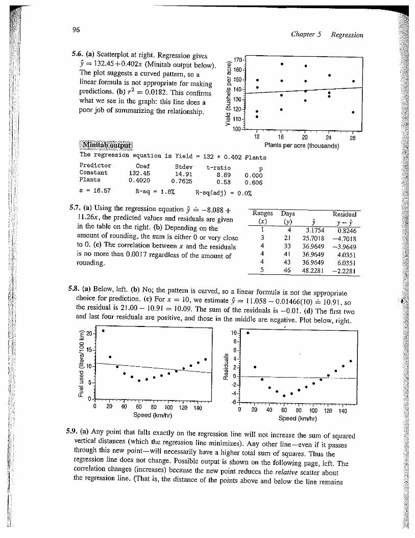
5.9. (a) Any point that falls exactly on the regression line will not increase the sum of squaredvertical distances (which the regression line minimizes). Any other line—even if it passesthrough this new point—will necessarily have a higher total sum of squares. Thus theregression line does not change. Possible output is shown on the following page, left. Thecorrelation changes (increases) because the new point reduces the relative scatter aboutthe regression line. (That is, the distance of the points above and below the line remains
Solutions 97
the same, but the spread of the x values increases.) (b) Influentialx coordinates are outliers; this point is on the right side, while allPossible output is shown below, right.
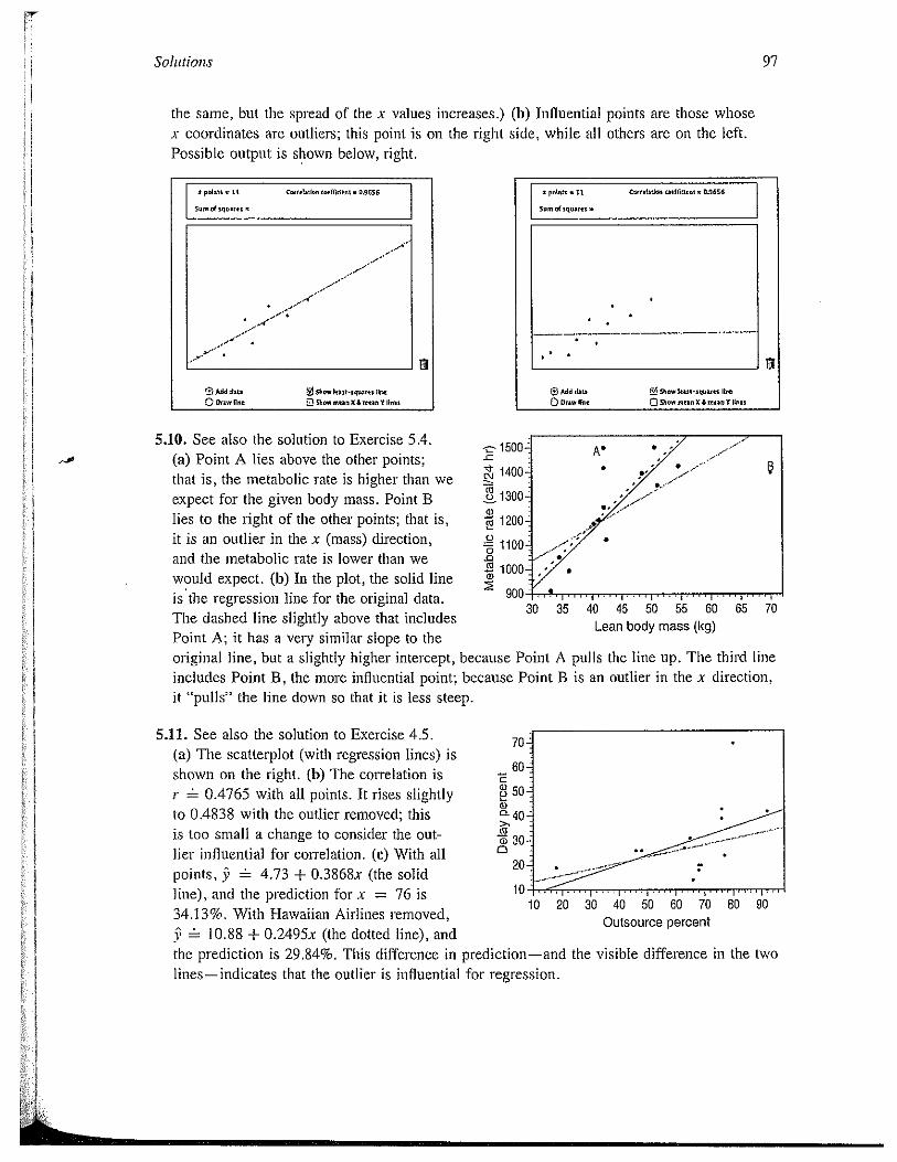
5.10. See also the solution to Exercise 5.4.(a) Point A lies above the other points;that is, the metabolic rate is higher than weexpect for the given body mass. Point Blies to the right of the other points; that is,it is an outlier in the x (mass) direction,and the metabolic rate is lower than wewould expect. (b) In the plot, the solid lineis the regression line for the original data.The dashed line slightly above that includesPoint A; it has a very similar slope to theoriginal line, but a slightly higher intercept,includes Point B, the more influential point;it “pulls” the line down so that it is less steep.
.11. See also the solution to Exercise 4.5. 70~
(a) The scatterplot (with regression lines) isshown on the right. (b)The correlation is 60~
r = 0.4765 with all points. It rises slightly 50-
to 0.4838 with the outlier removed; this 0~40;
is too small a change to consider the out- 30~
her influential for correlation. (c) With all 20
points, ~ 4.73 + 0.3868x (the solidline), and the prediction for x = 76 is 10
34.13%. With Hawaiian Airlines removed,10.88 + 0.2495x (the dotted line), and
the prediction is 29.84%. This difference inlines—indicates that the outlier is influential for regression.
points are those whoseothers are on the left.
S pclnts • LI C..r.Inlna tsmttjd~nI — ,S656
5,,., cf $qo.F*I~
El
SAM d,i~
0 Q5I,ot, non IC Anon V lou
S pnl,in • II C,,,IIuUC, i,,(lld.nt’ 0S656
50,,. 04 IlIUMotn
El
6AM di, SI,.,,, kni-,q.,nn II.,,
0 DrawlI,, OTh.wmoanxAo,nov lb.,
-c
c’J
U
I,
C)
0.0C”
0)
5
30 35 40 45 50 55 60 65 70Lean body mass (kg)
because Point A pulls the line up. The third linebecause Point B is an outlier in the x direction,
10 20 30 40 50 60 70Outsource percent
80 90
prediction—and the visible difference in the two
98 Chapte, 5 Reg, ession
5 12 (a) The regi ession equation is 9 = —43 81 + 0 1 302x (b) With x = 1027 thousand boatswe piedict about 90 manatee deaths (9 = 89 87) Assuming conditions in 2007 weje similarto the previous 30 years this is a fairly reliable prediction because of the strong linearassociation visible in the scatterplot (c) With x = 0 boats, our prediction is the inteicept9 = —43 81 manatee deaths A negative number of deaths makes no sense, unless we aremaking a hoiror film called “Attack of the Zombie Manatees”
Note The fact that we tins! our prediction in (b) does not guaiantee that it is exactlytight In fact the actual number of manatee deaths in 2007 was 73—quite a bit lowet thanour prediction (90 deaths). However, the point (1027, 73) fits reasonably well with the otherpoints in the scatterpiot; it just happens to be on the “edge” of the scarterplot, rather thanin the cente; (next to the regre cszon line)
The regression equation is Kills = — 43.8 + 0.130 Boats
Predictor Coef Stdev t—ratjo pConstant —43.812 5.717 —7.66 0.000Boats 0.130164 0.007822 16.64 0.000
s 7.445 R—sq = 90.87, R—sq(adj) = 90.5’!.
5.13. A student’s intelligence may be a lurking variable: stronger students (who are morelikely to succeed when they get to college) are more likely to choose to take these mathcourses, while weaker students may avoid them. Other possible answers might be variationson this idea; for example, if we believe that success in college depends on a student’sself-confidence, and perhaps confident students are more likely to choose math courses.
5.14. Possible lurking variables include the IQ and socioeconomic status of the mother, aswell as the mother’s other habits (drinking, diet, etc.). These variables are associated withsmoking in various ways, and are also predictive of a child’s IQ.
Note: There may be an indirect cause-and-effect relationship at work here: some studieshave found evidence that over time, smokers lose IQ points, perhaps due to brain damage I’caused by free radicals from the smoke. So perhaps smoking mothers gradually grow lesssmart, and are less able to nurture their children’s cognitive development.
5.15. Social status is a possible lurking variable: children from upper-class families can moreeasily afford higher education, and they would typically have had better preparation forcollege as well. They may also have some advantages when seeking employment, and havemore money should they want to start their own businesses.
This could be compounded by racial distinctions: some minority groups receive worseeducations than other groups, and prejudicial hiring practices may keep minorities out ofhigher-paying positions.
ft could also be that some causation goes the other way: people who are doing well intheir jobs might be encouraged to pursue further education.
5.16. Age is probably the most important lurking variable: married men would generally beolder than single men, so they would have been in the workforce longer, and therefore hadmore time to advance in their careers.
99
5.17. (b) The line passes through (or near) the point (110, 60).
5.18. (c) The line is clearly positively sloped.
5.19. (c) The slope is the coefficient of x.
5.20. (a) The slope is $100/yr, and the intercept is $500 (his beginning balance).
5.21. (b) Age at death and packs per day are negatively associated. In other words, the moreone smokes, the shorter one’s life.
522. (a) This is what the slope of the regression line tells us.
523. (b) 9 = 6.4 + 0.93(100) = 6.4 + 93 = 99.4 cm.
5.26. (b) One can also guess this by considering the slope between the first two points: ychanges by about —40 when x changes by about —10. The only sJope that is even closeto that is 2.4. Alternatively, note that when x = 50 cm, the data suggests that y should beabout 160 cm, and only the second equation gives a result close to that.
Solutions
5.24. (a) The slope and the correlation always have the same sign.
4’
5.25. (c) The regression line explains 95% of the variation in height.
5.27. (a) The slope is 0.0138 minutes per meter. On the average, if the depth of the diveis increased by one meter, it adds 0.0138minutes (about 0.83 seconds) to the timespent underwater. (b) Whcn D = 200.the regression formula estimates DD to be5.45 minutes. (c) To plot the line, computeDD = 3.242 minutes when D = 40 meters,and DD = 6.83 minutes when D = 300meters.
7.
C0~ 6-
~ 4,5CaD 4’0
0 30050 100 150 200 250Depth of dive (meters)
5.28. (a) The slope (1 .507) says that, on the average, BOD rises (fails) by 1 .507 mg/ifor every I mg/I increase (decrease) in TOC. (b) When TOC = 0 mg/I, the predictedBOD level is —55.43 mg/I. This must arise from extrapolation; the data used to find thisregression formula must not have included Values of TOC near 0.
5.29. See also the solution to Exercise 4.45. (a) The regression equation is 9—0.126 + 0.0608x. For x = 2.0, this formula gives 9 = —0.0044. (A student who usesthe numbers listed under “Coef” in the Minitab output might report the predicted brainactivity as —0.0045.) (b) This is given in the Minitab output as “R-sq”: 77.1%. The linearrelationship explains 77.1% of the variation in brain activity. (c) Knowing that r2 0.771,
100
we find r = 0.88; the sign is positive because it has the same sign as the slopecoefficient.
5.30. See also the solution to Exercise 4.44. (a) The regression line is 9 = 158 — 2.99x.Following a season with 30 breeding pairs, we find 9 68.3%, so we predict that about68% of males will return. (A student who uses the numbers listed under “Coef” in theMinitab output might report the prediction as 9 = 67.875%.) (b) This is given in theMinitab output as “R-sq”: 63.1%. The linear relationship explains 63.1% of the variation inthe percent of returning males. (c) Knowing that r2 0.631, we find r = _A4~ zr —0.79;the sign is negative because it has the same sign as the slope coefficient.
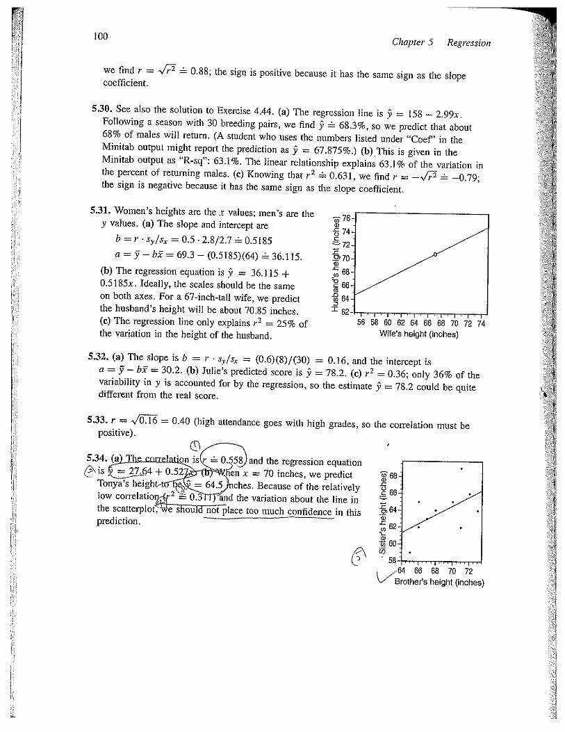
5.31. Women’s heights are the x values; men’s are they values. (a) The slope and intercept are
b = r sr/s, = 0.5 P2.8/2.7 0.5185
a = 51— bi = 69.3— (0.5185)(64) 36.115.
(b) The regression equation is 9 = 36.115 +0.5185x. Ideally, the scales should be the sameon both axes. For a 67-inch-tall wife, we predictthe husband’s height will be about 70.85 inches.(c) The regression line only explains r~ = 25% ofthe variation in the height of the husband.
5.32. (a) The slope is b = r s~/s~ = (0.6)(8)/(30) = 0.16, and the intercept isa = 51—hi = 30.2. (b) Julie’s predicted score is 5 = 78.2. (c~ r2 = 0.36; only 36%variability in y is accounted for by the regression, so the estimate 5 = 78.2 could bedifferent from the real score.
I68~Uc 66-
-c0)a)
0
60.0
-64 66 68 70 72~‘~~‘srother’s height (inches)
Chapter 5 Regression
—~ 76a)€74C
720)a)-c0
~0C
.00SX 62
56 58 60 62 64 66 68 70Wife’s height (inches)
72 74
of thequite
5.33. r = ~JOT~ = 0.40 (high attendance goes with high grades, sopositive).
5.34. (a TI ~on is r 0.558 and the regression equation~is =27.64 + 0.52 ~Wh~n x = 70 inches, we predict
Tonya’s height-t = 64.9nches. Because of the relativelylow colTelatio 2 0.3 land the variation about the line inthe scatterplot. e shon not place too much confidence in thisprediction.
the correlation must be
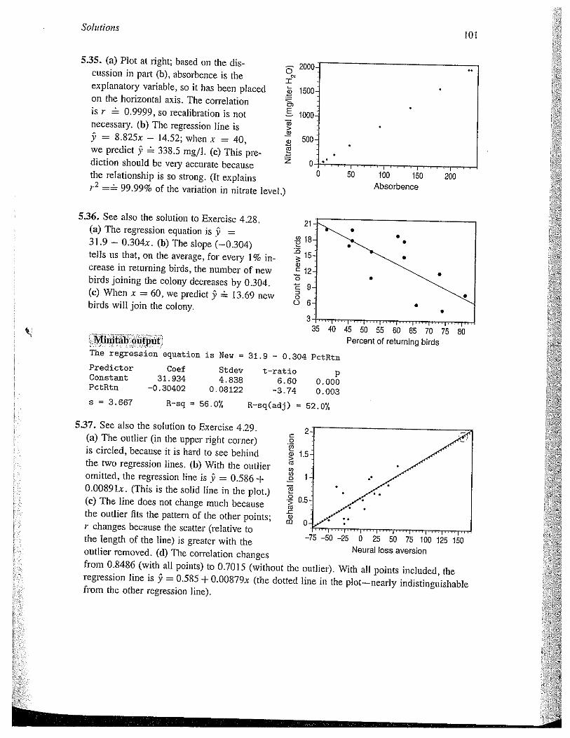
Solutionsto!
5.35. (a) Plot at right; based on the discussion in part (b), absorbence is theexplanatory variable, so it has been placedon the horizontal axis. The correlationis r 0.9999, so recalibration is notnecessary. (b) The regression line is9 = 8.825x — J4.52; when x = 40,we predict $ 338.5 mg/I. (c) This prediction should be very accui-ate becausethe relationship is so strong. (It explains
=~ 99.99% of the variation in nitrate level.)
500
0 50 100 150 200Absorbencie
5.37. See also the solution to Exercise 4.29. 2(a) The outlier (in the upper right corner)is circled, because it is hard to see behind 1.5the two regression lines. (b) With the outlier ~omitted, the regression line is ~ = 0.586 ±O.0089ix. (This is the solid line in the plot.) ~(c) The line does not change much because ~ 0,5
the outlier fits the pattern of the other points; ~r changes because the scatter (relative tothe length of the line) is greater with theoutlier removed. (d) The correlation changesfrom 0.8486 (with all points) to 0.7015 (without the outlier). With all points included, theregression line is 9 = 0.585 + O.OO879x (the dotted line in the plot—nearly indistinguishablefrom the other regression line).
0
0)
Ba)>a)0)‘Ti
z
2000
1500
1000
5.36. See also the solution to Exercise 4.28.(a) The regression equation is 9 =
31.9— 0.304x. (b) The slope (—0 304)tells us that, on the average, for every 1% increase in returning birds, the number of newbirds joining the colony decreases by 0.304.(c) When .x = 60, we predict 5 13.69 newbirds will join the colony.
21
.~ 18
.0
a)C 120
‘E 90o 6
3
Mirntab outputThe regression equation is New = 31.9 — 0.304 PctRtn
Predictor Coef Stdev t—ratio pConstant 31.934 4.838 6.60 0.000PctRtn —0.30402 0.08122 —3.74 0.003
5 = 3.667
45 50 55 60 65 70Percent of returning birds
R—sq 56.0’!. R—sq(adj) = 52.07,
—75 —50 —25 0 25 50 75 100 125 150Neural loss aversion
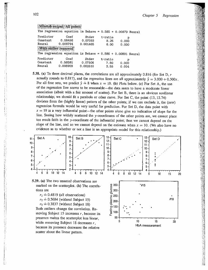
102
Mulitab output All poinf~The regression equation is Behave = 0.585 + 0.00879 Neural
Predictor Coef Stdev t—ratio pConstant 0.58496 0.07093 8.25 0.000Neural 0.008794 0.001465 6.00 0.000
With &uther iemove&The regression equation is Behave 0.586 ÷ 0.00891 Neural
Predictor Coef Stdev t—ratio pConstant 0.58581 0.07506 7.80 0.000Neural 0.008909 0.002510 3.55 0.004
5.38. (a) To three decimal places, the correlations are all approximately 0.816 (for Set D, ractually rounds to 0.817), and the regression lines are all approximately 9 = 3.000 + 0.500xFor all four sets, we predict 9 8 when x = 10. (b) Plots below. (c) For Set A, the useof the regression line seems to be reasonable—the data seem to have a moderate linearassociation (albeit with a fair amount of scatter). For Set B, there is an obvious nonlinearrelationship; we should fit a parabola or other curve. For Set C, the point (13, 12.74)deviates from the (highly linear) pattern of the other points; if we can exclude it, the (new)regression formula would be very useful for prediction. For Set D, the data point withx = 19 is a very influential point—the other points alone give no indication of slope for theline. Seeing how widely scattered the y-coordinates of the other points are, we cannot placetoo much faith in the y-coordinate of the influential point; thus we cannot depend on theslope of the line, and so we cannot depend on the estimate when x = 10. (We also have noevidence as to whether or not a line is an appropriate model for this relationship.)
ii. SetA10-9.8-7- •
6-5- /
I Ill I — ____________
4 6 8 10 12 14 4 6 8 10 12 14
5.39. (a) The two unusual observations aremarked on the scatterplot. (b) The correlations are ~ 300
rj 0.48 19 (all observations)r2 0.5684 (without Subject 15) 200r3 0.3837 (without Subject 18)
Both outliers change the correlation. Re-moving Subject 15 increases r, because its l00~
presence makes the scatterplot less linear,while removing Subject 18 decreases r,because its presence decreases the relativescatter about the linear pattern.
Chapter 5 Regression
10- SetS9- . .7’
8-7- 7’76-5- _7
4-3-2-
SetC
11~10-9.8-7. -‘
6-5-4.
13-12-11—IC.9-8-7-65-4
4
SetD
4I-I’-I-Thr6 8 10 12 14 5 10 15 20
‘#15
#18
5 10HbA measurement
20

Solutions 103
5.40. (a) The regression equation is 9 = 44.13 + 2.4254x. (b) With the altered data, theequation is 9 = 0.4413 + O.O024254x. (c) With x = 50 cm, the first equation predicts9 165.4 cm. With x = 500 mm, the second equation predicts 9 1.654 m.
5.41. The scatterplot from Exercise 5.39 isreproduced here with the regression linesadded. The equations are ~aoo- without #18
y = 66.4 + l0.4x (all observations) ra 250- - - .t . --
9 69.5 + 8.92x (without #15) ~ 200- . - - . - . -
5’ 52.3 + 12.lx (without #18) ~15O •-~-- wHhout#15While the equation changes in response to .. . . -
~100-removing either subject, one could arguethat neither one is particularly influential, 50- .
because the line moves very little over the HbA measurementrange of x (HbA) values. Subject 15 isan outlier in terms of its y value; such points are typically not influential. Subject 18 is anoutlier in terms of its x value, but is not particularly influential because it is consistent withthe linear pattern suggested by the other points.
5.42. In this case, there may be a causative effect, but in the direction opposite to the onesuggested: People who are overweight are more likely to be on diets, and so choose artificialsweeteners over sugar. (Also, heavier people are at a higher risk to develop Type 2 diabetes;if they do, they are likely to switch to artificial sweeteners.)
5.43. Responses will vary. For example, students who choose the online course might havemore self-motivation, or have better computer skills (which might be helpful in doing wellin the class; e.g., such students might do better at researching course topics on the Internet).
5.44. For example, a student who in the past might have received a grade of B (and a lowerSAT score) now receives an A (but has a lower SAT score than an A student in thepast). While this is a bit of an oversimplification, this means that today’s A students areyesterday’s A and B students, today’s B students are yesterday’s C students, and so on.Because of the grade inflation, we are not comparing students with equal abilities in the pastand today.
5.45. Here is a (relatively) simple example to show how this can happen: suppose that mostworkers are currently 30 to 50 years old; of course, some are older or younger than that, butthis age group dominates. Suppose further that each worker’s current salary is his/her age(in thousands of dollars); for example, a 30-year-old worker is currently making $30,000.
Over the next 10 years, all workers age, and their salaries increase. Suppose everyworker’s salary increases by between $4000 and $8000. Then every worker will be makingmore money than he/she did 10 years before, but less money than a worker of that same age10 years before.
During that time, a few workers will retire, and others will enter the workforce, but thatlarge cluster that had been between the ages of 30 and 50 (now between 40 and 60) willbring up the overall median salary despite the changes in older and younger workers.
104 Chapter 5 Regi~ssion
5.46. We have slope b = r s~/s, and intercept a = 51— hi, and 9 = a + bx, so when x = 1,
(Note that the value of the slope does not actually matter.)
5.47. With the regression equation, 9 = 61.93 +O.180x, a first-round score of x = 80 leads toa predicted second-round score of 9 76.33, while a first-round score of x = 70 leads to apredicted second-round score of 9 74.53. As the text notes, an above-average first-roundscore predicts a slightly-less-above-average score in the second round—and likewise forbelow-average scores.
5.48. Note that 37 = 46.6 + 0.411. We predict that Octavio will score 4.1 points above the meanon the final exam: 9 = 46.6 + 0.41(1 + 10) = 4&6 + 0.411+ 4.1 = 51+4.1. (Alternatively,because the slope is 0.41, we can observe that an increase of 10 points on the midtermyields an increase of 4.1 on the predicted final exam score.)
5.49. See the solution to Exercise 4.41 for three sample scatterplots. A regression line isappropriate only for the sealterplot of part (b). For the graph in (c), the point not in thevertical stack is very influential—the stacked points alone give no indication of slope for theline (if indeed a line is an appropriate model). If the stacked points are scattered, we cannotplace too much faith in the y-coordinate of the influential point; thus we cannot depend onthe slope of the line, and so we cannot depend on predictions made with the regression line.The curved relationship exhibited by the scatterplot in (d) clearly indicates that predictionsbased on a straight line are not appropriate.
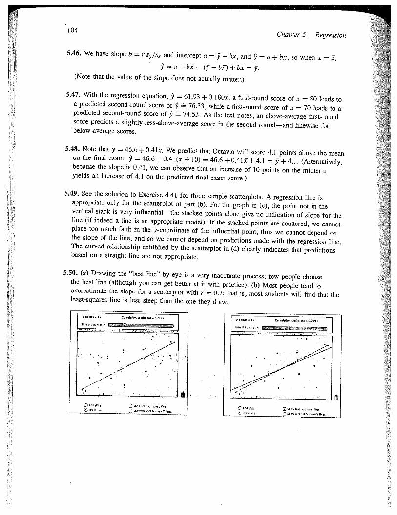
5.50. (a) Drawing the “best line” by eye is a very inaccurate process; few people choosethe best line (although you can get better at it with practice). (b) Most people tend tooverestimate the slope for a scatterplot with r 0.7; that is, most students will find that theleast-squares line is less steep than the one they draw.
Solutions
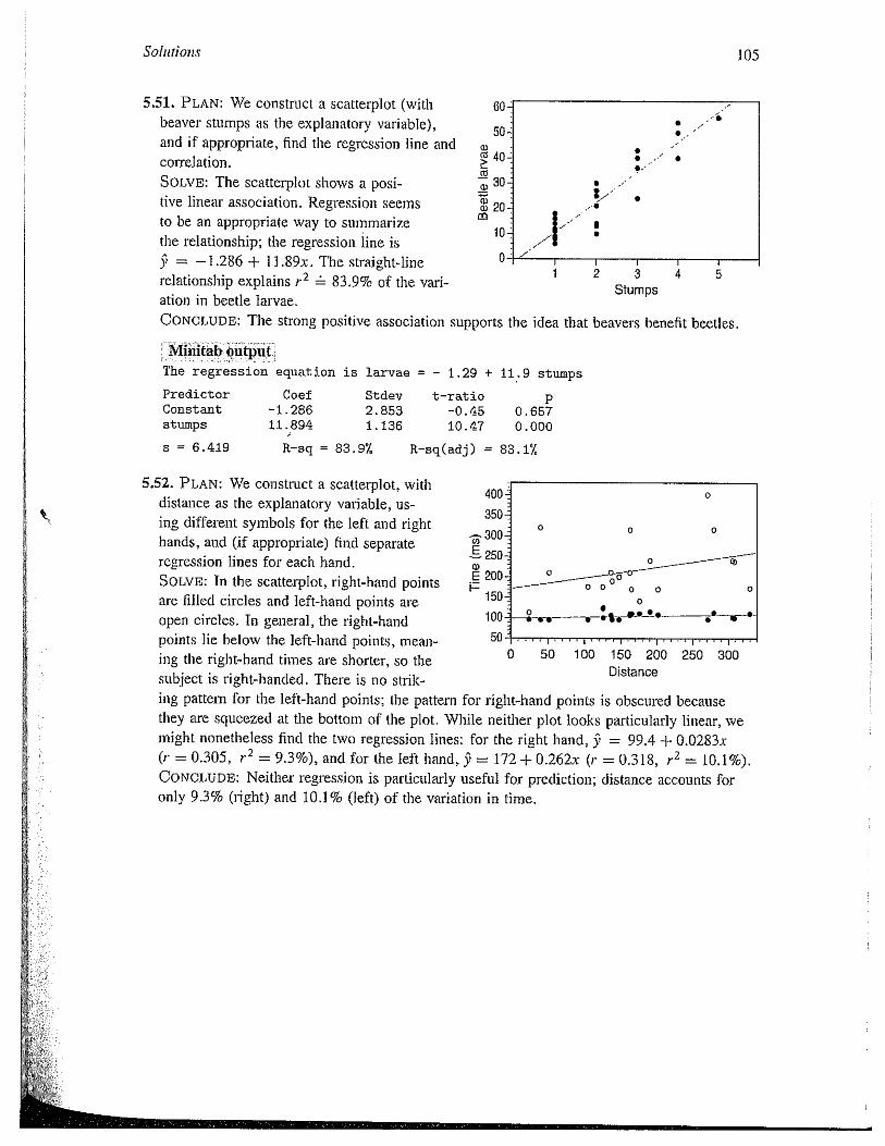
5.51. PLAN: We construct a scatterplot (withbeaver stumps as the explanatory variable),and if appropriate, find the regression line and
60
50a,
40:correlation.SOLVE: The scatterplot shows a posi- 30
tive linear association. Regression seems 20.
to be an appropriate way to summarizethe relationship; the regression line is9 = —1.286 + ll.89x. The straight-line 0relationship explains r2 83.9% of the variation in beetle larvae.CONCLUDE: The strong positive association supports the
1 2 3Stumps
Mhuitäb output.;The regression equation is larvae = — 1.29 + 11.9 stumps
5.52. PLAN: We construct a scatterplot, withdistance as the explanatory variable, using different symbols for the left and righthands, and (if appropriate) find separateregression lines for each hand.SOLvE: In the scatterplot, right-hand pointsare filled circles and left-hand points are
open circles. In general, the right-handpoints lie below the left-hand points, meaning the right-hand times are shorter, so thesubject is right-handed. There is no strik
0 50 100 150 200 250 300Distance
105
. /
.-
• .•-~
..
V IV 5
PredictorConstantstumps
idea that beavers benefit beetles.
Coef—1.28611. 894
Stdev2.8531 . 136
s = 6.419 R—sq = 83.97.
t—rat io-0.4510.47
p0.6570.000
R—sq(adj) = 83.17.
400
350-
~-300-g 250~a)S 200.
i—. 150-
100-
50
0
0 0
0 0 00
0 ____ ____—a—.-. _,1~_a._t. ..____b_.
ing pattern for the left-hand points; the pattern for right-hand points is obscured becausethey are squeezed at the bottom of the plot. While neither plot looks particularly linear, wemight nonetheless find the two regression lines: for the right hand, 9 = 99.4 + 0.0283x(r = 0.305, r2 = 9.3%), and for the left hand,~ 9 = 172 + 0.262x (r = 0.318, r2 = 10.1%).CONCLUDE: Neither regression is particularly useful for prediction; distance accounts foronly 9.3% (right) and 10.1% (left) of the variation in time.

106
5.53. PLAN: We construct a scatterplot withDr. Gray’s forecast as the explanatory van- [ 25able, and if appropriate, find the regressionequation.SOLVE: The scatterplot shows a moderatepositive association; the regression line is9 = 1.803 + O.9031x, with p2 28%. inThe relationship is strengthened by the large ~number of storms in the 2005 season, but it isweakened by the last two years of data, whenGray’s forecasts were the highest, but theactual numbers of storms were unremarkable Asseason, we might find the regression line withoutr2 22.6%.CONCLUDE: If Dr. Gray forecasts x = 16 tropical storms, we expect 16.25 storms in thatyear. However, we do not have very much confidence in this estimate, because the regression line explains only 28% of the variation in tropical storms. (If we exclude 2005, theprediction is 14.4 storms, but this estimate is less reliable than the first.)
5.54. PLAN: We examine a scatterplot ofwind stress against snow cover—viewingthe latter as explanatoly..and (if appropriate) compute correlation and regressionlines.
tc 0.1SOLVE: The scatterplot suggests a neg- 0.08ative linear association, with correlation o.osr —0.9179. The regression line is 0.04
9 = 0.212 — O.OO56lx; the linear relation- c~ 0.02ship explains r2 84.3% of the variationin wind stress.CONCLUDE: We have good evidence that decreasing snowincreasing wind stress.
iVhiutab outpuIThe regression equation is wind = 0.212 — 0.00561 snow
Chapter 5 Regression
-3.
u —I—
6 7 8 9 10 11 12 13 14 15 16Storms predicted by Dr. Gray
an indication of the influence of the 2005that point; it is 9 = 4.421 + O.6224x, with
17
(0L00~)
U)
10 IS 20 25Snow cover (millions of km2)
PredictorConstantsnow
30
cover is strongly associated with
Coef0. 21172
—0.0056096
Stdev0. 01083
0.0005562s = 0.02191 R—sq = 84.37,
t—ratjo19.56
—10.09
P0.0000.000
R-sq(adj) = 83.4°f,
Solutions
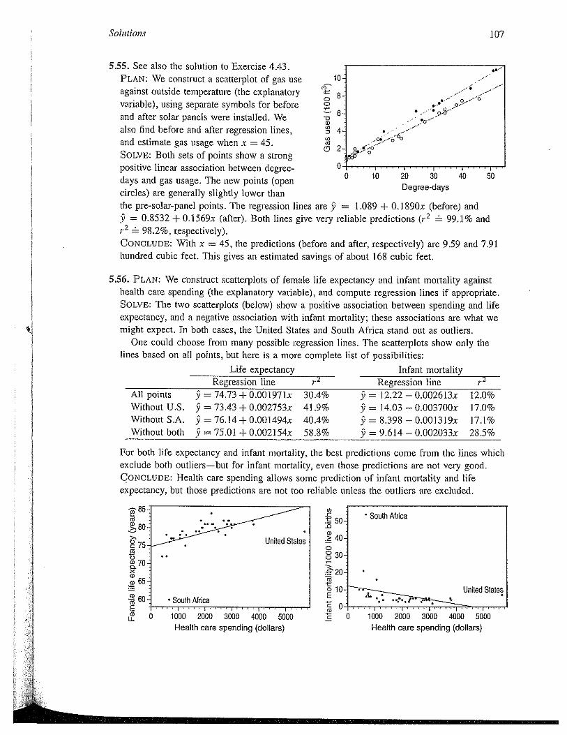
5.55. See also the solution to Exercise 4.43.PLAN: We construct a scatterplot of gas useagainst outside temperature (the explanatoryvariable), using separate symbols for beforeand after solar panels were installed. Wealso find before and after regression lines,and estimate gas usage when x = 45.SOLVE: Both sets of points show a strongpositive linear association between degree-days and gas usage. The new points (opencircles) are generally slightly lower thanthe pre-solar-panel points. The regression lines9 = 0.8532 + 0.1569x (after). Both lines give
98.2%, respectively).
20 30Degree-days
are 9 = 1.089 + O.1890x (before) andvery reliable predictions (r2 99.1% and
5.56. PLAN: We construct scatterplots of female life expectancy and infant mortality againsthealth care spending (the explanatory vai-iable), and compute regression lines if appropriate.SOLVE: The two scatterplots (below) show a positive association between spending and lifeexpectancy, and a negative association with infant mortality; these associations are what wemight expect. In both cases, the United States and South Africa stand out as outliers.
One could choose from many possible regression lines. The scatterplots show only thelines based on all points, but here is a more complete list of possibilities:
Life expectancy Infant mortalityRegression line 2 -- Regression line
All points 9 = 74.73 + 0.001971x 30.4% 9 = 12.22 — 0.002613x 12.0%Without U.S. 9 = 73.43 + 0.002753x 41.9% 9 = 14.03 — 0.003700x 17.0%Without S.A. 9 = 76.14+ 0.001494x 40.4% 9 = 8.398 — 0.0013l9x 17.1%Without both 9 = 75.01 + 0.002154x 58.8% 9 = 9.614 — 0.002033x 28.5%
For both life expectancy and infant mortality, the best predictions come from the lines whichexclude both outliers—but for infant mortality, even those predictions are not very good.CONCLUDE: Health caie spending allows some prediction of infant mortality and lifeexpectancy, but those predictions are not too reliable unless the outliers are excluded.
0)-C -
t so~-0I) ->
000
Ctt0ECCacC
107
C,
00
~0a)0DL0Ca
CD
10••
8
6
4.
2
K,
.---_- o____—6._• 0—
- - •. a-c-- - -~o__ -
a
0 10 40 50
CONCLUDE: With x = 45, the predictions (before and after, respectively) are 9.59 and 7.91hundred cubic feet. This gives an estimated savings of about 168 cubic feet.
I_~ —
COa)>,
Uc 75
65-
a)Ca2a)
United States
South Africa
0
South Africa
40-
30:
20-
10-
1000 2000 3000 4000 5000Health care spending (dollars)
1000 2000 3000 4000 5000Health care spending (dollars)