Software Quality Control Methods. Introduction Quality control methods have received a world wide...
25
Software Quality Control Methods
-
date post
20-Dec-2015 -
Category
Documents
-
view
217 -
download
0
Transcript of Software Quality Control Methods. Introduction Quality control methods have received a world wide...

Software Quality Control Methods

Introduction
Quality control methods have received a world wide surge of interest within thepast couple of decades as industries compete to design and produce morereliable products more efficiently.
Attention has been focused on the “quality” of a product or service, which is aconsidered to be a general term denoting how well it meets the particularDemands imposed upon it.
The origins of quality control can be traced back to the implementation of controlcharts by Walter Shewhart in the 1920s.
More recently the original quality control ideas together with related managementprinciples and guidelines have formed a subject which is often referred to asTotal Quality Management.

Introduction
Another important quality control tool is Statistical Process Control (SPC),
which is discussed. Statistical Process Control utilizes control
charts to provide a continuous monitoring of a process.
Finally, acceptance sampling produces, which can be used to make decision
about the acceptability of batches of items, are discussed.
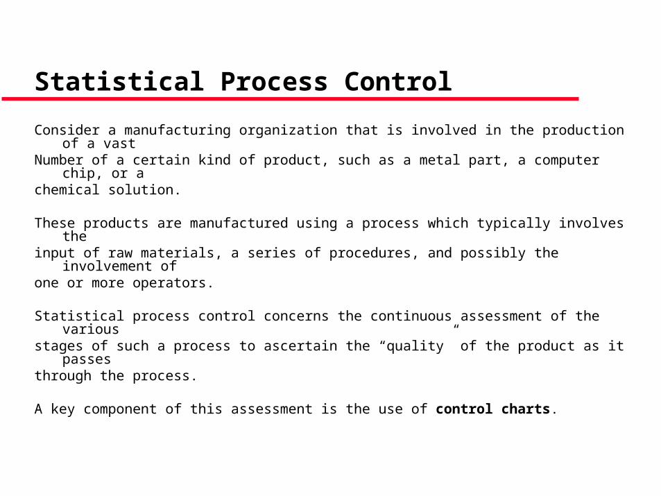
Statistical Process Control
Consider a manufacturing organization that is involved in the production of a vastNumber of a certain kind of product, such as a metal part, a computer chip, or achemical solution.
These products are manufactured using a process which typically involves theinput of raw materials, a series of procedures, and possibly the involvement ofone or more operators.
Statistical process control concerns the continuous assessment of the variousstages of such a process to ascertain the “quality” of the product as it passesthrough the process.
A key component of this assessment is the use of control charts.

Control Charts
A control chart is a simple quality control tool whereby certain measurements of
products at a particular point in a manufacturing process are plotted against time.
This simple graphical method allows a supervisor to detect when something
unusual is happening to the process.
With this continuous assessment, any problem can be fixed as they occur.
This is in contrast to a less desirable scheme whereby products are examined
only at the end of the process.

Piston Head ConstructionConsider the manufacture of a piston head that is designed to have a radius of30.00 mm.
A control chart can be used to monitor the actual values of the radius of themanufactured piston heads, and to alert a supervisor if any changes in theprocess occur.
For example, the control chart in Figure indicates that there has suddenlybeen an increase in the average radius of the piston heads.
With the continuous monitoring provided by the control chart the supervisor canimmediately investigate the reasons behind the radius increase and can take theappropriate corrective measures.
In this case due to a sudden rise in the variability of the radius values.

Control Limits
In order to help judge whether a point on a control chart is indicative of the
process having moved out of control, a control chart is drawn with a center line
and two control limits.
These control limits are the upper control limit (UCL) and the lower control limit
(LCL).
It is useful to realize that this procedure is essentially performing a hypothesis
test of whether the process is in control.

Control Limits
It is useful to think of the null hypothesis as being
HO : process in control
with the alternative hypothesis
HA : process out of control.
When new observations on the process are taken, the null hypothesis is
accepted as long as the point plotted on the control chart falls within the control
limits.
However, if the point lies outside the control limits then the null hypothesis is
rejected and there is evidence that the process is out of control.
Control Limits
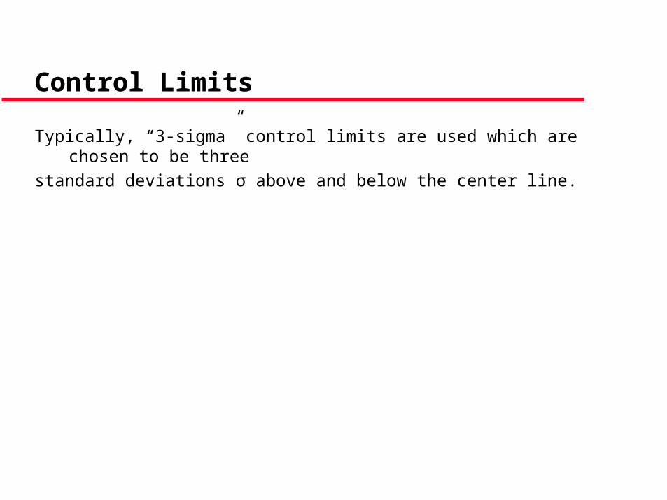
Typically, “3-sigma” control limits are used which are chosen to be three
standard deviations σ above and below the center line.

Example
Piston Head Construction
Suppose that experience with the process of manufacturing piston heads leads
the supervisors to conclude that the in-control process produces piston heads
with radius values which are normally distributed with a mean of μ0 = 30.00 mm
and a standard deviation of σ = 0.05 mm.
How should a control chart be constructed?

Example
Suppose that the observations
X1……xn
represent the radius values of the random sample of n piston heads chosen at aParticular time.
The point plotted on the control chart is the observed value of the sampleaverage
When the process is in control this sample average is an observation from a distribution with a mean value of 0 = 30.00 mm and a standard deviation of
n
xxx n
.....1
nnX
05.0

Example
A 3-sigma control chart therefore has a certain line at the “control value” 0 =30.00 mm together with control limits
and .
If the sample size taken every hour is n = 5 then the control limits are
and
as shown in Figure.
nUCL
30
nLCL
30
067.305
05.0300.30 UCL
933.295
05.0300.30 LCL

Example
The probability of a type one error of this control chart, that is, the probability thata point on the control chart lies outside the control limits when the process is stillin control, is
where the random variable X is normally distributed with a mean of 30.00 and astandard deviation of .This probability can be evaluated as
where the random variable Z has a standard normal distribution, which is
1-0.9974 = 0.0026,
as mentioned previously.
)067.30933.29(1 XP
5/05.0
)33(1 ZP

Example
It should be mentioned even if a series of points all lie within the control limitsthere may still be reason to believe that the process has moved out of control.
Remember that if the process is in control then the points plotted on the controlchart should exhibit random scatter about the center line.
Any patterns observed in the control chart maybe indications of an out of controlprocess.
For example, the last set of points on the control chart shown in Figure alllie within the control limits but they are all above the center line.
This suggests that the process may have moved out of control.
Example
There is a series of rules which has been developed to help identify
patterns in control charts which are symptomatic of an out-of-control
process even though no individual point lies outside the control limits.
These rules are often called the western electric rules, which is where
they were first suggested.
Most computer packages will implement these rules for you upon
request.

Properties of control charts
It is also useful to consider the probability that the control chart indicates that the
process is out of control when it really is out of control.
With in the hypothesis testing framework this is the power which is defined to be
power = P(reject H0 when H0 is false)
=1 – P(Type II error) = 1 -
Another point of interest relates to who long a control chart needs to be run
before an out of control process is detected.
The expected value of the number of points that need to be plotted on a control
chart before one of them lies outside the control limits and the process is
determined to be out of control is know as the Average Run Length (ARL).

Properties of control charts
If the process has moved out of control so that each point plotted has a
probability of 1 - of lying outside the control limits independent of the other
points on the control chart, then the number of points which must be plotted
before one of them lies outside the control limits has a geometric distribution with
success probability 1 - .
The expected value of a random variable with a geometric variation is the
reciprocal of the success probability, so that in this case the average run length
is
1
1ARL

Example
Piston head construction
Suppose that the piston head manufacturing process has moved out of control
due to a slight adjustment in some part of the machinery so that the piston heads
have radius values which are now normally distributed with a mean value =
30.06 mm, instead of the desired control value 30.00 mm, and with the same
standard deviation = 0.05 mm as before.
How good is the control chart at detecting this change?

Example
The plotted points on the control chart are observations of the random variable
X, which is now normally distributed with a mean = 30.06 mm and a standard
deviation = 0.0224 mm.
The probability that a point lies within the control limits is therefore
which can be written as
5/05.0
)067.30933.29( XP
0224.0
06.30067.30
0224.0
06.30933.29ZP

Example
where the random variable Z has a standard normal distribution. This is
The probability that a point lies outside the control limits is therefore
1 - = 1 – 0.622 = 0.378.
In other words, once the process has moved out of control in this manner, there
is about a 40% chance that each point plotted on the control chart will alert the
supervisor to the problem.
The average run length in this case is
So the problem should be detected within 2 or 3 hours.
622.00622.0)680.5()313.0()313.0680.5( ZP
65.2378.0
1
1
1
ARL

This section has provided a general introduction to the use of control charts and
the motivation behind their use.
Specific types of control charts for specific problems are now considered in more
detail.

Variable Control Charts
The X –chart looks for changes in the mean value and the R-chart looks for
changes in the standard deviation of the variable measured.
These control charts can be constructed from a base set of data observations
which are considered to be representative of the process when it is in control.
This data set is typically consists of a set of samples of size n taken at k different
points in time.
The sample size n is usually quiet small, perhaps only 3,4, or 5 but it may be as
large as 20 in some cases.
The control chart should be set up using data from at least k = 20 distinct points
in time.

X-Charts
An X-chart consists of a sample averages plotted against time and monitors
changes in the mean value of a variable.
The lines on the control chart can be determined from a set of k samples of size
n, with the center line being taken as
x,
the overall average of the sample averages, and with control limits
UCL = x + A2r
and
LCL = x – A2r,
where r is the average of the k sample ranges.
In practice, this X-chart is used in conjunction with an R-chart discussed below,
which monitors changes in the variability of the measurements.

R-Charts
The lines on the control chart are calculated from the data set of in control
observations, with the center line taken to be,
r,
The average of the k sample ranges r1,…..rk, and with control limits
UCL = D4r
and
LCL = D3r,
in Figure.

The R-Chart
An R-chart consists of sample ranges plotted against time and monitors changes
in the variability of a measurement of interest.
The lines on the control chart can be determined from a set of k samples of size
n, with the center line being taken as
r,
The average of the k sample ranges, and with control limits
UCL = D4r
and
LCL = D3r