
Single-case data analysis: Software resources for applied researchers
238
Resources and guidelines for analysing SCED data Rumen Manolov 1 2 , Mariola Moeyaert 3 4 , and Jonathan J. Evans 5 1 Department of Behavioural Sciences Methods, University of Barcelona, Spain 2 ESADE Business School, Ramon Llull University, Spain. 3 Faculty of Psychology and Educational Sciences, KU Leuven – University of Leuven, Belgium 4 Center of Advanced Study in Education, City University of New York, New York, USA 5 Institute of Health and Wellbeing, University of Glasgow, Scotland, UK
Transcript of Single-case data analysis: Software resources for applied researchers

Resources and guidelines for analysing SCED data
Rumen Manolov1 2
, Mariola Moeyaert3 4
, and Jonathan J. Evans5
1 Department of Behavioural Sciences Methods, University of Barcelona, Spain
2 ESADE Business School, Ramon Llull University, Spain.
3 Faculty of Psychology and Educational Sciences, KU Leuven – University of Leuven, Belgium
4 Center of Advanced Study in Education, City University of New York, New York, USA
5 Institute of Health and Wellbeing, University of Glasgow, Scotland, UK

SCED analytical resources for applied researchers
2
Initial version: Rumen Manolov and Jonathan J. Evans
Supplementary material for the article
“Single-case experimental designs: Reflections on conduct and analysis”
http://www.tandfonline.com/eprint/mNvW7GJ3IQtb5hcPiDWw/full
from Special Issue “Single-Case Experimental Design Methodology”
in Neuropsychological Rehabilitation (Vol. 24, Issues 3-4; 2014)
Chapters 6.7 and 6.9: Rumen Manolov and Lucien Rochat
Supplementary material for the article
“Further developments in summarising and meta-analysing single-case data: An
illustration with neurobehavioural interventions in acquired brain injury”
(Manuscript submitted for publication)
Extensions and updates: Rumen Manolov and Mariola Moeyaert
Current version: April 2015

Manolov, Moeyaert, & Evans
3
CONTENT
1. Aim, scope, and structure of the document................................................................. 5
2. Getting started with R and R-Commander.................................................................. 7
3. Tools for visual analysis ........................................................................................... 13
3.1 Visual analysis with the SCDA package ....................................................... 14
3.2 Using standard deviation bands as visual aids ............................................... 18
3.3 Estimating and projecting baseline trend ....................................................... 21
4. Nonoverlap indices ................................................................................................... 25
4.1 Percentage of nonoverlapping data ................................................................ 26
4.2 Percentage of data points exceeding the median ........................................... 29
4.3 Pairwise data overlap ..................................................................................... 32
4.4 Nonoverlap of all pairs................................................................................... 35
4.5 Improvement rate difference .......................................................................... 37
4.6 Tau-U ............................................................................................................. 39
4.7 Percentage of data points exceeding median trend ........................................ 44
4.8 Percentage of nonoverlapping corrected data ................................................ 49
5. Percentage indices not quantifying overlap .............................................................. 52
5.1 Percentage of zero data .................................................................................. 53
5.2 Percentage reduction data and Mean baseline reduction ............................... 56
SCED analytical resources for applied researchers
4
6. Unstandardized indices and their standardized versions .......................................... 60
6.1 Ordinary least squares regression analysis .................................................... 61
6.2 Piecewise regression analysis ........................................................................ 64
6.3 Generalized least squares regression analysis ................................................ 71
6.4 Classical mean difference indices .................................................................. 77
6.5 SCED-specific mean difference indices ........................................................ 82
6.6 Mean phase difference ................................................................................... 91
6.7 Mean phase difference – percentage and standardized versions ................... 95
6.8 Slope and level change ................................................................................. 110
6.9 Slope and level change – percentage and standardized versions ................. 115
7. Tools for implementing randomisation and using randomisation tests .................. 130
7.1 Randomisation tests with the SCDA package ............................................. 131
7.2 Randomisation tests with ExPRT ................................................................. 148
8. Carrying out simulation modelling analysis ........................................................... 154
9. Implementing the Maximal reference approach ..................................................... 161
10. Application of two-level multilevel models for analysing data ............................ 165
11. Integrating results of several studies ..................................................................... 175
11.1 Meta-analysis using the SCED-specific standardized mean difference .... 176
11.2. Meta-analysis using the MPD and SLC .................................................... 185
11.3. Application of three-level multilevel models for meta-analysing data ..... 195
11.4. Integrating results combining probabilities .............................................. 211
12. Summary list of the resources ............................................................................... 217
13. References ............................................................................................................. 220
Appendix A: Some additional information about R ................................................... 227
Appendix B: Some additional information about R-Commander .............................. 233

Manolov, Moeyaert, & Evans
5
Chapter 1.
Aim, scope, and structure of the document

SCED analytical resources for applied researchers
6
The present document was conceived as a brief guide to resources that practitioners and applied
researchers can use when they are facing the task of analysing single-case experimental designs
(SCED) data. The document should only be considered as a pointer rather than a detailed
manual, and therefore we recommend that the original works of the proponents of the different
analytical options are consulted and read in conjunction with this guide. Several additional
comments are needed. First, this document is not intended to be comprehensive guide and not all
possible analytical techniques are included. Rather we have focussed on procedures that can be
implemented in either widely available software such as Excel or, in most cases, the open source
R platform. Second, the document is intended to be provisional and will hopefully be extended
with more techniques and software implementations in time. Third, the illustrations of the
analytical tools mainly include the simplest design structure AB, given that most proposals were
made in this context. However, some techniques (d-statistic, randomization test, multilevel
models) are applicable to more appropriate design structures (e.g., ABAB and multiple baseline)
and the illustrations focus on such designs to make that broader applicability clear. Fourth, with
the step-by-step descriptions provided we do not suggest that these steps are the only way to run
the analyses. Finally, any potential errors in the use of the software should be attributed to the
first author of this document (R. Manolov) and not necessarily to the authors/proponents of the
procedures or to the creators of the software. Therefore, feedback from authors, proponents, or
software creators is welcome in order to improve subsequent versions of this document.
For each of the analytical alternatives, the corresponding section includes the following
information: a) Name of the technique; b) Authors/proponents of the technique and suggested
readings; c) Software that can be used and its author; d) How the software can be obtained; e)
How the analysis can be run to obtain the results and f) How to interpret the results.
We have worked with Windows as operative system. It is possible to experience some issues
with: (a) R-Commander (not expected for the code), when using Mac OS; (b) R packages (not
expected for the code), due to uneven updates of R, R-Commander, and the packages, when
using either Windows or Mac. Finally, we encourage practitioners and applied researchers to
work with the software themselves in conjunction with consulting the suggested readings both
for running the analyses and interpreting the results.

Manolov, Moeyaert, & Evans
7
Chapter 2.
Getting started with R and R-Commander
SCED analytical resources for applied researchers
8
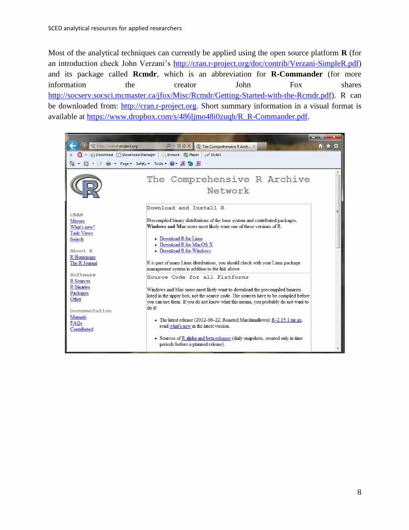
Most of the analytical techniques can currently be applied using the open source platform R (for
an introduction check John Verzani’s http://cran.r-project.org/doc/contrib/Verzani-SimpleR.pdf)
and its package called Rcmdr, which is an abbreviation for R-Commander (for more
information the creator John Fox shares
http://socserv.socsci.mcmaster.ca/jfox/Misc/Rcmdr/Getting-Started-with-the-Rcmdr.pdf). R can
be downloaded from: http://cran.r-project.org. Short summary information in a visual format is
available at https://www.dropbox.com/s/486ljmo48i0zuqh/R_R-Commander.pdf.

Manolov, Moeyaert, & Evans
9
Once R is downloaded and installed, the user should run it and install the R-Commander
package. Each new package should be installed once (for each computer on which R is installed).
To install a package, click on Packages, then Install Package(s), select a CRAN location and then
select the package to install. Once a package is installed each time it is going to be used it must
be loaded, by clicking on Packages, Load Package.
Using R code, installing the R-Commander can be achieved via the following code:
install.packages("Rcmdr", dependencies=TRUE)
This is expected to ensure that all the packages from which the R-Commander depends are also
installed. In case the user is prompted to answer the question about whether to install all
packages required s/he should answer with Yes.
Using R code, loading the R-Commander can be achieved via the following code:
require(Rcmdr)
The user should note that these lines of code are applicable to all packages and they only require
changing the name of the package (here Rcmdr).
SCED analytical resources for applied researchers
10
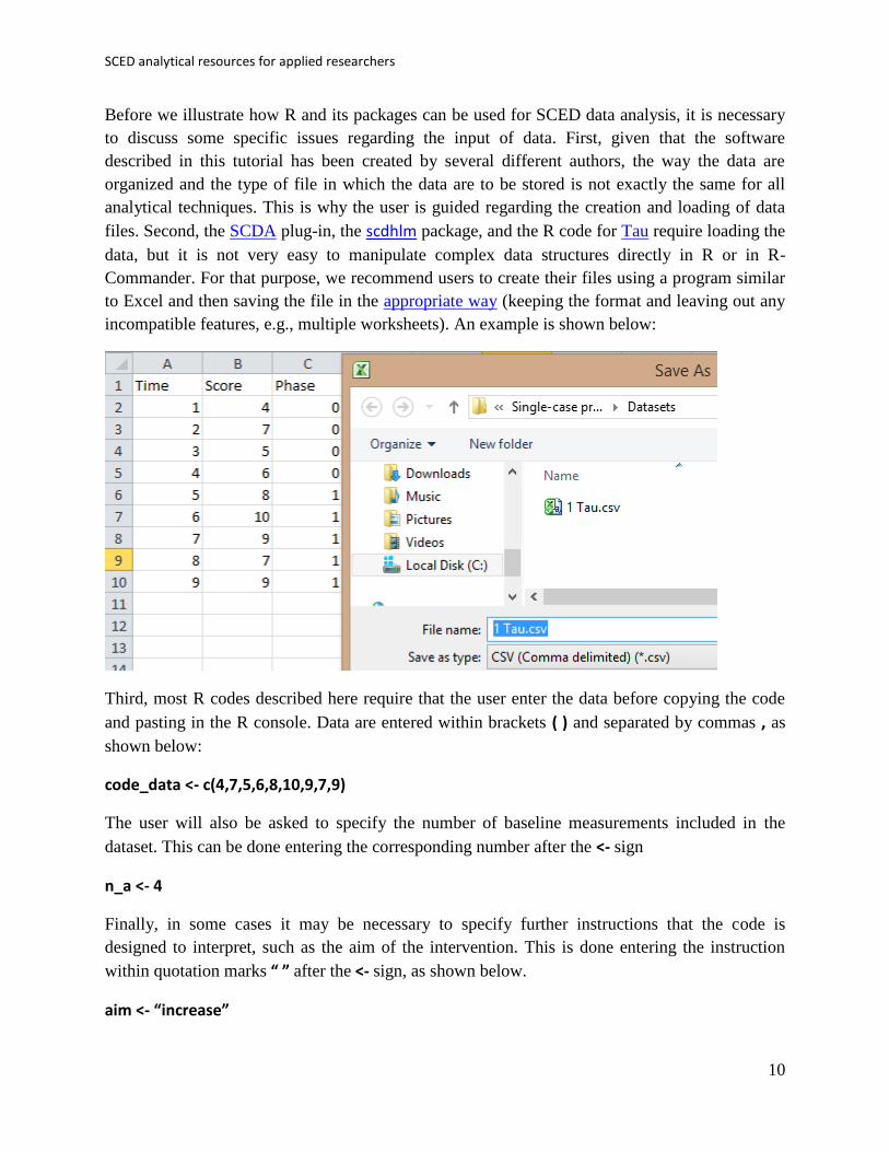
Before we illustrate how R and its packages can be used for SCED data analysis, it is necessary
to discuss some specific issues regarding the input of data. First, given that the software
described in this tutorial has been created by several different authors, the way the data are
organized and the type of file in which the data are to be stored is not exactly the same for all
analytical techniques. This is why the user is guided regarding the creation and loading of data
files. Second, the SCDA plug-in, the scdhlm package, and the R code for Tau require loading the
data, but it is not very easy to manipulate complex data structures directly in R or in R-
Commander. For that purpose, we recommend users to create their files using a program similar
to Excel and then saving the file in the appropriate way (keeping the format and leaving out any
incompatible features, e.g., multiple worksheets). An example is shown below:
Third, most R codes described here require that the user enter the data before copying the code
and pasting in the R console. Data are entered within brackets ( ) and separated by commas , as
shown below:
code_data <- c(4,7,5,6,8,10,9,7,9)
The user will also be asked to specify the number of baseline measurements included in the
dataset. This can be done entering the corresponding number after the <- sign
n_a <- 4
Finally, in some cases it may be necessary to specify further instructions that the code is
designed to interpret, such as the aim of the intervention. This is done entering the instruction
within quotation marks “ ” after the <- sign, as shown below.
aim <- “increase”

Manolov, Moeyaert, & Evans
11
Along the examples of R code the user will also see that for loading data in R directly, without
the use of R-Commander, we use R code.
For instance, for the data to be used by the SCDA plug-in, the data files are not supposed to
include headers (column names) and the separators between columns are blank spaces. This is
why we can use the following code:
SCDA_data <- read.table(file.choose(),header=FALSE,sep=" ")
In contrast, for the SCED-specific d statistic the data files do have headers and a tab is used as
separator. For that reason we use the following code:
d_data <- read.table(file.choose(),header=TRUE)
Finally, for the Tau nonoverlap index the data are supposed to be organized in a single column,
using commas as separators. Tau’s code includes the following line:
Tau_data <- read.csv(file.choose())
SCED analytical resources for applied researchers
12
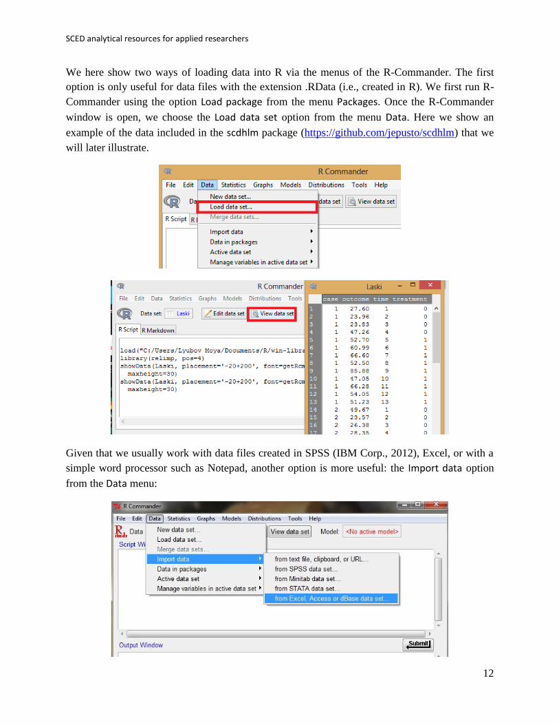
We here show two ways of loading data into R via the menus of the R-Commander. The first
option is only useful for data files with the extension .RData (i.e., created in R). We first run R-
Commander using the option Load package from the menu Packages. Once the R-Commander
window is open, we choose the Load data set option from the menu Data. Here we show an
example of the data included in the scdhlm package (https://github.com/jepusto/scdhlm) that we
will later illustrate.
Given that we usually work with data files created in SPSS (IBM Corp., 2012), Excel, or with a
simple word processor such as Notepad, another option is more useful: the Import data option
from the Data menu:

Manolov, Moeyaert, & Evans
13
In this section we will review two options using the R platform, but the interested reader can also
check the training protocol for visual analysis available at www.singlecase.org (developed by
Swoboda, Kratochwill, Horner, Levin, and Albin; copyright of the site: Hoselton and Horner).
Chapter 3.
Tools for visual analysis

SCED analytical resources for applied researchers
14
3.1a Name of the technique: Visual analysis with the SCDA package
3.1b Authors and suggested readings: Visual analysis is described in the What Works
Clearinghouse technical documentation about SCED (Kratochwill et al., 2010) as well as major
SCED methodology textbooks and specifically in Gast and Spriggs (2010) . The use of the
SCDA packages for visual analysis is explained in Bulté and Onghena (2012).
3.1c Software that can be used and its author: The SCDA is a plug-in for R-Commander and was
developed as part of the doctoral dissertation of Isis Bulté (2013) and is maintained by Marlies
Vervloet ([email protected]) from KU Leuven, Belgium.
3.1d How to obtain the software: The SCDA (version 1.1) is available at the R website
http://cran.r-project.org/web/packages/RcmdrPlugin.SCDA/index.html and can also be installed
directly from the R console.
First, open R.Second, install RcmdrPlugin.SCDA using the option Install package(s) from the
menu Packages.
Third, load RcmdrPlugin.SCDA in the R console (directly; this loads also R-Commander) or in
R-Commander (first loading Rcmdr and then the plug-in).
Manolov, Moeyaert, & Evans
15
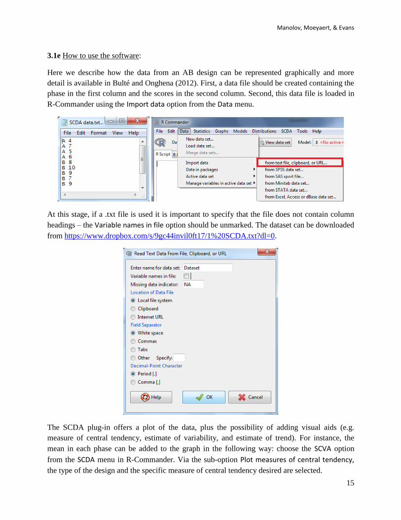
3.1e How to use the software:
Here we describe how the data from an AB design can be represented graphically and more
detail is available in Bulté and Onghena (2012). First, a data file should be created containing the
phase in the first column and the scores in the second column. Second, this data file is loaded in
R-Commander using the Import data option from the Data menu.
At this stage, if a .txt file is used it is important to specify that the file does not contain column
headings – the Variable names in file option should be unmarked. The dataset can be downloaded
from https://www.dropbox.com/s/9gc44invil0ft17/1%20SCDA.txt?dl=0.
The SCDA plug-in offers a plot of the data, plus the possibility of adding visual aids (e.g.
measure of central tendency, estimate of variability, and estimate of trend). For instance, the
mean in each phase can be added to the graph in the following way: choose the SCVA option
from the SCDA menu in R-Commander. Via the sub-option Plot measures of central tendency,
the type of the design and the specific measure of central tendency desired are selected.
SCED analytical resources for applied researchers
16
For representing an estimate of variability, the corresponding sub-option is used. Note that in this
case, a measure of central tendency should also be marked, although it is later not represented on
the graph.
For representing an estimate of trend, the corresponding sub-option is used. Note that in this
case, a measure of central tendency should also be marked, although it is later not represented on
the graph.
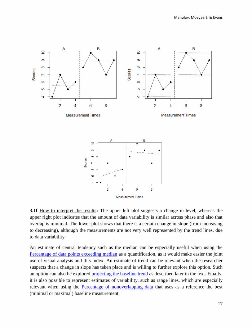
These actions lead to the following plots with the median (i.e., sub-option plot measure of central
tendency) represented in the top left graph, the maximum and minimum lines (i.e., sub-option
plot measure of variability) in the top right graph, and the ordinary least squares trend (sub-
option plot estimate of trend) in the bottom graph.
Manolov, Moeyaert, & Evans
17
3.1f How to interpret the results: The upper left plot suggests a change in level, whereas the
upper right plot indicates that the amount of data variability is similar across phase and also that
overlap is minimal. The lower plot shows that there is a certain change in slope (from increasing
to decreasing), although the measurements are not very well represented by the trend lines, due
to data variability.
An estimate of central tendency such as the median can be especially useful when using the
Percentage of data points exceeding median as a quantification, as it would make easier the joint
use of visual analysis and this index. An estimate of trend can be relevant when the researcher
suspects that a change in slope has taken place and is willing to further explore this option. Such
an option can also be explored projecting the baseline trend as described later in the text. Finally,
it is also possible to represent estimates of variability, such as range lines, which are especially
relevant when using the Percentage of nonoverlapping data that uses as a reference the best
(minimal or maximal) baseline measurement.
SCED analytical resources for applied researchers
18
3.2a Name of the technique: Using standard deviation bands as visual aids
3.2b Authors and suggested readings: The use of standard deviation bands arises from statistical
process control (Hansen & Gare, 1987), which has been extensively applied in industry when
controlling the quality of products. The graphical representations are known as Shewhart charts
and their use has also been recommended for single-case data (Callahan & Barisa, 2005; Pfadt &
Wheeler, 1995: look at the rules these latter authors suggest for deciding whether the scores in
the intervention phase are different than expected by baseline phase variability). We recommend
using this tool as a visual (not statistical) aid when baseline data shown no clear trend. When
trend is present, researchers can use the visual aid described in the next section (i.e., estimating
and projecting baseline trend).
3.2c Software that can be used and its author: Statistical process control has been incorporated in
the R package called qcc (http://cran.r-project.org/web/packages/qcc/index.html, for further
detail check http://stat.unipg.it/~luca/Rnews_2004-1-pag11-17.pdf). Here we will focus on the R
code created by R. Manolov, as it is specific to single-case data and more intuitive.
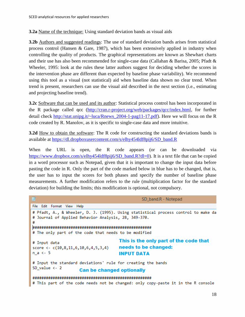
3.2d How to obtain the software: The R code for constructing the standard deviations bands is
available at https://dl.dropboxusercontent.com/s/elhy454ldf8pij6/SD_band.R
When the URL is open, the R code appears (or can be downloaded via
https://www.dropbox.com/s/elhy454ldf8pij6/SD_band.R?dl=0). It is a text file that can be copied
in a word processor such as Notepad, given that it is important to change the input data before
pasting the code in R. Only the part of the code marked below in blue has to be changed, that is,
the user has to input the scores for both phases and specify the number of baseline phase
measurements. A further modification refers to the rule (multiplication factor for the standard
deviation) for building the limits; this modification is optional, not compulsory.

Manolov, Moeyaert, & Evans
19
3.2e How to use the software
When the text file is downloaded and opened with Notepad, the values after score <- c( have to
be changed, inputting the scores separated by commas. The number of baseline phase
measurements is specified after n_a <- . Change the default value of 5, if necessary. In the
current example, the length of the baseline phase is 4.
When these modifications are carried out, the whole code (the part that was modified and the
remaining part) is copied and pasted into the R console.

SCED analytical resources for applied researchers
20
3.2f How to interpret the results: The first part of the output is the graphical representation that
opens in a separate window. This graph includes the baseline phase mean, plus the standard
deviation bands constructed from the baseline data and projected into the treatment phase.
The second part of the output of the code appears in the R console, where the code was pasted.
This part of the output includes the numerical values indicating the number of treatment phase
scores falling outside of the limits defined by the standard deviation bands, paying special
attention to consecutive scores outside these limits.

Manolov, Moeyaert, & Evans
21
3.3a Name of the technique: Estimating and projecting baseline trend
3.3b Authors and suggested readings: Estimating trend in the baseline phase and projecting it
into the subsequent treatment phase is an inherent part of visual analysis (Gast & Spriggs, 2010;
Kratochwill et al., 2010). For the tool presented here trend is estimated using the split-middle
technique (Miller, 1985). The stability of the baseline trend across conditions is assessed using
the 80%-20% formula described in Gast and Spriggs (2010) and also on the basis of the
interquartile range, IQR (Tukey, 1977). The idea is that if the treatment phase scores do not fall
within the limits of the projected baseline trend a change in the behaviour has taken place
(Manolov, Sierra, Solanas, & Botella, 2014).
3.3c Software that can be used and its author: The R code reviewed here was created by R.
Manolov.
3.3d How to obtain the software: The R code for estimating and projecting baseline trend is
available at https://dl.dropboxusercontent.com/s/5z9p5362bwlbj7d/ProjectTrend.R
When the URL is open, the R code appears (or can be downloaded via
https://www.dropbox.com/s/5z9p5362bwlbj7d/ProjectTrend.R?dl=0). It is a text file that can be
opened with a word processor such as Notepad. Only the part of the code marked below in blue
has to be changed, that is, the user has to input the scores for both phases and specify the number
of baseline phase measurements. Further modifications regarding the way in which trend
stability is assessed are also possible as the text marked below in green shows. Note that these
modifications are optional and not compulsory.

SCED analytical resources for applied researchers
22
3.3e How to use the software
When the text file is downloaded and opened with Notepad, the values after score <- c( have to
be changed, inputting the scores separated by commas. The number of baseline phase
measurements is specified after n_a <- , changing the default value of 4, if necessary.
When these modifications are carried out, the whole code (the part that was modified and the
remaining part) is copied and pasted into the R console.

Manolov, Moeyaert, & Evans
23
3.3f How to interpret the results: The output of the code is two numerical values indicating the
proportion of treatment phase scores falling within the stability limits for the baseline trend and a
graphical representation. In this case, the split-middle method suggests that there is no improving
or deteriorating trend, which is why the trend line is flat. No data points fall within the stability
envelope, indicating a change in the target behaviour after the intervention. Accordingly, only 1
of 5 (i.e., 20%) intervention data points fall within the IQR-based interval leading to the same
conclusion.
In case the data used were the default ones available in the code, which are also the data used for
illustrating the Percentage of data points exceeding median trend, the results would be shown
below, indicating a potential change according to the stability envelope and lack of change
according to the IQR-based intervals.

SCED analytical resources for applied researchers
24

Manolov, Moeyaert, & Evans
25
Chapter 4.
Nonoverlap indices

SCED analytical resources for applied researchers
26
4.1a Name of the technique: Percentage of nonoverlapping data (PND)
4.1b Authors and suggested readings: The PND was proposed by Scruggs, Mastropieri, and
Casto (1987); a recent review of its strengths and limitations is offered by Scruggs and
Mastropieri (2013) and Campbell (2013).
4.1c Software that can be used: The PND is implemented in the SCDA plug-in for R
Commander (Bulté, 2013; Bulté & Onghena, 2012).
4.1d How to obtain the software: The steps are as follows. First, open R.
Second, install RcmdrPlugin.SCDA using the option Install package(s) from the menu Packages.
Third, load RcmdrPlugin.SCDA in the R console (directly; this loads also R-Commander) or in
R-Commander (first loading Rcmdr and then the plug-in).
4.1e How to use the software:
First, the data file needs to be created (first column: phase; second column: scores) and imported
into R-Commander.
Manolov, Moeyaert, & Evans
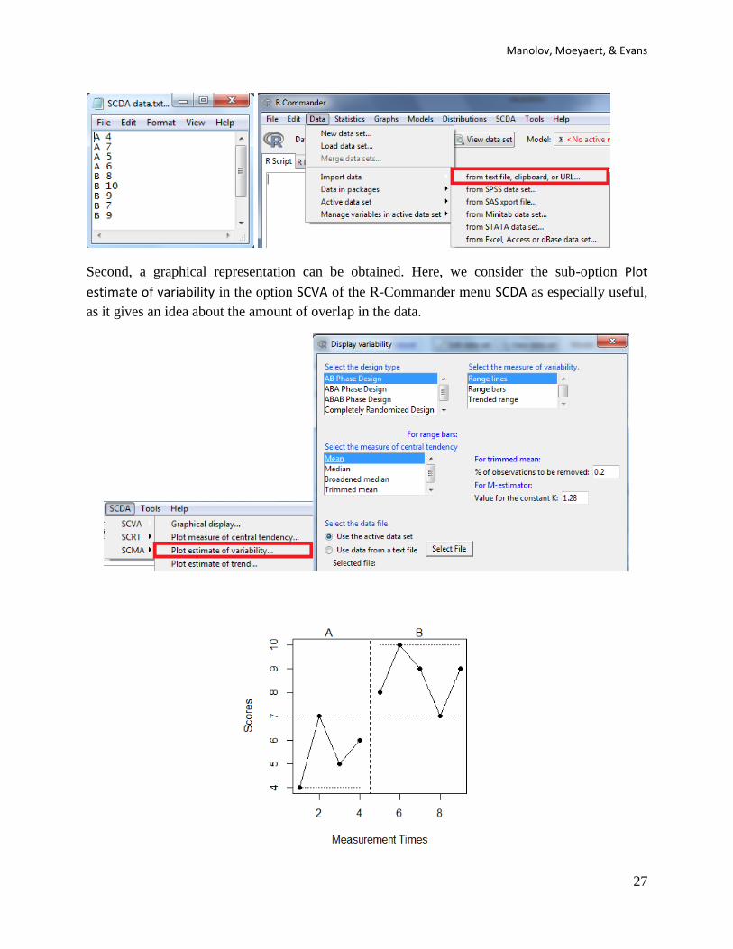
27
Second, a graphical representation can be obtained. Here, we consider the sub-option Plot
estimate of variability in the option SCVA of the R-Commander menu SCDA as especially useful,
as it gives an idea about the amount of overlap in the data.
SCED analytical resources for applied researchers
28
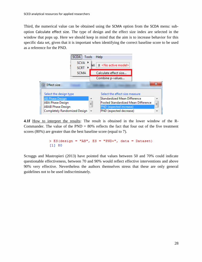
Third, the numerical value can be obtained using the SCMA option from the SCDA menu: sub-
option Calculate effect size. The type of design and the effect size index are selected in the
window that pops up. Here we should keep in mind that the aim is to increase behavior for this
specific data set, given that it is important when identifying the correct baseline score to be used
as a reference for the PND.
4.1f How to interpret the results: The result is obtained in the lower window of the R-
Commander. The value of the PND = 80% reflects the fact that four out of the five treatment
scores (80%) are greater than the best baseline score (equal to 7).
Scruggs and Mastropieri (2013) have pointed that values between 50 and 70% could indicate
questionable effectiveness, between 70 and 90% would reflect effective interventions and above
90% very effective. Nevertheless the authors themselves stress that these are only general
guidelines not to be used indiscriminately.
Manolov, Moeyaert, & Evans
29
4.2a Name of the technique: Percentage of data points exceeding the median (PEM)
4.2b Authors and suggested readings: The PEM was proposed by Ma (2006) and tested by
Parker and Hagan-Burke (2007). PEM was suggested in order to avoid relying on a single
baseline measurement, as the Percentage of nonoverlapping data does.
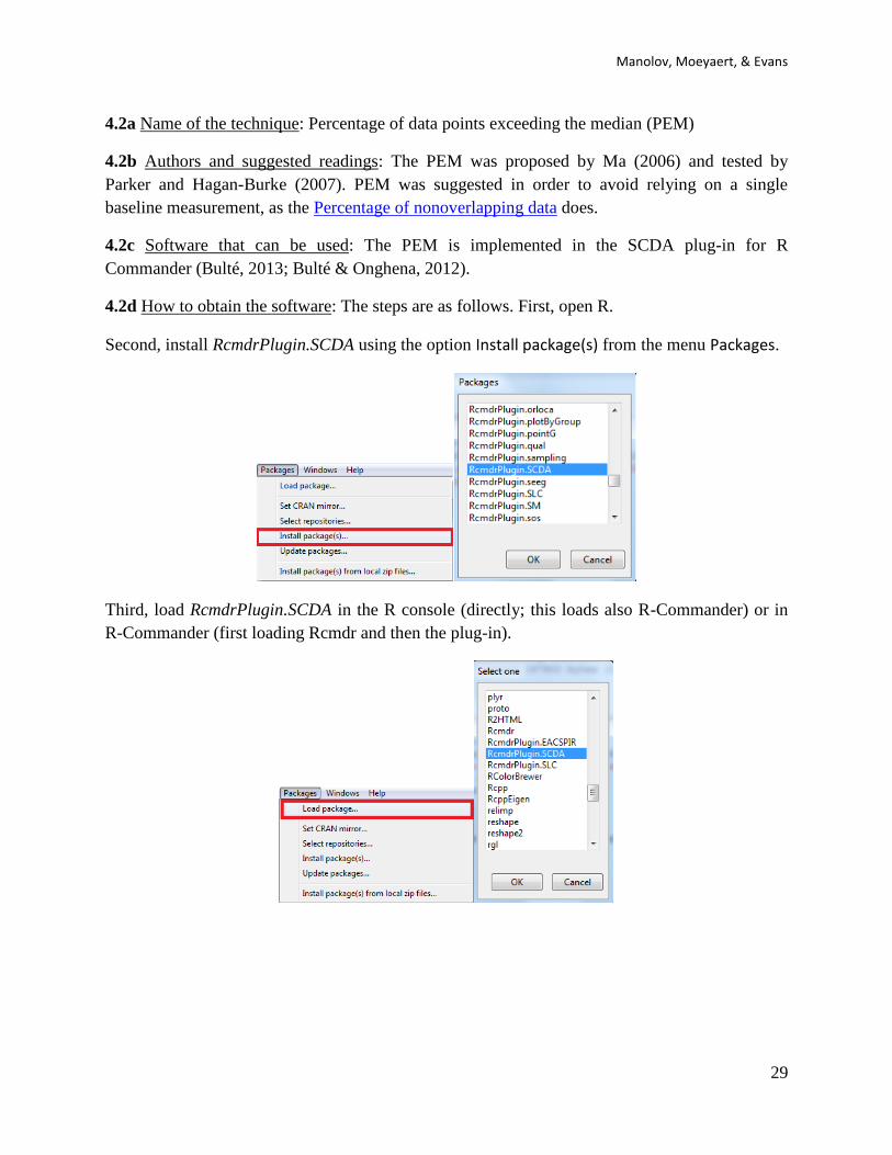
4.2c Software that can be used: The PEM is implemented in the SCDA plug-in for R
Commander (Bulté, 2013; Bulté & Onghena, 2012).
4.2d How to obtain the software: The steps are as follows. First, open R.
Second, install RcmdrPlugin.SCDA using the option Install package(s) from the menu Packages.
Third, load RcmdrPlugin.SCDA in the R console (directly; this loads also R-Commander) or in
R-Commander (first loading Rcmdr and then the plug-in).

SCED analytical resources for applied researchers
30
4.2e How to use the software:
First, the data file needs to be created (first column: phase; second column: scores) and imported
into R-Commander.
Second, a graphical representation can be obtained. Here, we consider the sub-option Plot
estimate of central tendency in the option SCVA of the R-Commander menu SCDA as especially
useful, as it is related to the quantification performed by the PEM.

Manolov, Moeyaert, & Evans
31
Third, the numerical value can be obtained using the SCMA option from the SCDA menu: sub-
option Calculate effect size. The type of design and the effect size index are selected in the
window that pops up. Here we should keep in mind that the aim is to increase behavior for this
specific data set, given that it is important when identifying the correct baseline score to be used
as a reference for the PEM.
4.2f How to interpret the results: The value PEM = 100% indicates that all five treatment scores
(100%) are greater than the baseline median (equal to 5.5). This appears to point at an effective
intervention. Nevertheless, nonoverlap indices in general do not inform about the distance
between baseline and intervention phase scores in case complete nonoverlap is present.

SCED analytical resources for applied researchers
32
4.3a Name of the technique: Pairwise data overlap (PDO)
4.3b Authors and suggested readings: The PDO was discussed by Wolery, Busick, Reichow, and
Barton (2010) who attribute it to Parker and Vannest from an unpublished paper from 2007 with
the same name. Actually PDO is very similar to the Nonoverlap of all pairs proposed by Parker
and Vannest (2009), with the difference being that (a) it quantifies overlap instead of nonoverlap;
(b) overlap is tallied without taking ties into account; and (d) the proportion of overlapping pairs
out of the total compared is squared.
4.3c Software that can be used: The first author of this tutorial (R. Manolov) has developed R
code that can be used to implement the index.
4.3d How to obtain the software: The R code can be downloaded via
https://www.dropbox.com/s/jd8a6vl0nv4v7dt/PDO2.R?dl=0. It is a text file that can be opened
with a word processor such as Notepad. Only the part of the code marked below in blue has to be
changed.
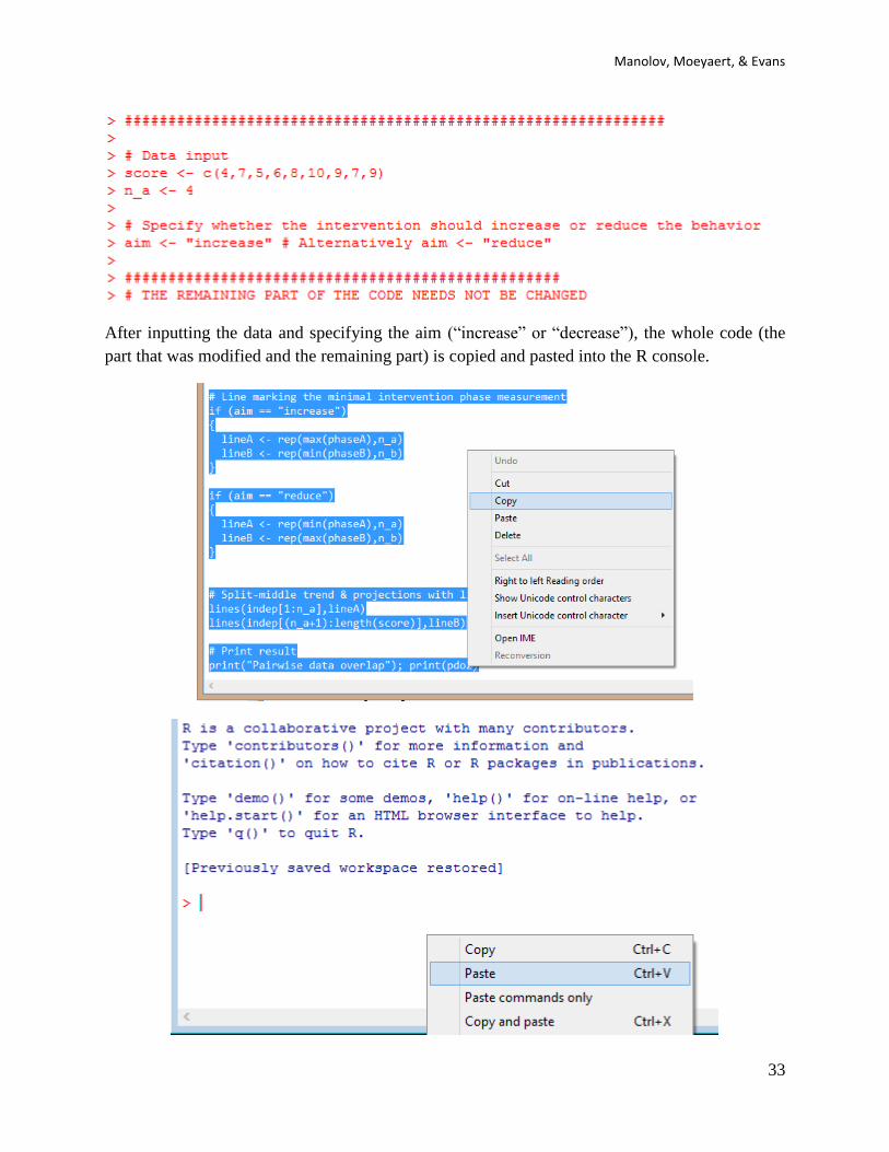
4.3e How to use the software: When the text file is downloaded and opened with Notepad, the
scores are inputted after score <- c( separating them by commas. The number of data points
corresponding to the baseline are specified after n_a <- . Note that it is important to specify
whether the aim is to increase behaviour (the default option) or to reduce it, with the text written
after aim <- within quotation marks.
Manolov, Moeyaert, & Evans
33
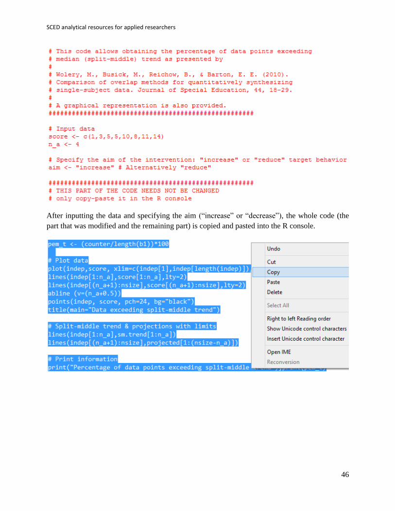
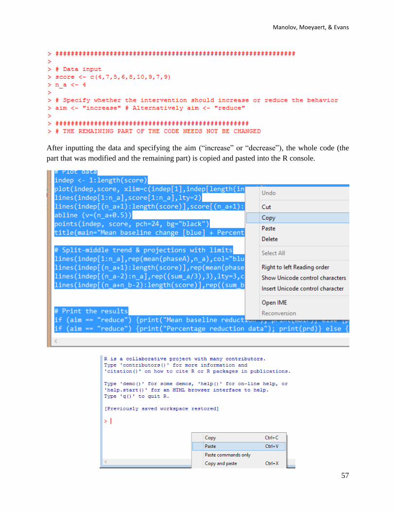
After inputting the data and specifying the aim (“increase” or “decrease”), the whole code (the
part that was modified and the remaining part) is copied and pasted into the R console.
SCED analytical resources for applied researchers
34
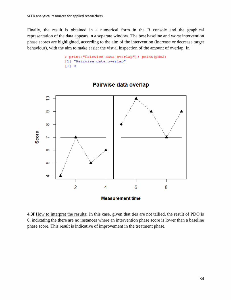
Finally, the result is obtained in a numerical form in the R console and the graphical
representation of the data appears in a separate window. The best baseline and worst intervention
phase scores are highlighted, according to the aim of the intervention (increase or decrease target
behaviour), with the aim to make easier the visual inspection of the amount of overlap. In
4.3f How to interpret the results: In this case, given that ties are not tallied, the result of PDO is
0, indicating the there are no instances where an intervention phase score is lower than a baseline
phase score. This result is indicative of improvement in the treatment phase.

Manolov, Moeyaert, & Evans
35
4.4a Name of the technique: Nonoverlap of all pairs (NAP)
4.4b Authors and suggested readings: The NAP was proposed by Parker and Vannest (2009) as a
potential improvement over the PND. The authors offer the details for this procedure.
4.4c Software that can be used: The NAP can be obtained via a web-based calculator available at
http://www.singlecaseresearch.org (Vannest, Parker, & Gonen, 2011). Its result is also part of the
output of the code for the Tau-U reviewed in a subsequent section.
4.4d How to obtain the software: The URL is typed and the NAP Calculator option is selected
from the Calculators menu. It is also available directly at
http://www.singlecaseresearch.org/calculators/nap
SCED analytical resources for applied researchers
36
4.4e How to use the software:
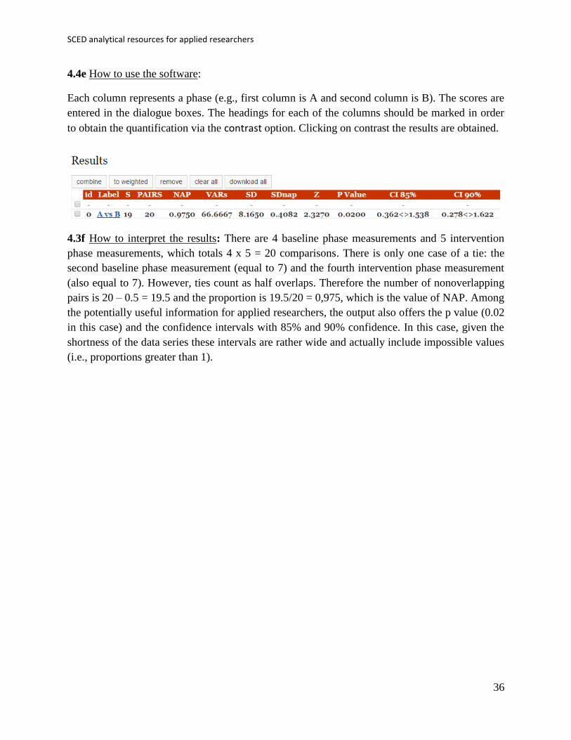
Each column represents a phase (e.g., first column is A and second column is B). The scores are
entered in the dialogue boxes. The headings for each of the columns should be marked in order
to obtain the quantification via the contrast option. Clicking on contrast the results are obtained.
4.3f How to interpret the results: There are 4 baseline phase measurements and 5 intervention
phase measurements, which totals 4 x 5 = 20 comparisons. There is only one case of a tie: the
second baseline phase measurement (equal to 7) and the fourth intervention phase measurement
(also equal to 7). However, ties count as half overlaps. Therefore the number of nonoverlapping
pairs is 20 – 0.5 = 19.5 and the proportion is 19.5/20 = 0,975, which is the value of NAP. Among
the potentially useful information for applied researchers, the output also offers the p value (0.02
in this case) and the confidence intervals with 85% and 90% confidence. In this case, given the
shortness of the data series these intervals are rather wide and actually include impossible values
(i.e., proportions greater than 1).

Manolov, Moeyaert, & Evans
37
4.5a Name of the technique: Improvement rate difference (IRD)
4.5b Authors and suggested readings: The IRD was proposed by Parker, Vannest, and Brown
(2009) as a potential improvement over the PND. The authors offer the details for this procedure,
but in short it can be said that the number of improved baseline measurements (e.g., greater than
intervention phase measurements when the aim is to increase target behaviour) is subtracted
from the number of improved treatment phase measurements (e.g., greater than baseline phase
measurements when the aim is to increase target behaviour). Thus it can be thought of as the
difference between two percentages.
4.5c Software that can be used: The IRD can be obtained via a web-based calculator available at
http://www.singlecaseresearch.org (Vannest, Parker, & Gonen, 2011). Its result is also part of the
output of the code for the Nonoverlap of all pairs and Tau-U reviewed also in this document.
4.5d How to obtain the software: The URL is typed and the NAP Calculator option is selected
from the Calculators menu. It is also available directly at
http://www.singlecaseresearch.org/calculators/ird

SCED analytical resources for applied researchers
38
4.5e How to use the software:
Each column represents a phase (e.g., first column is A and second column is B). The scores are
entered in the dialogue boxes. The headings for each of the columns should be marked in order
to obtain the quantification clicking the IRD option. The results are presented below.
4.5f How to interpret the results: From the data it can be seen that there is only one tie (the value
of 7) but it is not counted as an improvement for the baseline phase and, thus, the improvement
rate for baseline is 0/4 = 0%. For the intervention phase, there are 4 scores that are greater than
all other baseline scores and 1 that is not, thus, 4/5 = 80%. The IRD is 80% − 0% = 80%. The
IRD can also be computed considering the smallest amount of data points that need to be
removed in order to achieve lack of overlap. In this case, removing the fourth intervention phase
measurement (equal to 7) would achieve this. In the present example, eliminating the second
baseline phase measurement (equal to 7) would have the same effect.

Manolov, Moeyaert, & Evans
39
4.6a Name of the technique: Tau-U
4.6b Authors and suggested readings: Tau-U was proposed by Parker, Vannest, Davis, and
Sauber (2011). The review and discussion by Brossart, Vannest, Davis, and Patience (2014) is
also recommended to fully understand the procedure.
4.6c Software that can be used: The Tau-U can be obtained via the online calculator
http://www.singlecaseresearch.org/calculators/tau-u (see also the demo video at
http://www.youtube.com/watch?v=ElZqq_XqPxc). However, its proponents also suggest using
the R code developed by Kevin Tarlow.
4.6d How to obtain the software: The R code for computing Tau-U is available at
https://dl.dropboxusercontent.com/u/2842869/Tau_U.R When the URL is open, the R code
appears (or can be downloaded clicking the right button of the mouse and selecting Save As…).
Once downloaded, it is a text file that can be opened with a word processor such as Notepad or
saved. The file contains instruction for working with it and we recommend consulting them.
4.6e How to use the software:
First, the Tau-U code requires an R package called “Kendall”, which should be installed
(Packages Install package(s)) and loaded (Packages Load package).

SCED analytical resources for applied researchers
40
Second, a data file should be created with the following structure: the first column includes a
Time variable representing the measurement occasion; the second column includes a Score
variable with the measurements obtained; the third column includes a dummy variable for Phase
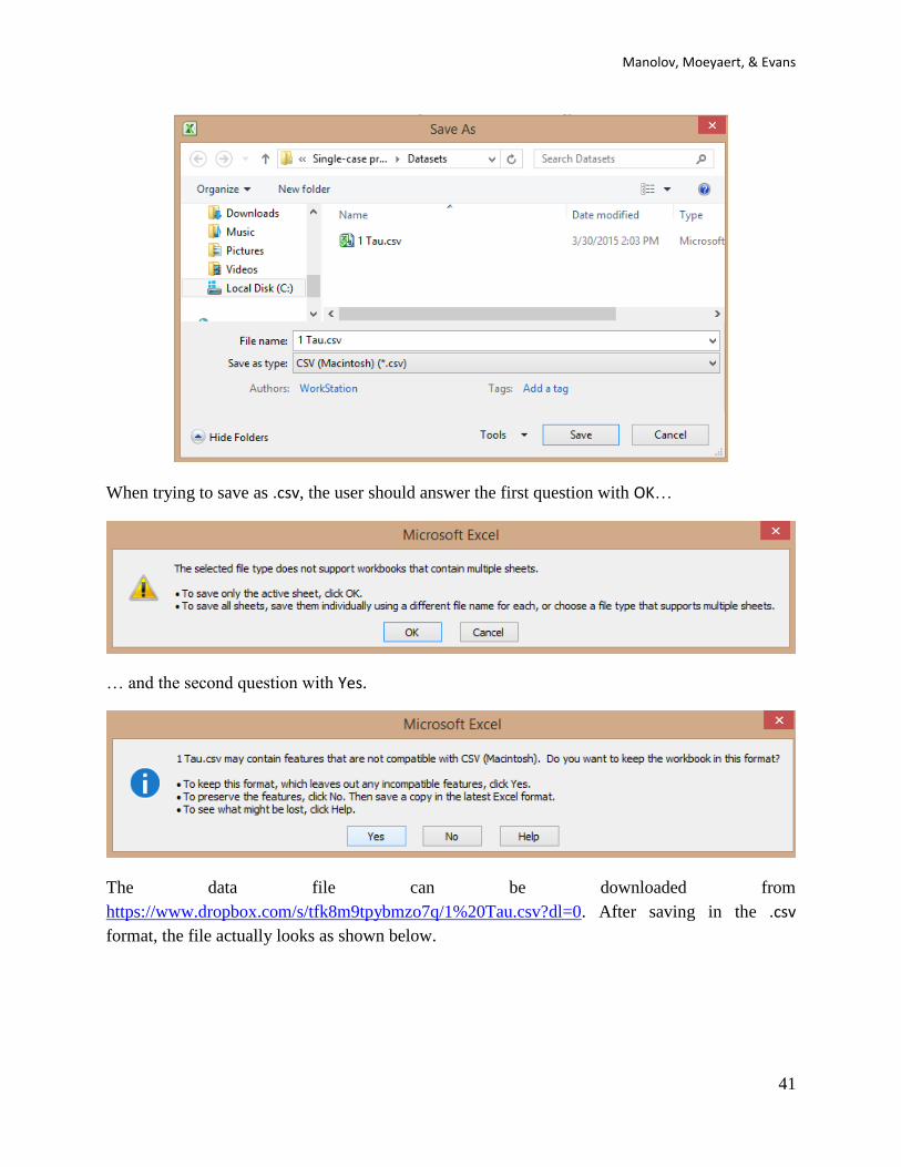
(0=baseline, 1=treatment). This data file can be created in Excel and should be saved with the
.csv extension.
Manolov, Moeyaert, & Evans
41
When trying to save as .csv, the user should answer the first question with OK…
… and the second question with Yes.
The data file can be downloaded from
https://www.dropbox.com/s/tfk8m9tpybmzo7q/1%20Tau.csv?dl=0. After saving in the .csv
format, the file actually looks as shown below.

SCED analytical resources for applied researchers
42
Third, the code corresponding to the functions (in the beginning of the file) is copied and pasted
into the R console. The code for the function ends right loading the Kendall package.
Fourth, the code for choosing a data file is also copied and passed into the R console:
Copy-Paste 1) cat("\n ***** Press ENTER to select .csv data file ***** \n")
Copy-Paste 2) line <- readline() # wait for user to hit ENTER
The user presses ENTER twice
Copy-Paste 3) data <- read.csv(file.choose()) # get data from .csv file
Manolov, Moeyaert, & Evans
43
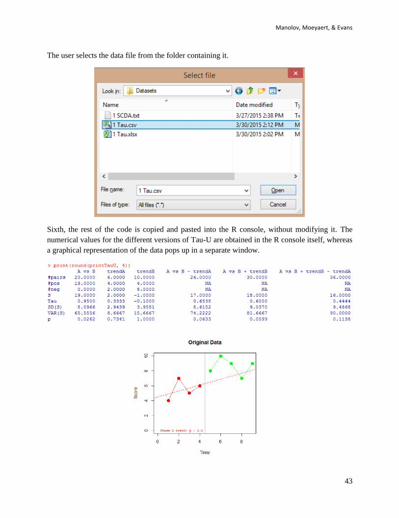
The user selects the data file from the folder containing it.
Sixth, the rest of the code is copied and pasted into the R console, without modifying it. The
numerical values for the different versions of Tau-U are obtained in the R console itself, whereas
a graphical representation of the data pops up in a separate window.

SCED analytical resources for applied researchers
44
4.6f How to interpret the results: The table includes several pieces of information. In the first
column (A vs B), the row entitled “Tau” provides a quantification similar to the Nonoverlap of
all pairs, as it is the proportion of comparisons in which the intervention phase measurements are
greater than the baseline measurements (19 out of 20, with 1 tie). Here the tie is counted as a
whole overlap, not a half overlap as in NAP, and thus the result is slightly different (0.95 vs.
NAP = 0.975).
The second column (“trendA”) deals only with baseline data and estimates baseline trend as the
difference between increasing data points (a total of 4: 7, 5, 6 greater than 4; 6 greater than 5)
minus decreasing data points (a total of 2: 5 and 6 lower than 7) relative to the total amount of
comparisons that can be performed forwards (6: 4 with 7, 5, and 6; 7 with 5 and 6; 5 with 6).
The third column (“trendB”) deals only with intervention phase data and estimates intervention
phase trend as the difference between increasing data points (a total of 4: 10 greater than 8; the
first 9 greater than 8; the second 9 greater than 8 and 7) minus decreasing data points (a total of
5: first 9 lower than 10; 7 lower than 8, 10, and 9; second 9 lower than 10) relative to the total
amount of comparisons that can be performed forwards (10: 8 with 10, 9,7, and 9; 10 with 9, 7,
and 9; 9 with 7 and 9; 7 with 9).
The following columns are combinations of these three main pieces of information. The fourth
column (A vs B – trendA) quantifies nonoverlap minus baseline trend; the fifth column (A vs B
+ trendB) quantifies nonoverlap plus intervention phase trend; and the sixth column (A vs B +
trendB – trendA) quantifies nonoverlap plus intervention phase trend minus baseline trend.
It should be noted that the last row in all columns offers the p value, which makes possible
making statistical decisions.
The graphical representation of the data suggests that there is a slight improving baseline trend
that can be controlled for. The numerical information commented above also illustrates how the
difference between the two phases (a nonoverlap of 95%) appears to be smaller once baseline
trend is accounted for (reducing this value to 65.38%).

Manolov, Moeyaert, & Evans
45
4.7a Name of the technique: Percentage of data points exceeding median trend (PEM-T)
4.7b Authors and suggested readings: The PEM-T was discussed by Wolery, Busick, Reichow,
and Barton (2010). It can be thought of as a version of the Percentage of data points exceeding
the median (Ma, 2006), but for the case in which the baseline data are not stable and thus the
median is not a suitable indicator.
4.7c Software that can be used: The first author of this tutorial (R. Manolov) has developed R
code that can be used to implement the index.
4.7d How to obtain the software: The R code can be downloaded via
https://www.dropbox.com/s/rlk3nwfoya7rm3h/PEM-T.R?dl=0. It is a text file that can be opened
with a word processor such as Notepad. Only the part of the code marked below in blue has to be
changed.
4.7e How to use the software: When the text file is downloaded and opened with Notepad, the
scores are inputted after score <- c( separating them by commas. The number of data points
corresponding to the baseline are specified after n_a <- . Note that it is important to specify
whether the aim is to increase behaviour (the default option) or to reduce it, with the text written
after aim <- within quotation marks.
SCED analytical resources for applied researchers
46
After inputting the data and specifying the aim (“increase” or “decrease”), the whole code (the
part that was modified and the remaining part) is copied and pasted into the R console.
Manolov, Moeyaert, & Evans
47
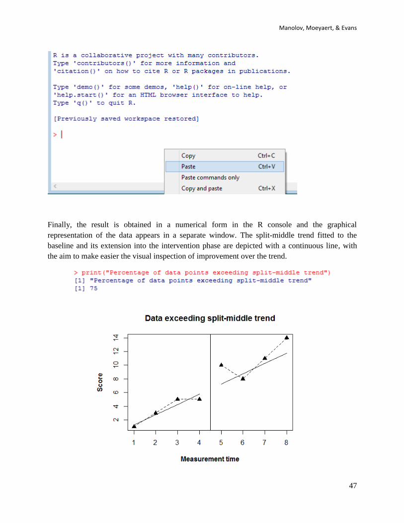
Finally, the result is obtained in a numerical form in the R console and the graphical
representation of the data appears in a separate window. The split-middle trend fitted to the
baseline and its extension into the intervention phase are depicted with a continuous line, with
the aim to make easier the visual inspection of improvement over the trend.

SCED analytical resources for applied researchers
48
4.7f How to interpret the results: In this case, the result of PEM-T is 75%, given that 3 of the 4
intervention phase scores are above the split-middle trend line that represents how the
measurements would have continued in absence of intervention effect.
Note that if we apply PEM-T to the same data as the remaining nonoverlap indices the result will
be the same as for the Percentage of data points exceeding the median, which does not control
for trend, but it will be different from the result for the Percentage of nonoverlapping corrected
data, which does control for trend. The reason for this difference between PEM-T and PNCD is
that the formed estimates baseline trend via the split-middle method, whereas the latter does it
through differencing.
Manolov, Moeyaert, & Evans
49
4.8a Name of the technique: Percentage of nonoverlapping corrected data (PNCD)
4.8b Authors and suggested readings: The PNCD was proposed by Manolov and Solanas (2009)
as a potential improvement over the PND. The authors offer the details for this procedure. The
procedure for controlling baseline trend is the same as for the Slope and level change technique.
4.8c Software that can be used: The PNCD can be calculated using R code created by the first
author of this tutorial (R. Manolov).
4.8d How to obtain the software:
The R code for estimating and projecting baseline trend is available at
https://dl.dropboxusercontent.com/s/8revawnfrnrttkz/PNCD.R
When the URL is open, the R code appears (or can be downloaded via
https://www.dropbox.com/s/8revawnfrnrttkz/PNCD.R?dl=0). It is a text file that can be opened
with a word processor such as Notepad. Only the part of the code marked below in blue has to be
changed.
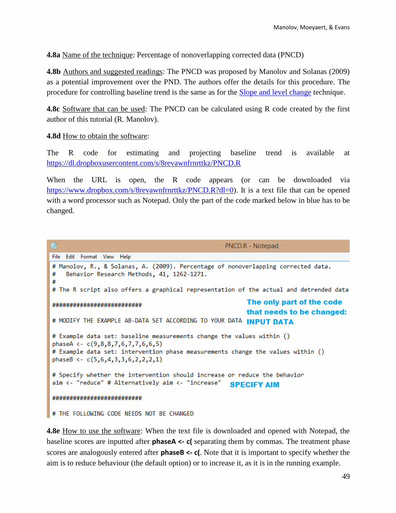
4.8e How to use the software: When the text file is downloaded and opened with Notepad, the
baseline scores are inputted after phaseA <- c( separating them by commas. The treatment phase
scores are analogously entered after phaseB <- c(. Note that it is important to specify whether the
aim is to reduce behaviour (the default option) or to increase it, as it is in the running example.

SCED analytical resources for applied researchers
50
After inputting the data and specifying the aim (“increase” or “decrease”), the whole code (the
part that was modified and the remaining part) is copied and pasted into the R console.
The result of running the code is a graphical representation of the original and detrended data, as
well as the value of the PNCD.

Manolov, Moeyaert, & Evans
51
4.8f How to interpret the results: The quantification obtained suggests that only one of the five
treatment detrended scores (20%) is greater than the best baseline detrended score (equal to 6).
Therefore, controlling for baseline trend implies a change in the result in comparison to the ones
presented above for the Nonoverlap of all pairs or the Percentage of nonoverlapping data.

SCED analytical resources for applied researchers
52
Chapter 5.
Chapter 5.
Percentage indices not quantifying overlap
Manolov, Moeyaert, & Evans
53
5.1a Name of the technique: Percentage zero data (PZD)
5.1b Authors and suggested readings: The PZD was discussed by Wolery, Busick, Reichow, and
Barton (2010). It is used as a complement to the Percentage of nonoverlapping data, given the
need to avoid a baseline reaching floor level (i.e., 0) yielding a PND equal to 0, which may not
always represent treatment effect correctly. Such use is illustrated by the meta-analysis
performed by Wehmeyer et al. (2006). The PZD is thus appropriate when the aim is to reduce
behaviour to zero.
5.1c Software that can be used: The first author of this tutorial (R. Manolov) has developed R
code that can be used to implement the index.
5.1d How to obtain the software: The R code can be downloaded via
https://www.dropbox.com/s/k57dj32gyit934g/PZD.R?dl=0. It is a text file that can be opened
with a word processor such as Notepad. Only the part of the code marked below in blue has to be
changed.
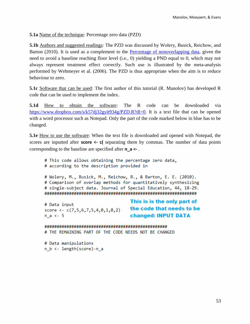
5.1e How to use the software: When the text file is downloaded and opened with Notepad, the
scores are inputted after score <- c( separating them by commas. The number of data points
corresponding to the baseline are specified after n_a <- .

SCED analytical resources for applied researchers
54
After inputting the data, the whole code (the part that was modified and the remaining part) is
copied and pasted into the R console.

Manolov, Moeyaert, & Evans
55
Finally, the result is obtained in a numerical form in the R console and the graphical
representation of the data appears in a separate window. The intervention scores equal to zero are
marked in red, in order to make easier the visual inspection of consecution of the best possible
result when the aim is to eliminate the target behaviour..
5.1f How to interpret the results: In this case, the result of PEM-T is 75%, given that 3 of the 4
intervention phase scores are above the split-middle trend line that represents how the
measurements would have continued in absence of intervention effect. A downward trend is
clearly visible in the graphical representation indicating a progressive effect of the intervention.
In case such an effect is considered desirable and an immediate abrupt change was not sought for
the result can be interpreted as suggesting an effective intervention.

SCED analytical resources for applied researchers
56
5.2a Name of the technique: Percentage reduction data (PRD) and Mean baseline reduction
(MBLR).
5.2b Authors and suggested readings: The percentage reduction data was described by Wendt
(2009), who attributes it Campbell (2004), as a quantification of the difference between the
average of the last three baseline measurements and the last three intervention phase
measurements (relative to the average of last three baseline measurements). It is referred to as
“Percentage change index” by Hershberger, Wallace, Green, and Marquis (1999), who also
provide a formula for estimating the index variance. Campbell (2004) himself uses an index
called Mean baseline reduction, in which the quantification is carried out using all measurements
and not only the last three in each phase. We here provide code for both of the mean baseline
reduction and percentage reductiondata in order to compare their results. Despite their names, the
indices are also applicable to situations in which an increase in the target behaviour is intended.
5.2c Software that can be used: The first author of this tutorial (R. Manolov) has developed R
code that can be used to implement the indices.
5.2d How to obtain the software: The R code can be downloaded via
https://www.dropbox.com/s/wt1qu6g7j2ln764/MBLR.R?dl=0. It is a text file that can be opened
with a word processor such as Notepad. Only the part of the code marked below in blue has to be
changed.
5.2e How to use the software: When the text file is downloaded and opened with Notepad, the
scores are inputted after score <- c( separating them by commas. The number of data points
corresponding to the baseline are specified after n_a <- . It is important to specify whether the
aim is to increase or reduce behaviour, with the text written after aim <- within quotation marks.
Manolov, Moeyaert, & Evans
57
After inputting the data and specifying the aim (“increase” or “decrease”), the whole code (the
part that was modified and the remaining part) is copied and pasted into the R console.
SCED analytical resources for applied researchers
58
Finally, the result is obtained in a numerical form in the R console and the graphical
representation of the data appears in a separate window.
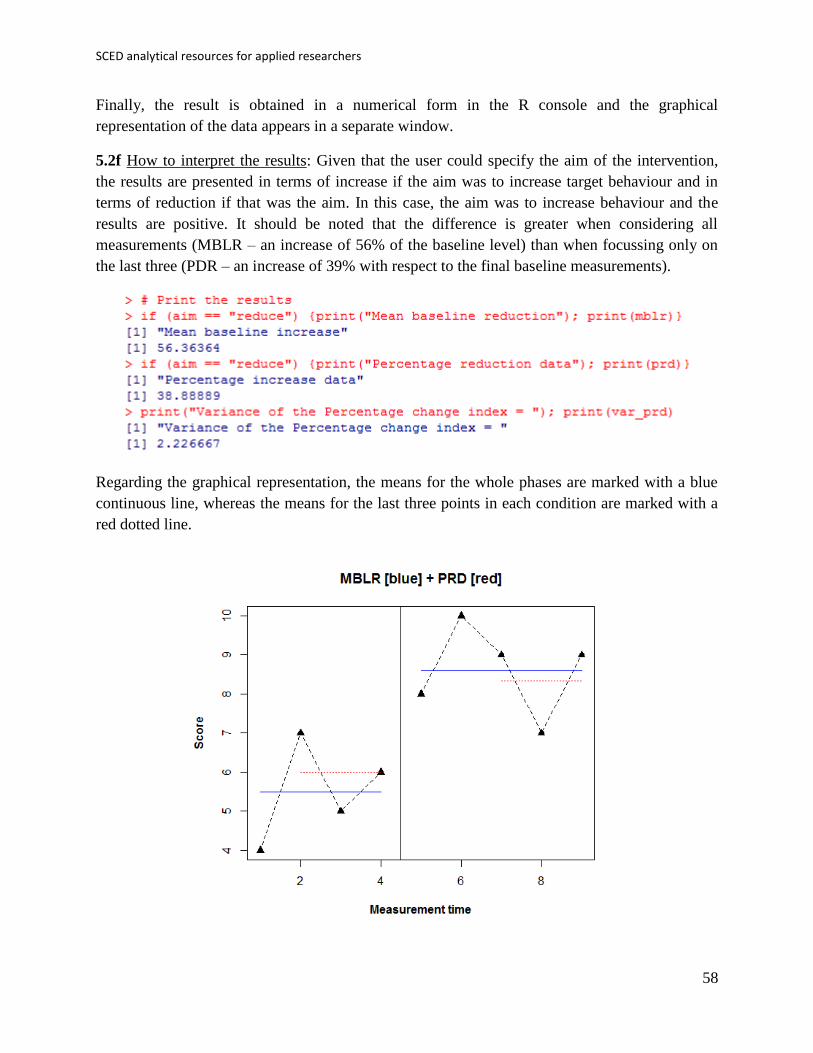
5.2f How to interpret the results: Given that the user could specify the aim of the intervention,
the results are presented in terms of increase if the aim was to increase target behaviour and in
terms of reduction if that was the aim. In this case, the aim was to increase behaviour and the
results are positive. It should be noted that the difference is greater when considering all
measurements (MBLR – an increase of 56% of the baseline level) than when focussing only on
the last three (PDR – an increase of 39% with respect to the final baseline measurements).
Regarding the graphical representation, the means for the whole phases are marked with a blue
continuous line, whereas the means for the last three points in each condition are marked with a
red dotted line.

Manolov, Moeyaert, & Evans
59
Given that for PRD the variance can be estimated using Hershberger et al.’s (1999) formula
𝑉𝑎𝑟(𝑃𝑅𝐷) =1
𝑠𝐴2 (
𝑠𝐴2 +𝑠𝐵
2
3+
(𝑥𝐴̅̅ ̅̅ −𝑥𝐵̅̅ ̅̅ )2
2), we present this result here, as it is also provided by the
code.
The inverse of the variance of the index can be used as weight when integrating meta-
analytically the results of several AB-comparisons.

SCED analytical resources for applied researchers
60
Chapter 6.
Unstandardized indices and
their standardized versions
Manolov, Moeyaert, & Evans
61
6.1a Name of the technique: Ordinary least squares (OLS) regression analysis
6.1b Authors and suggested readings: OLS regression analysis is a classical statistical technique.
The bases for modelling single-case data via regression can be consulted in Huitema and
McKean (2000), although the discussion in Moeyaert, Ugille, Ferron, Beretvas, & Van den
Noortgate (2014) about multilevel models is also applicable (i.e., multilevel analysis is an
extension of the single-level OLS). Further information is provided by Gorsuch (1983) and
Swaminathan, Rogers, Horner, Sugai, and Smolkowski (2014) and Swaminathan, Rogers, and
Horner (2014). In the current section we focus on the unstandardized difference between
conditions as presented by Swaminathan and colleagues and referred to as δAB. It is the results of
the difference between intercept and slopes of two regression lines, one fitted to each of the
phases using the time variable (1, 2, …, nA and 1, 2, …, nB, for baseline and intervention phase,
respectively) as a predictor. Standardizing is achieved by dividing the raw difference by the
pooled standard deviation of the residuals from the two separate regressions.
6.1c Software that can be used: Regression analysis with the appropriate variables representing
the phase, time, and the interaction between the two can be applied using conventional statistical
packages such as SPSS (IBM Corp., 2012), apart from using the R-Commander. However,
although the main results of OLS regression can easily be obtained with these menu-driven
options, the unstandardized and standardized differences require further computation. For that
purpose the first author of this document (R. Manolov) has developed R code carrying out the
regression analysis and providing the quantification.
6.1d How to obtain the software: The R code for computing the OLS-based unstandardized
difference is available at https://www.dropbox.com/s/v0see3bto1henod/OLS.R?dl=0. It is a text
file that can be opened with a word processor such as Notepad. Only the part of the code marked
below in blue has to be changed.
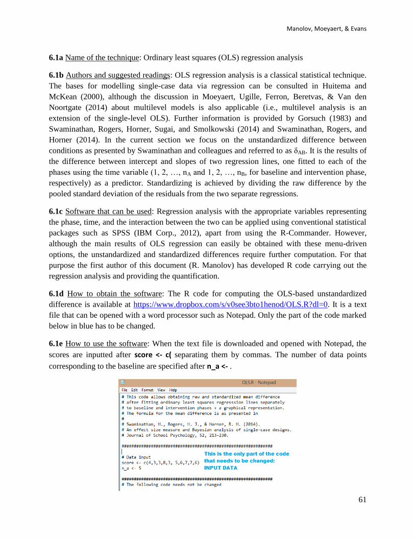
6.1e How to use the software: When the text file is downloaded and opened with Notepad, the
scores are inputted after score <- c( separating them by commas. The number of data points
corresponding to the baseline are specified after n_a <- .
SCED analytical resources for applied researchers
62
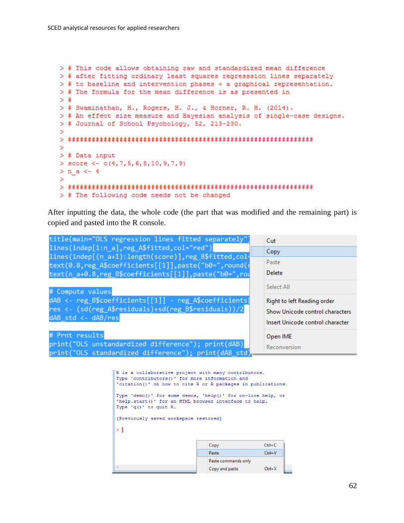
After inputting the data, the whole code (the part that was modified and the remaining part) is
copied and pasted into the R console.
Manolov, Moeyaert, & Evans
63
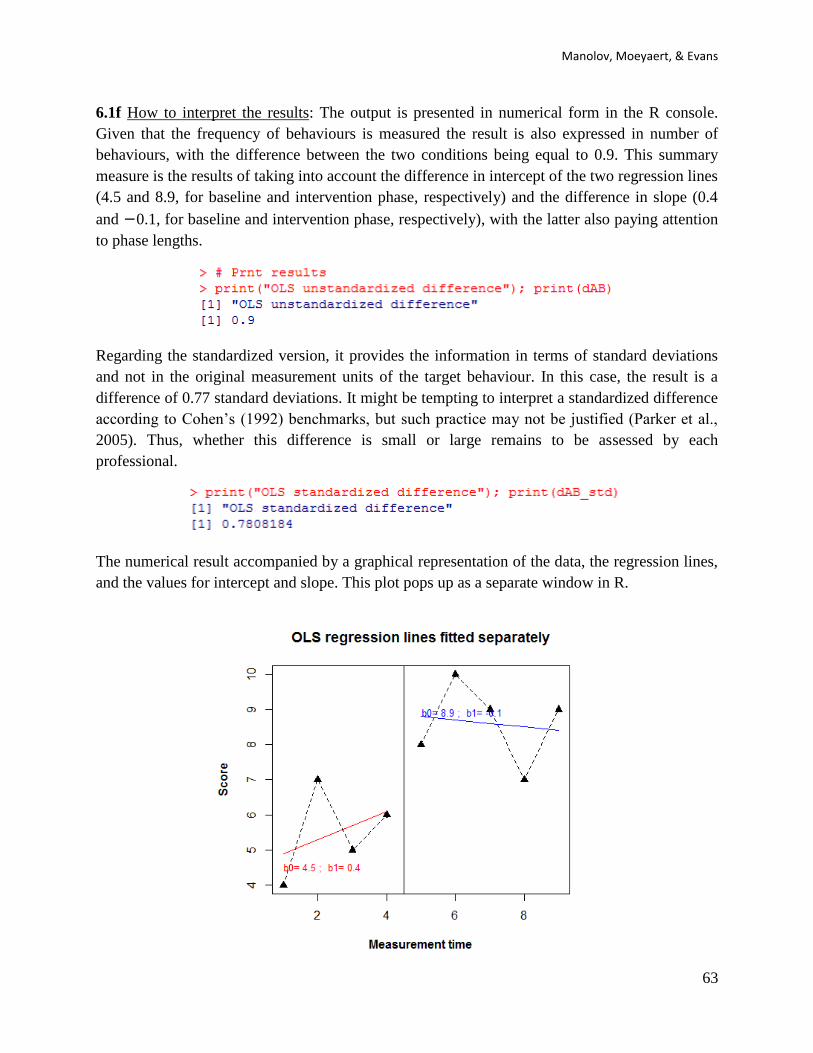
6.1f How to interpret the results: The output is presented in numerical form in the R console.
Given that the frequency of behaviours is measured the result is also expressed in number of
behaviours, with the difference between the two conditions being equal to 0.9. This summary
measure is the results of taking into account the difference in intercept of the two regression lines
(4.5 and 8.9, for baseline and intervention phase, respectively) and the difference in slope (0.4
and −0.1, for baseline and intervention phase, respectively), with the latter also paying attention
to phase lengths.
Regarding the standardized version, it provides the information in terms of standard deviations
and not in the original measurement units of the target behaviour. In this case, the result is a
difference of 0.77 standard deviations. It might be tempting to interpret a standardized difference
according to Cohen’s (1992) benchmarks, but such practice may not be justified (Parker et al.,
2005). Thus, whether this difference is small or large remains to be assessed by each
professional.
The numerical result accompanied by a graphical representation of the data, the regression lines,
and the values for intercept and slope. This plot pops up as a separate window in R.

SCED analytical resources for applied researchers
64
6.2a Name of the technique: Piecewise regression analysis
6.2b Authors and suggested readings: The piecewise regression approach, suggested by Center,
Skiba and Casey (1985-1986), allows estimating simultaneously the initial baseline level (at the
start of the baseline condition), the trend during the baseline level, and the changes in level and
slope due to the intervention. In order to get estimates of these 4 parameters of interest, attention
should be paid to parameterization of the model (and centring of the time variables) as this
determines the interpretation of the coefficients. This is discussed in detail in Moeyaert, Ugille,
Ferron, Beretvas, and Van den Noortgate (2014). Also, autocorrelation and heterogeneous
within-case variability can be modelled (Moeyaert et al., 2014). In the current section we focus
on the unstandardized estimates of the initial baseline level, the trend during the baseline, the
immediate treatment effect, the treatment effect on the time trend, and the within-case residual
variance estimate. We acknowledge that within one study, multiple cases can be involved and as
a consequence standardization is needed in order to make a fair comparison of the results across
cases. Standardization for continuous outcomes was proposed by Van den Noortgate and
Onghena (2008) and validated using computer-intensive simulation studies by Moeyaert, Ugille,
Ferron, Beretvas, and Van den Noortgate (2013). The standardization method they recommend
requires dividing the raw scores by the estimated within-case residual standard deviation
obtained by conducting a piecewise regression equation per case. The within-case residual
standard deviation reflects the difference in how the dependent variable is measured (and thus
dividing the original raw scores by this variability provides a method of standardizing the
scores).
6.2c Software that can be used: Regression analysis with the appropriate variables representing
the phase, time, and the interaction between phase and centred time can be applied using
conventional statistical packages such as SPSS (IBM Corp., 2012), apart from using the R-
Commander. However, the R code for simple OLS regression needed an adaptation and therefore
code has been developed by M. Moeyaert and R. Manolov.
6.2d How to obtain the software: The R code for computing the piecewise regression equation
coefficients is available at https://www.dropbox.com/s/bt9lni2n2s0rv7l/Piecewise.R?dl=0.
Despite its extension .R, it is a text file that can be opened with a word processor such as
Notepad..
6.2e How to use the software: A data file should be created with the following structure: the first
column includes a Time variable representing the measurement occasion; the second column
includes a Score variable with the measurements obtained; the third column includes a dummy
variable for Phase (0=baseline, 1=treatment), the fourth column represent the recoded Time1
variable (Time = 0 at the start of the baseline phase), the fifth column represent the recoded
Time2 variable (Time = 0 at the start of the treatment phase).
Before we proceed with the code a comment on design matrices, in general, and centring, in
particular, is necessary. In order to estimate both changes in level (i.e., is there an immediate

Manolov, Moeyaert, & Evans
65
treatment effect?) and treatment effect on the slope, we add centred time variables. How you
centre depends on your research interested and how you define the ‘treatment effect’. For
instance, if we centre time in the interaction effect around the first observation of the treatment
phase, then we are interested in the immediate treatment effect (i.e., the change in outcome score
between the first measurement of the treatment phase and the projected value of the last
measurement of the baseline phase). If we centre time in the interaction around the fourth
observation in the treatment phase, than the treatment effect refers to the change in outcome
score between the fourth measurement occasion of the treatment phase and the projected last
measurement occasion of the baseline phase. More detail about design matrix specification is
available in Moeyaert, Ugille, Ferron, Beretvas, and Van Den Noortgate (2014).
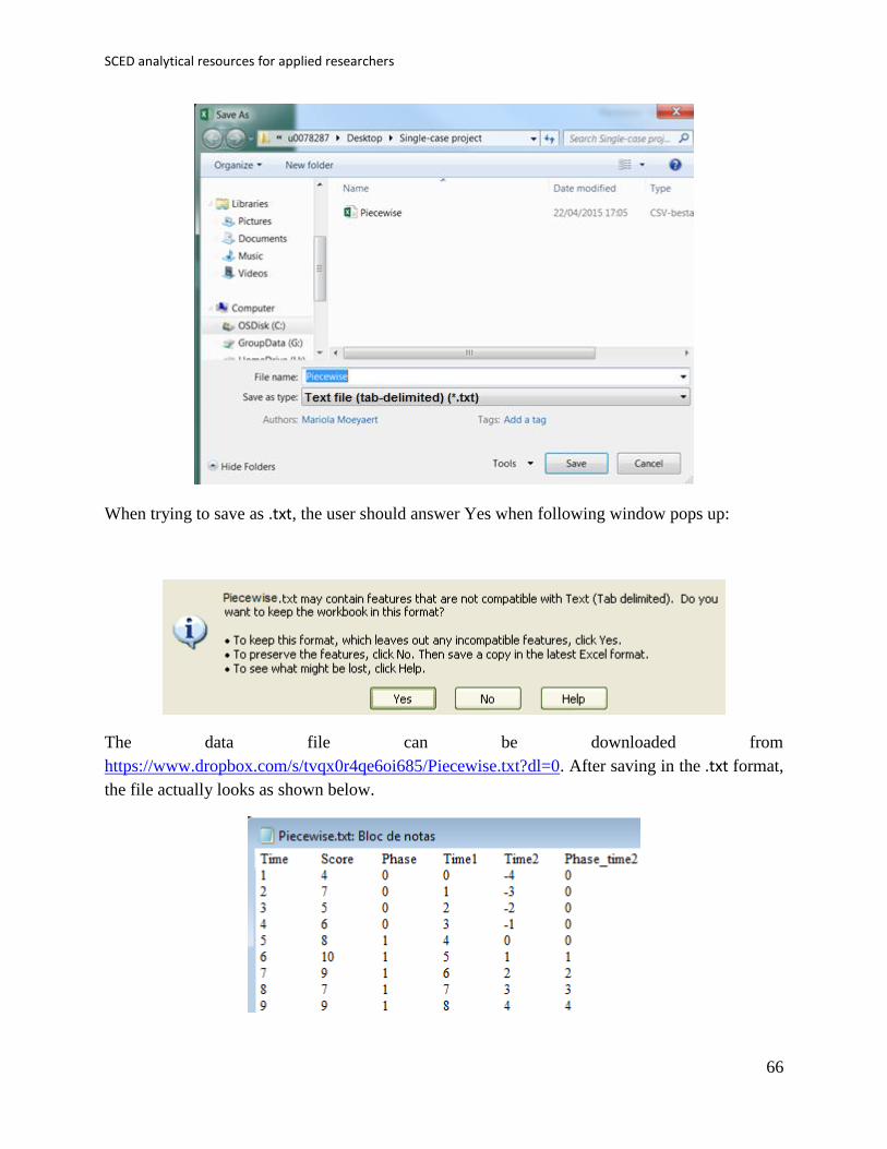
This data file can be created in Excel and should be saved as a tab-delimited file with the .txt
extension.
SCED analytical resources for applied researchers
66
When trying to save as .txt, the user should answer Yes when following window pops up:
The data file can be downloaded from
https://www.dropbox.com/s/tvqx0r4qe6oi685/Piecewise.txt?dl=0. After saving in the .txt format,
the file actually looks as shown below.
Manolov, Moeyaert, & Evans
67
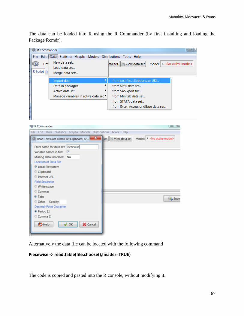
The data can be loaded into R using the R Commander (by first installing and loading the
Package Rcmdr).
Alternatively the data file can be located with the following command
Piecewise <- read.table(file.choose(),header=TRUE)
The code is copied and pasted into the R console, without modifying it.

SCED analytical resources for applied researchers
68
Numerical values for the initial baseline level (Intercept), the trend during the baseline (Time1),
the immediate treatment effect (Phase) and the change in slope (Phase_time2); whereas a
graphical representation of the data pops up in a separate window.
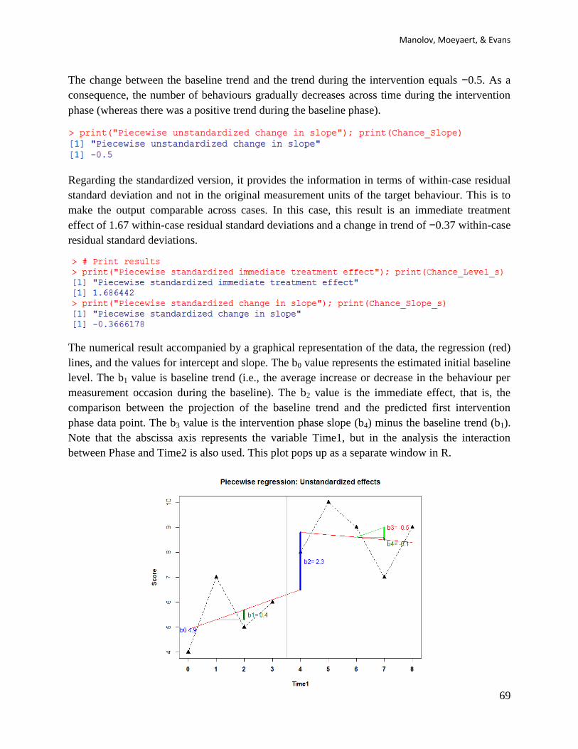
6.2f How to interpret the results: The output is presented in numerical form in the R console. The
dependent variable is the frequency of behaviours. The immediate treatment effect of the
intervention (defined as the difference between the first outcome score in the treatment and the
last outcome score in the baseline) equals 2.3. This means that the treatment induced
immediately an increase in the number of behaviours.
Manolov, Moeyaert, & Evans
69
The change between the baseline trend and the trend during the intervention equals −0.5. As a
consequence, the number of behaviours gradually decreases across time during the intervention
phase (whereas there was a positive trend during the baseline phase).
Regarding the standardized version, it provides the information in terms of within-case residual
standard deviation and not in the original measurement units of the target behaviour. This is to
make the output comparable across cases. In this case, this result is an immediate treatment
effect of 1.67 within-case residual standard deviations and a change in trend of −0.37 within-case
residual standard deviations.
The numerical result accompanied by a graphical representation of the data, the regression (red)
lines, and the values for intercept and slope. The b0 value represents the estimated initial baseline
level. The b1 value is baseline trend (i.e., the average increase or decrease in the behaviour per
measurement occasion during the baseline). The b2 value is the immediate effect, that is, the
comparison between the projection of the baseline trend and the predicted first intervention
phase data point. The b3 value is the intervention phase slope (b4) minus the baseline trend (b1).
Note that the abscissa axis represents the variable Time1, but in the analysis the interaction
between Phase and Time2 is also used. This plot pops up as a separate window in R.
SCED analytical resources for applied researchers
70
In addition to the analysis of the raw single-case data, the code allows standardizing the data.
The standardized outcome scores are obtained by dividing each raw outcome score by the
estimated within-case residual obtained by conducting a piecewise regression analysis. More
detail about this standardization method is described in Van den Noortgate and Onghena (2008).
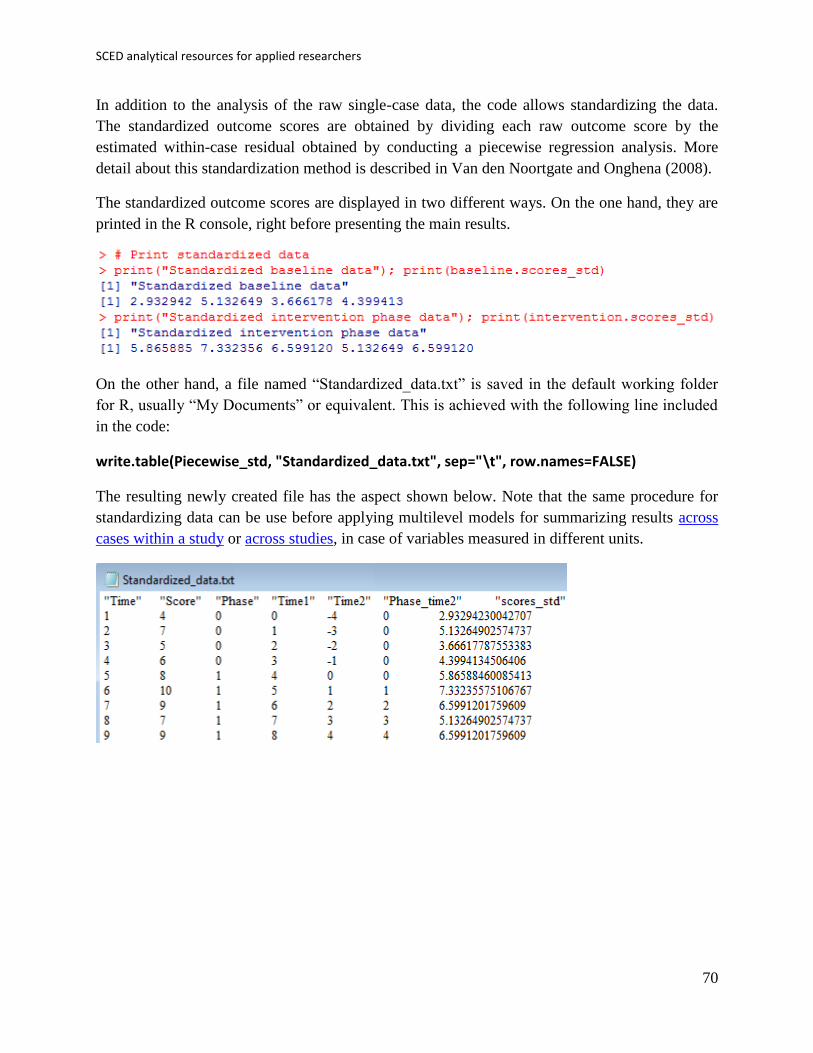
The standardized outcome scores are displayed in two different ways. On the one hand, they are
printed in the R console, right before presenting the main results.
On the other hand, a file named “Standardized_data.txt” is saved in the default working folder
for R, usually “My Documents” or equivalent. This is achieved with the following line included
in the code:
write.table(Piecewise_std, "Standardized_data.txt", sep="\t", row.names=FALSE)
The resulting newly created file has the aspect shown below. Note that the same procedure for
standardizing data can be use before applying multilevel models for summarizing results across
cases within a study or across studies, in case of variables measured in different units.
Manolov, Moeyaert, & Evans
71
6.3a Name of the technique: Generalized least squares (GLS) regression analysis
6.3b Authors and suggested readings: GLS regression analysis is a classical statistical technique
and an extension of ordinary least squares in order to deal with data that do not meet the
assumptions of the latter. The bases for modelling single-case data via regression can be
consulted in Huitema and McKean (2000), although the discussion in Moeyaert, Ugille, Ferron,
Beretvas, & Van den Noortgate (2014) about multilevel models is also applicable. Gorsuch
(1983) was among the first authors to suggest how regression analysis can deal with
autocorrelation and in his proposal the result is expressed as an R-squared value. Swaminathan,
Rogers, Horner, Sugai, and Smolkowski (2014) and Swaminathan, Rogers, and Horner (2014)
have proposed a GLS procedure for obtaining the unstandardized difference between two
conditions. Standardizing is achieved by dividing the raw difference by the pooled standard
deviation of the residuals from the two separate regressions. In this case, the residual is either
based on the regressions with original or with transformed data.
In the current section we deal with two different options. Both of them are based on
Swaminathan and colleagues’ proposal for fitting separately two regression lines to the baseline
and intervention phase conditions, with the time variable (1, 2, …, nA and 1, 2, …, nB, for
baseline and intervention phase, respectively) as a predictor. In both of them the results
quantifies the difference between intercept and slopes of the two regression lines. However, in
the first one, autocorrelation is dealt with according to Gorsuch’s (1983) autoregressive analysis
– the residuals are tested for autocorrelation using Durbin and Watson’s (1951, 1971) test and the
data are transformed only if this test yields statistically significant results. In the second one, the
data are transformed directly according to the Cochran-Orcutt estimate of the autocorrelation in
the residuals, as suggested by Swaminathan, Rogers, Horner, Sugai, and Smolkowski (2014). In
both case, the transformation is performed as detailed in the two papers by Swaminathan and
colleagues, already referenced.
6.3c Software that can be used: Although OLS regression analysis with the appropriate variables
representing the phase, time, and the interaction between the two can be applied using
conventional statistical packages such as SPSS (IBM Corp., 2012), apart from using the R-
Commander, GLS regression is less straightforward, especially in the need to deal with
autocorrelation. For that purpose the first author of this document (R. Manolov) has developed R
code carrying out the GLS regression analysis and providing the quantification.
6.3d How to obtain the software: The R code for computing the GLS-based unstandardized
difference is available at https://www.dropbox.com/s/dni9qq5pqi3pc23/GLS.R?dl=0. It is a text
file that can be opened with a word processor such as Notepad. Only the part of the code marked
below in blue has to be changed. The code requires using the lmtest package from R and,
therefore, it has to be installed and afterwards loaded. Installing can be achieved using the Install
Package(s) option from the Packages menu

SCED analytical resources for applied researchers
72
6.3e How to use the software: When the text file is downloaded and opened with Notepad, the
scores are inputted after score <- c( separating them by commas. The number of data points
corresponding to the baseline are specified after n_a <- . In order to choose how to handle
autocorrelation, the user can specify whether to transform data only if autocorrelation is
statistically significant (transform <- “ifsig”) or do it direcly using the Cochran-Orcutt procedure
(transform <- “directly”). Note that the code require(lmtest) loads the previously installed
package called lmtest.

Manolov, Moeyaert, & Evans
73
For instant, using the “ifsig” specification and illustrating the text that appears when the lmtest
package is loaded:
Alternatively, using the “directly” specification:
After inputting the data and choosing the procedure, the whole code (the part that was modified
and the remaining part) is copied and pasted into the R console.
SCED analytical resources for applied researchers
74
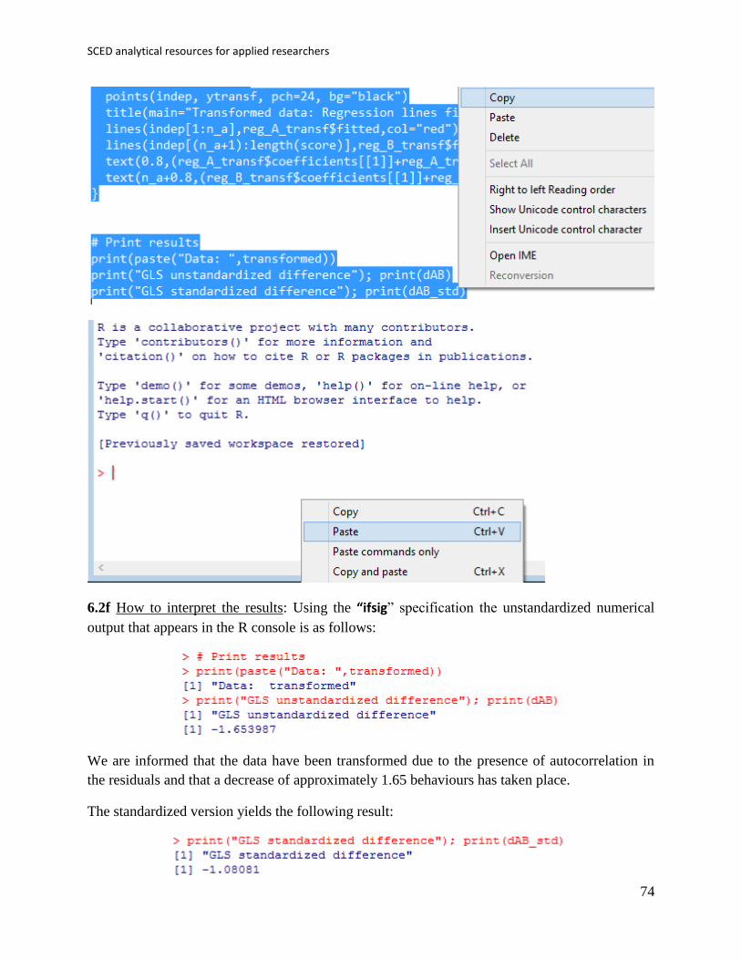
6.2f How to interpret the results: Using the “ifsig” specification the unstandardized numerical
output that appears in the R console is as follows:
We are informed that the data have been transformed due to the presence of autocorrelation in
the residuals and that a decrease of approximately 1.65 behaviours has taken place.
The standardized version yields the following result:
Manolov, Moeyaert, & Evans
75
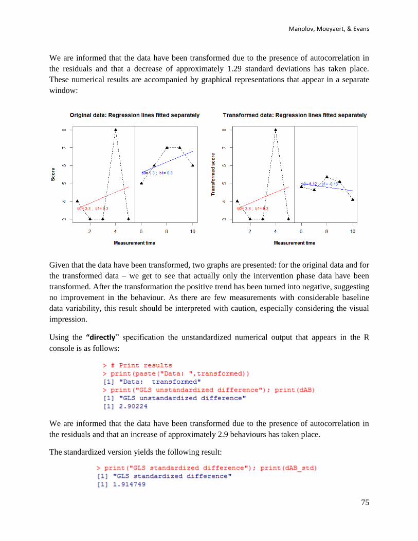
We are informed that the data have been transformed due to the presence of autocorrelation in
the residuals and that a decrease of approximately 1.29 standard deviations has taken place.
These numerical results are accompanied by graphical representations that appear in a separate
window:
Given that the data have been transformed, two graphs are presented: for the original data and for
the transformed data – we get to see that actually only the intervention phase data have been
transformed. After the transformation the positive trend has been turned into negative, suggesting
no improvement in the behaviour. As there are few measurements with considerable baseline
data variability, this result should be interpreted with caution, especially considering the visual
impression.
Using the “directly” specification the unstandardized numerical output that appears in the R
console is as follows:
We are informed that the data have been transformed due to the presence of autocorrelation in
the residuals and that an increase of approximately 2.9 behaviours has taken place.
The standardized version yields the following result:
SCED analytical resources for applied researchers
76
We are informed that the data have been transformed due to the presence of autocorrelation in
the residuals and that an increase of approximately 1.9 standard deviations has taken place.
These numerical results are accompanied by graphical representations that appear in a separate
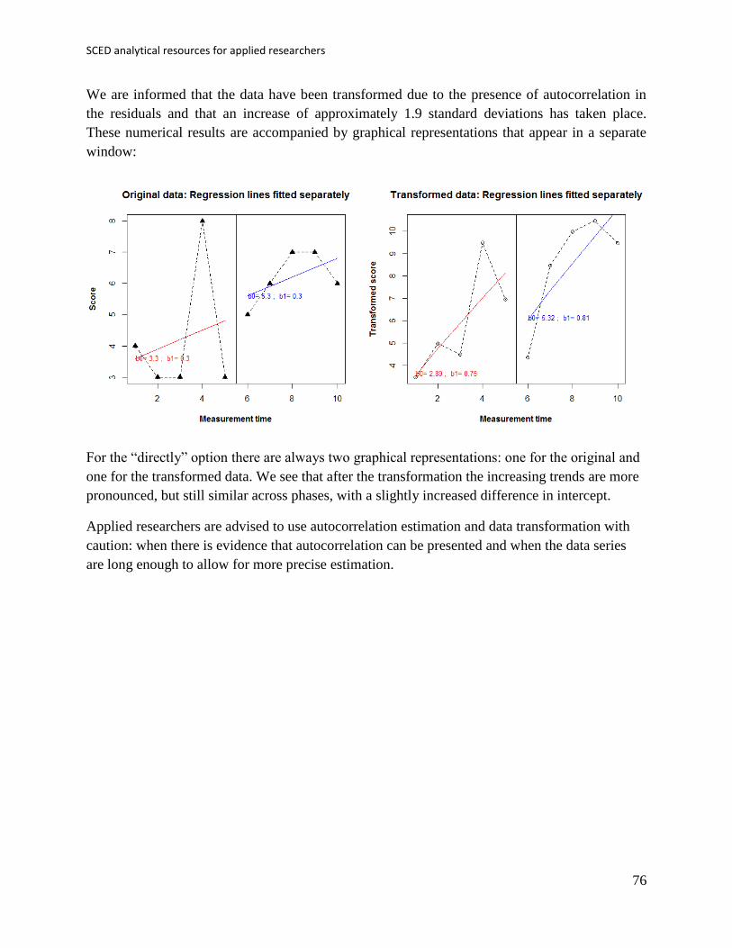
window:
For the “directly” option there are always two graphical representations: one for the original and
one for the transformed data. We see that after the transformation the increasing trends are more
pronounced, but still similar across phases, with a slightly increased difference in intercept.
Applied researchers are advised to use autocorrelation estimation and data transformation with
caution: when there is evidence that autocorrelation can be presented and when the data series
are long enough to allow for more precise estimation.

Manolov, Moeyaert, & Evans
77
6.4a Name of the technique: Classical mean difference indices.
6.4b Authors and suggested readings: The most commonly used index in between-group studies,
for quantifying the strength of relationship between a dichotomous and a quantitative variable is
Cohen’s (1992) d, generally using the pooled standard deviation in the denominator. Glass’ Δ
(Glass, McGaw, & Smith, 1981) is an alternative index using the control group variability in the
denominator. These indices have also been discussed in the SCED context – a discussion on their
applicability can be found in Beretvas and Chung (2008). Regarding the unstandardized version,
it is just the raw mean difference between the conditions and it is suitable when the mean can be
considered an appropriate summary of the measurements (e.g., when the data are not excessively
variable and do not present trends) and when the behaviour is measured in clinically meaningful
terms
6.4c Software that can be used: These two classical standardized indices are implemented in the
SCMA option of SCDA plug-in for R Commander (Bulté, 2013; Bulté & Onghena, 2012). The
same plug-in offers the possibility to compute raw mean differences via the SCRT option.
6.4d How to obtain the software: The steps are as described above for the visual analysis and for
obtaining the PND.
First, open R.
Second, install RcmdrPlugin.SCDA using the option Install package(s) from the menu Packages.

SCED analytical resources for applied researchers
78
Third, load RcmdrPlugin.SCDA in the R console (directly; this loads also R-Commander) or in
R-Commander (first loading Rcmdr and then the plug-in).
6.4e How to use the software:
First, the data file needs to be created (first column: phase; second column: scores) and imported
into R-Commander.
At this stage, if a .txt file is used it is important to specify that the file does not contain column
headings – the Variable names in file option should be unmarked. The dataset can be downloaded
from https://www.dropbox.com/s/9gc44invil0ft17/1%20SCDA.txt?dl=0.
Manolov, Moeyaert, & Evans
79
Second, a raw mean difference can be obtained via the Analyze your data sub-option of the SCRT
option of the SCDA menu.
The type of design and type of index are selected in the window that pops up. Among the options
we chose B phase mean minus A phase mean, given that an increase in the behaviour is
expected. It is also possible to compute the mean difference the other way around or to obtain an
absolute mean difference.

SCED analytical resources for applied researchers
80
The raw mean difference is printed in the output (bottom) window of the R-Commander:
Third, the standardized mean difference can be obtained via the Calculate effect size sub-option
of the SCMA option of the SCDA menu. The type of design and type of index are selected in the
window that pops up.
When the “Pooled standardized mean difference” is chosen, the result is Cohen’s d.

Manolov, Moeyaert, & Evans
81
When the “Standardized mean difference” is chosen, the result is Glass’ ∆.
6.4f How to interpret the results: First of all, it has to be mentioned that the two standardized
mean differences presented in the current section were not specifically created for single-case
data. Nevertheless, they could be preferred over the SCED-specific proposal in case the
researcher is willing to obtain a quantification for each comparison between a pair of conditions,
given that the latter offers an overall quantification across several comparisons and several
participants.
Second, both Cohen’s d and Glass’ ∆ can be used when there is no improving baseline trend.
Moreover, given that Cohen’s d takes into account the variability in the intervention phase, it is
to be used only when the intervention data show no trend, as it can be confounded with
variability.
Third, the values obtained in the current example suggest a large treatment effect, given that the
differences between conditions are greater than two standard deviations. An increase of 3
behaviours after the intervention, as shown by the raw mean difference, could also suggest
effectiveness, but it depends on the behaviour being measured and on the aims of the treatment.

SCED analytical resources for applied researchers
82
6.5a Name of the technique: SCED-specific mean difference indices.
6.5b Authors and suggested readings: Hedges, Pustejovsky, and Shadish (2012; 2013) developed
a standardized mean difference index specifically designed for SCED data, with the aim of
making it comparable to Cohen’s d. The standard deviation takes into account both within-
participant and between-participants variability. A less mathematical discussion is provided by
Shadish et al. (2014).
In contrast with the standardized mean differences borrowed from between-groups designs, the
indices included in this require datasets with several participants so that within-case and
between-cases variances can be computed. This is why we will use two new datasets. The first of
them corresponds to the ABAB design used by Coker, Lebkicher, Harris, and Snape (2009) and
it can be downloaded from https://www.dropbox.com/s/ueu8i5uyiir0ild/Coker_data.txt?dl=0.
The second one to the multiple-baseline design used by Boman, Bartfai, Borell, Tham, and
Hemmingsson, (2010) and it can be downloaded from
https://www.dropbox.com/s/mou9rvx2prwgfrz/Boman_data.txt?dl=0. We have included two
different data sets, given that the way the data should be organized is different for the different
design structures.
6.5c Software that can be used: Macros for SPSS have been developed and are available from
William Shadish’s website http://faculty.ucmerced.edu/wshadish/software/software-meta-
analysis-single-case-design. However, here we focus once again on the open source R and the
code and scdhlm package available at http://blogs.edb.utexas.edu/pusto/software/ (James
Pustejovsky’s web page).
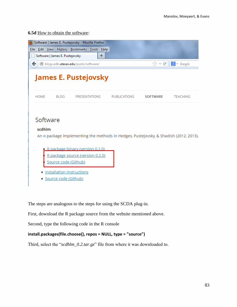
Manolov, Moeyaert, & Evans
83
6.5d How to obtain the software:
The steps are analogous to the steps for using the SCDA plug-in.
First, download the R package source from the website mentioned above.
Second, type the following code in the R console
install.packages(file.choose(), repos = NULL, type = "source")
Third, select the “scdhlm_0.2.tar.gz” file from where it was downloaded to.
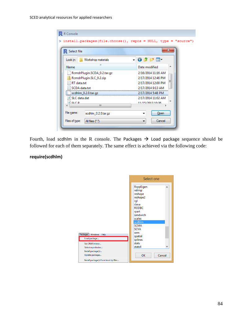
SCED analytical resources for applied researchers
84
Fourth, load scdhlm in the R console. The Packages Load package sequence should be
followed for each of them separately. The same effect is achieved via the following code:
require(scdhlm)
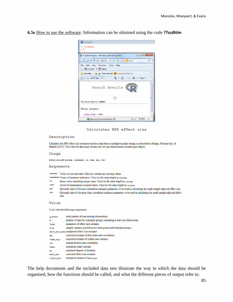
Manolov, Moeyaert, & Evans
85
6.5e How to use the software: Information can be obtained using the code ??scdhlm
The help documents and the included data sets illustrate the way in which the data should be
organised, how the functions should be called, and what the different pieces of output refer to.

SCED analytical resources for applied researchers
86
Regarding the structure of the data file for a replicated ABAB design, as the one used by Coker
et al. (2009), the necessary columns are as follows: “case” – specify an identifier for each of the
m replications of the ABAB design with number 1, 2, …, m; “outcome” – the measurements
obtained; “time” – the measurement occasions for each ABAB design; “phase” – the order of the
comparison in the ABAB design (first or second, or kth in an (AB)k design); and “treatment” –
indicates whether the condition is baseline (A) or treatment (B).

Manolov, Moeyaert, & Evans
87
Regarding the structure of the data file for a multiple-baseline design we present below the
example Boman et al.’s (2010) data with the columns as follows: “case” – specify an identifier
for each of the m tiers in the design with numbers 1, 2, …, m; “outcome” – the measurements
obtained; “time” – the measurement occasions for each tier; and “treatment” – indicates whether
the condition is baseline (0) or treatment (1).

SCED analytical resources for applied researchers
88
Second, the following two lines of code are pasted into the R console in order to read the data
and obtain the results for the replicated ABAB design and Coker et al.’s (2009) data. Actually,
this code would work for any replicated ABAB data, given that Coker is only a name given to
the dataset in order to identify the necessary columns include measurements and measurement
occasions, phases, comparisons and cases. In case the user wants to identify his/her data set s/he
can do so changing Coker for any other meaningful name, but, strictly speaking it is not
necessary.
Coker <- read.table(file.choose(),header=TRUE)
effect_size_ABk(Coker$outcome, Coker$treatment,Coker$case,Coker$phase, Coker$time)
Third, the results are obtained after the second line of code is executed. We offer a description of
the main pieces of output. It should be noted that an unstandardized version of the index is also
available, apart from the standardized versions.
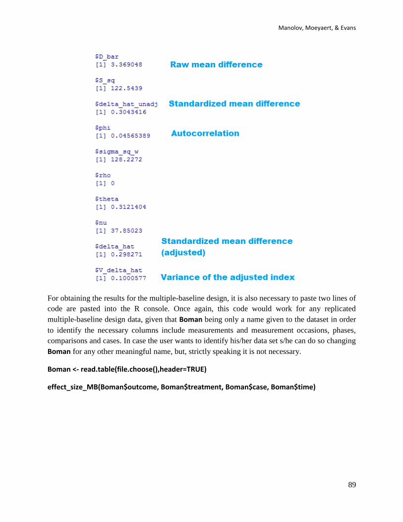
Manolov, Moeyaert, & Evans
89
For obtaining the results for the multiple-baseline design, it is also necessary to paste two lines of
code are pasted into the R console. Once again, this code would work for any replicated
multiple-baseline design data, given that Boman being only a name given to the dataset in order
to identify the necessary columns include measurements and measurement occasions, phases,
comparisons and cases. In case the user wants to identify his/her data set s/he can do so changing
Boman for any other meaningful name, but, strictly speaking it is not necessary.
Boman <- read.table(file.choose(),header=TRUE)
effect_size_MB(Boman$outcome, Boman$treatment, Boman$case, Boman$time)

SCED analytical resources for applied researchers
90
The results are obtained after the second line of code is executed. We offer a description of the
main pieces of output.

Manolov, Moeyaert, & Evans
91
6.5d How to interpret the results: Regarding the Coker et al. (2009) data, the value of the
adjusted standardized mean difference (0.29: an increase of 0.29 standard deviations) indicates a
small effect. In this case, we are using Cohen’s (1992) benchmarks, given that Hedges and
colleagues (2012, 2013) state that this index is comparable to the between-groups version. The
raw index (3.3) suggests that on average there are three more motor behaviours after the
intervention.
For the Boman et al. (2010) data there is a medium effect: a reduction 0.66 standard deviations.
The raw index (−1.6) suggests an average reduction of more than one and a half events missed
by the person with the memory problems.
If we looked to the variance indicators, we could see that the d-statistic for the Boman et al. data
with have a greater weight than the one for the Coker et al. data, given the smaller variance.

SCED analytical resources for applied researchers
92
6.6a Name of the technique: Mean phase difference (MPD)
6.6b Authors and suggested readings: The MPD was proposed and tested by Manolov and
Solanas (2013a). The authors offer the details for this procedure. A critical review of the
technique is provided by Swaminathan, Rogers, Horner, Sugai, and Smolkowski (2014). A
modified version by Manolov and Rochat (2015) is described also in the tutorial.
6.6c Software that can be used: The MPD can be implemented via an R code developed by R.
Manolov
6.6d How to obtain the software: The R code for computing MPD is available at
https://dl.dropboxusercontent.com/s/nky75oh40f1gbwh/MPD.R
When the URL is open, the R code appears (or can be downloaded from
https://www.dropbox.com/s/nky75oh40f1gbwh/MPD.R?dl=0). It is a text file that can be opened
with a word processor such as Notepad. Only the part of the code marked below in blue has to be
changed, that is, the user has to input the scores for the baseline and treatment phases separately.
6.6e How to use the software:
When the text file is downloaded and opened with Notepad, the baseline scores are inputted after
baseline <- c( separating them by commas. The treatment phase scores are analogously entered
after treatment <- c(.

Manolov, Moeyaert, & Evans
93
After inputting the data, the whole code (the part that was modified and the remaining part) is
copied and pasted into the R console.
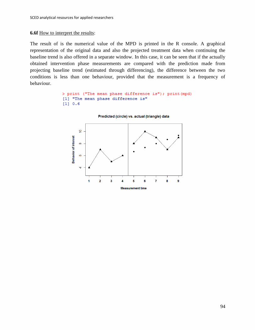
SCED analytical resources for applied researchers
94
6.6f How to interpret the results:
The result of is the numerical value of the MPD is printed in the R console. A graphical
representation of the original data and also the projected treatment data when continuing the
baseline trend is also offered in a separate window. In this case, it can be seen that if the actually
obtained intervention phase measurements are compared with the prediction made from
projecting baseline trend (estimated through differencing), the difference between the two
conditions is less than one behaviour, provided that the measurement is a frequency of
behaviour.
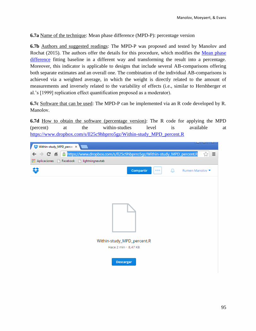
Manolov, Moeyaert, & Evans
95
6.7a Name of the technique: Mean phase difference (MPD-P): percentage version
6.7b Authors and suggested readings: The MPD-P was proposed and tested by Manolov and
Rochat (2015). The authors offer the details for this procedure, which modifies the Mean phase
difference fitting baseline in a different way and transforming the result into a percentage.
Moreover, this indicator is applicable to designs that include several AB-comparisons offering
both separate estimates and an overall one. The combination of the individual AB-comparisons is
achieved via a weighted average, in which the weight is directly related to the amount of
measurements and inversely related to the variability of effects (i.e., similar to Hershberger et
al.’s [1999] replication effect quantification proposed as a moderator).
6.7c Software that can be used: The MPD-P can be implemented via an R code developed by R.
Manolov.
6.7d How to obtain the software (percentage version): The R code for applying the MPD
(percent) at the within-studies level is available at
https://www.dropbox.com/s/ll25c9hbprro5gz/Within-study_MPD_percent.R
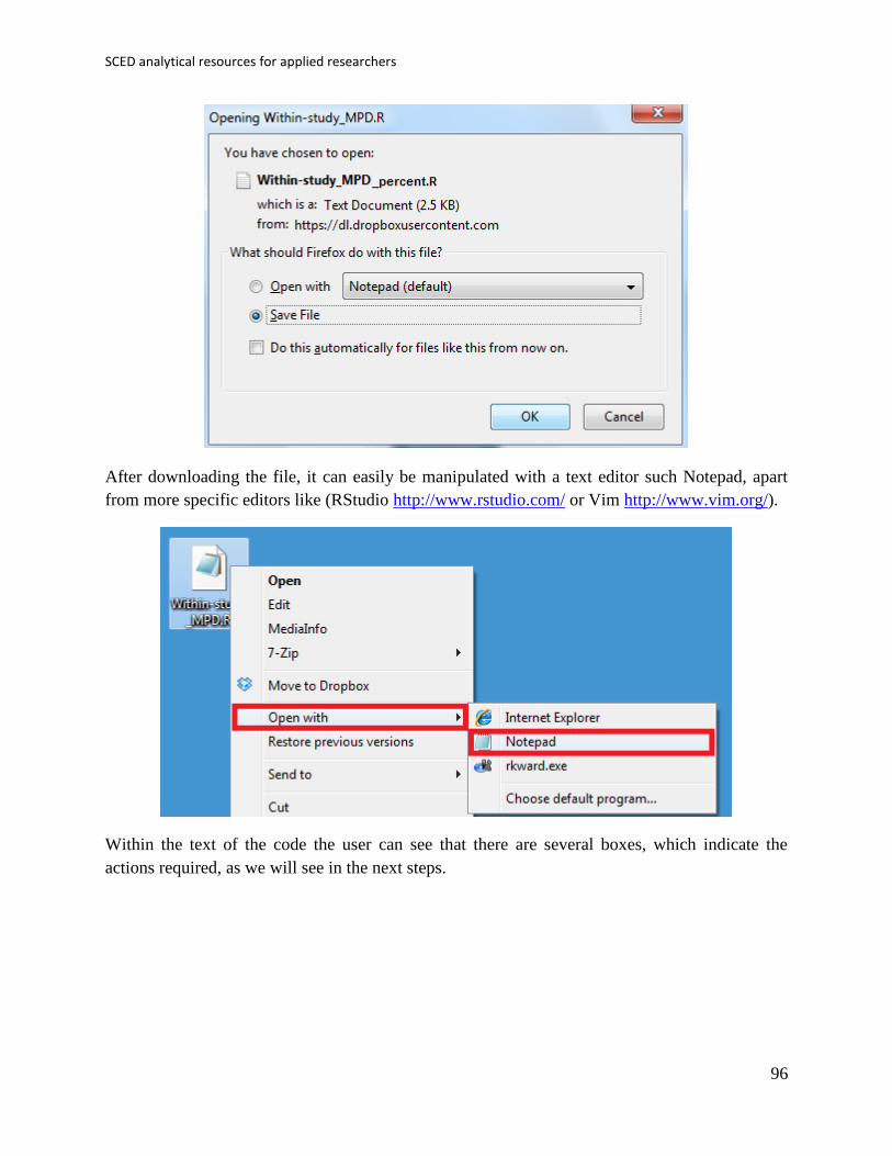
SCED analytical resources for applied researchers
96
After downloading the file, it can easily be manipulated with a text editor such Notepad, apart
from more specific editors like (RStudio http://www.rstudio.com/ or Vim http://www.vim.org/).
Within the text of the code the user can see that there are several boxes, which indicate the
actions required, as we will see in the next steps.
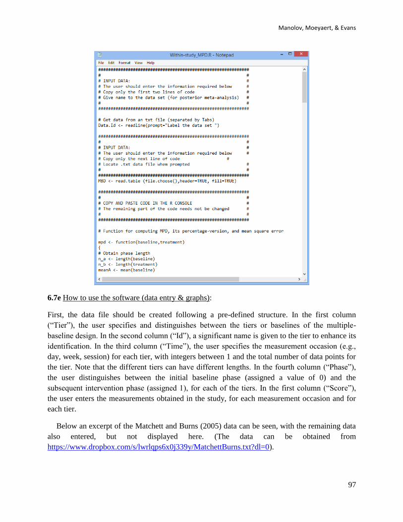
Manolov, Moeyaert, & Evans
97
6.7e How to use the software (data entry & graphs):
First, the data file should be created following a pre-defined structure. In the first column
(“Tier”), the user specifies and distinguishes between the tiers or baselines of the multiple-
baseline design. In the second column (“Id”), a significant name is given to the tier to enhance its
identification. In the third column (“Time”), the user specifies the measurement occasion (e.g.,
day, week, session) for each tier, with integers between 1 and the total number of data points for
the tier. Note that the different tiers can have different lengths. In the fourth column (“Phase”),
the user distinguishes between the initial baseline phase (assigned a value of 0) and the
subsequent intervention phase (assigned 1), for each of the tiers. In the first column (“Score”),
the user enters the measurements obtained in the study, for each measurement occasion and for
each tier.
Below an excerpt of the Matchett and Burns (2005) data can be seen, with the remaining data
also entered, but not displayed here. (The data can be obtained from
https://www.dropbox.com/s/lwrlqps6x0j339y/MatchettBurns.txt?dl=0).
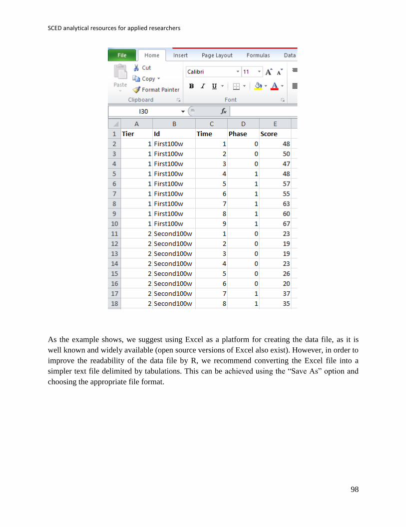
SCED analytical resources for applied researchers
98
As the example shows, we suggest using Excel as a platform for creating the data file, as it is
well known and widely available (open source versions of Excel also exist). However, in order to
improve the readability of the data file by R, we recommend converting the Excel file into a
simpler text file delimited by tabulations. This can be achieved using the “Save As” option and
choosing the appropriate file format.
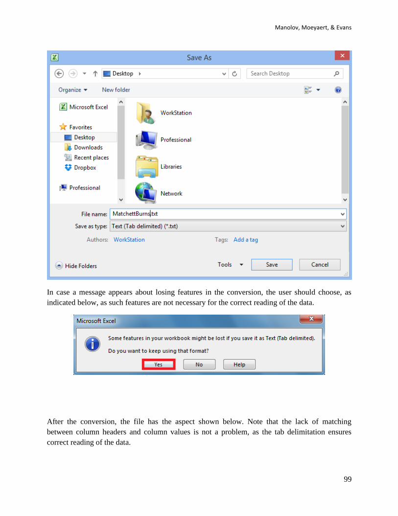
Manolov, Moeyaert, & Evans
99
In case a message appears about losing features in the conversion, the user should choose, as
indicated below, as such features are not necessary for the correct reading of the data.
After the conversion, the file has the aspect shown below. Note that the lack of matching
between column headers and column values is not a problem, as the tab delimitation ensures
correct reading of the data.

SCED analytical resources for applied researchers
100
Once the data file is created, with the columns in the order required and including headers, we
proceed to load the data in R and ask for the analyses. The next step is, thus, to start R.
To use the code, we will copy and paste different parts of it in several steps. First, we copy the
first two lines (between the first two text boxes) and paste them in the R console.
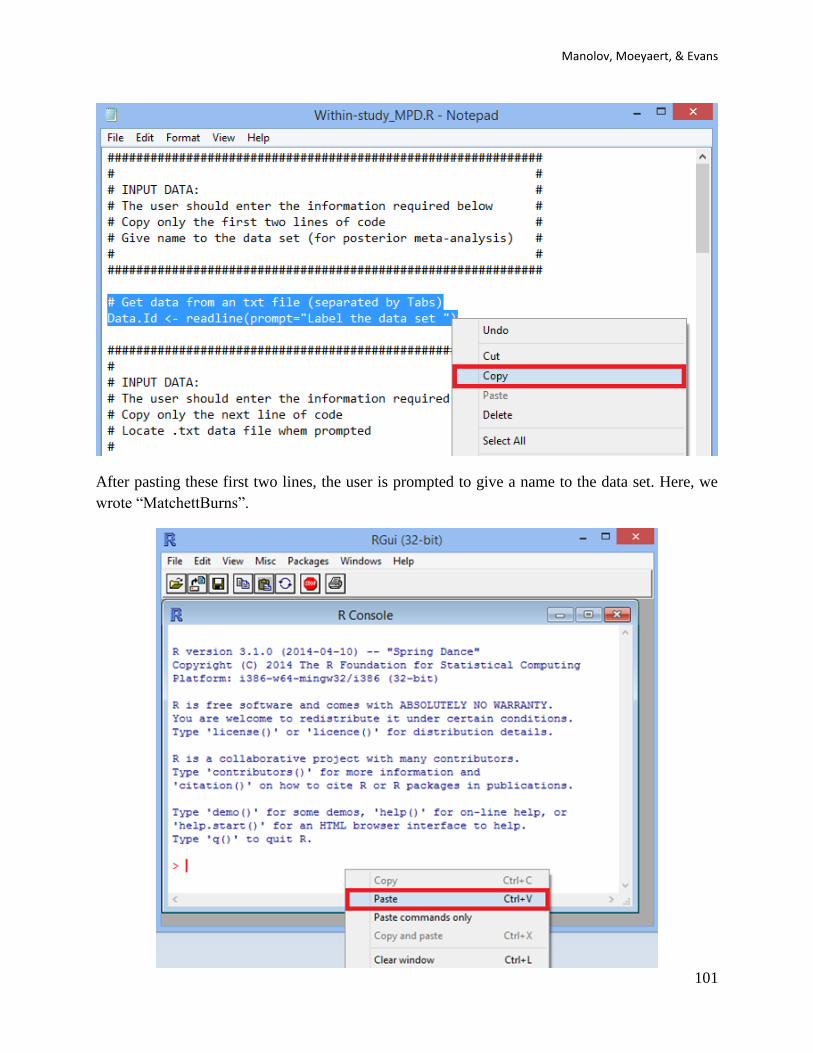
Manolov, Moeyaert, & Evans
101
After pasting these first two lines, the user is prompted to give a name to the data set. Here, we
wrote “MatchettBurns”.
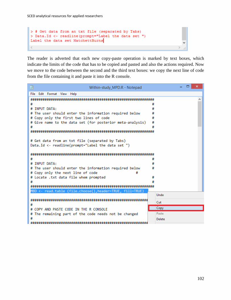
SCED analytical resources for applied researchers
102
The reader is adverted that each new copy-paste operation is marked by text boxes, which
indicate the limits of the code that has to be copied and pasted and also the actions required. Now
we move to the code between the second and the third text boxes: we copy the next line of code
from the file containing it and paste it into the R console.
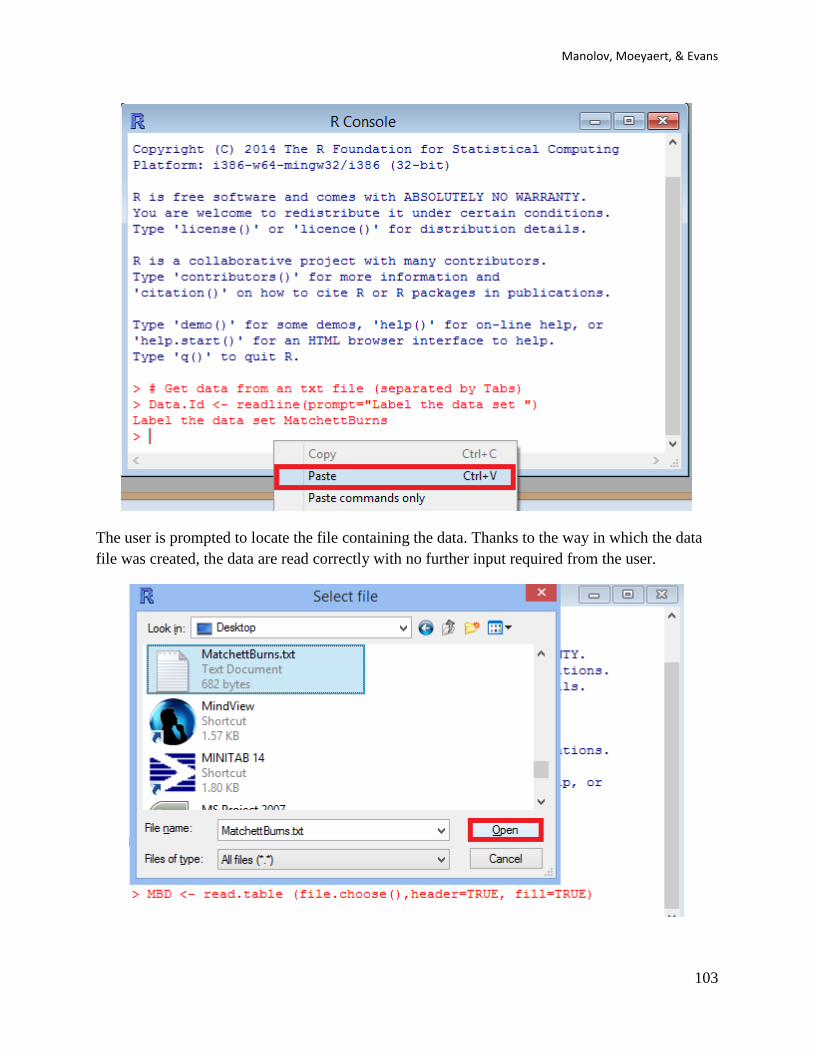
Manolov, Moeyaert, & Evans
103
The user is prompted to locate the file containing the data. Thanks to the way in which the data
file was created, the data are read correctly with no further input required from the user.
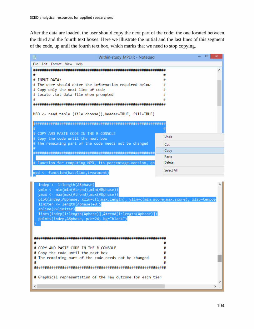
SCED analytical resources for applied researchers
104
After the data are loaded, the user should copy the next part of the code: the one located between
the third and the fourth text boxes. Here we illustrate the initial and the last lines of this segment
of the code, up until the fourth text box, which marks that we need to stop copying.
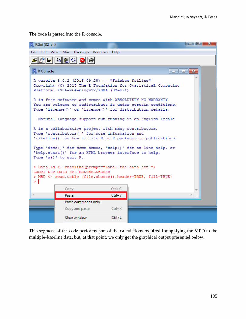
Manolov, Moeyaert, & Evans
105
The code is pasted into the R console.
This segment of the code performs part of the calculations required for applying the MPD to the
multiple-baseline data, but, at that point, we only get the graphical output presented below.

SCED analytical resources for applied researchers
106
This first output of the code offers a graphical representation of the data, with all three tiers of
the multiple-baseline design. Apart from the data points, we see the baseline trend lines fitted in
every tier.
6.7f How to interpret the results:
This visual representation enables the researcher to assess to what extent the baseline trend fitted
matched the actually obtained data. The better the match, the more appropriate the reference for
evaluating the behavioural change, as the baseline trend is projected into the intervention phase
and compared with the real measurements obtained after the intervention has been introduced.
Moreover, (the inverse of) the amount of variability around the fitted baseline is used, together
with tier length, when defining the weight of each tier. These weights are then used for obtaining
a weighted average, i.e., a single quantification for the whole multiple-baseline design.

Manolov, Moeyaert, & Evans
107
6.7e How to use the software (numerical results):
After obtaining and, if desired, saving the first graphical output, the user copies the rest of the
code, until the end of the data file.
This segment of the code is then pasted into the R console for obtaining the rest of the graphical
output and also the numerical results.
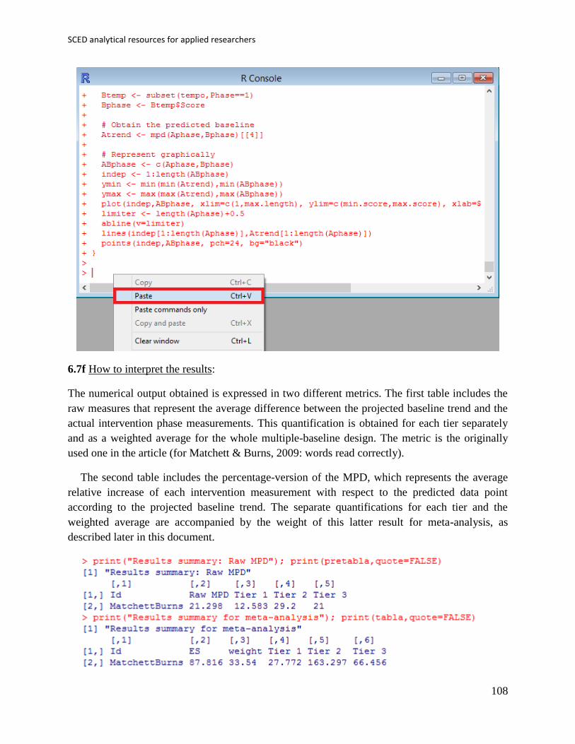
SCED analytical resources for applied researchers
108
6.7f How to interpret the results:
The numerical output obtained is expressed in two different metrics. The first table includes the
raw measures that represent the average difference between the projected baseline trend and the
actual intervention phase measurements. This quantification is obtained for each tier separately
and as a weighted average for the whole multiple-baseline design. The metric is the originally
used one in the article (for Matchett & Burns, 2009: words read correctly).
The second table includes the percentage-version of the MPD, which represents the average
relative increase of each intervention measurement with respect to the predicted data point
according to the projected baseline trend. The separate quantifications for each tier and the
weighted average are accompanied by the weight of this latter result for meta-analysis, as
described later in this document.

Manolov, Moeyaert, & Evans
109
The second graphical output of the code has two parts. To the left, we have one-dimensional
scatterplots with the MPDs (above) and MPD-converted-to-percentage (below) obtained for each
tier and the weighted average marked with a plus sign. With these graphs the researcher can
assess visually the variability in the values across tiers and also to see which tiers influence more
(and are better represented by) the weighted average. To the right, we have two-dimensional
scatterplots with the MPD values (raw above and percentage below) against the weights assigned
to them. With this graphical representation, the researcher can assess whether the weight is
related to the effect size in the sense that it can be evaluated whether smaller (or greater) effects
have received greater weights.
6.7g How to use the MPD (standardized version: MPD-S): The use of the code for the MPD
version standardized using the baseline phase standard deviation and employing tier length as a
weight is identical to the one described here. The R code can be found at
https://www.dropbox.com/s/g3btwdogh30biiv/Within-study_MPD_std.R Note that the weight
for the weighted average combining AB-comparisons is only the amount of measurements,
unlike MPD-P.

SCED analytical resources for applied researchers
110
6.8a Name of the technique: Slope and level change (SLC)
6.8b Authors and suggested readings: The SLC was proposed and tested by Solanas, Manolov
and Onghena (2010). The authors offer the details for this procedure. The SLC has been
extended and the extension is also described in the tutorial.
6.8c Software that can be used: The SLC can be implemented via an R code developed by R.
Manolov. It can also be applied using a plug-in for R-Commander developed by R. Manolov and
David Leiva.
6.8d How to obtain the software (code): The R code for computing SLC is available at
https://dl.dropboxusercontent.com/s/ltlyowy2ds5h3oi/SLC.R
When the URL is open, the R code appears (or can be downloaded via
https://www.dropbox.com/s/ltlyowy2ds5h3oi/SLC.R?dl=0). It is a text file that can be opened
with a word processor such as Notepad. Only the part of the code marked below in blue has to be
changed, that is, the user has to input the scores for both phases and specify the number of
baseline phase measurements.
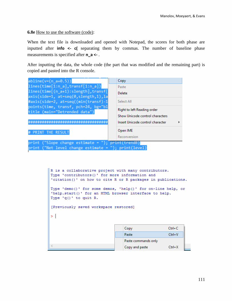
Manolov, Moeyaert, & Evans
111
6.8e How to use the software (code):
When the text file is downloaded and opened with Notepad, the scores for both phase are
inputted after info <- c( separating them by commas. The number of baseline phase
measurements is specified after n_a <- .
After inputting the data, the whole code (the part that was modified and the remaining part) is
copied and pasted into the R console.

SCED analytical resources for applied researchers
112
The result of running the code is a graphical representation of the original and detrended data, as
well as the value of the SLC.
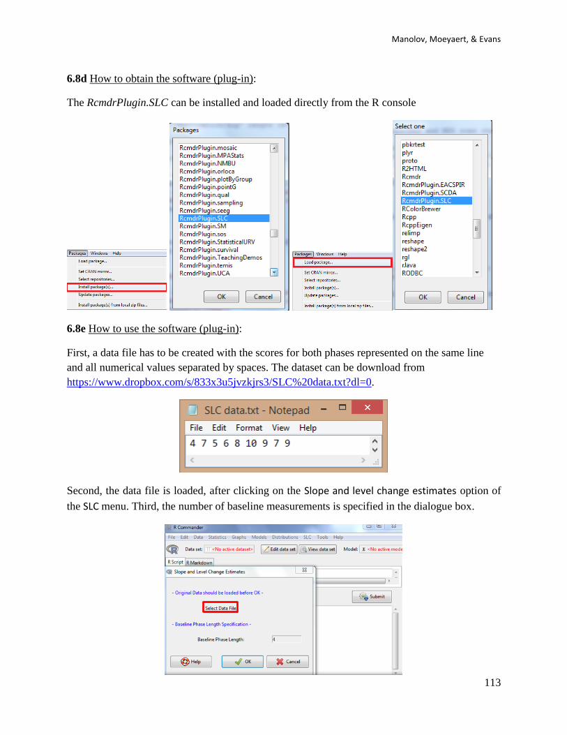
Manolov, Moeyaert, & Evans
113
6.8d How to obtain the software (plug-in):
The RcmdrPlugin.SLC can be installed and loaded directly from the R console
6.8e How to use the software (plug-in):
First, a data file has to be created with the scores for both phases represented on the same line
and all numerical values separated by spaces. The dataset can be download from
https://www.dropbox.com/s/833x3u5jvzkjrs3/SLC%20data.txt?dl=0.
Second, the data file is loaded, after clicking on the Slope and level change estimates option of
the SLC menu. Third, the number of baseline measurements is specified in the dialogue box.
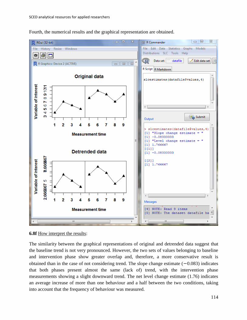
SCED analytical resources for applied researchers
114
Fourth, the numerical results and the graphical representation are obtained.
6.8f How interpret the results:
The similarity between the graphical representations of original and detrended data suggest that
the baseline trend is not very pronounced. However, the two sets of values belonging to baseline
and intervention phase show greater overlap and, therefore, a more conservative result is
obtained than in the case of not considering trend. The slope change estimate (−0.083) indicates
that both phases present almost the same (lack of) trend, with the intervention phase
measurements showing a slight downward trend. The net level change estimate (1.76) indicates
an average increase of more than one behaviour and a half between the two conditions, taking
into account that the frequency of behaviour was measured.

Manolov, Moeyaert, & Evans
115
6.9a Name of the technique: Slope and level change – percentage version (SLC-P)
6.9b Authors and suggested readings: The SLC_P was proposed by Manolov & Rochat (2015) as
an extension of the Slope and level change procedure (Solanas, Manolov, & Onghena, 2010).
The authors offer the details for this procedure. Moreover, this indicator is applicable to designs
that include several AB-comparisons offering both separate estimates and an overall one. The
combination of the individual AB-comparisons is achieved via a weighted average, in which the
weight is directly related to the amount of measurements and inversely related to the variability
of effects (i.e., similar to Hershberger et al.’s [1999] replication effect quantification proposed as
a moderator).
6.9c Software that can be used: The SLC can be implemented via an R code developed by R.
Manolov.
6.9d How to obtain the software (percentage version): The R code for applying the SLC
(percent) at the within-studies level is available at
https://www.dropbox.com/s/o0ukt01bf6h3trs/Within-study_SLC_percent.R
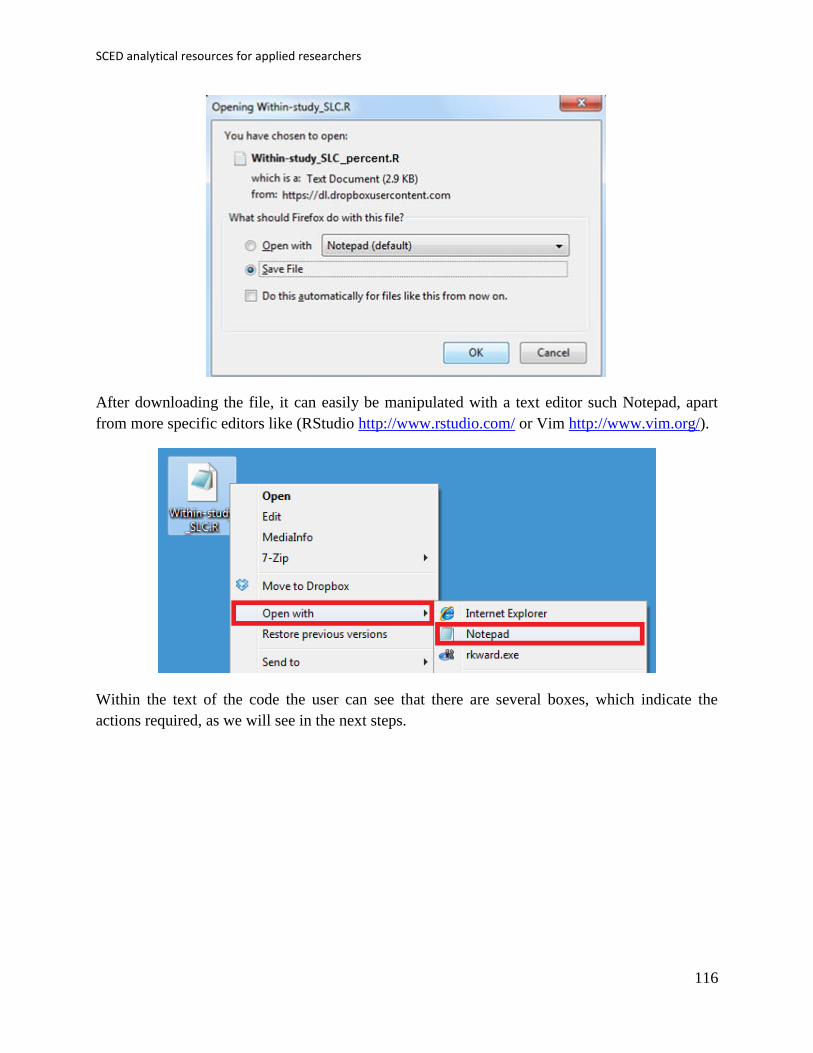
SCED analytical resources for applied researchers
116
After downloading the file, it can easily be manipulated with a text editor such Notepad, apart
from more specific editors like (RStudio http://www.rstudio.com/ or Vim http://www.vim.org/).
Within the text of the code the user can see that there are several boxes, which indicate the
actions required, as we will see in the next steps.
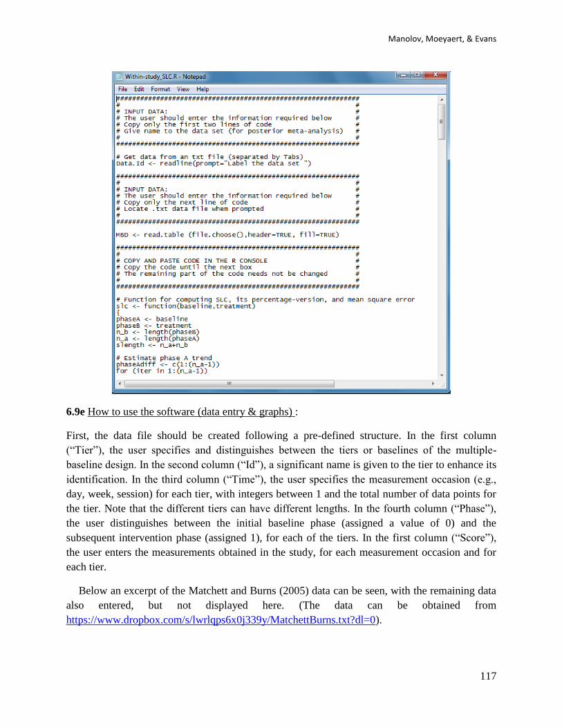
Manolov, Moeyaert, & Evans
117
6.9e How to use the software (data entry & graphs) :
First, the data file should be created following a pre-defined structure. In the first column
(“Tier”), the user specifies and distinguishes between the tiers or baselines of the multiple-
baseline design. In the second column (“Id”), a significant name is given to the tier to enhance its
identification. In the third column (“Time”), the user specifies the measurement occasion (e.g.,
day, week, session) for each tier, with integers between 1 and the total number of data points for
the tier. Note that the different tiers can have different lengths. In the fourth column (“Phase”),
the user distinguishes between the initial baseline phase (assigned a value of 0) and the
subsequent intervention phase (assigned 1), for each of the tiers. In the first column (“Score”),
the user enters the measurements obtained in the study, for each measurement occasion and for
each tier.
Below an excerpt of the Matchett and Burns (2005) data can be seen, with the remaining data
also entered, but not displayed here. (The data can be obtained from
https://www.dropbox.com/s/lwrlqps6x0j339y/MatchettBurns.txt?dl=0).

SCED analytical resources for applied researchers
118
As the example shows, we suggest using Excel as a platform for creating the data file, as it is
well known and widely available (open source versions of Excel also exist). However, in order to
improve the readability of the data file by R, we recommend converting the Excel file into a
simpler text file delimited by tabulations. This can be achieved using the “Save As” option and
choosing the appropriate file format.
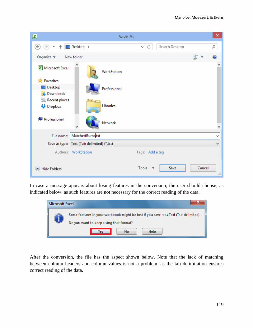
Manolov, Moeyaert, & Evans
119
In case a message appears about losing features in the conversion, the user should choose, as
indicated below, as such features are not necessary for the correct reading of the data.
After the conversion, the file has the aspect shown below. Note that the lack of matching
between column headers and column values is not a problem, as the tab delimitation ensures
correct reading of the data.

SCED analytical resources for applied researchers
120
Once the data file is created, with the columns in the order required and including headers, we
proceed to load the data in R and ask for the analyses. The next step is, thus, to start R.
To use the code, we will copy and paste different parts of it in several steps. First, we copy the
first two lines (between the first two text boxes) and paste them in the R console.

Manolov, Moeyaert, & Evans
121

SCED analytical resources for applied researchers
122
After pasting these first two lines, the user is prompted to give a name to the data set. Here, we
wrote “MatchettBurns”.
The reader is adverted that each new copy-paste operation is marked by text boxes, which
indicate the limits of the code that has to be copied and pasted and also the actions required. Now
we move to the code between the second and the third text boxes: we copy the next line of code
from the file containing it and paste it into the R console.

Manolov, Moeyaert, & Evans
123
The user is prompted to locate the file containing the data. Thanks to the way in which the data
file was created, the data are read correctly with no further input required from the user.
After the data are loaded, the user should copy the next part of the code: the one located between
the third and the fourth text boxes. Here we illustrate the initial and the last lines of this segment
of the code, up until the fourth text box, which marks that we need to stop copying.

SCED analytical resources for applied researchers
124

Manolov, Moeyaert, & Evans
125
The code is pasted into the R console.
This segment of the code performs part of the calculations required for applying the MPD to the
multiple-baseline data, but, at that point, we only get the graphical output presented below.
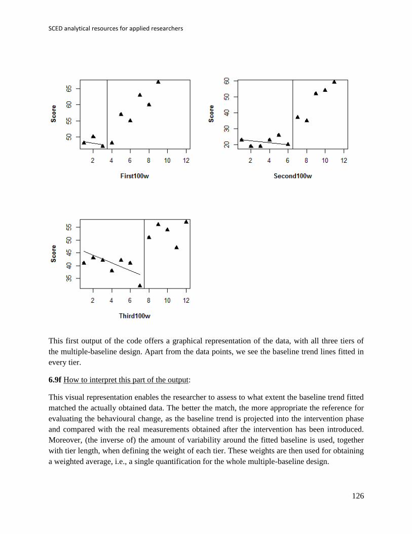
SCED analytical resources for applied researchers
126
This first output of the code offers a graphical representation of the data, with all three tiers of
the multiple-baseline design. Apart from the data points, we see the baseline trend lines fitted in
every tier.
6.9f How to interpret this part of the output:
This visual representation enables the researcher to assess to what extent the baseline trend fitted
matched the actually obtained data. The better the match, the more appropriate the reference for
evaluating the behavioural change, as the baseline trend is projected into the intervention phase
and compared with the real measurements obtained after the intervention has been introduced.
Moreover, (the inverse of) the amount of variability around the fitted baseline is used, together
with tier length, when defining the weight of each tier. These weights are then used for obtaining
a weighted average, i.e., a single quantification for the whole multiple-baseline design.
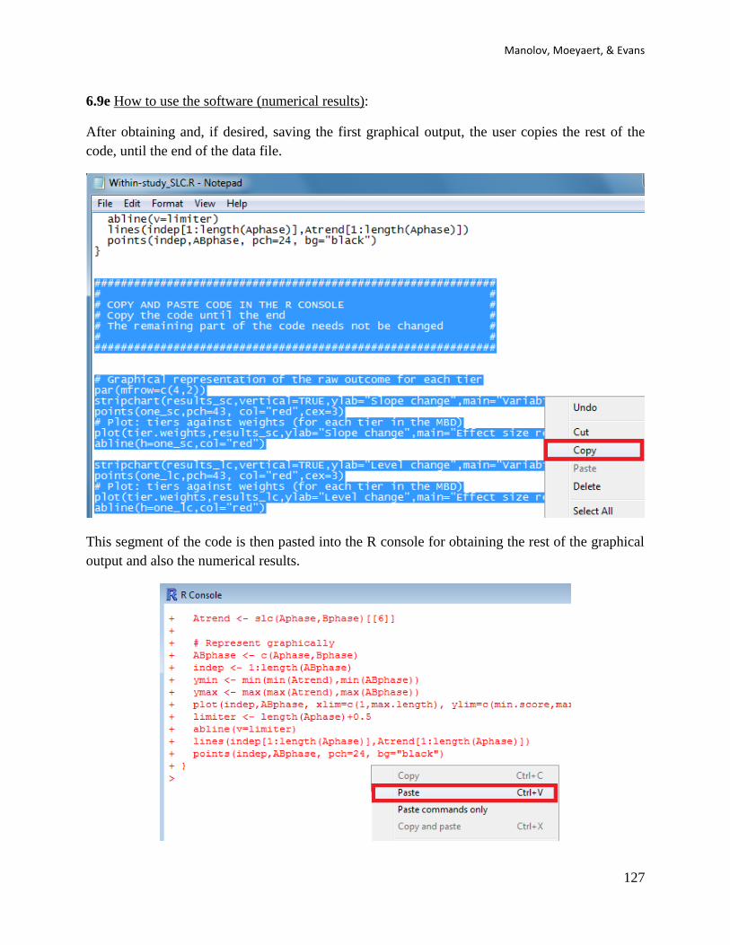
Manolov, Moeyaert, & Evans
127
6.9e How to use the software (numerical results):
After obtaining and, if desired, saving the first graphical output, the user copies the rest of the
code, until the end of the data file.
This segment of the code is then pasted into the R console for obtaining the rest of the graphical
output and also the numerical results.

SCED analytical resources for applied researchers
128
6.9f How to interpret the output:
The numerical output obtained is expressed in two different metrics. The first table includes the
raw measures that represent the change in slope and change in level, after controlling for baseline
linear trend. These quantifications are obtained for each tier separately and as a weighted average
for the whole multiple-baseline design. The metric is the originally used one in the article (for
Matchett & Burns, 2009: words read correctly). The slope change estimate represents the
average increase, per measurement time, in number of words read correctly after the intervention
– i.e., it quantifies a progressive change. The net level change represents the average difference
between the intervention and baseline phases, after taking into account the change in slope.
The second table includes the percentage-versions of the SLC. The percentage slope change
estimate represents the average relative increase of intervention phase slope as compared to the
baseline slope. The percentage level change estimate represents the average relative increase of
the intervention level as compared to the baseline level, after controlling for baseline and
treatment linear slopes.
The second graphical output of the code has two parts. To the left, we have one-dimensional
scatterplots with the SLC slope change and level change estimates (upper two graphs) and SLC-
converted-to-percentages (lower two graphs) obtained for each tier and the weighted average
marked with a plus sign. With these graphs the researcher can assess visually the variability in
the values across tiers and also to see which tiers influence more (and are better represented by)
the weighted average. To the right, we have two-dimensional scatterplots with the SLC values
(raw above and percentage below) against the weights assigned to them. With this graphical
representation, the researcher can assess whether the weight is related to the effect size in the
sense that it can be evaluated whether smaller (or greater) effects have received greater weights.

Manolov, Moeyaert, & Evans
129
6.9g How to use the SLC (standardized version: SLC-S): The use of the code for the SLC
version standardized using the baseline phase standard deviation and employing tier length as a
weight is identical to the one described here. The R code can be found at
https://www.dropbox.com/s/74lr9j2keclrec0/Within-study_SLC_std.R. Note that the weight for
the weighted average combining AB-comparisons is only the amount of measurements, unlike
SLC-P.

SCED analytical resources for applied researchers
130
Chapter 7.
Tools for implementing randomisation
and using randomisation tests

Manolov, Moeyaert, & Evans
131
7.1a Name of the technique: Randomisation tests via the SCDA package.
7.1b Authors and suggested readings: Randomisation tests are described in detail (and also in the
SCED context) by Edgington and Onghena (2007) and Heyvaert and Onghena (2014a, 2014b).
7.1c Software that can be used: An R package called “SCRT” is available for different design
structures (Bulté & Onghena, 2008; 2009). It can be downloaded from the R website
http://cran.r-project.org/web/packages/SCRT/index.html or as specified below. Randomisation
tests are also implemented in the SCDA plug-in for R Commander (Bulté, 2013; Bulté &
Onghena, 2012).
7.1d How to obtain the software: The steps are as described above for the visual analysis, the
PND, and Cohen’s d. First, open R.
Second, install RcmdrPlugin.SCDA using the option Install package(s) from the menu Packages.
Third, load RcmdrPlugin.SCDA in the R console (directly; this loads also R-Commander) or in
R-Commander (first loading Rcmdr and then the plug-in).
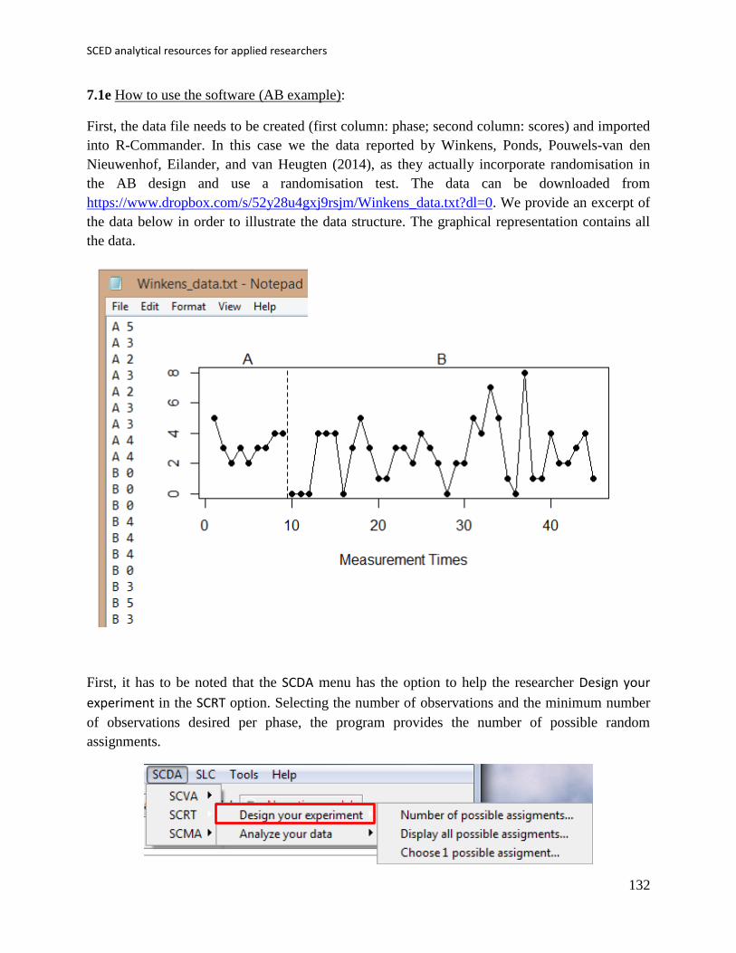
SCED analytical resources for applied researchers
132
7.1e How to use the software (AB example):
First, the data file needs to be created (first column: phase; second column: scores) and imported
into R-Commander. In this case we the data reported by Winkens, Ponds, Pouwels-van den
Nieuwenhof, Eilander, and van Heugten (2014), as they actually incorporate randomisation in
the AB design and use a randomisation test. The data can be downloaded from
https://www.dropbox.com/s/52y28u4gxj9rsjm/Winkens_data.txt?dl=0. We provide an excerpt of
the data below in order to illustrate the data structure. The graphical representation contains all
the data.
First, it has to be noted that the SCDA menu has the option to help the researcher Design your
experiment in the SCRT option. Selecting the number of observations and the minimum number
of observations desired per phase, the program provides the number of possible random
assignments.

Manolov, Moeyaert, & Evans
133
Moreover, the SCDA makes the random selection of an intervention start point for the AB design
we are working with (via the Choose 1 possible assignment sub-option).
The screenshot below shows the actual bipartition, with 9 measurements in the baseline phase
and 36 in the treatment phase. However, the output could be different each time the user selects
randomly a start point for the intervention.
Second, we will focus on the Analyze your data option and all three sub-options. For that
purpose, it is necessary to import the data, paying special attention to unclicking the Variable
names in file option.

SCED analytical resources for applied researchers
134

Manolov, Moeyaert, & Evans
135
Afterwards, the SCDA plug-in is used.
For obtaining the value of the Observed test statistic it is only necessary to specify the design
and type of test statistic to use. For instance, in the Winkens et al. (2014) study the objective was
to reduce behaviour, thus, the phase B mean was subtracted from the phase A mean in order to
obtain a positive difference
The result obtained is 0.611, marking an average reduction of more than half an aggressive
behaviour after the intervention.
Obtaining the value of the Randomization distribution entails obtaining the value of the same
test statistic for all possible bipartitions of the data. Considering the minimum number of
observations per phase (5), there are 36 possible values, one of which is the actually obtained
one.
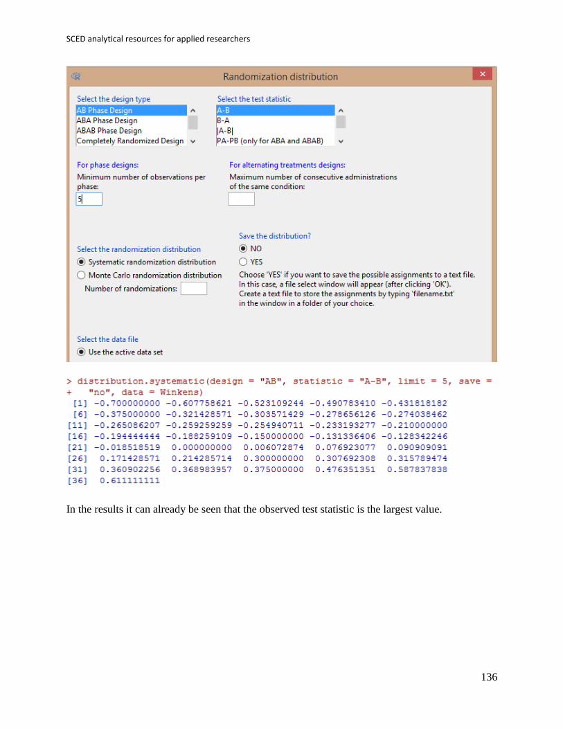
SCED analytical resources for applied researchers
136
In the results it can already be seen that the observed test statistic is the largest value.

Manolov, Moeyaert, & Evans
137
Finally, we can obtain the p value associated with the observed test statistic.
7.1f How interpret the results: The observed test statistic (0.611) is the largest of all 36 values in
the randomisation distribution. Given that this value is one of the possibility under the null
hypothesis that all data bipartitions are equally likely in case the intervention is ineffective, the p
values is equal to 1/36 = 0.0278. It is interesting to mention that in this case the statistical
significance of the result contrasts with the conclusion of Winkens and colleagues (2014), as
these authors also considered the fact that after the intervention the behaviour become more
unpredictable (as illustrated by the increased range), despite the average decrease in verbal
aggressive behaviours.

SCED analytical resources for applied researchers
138
7.1e How to use the software (multiple-baseline example):
First, the data file needs to be created (first column: phase for tier 1; second column: scores for
tier 1; third column: phase for tier 2; fourth column: scores for tier 3; and so forth) and imported
into R-Commander. The data for the multiple-baseline example can be downloaded from
https://www.dropbox.com/s/vcch4h06ra8flc4/2%20SCDA.txt?dl=0 and they belong to a
fictitious study intending to reduce target behavior. The data and their graphical representation
are presented below.
First, it has to be noted that the SCDA menu has the option to help the researcher Design your
experiment in the SCRT option.

Manolov, Moeyaert, & Evans
139
Selecting the type of design being multiple-baseline, there is nothing else left to specify.
However, a new window pops up and we need to locate a file in which the possible intervention
start points are specified.
This file has the following aspect: there is one line containing the possible intervention start
points for each of the three tiers. Note that there is not overlap between these points, because the
aim in a multiple-baseline design is that the intervention be introduced in a staggered way in

SCED analytical resources for applied researchers
140
order to control for threats to internal validity. A file with the starting points is only necessary for
multiple-baseline designs. The example can be downloaded from
https://www.dropbox.com/s/ripms2b0zq6qali/2%20SCDA_pts.txt?dl=0.
As a result we see that there are 384 possible combinations of intervention start points, taking
into account the fact that the individuals are also randomly assigned to the three baselines.
The SCDA plug-in can also be used to select at random one of these 384 option. via the Choose
1 possible assignment sub-option.
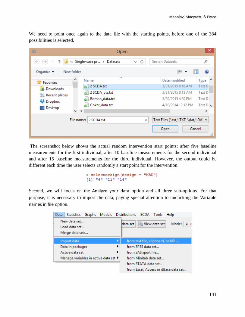
Manolov, Moeyaert, & Evans
141
We need to point once again to the data file with the starting points, before one of the 384
possibilities is selected.
The screenshot below shows the actual random intervention start points: after five baseline
measurements for the first individual, after 10 baseline measurements for the second individual
and after 15 baseline measurements for the third individual. However, the output could be
different each time the user selects randomly a start point for the intervention.
Second, we will focus on the Analyze your data option and all three sub-options. For that
purpose, it is necessary to import the data, paying special attention to unclicking the Variable
names in file option.

SCED analytical resources for applied researchers
142

Manolov, Moeyaert, & Evans
143
Afterwards, the SCDA plug-in is used.
For obtaining the value of the Observed test statistic it is only necessary to specify the design
and type of test statistic to use. For instance, in the Winkens et al. (2014) study the objective was
to reduce behaviour, thus, the phase B mean was subtracted from the phase A mean in order to
obtain a positive difference
The result obtained is 2.889, marking an average reduction of almost three behaviours after the
intervention.
Obtaining the value of the Randomization distribution entails obtaining the value of the same
test statistic for all possible bipartitions of the three series (and all possible ways of assigning
three individuals to three tiers), one of which is the actually obtained one.
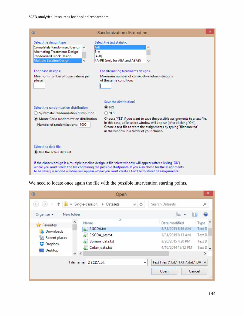
SCED analytical resources for applied researchers
144
We need to locate once again the file with the possible intervention starting points.
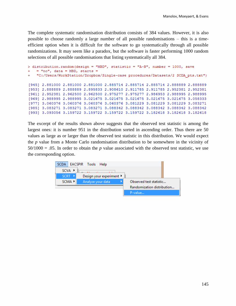
Manolov, Moeyaert, & Evans
145
The complete systematic randomisation distribution consists of 384 values. However, it is also
possible to choose randomly a large number of all possible randomisations – this is a time-
efficient option when it is difficult for the software to go systematically through all possible
randomizations. It may seem like a paradox, but the software is faster performing 1000 random
selections of all possible randomisations that listing systematically all 384.
The excerpt of the results shown above suggests that the observed test statistic is among the
largest ones: it is number 951 in the distribution sorted in ascending order. Thus there are 50
values as large as or larger than the observed test statistic in this distribution. We would expect
the p value from a Monte Carlo randomisation distribution to be somewhere in the vicinity of
50/1000 = .05. In order to obtain the p value associated with the observed test statistic, we use
the corresponding option.

SCED analytical resources for applied researchers
146
We need to locate once again the file with the possible intervention starting points.
Manolov, Moeyaert, & Evans
147
7.1f How to interpret the results (multiple-baseline example):
In this case, given that we are illustrating the Monte Carlo option for selecting randomly some of
the possible randomisations, the p value obtained by each user may be slightly different. We here
obtained a results that is just above the conventional 5% nominal alpha, which would suggest not
rejecting the null hypothesis that the treatment was ineffective.
It can be seen that with 1000 randomisations the previously presented list which suggested p =
.05 and the current result are very similar. Nevertheless, in this case the small difference would
imply making a different statistical decision. It is up to the user to decide whether a new Monte
Carlo randomisation distribution is warranted for gaining further evidence about the likelihood of
the observed test statistic under the null hypothesis that all possible bipartitions of the series are
equally likely.
Another option is to be patient and wait for the results of a systematic randomisation distribution,
which in this case suggest that the observed test statistic is statistically significant, as it is number
366th in 384 values sorted in ascending order – there are 18 values larger than it plus one value
equal (the observed test statistic itself). Thus the p value is 19/384 ≈ .049.
Finally, it has to be stressed that the result for the systematic and the Monte Carlo randomisation
distributions are very similar, which means that the Monte Carlo option is a good approximation.

SCED analytical resources for applied researchers
148
7.2a Name of the technique: Randomisation tests via ExPRT.
7.2b Authors and suggested readings: Further developments on randomisation tests have been
authored by Levin, Ferron, and Kratochwill (2012) and Levin, Lall, and Kratochwill (2011).
These developments are among the ones included in the software detailed below.
7.2c Software that can be used: A macro for Excel called “ExPRT” and developed by Boris
Gafurov and Joel Levin is available at the following website http://code.google.com/p/exprt/.
7.2d How to obtain the software:
The software is obtained via the Download ExPRT link, as shown below.

Manolov, Moeyaert, & Evans
149
7.2e How to use the software:
For using relatively complex programs (with many options), such as ExPRT, we recommend that
applied researchers consult the manual available in the Download section of the website. In this
case, it is especially relevant to become familiar with what each column of each Excel worksheet
should contain. Moreover, it is necessary to distinguish between the columns where user input is
required and the columns that provide information (i.e., that should not be modified). Here we
provide a simple example with an AB designs, but for more complex design structures the
manual and the corresponding articles have to be read in depth.
First, the worksheet called “randomizer” can be used to choose at random one of the possible
random assignments. After inputting the first possible intervention point and the number of
possible intervention points, clicking on the Randomize button leads to obtaining the
measurement time at which the intervention should be introduced: in the Winkens at al. (2014)
study it was at the 10th
observation when the intervention was introduced. This can also be
accomplished using the SCDA plug-in.

SCED analytical resources for applied researchers
150
Second, to obtain the result, data should be inputted in the worksheet called “data”. In this
worksheet, the admissible intervention start points are marked in yellow: in the running example,
all measurement times between the 6th
and 41st, both inclusive.
...
Third, in the worksheet called “intervention”, the user specifies the characteristics of the
analysis, namely, whether the null hypothesis is one-tailed (e.g., an improvement in the behavior
is only expressed as a reduction during the intervention phase), how the test statistic should be
defined, the nominal statistical significance level alpha.
The information on how to fill in the columns of this worksheet can be found in the manual,
where detailed information is provided (as illustrated below).
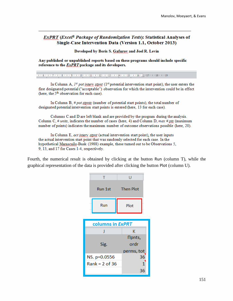
Manolov, Moeyaert, & Evans
151
Fourth, the numerical result is obtained by clicking at the button Run (column T), while the
graphical representation of the data is provided after clicking the button Plot (column U).
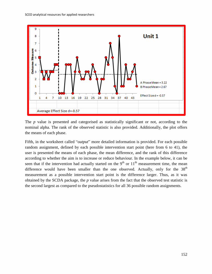
SCED analytical resources for applied researchers
152
The p value is presented and categorised as statistically significant or not, according to the
nominal alpha. The rank of the observed statistic is also provided. Additionally, the plot offers
the means of each phase.
Fifth, in the worksheet called “output” more detailed information is provided. For each possible
random assignment, defined by each possible intervention start point (here from 6 to 41), the
user is presented the means of each phase, the mean difference, and the rank of this difference
according to whether the aim is to increase or reduce behaviour. In the example below, it can be
seen that if the intervention had actually started on the 9th
or 11th
measurement time, the mean
difference would have been smaller than the one observed. Actually, only for the 38th
measurement as a possible intervention start point is the difference larger. Thus, as it was
obtained by the SCDA package, the p value arises from the fact that the observed test statistic is
the second largest as compared to the pseudostatistics for all 36 possible random assignments.
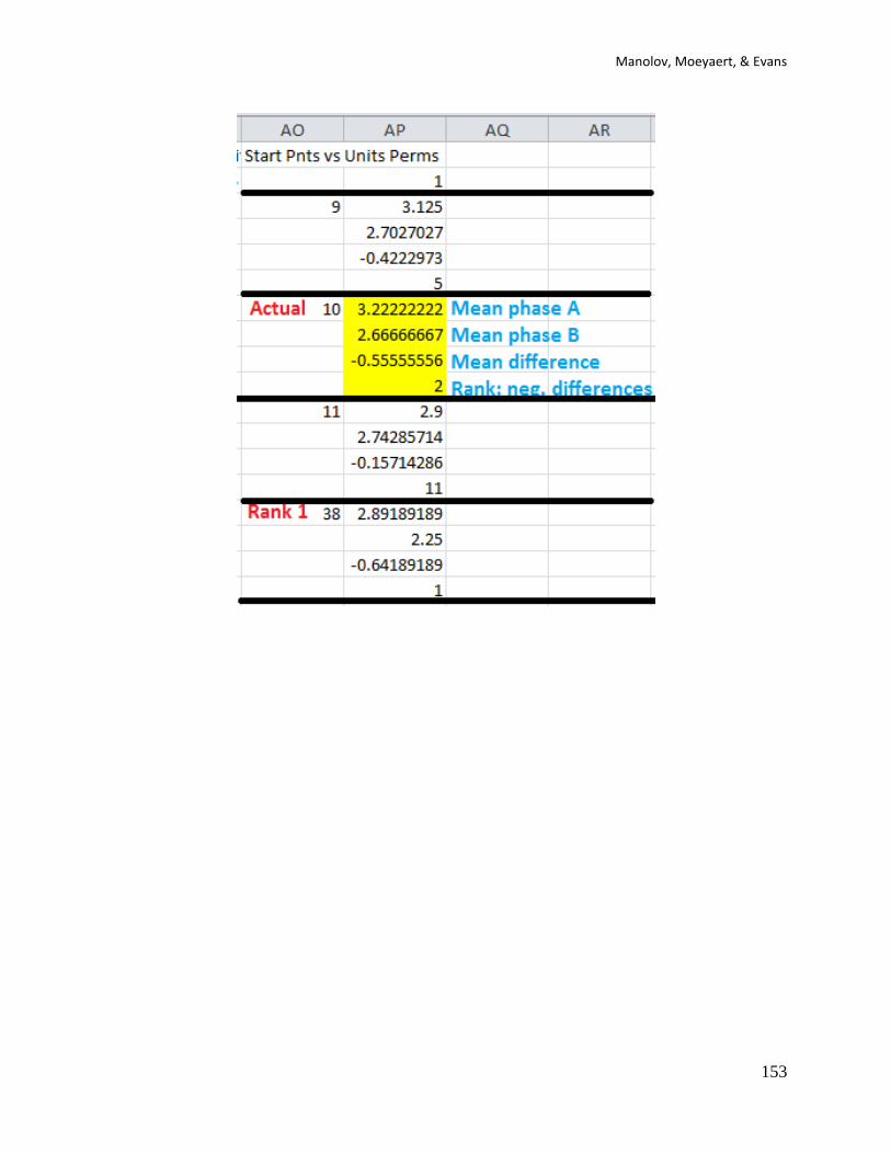
Manolov, Moeyaert, & Evans
153
SCED analytical resources for applied researchers
154
Chapter 8.
Simulation modelling analysis

Manolov, Moeyaert, & Evans
155
8.a Name of the technique: Simulation modelling analysis (SMA)
8.b Authors and suggested readings: The SMA was presented by Borckardt and colleagues
(2008). Further discussion and additional illustration is provided by Borckardt and Nash (2014).
8.c Software that can be used: Open source software is available for implementing the SMA. The
program is stand-alone and can be downloaded at http://clinicalresearcher.org/software.htm. The
software and the user’s guide are credited to Jeffrey Borckardt.
8.d How to obtain the software:
The software can be obtained from the website for two different operating systems.

SCED analytical resources for applied researchers
156
We also recommend downloading and consulting the User’s guide in order to become familiar
with the different tests that can be carried out.
8.e How to use the software:
First, the data are entered: scores in the Var1(DV) column and the dummy variable representing
the condition in the Var2(PHASE) column. Another (and easier) option is to have a tab-delimited
data file with the data organised in two columns (scores first, phase labels next using 0 for
baseline and 1 for the intervention phase). This file can be loaded into the software via the Tab-
Delim Text sub-option of the Open option of the File menu, as shown below for the Winkens et
al. (2014) data. This example data can be downloaded from
https://www.dropbox.com/s/0hj7kmouzhvx769/Winkens_data_SMA.txt?dl=0

Manolov, Moeyaert, & Evans
157
Alternatively, only the scores may be loaded and the partition of the data into phases can be done
by clicking on the graphical representation. Different aspects can be presented on the graph – in
the example below we chose phase means to be depicted, apart from the scores in each
measurement occasion.
The SMA uses Pearson’s correlation coefficient (actually, the point biserial correlation) for
measuring the outcome. The statistical significance of the value obtained can be tested via
bootstrap (Efron & Tibshirani, 1993) through the Pearson-r option of the Analyses menu.

SCED analytical resources for applied researchers
158
8.f How to interpret the results: The result suggests a negative correlation (i.e., a decrease in the
behaviour after the intervention), but the intensity of this correlation is rather low (close to 0.1,
which is usually an indication of a weak effect). The results is also not statistically significant
according to the bootstrap-based test, with p = .211, which is greater than the usual nominal
alpha of .05.
The statistical significance can also be obtained via Monte Carlo simulation methods, as shown
below, using the Simulation test option of the Analyses menu.
The user can choose what kind of test to perform (e.g., for level or slope change), whether to use
an overall estimation of autocorrelation or separate estimations for each phase, the number of
simulated data samples with the same size and the same autocorrelation as estimated, etc. Here,
we chose to use the phase vector for carrying out the statistical test and thus we are testing for
level change.
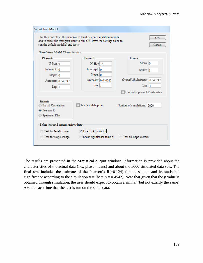
Manolov, Moeyaert, & Evans
159
The results are presented in the Statistical output window. Information is provided about the
characteristics of the actual data (i.e., phase means) and about the 5000 simulated data sets. The
final row includes the estimate of the Pearson’s R(−0.124) for the sample and its statistical
significance according to the simulation test (here p = 0.4542). Note that given that the p value is
obtained through simulation, the user should expect to obtain a similar (but not exactly the same)
p value each time that the test is run on the same data.
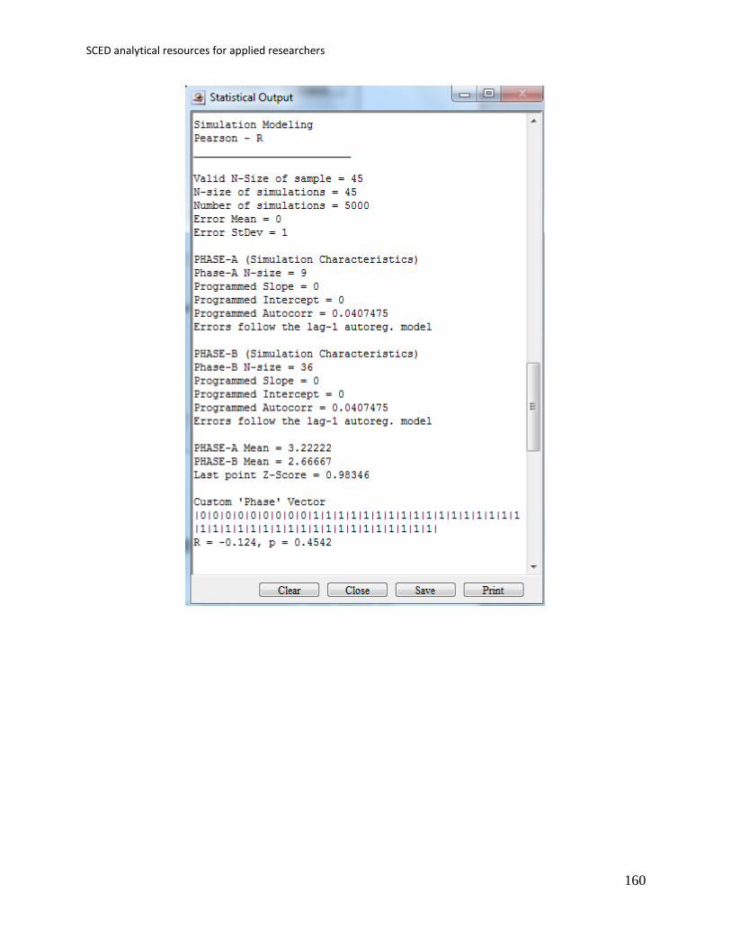
SCED analytical resources for applied researchers
160

Manolov, Moeyaert, & Evans
161
Chapter 9.
Maximal reference approach
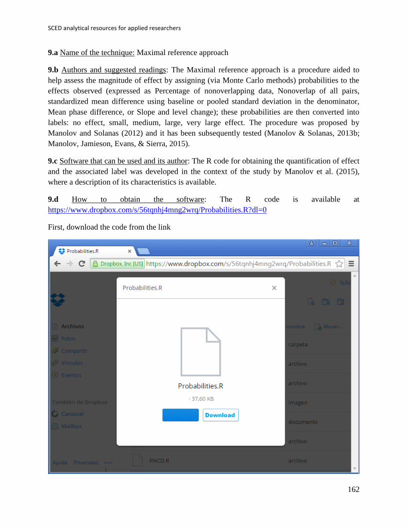
SCED analytical resources for applied researchers
162
9.a Name of the technique: Maximal reference approach
9.b Authors and suggested readings: The Maximal reference approach is a procedure aided to
help assess the magnitude of effect by assigning (via Monte Carlo methods) probabilities to the
effects observed (expressed as Percentage of nonoverlapping data, Nonoverlap of all pairs,
standardized mean difference using baseline or pooled standard deviation in the denominator,
Mean phase difference, or Slope and level change); these probabilities are then converted into
labels: no effect, small, medium, large, very large effect. The procedure was proposed by
Manolov and Solanas (2012) and it has been subsequently tested (Manolov & Solanas, 2013b;
Manolov, Jamieson, Evans, & Sierra, 2015).
9.c Software that can be used and its author: The R code for obtaining the quantification of effect
and the associated label was developed in the context of the study by Manolov et al. (2015),
where a description of its characteristics is available.
9.d How to obtain the software: The R code is available at
https://www.dropbox.com/s/56tqnhj4mng2wrq/Probabilities.R?dl=0
First, download the code from the link
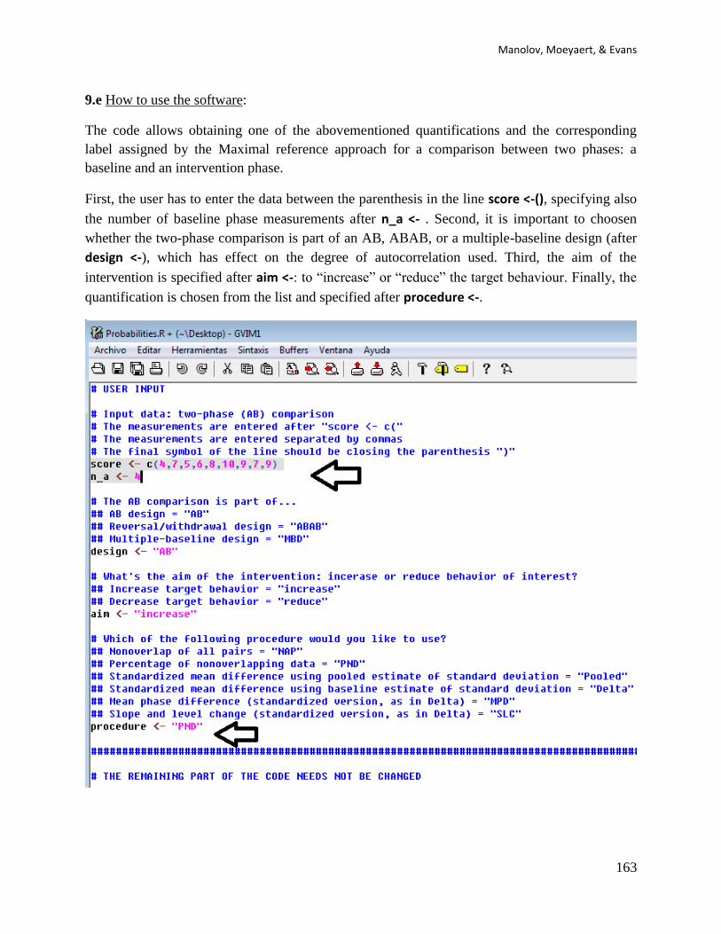
Manolov, Moeyaert, & Evans
163
9.e How to use the software:
The code allows obtaining one of the abovementioned quantifications and the corresponding
label assigned by the Maximal reference approach for a comparison between two phases: a
baseline and an intervention phase.
First, the user has to enter the data between the parenthesis in the line score <-(), specifying also
the number of baseline phase measurements after n_a <- . Second, it is important to choosen
whether the two-phase comparison is part of an AB, ABAB, or a multiple-baseline design (after
design <-), which has effect on the degree of autocorrelation used. Third, the aim of the
intervention is specified after aim <-: to “increase” or “reduce” the target behaviour. Finally, the
quantification is chosen from the list and specified after procedure <-.
SCED analytical resources for applied researchers
164
After all the necessary information is provided, the user selects the whole code and copies it.
Next, the code is pasted into the R console.
9.f How to interpret the results: As a result, the quantification and the label are obtained. In this
case, using the Percentage of nonoverlapping data as an index, there is only one (of five)
intervention phase value equal to or smaller than the highest baseline measurement, which lead
to a PND = 80%. The label “very large effect” provided by the Maximal reference approach
means that the value obtained has a probability of ≤ .05 of being observed only by chance in case
the intervention was not effective.
Manolov, Moeyaert, & Evans
165
Chapter 10.
Application of two-level multilevel models for analysing data
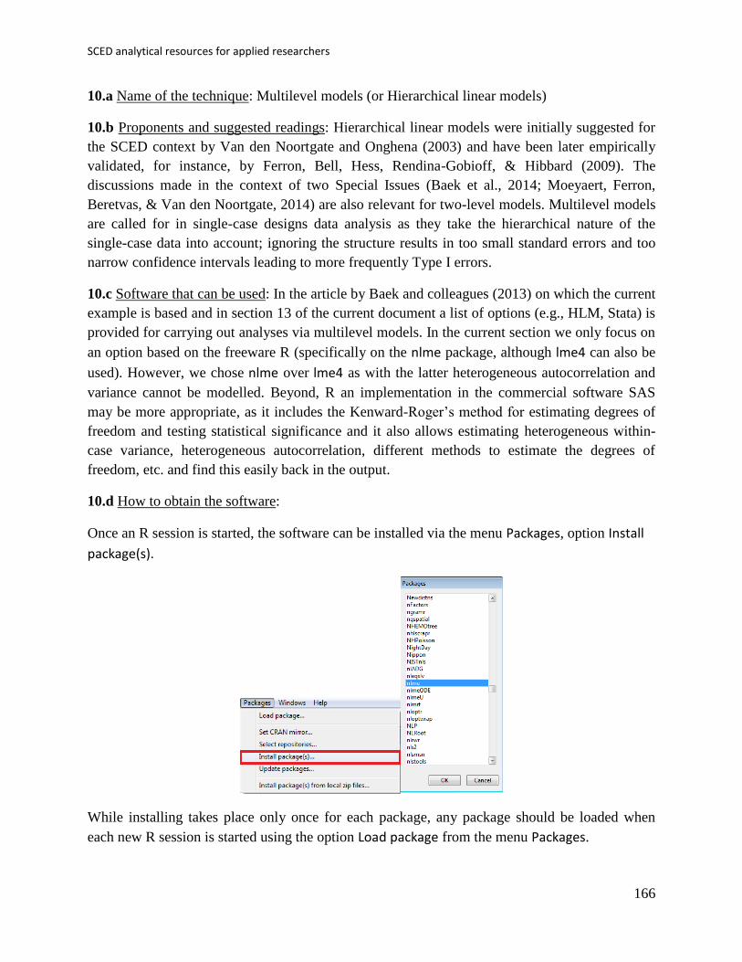
SCED analytical resources for applied researchers
166
10.a Name of the technique: Multilevel models (or Hierarchical linear models)
10.b Proponents and suggested readings: Hierarchical linear models were initially suggested for
the SCED context by Van den Noortgate and Onghena (2003) and have been later empirically
validated, for instance, by Ferron, Bell, Hess, Rendina-Gobioff, & Hibbard (2009). The
discussions made in the context of two Special Issues (Baek et al., 2014; Moeyaert, Ferron,
Beretvas, & Van den Noortgate, 2014) are also relevant for two-level models. Multilevel models
are called for in single-case designs data analysis as they take the hierarchical nature of the
single-case data into account; ignoring the structure results in too small standard errors and too
narrow confidence intervals leading to more frequently Type I errors.
10.c Software that can be used: In the article by Baek and colleagues (2013) on which the current
example is based and in section 13 of the current document a list of options (e.g., HLM, Stata) is
provided for carrying out analyses via multilevel models. In the current section we only focus on
an option based on the freeware R (specifically on the nlme package, although lme4 can also be
used). However, we chose nlme over lme4 as with the latter heterogeneous autocorrelation and
variance cannot be modelled. Beyond, R an implementation in the commercial software SAS
may be more appropriate, as it includes the Kenward-Roger’s method for estimating degrees of
freedom and testing statistical significance and it also allows estimating heterogeneous within-
case variance, heterogeneous autocorrelation, different methods to estimate the degrees of
freedom, etc. and find this easily back in the output.
10.d How to obtain the software:
Once an R session is started, the software can be installed via the menu Packages, option Install
package(s).
While installing takes place only once for each package, any package should be loaded when
each new R session is started using the option Load package from the menu Packages.

Manolov, Moeyaert, & Evans
167
10.e How to use the software: To illustrate the use of the nlme package, we will focus on the data
set analysed by Baek et al. (2014) and published by Jokel, Rochon, and Anderson (2010). This
dataset can be downloaded from https://www.dropbox.com/s/2yla99epxqufnm7/Two-
level%20data.txt?dl=0. For the ones who prefer using the SAS code for two-level models
detailed information is provided in Moyaert, Ferron, Beretvas, and Van Den Noortgate (2014).

SCED analytical resources for applied researchers
168
We digitized the data via Plot Digitizer 2.6.3 (http://plotdigitizer.sourceforge.net) focusing only
on the first two phases in each tier. One explanation1 for the differences in the results obtained
here and in the aforementioned article may be due to the fact that here we use the R package
nlme, whereas Baek and colleagues used SAS proc mixed [SAS Institute Inc., 1998] and
Kenward-Roger estimate of degrees of freedom (unlike the nlme package). SAS proc mixed
potentially handles missing data differently, which can potentially affect the estimation of
autocorrelation). Thus, the equivalence across programs is an issue yet to be solved and it needs
to be kept in mind when results are obtained with different software.
The data can be loaded via R-Commander:
1 Another explanation for differences in the results may be due to the fact that we digitized the data ourselves,
which does not ensure that that the scores retrieved by Baek et al. (2014) are exactly the same.
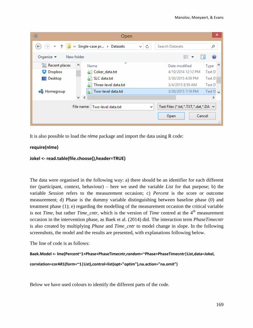
Manolov, Moeyaert, & Evans
169
It is also possible to load the nlme package and import the data using R code:
require(nlme)
Jokel <- read.table(file.choose(),header=TRUE)
The data were organised in the following way: a) there should be an identifier for each different
tier (participant, context, behaviour) – here we used the variable List for that purpose; b) the
variable Session refers to the measurement occasion; c) Percent is the score or outcome
measurement; d) Phase is the dummy variable distinguishing between baseline phase (0) and
treatment phase (1); e) regarding the modelling of the measurement occasion the critical variable
is not Time, but rather Time_cntr, which is the version of Time centred at the 4th
measurement
occasion in the intervention phase, as Baek et al. (2014) did. The interaction term PhaseTimecntr
is also created by multiplying Phase and Time_cntr to model change in slope. In the following
screenshots, the model and the results are presented, with explanations following below.
The line of code is as follows:
Baek.Model <- lme(Percent~1+Phase+PhaseTimecntr,random=~Phase+PhaseTimecntr|List,data=Jokel,
correlation=corAR1(form=~1|List),control=list(opt="optim"),na.action="na.omit")
Below we have used colours to identify the different parts of the code.

SCED analytical resources for applied researchers
170
The model used takes into account the visual impression that there is no baseline trend and thus
neither Time nor Time_cntr are included in the model, which is specified using the lme function
of the nlme package. However, there might be a change in level (modelled with the Phase
variable) and a change in slope (modelled with the PhaseTimecntr variable). Actually, we did
expect a trend in the treatment phase and therefore we added an estimator for the chance in trend
between baseline and treatment phase which is captured by PhaseTimecntr (Time_cntr is only
used as an intermediate step to calculate PhaseTimecntr = Phase × Timecntr). Phase and
PhaseTimecntr are are marked in red in the code presented above. The change in level and in
slope, as well as the intercept, are allowed to vary randomly across the three lists (|List
specification), which is why Phase and PhaseTimecntr also appear after the random= code.
Actually, as the reader might have noted, the intercept (1) is not explicitly included after the
random= , but it is rather automatically included by the function. This is why we obtain an
estimated for the variance of the intercept across lists (standard deviation equal to 2.25). The
random part of the model is marked above in green. The error structure is specified to be first-
order autoregressive (as Baek et al., did) and lag-one autocorrelation is estimated from the data
via the correlation=corAR1() part of the code (marked in blue), which also flects the fact that the
measurements are nested within lists (form~1|List). This line of code specifying the model can
be typed into the R console or the upper window of the R-Commander (clicking on Submit).
10.f How to interpret the results:
The estimates obtained for the fixed effects (Intercept = average initial baseline level across the 3
behaviours; Phase = because of the way the data are centred the estimate of phase does not refer
to the average chance in level immediate after the intervention (as is common); it rather

Manolov, Moeyaert, & Evans
171
represents the change between the outcome score at the fourth measurement occasion of the
treatment phase and the projected last measure of the treatment phase; PhaseTimecntr = average
increase in percentage correct at the 4th
measurement occasion in the intervention phase) are very
close to the ones reported by Baek et al. (2014). The statistical significance for the fixed effect of
interest (change in level and change in slope) can be obtained via the Wald test dividing the
estimate by its standard deviation and referring to a t distribution with J – P – 1 degrees of
freedom (J = number of measurements; P = number of predictors), according to Hox (2002). In
the nlme package, this information is obtained via the function summary ().
For the random effects (variances of Intercept, Phase, and PhaseTimecntr), the results are also
reasonably similar (after squaring the standard deviation values provided by R in order to obtain
the variances). In order to explore whether modelling variability in the change in level and in the
change in slope between the lists is useful from a statistical perspective, we can compare the full
model (Baek.Model) with the models not allowing for variation in the change in level
(Baek.NoVarPhase) and for variation in the change in slope (Baek.NoVarSlope). The latter two
models are created updating the portion of the code refers to random effects (random=)
excluding the effects whose statistical significance is being tested. The comparison is performed
using the anova function, which actually carries out a chi-square test on the –2 log likelihood
values for the models being compared.
Baek.NoVarSlope <- update(Baek.Model, random=~Phase|List)
anova(Baek.Model,Baek.NoVarSlope)
Baek.NoVarPhase <- update(Baek.Model, random=~PhaseTimecntr|List)
anova(Baek.Model,Baek.NoVarPhase)
Mark the text and press “Submit”

SCED analytical resources for applied researchers
172
These results indicate that incorporating these random effects is useful in reducing unexplained
variability as in both cases the p values are lower than .05. We can check the amount of
reduction of residual variability using the following code:
VarCorr(Baek.Model)
VarCorr(Baek.NoVarSlope)
VarCorr(Baek.NoVarPhase)
Allowing for the treatment effect on trend to vary across lists implies the following reduction:
68.892 − 9.038
68.892=
59.854
68.892≈ 86.88%

Manolov, Moeyaert, & Evans
173
Allowing for the average treatment effect to vary across lists implies the following reduction:
65.079 − 9.038
65.079=
56.041
65.079≈ 86.11%
10.g Additional resources:
Given that the use of code is more intensive for the multilevel models and for the nlme package,
we include some additional information here. In the present section we focused on the use of the
R package nlme developed by Jose Pinheiro and colleagues (2013). We recommend a text by
Paul Bliese (2013) as a guide for working with this package, with sections 3.6 and 4 being
especially relevant.
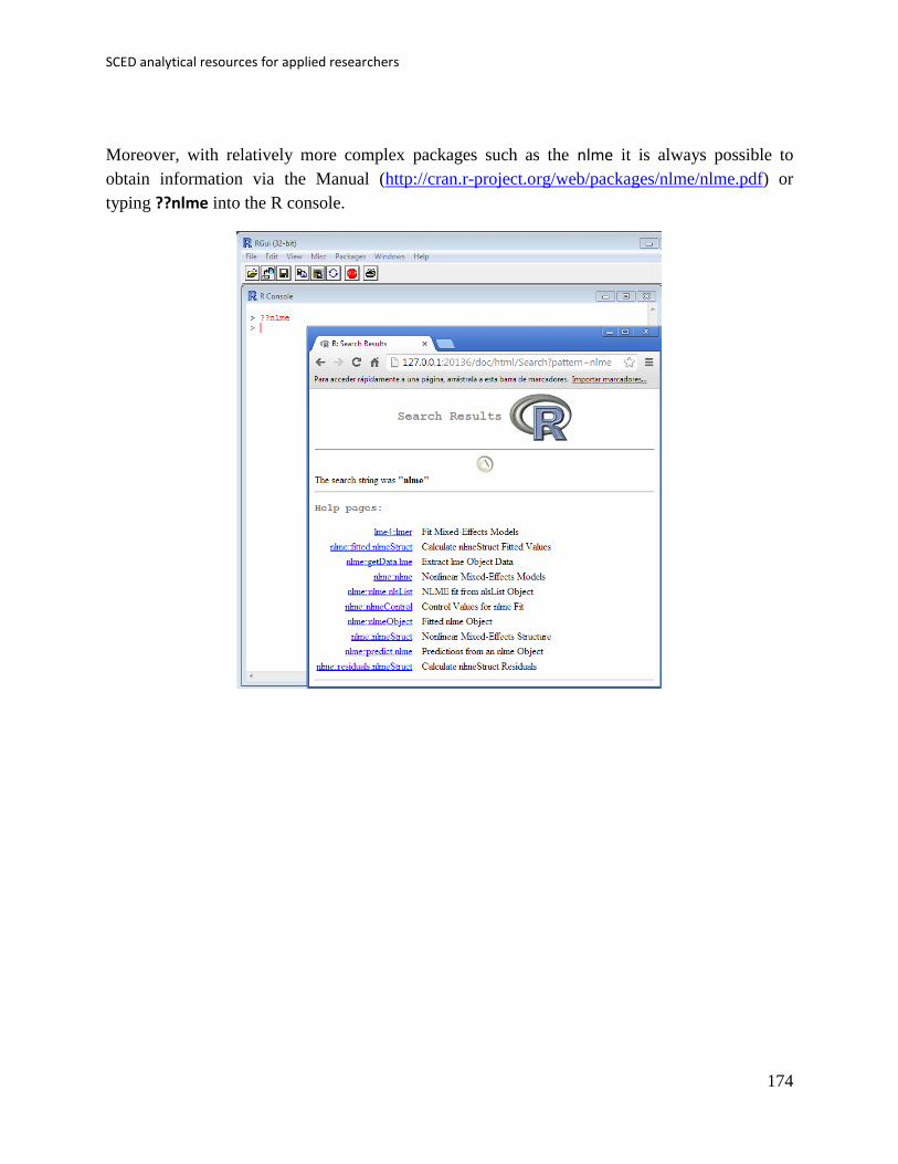
SCED analytical resources for applied researchers
174
Moreover, with relatively more complex packages such as the nlme it is always possible to
obtain information via the Manual (http://cran.r-project.org/web/packages/nlme/nlme.pdf) or
typing ??nlme into the R console.

Manolov, Moeyaert, & Evans
175
Chapter 11.
Integrating results of several studies

SCED analytical resources for applied researchers
176
11.1a Name of the technique: Meta-analysis using the SCED-specific standardized mean
difference
11.1b Proponents and suggested readings: Meta-analysis is a statistical procedure for integrating
quantitatively the results of several studies. Among the readings to consulted we should mention
Hedges and Olkin (1985), Hunter and Schimdt (2004), and Cooper, Hedges, and Valentine,
(2009). Specifically for single-case designs, several Special Issues have dedicated papers, for
instance, Journal of Behavioral Education (2012: Volume 21, Issue 3), Journal of School
Psychology (2014: Volume 52, Issue 2) and Neuropsychological Rehabilitation (2014: Volume
24, Issues 3-4).
Actually the code presented here can be used for any effect size index for which the variance can
be estimated and the inverse variance can be used as a weight. For that reason, the present
chapter is equally applicable to Percentage data reduction index, using the variance formula
provided by Hershberger et al. (1999).
11.1c Software that can be used: There are several options for carrying out meta-analysis of
group studies, such as Comprehensive meta-analysis and metafor, rmeta, and meta packages for
R. There appears to be no specific software for the meta-analysis of single-case data. In the
current section we focus on the way in which the SCED-specific d-statistic values can be
integrated quantitatively.
11.1d How to obtain the software: The R code for applying the d-statistics (Hedges, Pustejovsky,
& Shadish, 2012; 2013) at the across-studies level is available at
https://www.dropbox.com/s/41gc9mrrt3jw93u/Across%20studies_d.R?dl=0. This code was
developed for an illustration paper (Manolov & Solanas, 2015).
The d-statistics themselves can be implemented in R using the code from James Pustejovsky’s
blog: http://blogs.edb.utexas.edu/pusto/software/ in the section scdhlm, which is the name of the
package. (This code needs to be installed first as a package in R and, afterwards, loaded in the R
session. For instance, if the code is downloaded as a compressed (.zip) file from
https://www.box.com/shared/static/f63nfpiebs8s1uxdwgfh.zip, installation is performed in R via
the menu Packages Install package(s) from local zip files.)
The code for performing meta-analysis using the d-statistic as effect size measure and its inverse
variance as a weight for each study is obtained from the first URL provided in this section.
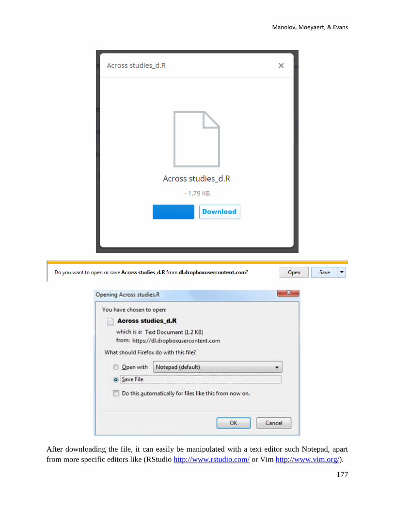
Manolov, Moeyaert, & Evans
177
After downloading the file, it can easily be manipulated with a text editor such Notepad, apart
from more specific editors like (RStudio http://www.rstudio.com/ or Vim http://www.vim.org/).
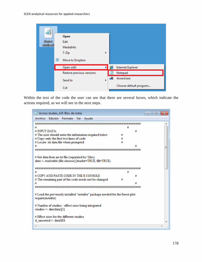
SCED analytical resources for applied researchers
178
Within the text of the code the user can see that there are several boxes, which indicate the
actions required, as we will see in the next steps.

Manolov, Moeyaert, & Evans
179
11.1e How to use the software:
First, the data file should be created following a pre-defined structure. In the first column (“Id”),
the user specifies the identification of each individual study to be included in the meta-analysis.
In the second column (“ES”), the user specifies the value of the d-statistic for each study. In the
third column (“Variance”), the user specifies the variance of the d-statistic as obtained using the
scdhlm R package. The inverse of this variance will be used for obtaining the weighted average.
Below a small set of four studies to be meta-analyzed is presented. This dataset can be obtained
from https://www.dropbox.com/s/jk9bzvikzae1aha/d_Meta-analysis.txt?dl=0.
The Excel file is saved as a text file, as shown below.
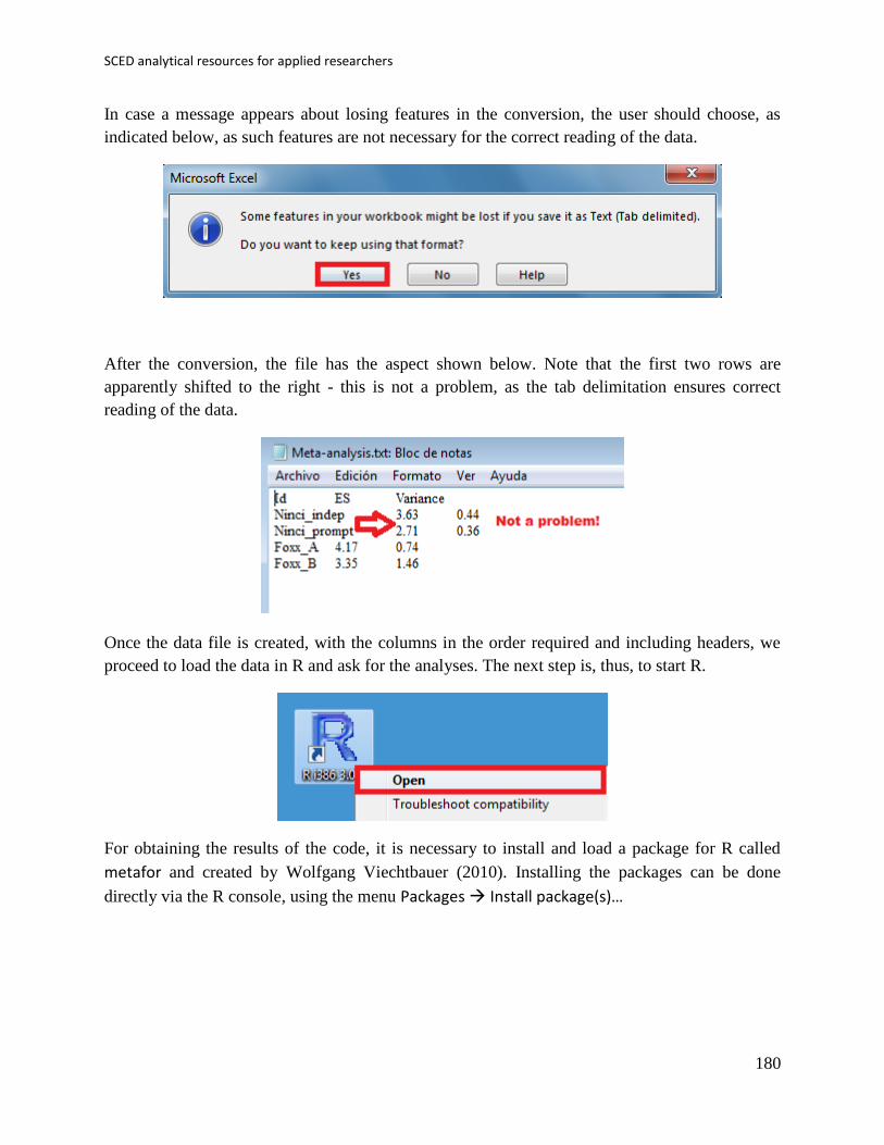
SCED analytical resources for applied researchers
180
In case a message appears about losing features in the conversion, the user should choose, as
indicated below, as such features are not necessary for the correct reading of the data.
After the conversion, the file has the aspect shown below. Note that the first two rows are
apparently shifted to the right - this is not a problem, as the tab delimitation ensures correct
reading of the data.
Once the data file is created, with the columns in the order required and including headers, we
proceed to load the data in R and ask for the analyses. The next step is, thus, to start R.
For obtaining the results of the code, it is necessary to install and load a package for R called
metafor and created by Wolfgang Viechtbauer (2010). Installing the packages can be done
directly via the R console, using the menu Packages Install package(s)…
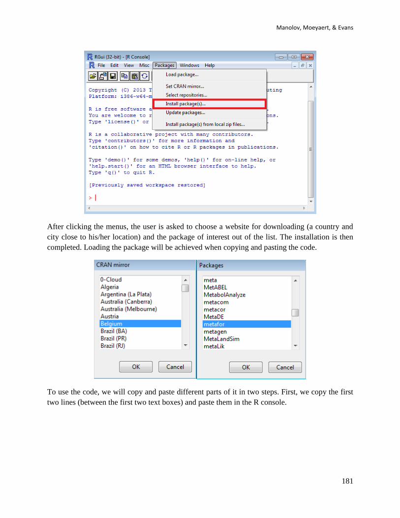
Manolov, Moeyaert, & Evans
181
After clicking the menus, the user is asked to choose a website for downloading (a country and
city close to his/her location) and the package of interest out of the list. The installation is then
completed. Loading the package will be achieved when copying and pasting the code.
To use the code, we will copy and paste different parts of it in two steps. First, we copy the first
two lines (between the first two text boxes) and paste them in the R console.

SCED analytical resources for applied researchers
182
After pasting the code in the R console, the user is prompted to locate the file containing the
summary data for the studies to be meta-analyzed. Thanks to the way in which the data file was
created, the data are read correctly with no further input required from the user.
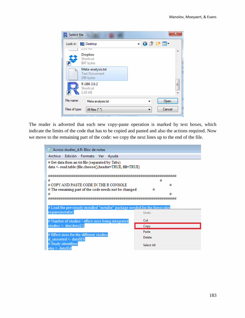
Manolov, Moeyaert, & Evans
183
The reader is adverted that each new copy-paste operation is marked by text boxes, which
indicate the limits of the code that has to be copied and pasted and also the actions required. Now
we move to the remaining part of the code: we copy the next lines up to the end of the file.

SCED analytical resources for applied researchers
184
This code is pasted into the R console
11.1f How to interpret the output:
After pasting the code in the R console, it leads to the output of the meta-analysis. This output is
presented in a graphical form using a standard forest plot, where each study is represented by its
identification (i.e., id) and its effect size (ES), marked by the location of the square box and also
presented numerically (e.g., 3.35 for Foxx B). The size of the square box corresponds to the
weight of the study and the error bars represent 95% confidence intervals. The researcher should
note that the effect sizes of the individual studies are sorted according to their distance from the
zero difference between baseline and intervention conditions. The weighted average is
represented by a diamond, the location of which marks its value. The horizontal extension of this
diamond is its confidence interval.

Manolov, Moeyaert, & Evans
185
11.2a Name of the technique: Meta-analysis using the Mean phase difference and the Slope and
level change procedures
11.2b Authors and suggested readings: This proposal was made by Manolov and Rochat (2015)
and it consists in obtaining a weighted average of the new versions of the MPD and SLC, where
the weight is either the series length or the series length and the inverse of the within-study
variability of effects. Actually, the code presented here can be used for any quantification that
compares two phases and any weight chosen by the user, as these pieces of information are part
of the data file. It is also possible to use an unweighted mean by assigning the same weight to all
outcomes.
11.2c Software that can be used: The R code was developed by R. Manolov in the context of the
abovementioned study.
11.2d How to obtain the software: The R code for applying either of the procedures (MPD or
SLC, in either percentage or standardized version, or actually any set of studies for which effect
sizes and weights have already been obtained) at the across-studies level is available at
https://www.dropbox.com/s/wtboruzughbjg19/Across%20studies.R.

SCED analytical resources for applied researchers
186
After downloading the file, it can easily be manipulated with a text editor such Notepad, apart
from more specific editors like (RStudio http://www.rstudio.com/ or Vim http://www.vim.org/).
Within the text of the code the user can see that there are several boxes, which indicate the
actions required, as we will see in the next steps.

Manolov, Moeyaert, & Evans
187
11.2e How to use the software:
First, the data file should be created following a pre-defined structure. In the first column (“Id”),
the user specifies the identification of each individual study to be included in the meta-analysis.
In the second column (“ES”), the user specifies the effect size for each study, keeping with the
recommendation to have only one effect size per study. In the third column (“weight”), the user
specifies the weight of this effect size, which will be used for obtaining the weighted average. In
subsequent columns (marked with “Tier”), the user specifies the different outcomes obtained
within each study. These columns are created on the basis that SCED multiple-baseline studies
are included in the meta-analysis, but actually, for the meta-analysis, it does not matter where the
different outcomes come from or if there is more one outcome within each study or not (all the
necessary information is already available in the weights).
Below a fictitious set of seven studies to be meta-analyzed is presented (it can be obtained
from https://www.dropbox.com/s/htb9fmrb0v6oi57/Meta-analysis.txt?dl=0). The reader should
note that the order of the columns is exactly the same as in the numerical output of the R code for
MPD and SLC presented above. Therefore, in order to construct a data file for meta-analysis, the
user is only required to copy and paste the results of each analysis carried out for each individual
study.
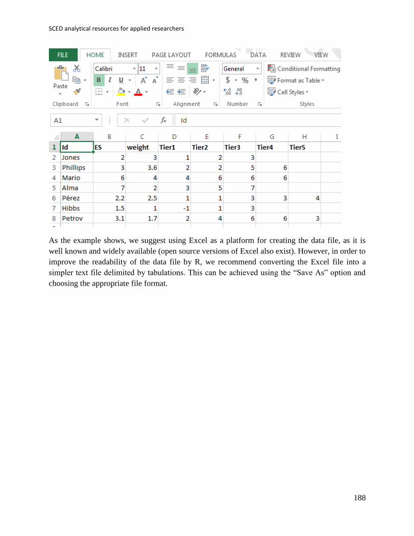
SCED analytical resources for applied researchers
188
As the example shows, we suggest using Excel as a platform for creating the data file, as it is
well known and widely available (open source versions of Excel also exist). However, in order to
improve the readability of the data file by R, we recommend converting the Excel file into a
simpler text file delimited by tabulations. This can be achieved using the “Save As” option and
choosing the appropriate file format.
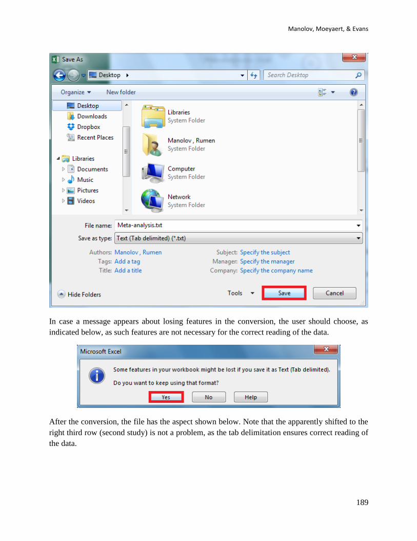
Manolov, Moeyaert, & Evans
189
In case a message appears about losing features in the conversion, the user should choose, as
indicated below, as such features are not necessary for the correct reading of the data.
After the conversion, the file has the aspect shown below. Note that the apparently shifted to the
right third row (second study) is not a problem, as the tab delimitation ensures correct reading of
the data.

SCED analytical resources for applied researchers
190
Once the data file is created, with the columns in the order required and including headers, we
proceed to load the data in R and ask for the analyses. The next step is, thus, to start R.
For obtaining the results of the code, it is necessary to install and load a package for R called
metaphor and created by Wolfgang Viechtbauer (2010). Installing the packages can be done
directly via the R console, using the menu Packages Install package(s)…

Manolov, Moeyaert, & Evans
191
After clicking the menus, the user is asked to choose a website for downloading (a country and
city close to his/her location) and the package of interest out of the list. The installation is then
completed. Loading the package will be achieved when copying and pasting the code.
To use the code, we will copy and paste different parts of it in several steps. First, we copy the
first two lines (between the first two text boxes) and paste them in the R console.
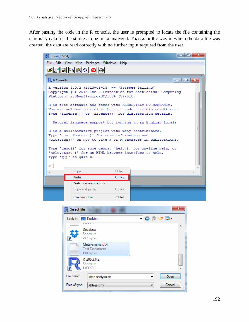
SCED analytical resources for applied researchers
192
After pasting the code in the R console, the user is prompted to locate the file containing the
summary data for the studies to be meta-analyzed. Thanks to the way in which the data file was
created, the data are read correctly with no further input required from the user.
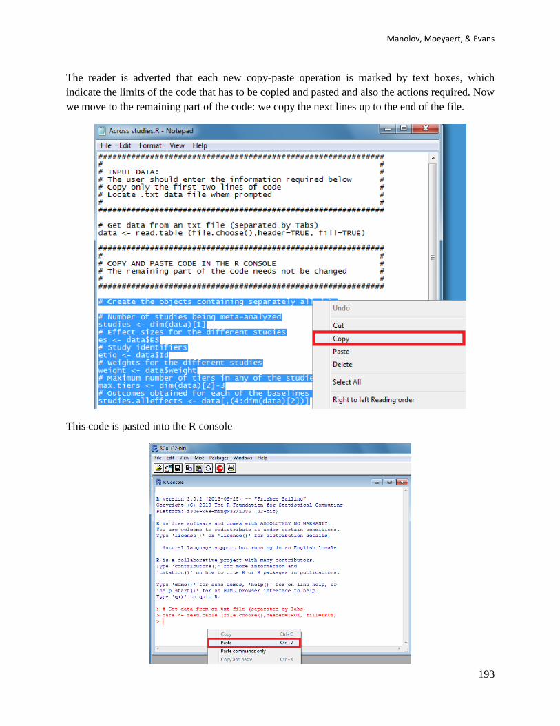
Manolov, Moeyaert, & Evans
193
The reader is adverted that each new copy-paste operation is marked by text boxes, which
indicate the limits of the code that has to be copied and pasted and also the actions required. Now
we move to the remaining part of the code: we copy the next lines up to the end of the file.
This code is pasted into the R console

SCED analytical resources for applied researchers
194
11.2f How to interpret the output:
After pasting the code in the R console, it leads to the output of the meta-analysis. This output is
presented in a graphical form using a modified version of the commonly used forest plot. Just
like a regular forest plot, each study is represented by its identification and its effect size, marked
by the location of the square box and also presented numerically (i.e., 1.5 for Hibbs, 2.00 for
Jones and so forth). The size of the square box corresponds to the weight of the study, as in a
normal forest plot, but the error bars do not represent confidence intervals; they rather represent
the range of effect sizes observed within-each study (e.g., across the different tiers of a multiple-
baseline design). If there is only one outcome within a study, there “is no range”, but only a box.
The researcher should note that the effect sizes of the individual studies are sorted according to
their distance from the zero difference between baseline and intervention conditions.
For the weighted average there are also similarities and differences with a regular forest plot.
This weighted average is represented by a diamond, the location of which marks its value.
Nonetheless, the horizontal extension of this diamond is not its confidence interval. It rather
represents, once again, the range of the individual-study effect sizes that contributed to the
weighted average.
Manolov, Moeyaert, & Evans
195
11.3 Application of three-level multilevel models for analysing data
11.3a Name of the technique: Multilevel models (or Hierarchical linear models)
11.3b Proponents and suggested readings: Hierarchical linear models were initially suggested for
the SCED context by Van den Noortage and Onghena (2003, 2008) and have been later
empirically validated, for instance, by Owens and Ferron, and Moeyaert, Ugille, Ferron,
Beretvas, and Van Den Noortgate (2013a, 2013b). An application by Davis et al. (2013) is also
recommended, apart from the discussion made in the context of the Special Issue (Baek et al.,
2014; Moeyaert, Ferron, Beretvas, and Van Den Noortgate (2014). Multilevel models are called
for in single-case designs data meta-analysis, as they take into account the nested structure of the
data and model the dependencies that this nested structure entails.
In the present section we deal with the application of multilevel models to unstandardized data
measured in the same measurement units (here, percentages). However, the same procedure can
be followed after data in different measurement units are standardized according to the proposal
of Van den Noortgate and Onghena (2008), described when dealing with Piecewise regression.
The single-case data are standardized prior to applying the multilevel model.
11.3c Software that can be used: In section 13 of the current document a list of options (e.g.,
HLM, Stata) is provided for carrying out analyses via multilevel models. In the current section
we only focus on an option based on the freeware R (specifically on the nlme package, although
lme4 can also be used), although an implementation in the commercial software SAS may be
more appropriate, as it includes the Kenward-Roger’s method for estimating degrees of freedom
and testing statistical significance and it also allows estimating heterogeneous within-case
variance, heterogeneous autocorrelation, different methods to estimate the degrees of freedom,
etc. and find this easily back in the output.
11.3d How to obtain the software:
Once an R session is started, the software can be installed via the menu Packages, option Install
package(s).

SCED analytical resources for applied researchers
196
While installing takes place only once for each package (and for each computer on which R is
installed), any package to-be-used should be loaded when each new R session is started using the
option Load package from the menu Packages.
11.3e How to use the software & 11.2f How to interpret the results: To illustrate the use of the
nlme package, we will focus on the data set analysed by Moeyaert, Ferron, Beretvas, and Van
Den Noortgate (2014) and published by Laski, Charlop, and Schreibman (1988) LeBlanc,
Geiger, Sautter, and Sidener (2007), Schreibman, Stahmer, Barlett, and Dufek (2009), Shrerer &
Schreibman (2005), Thorp, Stahmer, and Schreibman (1995), selecting only the data dealing
with appropriate and/or spontaneous speech behaviours. In this case the purpose is to combine
data across several single-case studies and therefore we need to take a three-level structure into
account, that is, measurements are nested within cases and cases in turn are nested within studies.

Manolov, Moeyaert, & Evans
197
Using the nlme package, we can take this nested structure into account. In contrast, we
previously described the case in which a two-level model is used for analyse the data within a
single study.
The data are organised in the following way: a) there should be an identified for each different
study – here we used the variable Study in the first column [see an extract of the data table
below]; b) there should also be an identifier for each different case – the variable Case in the
second column; c) the variable T (for time) refers to the measurement occasion; d) the variable
T1 refers to time centred around the first measurement occasion, which is thus equal to 0, with
the following measurement occasion taking the values of 1, 2, 3., …, until nA + nB − 1, where nA
and nB are the lengths of the baseline and treatment phases, respectively; e) the variable T2 refers
to time centred around the first intervention phase measurement occasion, which is thus equal to
0; in this way the last baseline measurement occasion is denoted by −1, the penultimate by −2,
and so forth down to –nA, whereas the intervention phase measurement occasions take the
numbers 0, 1, 2, 3,… up to nB – 1; f) the variable DVY is the score of the dependent variable: the
percentage of appropriate and/or spontaneous speech behaviours in this case; g) D is the dummy
variable distinguishing between baseline phase (0) and treatment phase (1); h) Dt is a variable
that represents the interaction between D and T2 and it is used for modelling change in slope; i)
Age is a second-level predictor representing the age of the participants (i.e., the Cases); j) Age1 is
the same predictor centred at the average age of all participants; this centring is performed in
order to make the intercept more meaningful, so that it represents the expected score (percentage
of appropriate and/or spontaneous speech behaviours) for the average-aged individual rather than
for individuals with age equal to zero, which would be less meaningful. The dataset can be
downloaded from https://www.dropbox.com/s/e2u3edykupt8nzi/Three-level%20data.txt?dl=0.

SCED analytical resources for applied researchers
198
The data can be loaded via R-Commander:
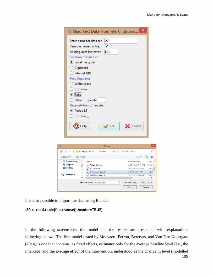
Manolov, Moeyaert, & Evans
199
It is also possible to import the data using R code:
JSP <- read.table(file.choose(),header=TRUE)
In the following screenshots, the model and the results are presented, with explanations
following below. The first model tested by Moeyaert, Ferron, Beretvas, and Van Den Noortgate
(2014) is one that contains, as fixed effects, estimates only for the average baseline level (i.e., the
Intercept) and the average effect of the intervention, understood as the change in level (modelled

SCED analytical resources for applied researchers
200
via the D variable). The variation, between cases and between studies, in the baseline level and
the change in level due to the introduction of the intervention is also modelled in the random part
of the model.
First the code is provided so that user can copy and paste it. Afterwards, the aspect of the code
from the Vim editor is shown in order to illustrate how the different parts of the code are marked,
including this time the explanations of the different lines after the # sign.
require(nlme) JSP <- read.table(file.choose(),header=TRUE) Model.1 <- lme(DVY~1+D, random=~1+D|Study/Case, data=JSP, control=list(opt="optim")) summary(Model.1) VarCorr(Model.1) coef(Model.1) intervals(Model.1)
As it can be seen, each part of the code is preceded by an explanation of what the code does. If
the package is already loaded, it is not necessary to use the require() function. When the
read.table() function is used the user has to locate the file. Regarding running the model, note
that all the code is actually a single line, which can look like divided in two (and sometimes
more) lines according to the text editor. The function summary() provides the results presented
below.
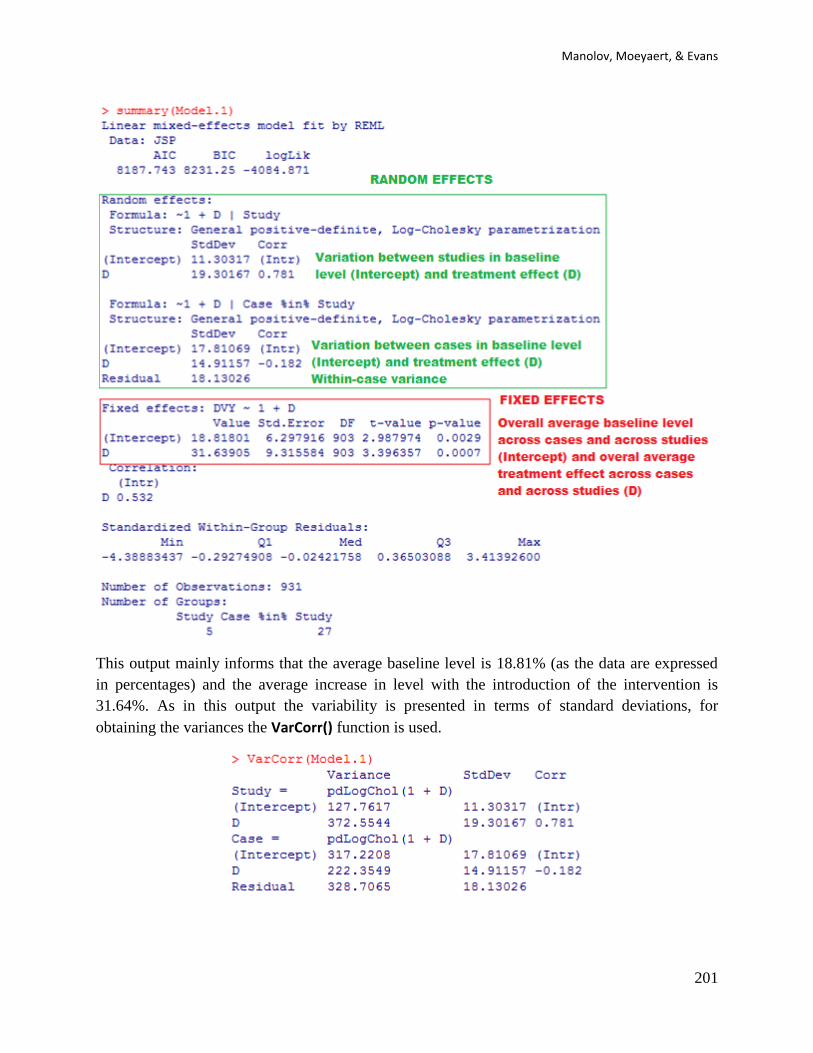
Manolov, Moeyaert, & Evans
201
This output mainly informs that the average baseline level is 18.81% (as the data are expressed
in percentages) and the average increase in level with the introduction of the intervention is
31.64%. As in this output the variability is presented in terms of standard deviations, for
obtaining the variances the VarCorr() function is used.

SCED analytical resources for applied researchers
202
From this output, it is possible to compute the covariance between baseline level and treatment
effect via the following multiplication 0.781 × 11.30317 × 19.30167 = 154.90007 (Moeyaert,
Ferron, Beretvas, & Van Den Noortgate, 2014, report 144.26).
It is also possible to obtain the estimates for each individual, given that we have allowed for
different estimates between cases and between studies, specifying both the intercept (using the
number 1) and the phase dummy variable (D) as random effects at the second and third level of
the three-level model.
From this output we can see that there is actually a lot of variability in the estimates of average
baseline level and average treatment effect, something which was already evident in high
variances presented above. (As a side note, simulation studies have shown that between-case and
between-case variance estimates can be biased, especially when there are a small number of
studies are combined, although this is more problematic for standardized data than for
unstandardized raw data. Thus, variance estimates need to be interpreted with caution).
Finally, the confidence intervals obtained with the intervals() function show that all the fixed
effects estimates are statistically significantly different from zero. Additionally, we get the
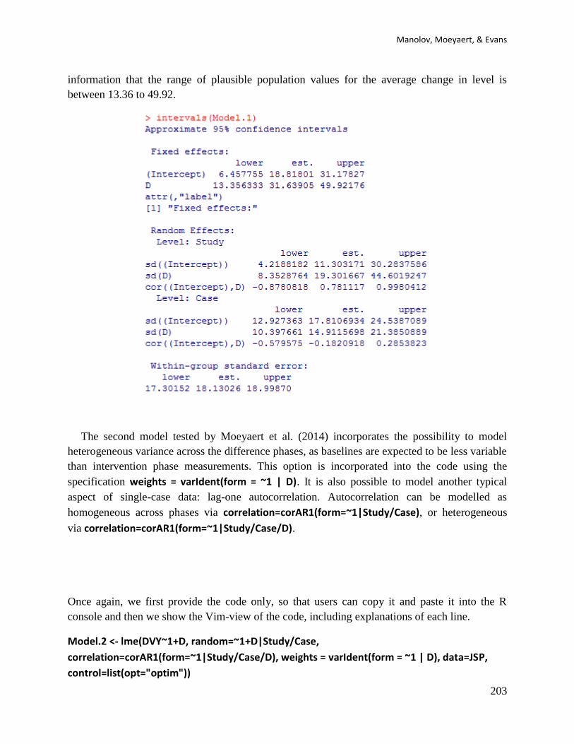
Manolov, Moeyaert, & Evans
203
information that the range of plausible population values for the average change in level is
between 13.36 to 49.92.
The second model tested by Moeyaert et al. (2014) incorporates the possibility to model
heterogeneous variance across the difference phases, as baselines are expected to be less variable
than intervention phase measurements. This option is incorporated into the code using the
specification weights = varIdent(form = ~1 | D). It is also possible to model another typical
aspect of single-case data: lag-one autocorrelation. Autocorrelation can be modelled as
homogeneous across phases via correlation=corAR1(form=~1|Study/Case), or heterogeneous
via correlation=corAR1(form=~1|Study/Case/D).
Once again, we first provide the code only, so that users can copy it and paste it into the R
console and then we show the Vim-view of the code, including explanations of each line.
Model.2 <- lme(DVY~1+D, random=~1+D|Study/Case,
correlation=corAR1(form=~1|Study/Case/D), weights = varIdent(form = ~1 | D), data=JSP,
control=list(opt="optim"))
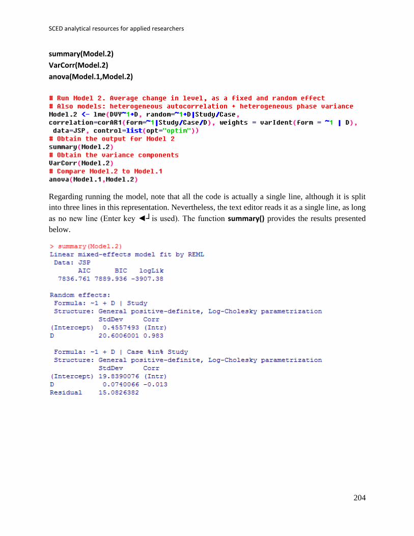
SCED analytical resources for applied researchers
204
summary(Model.2)
VarCorr(Model.2)
anova(Model.1,Model.2)
Regarding running the model, note that all the code is actually a single line, although it is split
into three lines in this representation. Nevertheless, the text editor reads it as a single line, as long
as no new line (Enter key ◄┘is used). The function summary() provides the results presented
below.
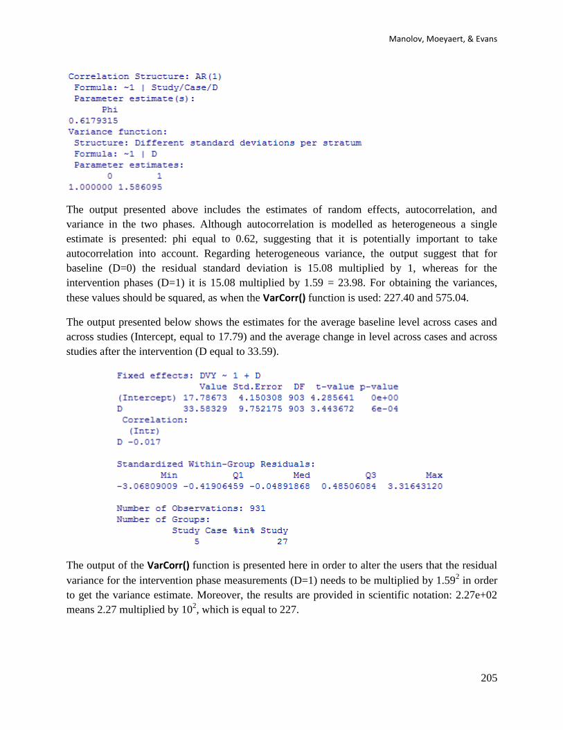
Manolov, Moeyaert, & Evans
205
The output presented above includes the estimates of random effects, autocorrelation, and
variance in the two phases. Although autocorrelation is modelled as heterogeneous a single
estimate is presented: phi equal to 0.62, suggesting that it is potentially important to take
autocorrelation into account. Regarding heterogeneous variance, the output suggest that for
baseline (D=0) the residual standard deviation is 15.08 multiplied by 1, whereas for the
intervention phases (D=1) it is 15.08 multiplied by 1.59 = 23.98. For obtaining the variances,
these values should be squared, as when the VarCorr() function is used: 227.40 and 575.04.
The output presented below shows the estimates for the average baseline level across cases and
across studies (Intercept, equal to 17.79) and the average change in level across cases and across
studies after the intervention (D equal to 33.59).
The output of the VarCorr() function is presented here in order to alter the users that the residual
variance for the intervention phase measurements (D=1) needs to be multiplied by 1.592 in order
to get the variance estimate. Moreover, the results are provided in scientific notation: 2.27e+02
means 2.27 multiplied by 102, which is equal to 227.
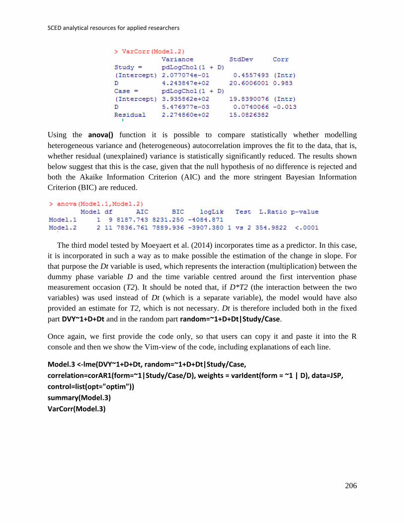
SCED analytical resources for applied researchers
206
Using the anova() function it is possible to compare statistically whether modelling
heterogeneous variance and (heterogeneous) autocorrelation improves the fit to the data, that is,
whether residual (unexplained) variance is statistically significantly reduced. The results shown
below suggest that this is the case, given that the null hypothesis of no difference is rejected and
both the Akaike Information Criterion (AIC) and the more stringent Bayesian Information
Criterion (BIC) are reduced.
The third model tested by Moeyaert et al. (2014) incorporates time as a predictor. In this case,
it is incorporated in such a way as to make possible the estimation of the change in slope. For
that purpose the Dt variable is used, which represents the interaction (multiplication) between the
dummy phase variable D and the time variable centred around the first intervention phase
measurement occasion (T2). It should be noted that, if D*T2 (the interaction between the two
variables) was used instead of Dt (which is a separate variable), the model would have also
provided an estimate for T2, which is not necessary. Dt is therefore included both in the fixed
part DVY~1+D+Dt and in the random part random=~1+D+Dt|Study/Case.
Once again, we first provide the code only, so that users can copy it and paste it into the R
console and then we show the Vim-view of the code, including explanations of each line.
Model.3 <-lme(DVY~1+D+Dt, random=~1+D+Dt|Study/Case,
correlation=corAR1(form=~1|Study/Case/D), weights = varIdent(form = ~1 | D), data=JSP,
control=list(opt="optim"))
summary(Model.3)
VarCorr(Model.3)
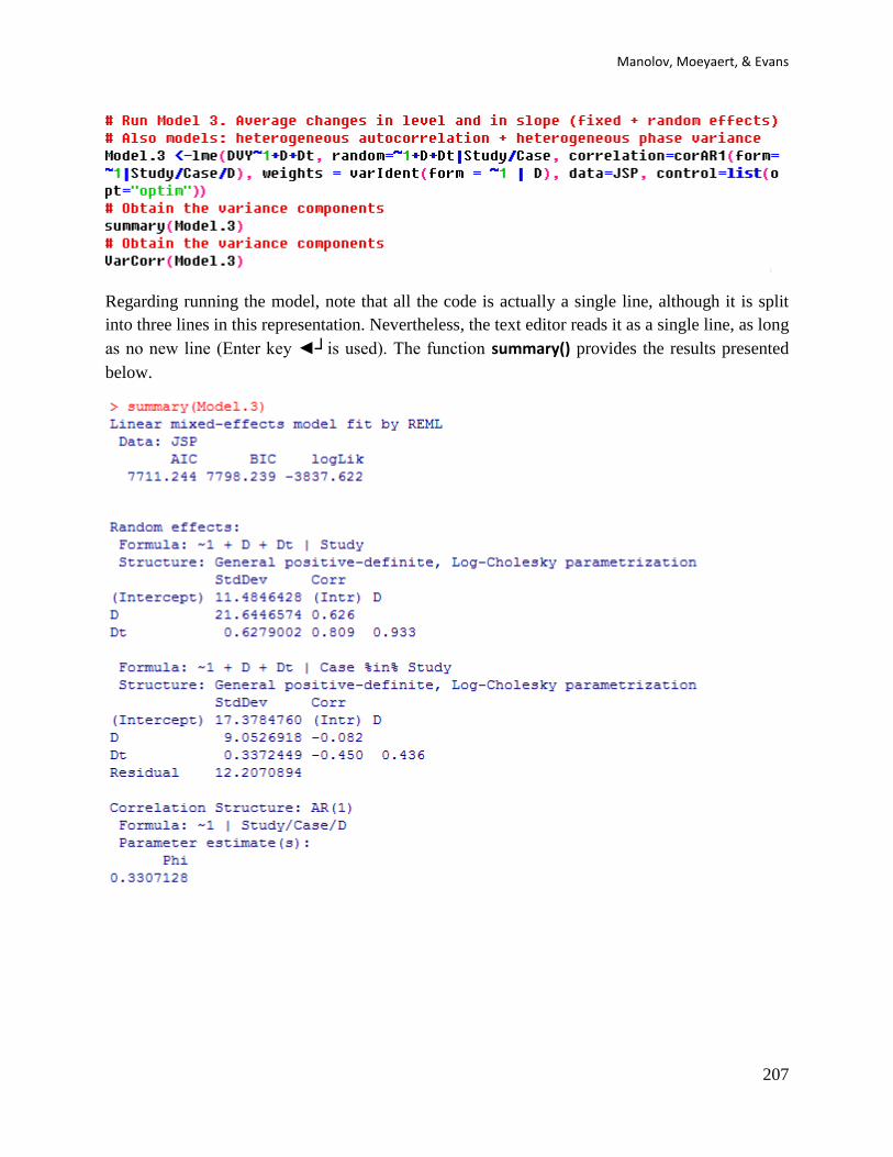
Manolov, Moeyaert, & Evans
207
Regarding running the model, note that all the code is actually a single line, although it is split
into three lines in this representation. Nevertheless, the text editor reads it as a single line, as long
as no new line (Enter key ◄┘is used). The function summary() provides the results presented
below.

SCED analytical resources for applied researchers
208
It can be seen that the average trend across cases and across studies during treatment is 1.22,
which is statistically significantly different from zero. In this case it is not possible to use the
anova() function for comparing models (as Model.2 and Model.3), as they incorporate different
variables in the fixed part. Nevertheless, we can check the relative reduction in variance
indicating how much the fit to the data is improved (and how much more variability of the
measurements is explained).
The residual variance in Model.2 was 227 for the baseline and 227 1.592 ≈ 575. The residual
variance in Model.3 is 149 for the baseline and 149 1.412 ≈ 296. Therefore, the relative
reduction in unexplained baseline variability is (227 – 149) / 227 = 34% and the for the treatment
phase variability it is (575 – 296) / 575 = 49%. Thus, modelling the change in slope is important
for explaining the variability in the data.
The fourth and final model tested by Moeyaert, Ferron, Beretvas, and Van den Noortgate
(2014) incorporates a predictor at the case-level (i.e., level 2): age. The authors choose not using
the original values of age, but to centre it on the average age of all participants. It is modelled in
this way, as they expected that the overall average baseline level is dependent on the age. In
contrast, they did not evaluate whether the overall average treatment effect and the overall
average treatment effect on the slope is dependent on age (otherwise we needed to include more
interaction effects).
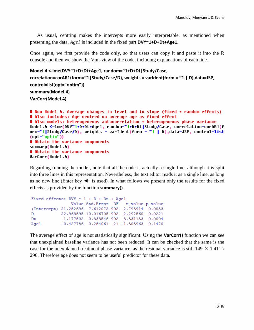
Manolov, Moeyaert, & Evans
209
As usual, centring makes the intercepts more easily interpretable, as mentioned when
presenting the data. Age1 is included in the fixed part DVY~1+D+Dt+Age1.
Once again, we first provide the code only, so that users can copy it and paste it into the R
console and then we show the Vim-view of the code, including explanations of each line.
Model.4 <-lme(DVY~1+D+Dt+Age1, random=~1+D+Dt|Study/Case,
correlation=corAR1(form=~1|Study/Case/D), weights = varIdent(form = ~1 | D),data=JSP,
control=list(opt="optim"))
summary(Model.4)
VarCorr(Model.4)
Regarding running the model, note that all the code is actually a single line, although it is split
into three lines in this representation. Nevertheless, the text editor reads it as a single line, as long
as no new line (Enter key ◄┘is used). In what follows we present only the results for the fixed
effects as provided by the function summary().
The average effect of age is not statistically significant. Using the VarCorr() function we can see
that unexplained baseline variance has not been reduced. It can be checked that the same is the
case for the unexplained treatment phase variance, as the residual variance is still 149 1.412 ≈
296. Therefore age does not seem to be useful predictor for these data.

SCED analytical resources for applied researchers
210
For further discussion on these results, the interested reader is referred to Moeyaert et al. (2014).
It should be noted that these authors use proc mixed in SAS instead of R and thus some
differences in the results may take place.

Manolov, Moeyaert, & Evans
211
11.4a Name of the technique: Integrating results combining probabilities
11.4b Authors and suggested readings: Integrating the results of studies using statistical
procedures that yield p values (e.g., randomisation tests, simulation modelling analysis) is a
classical approach reviewed and commented on by several authors, for instance, Jones and Fiske
(1957), Rosenthal (1978), Sturbe (1985), Becker (1987). We will deal here with the Fisher
method (referred to as “multiplicative” by Edgington, 1972a) and Edgington’s (1972a) proposal
that here called the “additive method” (not to be confused with the normal curve method by
Edgington, 1972b), as both are included in SCDA plug-in (see also Bulté, 2013). The
probabilities to be combined may arise, for instance, from randomisation tests or from simulation
modelling analysis.
We will also show how the binomial test can be used for assessing the results of several studies
following the Maximal reference approach, as described in Manolov and Solanas (2012).
11.4c Software that can be used: For the multiplicative and the additive methods we will use the
SCDA plug-in for R-Commander (Butlé & Onghena, 2012). For the binomial approach we will
use the R-Commander package itself.
11.4d How to obtain the software: The SCDA (version 1.1) is available at the R website
http://cran.r-project.org/web/packages/RcmdrPlugin.SCDA/index.html and can also be installed
directly from the R console.
First, open R.
Second, install RcmdrPlugin.SCDA using the option Install package(s) from the menu Packages.
Third, load RcmdrPlugin.SCDA in the R console (directly; this loads also R-Commander) or in
R-Commander (first loading Rcmdr and then the plug-in).
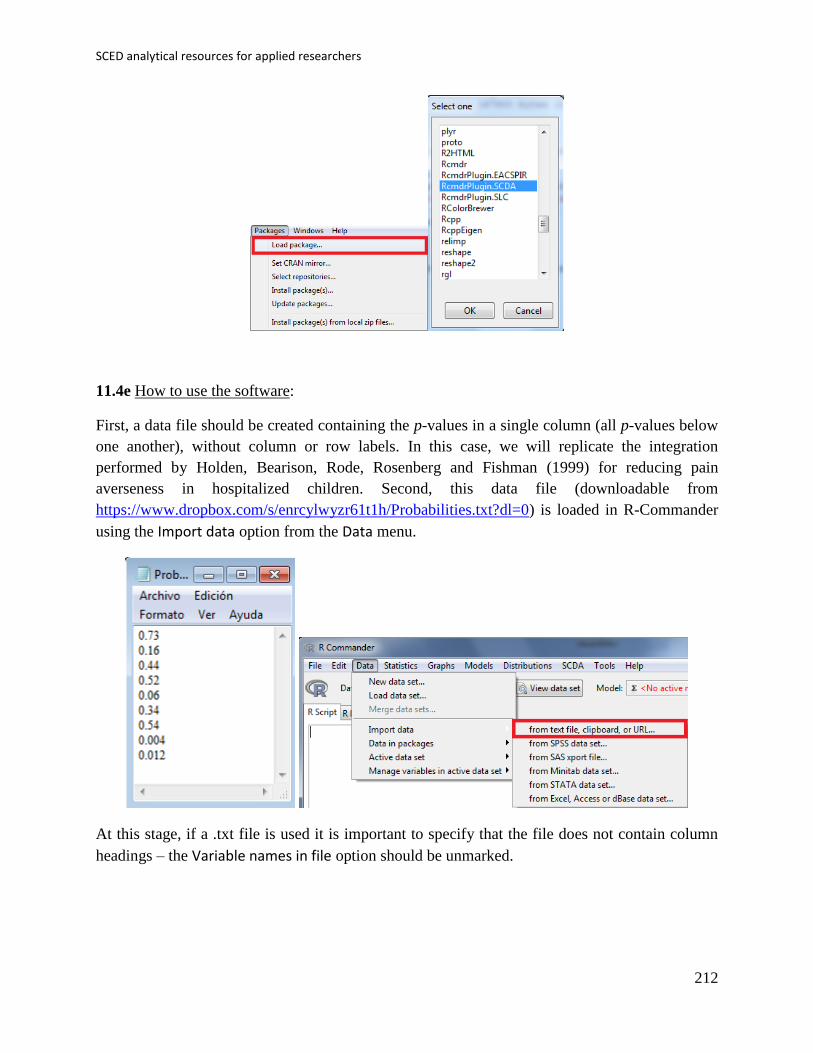
SCED analytical resources for applied researchers
212
11.4e How to use the software:
First, a data file should be created containing the p-values in a single column (all p-values below
one another), without column or row labels. In this case, we will replicate the integration
performed by Holden, Bearison, Rode, Rosenberg and Fishman (1999) for reducing pain
averseness in hospitalized children. Second, this data file (downloadable from
https://www.dropbox.com/s/enrcylwyzr61t1h/Probabilities.txt?dl=0) is loaded in R-Commander
using the Import data option from the Data menu.
At this stage, if a .txt file is used it is important to specify that the file does not contain column
headings – the Variable names in file option should be unmarked.
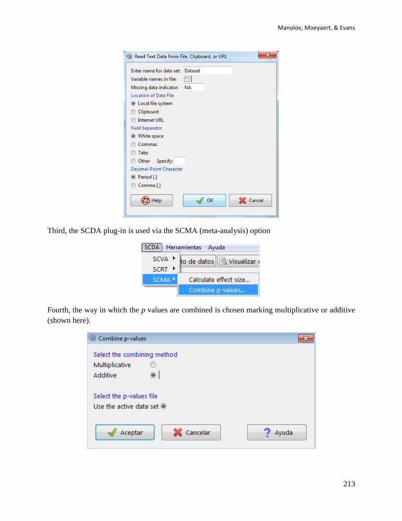
Manolov, Moeyaert, & Evans
213
Third, the SCDA plug-in is used via the SCMA (meta-analysis) option
Fourth, the way in which the p values are combined is chosen marking multiplicative or additive
(shown here).
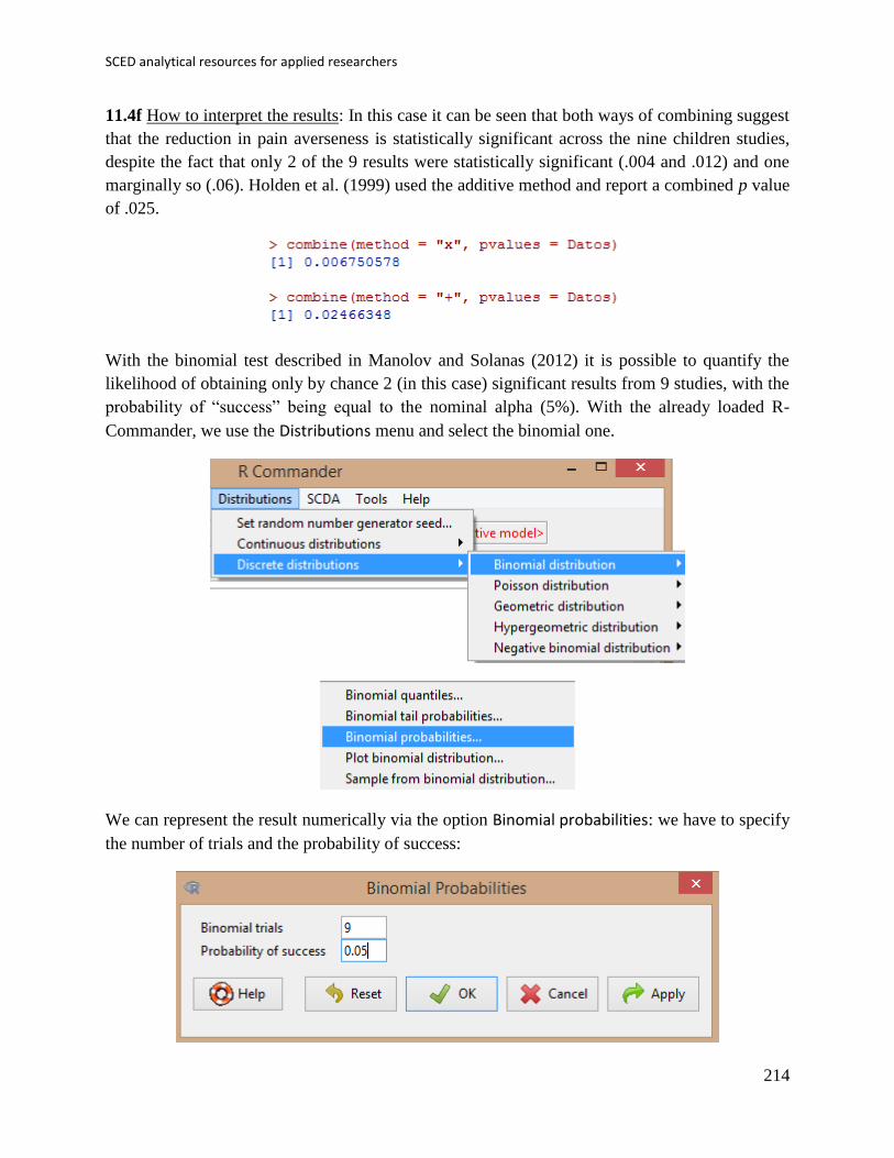
SCED analytical resources for applied researchers
214
11.4f How to interpret the results: In this case it can be seen that both ways of combining suggest
that the reduction in pain averseness is statistically significant across the nine children studies,
despite the fact that only 2 of the 9 results were statistically significant (.004 and .012) and one
marginally so (.06). Holden et al. (1999) used the additive method and report a combined p value
of .025.
With the binomial test described in Manolov and Solanas (2012) it is possible to quantify the
likelihood of obtaining only by chance 2 (in this case) significant results from 9 studies, with the
probability of “success” being equal to the nominal alpha (5%). With the already loaded R-
Commander, we use the Distributions menu and select the binomial one.
We can represent the result numerically via the option Binomial probabilities: we have to specify
the number of trials and the probability of success:
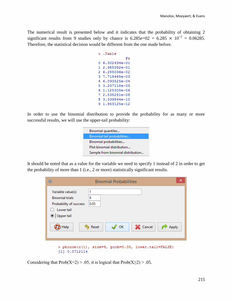
Manolov, Moeyaert, & Evans
215
The numerical result is presented below and it indicates that the probability of obtaining 2
significant results from 9 studies only by chance is 6.285e−02 = 6.285 × 10−2
= 0.06285.
Therefore, the statistical decision would be different from the one made before.
In order to use the binomial distribution to provide the probability for as many or more
successful results, we will use the upper-tail probability:
It should be noted that as a value for the variable we need to specify 1 instead of 2 in order to get
the probability of more than 1 (i.e., 2 or more) statistically significant results.
Considering that Prob(X=2) > .05, it is logical that Prob(X≥2) > .05.
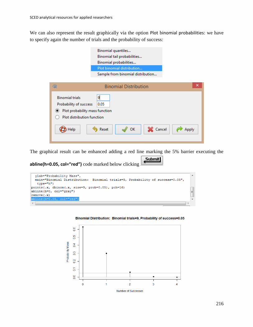
SCED analytical resources for applied researchers
216
We can also represent the result graphically via the option Plot binomial probabilities: we have
to specify again the number of trials and the probability of success:
The graphical result can be enhanced adding a red line marking the 5% barrier executing the
abline(h=0.05, col=“red”) code marked below clicking
Manolov, Moeyaert, & Evans
217
12. Summary list of the resources
In this section we offer a list of computerised SCED analysis tools (statistical packages, stand-
alone programs, and web-based calculators), as presented in the Editorial Discussion of the
Special Issue.
o Visual analysis – graphing, central tendency, trend, and variability: The SCDA plug-in
for R-Commander (Bulté & Onghena, 2012) offers the possibility to represent the data
graphically and to add visual aids referring to average level, trend, or data variability,
among other options. This plug-in was available from the R website: http://cran.r-
project.org/web/packages/RcmdrPlugin.SCDA/index.html redirecting to the R archive.
o Visual analysis – estimating and projecting baseline trend: R code is available on the
following address https://dl.dropboxusercontent.com/s/5z9p5362bwlbj7d/ProjectTrend.R.
The purpose of this code is to estimate baseline trend using the split-middle method
(Miller, 1985) and projecting it into the treatment phase. Trend stability across conditions
is estimated following the 80%-20% formula (Gast & Spriggs, 2010) and also using the
interquartile range (Tukey, 1977). The code has been developed by the first author (RM).
o Visual analysis – standard deviation bands, related to statistical process control or quality
control charts as a way of obtaining evidence about behavioural change after introducing
an intervention (Callahan & Barisa, 2005; Pfadt & Wheeler, 1995). R code available at
https://dl.dropboxusercontent.com/s/elhy454ldf8pij6/SD_band.R.
o Visual analysis and training: Another option for visual analysis is the training protocol
available at www.singlecase.org/ (content developed by Swoboda, Kratochwill, Horner,
Levin, and Albin; copyright of the site: Hoselton and Horner).
o Nonoverlap indices: Percentage of nonoverlapping data (Scruggs, Mastropieri, & Casto,
1987) and Percentage of data points exceeding the median (Ma, 2006) can be
implemented via the SCDA plug-in (http://cran.r-
project.org/web/packages/RcmdrPlugin.SCDA/index.html). Nonoverlap of all pairs
(Parker & Vannest, 2009), Improvement rate difference (Parker, Vannest, & Brown,
2009), and Tau-U (Parker, Vannest, Davis, & Sauber, 2011) can all be computed online
on the website http://www.singlecaseresearch.org (Vannest, Parker, & Gonen, 2011).
Tau-U: R code was developed by Kevin Tarlow and is offered by Brossart et al. (2014)
online via the URL https://dl.dropboxusercontent.com/u/2842869/Tau_U.R. Pairwise
data overlap (as described in Wolery et al., 2010) can be computed via
https://www.dropbox.com/s/jd8a6vl0nv4v7dt/PDO2.R?dl=0. Percentage of data points
exceeding median trend (PEM-T) also discussed by Wolery and colleagues (2010) can be
computed https://www.dropbox.com/s/rlk3nwfoya7rm3h/PEM-T.R?dl=0. Percentage of
nonoverlapping corrected data: R code available in the article presenting the procedure
(Manolov & Solanas, 2009) and also available online at
https://dl.dropboxusercontent.com/s/8revawnfrnrttkz/PNCD.R.
SCED analytical resources for applied researchers
218
o Other percentage indices: Percentage zero data discussed by Wolery et al. (2010) can be
computed via https://www.dropbox.com/s/k57dj32gyit934g/PZD.R?dl=0. Percentage
reduction data / Percentage change index discussed by Hershberger et al. (1999) and
Wendt (2009) and Mean baseline reduction discussed by Campbel (2004) can be
computed via https://www.dropbox.com/s/wt1qu6g7j2ln764/MBLR.R?dl=0.
o Simulation modelling analysis: available online on the website
http://clinicalresearcher.org/software.htm.
o Randomisation tests: R code available in the SCRT package (Bulté & Onghena, 2008;
2009) downloadable for free from the R platform itself and available from the R website
http://cran.r-project.org/web/packages/SCRT/index.html. The SCDA plug-in for R-
Commander (Bulté, 2013; Bulté & Onghena, 2012) also includes randomisation tests.
Analyses via randomization tests can also be carried out using Excel as a platform, thanks
to the work of Boris Gafurov and Joel Levin (http://code.google.com/p/exprt/).
o Maximal reference approach as described and tested by Manolov and Solanas (2012,
2013b) can be implemented via
https://www.dropbox.com/s/56tqnhj4mng2wrq/Probabilities.R?dl=0.
o Quantifying specific data features: Slope and level change technique: R code available in
the article presenting the procedure (Solanas et al., 2010) and also online at
https://dl.dropboxusercontent.com/s/ltlyowy2ds5h3oi/SLC.R; additionally, there is an
SLC plug-in for R-Commander available from the R website http://cran.r-
project.org/web/packages/RcmdrPlugin.SLC/index.html and downloadable for free from
the R platform itself. Mean phase difference technique: R code available in the article
presenting the procedure (Manolov & Solanas, 2013a) and also online at
https://dl.dropboxusercontent.com/s/nky75oh40f1gbwh/MPD.R.
o Quantifications in terms of the d statistic: SPSS macros and Graphic User Interface
(clickable menus) plus manuals are available via William Shadish’s website:
http://faculty.ucmerced.edu/wshadish/software/software-meta-analysis-single-case-design
R code for these developments is available at James Pustejovsky’s page
http://blogs.edb.utexas.edu/pusto/software/.
o Regression analysis as presented by Swaminathan et al. (2014): a computer programme
developed in FORTRAN 90 (Rogers & Swaminathan, 2007) has been created.
o Ordinary least squares analysis using the effect size measure presented by Swaminathan
and colleagues can be implemented via
https://www.dropbox.com/s/v0see3bto1henod/OLS.R?dl=0. Generalized least squares
based on the proposals of Gorscuh (1983) for autoregressive analysis and Swaminathan,
Rogers, Horner, Sugai, and Smolkowski (2014) for autocorrelation estimation via the
Cochran-Orcutt method, using the the effect size measure presented by Swaminathan
and colleagues can be implemented via
https://www.dropbox.com/s/dni9qq5pqi3pc23/GLS.R?dl=0
o Piecewise regression analysis according to the formula proposed by Center et al. (1985-
1986), obtaining an unstandardized estimate of the immediate effect and change in slope

Manolov, Moeyaert, & Evans
219
plus a standardization following the proposal of Van den Noortgate and Onghena (2008):
https://www.dropbox.com/s/bt9lni2n2s0rv7l/Piecewise.R?dl=0. The same code allows
standardizing the data before incorporating them in multilevel meta-analysis.
o Bayesian analysis: Rindskopf (2014) recommends using WinBUGS program available
for free at the website http://www.mrc-bsu.cam.ac.uk/bugs/. An R package called
BayesSingleSub (de Vries & Morey, 2013) is available from the R website http://cran.r-
project.org/web/packages/BayesSingleSub.
o Multilevel models: several alternative platforms can be used including two specifically
designed programs (HLM, MLwiN), the lme4 and nlme packages in R, proc mixed and
proc glimmix in SAS, the mixed option using SPSS syntax, and the gllamm programme in
Stata) of which only R is open-source. WinBUGS can be used also for multilevel models.
See also Shadish, Kyse, and Rindskopf (2013). Additionally, a website
(http://ppw.kuleuven.be/home/onderzoek/multilevel-synthesis-of-single-case-
experimental-data/ ) is available including theoretical information, examples and code in
relation to multilevel models. This website, expected to grow in near future is also
accessible from www.single-case.com.
o Combining quantitatively the results of several studies using the SCED-specific d statistic
(Hedges et al., 2012, 2013) can be done via
https://www.dropbox.com/s/41gc9mrrt3jw93u/Across%20studies_d.R?dl=0
o Combining probabilities: some options (e.g., the multiplicative approach described in
Jones and Fiske, 1953, and the additive approach by Edgington, 1972) are included in the
SCDA plug-in for R-Commander (Bulté, 2013; Bulté & Onghena, 2012): http://cran.r-
project.org/web/packages/RcmdrPlugin.SCDA/index.html. Additionally, R code is
available on the Neuropsychological Rehabilitation website as supplemental online
material to the article authored by Solmi and Onghena (2014). The use of the binomial
distribution as described by Manolov and Solanas (2012) can be implemented via R-
Commander itself.

SCED analytical resources for applied researchers
220
13. References
Baek, E., Moeyaert, M., Petit-Bois, M., Beretvas, S. N., Van de Noortgate, W., & Ferron, J.
(2014). The use of multilevel analysis for integrating single-case experimental design results
within a study and across studies. Neuropsychological Rehabilitation, 24, 590-606.
Becker, B. J. (1987). Applying tests of combined significance in meta-analysis. Psychological
Bulletin, 102, 164 –171.
Beretvas, S. N., & Chung, H. (2008). A review of meta-analyses of single-subject experimental
designs: Methodological issues and practice. Evidence-Based Communication Assessment and
Intervention, 2, 129-141.
Bliese, P. (2013). Multilevel modeling in R (2.5): A brief introduction to R, the multilevel
package and the nlme package. Retrieved from http://cran.r-
project.org/doc/contrib/Bliese_Multilevel.pdf
Boman, I.-L., Bartfai, A., Borell, L., Tham, K., & Hemmingsson, H. (2010).Support in everyday
activities with a home-based electronic memory aid for persons with memory impairments.
Disability and Rehabilitation: Assistive Technology, 5, 339–350.
Borckardt, J. J., & Nash, M. R. (2014). Simulation modelling analysis for small sets of single-subject data
collected over time. Neuropsychological Rehabilitation, 24, 492-506.
Borckardt, J. J., Nash, M. R., Murphy, M. D., Moore, M., Shaw, D., & O’Neil, P. (2008).
Clinical practice as natural laboratory for psychotherapy research: A guide to case-based
time-series analysis. American Psychologist, 63, 77-95.
Brossart, D. F., Vannest, K., Davis, J., & Patience, M. (2014). Incorporating nonoverlap indices
with visual analysis for quantifying intervention effectiveness in single-case experimental
designs. Neuropsychological Rehabilitation, 24, 464-491.
Bulté, I. (2013). Being grateful for small mercies: The analysis of single-case data. Unpublished
doctoral dissertation. KU Leuven, Belgium.
Bulté, I., & Onghena, P. (2008). An R package for single-case randomization tests. Behavior
Research Methods, 40, 467-478.
Bulté, I., & Onghena, P. (2009). Randomization tests for multiple-baseline designs: An extension
of the SCRT-R package. Behavior Research Methods, 41, 477-485.
Bulté, I., & Onghena, P. (2012). When the truth hits you between the eyes: A software tool for
the visual analysis of single-case experimental data. Methodology, 8, 104-114.
Callahan, C. D., & Barisa, M. T. (2005). Statistical process control and rehabilitation outcome:
The single-subject design reconsidered. Rehabilitation Psychology, 50, 24-33.
Campbell, J. M. (2004). Statistical comparison of four effect sizes for single-subject designs.
Behavior Modification, 28, 234-246.
Campbell, J. M. (2013). Commentary on PND at 25. Remedial and Special Education, 34, 20-25.

Manolov, Moeyaert, & Evans
221
Cohen, J. (1992). A power primer. Psychological Bulletin, 112, 155-159.
Coker, P., Lebkicher, C., Harris, L., & Snape, J. (2009). The effects of constraint-induced
movement therapy for a child less than one year of age. NeuroRehabilitation, 24, 199–208.
Cooper, H., Hedges, L. V., & Valentine, J. C. (Eds.) (2009). The handbook of research synthesis
and meta-analysis. (2nd ed.). New York, NY: Russell Sage.
Davis, D. H., Gagné, P., Fredrick, L. D., Alberto, P. A., Waugh, R. E., & Haardörfer, R. (2013).
Augmenting visual analysis in single-case research with hierarchical linear modeling.
Behavior Modification, 37, 62-89.
de Vries, R. M., & Morey, R. D. (2013). Bayesian hypothesis testing for single-subject designs.
Psychological Methods, 18, 165-185.
Durbin, J., & Watson, G. S. (1951). Testing for serial correlation in least squares regression. II.
Biometrika, 38, 159-177.
Durbin, J., & Watson, G. S. (1971). Testing for serial correlation in least squares regression. III.
Biometrika, 58, 1-19.
Edgington, E. S. (1972a). An additive method for combining probability values from
independent experiments. Journal of Psychology, 80, 351-363.
Edgington, E. S. (1972b). A normal curve method for combining probability values from
independent experiments. Journal of Psychology, 82, 85–89.
Edgington, E. S., & Onghena, P. (2007). Randomization tests (4th ed.). London, UK: Chapman
& Hall/CRC.
Efron, B., & Tibshirani R. J. (1993). An introduction to the bootstrap. London, UK: Chapman &
Hall/CRC.
Ferron, J. M., Bell, B. A., Hess, M. R., Rendina-Gobioff, G., & Hibbard, S. T. (2009). Making
treatment effect inferences from multiple-baseline data: The utility of multilevel modeling
approaches. Behavior Research Methods, 41, 372-384.
Gast, D. L., & Spriggs, A. D. (2010). Visual analysis of graphic data. In D. L. Gast (Ed.), Single
subject research methodology in behavioral sciences (pp. 199-233). London, UK: Routledge.
Glass, G. V., McGaw, B., & Smith, M. L. (1981). Meta-analysis in social research. Beverly
Hills, CA: Sage.
Gorsuch, R. L. (1983). Three methods for analyzing limited time-series (N of 1) data. Behavioral
Assessment, 5, 141-154.
Hansen, B. L. & Ghare, P . M. (1987). Quality control and application. New Delhi:
Prentice-Hall.
Hedges, L. V., & Olkin, I. (1985). Statistical methods for meta-analysis. New York, NY:
Academic Press.

SCED analytical resources for applied researchers
222
Hedges, L. V., Pustejovsky, J. E., & Shadish, W. R. (2012). A standardized mean difference
effect size for single case designs. Research Synthesis Methods, 3, 224-239.
Hedges, L. V., Pustejovsky, J. E., & Shadish, W. R. (2013). A standardized mean difference
effect size for multiple baseline designs across individuals. Research Synthesis Methods, 4,
324-341.
Hershberger, S. L., Wallace, D. D., Green, S. B., & Marquis, J. G. (1999). Meta-analysis of
single-case data. In R. H. Hoyle (Ed.), Statistical strategies for small sample research (pp.
107-132). London, UK: Sage.
Heyvaert, M., & Onghena, P. (2014a). Analysis of single-case data: Randomisation tests for
measures of effect size. Neuropsychological Rehabilitation, 24, 507-527.
Heyvaert, M., & Onghena, P. (2014b). Randomization tests for single-case experiments: State of
the art, state of the science, and state of the application. Journal of Contextual Behavioral
Science, , 51-64.
Holden, G., Bearison, D. J., Rode, D. C., Rosenberg, G., & Fishman, M. (1999). Evaluating the
effects of a virtual environment (STARBRIGHT world) with hospitalized children. Research
on Social Work Practice, 9, 365–382.
Hox, J. (2002). Multilevel analysis: Techniques and applications. London, UK: Lawrence
Erlbaum.
Huitema, B. E., & McKean, J. W. (2000). Design specification issues in time-series intervention
models. Educational and Psychological Measurement, 60, 38-58.
Hunter, J. E., & Schmidt, F. L. (2004). Methods of meta-analysis: Correcting error and bias in
research findings (2nd ed.). Thousand Oaks,CA: Sage.
IBM Corp. (2012). IBM SPSS Statistics for Windows, Version 21.0. Armonk, NY: IBM Corp.
Jokel, R., Rochon, E., & Anderson, N. D. (2010). Errorless learning of computer-generated
words in a patient with semantic dementia. Neuropsychological Rehabilitation, 20, 16-41.
Jones, L. V., & Fiske, D. W. (1953). Models for testing the significance of combined results.
Psychological Bulletin, 50, 375-382.
Kratochwill, T. R., Hitchcock, J., Horner, R. H., Levin, J. R., Odom, S. L., Rindskopf, D. M., et
al. (2010). Single-case designs technical documentation. Retrieved from What Works
Clearinghouse website: http://ies.ed.gov/ncee/wwc/pdf/reference_resources/wwc_scd.pdf .
Kratochwill, T. R., & Levin, J. R. (2010). Enhancing the scientific credibility of single-case
intervention research: Randomization to the rescue. Psychological Methods, 15, 124-144.
Laski, K. E., Charlop, M. H., & Schreibman, L. (1988). Training parents to use the natural
language paradigm to increase their autistic children's speech. Journal of Applied Behavior
Analysis, 21, 391–400.

Manolov, Moeyaert, & Evans
223
LeBlanc, L. A., Geiger, K. B., Sautter, R. A., & Sidener, T. M. (2007). Using the natural
language paradigm (NLP) to increase vocalizations of older adults with cognitive
impairments. Research in Developmental Disabilities, 28, 437–444.
Levin, J. R., Ferron, J. M., & Kratochwill, T. R. (2012). Nonparametric statistical tests for
single-case systematic and randomized ABAB…AB and alternating treatment intervention
designs: New developments, new directions. Journal of School Psychology, 50, 599-624.
Levin, J. R., Lall, V. F., & Kratochwill, T. R. (2011). Extensions of a versatile randomization test
for assessing single-case intervention effects. Journal of School Psychology, 49, 55-79.
Ma, H. H. (2006). An alternative method for quantitative synthesis of single-subject research:
Percentage of data points exceeding the median. Behavior Modification, 30, 598-617.
Manolov, R., & Rochat, L. (2015). Further developments in summarizing and meta-analyzing
single-case data: An illustration with neurobehavioural interventions in acquired brain
injury. Manuscript submitted for publication.
Manolov, R., Sierra, V., Solanas, A., & Botella, J. (2014). Assessing functional relations in
single-case designs: Quantitative proposals in the context of the evidence-based movement.
Behavior Modification, 38, 878-913.
Manolov, R., & Solanas, A. (2009). Percentage of nonoverlapping corrected data. Behavior
Research Methods, 41, 1262-1271.
Manolov, R., & Solanas, A. (2012). Assigning and combining probabilities in single-case
studies. Psychological Methods, 17, 495-509.
Manolov, R., & Solanas, A. (2013a). A comparison of mean phase difference and generalized
least squares for analyzing single-case data. Journal of School Psychology, 51, 201-215.
Manolov, R., & Solanas, A. (2013b). Assigning and combining probabilities in single-case
studies: A second study. Behavior Research Methods, 45, 1024-1035.
Manolov, R., Jamieson, M., Evans, J. J., & Sierra, V. (2015). Probability and visual aids for
assessing intervention effectiveness in single-case designs: A field test. Manuscript submitted
for publication.
Manolov, R., & Solanas, A. (2015). Quantifying differences between conditions in single-case
designs: Analysis and possibilities for meta-analysis. Manuscript submitted for publication.
Miller, M. J. (1985). Analyzing client change graphically. Journal of Counseling and
Development, 63, 491-494.
Moeyaert, M., Ferron, J., Beretvas, S., & Van Den Noortgate, W. (2014). From a single-level
analysis to a multilevel analysis of since-case experimental designs. Journal of School
Psychology, 52, 191-211.

SCED analytical resources for applied researchers
224
Moeyaert, M., Ugille, M., Ferron, J., Beretvas, S., & Van Den Noortgate, W. (2013). Three-level
analysis of single-case experimental data: Empirical validation. Journal of Experimental
Education, 82, 1-21.
Moeyaert, M., Ugille, M., Ferron, J., Beretvas, S., Van Den Noortgate, W. (2013). The three-
level synthesis of standardized single-subject experimental data: A Monte Carlo simulation
study. Multivariate Behavioral Research, 48 (5), 719-748.
Moeyaert, M., Ugille, M., Ferron, J., Beretvas, S. N., & Van den Noortgate, W. (2014). The
influence of the design matrix on treatment effect estimates in the quantitative analyses of
single-case experimental designs research. Behavior Modification, 38, 665-704.
Parker, R. I., Brossart, D. F., Vannest, K. J., Long, J. R., Garcia De-Alba, R., Baugh, F. G., &
Sullivan, J. R. (2005). Effect sizes in single case research: How large is large? School
Psychology Review, 34, 116-132.
Parker, R. I., & Hagan-Burke, S. (2007). Median-based overlap analysis for single case data: A
second study. Behavior Modification, 31, 919-936.
Parker, R. I., & Vannest, K. J. (2009). An improved effect size for single-case research:
Nonoverlap of all pairs. Behavior Therapy, 40, 357-367.
Parker, R. I., Vannest, K. J., & Brown, L. (2009). The improvement rate difference for single-
case research. Exceptional Children, 75, 135-150.
Parker, R. I., Vannest, K. J., Davis, J. L., & Sauber, S. B. (2011). Combining nonoverlap and
trend for single-case research: Tau-U. Behavior Therapy, 42, 284-299.
Pfadt, A., & Wheeler, D. J. (1995). Using statistical process control to make data-based clinical
decisions. Journal of Applied Behavior Analysis, 28, 349-370.
Pinheiro, J., Bates, D., DebRoy, S., Sarkar, D., & the R Development Core Team (2013). nlme:
Linear and nonlinear mixed effects models. R package version 3.1-113. Documentation:
http://cran.r-project.org/web/packages/nlme/nlme.pdf
Rogers, H. J. & Swaminathan, H. (2007). A computer program for the statistical analysis of
single subject designs. Storrs, CT: University of Connecticut, Measurement, Evaluation, and
Assessment Program.
Rosenthal, R. (1978). Combining results of independent studies. Psychological Bulletin, 85,
185–193.
Rindskopf, D. (2014). Bayesian analysis of data from single case designs. Neuropsychological
Rehabilitation, 24, 572-589.
SAS Institute Inc. (2008). SAS/STAT® 9.2 User’s Guide.. Cary, NC: SAS Institute Inc.
Schreibman, L., Stahmer, A. C., Barlett, V. C., & Dufek, S. (2009). Brief report: toward
refinement of a predictive behavioral profile for treatment outcome in children with autism.
Research in Autism Spectrum Disorders, 3, 163–172.

Manolov, Moeyaert, & Evans
225
Scruggs, T. E., & Mastropieri, M. A. (2013). PND at 25: Past, present, and future trends in
summarizing single-subject research. Remedial and Special Education, 34, 9-19.
Scruggs, T. E., Mastropieri, M. A., & Casto, G. (1987). The quantitative synthesis of single-
subject research: Methodology and validation. Remedial and Special Education, 8, 24-33.
Shadish, W. R., Hedges, L. V., Pustejovsky, J. E., Boyajian, J. G., Sullivan, K. J., Andrade, A, &
Barrientos, J. L. (2014). A d-statistic for single-case designs that is equivalent to the usual
between-groups d-statistic. Neuropsychological Rehabilitation, 24, 528-553.
Shadish, W. R., Kyse, E. N., & Rindskopf, D. M. (2013). Analyzing data from single-case
designs using multilevel models: New applications and some agenda items for future research.
Psychological Methods, 18, 385-405.
Shrerer, M. R., & Schreibman, L. (2005). Individual behavioral profiles and predictors of
treatment effectiveness for children with autism. Journal of Consulting and Clinical
Psychology, 73, 525–538.
Solanas, A., Manolov, R., & Onghena, P. (2010). Estimating slope and level change in N=1
designs. Behavior Modification, 34, 195-218.
Solmi, F., & Onghena, P. (2014). Combining p-values in replicated single-case experiments with
multivariate outcome. Neuropsychological Rehabilitation, 24, 607-633.
Strube, M. J. (1985). Combining and comparing significance levels from nonindependent
hypothesis tests. Psychological Bulletin, 97, 334–341.
Swaminathan, H., Rogers, H. J., & Horner, R. H. (2014). An effect size measure and Bayesian
analysis of single-case designs. Journal of School Psychology, 52, 213-230.
Swaminathan, H., Rogers, H. J., Horner, R., Sugai, G., & Smolkowski, K. (2014). Regression
models for the analysis of single case designs. Neuropsychological Rehabilitation, 24, 554-
571.
Thorp, D. M., Stahmer, A. C., & Schreibman, L. (1995). The effects of sociodramatic play
training on children with autism. Journal of Autism and Developmental Disorders, 25, 265–
282.
Tukey, J. W. (1977). Exploratory data analysis. London, UK: Addison-Wesley.
Vannest, K. J., Parker, R. I., & Gonen, O. (2011). Single Case Research: web based calculators
for SCR analysis. (Version 1.0) [Web-based application]. College Station, TX: Texas A&M
University. Retrieved Friday 12th July 2013. Available from singlecaseresearch.org
Van den Noortgate, W., & Onghena, P. (2003). Hierarchical linear models for the quantitative
integration of effect sizes in single-case research. Behavior Research Methods, Instruments, &
Computers, 35, 1-10.

SCED analytical resources for applied researchers
226
Van den Noortgate, W., & Onghena, P. (2008). A multilevel meta-analysis of single-subject
experimental design studies. Evidence Based Communication Assessment and
Intervention, 2, 142-151.
Wehmeyer, M. L., Palmer, S. B., Smith, S. J., Parent, W., Davies, D. K., & Stock, S. (2006).
Technology use by people with intellectual and developmental disabilities to support
employment activities: A single-subject design meta analysis. Journal of Vocational
Rehabilitation, 24, 81–86.
Wendt, O. (2009). Calculating effect sizes for single-subject experimental designs: An overview
and comparison. Paper presented at The Ninth Annual Campbell Collaboration Colloquium,
Oslo, Norway. Downloaded from
http://www.campbellcollaboration.org/artman2/uploads/1/Wendt_calculating_effect_sizes.pdf
Winkens, I., Ponds, R., Pouwels-van den Nieuwenhof, C., Eilander, H., & van Heugten, C.
(2014). Using single-case experimental design methodology to evaluate the effects of the
ABC method for nursing staff on verbal aggressive behaviour after acquired brain injury.
Neuropsychological Rehabilitation, 24, 349-364.
Wolery, M., Busick, M., Reichow, B., & Barton, E. E. (2010). Comparison of overlap methods
for quantitatively synthesizing single-subject data. Journal of Special Education, 44, 18-29.
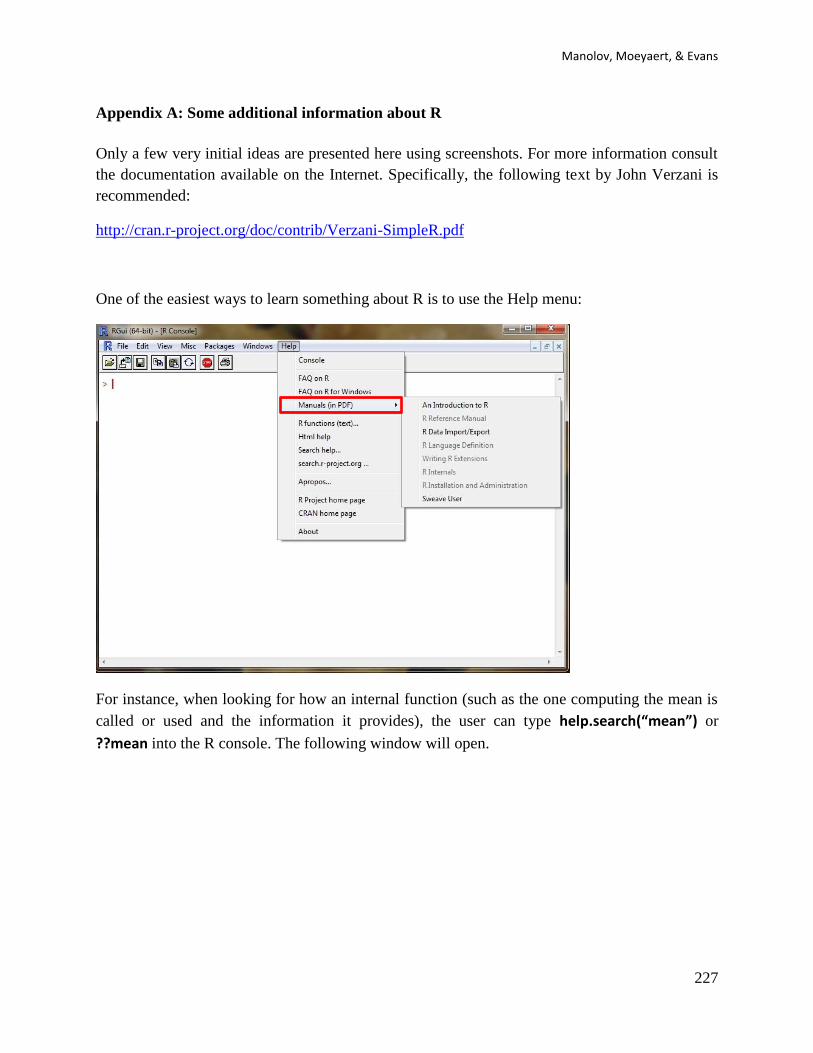
Manolov, Moeyaert, & Evans
227
Appendix A: Some additional information about R
Only a few very initial ideas are presented here using screenshots. For more information consult
the documentation available on the Internet. Specifically, the following text by John Verzani is
recommended:
http://cran.r-project.org/doc/contrib/Verzani-SimpleR.pdf
One of the easiest ways to learn something about R is to use the Help menu:
For instance, when looking for how an internal function (such as the one computing the mean is
called or used and the information it provides), the user can type help.search(“mean”) or
??mean into the R console. The following window will open.
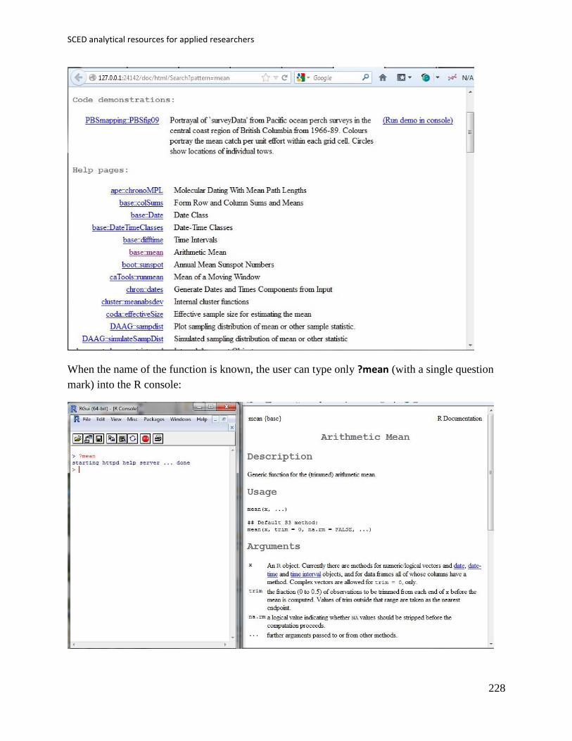
SCED analytical resources for applied researchers
228
When the name of the function is known, the user can type only ?mean (with a single question
mark) into the R console:
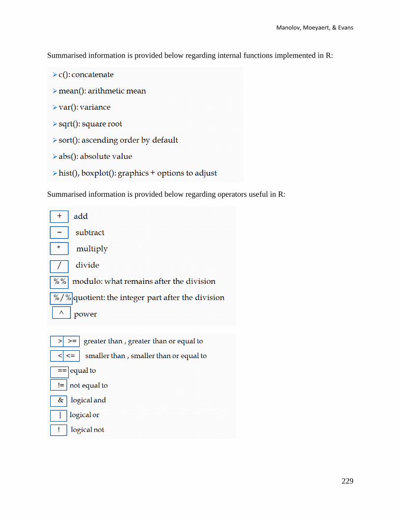
Manolov, Moeyaert, & Evans
229
Summarised information is provided below regarding internal functions implemented in R:
Summarised information is provided below regarding operators useful in R:
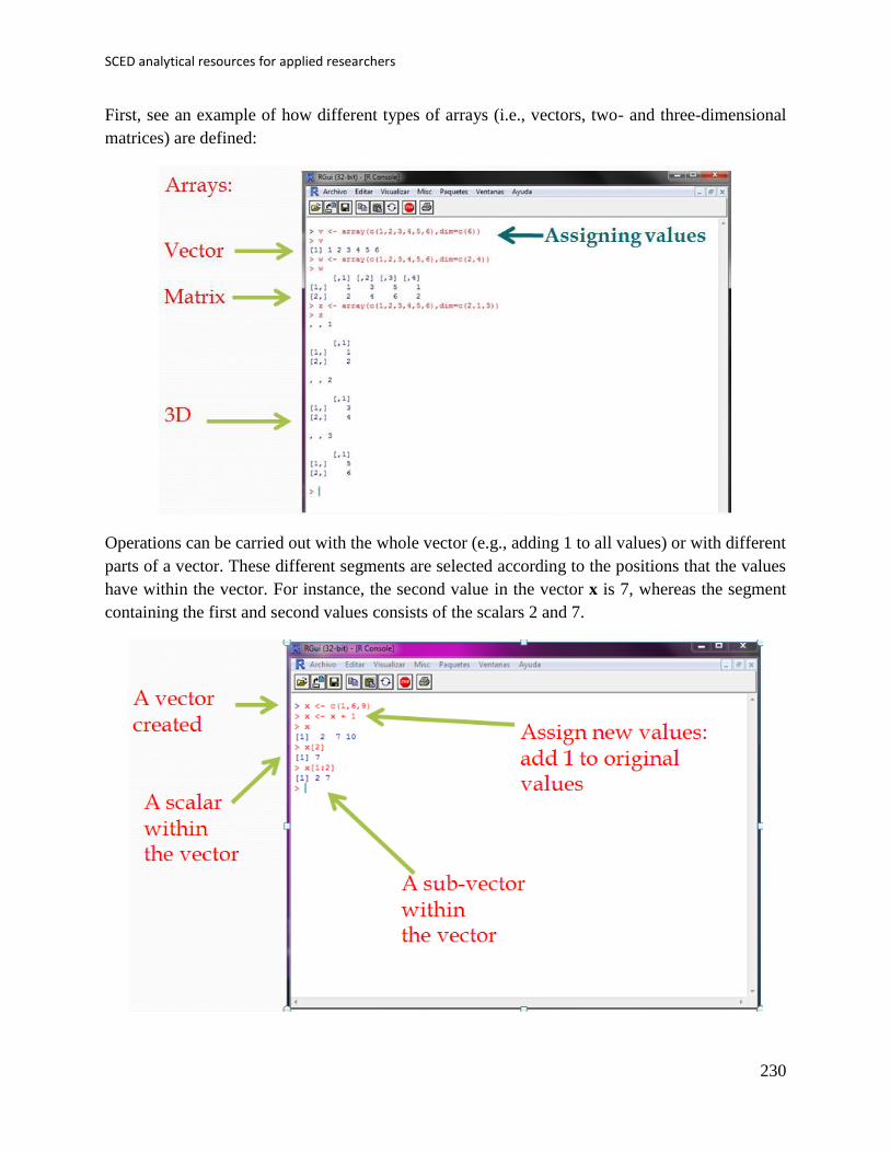
SCED analytical resources for applied researchers
230
First, see an example of how different types of arrays (i.e., vectors, two- and three-dimensional
matrices) are defined:
Operations can be carried out with the whole vector (e.g., adding 1 to all values) or with different
parts of a vector. These different segments are selected according to the positions that the values
have within the vector. For instance, the second value in the vector x is 7, whereas the segment
containing the first and second values consists of the scalars 2 and 7.

Manolov, Moeyaert, & Evans
231
Regarding data input, in R it is possible to open and read a data file (using the function
read.table) or to enter the data manually, creating a data.frame (called “datos1”) consisting of
several variables (here only two: “studies” and “grades”). It is possible to wotk with one of the
variables of the data frame or even with a single value of a variable.
Regarding, some of the most useful aspects of programming (loops and conditional statements),
an example is provided below. The code provided computes the average grade for students that
have studied Humanities only (mean_h), by first computing the sum_h and then dividing it by
ppts_h (the number of students from this are). For iteration or looping, the internal function for()
is used for reading all the grades. For selecting only students of Humanities the conditional
function if() is used.

SCED analytical resources for applied researchers
232
Regarding user-created functions, below is provided information on how to use a function called
“moda” yielding the modal value of a variable. Such a function needs to be available in the
workspace, that is, pasted into the R console before calling it. Calling itself requires using the
function name and the arguments in parenthesis needed for the function to operate with (here: the
array including the values of the variable).
The second example of calling user-defined functions refers to a function called V.Cramer and
yielding a quantification (in terms of Cramér’s V) of the strength of relation between to
categorical variables. The arguments required when calling the function are, therefore, two
arrays containing the categories of the variables.
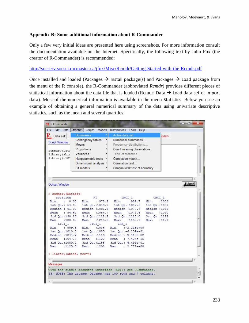
Manolov, Moeyaert, & Evans
233
Appendix B: Some additional information about R-Commander
Only a few very initial ideas are presented here using screenshots. For more information consult
the documentation available on the Internet. Specifically, the following text by John Fox (the
creator of R-Commander) is recommended:
http://socserv.socsci.mcmaster.ca/jfox/Misc/Rcmdr/Getting-Started-with-the-Rcmdr.pdf
Once installed and loaded (Packages Install package(s) and Packages Load package from
the menu of the R console), the R-Commander (abbreviated Rcmdr) provides different pieces of
statistical information about the data file that is loaded (Rcmdr: Data Load data set or Import
data). Most of the numerical information is available in the menu Statistics. Below you see an
example of obtaining a general numerical summary of the data using univariate descriptive
statistics, such as the mean and several quartiles.
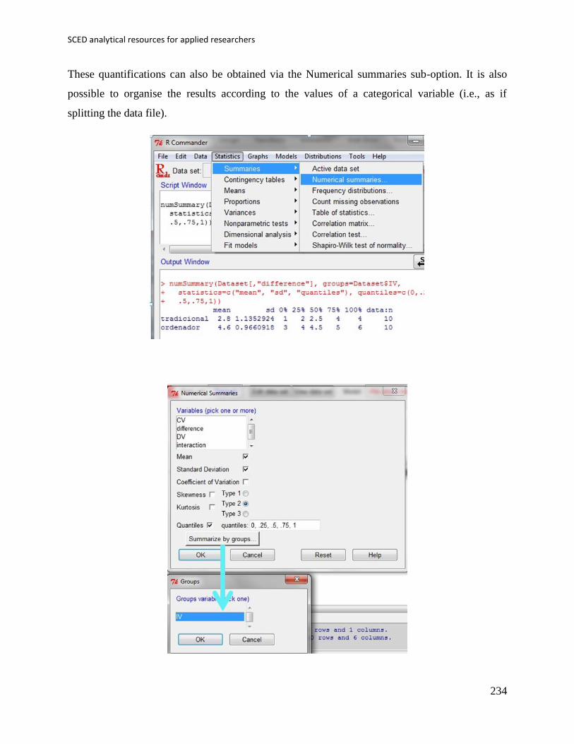
SCED analytical resources for applied researchers
234
These quantifications can also be obtained via the Numerical summaries sub-option. It is also
possible to organise the results according to the values of a categorical variable (i.e., as if
splitting the data file).
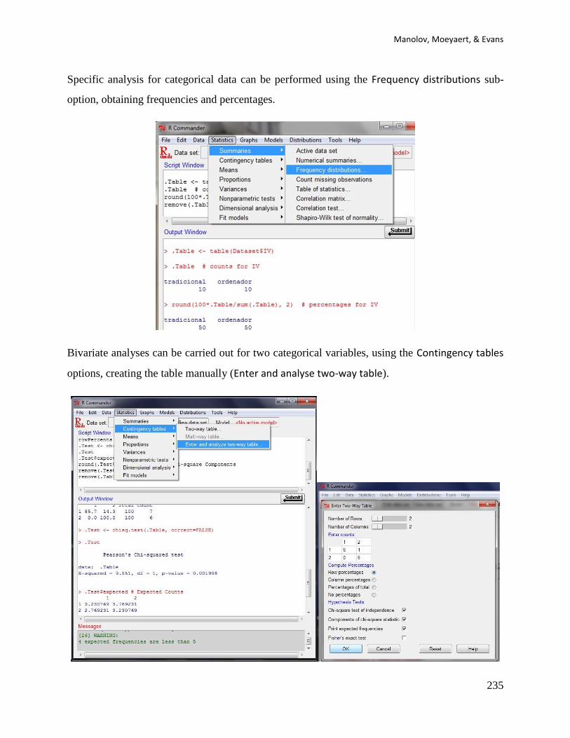
Manolov, Moeyaert, & Evans
235
Specific analysis for categorical data can be performed using the Frequency distributions sub-
option, obtaining frequencies and percentages.
Bivariate analyses can be carried out for two categorical variables, using the Contingency tables
options, creating the table manually (Enter and analyse two-way table).

SCED analytical resources for applied researchers
236
Bivariate analyses can be carried out for two categorical variables, using the Contingency tables
options, generating the table automatically (Two-way table).
Bivariate analyses can be carried out for two quantitative variables, using the Correlation matrix
sub-option.
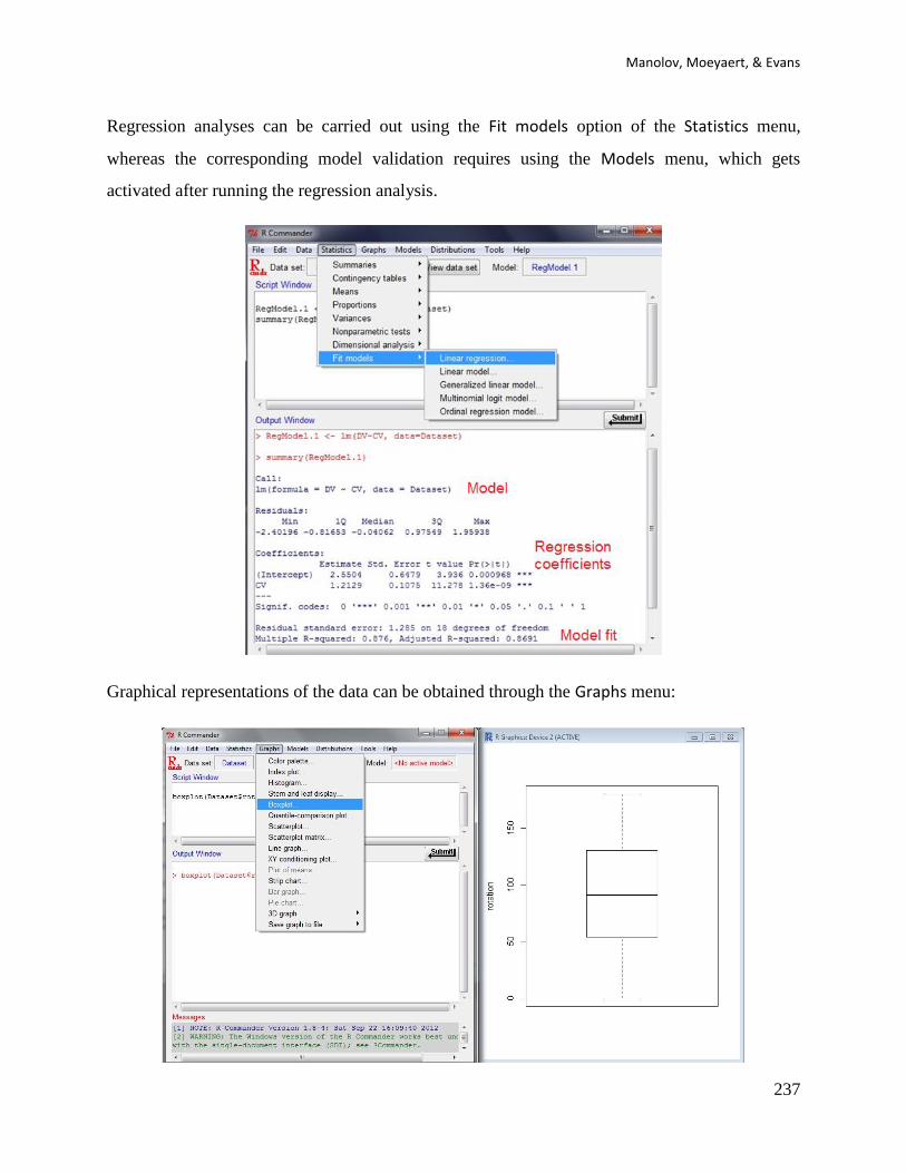
Manolov, Moeyaert, & Evans
237
Regression analyses can be carried out using the Fit models option of the Statistics menu,
whereas the corresponding model validation requires using the Models menu, which gets
activated after running the regression analysis.
Graphical representations of the data can be obtained through the Graphs menu:

SCED analytical resources for applied researchers
238
There is also information about probability Distributions, which can help finding the p value
associated with the value of a statistic without the need to consult statistical tables.
Finally, plug-ins for R-Commander (such as the SCDA) can be loaded using the Tools menu.

![Destructive single-event effects in semiconductor devices ...sirad.pd.infn.it/~candelor/Parte6/TNS2003_SEB_SEGR_OKPerCorso.pdf · [17]). Other researchers quickly confirmed the existence](https://static.fdocuments.in/doc/165x107/5f6a24f7cd3d3344cb52e064/destructive-single-event-effects-in-semiconductor-devices-siradpdinfnitcandelorparte6tns2003sebsegr.jpg)


![Applied Soft Computing - Madjid Tavana · Applied Soft Computing ... [11] single-input ... a single-input single-output ratio to a multiple-input multiple-output ratio by using a](https://static.fdocuments.in/doc/165x107/5af11c017f8b9aa9168ea761/applied-soft-computing-madjid-soft-computing-11-single-input-a-single-input.jpg)