Signet Health Website Market Analysis
18
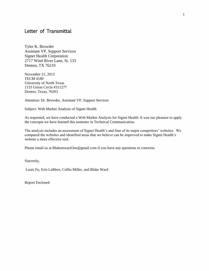
1 Letter of Transmittal Tyler K. Browder Assistant VP, Support Services Signet Health Corporation 2717 Wind River Lane, St. 133 Denton, TX 76210 November 21, 2013 TECM 4180 University of North Texas 1155 Union Circle #311277 Denton, Texas, 76203 Attention: Dr. Browder, Assistant VP, Support Services Subject: Web Market Analysis of Signet Health As requested, we have conducted a Web Market Analysis for Signet Health. It was our pleasure to apply the concepts we have learned this semester in Technical Communication. The analysis includes an assessment of Signet Health’s and four of its major competitors’ websites. We compared the websites and identified areas that we believe can be improved to make Signet Health’s website a more effective tool. Please email us at [email protected] if you have any questions or concerns. Sincerely, Louis Fo, Erin LaMere, Collin Miller, and Blake Ward Report Enclosed
-
Upload
blake-ward -
Category
Documents
-
view
25 -
download
0
Transcript of Signet Health Website Market Analysis
1
Letter of Transmittal
Tyler K. Browder
Assistant VP, Support Services
Signet Health Corporation
2717 Wind River Lane, St. 133
Denton, TX 76210
November 21, 2013
TECM 4180
University of North Texas
1155 Union Circle #311277
Denton, Texas, 76203
Attention: Dr. Browder, Assistant VP, Support Services
Subject: Web Market Analysis of Signet Health
As requested, we have conducted a Web Market Analysis for Signet Health. It was our pleasure to apply
the concepts we have learned this semester in Technical Communication.
The analysis includes an assessment of Signet Health’s and four of its major competitors’ websites. We
compared the websites and identified areas that we believe can be improved to make Signet Health’s
website a more effective tool.
Please email us at [email protected] if you have any questions or concerns.
Sincerely,
Louis Fo, Erin LaMere, Collin Miller, and Blake Ward
Report Enclosed
2
Website Market Analysis for Signet Health
Prepared for:
Signet Health Corporation
2717 Wind River Lane
Suite 133
Denton, TX, 76210
Prepared by:
Erin LaMere, Blake Ward, Louis Fo, and Collin Miller
The University of North Texas
1155 Union Circle #311277
Denton, Texas, 76203
3
Executive Summary
The following report provides a content analysis and evaluation of the Signet Health primary website,
www.signethealth.com, against four competitors’ web presences. The analysis of the competitors’
websites is cross-examined with the analysis of the Signet Health website in order to determine the most
effective components for a website in the mental health provisioning industry. The results of the initial
evaluation show that the Signet Health website lacks the efficiency that makes the competitors’ websites
practical. In particular the Signet Health website could use better informational organization, for easy
user interaction, and an up-to-date interface. Signet Health’s web presence would benefit from addressing
issues regarding layout: aesthetics and design, navigation menu block, pictures and quotations, location of
essential information, career pages, regulatory news/updates page, and contact accessibility. Although the
competitors’ websites are not lacking fault, the analysis shows Signet Health can implement aspects of
their designs to make the website easier to use and to make it a more persuasive business tool. In
particular, the other websites have a navigation scheme that is easier to follow than Signet Health’s, and
the essential information concerning who they are, what their business does, and why one would consult
with them can be determined quicker and easier. Although the Signet Health website is adequate, we find
that it can excel that and meet a standard in web presence that its competitors are at. Recommendations
discussed include:
● Altering the horizontal-based navigation menu;
● Placing marketable content in the appropriate locations
● Creating design consistency
● Creating a more interactive interface
● Keeping the style consistent and effective in wording
● Creating an easier method of contact
4
Table of Contents
Table of Contents .......................................................................................................................................... 4
Introduction ................................................................................................................................................... 5
Analysis of Signet Health Website (www.signethealth.com) ....................................................................... 6
Analysis of Competitor Websites ............................................................................................................... 12
Telecare ............................................................................................................................................... 13
Horizon Health .................................................................................................................................... 13
Diamond Health .................................................................................................................................. 14
Psychiatric Resource Partners ............................................................................................................. 15
Recommended changes to www.signethealth.com ..................................................................................... 16
Strongly Recommended Changes: ...................................................................................................... 16
Recommended Changes: ..................................................................................................................... 17
Conclusion .......................................................................................................................................... 17
Appendix ..................................................................................................................................................... 18
5
Introduction
We have analyzed the web portal of Signet Health, www.signethealth.com, in order to compile a list of
recommendations to update the web portal. Signet Health is a privately-owned company that develops in-
house inpatient psychiatry programs and acute rehabilitation units for health-care facilities. Signet
Health’s business model is to consult with hospitals and mental-health facilities to setup and
accommodate patients with mental health problems in a cost-efficient manner. Signet Health reaches out
to potential clients to learn about their facilities’ specific needs, and then develops a free feasibility study
for them. However, it is difficult for potential clients to discern the business model of Signet Health from
their website; Signethealth.com does not convey information that is representative of Signet Health’s
brand as a leading provider of behavioral health management. In addition, it is difficult to navigate for
first time visitors.
Our goal is to highlight some of the reasons for these problems and find ways Signet Health can improve
upon them. Our analyses will only cover the primary-level of the domain name (i.e.
/signethealth.com/:path). In essence, other secondary-level paths that require authentications such as
“/signethealth.com/data-center/:location” and “/signethealth.com/ft/:location” will be excluded from our
analyses. We started our analysis with the index page (i.e. home page) of the website. We then analyzed
the immediate first-level hyperlinks that are within the Signet health domain name. Our analyses move
on to Signet Health’s online competitors, Psychiatric Resource Partners, Diamond Health, Telecare Corp,
and Horizon Health. We then break down the webpages and their contents for strengths and weaknesses
in relation to Signet Health. Finally, we provide a number of recommendations and the explanations of
why signethealth.com would benefit from implementing the changes that we suggest.
One of the main ways we discovered these problems was by cross referencing the websites of major
competitors. As detailed in our report, these businesses succeeded in clear communication, accessible
design, and a structured organization of information. As you continue reading our report, you will first
come across our general perception of Signet Health’s website. This section will discuss the issues of
Signet Health’s website. The report will refer to this section later in another section concerning the
competitors’ websites. In that section we discuss our suggested adjustments.
After looking at all the successes of these websites and comparing them to areas where Signet Health’s
website needs work, we are confident that we have detailed a plan of action for Signet Health to bring in
more business through better online communication. Through our detailed analysis and comparison,
Signet Health can better understand how to match the websites of other companies and by so doing,
secure more business for themselves. Signet Health will become even stronger with more efficient online
advertising.
6
Analysis of Signet Health Website (www.signethealth.com)
Signet Health’s web portal, www.signethealth.com, is the only web-presence for Signet Health. It houses
a substantial amount of documents with regards to mental-health regulations and news that impacts the
mental-health industry. The website’s primary function is to be the content presenter of Signet Health.
First, we analyzed the homepage. The homepage initiates the themes of the entire Web portal. Secondly,
we analyzed the content of each of the Web pages to ensure interpage consistency and presentation.
We started our analysis of the website by choosing the Google Chrome browser as our viewing browser
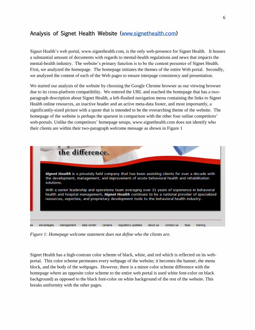
due to its cross-platform compatibility. We entered the URL and reached the homepage that has a two-
paragraph description about Signet Health, a left-flushed navigation menu containing the links to Signet
Health online resources, an inactive header and an active meta-data footer, and most importantly, a
significantly-sized picture with a quote that is intended to be the overarching theme of the website. The
homepage of the website is perhaps the sparsest in comparison with the other four online competitors’
web-portals. Unlike the competitors’ homepage setups, www.signethealth.com does not identify who
their clients are within their two-paragraph welcome message as shown in Figure 1
Figure 1: Homepage welcome statement does not define who the clients are.
Signet Health has a high-contrast color scheme of black, white, and red which is reflected on its web-
portal. This color scheme permeates every webpage of the website; it becomes the banner, the menu
block, and the body of the webpages. However, there is a minor color scheme difference with the
homepage where an opposite color scheme to the entire web portal is used white font-color on black
background) as opposed to the black font-color on white background of the rest of the website. This
breaks uniformity with the other pages.
7
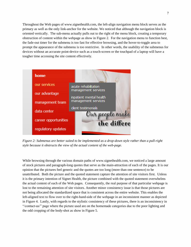
Throughout the Web pages of www.signethealth.com, the left-align navigation menu block serves as the
primary as well as the only link-anchor for the website. We noticed that although the navigation block is
oriented vertically. The sub-menu actually pulls out to the right of the menu block, creating a temporary
obstruction of content within the webpage as show in Figure 2. For the navigation menu to function best,
the fade-out timer for the submenu is too fast for effective browsing, and the hover-to-toggle area to
prompt the appearance of the submenu is too restrictive. In other words, the usability of the submenus for
devices without an accurate point-device such as a touch-screen or the touchpad of a laptop will have a
tougher time accessing the site content effectively.
Figure 2: Submenus are better suited to be implemented as a drop-down style rather than a pull-right
style because it obstructs the view of the actual content of the web-page.
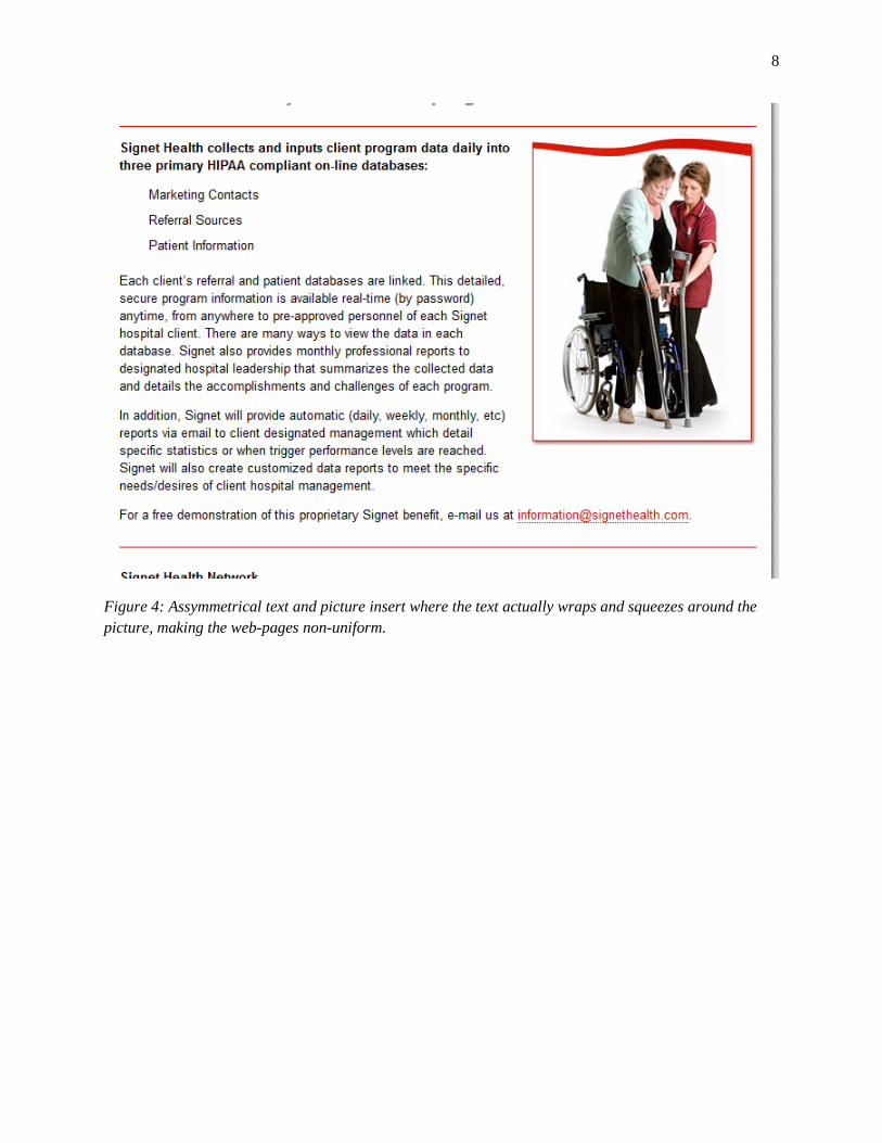
While browsing through the various domain paths of www.signethealth.com, we noticed a large amount
of stock pictures and paragraph-long quotes that serve as the main-attraction of each of the pages. It is our
opinion that the pictures feel generic and the quotes are too long (more than one sentence) to be
unattributed. Both the picture and the quoted statement capture the attention of site visitors first. Unless
it is the primary intention of Signet Health, the picture combined with the quoted statement overwhelms
the actual content of each of the Web pages. Consequently, the real purpose of that particular webpage is
lost to the remaining attention of site visitors. Another minor consistency issue is that those pictures are
not being allocated the standardized space that is consistent across the entire website. This enables the
left-aligned text to flow over to the right-hand-side of the webpage in an inconsistent manner as depicted
in Figure 4. Lastly, with regards to the stylistic consistency of these pictures, there is an inconsistency in
“/contact-us/” page where the picture used are on the homemade categories due to the poor lighting and
the odd cropping of the body-shot as show in Figure 5.
8
Figure 4: Assymmetrical text and picture insert where the text actually wraps and squeezes around the
picture, making the web-pages non-uniform.
9
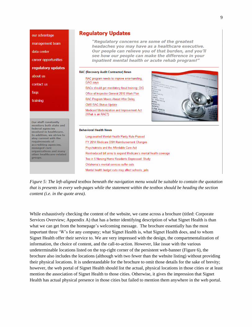
Figure 5: The left-aligned textbox beneath the navigation menu would be suitable to contain the quotation
that is presents in every web-pages while the statement within the textbox should be heading the section
content (i.e. in the quote area).
While exhaustively checking the content of the website, we came across a brochure (titled: Corporate
Services Overview; Appendix A) that has a better identifying description of what Signet Health is than
what we can get from the homepage’s welcoming message. The brochure essentially has the most
important three ‘W’s for any company; what Signet Health is, what Signet Health does, and to whom
Signet Health offer their service to. We are very impressed with the design, the compartmentalization of
information, the choice of content, and the call-to-action. However, like issue with the various
undeterminable locations listed on the top-right corner of the persistent web-banner (Figure 6), the
brochure also includes the locations (although with two fewer than the website listing) without providing
their physical locations. It is understandable for the brochure to omit those details for the sake of brevity;
however, the web portal of Signet Health should list the actual, physical locations in those cities or at least
mention the association of Signet Health to those cities. Otherwise, it gives the impression that Signet
Health has actual physical presence in those cities but failed to mention them anywhere in the web portal.

10
Figure 6: The most important page of signethealth.com; picture insert has style consistency issue, the
usage of CAPTCHA to prevent/solve form spammers can actually deter potential clients
When we reach the “our-advantages” webpage, we are overwhelmed by all three major statements
situated in three different locations. Each illustrate why potential clients should choose Signet Health
over the competitors. Specifically, the bold-faced leading statement that starts beneath the navigation
menu are competing against each other by distance instead of producing an enhancing effect by being
closer together. For instance, the leading statement mentions how Signet Health can overcome cost and
tackle the tricky nature of mental health industry whilst the extra statement talks about the rewards of
choosing Signet Health. Notice how these two sentences can complement each other by putting the
leading statement first and then by including extra statement as a new paragraph. Additionally, the

11
formatting of the only list (Figure 3) in that webpage is different from the rest of the website, where the
spacing between every list item and the indentation is different.
Figure 3: Symmetrical text and picture insert where the text and the picture are properly aligned left and
right.
When we reach the “data-center” webpage, we are impressed by the vastness of the Signet Health
network, aptly titled SigNetwork. The requirements and the services by SigNetwork are clearly defined
to the site visitors/potential clients and to the current clients as well. There is only one technical encounter
that we have uncovered; by clicking on the “Enter” button without any input in both the username and
password fields, the webform will force the webserver to generate potentially security-breaching XML
default error lines.
When we hover the mouse pointer over “career opportunities” in the navigation menu, a submenu that
contains only a single entry pulls out, and it subsequently obscures part of the “career opportunities”
links. When we inspect the content of both the “career opportunities” and “current job openings”, we
12
notice there are overlapping similarities between those two webpages. For instance, the quote and the
extra statement in the grey block are nearly identical.
When we reach the “regulatory-updates” webpage, we are impressed that the actual news articles are
classified by categories and efficiently stored in a single page. Not only that, the individual articles also
have front-back navigation to streamline the content presentation in a chronological manner. However,
we noticed that the navigation menu also has a submenu under “regulatory updates” with four options: 1)
to rac news, 2) to behavioral health news, 3) to mental health news, or 4) to acute rehabilitation news.
Every one of those four options would lead to a unique page that has vertically oriented content
presentation that is too long for reading and scrolling. On top of that, we cannot date the articles within
those news updates without going to the source of the document where some external web portals are
restricted by membership subscription.
In the “contact-us” webpage, we realized that the page is actually the most important part of website.
This is, ideally speaking, where the web portal is supposed to funnel potential clients to email
[email protected]. However, the implementation of CAPTCHA can be a potentially
deterrent to potential clientele as it reduces the easiness of completing the form by reloading the page and
losing the inputted comments to a failed CAPTCHA challenge. There are some web programming tricks
that works behind the scene to defeat automated form spammers (spambots) that does not require
CAPTCHA implementation.
In the “frequently-asked-questions” webpage, we find that it has a minor content presentation issue where
the question-answer pairings make the page too long and require attention and time consuming reading in
order to arrive to the question in mind. This illustrates the importance of effective content indexing and
selective information presentation that enhances the effectiveness of any electronic faq page.
In the “training” tab within the navigation menu, authentication is required to even know what “training”
means. Unlike the similar “data-center” webpage, there is the absence of description saying what
“training” does other than it leads to Signet Academy and we are not authorized for access. The lack of a
transitioning page or any descriptive statement is confusing for the first time site-visitor and inaccessible
for anyone.
Finally, we visited the “privacy-policy” webpage where Signet Health’s policy with respect to visitor’s
private information is outlined. The very first thing that we realize is that the quote that permeates
throughout the website is missing from the top of the web content.
Next, we will investigate and conduct a brief content analysis of each of the four Signet Health’s
competitor's web portals; telecarecorp.com, horizonhealth.com, diamondhealth.com, and
psychiatricresourcepartners.com. These analyses yield valuable insight to what Signet Health needs to do
to remain competitive in an online world.
Analysis of Competitor Websites
13
Telecare
Telecare’s website is functionally superior to Signet Health’s website in several ways. It has an overall
more effective design. For instance, it has two navigation menu bars instead of one. Having more than
one makes Telecare’s website accessible and simple to understand. It is easy to find each button to the
link that visitors need.
There are more links on Telecare’s homepage. It has 39, whereas Signet Health’s homepage has 23. This
includes the submenu links for both sites. This outmatches Signet Health in terms of information
presentation at a glance. However, www.Telecarecorp.com lacks a button to take visitors back to the
homepage – a function that Signet Health has that is very important.
We could gather from the homepage that Telecare took more care in hiding and separating their
information for the benefit of their users by having a more efficient drop-down menu. Signet Health also
has several pictures on their website, whereas Telecare only has one in the top banner that contains the
tree. While graphics can be helpful, perhaps Signet Health needs to focus more on distributing
information and less on appealing through graphics that don’t add much to the content of every webpage.
The “Telecare News” button takes one a place to receive general updates about the company, and this
accommodation is absent from Signet Health’s website. It is easy to find Telecare clinics in various areas
because clinic addresses are available in an easy to navigate section of their website. This may not seem
important, but when you need a clinic in an emergency, you will need the simplest possible access to the
clinic’s addresses.
It is generally easy to find the information you need on Telecare’s website with the built-in search
function located on the top-left corner of every webpage. In addition, there is a section on the website
where users can voice their concerns. Adding these similar practices to www.signethealth.com will help
Signet Health customers feel more efficient and productive on the website.
Horizon Health
The Horizon Health website claims to be “the leading provider to hospital-based mental health services”
on the home page and has a light blue color palate that puts its users at ease. Horizon Health’s website
contains a horizontal menu bar at the top of the screen. This tends to be more user-friendly than the far
left menu bar which obstructs content. These buttons easily lead users to information about Horizon
Health, what work they do, and who they are looking to hire. These elements combined make a positive
web experience that instills confidence in Horizon Health as a company.
In addition, the presence of a rotating banner on the homepage gives the user quick looks into different
features of the site. The images used in the banner communicate security in their company and its
reputation. Overall, the website provides 20 supplemental pictures and diagrams, as compared to Signet
Health’s 14. An increased amount of pictures help keep the attention of the website’s users and help to

14
convey important information. The “contact us” link was also present on every page. Users may find this
helpful because they can ask questions whenever they might occur.
Horizon Health’s website features “quick assessments” to see if their current program is under-
performing or assess their need for a new program see. If Signet Health incorporated this function into
their website, they could stay much more up to date with the ongoing functions of their company.
Signet services are listed in short bullet points, but Horizon poses questions that makes a hospital assess
their current status. This question approach is used to make customers feel like they need Horizon’s
services. For example, “Is your emergency room challenged to find more effective ways of meeting the
needs of psychiatric patients?” These directed questions allow users to evaluate their needs on a personal
level. Though Signet Health has a frequently asked questions area, there is such a bulk of text on the page.
It is unlikely that a customer would read through the entire section.
Their website is overall easily navigated and is tactically laid out to increase consumer interest in their
business.
Diamond Health
The Diamond Health homepage has the following information: information about Diamond Healthcare
Corporation concerning their missions, news and events about Diamond Health, and links to a) hospital
behavioral health needs and their solutions, b) Diamond Healthcare’s career site, c) a brochure appealing
to hospital executive, and finally, d) the key services offered by Diamond Healthcare Corporation.
Conversely, Signet Health Corporation homepage has a navigation menu and an identifying statement
that is not as clear as Diamond Health’s mission statement. In spite of that, Diamond Health high-function
homepage also means that the maintenance of their web portal is much trickier as witnessed by the
disorganization of their right-align newsfeed.
In Diamond Health, under each of the four navigation menu headings, site visitors can quickly and
conveniently browse through the sub-menu headings. Additionally, Diamond Health offers three-way
navigation in the form of a fixed-top banner, a horizontal drop-down navigation menu bar, and an
auxiliary vertical menu container (in all of the webpages other than the home page). These better direct
content management of the individual webpage as compared to one single navigation menu that does all
the navigation, like on Signet Health’s website.
Diamond Health has 31 primary links from Diamond Health but only possessed 7 distinctive pictures
(excluding staff’s thumbnail pictures, brochures, external site, and corporate logos). Due to the persistent
horizontal navigation menu bar that keeps the four token pictures present, it gives the impression of
varieties with little effort. However, it is unclear why Diamond Health chose to alternate between full-
color and monotone scheme with their four token pictures. Also, the lack of complementary pictures in
every Diamond Health webpage means it could afford to organize its content in an effective and also
creative manner.
Overall, Diamond Health’s main strong suit is its content presentation enabled by the minimal usage of
big-sized pictures that consume space. It also has a landing page prior to the login page to Diamond
15
University. However, the downside of Diamond Health is messy maintenance of its news entries and its
newsfeed from its homepage.
Psychiatric Resource Partners
Psychiatric Resource Partners' (PRP) website is functional and up to date. It is clear what PRP does and
how it operates right away on the home page. The home page has appealing, interactive graphics and a
more in-depth description of PRP below it. Here, the statement of operations is descriptive and
convincing, and we could easily understand what PRP does, why we should consult their company, and
how to consult them.
At the bottom of each page are features that are persuasive for potential clients to contact the company,
such as an image pinpointing locations where PRP has done outsourcing, showing that the company is
successful in the number of operations it has done and that it has the ability to consult on a large scale.
Next to that image is contact information for the Senior Vice President of development with his name,
phone number, email, and linkedin profile link. The quick contact form on the homepage is professional
and functional, and the "Contact" tab offers a more specific method of reaching PRP. The form allows
aspiring clients to state their business affiliation as well as why they would like to contact PRP. This
effectively creates more interaction between the user and the website, and it lets the user now that its
message will be considered in an individualized manner that takes into consideration the reason for
contact.
The CEO letter page is friendly and inviting and creates an interaction between the website user and the
company. It shows a degree of accountability from the company that Signet Health's site lacks. The
“Behavioral Management” tab goes into more depth about PRP’s business and is easily navigable. Each
page clearly describes each of the five services that PRP offers in a concise way. To the right of the
“Behavioral management” tab is a “Partnership Models” tab. The position of the tab next to the
descriptions of services shows confidence in those services and encourages a potential client to contact
PRP. Like the “Behavioral Management” tab, the “Partnership Models” tab clearly describes the four
models PRP offers and is easily navigable. The ease of finding information on the services and models
that PRP offers as well as the professional contact form make the website an effective tool to pull in
potential clients. The website has 19 primary links that are easy to navigate between, but like the Signet
Health website, PRP’s images do not effectively represent the company.
16
Recommended changes to www.signethealth.com
Here is our list of recommendations to your website, www.signethealth.com, listed according to our
analysis. We hope that you find our recommendations helpful and easy to follow and implement.
Strongly Recommended Changes:
● Describe with clarity what Signet Health does as a company because the four other competitor’s
homepages are much clearer with more definition about what they do and how they do it.
Therefore, it is recommended that the promotional message of the Corporate Service Overview
replace the homepage welcome message as it is much clearer and much persuasive as the very
first messages that visitors see.
● Index Signet Health’s web pages so that an optional but highly recommended search function can
be implemented from the homepage or above the navigation menu block. It is necessary for
content, such as news articles, to be indexed so that dynamic viewing is possible with either a
listing of categories (already present) or a search function that enables only those specific and
relevant articles to be displayed, instead of displaying all 10 articles of mental health news.
● Implement a horizontally-based navigation menu that drops down to non-essential web banner or
thumbnails with stock pictures as how it is being done by Diamond Health’s homepage (Figure
12). That way, no essential information would be obscured and this keeps the toggling action
much easier. Nevertheless, a secondary vertically-based navigation menu (without submenus) can
be considered for better navigation.
● Switch the two statements contained in the grey block below the navigation menu block with the
quotes’ place. We advocate the swapping of content and message because the message in the grey
container has more marketable definition of Signet Health versus the quote itself and, more
importantly, we recommend that the alternate message displays itself front and center as soon as
the page loads (i.e. no scrolling down required).
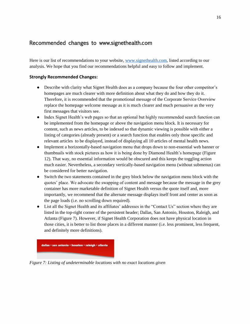
● List all the Signet Health and its affiliates’ addresses in the “Contact Us” section where they are
listed in the top-right corner of the persistent header; Dallas, San Antonio, Houston, Raleigh, and
Atlanta (Figure 7). However, if Signet Health Corporation does not have physical location in
those cities, it is better to list those places in a different manner (i.e. less prominent, less frequent,
and definitely more definitions).
Figure 7: Listing of undeterminable locations with no exact locations given
17
Recommended Changes:
● Merge the content of “career-opportunities” with the content of “current job openings” to
eliminate content separation because they are complementary of each other. The available job
openings should be listed in the center-body of the webpage and the human resources’ contact
information should be listed in the left-margin (if implemented) or below the picture.
● Add basic interactivity within the frequently asked questions (FAQs) page where every question
can be toggled to review the answer to that particular question when pressed. We suggest that the
answers are all hidden initially by default to give a clean and condensed presentation.
● Date the news so that readers would not need to trace the link to the article’s source to find out
the date of origin.
● Separate prospective clients’ sections from current clients’ sections so that visitors and users alike
can find the sections they need to look in more easily. For example, consider grouping or
separating a section for “data center” and “training/Signet Academy” for current clients.
● Structure the website to be more easily accessible by creating clearer contrast in the text on your
homepage. Currently it is hard to tell which words are buttons and links. For example, buttons
and clickable icons should have a more definitive outline and borders when the page loads or
when the mouse pointer hovers over it instead of lightly coloring the words.
● Collate and group what might be considered as “critical mental-health information” so that people
can find important and pressing information quicker. For instance, consider grouping the IPFQR
summary together with “regulatory updates”. Conversely, grouping Signet Health identity
webpages such as “about us” and “management team” together in the menu block.
● Organize the headings with sub-headings so that they flow seamlessly from broad topic to
specific subject.
● Let website visitors give feedback on the usability of www.signethealth.com. It helps them feel
like their voices are heard and more importantly it distinguished what inquiries are for Signet
Health and what inquiries are specifically for the website.
● Design the layout of the homepage to be more interactive (i.e. visitors can actually make changes)
and informative so that your company presents an overall modern face to potential clients.
● Create a landing page prior to any secured-login such as those leading to data center and Signet
academy because this will let site-visitors understand where this login will be leading towards.
Conclusion
Our analysis of the Signet Health website has revealed some areas that need to be improved.
Among the most important are information organization, page layouts, and the conveying of the mission
statement. Our evaluations of the Web pages of similar businesses have led us to believe that additional
changes are necessary to remain a competitive Web presence. We believe that the implementation of our
suggestions will attract new clienteles and strengthen the growth of your business network.

18
Appendix