Self evaluation
9
Self Evaluation ANCILLARY PRODUCTS
-
Upload
lister8566 -
Category
Education
-
view
113 -
download
1
Transcript of Self evaluation

Self EvaluationANCILLARY PRODUCTS

Film PosterWhy do I think it is effective?I feel that my poster would be effective because I have considered many conventions when designing it. I took into consideration the layout of the poster to make sure it was easy to read and clear. I used the route of the eye layout to make sure everything was on point across my poster. As you can see the reviews, the film name, the slogan and the release date are all in a clear route of the eye layout. You can also see the image is in the middle of the page showing that it is the most important part of the poster. I also paid a lot of attention to the fonts I have used in my magazine. I have used very bold and big fonts to make sure all the important text the poster is clear and easy to read. I used a san serif fonts for the film name and slogan because they are conventional fonts for this text. I have used a serif font for the release date and the reviews of the film because they are conventional for that type of text.
What could I improve?I think I could improve my poster by adding the colours that I am going to use for the actual poster. I will use conventional colours for the horror genre, for example; reds, blacks to make the poster conventional. I could also add the background and the image to the poster to see what it will look like.

Comparison
After looking at my poster and a existing horror poster, I compared them to see if mine was conventional. As you can see the reviews for the film are at the top of the poster on both posters. You can also see that the main image is in the middle of the poster which is conventional for a horror poster. You can also see the title of the film and the slogan are below the picture but really stand out on the page so they can be easily seen. You can also see that a list of the actors and the release date are at the bottom of the poster in a serif font which makes them easy to see but also means they are not the most important part of the poster. You can see that both posters have used the route of the eye layout which is effective because everything can be see easily.
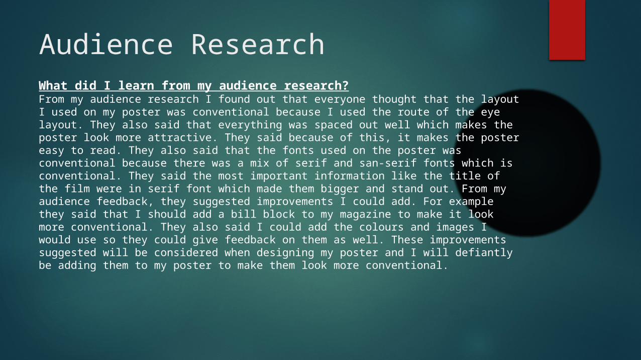
Audience ResearchWhat did I learn from my audience research?From my audience research I found out that everyone thought that the layout I used on my poster was conventional because I used the route of the eye layout. They also said that everything was spaced out well which makes the poster look more attractive. They said because of this, it makes the poster easy to read. They also said that the fonts used on the poster was conventional because there was a mix of serif and san-serif fonts which is conventional. They said the most important information like the title of the film were in serif font which made them bigger and stand out. From my audience feedback, they suggested improvements I could add. For example they said that I should add a bill block to my magazine to make it look more conventional. They also said I could add the colours and images I would use so they could give feedback on them as well. These improvements suggested will be considered when designing my poster and I will defiantly be adding them to my poster to make them look more conventional.

Strengths and Weaknesses
Strengths Weaknesses
The fonts I have used are conventional and stand out on the poster.
There is no billing block on my poster.
The layout of the magazine is conventional and because of this everything is easy to read and well spaced out.
There is no colour scheme added to the poster yet.
The ideas for the images are conventional and will make the poster more conventional.
There is no actual images added yet.
The slogan is conventional and gives the poster a scarier feel.

Film MagazineWhy do I think it is effective?I feel that my magazine cover for film is effective for many reasons. I have used the same fonts for the title of the film and for the slogan so that it will create brand identity between the poster and the magazine. I have also included conventional fonts for the mast head and cover lines on my magazine. I have also used the route of the eye layout to make it conventional and for everything on my poster easy to read. The route of the eye also allows for everything to be spaced out well. I have also placed where the main image is going to go, which will be a similar image to what I am using on my poster, this will create brand identity between the two. The magazine cover also includes conventional features such as cover lines, the bar cade, and other articles in the magazine.
What could I improve?I think I could improve my magazine by adding the colours that I am going to use for the actual magazine. I will use conventional colours for the horror genre, for example; reds, blacks to make the poster conventional. I could also add the background and the image to the magazine to see what it will look like.

Comparison
After looking at my magazine I compared it to an existing magazine to see the similarities. As you can see the masthead for both magazines are at the top on the page, they are both in a serif font which is conventional for a magazine cover. You can also see that there is cover lines down the left hand side of both magazines. The image on both magazines are covering a majority of the magazine and they are both on the right hand side of the magazine. You can also see they have a image in the bottom left hand corner which is from another film and the bar code is in the right hand corner for both.

Audience ResearchWhat did I learn from my audience research?From my audience research I found out that everyone thought that my magazine was effective. A majority of people said that the layout I used was conventional because I used the route of the eye which made everything very easy to read and everything is well spread out. They also said that the fonts I have used on my magazine were conventional because they stand out and are very easy to read. They also said that other conventional features on my magazine that have been added such as bar code and cover lines make my magazine more conventional and appealing. I was also suggested improvements such as making the cover story bigger so its clearer and making the image bigger. After looking at my audience feedback, I am going to include these improvements as it will make my magazine cover more conventional and eye catching. Also a majority of people suggested the same improvements.

Strengths and Weaknesses
Strengths Weaknesses
The fonts I have used stand out and are conventional.
The cover story needs to be bigger.
The layout of the magazine is conventional as the route of the eye has been used.
The colours and images need to be added.
Other magazine features have been included such as cover lines and the barcode.
The image needs to be bigger.
Everything is positioned well and has its own space.