Selection and rejection
13
-
Upload
sarah12345678910 -
Category
Education
-
view
95 -
download
0
Transcript of Selection and rejection

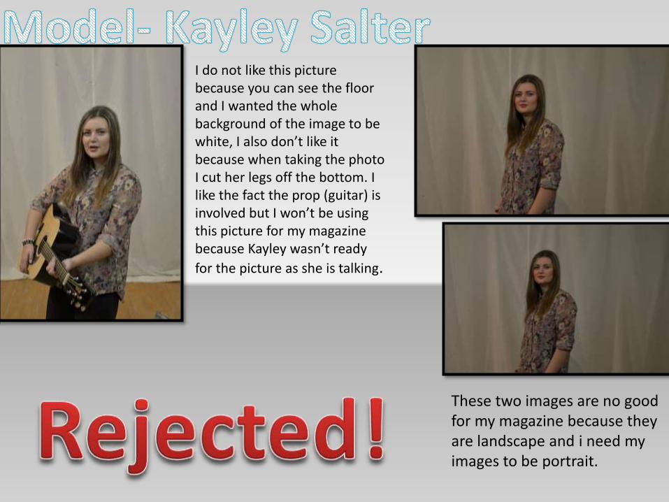
I do not like this picture because you can see the floor and I wanted the whole background of the image to be white, I also don’t like it because when taking the photo I cut her legs off the bottom. I like the fact the prop (guitar) is involved but I won’t be using this picture for my magazine because Kayley wasn’t ready
for the picture as she is talking.
These two images are no good for my magazine because they are landscape and i need my images to be portrait.

These 3 images are ok but they all have a shadow behind my model, kayley, I could edit this out by using elements 11 if I am going to use these photos.
Both of these images are blurry so I definitely will not be using these photos in magazine.
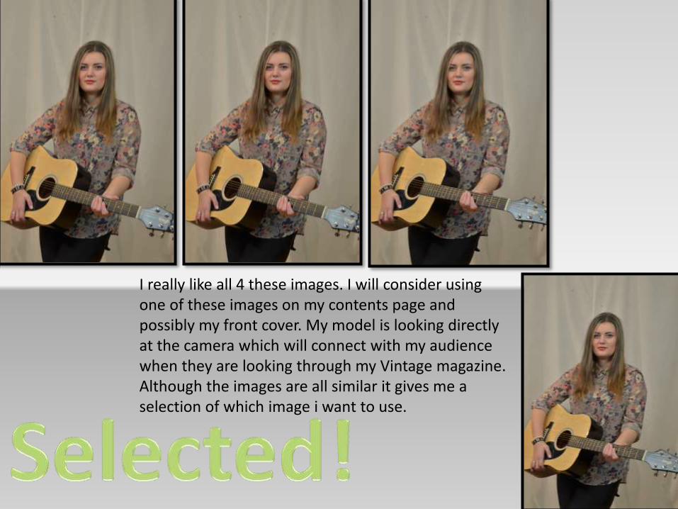
I really like all 4 these images. I will consider using one of these images on my contents page and possibly my front cover. My model is looking directly at the camera which will connect with my audience when they are looking through my Vintage magazine. Although the images are all similar it gives me a selection of which image i want to use.
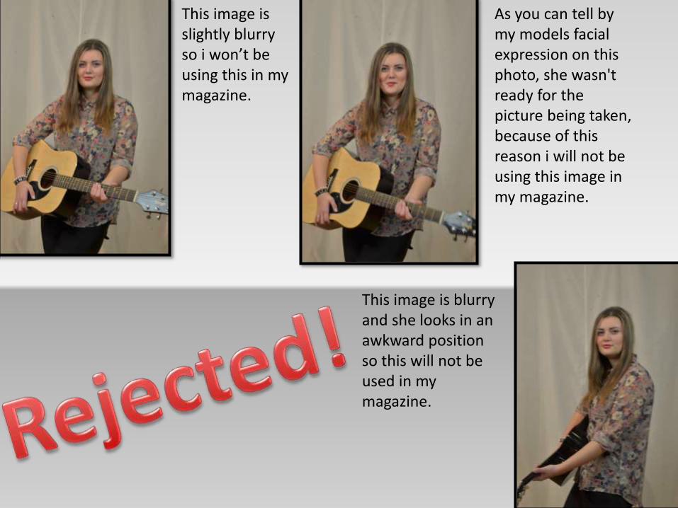
This image is slightly blurry so i won’t be using this in my magazine.
As you can tell by my models facial expression on this photo, she wasn't ready for the picture being taken, because of this reason i will not be using this image in my magazine.
This image is blurry and she looks in an awkward position so this will not be used in my magazine.
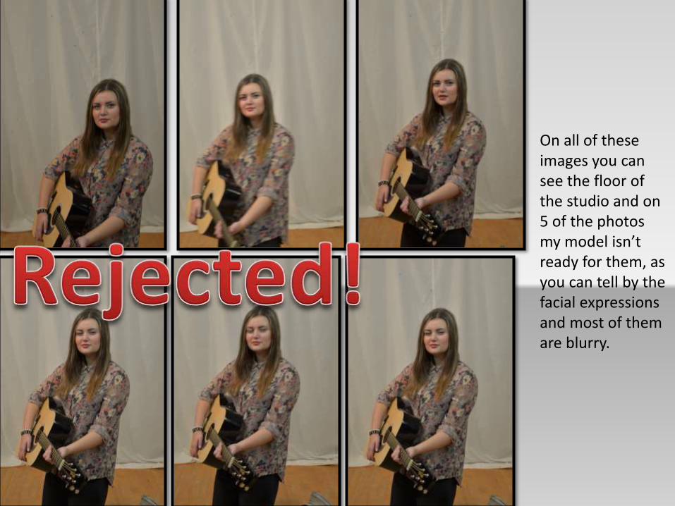
On all of these images you can see the floor of the studio and on 5 of the photos my model isn’t ready for them, as you can tell by the facial expressions and most of them are blurry.
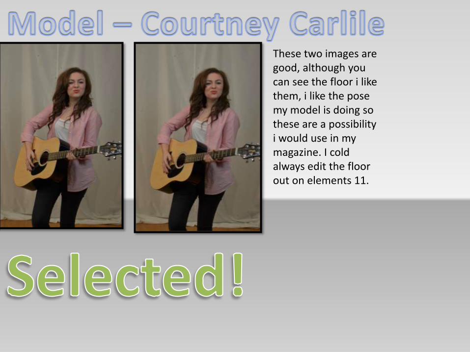
These two images are good, although you can see the floor i like them, i like the pose my model is doing so these are a possibility i would use in my magazine. I cold always edit the floor out on elements 11.

These images are blurry so they will not be used for any of the pages in my magazine.
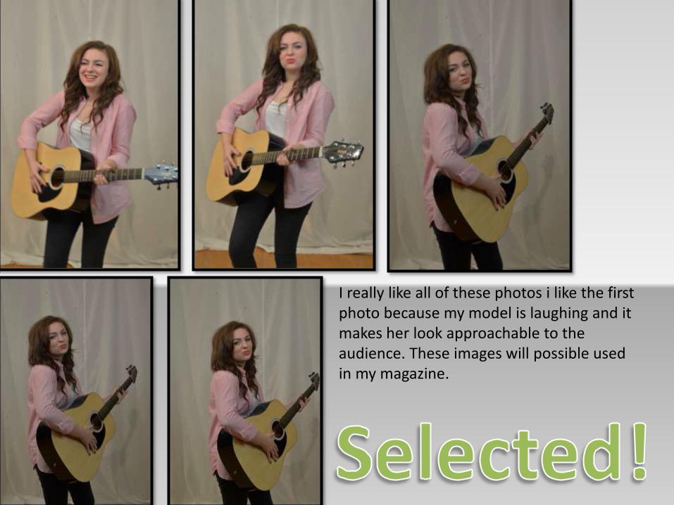
I really like all of these photos i like the first photo because my model is laughing and it makes her look approachable to the audience. These images will possible used in my magazine.
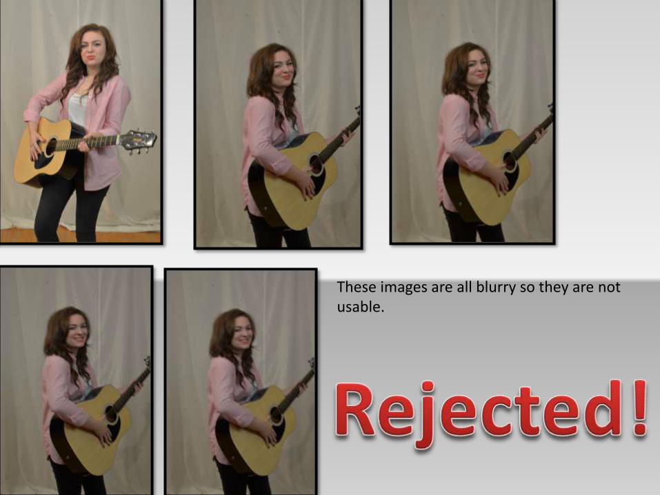
These images are all blurry so they are not usable.
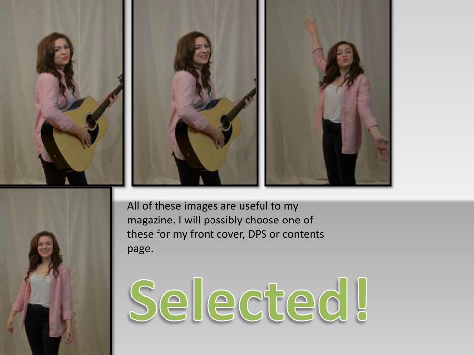
All of these images are useful to my magazine. I will possibly choose one of these for my front cover, DPS or contents page.

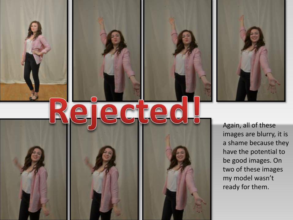
Again, all of these images are blurry, it is a shame because they have the potential to be good images. On two of these images my model wasn’t ready for them.