Selecting Strong Imagery for Interpretive Stories Strong...Selecting Strong Imagery for Interpretive...
43
Selecting Strong Imagery for Interpretive Stories This webinar is sponsored by the Texas Historical Commission’s Texas Heritage Trails Program in partnership with the Texas Association of Museums. This project was supported in part by funding through TxDOT’s Statewide Transportation Enhancement Program.
Transcript of Selecting Strong Imagery for Interpretive Stories Strong...Selecting Strong Imagery for Interpretive...

Selecting Strong Imagery
for Interpretive Stories
This webinar is sponsored by the Texas Historical Commission’s Texas Heritage Trails Program
in partnership with the Texas Association of Museums. This project was supported in part by
funding through TxDOT’s Statewide Transportation Enhancement Program.
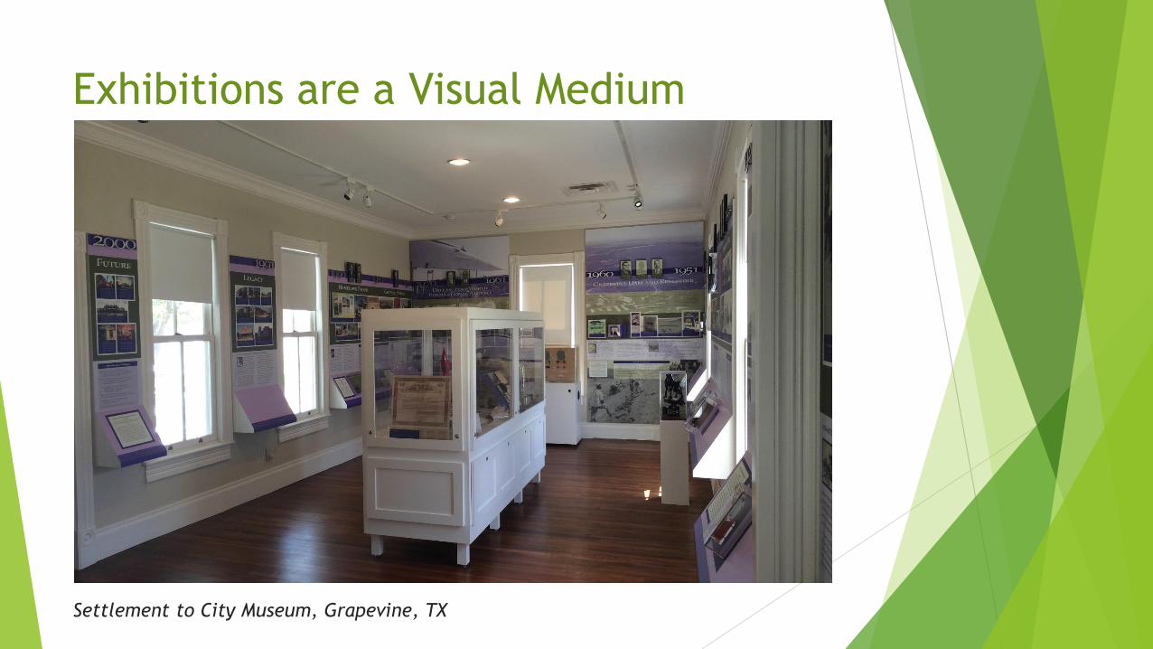
Exhibitions are a Visual Medium
Settlement to City Museum, Grapevine, TX

Texas State Cemetery, Austin, TX
Exhibits of All Kinds are Visual Media

Exhibits of All Kinds are Visual Media
Bayer Museum of Agriculture, Lubbock, TX

Audience Expectations

Visual Variety
Donald Schoolhouse Museum, Grapevine, TX

Visual Variety
Outdoor interpretive sign, Garner State Park, Concan, TX

Choosing the Right Type of Visual
Step 1: Figure out what it is you’re trying to communicate.
Step 2: Figure out which type of visual will best communicate that.
Step 3: Assess the quality of your options.
Step 4: Choose your visual.

Maps
The Basics
Need to be reproduced at a scale large enough that people can see what it is
you’re interpreting.
If necessary, it’s okay to reproduce just a segment of a map.

Maps Historical maps are good for giving people a snapshot of what a particular place
looked like at a given time.
“Bird’s Eye View of the City of Austin,” by Augustus Koch, 1873, from Texas Bird’s-Eye
Views, Amon Carter Museum, Fort Worth, TX

Maps When historical maps are used together, they can also be used to show growth
and change over time.
“Bird’s Eye View of the City of Austin,” by Augustus Koch, 1887, from Texas Bird’s-Eye
Views, Amon Carter Museum, Fort Worth, TX

Charts, Graphs and Tables
Battleship TEXAS State Historic Site, La Porte, TX
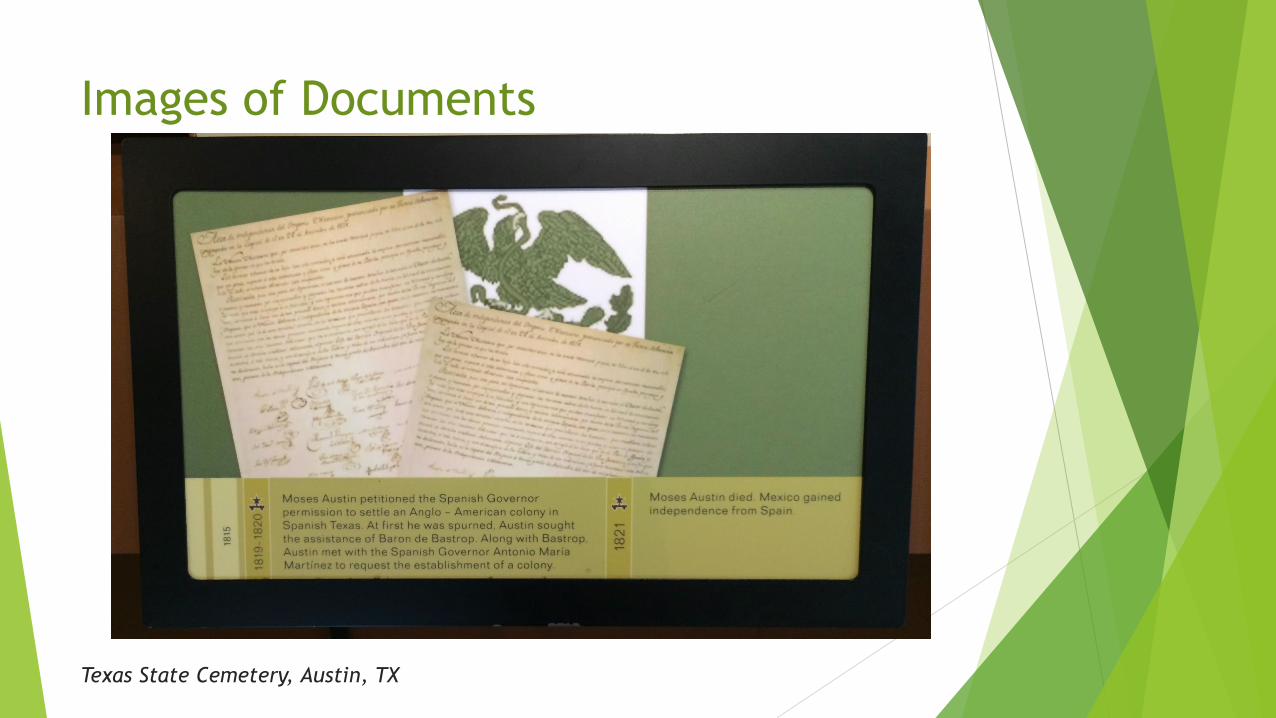
Images of Documents
Texas State Cemetery, Austin, TX

Images of Documents
Waves of Hope: Asian American History in Austin, Asian American Resource Center,
Austin, TX
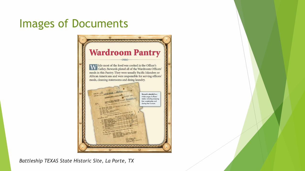
Images of Documents
Battleship TEXAS State Historic Site, La Porte, TX

Photographs: The Basics
Donald Schoolhouse Museum, Grapevine, TX
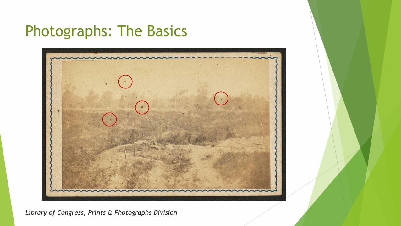
Photographs: The Basics
Library of Congress, Prints & Photographs Division

Photographs: The Basics
Time Exposures: Picturing Isleta Pueblo in the 19th Century, Museum of Texas Tech
University, Lubbock, TX
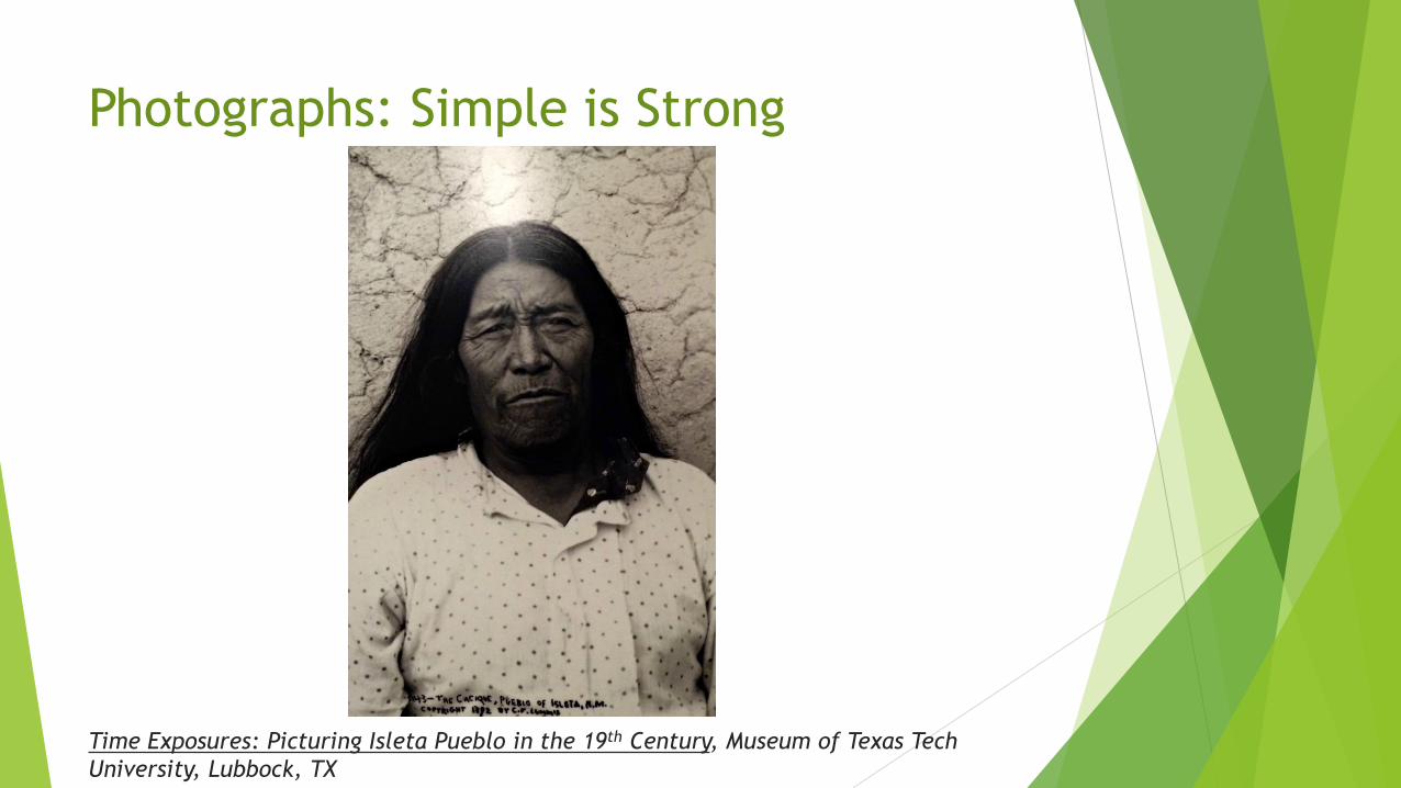
Photographs: Simple is Strong
Time Exposures: Picturing Isleta Pueblo in the 19th Century, Museum of Texas Tech
University, Lubbock, TX
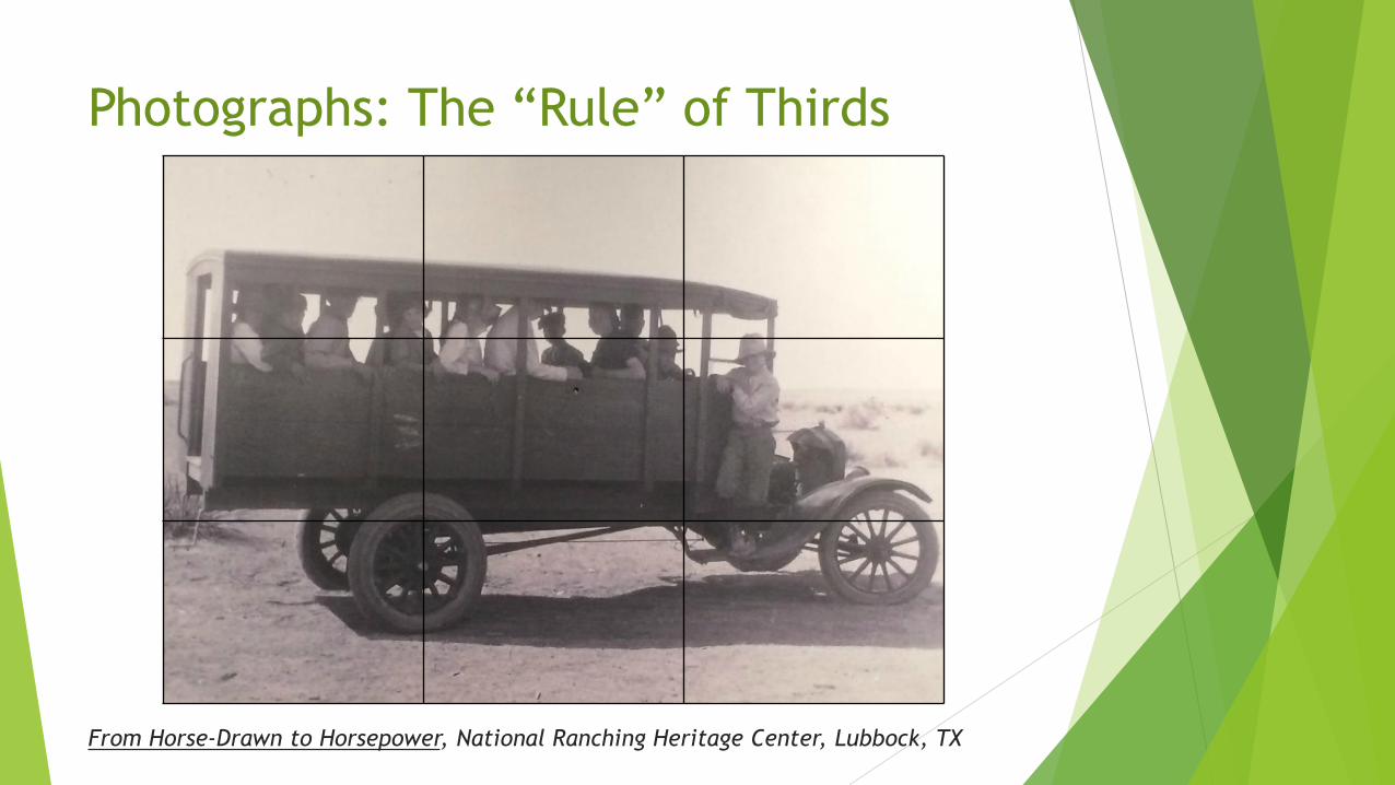
Photographs: The “Rule” of Thirds
From Horse-Drawn to Horsepower, National Ranching Heritage Center, Lubbock, TX

Photographs: The “Rule” of Thirds
Library of Congress, Prints & Photographs Division

Photographs: The “Rule” of Thirds
Library of Congress, Prints & Photographs Division

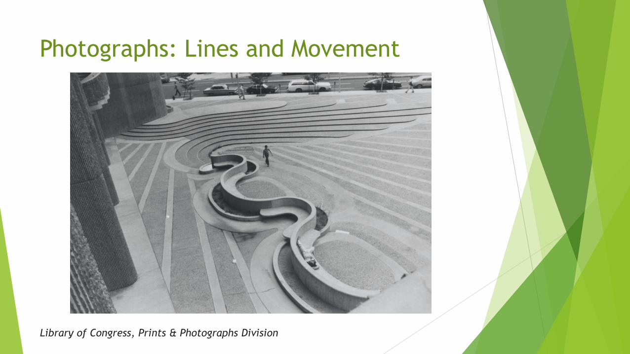
Photographs: Lines and Movement
Library of Congress, Prints & Photographs Division
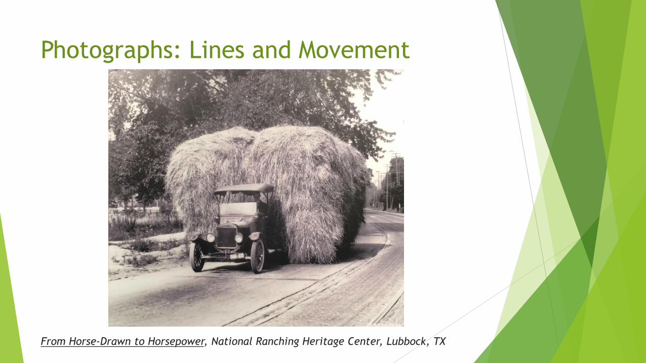
Photographs: Lines and Movement
From Horse-Drawn to Horsepower, National Ranching Heritage Center, Lubbock, TX
Photographs: Lines and Movement
Library of Congress, Prints & Photographs Division

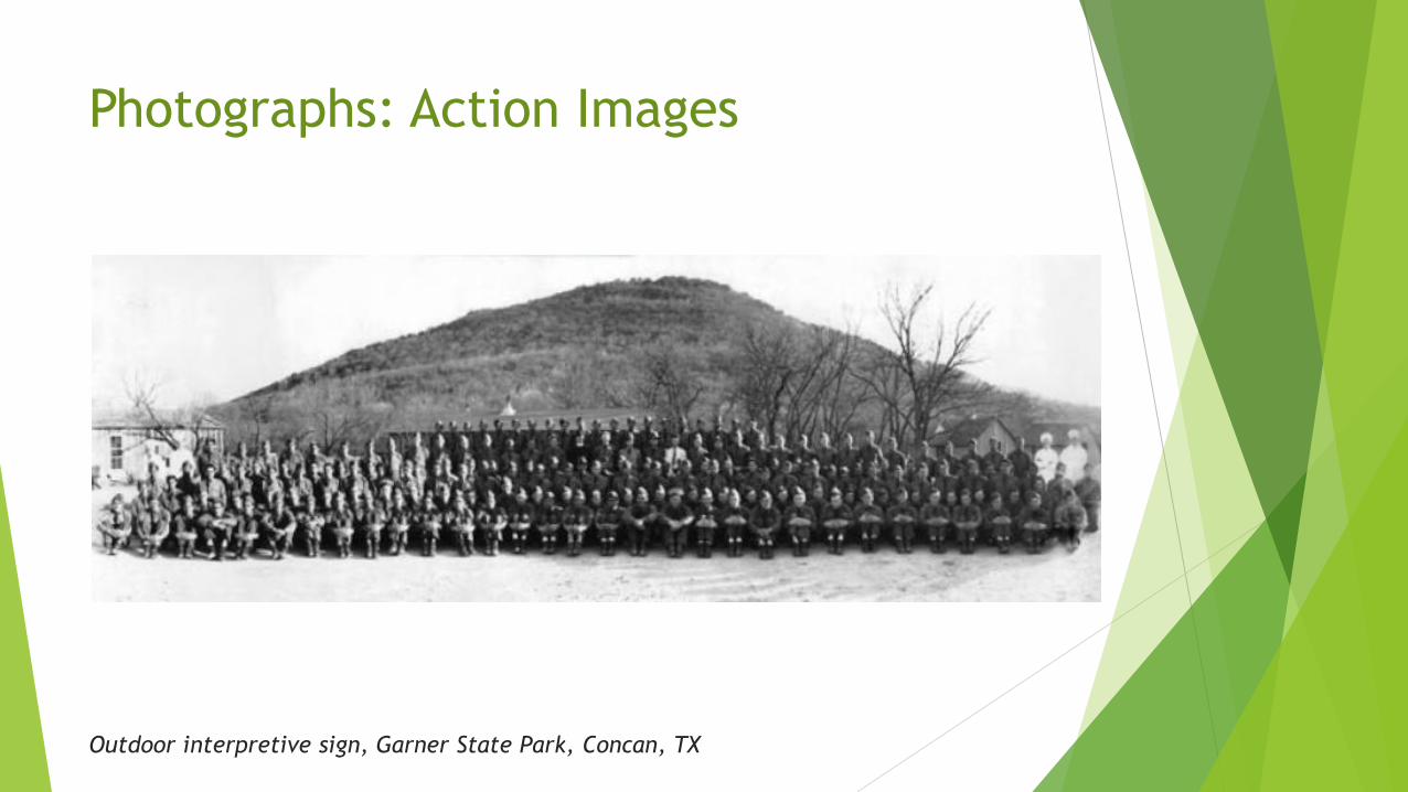
Photographs: Action Images
Outdoor interpretive sign, Garner State Park, Concan, TX
Photographs: Action Images
Outdoor interpretive sign, Garner State Park, Concan, TX

Photographs: Static Images
Mail Call, Smithsonian Institution Traveling Exhibition Service, at Grapevine CVB,
Grapevine, TX
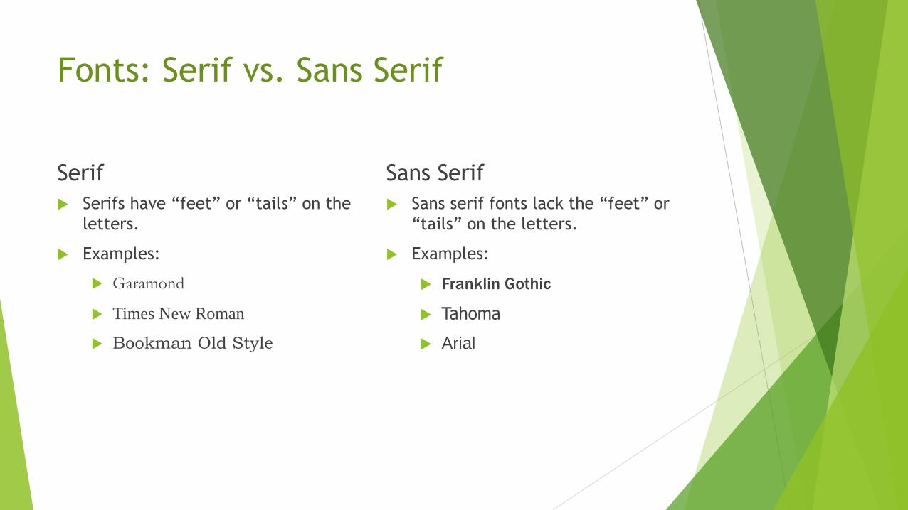
Fonts: Serif vs. Sans Serif
Serif
Serifs have “feet” or “tails” on the
letters.
Examples:
Garamond
Times New Roman
Bookman Old Style
Sans Serif
Sans serif fonts lack the “feet” or
“tails” on the letters.
Examples:
Franklin Gothic
Tahoma
Arial

Fonts: Print vs. Web
Serif fonts are considered more
legible in print.
In general, use serif fonts for body
copy and larger.
Exception: serif fonts are harder to
read at small size. Use sans serif
fonts for smaller print (e.g.,
captions).
Web
Sans serif fonts are considered
more legible on screen.
Use sans serif fonts at any size.

Fonts: Sizes
Captions: 20 to 24-point type
Body copy and Titles: 28 to 42-point type, depending on:
color of type
spacing between letters (kerning) and between lines (leading)
type of font (regular, bold, italic)
Note: the actual print size of a 20-point font will vary depending on the font. For example:
Garamond at 20 point
DilleniaUPC at 20 point
When using a font that runs on the smaller side, make sure you compensate for this by using it at a larger size.

Fonts: More Readable
Source: Smithsonian Guidelines for Accessible Design
In general: regular typefaces (not BOLD or italic)
Don’t set text in ALL CAPS
Serif fonts:
Times New Roman
New Century Schoolbook
Sans serif fonts:
Helvetica
Univers 55
Futura
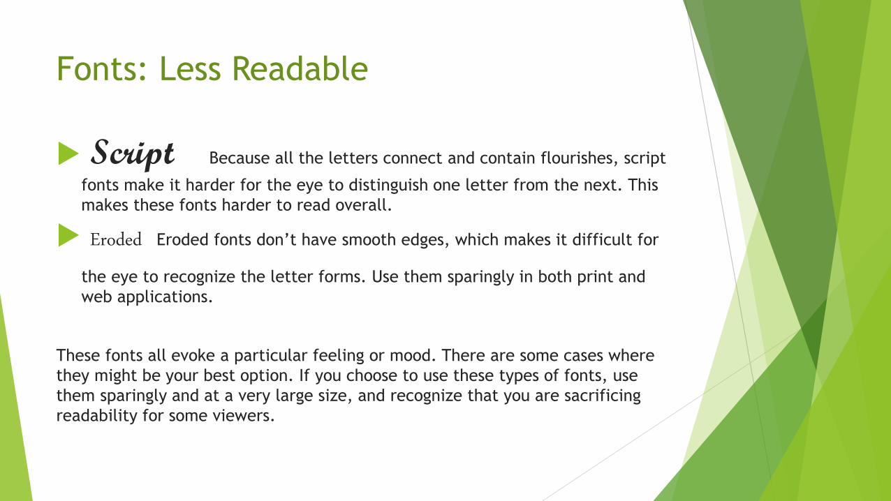
Fonts: Less Readable
Script Because all the letters connect and contain flourishes, script
fonts make it harder for the eye to distinguish one letter from the next. This
makes these fonts harder to read overall.
Eroded Eroded fonts don’t have smooth edges, which makes it difficult for
the eye to recognize the letter forms. Use them sparingly in both print and
web applications.
These fonts all evoke a particular feeling or mood. There are some cases where
they might be your best option. If you choose to use these types of fonts, use
them sparingly and at a very large size, and recognize that you are sacrificing
readability for some viewers.

Fonts: Less Readable
Texas State Cemetery, Austin, TX

Fonts: Overused Fonts
Comic Sans
Papyrus Looking for an alternative font? I often use www.dafont.com for free,
downloadable fonts that are fully licensed for non-commercial use.

Composition: Balance
Texas State Cemetery, Austin, TX

Composition: Colors and Contrast
Time Exposures: Picturing Isleta Pueblo in the 19th Century, Museum of Texas Tech
University, Lubbock, TX

Composition: Image Orientation
Battleship TEXAS State Historic Site, La Porte, TX
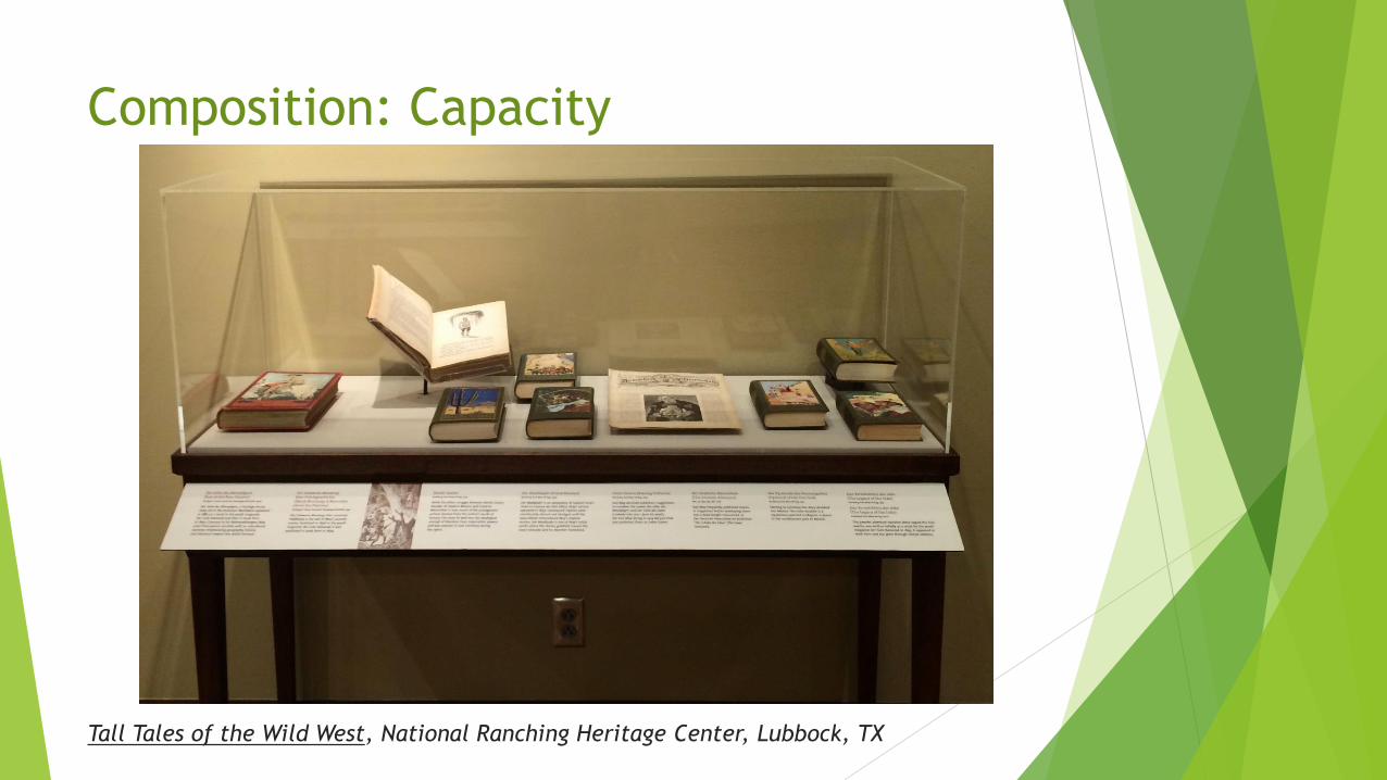
Composition: Capacity
Tall Tales of the Wild West, National Ranching Heritage Center, Lubbock, TX

Composition: Capacity
Bayer Museum of Agriculture, Lubbock, TX

Composition: Capacity
Asian American Resource Center, Austin, TX

Take-Aways
Choose the right type of visual for your message.
Look for simple, well-composed, and dynamic images.
Rely on fonts that are highly readable (and limit use of those
that are not).
Think about balance, contrast, image orientation, and capacity
when putting it all together.

Resources
Useful (free!) resources:
PicMonkey (http://www.picmonkey.com): free web-based photo editing, good for touching up modern images.
http://www.dafonts.com: downloads of all types of fonts, free licenses for non-commercial uses
Colour Contrast Check (http://www.snook.ca/technical/colour_contrast/colour.html): check the contrast between your text (foreground) color and background color by inputting color values or using a slider to select your color. Sidebar tells you whether your contrast is at least 7:1.
Smithsonian Guidelines for Accessible Exhibition Design (http://accessible.si.edu/pdf/Smithsonian%20Guidelines%20for%20accessible%20design.pdf)
Library of Congress (http://www.loc.gov/pictures/): free image downloads, usually free of copyright issues)