Section 4.8 Line of Best Fit. Let’s make a scatter plot on the board together. 1.) Think of how...
18
Section 4.8 Line of Best Fit
-
Upload
lillian-williamson -
Category
Documents
-
view
214 -
download
0
Transcript of Section 4.8 Line of Best Fit. Let’s make a scatter plot on the board together. 1.) Think of how...

Section 4.8
Line of Best Fit

Let’s make a scatter plot on the board together.
1.) Think of how old you are in months, and your shoe size.
2.) Plot on the board your information. x-axis, age in months from 150 to 200y-axis, show size 4 to 15
3.) Now think of a younger sibling and plot what you think is their information
4.) Is there a correlation?
5.) Can we make a prediction for someone 30 years old? 3 years old?

Age (months)
Height (inches)
18 76.1
19 77
20 78.1
21
22 78.8
23 79.7
24 79.9
25 81.1
26 81.2
27 82.8
28
29 83.5
Work with your group to make a prediction for the height at:
• 21 months
• 28 months
• 20 years


Line of Best Fit• Definition - A Line of Best is a straight line on a
Scatterplot that comes closest to all of the dots on the graph.
• A Line of Best Fit does not touch all of the dots.• A Line of Best Fit is useful because it allows us
to:– Understand the type and strength of the relationship
between two sets of data– Predict missing Y values for given X values, or
missing X values for given Y values


Equation For Line of Best Fity = 0.6618x + 64.399
X (months) Formula Y (inches)
21 0.6618(21) + 64.399
28 0.6618(28) + 64.399
240 0.6618(240) + 64.399
78.3
82.9
223.3
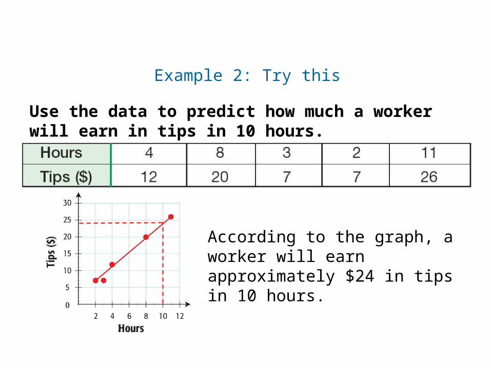
Use the data to predict how much a worker will earn in tips in 10 hours.
Example 2: Try this
According to the graph, a worker will earn approximately $24 in tips in 10 hours.

Use the data to predict how many circuit boards a worker will assemble in 10 hours.
Try This: Example 3
Course 3
Scatter Plots
According to the graph, a worker will assemble approximately 12 circuit boards in 10 hours.
Hours Worked
4 8 6 9 11
Circuit Board Assemblies
2 7 5 8 12
141210 8 6 4 2
2 4 6 8 10 12 14
Hou
rs
Circuit Board Assemblies

BIRD POPULATIONS
The table shows the number of active woodpecker clusters in a part of the De Soto National Forest in Mississippi. Determine the correlation between the year and the number of Active clusters.
Year 1992 1993 1994 1995 1996 1997 1998 1999 2000
Active clusters
22 24 27 27 34 40 42 45 51

SOLUTION
EXAMPLE 3
Make a scatter plot of the data. Let x represent the number of years since 1990. Let y represent the number of active clusters Since the dots are generally going up and to the right, we say this is a positive correlation.

Describe the correlation of the data graphed in the scatter plot.
The scatter plot shows a positive correlation between hours of studying and test scores. This means that as the hours of studying increased, the test scores tended to increase.

EXAMPLE 1 Describe the correlation of data
The scatter plot shows a negative correlation between hours of television watched and test scores. that as the hours of television This means that as the hours of television watched
Increased, the test scores tended to decrease.
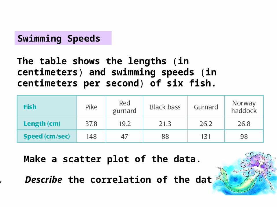
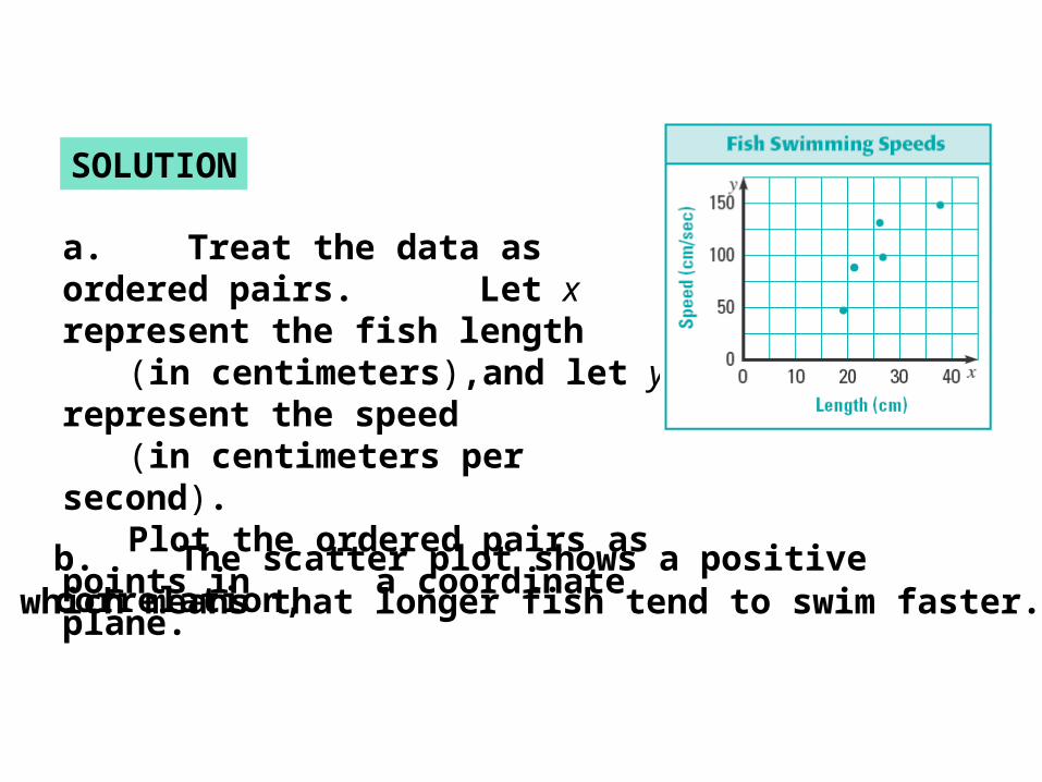
Swimming Speeds
EXAMPLE 2
The table shows the lengths (in centimeters) and swimming speeds (in centimeters per second) of six fish.
a. Make a scatter plot of the data.
b. Describe the correlation of the data.
EXAMPLE 2
b. The scatter plot shows a positive correlation, which means that longer fish tend to swim faster.
SOLUTION
a. Treat the data as ordered pairs. Let x represent the fish length (in centimeters),and let y represent the speed
(in centimeters per second). Plot the ordered pairs as points in a coordinate plane.

GUIDED PRACTICE
Make a scatter plot of the data in the table. Describe the correlation of the data.
ANSWER
The scatter plot shows a positive correlation.