Section 1-1 Day One Types of Data Bar Graphs, Pie Charts Dots Plots, Stem and leaf plots,...
32
AP Statistics Section 1-1 Day One Types of Data Bar Graphs, Pie Charts Dots Plots, Stem and leaf plots, Histograms
-
Upload
benjamin-jefferson -
Category
Documents
-
view
216 -
download
0
Transcript of Section 1-1 Day One Types of Data Bar Graphs, Pie Charts Dots Plots, Stem and leaf plots,...

AP StatisticsSection 1-1
Day OneTypes of Data
Bar Graphs, Pie ChartsDots Plots, Stem and leaf plots, Histograms

Homeworkp. 46 1, 2 ,4 ,5
Use Create a graph as needed
Misleading Graph
Bad Graphs

Ed Tufte of Yale University has defined a “lie factor” asa measure of the amount of distortion in a graph.
Lie Factor =size of effect shown in graphic/size of effect shown in data
If the lie factor of a graph is greater than 1, the graph isexaggerating the size of the effect
THE LIE FACTOR
Look at graphs with different Lie Factors

I) Types of Data A. Categorical – a variable that places an
individual into one of several groups or categories. “Gender”, “Color”, “State”
B. Quantitative (numerical) – a variable that takes on a numerical value for which arithmetic operations and averaging make sense. “Height ”, “Temperature”
Displaying Distributions with Graphs
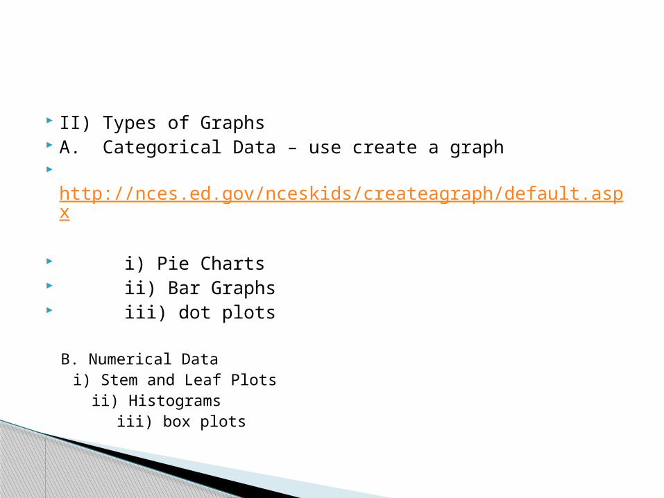
II) Types of Graphs A. Categorical Data – use create a graph http://nces.ed.gov/nceskids/createagraph/default.aspx
i) Pie Charts ii) Bar Graphs iii) dot plots
B. Numerical Data i) Stem and Leaf Plots
ii) Histograms iii) box plots
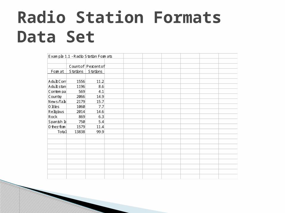
Example 1.1 - Radio Station Formats
Count of Percent ofFormat Stations Stations
Adult Contemporary1556 11.2Adult standards 1196 8.6Contempary hit 569 4.1Country 2066 14.9News/Talk/Information2179 15.7Oldies 1060 7.7Religious 2014 14.6Rock 869 6.3Spanish language750 5.4Other formats 1579 11.4
Total 13838 99.9
Radio Station Formats Data Set


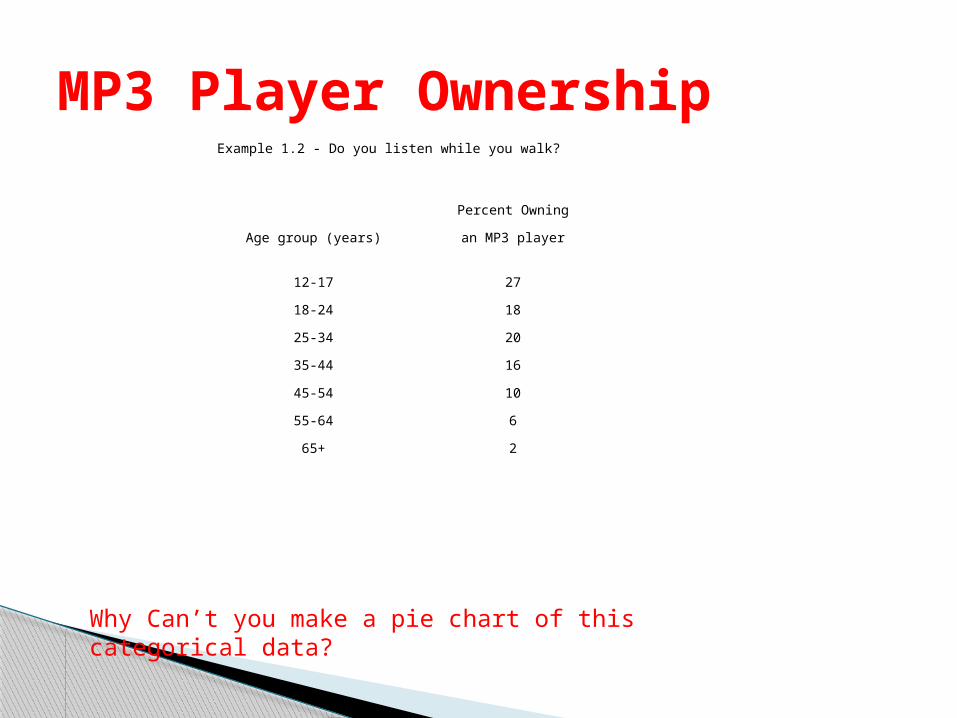
Example 1.2 - Do you listen while you walk?
Percent Owning
Age group (years) an MP3 player
12-17 27
18-24 18
25-34 20
35-44 16
45-54 10
55-64 6
65+ 2
MP3 Player Ownership
Why Can’t you make a pie chart of this categorical data?
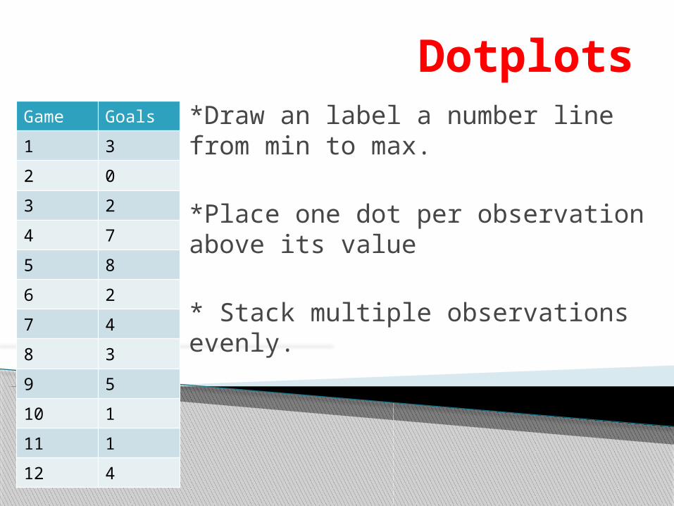
Dotplots*Draw an label a number line from min to max.
*Place one dot per observation above its value
* Stack multiple observations evenly.
Game Goals
1 3
2 0
3 2
4 7
5 8
6 2
7 4
8 3
9 5
10 1
11 1
12 4

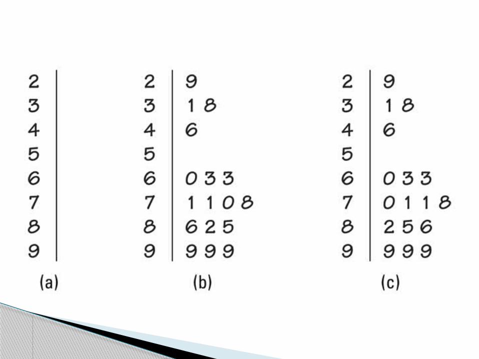
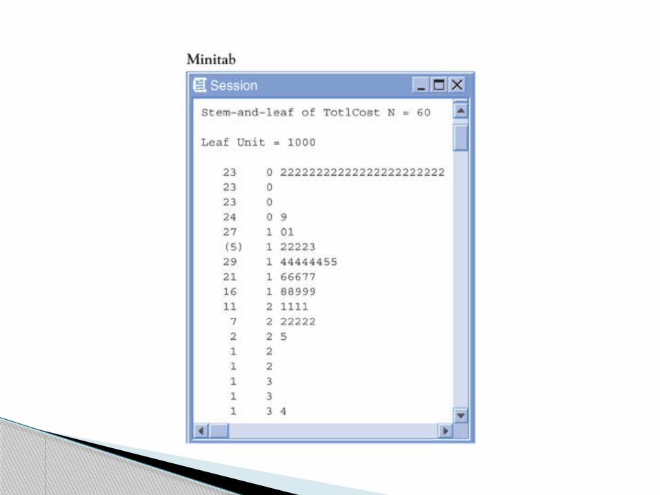
Steam and Leaf Plots


Literacy Rates in Islamic Countries
Female MaleCountry Percent Percent
Algeria 60 78Bangladesh 31 50Egypt 46 68Iran 71 85Jordan 86 96Kazakhstan 99 100Lebanon 82 95Libya 71 92Malaysia 85 92Morocco 38 68Saudi Arabia 70 84Syria 63 89Tajikistan 99 100Tunisia 63 83Turkey 78 94Uzbekistan 99 100Yemen 29 70


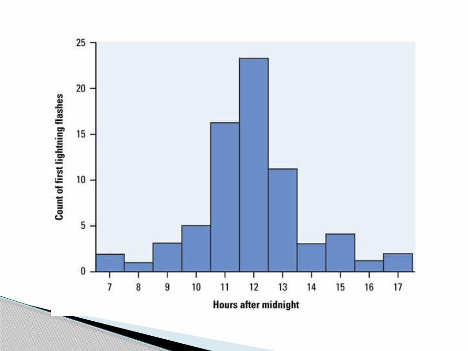
Histograms
Divide the range of data in equal-width classes.
Count the observations in each class – “frequency”
Draw bars to represent count or percentage of observations that fall into each class.
Bars should touch (unlike bar graphs)
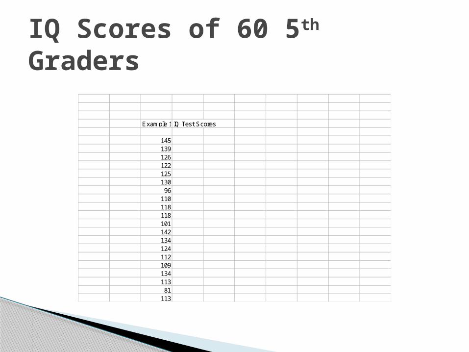
IQ Scores of 60 5th Graders
Example 1.6IQ Test Scores
14513912612212513096
11011811810114213412411210913411381
113
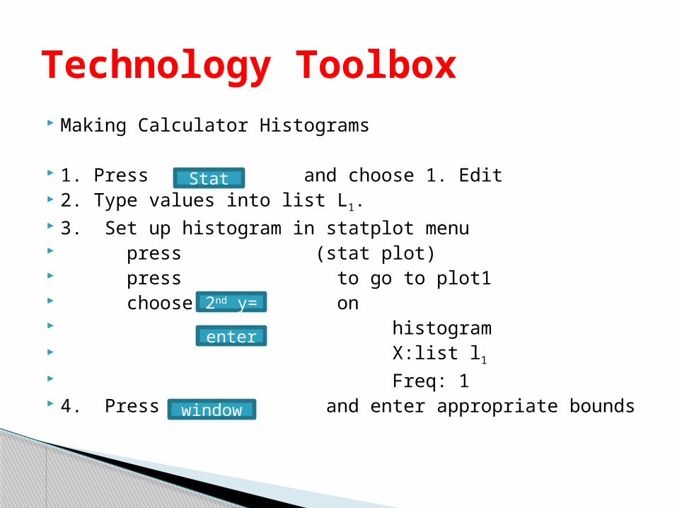
Making Calculator Histograms
1. Press and choose 1. Edit 2. Type values into list L1. 3. Set up histogram in statplot menu press (stat plot) press to go to plot1 choose on histogram X:list l1 Freq: 1 4. Press and enter appropriate bounds
Technology Toolbox
Stat
2nd y=
enter
window


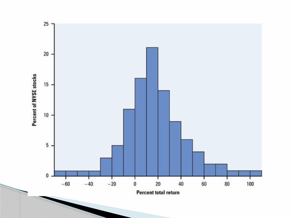
SOCS !
SHAPE - roughly symmetric
skewed left skewed right, number placement of peaks (modes)
OUTLIERS – departures from pattern
CENTER - midpoint
SPREAD - minimum value
maximum value range

Shape Symmetric
Skewed
Skewed Right Skewed Left


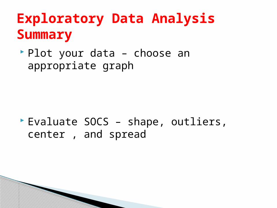
Exploratory Data AnalysisSummary Plot your data – choose an appropriate
graph
Evaluate SOCS – shape, outliers, center , and spread