SCATTER PLOTS AND TREND LINES - ksassessments.org€¦ · bivariate measurement data to depict the...
93
Copyright © 2015 The Dynamic Learning Maps, including node names, descriptions, and connections, have been developed by the Achievement and Assessment Institute and are copyrighted by the University of Kansas Center for Research. Learning map information is available for use by educators but may not be used for commercial purposes (including being shared without cost when bundled in a commercial transaction) without written permission. Dynamic Learning Map nodes and connections may not be altered by anyone other than the staff of the Achievement and Assessment Institute at the University of Kansas. SCATTER PLOTS AND TREND LINES 8.SP.1, 8.SP.2, and 8.SP.3 Contributing Author: Natasha Cox CONTENTS The types of documents contained in the unit are listed below. Throughout the unit, the documents are arranged by lesson. L EARNING MAP I NFORMATION An overview of the standards, the learning map section, and the nodes addressed in this unit T EACHER NOTES A brief discussion describing the progression depicted in the learning map section with research-based recommendations for focusing instruction to foster student learning and an introduction to the unit’s lessons I NSTRUCTIONAL ACTIVITY A detailed walkthrough of the unit S TUDENT ACTIVITY A work-alone activity for students S TUDENT ACTIVITY S OLUTION GUIDE A solution guide for the work-alone activity with example errors, misconceptions, and links to the learning map section
Transcript of SCATTER PLOTS AND TREND LINES - ksassessments.org€¦ · bivariate measurement data to depict the...

Copyright © 2015
The Dynamic Learning Maps, including node names, descriptions, and connections, have been developed by the Achievement and Assessment Institute and are copyrighted by the University of Kansas Center for Research. Learning map information is available for use by educators but may not be used for commercial purposes (including being shared without cost when bundled in a commercial transaction) without written permission. Dynamic Learning Map nodes and connections may not be altered by anyone other than the staff of the Achievement and Assessment Institute at the University of Kansas.
SCATTER PLOTS AND TREND LINES 8.SP.1, 8.SP.2, and 8.SP.3
Contributing Author: Natasha Cox
CONTENTS
The types of documents contained in the unit are listed below. Throughout the unit, the documents are arranged by lesson.
LEARNING MAP INFORMATION
An overview of the standards, the learning map section, and the nodes addressed in this unit
TEACHER NOTES A brief discussion describing the progression depicted in the learning map section with research-based recommendations for focusing instruction to foster student learning and an introduction to the unit’s lessons
INSTRUCTIONAL ACTIVITY A detailed walkthrough of the unit
STUDENT ACTIVITY A work-alone activity for students
STUDENT ACTIVITY SOLUTION GUIDE
A solution guide for the work-alone activity with example errors, misconceptions, and links to the learning map section
1
The Dynamic Learning Maps, including node names, descriptions, and connections, have been developed by the Achievement and Assessment Institute and are copyrighted by the University of Kansas Center for Research. Learning map information is available for use by educators but may not be used for commercial purposes (including being shared without cost when bundled in a commercial transaction) without written permission. Dynamic Learning Map nodes and connections may not be altered by anyone other than the staff of the Achievement and Assessment Institute at the University of Kansas.
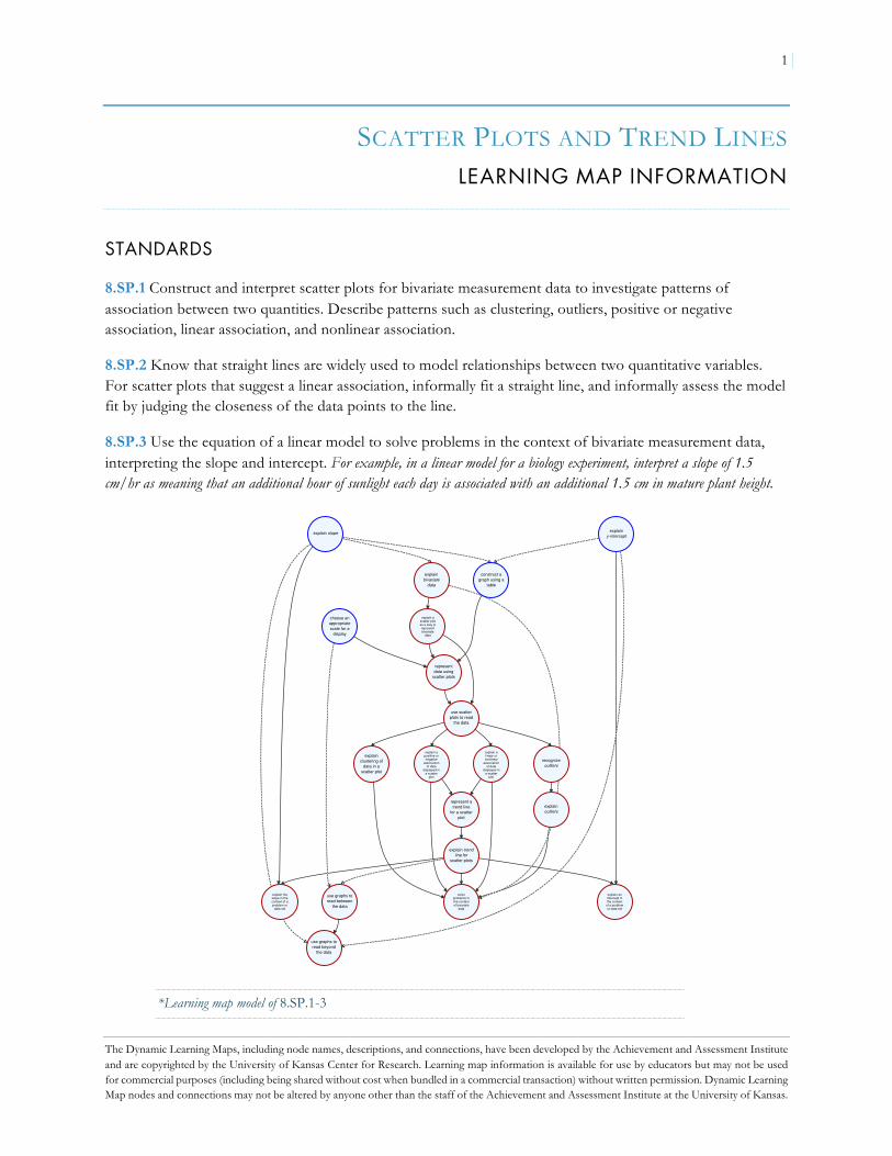
SCATTER PLOTS AND TREND LINES LEARNING MAP INFORMATION
STANDARDS
8.SP.1 Construct and interpret scatter plots for bivariate measurement data to investigate patterns of association between two quantities. Describe patterns such as clustering, outliers, positive or negative association, linear association, and nonlinear association.
8.SP.2 Know that straight lines are widely used to model relationships between two quantitative variables. For scatter plots that suggest a linear association, informally fit a straight line, and informally assess the model fit by judging the closeness of the data points to the line.
8.SP.3 Use the equation of a linear model to solve problems in the context of bivariate measurement data, interpreting the slope and intercept. For example, in a linear model for a biology experiment, interpret a slope of 1.5 cm/hr as meaning that an additional hour of sunlight each day is associated with an additional 1.5 cm in mature plant height.
*Learning map model of 8.SP.1-3
use graphs toread between
the data
explain slope explainy-intercept
explain ascatter plotas a way torepresentbivariate
data
representdata using
scatter plots
use scatterplots to read
the data
explainoutliers
explain trendline for
scatter plots
solveproblems inthe contextof bivariate
data
explainbivariate
data
explainclustering of
data in ascatter plot
explain apositive ornegative
associationof data
displayed ina scatter
plot
explain alinear ornonlinear
associationof data
displayed ina scatter
plot
construct agraph using a
table
explain theslope in thecontext of aproblem or
data set
explain anintercept inthe context
of a problemor data set
use graphs toread beyond
the data
recognizeoutliers
represent atrend line
for a scatterplot
choose anappropriatescale for a
display

2
The Dynamic Learning Maps, including node names, descriptions, and connections, have been developed by the Achievement and Assessment Institute and are copyrighted by the University of Kansas Center for Research. Learning map information is available for use by educators but may not be used for commercial purposes (including being shared without cost when bundled in a commercial transaction) without written permission. Dynamic Learning Map nodes and connections may not be altered by anyone other than the staff of the Achievement and Assessment Institute at the University of Kansas.
8.SP.1 Construct and interpret scatter plots for bivariate measurement data to investigate patterns of association between two quantities. Describe patterns such as clustering, outliers, positive or negative association, linear association, and nonlinear association.
*Learning map model of 8.SP.1
use graphs toread between
the data
explain therelationship
betweenindependent
and dependentvariable
explain ascatter plotas a way torepresentbivariate
data
representdata using
scatter plots
use scatterplots to read
the data
explainoutliers
explainbivariatedata
explainclustering of
data in ascatter plot
explain apositive ornegative
associationof data
displayed ina scatter
plot
explain alinear ornonlinear
associationof data
displayed ina scatter
plot
use graphs toread beyond
the data
recognizeoutliers

3
The Dynamic Learning Maps, including node names, descriptions, and connections, have been developed by the Achievement and Assessment Institute and are copyrighted by the University of Kansas Center for Research. Learning map information is available for use by educators but may not be used for commercial purposes (including being shared without cost when bundled in a commercial transaction) without written permission. Dynamic Learning Map nodes and connections may not be altered by anyone other than the staff of the Achievement and Assessment Institute at the University of Kansas.
8.SP.2 Know that straight lines are widely used to model relationships between two quantitative variables. For scatter plots that suggest a linear association, informally fit a straight line, and informally assess the model fit by judging the closeness of the data points to the line.
*Learning map model of 8.SP.2
use scatterplots to read
the data
explain apositive ornegative
associationof data
displayed ina scatter
plot
explain alinear ornonlinear
associationof data
displayed ina scatter
plot
explain trendline for
scatter plots
represent atrend line
for a scatterplot

4
The Dynamic Learning Maps, including node names, descriptions, and connections, have been developed by the Achievement and Assessment Institute and are copyrighted by the University of Kansas Center for Research. Learning map information is available for use by educators but may not be used for commercial purposes (including being shared without cost when bundled in a commercial transaction) without written permission. Dynamic Learning Map nodes and connections may not be altered by anyone other than the staff of the Achievement and Assessment Institute at the University of Kansas.
8.SP.3 Use the equation of a linear model to solve problems in the context of bivariate measurement data, interpreting the slope and intercept. For example, in a linear model for a biology experiment, interpret a slope of 1.5 cm/hr as meaning that an additional hour of sunlight each day is associated with an additional 1.5 cm in mature plant height.
*Learning map model of 8.SP.3
explain trendline for
scatter plots
represent atrend line
for a scatterplot
solveproblems inthe contextof bivariate
data
explain theslope in thecontext of aproblem or
data set
explain anintercept inthe context
of a problemor data set

5
The Dynamic Learning Maps, including node names, descriptions, and connections, have been developed by the Achievement and Assessment Institute and are copyrighted by the University of Kansas Center for Research. Learning map information is available for use by educators but may not be used for commercial purposes (including being shared without cost when bundled in a commercial transaction) without written permission. Dynamic Learning Map nodes and connections may not be altered by anyone other than the staff of the Achievement and Assessment Institute at the University of Kansas.
Node Name Node Description
CHOOSE AN APPROPRIATE SCALE FOR A DISPLAY
Choose an appropriate scale to display the range and distribution of given data.
CONSTRUCT A GRAPH USING A TABLE Create a graph of a relation, equation, or function from a table of x- and y-values.
EXPLAIN A LINEAR OR NONLINEAR ASSOCIATION OF DATA DISPLAYED IN A SCATTER PLOT
Make known your understanding of a linear or nonlinear association of data displayed in a scatter plot.
EXPLAIN A POSITIVE OR NEGATIVE ASSOCIATION OF DATA DISPLAYED IN A SCATTER PLOT
Make known your understanding that positively associated variables change in the same direction (i.e., they are increasing or decreasing together) and that negatively associated variables change in opposite directions (i.e., one variable is increasing as the other is decreasing).
EXPLAIN A SCATTER PLOT AS A WAY TO REPRESENT BIVARIATE DATA
Make known your understanding that a scatter plot is used to display bivariate measurement data to depict the general direction and form of the relationship between two quantities.
EXPLAIN AN INTERCEPT IN THE CONTEXT OF A PROBLEM OR DATA SET
Make known your understanding of the meaning of the intercept(s) in the linear model for a problem or in the context of data.
EXPLAIN BIVARIATE DATA Make known your understanding that bivariate data involve two variables, and that patterns of variation are often present within each variable and between the trends of the two variables.
EXPLAIN CLUSTERING OF DATA IN A SCATTER PLOT
Make known your understanding of data clusters in a scatter plot; interpret data that are locally concentrated in a scatter plot.
EXPLAIN OUTLIERS Make known your understanding that in any representation, an outlier is a data value that is distant from the other values in the data.
EXPLAIN SLOPE Make known your understanding that the slope of a line is the steepness of the line as a ratio. Describe slope as rise over run or the change in y divided by the change in x.
EXPLAIN THE RELATIONSHIP BETWEEN INDEPENDENT AND DEPENDENT VARIABLE
Make known your understanding of the relationship between the dependent and independent variables using graphs and tables.
EXPLAIN THE SLOPE IN THE CONTEXT OF A PROBLEM OR DATA SET
Make known your understanding of the meaning of slope in the linear model for a problem or in the context of a data set.
EXPLAIN TREND LINE FOR SCATTER PLOTS Make known your understanding that a line through a scatter plot that defines or expresses the trend of the data can summarize the data and be used to make predictions.
EXPLAIN Y-INTERCEPT Make known your understanding that the y-intercept is a coordinate pair where the graph of a function intersects the y-axis.
RECOGNIZE OUTLIERS Recognize outliers in univariate data as data values that are substantially larger or smaller than the other values. Recognize outliers in bivariate data as coordinates that substantially deviate from an overall pattern.
REPRESENT A TREND LINE FOR A SCATTER PLOT
For scatter plots that suggest a linear association, sketch a trend line that is centrally located within the points.
REPRESENT DATA USING SCATTER PLOTS Create a scatter plot for a given set of data.
SOLVE PROBLEMS IN THE CONTEXT OF BIVARIATE DATA
Use the equation of a line to solve problems in the context of bivariate measurement data.
USE GRAPHS TO READ BETWEEN THE DATA Answer questions that require interpretation and integration of information presented in a graph.

6
The Dynamic Learning Maps, including node names, descriptions, and connections, have been developed by the Achievement and Assessment Institute and are copyrighted by the University of Kansas Center for Research. Learning map information is available for use by educators but may not be used for commercial purposes (including being shared without cost when bundled in a commercial transaction) without written permission. Dynamic Learning Map nodes and connections may not be altered by anyone other than the staff of the Achievement and Assessment Institute at the University of Kansas.
Node Name Node Description
USE GRAPHS TO READ BEYOND THE DATA Extend, predict, or infer information presented in graphs. For example, make a prediction about an unknown case, compare and contrast data sets, generalize to a population, or identify a trend.
USE SCATTER PLOTS TO READ THE DATA Read a scatter plot to describe individual data points and their meaning within the context of the data.
ADDITIONAL NODES RELATED TO THIS UNIT OF INSTRUCTION
Node Name Node Description Related Node
CHOOSE THE APPROPRIATE GRAPH FOR A GIVEN SET OF DATA
Choose the appropriate graph for a given set of data (i.e. bar graph, pie chart, line graph, etc.)
Prerequisite of CHOOSE AN APPROPRIATE SCALE FOR A DISPLAY

1
The Dynamic Learning Maps, including node names, descriptions, and connections, have been developed by the Achievement and Assessment Institute and are copyrighted by the University of Kansas Center for Research. Learning map information is available for use by educators but may not be used for commercial purposes (including being shared without cost when bundled in a commercial transaction) without written permission. Dynamic Learning Map nodes and connections may not be altered by anyone other than the staff of the Achievement and Assessment Institute at the University of Kansas.
SCATTER PLOTS AND TREND LINES TEACHER NOTES
This unit includes the following documents:
u Learning Map Information u Instructional Activity (three lessons) u Student Activity u Student Activity Solution Guide
In this unit, students will learn how to create scatter plots with properly scaled axes, how to identify outliers, and how to draw a trend line for the data when the trend is approximately linear. They will also identify scatter plots with nonlinear association or with no association. A discussion of y-intercept and slope of the trend line, and how they relate to the variables in the data, is also included.
Students need to develop statistical thinking to understand, describe, and analyze variability in data and in information related to problems of daily life and common workplaces (Franklin et al., 2007). Variability can be seen in data describing one characteristic of a person or object that changes over time or in responses to the same question posed to different people. Statistics can be viewed as a problem-solving process for addressing questions through collecting and analyzing data collected in real-world settings. Four activities critical to this process are formulating statistical questions, collecting data, analyzing data, and interpreting results (Kader, Jacobbe, Wilson, & Zbiek, 2013). It is important that students’ ongoing experiences with statistics focus on the contexts from which data are collected and on using data to address particular problems or to answer particular questions.
The learning map section illustrates that students will draw on their knowledge of single-variable statistics, graphing techniques, and covariation to work with bivariate data (i.e., data collected for two variables). In particular, students should have some experience analyzing and summarizing single-variable data to identify patterns, range, and measures of central tendency. They should have experience graphing points and lines on the coordinate plane and should understand the slope and y-intercept of a line. Students also should have some experience with the concept of covariation, where two variables change in response to one another.
Students should recognize the difference between categorical and quantitative data (Kader et al., 2013). Categorical data often describe peoples’ choices or characteristics such as gender, home state, shoe size, or favorite color. Quantitative data often describe measurements such as age, length, or quantity. In these activities, students will work primarily with quantitative data that are measured on interval or continuous scales (e.g., height, length, number of participants).
Students should understand that bivariate data sets involve two variables related to each case in a data set (Kader et al., 2013). For example, a gym owner might collect information from his clients about how much time they spend in the gym each day and how much water they drink each day. The two variables in this case are time spent in the gym and daily water intake. One important difference between univariate and bivariate data is the potential for a systematic relationship between the variables in bivariate data. In the gym scenario, there

2
The Dynamic Learning Maps, including node names, descriptions, and connections, have been developed by the Achievement and Assessment Institute and are copyrighted by the University of Kansas Center for Research. Learning map information is available for use by educators but may not be used for commercial purposes (including being shared without cost when bundled in a commercial transaction) without written permission. Dynamic Learning Map nodes and connections may not be altered by anyone other than the staff of the Achievement and Assessment Institute at the University of Kansas.
might be a systematic relationship between the time people spend in the gym and the amount of water they drink. We can use statistics to identify such a relationship and describe it using graphs or equations.
Once students understand what a bivariate data set represents, they should represent the data both in a table and in a scatter plot. Help students identify one variable as independent and the other variable as dependent. It may be useful to ask students to think about which variable they would want to predict based on the other. Often times, one variable is harder to measure, which makes it a good candidate for the dependent variable. In some cases, statisticians have adopted customs for independent variables; for example, time and unit price are very often used as independent variables. Once students have classified each variable, they will create graphs to represent their data, including accurate labels and scales on each of the graph’s axes.
As students read and interpret data and construct tables and graphs for the data, they should be able to describe the meaning of each individual point or case in the data and examine local groups of data to describe their proximity in relation to the context of the data. Students should also consider the data set and graph globally to describe trends or relationships between the variables in terms of the context of the data (Leinhardt, Zaslavsky, & Stein, 1990). Trends can be described in terms of the direction of a relationship (e.g., positive or negative association) or whether the relationship appears to be linear or nonlinear. It is also important to address how outliers in bivariate data are different from outliers in univariate data. Whereas outliers in single lists are values that are substantially distant from the majority of the data (e.g., much greater or much smaller), outliers in bivariate data may lie within the range of one or both of the variables but do not lie within the pattern or general trend of the data set.
Summarizing a data set allows us to describe and interpret general information. For univariate data, we use statistics such as measures of central tendency, frequency, and range to summarize a data set. For bivariate data, these statistics remain useful for summarizing each variable but are insufficient to describe relationships between variables. Trend lines drawn through scatter plots and their equations are useful tools for representing the relationships between two variables and for making predictions. Importantly, trend lines should be centrally located within the data and imitate the relationships between the variables or pattern of covariation expressed in the data. This is an informal means for summarizing a relationship between two linearly related variables and will provide the foundation for least squares regression in subsequent coursework.
Once a trend line is established for a bivariate data set, students should describe the relationship between the variables in terms of the slope of the trend line. These descriptions should read similarly to descriptions of rate. Where possible, students should focus on unit increases or decreases, for which the relationship is described in terms of a unit change in the independent variable. For example, for each hour spent in the gym, a client drinks 24 ounces of water. If students already know how to derive the equation of a line using the slope and a point, they can represent the trend line in an equation and use it to predict values inside and outside the existing range of data.
If students use the trend line to make a prediction within the range of the data, they may notice that predictions do not always match the actual data. In these cases, students should learn that “deviation” describes the distance between an actual data point and a predicted value. Although the trend line is useful for predicting values beyond the range of the given data set, students should acquire sensitivity to the fact that in any model, the most accurate predictions will be close to the range of data used to derive the model. Thus, using a trend line to make predictions far beyond the original data’s range may result in inaccurate

3
The Dynamic Learning Maps, including node names, descriptions, and connections, have been developed by the Achievement and Assessment Institute and are copyrighted by the University of Kansas Center for Research. Learning map information is available for use by educators but may not be used for commercial purposes (including being shared without cost when bundled in a commercial transaction) without written permission. Dynamic Learning Map nodes and connections may not be altered by anyone other than the staff of the Achievement and Assessment Institute at the University of Kansas.
predictions. Additionally, the meaning and prediction of a y-intercept may require discussion to reinforce students’ consideration of the context of the data. They should evaluate whether it is realistic for the independent variable to ever equal zero. If this is not realistic, then what is the most likely smallest value for the independent variable? Is that value within the range of the data? Would the model provide a good prediction at that point?
The activites in this unit are designed to provide opportunities for students to develop understanding of statistical concepts by exploring bivariate data sets using algebraic and graphing techniques. At each step in their work students will be encouraged to describe the relationships between the data, statistics, and the context from which they are derived. In this set of lessons, students will develop a data set as a class, discuss how to scale one or more axes of their graphs, create scatter plots, and identify (or create) outliers. Students will use their scatter plots to draw an appropriate trend line that they will use to predict values, find the y-intercept (when appropriate), and determine the slope. Once students have identified the y-intercept and slope, they will describe what they mean in terms of the variables in the problem situation. Finally, students will determine whether the provided equations are appropriate trend lines for a scatter plot. They will explain why some equations are appropriate and others are not by using the definition of a trend line, and they will identify situations where the association is nonlinear or where there is no association in the data.

4
The Dynamic Learning Maps, including node names, descriptions, and connections, have been developed by the Achievement and Assessment Institute and are copyrighted by the University of Kansas Center for Research. Learning map information is available for use by educators but may not be used for commercial purposes (including being shared without cost when bundled in a commercial transaction) without written permission. Dynamic Learning Map nodes and connections may not be altered by anyone other than the staff of the Achievement and Assessment Institute at the University of Kansas.
REFERENCES
Franklin, C., Kader, G., Mewborn, D., Moreno, J., Peck, R., Perry, M., & Scheaffer, R. (2007). Guidelines and Assessment for Instruction in Statistics Education (GAISE) Report: A Pre-K-12 Curriculum Framework. Alexandria, VA: American Statistical Association. Retrieved from www.amstat.org/education/gaise
Kader, G. D., Jacobbe, T., Wilson, P. S., & Zbiek, R. M. (2013). Developing essential understanding of statistics for
teaching mathematics in grades 6–8. Reston, VA: National Council of Teachers of Mathematics. Leinhardt, G., Zaslavsky, O., & Stein, M. K. (1990). Functions, graphs, and graphing: Tasks, learning, and
teaching. Review of Educational Research, 60, 1–64. doi:10.3102/00346543060001001

1
The Dynamic Learning Maps, including node names, descriptions, and connections, have been developed by the Achievement and Assessment Institute and are copyrighted by the University of Kansas Center for Research. Learning map information is available for use by educators but may not be used for commercial purposes (including being shared without cost when bundled in a commercial transaction) without written permission. Dynamic Learning Map nodes and connections may not be altered by anyone other than the staff of the Achievement and Assessment Institute at the University of Kansas.
SCATTER PLOTS AND TREND LINES INSTRUCTIONAL ACTIVITY
Lesson 1
LEARNING GOAL
Students will create a scatter plot with appropriately labeled and scaled axes and estimate new data values. The critical outcome of this activity is for students to recognize scatter plots as tools for graphing bivariate data and to construct scatter plots accurately.
PRIMARY ACTIVITY
Students will measure the lengths of their feet and their heights and record the results. The students will then graph the results on a scatter plot.
OTHER VOCABULARY
Students will need to know the meaning of
u Independent variable u Dependent variable u Scatter plot u Bivariate data u Linear function graph
MATERIALS
u Rulers with centimeter markings (for measuring foot length) u Tape measures or yard sticks with centimeter markings (for measuring height) u Graph paper

2
The Dynamic Learning Maps, including node names, descriptions, and connections, have been developed by the Achievement and Assessment Institute and are copyrighted by the University of Kansas Center for Research. Learning map information is available for use by educators but may not be used for commercial purposes (including being shared without cost when bundled in a commercial transaction) without written permission. Dynamic Learning Map nodes and connections may not be altered by anyone other than the staff of the Achievement and Assessment Institute at the University of Kansas.
IMPLEMENTATION
This lesson begins with students collecting data to create a scatter plot to answer the question, “Is there a relationship between a person’s foot length and a person’s height?”
Students should measure the lengths of their feet and their heights and record the results as a T-chart. Foot length should be measured to the nearest tenth of a centimeter, whereas height can be measured to the nearest centimeter. These results will need to be available to all students.
Review a few of the other graphical displays students have learned before introducing the concept of a scatter plot (these will most likely be displays that are only appropriate for one-variable data). Showing the students examples of each type of display may help explain why the displays are inappropriate to represent pairs of numbers. In addition, some displays (pie charts, bar graphs, and line graphs) are only appropriate for categorical data, while the class’s data are quantitative.
GUIDING QUESTIONS
Elicit student thinking:
u How can we represent these data in other ways?
u What are some graphs you have used before?
u Have you worked with tables like this (i.e., T-charts) before? For what purpose?
Determine if the student can EXPLAIN BIVARIATE DATA:
u How would our data be different if we had only measured our heights?
u What patterns or relationships exist in our data?
Determine if the student can CHOOSE THE APPROPRIATE GRAPH FOR A GIVEN SET
OF DATA (use the graph types the student mentioned previously):
u Can you represent the data as a pie chart, bar graph/histogram, box plot? Why or why not?
u How have you graphed information from two-column tables before?
u What pattern did you usually see when you graphed information from two-column tables? (The points lined up.)

3
The Dynamic Learning Maps, including node names, descriptions, and connections, have been developed by the Achievement and Assessment Institute and are copyrighted by the University of Kansas Center for Research. Learning map information is available for use by educators but may not be used for commercial purposes (including being shared without cost when bundled in a commercial transaction) without written permission. Dynamic Learning Map nodes and connections may not be altered by anyone other than the staff of the Achievement and Assessment Institute at the University of Kansas.
Remind students that they have already graphed real-world data on a coordinate plane (5.G.3, 6.EE.9) if students have not yet suggested the coordinate plane as a way to represent the class’s data. Draw on students’ experiences plotting points to graph a line.
Explain that when several separate points (bivariate data) are plotted on the same coordinate plane, whether or not the points line up, it is called a scatter plot.
Steps for setting up the graph are shown below:
When choosing scales for a scatter plot, the x- and y-axes should be considered separately, as they do not need to be the same.
Tell students that there is still one more point that will be added in LESSON 2 (the teacher’s height and foot length), so they will need to make sure their scale accommodates this point. Additionally, in order to make predictions, students should not start or end their scales too close to the minimum and maximum values for both foot length and height. Give the students time to experiment with a few different scales.
GUIDING QUESTIONS
Elicit student thinking:
u What should you consider as you set up a graph?
Determine if the student can CHOOSE AN APPROPRIATE SCALE FOR A DISPLAY:
u Do all axes on graphs need to start at zero?
u Do the x- and y-axes need to have the same scale?
u Do all points need to fit on the scatter plot?
u Do the tic marks on an axis need to be evenly spaced?
u Do the tic marks on an axis need to represent equal intervals?
u Does a person's height depend on foot length? Does a person’s foot length depend on height?
u Does it matter whether the x-axis represents foot length or height?
u [Direct students to draw a scale for the x-axis and for the y-axis.] Is there anything missing? Will someone who doesn't know what the numbers mean be able to understand your scatter plot?

4
The Dynamic Learning Maps, including node names, descriptions, and connections, have been developed by the Achievement and Assessment Institute and are copyrighted by the University of Kansas Center for Research. Learning map information is available for use by educators but may not be used for commercial purposes (including being shared without cost when bundled in a commercial transaction) without written permission. Dynamic Learning Map nodes and connections may not be altered by anyone other than the staff of the Achievement and Assessment Institute at the University of Kansas.
Note: The sixth question (i.e., Does a person’s height depend on foot length? Does a person’s foot length depend on height?) may be difficult for students. They have already learned about independent and dependent variables and that the independent variable is represented on the x-axis and the dependent variable is represented on the y-axis (6.EE.9). In this case, the two variables are mutually dependent, so it does not matter which axis represents foot length and which represents height. For simplicity, you may want to decide for your students what the axes represent. Since the height might be scaled, it may be easier to keep it on the y-axis. Alternatively, you could allow either arrangement of axes and discuss the differences between the two possibilities.
Make sure all students have properly scaled and labeled their scatter plots. Once students have set up their axes, they should plot the data the class collected.
Note: Because there likely will not be students with feet less than about 15 cm in length, you may want to introduce or review the idea of placing a break in the graph. (In the student activity, it will be beneficial to break the graph, so this is a good opportunity to practice.) This is often the case with real-world data, but make sure students are aware that a break in the graph will affect their ability to find the y-intercept of a trend line in LESSON 2. It is likely, however, that in situations where there aren’t any data close to the y-axis, the y-intercept will not be a realistic or accurate value in terms of the variables in the problem.
GUIDING QUESTIONS
Elicit student thinking:
u What is the difference between linear function graphs and scatter plots that have a linear trend?
u What do you notice about points on a scatter plot?
Determine if the student can USE SCATTER PLOTS TO READ THE DATA:
u [Point to a data point on the scatter plot.] What does this point mean in terms of the variables in the problem situation?

5
The Dynamic Learning Maps, including node names, descriptions, and connections, have been developed by the Achievement and Assessment Institute and are copyrighted by the University of Kansas Center for Research. Learning map information is available for use by educators but may not be used for commercial purposes (including being shared without cost when bundled in a commercial transaction) without written permission. Dynamic Learning Map nodes and connections may not be altered by anyone other than the staff of the Achievement and Assessment Institute at the University of Kansas.
The goal of this activity is for students to recognize scatter plots as tools for graphing bivariate data. They should also distinguish between how data used to generate a scatter plot may not result in a straight line graph, whereas linear function tables do result in straight line graphs.
Determine if the student can EXPLAIN A SCATTER PLOT AS A WAY TO REPRESENT
BIVARIATE DATA:
u What type of data does a scatter plot model?
u What is the relationship between the term “bivariate data” and a scatter plot?
u Do bivariate data points always fall in a straight line?
Determine if the student is ready to USE GRAPHS TO READ BEYOND THE DATA:
u Could you use the scatter plot to predict heights or foot lengths?
u Do you think the scatter plot could predict heights of babies? Or professional basketball players?
u Do you think the data will continue in this pattern forever?
u What are the risks for predicting values in areas of a scatter plot that do not already have data?

6
The Dynamic Learning Maps, including node names, descriptions, and connections, have been developed by the Achievement and Assessment Institute and are copyrighted by the University of Kansas Center for Research. Learning map information is available for use by educators but may not be used for commercial purposes (including being shared without cost when bundled in a commercial transaction) without written permission. Dynamic Learning Map nodes and connections may not be altered by anyone other than the staff of the Achievement and Assessment Institute at the University of Kansas.
SCATTER PLOTS AND TREND LINES INSTRUCTIONAL ACTIVITY
Lesson 2
LEARNING GOAL
Students will use a scatter plot to identify outliers and clusters, estimate a linear model, and use the linear model to make predictions. The critical outcome of this activity is for students to identify outliers on a scatter plot, informally draw and assess the accuracy of a trend line, and use the trend line to make predictions. Additionally, students should be able to identify the y-intercept and slope of a trend line and to describe what they mean in terms of the data.
PRIMARY ACTIVITY
Students will use the scatter plot from LESSON 1 to identify outliers and clusters of data. Then, given a foot length (or height), students will predict height (or foot length), first visually, using the scatter plot alone, then with a trend line (determined informally).
OTHER VOCABULARY
Students will need to know the meaning of
u Slope u y-intercept u Trend line u Outlier u Data cluster
MATERIALS
u Scatter plot from LESSON 1

7
The Dynamic Learning Maps, including node names, descriptions, and connections, have been developed by the Achievement and Assessment Institute and are copyrighted by the University of Kansas Center for Research. Learning map information is available for use by educators but may not be used for commercial purposes (including being shared without cost when bundled in a commercial transaction) without written permission. Dynamic Learning Map nodes and connections may not be altered by anyone other than the staff of the Achievement and Assessment Institute at the University of Kansas.
IMPLEMENTATION
This lesson begins with the data collected in LESSON 1.
Create at least one outlier for discussion in this lesson when recording the results from the previous lesson. One example could be if your class has a very young student who was accelerated by several years or a student who has long feet but is significantly shorter than other students with the same size feet.
Require students to add the outlier to their scatter plot from LESSON 1 (do not tell students it is an outlier).
Ask students what they notice about the point. Students should have experience identifying outliers in work with one-variable data.
Define an outlier in bivariate data as a data value that substantially deviates or is distant from an overall pattern in the data set.
Lead students to identify any other outliers from the scatter plot they created in LESSON 1—it is possible that the only outlier will be the one you included.
Ask each student to think of a data point that would have been an outlier if it was part of the data. Have students share with a partner and confirm each other’s outlier, then share their outliers with the rest of the class.
GUIDING QUESTIONS
Determine if the student can EXPLAIN OUTLIERS:
u Do any of the points look out of place?
u What is different about the points you identified?
u What should you consider when creating a data point that would be considered an outlier?
u How did you determine if your partner’s data point was an outlier?
Determine if the student can EXPLAIN CLUSTERING OF DATA IN A SCATTER PLOT:
u Where are most of your data points?
u Why is the data clustered in this portion of the scatter plot?

8
The Dynamic Learning Maps, including node names, descriptions, and connections, have been developed by the Achievement and Assessment Institute and are copyrighted by the University of Kansas Center for Research. Learning map information is available for use by educators but may not be used for commercial purposes (including being shared without cost when bundled in a commercial transaction) without written permission. Dynamic Learning Map nodes and connections may not be altered by anyone other than the staff of the Achievement and Assessment Institute at the University of Kansas.
After a discussion of outliers, students will start predicting values within the data.
Provide your students either your foot length or height and have students predict the other measure using their scatter plot alone. (The scatter plot should appear roughly linear, with a positive slope, so students should be able to make a reasonable prediction.)
Ask students to share their predictions and describe how they arrived at that number.
Make the measurement and share with students to determine how close their estimates are. It is likely that the teacher’s foot length and height fall within or close to the student data.
After discussing a point within the data, discuss a point that falls outside or beyond the class data. For example, choose a basketball player (e.g., Kevin Durant—height: 206 cm, foot length: 31.8 cm) to add to the scatter plot to require students to estimate a value beyond the data.
Ask students to share their predictions for the measurement not given and ask how they arrived at that number. Some students may, without a prompt to do so, draw a line to help estimate a value that is well beyond the majority of the data.
Lead all students to the idea of drawing a trend line through data in a scatter plot to help them estimate values that are not in their data set.
GUIDING QUESTIONS
Determine if the student can USE GRAPHS TO READ BETWEEN THE DATA:
u How did you estimate the unknown measurement using the scatter plot?
u How does the structure of the scatter plot help you estimate?
Determine if the student can USE GRAPHS TO READ BEYOND THE DATA:
u How did you estimate an unknown measurement outside of the values plotted on the scatter plot?
u What strategies can help you make a more accurate estimate?

9
The Dynamic Learning Maps, including node names, descriptions, and connections, have been developed by the Achievement and Assessment Institute and are copyrighted by the University of Kansas Center for Research. Learning map information is available for use by educators but may not be used for commercial purposes (including being shared without cost when bundled in a commercial transaction) without written permission. Dynamic Learning Map nodes and connections may not be altered by anyone other than the staff of the Achievement and Assessment Institute at the University of Kansas.
Define a trend line as a line that best defines or expresses the trend of the data, approximates the pattern in the data, and is centrally located within the points.
Direct students to draw a trend line on their data if they haven’t already. If they drew a line while predicting values earlier in the lesson, require students to assess whether the line fits the criteria for a trend line and adjust the line if needed.
Once all students have their trend line drawn, students will explore the meaning of the y-intercept in terms of foot length and height.
Determine if the student can EXPLAIN A LINEAR OR NONLINEAR ASSOCIATION OF
DATA DISPLAYED IN A SCATTER PLOT:
u Do the points on the scatter plot seem to follow a pattern?
u Does the pattern appear to be straight (linear) or curved?
u Can you think of a relationship between two quantities that might not be linear?
u Does the pattern have a positive or negative relationship?
u Can you think of a relationship that might be negative?
GUIDING QUESTIONS
Elicit student thinking:
u How does the name “trend line” relate to the way the line is drawn on a scatter plot?
Determine if the student can REPRESENT A TREND LINE FOR A SCATTER PLOT:
u How do you know the line you drew fits the data? (Student should provide reasoning that includes the criteria of the trend line.)
u How many points are within one centimeter (above or below) the trend line? Two centimeters? Five centimeters?

10
The Dynamic Learning Maps, including node names, descriptions, and connections, have been developed by the Achievement and Assessment Institute and are copyrighted by the University of Kansas Center for Research. Learning map information is available for use by educators but may not be used for commercial purposes (including being shared without cost when bundled in a commercial transaction) without written permission. Dynamic Learning Map nodes and connections may not be altered by anyone other than the staff of the Achievement and Assessment Institute at the University of Kansas.
If the x-axis is constructed with a break,
Focus students on the trend line. Ask students if it would be accurate to continue the trend line through the y-axis. Alternatively, if the trend line is already drawn through the y-axis, ask students if this is an accurate y-intercept. Through discussion, students should come to understand that this point is not accurate because of the break in the graph.
Ask students what the y-intercept would mean in terms of the problem situation. Depending on how the axes are oriented, this is either someone’s height who has a foot length of 0 cm or someone’s foot length who has a height of 0 cm. Ask students to explain whether this is a reasonable data value for this situation.
Discuss where the values on the scatter plot begin to make sense. Students should discuss topics such as possible heights and foot lengths when babies are born and identify where these points would be located on the scatter plot.
If the x-axis is constructed without a break,
Focus students on the point where their trend line crosses the y-axis, and ask them what this point is called.
Ask students what this point means in terms of the problem situation. Depending how the axes are oriented, this is either someone’s height who has a foot length of 0 cm or someone’s foot length who has a height of 0 cm. Ask students to explain whether this is a reasonable data value for this situation.
Discuss where the values on the scatter plot begin to make sense. Students should discuss topics such as possible heights and foot lengths when babies are born and identify where these points would be located on the scatter plot.
GUIDING QUESTIONS
Elicit student thinking:
u Where is the scatter plot realistic?

11
The Dynamic Learning Maps, including node names, descriptions, and connections, have been developed by the Achievement and Assessment Institute and are copyrighted by the University of Kansas Center for Research. Learning map information is available for use by educators but may not be used for commercial purposes (including being shared without cost when bundled in a commercial transaction) without written permission. Dynamic Learning Map nodes and connections may not be altered by anyone other than the staff of the Achievement and Assessment Institute at the University of Kansas.
After discussing the y-intercept, shift the conversation toward the meaning of the slope of the trend line.
Focus students on how the trend line is changing. Ask whether the trend line is increasing or decreasing and what this means in terms of the problem situation.
Discuss more specifically how much the line increases over each unit on the x-axis. Students should be able to answer quantitatively and describe the meaning in terms of foot length and height (e.g., “As foot length increases by 1 cm, height increases by about __ cm.”).
At the end of this activity,
Require students to sketch a scatter plot with data points that suggest a linear trend. Ask students to label the axes with possible variables (e.g., hours studied and test grade) and draw a trend line. Students should then answer the following three questions about their scatter plot and trend line:
u How do you know the trend line you drew is appropriate for the data? u Describe the meaning of the y-intercept of the trend line in terms of your data. u Describe the meaning of the slope of the trend line in terms of your data.
Determine if the student can EXPLAIN AN INTERCEPT IN THE CONTEXT OF A
PROBLEM OR DATA SET:
u Are you able to find the y-intercept of the trend line? If so, what is the y-intercept?
u What does the y-intercept mean in terms of the variables in the problem situation?
u Is this a realistic combination of foot length and height?
GUIDING QUESTIONS
Determine if the student can EXPLAIN THE SLOPE IN THE CONTEXT OF A PROBLEM
OR DATA SET:
u What is the approximate slope of the trend line?
u What does the slope mean in terms of the variables in the problem situation?

12
The Dynamic Learning Maps, including node names, descriptions, and connections, have been developed by the Achievement and Assessment Institute and are copyrighted by the University of Kansas Center for Research. Learning map information is available for use by educators but may not be used for commercial purposes (including being shared without cost when bundled in a commercial transaction) without written permission. Dynamic Learning Map nodes and connections may not be altered by anyone other than the staff of the Achievement and Assessment Institute at the University of Kansas.
SCATTER PLOTS AND TREND LINES INSTRUCTIONAL ACTIVITY
CONTRIBUTING AUTHOR: NATASHA COX (HIGH SCHOOL MATH TEACHER) MILL VALLEY HIGH SCHOOL, SHAWNEE, KS
Lesson 3
LEARNING GOAL
Students determine the trend line equation that is most appropriate for a scatter plot. The critical outcome of this activity is for students to describe and identify an appropriate trend line for any data set and represent positive and negative linear association, nonlinear association, and no association in scatter plots.
PRIMARY ACTIVITY
Students will create a scatter plot and determine, from a list of possible equations, which equation best represents the trend line for the data and why.
OTHER VOCABULARY
Students will need to know the meaning of
u Trend line
MATERIALS
u Graph paper u Colored pencils, markers, or pens
IMPLEMENTATION
This lesson begins with a new set of data provided in the table below. Several people were given different lengths of licorice and asked how many bites it took to eat the licorice. The results are recorded below.

13
The Dynamic Learning Maps, including node names, descriptions, and connections, have been developed by the Achievement and Assessment Institute and are copyrighted by the University of Kansas Center for Research. Learning map information is available for use by educators but may not be used for commercial purposes (including being shared without cost when bundled in a commercial transaction) without written permission. Dynamic Learning Map nodes and connections may not be altered by anyone other than the staff of the Achievement and Assessment Institute at the University of Kansas.
Students are trying to answer the question, “Is there a relationship between the length of the licorice and the number of bites people take to eat the licorice?”
Licorice Length (inches) Number of Bites 3 2 3 3 4 3 5 3 6 4 7 5 8 5 9 5 9 6 10 5 10 7
Create a scatter plot for the data with the axes labeled.
Provide students with the following three equations. One of the equations describes a trend line for the data. The others reflect common misconceptions students have about the trend line. It may be necessary to remind students how to graph the equation of a line in slope-intercept form before asking them to graph the following equations on their scatter plot. In order to distinguish between the lines, students should label them with the corresponding equation and graph them in different colors.
u 5.4=y
u xy75
=
u 121
+= xy
Students should graph each line on their scatter plot and determine which one best fits the data.
After selecting the most appropriate equation (i.e., y = !" x +1), ask students what criteria each
equation did or did not meet to be an appropriate trend line. Then, ask students what the slope and the y-intercept of the trend line mean in terms of the variables in the problem situation.

14
The Dynamic Learning Maps, including node names, descriptions, and connections, have been developed by the Achievement and Assessment Institute and are copyrighted by the University of Kansas Center for Research. Learning map information is available for use by educators but may not be used for commercial purposes (including being shared without cost when bundled in a commercial transaction) without written permission. Dynamic Learning Map nodes and connections may not be altered by anyone other than the staff of the Achievement and Assessment Institute at the University of Kansas.
Extension: To elicit another level of thinking, you could ask students to use the equation for the trend line to predict how many bites it would take a person to eat a 100-inch piece of licorice. Ask students why it is preferable to use the equation rather than their scatter plot for this question.
So far, the scatter plots students have looked at have had a positive linear association. Not all scatter plots will look this way, so students should be exposed to negative linear association, nonlinear association, and no association.
Discuss, as a class, the difference between a line with a positive slope and a line with a negative slope. This will allow students to make a reasonable attempt at sketching a scatter plot with a negative linear association.
Ask students to sketch a graph that they think has a negative linear association. Then have students compare with a partner and check each other’s work. You could have students sketch their scatter plots on the board to discuss as a class.
GUIDING QUESTIONS
Determine if the student can EXPLAIN TREND LINE FOR SCATTER PLOTS:
u What are you looking for as you judge possible trend line equations?
u What makes a trend line accurate? Inaccurate?
u What are the benefits of drawing a trend line?
Determine if the student can EXPLAIN AN INTERCEPT IN THE CONTEXT OF A
PROBLEM OR DATA SET:
u What is the y-intercept of the trend line?
u What does the y-intercept mean in terms of the variables in the problem situation?
u Is this a realistic combination for the variables in the problem situation?
Determine if the student can EXPLAIN THE SLOPE IN THE CONTEXT OF A PROBLEM
OR DATA SET:
u What is the slope of the trend line?
u What does the slope mean in terms of the variables in the problem situation?

15
The Dynamic Learning Maps, including node names, descriptions, and connections, have been developed by the Achievement and Assessment Institute and are copyrighted by the University of Kansas Center for Research. Learning map information is available for use by educators but may not be used for commercial purposes (including being shared without cost when bundled in a commercial transaction) without written permission. Dynamic Learning Map nodes and connections may not be altered by anyone other than the staff of the Achievement and Assessment Institute at the University of Kansas.
Provide students with a sketch of a scatter plot with a clear nonlinear association (e.g., quadratic trend). Ask students if they believe the trend is linear. Students should respond that it is not, at which point you can ask whether there is a trend at all. They should indicate that there is a trend (they could predict values in the scatter plot.).
Provide students with a sketch of a scatter plot with no association (i.e., data points have no trend). Ask students if they would be able to predict the y-value of a point if they were provided with an x-value. Because the answer is no, explain that this scatter plot has no association.
At the end of this activity,
Require students to sketch four scatter plots: one with a positive linear association, one with a negative linear association, one with a nonlinear association, and one with no association.
GUIDING QUESTIONS
Elicit student thinking:
u How do you know if there is an association of data in the scatter plot?
Determine if the student can EXPLAIN A LINEAR OR NONLINEAR ASSOCIATION OF
DATA DISPLAYED IN A SCATTER PLOT:
u What does the data set look like if it has a linear association?
u What does the data set look like if it has a nonlinear association?
u What does the data set look like if it has no association?
u What is the difference between nonlinear association and no association?

Name_________________________________________
Copyright © 2016 by The University of Kansas 1
SCATTER PLOTS AND TREND LINES VERSION 1
Lessons 1 – 3
1. You have collected the following data while researching the Winter Olympics. You are trying to determine if there is a relationship between the year of the Winter Olympics and the number of countries participating.
Year Number of Participating Countries 1976 37 1980 37 1984 49 1988 57 1992 64 1994 67 1998 72 2002 77 2006 79 2010 82 2014 89
1.a. Create a scatter plot for the data. Be sure to label the axes and scale the graph appropriately. It may be helpful to break the x-axis to accommodate the year data.

Name_________________________________________
Copyright © 2015 by The University of Kansas 2
1.b. Sketch a trend line through the data points and determine whether the trend line reflects a positive or negative association in the data.
1.c. If you were asked to use your trend line to predict the number of participating countries for the year 1924, what would you say? Do you think your trend line is an accurate predictor for this time frame?
1.d. Estimate the slope of your trend line. What does this mean in terms of the variables in the problem situation?
1.e. If this trend continues, about how many countries will participate in the Winter Olympics in the year 2030? Is this a reasonable prediction? Why or why not?
1.f. Write the ordered pair of a data point that would be considered an outlier in this problem situation. What makes this point an outlier?

Name_________________________________________
Copyright © 2015 by The University of Kansas 3
2. Use the scatter plot below to answer the following questions.
2.a. Draw the line y = 7.5 on the scatter plot in black. Is this an appropriate trend line for the data? Why or why not?
2.b. Draw the line 952
+−= xy on the scatter plot in blue. Is this an appropriate trend line for the data?
Why or why not?
2.c. Draw the line y = 2x on the scatter plot in red. Is this an appropriate trend line for the data? Why or why not?
2.d. What is the y-intercept of the trend line that is appropriate for this data set? What does this point mean in terms of the variables in the problem situation?

Name_________________________________________
Copyright © 2015 by The University of Kansas 4
3. What information is needed to construct a scatter plot?
4. Explain the difference between a group of points on a scatter plot and a group of points that lie on the graph of a linear function or trend line. Your explanation should include requirements for how points lie on the graph of a scatter plot versus the graph of a linear function or trend line.
5. Sketch a scatter plot with a positive linear association.
6. Sketch a scatter plot with a negative linear association.

Name_________________________________________
Copyright © 2015 by The University of Kansas 5
7. Sketch a scatter plot with a nonlinear association.
8. Sketch a scatter plot with no association.
9. Describe the characteristics of an accurately drawn trend line.
10. What should you consider when you are asked to interpret the y-intercept of a trend line?

KEY 1
The Dynamic Learning Maps, including node names, descriptions, and connections, have been developed by the Achievement and Assessment Institute and are copyrighted by the University of Kansas Center for Research. Learning map information is available for use by educators but may not be used for commercial purposes (including being shared without cost when bundled in a commercial transaction) without written permission. Dynamic Learning Map nodes and connections may not be altered by anyone other than the staff of the Achievement and Assessment Institute at the University of Kansas.
SCATTER PLOTS AND TREND LINES STUDENT ACTIVITY SOLUTION GUIDE: VERSION 1
Lessons 1–3
1. You have collected the following data while researching the Winter Olympics. You are trying to determine if there is a relationship between the year of the Winter Olympics and the number of countries participating.
Year Number of Participating Countries 1976 37 1980 37 1984 49 1988 57 1992 64 1994 67 1998 72 2002 77 2006 79 2010 82 2014 89

2 KEY
The Dynamic Learning Maps, including node names, descriptions, and connections, have been developed by the Achievement and Assessment Institute and are copyrighted by the University of Kansas Center for Research. Learning map information is available for use by educators but may not be used for commercial purposes (including being shared without cost when bundled in a commercial transaction) without written permission. Dynamic Learning Map nodes and connections may not be altered by anyone other than the staff of the Achievement and Assessment Institute at the University of Kansas.
1.a. Create a scatter plot for the data. Be sure to label the axes and scale the graph appropriately. It may be helpful to break the x-axis to accommodate the year data.
CORRECT ANSWER
ERRORS, MISCONCEPTIONS, AND MISSING KNOWLEDGE
Example Error Misconception Missing Knowledge
The student incorrectly plots points. may be confusing x- and y-values when plotting points from a table
CONSTRUCT A GRAPH USING A TABLE
The student is inconsistent in scaling the x-axis, the y-axis, or both axes.
does not understand that within an axis on a graph, the scale must be consistent
CHOOSE AN APPROPRIATE SCALE FOR A DISPLAY

KEY 3
The Dynamic Learning Maps, including node names, descriptions, and connections, have been developed by the Achievement and Assessment Institute and are copyrighted by the University of Kansas Center for Research. Learning map information is available for use by educators but may not be used for commercial purposes (including being shared without cost when bundled in a commercial transaction) without written permission. Dynamic Learning Map nodes and connections may not be altered by anyone other than the staff of the Achievement and Assessment Institute at the University of Kansas.
1.b. Sketch a trend line through the data points and determine whether the trend line reflects a positive or negative association in the data.
CORRECT ANSWER
The trend line reflects a positive association in the data.

4 KEY
The Dynamic Learning Maps, including node names, descriptions, and connections, have been developed by the Achievement and Assessment Institute and are copyrighted by the University of Kansas Center for Research. Learning map information is available for use by educators but may not be used for commercial purposes (including being shared without cost when bundled in a commercial transaction) without written permission. Dynamic Learning Map nodes and connections may not be altered by anyone other than the staff of the Achievement and Assessment Institute at the University of Kansas.
ERRORS, MISCONCEPTIONS, AND MISSING KNOWLEDGE
Example Error Misconception Missing Knowledge
The student identifies a negative association instead of positive association in the scatter plot.
may be reading the data from right to left instead of left to right or confusing positive and negative association
EXPLAIN A POSITIVE OR NEGATIVE ASSOCIATION OF DATA DISPLAYED IN A SCATTER PLOT
The student draws a horizontal line or a line through the data points.
knows the trend line needs to go through the center of the data but does not understand what it means to follow the trend of the data
REPRESENT A TREND LINE FOR A SCATTER PLOT
The student draws a line with a positive slope but draws through the point (0, 0) and therefore does not follow the trend of the data or keep the trend line centrally located in the data.
thinks the trend line needs to go through the origin and the center of the data but does not understand what it means to follow the trend of the data
REPRESENT A TREND LINE FOR A SCATTER PLOT
The student does not draw a straight line and/or tries to connect each point in the scatter plot.
does not understand that a trend line must be a single, straight line and that it does not need to go through every point on the scatter plot
REPRESENT A TREND LINE FOR A SCATTER PLOT
1.c. If you were asked to use your trend line to predict the number of participating countries for the year 1924, what would you say? Do you think your trend line is an accurate predictor for this time frame?
CORRECT ANSWER
I would not be able to use my trend line to predict the number of participating countries in the year 1924. Because I don’t have any data close to that time frame and it is distant from the data on the scatter plot, I do not think the trend line would be accurate for the year 1924.
ERRORS, MISCONCEPTIONS, AND MISSING KNOWLEDGE
Example Error Misconception Missing Knowledge
The student believes that the trend line can be used for the year 1924.
unable to infer information presented in graphs to answer a question
USE GRAPHS TO READ BEYOND THE DATA

KEY 5
The Dynamic Learning Maps, including node names, descriptions, and connections, have been developed by the Achievement and Assessment Institute and are copyrighted by the University of Kansas Center for Research. Learning map information is available for use by educators but may not be used for commercial purposes (including being shared without cost when bundled in a commercial transaction) without written permission. Dynamic Learning Map nodes and connections may not be altered by anyone other than the staff of the Achievement and Assessment Institute at the University of Kansas.
1.d. Estimate the slope of your trend line. What does this mean in terms of the variables in the problem situation?
CORRECT ANSWER
The slope of the trend line is about !" (student answers will vary, but
should be close). This means that there are about five additional countries participating every 3 years. Since the Olympics occur every 4 years, it would be reasonable to anticipate an increase of just over five countries per Winter Olympics.
ERRORS, MISCONCEPTIONS, AND MISSING KNOWLEDGE
Example Error Misconception Missing Knowledge
The student gives a slope that is not close to
!".
does not understand how to find the slope of a line EXPLAIN SLOPE
The student identifies an accurate slope but cannot explain what the slope means in terms of the year and number of countries participating in the Winter Olympics.
cannot interpret information about rate of change or slope from a graph
EXPLAIN THE SLOPE IN THE CONTEXT OF A PROBLEM OR DATA SET
1.e. If this trend continues, about how many countries will participate in the Winter Olympics in the year 2030? Is this a reasonable prediction? Why or why not?
CORRECT ANSWER
If the trend continues, there would be about 123 countries participating in the Winter Olympics in 2030. I think this is a reasonable estimate because the data value is relatively close to the data values on the scatter plot and because there are more than 123 countries in the world that could participate. (Answers may vary, but student predictions should be relatively close to 123 countries.)

6 KEY
The Dynamic Learning Maps, including node names, descriptions, and connections, have been developed by the Achievement and Assessment Institute and are copyrighted by the University of Kansas Center for Research. Learning map information is available for use by educators but may not be used for commercial purposes (including being shared without cost when bundled in a commercial transaction) without written permission. Dynamic Learning Map nodes and connections may not be altered by anyone other than the staff of the Achievement and Assessment Institute at the University of Kansas.
ERRORS, MISCONCEPTIONS, AND MISSING KNOWLEDGE
Example Error Misconception Missing Knowledge
The student provides a number much higher or lower than 123.
may use the points in general instead of the trend line to predict the value
USE GRAPHS TO READ BEYOND THE DATA
The student identifies an acceptable value as a prediction, but cannot explain why it is reasonable.
cannot interpret the information in the scatter plot based on the variables in the problem situation
USE SCATTER PLOTS TO READ THE DATA
1.f. Write the ordered pair of a data point that would be considered an outlier in this problem situation. What makes this point an outlier?
CORRECT ANSWER
Answers will vary.
Possible outliers include (1998, 30), (1976, 80), and (2014, 50).
These points are outliers because they deviate from the overall pattern in the data and are substantially different than the other values in the data set.
ERRORS, MISCONCEPTIONS, AND MISSING KNOWLEDGE
Example Error Misconception Missing Knowledge
The student chooses points that are in line with the trend of the data.
may not understand the difference between outliers in single variable data and bivariate data
RECOGNIZE OUTLIERS
The student cannot explain what makes the point they chose an outlier.
knows to choose a point that is not near the data but cannot express this understanding verbally
EXPLAIN OUTLIERS

KEY 7
The Dynamic Learning Maps, including node names, descriptions, and connections, have been developed by the Achievement and Assessment Institute and are copyrighted by the University of Kansas Center for Research. Learning map information is available for use by educators but may not be used for commercial purposes (including being shared without cost when bundled in a commercial transaction) without written permission. Dynamic Learning Map nodes and connections may not be altered by anyone other than the staff of the Achievement and Assessment Institute at the University of Kansas.
2. Use the scatter plot below to answer the following questions.
2.a. Draw the line y = 7.5 on the scatter plot in black. Is this an appropriate trend line for the data? Why or why not?
CORRECT ANSWER
This is not an appropriate trend line for the data. Although the line is centrally located in the data and approximately divides the data in half, it does not define the trend of the data.

8 KEY
The Dynamic Learning Maps, including node names, descriptions, and connections, have been developed by the Achievement and Assessment Institute and are copyrighted by the University of Kansas Center for Research. Learning map information is available for use by educators but may not be used for commercial purposes (including being shared without cost when bundled in a commercial transaction) without written permission. Dynamic Learning Map nodes and connections may not be altered by anyone other than the staff of the Achievement and Assessment Institute at the University of Kansas.
ERRORS, MISCONCEPTIONS, AND MISSING KNOWLEDGE
Example Error Misconception Missing Knowledge
The student graphs the line accurately but identifies this equation as an appropriate trend line for the data.
knows the trend line needs to go through the center of the data but does not understand what it means to follow the trend of the data
REPRESENT A TREND LINE FOR A SCATTER PLOT
The student graphs the line accurately and states this equation is not an appropriate trend line for the data but cannot explain why.
unable to describe what a trend line should look like related to the data points on a scatter plot
EXPLAIN TREND LINE FOR SCATTER PLOTS
2.b. Draw the line on the scatter plot in blue. Is this an appropriate trend line for the data?
Why or why not?
CORRECT ANSWER
This is an appropriate trend line for the data. The line is centrally located in the data and it defines the trend of the data.
952
+−= xy

KEY 9
The Dynamic Learning Maps, including node names, descriptions, and connections, have been developed by the Achievement and Assessment Institute and are copyrighted by the University of Kansas Center for Research. Learning map information is available for use by educators but may not be used for commercial purposes (including being shared without cost when bundled in a commercial transaction) without written permission. Dynamic Learning Map nodes and connections may not be altered by anyone other than the staff of the Achievement and Assessment Institute at the University of Kansas.
ERRORS, MISCONCEPTIONS, AND MISSING KNOWLEDGE
Example Error Misconception Missing Knowledge
The student graphs the line accurately but does not identify this equation as an appropriate trend line for the data.
thinks the trend line should be horizontal, go through the origin, or connect each point in the scatter plot
REPRESENT A TREND LINE FOR A SCATTER PLOT
The student graphs the line accurately and states this equation is an appropriate trend line for the data but cannot explain why.
unable to describe what a trend line should look like related to the data points on a scatter plot
EXPLAIN TREND LINE FOR SCATTER PLOTS
The student graphs the line with an incorrect slope (e.g., the reciprocal slope), then states this equation is not an appropriate trend line for the data.
understands whether a trend line is appropriate but sketches a graph using an incorrect slope
EXPLAIN SLOPE
2.c. Draw the line y = 2x on the scatter plot in red. Is this an appropriate trend line for the data? Why or why not?
CORRECT ANSWER
This is not an appropriate trend line for the data. Although the line is centrally located in the data and approximately divides the data in half, it does not define the trend of the data.

10 KEY
The Dynamic Learning Maps, including node names, descriptions, and connections, have been developed by the Achievement and Assessment Institute and are copyrighted by the University of Kansas Center for Research. Learning map information is available for use by educators but may not be used for commercial purposes (including being shared without cost when bundled in a commercial transaction) without written permission. Dynamic Learning Map nodes and connections may not be altered by anyone other than the staff of the Achievement and Assessment Institute at the University of Kansas.
ERRORS, MISCONCEPTIONS, AND MISSING KNOWLEDGE
Example Error Misconception Missing Knowledge
The student graphs the line accurately but identifies this equation as an appropriate trend line for the data.
thinks the trend line needs to go through the origin and the center of the data but does not understand what it means to follow the trend of the data
REPRESENT A TREND LINE FOR A SCATTER PLOT
The student graphs the line accurately and states this equation is not an appropriate trend line for the data but cannot explain why.
unable to describe what a trend line should look like related to the data points on a scatter plot
EXPLAIN TREND LINE FOR SCATTER PLOTS
The student graphs the line with an incorrect slope (e.g., the reciprocal slope), then states this equation is not an appropriate trend line for the data.
understands whether a trend line is appropriate but sketches a graph using an incorrect slope
EXPLAIN SLOPE
2.d. What is the y-intercept of the trend line that is appropriate for this data set? What does this point mean in terms of the variables in the problem situation?
CORRECT ANSWER
The y-intercept of the trend line that is appropriate for this data set is (0, 9). This means that if someone spends 0 hours playing video games the day before a quiz, that person will earn 9 out of 10 points on the quiz.

KEY 11
The Dynamic Learning Maps, including node names, descriptions, and connections, have been developed by the Achievement and Assessment Institute and are copyrighted by the University of Kansas Center for Research. Learning map information is available for use by educators but may not be used for commercial purposes (including being shared without cost when bundled in a commercial transaction) without written permission. Dynamic Learning Map nodes and connections may not be altered by anyone other than the staff of the Achievement and Assessment Institute at the University of Kansas.
ERRORS, MISCONCEPTIONS, AND MISSING KNOWLEDGE
Example Error Misconception Missing Knowledge
The student chooses the appropriate equation for the trend line but does not identify the y-intercept as (0, 9).
cannot explain what the y-intercept is on a graph EXPLAIN Y-INTERCEPT
The student identifies (0, 7.5) or (0, 0) as the y-intercept and chooses the equation y = 7.5 or y = 2x, respectively, as the appropriate equation for the trend line.
knows how to find the y-intercept but does not correctly represent the trend line for a scatter plot
REPRESENT A TREND LINE FOR A SCATTER PLOT
The student identifies the y-intercept as (0, 9) but cannot explain what it means in terms of the variables in the problem situation.
knows what a y-intercept is but cannot explain its meaning in a problem situation
EXPLAIN AN INTERCEPT IN THE CONTEXT OF A PROBLEM OR DATA SET
3. What information is needed to construct a scatter plot?
CORRECT ANSWER
To construct a scatter plot, bivariate data are needed. In other words, data with information about two different variables are required to create a scatter plot.
ERRORS, MISCONCEPTIONS, AND MISSING KNOWLEDGE
Example Error Misconception Missing Knowledge
The student cannot identify what type of data or how many variables are needed to create a scatter plot.
can plot points and perform procedures with scatter plots but does not understand the criteria for the data used for the scatter plot
EXPLAIN A SCATTER PLOT AS A WAY TO REPRESENT BIVARIATE DATA

12 KEY
The Dynamic Learning Maps, including node names, descriptions, and connections, have been developed by the Achievement and Assessment Institute and are copyrighted by the University of Kansas Center for Research. Learning map information is available for use by educators but may not be used for commercial purposes (including being shared without cost when bundled in a commercial transaction) without written permission. Dynamic Learning Map nodes and connections may not be altered by anyone other than the staff of the Achievement and Assessment Institute at the University of Kansas.
4. Explain the difference between a group of points on a scatter plot and a group of points that lie on the graph of a linear function or trend line. Your explanation should include requirements for how points lie on the graph of a scatter plot versus the graph of a linear function or trend line.
CORRECT ANSWER
Points on a scatter plot do not need to follow a linear pattern. When the points do fall in a linear pattern, there is still variation due to the natural variability of real-world data. Additionally, scatter plots do not have to be functions (an x-value may have more than one corresponding y-value). Linear function graphs and trend lines, however, will always have points that lie on a single, straight line, and they must be functions (each input has exactly one output).
ERRORS, MISCONCEPTIONS, AND MISSING KNOWLEDGE
Example Error Misconception Missing Knowledge
The student does not describe any differences between linear function graphs and scatter plots, noting that both involve points and that scatter plots can have a linear association.
does not interpret the difference between the meaning of the points on the scatter plot and the points on a linear function
USE SCATTER PLOTS TO READ THE DATA

KEY 13
The Dynamic Learning Maps, including node names, descriptions, and connections, have been developed by the Achievement and Assessment Institute and are copyrighted by the University of Kansas Center for Research. Learning map information is available for use by educators but may not be used for commercial purposes (including being shared without cost when bundled in a commercial transaction) without written permission. Dynamic Learning Map nodes and connections may not be altered by anyone other than the staff of the Achievement and Assessment Institute at the University of Kansas.
5. Sketch a scatter plot with a positive linear association.
CORRECT ANSWER
Answers may vary. Any scatter plot with a positive linear trend is appropriate. Below is an example solution.
ERRORS, MISCONCEPTIONS, AND MISSING KNOWLEDGE
Example Error Misconception Missing Knowledge
The student sketches a scatter plot with a negative linear association.
may be confusing the difference between positive and negative association
EXPLAIN A POSITIVE OR NEGATIVE ASSOCIATION OF DATA DISPLAYED IN A SCATTER PLOT
The student sketches a scatter plot with a positive association, but the points do not follow a linear trend.
may not be able to distinguish between linear and nonlinear associations in data
EXPLAIN A LINEAR OR NONLINEAR ASSOCIATION OF DATA DISPLAYED IN A SCATTER PLOT

14 KEY
The Dynamic Learning Maps, including node names, descriptions, and connections, have been developed by the Achievement and Assessment Institute and are copyrighted by the University of Kansas Center for Research. Learning map information is available for use by educators but may not be used for commercial purposes (including being shared without cost when bundled in a commercial transaction) without written permission. Dynamic Learning Map nodes and connections may not be altered by anyone other than the staff of the Achievement and Assessment Institute at the University of Kansas.
6. Sketch a scatter plot with a negative linear association.
CORRECT ANSWER
Answers may vary. Any scatter plot with a negative linear trend is appropriate. Below is an example solution.
ERRORS, MISCONCEPTIONS, AND MISSING KNOWLEDGE
Example Error Misconception Missing Knowledge
The student sketches a scatter plot with a positive linear association.
may be confusing the difference between positive and negative association
EXPLAIN A POSITIVE OR NEGATIVE ASSOCIATION OF DATA DISPLAYED IN A SCATTER PLOT
The student sketches a scatter plot with a negative association, but the points do not follow a linear trend.
may not be able to distinguish between linear and nonlinear associations in data
EXPLAIN A LINEAR OR NONLINEAR ASSOCIATION OF DATA DISPLAYED IN A SCATTER PLOT

KEY 15
The Dynamic Learning Maps, including node names, descriptions, and connections, have been developed by the Achievement and Assessment Institute and are copyrighted by the University of Kansas Center for Research. Learning map information is available for use by educators but may not be used for commercial purposes (including being shared without cost when bundled in a commercial transaction) without written permission. Dynamic Learning Map nodes and connections may not be altered by anyone other than the staff of the Achievement and Assessment Institute at the University of Kansas.
7. Sketch a scatter plot with a nonlinear association.
CORRECT ANSWER
Answers may vary. Any scatter plot with a nonlinear trend is appropriate. Below is an example solution.
ERRORS, MISCONCEPTIONS, AND MISSING KNOWLEDGE
Example Error Misconception Missing Knowledge
The student sketches a scatter plot with no association.
interprets “nonlinear association” as “no association” rather than a trend or association that is curved
EXPLAIN A LINEAR OR NONLINEAR ASSOCIATION OF DATA DISPLAYED IN A SCATTER PLOT

16 KEY
The Dynamic Learning Maps, including node names, descriptions, and connections, have been developed by the Achievement and Assessment Institute and are copyrighted by the University of Kansas Center for Research. Learning map information is available for use by educators but may not be used for commercial purposes (including being shared without cost when bundled in a commercial transaction) without written permission. Dynamic Learning Map nodes and connections may not be altered by anyone other than the staff of the Achievement and Assessment Institute at the University of Kansas.
8. Sketch a scatter plot with no association.
CORRECT ANSWER
Answers may vary. Any scatter plot with no trend is appropriate. Below is an example solution.
ERRORS, MISCONCEPTIONS, AND MISSING KNOWLEDGE
Example Error Misconception Missing Knowledge
The student sketches a scatter plot with a nonlinear association.
interprets “no association” as “nonlinear association” rather than data that do not have a trend or pattern
EXPLAIN A LINEAR OR NONLINEAR ASSOCIATION OF DATA DISPLAYED IN A SCATTER PLOT
9. Describe the characteristics of an accurately drawn trend line.
CORRECT ANSWER
Trend lines should be centrally located in the data points and should define the trend of the data.
KEY 17
The Dynamic Learning Maps, including node names, descriptions, and connections, have been developed by the Achievement and Assessment Institute and are copyrighted by the University of Kansas Center for Research. Learning map information is available for use by educators but may not be used for commercial purposes (including being shared without cost when bundled in a commercial transaction) without written permission. Dynamic Learning Map nodes and connections may not be altered by anyone other than the staff of the Achievement and Assessment Institute at the University of Kansas.
ERRORS, MISCONCEPTIONS, AND MISSING KNOWLEDGE
Example Error Misconception Missing Knowledge
The student incorrectly describes a trend line or cannot provide an explanation for an accurate trend line.
may be able to draw a trend line on a scatter plot but cannot describe a trend line
EXPLAIN TREND LINE FOR SCATTER PLOTS
10. What should you consider when you are asked to interpret the y-intercept of a trend line?
CORRECT ANSWER
When asked to interpret the y-intercept of a trend line, you should consider whether the x-axis has been broken to graph the data. If the x-axis was broken, what appears to be the y-intercept on the graph is not an accurate point because it does not take into consideration the break in the x-axis. Additionally, you should consider whether the y-intercept is close to the data points on the scatter plot. Trend lines can be used to predict values near the data, but they may not be realistic in portions of the scatter plot that are distant from the plotted points.
ERRORS, MISCONCEPTIONS, AND MISSING KNOWLEDGE
Example Error Misconception Missing Knowledge
The student does not consider whether the y-intercept is far away from the data points in the scatter plot or does not consider a break in the scale of the x-axis.
cannot extend or infer information on a scatter plot
USE GRAPHS TO READ BEYOND THE DATA
The student’s description does not imply accurate knowledge of the location of the y-intercept.
does not understand the meaning of the term “y-intercept” EXPLAIN Y-INTERCEPT

Name_________________________________________
Copyright © 2016 by The University of Kansas 1
SCATTER PLOTS AND TREND LINES VERSION 2
Lessons 1 – 3
1. You have collected the following data while researching the Winter Olympics. You are trying to determine if there is a relationship between the year of the Winter Olympics and the number of sports in the Winter Olympics.
Year Number of Sports 1976 10 1980 10 1984 10 1988 11 1992 12 1994 12 1998 14 2002 15 2006 15 2010 15 2014 15
1.a. Create a scatter plot for the data. Be sure to label the axes and scale the graph appropriately. It may be helpful to break the x-axis to accommodate the year data.

Name_________________________________________
Copyright © 2016 by The University of Kansas 2
1.b. Sketch a trend line through the data points and determine whether the trend line reflects a positive or negative association in the data.
1.c. If you were asked to use your trend line to predict the number of sports for the year 1924, what would you say? Do you think your trend line is an accurate predictor for this time frame?
1.d. Estimate the slope of your trend line. What does this mean in terms of the variables in the problem situation?
1.e. If this trend continues, about how many sports will there be in the Winter Olympics in the year 2030? Is this a reasonable prediction? Why or why not?
1.f. Write the ordered pair of a data point that would be considered an outlier in this problem situation. What makes this point an outlier?

Name_________________________________________
Copyright © 2016 by The University of Kansas 3
2. Use the scatter plot below to answer the following questions.
2.a. Draw the line y = 5.5 on the scatter plot in black. Is this an appropriate trend line for the data? Why or why not?
2.b. Draw the line y = "# x + 1.5 on the scatter plot in blue. Is this an appropriate trend line for the data?
Why or why not?
2.c. Draw the line y = x on the scatter plot in red. Is this an appropriate trend line for the data? Why or why not?
2.d. What is the y-intercept of the trend line that is appropriate for this data set? What does this point mean in terms of the variables in the problem situation?

Name_________________________________________
Copyright © 2016 by The University of Kansas 4
3. Describe the information you would have to collect to create a scatter plot.
4. Explain the difference between a group of points on a scatter plot and a group of points that lie on the graph of a linear function or trend line. Your explanation should include requirements for how points lie on the graph of a scatter plot versus the graph of a linear function or trend line.
5. Sketch a scatter plot with a negative linear association.
6. Sketch a scatter plot with a positive linear association.
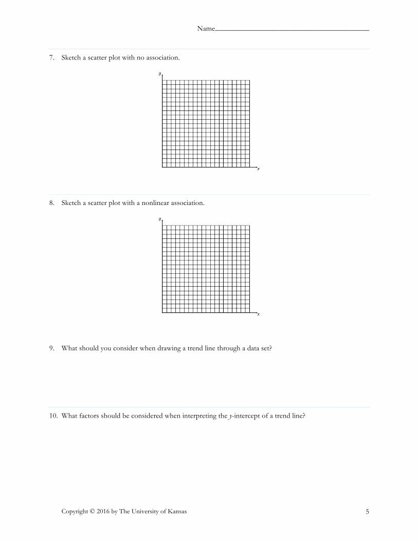
Name_________________________________________
Copyright © 2016 by The University of Kansas 5
7. Sketch a scatter plot with no association.
8. Sketch a scatter plot with a nonlinear association.
9. What should you consider when drawing a trend line through a data set?
10. What factors should be considered when interpreting the y-intercept of a trend line?

18 KEY
The Dynamic Learning Maps, including node names, descriptions, and connections, have been developed by the Achievement and Assessment Institute and are copyrighted by the University of Kansas Center for Research. Learning map information is available for use by educators but may not be used for commercial purposes (including being shared without cost when bundled in a commercial transaction) without written permission. Dynamic Learning Map nodes and connections may not be altered by anyone other than the staff of the Achievement and Assessment Institute at the University of Kansas.
SCATTER PLOTS AND TREND LINES STUDENT ACTIVITY SOLUTION GUIDE: VERSION 2
Lessons 1–3
1. You have collected the following data while researching the Winter Olympics. You are trying to determine if there is a relationship between the year of the Winter Olympics and the number of sports in the Olympics.
Year Number of Sports 1976 10 1980 10 1984 10 1988 11 1992 12 1994 12 1998 14 2002 15 2006 15 2010 15 2014 15

KEY 19
The Dynamic Learning Maps, including node names, descriptions, and connections, have been developed by the Achievement and Assessment Institute and are copyrighted by the University of Kansas Center for Research. Learning map information is available for use by educators but may not be used for commercial purposes (including being shared without cost when bundled in a commercial transaction) without written permission. Dynamic Learning Map nodes and connections may not be altered by anyone other than the staff of the Achievement and Assessment Institute at the University of Kansas.
1.a. Create a scatter plot for the data. Be sure to label the axes and scale the graph appropriately. It may be helpful to break the x-axis to accommodate the year data.
CORRECT ANSWER
ERRORS, MISCONCEPTIONS, AND MISSING KNOWLEDGE
Example Error Misconception Missing Knowledge
Student incorrectly plots points. may be confusing x- and y-values when plotting points from a table
CONSTRUCT A GRAPH USING A TABLE
Student is inconsistent in scaling the x-axis, the y-axis, or both.
does not understand that within an axis on a graph, the scale must be consistent
CHOOSE AN APPROPRIATE SCALE FOR A DISPLAY

20 KEY
The Dynamic Learning Maps, including node names, descriptions, and connections, have been developed by the Achievement and Assessment Institute and are copyrighted by the University of Kansas Center for Research. Learning map information is available for use by educators but may not be used for commercial purposes (including being shared without cost when bundled in a commercial transaction) without written permission. Dynamic Learning Map nodes and connections may not be altered by anyone other than the staff of the Achievement and Assessment Institute at the University of Kansas.
1.b. Sketch a trend line through the data points and determine whether the trend line reflects a positive or negative association in the data.
CORRECT ANSWER
The trend line reflects a positive association in the data.

KEY 21
The Dynamic Learning Maps, including node names, descriptions, and connections, have been developed by the Achievement and Assessment Institute and are copyrighted by the University of Kansas Center for Research. Learning map information is available for use by educators but may not be used for commercial purposes (including being shared without cost when bundled in a commercial transaction) without written permission. Dynamic Learning Map nodes and connections may not be altered by anyone other than the staff of the Achievement and Assessment Institute at the University of Kansas.
ERRORS, MISCONCEPTIONS, AND MISSING KNOWLEDGE
Example Error Misconception Missing Knowledge
The student identifies a negative association instead of positive association in the scatter plot.
may be reading the data from right to left instead of left to right or is confusing positive and negative association
EXPLAIN A POSITIVE OR NEGATIVE ASSOCIATION OF DATA DISPLAYED IN A SCATTER PLOT
The student draws a horizontal line or a line through the data points.
knows the trend line needs to go through the center of the data but does not understand what it means to follow the trend of the data
REPRESENT A TREND LINE FOR A SCATTER PLOT
The student draws a line with a positive slope but draws through the point (0, 0) and therefore does not follow the trend of the data or keep the trend line centrally located in the data.
thinks the trend line needs to go through the origin and the center of the data but does not understand what it means to follow the trend of the data
REPRESENT A TREND LINE FOR A SCATTER PLOT
The student does not draw a straight line and/or tries to connect each point in the scatter plot.
does not understand that a trend line must be a single, straight line and that it does not need to go through every point on the scatter plot
REPRESENT A TREND LINE FOR A SCATTER PLOT
1.c. If you were asked to use your trend line to predict the number of sports for the year 1924, what would you say? Do you think your trend line is an accurate predictor for this time frame?
CORRECT ANSWER
I would not be able to use my trend line to predict the number of sports in the year 1924. Because I don’t have any data close to that time frame and it is distant from the data on the scatter plot, I do not think the trend line would be accurate for the year 1924.
ERRORS, MISCONCEPTIONS, AND MISSING KNOWLEDGE
Example Error Misconception Missing Knowledge
The student believes that the trend line can be used for the year 1924.
unable to infer information presented in graphs to answer a question
USE GRAPHS TO READ BEYOND THE DATA
22 KEY
The Dynamic Learning Maps, including node names, descriptions, and connections, have been developed by the Achievement and Assessment Institute and are copyrighted by the University of Kansas Center for Research. Learning map information is available for use by educators but may not be used for commercial purposes (including being shared without cost when bundled in a commercial transaction) without written permission. Dynamic Learning Map nodes and connections may not be altered by anyone other than the staff of the Achievement and Assessment Institute at the University of Kansas.
1.d. Estimate the slope of your trend line. What does this mean in terms of the variables in the problem situation?
CORRECT ANSWER
The slope of the trend line is about #$ (student answers will vary, but
should be close). This means that there is about one additional sport every 6 years. Since the Olympics occur every 4 years, it would be reasonable to anticipate an increase of about one new sport every one to two Winter Olympics.
ERRORS, MISCONCEPTIONS, AND MISSING KNOWLEDGE
Example Error Misconception Missing Knowledge
The student gives a slope that is not close to
#$.
does not understand how to find the slope of a line EXPLAIN SLOPE
The student identifies an accurate slope but cannot explain what the slope means in terms of the year and number of sports in the Winter Olympics.
cannot interpret information about rate of change or slope from a graph
EXPLAIN THE SLOPE IN THE CONTEXT OF A PROBLEM OR DATA SET
1.e. If this trend continues, about how many sports will there be in the Winter Olympics in the year 2030? Is this a reasonable prediction? Why or why not?
CORRECT ANSWER
If the trend continues, there would be about 19 sports in the Winter Olympics in 2030. I think this is a reasonable estimate because the data value is relatively close to the data values on the scatter plot and because 19 seems like a possible number of winter sports for the Olympics. (Answers may vary, but student predictions should be relatively close to 19 sports.)

KEY 23
The Dynamic Learning Maps, including node names, descriptions, and connections, have been developed by the Achievement and Assessment Institute and are copyrighted by the University of Kansas Center for Research. Learning map information is available for use by educators but may not be used for commercial purposes (including being shared without cost when bundled in a commercial transaction) without written permission. Dynamic Learning Map nodes and connections may not be altered by anyone other than the staff of the Achievement and Assessment Institute at the University of Kansas.
ERRORS, MISCONCEPTIONS, AND MISSING KNOWLEDGE
Example Error Misconception Missing Knowledge
The student provides a number much higher or lower than 19.
may use the points in general instead of the trend line to predict the value
USE GRAPHS TO READ BEYOND THE DATA
The student identifies an acceptable value as a prediction, but cannot explain why it is reasonable.
cannot interpret the information in the scatter plot based on the variables in the problem situation
USE SCATTER PLOTS TO READ THE DATA
1.f. Write the ordered pair of a data point that would be considered an outlier in this problem situation. What makes this point an outlier?
CORRECT ANSWER
Answers will vary.
Possible outliers include (1998, 6), (1976, 15), and (2014, 10).
These points are outliers because they deviate from the overall pattern in the data and are substantially different than the other values in the data set.
ERRORS, MISCONCEPTIONS, AND MISSING KNOWLEDGE
Example Error Misconception Missing Knowledge
The student chooses points that are in line with the trend of the data.
may not understand the difference between outliers in single variable data and bivariate data
RECOGNIZE OUTLIERS
The student cannot explain what makes the point they chose an outlier.
knows to choose a point that is not near the data but cannot express this understanding verbally
EXPLAIN OUTLIERS

24 KEY
The Dynamic Learning Maps, including node names, descriptions, and connections, have been developed by the Achievement and Assessment Institute and are copyrighted by the University of Kansas Center for Research. Learning map information is available for use by educators but may not be used for commercial purposes (including being shared without cost when bundled in a commercial transaction) without written permission. Dynamic Learning Map nodes and connections may not be altered by anyone other than the staff of the Achievement and Assessment Institute at the University of Kansas.
2. Use the scatter plot below to answer the following questions.
2.a. Draw the line y = 5.5 on the scatter plot in black. Is this an appropriate trend line for the data? Why or why not?
CORRECT ANSWER
This is not an appropriate trend line for the data. Although the line is centrally located in the data and approximately divides the data in half, it does not define the trend of the data.

KEY 25
The Dynamic Learning Maps, including node names, descriptions, and connections, have been developed by the Achievement and Assessment Institute and are copyrighted by the University of Kansas Center for Research. Learning map information is available for use by educators but may not be used for commercial purposes (including being shared without cost when bundled in a commercial transaction) without written permission. Dynamic Learning Map nodes and connections may not be altered by anyone other than the staff of the Achievement and Assessment Institute at the University of Kansas.
ERRORS, MISCONCEPTIONS, AND MISSING KNOWLEDGE
Example Error Misconception Missing Knowledge
The student graphs the line accurately but identifies this equation as an appropriate trend line for the data.
knows the trend line needs to go through the center of the data but does not understand what it means to follow the trend of the data
REPRESENT A TREND LINE FOR A SCATTER PLOT
The student graphs the line accurately and states this equation is not an appropriate trend line for the data but cannot explain why.
unable to describe what a trend line should look like related to the data points on a scatter plot
EXPLAIN TREND LINE FOR SCATTER PLOTS
2.b. Draw the line y = !$ x + 1.5 on the scatter plot in blue. Is this an appropriate trend line for the data?
Why or why not?
CORRECT ANSWER
This is an appropriate trend line for the data. The line is centrally located in the data, and it defines the trend of the data.

26 KEY
The Dynamic Learning Maps, including node names, descriptions, and connections, have been developed by the Achievement and Assessment Institute and are copyrighted by the University of Kansas Center for Research. Learning map information is available for use by educators but may not be used for commercial purposes (including being shared without cost when bundled in a commercial transaction) without written permission. Dynamic Learning Map nodes and connections may not be altered by anyone other than the staff of the Achievement and Assessment Institute at the University of Kansas.
ERRORS, MISCONCEPTIONS, AND MISSING KNOWLEDGE
Example Error Misconception Missing Knowledge
The student graphs the line accurately but does not identify this equation as an appropriate trend line for the data.
thinks the trend line should be horizontal, go through the origin, or connect each point in the scatter plot
REPRESENT A TREND LINE FOR A SCATTER PLOT
The student graphs the line accurately and states this equation is an appropriate trend line for the data but cannot explain why.
unable to describe what a trend line should look like related to the data points on a scatter plot
EXPLAIN TREND LINE FOR SCATTER PLOTS
The student graphs the line with an incorrect slope (e.g., the reciprocal slope), then states this equation is not an appropriate trend line for the data.
understands whether a trend line is appropriate but sketches the graph using an incorrect slope
EXPLAIN SLOPE
2.c. Draw the line y = x on the scatter plot in red. Is this an appropriate trend line for the data? Why or why not?
CORRECT ANSWER
This is not an appropriate trend line for the data. Although the line is centrally located in the data and approximately divides the data in half, it does not define the trend of the data.

KEY 27
The Dynamic Learning Maps, including node names, descriptions, and connections, have been developed by the Achievement and Assessment Institute and are copyrighted by the University of Kansas Center for Research. Learning map information is available for use by educators but may not be used for commercial purposes (including being shared without cost when bundled in a commercial transaction) without written permission. Dynamic Learning Map nodes and connections may not be altered by anyone other than the staff of the Achievement and Assessment Institute at the University of Kansas.
ERRORS, MISCONCEPTIONS, AND MISSING KNOWLEDGE
Example Error Misconception Missing Knowledge
The student graphs the line accurately but identifies this equation as an appropriate trend line for the data.
thinks the trend line needs to go through the origin and the center of the data but does not understand what it means to follow the trend of the data
REPRESENT A TREND LINE FOR A SCATTER PLOT
The student graphs the line accurately and states this equation is not an appropriate trend line for the data but cannot explain why.
unable to describe what a trend line should look like related to the data points on a scatter plot
EXPLAIN TREND LINE FOR SCATTER PLOTS
The student graphs the line with an incorrect slope (e.g., the reciprocal slope), then states this equation is not an appropriate trend line for the data.
understands whether a trend line is appropriate but sketches a graph using an incorrect slope
EXPLAIN SLOPE
2.d. What is the y-intercept of the trend line that is appropriate for this data set? What does this point mean in terms of the variables in the problem situation?
CORRECT ANSWER
The y-intercept of the trend line that is appropriate for this data set is (0, 1.5). This means that if someone spends 0 hours playing video games per day, the highest level reached on the video game is level 1.5.

28 KEY
The Dynamic Learning Maps, including node names, descriptions, and connections, have been developed by the Achievement and Assessment Institute and are copyrighted by the University of Kansas Center for Research. Learning map information is available for use by educators but may not be used for commercial purposes (including being shared without cost when bundled in a commercial transaction) without written permission. Dynamic Learning Map nodes and connections may not be altered by anyone other than the staff of the Achievement and Assessment Institute at the University of Kansas.
ERRORS, MISCONCEPTIONS, AND MISSING KNOWLEDGE
Example Error Misconception Missing Knowledge
The student chooses the appropriate equation for the trend line but does not identify the y-intercept as (0, 1.5).
cannot explain what the y-intercept is on a graph EXPLAIN Y-INTERCEPT
The student identifies (0, 5.5) or (0, 0) as the y-intercept and chooses the equation y = 5.5 or y = x, respectively, as the appropriate equation for the trend line.
knows how to find the y-intercept but does not correctly represent the trend line for a scatter plot
REPRESENT A TREND LINE FOR A SCATTER PLOT
The student identifies the y-intercept as (0, 1.5) but cannot explain what it means in terms of the variables in the problem situation.
knows what a y-intercept is but cannot explain its meaning in a problem situation
EXPLAIN AN INTERCEPT IN THE CONTEXT OF A PROBLEM OR DATA SET
3. Describe the information you would have to collect to create a scatter plot.
CORRECT ANSWER
To create a scatter plot, I would need to collect bivariate data. In other words, I would need to collect data with information about two different variables to create a scatter plot.
ERRORS, MISCONCEPTIONS, AND MISSING KNOWLEDGE
Example Error Misconception Missing Knowledge
The student cannot identify what type of data or how many variables are needed to create a scatter plot.
can plot points and perform procedures with scatter plots but does not understand the criteria for the data used for the scatter plot
EXPLAIN A SCATTER PLOT AS A WAY TO REPRESENT BIVARIATE DATA

KEY 29
The Dynamic Learning Maps, including node names, descriptions, and connections, have been developed by the Achievement and Assessment Institute and are copyrighted by the University of Kansas Center for Research. Learning map information is available for use by educators but may not be used for commercial purposes (including being shared without cost when bundled in a commercial transaction) without written permission. Dynamic Learning Map nodes and connections may not be altered by anyone other than the staff of the Achievement and Assessment Institute at the University of Kansas.
4. Explain the difference between a group of points on a scatter plot and a group of points that lie on the graph of a linear function graph or trend line. Your explanation should include requirements for how points lie on the graph of a scatter plot versus the graph of a linear function or trend line.
CORRECT ANSWER
Points on a scatter plot do not need to follow a linear pattern. When the points do fall in a linear pattern, there is still variation due to the natural variability of real-world data. Additionally, scatter plots do not have to be functions (an x-value may have more than one corresponding y-value). Linear function graphs and trend lines, however, will always have points that fall in a single, straight line, and they must be functions (each input has exactly one output).
ERRORS, MISCONCEPTIONS, AND MISSING KNOWLEDGE
Example Error Misconception Missing Knowledge
The student does not describe any differences between linear function graphs and scatter plots, noting that both involve points and that scatter plots can have a linear association.
does not interpret the difference between the meaning of the points on the scatter plot and the points on a linear function
USE SCATTER PLOTS TO READ THE DATA

30 KEY
The Dynamic Learning Maps, including node names, descriptions, and connections, have been developed by the Achievement and Assessment Institute and are copyrighted by the University of Kansas Center for Research. Learning map information is available for use by educators but may not be used for commercial purposes (including being shared without cost when bundled in a commercial transaction) without written permission. Dynamic Learning Map nodes and connections may not be altered by anyone other than the staff of the Achievement and Assessment Institute at the University of Kansas.
5. Sketch a scatter plot with a negative linear association.
CORRECT ANSWER
Answers may vary. Any scatter plot with a negative linear trend is appropriate. Below is an example solution.
ERRORS, MISCONCEPTIONS, AND MISSING KNOWLEDGE
Example Error Misconception Missing Knowledge
The student sketches a scatter plot with a positive linear association.
may be confusing the difference between positive and negative association
EXPLAIN A POSITIVE OR NEGATIVE ASSOCIATION OF DATA DISPLAYED IN A SCATTER PLOT
The student sketches a scatter plot with a negative association, but the points do not follow a linear trend.
may not be able to distinguish between linear and nonlinear associations in data
EXPLAIN A LINEAR OR NONLINEAR ASSOCIATION OF DATA DISPLAYED IN A SCATTER PLOT

KEY 31
The Dynamic Learning Maps, including node names, descriptions, and connections, have been developed by the Achievement and Assessment Institute and are copyrighted by the University of Kansas Center for Research. Learning map information is available for use by educators but may not be used for commercial purposes (including being shared without cost when bundled in a commercial transaction) without written permission. Dynamic Learning Map nodes and connections may not be altered by anyone other than the staff of the Achievement and Assessment Institute at the University of Kansas.
6. Sketch a scatter plot with a positive linear association.
CORRECT ANSWER
Answers may vary. Any scatter plot with a positive linear trend is appropriate. Below is an example solution.
ERRORS, MISCONCEPTIONS, AND MISSING KNOWLEDGE
Example Error Misconception Missing Knowledge
The student sketches a scatter plot with a negative linear association.
may be confusing the difference between positive and negative association
EXPLAIN A POSITIVE OR NEGATIVE ASSOCIATION OF DATA DISPLAYED IN A SCATTER PLOT
The student sketches a scatter plot with a positive association, but the points do not follow a linear trend.
may not be able to distinguish between linear and nonlinear associations in data
EXPLAIN A LINEAR OR NONLINEAR ASSOCIATION OF DATA DISPLAYED IN A SCATTER PLOT

32 KEY
The Dynamic Learning Maps, including node names, descriptions, and connections, have been developed by the Achievement and Assessment Institute and are copyrighted by the University of Kansas Center for Research. Learning map information is available for use by educators but may not be used for commercial purposes (including being shared without cost when bundled in a commercial transaction) without written permission. Dynamic Learning Map nodes and connections may not be altered by anyone other than the staff of the Achievement and Assessment Institute at the University of Kansas.
7. Sketch a scatter plot with no association.
CORRECT ANSWER
Answers may vary. Any scatter plot with no trend is appropriate. Below is an example solution.
ERRORS, MISCONCEPTIONS, AND MISSING KNOWLEDGE
Example Error Misconception Missing Knowledge
The student sketches a scatter plot with a nonlinear association.
interprets “no association” as “nonlinear association” rather than data that do not have a trend or pattern
EXPLAIN A LINEAR OR NONLINEAR ASSOCIATION OF DATA DISPLAYED IN A SCATTER PLOT

KEY 33
The Dynamic Learning Maps, including node names, descriptions, and connections, have been developed by the Achievement and Assessment Institute and are copyrighted by the University of Kansas Center for Research. Learning map information is available for use by educators but may not be used for commercial purposes (including being shared without cost when bundled in a commercial transaction) without written permission. Dynamic Learning Map nodes and connections may not be altered by anyone other than the staff of the Achievement and Assessment Institute at the University of Kansas.
8. Sketch a scatter plot with a nonlinear association.
CORRECT ANSWER
Answers may vary. Any scatter plot with a nonlinear trend is appropriate. Below is an example solution.
ERRORS, MISCONCEPTIONS, AND MISSING KNOWLEDGE
Example Error Misconception Missing Knowledge
The student sketches a scatter plot with no association.
interprets “nonlinear association” as “no association” rather than a trend or association that is curved
EXPLAIN A LINEAR OR NONLINEAR ASSOCIATION OF DATA DISPLAYED IN A SCATTER PLOT
9. What should you consider when drawing a trend line through a data set?
CORRECT ANSWER
Trend lines should be centrally located in the data points and define the trend of data with a linear association.

34 KEY
The Dynamic Learning Maps, including node names, descriptions, and connections, have been developed by the Achievement and Assessment Institute and are copyrighted by the University of Kansas Center for Research. Learning map information is available for use by educators but may not be used for commercial purposes (including being shared without cost when bundled in a commercial transaction) without written permission. Dynamic Learning Map nodes and connections may not be altered by anyone other than the staff of the Achievement and Assessment Institute at the University of Kansas.
ERRORS, MISCONCEPTIONS, AND MISSING KNOWLEDGE
Example Error Misconception Missing Knowledge
The student incorrectly describes a trend line or cannot provide an explanation for an accurate trend line.
can draw a trend line on a scatter plot but cannot describe a trend line
EXPLAIN TREND LINE FOR SCATTER PLOTS
10. What factors should be considered when interpreting the y-intercept of a trend line?
CORRECT ANSWER
When asked to interpret the y-intercept of a trend line, you should consider whether the x-axis has been broken to graph the data. If the x-axis was broken, what appears to be the y-intercept on the graph is not an accurate point because it does not take into consideration the break in the x-axis. Additionally, you should consider whether the y-intercept is close to the data points on the scatter plot. Trend lines can be used to predict values near the data, but they may not be realistic in portions of the scatter plot that are distant from the plotted points.
ERRORS, MISCONCEPTIONS, AND MISSING KNOWLEDGE
Example Error Misconception Missing Knowledge
The student does not consider whether the y-intercept is far away from the data points in the scatter plot or does not consider a break in the scale of the x-axis.
cannot extend or infer information on a scatter plot
USE GRAPHS TO READ BEYOND THE DATA
The student’s description does not imply accurate knowledge of the location of the y-intercept.
does not understand the meaning of the term “y-intercept” EXPLAIN Y-INTERCEPT

Name_________________________________________
Copyright © 2016 by The University of Kansas 1
SCATTER PLOTS AND TREND LINES VERSION 3
Lessons 1 – 3
1. You have collected the following data while researching the Winter Olympics. You are trying todetermine if there is a relationship between the year of the Winter Olympics and the number of events inthe Winter Olympics.
Year Number of Events 1976 37 1980 38 1984 39 1988 46 1992 57 1994 61 1998 68 2002 78 2006 84 2010 86 2014 98
1.a. Create a scatter plot for the data. Be sure to label the axes and scale the graph appropriately. It may be helpful to break the x-axis to accommodate the year data.

Name_________________________________________
Copyright © 2016 by The University of Kansas 2
1.b. Sketch a trend line through the data points and determine whether the trend line reflects a positive or negative association in the data.
1.c. If you were asked to use your trend line to predict the number of events for the year 1924, what would you say? Do you think your trend line is an accurate predictor for this time frame?
1.d. Estimate the slope of your trend line. What does this mean in terms of the variables in the problem situation?
1.e. If this trend continues, about how many events will there be in the Winter Olympics in the year 2030? Is this a reasonable prediction? Why or why not?
1.f. Write the ordered pair of a data point that would be considered an outlier in this problem situation. What makes this point an outlier?
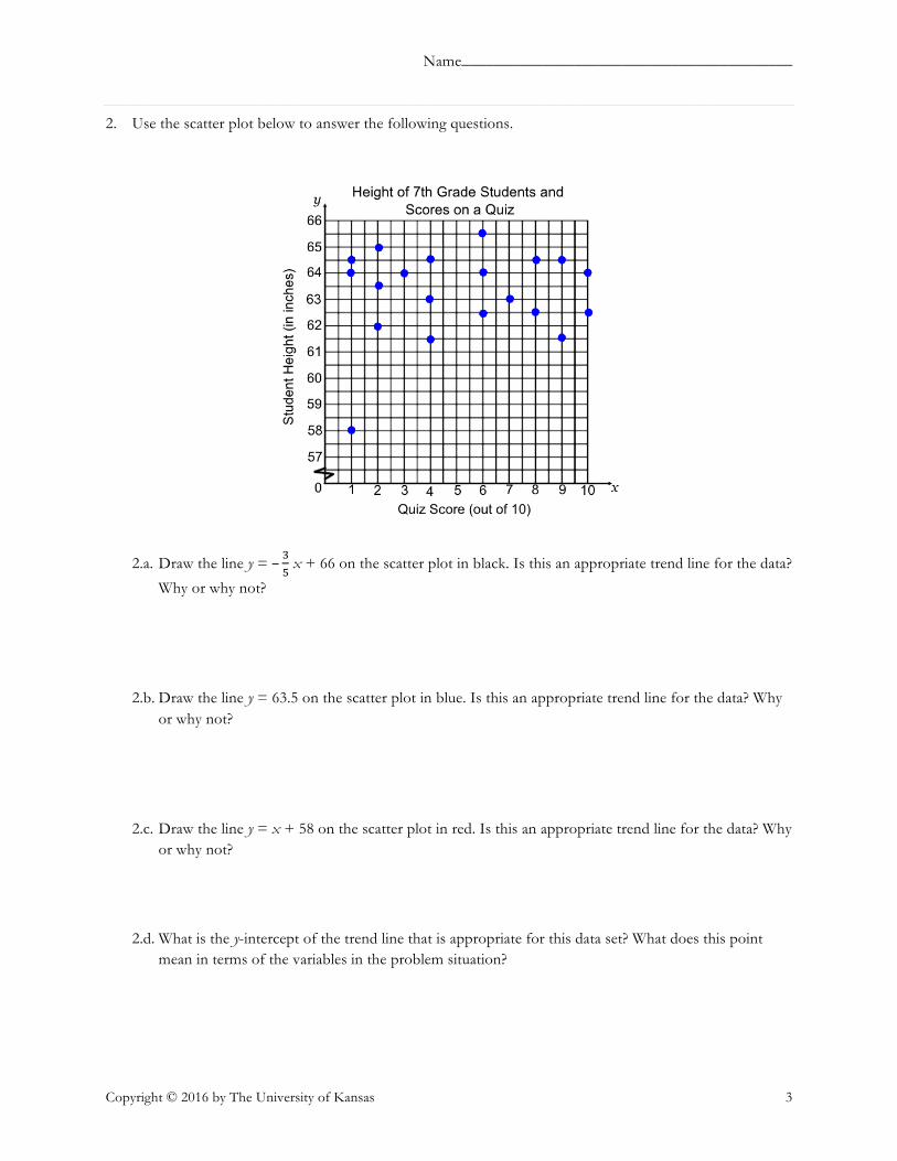
Name_________________________________________
Copyright © 2016 by The University of Kansas 3
2. Use the scatter plot below to answer the following questions.
2.a. Draw the line y = – %" x + 66 on the scatter plot in black. Is this an appropriate trend line for the data?
Why or why not?
2.b. Draw the line y = 63.5 on the scatter plot in blue. Is this an appropriate trend line for the data? Why or why not?
2.c. Draw the line y = x + 58 on the scatter plot in red. Is this an appropriate trend line for the data? Why or why not?
2.d. What is the y-intercept of the trend line that is appropriate for this data set? What does this point mean in terms of the variables in the problem situation?

Name_________________________________________
Copyright © 2016 by The University of Kansas 4
3. What kind of data do you need to construct a scatter plot?
4. Explain the difference between a group of points on a scatter plot and a group of points that lie on thegraph of a linear function or trend line. Your explanation should include requirements for how points lieon the graph of a scatter plot versus the graph of a linear function or trend line.
5. Sketch a scatter plot with a nonlinear association.
6. Sketch a scatter plot with no association.

Name_________________________________________
Copyright © 2016 by The University of Kansas 5
7. Sketch a scatter plot with a positive linear association.
8. Sketch a scatter plot with a negative linear association.
9. When drawing a trend line through data with a linear association, what must you consider?
10. What factors affect what the y-intercept of a trend line means in terms of the problem or data shown inthe graph?

KEY 35
The Dynamic Learning Maps, including node names, descriptions, and connections, have been developed by the Achievement and Assessment Institute and are copyrighted by the University of Kansas Center for Research. Learning map information is available for use by educators but may not be used for commercial purposes (including being shared without cost when bundled in a commercial transaction) without written permission. Dynamic Learning Map nodes and connections may not be altered by anyone other than the staff of the Achievement and Assessment Institute at the University of Kansas.
SCATTER PLOTS AND TREND LINES STUDENT ACTIVITY SOLUTION GUIDE: VERSION 3
Lessons 1–3
1. You have collected the following data while researching the Winter Olympics. You are trying to determine if there is a relationship between the year of the Winter Olympics and the number of events in the Olympics.
Year Number of Events 1976 37 1980 38 1984 39 1988 46 1992 57 1994 61 1998 68 2002 78 2006 84 2010 86 2014 98

36 KEY
The Dynamic Learning Maps, including node names, descriptions, and connections, have been developed by the Achievement and Assessment Institute and are copyrighted by the University of Kansas Center for Research. Learning map information is available for use by educators but may not be used for commercial purposes (including being shared without cost when bundled in a commercial transaction) without written permission. Dynamic Learning Map nodes and connections may not be altered by anyone other than the staff of the Achievement and Assessment Institute at the University of Kansas.
1.a. Create a scatter plot for the data. Be sure to label the axes and scale the graph appropriately. It may be helpful to break the x-axis to accommodate the year data.
CORRECT ANSWER
ERRORS, MISCONCEPTIONS, AND MISSING KNOWLEDGE
Example Error Misconception Missing Knowledge
Student incorrectly plots points. may be confusing x- and y-values when plotting points from a table
CONSTRUCT A GRAPH USING A TABLE
Student is inconsistent in scaling the x-axis, the y-axis, or both.
does not understand that within an axis on a graph, the scale must be consistent
CHOOSE AN APPROPRIATE SCALE FOR A DISPLAY

KEY 37
The Dynamic Learning Maps, including node names, descriptions, and connections, have been developed by the Achievement and Assessment Institute and are copyrighted by the University of Kansas Center for Research. Learning map information is available for use by educators but may not be used for commercial purposes (including being shared without cost when bundled in a commercial transaction) without written permission. Dynamic Learning Map nodes and connections may not be altered by anyone other than the staff of the Achievement and Assessment Institute at the University of Kansas.
1.b. Sketch a trend line through the data points and determine whether the trend line reflects a positive or negative association in the data.
CORRECT ANSWER
The trend line reflects a positive association in the data.

38 KEY
The Dynamic Learning Maps, including node names, descriptions, and connections, have been developed by the Achievement and Assessment Institute and are copyrighted by the University of Kansas Center for Research. Learning map information is available for use by educators but may not be used for commercial purposes (including being shared without cost when bundled in a commercial transaction) without written permission. Dynamic Learning Map nodes and connections may not be altered by anyone other than the staff of the Achievement and Assessment Institute at the University of Kansas.
ERRORS, MISCONCEPTIONS, AND MISSING KNOWLEDGE
Example Error Misconception Missing Knowledge
The student identifies a negative association instead of positive association in the scatter plot.
may be reading the data from right to left instead of left to right or may be confusing positive and negative association
EXPLAIN A POSITIVE OR NEGATIVE ASSOCIATION OF DATA DISPLAYED IN A SCATTER PLOT
The student draws a horizontal line or a line through the data points.
knows the trend line needs to go through the center of the data but does not understand what it means to follow the trend of the data
REPRESENT A TREND LINE FOR A SCATTER PLOT
The student draws a line with a positive slope but draws through the point (0, 0) and therefore does not follow the trend of the data or keep the trend line centrally located in the data.
thinks the trend line needs to go through the origin and the center of the data but does not understand what it means to follow the trend of the data
REPRESENT A TREND LINE FOR A SCATTER PLOT
The student does not draw a straight line and/or tries to connect each point in the scatter plot.
does not understand that a trend line must be a single, straight line and that it does not need to go through every point on the scatter plot
REPRESENT A TREND LINE FOR A SCATTER PLOT
1.c. If you were asked to use your trend line to predict the number of events for the year 1924, what would you say? Do you think your trend line is an accurate predictor for this time frame?
CORRECT ANSWER
I would not be able to use my trend line to predict the number of events in the year 1924. Because I don’t have any data close to that time frame and it is distant from the data on the scatter plot, I do not think the trend line would be accurate for the year 1924.
ERRORS, MISCONCEPTIONS, AND MISSING KNOWLEDGE
Example Error Misconception Missing Knowledge
The student believes that the trend line can be used for the year 1924.
not able to infer information presented in graphs to answer a question
USE GRAPHS TO READ BEYOND THE DATA

KEY 39
The Dynamic Learning Maps, including node names, descriptions, and connections, have been developed by the Achievement and Assessment Institute and are copyrighted by the University of Kansas Center for Research. Learning map information is available for use by educators but may not be used for commercial purposes (including being shared without cost when bundled in a commercial transaction) without written permission. Dynamic Learning Map nodes and connections may not be altered by anyone other than the staff of the Achievement and Assessment Institute at the University of Kansas.
1.d. Estimate the slope of your trend line. What does this mean in terms of the variables in the problem situation?
CORRECT ANSWER
The slope of the trend line is about !" (student answers will vary, but
should be close). This means that there are about five additional events in the Winter Olympics every 3 years. Since the Olympics occur every 4 years, it would be reasonable to anticipate an increase of just over five events per Winter Olympics.
ERRORS, MISCONCEPTIONS, AND MISSING KNOWLEDGE
Example Error Misconception Missing Knowledge
The student gives a slope that is not close to
!".
does not understand how to find the slope of a line EXPLAIN SLOPE
The student identifies an accurate slope but cannot explain what the slope means in terms of the year and number of events in the Winter Olympics.
cannot interpret information about rate of change or slope from a graph
EXPLAIN THE SLOPE IN THE CONTEXT OF A PROBLEM OR DATA SET
1.e. If this trend continues, about how many events will there be in the Winter Olympics in the year 2030? Is this a reasonable prediction? Why or why not?
CORRECT ANSWER
If the trend continues, there would be about 123 events in the Winter Olympics in 2030. I think this is a reasonable estimate because the data value is relatively close to the data values on the scatter plot and because 123 events seems like a realistic number based on the most recent data and previous increases. (Answers may vary, but student predictions should be relatively close to 123 events.)

40 KEY
The Dynamic Learning Maps, including node names, descriptions, and connections, have been developed by the Achievement and Assessment Institute and are copyrighted by the University of Kansas Center for Research. Learning map information is available for use by educators but may not be used for commercial purposes (including being shared without cost when bundled in a commercial transaction) without written permission. Dynamic Learning Map nodes and connections may not be altered by anyone other than the staff of the Achievement and Assessment Institute at the University of Kansas.
ERRORS, MISCONCEPTIONS, AND MISSING KNOWLEDGE
Example Error Misconception Missing Knowledge
The student provides a number much higher or lower than 123.
may use the points in general instead of the trend line to predict the value
USE GRAPHS TO READ BEYOND THE DATA
The student identifies an acceptable value as a prediction, but cannot explain why it is reasonable.
cannot interpret the information in the scatter plot based on the variables in the problem situation
USE SCATTER PLOTS TO READ THE DATA
1.f. Write the ordered pair of a data point that would be considered an outlier in this problem situation. What makes this point an outlier?
CORRECT ANSWER
Answers will vary.
Possible outliers include (1998, 30), (1976, 80), and (2014, 50).
These points are outliers because they deviate from the overall pattern in the data and are substantially different than the other values in the data set.
ERRORS, MISCONCEPTIONS, AND MISSING KNOWLEDGE
Example Error Misconception Missing Knowledge
The student chooses points that are in line with the trend of the data.
may not understand the difference between outliers in single variable data and bivariate data
RECOGNIZE OUTLIERS
The student cannot explain what makes the point they chose an outlier.
knows to choose a point that is not near the data but cannot express this understanding verbally
EXPLAIN OUTLIERS
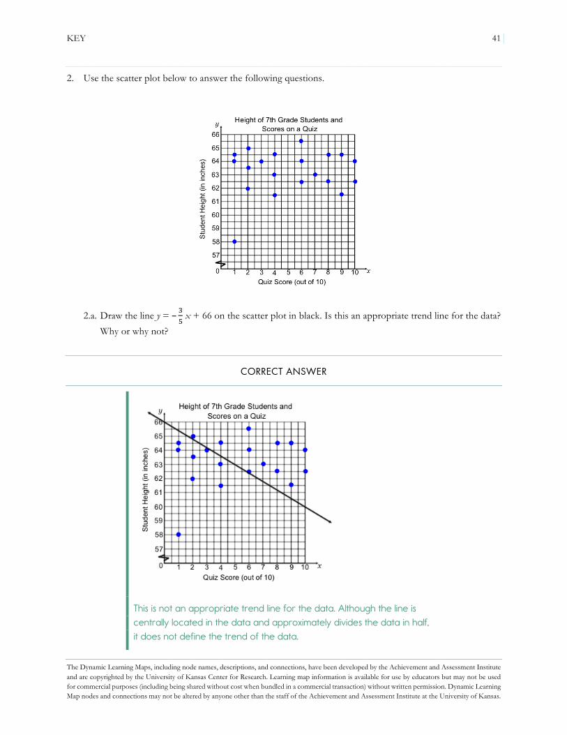
KEY 41
The Dynamic Learning Maps, including node names, descriptions, and connections, have been developed by the Achievement and Assessment Institute and are copyrighted by the University of Kansas Center for Research. Learning map information is available for use by educators but may not be used for commercial purposes (including being shared without cost when bundled in a commercial transaction) without written permission. Dynamic Learning Map nodes and connections may not be altered by anyone other than the staff of the Achievement and Assessment Institute at the University of Kansas.
2. Use the scatter plot below to answer the following questions.
2.a. Draw the line y = – "! x + 66 on the scatter plot in black. Is this an appropriate trend line for the data?
Why or why not?
CORRECT ANSWER
This is not an appropriate trend line for the data. Although the line is centrally located in the data and approximately divides the data in half, it does not define the trend of the data.

42 KEY
The Dynamic Learning Maps, including node names, descriptions, and connections, have been developed by the Achievement and Assessment Institute and are copyrighted by the University of Kansas Center for Research. Learning map information is available for use by educators but may not be used for commercial purposes (including being shared without cost when bundled in a commercial transaction) without written permission. Dynamic Learning Map nodes and connections may not be altered by anyone other than the staff of the Achievement and Assessment Institute at the University of Kansas.
ERRORS, MISCONCEPTIONS, AND MISSING KNOWLEDGE
Example Error Misconception Missing Knowledge
The student graphs the line accurately but identifies this equation as an appropriate trend line for the data.
knows the trend line needs to go through the center of the data but does not understand what it means to follow the trend of the data
REPRESENT A TREND LINE FOR A SCATTER PLOT
The student graphs the line accurately and states this equation is not an appropriate trend line for the data but cannot explain why.
unable to describe what a trend line should look like related to the data points on a scatter plot
EXPLAIN TREND LINE FOR SCATTER PLOTS
The student graphs the line with an incorrect slope (e.g., the reciprocal slope), then states this equation is not an appropriate trend line for the data.
understands whether a trend line is appropriate but sketches a graph using an incorrect slope
EXPLAIN SLOPE
2.b. Draw the line y = 63.5 on the scatter plot in blue. Is this an appropriate trend line for the data? Why or why not?
CORRECT ANSWER
This is an appropriate trend line for the data. The line is centrally located in the data, and it defines the trend of the data.

KEY 43
The Dynamic Learning Maps, including node names, descriptions, and connections, have been developed by the Achievement and Assessment Institute and are copyrighted by the University of Kansas Center for Research. Learning map information is available for use by educators but may not be used for commercial purposes (including being shared without cost when bundled in a commercial transaction) without written permission. Dynamic Learning Map nodes and connections may not be altered by anyone other than the staff of the Achievement and Assessment Institute at the University of Kansas.
ERRORS, MISCONCEPTIONS, AND MISSING KNOWLEDGE
Example Error Misconception Missing Knowledge
The student graphs the line accurately but does not identify this equation as an appropriate trend line for the data.
thinks the trend line should be horizontal, go through the origin, or connect each point in the scatter plot
REPRESENT A TREND LINE FOR A SCATTER PLOT
The student graphs the line accurately and states this equation is an appropriate trend line for the data but cannot explain why.
unable to describe what a trend line should look like related to the data points on a scatter plot
EXPLAIN TREND LINE FOR SCATTER PLOTS
2.c. Draw the line y = x + 58 on the scatter plot in red. Is this an appropriate trend line for the data? Why or why not?
CORRECT ANSWER
This is not an appropriate trend line for the data. Although the line is centrally located in the data and approximately divides the data in half, it does not define the trend of the data.

44 KEY
The Dynamic Learning Maps, including node names, descriptions, and connections, have been developed by the Achievement and Assessment Institute and are copyrighted by the University of Kansas Center for Research. Learning map information is available for use by educators but may not be used for commercial purposes (including being shared without cost when bundled in a commercial transaction) without written permission. Dynamic Learning Map nodes and connections may not be altered by anyone other than the staff of the Achievement and Assessment Institute at the University of Kansas.
ERRORS, MISCONCEPTIONS, AND MISSING KNOWLEDGE
Example Error Misconception Missing Knowledge
The student graphs the line accurately but identifies this equation as an appropriate trend line for the data.
thinks the trend line needs to go through the origin and the center of the data but does not understand what it means to follow the trend of the data
REPRESENT A TREND LINE FOR A SCATTER PLOT
The student graphs the line accurately and states this equation is not an appropriate trend line for the data but cannot explain why.
unable to describe what a trend line should look like related to the data points on a scatter plot
EXPLAIN TREND LINE FOR SCATTER PLOTS
The student graphs the line with an incorrect slope (e.g., the reciprocal slope), then states this equaion is not an appropriate trend line for the data.
understands whether a trend line is appropriate but sketches a graph using an incorrect slope
EXPLAIN SLOPE
2.d. What is the y-intercept of the trend line that is appropriate for this data set? What does this point mean in terms of the variables in the problem situation?
CORRECT ANSWER
The y-intercept of the trend line that is appropriate for this data set is (0, 63.5). This means that if someone earns 0 points out of 10, that person is approximately 63.5 inches tall. Since this scatter plot has a horizontal trend line representing the average height of the students in the class, all predicted student heights will equal the average height of 63.5 inches.

KEY 45
The Dynamic Learning Maps, including node names, descriptions, and connections, have been developed by the Achievement and Assessment Institute and are copyrighted by the University of Kansas Center for Research. Learning map information is available for use by educators but may not be used for commercial purposes (including being shared without cost when bundled in a commercial transaction) without written permission. Dynamic Learning Map nodes and connections may not be altered by anyone other than the staff of the Achievement and Assessment Institute at the University of Kansas.
ERRORS, MISCONCEPTIONS, AND MISSING KNOWLEDGE
Example Error Misconception Missing Knowledge
The student chooses the appropriate equation for the trend line but does not identify the y-intercept as (0, 63.5).
cannot explain what the y-intercept is on a graph EXPLAIN Y-INTERCEPT
The student identifies (0, 66) or (0, 58) as the y-intercept and chooses the equation y = y = – "
! x + 66 or y = x + 58,
respectively, as the appropriate equation for the trend line.
knows how to find the y-intercept but does not correctly represent the trend line for a scatter plot
REPRESENT A TREND LINE FOR A SCATTER PLOT
The student identifies the y-intercept as (0, 63.5) but cannot explain what it means in terms of the variables in the problem situation.
knows what a y-intercept is but cannot explain its meaning in a problem situation
EXPLAIN AN INTERCEPT IN THE CONTEXT OF A PROBLEM OR DATA SET
3. What kind of data do you need to construct a scatter plot?
CORRECT ANSWER
To construct a scatter plot, you must have bivariate data. In other words, data with information about two different variables are required to create a scatter plot.
ERRORS, MISCONCEPTIONS, AND MISSING KNOWLEDGE
Example Error Misconception Missing Knowledge
The student cannot identify what type of data or how many variables are needed to create a scatter plot.
can plot points and perform procedures with scatter plots but does not understand the criteria for the data used for the scatter plot
EXPLAIN A SCATTER PLOT AS A WAY TO REPRESENT BIVARIATE DATA

46 KEY
The Dynamic Learning Maps, including node names, descriptions, and connections, have been developed by the Achievement and Assessment Institute and are copyrighted by the University of Kansas Center for Research. Learning map information is available for use by educators but may not be used for commercial purposes (including being shared without cost when bundled in a commercial transaction) without written permission. Dynamic Learning Map nodes and connections may not be altered by anyone other than the staff of the Achievement and Assessment Institute at the University of Kansas.
4. Explain the difference between a group of points on a scatter plot and a group of points that lie on the graph of a linear function graph or trend line. Your explanation should include requirements for how points lie on the graph of a scatter plot versus the graph of a linear function or trend line.
CORRECT ANSWER
Points on a scatter plot do not need to follow a linear pattern. When the points do fall in a linear pattern, there is still variation due to the natural variability of real-world data. Additionally, scatter plots do not have to be functions (an x-value may have more than one corresponding y-value). Linear function graphs and trend lines, however, will always have points that fall in a single, straight line, and they must be functions (each input has exactly one output).
ERRORS, MISCONCEPTIONS, AND MISSING KNOWLEDGE
Example Error Misconception Missing Knowledge
The student does not think there is a difference between linear function graphs and scatter plots because both involve points and because scatter plots can have a linear association.
does not interpret the difference between the meaning of the points on the scatter plot and the points on a linear function
USE SCATTER PLOTS TO READ THE DATA

KEY 47
The Dynamic Learning Maps, including node names, descriptions, and connections, have been developed by the Achievement and Assessment Institute and are copyrighted by the University of Kansas Center for Research. Learning map information is available for use by educators but may not be used for commercial purposes (including being shared without cost when bundled in a commercial transaction) without written permission. Dynamic Learning Map nodes and connections may not be altered by anyone other than the staff of the Achievement and Assessment Institute at the University of Kansas.
5. Sketch a scatter plot with a nonlinear association.
CORRECT ANSWER
Answers may vary. Any scatter plot with a nonlinear trend is appropriate. Below is an example solution.
ERRORS, MISCONCEPTIONS, AND MISSING KNOWLEDGE
Example Error Misconception Missing Knowledge
The student sketches a scatter plot with no association.
interprets “nonlinear association” as “no association” rather than a trend or association that is curved
EXPLAIN A LINEAR OR NONLINEAR ASSOCIATION OF DATA DISPLAYED IN A SCATTER PLOT

48 KEY
The Dynamic Learning Maps, including node names, descriptions, and connections, have been developed by the Achievement and Assessment Institute and are copyrighted by the University of Kansas Center for Research. Learning map information is available for use by educators but may not be used for commercial purposes (including being shared without cost when bundled in a commercial transaction) without written permission. Dynamic Learning Map nodes and connections may not be altered by anyone other than the staff of the Achievement and Assessment Institute at the University of Kansas.
6. Sketch a scatter plot with no association.
CORRECT ANSWER
Answers may vary. Any scatter plot with no trend is appropriate. Below is an example solution.
ERRORS, MISCONCEPTIONS, AND MISSING KNOWLEDGE
Example Error Misconception Missing Knowledge
The student sketches a scatter plot with a nonlinear association.
interprets “no association” as “nonlinear association” rather than data that do not have a trend or pattern
EXPLAIN A LINEAR OR NONLINEAR ASSOCIATION OF DATA DISPLAYED IN A SCATTER PLOT

KEY 49
The Dynamic Learning Maps, including node names, descriptions, and connections, have been developed by the Achievement and Assessment Institute and are copyrighted by the University of Kansas Center for Research. Learning map information is available for use by educators but may not be used for commercial purposes (including being shared without cost when bundled in a commercial transaction) without written permission. Dynamic Learning Map nodes and connections may not be altered by anyone other than the staff of the Achievement and Assessment Institute at the University of Kansas.
7. Sketch a scatter plot with a positive linear association.
CORRECT ANSWER
Answers may vary. Any scatter plot with a positive linear trend is appropriate. Below is an example solution.
ERRORS, MISCONCEPTIONS, AND MISSING KNOWLEDGE
Example Error Misconception Missing Knowledge
The student sketches a scatter plot with a negative linear association.
may be confusing the difference between positive and negative association
EXPLAIN A POSITIVE OR NEGATIVE ASSOCIATION OF DATA DISPLAYED IN A SCATTER PLOT
The student sketches a scatter plot with a positive association, but the points do not follow a linear trend.
may not be able to distinguish between linear and nonlinear associations in data
EXPLAIN A LINEAR OR NONLINEAR ASSOCIATION OF DATA DISPLAYED IN A SCATTER PLOT

50 KEY
The Dynamic Learning Maps, including node names, descriptions, and connections, have been developed by the Achievement and Assessment Institute and are copyrighted by the University of Kansas Center for Research. Learning map information is available for use by educators but may not be used for commercial purposes (including being shared without cost when bundled in a commercial transaction) without written permission. Dynamic Learning Map nodes and connections may not be altered by anyone other than the staff of the Achievement and Assessment Institute at the University of Kansas.
8. Sketch a scatter plot with a negative linear association.
CORRECT ANSWER
Answers may vary. Any scatter plot with a negative linear trend is appropriate. Below is an example solution.
ERRORS, MISCONCEPTIONS, AND MISSING KNOWLEDGE
Example Error Misconception Missing Knowledge
The student sketches a scatter plot with a positive linear association.
may be confusing the difference between positive and negative association
EXPLAIN A POSITIVE OR NEGATIVE ASSOCIATION OF DATA DISPLAYED IN A SCATTER PLOT
The student sketches a scatter plot with a negative association, but the points do not follow a linear trend.
may not be able to distinguish between linear and nonlinear associations in data
EXPLAIN A LINEAR OR NONLINEAR ASSOCIATION OF DATA DISPLAYED IN A SCATTER PLOT

KEY 51
The Dynamic Learning Maps, including node names, descriptions, and connections, have been developed by the Achievement and Assessment Institute and are copyrighted by the University of Kansas Center for Research. Learning map information is available for use by educators but may not be used for commercial purposes (including being shared without cost when bundled in a commercial transaction) without written permission. Dynamic Learning Map nodes and connections may not be altered by anyone other than the staff of the Achievement and Assessment Institute at the University of Kansas.
9. When drawing a trend line through data with a linear association, what must you consider?
CORRECT ANSWER
I must make sure the trend line is centrally located in the data points and defines the trend of the data.
ERRORS, MISCONCEPTIONS, AND MISSING KNOWLEDGE
Example Error Misconception Missing Knowledge
The student incorrectly describes a trend line or cannot provide an explanation for an accurate trend line.
may be able to draw a trend line on a scatter plot but cannot describe a trend line
EXPLAIN TREND LINE FOR SCATTER PLOTS

52 KEY
The Dynamic Learning Maps, including node names, descriptions, and connections, have been developed by the Achievement and Assessment Institute and are copyrighted by the University of Kansas Center for Research. Learning map information is available for use by educators but may not be used for commercial purposes (including being shared without cost when bundled in a commercial transaction) without written permission. Dynamic Learning Map nodes and connections may not be altered by anyone other than the staff of the Achievement and Assessment Institute at the University of Kansas.
10. What factors should be considered when interpreting the y-intercept of a trend line?
CORRECT ANSWER
When interpreting the accuracy of the y-intercept of a trend line, you should consider whether the x-axis has been broken to graph the data. If the x-axis was broken, what appears to be the y-intercept on the graph is not an accurate point because it does not take into consideration the break in the x-axis. Additionally, you should consider whether the y-intercept is close to the data points on the scatter plot. Trend lines can be used to predict values near the data, but they may not be realistic in portions of the scatter plot that are distant from the plotted points.
ERRORS, MISCONCEPTIONS, AND MISSING KNOWLEDGE
Example Error Misconception Missing Knowledge
The student does not consider whether the y-intercept is far away from the data points in the scatter plot or does not consider a break in the scale of the x-axis.
cannot extend or infer information on a scatter plot
USE GRAPHS TO READ BEYOND THE DATA
The student’s description does not imply accurate knowledge of the location of the y-intercept.
does not understand the meaning of the term “y-intercept” EXPLAIN Y-INTERCEPT