SAP Analytics Cloud, analytics designer · handbook for SAP Analytics Cloud, analytics designer!...
204
SAP Analytics Cloud, analytics designer Developer Handbook Document Version: 2.1 - 2019-08-12
Transcript of SAP Analytics Cloud, analytics designer · handbook for SAP Analytics Cloud, analytics designer!...

SAP Analytics Cloud, analytics designer
Developer Handbook
Document Version: 2.1 - 2019-08-12

Table of Contents 1
Table of Contents
Table of Contents .................................................................................................................... 1
Figures..................................................................................................................................... 5
Preface..................................................................................................................................... 7
1 About Analytics Designer ........................................................................................... 8
1.1 What is an analytic application? ..................................................................................... 8
1.2 What is Analytics Designer? .......................................................................................... 8
1.3 What can you do with analytic applications that you can't do with stories? ..................... 8
1.4 How are stories and analytic applications related to each other? .................................... 8
1.5 Why do we need both stories and analytic applications? ................................................ 9
1.6 What is the typical workflow in creating an analytic application? ..................................... 9
1.7 What are typical analytic applications? ........................................................................ 10
1.8 How does scripting work in analytic applications? ........................................................ 10
1.9 What's the scripting language for analytic applications? ............................................... 11
2 Getting Started .......................................................................................................... 12
2.1 Prerequisites ............................................................................................................... 12
2.1.1 Required access ......................................................................................................... 12
2.1.2 Required roles ............................................................................................................. 12
2.1.3 Required licenses ........................................................................................................ 12
2.1.4 Modes ......................................................................................................................... 13
2.2 Designing elements ..................................................................................................... 13
2.2.1 Canvas........................................................................................................................ 13
2.2.2 Widgets and filters ....................................................................................................... 13
2.2.3 Data sources and models ............................................................................................ 13
2.3 Managing your analytics application ............................................................................ 14
2.3.1 Transporting an analytic application ............................................................................. 14
2.3.2 Sharing an analytic application .................................................................................... 14
2.3.3 Bookmarking your analytic application ......................................................................... 14
2.3.4 Translating your analytic application ............................................................................ 15
2.4 Navigating from analytic application to another document or URL ................................ 16
2.4.1 Create a story from a widget ........................................................................................ 16
2.4.2 Navigation APIs........................................................................................................... 16
3 Designing an Analytic Application ........................................................................... 18
3.1 Creating ...................................................................................................................... 18
3.2 Browsing ..................................................................................................................... 18
3.3 Opening analytic applications in a specific mode ......................................................... 19
3.3.1 Opening an analytic application from File Repository with CRUD permissions ............. 19
3.3.2 Opening an analytic application from File Repository with read permissions ................ 19
3.3.3 Opening a mode with the URL ..................................................................................... 19
3.3.4 Switching between present and view mode.................................................................. 20
3.4 Toolbar functionalities.................................................................................................. 20
Table of Contents 2
3.4.1 Toolbar in edit mode .................................................................................................... 20
3.4.2 Toolbar in view mode .................................................................................................. 21
3.5 Edit mode functionalities .............................................................................................. 21
3.5.1 Outline and side panels ............................................................................................... 21
3.5.2 Scripting section .......................................................................................................... 22
3.5.3 Layout section ............................................................................................................. 23
4 Scripting in Analytics Designer ................................................................................ 27
4.1 Why scripting?............................................................................................................. 27
4.2 Scripting language overview ........................................................................................ 27
4.2.1 Type system ................................................................................................................ 27
4.2.2 Tooling – code completion and value help ................................................................... 27
4.2.3 Events ......................................................................................................................... 27
4.2.3.1 Application events .................................................................................................... 27
4.2.3.2 Individual Widget Events .......................................................................................... 28
4.2.4 Global script objects .................................................................................................... 28
4.2.5 Accessing objects........................................................................................................ 28
4.2.6 Script Variable ............................................................................................................. 28
4.3 Script editor ................................................................................................................. 29
4.3.1 Creating and editing event-based scripts ..................................................................... 30
4.3.2 Creating and editing functions in global script objects .................................................. 31
4.3.3 Script editor layout....................................................................................................... 32
4.3.4 Info panel: errors and reference list ............................................................................. 33
4.4 Scripting language features ......................................................................................... 33
4.4.1 Typing ......................................................................................................................... 33
4.4.2 No automatic type casting ........................................................................................... 33
4.4.3 Accessing objects........................................................................................................ 34
4.4.4 Finding widgets with fuzzy matching ............................................................................ 34
4.4.5 External Libraries ........................................................................................................ 34
4.4.6 Debugging with console.log()....................................................................................... 35
4.4.7 Loops .......................................................................................................................... 35
4.4.8 Double and triple equals (===) operators ..................................................................... 36
4.4.9 If, else, statements ...................................................................................................... 36
4.4.10 this 37
4.4.11 switch statements ........................................................................................................ 37
4.4.12 break statement .......................................................................................................... 37
4.5 Working with data ........................................................................................................ 37
4.6 Method chaining .......................................................................................................... 38
4.7 Script Runtime............................................................................................................. 38
4.8 The R widget and JavaScript ....................................................................................... 39
4.9 Differences Between Analytics Cloud and Lumira ........................................................ 39
5 Widget concepts, APIs and usages .......................................................................... 41
5.1 Basic widget concepts ................................................................................................. 41
5.1.1 Supported widgets....................................................................................................... 41
5.2 The Builder Panel ........................................................................................................ 41
5.3 The Styling Panel ........................................................................................................ 42

Table of Contents 3
5.4 Action Menu ................................................................................................................ 42
5.5 Script Editor View ........................................................................................................ 43
5.6 Table ........................................................................................................................... 44
5.6.1 Table APIs .................................................................................................................. 44
5.6.2 Table Events ............................................................................................................... 46
5.7 Chart ........................................................................................................................... 46
5.7.1 Chart APIs................................................................................................................... 46
5.7.2 Chart Events ............................................................................................................... 47
5.8 Popup / Dialog............................................................................................................. 47
5.8.1 Main Popup / Dialog APIs ............................................................................................ 48
5.8.2 Button-related Popup / Dialog APIs ............................................................................. 48
5.8.3 Popup / Dialog Events ................................................................................................. 48
5.8.4 Known Limitations with Popup / Dialog ........................................................................ 49
5.9 Text Widget ................................................................................................................. 49
5.9.1 Changing text .............................................................................................................. 49
5.9.2 Adding dynamic text .................................................................................................... 50
5.10 RSS Feed ................................................................................................................... 50
5.11 R Visualization ............................................................................................................ 50
5.12 Geo Map ..................................................................................................................... 51
6 Typical Patterns and Best Practices ........................................................................ 52
6.1 Switching between Chart and Table............................................................................. 52
6.2 Selecting Measures via Dropdown or Radio Button to filter Table and Chart to display (Single Selection) ............................................................................................ 56
6.3 Selecting Measures via Dropdown to filter Table and Chart to display (Multi – Selection) .................................................................................................................... 63
6.4 Using Filterline for filtering Table, Chart and R Visualization: ....................................... 74
6.5 Cascaded Filtering ...................................................................................................... 80
6.6 Add and remove dimension in rows and columns for Table .......................................... 89
6.7 Creating a Settings Panel using a Popup Window ..................................................... 111
6.8 Selection handling in a Table or Chart and open a details popup ............................... 129
6.9 Using RWidget Wordcloud for visualization ................................................................ 152
7 Planning ................................................................................................................... 173
7.1 What to expect from Analytics Designer in regard to Planning?.................................. 173
7.2 Basic Planning concepts in Analytics Designer .......................................................... 173
7.3 Refreshing your data ................................................................................................. 175
7.4 Set user input ............................................................................................................ 175
7.5 Planning Versions ..................................................................................................... 176
7.6 How to manage versions ........................................................................................... 177
7.6.1 Publishing or Reverting data changes........................................................................ 177
7.6.2 Copy ......................................................................................................................... 179
8 Predictive ................................................................................................................. 180
8.1 Time Series Forecast ................................................................................................ 180
8.1.1 Switch on/off Forecast ............................................................................................... 180

Table of Contents 4
8.1.2 Configure Forecast .................................................................................................... 180
8.2 Smart Insights ........................................................................................................... 181
8.2.1 Discover per selected data point ................................................................................ 181
8.3 Smart Grouping ......................................................................................................... 182
8.3.1 Switch on/off Smart Grouping .................................................................................... 182
8.3.2 Configure Smart Grouping ......................................................................................... 183
8.4 Smart Discovery ........................................................................................................ 183
8.5 Smart Predictive (Beta) ............................................................................................. 185
8.5.1 Add Predictive Service .............................................................................................. 185
8.5.2 Consume Embedded Data Model .............................................................................. 185
8.5.3 Apply Predictive Model .............................................................................................. 186
8.6 Search to Insight ....................................................................................................... 186
9 OData ....................................................................................................................... 188
9.1 What you should know about OData .......................................................................... 188
9.2 How you can connect to OData ................................................................................. 188
9.2.1 What you need to do ................................................................................................. 188
9.2.2 The following restrictions are known .......................................................................... 188
9.2.3 What is an Action ...................................................................................................... 189
9.2.4 What are Action Imports ............................................................................................ 189
9.2.5 What is a Bound Action ............................................................................................. 189
9.3 How you can call OData Actions ................................................................................ 189
9.4 How you can read data from OData Services ............................................................ 196
10 Post Message API ................................................................................................... 198
10.1 Scenario 1: How you can embed an analytic application in a host HTML page via iFrame....................................................................................................................... 198
10.1.1 postMessage ............................................................................................................. 198
10.1.2 onPostMessageReceived .......................................................................................... 199
10.1.3 Example .................................................................................................................... 199
10.2 Scenario 2: How you embed a web application in an analytic application through the web page widget ................................................................................................. 200
10.2.1 Web Page Widget Related postMessage and OnPostMessageReceived ................... 200
10.2.2 Case 1 - Posting messages from the host analytic application to the embedded application ................................................................................................................. 200
10.2.3 Case 2 - Posting messages from the embedded application to the host analytic
application ................................................................................................................. 201
11 The End and the Future........................................................................................... 202
12 Important Links ....................................................................................................... 203

Figures 5
Figures
Figure 1: Bookmark component in Outline ............................................................................... 14
Figure 2: Side panel of bookmark component .......................................................................... 14
Figure 3: Turn on Translation .................................................................................................. 16
Figure 4: Create a story from a widget ..................................................................................... 16
Figure 5: Create Application .................................................................................................... 18
Figure 6: Edit Sharing Settings ................................................................................................ 18
Figure 7: Open in View Mode .................................................................................................. 19
Figure 8: Run Analytic Application ........................................................................................... 20
Figure 9: Fullscreen ................................................................................................................ 20
Figure 10: Outline ................................................................................................................... 22
Figure 11: Context menu for Scripting Objects in Outline ......................................................... 22
Figure 12: Context menu for Canvas Objects in Outline ........................................................... 23
Figure 13: Widget Name ......................................................................................................... 23
Figure 14: Analytics Designer Properties ................................................................................. 24
Figure 15: Dropdown Menu Style ............................................................................................ 24
Figure 16: Filter Menu Style .................................................................................................... 24
Figure 17: Visual Feedback of Mouse Click & Hover................................................................ 25
Figure 18: Settings of Icon....................................................................................................... 25
Figure 19: Type of Button ........................................................................................................ 25
Figure 20: Actions Menu ......................................................................................................... 25
Figure 21: Quick Menu Options in Styling Panel ...................................................................... 26
Figure 22: Create Calculation .................................................................................................. 29
Figure 23: Reference Script Variable ....................................................................................... 29
Figure 24: Edit Scripts ............................................................................................................. 30
Figure 25: Multiple Events ....................................................................................................... 30
Figure 26: Script for Dropdown ................................................................................................ 30
Figure 27: Script for Chart ....................................................................................................... 30
Figure 28: Hover Menu............................................................................................................ 31
Figure 29: Add Script Object ................................................................................................... 31
Figure 30: Add Script Function ................................................................................................ 31
Figure 31: Script Object Function ............................................................................................ 31
Figure 32: Script of Script Object Function............................................................................... 32
Figure 33: Script Editor............................................................................................................ 32
Figure 34: 3 Areas of Script Editor ........................................................................................... 33
Figure 35: Accessing Objects .................................................................................................. 34
Figure 36: Example Application Switch Chart Table ................................................................. 52
Figure 37: Switch Chart Table ................................................................................................. 52
Figure 38: Example Application Dropdown .............................................................................. 57
Figure 39: Dropdown Selection ............................................................................................... 57
Figure 40: Example Application Multi Selection ....................................................................... 64
Figure 41: Choose Input Data for Filtering R Visualization ....................................................... 75
Figure 42: Example Application Filterline ................................................................................. 75
Figure 43: Select Filterline ....................................................................................................... 76
Figure 44: Example Application Cascading Filtering ................................................................ 80
Figure 45: Add and remove Dimensions .................................................................................. 89
Figure 46: Example Application Settings Panel ...................................................................... 112
Figure 47: Popup Settings Panel ........................................................................................... 112

Figures 6
Figure 48: Example Application Details Popup ...................................................................... 130
Figure 49: Details Popup ....................................................................................................... 130
Figure 50: Example Application Word Cloud .......................................................................... 153
Figure 51: Toolbar Planning Features.................................................................................... 173
Figure 52: Planning enabled .................................................................................................. 174
Figure 53: Unbooked Data .................................................................................................... 174
Figure 54: SetUserInput ........................................................................................................ 175
Figure 55: Publish Version .................................................................................................... 177
Figure 56: Publish Data ......................................................................................................... 177
Figure 57: Success Message ................................................................................................ 177
Figure 58: Message .............................................................................................................. 178
Figure 59: Dirty Version......................................................................................................... 178
Figure 60: Planning Table in Popup ....................................................................................... 179
Figure 61: Automatic Forecast............................................................................................... 180
Figure 62: Linear Regression ................................................................................................ 181
Figure 63: Time Series Chart: Select the interested data point ............................................... 181
Figure 64: Side panel of Smart Insights ................................................................................. 182
Figure 65: Smart Grouping .................................................................................................... 182
Figure 66: Configure Smart Grouping in Builder Panel of chart .............................................. 183
Figure 67: Configure Smart Grouping in Chart Details ........................................................... 183
Figure 68: Smart Discovery setting panel .............................................................................. 184
Figure 69: New document created by Smart Discovery .......................................................... 184
Figure 70: Add Predictive Service in Outline .......................................................................... 185
Figure 71: Predictive Service Properties ................................................................................ 185
Figure 72: Create a SearchToInsight component ................................................................... 186
Figure 73: Launch Search To Insight ..................................................................................... 187
Figure 74: OData Service in Outline ...................................................................................... 190
Figure 75: Odata Service ...................................................................................................... 190
Figure 76: Actions for OData Service in Outline ..................................................................... 190
Figure 77: OData Service Sidepanel ..................................................................................... 191
Figure 78: Define OData Service Properties .......................................................................... 192
Figure 79: Styling options ...................................................................................................... 192
Figure 80: Widget context menu ............................................................................................ 193
Figure 81: Create Script ........................................................................................................ 193
Figure 82: Create Script ........................................................................................................ 193
Figure 83: Value Help ........................................................................................................... 194
Figure 84: Value Help for Flight/Book .................................................................................... 194
Figure 85: Value Help for Flight ............................................................................................. 194
Figure 86: Define Message ................................................................................................... 195
Figure 87: Post Message Scenarios ...................................................................................... 198
Figure 88: Embed an analytic application into a host page ..................................................... 199

Preface 7
Preface
Why shall you read this book? Because we offer you the following:
We give you a kickstart in how to use the SAP Analytics Cloud, analytics designer. We offer you
coding examples and we want to get you enthusiastic about the enormous flexibility you have for
building advanced analytic applications. We want you to become a fan of our product seeking for
the unlimited possibilities in the cloud.
Thanks to all people around the globe who helped writing this first version of the developer
handbook for SAP Analytics Cloud, analytics designer!
Thanks to all developers, as well as colleagues from quality team, user experience, user
assistance and product management (and any other contributor) who made this awesome product
possible!
About Analytics Designer 8
1 About Analytics Designer
This handbook presents the basics about SAP Analytics Cloud, Analytics Designer to help you
understand what it's all about and how it works. Let’s start with some fundamental concepts.
1.1 What is an analytic application?
An analytic application presents data in various forms, and lets you navigate it, and enables
planning. Analytic applications can range from simple static dashboards, showing static numbers,
to highly customized applications. These customized applications can contain many options for
browsing and navigating data, changing visualizations, and navigating across multiple pages or
areas. They can have a highly customized look-and-feel, in alignment with customer branding.
1.2 What is Analytics Designer?
Analytics Designer is the functionality in SAP Analytics Cloud that allows you to create analytic
applications. There is a dedicated design environment in SAP Analytics Cloud to create such
applications. The term design doesn't refer specifically to the UX or UI design aspect of the
application.
It is the entire process of creating an analytic application, which includes:
• defining the data model
• laying out the screen
• configuring widgets
• wiring it all up with the help of custom scripts
Therefore, Analytics Designer is another way to create analytical content in SAP Analytics Cloud.
1.3 What can you do with analytic applications that you can't
do with stories?
A story is created in a self-service workflow and can be made up of various widgets and a lot of
configured functionality. However, the amount of customization is limited to the foreseen
possibilities offered in the story design-time environment.
An analytic application typically contains some custom logic, expressed with the help of scripts.
With analytic applications there is much more flexibility to implement custom behavior. It requires
a higher skill level to create those.
1.4 How are stories and analytic applications related to each
other?
In general, stories and applications share widgets and functionality to a large extent, but some
widgets can only be used in applications, because they need to be scripted (dropdown boxes or

About Analytics Designer 9
buttons, for example). Analytic applications can also have custom logic, which cannot be
implemented in stories since there is no scripting.
From a consumption point of view, there shouldn't be any difference between stories and analytic
applications. The consumer shouldn't be aware of whether the analytical content is a story or an
analytic application. The exposed widgets, the available functionality, and the look, feel, and
behavior should be the same.
1.5 Why do we need both stories and analytic applications?
Stories and analytic applications share functionality and widgets and may even have very similar
design environments. Why are two different artifact types necessary? The answer is that story
designers and Analytics Designerers have completely different expectations. This is related to the
differences between stories and applications:
• In the story design environment, it's practically impossible for you to create a story that
doesn't work. The expectation of self-service design time for stories is that business users
are guided (to some extent limited) in what they do and can do. The story design time is
supposed to consist of multiple configuration steps that prevent business users from
creating something which breaks. With story design time, we ensure some level of
consistency.
• It's completely different with applications, especially with the added scripts. As soon as
Analytics Designerers add custom logic with scripting, they have complete freedom to
change the default behavior of the entire analytic application. The design environment
provides everything to create correct applications, but it doesn't guarantee that the
application is correct or won't break.
In addition, an analytic application has a dedicated life-cycle. You start it and there are certain
steps which are performed, like the startup event, for example. The story doesn't have that. You
can switch the story between edit and view mode as often as you like.
These are major differences. That is why we offer two artifacts and two corresponding design-
time environments to create stories and analytic applications.
1.6 What is the typical workflow in creating an analytic
application?
An analytic application is always data-driven. The foundation of an analytic application is one or
more underlying SAP Analytics Cloud models or a direct data access to an OData Service.
As a first step, you need to decide whether you want to visualize your data in a table or a chart
and add a table or a chart to your analytic application. This triggers another step for picking a
model. A model is a representation of the business data of an organization, organized into
dimensions and measures. In addition to widgets showing data, you add to the layout other
widgets that control data, such as filters, arrange and configure them, and wire them up.
Almost all widgets expose events. To add custom logic to the analytic application, you can
implement event handlers with the help of the scripting language.

About Analytics Designer 10
1.7 What are typical analytic applications?
The variety of analytic applications is huge. analytic applications can range from very static
visualizations of a few data points to very advanced, highly customized and interactive
applications which offer rich navigation and generic built-in exploration capabilities. However,
there are some patterns of analytic applications:
• Table-centric data visualization
The application is comprised of a table, which consumes a large extent of the available
screen real estate. Around the table, typically above it, are many user interface controls
(buttons, checkboxes, dropdown boxes, and so on) to change the data display, such as
to filter the data, change the data view, or show different dimensions. The nature of this
application is that there is only one table, but many and potentially complex ways to show
data differently.
• Dashboard
The application is a dashboard visualizing a few data points with the help of tiles. There
is no interactivity, but it gives users an overview of highly aggregated data. A typical option
of some dashboards is to use the tiles for further drilling into details: clicking on a tile
takes you to a more detailed page or an entirely new application showing more details for
the aggregated number on the tile.
• Generic application
Many applications are created for a specific model. That means that the user interface,
the widgets, and the logic are done with knowledge of the model and its available
dimensions, members, and so on. Another category is generic applications. These are
applications which need to be provided with a model whenever the application is
executed. These applications are more complex to create as their logic needs to work
with whatever model the end user selects at runtime. The advantage is that customers
don't need to create applications for each model they have maintained in their system.
1.8 How does scripting work in analytic applications?
Almost all widgets, whether smart, data-related widgets or simple widgets such as buttons and
dropdown boxes, expose events. Even the analytic application itself exposes events such as a
startup event or similar. To add custom logic to the application, you can implement event handlers
with the help of the scripting language.
Example
Let's say a dropdown box is populated with the available years in the data model - 2015 to 2019.
The dropdown box exposes the event OnSelect, which is triggered whenever a value is selected
from the dropdown box. The implementation of that event handler could read the selected value
and set a filter for the selected year in the model. The numbers shown reflects the selected year.
Because you can add many event handlers using the scripting APIs of all widgets and other
service APIs offered, the application can be geared towards the specific needs of a customer.

About Analytics Designer 11
1.9 What's the scripting language for analytic applications?
The scripting language is JavaScript. Scripts are executed by the web browser JavaScript engine,
which is available out of the box. To offer good tool support for application designers, we add a
type system on top. This is used for the tooling and for validating scripts.
Example
Let's say that there is an API method available for filtering members: setFilter("YEAR",
"2014"). A member is an element of a dimension. The plain JavaScript method expects two
strings, and this is what is executed at runtime by the web browser. However, our definition of the
API method uses dedicated predefined types for our business domain, that is
setFilter(Dimension, Member). With that definition, the system checks and validates that
the passed strings are a valid dimension and a valid member.
The script editor uses the type information. It doesn't just statically check the types but uses the
knowledge about the underlying model and provides value help to offer dimensions and members
existing in the model.

Getting Started 12
2 Getting Started
Analytics Designer provides a software development environment that enables application
designers or developers to reuse SAP Analytics Cloud widgets and other functionalities to build
different kinds of applications. Interactions between different widgets, pages, and applications are
implemented with script functionalities (including planning, machine learning, etc.) - at design
time. End users will then be consuming these applications - at runtime.
Analytics Designer is built around core story components to keep them synchronized as you go
forward. Analytics Designer and Story have different entry points but share much in common:
• Analytics Designer is deeply integrated into SAP Analytics Cloud.
• Analytics Designer and story share data connectivity and User Interface artifacts.
• It ensures a consistent user experience for application and story consumers.
• It inherits infrastructure and life cycle management of SAP Analytics Cloud.
2.1 Prerequisites
2.1.1 Required access
Read access: the user of an analytic application needs a read access to open the application at
runtime.
Full access: the application author who creates or edits the application needs a Create, Read,
Update and Delete access (CRUD). The CRUD permissions are part the standard role
Application Creator or can be assigned to any other role.
The folder where the application is stored passes on its access settings. For example, when an
application is saved in a public folder, all users get Read access by default.
2.1.2 Required roles
All standard Business Intelligence roles have a read access to consume analytic applications.
The ability to create, update, and delete is part of an extra standard role Application Creator.
2.1.3 Required licenses
All SAP Analytics Cloud licenses include the creation and consumption of analytic applications.
For planning applications, please note the following:
• If you only need read access to existing planning models and create private versions only,
you can use the SAP Analytics Cloud for business intelligence license.
• If you need to create public versions and use all planning features, the SAP Analytics
Cloud for planning, standard edition is required.
• If you need to create or update a planning model for your planning application, the SAP
Analytics Cloud for planning, professional edition license is required.

Getting Started 13
2.1.4 Modes
There are three modes in analytic applications:
Edit mode: this is a design time mode. It allows you to edit applications. CRUD access is
necessary. The application opens in edit mode by default if you have CRUD access.
Present mode: this is a runtime mode. It allows you to execute applications. Read access is
necessary. The application opens in present mode by default if you run an it from edit mode.
View mode: this is a runtime mode. It allows you to execute applications. Read access is
necessary. The application opens in view mode by default if you have read access.
2.2 Designing elements
For analytic applications there is a strict differentiation between design time and runtime. A few
trained users create applications by using the design time elements, while many end users
accessing and navigating the final application only at runtime. The following are the available
designing elements.
2.2.1 Canvas
The Canvas is a flexible space where you can explore and present your data. Applications have
only one canvas. Scripting allows you to build numerous navigation options in your app.
2.2.2 Widgets and filters
In Analytics Designer, a Widget is a user interface element that can be inserted and is visible on
the canvas.
Note: Applications don’t have pages. The story concepts of cascading story, page, widget filters,
and input controls are thus unavailable in applications. You should add a Filter line widget
instead. The Filter line widget mimics the story filter and can be placed on the application canvas.
Assign a data bound source widget, such as a table or a chart, as source widget. Target widgets
can be assigned via scripting to apply the selected filters to several widgets.
To learn more about widgets, see the related chapter.
2.2.3 Data sources and models
In SAP Analytics Cloud, the widgets table, chart and R widget are data bound. They have their
own data source, even if the same SAP Analytics Cloud model is connected. There is no shared
data source concept. For example, you need to apply filters to each widget when you script in
Analytics Designer for this reason.
Getting Started 14
2.3 Managing your analytics application
2.3.1 Transporting an analytic application
You can import and export analytic applications from/to other SAP Analytics Cloud tenants. You
can choose to export with data and other options.
Note: The software release Wave versions of SAP Analytics Cloud installed on the source and
target tenants need to be either the same Wave version or just one Wave version different.
2.3.2 Sharing an analytic application
Analytics Designer has its own access. As the owner of an analytic application, you can share
individual analytic applications with others and grant access to these applications.
2.3.3 Bookmarking your analytic application
Bookmark lets an application user capture the current state of an analytic application after certain
operations such as filtering or changing hierarchy level.
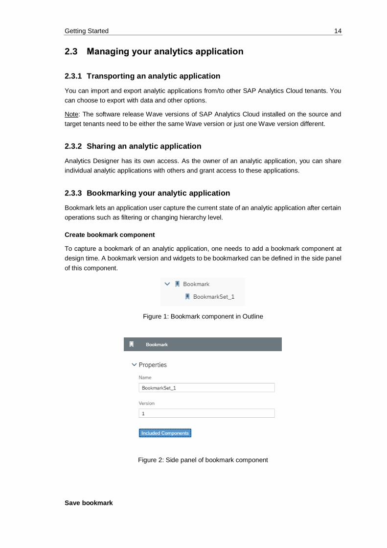
Create bookmark component
To capture a bookmark of an analytic application, one needs to add a bookmark component at
design time. A bookmark version and widgets to be bookmarked can be defined in the side panel
of this component.
Figure 1: Bookmark component in Outline
Figure 2: Side panel of bookmark component
Save bookmark
Getting Started 15
Write Analytic Design scripts to save a bookmark. At runtime, the analytic application user can
capture the latest application state via API.
BookmarkSet_1.save("application bookmark", true, true);
Get bookmark information
Certain information concerning a bookmark can be retrieved via APIs as well.
BookmarkSet_1.getAll(); //get all valid bookmarks
BookmarkSet_1.getVersion(); //get the version of current
bookmark
//get current applied bookmark
var bookmarkInfo = BookmarkSet_1.getAppliedBookmark();
//check if bookmark is changed
BookmarkSet_1.isSameAsApplicationState(bookmarkInfo);
Delete bookmark
Remove a specific bookmark via API.
var bookmarkInfo = BookmarkSet_1.getAppliedBookmark();
BookmarkSet_1.deleteBookmark(bookmarkInfo); //delete bookmark
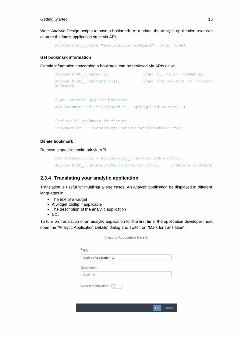
2.3.4 Translating your analytic application
Translation is useful for multilingual use cases. An analytic application be displayed in different
languages in:
• The text of a widget
• A widget tooltip if applicable
• The description of the analytic application
• Etc.
To turn on translation of an analytic application for the first time, the application developer must
open the “Analytic Application Details” dialog and switch on “Mark for translation”.

Getting Started 16
Figure 3: Turn on Translation
The current language will become the source language of this document. If users switch to
another language, the document will be shown only in view mode.
2.4 Navigating from analytic application to another document
or URL
2.4.1 Create a story from a widget
For each data-bound widget at runtime, such as Table or Chart, the analytic application user can
create a new story from the widget and start exploration based on it afterwards.
Figure 4: Create a story from a widget
The new story will be created in a new browser page, and the settings and data state (i.e. filter,
etc.) will be carried over as well.
2.4.2 Navigation APIs
Navigation APIs let users navigate from an opened analytic application to another page of a story.
Basically the APIs can be used in two ways: open the analytic application or a page of a story
directly, or open an URL.
Navigate to Analytic Application or Story
The APIs take the uuid of an analytic application or a page in a story, and open the expected
application or page in a new tab if parameter “newTab” is set to true.
NavigationUtils.openStory("story_uuid", "page_uuid",
[UrlParameter.create("p_script_var_1", "123"), UrlPara
meter.create("p_script_var_2", "Value with Spaces")]);

Getting Started 17
NavigationUtils.openApplication("application_uuid", true);
Open URL
The user can also choose to open an URL, which is a story or analytic application URL, or even
a general external URL. The URL can be opened in a new tab or in a browser page that is already
open.
var storyURL = createStoryUrl("story_uuid", "page_uuid",
UrlParameter.create("p_script_var_1", "123"));
var appURL = createApplicationUrl("application_uuid");
openUrl(storyURL, true);
openUrl(appURL, true);

Designing an Analytic Application 18
3 Designing an Analytic Application
3.1 Creating
To create an analytic application, you need the Application Creator role (or a custom role with the CRUD permissions) to be able to see the menu entry in the Home menu under Create.
1. Click the menu icon,
2. click Create,
3. and click Analytic Application.
Figure 5: Create Application
3.2 Browsing
Select Browse under the menu to access the file repository where are:
• filters,
• all existing public analytic applications,
• private applications,
• and applications shared with you.
The default access set for an application saved in a public folder is read only for others. You need
to explicitly share your application with other users and give CRUD access to allow them to edit
the application.
Figure 6: Edit Sharing Settings

Designing an Analytic Application 19
3.3 Opening analytic applications in a specific mode
For analytic applications we talk about the edit mode, where applications can be edited and the
view mode, where applications are executed.
At design time, the CRUD permissions are necessary, at runtime only read access. When users
have only read access and open an application from file repository, the application will open
automatically in runtime mode. If a user has CRUD permissions, the application will open per
default in design time mode. If you as application author with CRUD permissions want to open
the application from file repository directly in view mode, you can select this option from context
menu when hovering over the application name in the list. If you are not the owner of the
application and it was not shared with full access, the application will open in view mode and you
don’t have the option in the context menu. Only for your own applications you have this option.
3.3.1 Opening an analytic application from File Repository with CRUD
permissions
If you are the owner of the application, or if you have CRUD access for this analytic application,
the application opens automatically in edit mode. The option to open the application in view mode
is available in the context menu.
To open an application from a file repository in view mode:
• Hover over the application name in the list.
• Open the context menu under the icon.
• Select Open in view mode.
Figure 7: Open in View Mode
3.3.2 Opening an analytic application from File Repository with read
permissions
If you are not the owner of the application, or if you have only read access, the application opens
automatically in view mode and does not have a context menu entry.
3.3.3 Opening a mode with the URL
A typical application URL looks as follows and contains a mode:
Example:
https://xxxx/sap/fpa/ui/tenants/abc123/app.html#,mode=present;view_id=appBuilding;appID=xy
z78

Designing an Analytic Application 20
In edit mode, the URL contains mode=edit. In present mode, the URL contains mode=present.
In view mode, the URL contains mode=view. The analytic application opens in present mode by
default when running the application from the design time.
Figure 8: Run Analytic Application
To change the mode:
• Modify the URL directly or using the navigation options in the user interface.
• Click the Fullscreen button in the toolbar. This action changes the URL from
mode=present to mode=view.
3.3.4 Switching between present and view mode
You can switch between present and view mode by clicking the Display Fullscreen button in the
toolbar. You will notice that the URL will change. Instead of mode=present, the URL contains
now mode=view.
Figure 9: Fullscreen
3.4 Toolbar functionalities
3.4.1 Toolbar in edit mode
As in Stories there is a toolbar on top of the application which contains the features. Some options
are only active once you have saved the application, otherwise they are greyed out.
• File contains the options like Application Details, Save and Save As, Copy, Duplicate,
Paste and Share.

Designing an Analytic Application 21
• For Analytics Designer you have 2 Views which are exclusively for applications and ON
by default: the Outline and the Info Panel which contains the error list and the reference
list.
• Insert allows you to insert chart, table and all other available widgets.
• With Tools you can do chart scaling and create conditional formatting.
• Data contains refresh data and edit prompts.
• Designer opens the builder and styling panel
• Run Analytic synApplication opens the application in another browser tab in present
mode. Present mode means, that the toolbar is visible only at hover. But it can be toggled
to View mode with a static toolbar by clicking on Fullscreen button in the toolbar.
3.4.2 Toolbar in view mode
In view mode as well as in present mode the toolbar contains a limited set of features.
• Data allows you to refresh data and edit prompts.
• Plan contains publish data, version management, version history, value lock
management, predictive forecast and allocate values.
• Display Fullscreen will change the mode to present mode by showing the toolbar only at
hover
3.5 Edit mode functionalities
3.5.1 Outline and side panels
The outline is a crucial element of the edit mode. It contains:
• all visible widgets in the Layout area, either directly on the main Canvas or in a Popup
• the non-visible elements of an application in the Scripting area.
Click on + to create Script Variables, Script Objects, OData Services, and Predictive Models.
You can maintain them here and use them in every script of the application.
The outline has a search bar that filters the complete tree to match your search. Click the symbol
> to expand or collapse an item.

Designing an Analytic Application 22
Figure 10: Outline
3.5.2 Scripting section
Every Scripting object has a context menu that contains Rename, Find Reference, and Delete.
When you select one of these objects, a side panel appears. It allows you to edit properties. The
panel opens if you click these objects and closes when you click Done in the panel.
For more information, see the chapter on Scripting.
Figure 11: Context menu for Scripting Objects in Outline

Designing an Analytic Application 23
3.5.3 Layout section
If the Designer button on the top right of the application is selected, a Designer panel is available
for the visible widgets on the canvas. Access the Builder and Styling panels
from there.
The widgets in the outline, on the canvas, and the side panel are always synchronized and based
on your selection. Widgets in the outline have a context menu containing Rename, Find
Reference, Delete, and Hide. Hide conceals the widget on the canvas in edit mode. It has no
influence on the different view modes when executing the application.
Figure 12: Context menu for Canvas Objects in Outline
Widgets have their own analytic application Properties section in the Styling panel. This is where
the widget name used for scripting can be changed; it is updated in the outline, and vice versa.
The specific properties of the Analytics Designer depend on the widget type.
Figure 13: Widget Name

Designing an Analytic Application 24
Figure 14: Analytics Designer Properties
Dropdown widget
Users can now configure dropdown style with greater granularity. In addition to the default style,
users can now configure different styles of dropdown menu when item are selected, or mouse
hover, or mouse down.
Figure 15: Dropdown Menu Style
Filter Line widget
In addition to the default style, users can now configure different styles of filter menu during mouse
hover or mouse down.
Figure 16: Filter Menu Style

Designing an Analytic Application 25
Button widget
Several new settings of Button widget have been added in the Styling Panel:
Figure 17: Visual Feedback of Mouse Click & Hover
Figure 18: Settings of Icon
Figure 19: Type of Button
The possible types of button are: standard, lite, emphasized, positive (accept), and negative (reject).
Under Actions, you can flag the option to hide the widget in application view time.
Figure 20: Actions Menu
At runtime for each widget, there are quick menus for either a widget or relevant data points (i.e.
Table or Chart). An application developer can configure the visibility of these quick menu items
via the settings in the Styling Panel of a widget. More styling options are available.
By checking or unchecking the checkbox before each item, the application developer can control
the availability of the related quick menu item at runtime.
Please be adviced that the configurable items in quick menus vary by widget.

Designing an Analytic Application 26
Figure 21: Quick Menu Options in Styling Panel

Scripting in Analytics Designer 27
4 Scripting in Analytics Designer
4.1 Why scripting?
You might be wondering why you would want to script and what advantage it could possibly be.
Most modern analytics tools avoid scripting to simplify the designer’s tasks. Users may find it
easier to use at first, but they quickly find themselves limited to the scenarios built into the tool.
Scripting allows you to go beyond present narratives, to respond to user interaction in a custom
way, to change data result sets, and to dynamically alter layout. Scripting frees your creativity.
4.2 Scripting language overview
The scripting language in Analytics Designer is a limited subset of JavaScript. It is extended with
a logical type system at design time enforcing type safety. Being a true JavaScript subset allows
executing it in browser natively. All scripts are run and validated against strict mode. Some more
advanced JavaScript features are hidden. Scripts are either tied to events or global script objects.
4.2.1 Type system
The logical type system runs on top of plain JavaScript. It enforces strict types to enable more
powerful tooling. The behavior at runtime doesn’t change as it is still plain JavaScript.
4.2.2 Tooling – code completion and value help
The Analytics Designer scripting framework exposes analytics data and metadata during script
creation and editing. This enables
• code completion in the traditional sense like completing local or global Identifiers,
• semantic code completion by suggesting member functions or similar
• and value help in the form of context-aware value proposals like measures of a data source for function parameters.
For example, when calling an API method on a Business Warehouse DataSource, the code
completion can propose measures as code completion options or values to specify a filter.
4.2.3 Events
Scripts always run in response to something happening in the application. Application Events are
your hook. There are several types of events in analytic applications. Some occur in the
application itself and some occur on individual widgets.
4.2.3.1 Application events
The application has two events: one that fires when the app starts, and another that is triggered
in certain embedded scenarios.
• onInitialization: this event runs once when the application is instantiated by a user.
It is where you script anything that you want to be done during startup. Like most events,
it has no input parameters.

Scripting in Analytics Designer 28
• onPostMessageRecieved: if your application is embedded in an iFrame, your SAP
Analytics Cloud analytic application can communicate bidirectionally with the host web
app using JavaScript PostMessage (see also: https://developer.mozilla.org/en-
US/docs/Web/API/Window/postMessage) calls. It allows the host application to pass
information into the analytic application. This event is called whenever the host
application makes a post message call into the analytic application.
Designers have access to this information and to the event’s two input parameters:
• origin: it is the domain of the host application. The contents of an iFrame don’t need to
be in the same origin as the host app, even when same origin policies are in effect. It can
be convenient but be careful about clickjacking attacks and malicious iFrame hosts. For
the sake of security, we recommend that you check this parameter to ensure that the
iFrame host is what you expect.
• message: it is the standard message parameter of the Javascript PostMessage passed
into SAP Analytics Cloud. It does not follow any format and could be almost anything. It
is encoded using the structured clone algorithm and there are a few documented
limitations in what can and can’t be encoded.
4.2.3.2 Individual Widget Events
Most widgets have an event that is fired when the widget is clicked by a user. However, some
widgets have no events, such as text labels. Data bound widgets generally have an event that is
fired when the result set of the data source changes.
Most events have no input parameters, like onSelect and onResultChanged.
4.2.4 Global script objects
Global script objects act as containers. They allow you to maintain and organize script functions
that are not tied to any event and are invoked directly. You can maintain libraries of re-usable
functions. These library scripts are called functions.
4.2.5 Accessing objects
You can access every object in the Outline pane such as widgets, script variables, or script objects
by its name when you are working on a script.
4.2.6 Script Variable
By referencing Script Variable in Calculated Measure, users can easily build a what-if simulation
with query results.
For example, an analytic application developer can bind a calculated measure which references
one script variable (ScriptVariable_Rate) to a chart.

Scripting in Analytics Designer 29
Figure 22: Create Calculation
Figure 23: Reference Script Variable
4.3 Script editor
The script editor is a tool within Analytics Designer to specify the actions taking place when an
event is triggered by an application user. By adding a script to a widget, you can influence the
behavior of this widget and thus enable user interaction, also referred to as events, at runtime. A
script typically consists of several statements. A statement is a programmatic instruction within a
script. The execution of a statement is typically triggered by user interaction with the widget.
Scripting in Analytics Designer 30
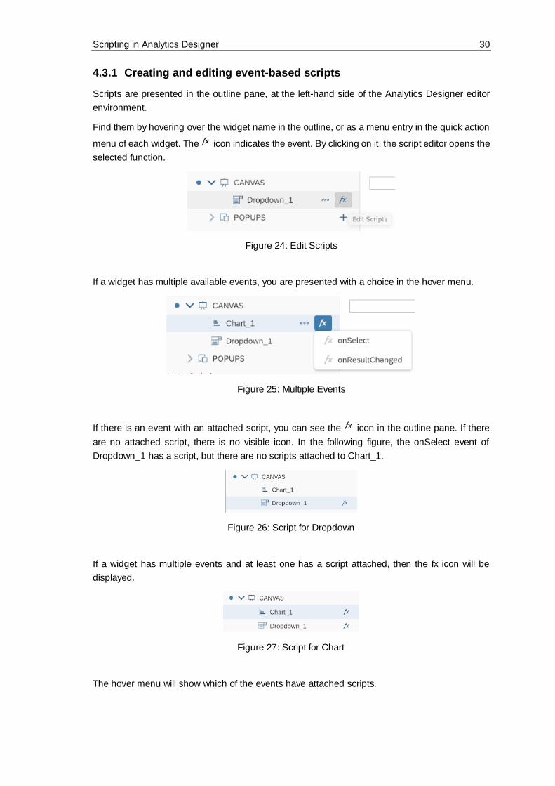
4.3.1 Creating and editing event-based scripts
Scripts are presented in the outline pane, at the left-hand side of the Analytics Designer editor
environment.
Find them by hovering over the widget name in the outline, or as a menu entry in the quick action
menu of each widget. The icon indicates the event. By clicking on it, the script editor opens the
selected function.
Figure 24: Edit Scripts
If a widget has multiple available events, you are presented with a choice in the hover menu.
Figure 25: Multiple Events
If there is an event with an attached script, you can see the icon in the outline pane. If there
are no attached script, there is no visible icon. In the following figure, the onSelect event of
Dropdown_1 has a script, but there are no scripts attached to Chart_1.
Figure 26: Script for Dropdown
If a widget has multiple events and at least one has a script attached, then the fx icon will be
displayed.
Figure 27: Script for Chart
The hover menu will show which of the events have attached scripts.

Scripting in Analytics Designer 31
Figure 28: Hover Menu
4.3.2 Creating and editing functions in global script objects
Functions are found under the global script objects portion of the outline pane. Before you can
add functions, you will need to add your first script object. Do this by clicking the plus sign, next
to the Script Objects header.
Figure 29: Add Script Object
Within a script object, you can add several functions, by invoking Add Script Function in the
context menu. Keep in mind that the script object container is an organizational aid for you.
Figure 30: Add Script Function
Individual functions are nested within global script objects. For example, in the Figure below
Error! Reference source not found. you see the function1 nested within a script object called S
criptObject_1.
Figure 31: Script Object Function

Scripting in Analytics Designer 32
Like canvas widgets, the scripts attached to a function are created by clicking the fx icon in the
hover menu of that function. Functions that have and don’t have scripts are visible in the outline,
just as with widgets.
Figure 32: Script of Script Object Function
Once you have a script attached to a function, you can call it whenever you please, from any
other script. The script objects are accessible by name and individual functions are accessible
within the objects. If you wanted to invoke the function1 script within ScriptObject_1, you would
call is like this:
ScriptObject_1.function1();
4.3.3 Script editor layout
Once an open script is in the editor, it shows up as a tab along the top of the canvas. You can
open several script editor tabs at the same time: use keyboard shortcuts, for example undo, redo
(to be found in the help page “Using Keyboard Shortcuts in the Script Editor”:
https://help.sap.com/doc/00f68c2e08b941f081002fd3691d86a7/release/en-
US/68dfa2fd057c4d13ad2772825e83b491.html) and referring to the widgets listed in outline with
the corresponding widget names.
Figure 33: Script Editor
The script editor has three areas:
• the widget and event (1)
• the documentation (2)
• and the main body of the script itself (3)

Scripting in Analytics Designer 33
Figure 34: 3 Areas of Script Editor
Write script in the main body using the inbuild help features like code completion and value help.
4.3.4 Info panel: errors and reference list
All errors are listed in the Errors tab of the Info panel. Search for errors and filter out only
warnings or errors. Double click an error to open the script in a new tab and jump directly to the
error location in the script.
Find all places where a widget or a scripting object is used with the Find References feature.
You can find it in the context menu per object in the outline. The result is displayed in the
Reference list tab of the Info Panel.
4.4 Scripting language features
4.4.1 Typing
Normal JavaScript is weakly typed and dynamically typed. Weak typing means that the script
writer can implicitly coerce variables to act like different types. For example, you could have an
integer value and treat it as if it were a string. Dynamic typing means that the runtime will try to
guess the type from the context at that moment and the user can even change the type after the
variable is already in use. For example, you could change the value of the beforementioned
integer to another type of object at will; “Dear integer, you are now a duck”.
SAP Analytics Cloud, analytics designer forbids both of these. Once you have a duck, it remains
a duck and you can’t recycle variable names as new types. If you want something else, you’ll
need another variable. It is also strongly typed, meaning that if you want to use an integer as a
string, you’ll have to explicitly cast it. Both are a consequence of enabling the rich code
completion capabilities in the editing environment.
The Analytics Designer scripting language is still JavaScript. You can write perfectly valid
JavaScript while treating the language as if it was strongly and statically typed.
4.4.2 No automatic type casting
A consequence of strong typing is that you can’t expect automatic conversions. The following is
valid JavaScript:
var nth = 1;
console.log("Hello World, " + nth);
Scripting in Analytics Designer 34
In Analytics Designer, you will see an error in the script editor, informing you that auto-type
conversion is not possible, and the script will be disabled at runtime, until fixed. Instead, you
should explicitly cast nth to a string.
var nth = 1;
console.log("Hello World, " + nth.toString());
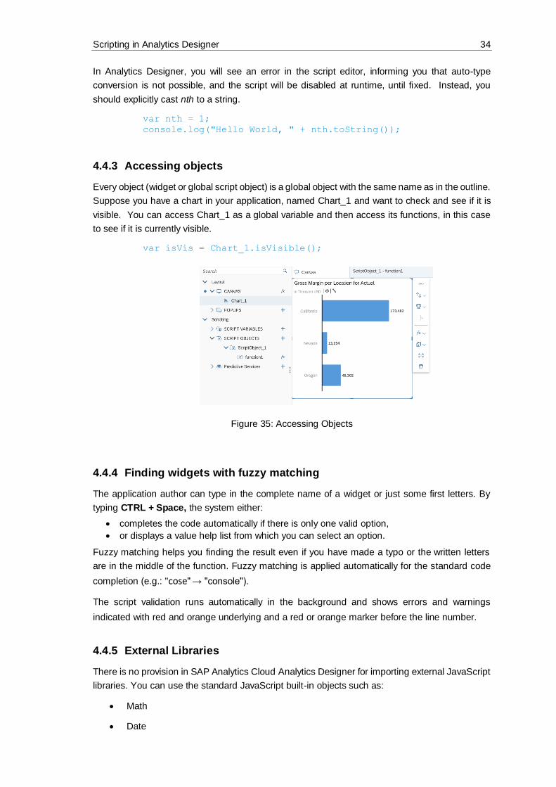
4.4.3 Accessing objects
Every object (widget or global script object) is a global object with the same name as in the outline.
Suppose you have a chart in your application, named Chart_1 and want to check and see if it is
visible. You can access Chart_1 as a global variable and then access its functions, in this case
to see if it is currently visible.
var isVis = Chart_1.isVisible();
Figure 35: Accessing Objects
4.4.4 Finding widgets with fuzzy matching
The application author can type in the complete name of a widget or just some first letters. By
typing CTRL + Space, the system either:
• completes the code automatically if there is only one valid option,
• or displays a value help list from which you can select an option.
Fuzzy matching helps you finding the result even if you have made a typo or the written letters
are in the middle of the function. Fuzzy matching is applied automatically for the standard code
completion (e.g.: "cose" → "console").
The script validation runs automatically in the background and shows errors and warnings
indicated with red and orange underlying and a red or orange marker before the line number.
4.4.5 External Libraries
There is no provision in SAP Analytics Cloud Analytics Designer for importing external JavaScript
libraries. You can use the standard JavaScript built-in objects such as:
• Math
• Date

Scripting in Analytics Designer 35
• Number
• Array
• Functions on String
All standard functions listed in the SAP Analytics Cloud Analytics Designer API Reference are
supported even if some browsers don‘t support them natively.
For example, String#startsWith is not available in Microsoft Internet Explorer, but can be
used in SAP Analytics Cloud with all browsers.
4.4.6 Debugging with console.log()
Scripts are stored as minified variables and are not directly debuggable in the browser console.
Write messages directly to the browser’s JavaScript console to aid in troubleshooting. A global
variable called console and has a log() function that accepts a string.
var nth = 1;
console.log("Hello World, " + nth.toString());
This would print “Hello World, 1” to the JavaScript console of the browser. Complex objects can
be printed.
4.4.7 Loops
Two types of JavaScript loops are possible in SAP Analytics Cloud Analytics Designer, for and
while loops. Other types, such as foreach iterators, are not supported.
for
For loops are standard JavaScript for loops, with one caveat. You must explicitly declare the for
iterator. This is valid JavaScript, but it isn’t accepted in the script editor:
for (i = 0; i < 3; i++) {
console.log("Hello for, " + nth.toString());
}
Instead, explicitly declare i. The example below is valid:
for (var i = 0; i < 3; i++) {
console.log("Hello for, " + nth.toString());
}
while
We fully support while loops in SAP Analytics Cloud Analytics Designer:
var nth = 1;
while (nth < 3) {
console.log("Hello while, " + nth.toString());
nth++;
}
for in

Scripting in Analytics Designer 36
An additional type of look is the for in iterator. Suppose you had a JavaScript object: you can
iterate over the properties with the for-in loop. Data selections are JavaScript objects and can be
iterated over:
var selection = {
"Color" : "red",
"Location" : "GER"
};
for(var propKey in selection) {
var propValue = selection[propKey];
// ...
};
4.4.8 Double and triple equals (===) operators
Plain JavaScript has two kinds of “equals” comparison operators, “==” (double equals) and “===”
(triple equals). The main difference between these is that double equals has automatic type
casting while triple equals doesn’t. With triple equals, both the value and type must be the same
for the result to be true. The triple equals is known as the strict equality comparison operator (see
https://developer.mozilla.org/en-
US/docs/Web/JavaScript/Equality_comparisons_and_sameness).
SAP Analytics Cloud Analytics Designer has no automatic type casting. It supports:
• Triple equals.
• Double equals only if both sides have the same static type.
The examples below show the difference between double and triple equals operators. In both
cases, there is a variable aNumber, with an integer value and we are comparing it to the string
“1”.
In the double equals case, aNumber is cast to string and compared. The result is true, and the if
block is entered. In the triple equals case, aNumber is not cast to string and the comparison is
false, because the values are of a different type.
This is true, and you can see the if statement is entered:
var aNumber = 1;
if (aNumber == "1"){
...
}
This is false, and you can see the if statement is skipped:
var aNumber = 1;
if (aNumber === "1"){
...
}
4.4.9 If, else, statements
The statements if, else are supported. Remember that there is no automatic type casting and
double equals are valid only if both sides have the same static type:

Scripting in Analytics Designer 37
if (nth === 1){
console.log("if...");
} else if (nth < 3){
console.log("else if...");
} else {
console.log("else...");
}
4.4.10 this
The this keyword allows you to ignore the name of the object. It is simply the object that this script
is attached to, regardless of what it is called. It doesn’t matter and is merely a stylistic choice.
With this, refer to:
• the instance itself within widget scripts or script object functions
• the parent instance explicitly by its variable name, such as Chart_1
• the parent instance as this
When performing the above console print on one of the events of Chart_1 itself, use the following
variation of the code:
var theDataSource = this.getDataSource();
console.log(theDataSource.getVariables());
4.4.11 switch statements
You can use normal JavaScript switch statements:
switch (1) {
case 0:
day = "Zero";
break;
case 1:
day = "One";
break;
case 2:
day = "Two";
break;
}
4.4.12 break statement
You can use break to break out of loops and switch statements, as seen in the example above.
4.5 Working with data
You can perform many simple operations on data. Keep in mind there are no standalone data
sources, and there is a getVariables() function on data sources.
Example
Let’s say you want to print the variables on Chart_1 to the console.

Scripting in Analytics Designer 38
Get the data source on a widget with its getDataSource() function. This returns the data
source attached to that widget and allows you to perform further operations.
The snippet below prints the data source variables of Chart_1 to the console:
var theDataSource = Chart_1.getDataSource();
var theVariables = theDataSource.getVariables();
console.log(theVariables);
4.6 Method chaining
In the example above, one line of code executes one operation. It is useful when the individual
variables might get re-used in a script, and it increases readability. But some scripts need to be
made compact, and this can be done with method chaining. Certain JavaScript libraries support
method chaining where the result of a previous operation can immediately be used in the same
statement. SAP Analytics Cloud Analytics Designer supports method chaining.
Suppose you were only logging the variables in the above example as a debug aid. You were
not re-using them, and the multiple lines were visual clutter. Then you might want to use method
chaining. The code below uses method chaining for compactness and does exactly the same
thing:
console.log(Chart_1.getDataSource().getVariables());
4.7 Script Runtime
Analytics Designer validates the script before execution because running arbitrary JavaScript in
the browser is a risk. It ensures that only allowed JavaScript subset can be used. Critical features
like sending requests can be prevented or forced to use alternative secured APIs if needed. In
addition, the execution is isolated to prevent:
• access to DOM
• access to global variables
• modifying globals/prototypes
• sending requests
• importing scripts
• including ActiveX etc.
• launching other Web Workers
• access to cookies
• and enforcing different domain
Validation
Validation at runtime follows the same logic as for the script editor. Not all validations have to be
performed e.g. validating analytic data like filter values.

Scripting in Analytics Designer 39
4.8 The R widget and JavaScript
You might know the R widget from stories already. It becomes much more powerful in
applications. The R widget has two separate runtime environments:
The R environment is on the server, in the R engine.
The JavaScript environment runs in the normal browser space along with the rest of the widget
scripts.
Execution order
On Startup, the R script runs and the JavaScript onResultSetChanged doesn’t run because
the widget is in its initial view state.
On data change, the R script runs first, the JavaScript onResultChanged event runs.
Accessing the R environment from JavaScript
The R environment can be accessed from the JavaScript environment. It can be read from and
manipulated. However, the JavaScript environment can’t be accessed from the R environment.
Reading
Suppose you had an R widget that had a very simple script. It just gets the correlation coefficient
between two measures on a model and puts that into a number named gmCorrelation:
grossMargin <- BestRun_Advanced$`Gross Margin`
grossMarginPlan <- BestRun_Advanced$`Gross Margin Plan`
gmCorrelation <- cor(grossMargin, grossMarginPlan)
Use the getEnvironmentValues on the R widget to access its environment and getNumber
to read a number from the R environment. The following JavaScript code takes the correlation
coefficient from the R environment and logs it to the JavaScript console. Note the this. This code
was taken from the onResultChanged event of a widget with the above R snippet. It means that
R widgets can be used as global data science scripts:
var nCcor = this.getEnvironmentValues().getNumber("gmCorrelation");
var sCor = nCcor.toString();
console.log("Margin Correlation: " + sCor);
Writing
You can also manipulate the R environment from JavaScript. The magic methods are
getInputParameters and setNumber. The following line of JavaScript sets an R environment
variable named userSelection to 0.
RVisualization_1.getInputParameters().setNumber("userSelect
ion", 0);
4.9 Differences Between Analytics Cloud and Lumira
Design Studio/Lumira Designer and SAP Analytics Cloud Analytics Designer have broadly similar
scripting environments. Both are JavaScript based, perform similar missions and SAP Analytics
Cloud Analytics Designer’s scripting framework was informed by experience with Design Studio.
However, there are some differences that you should keep in mind.

Scripting in Analytics Designer 40
Lumira scripts execute on the server. SAP Analytics Cloud Analytics Designer scripts execute in
the browser JavaScript engine. Lumira scripts execute close to the data. SAP Analytics Cloud
Analytics Designer scripts execute close to the user.
SAP Analytics Cloud Analytics Designer is not copy + paste compatible with Lumira. This is
partially a consequence of the close-to-data vs close-to-user philosophical difference.
Data sources are currently hidden within data bound widgets and you must access them using
getDataSource(). When standalone data sources become available, you will be able to access
them as global variables, as in Lumira.
SAC Analytics Designer not supporting automatic type conversion makes scripts more explicit
and avoids common mistakes. This includes requiring a strict equality comparison operator,
whereas Lumira allowed the use of the double equals comparison operator for expressions of
different types.

Widget concepts, APIs and usages 41
5 Widget concepts, APIs and usages
In Analytics Designer, widgets are UI elements and can be inserted onto the canvas. There is a
wide variety of widgets available. They range from basic widgets like button, text, shape, image,
dropdown, checkbox group, radio button group, to data-bound ones like Table, Chart, Geo Map,
and further to custom widgets built by partners and customers.
Once you have added a widget to the canvas, you can then use its Builder Panel, Styling Panel,
Action Menu to configure its styling and runtime behavior, and even write script to configure how
it interacts with other widgets.
If you need more information about any script API in Analytics Designer, you can read through
the API Reference document which you can open from the help portal:
https://help.sap.com/doc/958d4c11261f42e992e8d01a4c0dde25/latest/en-US/index.html
5.1 Basic widget concepts
5.1.1 Supported widgets
All widgets available in stories are available in Analytics Designer:
• Table,
• Chart,
• Filter Line,
• Image,
• Text,
• Clock,
• Shape,
• Geo Map,
• and Web Page.
Other widgets are available, such as:
• Dropdown,
• Radio button group,
• Checkbox group,
• and Button.
Widgets can also be:
• custom-made by partners and customers,
or belong to other varieties like a web page or a clock
5.2 The Builder Panel
If you select a widget on the canvas, the Builder Panel opens on the right-hand side.
With the Builder Panel you configure your widget’s data-related settings. The following example
shows, how to select at least a chart type, measures, and dimension to build a chart. You can
add other characteristics of this chart as well: for instance, a Reference Line. Different widgets
have different configurations.

Widget concepts, APIs and usages 42
5.3 The Styling Panel
You can configure the format of a widget with the help of the Styling Panel. Multiple
properties are provided with the Styling Panel, for example background color, font and data
formats.
5.4 Action Menu
The action menu is a dynamic menu and is only visible if the widget is selected. Different
widgets have different options available, and some of the options are not available in view mode.

Widget concepts, APIs and usages 43
5.5 Script Editor View
Scripting provides you a powerful way to define a widget’s runtime behavior and how it can interact
with other widgets and other available functionality.
To edit a Script function,
• click the button in the Action Menu
• or click the same button next to the widget name in the Outline.
It opens the Script Editor view.

Widget concepts, APIs and usages 44
5.6 Table
5.6.1 Table APIs
The Table widget displays data in rows and columns. In contrast to a chart (which is the graphical
representation of data to help understand the relationship between a large quantity of data and
its parts), a table is used to keep track of information such as quantities, price, text description,
and other details. However, both are important means to present data and to enable end users
to directly interact with data.
Analytics Designer provides table APIs and Datasource APIs to help Analytics Designerers use
script custom specific logic into their analytic applications.
Besides the common widget APIs like getVisible, setVisible , the main Table APIs are listed below.

Widget concepts, APIs and usages 45
addDimensionToColumns(dimension: string|Dimension, position?: integer
): void
Adds the dimension to the column axis at the specified position. If no position is specified, the
dimension is added as the last dimension of the columns axis.
Example:
Table_1.addDimensionToColumns("Location_4nm2e04531");
addDimensionToRows(dimension: string|Dimension, position?: integer):
void
Adds the dimension to the row axis at the specified position. If no position is specified, the
dimension is added as the last dimension of the row axis.
Example:
Table_1.addDimensionToRows("Location_4nm2e04531");
getDataSource(): DataSource
Returns the data source of the table. If the table has no data source, undefined is
returned. Refer to the section of data-related APIs.
getDimensionsOnColumns(): Dimension[]
Returns the dimensions on the column axis.
getDimensionsOnRows(): Dimension[]
Returns the dimensions on the row axis.
getPlanning(): Planning
Returns the planning object of the table. If the table data source is not of type planning, undefined
is returned.
Refer to the section of planning.
getSelections(): Selection[]
Returns the selections of the chart. You can use the elements of the returned array with the
function DataSource.getData() to get the value of a cell. See also the documentation of
Selection.
(https://help.sap.com/doc/958d4c11261f42e992e8d01a4c0dde25/2019.8/en-
US/doc/Selection.html)
removeDimension(dimension: string|Dimension): void
Removes the dimension from whichever axis it is present on. If the dimension is neither on the
Rows nor Columns axis, the operation is ignored.
Example :

Widget concepts, APIs and usages 46
Table_1.removeDimension("Location_4nm2e04531");
5.6.2 Table Events
onResultChanged()
Called when the result set displayed by the table changes
onSelect()
Called when the user selects within the table
5.7 Chart
5.7.1 Chart APIs
A chart is a graphical representation of data in symbols such as bars, lines, or slices. Analytics
Designer provides chart APIs and Datasource APIs to help Analytics Designerers use script
custom specific logic into their analytic applications.
Besides the common widget APIs like getVisible, setVisible, the main Chart APIs are as
below.
addDimension(dimension: string|Dimension, feed: Feed, position?: inte
ger): void
Adds a dimension to the feed at the specified position. If no position is specified, the dimension
is added at the end of the feed.
Example:
Chart_1.addDimension("Location_4nm2e04531", Feed.CategoryAxis);
addMeasure(measure: string|Measure, feed: Feed, position?: integer):
void
Adds the measure to the feed, at the specified position. If no position is specified, the measure
is added at the end of the feed.
Example:
Chart_1.addMeasure("[Account_BestRunJ_sold].[parentId].&[Gross_Margin
Plan]",Feed.ValueAxis);
getDataSource(): DataSource
Returns the data source of the chart. If the chart has no data source, undefined is returned.
Refer to the section of Data-related APIs
getForecast(): Forecast
Returns the forecast of the chart.

Widget concepts, APIs and usages 47
Refer to the section of Forecast
getMeasures(feed: Feed): Measure[]
Returns the measures of the feed.
Example:
var measures = Chart_1.getMeasures(Feed.ValueAxis);
getSelections(): Selection[]
Returns the selections of the chart. You can use elements of the returned array with the function
DataSource.getData() to get the value of a cell. See also the documentation of Selection.
(https://help.sap.com/doc/958d4c11261f42e992e8d01a4c0dde25/2019.8/en-
US/doc/Selection.html)
getSmartGrouping(): SmartGrouping
Returns the Smart Grouping of the chart.
Refer to the section of Smart Grouping
removeDimension(dimension: string|Dimension, feed: Feed): void
Removes the dimension from the feed.
Example:
Chart_1.removeDimension("Location_4nm2e04531", Feed.CategoryAxis);
removeMeasure(measure: string|Measure, feed: Feed): void
Removes the measure from the feed.
Example:
Chart_1.removeMeasure("[Account_BestRunJ_sold].[parentId].&[Gross_Mar
ginPlan]",Feed.ValueAxis);
5.7.2 Chart Events
onResultChanged()
Called when the result set displayed by the chart changes
onSelect()
Called when the user selects within the chart
5.8 Popup / Dialog
A Popup/Dialog is usually a small window on top of the main page of the application. It
communicates information to the user or prompts them for inputs.

Widget concepts, APIs and usages 48
For instance, a Popup can show a description of the application, and another Popup can ask the
user to perform configurations. Because the popup acts as a container widget, you can put any
other widget into the popup, such as a table, button, or checkbox.
You can choose to design a popup starting from scratch. Start with an empty canvas and have
the flexibility to add whatever widget you want. You can enable the header and footer setting to
turn the popup directly into a popup dialog that has a consistent look and feel compared to other
dialogs in SAP Analytics Cloud stories.
5.8.1 Main Popup / Dialog APIs
close(): void
Hides the popup
getTitle(): string
Returns the title of the popup
open(): void
Shows the popup
setTitle(title: string): void
Sets the title of the popup
5.8.2 Button-related Popup / Dialog APIs
isButtonEnabled(buttonId: string): Boolean
Returns whether the specified button in the footer of the popup is enabled
isButtonVisible(buttonId: string): Boolean
Returns whether the specified button in the footer of the popup is visible
setButtonEnabled(buttonId: string, enabled: boolean): void
Enables or disables the specified button in the footer of the popup
setButtonVisible(buttonId: string, visible: boolean): void
Shows or hides the specified button in the footer of the popup
onButtonClick(buttonId: string)
Called when the user clicks one of the buttons in the footer of the popup
5.8.3 Popup / Dialog Events
onButtonClick(buttonId: string)

Widget concepts, APIs and usages 49
Called when the user clicks one of the buttons in the footer of the popup
5.8.4 Known Limitations with Popup / Dialog
Need to add at least two widgets to a popup to run the popup as designed
We recommend you add at least two widgets to a popup as widgets are the visualization of the
popup. If no widgets are added, you won't see the popup displayed when you trigger it while
running the analytic application. If only one widget is added, the height and width you set for the
popup won't take effect.
When a table or chart in the canvas act as the source widget of a filter line widget in a popup,
source widget cannot find the filter line as its reference after reloading the analytic application
In the case when a table or chart in the canvas act as the source widget of a filter line widget in a
popup and you reopen or refresh the analytic application, you will find the filter line is not listed in
the reference list of the table or chart widget after you choose Find Reference. This is because
currently we don't initiate the filter line widget in the popup when you first entering an analytic
application.
To solve this, for now we recommend you activate the popups by clicking on each of them. Then
the reference list will display all relevant results.
5.9 Text Widget
Use the Text widget to add user-defined text to your application. The style of the text can be
configured as usual. You could refer to sample Show R Visualization result in Text. The most
frequently used usages, get/set text and adding dynamic text, are demonstrated and explained
5.9.1 Changing text
In Show R Visualization result in Text, the total value of gross margin is dynamically updated in Text_GrossMargin when switching among locations. Via API, applyText, you can
customize the display text of Text at runtime:
if (totalSum) {
Text_GrossMargin.applyText(totalSum.toString());
} else {
Text_GrossMargin.applyText("loading...");
}
The Text shows “loading…” until totalSum is valid.
The text style can be configured by each segment. In-place edit the text by double-clicking the
Text input field of Text_Title in Canvas and config the style of description.

Widget concepts, APIs and usages 50
5.9.2 Adding dynamic text
Add a script variable as the source of dynamic text to a Text widget to automatically update the
text based on the values. For example, in Show R Visualization result in Text,
ScriptVariable_Currency is defined and used in Text_Title.
The script variable can be exposed as URL parameter if you switch on the option. For example,
if you input p_ScriptVariable_Currency=CNY in the URL link, you’ll get the following:
5.10 RSS Feed
Use the RSS feed widget to present relevant articles from an RSS feed alongside data and
visualizations. Leverage the open APIs to dynamically update the list of RSS feeds according to
your actions. For example, show blogs relevant to your area of interest. The sample Present
relevant RSS articles can be referred for the most frequently used APIs.
Configure Feeds
The RSS feeds in the widget can be updated dynamically at runtime via APIs when you select in
Chart_RSSCategory in Present relevant RSS articles.
Example:
If you select Business in the chart, BBC Business is added in the list of feeds and selected by
default after running the scripts below:
RssReader_Content.removeAllFeeds();
RssReader_Content.addFeed("BBCBusiness","http://feeds.bbci.co.uk/news/
business/rss.xml");
RssReader_Content.setSelectedFeed("http://feeds.bbci.co.uk/news/busine
ss/rss.xml")
5.11 R Visualization
Use R Visualization widget to leverage R scripts. It allows you to build your own visualizations,
do calculation, and more. Refer to sample Show R Visualization result in Text for the most
frequently used APIs.
In Script of R Visualization, you can define parameters to get input values or return results
calculated in Script.
Example:
Configure the title of visualization R Visualization in Show R Visualization result in Text per
location by input parameter:
RVisualization.getInputParameters().setString("titleParam", "Gross
Margin of Oregon");
Example:
Calculate the total of gross margin in RVisualization script, and return the result:
RVisualization.getEnvironmentValues().getNumber("totalSum");

Widget concepts, APIs and usages 51
Configure the data source of R Visualization via APIs. For example, in Show R Visualization
result in Text, the dimension filter is set to “Oregon” when you change location via
Dropdown_Location by this
RVisualization.getDataFrame("BestRunJuice_SampleModel").getDataSource(
).setDimensionFilter("Location_4nm2e04531",
["CT13","CT14","CT15","CT16","CT17","CT18"]);
5.12 Geo Map
The Geo Map widget is now supported in Analytic Application. It lets application users overlay
multiple layers of business data on a base map and explore the information behind the data from
a geographical point of view.
The Geo Map widget in Analytic Application has the same capabilities as in Story, and also
provides APIs to make changes by scripting.
Configure layer visibility
Since a Geo Map widget can have multiple visualization layers on the top, there are APIs to
control their visibility so users can decide which layers they need to see.
GeoMap_1.getLayer(0).setVisible(true);
GeoMap_1.getLayer(0).isVisible();

Typical Patterns and Best Practices 52
6 Typical Patterns and Best Practices
6.1 Switching between Chart and Table
In this example, we will explore how to switch between a chart and a table using a toggle feature
in an analytic application.
To achieve this, we will add an icon that represents a chart and another that represents a table.
Then, we will write scripts for each of the images/icon we added to make it so that when we click
on the Chart icon, the chart will appear, and the Table will be invisible, and vice versa.
Our default setting, shown when the application is first run, will be to make the Table visible (and
the Chart invisible).
The result will look like this when we first run the application:
Figure 36: Example Application Switch Chart Table
And if we click on the image, we will get the chart and the image will change its look to a
table icon and if we select it we come back to the view of the previous screenshot:
Figure 37: Switch Chart Table

Typical Patterns and Best Practices 53
Prerequisites for this use case is having already added a table and a chart to your canvas. Please select e.g. the model “BestRun_Advanced” as data source.
Select the Table in your canvas and click on Designer. Go to the Styling Panel and under Actions, select “Show this item at view time”. Afterwards, change the name of the widget to Table.
Select the Chart afterwards and make sure that the action “Show this item at view time” is deselected. Afterwards, we will do the same as in the Table and change the name of this widget to “Chart”

Typical Patterns and Best Practices 54
Choose the images you want the user to click on to change from Table to Chart and back.
Here, and were used. You can insert them on top of each other so that when one is clicked on, the other one will appear in the same place. To insert an image, go to the Insert Panel and under the “+” Icon, select Image.
To enable the switch between table and chart, we will edit the name and then the scripts of both images. First, we will edit the Chart Image’s script. Select the image of the Chart you
added and click on the button.

Typical Patterns and Best Practices 55
This will open the onClick script of the image. Here, we will write a script that makes it possible to switch from the Table to the Chart. We have set the name of the
icon to Switch_to_Table_display and the
name of the icon to Switch_to_Chart_display. This can be done through the Canvas in the Layout or Styling Panel. This script makes the Chart visible and the Table invisible as well as set the visibility of the Table icon to true and the visibility of the Chart icon to false. This way when the Chart is visible, the icon of the Table will also be visible to indicate our ability to now switch back to the Table.
Chart.setVisible(true);
Table.setVisible(false);
Switch_to_Table_display.setVisible(true);
Switch_to_Chart_display.setVisible(false);
We will now do the same for the icon of the Table. Select the image of the Table you chose and click
on the button. Here, we will set the Chart as well as the Switch_to_Table_display to false and the Table as well as the Switch_to_Chart_display to true.
Chart.setVisible(false);

Typical Patterns and Best Practices 56
Table.setVisible(true);
Switch_to_Table_display.setVisible(false);
Switch_to_Chart_display.setVisible(true);
Save the application and click on Run Analytic Application in the upper right side of the page and the result should look something like this: The Table is displayed as we have set it to the default. Now click on the Chart icon above it and the Table will change into a Chart. If we want to look at the Table again, we only have to click on the icon of the Table and we would have the previous icon view again.
6.2 Selecting Measures via Dropdown or Radio Button to filter
Table and Chart to display (Single Selection)
In this example, we will explore how to filter a Table or a Chart using a single measure selected
from a Dropdown widget or a Radio Button.
In the Dropdown widget, we will load all the measures from our data set and set the default filtering
measure of the table to “Gross Margin Plan”.
When another measure is selected, the filter is applied to the Table as well as the Chart (You can
go from the Table to the Chart and vice versa using the and the icons, respectively.)
The result will look like this when we run the application:

Typical Patterns and Best Practices 57
Figure 38: Example Application Dropdown
And if we click on the Dropdown box, we will get all the measures with which we can filter the
results of the Table or the Chart:
Figure 39: Dropdown Selection
Prerequisites for this use case is having already added a table and a chart to your canvas. To
have all the functionalities in this use case, please first go through the “Switching between Table
and Chart“ exercise.

Typical Patterns and Best Practices 58
To add a Dropdown widget, go to the Insert Panel and click on the + sign and then choose Dropdown. We will name the dropdown Dropdown_Measures. To rename the objects, hover over them one by one in the
Layout and when the icon appears click on it and choose Rename. This use case assumes that you have a Table and a Chart already set in the Canvas. If you don’t, please go through the Switching between Table and Chart exercise and keep the names as they are in that exercise so that it works here as well.
We will also add a Dropdown label so that we can indicate to the user that they can select measures through the Dropdown table. To insert Text, please click again on the + icon in the Insert Panel and choose Text.

Typical Patterns and Best Practices 59
Place the Text widget on the left side of the Dropdown widget and we can then choose what to write in the Text box we inserted. We can, for example, write “Selected Measure”.
Now we want to be able to access the value that the user chooses from the Dropdown widget. That is why we will add a Script Variable that acts as a global variable that can be accessed from anywhere in our application. To add a script variable, click on the “+” next to SCRIPT VARIABLES that is under Scripting.
A window for the newly added script variable should now open. In the Structure part, type in CurrentMeasureFilterSelection as the Name and set the Default Value to [Account_BestRunJ _sold].[parentId].&[Gross_MarginActual]. This will make Gross Margin appear as our Default Value in the Dropdown widget when we run our application. Click on Done button to close variable definition dialog.
[Account_BestRunJ_sold].[parentId].&[Gross_Ma
rginActual]

Typical Patterns and Best Practices 60
To define what should happen when a filter is selected, we need to create a Script Object. In this object, we will write a function that sets the measure filter according to what the user has chosen from the Dropdown options. To create a Script Object, select the “+” icon next to SCRIPT OBJECTS under the Layout. Afterwards, rename both the folder that was created as well as the function. We will name the folder Utils and the function setMeasureFilter. To rename the objects, hover over them one by one and when
the icon appears click on it and choose Rename.
Click on the function setMeasureFilter and when the Properties window opens, click on the “+” icon next to Arguments. We will add an argument with the name selectedId and the Type string. Click on Done.
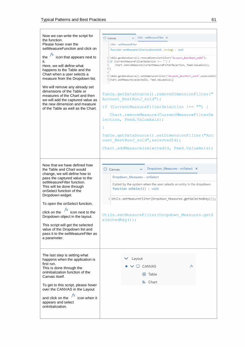
Typical Patterns and Best Practices 61
Now we can write the script for the function. Please hover over the setMeasureFunction and click on
the icon that appears next to it. Here, we will define what happens to the Table and the Chart when a user selects a measure from the Dropdown list. We will remove any already set dimensions of the Table or measures of the Chart and then we will add the captured value as the new dimension and measure of the Table as well as the Chart.
Table.getDataSource().removeDimensionFilter("
Account_BestRunJ_sold");
if (CurrentMeasureFilterSelection !== "") {
Chart.removeMeasure(CurrentMeasureFilterSe
lection, Feed.ValueAxis);
}
Table.getDataSource().setDimensionFilter("Acc
ount_BestRunJ_sold",selectedId);
Chart.addMeasure(selectedId, Feed.ValueAxis);
Now that we have defined how the Table and Chart would change, we will define how to pass the captured value to the setMeasureFilter function. This will be done through onSelect function of the Dropdown widget. To open the onSelect function,
click on the icon next to the Dropdown object in the layout. This script will get the selected value of the Dropdown list and pass it to the setMeasureFilter as a parameter.
Utils.setMeasureFilter(Dropdown_Measures.getS
electedKey());
The last step is setting what happens when the application is first run. This is done through the onInitialization function of the Canvas itself. To get to this script, please hover over the CANVAS in the Layout
and click on the icon when it appears and select onInitialization.
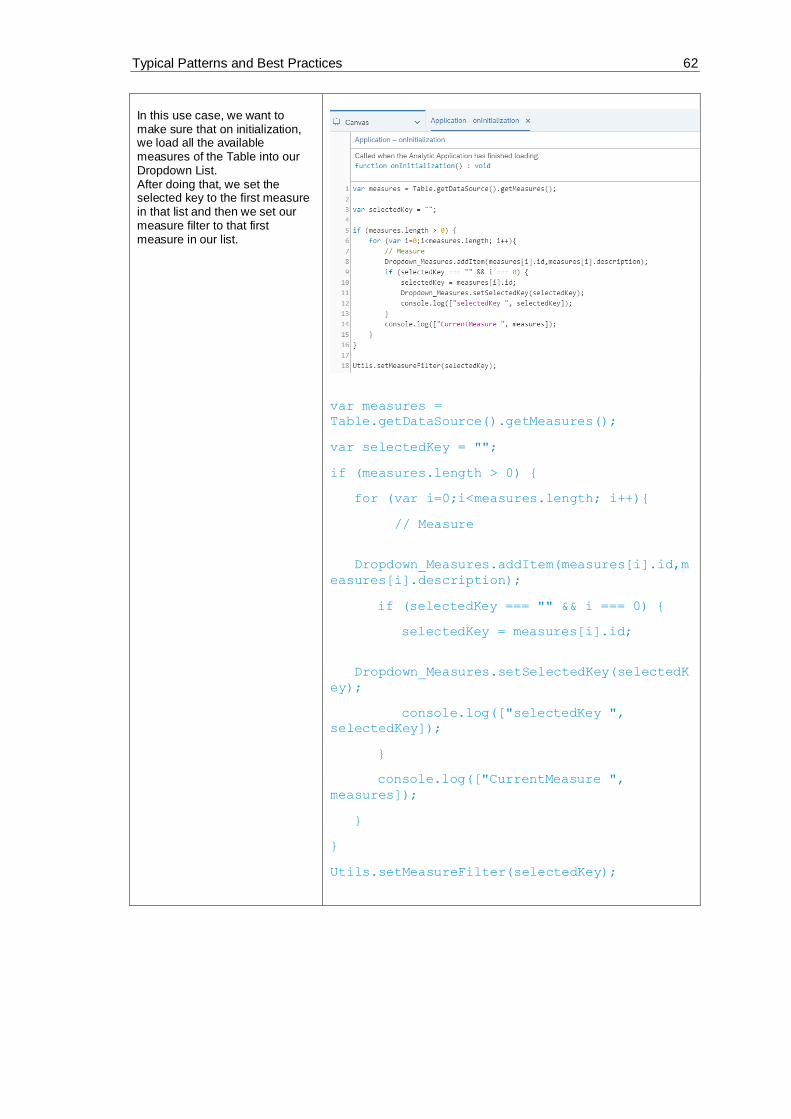
Typical Patterns and Best Practices 62
In this use case, we want to make sure that on initialization, we load all the available measures of the Table into our Dropdown List. After doing that, we set the selected key to the first measure in that list and then we set our measure filter to that first measure in our list.
var measures =
Table.getDataSource().getMeasures();
var selectedKey = "";
if (measures.length > 0) {
for (var i=0;i<measures.length; i++){
// Measure
Dropdown_Measures.addItem(measures[i].id,m
easures[i].description);
if (selectedKey === "" && i === 0) {
selectedKey = measures[i].id;
Dropdown_Measures.setSelectedKey(selectedK
ey);
console.log(["selectedKey ",
selectedKey]);
}
console.log(["CurrentMeasure ",
measures]);
}
}
Utils.setMeasureFilter(selectedKey);

Typical Patterns and Best Practices 63
Now let’s see how it looks like. Save the application and click on Run Analytic Application in the upper right side of the page and the result should look something like this: If you select a measure from the Dropdown list, the values in the Table as well as the Chart (accessed by clicking on the
icon – See “Switching between Table and Chart” exercise) should change accordingly.
• Application when it’s first run:
• Chart with “Gross Margin Plan” as the selected measure:
• Chart with “Discount” as the selected measure:
6.3 Selecting Measures via Dropdown to filter Table and Chart
to display (Multi – Selection)
In this example, we will explore how to filter a Table or a Chart using multiple measures selected
from a Checkbox Group widget.
Unlike a Dropdown box, the Checkbox Group allows using multiple measures as filters. In this
use case, we will add a Checkbox Group widget where we will list all the measures in our data
set. On top of that, there will be three buttons;
• “set selected”: to filter the Table and Chart using the checked measures in the Checkbox,
• “remove all”: to remove all the selected filters, and
• “set all”: to display all the available measures in our Table/Chart

Typical Patterns and Best Practices 64
The result will look like this when we run the application:
Figure 40: Example Application Multi Selection
Prerequisites for this use case is having already added a table and a chart to your canvas. To
have all the functionalities in this use case, please first go through the “Switching between Table
and Chart“ exercise.
To add a Checkbox Group widget to your Canvas, go to the Insert Panel and click on the “+” sign and then choose Checkbox Group. Please place the newly added widget on the left side of your Table in the canvas. We will name the checkbox group CheckboxGroup_Measures. To rename the objects, hover over them
one by one and when the icon appears click on it and choose Rename. Please remove the initial values “Value 1” and “Value 2” from the Checkbox group
Value list. Select and click and then click Apply. This use case assumes that you have a Table and a Chart already set in the Canvas. If you don’t, please go through the Switching between Table and Chart exercise and keep the names as they are in that exercise so that it works here as well.

Typical Patterns and Best Practices 65
We will also add a label so that we can indicate to the user that the Checkbox Group is displaying the measures of our data set. To insert Text, please click again on the “+” icon in the Insert Panel and choose Text.
Place the Text widget on the left side of the Dropdown widget and we can then choose what to write in the Text box we inserted. We can, for example, simple write “Measures”.
Now we want to be able to quickly use the Checkbox Group which is why we will add some buttons that will help us do that. The first button will be a “set selected” button; this will enable us to filter the data according to the selected checkboxes in our Checkbox Group. The second button will be a “Remove all” button; this will be a shortcut button that simplifies removing all the selected measures rather than deselecting them one by one. And the third, and final, button will be a “set all” button which when selected, selects all the measures in the Checkbox Group.

Typical Patterns and Best Practices 66
To add the buttons, go to the “+” icon in the Insert Panel and select Button and add three of them.
After adding the three buttons, we will edit some of their properties. Select the first button and open the Designer (found on upper right part of the Page) and go to the Styling Panel. There, change the name of the button to “Button_setMeasureFilter” and the Text to “set selected”.
Select the second button and open the Designer again and go to the Styling Panel. There, change the name of the button to “Button_removeAllMeasures” and the Text to “Remove all”.

Typical Patterns and Best Practices 67
Select the third button and in the Styling Panel, change the name of the button to “Button_setAllMeasures” and the Text to “set all”
To be able to access the values that have been selected in the Checkbox Group, we need to create variables that can be accessed anywhere in the application. Which is why, we will create 2 Script Variables. The first one will be called “AllMeasures” and we will set it as an array. This variable will hold all the measures that could be selected in the Checkbox Group. To insert this variable, go to SCRIPT VARIABLES under SCRIPTING in the Layout which you can find on the left part of the Page. Click on the “+” icon next to the SCRIPTING VARIABLES which should open a new window where you can change the structure of your variable. There, type in “AllMeasures” in the Name box, select “string” as Type, and set the Set As Array button to “YES”. Click on Done to close the properties’ window.
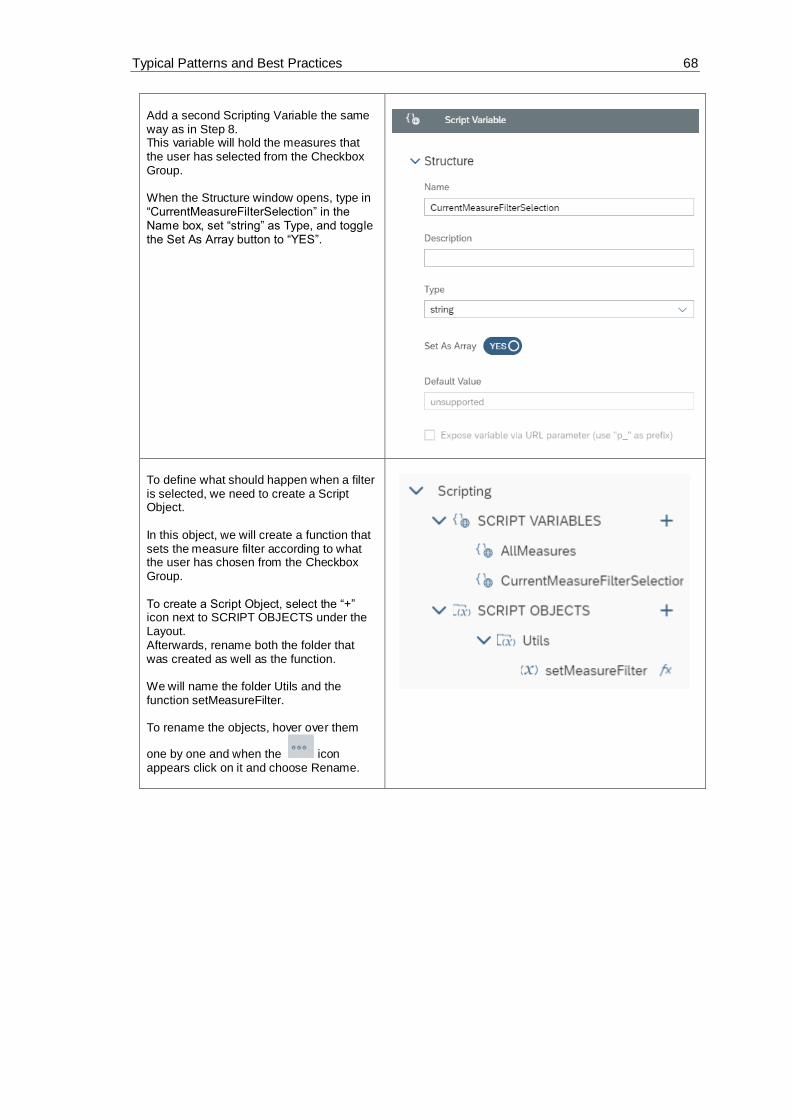
Typical Patterns and Best Practices 68
Add a second Scripting Variable the same way as in Step 8. This variable will hold the measures that the user has selected from the Checkbox Group. When the Structure window opens, type in “CurrentMeasureFilterSelection” in the Name box, set “string” as Type, and toggle the Set As Array button to “YES”.
To define what should happen when a filter is selected, we need to create a Script Object. In this object, we will create a function that sets the measure filter according to what the user has chosen from the Checkbox Group. To create a Script Object, select the “+” icon next to SCRIPT OBJECTS under the Layout. Afterwards, rename both the folder that was created as well as the function. We will name the folder Utils and the function setMeasureFilter. To rename the objects, hover over them
one by one and when the icon appears click on it and choose Rename.

Typical Patterns and Best Practices 69
Click on the function setMeasureFilter and when the Editing window opens, click on the “+” icon next to Arguments. Here, we will add an argument with the name “selectedIds” and the Type string[ ] (array of strings).

Typical Patterns and Best Practices 70
To define what the setMeasureFilter function, that we added in Step 11, does, please go to the function in the Layout,
hover over its name, and click on the icon next to it. The script of this function does the following: Firstly, it removes any dimensions from the Table or measures from the Chart that were added to filter them before. Secondly, it looks to see which measures the user has chosen from the Checkbox Group and adds them as dimensions to the Table/measures for the Chart. Lastly, it takes the selected measures of the user and saves them in the variable we created in Step 9 (CurrentMeasureFilterSelection)
// remove Measures
Table.getDataSource().removeDimensionF
ilter("Account_BestRunJ_sold");
if (CurrentMeasureFilterSelection !==
[""]) {
for (var
i=0;i<CurrentMeasureFilterSelection.le
ngth; i++){
Chart.removeMeasure(CurrentMeasureF
ilterSelection[i], Feed.ValueAxis);
}
}
// add Measures
Table.getDataSource().setDimensionFilt
er("Account_BestRunJ_sold",selectedIds
);
for (i=0;i<selectedIds.length; i++){
Chart.addMeasure(selectedIds[i],
Feed.ValueAxis);
}
// save the current selection into
global variable
CurrentMeasureFilterSelection =
selectedIds;

Typical Patterns and Best Practices 71
Now, we need to define what happens when the buttons we created are clicked. The first button, “set selected” should filter the data according to the selected checkboxes in our Checkbox Group. To edit the onClick function script of the button, you can either hover over it in the
Layout and click on the icon or you can click on the button in the canvas and
similarly select
In the script of the onClick function, we will call the Utils.setMeasureFilter function and pass to it the selected measures of the Checkbox Group.
Utils.setMeasureFilter(CheckboxGroup_M
easures.getSelectedKeys());
The second button, “Remove all”, removes all the selected measures from the Checkbox Group. Open the script of the button like in step 13 and here, we will remove all the selected measures from the Checkbox Group itself and also pass an empty array to the Utils.setMeasureFilter so that our Table and Chart as well as our global variable CurrentMeasureFilterSelection will be updated.
CheckboxGroup_Measures.setSelectedKeys
([""]);
Utils.setMeasureFilter([""]);

Typical Patterns and Best Practices 72
The third button, “set all”, selects all the measures in the Checkbox Group. In the script of this button, we will set the selected keys of the Checkbox Group to the AllMeasures script variable we had defined before and we will pass the same variable to the Utils.setMeasureFilter function.
CheckboxGroup_Measures.setSelectedKeys
(AllMeasures);
Utils.setMeasureFilter(AllMeasures);
The last step is setting what happens when the application is first run. This is done through the onInitialization function of the Canvas itself. To get to this script, please hover over the CANVAS in the Layout and click on the
icon when it appears and select onInitialization.
In this use case, we want to make sure that on initialization, we get all the available measures of the Table’s data source. Then, we define a selected keys array of type string and using a loop, we add the measures to our Checkbox Group and the selected keys array. We also call on the setSelectedKeys function of the Checkbox Group and set its selected keys to our array. Finally, we set the script variable AllMeasures and the measure filter to the selected keys.
// get all measures from the table
data source
var measures =
Table.getDataSource().getMeasures();

Typical Patterns and Best Practices 73
// define array or the selected Keys
var selectedKeys =
ArrayUtils.create(Type.string);
if (measures.length > 0) {
for (var i=0;i<measures.length;
i++){
// add the Measure to checkbox
group
CheckboxGroup_Measures.addItem(meas
ures[i].id,measures[i].description);
//add the measure to the
selecedKeys
selectedKeys.push(measures[i].id);
CheckboxGroup_Measures.setSelectedK
eys(selectedKeys);
console.log(["CurrentMeasure ",
measures]);
}
}
console.log(["selectedKey ",
selectedKeys]);
AllMeasures = selectedKeys;
Utils.setMeasureFilter(selectedKeys);
Now let’s see how it looks like. Click on Run Analytic Application in the upper right side of the page and the result should look something like this: If we click on the “Remove all” button, all measures are deselected and there is no Table (or Chart -> accessed through the
icon) to look at. If we click on “set all”, all measures are selected again and the Table (or Chart) looks like when we first ran the application. Let us only select a few measures and see how the Table will change. In the screenshot on the right, 4 measures are chosen (Gross Margin Plan, Quantity
• Application when it’s first run:
• Table after clicking on “Remove all”:

Typical Patterns and Best Practices 74
Sold, Original Sales Price abs Dev, and Discount). After selecting the measures, please click on “set selected” to update the Table/Chart with your chosen measures.
• Table after clicking on “set all”:
• Table after selecting specific measures:
6.4 Using Filterline for filtering Table, Chart and R
Visualization:
In this example, we will explore how to filter a Table, a Chart or an R Visualization using a Filter
Line widget.
Instead of loading all the dimensions in our data set into a Checkbox group or a Dropdown widget,
in this use case, we will select specific dimensions to load into a filter line.
Unlike other data bound widgets (such as Table or Chart), R Visualization can add multiple input
data models. To support R Visualization in Filter Line, one dropdown list is added to select the
connected input data.

Typical Patterns and Best Practices 75
Figure 41: Choose Input Data for Filtering R Visualization
After the user selects an input data model of the R Visualization widget, the Filter Line can support
R Visualization just like other widgets.
After loading the desired dimensions into our filter line, we will connect it to our Table/Chart/R
Visualization so that the data is filtered using the selected filter.
To use the filter line after running the application, simply click on the filter line icon and select the
dimension you want to use to filter your data.
The result will look like this when we run the application:
Figure 42: Example Application Filterline
And this is how it will look like when we click on our Filter line widget:

Typical Patterns and Best Practices 76
Figure 43: Select Filterline
Prerequisites for this use case is having already added a table and a chart to your canvas. To
have all the functionalities in this use case, please first go through the “Switching between Table
and Chart“ exercise.
To add a Filter Line widget to your Canvas, go to the Insert Panel and click on the “+” sign and then choose Filter Line. Please place the newly added widget above the Table. We will name the filterline FilterLine. To rename the objects, hover over them one by one and when
the icon appears click on it and choose Rename. This use case assumes that you have a Table and a Chart already set in the Canvas. If you don’t, please go through the Switching between Table and Chart exercise and keep the names as they are in that exercise so that it works here as well.
After adding the Filter Line, we need to set its properties. We can do that by selecting the Filter Line we added to our canvas and afterwards, clicking on the Designer button. You can find this button on the upper right side of the screen. There, navigate over to the Builder Panel.

Typical Patterns and Best Practices 77
In the Builder Panel, we will set the structure of the Filter Line. We will set the source widget as the Table. This is done by going to Source Widget and choosing “Table” from the Dropdown List.
Now we will add the filters we want: In this use case we want the user to be able to filter on 4 dimensions: Location, Product, Sales Manager, and Store. We can add these by going to the Dimension Selection part and clicking Add Dimension and selecting all 4 when the Checklist comes up.

Typical Patterns and Best Practices 78
In step 3 we needed to select a source widget for our Filter Line and we chose the Table, however, in our application we give the user the option to toggle between Table and Chart using
the and respectively (please refer to the “Switching between Table and Chart” Exercise). This means that we have to find a way to get the filter that’s been applied to the Table so that we can apply that on our Chart too.
To do that, click on the next to the Table in the Layout and choose onResultChanged.
In the script of the onResultChanged function, we will copy the dimension filters from the Table. We do the copying 4 times for each of the measures we had added in the Dimension Selection part (in step 4).
console.log('OnResultChanged');
Chart.getDataSource().copyDimensionFilterFrom(
Table.getDataSource(), "Location_4nm2e04531");
Chart.getDataSource().copyDimensionFilterFrom(
Table.getDataSource(), "Product_3e315003an");
Chart.getDataSource().copyDimensionFilterFrom(
Table.getDataSource(),
"Sales_Manager__5w3m5d06b5");
Chart.getDataSource().copyDimensionFilterFrom(
Table.getDataSource(),
"Store_3z2g5g06m4.Store_GEOID");
Now let’s see how it looks like. Click on Run Analytic Application in the upper right side of the page and the result should look something like this:

Typical Patterns and Best Practices 79
When you click on the Filter Line, the 4 measures we added pop up. When one of the measures in the Filterline is clicked, a pop-up window comes up and we get to choose which cities (locations), products, sales managers, and stores do we want to include in our Table or Chart.
If we were to choose San Francisco, Las Vegas, and Portland as our members, the table would update according to that filter. And the Chart will be updated as
well (Click the icon to get the view of the Chart
• Location is selected

Typical Patterns and Best Practices 80
6.5 Cascaded Filtering
In this example, we will explore how to do cascaded filtering; meaning filtering on dimensions and
then filtering according to hierarchies (such as Flat Presentation, ABC, …) to choose how to
display the data.
We will add two Dropdown Lists, one for filtering Dimension and the other for filtering Hierarchies
and depending on what Dimension we choose to filter on, the Dropdown List for the Hierarchies
filters will change.
There is always one consistent filter for Hierarchies which is Flat Presentation and according to
our chosen Dimension, we might either only have that one or have more options.
For example, if we are filtering on Location, we have two choices for Hierarchies; Flat Presentation
and according to States, however, if we are filtering on Product, we have Flat Presentation,
Category, or ABC (this one categorizes the dimension as “worst-selling”, “medium-selling”, or
“best-selling”), and if we are filtering on Store or Sales Manager, our only option is Flat
Presentation.
The different filters can be chosen by simply selecting them from the Dropdown lists we added.
The result will look like this when we run the application:
Figure 44: Example Application Cascading Filtering
Prerequisites for this use case is having already added a table and a chart to your canvas. To
have all the functionalities in this use case, please first go through the “Switching between Table
and Chart“ exercise.

Typical Patterns and Best Practices 81
To add a Dropdown widget for the List of Dimensions and one for the Hierarchies, we need to go to the Insert Panel, click on the “+” icon, and choose Dropdown. Please insert two widgets into your Canvas and position them on the same level above the Table. We will name the dropdown Dropdown_Dimensions. To rename the objects, hover over
them one by one and when the icon appears click on it and choose Rename. Add the second Dropdown widget for the Hierarchies we will name Dropdown_Hierarchies. This use case assumes that you have a Table and a Chart already set in the Canvas. If you don’t, please go through the Switching between Table and Chart exercise and keep the names as they are in that exercise so that it works here as well.
Go into the Builder properties of the Dimensions Dropdown widget (through the Designer button on the upper right side of the screen). Here, we will add the values that the user can choose from the widget. Add values by clicking on the “+” icon. We will set Location to our default value. After entering all the values, click on “Apply” to save the changes.
Location_4nm2e04531 Location
Product_3e315003an Product
Store_3z2g5g06m4 Store
Sales_Manager__5w3m5d06b5 Sales Manager

Typical Patterns and Best Practices 82
To be able to distinguish the Dropdown List of the Dimensions and the one of the Hierarchies, we need to have labels for both. To add a Label, please click again on the “+” icon, insert two Text widgets, and place them on the left side of each of the Dropdown Lists we added in the previous step.
Now, we will set the properties of the labels we added. Double click on the first label and type “Dimension” And then go into the Designer Styling Panel of the label. There, we will set the name of the Label that we will use if we need to reference this widget in a script. Please, insert the name “Dropdown_Dimensions_Label”
We will do the same for our second label. Double click on the first label and type “Hierarchies” And then go into the Designer Styling Panel of the label and Insert “Dropdown_Hierarchies_Label” as its Name.
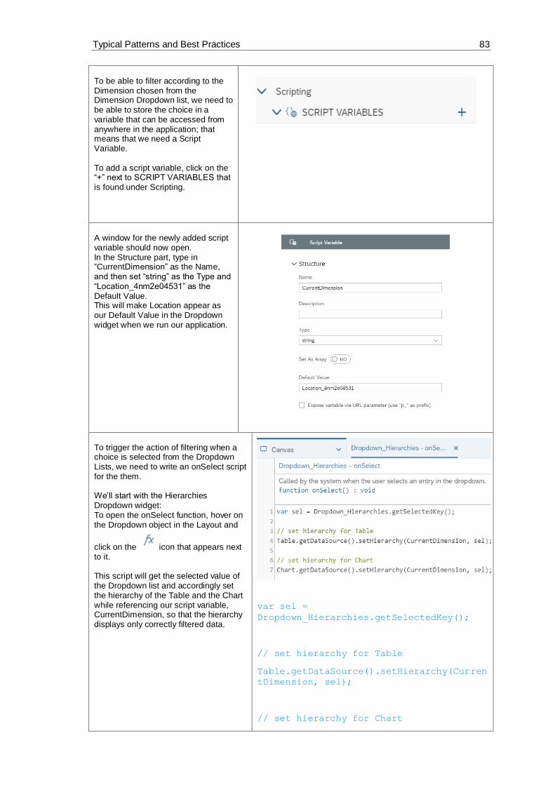
Typical Patterns and Best Practices 83
To be able to filter according to the Dimension chosen from the Dimension Dropdown list, we need to be able to store the choice in a variable that can be accessed from anywhere in the application; that means that we need a Script Variable. To add a script variable, click on the “+” next to SCRIPT VARIABLES that is found under Scripting.
A window for the newly added script variable should now open. In the Structure part, type in “CurrentDimension” as the Name, and then set “string” as the Type and “Location_4nm2e04531” as the Default Value. This will make Location appear as our Default Value in the Dropdown widget when we run our application.
To trigger the action of filtering when a choice is selected from the Dropdown Lists, we need to write an onSelect script for the them. We’ll start with the Hierarchies Dropdown widget: To open the onSelect function, hover on the Dropdown object in the Layout and
click on the icon that appears next to it. This script will get the selected value of the Dropdown list and accordingly set the hierarchy of the Table and the Chart while referencing our script variable, CurrentDimension, so that the hierarchy displays only correctly filtered data.
var sel =
Dropdown_Hierarchies.getSelectedKey();
// set hierarchy for Table
Table.getDataSource().setHierarchy(Curren
tDimension, sel);
// set hierarchy for Chart

Typical Patterns and Best Practices 84
Chart.getDataSource().setHierarchy(Curren
tDimension, sel);
In this step, we will edit the onSelect script of the Dimensions Dropdown widget: To open the onSelect function, hover on the Dropdown object in the Layout and
click on the icon that appears next to it. This script will get the selected choice from the Dimensions Dropdown List and save it in a variable called sel. The next step is to remove all the dimensions from the Table and Chart and set the selected dimension as the new dimension. Then, from our data, we will get all the hierarchies that are available for that selected dimension, remove the hierarchies that are written now in the Hierarchies Dropdown List and loop over the available hierarchies for this selected dimension. Lastly, we set Flat Presentation as the default hierarchy and filter our Table and Chart with the selected Dimension.
var sel =
Dropdown_Dimensions.getSelectedKey();
// Table
Table.removeDimension(CurrentDimension);
Table.addDimensionToRows(sel);
//Chart

Typical Patterns and Best Practices 85
Chart.removeDimension(CurrentDimension,
Feed.CategoryAxis);
Chart.addDimension(sel,
Feed.CategoryAxis);
// write filter information into the
browser console
console.log( ['CurrentDimension: ',
CurrentDimension ]);
console.log( ['Selection: ', sel ]);
// save the current selection (dimension)
into a global variable
CurrentDimension = sel;
// get hierarchies from the current
dimension
var hierarchies =
Table.getDataSource().getHierarchies(Curr
entDimension);
var flag = true;
// remove all current items form the
Dropdown_Hierarchies
Dropdown_Hierarchies.removeAllItems();
// loop
for (var i=0;i<hierarchies.length; i++){
if (hierarchies[i].id === '__FLAT__')
{
Dropdown_Hierarchies.addItem(hierarchi
es[i].id, 'Flat Presentation');
}
else {
Dropdown_Hierarchies.addItem(hierarchi
es[i].id, hierarchies[i].description);
if (flag === true) {
var hierarchy =
hierarchies[i].id;
flag = false;
}

Typical Patterns and Best Practices 86
}
}
// write hierarchy information to browser
console
console.log( ['Hierarchy: ', hierarchy
]);
console.log( ['Current Dimension: ',
CurrentDimension ]);
// set Flat Hierarchie als Default
Dropdown_Hierarchies.setSelectedKey('__FL
AT__');
// Table
Table.getDataSource().setHierarchy(Curren
tDimension, '__FLAT__');
// Chart
Chart.getDataSource().setHierarchy(Curren
tDimension, '__FLAT__');
The last step is setting what happens when the application is first run. This is done through the onInitialization function of the Canvas itself. To get to this script, please hover over the CANVAS in the Layout and click on
the icon when it appears and select onInitialization.

Typical Patterns and Best Practices 87
In this use case, we want to make sure that on initialization, we load all the available hierarchies of the dimensions and set Flat Presentation as the default of the Hierarchies Dropdown List. The script for this part is the same as some of what happens when a dimension is chosen.
// get hierarchies from the current
dimension
var hierarchies =
Table.getDataSource().getHierarchies(Curr
entDimension);
var flag = true;
// loop
for (var i=0;i<hierarchies.length; i++){
if (hierarchies[i].id === '__FLAT__')
{
Dropdown_Hierarchies.addItem(hierarchi
es[i].id, 'Flat Presentation');
}
else {
Dropdown_Hierarchies.addItem(hierarchi
es[i].id, hierarchies[i].description);
if (flag === true) {
var hierarchy =
hierarchies[i].id;
flag = false;
}
}
}

Typical Patterns and Best Practices 88
// write hierarchy information to browser
console
console.log( ['Hierarchy: ', hierarchy
]);
console.log( ['Current Dimension: ',
CurrentDimension ]);
// set Flat Hierarchie als Default
Dropdown_Hierarchies.setSelectedKey('__FL
AT__');
//Table
Table.getDataSource().setHierarchy(Curren
tDimension, '__FLAT__');
//Chart
Chart.getDataSource().setHierarchy(Curren
tDimension, '__FLAT__');
Now let’s see how it looks like. Click on Run Analytic Application in the upper right side of the page and the result should look something like this: If we keep the dimension on “Location” but change the hierarchy to “States”, the Table would change to display the location according to the states we have. Now, if we change the dimension to “Product” and set the hierarchy to “Category”, we will see the different categories of products displayed.

Typical Patterns and Best Practices 89
6.6 Add and remove dimension in rows and columns for Table
In this example, we will, through Checkbox Groups, control which measures as well as which
dimensions are displayed in the Table.
The user can select which measures they would like displayed in the Table through the Measures
Checkbox and then through another Checkbox, they could decide which dimensions they want
displayed on the Columns or the Rows of the Table.
The application also makes it easier for the user to select all or remove all measures by adding
buttons specifically for that purpose.
They can also remove the dimensions that they added to the columns and rows and are able to
choose to add them again afterwards.
The result will look like this when we run the application:
Figure 45: Add and remove Dimensions
This application assumes that there already is a Table in your Canvas. To match the scripts in
the application it is recommended to rename the widget to “Table”.

Typical Patterns and Best Practices 90
We will start by adding 5 Checkbox Groups. The first one will display all the available measures and the user can choose which ones they want to see in the Table, the second one will display the dimensions we want our Columns to be filtered on, while the third does the same but for our Rows. The fourth Checkbox Group will display the dimensions that we could add to the second and third Checkbox. Place the first four Checkbox Groups under each other on the left side of the Table. (as shown in the screenshot). The fifth Checkbox Group will get the selected dimensions of the fourth Checkbox and order the Checkboxes according to the selections while also taking care that there aren’t any repetitions in any of the other Checkbox Groups. To start off, please click on the “+” icon in the Insert Panel and choose Checkbox Group and place on the left side of the Table.

Typical Patterns and Best Practices 91
Go to the Designer of the first Checkbox (by clicking on Designer on the upper right side of the screen) and switch to the Styling
Panel by clicking on the button. There, please enter “CheckboxGroup_Measures” as the Name and choose “Vertical Layout” as the Display Option.
Switch over to the Builder Panel of the same widget and delete the values in the Table. Simply select the value and click on
the icon to delete it. Afterwards, click on Apply to save the changes.
We will do the same for the other Checkbox Groups. Please add four new Checkbox Groups; for the first enter “CheckboxGroup_Columns”, for the second enter “CheckboxGroup_Rows”, for the third enter “CheckboxGroup_Free”, and for the last enter “CheckboxGroup_AllDimensions” as the Name. Choose “Vertical Layout” as the Display Option for all of them. Place the three Checkbox Groups under each other on the left side of the Table, under the Measure Checkbox, in the order in which we inserted them (as described before).

Typical Patterns and Best Practices 92
Please place the last checkbox as indicated in the screenshot on the right or somewhere in the canvas (the place is not important because the checkbox will be hidden). After editing these values, go to the Builder Panel of each of the Checkbox Groups and delete the values that are there like we did in the first Checkbox Group.
To be able to distinguish the Checkbox Groups from each other, we need to have labels for four of them. (We don’t need a label for the All Dimensions Checkbox because it won’t be visible at view time) To add a Label, please click again on the “+” icon, insert four Text widgets, and place each one of them above each of the Checkbox Groups we added.

Typical Patterns and Best Practices 93
Now, we will set the properties of the labels we added. Double click on the first label and type “Measures” And then go into the Designer Styling Panel of the label. There, we will set the name of the Label that we will use if we need to reference this widget in a script. Please, insert the name “CheckboxGroup_Measures_Label”
We will do the same for our second label. Double click on the first label and type “Columns” And then go into the Designer Styling Panel of the label and insert “CheckboxGroup_Columns_Label” in its Name field.
Navigate towards the third label and there: Double click on the first label and type “Rows” And then go into the Designer Styling Panel of the label and Insert the Name “CheckboxGroup_Rows_Label”.

Typical Patterns and Best Practices 94
Finally, we will edit our fourth label. Double click on the first label and type “Free” And then go into the Designer Styling Panel of the label and insert the name “CheckboxGroup_Free_Label” as its Name.
Now, we need to set the AllDimensions Checkbox to invisible at view time because we only need it to sort our dimensions as you’ll see later in the exercise. Go into the Styling Panel in the Designer of the CheckboxGroup_AllDimensions and uncheck Show this item at view time
Now, we will add all the buttons, we need, to control our choices from the Checkbox Groups. To add our first button, please click on the “+” icon and insert a Button and place it between the Measures Label and its Checkbox Group.

Typical Patterns and Best Practices 95
To edit the button, click on it and go to the Styling Panel in the Designer. For the Name, enter “Button_setMeasureFilter” and for the Text enter “set selected”. This button will set the measures we choose from the Measures Checkbox as measures for our Table.
Now, we will do the same for all the buttons we need. Add a new button and place it next to the first one. For this button, enter “Button_removeAllMeasures” for the Name and “Remove all” for the Text. This button will be used to uncheck all the measures from the Measures Checkbox Group and set the measure filters for the Table to empty.
Add a third button and place it next to the second one. For this button, enter “Button_setAllMeasures” for the Name and “set all” for the Text. This button will be used to set all the available measures as measures for our Table.
Add a new button and place it next to the “Columns” Label. This button’s Name will be set to “Button_ColRemove” and its Text will read “Remove” and it will be used to remove the dimensions that the user selects in the Columns Checkbox from the Checkbox as well as from the columns of our Table.

Typical Patterns and Best Practices 96
Next to the Rows Label, insert a new button and enter the Name “Button_RowRemove” and the Text “Remove” in its properties’ settings. This button will be used to remove the dimensions that the user selects in the Rows Checkbox from the Checkbox as well as the rows of our Table.
Next to the Free Label we will add two buttons; for the first, insert a new button and enter the Name “Button_AddToCol” and the Text “add to Column” in its properties’ settings. When this button is clicked, the selected dimensions from the Free Checkbox Group will be added as dimensions of the Table’s Columns.
Next to the previous button, please add another button and enter “Button_AddToRow” for the Name and “add to Row” for the Text. When this button is clicked, the selected dimensions from the Free Checkbox Group will be added as dimensions to the Rows in the Table.
Please compare your Canvas to the screenshot on the right and make sure they look alike. We will not add a label for the last Checkbox Group (All Dimensions) since it is there to simply help us set the dimensions in the Columns, Rows, and Free Checkboxes so that there are no repetitions.
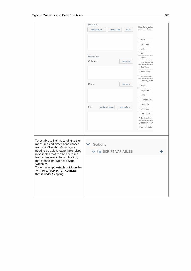
Typical Patterns and Best Practices 97
To be able to filter according to the measures and dimensions chosen from the Checkbox Groups, we need to be able to store the choices in variables that can be accessed from anywhere in the application; that means that we need Script Variables. To add a script variable, click on the “+” next to SCRIPT VARIABLES that is under Scripting.

Typical Patterns and Best Practices 98
A window for the newly added script variable should now open. In the Structure part, type in “AllDimensions” as the Name, and then set “string” as the Type and toggle the Set As Array button to Yes. This variable will hold all the dimensions in our data set.
Now, we will add a second script variable that will hold all the measures of our data set. Add a new variable like we did in the previous 2 steps. In the name field insert “AllMeasures”, set the Type to “string”, and toggle the Set As Array button to Yes.
To be able to implement the selected dimensions in our Columns and Rows, we need to save these in a script variable. Firstly, we will insert a script variable to hold the selected dimensions that we have chosen to add to our Columns. Add a new script variable and enter “CurrentDimensionColumn” in the Name field, set string as Type, and toggle the Set As Array button to Yes.

Typical Patterns and Best Practices 99
To hold the selected dimensions, we have chosen to add to our Rows, we will insert a new script variable. Type “CurrentDimensionRows” in the Name field, set the Type to string, and toggle the Set As Array button to Yes.
Our final script variable will hold the measure(s) we have selected from the Measures Checkbox Group. Insert a new script variable and set the Name to “CurrentMeasureFilterSelection”, the Type to string, and the Set As Array to Yes.
To define what should happen when a dimension or a measure is chosen, we need to create a Script Object. In this object, we will create a function that sets the measure filter according to what the user has chosen from the Measures Checkbox Group and another function that sets the dimensions according to what the user has chosen from the Free Checkbox Group. To create a Script Object, select the “+” icon next to SCRIPT OBJECTS under the Layout. This will add only one script function to the script object. To add a second one, hover over
the folder created, click on the icon when it appears and click on “+ Add Script Function”. Rename all the added elements as the following: We will name the folder Utils, the first function

Typical Patterns and Best Practices 100
setDimensionCheckboxes and the second function setMeasureFilter. To rename the objects, hover over them one by one and when the
icon appears click on it and choose Rename.
Click on the function setDimensionCheckboxes and set the Return Type to void.
Click on the function setMeasureFilter and when the Properties window opens, set the Return Type to void and click on the “+” icon next to Arguments. There, add an argument with the name “selectedIds” and the type string[] (string array).

Typical Patterns and Best Practices 101
Now, we can write the script for the functions.
Please click on the icon next to the setDimensionCheckboxes function. Here, we will define what happens when a user selects dimensions from the Free Checkbox Group to be added to the Columns or the Rows. Firstly, we will remove all items from the Column, Rows, and Free Checkboxes. Then, we will call on the create function of the script variables and create two new string arrays and save one in our CurrentDimensionColumn script variable and the other in the CurrentDimensionRows script variable. Afterwards, we get the dimensions that are now on the Table’s columns and push each on into the string array of CurrentDimensionColumn. We then do the same for the Rows, this time pushing the row dimensions into the string array of CurrentDimensionRows. We then get all the dimensions and we will see which dimensions were chosen from the AllDimensionsCheckbox. Next, we will add these dimensions to our Free Checkbox but remove the ones that are in the Rows or Columns Checkboxes so that we

Typical Patterns and Best Practices 102
don’t have any repetitions between the three Checkboxes.
CheckboxGroup_Columns.removeAllItems();
CheckboxGroup_Rows.removeAllItems();
CheckboxGroup_Free.removeAllItems();
CurrentDimensionColumn =
ArrayUtils.create(Type.string);
CurrentDimensionRows =
ArrayUtils.create(Type.string);
console.log(["CurrentDimensionColumn
should empty",
CurrentDimensionColumn.slice()]);
console.log(["CurrentDimensionRows should
empty", CurrentDimensionRows.slice()]);
// Dimension in Columns
var dimCol =
Table.getDimensionsOnColumns();
if (dimCol.length > 0) {
for (var i=0;i<dimCol.length; i++){
CurrentDimensionColumn.push(dimCol[i].id);
console.log(["CurrentDimensionColumn ",
dimCol[i].id]);
}
}
// Dimension in Rows
var dimRows = Table.getDimensionsOnRows();

Typical Patterns and Best Practices 103
if (dimRows.length > 0) {
for (i=0;i<dimRows.length; i++){
CurrentDimensionRows.push(dimRows[i].id);
console.log(["CurrentDimensionRows ",
dimRows[i].id]);
}
}
// get all Dimensions
if (AllDimensions.length > 0) {
for (i=0;i<AllDimensions.length; i++){
if (AllDimensions[i] !== "") {
CheckboxGroup_AllDimensions.setSelectedKey
s([AllDimensions[i]]);
var dimdesc =
CheckboxGroup_AllDimensions.getSelectedTex
ts();
CheckboxGroup_Free.addItem(AllDimensions[i
],dimdesc[0]);
console.log(["AllDimensions",AllDimensions
[i], dimdesc[0]]);
}
}
}
console.log(["CurrentDimensionColumn",
CurrentDimensionColumn]);
console.log(["CurrentDimensionRows",
CurrentDimensionRows]);
// remove the dimensions from the free
list, which are in rows / columns
if (CurrentDimensionRows.length > 0) {
for (i=0;i<CurrentDimensionRows.length;
i++){
if (CurrentDimensionRows[i] !== "") {
CheckboxGroup_Free.setSelectedKeys([Curren
tDimensionRows[i]]);
dimdesc =
CheckboxGroup_Free.getSelectedTexts();
CheckboxGroup_Rows.addItem(CurrentDimensio
nRows[i],dimdesc[0]);

Typical Patterns and Best Practices 104
CheckboxGroup_Free.removeItem(CurrentDimen
sionRows[i]);
}
}
}
if (CurrentDimensionColumn.length > 0) {
for (i=0;i<CurrentDimensionColumn.length;
i++){
if (CurrentDimensionColumn[i] !== "") {
CheckboxGroup_Free.setSelectedKeys([Curren
tDimensionColumn[i]]);
dimdesc =
CheckboxGroup_Free.getSelectedTexts();
CheckboxGroup_Columns.addItem(CurrentDimen
sionColumn[i],dimdesc[0]);
CheckboxGroup_Free.removeItem(CurrentDimen
sionColumn[i]);
}
}
}
Now, we will do the same for the setMeasureFilter function. Click on
the icon next to the setMeasureFilter function and there, we will define what happens to the Table when a user selects a measure from the Dropdown list. We will remove any already set dimension filter of the Table and then we will add the selectedIds as the new dimension(s) of the Table. Finally, we will save the selected measures in our CurrentMeasureFilterSelection script variable.
// remove Measures
Table.getDataSource().removeDimensionFilte
r("Account_BestRunJ_sold");
// add Measures
Table.getDataSource().setDimensionFilter("
Account_BestRunJ_sold",selectedIds);
// save the current selection into global
variable
CurrentMeasureFilterSelection =
selectedIds;

Typical Patterns and Best Practices 105
To trigger an action when our buttons are clicked, we need to write onClick scripts for the them. Let’s start with the first button, setMeasureFilter (Text: set selected). Click on the button in your Canvas
and select the icon.
In the script of this button, we will get the selected keys of the Measures Checkbox and using the function Utils.setMeasureFilter, we will set them as the measure filters for our table.
Utils.setMeasureFilter(CheckboxGroup_Measu
res.getSelectedKeys());
Next, we will edit the onClick script of the second button, removeAllMeasures (Text: Remove All). Click on the button in your Canvas
and select the icon. Here, we will set the selected keys and the measure filter to empty arrays.
CheckboxGroup_Measures.setSelectedKeys([""
]);
Utils.setMeasureFilter([""]);
The script of the third button, Button_setAllMeasures (Text: set all), will set the selected keys of the Checkbox Group to the script variable AllMeasures and use the Utils.setMeasureFilter function to set the measure filter to all measures.
CheckboxGroup_Measures.setSelectedKeys(All
Measures);
Utils.setMeasureFilter(AllMeasures);
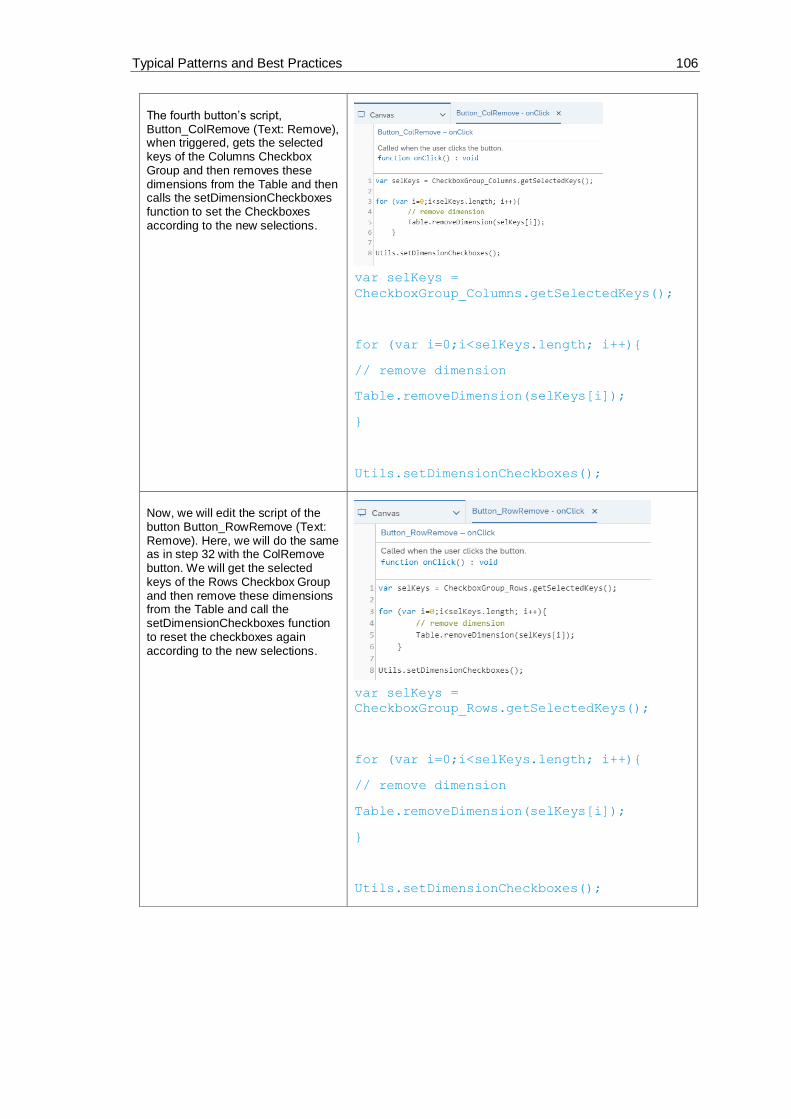
Typical Patterns and Best Practices 106
The fourth button’s script, Button_ColRemove (Text: Remove), when triggered, gets the selected keys of the Columns Checkbox Group and then removes these dimensions from the Table and then calls the setDimensionCheckboxes function to set the Checkboxes according to the new selections.
var selKeys =
CheckboxGroup_Columns.getSelectedKeys();
for (var i=0;i<selKeys.length; i++){
// remove dimension
Table.removeDimension(selKeys[i]);
}
Utils.setDimensionCheckboxes();
Now, we will edit the script of the button Button_RowRemove (Text: Remove). Here, we will do the same as in step 32 with the ColRemove button. We will get the selected keys of the Rows Checkbox Group and then remove these dimensions from the Table and call the setDimensionCheckboxes function to reset the checkboxes again according to the new selections.
var selKeys =
CheckboxGroup_Rows.getSelectedKeys();
for (var i=0;i<selKeys.length; i++){
// remove dimension
Table.removeDimension(selKeys[i]);
}
Utils.setDimensionCheckboxes();

Typical Patterns and Best Practices 107
The fifth button, Button_AddToCol (Text: add to Column) will, when clicked on, get the selected keys of the Free Checkbox and add the dimensions to the column of the Table. The script will then call the setDimensionCheckboxes function to set the Checkboxes to the new selection.
var selKeys =
CheckboxGroup_Free.getSelectedKeys();
for (var i=0;i<selKeys.length; i++){
// add dimension to Column in table
Table.addDimensionToColumns(selKeys[i]);
}
Utils.setDimensionCheckboxes();
The script of the last button, Button_AddtRow (Text: add to Row), will get the selected keys of the Free Checkbox and add the dimensions to the Rows of the Table, and then, same as the previous script, it will call the setDimensionCheckboxes function to set the Checkboxes to the new selection.
var selKeys =
CheckboxGroup_Free.getSelectedKeys();
for (var i=0;i<selKeys.length; i++){
// remove dimension
Table.addDimensionToRows(selKeys[i]);
}
Utils.setDimensionCheckboxes();
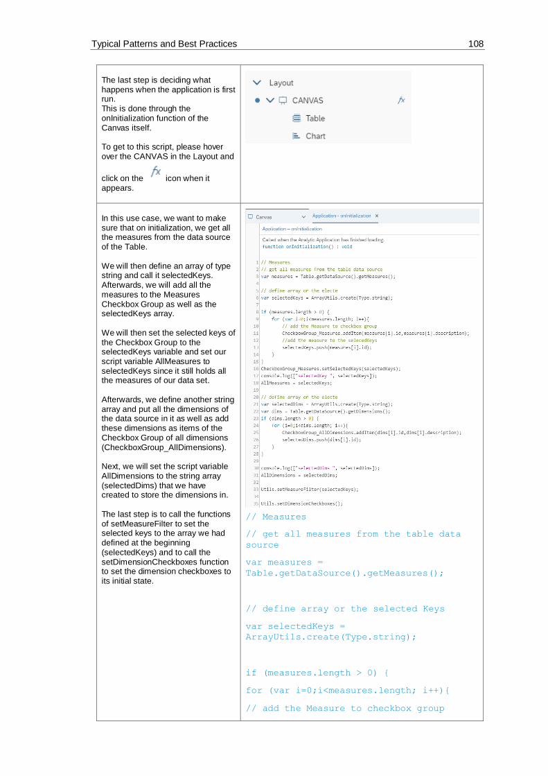
Typical Patterns and Best Practices 108
The last step is deciding what happens when the application is first run. This is done through the onInitialization function of the Canvas itself. To get to this script, please hover over the CANVAS in the Layout and
click on the icon when it appears.
In this use case, we want to make sure that on initialization, we get all the measures from the data source of the Table. We will then define an array of type string and call it selectedKeys. Afterwards, we will add all the measures to the Measures Checkbox Group as well as the selectedKeys array. We will then set the selected keys of the Checkbox Group to the selectedKeys variable and set our script variable AllMeasures to selectedKeys since it still holds all the measures of our data set. Afterwards, we define another string array and put all the dimensions of the data source in it as well as add these dimensions as items of the Checkbox Group of all dimensions (CheckboxGroup_AllDimensions). Next, we will set the script variable AllDimensions to the string array (selectedDims) that we have created to store the dimensions in. The last step is to call the functions of setMeasureFilter to set the selected keys to the array we had defined at the beginning (selectedKeys) and to call the setDimensionCheckboxes function to set the dimension checkboxes to its initial state.
// Measures
// get all measures from the table data
source
var measures =
Table.getDataSource().getMeasures();
// define array or the selected Keys
var selectedKeys =
ArrayUtils.create(Type.string);
if (measures.length > 0) {
for (var i=0;i<measures.length; i++){
// add the Measure to checkbox group

Typical Patterns and Best Practices 109
CheckboxGroup_Measures.addItem(measures[i]
.id,measures[i].description);
//add the measure to the selected Keys
selectedKeys.push(measures[i].id);
}
}
CheckboxGroup_Measures.setSelectedKeys(sel
ectedKeys);
console.log(["selectedKey ",
selectedKeys]);
AllMeasures = selectedKeys;
// define array or the selected Keys
var selectedDims =
ArrayUtils.create(Type.string);
var dims =
Table.getDataSource().getDimensions();
if (dims.length > 0) {
for (i=0;i<dims.length; i++){
CheckboxGroup_AllDimensions.addItem(dims[i
].id,dims[i].description);
selectedDims.push(dims[i].id);
}
}
console.log(["selectedDims ",
selectedDims]);
AllDimensions = selectedDims;
Utils.setMeasureFilter(selectedKeys);
Utils.setDimensionCheckboxes();

Typical Patterns and Best Practices 110
Now let’s see how it looks like. Click on Run Analytic Application in the upper right side of the page and the result should look something like this: If we add the Time to the Columns Checkbox (select it in the Free Checkbox and click on add to Column), we will see that the dimension has been added and we can now see in more details what happened in which year regarding every measure. Now, if we also add the dimension Location to the Rows, we will see the columns being filtered on the Time and the rows on the Location. Finally, we can try to remove dimensions from the Rows and leave the Columns as we had them in the previous screenshot. (Note: We cannot remove all the dimensions from the Columns because we must filter on at least one dimension)

Typical Patterns and Best Practices 111
6.7 Creating a Settings Panel using a Popup Window
In this example, we will see how to use a popup window widget to create a setting panel where the
user could control the contents of the Table and Chart in the Canvas.
In this use case, we want to be able to filter our table and chart according to certain measure
groups of our data set. Here, Gross Margin, Discount, Quantity Sold, and Original Sales Price are
the options.
These measure groups are going to be selected from a Dropdown list in our Canvas.
Afterwards, we will use the popup widget to switch between Table and Chart using a Radio Button
Group and give the user the ability to control the measures (Actual, Plan, Absolute, and % of
Deviation) of the measure groups using a Checkbox Group widget.
The result will look like this when we run the application:

Typical Patterns and Best Practices 112
Figure 46: Example Application Settings Panel
And when the Settings button is clicked on, the application will display the popup with the
settings that the user can change:
Figure 47: Popup Settings Panel
Prerequisites for this use case is having already added a table and a chart to your canvas. To
have all the functionalities in this use case, please first go through the “Switching between Table
and Chart“exercise.

Typical Patterns and Best Practices 113
The first thing we will do is add a Dropdown list that houses the measure groups with which we can filter our Table and Chart. To do this, please click on the “+” icon in the Insert panel and select Dropdown and place the widget above the Table in the Canvas.
Go to the Designer (by clicking on Designer on the upper right side of the screen) and switch to the Styling Panel
by clicking on the button. There, enter “Dropdown_MeasureGroup” as the Name.
Now, we will select which measures we want the user to be able to filter on. In this use case, we will choose 4 measures; Gross Margin, Discount, Quantity Sold, and Original Sales Price. To enter these values in our dropdown list, switch over to the Builder Panel in
the Designer by clicking on the button. There, press the “+” icon near the Dropdown value to enter our desired values. The first value is Gross_Margin and its displayed text should read Gross Margin. The second value is Discount and the displayed text is the same. The third value is Quantity_sold and its displayed text is Quantity Sold. And add a fourth Dropdown list element with the value Original_Sales_Price and its text should read Original Sales Price.
Value Text (Optional)
Gross_Margin Gross Margin

Typical Patterns and Best Practices 114
And finally, set Gross_Margin as the default value of the Dropdown list and click on Apply to save the changes.
Discount Discount
Quantity_sold Quantity Sold
Original_Sales_Price Original Sales Price
To make it clear what the contents of our Dropdown widget are, we will insert a Label. To do that, click on the “+” icon in the Insert panel and select Text.
Place the inserted Text widget to the left side of the Dropdown widget and select it to edit its properties. Go to the Styling Panel in the Designer and enter “Dropdown_Measures_Label” as the Name.
To edit what the label shows, double click on the Text widget in the Canvas and enter “Measure Group”.

Typical Patterns and Best Practices 115
The next step is adding the popup that lets us edit some settings of our Table and Chart. However, we first need to add an icon that, when the user clicks on, will make the popup appear. To do this, click on the “+” icon in the Insert panel and choose image. Now add any image that you want to use as an icon for the settings.
In our application, we used as our image.
To edit the name of the image, go to the Styling Panel in the Designer and enter Settings_Logo as the name.
Now we will add our popup window. To do this, look for Popups in the Layout and click on the “+” icon to add one.
Double click on the newly added popup in the Layout to rename it and enter the name “Popup_Settings”.

Typical Patterns and Best Practices 116
And then select the popup in the Layout and a new window should open. There, we will add the elements that we want to appear in our Popup window.
To have a header and a footer, click on the popup and go to the Builder Panel in the Designer. There, toggle the “Enable header & footer” button to YES.
Enter “Settings” as the Title of the Popup.
We will have two buttons, an Ok and a Cancel button. To add them, click on the “+” icon next to Buttons. Set the ID of the first button to “Ok_button” and the text to “OK”. Finally, select all the options displayed afterwards (Emphasized, Enabled, and Visible)
Set the ID of the second button to “Cancel_button” and the text to “Cancel”. Please select the options Enabled and Visible but leave the Emphasized checkbox disabled. Click on Apply to save the changes.
In this settings popup, we would like to give the user the option of switching between the Table and Chart. To achieve this, please add a Radio Button Group widget from the Insert Panel and place it in the middle of the Popup window.

Typical Patterns and Best Practices 117
To edit the properties of the Radio Button Group, select the widget and go to the Builder Panel in the Designer. There, we will add the two options that users can choose from. The first will be “Show Table” and we’ll set this to the default while the second will read “Show Chart”. After entering the values, please click on Apply to save the changes.
To edit the properties of the Radio Button Group, switch over to the Styling Panel. There, enter “RadioButtonGroup_View” as the Name and select “Vertical Layout” as the Display Option.
We will also give the user the option of choosing which measures of the chosen measure group they want displayed. To do this, we will add a Checkbox Group from the Insert panel and place it underneath the Radio Button Group widget.
We will firstly edit the Styling properties of the widget. To do that, select it in the Canvas or the Layout and go to the Styling panel in the Designer. There, please enter “CheckboxGroup_Measure_Selection” as the Name and select “Vertical Layout” as the Display Option.

Typical Patterns and Best Practices 118
We also want a label text, so we will toggle the Label text option to enable it and write “Measures” to display it as our Checkbox Group label.
The next step is to edit the values that appear in the Checkbox. To do this, go to the Builder panel in the Designer. We will add the values Actual, Plan, Absolute, and % Deviation as the measures with which the measure groups can be filtered. To do that, click on the “+” button and add the values. We will set all 4 values as Default. Click on Apply to save the changes.
Value Text (Optional)
Actual Actual
Plan Plan
_Abs Absolute
_Percent % Deviation
We also need to write a script for the settings icon we added so that when the user clicks on it, the settings popup we added, is opened. To do that, select the icon in the Layout
and click on the icon next to it.
There, we will simply make the click event open our settings popup.

Typical Patterns and Best Practices 119
Popup_Settings.open();
To be able to access all the selections that the user made from any widget in our app, we need to add global variables. To add these script variables, go to Scripting and click the “+” next to Script Variables.
The first script variable we will add, is one that will hold the concatenated filter of the Dropdown List in the Canvas and the Checkbox Group in the Popup window. Add a script variable and its properties enter “CurrentMeasureFilterSelectionPopup” in the Name field, set the Type to “string”, and toggle the Set As Array button to “YES”.
The second script variable we will add is one that will hold the current measure filter from the Dropdown list. Add a script variable and in its properties enter “CurrentMeasureGroup” in the Name field, set the Type to “string”, and the Default Value to “Gross_Margin”.

Typical Patterns and Best Practices 120
The third and final script variable we need is one that will hold the measures selected from the Checkbox Group in the Popup window. Add a script variable and its properties enter “CurrentMeasureSelection” in the Name field, set the Type to “string”, and toggle the Set As Array button to “YES”.
To define what should happen when a filter is selected, we need to create a Script Object. In this object, we will create a function that sets the measure filter according to what the user has chosen from the Checkbox Group. To create a Script Object, select the “+” icon next to SCRIPT OBJECTS under the Layout. Afterwards, rename both the folder that was created as well as the function. We will name the folder Utils and the function setMeasureFilter. To rename the objects, hover over them
one by one and when the icon appears click on it and choose Rename.

Typical Patterns and Best Practices 121
Click on the function setMeasureFilter and when the Editing window opens, click on the “+” icon next to Arguments. Here, we will add an argument with the name “selectedId” and the Type string.
To define what the setMeasureFilter function does, please go to the function in the Layout, hover over its name, and
click on the icon next to it. In this use case, when the setMeasureFilter function is called, the set measure filters are removed from the Table and the Chart and the selected measure sent to the function is inserted instead.
Table.getDataSource().removeDimensionFi
lter("Account_BestRunJ_sold");
if (CurrentMeasureGroup !== "") {

Typical Patterns and Best Practices 122
Chart.removeMeasure(CurrentMeasureGr
oup, Feed.ValueAxis);
}
Table.getDataSource().setDimensionFilte
r("Account_BestRunJ_sold",selectedId);
Chart.addMeasure(selectedId,
Feed.ValueAxis);
Now, we will define what happens when a user selects a measure group from the Dropdown list in the canvas. To do that, select the Dropdown widget in the Canvas or Layout and click on the
icon that appears next to it. In this script, we will first see which value was selected and will remove the measures of these measure groups from our Chart. Then, we will save the current selection in our script variable, CurrentMeasureGroup. Afterwards, we will see which measures were selected in the Checkbox in the Popup so that we filter on all the inputs the user gave us. After getting these values, we will remove any old filters used and apply the new ones. To get a valid filter, we will concatenate the selected measures to a filter statement. Finally, we will save the concatenated filter statement in our CurrentMeasureFilterSelectionPopup script variable and the selected keys of the Checkbox Group in the CurrentMeasureSelection script variable.
var sel =
Dropdown_MeasureGroup.getSelectedKey();
if (CurrentMeasureGroup ===
'Gross_Margin') {
Chart.removeMeasure("[Account_BestRunJ_
sold].[parentId].&[Gross_MarginActual]"
, Feed.ValueAxis);

Typical Patterns and Best Practices 123
Chart.removeMeasure("[Account_BestRunJ_
sold].[parentId].&[Gross_MarginPlan]",
Feed.ValueAxis);
Chart.removeMeasure("[Account_BestRunJ_
sold].[parentId].&[Gross_Margin_Abs]",
Feed.ValueAxis);
Chart.removeMeasure("[Account_BestRunJ_
sold].[parentId].&[Gross_Margin_Percent
]", Feed.ValueAxis);
}
else if (CurrentMeasureGroup ===
'Discount') {
Chart.removeMeasure("[Account_BestRunJ_
sold].[parentId].&[DiscountActual]",
Feed.ValueAxis);
Chart.removeMeasure("[Account_BestRunJ_
sold].[parentId].&[DiscountPlan]",
Feed.ValueAxis);
Chart.removeMeasure("[Account_BestRunJ_
sold].[parentId].&[Discount_Abs]",
Feed.ValueAxis);
Chart.removeMeasure("[Account_BestRunJ_
sold].[parentId].&[Discount_Percent]",
Feed.ValueAxis);
}
else if (CurrentMeasureGroup ===
'Quantity_Sold') {
Chart.removeMeasure("[Account_BestRunJ_
sold].[parentId].&[Quantity_soldActual]
", Feed.ValueAxis);
Chart.removeMeasure("[Account_BestRunJ_
sold].[parentId].&[Quantity_soldPlan]",
Feed.ValueAxis);
Chart.removeMeasure("[Account_BestRunJ_
sold].[parentId].&[Quantity_sold_Abs]",
Feed.ValueAxis);
Chart.removeMeasure("[Account_BestRunJ_
sold].[parentId].&[Quantity_sold_Percen
t]", Feed.ValueAxis);
}
else if (CurrentMeasureGroup ===
'Original_Sales_Price') {
Chart.removeMeasure("[Account_BestRunJ_
sold].[parentId].&[Original_Sales_Price
Actual]", Feed.ValueAxis);

Typical Patterns and Best Practices 124
Chart.removeMeasure("[Account_BestRunJ_
sold].[parentId].&[Original_Sales_Price
Plan]", Feed.ValueAxis);
Chart.removeMeasure("[Account_BestRunJ_
sold].[parentId].&[Original_Sales_Price
_Abs]", Feed.ValueAxis);
Chart.removeMeasure("[Account_BestRunJ_
sold].[parentId].&[Original_Sales_Price
_Percent]", Feed.ValueAxis);
}
// save the current selection (measure
filter) into a global variable
CurrentMeasureGroup = sel;
// get Measures Selection
var Selected_Measures =
CheckboxGroup_Measure_Selection.getSele
ctedKeys();
// remove the current measures from
Chart
for (var i=0;
i<CurrentMeasureFilterSelectionPopup.le
ngth; i++){
Chart.removeMeasure(CurrentMeasureFilte
rSelectionPopup[i], Feed.ValueAxis);
}
// help variables
var Filter_Pattern_1 =
"[Account_BestRunJ_sold].[parentId].&["
;
var Filter_Pattern_2 = "]";
var Filter_Area =
ArrayUtils.create(Type.string);
// loop over the selected measures
for (i=0; i<Selected_Measures.length;
i++){
//concate all selection information
together to a valid filter statemant
var Filter = Filter_Pattern_1 +
CurrentMeasureGroup +

Typical Patterns and Best Practices 125
Selected_Measures[i] +
Filter_Pattern_2;
Filter_Area.push(Filter);
// add Measure to Chart
Chart.addMeasure(Filter,
Feed.ValueAxis);
}
// remove the "old" filter and set the
new filter selection
Table.getDataSource().removeDimensionFi
lter("Account_BestRunJ_sold");
Table.getDataSource().setDimensionFilte
r("Account_BestRunJ_sold",
Filter_Area);
// save the current measure filter
selection into a global variable
// Note --> this global variable need
to be set with the default values on
the onInitialization event from the
Main Canvas
CurrentMeasureFilterSelectionPopup =
Filter_Area;
CurrentMeasureSelection =
Selected_Measures;
// write the current measure filter
selection to the browser console
console.log(["Measure Selection: ",
CurrentMeasureSelection]);
console.log(["Measure Filter Selection:
",
CurrentMeasureFilterSelectionPopup]);
The final script we need to write is the script of buttons OK and Cancel that we have in our popup window. Select the popup in the Layout and click
on the icon that appears next to it.

Typical Patterns and Best Practices 126
We have two buttons, OK and Cancel, so, we will start off with an if statement that differentiates the buttons according to their Ids. In this script, we will get the selections from the Checkbox Group in the popup window and then we will remove the measures currently being used as filters for the Chart. To get a valid filter, we will concatenate the selected measures to a filter statement. We will save the concatenated filter statement in our CurrentMeasureFilterSelectionPopup script variable and the selected keys of the Checkbox Group in the CurrentMeasureSelection script variable. Afterwards, we will get the selected key of the Radio Button Group in the Popup window. If “Show Table” is selected, then we will set the Table to visible and the Chart to invisible and vice versa if “Show Chart” is selected. Finally, we will close the Popup whether the user clicked on OK or Cancel.
if (buttonId === "Ok_button"){
// get Measures Selection
var Selected_Measures =
CheckboxGroup_Measure_Selection.getSele
ctedKeys();
if (CurrentMeasureSelection !==
Selected_Measures) {
// remove the current measures from
Chart
for (var i=0;
i<CurrentMeasureGroup.length; i++){
Chart.removeMeasure(CurrentMeasureFi
lterSelectionPopup[i], Feed.ValueAxis);
}

Typical Patterns and Best Practices 127
// help variables
var Filter_Pattern_1 =
"[Account_BestRunJ_sold].[parentId].&["
;
var Filter_Pattern_2 = "]";
var Filter_Area =
ArrayUtils.create(Type.string);
// loop over the seleced measures
for (i=0;
i<Selected_Measures.length; i++){
//concate all selection information
together to a valid filter statemant
var Filter = Filter_Pattern_1 +
CurrentMeasureGroup +
Selected_Measures[i] +
Filter_Pattern_2;
Filter_Area.push(Filter);
// add Measure to Chart
Chart.addMeasure(Filter,
Feed.ValueAxis);
}
// remove the "old" filter and set
the new filter selection
Table.getDataSource().removeDimensio
nFilter("Account_BestRunJ_sold");
Table.getDataSource().setDimensionFi
lter("Account_BestRunJ_sold",
Filter_Area);
// save the current measure filter
selection into a global variable
// Note --> this global variable
need to be set with the default values
on the onInitialization event from the
Main Canvas
CurrentMeasureFilterSelectionPopup =
Filter_Area;
CurrentMeasureSelection =
Selected_Measures;

Typical Patterns and Best Practices 128
// write the current measure filter
selection to the browser console
console.log(["Measure Selection: ",
CurrentMeasureSelection]);
console.log(["Measure Filter
Selection: ",
CurrentMeasureFilterSelectionPopup]);
}
// set the visibiltiy of Chart and
Table --> Script from the
RadioButtonGroup_View onSelect event
var sel =
RadioButtonGroup_View.getSelectedKey();
if (sel === 'Show Table') {
Table.setVisible(true);
Chart.setVisible(false);
}
else {
Table.setVisible(false);
Chart.setVisible(true);
}
}
Popup_Settings.close();
Now let’s see how it looks like. Click on Run Analytic Application in the upper right side of the page and the result should look something like this: If we click on the Settings icon, the Popup will appear. Now, let’s select “Show Chart” from the popup window and leave all the measures selected. The result should be that the settings are left as they were, and the only change is that the Chart is now displayed. Open the popup window again but this time select only two items from the Checkbox Group. Here, we have selected Actual and Plan. Now, change the Measure Group from the “Gross Margin” to “Discount” and

Typical Patterns and Best Practices 129
the two measures, Actual and Plan are displayed here for the measure group Discount. Finally, let’s switch back to the Table from the popup window while leaving all the settings unchanged from the previous example. The result is that the Discount measure group is presented and only Actual and Plan are displayed.
6.8 Selection handling in a Table or Chart and open a details
popup
In this example, we will let the user select certain elements in the Table and the Chart that when
clicked on, open a popup window with extra information in a chart format about the selected
element.
In a Table, a user will be able to select a measure cell, a dimension cell, or a data cell. Each will
open a popup window that displays information about the selected element in a trend chart.
In the Chart, a user will be able to select a dimension cell and a measure/dimension chart bar
(e.g. Gross Margin Plan for Lemonade).
There are also two Dropdown lists, one for Dimensions and the other for Hierarchies. The list of
dimensions let the user choose which dimension filter they want to use on the Table/Chart. In this
use case, we have chosen 4 dimensions; Location, Product, Store, and Sales Manager.

Typical Patterns and Best Practices 130
The second Dropdown list displays the available hierarchies that can be used to change how the
data is displayed.
Note: In this example, only single selection is supported for the Table and Chart.
The result will look like this when we run the application:
Figure 48: Example Application Details Popup
And when a cell is chosen, a popup window like the one in the screenshot will appear (In this
screenshot, the dimension cell of Los Angeles was clicked on in the Table):
Figure 49: Details Popup
Prerequisites for this use case is having already added a functioning table and a chart to your
canvas. To have all the functionalities in this use case, please first go through the “Switching
between Table and Chart“ exercise.
It is recommended to use the same names as that exercise for the Table and Chart so that the
scripts in this use case don’t have to be altered.

Typical Patterns and Best Practices 131
The first thing we will do is add a Dropdown list that houses the dimensions in our data set. To do this, please click on the “+” icon in the Insert panel and select Dropdown and place the widget above the Table in the Canvas.
Go to the Designer (by clicking on Designer on the upper right side of the screen) and switch to the Styling Panel
by clicking on the button. There, enter “Dropdown_Dimensions” as the Name.
Now, we will select which dimensions we want the user to be able to filter on. In this use case, we will choose 4; Location, Product, Store, and Sales Manager. To enter these values in our dropdown list, switch over to the Builder Panel in
the Designer by clicking on the button. There, press the “+” icon near the Dropdown value to enter the desired values. The first value is Location_4nm2e04531 and its displayed text should read Location. The second value is Product_3e315003an and the displayed text is Product. The third value is Store_3z2g5g06m4 and its displayed text is Store. And we’ll add a fourth Dropdown list element with the value
Value Text (Optional)
Location_4nm2e04531 Location
Product_3e315003an Product

Typical Patterns and Best Practices 132
Sales_Manager__5w3m5d06b5 and its text should read Sales Manager. And finally, set Location as the default value of the Dropdown list. Click on Apply to save the changes.
Store_3z2g5g06m4 Store
Sales_Manager__5w3m5
d06b5 Sales Manager
We will now add a second list where the user can choose the hierarchy in which they want to display their data. To do this, please click on the “+” icon in the Insert panel and select Dropdown and place the widget next to the first Dropdown list in the Canvas.
Go to the Designer (by clicking on Designer on the upper right side of the screen) and switch to the Styling Panel
by clicking on the button. There, enter “Dropdown_Hierarchies” as the Name. We will load the hierarchies into this Dropdown list later from a script.
To make it clear what the contents of our Dropdown widgets are, we will insert a Label for each of the Dropdown widgets. To do that, click on the “+” icon in the Insert panel and select Text.

Typical Patterns and Best Practices 133
Place the inserted Text widget to the left side of each Dropdown widget and select the first one to edit its properties. Go to the Styling Panel in the Designer and enter “Dropdown_Dimensions_Label” as the Name.
To edit what the label shows, double click on the Text widget in the Canvas and enter “Dimension”.
Select the second label and go to the Styling Panel in the Designer and enter “Dropdown_Dimensions_Label” as the Name.
To edit what the label shows, double click on the Text widget in the Canvas and enter “Hierarchies”.
We will now add the popup window that will display extra information about the selected measure, dimension, or data cell. To add a popup window, go to Popups in the Layout and click on the “+” icon next to it.
Click on the newly added popup and go to the Styling Panel in the Designer. There, enter “Popup_Details” in the Name input form and set the Popup Size to the width of 800 px and height of 400 px.

Typical Patterns and Best Practices 134
Now, switch over to the Builder Panel
by clicking on the button. Insert “Details” as the Title. Here, we will also enable the header and footer by toggling the button to Yes.
We also want to add a button through which the user can exit the popup. Firstly, delete the buttons that can be found there by selecting each of them
and clicking on the icon. To add this new button, click on the “+” icon next to Buttons. Insert the ID “BTN_Cancel”, the text “Cancel”, and check the options “Emphasized”, “Enabled”, and “Visible”. Click on Apply to save the changes.
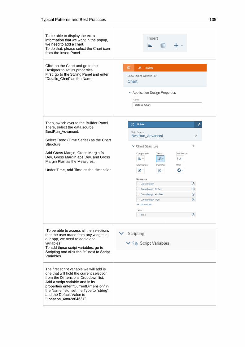
Typical Patterns and Best Practices 135
To be able to display the extra information that we want in the popup, we need to add a chart. To do that, please select the Chart icon from the Insert Panel.
Click on the Chart and go to the Designer to set its properties. First, go to the Styling Panel and enter “Details_Chart” as the Name.
Then, switch over to the Builder Panel. There, select the data source BestRun_Advanced. Select Trend (Time Series) as the Chart Structure. Add Gross Margin, Gross Margin % Dev, Gross Margin abs Dev, and Gross Margin Plan as the Measures. Under Time, add Time as the dimension
=
To be able to access all the selections that the user made from any widget in our app, we need to add global variables. To add these script variables, go to Scripting and click the “+” next to Script Variables.
The first script variable we will add is one that will hold the current selection from the Dimensions Dropdown list. Add a script variable and in its properties enter “CurrentDimension” in the Name field, set the Type to “string”, and the Default Value to “Location_4nm2e04531”.

Typical Patterns and Best Practices 136
The second script variable we will add, is one that will hold the current measure selection(s) (Actual, Plan, Absolute, Percent). Add a script variable and its properties enter “CurrentMeasures” in the Name field, set the Type to “string”, and toggle the Set As Array button to “YES”.
The third, and last, script variable we will add will hold the data about the selections made that will be used to display the data in the popup window. Set “CurrentDetailsMeasures” as the Name, the Type to string, and toggle the Set As Array button to YES.

Typical Patterns and Best Practices 137
Now, we will decide what will happen when a Dropdown list element in the Canvas is selected. Firstly, we will write the script for the first widget, the Dimensions Dropdown list. To do this, select the Dimensions Dropdown list in the Canvas and click
on the icon that appears next to it.
This will open the onSelect script of the Dropdown widget. Here, we will first get the selected element of the list. We will then remove any already set dimensions in the Table and the Chart and add the newly selected dimension to them. We will also add that dimension to our Details Chart (the one that we added to the Popup window). Afterwards, we will write the filter information in the browser’s console and save the selection in our script variable, CurrentDimension. Then, to set the available hierarchies for the selected dimension, we loop through the available hierarchies of our data source in relation to the current dimension and then we push all the available hierarchies in the Dropdown list of the Hierarchies. At the end, we set the default hierarchy of the Table, Chart, and Details Chart to Flat Presentation.

Typical Patterns and Best Practices 138
var sel =
Dropdown_Dimensions.getSelectedKey()
;
// Table
Table.removeDimension(CurrentDimension)
;
Table.addDimensionToRows(sel);
//Chart
Chart.removeDimension(CurrentDimension,
Feed.CategoryAxis);
Chart.addDimension(sel,
Feed.CategoryAxis);
//Details_Chart remove dimension filter
Details_Chart.getDataSource().removeDim
ensionFilter(CurrentDimension);

Typical Patterns and Best Practices 139
// write filter information into the
browser console
console.log( ['CurrentDimension: ',
CurrentDimension ]);
console.log( ['Selection: ', sel ]);
// save the current selection
(dimension) into a global variable
CurrentDimension = sel;
// get hierarchies from the current
dimension
var hierarchies =
Table.getDataSource().getHierarchies(Cu
rrentDimension);
var flag = true;
// remove all current items form the
Dropdown_Hierarchies
Dropdown_Hierarchies.removeAllItems();
// loop
for (var i=0;i<hierarchies.length;
i++){
if (hierarchies[i].id ===
'__FLAT__') {
Dropdown_Hierarchies.addItem(hierarc
hies[i].id, 'Flat Presentation');
}
else {
Dropdown_Hierarchies.addItem(hierarc
hies[i].id,
hierarchies[i].description);
if (flag === true) {
var hierarchy =
hierarchies[i].id;
flag = false;
}
}
}
// write hierarchy information to
browser console
console.log( ['Hierarchy: ', hierarchy
]);

Typical Patterns and Best Practices 140
console.log( ['Current Dimension: ',
CurrentDimension ]);
// set Flat Hierarchie als Default
Dropdown_Hierarchies.setSelectedKey('__
FLAT__');
// Table
Table.getDataSource().setHierarchy(Curr
entDimension, '__FLAT__');
// Chart
Chart.getDataSource().setHierarchy(Curr
entDimension, '__FLAT__');
// Details_Chart
Details_Chart.getDataSource().setHierar
chy(CurrentDimension, '__FLAT__');
Now to edit the onSelect function of the second Dropdown list, Hierarchies, select it in the Canvas and click on the
icon next to it.
In the script of the onSelect function of this widget, we will simply set the hierarchy of the Table, Chart, and Display Chart (the one in the popup window) to the selected element of the Dropdown list.
var sel =
Dropdown_Hierarchies.getSelectedKey();
// set hierarchy for Table
Table.getDataSource().setHierarchy(Curr
entDimension, sel);
// set hierarchy for Chart
Chart.getDataSource().setHierarchy(Curr
entDimension, sel);
// set hierarchy for Details Chart
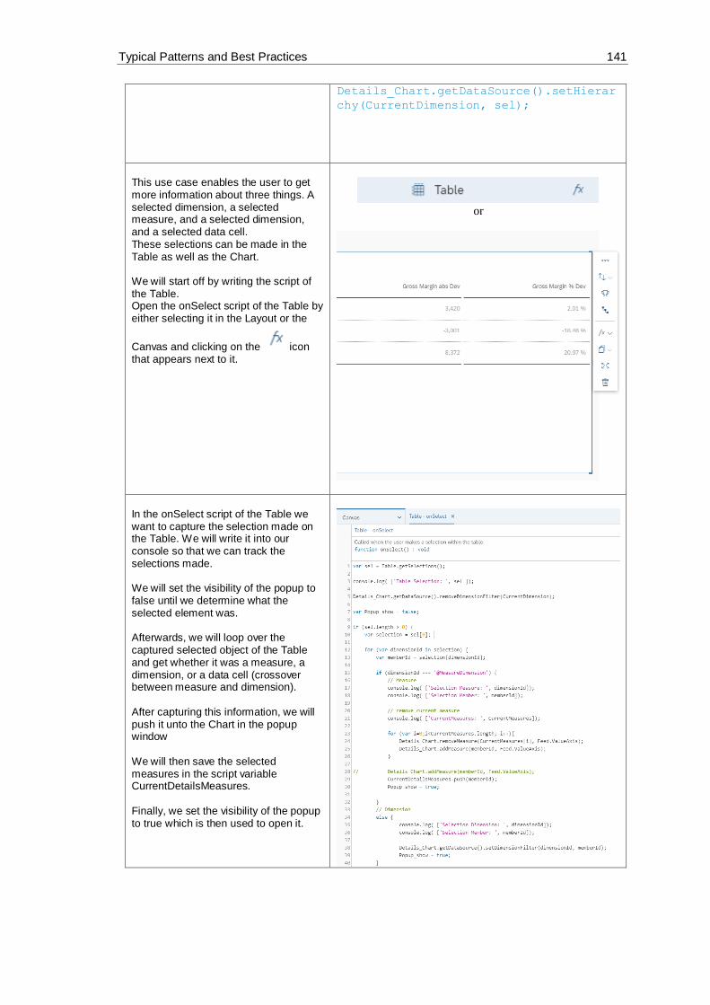
Typical Patterns and Best Practices 141
Details_Chart.getDataSource().setHierar
chy(CurrentDimension, sel);
This use case enables the user to get more information about three things. A selected dimension, a selected measure, and a selected dimension, and a selected data cell. These selections can be made in the Table as well as the Chart. We will start off by writing the script of the Table. Open the onSelect script of the Table by either selecting it in the Layout or the
Canvas and clicking on the icon that appears next to it.
or
In the onSelect script of the Table we want to capture the selection made on the Table. We will write it into our console so that we can track the selections made. We will set the visibility of the popup to false until we determine what the selected element was. Afterwards, we will loop over the captured selected object of the Table and get whether it was a measure, a dimension, or a data cell (crossover between measure and dimension). After capturing this information, we will push it unto the Chart in the popup window We will then save the selected measures in the script variable CurrentDetailsMeasures. Finally, we set the visibility of the popup to true which is then used to open it.

Typical Patterns and Best Practices 142
var sel = Table.getSelections();
console.log( ['Table Selection: ', sel
]);
Details_Chart.getDataSource().removeDim
ensionFilter(CurrentDimension);
var Popup_show = false;
if (sel.length > 0) {
var selection = sel[0];
for (var dimensionId in selection) {
var memberId =
selection[dimensionId];
if (dimensionId ===
'@MeasureDimension') {
// Measure
console.log( ['Selection
Measure: ', dimensionId]);
console.log( ['Selection
Member: ', memberId]);
// remove current measure
console.log(
['CurrentMeasures: ',
CurrentMeasures]);
for (var
i=0;i<CurrentMeasures.length; i++){
Details_Chart.removeMeasure(CurrentM
easures[i], Feed.ValueAxis);
Details_Chart.addMeasure(memberId,
Feed.ValueAxis);
}
//
Details_Chart.addMeasure(memberId,
Feed.ValueAxis);

Typical Patterns and Best Practices 143
CurrentDetailsMeasures.push(memberId
);
Popup_show = true;
}
// Dimension
else {
console.log( ['Selection
Dimension: ', dimensionId]);
console.log( ['Selection
Member: ', memberId]);
Details_Chart.getDataSource().setDim
ensionFilter(dimensionId, memberId);
Popup_show = true;
}
}
}
if (Popup_show === true) {
Popup_Details.open();
}
Now, we need to do the same for the Chart. Opposed to the Table, in the Chart, the user can only click on a dimension and can click on the chart bars which are crossovers of a measure and a dimension. To write the script of the Chart, select the widget in the Layout and click on the
icon next to it.
In the onSelect function of the Chart, we will get the selected element of the Chart and save it in a local variable, sel. We will set the popup window’s visibility to false and remove the current measures from the Details_Chart in the popup. And then, if it’s a measure, we will add it as a measure to the Details_Chart and if it’s a dimension, we will set it as a dimension filter of the Details_Chart.

Typical Patterns and Best Practices 144
We will then push the selected measures, if any, unto the script variable CurrentDetailsMeasures. At the end, the popup window’s visibility is set to true and is opened.
var sel = Chart.getSelections();
console.log( ['Chart Selection: ', sel,
CurrentMeasures ]);
var Popup_show = false;
if (sel.length > 0) {
Details_Chart.getDataSource().remove
DimensionFilter(CurrentDimension);
// remove the current measures
for (var
i=0;i<CurrentMeasures.length; i++){
Details_Chart.removeMeasure(CurrentM
easures[i], Feed.ValueAxis);
}
for (i=0;i<sel.length; i++){

Typical Patterns and Best Practices 145
var selection = sel[i];
for (var dimensionId in
selection) {
var memberId =
selection[dimensionId];
if (dimensionId ===
'@MeasureDimension') {
// Measure
console.log( ['Add
Selection Measure: ', dimensionId]);
console.log( ['Add
Selection Member: ', memberId]);
Details_Chart.addMeasure(memberId,
Feed.ValueAxis);
CurrentDetailsMeasures.push(memberId
);
Popup_show = true;
}
// Dimension
else {
console.log( ['Selection
Dimension: ', dimensionId]);
console.log( ['Selection
Member: ', memberId]);
Details_Chart.getDataSource().setDim
ensionFilter(dimensionId, memberId);
Popup_show = true;
}
}
}
}
if (Popup_show === true) {
Popup_Details.open();

Typical Patterns and Best Practices 146
}
In previous steps, we had created the popup window and added a Cancel button. To make the button do anything, we need to write a script for it. To do that, select Popup_Details in the
Layout and click on the next to it.
This will open the onButtonClick script of the Popup widget. Here, we will set what happens when the user clicks on the Cancel button. Firstly, we will remove the content, if there is any, of the CurrentDetailsMeasures from the Details_Chart and set the default measures, from the CurrentMeasures script variable, as the measures of the Details_Chart. At the end, we will trigger the closing of the popup.
// remove the current measure selection
and set all default measures for the
details chart
for (var
i=0;i<CurrentDetailsMeasures.length;
i++){
Details_Chart.removeMeasure(CurrentD
etailsMeasures[i], Feed.ValueAxis);
}
CurrentDetailsMeasures =
ArrayUtils.create(Type.string);
for (i=0;i<CurrentMeasures.length;
i++){
Details_Chart.addMeasure(CurrentMeas
ures[i], Feed.ValueAxis);
}
// close the popup

Typical Patterns and Best Practices 147
Popup_Details.close();
The last script we will write is the one for the Canvas. This script gets executed on the initialization of the Canvas. Please, select the Canvas element in
the Layout and click on the icon next to it. Select the onInitialization function there.
In this script, we will load the hierarchies into the Hierarchies Dropdown list and set the default hierarchy to Flat Presentation. At the end, we will also fill the script variable CurrentMeasures with the available measures of Gross margin (Actual, Plan, Absolute, and Percent)
// get hierarchies from the current
dimension
var hierarchies =
Table.getDataSource().getHierarchies(Cu
rrentDimension);
var flag = true;
// loop

Typical Patterns and Best Practices 148
for (var i=0;i<hierarchies.length;
i++){
if (hierarchies[i].id ===
'__FLAT__') {
Dropdown_Hierarchies.addItem(hierarc
hies[i].id, 'Flat Presentation');
}
else {
Dropdown_Hierarchies.addItem(hierarc
hies[i].id,
hierarchies[i].description);
if (flag === true) {
var hierarchy =
hierarchies[i].id;
flag = false;
}
}
}
// write hierarchy information to
browser console
console.log( ['Hierarchy: ', hierarchy
]);
console.log( ['Current Dimension: ',
CurrentDimension ]);
// set Flat Hierarchy as Default
Dropdown_Hierarchies.setSelectedKey('__
FLAT__');
//Table
Table.getDataSource().setHierarchy(Curr
entDimension, '__FLAT__');
//Chart
Chart.getDataSource().setHierarchy(Curr
entDimension, '__FLAT__');
//Details_Chart
Details_Chart.getDataSource().setHierar
chy(CurrentDimension, '__FLAT__');

Typical Patterns and Best Practices 149
//fill global Variable CurrentMeasures
CurrentMeasures.push('[Account_BestRunJ
_sold].[parentId].&[Gross_MarginActual]
');
CurrentMeasures.push('[Account_BestRunJ
_sold].[parentId].&[Gross_MarginPlan]')
;
CurrentMeasures.push('[Account_BestRunJ
_sold].[parentId].&[Gross_Margin_Abs]')
;
CurrentMeasures.push('[Account_BestRunJ
_sold].[parentId].&[Gross_Margin_Percen
t]');
Now let’s see how it looks like. Click on Run Analytic Application in the upper right side of the page and the result should look something like this: If we click on one of the dimension data cells, in this example the dimension is set to Location and we clicked on Los Angeles, the popup window will appear. It gives us an overview of all the measures (Gross Margin Actual, Plan, Absolute, Percent) in relation to the selected Location (Los Angeles) over the Time factor. When opening the browser’s console, we can also see that the selection was printed there. If we click on one of the measures, in this screenshot we chose Gross Margin Actual, the measure is shown in the popup window in relation to the Time factor. The selection is also printed out in the console: The third option to select in the Table is an individual data cell. In this example, we changed the Dimension to store and selected the data cell at the crossover of Gross Margin Plan and Country Fair Foods. This triggers the opening of a popup window that shows Gross Margin Plan in relation with Time and with a Store Filter of Country Fair Foods. The selection triggers the following console message: If we change the dimension back to Location and change the hierarchy of the Table to States, the following Table will be displayed:

Typical Patterns and Best Practices 150
We can then choose a state and we would also get a popup window that displays the measures in regard to a state (here, Nevada was selected). This state selection prints the following message to the browser console: Now, we will look at how the Chart behaves. To switch to the Chart, click on the
icon in the Canvas. There, we will firstly click on a dimension. Here, the dimension filter was set to Product and Lemonade was clicked on. All the measures are shown in regard to Time and with a product filter of Lemonade. This selection prints the following message into the console: The measures are added according to the chosen product The second thing we can click on in the Chart is a specific measure in regard to a specific dimension. For example, Gross Margin Abs Dev in relation to Orange with pulp (the chart bar marked in the screenshot). This causes a popup window to appear that displays the measure chosen (Gross Margin abs Dev) per Time and with a dimension filter (here: Product – Orange with pulp) This triggers the printing of the following messages in the browser’s console: Note: The user can always check what filter is being utilized by clicking on Filter. This opens a list of filters used – here only one product (Orange with pulp) has been used as a filter.

Typical Patterns and Best Practices 151

Typical Patterns and Best Practices 152
6.9 Using RWidget Wordcloud for visualization
This application features an overview for the Customer Complaints a company got from its
customers over the years 2018 and 2019.
In the Canvas, we will add a Table with our Top 10 Customers as well as a Chart with the
Complaints of the Customers. Other than that, we will have two R Visualization widgets through
which we will create word clouds that change the size of the words displayed according to the
frequency with which they appear in the data set.
Further functionalities in this application include how to filter widgets according to a selected
element of a Table and how we can change the color of the word clouds through external input
(in this use case, it is achieved through a Radio Button Group that has a script that passes the
value to the R widgets.)

Typical Patterns and Best Practices 153
And lastly, the filtering of all the widgets in the Canvas through the use of Radio Button Groups
will be explored (here, we will filter according to Regions and according to the selected Region,
several countries from that Region will be displayed in another Radio Button Group (Country) for
further filtering of the widgets).
The result will look like this when we run the application:
Figure 50: Example Application Word Cloud
There are no prerequisites for this use case. You can start with a new application.
It is recommended to use the same names as that exercise for the used widgets so that the scripts
in this use case don’t have to be altered.
The first thing we will do, is add a Radio Button Group to our Canvas where we will enable the user to choose between regions.

Typical Patterns and Best Practices 154
Select the newly added widget in the Canvas and go to the Designer (by clicking on Designer on the upper right side of the screen) and switch to the
Styling Panel by clicking on the button. There, enter “RadioButtonGroup_Region” as the Name, choose Vertical Layout as the Display Option, and toggle the Label Text button to enable it and write “Region” as the Label Text.
Now, we will insert the options we want available in our Radio Button Group widget. To do that, switch to the Building Panel
by clicking on the button. Once there, start adding values using the “+” button. We will add an option that has all the regions (1), and the others will be for Latin America (2), Europe, the Middle East and Africa (3), North America (4), and the Asia-Pacific region (5). We will set All as our default value; this means that the widgets in our canvas will be by default filtered according to that option and the user can change it afterwards. Please click on Apply to save the changes to your application.
Value Text (Optional)
ALL ALL
REGION01 LATAM
REGION02 EMEA
REGION03 NA
REGION04 APJ

Typical Patterns and Best Practices 155
To enable further filtering, we will insert another Radio Button Group that houses the countries. The values of this widget will change depending on the region selected. Please place the widget underneath the Region Radio Button Group.
Select the widget in the Canvas and go to the Styling panel in the Designer. There, enter “RadioButtonGroup_Country” as the Name, choose Vertical Layout as the Display Option, and toggle the Label Text button to enable it and write “Country” as the Label Text.
Now, we will insert the options we want available in our Radio Button Group widget. To do that, switch to the Building Panel
by clicking on the button. For this widget, we will only add one option which is “All”. To do that, click on the “+” button and add the values like in the screenshot to the right. Lastly, click on Apply to save the changes. (The other countries will be added through a script later in this tutorial.)
Value Text (Optional)
ALL All

Typical Patterns and Best Practices 156
Now, we will move on to add our Table, Chart, and R Widgets. We will start off with the Table. Through the Insert Panel, add a new Table and place it to the right side of the two radio button groups. Select BestRunBike_Customer_Complaint as the data source.
In the Styling Panel of the Table insert the Name “Table_Customer”.
Afterwards, switch over to the Building Panel and there, enter the values as in the screenshot to the right. Check Responsive / flexible columns width Check Arrange totals / parent nodes below Add Customer to Rows Add Account to Columns And set the Filters to Account – Count Category – Actual Date – Jan (Q1/2018) – Nov (Q4/2019) This Table will hold the customers of our data set.

Typical Patterns and Best Practices 157
To have a better visual over our Customers and their complaints, we will only show the Top 10 Customers in our Table. To do that, select the Table in the
Canvas and click on the icon in its menu.
This opens a “Create Top N” window. Enter “Top” as the Type, 10 as the Value, and Count in the Related Dimension’s Account field.

Typical Patterns and Best Practices 158
We also want to be able to view the complaints that we got from our customers, which is why we will add a chart to display them. First, we need to add the Chart. We will do that, again, through the Insert Panel.
To edit the properties of our Chart, go to the Designer. We’ll change the Styling properties first. In the Styling panel enter “Chart_Complaints” as the Name.
To display the complaints of our customers, we will edit the Builder components of the Chart. Switch over to the Chart’s Builder panel and enter the values as seen in the screenshot: Chart Structure: Comparison (Bar/Column) Chart Orientation: Horizontal Measures: Count Dimensions: Complaint Category Filters: Category: Actual Date: Jan (Q1/2018) – Nov (Q4/2019)
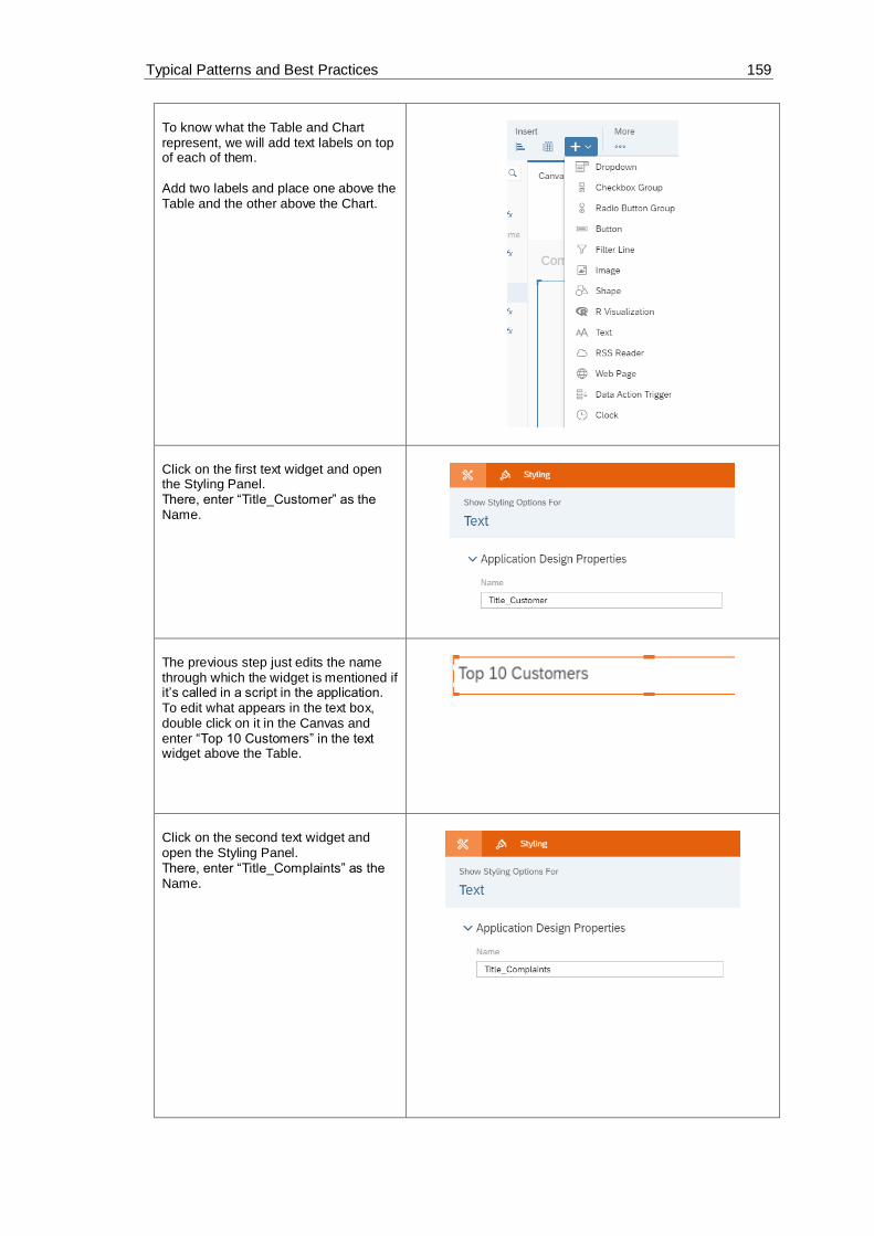
Typical Patterns and Best Practices 159
To know what the Table and Chart represent, we will add text labels on top of each of them. Add two labels and place one above the Table and the other above the Chart.
Click on the first text widget and open the Styling Panel. There, enter “Title_Customer” as the Name.
The previous step just edits the name through which the widget is mentioned if it’s called in a script in the application. To edit what appears in the text box, double click on it in the Canvas and enter “Top 10 Customers” in the text widget above the Table.
Click on the second text widget and open the Styling Panel. There, enter “Title_Complaints” as the Name.

Typical Patterns and Best Practices 160
To edit what appears in the box, double click on it in the Canvas and enter “Complaints” in the text widget above the Table.
Now, we will add the R Visualization widgets. To do that, select the widget from the Insert panel and insert 2 into the Canvas and place them vertically next to the Chart.
Select the first R Visualization widget in the Canvas and open the Designer to edit its properties. We will start in the Styling Panel. There, enter “RVisualization_WordCloud_2018” as the Name.
To edit its content, let’s switch over to the Builder panel. Here, enter the data set as the input data and check the “Refresh On Resize” option.

Typical Patterns and Best Practices 161
After inserting the data source (here: BestRunBike_Customer_Complaint), click on it (still in the Builder panel) so that we can edit the properties that we want the data set to have. Here, we will add Complaint Category to the Rows and Account to the Columns. Click on Add Filters and select Date – Range and choose Year 2018 to 2018. The filters should now be Category set to Actual and Date set to 2018-2018.
Click on OK and back in the Builder panel of the widget, click on Edit Script.
In the R script of this widget, we will get the words from the complaints and also how frequent they come up and according to these values, the word cloud is generated and the words with the higher frequency are also drawn bigger in the word cloud. Insert the script written on the right side, into the editor of the R widget and click on Apply to save the changes.
# load package
library(wordcloud)
# get words
words <-
BestRunBike_Customer_Complaint$`Complain
t Category`

Typical Patterns and Best Practices 162
# get frequency
frequency <-
BestRunBike_Customer_Complaint$Count
if(exists("colorValue")){
myColor <- colorValue
}else {
myColor <- "Oranges"
}
# generate word cloud
wordcloud(words, frequency, scale = c(4,
1), rot.per=0.2, colors=brewer.pal(8,
myColor))
Now, let’s do the same for the second R Visualization widget. Select it in the Canvas and open the Styling panel. There, enter “RVisualization_WordCloud_2019” as the Name.
To edit its content, let’s switch over to the Builder panel. Here, enter the data set as the input data and check the “Refresh On Resize” option.

Typical Patterns and Best Practices 163
After inserting the data source, click on it (still in the Builder panel) so that we can edit the properties that we want the data set to have. (We will have the same settings that we had for the last widget but change the date to 2019.) Here, we will add Complaint Category to the Row and in the Columns, we will add Account. Click on Add Filters and select Date – Range and choose Year 2019 to 2019. The filters will be Category set to Actual and Date set to 2019-2019.
Click on OK and back in the Builder panel of the widget, click on Edit Script.
In the R script of this widget, we will do the same as in the first widget; we will get the words from the complaints and how frequent they come up and according to these values, the word cloud is generated and the words with the higher frequency are also drawn bigger in the word cloud. Please insert the script written on the right side, into the editor of the R widget. Click on Apply to save the changes.
# load package
library(wordcloud)
# get words

Typical Patterns and Best Practices 164
words <-
BestRunBike_Customer_Complaint$`Complain
t Category`
# get frequency
frequency <-
BestRunBike_Customer_Complaint$Count
if(exists("colValue")) {
myColor <- colValue
} else {
myColor <- "Oranges"
}
# generate word cloud
wordcloud(words, frequency, scale = c(4,
1), rot.per=0.2, colors=brewer.pal(8,
myColor))
To give the users more choice in the look of the R Visualization widgets, we want them to be able to choose the color of the generated word cloud. To do this, we need to have a Radio Button Group where we will give them the choice between 2 colors. Add a Radio Button Group widget and place it above the R Visualization widgets.
Select the widget in the Canvas and open the Styling panel. Here, we will edit its Name and set it to “RadioButtonGroup_Color” and set the Display Option to Horizontal Layout.
To edit the content of the Radio Button Group widget, switch over to the Builder Panel. There, we will add 2 values “Oranges” and “Greys”, while setting Oranges to our default. To save the changes, please click on Apply.

Typical Patterns and Best Practices 165
The last widget we will need for this application is a Dropdown list. To add a Dropdown list, go to the Insert Panel and select a Dropdown widget.
Firstly, we need to change the name of the widget to make it more comprehensible if we want to call it in a script. To do that, select the widget in the Canvas and go to the Styling Panel in the Designer. There, enter “Hidden_DropDown_Customer” in the Name field.
Through the getSelection function of the Table, we get back a dimension ID and a member ID when a user selects an element in the Table. This ID is very useful and allows us to manipulate widgets, however, if we want to be able to display the name of the selected member (here: the name of the selected customer), we have to get the text of the name using the member ID we get from the Table’s function. That’s why we need this Dropdown list here, we will simply load all the customers in our data set into it and set its selected key to the captured memberId. This way we can get the text of the element and use it to make our Canvas more dynamic. Thus, we do not need this widget to be visible since we just need it for behind-the-scenes work.

Typical Patterns and Best Practices 166
To set the widget to invisible, hover over
it in the Layout and click on the icon. Once there, click on Hide to make the widget invisible in the Canvas.
To enable the user to filter the Chart and the R Visualization widgets according to a specific customer, we will write a script for the Table so that when a user select a specific customer from our Top 10 Customers list, all our other widgets are filtered to that specific customer. To access the script of the Table, hover over the widget in the Layout and click
on the icon next to it and select the onSelect function.
In this onSelect script, we will capture the selected element and get its dimension (here: it’s already known that it’s Customer) and the selected member id (the specific customer selected). We will then use these values to add filters to the Chart, and the two R Visualization widgets. At the end of the script, we will use our Hidden Dropdown list to get the Text related to the memberId we get back from the getSelection function and edit the text of the Complaint Chart’s label to include the name of the selected customer.
var sel =
Table_Customer.getSelections();
console.log(["Sel ", sel]);
if (sel.length > 0){
var selection = sel[0];
console.log( ['Selection [0] : ',
selection]);
for (var dimensionId in selection){
var memberId =
selection[dimensionId];
console.log( ['Selection
Dimension: ', dimensionId]);
console.log( ['Selection Member:
', memberId]);

Typical Patterns and Best Practices 167
Chart_Complaints.getDataSource().setD
imensionFilter(dimensionId, memberId);
RVisualization_WordCloud_2018.getData
Frame("BestRunBike_Customer_Complaint").
getDataSource().setDimensionFilter(dimen
sionId, memberId);
RVisualization_WordCloud_2019.getData
Frame("BestRunBike_Customer_Complaint").
getDataSource().setDimensionFilter(dimen
sionId, memberId);
Hidden_DropDown_Customer.setSelectedK
ey(memberId);
var text =
Hidden_DropDown_Customer.getSelectedText
();
Title_Complaints.applyText("Complaint
s for Customer " + text);
}
}
The next script we will write is for the Region Radio Button Group. To access the script, hover over the widget in the Layout and click on the
icon next to it.
In this script, we will add countries to the Radio Button Group of Country according to what region is selected. For example, if Region 2 (EMEA) is selected, then Dubai, Germany, and Great Britain are displayed as options in the Countries widget, however, if the region changes to another, e.g. Region 4 is chosen (APJ), then the countries that the user can choose from in the other Radio Button Group are India, China, and Australia. Furthermore, we will set the dimension filter of the widgets in our Canvas according to the selected region.
var sel =
RadioButtonGroup_Region.getSelectedKey()
;

Typical Patterns and Best Practices 168
RadioButtonGroup_Country.removeAllIte
ms();
RadioButtonGroup_Country.addItem("ALL
", "All");
RadioButtonGroup_Country.setSelectedK
ey("ALL");
if (sel === "REGION01") {
RadioButtonGroup_Country.addItem("[Co
untry].[Region].&[COUNTRY011]",
"Mexico");
}else if (sel === "REGION02") {
RadioButtonGroup_Country.addItem("[Co
untry].[Region].&[COUNTRY021]",
"Dubai");
RadioButtonGroup_Country.addItem("[Co
untry].[Region].&[COUNTRY022]",
"Germany");
RadioButtonGroup_Country.addItem("[Co
untry].[Region].&[COUNTRY023]", "Great
Britian");
} else if (sel === "REGION03") {
RadioButtonGroup_Country.addItem("[Co
untry].[Region].&[COUNTRY031]", "USA
East");
RadioButtonGroup_Country.addItem("[Co
untry].[Region].&[COUNTRY032]", "USA
West");
RadioButtonGroup_Country.addItem("[Co
untry].[Region].&[COUNTRY033]",
"Canada");
} else if (sel === "REGION04") {
RadioButtonGroup_Country.addItem("[Co
untry].[Region].&[COUNTRY041]",
"India");
RadioButtonGroup_Country.addItem("[Co
untry].[Region].&[COUNTRY042]",
"China");
RadioButtonGroup_Country.addItem("[Co
untry].[Region].&[COUNTRY043]",
"Australia");
}
Table_Customer.getDataSource().setDimens
ionFilter("Region",sel);
Chart_Complaints.getDataSource().setDime
nsionFilter("Region",sel);

Typical Patterns and Best Practices 169
RVisualization_WordCloud_2018.getDataFra
me("BestRunBike_Customer_Complaint").get
DataSource().setDimensionFilter("Region"
,sel);
RVisualization_WordCloud_2019.getDataFra
me("BestRunBike_Customer_Complaint").get
DataSource().setDimensionFilter("Region"
,sel);
Table_Customer.getDataSource().removeDim
ensionFilter("Country");
Chart_Complaints.getDataSource().removeD
imensionFilter("Country");
RVisualization_WordCloud_2018.getDataFra
me("BestRunBike_Customer_Complaint").get
DataSource().removeDimensionFilter("Coun
try");
RVisualization_WordCloud_2019.getDataFra
me("BestRunBike_Customer_Complaint").get
DataSource().removeDimensionFilter("Coun
try");
Now, we will edit what happens when one of the options in the Radio Button Group Country is selected. To do that, hover over the widget in the
Layout and click on the icon that appears next to it.
In this script, we will simply set the selected option as the dimension filter of our Table, Chart, and R Visualization widgets. However, because the R Visualization widget needs a different kind of input than the Table and the Chart, we need to edit the key we get and cut some of it so that we can forward it to the R widgets.
var sel =
RadioButtonGroup_Country.getSelectedKey(
);
var cloud_sel =
sel.replace("[Country].[Region].&[",
"");
cloud_sel = cloud_sel.replace("]", "");
console.log(cloud_sel);
if (sel === "ALL") {
Table_Customer.getDataSource().remove
DimensionFilter("Country");
Chart_Complaints.getDataSource().remo
veDimensionFilter("Country");

Typical Patterns and Best Practices 170
RVisualization_WordCloud_2018.getData
Frame("BestRunBike_Customer_Complaint").
getDataSource().removeDimensionFilter("C
ountry");
RVisualization_WordCloud_2019.getData
Frame("BestRunBike_Customer_Complaint").
getDataSource().removeDimensionFilter("C
ountry");
} else {
Table_Customer.getDataSource().setDim
ensionFilter("Country",sel);
Chart_Complaints.getDataSource().setD
imensionFilter("Country",sel);
RVisualization_WordCloud_2018.getData
Frame("BestRunBike_Customer_Complaint").
getDataSource().setDimensionFilter("Coun
try",cloud_sel);
RVisualization_WordCloud_2019.getData
Frame("BestRunBike_Customer_Complaint").
getDataSource().setDimensionFilter("Coun
try",cloud_sel);
}
There is now another widget that we have to write the function for; the Color Radio Button Group that controls whether the word cloud will be displayed in Orange or in Gray. To edit the script of this widget, hover over it in the Layout and click on the
icon that appears next to it.
In the script of this widget, we will simply get the selected option, save it in a variable and pass it as input parameters to the R Visualization widgets’ scripts.
var sel =
RadioButtonGroup_Color.getSelectedKey();
RVisualization_WordCloud_2018.getInputPa
rameters().setString("colorValue",sel);
RVisualization_WordCloud_2019.getInputPa
rameters().setString("c
olValue",sel);

Typical Patterns and Best Practices 171
The last script for this application is the one that gets executed when the application is initialized. To access this script, hover over the “Canvas” in the
Layout, click on the icon that appears next to it, and select onInitialization.
In this script, we will load a maximum of 1000 customers into the Hidden Dropdown of Customers. This number was chosen because the number of customers in our data set is under 1000, however, this number can be changed if needed.
var list =
Table_Customer.getDataSource().getMember
s("Customer_",1000);
if (list.length !== 0) {
for (var i=0;i<list.length; i++){
console.log( ['List Dimension: ',
i , list[i].displayId ]);
console.log( ['List Description:
', i , list[i].description ]);
console.log( ['List Member: ', i ,
list[i].id ]);
Hidden_DropDown_Customer.addItem(list
[i].id, list[i].description);
}
}
Now let’s save the application and see how it looks like. Click on Run Analytic Application in the upper right side of the page and the result should look something like this: If we click on one of the elements in the Table (one of the Customers), the Chart and the R Visualization widgets will be filtered according to the data related to this particular customer (here: Northside Bikes was selected).

Typical Patterns and Best Practices 172
Now, if we select Greys instead of Oranges in the Color Radio Button Group, the R Visualization widgets are displayed in gray. To filter according to a certain region, we can select one of the Regions from the Region Radio Button Group (here: EMEA was selected), and consequently the Country Radio Button Group’s options changed from (All and Mexico) to EMEA countries (All, Dubai, Germany, and Great Britain). The screenshot on the right displays the widgets filtered on EMEA and Germany; the customer is Greenhigh Bikes.

Planning 173
7 Planning
7.1 What to expect from Analytics Designer in regard to
Planning?
Analytics Designer reuses the Planning features of Analytics Cloud and leverage the capabilities
by offering flexible scripting that supports customizations of applications according to user
requirements. Planning Data Models, Allocations, Data Action Triggers and all Planning features
can be integrated to applications.
And what can you not expect? In Analytics Designer you cannot use Input Tasks and Planning
scripting is not possible for models based on BPC Write-Back.
7.2 Basic Planning concepts in Analytics Designer
Planning specific features can be triggered through the toolbar icons in the Plan area.
Figure 51: Toolbar Planning Features
These icons are greyed out if no table cell with a planning model is selected.
Most of these features can also be triggered through scripting.
To get the Planning Table object, use below script. If the table has no planning model assigned,
it will return undefined.
Table.getPlanning(): Planning | undefined
Scripting will perform the same planning actions that could be done via UI. The benefits of
scripting are augumented in cases which you want to minimize the number of clicks from your
user, personalize your UI or when a special customer requirement can not be fulfilled with
standard planning behaviour.
Data cannot be changed during design time, and you can enable the usage of planning features
during runtime in two different ways:
• In the table designer UI: you can find in the Builder panel, section Properties, a box called ‘Planning enabled’.

Planning 174
Figure 52: Planning enabled
• Through below script:
setEnabled(boolean): void
This option can be useful when you shall disable planning due specific requirements. For
example, budget might not be changed in last quarter of the year.
One other valuable script allows checking whether the data model is planning enabled.
isEnabled() : boolean
In the Table Builder panel, there are some configurations that you can do in each dimension, and
Unbooked Data might be a good choice when, for example, your Planning Data Model has no
booked data and your end users need to see which dimension members are available for
planning.
Figure 53: Unbooked Data

Planning 175
7.3 Refreshing your data
This feature is not exclusive to Planning and affects all data models and widgets of your
application. It can be reached in two different ways:
• by clicking on the first icon of the toolbar.
• through below script:
Application.refreshData(): void
Scripting is useful when, for example, you use data models with Live Connectivity and the end
user wishes to refresh data because a background process that updates master data has finished
after the application was opened.
7.4 Set user input
Instead of having to guide a business user by showing which table cell should be planned, the
app designer could create a separate input field. This input field has a pre-informed value from a
table selection. The changed value is then updated on a planning model.
Below picture can represent the scenario mentioned above to explain this feature.
Figure 54: SetUserInput
In this example, the following scripting would be included on the “Save Data” button.
To update a cell of a table with the given value:
setUserInput(selectedData:Selection, value:String) : boolean
Few considerations for this script:
• value can be maximum 17 characters
• if value is scale then it shall be less than 7 digits
• it can be performed from a widget or from a table event
Regarding data formatting - it takes as parameter either a raw value in the user formatting setting
(“1234.567” with . grouping separator) or a scale in the user formatting setting (“*0.5” – in this
case value is divided by half or “*2” the value is multiplied by quantifier) – both of type string.

Planning 176
Example: (scaling in million)
• if you plan “12345678” the formattedValue will be “12.35”
• if you plan “123456789” the formattedValue will be “123.46”
• if you plan “*0.5” of rawValue “123456789” the rawValue will be “61728394.5” and formattedValue will be “61.73
Regarding data validation:
• If an invalid value is planned, error/warning message is returned, and the API also returns false
• if the same value is planned twice, the value is set and API returns true
• If the cell is locked, the API returns false and a warning message is shown to the user
To submit the updated cell data with all the beforehand modified data and to trigger refresh of
data:
submitData() : boolean
7.5 Planning Versions
There are two types of planning versions, private and public.
• Private Version
This data is not visible to other users and solutions of Analytics Cloud.
getPrivateVersions() : [ Array of Planning Private Versions] | empty
array
getPrivateVersion(versionId: String): Planning Private Version |
undefined
Below script returns the user id of the user who created this private version.
getOwnerID() : String
• Public Version
This data is visible to all users and solutions of Analytics Cloud.
getPublicVersions() : [ Array of Planning Public Versions] | empty
array
getPublicVersion(versionId: String): Planning Public Version |
undefined
Both planning version types have IDs.
getId(): String
You can use it, for example, when calling getData().
getDisplayId(): String
You can use it, for example, to display the version in dropdowns or texts.
All versions besides ‘Actual’ can be deleted.
deleteVersion(): boolean

Planning 177
7.6 How to manage versions
7.6.1 Publishing or Reverting data changes
Any change in data, in any type of version, is automatically saved. This means that even without
any active saving action, if browser is closed by mistake, for example, data will still be there when
application is reopened by the same user who changed the data.
But to make this data visible to other users, you can Publish the public versions through the
following toolbar icon.
Figure 55: Publish Version
After clicking on this icon, below dialog is opened, and action can be taken per Model. You can
also Revert, and all data changes will be discarded.
Figure 56: Publish Data
The actions performed within this dialog can also be done via the below scripting on public
versions.
revert(): boolean
publish(): boolean
After the execution of these scripts, a message informs whether the script ended successfully or
not. These are the expected messages.
Figure 57: Success Message

Planning 178
If version was not modified before these actions are triggered, below message should be
expected.
Figure 58: Message
This message could be avoided if the dirty check is done in advance.
isDirty(): boolean
Dirty versions can be identified by a symbol of asterisk (*) just after the version name.
Figure 59: Dirty Version
It is also possible to Publish private versions via the two below scripting options.
publish() : boolean
publishAs(newVersionName: String, versionCategory: PlanningCategory):
boolean
In the second option, a version name is given, and a new public version is created under the
informed version category.
These scripts can be very useful if your planning model is placed in a popup, for example. As the
toolbar is kept in the background canvas, user does not need to close the popup to then Publish
the data. With scripting, you can do it directly in the popup!

Planning 179
Figure 60: Planning Table in Popup
Find in the next session more information about version category and how to create private
versions.
7.6.2 Copy
Data models with planning enabled capability have one dimension in common - version. And each
version shall be classified in one of the following planning categories:
• Actual
• Planning
• Budget
• Forecast
• Rolling Forecast
Version category 'Actuals' is created automatically and cannot be deleted.
PlanningCopyOptions offers you the possibility to either create a new empty version or to copy all
data from the source version. In case you want to create a private copy of any version, use below
script.
copy(newVersionName: string, planningCopyOption: PlanningCopyOption,
versionCategory?: PlanningCategory): boolean

Predictive 180
8 Predictive
In Analytics Designer, there are several predictive features that can help you to explore the data
and gain more insights.
8.1 Time Series Forecast
In order to predict future values of a specific measure for a period of time, you can run Time Series
Forecast on historical data in a Time Series Chart. Time Series Forecast can be configured to
turn on/off and switch among different algorithms. You could refer to sample Gain insights into
the data for the usages in detail.
8.1.1 Switch on/off Forecast
In Gain insights into the data, a Time Series Chart, Chart_Forecast, is added to show Gross
Margin over time. You can turn on Forecast to predict the future trend based on existing historical
data.
Basically, Time Series Forecast can be switched on/off via two ways: the entry in context menu
at both design time and runtime,
Figure 61: Automatic Forecast
AND API to set the forecast type.
Chart_Forecast.getForecast().setType(ForecastType.Auto);
8.1.2 Configure Forecast
You can also configure the number of periods to predict Chart_Forecast for a longer time if
needed.
The number of periods to predict can be configured via two ways: the entry in Chart Details at
both design time and runtime,

Predictive 181
Figure 62: Linear Regression
AND API to set the value.
Chart_Forecast.getForecast().setNumberofPeriods(7);
8.2 Smart Insights
Smart Insights automatically discovers key insights based on existing data. The insights vary
among links, correlations, clusters, predictions, etc. As an analytic application developer or end
user, you can straightly look into the result without any manual exploration. Sample Gain insights
into the data can be referred to get familiar with the usage.
8.2.1 Discover per selected data point
In Gain insights into the data, a Time Series Chart, Chart_Forecast, is added to show Gross
Margin over time. You will notice that the gross margin of May 2015 is pretty low. To get more
insights, you can trigger Smart Insights to explore further.
Figure 63: Time Series Chart: Select the interested data point

Predictive 182
Figure 64: Side panel of Smart Insights
8.3 Smart Grouping
Smart Grouping can be used to automatically analyze the data points in correlation chart, Bubble
or Scatterplot, and group them based on similar properties. As an analytic application developer,
you can configure the visibility of Smart Grouping and the related settings. Sample Gain insights
into the data demonstrates the typical usages.
8.3.1 Switch on/off Smart Grouping
In Gain insights into the data, a Scatterplot, Chart_Group, is added to show Discount and Gross
Margin per Store. You can turn on Smart Grouping in this chart to analyze based on similar
properties.
Basically, Smart Grouping can be switched on/off via two ways: the setting in Builder Panel at
design time,
Figure 65: Smart Grouping
AND API to set the visibility.

Predictive 183
Chart_Group.getSmartGrouping().setVisible(true);
8.3.2 Configure Smart Grouping
There are several Smart Grouping settings that you can configure in Chart_Group. And you can
configure them in two ways: the entry in Builder Panel or Chart Details at both design time and
runtime,
Figure 66: Configure Smart Grouping in Builder Panel of chart
Figure 67: Configure Smart Grouping in Chart Details
AND APIs to set the values.
Chart_Group.getSmartGrouping().setNumberOfGroups(3);
Chart_Group.getSmartGrouping().setGroupLabel("Group");
Chart_Group.getSmartGrouping().includeTooltipMeasure(true);
8.4 Smart Discovery
As an analytic application developer, you can enable Smart Discovery in your application to
discover additional information (for example, key influencers) between columns within a data set.
Sample Gain insights into the data demonstrates how to trigger Smart Discovery via APIs.
var ds = Chart_Forecast.getDataSource();
var members = ds.getMembers("Product_3e315003an");
var SDsetting =
SmartDiscoveryDimensionSettings.create(ds,"Product_3e315003an",[member
s[1]]);

Predictive 184
SDsetting.setIncludedDimensions(["Location_4nm2e04531","Store_3z2g5g06
m4"]);
SDsetting.setIncludedMeasures(["[Account_BestRunJ_sold].[parentId].&[G
ross_Margin]","[Account_BestRunJ_sold].[parentId].&[Discount]"]);
SmartDiscovery.buildStory(SDsetting);
In this example, Smart Discovery is invoked via clicking “More Insights…” to discover Product
with Dark Beer as the target group. In addition, two more measures (Gross Margin and Discount)
and two more dimensions (Location and Store) are included in the analysis.
Figure 68: Smart Discovery setting panel
Figure 69: New document created by Smart Discovery

Predictive 185
8.5 Smart Predictive (Beta)
In Analytics Designer, predictive functionality of SAP Analytic Cloud is integrated to enable Data
Scientist and IT Developers to build intelligent applications which help business user make better
decisions.
With the help of APIs, you can apply Predictive Model at runtime, and consume the output via
binding/scripting on the chart or table.
8.5.1 Add Predictive Service
Firstly, add a Predictive Service in Outline on the left. And the corresponding Predictive Model,
Output Dataset, etc. can be defined in the side panel.
Figure 70: Add Predictive Service in Outline
Figure 71: Predictive Service Properties
Note: As the Predictive Scenario doesn’t support import/export, you may have to manually
recreate the Predictive Scenario on the new server and bind the Predictive Model again when
import an existing document.
8.5.2 Consume Embedded Data Model
Bind chart or table to the Embedded Data Model, or blend/link the Embedded Data Model with
other data models. So that the chart or table will be updated according to predictive results.
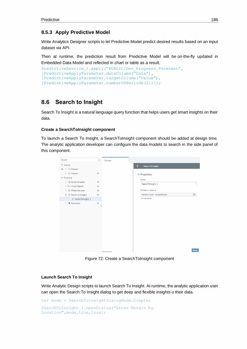
Predictive 186
8.5.3 Apply Predictive Model
Write Analytics Designer scripts to let Predictive Model predict desired results based on an input
dataset via API.
Then at runtime, the prediction result from Predictive Model will be on-the-fly updated in
Embedded Data Model and reflected in chart or table as a result.
PredictiveService_1.apply(“PUBLIC/Dev_Progress_Forecast”,
[PredictiveApplyParameter.dateColumn(“Date”),
[PredictiveApplyParameter.targetColumn(“Value”),
[PredictiveApplyParameter.numberOfPeriods(21)]);
8.6 Search to Insight
Search To Insight is a natural language query function that helps users get smart insights on their
data.
Create a SearchToInsight component
To launch a Search To Insight, a SearchToInsight component should be added at design time.
The analytic application developer can configure the data models to search in the side panel of
this component.
Figure 72: Create a SearchToInsight component
Launch Search To Insight
Write Analytic Design scripts to launch Search To Insight. At runtime, the analytic application user
can open the Search To Insight dialog to get deep and flexible insights o their data.
var mode = SearchToInsightDialogMode.Simple;
SearchToInsight_1.openDialog("Gross Margin by
Location",mode,true,true);

Predictive 187
Figure 73: Launch Search To Insight

OData 188
9 OData
9.1 What you should know about OData
Open Data Protocol (OData) is an open protocol which allows the creation and consumption of
queryable and interoperable RESTful APIs in a simple and standard way, initiated by Microsoft
in 2007.
Versions 1.0, 2.0, and 3.0 are released under the Microsoft Open Specification Promise.
Version 4.0 was standardized at OASIS, with a release in March 2014. In April 2015 OASIS
submitted OData v4 and OData JSON Format v4 to ISO/IEC JTC 1 for approval as an
international standard.
“The protocol enables the creation and consumption of REST APIs, which allow Web clients to
publish and edit resources, identified using URLs and defined in a data model, using simple
HTTP messages. OData shares some similarities with JDBC and with ODBC; like ODBC,
OData is not limited to relational databases.” (https://en.wikipedia.org/wiki/Open_Data_Protocol)
9.2 How you can connect to OData
In Analytics Designer in SAP Analytics Cloud, you can define OData Services based on an
existing on-premise S/4 HANA live connection in your system which was created using CORS
(Cross-origin resource sharing) connectivity also referred to as direct connection.
For oData, CORS should be configured on backend analogous to InA connection plus: Support
for "if-match" as allowed header.
9.2.1 What you need to do
• Define the CORS configuration to your S/4HANA on premise system according to the help page
• Additionally: Configure support for "if-match" as allowed header in the S/4HANA system
• Define a direct connection to this system
• Open an application and add an OData service (more details in the following chapters)
9.2.2 The following restrictions are known
In the initial iteration:
• Only parameters of simple types will be supported.
• Actions with mandatory parameters of unsupported types will not be available.
• For actions with optional parameters of unsupported types, the parameters will not be available but the action itself will.
• In case of bound actions, only binding on entity types (passable by key) will be supported.
• Only the JSON format will be supported
• Only S/4HANA on-prem will be supported
• Only Direct (CORS) connections will be supported. No Path (Proxy), as this feature is being deprecated

OData 189
Script execution will block waiting on the response of a triggered action. For now, the assumption
is that actions triggering long-running processes return quickly (although the process may not yet
be complete). So, while of course the XHR invoking the action is asynchronous, script execution
will block waiting for the response, to allow the script writer to react to the return value of the
action.
The following types are not supported:
• Edm.Stream
• Edm.Untyped
• All Edm.Geography types
• All Edm.Geometry types
• All types defined in different namespaces.
9.2.3 What is an Action
Actions are operations exposed by an OData service that MAY have side effects when invoked.
Actions MAY return data but MUST NOT be further composed with additional path segments.
9.2.4 What are Action Imports
Action Imports or unbound actions are not associated with any OData EntitySet or Entity. They
generally expose simple parameters. All parameters are set via POST body.
9.2.5 What is a Bound Action
Bound Actions are actions which may be invoked on a specific Entity. They always contain a first
parameter which is set via URL (to resolve the binding to the Entity within the relevant EntitySet),
and all other parameters are set via POST body.
In general, actions can be bound on every type, but we support only binding on single entities.
In Analytics Designer OData actions can be called from and executed in the backend system via
scripting inside an analytic application. Also, programmatic read access to Odata services is
provided.
9.3 How you can call OData Actions
With this feature you as application developer have the ability to execute OData (V4) Actions
exposed by a connected on-premise S/4HANA system within an analytic application.
In your analytic application in the Layout Outline in the Scripting Section you can create a new
OData Service by clicking on plus.
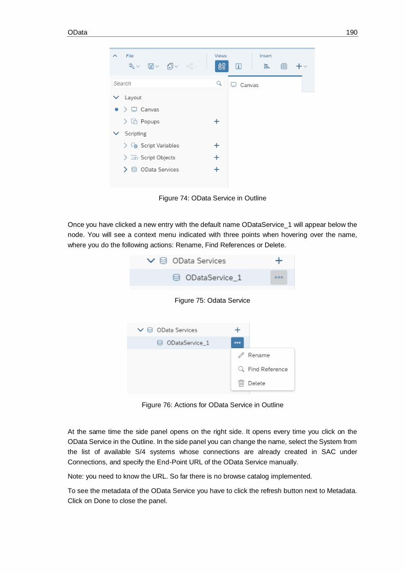
OData 190
Figure 74: OData Service in Outline
Once you have clicked a new entry with the default name ODataService_1 will appear below the
node. You will see a context menu indicated with three points when hovering over the name,
where you do the following actions: Rename, Find References or Delete.
Figure 75: Odata Service
Figure 76: Actions for OData Service in Outline
At the same time the side panel opens on the right side. It opens every time you click on the
OData Service in the Outline. In the side panel you can change the name, select the System from
the list of available S/4 systems whose connections are already created in SAC under
Connections, and specify the End-Point URL of the OData Service manually.
Note: you need to know the URL. So far there is no browse catalog implemented.
To see the metadata of the OData Service you have to click the refresh button next to Metadata.
Click on Done to close the panel.

OData 191
Figure 77: OData Service Sidepanel
In the example you see System FUB, the End-Point URL for this OData Service and as Metadata
you got the information that this Service is based on OData Version V.4 and it has 2 Actions called
Flight/Book and CancelMyFlights.
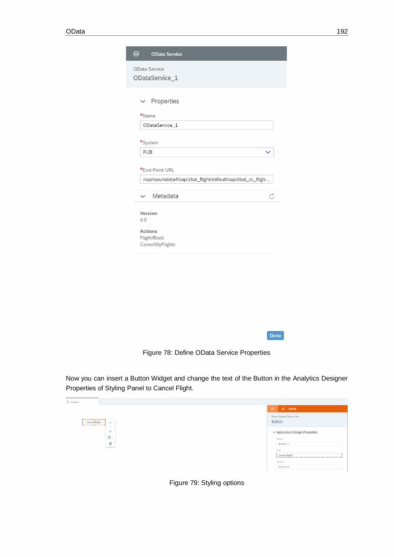
OData 192
Figure 78: Define OData Service Properties
Now you can insert a Button Widget and change the text of the Button in the Analytics Designer
Properties of Styling Panel to Cancel Flight.
Figure 79: Styling options

OData 193
Start the script editor by clicking the fx sign in the quick action menu of the widget to create a
script which triggers the execution of the action in the source system.
Figure 80: Widget context menu
The script editor opens. You can open it as well by hovering over the widget in the outline and
clicking the fx sign.
Figure 81: Create Script
Figure 82: Create Script
Type in the name of the OData Service you have specified. The script editor assists you with code
completion and value help wherever possible when you click CTRL+Space.

OData 194
The complete expression will look like this:
ODataService_1.executeAction("CancelMyFlights", {DateFrom: "2019-01-
01", DateTo: "2019-12-31"});
You have now created the first script to execute an OData action. This Action had a very simple
syntax with only 2 parameters.
Figure 83: Value Help
Now you can insert another button, rename the text to Book Flight in the Styling Panel and open
the script editor. The BookFlight Action is a bound action which is much more complex than the
first one.
The result shall look like this:
ODataService_1.executeAction("Flight/Book",
{Flight:{Airline:"UA",Flightconnection:"0941", Flightdate: "2019-01-
05"},NumberOfSeats: 1});
Figure 84: Value Help for Flight/Book
Figure 85: Value Help for Flight
Congratulations. You finished the second more complex OData action and now you can run your
application and book and cancel a flight for the selected values.
You can enhance your application and start using other script methods to fill the parameter values
dynamically with local or global variables.
Also, you can make the response from the backend system visible in the app by writing the
response as message in a text field.

OData 195
Insert six Text widgets on the canvas and rename the last one to MessageBox.
Figure 86: Define Message
Now rewrite your scripts from Book Flight as follows:
var ret = ODataService_1.executeAction("Flight/Book",
{Flight:{Airline:"UA",Flightconnection:"0941", Flightdate: "2019-01-
05"},NumberOfSeats: 1});
var succ = "";
if (ret.ok === true) {
succ = "SUCCESS";
} else {
succ = "ERROR";
}
MessageBox.applyText(succ);
Text_2.applyText(succ + " message :" + ret.error.message);
Text_3.applyText(succ + " code :" + ret.error.code);
Text_4.applyText("target :" + ret.error.target);
Text_5.applyText("");
And rewrite your script from Cancel Flight as follows:
var ret = ODataService_1.executeAction("CancelMyFlights", {DateFrom:
"2019-01-01", DateTo: "2019-12-31"});
console.log(ret);
var succ = "";
if (ret.ok === true) {
succ = "SUCCESS";
} else {
succ = "ERROR";
}
MessageBox.applyText(succ);

OData 196
Text_2.applyText(succ + " message :" + ret.error.message);
Text_3.applyText(succ + " code :" + ret.error.code);
Text_4.applyText("target :" + ret.error.target);
var info = "";
if (ret.ok === true) {
var numberofoccupiedseats =
ConvertUtils.integerToString(ret.value[0].Numberofoccupiedseats);
var flightprice =
ConvertUtils.numberToString(ret.value[0].Flightprice);
var totalnumberofseats =
ConvertUtils.integerToString(ret.value[0].Totalnumberofseats);
var currency = ret.value[0].Currency;
info = "Your flight price was " + flightprice + " " + currency + ".
" + "There are " + numberofoccupiedseats + " occupied from " +
totalnumberofseats + " seats in total.";
}
Text_5.applyText("" + info);
Run the application and book a flight and cancel a flight to see the error messages.
To create a meaningful application in the sense of an intelligent application, the best would be to
display the backend data via a live connection to a Bex Query. Like this you would be able to see
the changes (the booked and canceled seats) in the data directly after clicking the buttons and
executing the actions.
9.4 How you can read data from OData Services
Besides OData Actions, there are also many usecases why it makes sense to access EntitySets
exposed via OData services.
Therefore, in Analytics Designer you have programmatic access to these data, which can be
used for any purposes other than visualization in table or chart. For example, you can read
and display one member in a text widget.
You can focus on the following 2 capabilities regarding access to OData entity sets:
Retrieving a single OData Entity from an EntitySet, by specifying the key to the entity. (analogous
to selecting a single row from a SQL table via SELECT * FROM T1 WHERE ID = <id>).
Retrieving all (throttled to a maximum number) Entities from an OData EntitySet. (analogous to
SELECT TOP <N> * FROM T1).
As of today the following features are not supported:
• Chaining from one EntitySet to another
• filter
• orderby
• select
• count
• expand (analogous to joining)
OData 197
• Skip
• EntitySets with parameters and EntitySets with mandatory filters
//Get all entities (up to a throttled limit of 1000) from a given
EntitySet
getEntitiesFromEntitySet(entitySetName: string):
ODataResult<EntityTypeSpecificPayload[]>;
//ODataResult is the same result structure returned when executing
actions, and contains generic information about whether the raw
request on
HTTP level was successful, and additionally the response payload in
success cases.
//included here for completeness, but the "main" definition is in "PD
Calling OData Actions".
ODataResult<T>: {
ok: boolean;
value: T; //depends on payload of action or entity type
error: ODataError;
}
ODataError: {
code: string;
message: string;
target: string;
details: ODataError[];
}
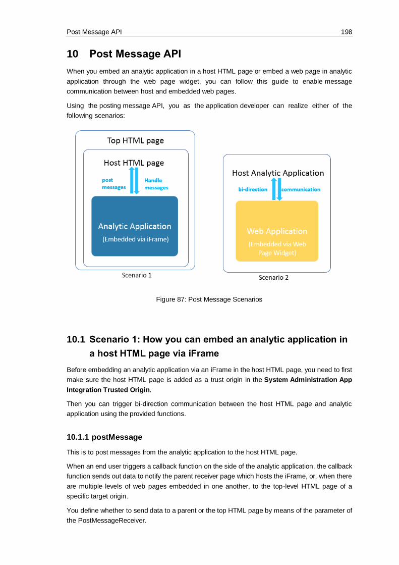
Post Message API 198
10 Post Message API
When you embed an analytic application in a host HTML page or embed a web page in analytic
application through the web page widget, you can follow this guide to enable message
communication between host and embedded web pages.
Using the posting message API, you as the application developer can realize either of the
following scenarios:
Figure 87: Post Message Scenarios
10.1 Scenario 1: How you can embed an analytic application in
a host HTML page via iFrame
Before embedding an analytic application via an iFrame in the host HTML page, you need to first
make sure the host HTML page is added as a trust origin in the System Administration App
Integration Trusted Origin.
Then you can trigger bi-direction communication between the host HTML page and analytic
application using the provided functions.
10.1.1 postMessage
This is to post messages from the analytic application to the host HTML page.
When an end user triggers a callback function on the side of the analytic application, the callback
function sends out data to notify the parent receiver page which hosts the iFrame, or, when there
are multiple levels of web pages embedded in one another, to the top-level HTML page of a
specific target origin.
You define whether to send data to a parent or the top HTML page by means of the parameter of
the PostMessageReceiver.

Post Message API 199
The syntax of the postMessage event is:
postMessage (receiver: PostMessageReceiver, message: string, targetOrigin: string): void
10.1.2 onPostMessageReceived
This is to handle messages sent from the host parent or top HTML page in the analytic application.
In scenario 2 depicted below, the event can also handle messages sent from an HTML page
embedded via the web page widget in an analytic application.
Note:
We advise you always to check the origin when receiving an event-triggered message, because
a malicious site can change the location of the window and therefore intercept the data you sent
using the postMessage event without your knowledge.
In the current scenario, the parent window which hosts the iFrame can post messages to the
analytic application's iFrame window of specific target origin. The messages posted are then
retrieved by the analytic application and trigger changes accordingly, such as updating some input
data.
The syntax of the onPostMessageReceived event is:
onPostMessageReceived(message: string, origin: string)
10.1.3 Example
You can embed an analytic application in a host HTML page. The URL of the host HTML page is
http://localhost:8080.
Figure 88: Embed an analytic application into a host page

Post Message API 200
First, you want to allow end users to post the company selection in the analytic application to the
host HTML page. Write the script below for the sending button:
var message = RadioButtonGroup_Company.getSelectedText();
Application.postMessage(PostMessageReceiver.Parent, message,
"http://localhost:8080");
Then you want to allow end users to display the message received from the Host HTML page in
a text box of the embedded analytic application.
If (origin == “http://localhost:8080”) {
Text_ReceivedMessage.applyText(message);}
10.2 Scenario 2: How you embed a web application in an
analytic application through the web page widget
You can trigger bi-direction communication between the embedded web application and the host
analytic application.
10.2.1 Web Page Widget Related postMessage and
OnPostMessageReceived
When the host analytic application's web page widget embeds a web application, you
can post messages from the embedded application to the host analytic application or the other
way around.
The syntax of the postMessage event is:
postMessage(message: string, targetOrigin: string): void
Note:
The target origin is optional. If it is left empty, the URL defined in the web page widget will be
taken as the target origin by default.
The syntax of the onPostMessageReceived event is:
onPostMessageReceived(message: string, origin: string)
10.2.2 Case 1 - Posting messages from the host analytic application to the
embedded application
The event for posting messages is:
postMessage()
The event for handling messages sent from the host analytic application depends on the type of
the embedded application:
• If the embedded application is an SAP Analytics Cloud application, once the message is received, the embedded application can use the event onPostMessageReceived() to
handle the message.

Post Message API 201
• If the embedded application is another web application, once the message is received, the embedded application can use the event window.on("message") to handle the message.
10.2.3 Case 2 - Posting messages from the embedded application to the
host analytic application
The event for posting messages depends on the type of the embedded application:
• If the embedded application is an SAP Analytics Cloud application, use the event Application.postMessage() to post messages.
• If the embedded application is another web application, use the event window.parent.postMessage to post messages.
The event for handling messages sent from embedded application is: Once the messages is
received, the host application can use the event onPostMessageReceived() to handle
the messages.

The End and the Future 202
11 The End and the Future
Dear Reader, we hope you have enjoyed the book. We will enhance the content in the future with
the newest features. Now please go ahead and have fun building awesome analytic applications!

Important Links 203
12 Important Links
Please open the SAP Help page to find many more information about SAP Analytics Cloud,
analytics designer:
https://help.sap.com/viewer/product/SAP_ANALYTICS_CLOUD/release/en-US
• The official documentation
• The API reference guide
• The SAP Analytics Cloud community
• The SAP Analytics Cloud wiki
• And many more links
© 2019 SAP SE or an SAP affiliate company. All rights reserved.
No part of this publication may be reproduced or transmitted in any form or for any purpose without the express permission of SAP SE or an SAP affiliate company.
The information contained herein may be changed without prior notice. Some software products marketed by SAP SE and its distributors contain proprietary
software components of other software vendors. National product specifications may vary.
These materials are provided by SAP SE or an SAP affiliate company for informational purposes only, without representation or warranty of any kind, and SAP or
its affiliated companies shall not be liable for errors or omissions with respect to the materials. The only warranties for SAP or SAP affiliate company products and
services are those that are set forth in the express warranty statements accompanying such products and services, if any. Nothing herein should be construed as
constituting an additional warranty.
In particular, SAP SE or its affiliated companies have no obligation to pursue any course of business outlined in this document or any related presentation, or to
develop or release any functionality mentioned therein. This document, or any related presentation, and SAP SE’s or its affiliated companies’ strategy and possible
future developments, products, and/or platform directions and functionality are all subject to change and may be changed by SAP SE or its affiliated companies
at any time for any reason without notice. The information in this document is not a commitment, promise, or legal obligation to deliver any material, code, or
functionality. All forward-looking statements are subject to various risks and uncertainties that could cause actual results to differ materially from e xpectations.
Readers are cautioned not to place undue reliance on these forward-looking statements, and they should not be relied upon in making purchasing decisions.
SAP and other SAP products and services mentioned herein as well as their respective logos are trademarks or registered trademarks of SAP SE (or an SAP
affiliate company) in Germany and other countries. All other product and service names mentioned are the trademarks of their respective companies. See
www.sap.com/copyright for additional trademark information and notices.