Sanomat - Commercial Type · Sanomat is a typeface that was designed with not only language but...
17
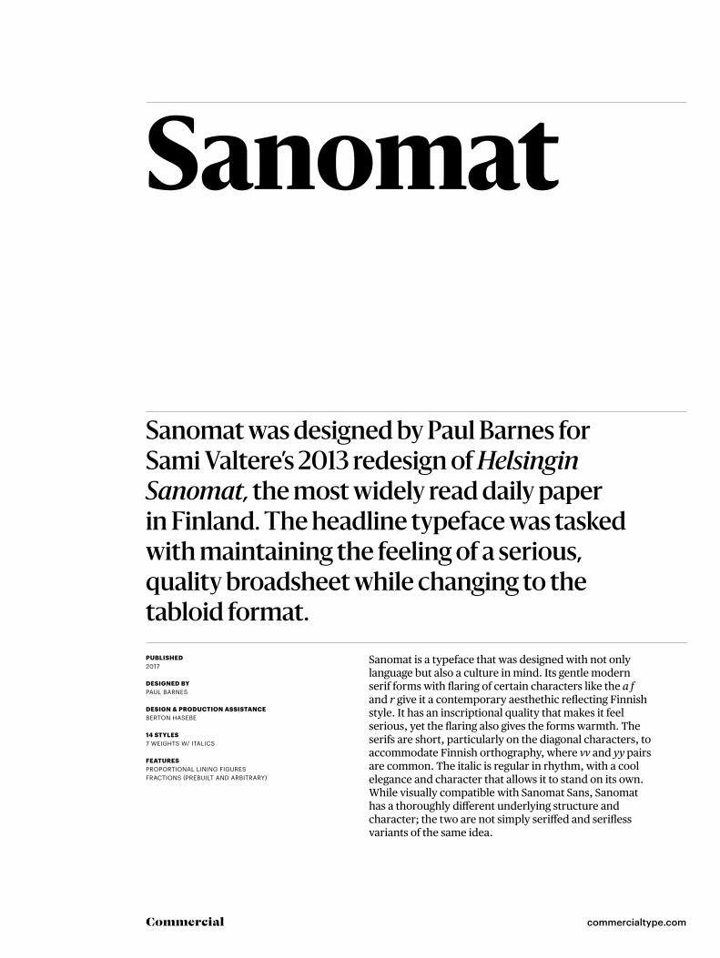
commercialtype.com Commercial Sanomat Sanomat was designed by Paul Barnes for Sami Valtere’s 2013 redesign of Helsingin Sanomat, the most widely read daily paper in Finland. The headline typeface was tasked with maintaining the feeling of a serious, quality broadsheet while changing to the tabloid format. PUBLISHED 2017 DESIGNED BY PAUL BARNES DESIGN & PRODUCTION ASSISTANCE BERTON HASEBE 14 STYLES 7 WEIGHTS W/ ITALICS FEATURES PROPORTIONAL LINING FIGURES FRACTIONS (PREBUILT AND ARBITRARY) Sanomat is a typeface that was designed with not only language but also a culture in mind. Its gentle modern serif forms with flaring of certain characters like the a f and r give it a contemporary aesthethic reflecting Finnish style. It has an inscriptional quality that makes it feel serious, yet the flaring also gives the forms warmth. The serifs are short, particularly on the diagonal characters, to accommodate Finnish orthography, where vv and yy pairs are common. The italic is regular in rhythm, with a cool elegance and character that allows it to stand on its own. While visually compatible with Sanomat Sans, Sanomat has a thoroughly different underlying structure and character; the two are not simply seriffed and serifless variants of the same idea.
Transcript of Sanomat - Commercial Type · Sanomat is a typeface that was designed with not only language but...
commercialtype.comCommercial
Sanomat
Sanomat was designed by Paul Barnes for Sami Valtere’s 2013 redesign of Helsingin Sanomat, the most widely read daily paper in Finland. The headline typeface was tasked with maintaining the feeling of a serious, quality broadsheet while changing to the tabloid format.PUBLISHED 2017 DESIGNED BY PAUL BARNES
DESIGN & PRODUCTION ASSISTANCE BERTON HASEBE 14 STYLES7 WEIGHTS W/ ITALICS
FEATURESPROPORTIONAL LINING FIGURESFRACTIONS (PREBUILT AND ARBITRARY)
Sanomat is a typeface that was designed with not only language but also a culture in mind. Its gentle modern serif forms with flaring of certain characters like the a f and r give it a contemporary aesthethic reflecting Finnish style. It has an inscriptional quality that makes it feel serious, yet the flaring also gives the forms warmth. The serifs are short, particularly on the diagonal characters, to accommodate Finnish orthography, where vv and yy pairs are common. The italic is regular in rhythm, with a cool elegance and character that allows it to stand on its own. While visually compatible with Sanomat Sans, Sanomat has a thoroughly different underlying structure and character; the two are not simply seriffed and serifless variants of the same idea.

Sanomat 2 of 17
commercialtype.comCommercial
Sanomat LightSanomat Light ItalicSanomat RegularSanomat Regular ItalicSanomat MediumSanomat Medium ItalicSanomat SemiboldSanomat Semibold ItalicSanomat BoldSanomat Bold ItalicSanomat ExtraboldSanomat Extrabold ItalicSanomat BlackSanomat Black Italic
Sanomat 3 of 17
commercialtype.comCommercial
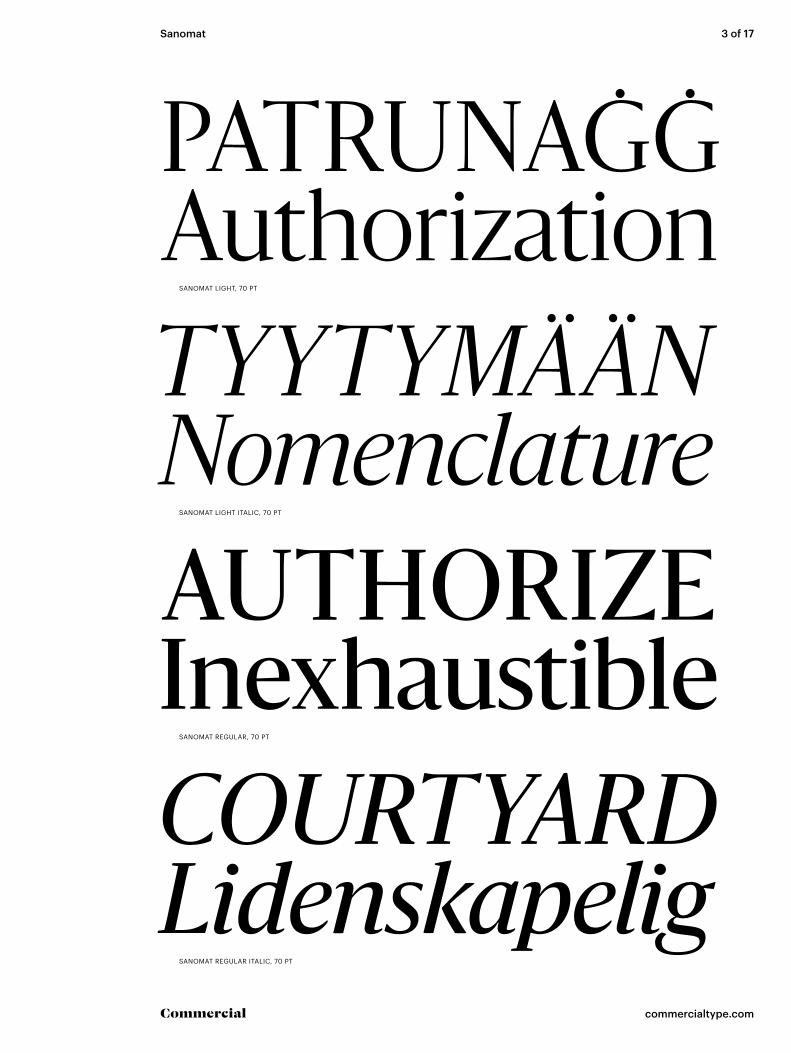
PATRUNAĠĠAuthorizationTYYTYMÄÄNNomenclatureAUTHORIZEInexhaustibleCOURTYARDLidenskapelig
SANOMAT LIGHT, 70 PT
SANOMAT LIGHT ITALIC, 70 PT
SANOMAT REGULAR, 70 PT
SANOMAT REGULAR ITALIC, 70 PT
Sanomat 4 of 17
commercialtype.comCommercial
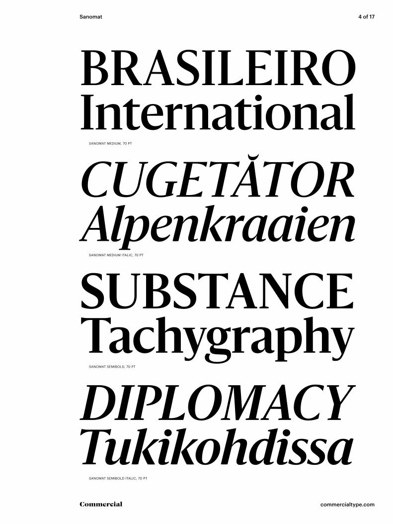
BRASILEIROInternationalCUGETĂTORAlpenkraaienSUBSTANCETachygraphyDIPLOMACYTukikohdissa
SANOMAT MEDIUM, 70 PT
SANOMAT MEDIUM ITALIC, 70 PT
SANOMAT SEMIBOLD, 70 PT
SANOMAT SEMIBOLD ITALIC, 70 PT
Sanomat 5 of 17
commercialtype.comCommercial
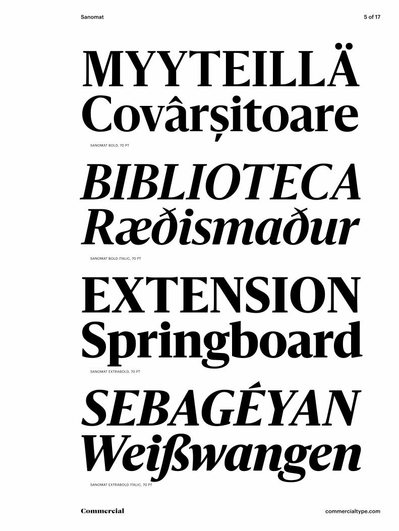
MYYTEILLÄCovârșitoareBIBLIOTECARæðismaðurEXTENSIONSpringboardSEBAGÉYANWeißwangen
SANOMAT BOLD, 70 PT
SANOMAT BOLD ITALIC, 70 PT
SANOMAT EXTRABOLD, 70 PT
SANOMAT EXTRABOLD ITALIC, 70 PT

Sanomat 6 of 17
commercialtype.comCommercial
DISCOVERYTyydyttänyt MEDIEVALEHoukuttelee
SANOMAT BLACK, 70 PT
SANOMAT BLACK ITALIC, 70 PT [ALTERNATE k]

Sanomat 7 of 17
commercialtype.comCommercial
Exposing deep structureACHIEVE SOLIDARITYMatatandang Dalubhasa
Radiação infravermelhaARTWORK FROM 1461Die erste Wiener Dekade
Mukaan voimanosoitusILMAISSUT TUKENSAExpresszionizmus egyik
Optic & HydrodynamicPIEZĪMJU GRĀMATĀSSplintering oppositions
SANOMAT LIGHT, LIGHT ITALIC, 40 PT
SANOMAT REGULAR, REGULAR ITALIC, 40 PT
SANOMAT MEDIUM, MEDIUM ITALIC, 40 PT
SANOMAT SEMIBOLD, SEMIBOLD ITALIC, 40 PT
Sanomat 8 of 17
commercialtype.comCommercial
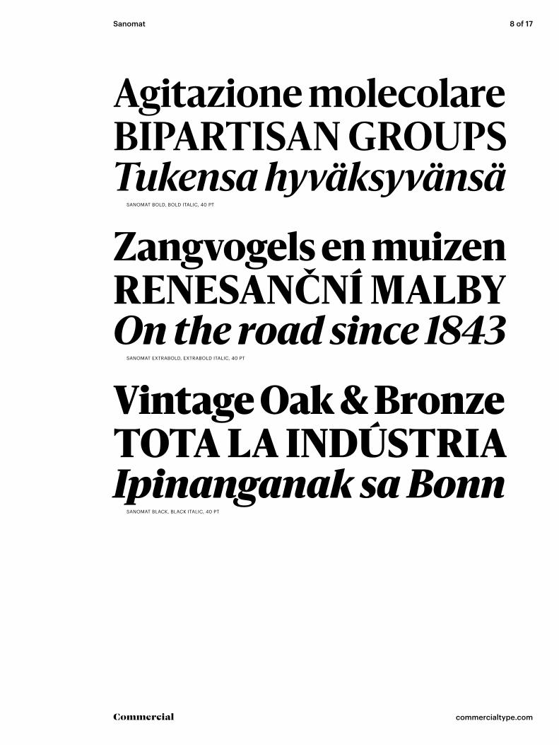
Agitazione molecolareBIPARTISAN GROUPSTukensa hyväksyvänsä
Zangvogels en muizenRENESANČNÍ MALBYOn the road since 1843
Vintage Oak & BronzeTOTA LA INDÚSTRIAIpinanganak sa Bonn
SANOMAT BOLD, BOLD ITALIC, 40 PT
SANOMAT EXTRABOLD, EXTRABOLD ITALIC, 40 PT
SANOMAT BLACK, BLACK ITALIC, 40 PT
Sanomat 9 of 17
commercialtype.comCommercial
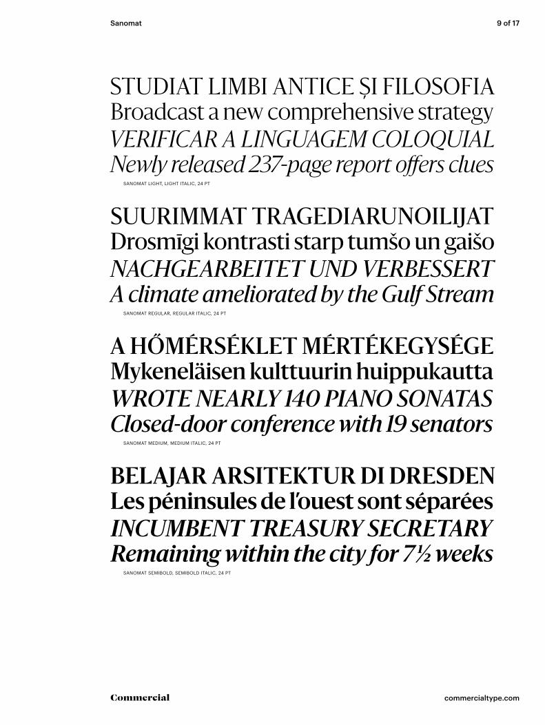
STUDIAT LIMBI ANTICE Ș I FILOSOFIABroadcast a new comprehensive strategyVERIFICAR A LINGUAGEM COLOQUIALNewly released 237-page report offers clues
SUURIMMAT TRAGEDIARUNOILIJATDrosmīgi kontrasti starp tumšo un gaišoNACHGEARBEITET UND VERBESSERTA climate ameliorated by the Gulf Stream
A HŐMÉRSÉKLET MÉRTÉKEGYSÉGEMykeneläisen kulttuurin huippukauttaWROTE NEARLY 140 PIANO SONATASClosed-door conference with 19 senators
BELAJAR ARSITEKTUR DI DRESDENLes péninsules de l’ouest sont séparéesINCUMBENT TREASURY SECRETARYRemaining within the city for 7 1/2 weeks
SANOMAT LIGHT, LIGHT ITALIC, 24 PT
SANOMAT REGULAR, REGULAR ITALIC, 24 PT
SANOMAT MEDIUM, MEDIUM ITALIC, 24 PT
SANOMAT SEMIBOLD, SEMIBOLD ITALIC, 24 PT

Sanomat 10 of 17
commercialtype.comCommercial
DEZE TREKVOGEL VLIEGT TIJDENSThe state’s most famous watchmakersLES PRINCIPAUX ATTRAITS DE L’ÎLEGrundades 1847 av Hector Hendersson
IDENTIFICA CON EL ESTEREOTIPOAnnouncing 5 specific policy changesHYÖDYNTÄEN MYÖS MYTOLOGISIATyyliin monet löydöksistään suoraan
SANOMAT BOLD, BOLD ITALIC, 24 PT
SANOMAT EXTRABOLD, EXTRABOLD ITALIC, 24 PT
1,750 HISTORIANS AND SCHOLARSŠajā laikā zonde 17 reizes satuvinājāsTOASTED CUMIN & AGAVE NECTARKonstant at eksperimentere og blive
SANOMAT BLACK, BLACK ITALIC, 24 PT [ALTERNATE k]
Sanomat 11 of 17
commercialtype.comCommercial
KÄTEISKORVAUKSENA HETI 5 693 000 MARKKAAEyjan sú í miðjarðarhafinu er staðsett á milli FrakklandsGANYMED PRAVDĚPODOBNĚ VZNIKL V AKREČNÍMEvidențiată de vânzarea primelor numere 410 exemplare
HAR IKKE BARE EN KLAR KOMPOSISJON MEN ERDank eines kleinen Stipendiums des örtlichen GrafenNYERSEK ÉS AZ EMBERI SORSOT SZIMBOLIZÁLJÁKAllocated $127,843 to purchase Cheesequake State Park
SAILED TO BRITAIN IN 1711 AS HENRI LE RENNETSalapoliisikirjallisuuden ytimen muodostavat kolmeHAN VAR SØN AF ET SKUESPILLERÆGTEPAR SOMSeveral of Frank Lloyd Wright’s most renowned pupils
SET OFF IN EARNEST TO START A NEW CAREERRooms playfully juxtaposed with bold, dark accentsHALLMARK OF A GOOD CONTRARIAN CONCEPTSyntymäaikaa ei tiedetä, mutta hänen myöhempien
ARRIVING IN BALTIMORE ON 2 AUGUST @ 7 PM Declined to respond to new calls seeking commentV POZDĚJŠÍ TVORBĚ JE ZNÁT CITELNÝ PŘÍKLONDa un lato una grande varietà di atteggiamenti che
EX-CEO FORFEITS $39.52 MILLION IN OPTIONSIllustrated an episode of vivid sensory experienceSAAREN PÄÄTULONLÄHDE ON VISKIN TISLAUSMarkets down nearly 34.7 percent over the decade
SANOMAT LIGHT, LIGHT ITALIC, 18 PT
SANOMAT REGULAR, REGULAR ITALIC, 18 PT
SANOMAT MEDIUM, MEDIUM ITALIC, 18 PT
SANOMAT SEMIBOLD, SEMIBOLD ITALIC, 18 PT
SANOMAT BOLD, BOLD ITALIC, 18 PT
SANOMAT EXTRABOLD, EXTRABOLD ITALIC, 18 PT [ALTERNATE ITALIC k]

Sanomat 12 of 17
commercialtype.comCommercial
CaractéristiquesDistilleerderijenMötesplatsernaYhdeksänneksi
SANOMAT LIGHT, 60 PT
SANOMAT REGULAR, 60 PT
SANOMAT MEDIUM, 60 PT
SANOMAT SEMIBOLD, 60 PT
MulticulturallySANOMAT BOLD, 60 PT
JipperfezzjonaSANOMAT EXTRABOLD, 60 PT
QuatuorvirateSANOMAT BLACK, 60 PT

Sanomat 13 of 17
commercialtype.comCommercial
WarmgemäßigteElettrodinamicaJoukkueeseensaQuadrigeminal
SANOMAT LIGHT ITALIC, 60 PT
SANOMAT REGULAR ITALIC, 60 PT
SANOMAT MEDIUM ITALIC, 60 PT
SANOMAT SEMIBOLD ITALIC, 60 PT
RaznovrsnošćuSANOMAT BOLD ITALIC, 60 PT
UnadulteratedSANOMAT EXTRABOLD ITALIC, 60 PT
ViðskiptavinirSANOMAT BLACK ITALIC, 60 PT [ALTERNATE k]

Sanomat 14 of 17
commercialtype.comCommercial
UPPERCASE
LOWERCASE
STANDARD PUNCTUATION
ALL CAP PUNCTUATION
LIGATURES
PROPORTIONAL LINING default figures
PREBUILT FRACTIONS
NUMERATORS & DENOMINATORS
ACCENTED UPPERCASE
ACCENTED LOWER CASE

Sanomat 15 of 17
commercialtype.comCommercial
UPPERCASE
LOWERCASE
STANDARD PUNCTUATION
ALL CAP PUNCTUATION
LIGATURES
$£€¥1234567890¢ƒ%‰ªº#°<+=−×÷>′″PROPORTIONAL LINING default figures
½ ⅓ ⅔ ¼ ¾ ⅛ ⅜ ⅝ ⅞PREBUILT FRACTIONS
NUMERATORS & DENOMINATORS
STYLISTIC ALTERNATES
ACCENTED UPPERCASE
ACCENTED LOWER CASE
Sanomat 16 of 17
commercialtype.comCommercial
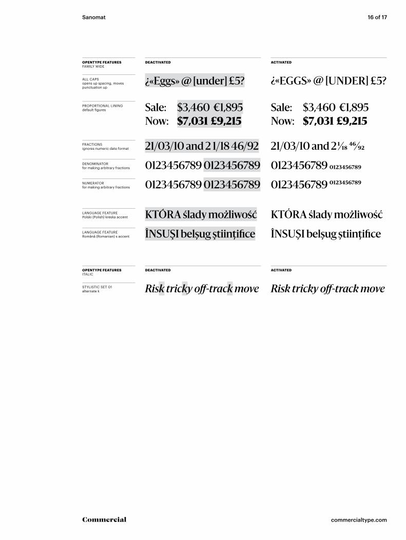
OPENTYPE FEATURESFAMILY WIDE
DEACTIVATED ACTIVATED
PROPORTIONAL LINING default figures Sale: $3,460 €1,895
Now: $7,031 £9,215Sale: $3,460 €1,895Now: $7,031 £9,215
ALL CAPS opens up spacing, moves punctuation up
¿«Eggs» @ [under] £5? ¿«EGGS» @ [UNDER] £5?
FRACTIONS ignores numeric date format 21/03/10 and 2 1/18 46/92 21/03/10 and 2 1/18 46/92
LANGUAGE FEATURE Polski (Polish) kreska accent
LANGUAGE FEATURE Română (Romanian) s accent
NUMERATOR for making arbitrary fractions 0123456789 01234567890123456789 0123456789
DENOMINATOR for making arbitrary fractions 0123456789 01234567890123456789 0123456789
KTÓRA ślady możliwość KTÓRA ślady możliwość
ÎNSUŞI belșug ştiinţifice ÎNSUŞI belșug știinţifice
STYLISTIC SET 01 alternate k Risk tricky off-track move Risk tricky off-track move
OPENTYPE FEATURESITALIC
DEACTIVATED ACTIVATED
Sanomat 17 of 17
commercialtype.comCommercial
ABOUT THE DESIGNERS
© 2017 Commercial Type. All rights reserved. Commercial® is a registered trademark & Sanomat™ isa trademark of Schwartzco Inc., dba Commercial Type. This file may be used for evaluation purposes only.
COPYRIGHT
Afrikaans, Albanian, Asturian, Basque, Breton, Bosnian, Catalan, Cornish, Croatian, Czech, Danish, Dutch, English, Esperanto, Estonian, Faroese, Finnish, French, Galician, German, Greenlandic, Guarani, Hawaiian, Hungarian, Ibo, Icelandic, Indonesian, Irish, Gaelic, Italian, Kurdish, Latin, Latvian, Lithuanian, Livonian, Malagasy, Maltese, Maori, Moldavian, Norwegian, Occitan, Polish, Portuguese, Romanian, Romansch, Saami, Samoan, Scots, Scottish Gaelic, Serbian (Latin), Slovak, Slovenian, Spanish (Castillian), Swahili, Swedish, Tagalog, Turkish, Walloon, Welsh, Wolof
SUPPORTED LANGUAGES
Commercial Type 110 Lafayette Street, #203New York, New York 10013
office 212 604-0955fax 212 925-2701 www.commercialtype.com
CONTACT
Sanomat LightSanomat Light ItalicSanomat RegularSanomat Regular ItalicSanomat MediumSanomat Medium ItalicSanomat SemiboldSanomat Semibold ItalicSanomat BoldSanomat Bold ItalicSanomat ExtraboldSanomat Extrabold Italic
STYLES INCLUDED IN COMPLETE FAMILY
Paul Barnes (born 1970) is a graphic designer special-izing in the fields of lettering, typography, type design, and publication design. In the early 1990s he worked for Roger Extrabold in New York where he was involved in redesigns of Newsweek, US and British Esquire and Foreign Affairs. During this time he art directed Esquire Gentleman and U&lc. He later returned to America to be art director of the music magazine Spin.
Since 1995 he has lived and worked in London. He has formed a long term collaboration with Peter Saville, which has resulted in such diverse work as identities for Givenchy, ‘Original Modern’ for Manchester and numerous music based projects, such as Gay Dad, New Order, Joy Division and Electronic. Independently he has created identities for luxury Italian shoe manufac-turer Gianvito Rossi, and German publisher Schirmer Graf. Barnes has also been an advisor and consultant on numerous publications, notably The Sunday Times Magazine, The Guardian and The Observer Newspapers, GQ, Wallpaper*, Harper’s Bazaar and frieze. He has designed many books for publishers all over Europe including Schirmer Mosel, Oxford University Press, the Tate, and the iconic Schirmer Graf series.
His interest in the modern and vernacular is en-compassed in his type design ranging from the con-temporary such as for Björk, through to the extensive traditional British modern Brunel as seen in Condé Nast Portfolio. Whilst consultant to The Guardian he designed Guardian Egyptian with Christian Schwartz. Following the redesign of The Guardian, as part of the team head-ed by Mark Porter, Barnes was awarded the Extrabold Pencil from the D&AD. They were also nominated for the Design Museum ‘Designer of the Year’. In September 2006, with Schwartz he was named one of the 40 most influential designers under 40 in Wallpaper*. A year later The Guardian named him as one of the 50 best designers in Britain.