sandbergkelli_processbook
-
Upload
kellisandberg -
Category
Documents
-
view
219 -
download
0
Transcript of sandbergkelli_processbook

8/12/2019 sandbergkelli_processbook
http://slidepdf.com/reader/full/sandbergkelliprocessbook 1/7
JIFredesign
kel l i sandberg

8/12/2019 sandbergkelli_processbook
http://slidepdf.com/reader/full/sandbergkelliprocessbook 2/7
Product Name
JIF Peanut Butter
Target Group
The target consumers that Jif is currently aiming toward is moth-
ers. Their slogan is, “Choosy Moms Choose Jif ”. They have been
advertising for mom’s who buy peanut butter for their kids. I thinkthis is a great start but now it’s time to expand to other consum-
ers. I am a college student but I have a peanut butter sandwich
almost every day for lunch. A ton of people love peanut butter, it’s
not only little kids. I want to target young adults with the design
I’m going for.

8/12/2019 sandbergkelli_processbook
http://slidepdf.com/reader/full/sandbergkelliprocessbook 3/7
brief history
In 1958, original Jif Creamy Peanut Butter was introduced, and
quickly became a favorite. Jif introduced several new varieties overthe years. In 1974, Jif Extra Crunchy peanut butter made its debut
and proved to be a success with adults and children alike. After
the successful response from their consumers, Jif introduced other
products such as Jif with Honey, Jif Natural, Jif Omega-3 and most
recently, Jif To Go.
For more than 115 years, the J.M. Smucker Company has beencommitted to offering consumers quality products that bring
families together to share memorable meals and moments.Today,
Smucker is a leading marketer and manufacturer of fruit spreads,
retail packaged coffee, peanut butter, shortening and oils, ice
cream toppings, sweetened condensed milk, and health and
natural foods.
big ideaMy plan for the redesign is to take bold action and change their
logo. I am considering keeping the colors but toning them down
because when I look at them now, the color combination looks old
and outdated. I am going to create a design that is more modern
and will relate to other users. It will stand out from other peanutbutters because they all have cheesy designs as well. When it
comes to designing food labels, simple is better. The big blocks
of color are distracting and take away from the goodness of the
actual product. I think by doing this redesign, it will reach out to
a wider range of consumers and will stand out from the compet-
itors.
8/12/2019 sandbergkelli_processbook
http://slidepdf.com/reader/full/sandbergkelliprocessbook 4/7
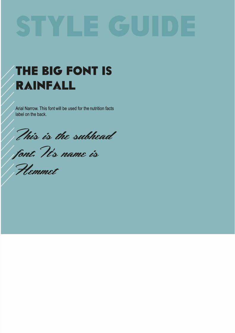
the big Font is
rainfall
Arial Narrow. This font will be used for the nutrition facts
label on the back.
This is the subhead font. It’s name isHemmet

8/12/2019 sandbergkelli_processbook
http://slidepdf.com/reader/full/sandbergkelliprocessbook 5/7
green appleCMYK: 67, 20, 76, 3
RGB: 95, 155, 101
Pantone: 7730 CHex: #5f9b65
cherry redCMYK: 21, 97, 83, 11
RGB: 181, 39, 53
Pantone: 187 CHex: #b52735
river blueCMYK: 66, 24, 35, 1
RGB: 91, 156, 162
Pantone: 5493 CHex: #5b9ca2
soft sandCMYK: 3, 2, 16, 0
RGB: 245, 241, 246Pantone: 5803 C
Hex: #f6f2d9
peanutCMYK: 24, 35, 59, 1
RGB: 196, 162, 119Pantone: 466 C
Hex: #c3a176

8/12/2019 sandbergkelli_processbook
http://slidepdf.com/reader/full/sandbergkelliprocessbook 6/7
Original Logo Logo Redesign
J F

8/12/2019 sandbergkelli_processbook
http://slidepdf.com/reader/full/sandbergkelliprocessbook 7/7
The logo font is Rainfall. I wanted to change elements about the
logo but still make it recognizable because they have a well known
brand already.
This logo will be placed on the label in front on a jar of peanut
butter.
font
placement