Saigon Vintage Lettering - Trinity College Dublin · further develop Saigon Vintage lettering in...
46
Saigon Vintage Lettering: From Hand-painted Shop Signs to Digital Typefaces Nhung Thi Thuy Luu (Lưu Thị Thùy Nhung) A research Paper submitted to the University of Dublin, in partial fulfilment of the requirements for the degree of Master of Science Interactive Digital Media 2019
Transcript of Saigon Vintage Lettering - Trinity College Dublin · further develop Saigon Vintage lettering in...

Saigon Vintage Lettering:
From Hand-painted Shop Signs
to Digital Typefaces
Nhung Thi Thuy Luu
(Lưu Thị Thùy Nhung)
A research Paper submitted to the University of Dublin,
in partial fulfilment of the requirements for the degree of
Master of Science Interactive Digital Media
2019

Declaration
I have read and I understand the plagiarism provisions in the General
Regulations of the University Calendar for the current year, found at:
http://www.tcd.ie/calendar.
I have also completed the Online Tutorial on avoiding plagiarism
‘Ready, Steady, Write’, located at
http://tcdie.libguides.com/plagiarism/ready-steady-write.
I declare that the work described in this research Paper is, except
where otherwise stated, entirely my own work and has not been
submitted as an exercise for a degree at this or any other university.
Signed: ___________________
Nhung Thi Thuy Luu
7 May 2019
Permission to lend and/or copy
I agree that Trinity College Library may lend or copy
this research Paper upon request.
Signed: ___________________
Nhung Thi Thuy Luu
7 May 2019
Acknowledgement
First and foremost, I would like to thank my supervisor, Dr. Robin Fuller. Without his
insightful guidance, constructive feedback, and absolute patience, this research paper would
not have been possible.
To Irish Aid, the Department of Foreign Affair and Trade, and the Irish people, thank you for
sponsoring my Master study and living in Ireland. I can’t express enough my appreciation for
having this chance to pursue higher education at a renowned institution like Trinity College
Dublin.
I would also like to thank Dan Ni, the incredibly talented Vietnamese artist, whose passion
and design work on Saigon Vintage have deeply inspired me to explore this beautiful
lettering style.
Finally, I dedicate this work to my parents, who may not be aware of where I am and what I
do at the moment, but it’s their love and support that have taken me this far. For love is
capable of travelling through time and space, I hope you would be proud of me and know
that I love you both to eternity.
Abstract
Vintage shop signs and billboards dated back to the 20th century in Saigon, or currently
known as Ho Chi Minh City, has been a familiar and mesmerising feature of the city
landscape. From market stalls to high-street tailors, old cinemas to blacksmith’s, these
vintage shop signs appear in various unusual lettering styles and colours. The blacksmith’s
sign is bold and sharp. The tailor’s sign is rather flowy and elegant. The paint shop branded
themselves with a quirky script. There are no identical shop signs in Saigon despite the fact
that streets might have a number of businesses in the same line living next to each other.
This diversity shows the ultimate creativity and unique artistic flair of the Saigon Vintage
artists.
Saigon Vintage itself conveys more than just the ‘shops’. It’s a result of Vietnamese’s written
language evolution from Chinese characters to Latin alphabet. It also carries the economics
and social cultures from the French colony to United States throughout an eventful period of
the country’s history in the twentieth century. It’s a unique style that needs to be preserved.
Modern printing and type design technologies provide the markets with extensive choice of
advertising options. This has virtually made the hand-painted shop signs slowly disappear.
However, these digital technologies themselves also hold the potential of preserving and
further develop Saigon Vintage lettering in modern design world.
Throughout a series of analysis and qualitative research of Vietnamese typography, Saigon
Vintage lettering, and digital type design technologies, this paper will present how modern
digital type formats can be used to digitise this unique form of vintage lettering.
Contents
Chapter 1: Introduction .......................................................................................................... 1
Chapter 2: Vietnamese Typography ...................................................................................... 3
2.1. A brief history of Vietnamese typography ................................................................ 3
2.2. Vietnamese Alphabet .............................................................................................. 5
2.3. Design challenges................................................................................................... 6
Chapter 3: Saigon Vintage Lettering ..................................................................................... 9
3.1. Saigon Vintage lettering .......................................................................................... 9
3.2. The creation of the shop signs .............................................................................. 11
3.3. Analysis of Saigon Vintage lettering ...................................................................... 13
Chapter 4: Type Design Technology – from Hand-drawn to Digital ..................................... 18
4.1. Digitising typefaces ............................................................................................... 18
4.2. OpenType & advanced typography ....................................................................... 20
4.3. OpenType features to emulate Saigon Vintage lettering ....................................... 21
Chapter 5: Digitising Saigon Vintage Lettering .................................................................... 26
5.1. Digitising Saigon Vintage lettering with OpenType ................................................ 26
5.2. Case Studies ........................................................................................................ 29
Conclusion .......................................................................................................................... 37
Bibliography……………………………………………………………………………………………I
1
Chapter 1: Introduction
Walking through the bustling streets of Ho Chi Minh City or Saigon, if people can temporarily ignore the heat, the dust, the non-stop honking, the flow of scooters and street vendors, they might catch the sight of some old but colourful hand-painted shop signs with unusually styled lettering. From blocky to cursive scripts, flat to three dimensional shadow, boldly stroked or whimsical flown, this vintage hand-painted styling once dominates all signs, adverts billboards, and propaganda posters across the whole city during the period of 1954 to 1975. Saigon was then capital of South Vietnam.
But there’s a lot more about Saigon Vintage than an additional artistic flair to the cityscape of Saigon. It’s a work of art in its own right, and a language speaks to us about the city’s diverse culture, its dramatic social and political history, as well as the unique alphabetical characteristics and evolvement of a country’s handwriting.
The wave of modernisation in city construction, culture, together with new digital type technologies have slowly pushed Saigon Vintage lettering on the brink of extinction. However, advanced technologies in type design can also be the solution to preserve, develop and pave the way to integrate Saigon Vintage into the modern design world. This research paper will therefore explore this potential through constructive analysis of Saigon Vintage’s typical lettering characteristics, based on the historical and social background of Saigon and Vietnam, as well as the nature of Vietnamese typography. It will then examine modern type design technologies to define the suitable formats to digitise this form of letter design.
The first part of the paper will look at Vietnamese typography, starting with the history of the country’s written language from Chinese characters to Latin alphabets. The main focus of this part is Vietnamese’s modern Latin alphabet or ‘chữ Quốc ngữ’, how it was created to simplify communication but at the same time has generated difficulties in designing typefaces in this language by having multiple modified letters, tone marks and diacritics.
The second part will focus on Saigon Vintage lettering’s special design features based on the analysis of a series of shop signs from various sources and archives. It will also refer to the historical and social background of Saigon to understand the process of creating these signs, and how they became popular in advertising at that time.
In the third part, type technologies will be explored from encoding to formating, with a strong focus on OpenType’s expanded character set and glyph substitution, and how these features can be used to digitise handwriting in general. This purpose is to be done by researching the specification of Unicode, PostScript, TrueType, and OpenType and type designers’ experience in working with these tools. Existing handwriting-styled typefaces by various artists will be examined to demonstrate how OpenType’s features can aid the process of manipulating glyphs to render handwriting look.
All these three parts come together in the fifth chapter. Based on the characteristics of Saigon Vintage lettering as defined in chapter 2, and the OpenType features essential for creating typefaces mimicking the handwriting style, suggestions will be made on how to use specific OpenType features to create a Saigon Vintage inspired typefaces. This will be followed by the three case studies, which are three typefaces in retro Saigon style created by Vietnamese artists, focusing on what they have achieved and how the typefaces could be improved using some of OpenType features as suggested in the previous parts.

2
Today, Saigon Vintage is making its way back into contemporary art and media in Vietnam, where people can easily see film posters, postcards, shop signs, web design, and other artworks with letters rendered with three-dimensional shadow or highly-idiosyncratic and expressive cursive. Efforts made to digitise Saigon Vintage lettering will not only preserve this unique style but also open up new potentials to artists to further develop typefaces and put them into application in various forms.

3
Chapter 2: Vietnamese Typography
This chapter will analyse the characteristics of Vietnamese modern typography with Latin alphabet and how it has evolved, in relation with the country’s historical background. Looking into these areas will help understand the features of Saigon Vintage lettering and how its visual form was a result of Vietnamese writing shaped by occupying forces in historical periods.
2.1. A brief history of Vietnamese typography
2.1.1. Vietnamese history in summary
For many Westerners, Vietnam is mostly associated with United State media representations of the Vietnam War. However, the country beyond this has developed a long and diverse history of being conquered and within conflicts. This has resulted in strong influences from different cultures, contributing to the country’s formation and transformation in language and handwriting.
In general, the history of Vietnam can be divided into three main periods in line with the development of Vietnamese language and handwriting. These include Chinese Dynasties rule, Imperial Vietnam, French Colonialism, and modern Vietnam.
Despite being a small country, Vietnam is located on “one of the most coveted parts of the world where the ‘great power’ repeatedly collided” (Goscha, 2017) and also holds a key role on the trading route with the Indian Ocean. For this reason, Vietnam was under the rule of Chinese Dynasty for nearly a thousand years from 111 B.C. with a brief period of freedom from the tenth to early fifteen century (Holmgren, 1980). The country successfully declared its independence from the Northern power in 1427 and started a series of imperialist dynasties and started expanding the territory south, conquering the Champa Kingdom, forming the new country border as in modern world (Anon., 1991).
In the nineteenth century, French missionaries arrived in Vietnam. The missionaries became involved in politics, resulting in execution by the Vietnamese Emperor, prompting the Napoleon III to engage troops the first time in 1858 ( (Anon., 1991). From this point, the French started their colony of Cochinchina in the South Vietnam, with Saigon as capital, while still keeping the Vietnamese Emperors as puppets. After this, they further expanded the colony north, and eventually formed the colony of Cochinchina, together with the protectorates of Annam (central Vietnam), Tonkin (northern Vietnam), Cambodia and Laos.
The next period of the twentieth century saw more intense conflicts and political changes with the formation of the Vietnamese Communist Party and their Viet Minh force, the invasion of Japan towards the end of the Second World War In 1945, Ho Chi Minh proclaimed the Democratic Republic of Vietnam, but not until 1954 that the French Colonialism officially ended. This was then followed by two more decades of the country being divided under the Vietnam Civil War with the involvement of the United States, and the Soviet and Chinese Communist (Goscha, 2017).
In 1975, Viet Nam North and South finally reunited under one Communist Government (Goscha, 2017).
The country has been through a complex history with changes, and despite this, “there has never been one Vietnam, but several remarkably varied ones” (Goscha, 2017). This also
4
implies how diverse the culture has been throughout the history and the Vietnamese language and handwriting largely reflect this complication. For this reason, this research paper will primarily focus on the official Vietnamese language with the geographical extent being Saigon or Ho Chi Minh City.
2.1.2. History of Vietnamese handwriting
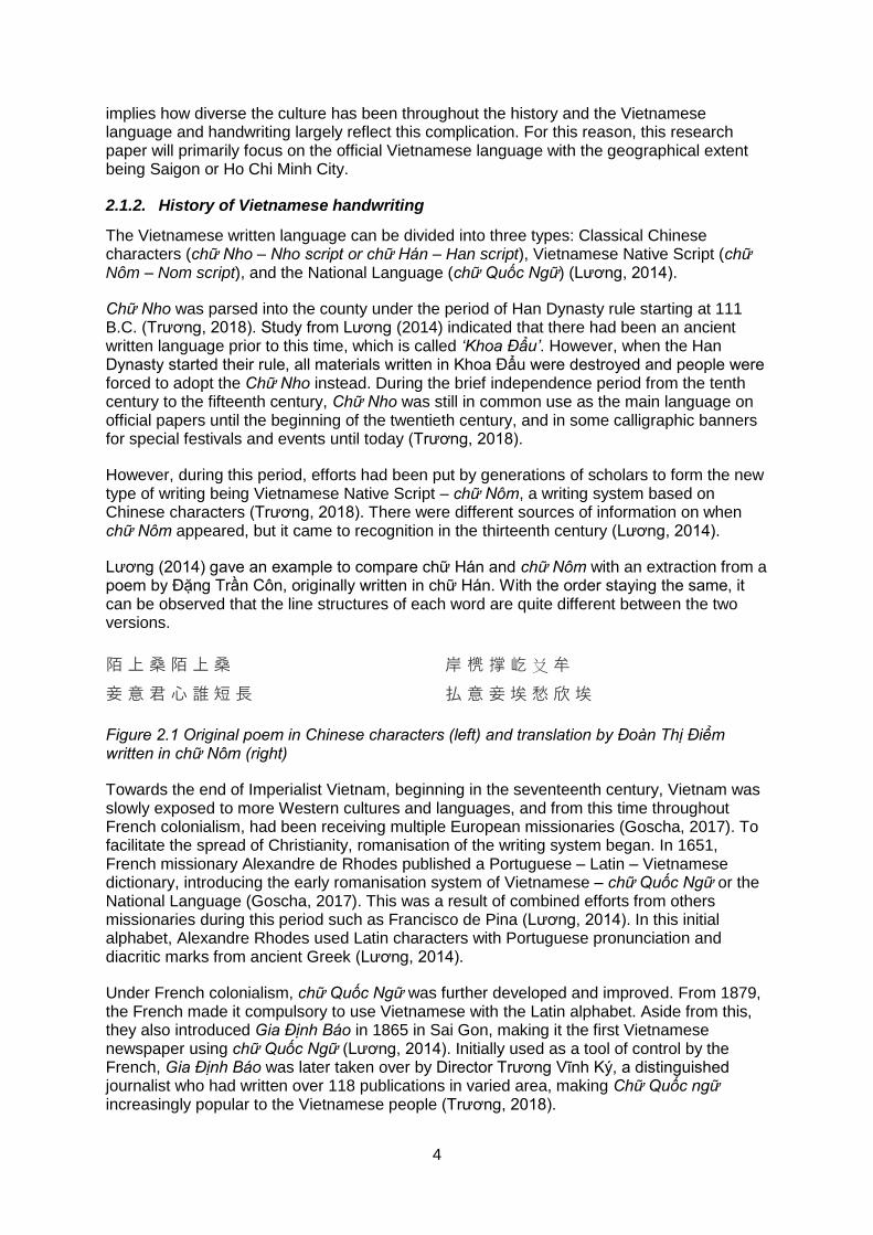
The Vietnamese written language can be divided into three types: Classical Chinese characters (chữ Nho – Nho script or chữ Hán – Han script), Vietnamese Native Script (chữ Nôm – Nom script), and the National Language (chữ Quốc Ngữ) (Lương, 2014).
Chữ Nho was parsed into the county under the period of Han Dynasty rule starting at 111 B.C. (Trương, 2018). Study from Lương (2014) indicated that there had been an ancient written language prior to this time, which is called ‘Khoa Đẩu’. However, when the Han Dynasty started their rule, all materials written in Khoa Đẩu were destroyed and people were forced to adopt the Chữ Nho instead. During the brief independence period from the tenth century to the fifteenth century, Chữ Nho was still in common use as the main language on official papers until the beginning of the twentieth century, and in some calligraphic banners for special festivals and events until today (Trương, 2018).
However, during this period, efforts had been put by generations of scholars to form the new type of writing being Vietnamese Native Script – chữ Nôm, a writing system based on Chinese characters (Trương, 2018). There were different sources of information on when chữ Nôm appeared, but it came to recognition in the thirteenth century (Lương, 2014).
Lương (2014) gave an example to compare chữ Hán and chữ Nôm with an extraction from a poem by Đặng Trần Côn, originally written in chữ Hán. With the order staying the same, it can be observed that the line structures of each word are quite different between the two versions.
陌 上 桑 陌 上 桑
妾 意 君 心 誰 短 長
岸 橷 撑 屹 𠬠 牟
払 意 妾 埃 愁 欣 埃
Figure 2.1 Original poem in Chinese characters (left) and translation by Đoàn Thị Điểm written in chữ Nôm (right)
Towards the end of Imperialist Vietnam, beginning in the seventeenth century, Vietnam was slowly exposed to more Western cultures and languages, and from this time throughout French colonialism, had been receiving multiple European missionaries (Goscha, 2017). To facilitate the spread of Christianity, romanisation of the writing system began. In 1651, French missionary Alexandre de Rhodes published a Portuguese – Latin – Vietnamese dictionary, introducing the early romanisation system of Vietnamese – chữ Quốc Ngữ or the National Language (Goscha, 2017). This was a result of combined efforts from others missionaries during this period such as Francisco de Pina (Lương, 2014). In this initial alphabet, Alexandre Rhodes used Latin characters with Portuguese pronunciation and diacritic marks from ancient Greek (Lương, 2014).
Under French colonialism, chữ Quốc Ngữ was further developed and improved. From 1879, the French made it compulsory to use Vietnamese with the Latin alphabet. Aside from this, they also introduced Gia Định Báo in 1865 in Sai Gon, making it the first Vietnamese newspaper using chữ Quốc Ngữ (Lương, 2014). Initially used as a tool of control by the French, Gia Định Báo was later taken over by Director Trương Vĩnh Ký, a distinguished journalist who had written over 118 publications in varied area, making Chữ Quốc ngữ increasingly popular to the Vietnamese people (Trương, 2018).

5
Figure 2.2 Gia Định
Báo (嘉定報), the first
Vietnamese newspaper established in 1865 (Trương, 2018)
Not only in the South, chữ Quốc Ngữ was adopted quickly in the North, starting by the establishment of ‘Đông Kinh Nghĩa Thục’, a free school using chữ Quốc Ngữ as the main tool of spreading knowledge to the public. In 1907, Nguyễn Văn Vĩnh opened his newspaper ‘Đăng Cổ Tùng Báo’, the first newspaper using the Latin alphabet in Hà Nội, the capital city of the North (Lương, 2014).
Throughout the twentieth century, chữ Quốc Ngữ became a strong tool for improving the public’s education level, paving the way for the development of varied fields. At the same time, the writing system was constantly improved and advanced by Vietnamese scholars, poets, writers, journalists, and reached its modern form after over 300 years, as it is today (Lương, 2014).
2.2. Vietnamese alphabet
A Ă Â B C D Đ E
Ê G H I K L M N
O Ô Ơ P Q R S T
U Ư V X Y
Figure 2.3 Vietnamese Latin alphabet
The official Latin-based Vietnamese alphabet consists of 29 letters: 17 consonants and 12 vowels. The alphabet was created by European missionaries with the initial of helping in memorising the pronunciation of the Vietnamese spoken language. However, the original Latin characters themselves were not enough to cover the complication of the language, with six different tones, additional vowels, and multiple sound distinctions. For this reason, they had to add diacritics including modified letters and tone marks.
The modified letters (ă, â, đ, ê, ô, ơ, ư,) were formed either by placing diacritic marks above the Latin letters (ă, â, ê, ô), or attached to them (đ, ê, ơ, ư).

6
Unlike the majority of European languages, Vietnamese has six tones, denoting how high/low the pronunciation of a specific word should be. Applying wrong tones in either speaking or writing can completely change the meaning of the words. To produce the six distinctive tones of the language, five tone marks are used together with a none-toned characters. These include:
ngang (level) – unmarked: no accent. E.g. ‘a’
sắc (acute) – a forward-slash, to be placed above vowels, denoting a high-rising pitch. E.g. ‘á’
huyền (grave) – a backward-slash, to be placed above vowels, denoting a low pitch. E.g. ‘à’
hỏi (hook-above) – a hook, to be placed above vowels, denoting mid-low dropping pitch. E.g. ‘ả’
ngã (tilde) – a wavy mark, denoting high-rising pitch. E.g. ‘ã’
nặng (underdot) – a dot, to be placed under vowels, denoting a low dropping pitch. E.g. ‘ạ’
When combined with other marks for modified letters, the tone marks need to be placed above with a clear distance.
The modern alphabet of Vietnam has two great achievements according to Nguyen (2017). First, it’s able to cover the high complexity of sounds and accents of the Vietnamese language. Second, it was completely created based on the actual spoken language instead of coming from historical factors such as the Chinese, French, or English languages that arrived in Vietnam with foreign forces.
However, the alphabet also has some drawbacks, including the repetitive sounds (e.g. c & k, g and diagraphs such as gh, ng and ngh), and a large number of diacritic marks especially when combined (e.g. ẩ, ẫ, ứ, ữ, etc.) (Nguyen, 2017)
These have posed significant challenges for dictation and for typography design.
2.3. Design challenges
As previously mentioned in part 2 of this chapter, chữ Quốc Ngữ was initially created with the purpose of noting the sound and pronunciation of Vietnamese language to help the European missionaries learn and remember the language easily. It didn’t come from the background of scientific linguistic research (Nguyen, 2017), and therefore, created challenges for not only learners but also designers in creating a Vietnamese typeface.
These challenges come from the diacritic marks in the modified letters, the tone marks, and the combination of these two, which significantly expand the space vertically and horizontally occupied by each letter. The typeface designers need to address this issue to achieve balance and consistency throughout the presence in actual context of the typeface.
7
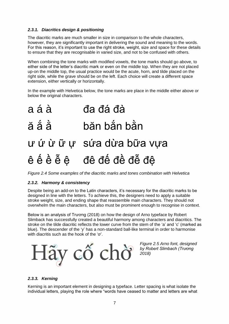
2.3.1. Diacritics design & positioning
The diacritic marks are much smaller in size in comparison to the whole characters, however, they are significantly important in delivering the sound and meaning to the words. For this reason, it’s important to use the right stroke, weight, size and space for these details to ensure that they are recognisable in varied size, and not to be confused with others.
When combining the tone marks with modified vowels, the tone marks should go above, to either side of the letter’s diacritic mark or even on the middle top. When they are not placed up-on the middle top, the usual practice would be the acute, horn, and tilde placed on the right side, while the grave should be on the left. Each choice will create a different space extension, either vertically or horizontally.
In the example with Helvetica below, the tone marks are place in the middle either above or below the original characters.
a á à đa đá đà
ă ắ ằ băn bắn bằn
ư ứ ừ ữ ự sứa dừa bữa vựa
ê ế ề ễ ệ đê đế đề đễ đệ Figure 2.4 Some examples of the diacritic marks and tones combination with Helvetica
2.3.2. Harmony & consistency
Despite being an add-on to the Latin characters, it’s necessary for the diacritic marks to be designed in line with the letters. To achieve this, the designers need to apply a suitable stroke weight, size, and ending shape that reassemble main characters. They should not overwhelm the main characters, but also must be prominent enough to recognise in context.
Below is an analysis of Trương (2018) on how the design of Arno typeface by Robert Slimback has successfully created a beautiful harmony among characters and diacritics. The stroke on the tilde diacritic reflects the lower curve from the stem of the ‘a’ and ‘c’ (marked as blue). The descender of the ‘y’ has a non-standard ball-like terminal in order to harmonise with diacritis such as the hook of the ‘ơ’.
Figure 2.5 Arno font, designed by Robert Slimbach (Trương 2018)
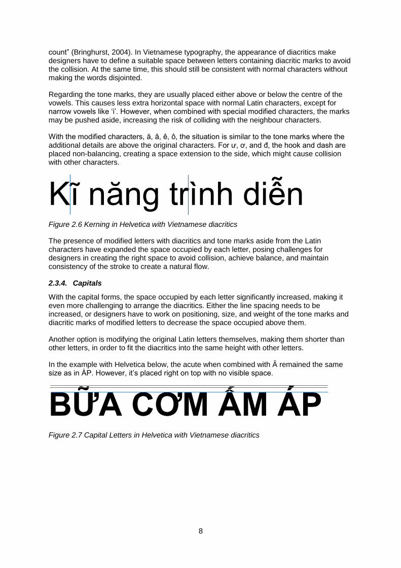
2.3.3. Kerning
Kerning is an important element in designing a typeface. Letter spacing is what isolate the individual letters, playing the role where “words have ceased to matter and letters are what
8
count” (Bringhurst, 2004). In Vietnamese typography, the appearance of diacritics make designers have to define a suitable space between letters containing diacritic marks to avoid the collision. At the same time, this should still be consistent with normal characters without making the words disjointed.
Regarding the tone marks, they are usually placed either above or below the centre of the vowels. This causes less extra horizontal space with normal Latin characters, except for narrow vowels like ‘i’. However, when combined with special modified characters, the marks may be pushed aside, increasing the risk of colliding with the neighbour characters.
With the modified characters, ă, â, ê, ô, the situation is similar to the tone marks where the additional details are above the original characters. For ư, ơ, and đ, the hook and dash are placed non-balancing, creating a space extension to the side, which might cause collision with other characters.
Kĩ năng trình diễn Figure 2.6 Kerning in Helvetica with Vietnamese diacritics
The presence of modified letters with diacritics and tone marks aside from the Latin characters have expanded the space occupied by each letter, posing challenges for designers in creating the right space to avoid collision, achieve balance, and maintain consistency of the stroke to create a natural flow.
2.3.4. Capitals
With the capital forms, the space occupied by each letter significantly increased, making it even more challenging to arrange the diacritics. Either the line spacing needs to be increased, or designers have to work on positioning, size, and weight of the tone marks and diacritic marks of modified letters to decrease the space occupied above them.
Another option is modifying the original Latin letters themselves, making them shorter than other letters, in order to fit the diacritics into the same height with other letters.
In the example with Helvetica below, the acute when combined with  remained the same size as in ÁP. However, it’s placed right on top with no visible space.
BỮA CƠM ẤM ÁP Figure 2.7 Capital Letters in Helvetica with Vietnamese diacritics
9
Chapter 3: Saigon Vintage Lettering
This chapter will give a definition of Saigon Vintage lettering within the scope of this research
paper, including the historical and social background related to its creation, the process of
manually rendering the letters, and the analysis of its unique characteristics.
3.1. Saigon Vintage lettering
The term Saigon Vintage lettering in this research paper refers to the design of the artisan
shop signs and billboards of Saigon, currently known as Ho Chi Minh City from 1954 until
late 1980s. Once again, the name Saigon is intentionally used in this paper to maintain
consistency and social and historical accuracy.
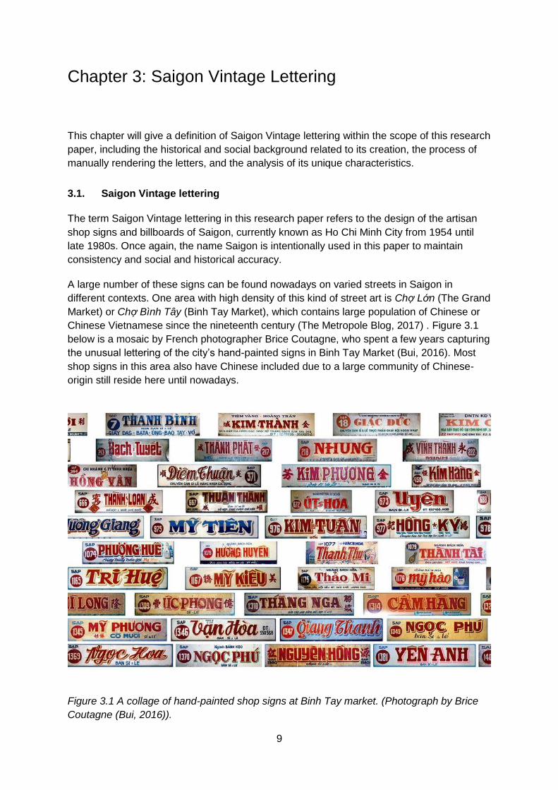
A large number of these signs can be found nowadays on varied streets in Saigon in
different contexts. One area with high density of this kind of street art is Chợ Lớn (The Grand
Market) or Chợ Bình Tây (Binh Tay Market), which contains large population of Chinese or
Chinese Vietnamese since the nineteenth century (The Metropole Blog, 2017) . Figure 3.1
below is a mosaic by French photographer Brice Coutagne, who spent a few years capturing
the unusual lettering of the city’s hand-painted signs in Binh Tay Market (Bui, 2016). Most
shop signs in this area also have Chinese included due to a large community of Chinese-
origin still reside here until nowadays.
Figure 3.1 A collage of hand-painted shop signs at Binh Tay market. (Photograph by Brice
Coutagne (Bui, 2016)).

10
Brice Coutagne chose Binh Tay market to photograph these shop signs as it currently holds
over 1,400 stalls with diverse businesses. On these signs, the name of the shop covers the
majority of the area with eye-catching styling and colours, followed by its stall number. For
example, figure 3.2 below shows a merchandise shop named ‘Hồng Minh’, which is painted
in prominent letters with a highly-idiosyncratic and expressive cursive and blue three
dimensional projection. The upper line ‘Bách Hóa Mỹ Phẩm’ indicates the shop is
specialised in cosmetics products. The bottom line ‘Sỉ & Lẻ’ means the shop offers both
wholesale and individual purchase. The number ‘1046’ in red circle is the stall number.
Figure 3.2 A merchandise shop sign in Binh Tay market. (Photograph by Brice Coutagne
(Bui, 2016))
Figure 3.3 Billboards in front of a market in Saigon. Photograph from Saigon Vivu archive / www.facebook.com/saigonvivu. Official
The establishment of Saigon Vintage lettering was largely contributed by the economic
development and the evolution of Vietnamese Latin alphabet at that time. The reason for
choosing 1954 to 1980s as the period of research is directly related to the historical
background of Saigon and Vietnam as previously mentioned in chapter two of this paper. In
1954, the French colony in Vietnam officially ended and Vietnam entered an era of division
with the two Republics of North Vietnam and South Vietnam (Goscha, 2017). Saigon was
the capital city of South Vietnam from that period until the reunification of the country in
1975, and remained Vietnam’s most active social and economic centre afterwards (Goscha,
2017). In early twentieth century, the city was designed to be the French’s colonial
administrative centre in 1931, and was often referred to as ‘Venice of Asia’ or ‘Little Paris’
(The Metropole Blog, 2017). The French also made chữ Quốc Ngữ, the Latin-based
Vietnamese written language compulsory on various means of communications, hence,
paving the way for the art of typography to develop.
Later on, from 1954 to 1970, South Vietnam turned toward market-based capitalism,
supported by the United States, which brought in massive economic development (The
11
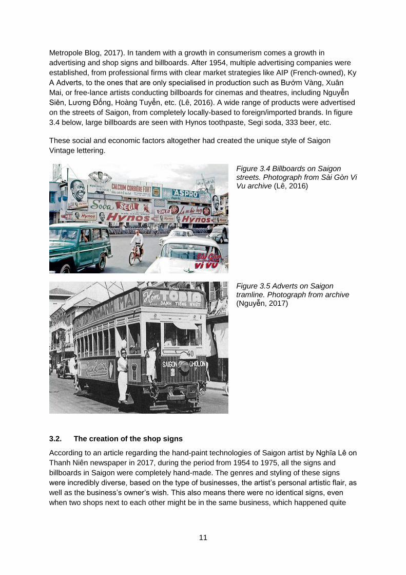
Metropole Blog, 2017). In tandem with a growth in consumerism comes a growth in
advertising and shop signs and billboards. After 1954, multiple advertising companies were
established, from professional firms with clear market strategies like AIP (French-owned), Ky
A Adverts, to the ones that are only specialised in production such as Bướm Vàng, Xuân
Mai, or free-lance artists conducting billboards for cinemas and theatres, including Nguyễn
Siên, Lương Đống, Hoàng Tuyển, etc. (Lê, 2016). A wide range of products were advertised
on the streets of Saigon, from completely locally-based to foreign/imported brands. In figure
3.4 below, large billboards are seen with Hynos toothpaste, Segi soda, 333 beer, etc.
These social and economic factors altogether had created the unique style of Saigon
Vintage lettering.
Figure 3.4 Billboards on Saigon streets. Photograph from Sài Gòn Vi Vu archive (Lê, 2016)
Figure 3.5 Adverts on Saigon tramline. Photograph from archive (Nguyễn, 2017)
3.2. The creation of the shop signs
According to an article regarding the hand-paint technologies of Saigon artist by Nghĩa Lê on
Thanh Niên newspaper in 2017, during the period from 1954 to 1975, all the signs and
billboards in Saigon were completely hand-made. The genres and styling of these signs
were incredibly diverse, based on the type of businesses, the artist’s personal artistic flair, as
well as the business’s owner’s wish. This also means there were no identical signs, even
when two shops next to each other might be in the same business, which happened quite

12
often in Saigon as streets were often organised in groups according to the nature of what
they do.
The artists also had to follow some fixed regulations in advertising and billboards. In
December 1967, the Saigon Government required all signs to use Vietnamese (Latin
alphabet), except for foreign businesses, which were allowed to have dual languages,
providing that the title in Vietnamese had to be three times larger than the same title in other
languages (Lê, 2016). The size of these signs also had to follow strict regulation (Lê, 2016).
Upon receiving the design order, the artist would let the client choose the lettering style,
which was usually from a set of existing fonts, and colours. The skeleton would be created
first, normally made of wood, before applying zinc canvas. The artist then applied the first
layer of white paint, forming a blank canvas for sketching the characters and symbols with
chalk or pencils. The last process would be applying colours to the letters (Lê, 2016).
In figure 3.6 and 3.7, Hoàng Minh Phương, one of the very few shop sign artists in Saigon is
applying colours upon a sketch previously created with red strokes (Hà My, 2017). It can be
observed that the artist started out with creating grid lines for upper-case and lower-case
characters. For block characters in figure 3.7, an additional grid line was created to position
the starting stroke of number 2 and 1, as well as the outline for all characters with spacing in
between.
Figure 3.6 Applying coloured paint upon a sketch of a shop sign. Photograph by Nguyễn Đạt - Thanh Phong (Hà My, 2017)
Figure 3.7 Applying coloured paint upon a sketch of a shop sign. Photograph by Hải An (An, 2016)

13
3.3. Analysis of Saigon Vintage lettering
This section will determine the defining characteristics of Saigon Vintage lettering and how it
managed to address the design challenges of Vietnamese typography, in order to propose
how current type technologies can be used to recreate the expressive and unique look of
Saigon Vintage.
One requirement for all the shop signs of Saigon is being eye-catching and unique (Lê,
2016), and providing the requirement of sign size, the artists had to put extra effort in making
the main title outstanding. One of the popular technique to achieve this result is applying
three-dimensional shadow to the text.
This is an extremely popular technique that can be combined with block capital letters or
lower-case, script type. The artist usually created thin border around the core letters,
followed by three-dimensional shadow dropping to the lower right or upper right. This can be
observed in figure 3.8. The upper sign of ‘Giang Thanh’ shop had a thin light blue border
almost the same as the canvas background, wrapping around the core letters filled in red.
The shadow is in dark blue with medium thickness. The lower sign of ‘Quang Vinh’ shop has
quite a different shadow styling. The letters in this case are quite thick and bold with extra
shading and dark shadow at the end, creating a more prominent 3-D effect. Instead of using
script type with thick/thin mixed stroke as in the upper layout, ‘Quang Minh’ sign uses clean,
blocky characters with consistent stroke (except of Q and V) and clean-cut ending. This
allows the thick side to be applied in clean and clear manner.
Another interesting point is the design of the letters ‘a’, ‘n’, and ‘h’ in sign 1347 in the same
figure. All of these three characters appear twice in the sign, however, they are not
completely identical. Subtle differences can be observed in the ending stroke, the shape,
and thickness of each line. This is one part that makes these letters more expressive than
mechanically perfect reproductions.
Figure 3.8 Three-dimensional shadow design on two shop signs in Binh Tay market.
Photographs by Brice Coutagne (Bui, 2016)

14
Many Saigon shop signs are also seen using the calligraphic script type with the two typical
characteristics being letters join within the same word, and applying the alternative thick-thin
stroke upon the letters. In figure 3.9, both shop signs feature these two characters. For “Anh
Thư”, either the starting or ending stroke of each letter is made longer to create the
connection with the ones standing next to it. The vertical strokes are also thicker than other
lines. The styling of “Bạch Tuyết” in the lower sign is also quite similar to “Anh Thư”.
However, letters connection in this case is initialised by the before letter with the ending
stroke going further into the letter that comes afterwards.
Figure 3.9 Calligraphic script styling. Photographs from Saigon Vi Vu Archive / www.facebook.com/saigonvivu/
One possible influence for this design type could be the original Hán Nôm characters prior to
chữ Quốc ngữ, in which the calligraphers paint draw the characters with large brush and ink.
Figure 3.10 A Vietnamese calligrapher at work. Photograph by unknown. / www.soha.vn
In order to create visual impression for the sign, the artist may design the capital letter of
word in an unusual way, either by enlarging the size or adding extra swash details. In figure
3.9, the letter A and T in the “Anh Thư” shop sign are extended vertically to both the upper
and lower space. The tips of these letters are also modified into big curls.
Figure 3.2 is also an interesting example with the two letters H and M being reshaped. The
ending tip of both characters are enlarged and goes below the character(s) next to it. The
starting strokes of these letters are also extended, and in the case of the letter H, it starts
from inside the letter itself before going round and back in as a proper dash.

15
Despite the modification, these letters, however, still maintain great design consistency with
no conflicts, i.e. the playful ending stroke of ‘H’, ‘h’, ‘n’, ‘g’, the combination of thick/thin line
in each letter. This has formed an aesthetic harmony to the layout in general.
One big challenge of Vietnamese typography as analysed in the chapter two is the
positioning of the diacritics, including the modified Latin characters and tone marks. The
Saigon Vintage artists have found some interesting solutions to address these issues.
The first technique is pushing the hooks of the modified letters (ư, ơ) to the right side within
the horizontal limit of the characters as shown in figure 3.11 in the phrase “VĨNH TƯỜNG”.
Also within “VĨNH TƯỜNG” and “TIỆM SẮT”, the letter ‘i’ is intentionally transformed to
lower case and added with the diacritic dot, which wouldn’t be necessary if it had been put in
the plain capital form as in the bottom line (in SỈ, CHAI). Adding this diacritic mark obviously
created another alignment challenge, which the artist had solved by shortening it down,
making the whole letter i fit within the horizontal limit.
Figure 3.11 Vinh Tuong blacksmith. Photo by unknown. Collection by The Lost Type
Vietnam / www.luuchu.com
Another artist in the example of figure 3.12 simply let the hook sink into the main character
making the letter Ơ in the first word HỚT almost identical to letter O in the second word
TÓC.
Figure 3.12 Hairdresser. Photo by unknown. Collection by The Lost Type Vietnam / www.luuchu.com

16
When it comes to combining modified letter with tone marks as in (ấ ắ ầ), which adds extra
space above the characters to the design, the artists tend to make these marks flat and thin,
and/or push the tone marks aside instead of piling up on the letter’s diacritics. Figure 3.13
below is an extraction of figure 3.11. On the left side, in “SẮT”, the acute is placed upon the
breve of the letter Ă within both being quite thin. However, when combining the
circumflex/breve with grave/acute on the right side (as in ĐỒ, SẮT, VÔI, DẦU), the
grave/acute are pushed aside and also smaller in size in comparison to the stand-alone in
VÀ. This resizing technique can be observed in Helvetical Neue in the analysis of chapter 2.
Figure 3.13 Extraction of figure 3.11.
Alongside solving the design challenges with diacritic marks, Saigon Vintage artists also put
extra work in creating special design for these marks.
In figure 3.14, all tone marks are turned in to dash, either vertical (for acute, underdot, as in
ĐẠI, LÝ, VÉ, SỐ), or horizontal (for grave, as in CÀO). The circumflex in Ô (TỔNG, SỐ, LÔ,
TÔ) is also significantly flattened out to achieve the horizontal orientation. This
vertical/horizontal styling also appears in the sign of a tape recording shop in figure 3.15.
Figure 3.14 Lottery shop sign. Collection by The Lost Type Vietnam / www.luuchu.com
Figure 3.15 Recording shop. Photograph from archive. (Lê, 2016)

17
Figure 3.16 shows another interesting styling when the diacritic marks are shaped based on
curve shape, with the underdot being half circle, the dot of the letter i being a full circle, the
circumflex of  being a curve in consistent with the letter U, A, and O.
Figure 3.16 Shoes shop. Photograph from archive / Collection by The Lost Type Vietnam /
www.luuchu.com
It’s necessary to mention that these sign shops often have a small amount of the text with a
title being the centre of the design, which makes lines and letters spacing not a great issue
as in normal typography design for other documents in Vietnamese language. This also
allows the artists to be creative with art concepts, using multiple languages, style of letters,
colours, and decoration to create an impressive design work.
Another feature that wasn’t created intentionally by the artists at the time of creating these
shop signs and billboards, but has become an integrated part of Saigon Vintage, which is the
surface erosion of these products. As most of these signs are around 40 year-old, the hot
and humid tropical climate of Vietnam has significantly damaged parts of it. This can be the
fading effect, meaning the sign’s fill colour is not as vibrant as originally painted. On the
same surface, the colour may also varied, for example, the red shade of ‘THUẬN LỢI’ in
figure 3.16. The paint also fell off, creating some erosion mark the canvas (figure 3.8, 3.11).
In order to re-create the ambiance of Saigon Vintage, it’s important for the type designers to
convey the old-age aspect by including this feature in their work. This will make a significant
difference in comparing to modern typefaces with retro letter forms.
18
Chapter 4:
Type Design Technology – from Hand-drawn to Digital
In its basic function, writing systems are to convey linguistic information through graphic
marks. But aside drom that, the specificity of the forms used can convey further information.
Saigon Vintage itself conveys more than 'shop' information. It has a unique style and
nowadays is recognised as belonging to a particular time and place.
Throughout the first half of this paper, the features of Saigon Vintage lettering has been
analysed in line with its social and historical origins, as well as the characteristics of
Vietnamese typography. Based on these results, this chapter will examine the how current
type design technologies can be used to digitise hand writing and Saigon Vintage lettering.
4.1. Digitising typefaces
4.1.1. A brief history of type technologies
For more than 500 years, various printing technologies have been invented that not only
promoted but also impacted type design techniques (Henestrosa, et al., 2017). According to
Henestrosa et al, there are four periods that created revolutionary effects upon typefaces.
The first phase is the invention of manual type with significant attribution from Johannes
Gutenberg in the mid-fifteenth century, giving the movable type method, which was later
used in typographic composition (Henestrosa, et al., 2017).
The second phase is the industrial revolution in late nineteenth century, with the result being
multiple technological advances especially steam press, the typographical pantograph, and
mechanical composing machines. One of the most important inventions of this period is the
‘hot metal’ typesetting machines such as Linotype and Monotype.
Thirdly, photocomposition was invented, which was quicker, less hazardous and more
flexible in terms of composition that letterpress printing.
Finally, the digital era came with fonts encoded in a computer with the aid of software, which
completely changed the normal idea of graphic representation of glyphs. Digital type design
software made it much easier to design typefaces and led to an explosion in type design.
4.1.2. Digital type technologies
Although the digital era significantly reduced the complication on the physical aspect of the
type production process as seen in Gutenberg’s time, it also created difficulties for the artists
to control and manipulate the appearance of the typefaces. The first issue is the encoding of
a typeface with computers. All characters are stored in computers using a special code, and
a character encoding provides a key to unlock the code for each character (W3C, 2015).
This leads to the challenge of presenting all languages and characters with a limited number
of keys available. All over the world, there are 4,000 out of 7,000 living languages that have
written form, but however, not all of these languages are created and supported equally on

19
computer (Fleishman, 2019). The incompatibility of encoding among different system and
devices can cause missing letters or wrong/meaningless representation. As previously
analysed in chapter 2, the Vietnamese written language has 7 modified characters in
addition to the 23 Latin characters. This level of complexity is nothing compared to other
languages such as Chinese, Japanese, Thai, Indian, etc. After multiple UTF encoding
standards introduced to satisfy the needs of presenting a large number of glyphs, Unicode
was created unifying all standards, defining a total of 1,114,112 code points that can be
used for all letters and symbols (Zentgraf, 2015). Technological advances have made
operating system more powerful and completely compatible with Unicode, although there will
be constant growth to the list as needs of adding more signs or transcribing old language
scripts emerge.
The second issue of the digital era is the visual presentation of the type face. This has been
addressed by the font formats, which is how the computer and devices present the shape of
the characters to viewers. There are three kinds of font formats, bitmapped, stroke, and
outlined. Originally, the ‘analog’ letterforms in the first three phase of printing technology as
mentioned previously were transformed into the digital era as ‘bitmap’ fonts, which could be
edited for good quality and readability but has a great drawback on occupying memory size
and not scalable (Strizver, n.d.). With stroke fonts, they use a set of lines to create the
appearance of a glyph. The next and also the current generation is outline fonts, or vector
fonts using Bézier curve, which is a collection of line endpoints that define the line segments
so the system can follow to draw a character or symbol (Strizver, 2016). These fonts are
scalable, smaller in memory size, and faster to process (Strizver, n.d.). Three of the most
prominent font formats that have ever been used are all outline fonts, including PostScript,
TrueType, and OpenType (Pluralsight, 2014).
PostScript, also usually referred to as Type 1 fonts, were created by Adobe in 1984 (Adobe,
n.d.). It contains two different parts, one with information for printing, and one to display font
on screen. One big advantage of PostScript is the high quality for printing. However, it’s not
compatible across Macs and PCs, which means there are different versions for these
operating systems (Adobe, n.d.).
The next generation is TrueType, a font format developed by Apple in 1990 but eventually
licenced to Microsoft (Pluralsight, 2014). Similar to Type 1, TrueType is scalable, with the
shapes of the letters defined by mathematical formulas based on the outlined defined by
‘control points’ (MyFonts, n.d.). In TrueType, both font files are combined so it can be used
in either Mac or Windows. In this format, a file needs to be added for each instance of the
font (e.g. normal, italic, bold, thin, etc.).
One issue with scalable font is the resolution on screen and printouts with medium quality
printers (Pluralsight, 2014). TrueType addresses this problem by ‘hinting’, which means it
has a programming language available for font engineers can embed a programme to make
the right pixel decision inside each character in the font by push/pull the outline, and fix the
distorted part (MyFonts, n.d.). The vector information in the font is always translated into a
raster/pixel display, whether on screen or in print. Hinting ensures that the font will appear in
its optimum form for the particular scale it is used at.
The third format is OpenType, which was developed by Microsoft and Adobe as an
extension of Apple TrueType format (Constable & Jacobs, 2018). Like TrueType, OpenType

20
also uses Unicode standard for character encoding. One outstanding benefit of OpenType is
its ability to provide richer linguistic support and advanced typographic control. This format
also has better protection for font data, and offers smaller file sizes, making font distribution
more efficient.
The advanced typographic control support with typesetting features such as smallcaps,
ligatures, and alternatives inside the font instead of separately, means that OpenType can
include an expanded character set and layout features. These characteristics are
significantly important in presenting non-Latin characters with special diacritics such as
Vietnamese. The flexibility in design at the same time provides large support for different
variations and expanded glyphs, which makes it a suitable format to digitise Saigon Vintage
lettering. These attributes of OpenType will be further analysed in the next parts of this
chapter.
In addition to the four phases identified by Henestrosa et al., we could claim that we are now
in another phase far beyond the first digital typefaces. More writing systems than ever before
are now encoded in Unicode and available in multiple styles of typeface. A typeface was
once a box of metal is now a very small file that can encode literally thousands of characters
in multiple writing systems. There are also new type design technologies have with much
higher level of complexity, giving larger control and room for creativity for artists.
4.2. OpenType & advanced typography
The two characteristics of OpenType that makes OpenType a great support to type
designers and developers in creating extended typography are expanded character set and
glyph substitution.
The expanded character set attribution was created using OpenType’s Font Variations. From
version 1.8, the new extension was introduced to the OpenType font format specification,
known as OpenType Font Variations, and the fonts using this extension is known as
OpenType variable fonts (Kennedy & Satran, 2018). The name itself has partially described
the most important attribution of this font type, which is the ability for a single font to appear
like multiple fonts by using continuous interpolation between different designs, all defined
within one single font resource. This provides great flexibility for designers and developers
while keeping the data in an efficient format.
Prior to OpenType, Western PostScript font was limited to only 256 glyphs (Adobe, n.d.),
which mean the type designer would have to carefully select or develop multiple style-related
fonts to achieve the set of characters as desired. On the other hand, OpenType fonts can
now contain more than 65,000 glyphs. This is a tremendous improvement both for the
process of creation but also in transition across devices and operating system, making sure
that they are all understandable and properly-displayed in all digital formats.
A variable font gives continuous variation along given design axis, for example, weight or
width. Beyond this, there can be multiple and more complex axes, separately, or in
combined form. This information is included within the font as a font variations (‘fvar’) table
(Constable & Jacobs, 2018). The example in figure 4.1 below shows continuous variation
along two axes, weight, and width.
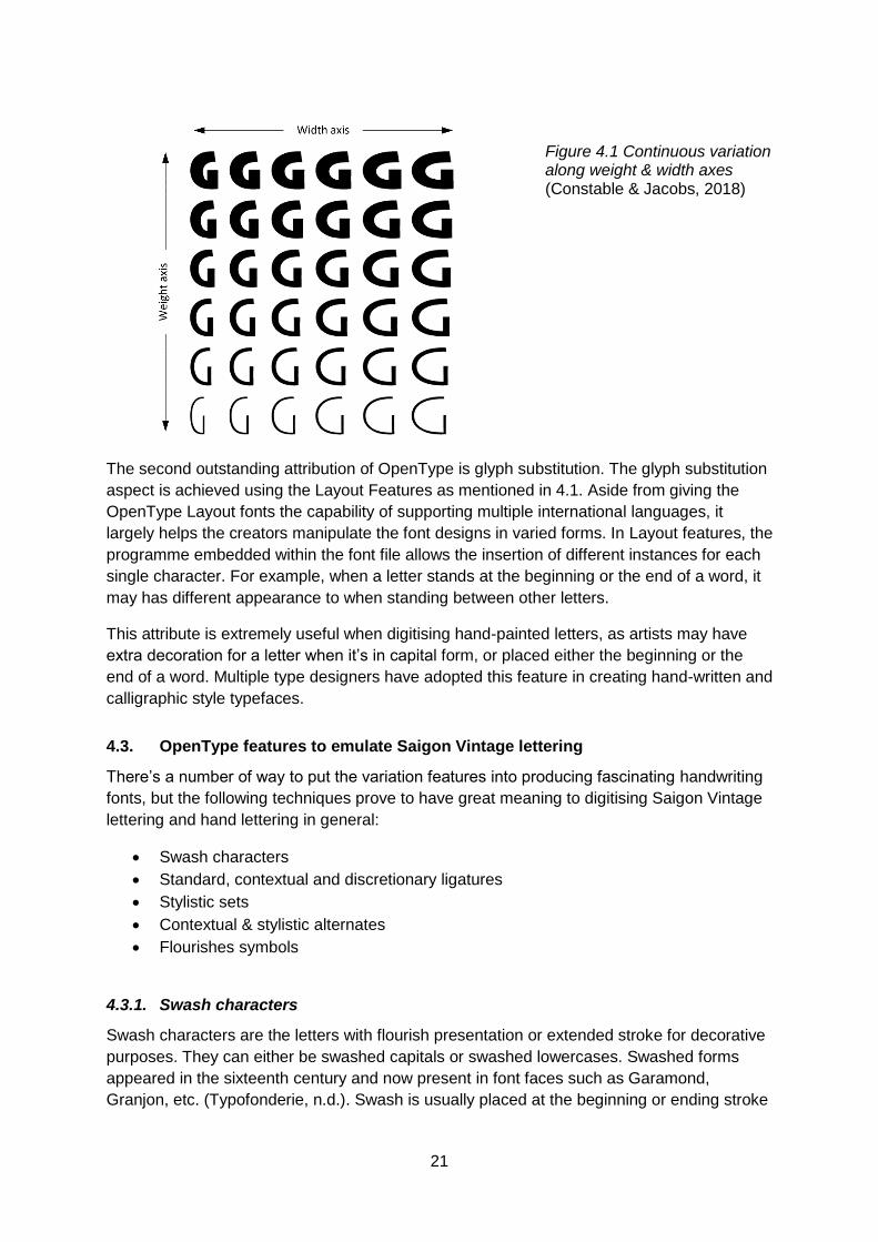
21
Figure 4.1 Continuous variation along weight & width axes (Constable & Jacobs, 2018)
The second outstanding attribution of OpenType is glyph substitution. The glyph substitution
aspect is achieved using the Layout Features as mentioned in 4.1. Aside from giving the
OpenType Layout fonts the capability of supporting multiple international languages, it
largely helps the creators manipulate the font designs in varied forms. In Layout features, the
programme embedded within the font file allows the insertion of different instances for each
single character. For example, when a letter stands at the beginning or the end of a word, it
may has different appearance to when standing between other letters.
This attribute is extremely useful when digitising hand-painted letters, as artists may have
extra decoration for a letter when it’s in capital form, or placed either the beginning or the
end of a word. Multiple type designers have adopted this feature in creating hand-written and
calligraphic style typefaces.
4.3. OpenType features to emulate Saigon Vintage lettering
There’s a number of way to put the variation features into producing fascinating handwriting
fonts, but the following techniques prove to have great meaning to digitising Saigon Vintage
lettering and hand lettering in general:
Swash characters
Standard, contextual and discretionary ligatures
Stylistic sets
Contextual & stylistic alternates
Flourishes symbols
4.3.1. Swash characters
Swash characters are the letters with flourish presentation or extended stroke for decorative
purposes. They can either be swashed capitals or swashed lowercases. Swashed forms
appeared in the sixteenth century and now present in font faces such as Garamond,
Granjon, etc. (Typofonderie, n.d.). Swash is usually placed at the beginning or ending stroke

22
of a glyph, with the purpose of making the letter standout to create an elegant stress for the
word’s lettering style.
Swash styling can come in various ways, simple or complex, subtle or dramatic. Type
designers can design initial swashes to provide a highlight decorative character at the
beginning of a set of characters, or terminal swashes to be placed at the end. Sometimes,
the designers might also create a swash in the middle of a word or phrase. In this case, it’s
necessary to design a suitable contextual swash so the flair and extension of a letter won’t
clash with its neighbour letters.
Burgues Script typeface by Alejandro Paul (Sudtipos, n.d.) is a great example of swash
characters. The font was inspired by the late 19th century American calligrapher Louis
Madarasz. The characters were created to achieve a great flexibility in flowing details with
multiple variety of appearance to reproduce the old calligraphic style of Madarasz. Full
flourished sets of letters were used for the beginning/ending of words/sentences. In figure
4.2 below, the letters “t”, “f”, “a”, “n”, “r”, “g” were added with long curly extension as they
stand at the beginning or the end of the line. The letters standing in the middle of a words
are kept simpler, for example the letter “h” in “the”, and the letter “k” in “quick”, despite being
similar in the standard alphabet, “h” has a fairly simple script style as it stands between “t”
and “e”, while “k” got an extra extension that reaches over to the next word. Some other
letters standing close to the end of a word might also have swashed details, such as “z” in
“lazy”, and “v” in “over”.
Figure 4.2 Burges Script by Alejandro Paul (Sudtipos, n.d.)
This form of appears in plenty old scripts and hand-painted lettering including Saigon
Vintage. One example is the two shop signs in figure 3.9. The characters ‘A’ and ‘T’ in the
upper sign, and ‘B’ and ‘T’ in the lower signs are added with extra flowing extension to all
endings of the characters. This will be further analysed in the next chapter to identify how
OpenType’s feature can be utilised to digitise Saigon Vintage lettering.
4.3.2. Standard, contextual & discretionary ligatures
The next feature is standard, contextual & discretionary ligatures. A ligature is formed when
connecting two or more characters and comes in two forms, standard or discretionary
(Strizver, 2016). Standard ligatures improve the appearance of characters that collide or are
combined in unattractive way. Prior to OpenType, this often consists of fi, fl plus ff, ffi, ffl, and
sometimes Th (figure 4.3). On PostScript Type 1, this was created on a software level, not
as a typographic feature. Contextual ligatures are used in a specific context. For example

23
when the artist wants to create join between characters within a word, the original set of
characters could be replaced with a different form containing the link between each pair of
characters. Discretionary ligatures also serve a similar function but more decorative and
aesthetic, which is useful in creating appearance variety to form an specific ambiance of
historic or elegant. Some common discretionary ligatures are ck, sp, st, rt.
Figure 4.3 Standard ligatures in Font Bureau’s Farnham Headline (Condensed, 2017)
This feature can be seen in Quotes, a typeface developed by Alejandro Paul, Guillermo
Vizzari, and Yanina Arabena. The typeface was inspired by the use of pointed brush,
spontaneous messages to represent inspirational handwritten phrases and quotes. The
Quotes Script version offers a great variety of connecters using both standard and
discretionary ligatures to recreate the natural paintbrush stroke. In figure 4.4, the join can be
seen in r-u-s in “Brushed”, and o-r-d in “Words”. Aguafina Script Pro by Alejandro Paul and
Angel Koziupa (Sudtipos, n.d.) also utilises this feature to imitate the graceful,
knowledgeable and artistic script stroke (figure 4.5).
Figure 4.4 Quotes typeface by Alejandro Paul, Guillermo Vizzari, and Yanina Arabena (Sudtipos, n.d.)
24
Figure 4.5 Aguafina typeface by Alejandro Paul and Angel Koziupa (Sudtipos, n.d.)
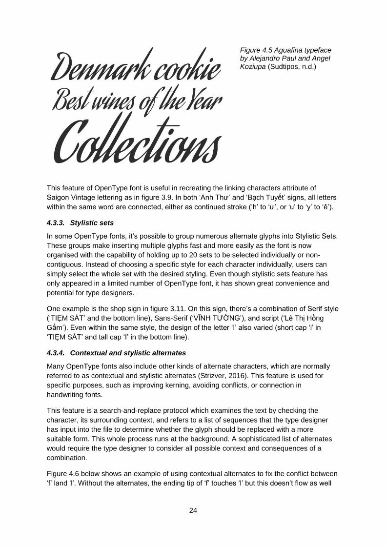
This feature of OpenType font is useful in recreating the linking characters attribute of
Saigon Vintage lettering as in figure 3.9. In both ‘Anh Thư’ and ‘Bạch Tuyết’ signs, all letters
within the same word are connected, either as continued stroke (‘h’ to ‘ư’, or ‘u’ to ‘y’ to ‘ê’).
4.3.3. Stylistic sets
In some OpenType fonts, it’s possible to group numerous alternate glyphs into Stylistic Sets.
These groups make inserting multiple glyphs fast and more easily as the font is now
organised with the capability of holding up to 20 sets to be selected individually or non-
contiguous. Instead of choosing a specific style for each character individually, users can
simply select the whole set with the desired styling. Even though stylistic sets feature has
only appeared in a limited number of OpenType font, it has shown great convenience and
potential for type designers.
One example is the shop sign in figure 3.11. On this sign, there’s a combination of Serif style
(‘TIỆM SẮT’ and the bottom line), Sans-Serif (‘VĨNH TƯỜNG’), and script (‘Lê Thị Hồng
Gấm’). Even within the same style, the design of the letter ‘I’ also varied (short cap ‘i’ in
‘TIỆM SẮT’ and tall cap ‘I’ in the bottom line).
4.3.4. Contextual and stylistic alternates
Many OpenType fonts also include other kinds of alternate characters, which are normally
referred to as contextual and stylistic alternates (Strizver, 2016). This feature is used for
specific purposes, such as improving kerning, avoiding conflicts, or connection in
handwriting fonts.
This feature is a search-and-replace protocol which examines the text by checking the
character, its surrounding context, and refers to a list of sequences that the type designer
has input into the file to determine whether the glyph should be replaced with a more
suitable form. This whole process runs at the background. A sophisticated list of alternates
would require the type designer to consider all possible context and consequences of a
combination.
Figure 4.6 below shows an example of using contextual alternates to fix the conflict between
‘f’ land ‘l’. Without the alternates, the ending tip of ‘f’ touches ‘l’ but this doesn’t flow as well

25
as a proper connection and also doesn’t fall in line the whole design where letter connection
doesn’t appear elsewhere.
Figure 4.6 Nordvest medium with and without contextual alternates. Artwork by (Condensed,
2018)
The contextual/stylistic alternates produce some similar result to ligatures in some cases but
it’s important to understand that these are two different features in OpenType. Some
designers may avoid ligatures for personal or linguistic preferences (Condensed, 2018).
4.3.5. Flourishes
Another interesting feature of OpenType fonts is the inclusion of decorative glyphs. This may
contains fleurons, vignettes, borders, bullets, brackets, etc., allowing designers to add more
authenticity to their type design when it comes to mimicking an existing handwriting vintage
font.
Figure 4.7 Ornament feature used in Burgues typeface by Alejandro Paul (Sudtipos, n.d.)
For Saigon Vintage lettering, the ornaments may include random flowing underline stroke
(figure 3.4) or geometrical shapes (triangle shape in figure 3.11, rectangles in figure 3.13
and 3.14).

26
Chapter 5: Digitising Saigon Vintage Lettering
Based on the previous findings on Saigon Vintage lettering characteristics and OpenType
features, this chapter will present some suggestions on digitising Saigon Vintage lettering
using OpenType format. This is to be done by utilising OpenType’s expanded characters
feature and glyph substitution. It will also analyse three case studies of modern typefaces
inspired by Saigon Vintage lettering.
5.1. Digitising Saigon Vintage lettering with OpenType
5.1.1. Swashed letters
Swash characters with extended calligraphic details is an interesting and very unique aspect
of Saigon Vintage lettering, providing how creative the artists were to have created such a
varied range of glyphs. This can be observed in figure 3.9, where the letter ‘A’ in ‘Anh’ and
‘T’ in ‘Thư’ were added with extra curls. Type designer can use OpenType’s swash feature
to generate this effect.
Figure 5.1. also shows another two examples of swash characters. For the upper signs, the
letter ‘T’ in both ‘Thanh’ and ‘Thuy’ both have similar design with long starting stroke and the
ending line goes back in the letter’s body before turning out again forming a swirl shape. The
letter ‘y’ at the end also has its terminal stroke extended but simpler. Using OpenType swash
feature, the designer can add flair glyph to the original ‘T’, and straight line to the ‘y’ shape to
create these two final swashed forms.
Same technique can be applied to the second sign in figure 5.1., with curl extension added
to the beginning stroke of both ‘V’ and ‘N’ in the same style, and the endings.
Figure 5.1. Swashed characters on two shop signs. Photographs from Saigon Vi Vu project /
www.facebook.com/saigonvivu.Official/

27
5.1.2. Three-dimensional letters
This decorative feature is common on Saigon Vintage shop signs (figures 3.1, 3.2, 3.8,
3.11). However, one issue that the type designers might meet when turning this style into
digital form is the spacing between characters. The 3D shadow significantly extends a
letter’s horizontal and vertical space. Between these, the horizontal space has large impact
upon the typography kerning. This mean there needs to be overlapping between letters
when placing them in a single word. The level of overlapping depends on the thickness of
the 3D projection.
For example, in sign 1347 of figure 3.8, the 3D edge is quite thin and the letters are
designed with minimal kerning and linking characters. Therefore, this edge can only fully
seen with the terminate letters (“g” in “Giang” and “h” in “Thanh”). For the other letters, only
parts of the edge is visible, as the most part is overlapped by the letter that follows.
In sign 1026 of the same letter, the 3D edge is in white with some light red shading. It’s
significantly thicker with an additional blue shadow in the end. Similar to sign 1347, only the
edge of letter “a” in “Quang”, and “h” in “Vinh” are fully visible, even though the characters in
this case are in clean Sans-Serif style with no linking.
Fortunately, this issue can be addressed by the contextual alternates feature in OpenType.
When combining letters with 3D edge into a word, the normal set of characters would be
replaced with alternate letters with lower value of kerning. For example, from the second
character of the word, when detecting that there’s no space between them, the feature will
replace the first letter with another version with lower margin around it so the second letter
will overlap its 3D edge. This substitution process would continue until the end of the word,
this means the terminate letter will always have the original form.
5.1.3. Linking and combining letters
As mentioned in chapter 3, the lower-case script-style letters on Saigon Vintage shop signs
are often seen with linking characters (figure 3.8, 3.9). The link can either be in a continuous
stroke, as from “h” to “u”, “u” to “y”, “c” to “h” in figure 3.9, or in a light touch as in figure 3.8.
This can be achieved with standard and contextual ligatures in OpenType. Some designers
may choose to design each letter with linking lines ready for connection. However, this may
limit the choices of design (the lines may not be too long or flowing). Instead, designers can
create ligatures with additional join between each pair. These ligatures will replace the
original set when the context detected.
Aside from linking letters, letter combination feature can also be created by ligatures. If
contextual ligatures can be applied to all words, discretionary ligatures may normally applied
to some specific letter combination to enhance its readability or creative design. In figure 3.2,
the letter “H” in “Hồng” and “M” in “Minh” has the ending go well below the next one or two
characters. With discretional ligatures, type designers can have the H-ô-n and M-i-n
combined into single glyphs so they can be readable but also visually attractive.
OpenType’s expanded character set might also include full words as “dingbat” type
character. This means, designers may include words such as “Pho” or “Saigon” as dingbats
with special design.

28
5.1.4. Multiple styling letters
In most vintage shop signs or billboards of Saigon, the artists rarely keep only one font but
usually combine multiple lettering styles. The combination can be between a heavily stroked
san-seriff style with flowing script hand-writing (figure 3.9), or thick 3D shadow with clean 2D
(figure 3.8). Using OpenType’s stylistic set feature would help organise these styles within a
typeface, giving suggestions of style combination for users and also make it convenient to
choose a style for each set of words.
Another case is varied styling of some letters within a style set. This can be switching
between the swash/normal style depending on whether the letter stand one end or in the
middle of a word. It might also be applying multiple design for a letter even in the same
position as the letter “i”/”I” in figure 3.11, or in figure 5.2.
This is where OpenType’s glyph substitution ability can show its strength. The features that
can be used for this purpose are contextual and stylistic alternates. Stylistic set feature may
also be used if the designer wants to keep them in separate groups.
Figure 5.2 Varied design of the letter “i” on a shop sign. Photo from Lưu chữ - Lost Type
Project / www.luuchu.com
5.1.5. Special diacritics design
The design and positioning of the diacritic marks, either in modified characters or tone
marks, is a great challenge in designing Vietnamese typeface. The Saigon Vintage artists
not only addressed this issue but also made bold decisions to show their own design taste in
a number of ways, from ordinary to absolutely unusual. For example, modern type designers
normally try to narrow down the extra space occupied by diacritic marks by small-size
design, or placing them in a specific order to fill in the blank around the characters. Some
Saigon Vintage artists, on the other hand, even enlarged the size and gave these marks a
designated space and special design, such as in figure 3.14, 3.15, and 3.16.
Preserving this characteristic is absolutely crucial to make a typeface truly Saigon Vintage,
and differentiate it from other Latin retro typefaces.
5.1.6. Surface erosion
This feature wasn’t created intentionally by the Saigon Vintage artists but has appeared on
most of their work nowadays. It’s the erosion upon the surface of the signs as a result of the
tropical climate and decades of time. It can be the uneven fading colour (figure 3.11), or
29
erosion marks (figure 3.16). This is an essential part in creating a Saigon Vintage ambiance,
for this design style is not simply to create the past, but to create a ‘retro’ notion of the past.
To achieve this, the type designer can simply apply these texture upon each letter, but if the
letter appears in the same fill shade all the time, it may not generate the genuine and natural
ambiance as when we look in the actual old-age sign. In order to address this, one
suggestion is using OpenType’s stylistic alternates for each character with different level of
erosions. This gives type designers a number of choices and creates a more natural look for
the design.
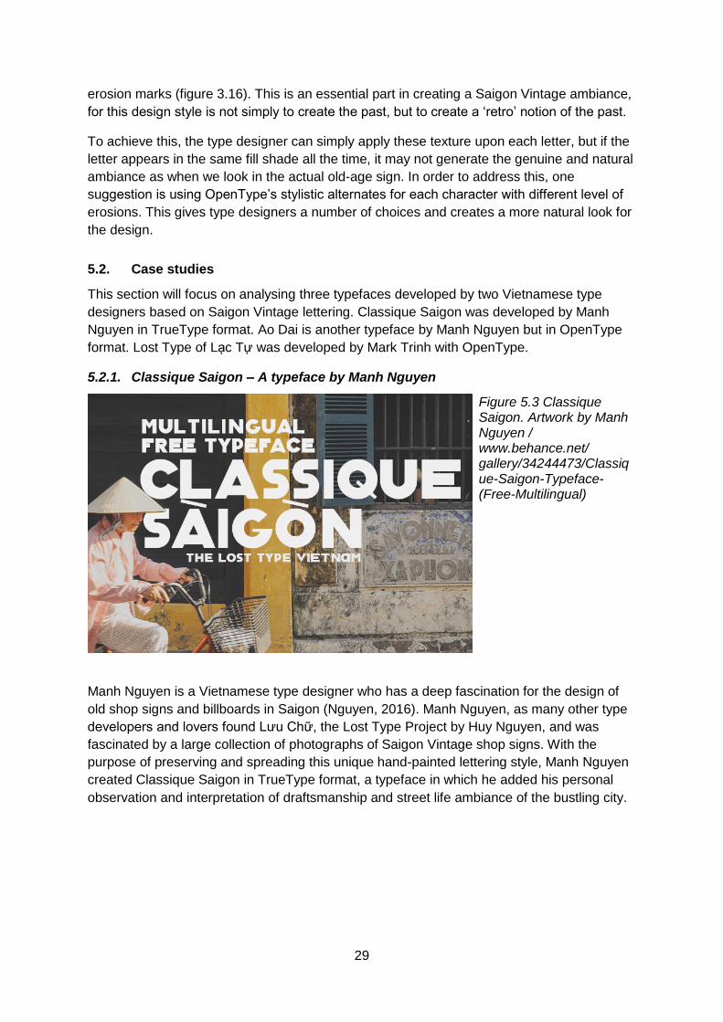
5.2. Case studies
This section will focus on analysing three typefaces developed by two Vietnamese type
designers based on Saigon Vintage lettering. Classique Saigon was developed by Manh
Nguyen in TrueType format. Ao Dai is another typeface by Manh Nguyen but in OpenType
format. Lost Type of Lạc Tự was developed by Mark Trinh with OpenType.
5.2.1. Classique Saigon – A typeface by Manh Nguyen
Figure 5.3 Classique Saigon. Artwork by Manh Nguyen / www.behance.net/ gallery/34244473/Classique-Saigon-Typeface-(Free-Multilingual)
Manh Nguyen is a Vietnamese type designer who has a deep fascination for the design of
old shop signs and billboards in Saigon (Nguyen, 2016). Manh Nguyen, as many other type
developers and lovers found Lưu Chữ, the Lost Type Project by Huy Nguyen, and was
fascinated by a large collection of photographs of Saigon Vintage shop signs. With the
purpose of preserving and spreading this unique hand-painted lettering style, Manh Nguyen
created Classique Saigon in TrueType format, a typeface in which he added his personal
observation and interpretation of draftsmanship and street life ambiance of the bustling city.
30
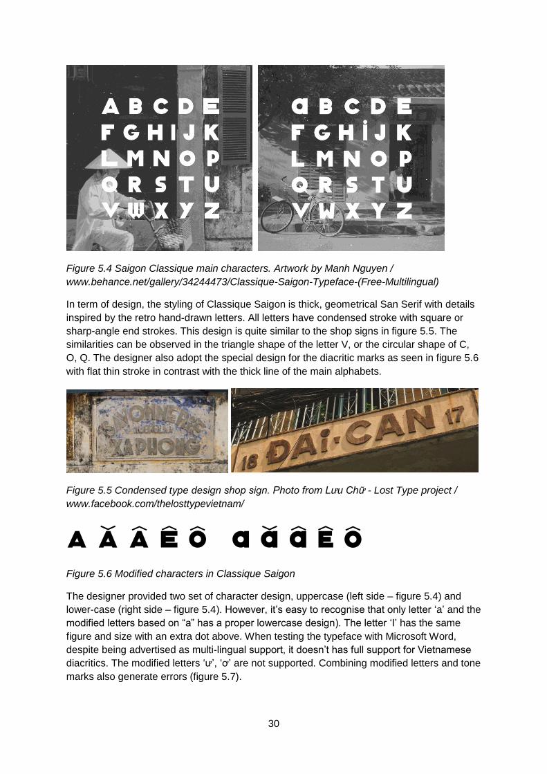
Figure 5.4 Saigon Classique main characters. Artwork by Manh Nguyen /
www.behance.net/gallery/34244473/Classique-Saigon-Typeface-(Free-Multilingual)
In term of design, the styling of Classique Saigon is thick, geometrical San Serif with details
inspired by the retro hand-drawn letters. All letters have condensed stroke with square or
sharp-angle end strokes. This design is quite similar to the shop signs in figure 5.5. The
similarities can be observed in the triangle shape of the letter V, or the circular shape of C,
O, Q. The designer also adopt the special design for the diacritic marks as seen in figure 5.6
with flat thin stroke in contrast with the thick line of the main alphabets.
Figure 5.5 Condensed type design shop sign. Photo from Lưu Chữ - Lost Type project /
www.facebook.com/thelosttypevietnam/
A Ă Â Ê Ô a ă â ê ô Figure 5.6 Modified characters in Classique Saigon
The designer provided two set of character design, uppercase (left side – figure 5.4) and
lower-case (right side – figure 5.4). However, it’s easy to recognise that only letter ‘a’ and the
modified letters based on “a” has a proper lowercase design). The letter ‘I’ has the same
figure and size with an extra dot above. When testing the typeface with Microsoft Word,
despite being advertised as multi-lingual support, it doesn’t has full support for Vietnamese
diacritics. The modified letters ‘ư’, ‘ơ’ are not supported. Combining modified letters and tone
marks also generate errors (figure 5.7).
31
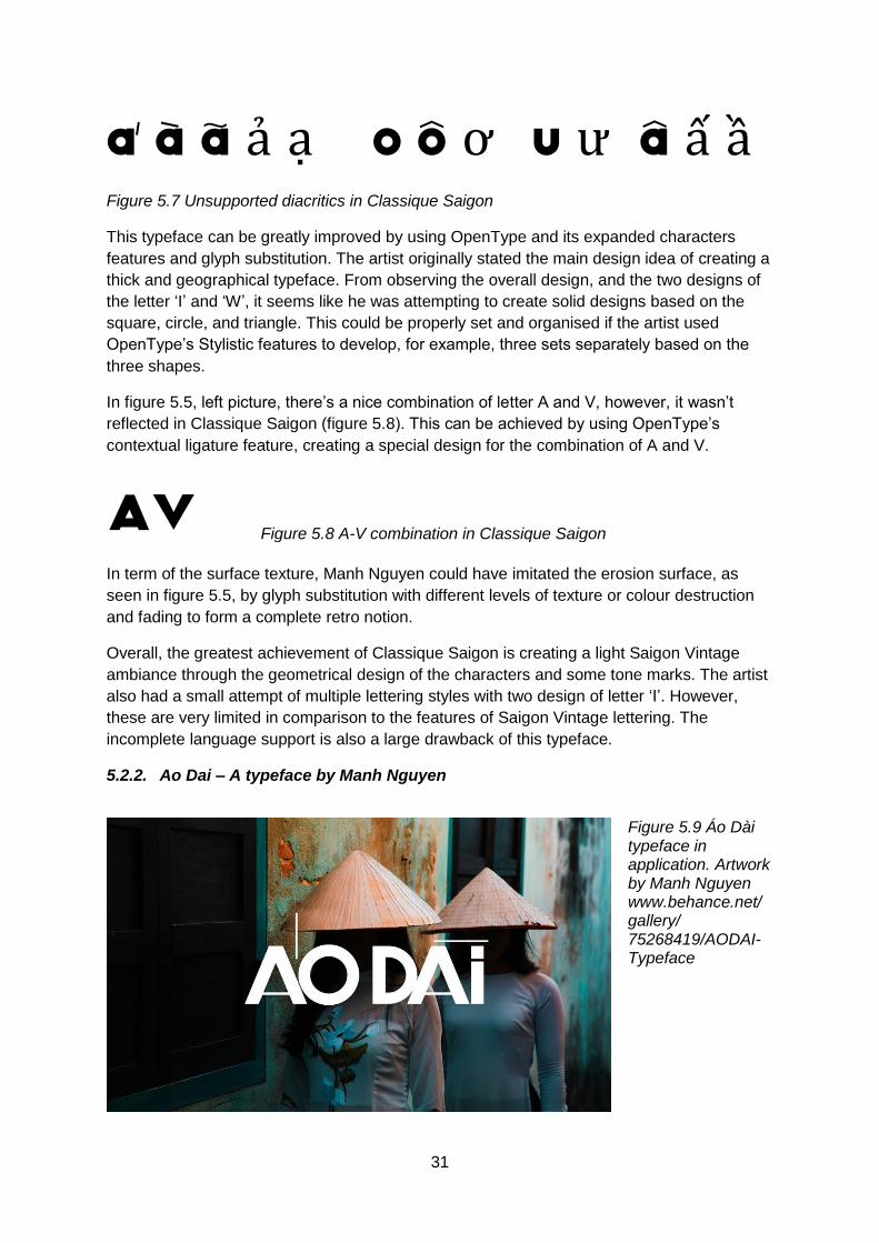
á à ã ả ạ o ô ơ u ư â ấ ầ Figure 5.7 Unsupported diacritics in Classique Saigon
This typeface can be greatly improved by using OpenType and its expanded characters
features and glyph substitution. The artist originally stated the main design idea of creating a
thick and geographical typeface. From observing the overall design, and the two designs of
the letter ‘I’ and ‘W’, it seems like he was attempting to create solid designs based on the
square, circle, and triangle. This could be properly set and organised if the artist used
OpenType’s Stylistic features to develop, for example, three sets separately based on the
three shapes.
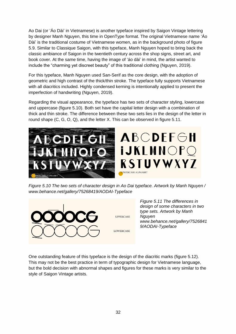
In figure 5.5, left picture, there’s a nice combination of letter A and V, however, it wasn’t
reflected in Classique Saigon (figure 5.8). This can be achieved by using OpenType’s
contextual ligature feature, creating a special design for the combination of A and V.
AV Figure 5.8 A-V combination in Classique Saigon
In term of the surface texture, Manh Nguyen could have imitated the erosion surface, as
seen in figure 5.5, by glyph substitution with different levels of texture or colour destruction
and fading to form a complete retro notion.
Overall, the greatest achievement of Classique Saigon is creating a light Saigon Vintage
ambiance through the geometrical design of the characters and some tone marks. The artist
also had a small attempt of multiple lettering styles with two design of letter ‘I’. However,
these are very limited in comparison to the features of Saigon Vintage lettering. The
incomplete language support is also a large drawback of this typeface.
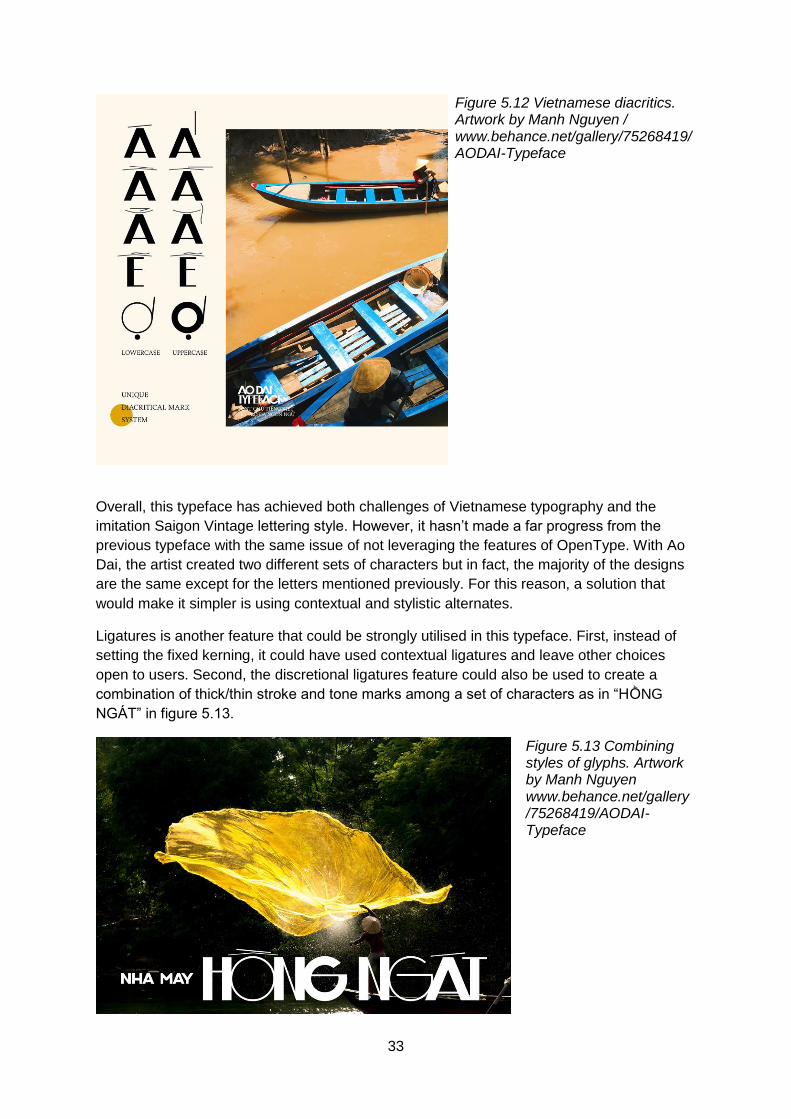
5.2.2. Ao Dai – A typeface by Manh Nguyen
Figure 5.9 Áo Dài typeface in application. Artwork by Manh Nguyen www.behance.net/ gallery/ 75268419/AODAI-Typeface
32
Ao Dai (or ‘Áo Dài’ in Vietnamese) is another typeface inspired by Saigon Vintage lettering
by designer Manh Nguyen, this time in OpenType format. The original Vietnamese name ‘Áo
Dài’ is the traditional costume of Vietnamese women, as in the background photo of figure
5.9. Similar to Classique Saigon, with this typeface, Manh Nguyen hoped to bring back the
classic ambiance of Saigon in the twentieth century across the shop signs, street art, and
book cover. At the same time, having the image of ‘áo dài’ in mind, the artist wanted to
include the “charming yet discreet beauty” of this traditional clothing (Nguyen, 2019).
For this typeface, Manh Nguyen used San-Serif as the core design, with the adoption of
geometric and high contrast of the thick/thin stroke. The typeface fully supports Vietnamese
with all diacritics included. Highly condensed kerning is intentionally applied to present the
imperfection of handwriting (Nguyen, 2019).
Regarding the visual appearance, the typeface has two sets of character styling, lowercase
and uppercase (figure 5.10). Both set have the capital letter design with a combination of
thick and thin stroke. The difference between these two sets lies in the design of the letter in
round shape (C, G, O, Q), and the letter X. This can be observed in figure 5.11.
Figure 5.10 The two sets of character design in Ao Dai typeface. Artwork by Manh Nguyen /
www.behance.net/gallery/75268419/AODAI-Typeface
Figure 5.11 The differences in design of some characters in two type sets. Artwork by Manh Nguyen www.behance.net/gallery/7526841 9/AODAI-Typeface
One outstanding feature of this typeface is the design of the diacritic marks (figure 5.12).
This may not be the best practice in term of typographic design for Vietnamese language,
but the bold decision with abnormal shapes and figures for these marks is very similar to the
style of Saigon Vintage artists.
33
Figure 5.12 Vietnamese diacritics. Artwork by Manh Nguyen / www.behance.net/gallery/75268419/AODAI-Typeface
Overall, this typeface has achieved both challenges of Vietnamese typography and the
imitation Saigon Vintage lettering style. However, it hasn’t made a far progress from the
previous typeface with the same issue of not leveraging the features of OpenType. With Ao
Dai, the artist created two different sets of characters but in fact, the majority of the designs
are the same except for the letters mentioned previously. For this reason, a solution that
would make it simpler is using contextual and stylistic alternates.
Ligatures is another feature that could be strongly utilised in this typeface. First, instead of
setting the fixed kerning, it could have used contextual ligatures and leave other choices
open to users. Second, the discretional ligatures feature could also be used to create a
combination of thick/thin stroke and tone marks among a set of characters as in “HỒNG
NGÁT” in figure 5.13.
Figure 5.13 Combining styles of glyphs. Artwork by Manh Nguyen www.behance.net/gallery /75268419/AODAI-Typeface

34
Another feature that Ao Dai as well as Classique Saigon don’t seem to attempt is creating
the old ruined surface with erosion texture, which can be done by stylistic alternates with
various erosion level texture.
5.2.3. Lost Type (Lạc Tự) – A typeface by Mack Trinh
Figure 5.14 Lạc Tự / Lost Type Typeface by Mack Trinh / www.behance.net/gallery/66119
757/Lost-Type-(Lc-T)-Free-Typeface
Lost Type or Lạc Tự is a typeface created by Mack Trinh, another Vietnamese designer.
Similar to Manh Nguyen, Mack also got inspired by the strangely-styled shop signs of
Saigon. After running through the photographs archive of Lost Type project by Huy Nguyen,
Mack decided to create a typeface combining modern design with Retro feels, something
that’s both bold and original. Lost Type was born in OpenType format, with the name take
from the project that gave him the inspiration (Trinh, 2018).
The original source of design for Lost Type is the sign of ‘Nghĩa Sĩ’ shop (figure 5.15).
Figure 5.15 Nghĩa Sĩ shop sign. Photo from The Lost Type project / www.facebook.com/thelosttype vietnam/
Figure 5.16 Nghĩa Sĩ with Lost Type typeface by Mack Trinh. Artwork by Mack Trinh www.behance.net/gallery/66119 757/Lost-Type-(Lc-T)-Free-Typeface
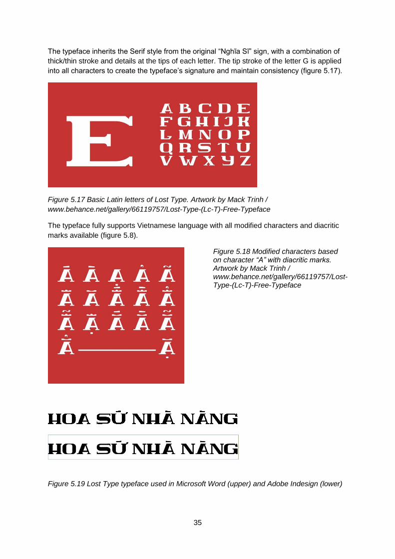
35
The typeface inherits the Serif style from the original “Nghĩa Sĩ” sign, with a combination of
thick/thin stroke and details at the tips of each letter. The tip stroke of the letter G is applied
into all characters to create the typeface’s signature and maintain consistency (figure 5.17).
Figure 5.17 Basic Latin letters of Lost Type. Artwork by Mack Trinh /
www.behance.net/gallery/66119757/Lost-Type-(Lc-T)-Free-Typeface
The typeface fully supports Vietnamese language with all modified characters and diacritic
marks available (figure 5.8).
Figure 5.18 Modified characters based on character “A” with diacritic marks. Artwork by Mack Trinh / www.behance.net/gallery/66119757/Lost-Type-(Lc-T)-Free-Typeface
Figure 5.19 Lost Type typeface used in Microsoft Word (upper) and Adobe Indesign (lower)

36
In comparison to Classique Saigon and Ao Dai, Lost Type is more successful in addressing
the challenges of Vietnamese typography by giving the full set of alphabet and diacritics. On
the design aspect, the typeface has created a retro feel by the edgy shaped with signature
ending details. However, despite using OpenType format, the author doesn’t seem to have
leveraged its special features for a more flexible design. The artwork in figure 5.16 shows
some erosion marks but this is simply a colour and texture effect of design software rather
than a feature embedded into the typeface. This is also applied to the 3D effect in the same
figure. Both of these stylings can be achieved with contextual or stylistic alternates feature in
OpenType. For example, the artist can create a set of letter with 3D edge and use contextual
alternates, i.e. replacing the original letters with 3D letters with smaller kerning value as
described in 1.2. For the erosion, different forms of letters with varied degree of surface
erosion can be stored and used alternatively.
All characters in the whole design also have only one visual form as capital letters. This is a
huge limit when putting this typeface in actual design work. It might work well for logo or a
simple banner, but in other cases, the designer would have to source different typefaces to
incorporate with Lost Type. To solve this, Mack Trinh can create a proper lowercase set with
shorter caps and rounder edge while keeping the signature tip stroke. The diacritics can also
be made larger for better readability.
Finding a typeface that supports Vietnamese language and has the design in-line with
Saigon Vintage lettering might not be an easy task. It’s quite a pity that the type designer
doesn’t leverage the special design of the letter “i” to create multiple glyph substitution
similar to figure 5.1. Once again, stylistic alternates feature when adopted will help make
these ideas possible.
37
Conclusion
The analysis of Saigon Vintage lettering in this paper shows the unique characteristics of this
letter form and how it was shaped by the diverse social and historical background with the
involvement of multiple foreign forces. The vintage hand-painted shop signs of Saigon don’t
only carry the advertising message but also conveys broader meaning to it. It’s a style on its
own, a result of Vietnamese written language’s evolution, and a nostalgic highlight to the
cityscape of Saigon.
Modern technologies can sometimes be perceived as a threat towards traditional forms of
art, and in the case of Saigon Vintage lettering, they also bear the blame with new digital
printed billboards replacing the old soulful shop signs (Bui, 2016). However, this paper has
sought a way for technologies not only to coexist but even contribute to the preservation of
this unique form of letter design. By paying attention to details to identify the typical
characteristics of Saigon Vintage, and map them with the right features of OpenType format,
the paper gives a number of way for artists and designers to transform the whimsical hand-
painted letters into digital typefaces.
Today, Saigon Vintage style has appeared in various design on print, movies, product
packaging, or shop decoration. However, the analysis of the case studies of three
Vietnamese typeface inspired by the retro ambiance of old Saigon show that despite efforts
have been made, these modern typefaces haven’t leveraged the full potentials of OpenType
to imitate all the characteristics of Saigon Vintage lettering.
It’s also a motivation for type designers to explore the vast potential of OpenType,
considering all the possible substitution of glyphs and planning the ligatures to create a
typeface with high flexibility and natural look despite being a result of machinery production.
The results of this research paper can be adapted in modern design, bringing Saigon
Vintage lettering to digital life and further developing it in the next generations of technology,
despite the old vintage signs may fade out into time and the disappear of the hand-paint
artists.

I
Bibliography
Adobe, n.d. Adobe.com. [Online]
Available at: https://www.adobe.com/ie/products/postscript.html
[Accessed 30 Apr 2019].
A. H., 2016. Người vẽ quảng cáo kiểu cổ còn sót lại ở Sài Gòn. [Online]
Available at: https://news.zing.vn/nguoi-ve-quang-cao-kieu-co-con-sot-lai-o-sai-gon-
post688100.html
[Accessed 22 4 2019].
Anon., 1991. Simply... A History Of Vietnam. [Online]
Available at: https://newint.org/features/1991/02/05/simply
[Accessed 30 Mar 2019].
Bringhurst, R., 2004. The Element of Typographic Style. Vancouver: Hartley & Marks.
Bui, D., 2016. Paying Homage to the Hand-Painted Signs of Cho Lon. [Online]
Available at: https://saigoneer.com/saigon-arts-culture/arts-culture-categories/6959-paying-
homage-to-the-hand-painted-signs-of-cho-lon
[Accessed 22 4 2019].
Condensed, B., 2017. Type Network. [Online]
Available at: https://www.typenetwork.com/news/article/opentype-at-work-standard-ligatures
[Accessed 07 May 2019].
Condensed, B., 2018. Type Network. [Online]
Available at: https://www.typenetwork.com/news/article/opentype-at-work-contextual-
alternates
[Accessed 07 May 2019].
Constable, P. & Jacobs, M., 2018. Microsoft Typography. [Online]
Available at: https://docs.microsoft.com/en-us/typography/opentype/
[Accessed 30 Apr 2019].
Fleishman, G., 2019. For want of a typeface. Increment, 2.Issue 8.
Goscha, C., 2017. The Penguin History of Vietnam. London: Penguin UK.
Henestrosa, C., Meseguer, L. & Scaglione, J., 2017. How to create typefaces: From sketch
to screen. Madrid: Tipo e.

II
H. M., 2017. Chuyện về ông hoạ sĩ già, nghệ nhân duy nhất còn vẽ bảng hiệu bằng tay ở Sài
Gòn. [Online]
Available at: https://www.yan.vn/mot-sai-gon-hoai-co-qua-nhung-tam-bang-hieu-ve-tay-cua-
ong-hoa-si-gia-147272.html
[Accessed 22 4 2019].
Holmgren, J., 1980. Chinese Colonisation of Northern Vietnam. Canberra: The Australian
National University Press.
Kennedy, J. & Satran, M., 2018. Microsoft - OpenType Variable Fonts. [Online]
Available at: https://docs.microsoft.com/en-us/windows/desktop/directwrite/opentype-
variable-fonts
[Accessed 1 May 2019].
Lê, N. V., 2016. Nghề vẽ bảng hiệu ở Sài Gòn - Gia Định. [Online]
Available at: https://thanhnien.vn/van-hoa/nghe-ve-bang-hieu-o-sai-gon-gia-dinh-
733669.html
[Accessed 22 04 2019].
Lương, H. N., 2014. Chữ Quốc ngữ nước ta, từ Alexandre de Rhodes đến Trương Vĩnh Ký.
[Online]
Available at: https://thuvienhoasen.org/a30249/chu-quoc-ngu-chu-nuoc-ta-tu-alexandre-de-
rhodes-den-truong-vinh-ky
[Accessed 30 Mar 2019].
MyFonts, n.d. MyFonts. [Online]
Available at: https://www.myfonts.com/info/truetype/
[Accessed 30 Apr 2019].
Nguyễn, H., 2017. Giật mình 1.001 kiểu quảng cáo ấn tượng của người Sài Gòn xưa.
[Online]
Available at: https://thanhnien.vn/doi-song/giat-minh-1001-kieu-quang-cao-an-tuong-cua-
nguoi-sai-gon-xua-789642.html
[Accessed 22 04 2019].
Nguyen, L. V., 2017. Chữ viết tiếng Việt và vấn đề cải cách. [Online]
Available at: https://tuoitre.vn/chu-viet-tieng-viet-va-van-de-cai-cach-1411612.htm
[Accessed 31 March 2019].
Nguyen, M., 2016. Behance. [Online]
Available at: https://www.behance.net/gallery/34244473/Classique-Saigon-Typeface-(Free-
Multilingual)
[Accessed 04 May 2019].
Nguyen, M., 2019. Behance. [Online]
Available at: https://www.behance.net/gallery/75268419/AODAI-Typeface
[Accessed 04 May 2019].
III
Pluralsight, 2014. Understanding Differences Between Font Formats. Pluralsight, 23 Dec.
Strizver, I., 2016. creative Pro. [Online]
Available at: https://creativepro.com/typetalk-what-is-opentype-part-2/
[Accessed 01 May 2019].
Strizver, I., n.d. A Brief History of Digital Type. [Online]
Available at: https://www.fonts.com/content/learning/fyti/using-type-tools/digital-format
[Accessed 30 Apr 2019].
Sudtipos, n.d. Sudtipos.com. [Online]
Available at: https://www.sudtipos.com/
[Accessed 02 May 2019].
The Metropole Blog, 2017. Culture, Commerce, and History in Ho Chi Minh City: A
Bibliography of Vietnam's Cultural Capital. [Online]
Available at: https://themetropole.blog/2017/09/07/culture-commerce-and-history-in-ho-chi-
minh-city-a-bibliography-of-vietnams-cultural-capital/
[Accessed 22 04 2019].
Trinh, M., 2018. Behance. [Online]
Available at: https://www.behance.net/gallery/66119757/Lost-Type-(Lc-T)-Free-Typeface
[Accessed 04 May 2019].
Trương, D., 2018. Vietnameses Typography. [Online]
Available at: https://vietnamesetypography.com/
[Accessed 30 March 2019].
Typofonderie, n.d. Typofonderie. [Online]
Available at: https://typofonderie.com/font-support/opentype-features/
[Accessed 01 May 2019].
W3C, 2015. W3C Internationalization. [Online]
Available at: https://www.w3.org/International/questions/qa-what-is-encoding
[Accessed 04 Apr 2019].
Zentgraf, D., 2015. Kunststube. [Online]
Available at: http://kunststube.net/encoding/
[Accessed 30 Apr 2019].