Robustness of Shared Prosperity Estimates
28
Policy Research Working Paper 7611 Robustness of Shared Prosperity Estimates How Different Methodological Choices Matter Aziz Atamanov Christina Wieser Hiroki Uematsu Nobuo Yoshida Minh Cong Nguyen Joao Pedro Wagner De Azevedo Reno Dewina Poverty and Equity Global Practice Group March 2016 WPS7611 Public Disclosure Authorized Public Disclosure Authorized Public Disclosure Authorized Public Disclosure Authorized
Transcript of Robustness of Shared Prosperity Estimates

Policy Research Working Paper 7611
Robustness of Shared Prosperity Estimates
How Different Methodological Choices Matter
Aziz AtamanovChristina WieserHiroki UematsuNobuo Yoshida
Minh Cong NguyenJoao Pedro Wagner De Azevedo
Reno Dewina
Poverty and Equity Global Practice GroupMarch 2016
WPS7611P
ublic
Dis
clos
ure
Aut
horiz
edP
ublic
Dis
clos
ure
Aut
horiz
edP
ublic
Dis
clos
ure
Aut
horiz
edP
ublic
Dis
clos
ure
Aut
horiz
ed
Produced by the Research Support Team
Abstract
The Policy Research Working Paper Series disseminates the findings of work in progress to encourage the exchange of ideas about development issues. An objective of the series is to get the findings out quickly, even if the presentations are less than fully polished. The papers carry the names of the authors and should be cited accordingly. The findings, interpretations, and conclusions expressed in this paper are entirely those of the authors. They do not necessarily represent the views of the International Bank for Reconstruction and Development/World Bank and its affiliated organizations, or those of the Executive Directors of the World Bank or the governments they represent.
Policy Research Working Paper 7611
This paper is a product of the Poverty and Equity Global Practice Group. It is part of a larger effort by the World Bank to provide open access to its research and make a contribution to development policy discussions around the world. Policy Research Working Papers are also posted on the Web at http://econ.worldbank.org. The authors may be contacted at [email protected].
This paper is the first to systematically test the robustness of shared prosperity estimates to different methodological choices using a sample of countries from all regions in the world. The tests that are conducted include grouped versus microdata, nominal welfare aggregate versus adjustment for spatial price variation, and different treatment of income with negative and zero values. The empirical results reveal an only minimal impact of the proposed tests on shared prosperity estimates. Nevertheless, there are important
caveats. First, spatial adjustment can change the ranking of households, affecting the distribution of the population in the bottom 40 percent. Second, the negligible impact of spatial deflation holds only if price adjustments are car-ried out consistently over time. Finally, the treatment of negative and zero income numbers can potentially lead to substantial differences in shared prosperity, depending on the magnitude of negative income and the share of households with negative and zero numbers across years.

Robustness of Shared Prosperity Estimates: How Different Methodological Choices Matter
Aziz Atamanov, Christina Wieser, Hiroki Uematsu, Nobuo Yoshida, Minh Cong Nguyen, Joao Pedro Wagner De Azevedo and Reno Dewina1
JEL codes: I32, D31, D63
Key words: shared prosperity; robustness tests
1 All authors are with the World Bank, Washington DC. Contact email: [email protected].

2
1. INTRODUCTION
The World Bank Group’s (WBG) twin goals of ending extreme poverty and promoting shared prosperity are at the forefront of the WBG’s operations. The shared prosperity goal, defined as fostering income growth of the bottom 40 percent, reflects the fact that as countries grow, the benefits of the growth may not necessarily be widely shared among the population. Nations with a widening gap between those who can and cannot access opportunities in life have difficulty sustaining economic growth and social stability over time. Shared prosperity therefore focuses on two, often competing, concerns, expanding the size of the economy and sharing it among all members of society, particularly the poor (World Bank, 2015a). Furthermore, the indicator of shared prosperity features prominently as target 10.1 of one of the Sustainable Development Goals of reducing inequality within and among countries. The concept and measurement of shared prosperity may therefore gain traction beyond the Word Bank Group’s operational work in the coming years.
Unlike ending extreme poverty, the shared prosperity goal is country specific without a specific target at the global level. Good performance depends on whether consumption of the bottom 40 percent of the population is positive and how it compares with growth of the population from other parts of the distribution.
The frequency and quality of data on poverty and shared prosperity are of utmost importance to successfully monitor the twin goals and to set effective policies for a country’s poverty reduction program. Shared prosperity measures consumption or income growth rates from representative household surveys and requires a comparable welfare aggregate at two points in time. This makes it particularly demanding in terms of data availability and quality (World Bank, 2015a).
Countries should make numerous methodological choices to measure shared prosperity. The impact of these choices on the shared property indicator is an empirical question. This issue becomes even more important when the monitoring of shared prosperity is done at the global level. For example, the World Bank constructs corporate numbers on shared prosperity based on welfare indicators used for estimating poverty headcount rates measured at the $1.90 per day per capita in 2011 PPPs poverty line. This decision was made to ensure consistency for the two indicators of the WBG measuring extreme poverty and shared prosperity. As a result, the estimation of the shared prosperity indicator follows special conventions of adjustments adopted for estimating extreme poverty. Some of these adjustments are not necessarily consistent with the recommendations of the World Bank’s poverty measurement manuals (Deaton and Zaidi 2002; Ravallion 1992, 1996), which have been adopted by many developing countries when estimating national poverty and inequality statistics. It is, therefore, crucial to understand how different choices in the estimation process affect the shared prosperity indicator.
Given that shared prosperity is a relatively new indicator, there is a lack of studies that systematically test the robustness of the indicator to different parameters. Most of the existing literature focuses on global performance in shared prosperity and its relationship with overall growth and inequality (Narayan et al., 2013; Cruz et al., 2015; World Bank, 2015ab). To the best of our knowledge, there were only a couple of illustrative tests in the World Bank (2015a) thus far, demonstrating how the choices of data and time intervals affect the indicator of shared prosperity using the example of Peru. Results of systematic robustness tests will be useful to the World Bank for a better measurement of its corporate goal and to countries which may choose to deviate from the methodology used by the World Bank and to introduce changes to the construction of the indicator of shared prosperity.

3
The key objective of this paper is to systematically explore the robustness of the shared prosperity indicator to different methodological choices in the estimation process such as: grouped versus microdata, nominal welfare aggregate versus adjustments for spatial price variation, and different treatment of income with negative and zero values. The analysis is conducted using household survey data used for estimating extreme poverty and shared prosperity indices. For most tests, we randomly selected at least two countries from each of the six regions to reflect global representation. In addition to robustness tests, we briefly present the most recent results and findings from the Global Database of Shared Prosperity (GDSP) circa 2007‐2012 to provide context and familiarize the readers with the most recent trends in shared prosperity in the world.
The paper continues as follows. Section 2 provides a brief overview of the GDSP. In section 3, we focus on special technical issues in the construction of the shared prosperity index that may affect the obtained results and empirically test them. Section 4 concludes.
2. AN OVERVIEW OF THE GLOBAL DATABASE OF SHARED PROSPERITY
This section provides a brief overview of data and trends in the Global Database of Shared Prosperity (GDSP). This is merely a complement to recent publications on shared prosperity such as Cruz et al. (2015), the World Bank Global Monitoring Report (2015b), and the World Bank Policy Research Report (2015a), which provide a more exhaustive analysis and results on shared prosperity. The GDSP is a collection of the shared prosperity index across the world, where the index is defined as the average annualized growth rate of consumption or income among the bottom 40 percent of the population. The latest version of the GDSP, published in October 2015,2 has the shared prosperity index for 94 countries, up from 72 in the version published in September 2014.3 In the latest GDSP, the shared prosperity index is calculated using household surveys circa 2007–2012. The average years for the first and the second surveys are 2006.6 and 2011.7, respectively.4
With the paucity of household survey data as recently documented in Serajuddin, et al. (2015), it is remarkable that as many as 94 countries satisfied the substantial data requirements to calculate the shared prosperity index. Of the 134 countries included in PovcalNet,5 however, only 71 countries (53 percent) are also included in the latest version of the GDSP. Using the World Bank’s regional classification, three regions are relatively underrepresented in the GDSP. For East Asia and the Pacific, the GDSP has 7 out of 18 countries (39 percent); for the Middle East and North Africa, 4 out of 11 countries (36 percent); and for Sub‐Saharan Africa, 15 out of 43 countries (35 percent). In the other four regions, the GDSP contains 45 out of 72 or about 70 percent of the countries in PovcalNet. IDA countries and countries designated as fragile and conflict affected states are also under‐represented. The GDSP includes about 35 percent of IDA countries and 65 percent of all other countries in PovcalNet. Of the 24 fragile and conflict affected states in PovcalNet, only five of them are in the GDSP.
Notwithstanding, the GDSP appears to be a fairly good representation of the developing world in terms of poverty incidence. The 71 countries that are present in both the GDSP and PovcalNet in total account for approximately 800 million of the poor population and 5.1 billion of the total population,6 both of which
2 Available at: http://www.worldbank.org/en/topic/poverty/brief/global‐database‐of‐shared‐prosperity 3 Most of the increase is due to the addition of high income countries in Europe and Central Asia as well as North America. 4 For a more detailed description on how the Shared Prosperity indicator is calculated, please refer to Box 1 in the annex. 5 PovcalNet is the primary source of the World Bank’s international poverty estimates, available at: http://iresearch.worldbank.org/PovcalNet/ 6 Based on figures in the World Development Indicators as of the year of the second survey for each country.

4
are about 85 percent of the developing world total (PovcalNet, 2015). The population weighted average poverty rate among the 71 countries as of the second survey year is 16.8 percent, fairly close to the developing world average poverty rate of 15 percent in 2012 (PovcalNet, 2015).
2.1. Growth of the Bottom 40 Percent vs. Total Population
The shared prosperity index and its focus on the bottom 40 percent of the population is a refinement to the long‐standing and implicit focus on economic growth for the total population as a condition for poverty reduction (Beegle et al., 2014). In this light, a simple comparison of the two growth rates, one for the bottom 40 percent and the other for the total population,7 is a natural starting point to understand the state of shared prosperity. Of the 94 countries in the GDSP, the bottom 40 growth rate was higher than the total growth rate in 56 countries (Table 1). Of those, 20 countries experienced a bottom 40 growth rate greater than 4 percent a year (top right quadrant).8 These are countries in which strong economic growth was shared with the poorer segments of the population. An additional 27 countries shared the gains of economic growth to a larger extent with the poorer segments of the population but growth overall was lower than 4 percent annually. On the contrary, in 18 countries, the bottom 40 growth was positive, but lower than the total growth. Finally, 29 countries experienced a negative bottom 40 growth rate and, in more than two‐thirds of these countries, the mean consumption/income of the bottom 40 percent contracted even more than that for the total population.
Table 1: Income growth of the bottom 40 percent (G40), circa 2007‐2012
Annualized growth in mean consumption or income of bottom 40
Total Bottom 40 Growth < 0 0 < Bottom 40 Growth < 4% Bottom 40 Growth > 4%
Bottom 40 Growth > Total Growth
9 27 20 56
Bottom 40 Growth < Total Growth
20 12 6 38
Total 29 39 26 94
Source: Global Database of Shared Prosperity (GDSP), circa 2007‐2012.
Figure 1 is a scatter plot of the bottom 40 growth and the total growth rates. A positive and significant correlation coefficient of 0.90 (p‐value < 0.001) indicates that the bottom 40 growth is strongly correlated with the total growth and that prosperity is often shared when economy grows as a whole. This finding is consistent with Dollar et al. (2013). At the same time, there is a non‐negligible variation in this relationship and the correlation between the two growth rates are weaker at a higher growth range. For example, the correlation coefficient for the 29 countries with a negative bottom 40 growth rate is 0.78 (p‐value <0.001), while it is 0.59 (p‐value < 0.001) for 39 countries with a bottom 40 growth rate between 0 to 4 percent, and 0.35 (p‐value =0.08) for 26 countries with a bottom 40 growth rate greater than 4 percent. Country specific analysis is needed to detect possible contributors of the inclusiveness of growth.
7 For brevity, we refer to these growth rates as the bottom 40 growth rate and the total growth rate, respectively, regardless of the underlying welfare indicator, consumption or income. 8 As suggested in Narayan et al. (2013), the threshold of 4 percent is an arbitrary measure of separating “good” growth performers from the rest and is kept here to maintain consistency and comparability to previous results.

5
Figure 1: Bottom 40 Growth Rates and Total Growth Rates, circa 2007‐2012
Source: Global Database of Shared Prosperity, circa 2007‐2012.
2.2. Shared Prosperity Index, Gini, and Poverty
In the latest GDSP, there is a weak but positive correlation between the initial level of the Gini coefficient and the bottom 40 growth rate (figure 2) with a correlation coefficient of 0.38 (p‐value < 0.001). A simple regression model of the initial level of the Gini coefficient on the bottom 40 growth rates also yields a negative and significant coefficient.9 This is in contrast to the previous versions of the GDSP, in which the correlation was positive but insignificant. The correlation becomes weaker but remains significant (0.34, p‐value < 0.001) even if we exclude some high income countries and limit the sample to the 71 countries present in both the GDSP and PovcalNet.
A much clearer relationship between inequality and the bottom 40 growth is observed in Figure 3, which is a scatter plot of the bottom 40 growth rates and the changes in the Gini coefficient between two survey years. Countries with a large reduction in Gini coefficient are likely to have experienced a high growth rate in its bottom 40 percent of the population. A simple regression model between the two variables yields a negative and significant coefficient (‐0.23, p‐value < 0.001).
9 The grey line in Figures 2 ‐ 4 is the liner prediction from a simple regression between the two variables in respective figures.

6
Figure 2. Gini (1st year) and Bottom 40 Growth Rates
Source: Global Database of Shared Prosperity, circa 2007‐2012.
Figure 3. Changes in Gini and Bottom 40 Growth Rates
7
Source: Global Database of Shared Prosperity, circa 2007‐2012.
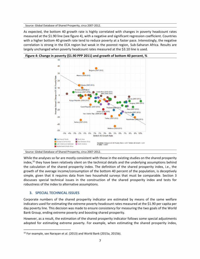
As expected, the bottom 40 growth rate is highly correlated with changes in poverty headcount rates measured at the $1.90 line (see figure 4), with a negative and significant regression coefficient. Countries with a higher bottom 40 growth rate tend to reduce poverty at a faster pace. Interestingly, the negative correlation is strong in the ECA region but weak in the poorest region, Sub‐Saharan Africa. Results are largely unchanged when poverty headcount rates measured at the $3.10 line is used.
Figure 4: Change in poverty ($1.90 PPP 2011) and growth of bottom 40 percent, %
Source: Global Database of Shared Prosperity, circa 2007‐2012.
While the analyses so far are mostly consistent with those in the existing studies on the shared prosperity index,10 they have been relatively silent on the technical details and the underlying assumptions behind the calculation of the shared prosperity index. The definition of the shared prosperity index, i.e., the growth of the average income/consumption of the bottom 40 percent of the population, is deceptively simple, given that it requires data from two household surveys that must be comparable. Section 3 discusses special technical issues in the construction of the shared prosperity index and tests for robustness of the index to alternative assumptions.
3. SPECIAL TECHNICAL ISSUES
Corporate numbers of the shared prosperity indicator are estimated by means of the same welfare indicators used for estimating the extreme poverty headcount rates measured at the $1.90 per capita per day poverty line. This decision was made to ensure consistency for measuring the two goals of the World Bank Group, ending extreme poverty and boosting shared prosperity.
However, as a result, the estimation of the shared prosperity indicator follows some special adjustments adopted for estimating extreme poverty. For example, when estimating the shared prosperity index,
10 For example, see Narayan et al. (2013) and World Bank (2015a, 2015b).
8
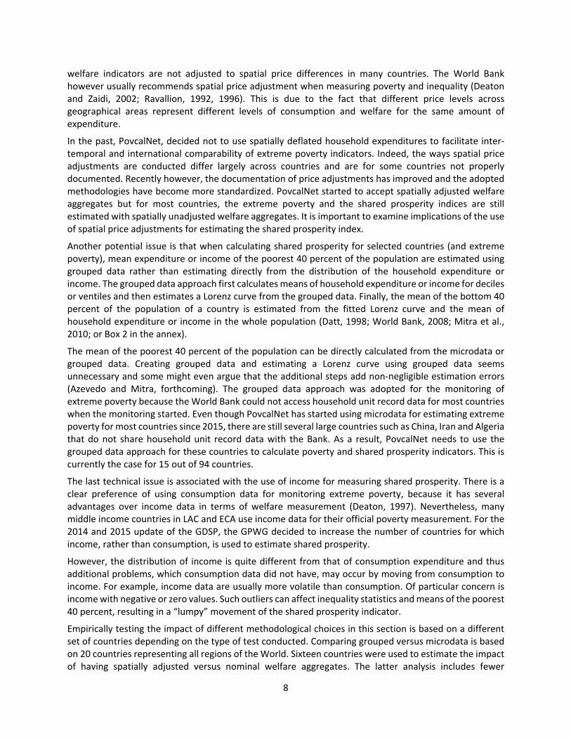
welfare indicators are not adjusted to spatial price differences in many countries. The World Bank however usually recommends spatial price adjustment when measuring poverty and inequality (Deaton and Zaidi, 2002; Ravallion, 1992, 1996). This is due to the fact that different price levels across geographical areas represent different levels of consumption and welfare for the same amount of expenditure.
In the past, PovcalNet, decided not to use spatially deflated household expenditures to facilitate inter‐temporal and international comparability of extreme poverty indicators. Indeed, the ways spatial price adjustments are conducted differ largely across countries and are for some countries not properly documented. Recently however, the documentation of price adjustments has improved and the adopted methodologies have become more standardized. PovcalNet started to accept spatially adjusted welfare aggregates but for most countries, the extreme poverty and the shared prosperity indices are still estimated with spatially unadjusted welfare aggregates. It is important to examine implications of the use of spatial price adjustments for estimating the shared prosperity index.
Another potential issue is that when calculating shared prosperity for selected countries (and extreme poverty), mean expenditure or income of the poorest 40 percent of the population are estimated using grouped data rather than estimating directly from the distribution of the household expenditure or income. The grouped data approach first calculates means of household expenditure or income for deciles or ventiles and then estimates a Lorenz curve from the grouped data. Finally, the mean of the bottom 40 percent of the population of a country is estimated from the fitted Lorenz curve and the mean of household expenditure or income in the whole population (Datt, 1998; World Bank, 2008; Mitra et al., 2010; or Box 2 in the annex).
The mean of the poorest 40 percent of the population can be directly calculated from the microdata or grouped data. Creating grouped data and estimating a Lorenz curve using grouped data seems unnecessary and some might even argue that the additional steps add non‐negligible estimation errors (Azevedo and Mitra, forthcoming). The grouped data approach was adopted for the monitoring of extreme poverty because the World Bank could not access household unit record data for most countries when the monitoring started. Even though PovcalNet has started using microdata for estimating extreme poverty for most countries since 2015, there are still several large countries such as China, Iran and Algeria that do not share household unit record data with the Bank. As a result, PovcalNet needs to use the grouped data approach for these countries to calculate poverty and shared prosperity indicators. This is currently the case for 15 out of 94 countries.
The last technical issue is associated with the use of income for measuring shared prosperity. There is a clear preference of using consumption data for monitoring extreme poverty, because it has several advantages over income data in terms of welfare measurement (Deaton, 1997). Nevertheless, many middle income countries in LAC and ECA use income data for their official poverty measurement. For the 2014 and 2015 update of the GDSP, the GPWG decided to increase the number of countries for which income, rather than consumption, is used to estimate shared prosperity.
However, the distribution of income is quite different from that of consumption expenditure and thus additional problems, which consumption data did not have, may occur by moving from consumption to income. For example, income data are usually more volatile than consumption. Of particular concern is income with negative or zero values. Such outliers can affect inequality statistics and means of the poorest 40 percent, resulting in a “lumpy” movement of the shared prosperity indicator.
Empirically testing the impact of different methodological choices in this section is based on a different set of countries depending on the type of test conducted. Comparing grouped versus microdata is based on 20 countries representing all regions of the World. Sixteen countries were used to estimate the impact of having spatially adjusted versus nominal welfare aggregates. The latter analysis includes fewer
9
countries because PovcalNet does not yet use spatially adjusted welfare aggregates for many countries. Finally, the issue of negative and zero incomes is only relevant for countries of the European Union and Latin American and Caribbean (LAC). In LAC, negative incomes are recoded as missing and therefore, the EUSILC database was used to test the impact of negative incomes, while LAC countries were used to test the impact of zero incomes. The sections below investigate how changes in these particular adjustments may affect the shared prosperity index.
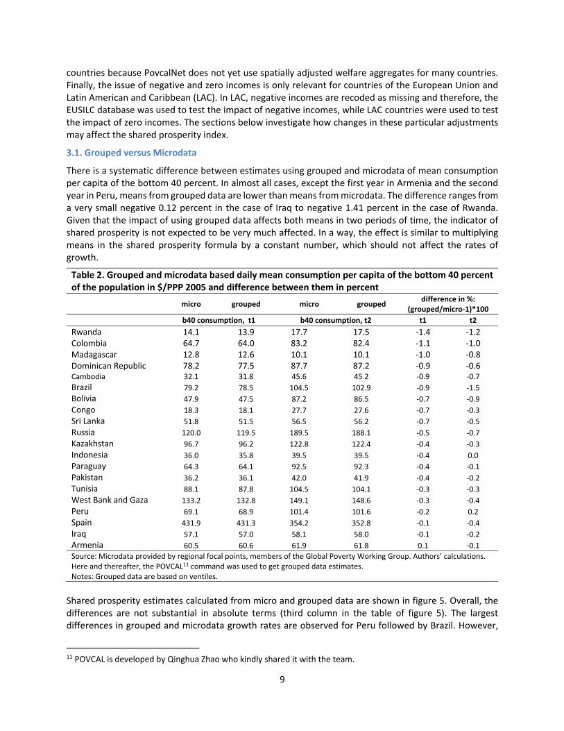
3.1. Grouped versus Microdata
There is a systematic difference between estimates using grouped and microdata of mean consumption per capita of the bottom 40 percent. In almost all cases, except the first year in Armenia and the second year in Peru, means from grouped data are lower than means from microdata. The difference ranges from a very small negative 0.12 percent in the case of Iraq to negative 1.41 percent in the case of Rwanda. Given that the impact of using grouped data affects both means in two periods of time, the indicator of shared prosperity is not expected to be very much affected. In a way, the effect is similar to multiplying means in the shared prosperity formula by a constant number, which should not affect the rates of growth.
Table 2. Grouped and microdata based daily mean consumption per capita of the bottom 40 percent of the population in $/PPP 2005 and difference between them in percent
micro grouped micro grouped
difference in %: (grouped/micro‐1)*100
b40 consumption, t1 b40 consumption, t2 t1 t2
Rwanda 14.1 13.9 17.7 17.5 ‐1.4 ‐1.2 Colombia 64.7 64.0 83.2 82.4 ‐1.1 ‐1.0 Madagascar 12.8 12.6 10.1 10.1 ‐1.0 ‐0.8 Dominican Republic 78.2 77.5 87.7 87.2 ‐0.9 ‐0.6 Cambodia 32.1 31.8 45.6 45.2 ‐0.9 ‐0.7
Brazil 79.2 78.5 104.5 102.9 ‐0.9 ‐1.5
Bolivia 47.9 47.5 87.2 86.5 ‐0.7 ‐0.9
Congo 18.3 18.1 27.7 27.6 ‐0.7 ‐0.3
Sri Lanka 51.8 51.5 56.5 56.2 ‐0.7 ‐0.5
Russia 120.0 119.5 189.5 188.1 ‐0.5 ‐0.7
Kazakhstan 96.7 96.2 122.8 122.4 ‐0.4 ‐0.3
Indonesia 36.0 35.8 39.5 39.5 ‐0.4 0.0
Paraguay 64.3 64.1 92.5 92.3 ‐0.4 ‐0.1
Pakistan 36.2 36.1 42.0 41.9 ‐0.4 ‐0.2
Tunisia 88.1 87.8 104.5 104.1 ‐0.3 ‐0.3
West Bank and Gaza 133.2 132.8 149.1 148.6 ‐0.3 ‐0.4
Peru 69.1 68.9 101.4 101.6 ‐0.2 0.2
Spain 431.9 431.3 354.2 352.8 ‐0.1 ‐0.4
Iraq 57.1 57.0 58.1 58.0 ‐0.1 ‐0.2
Armenia 60.5 60.6 61.9 61.8 0.1 ‐0.1
Source: Microdata provided by regional focal points, members of the Global Poverty Working Group. Authors’ calculations. Here and thereafter, the POVCAL11 command was used to get grouped data estimates. Notes: Grouped data are based on ventiles.
Shared prosperity estimates calculated from micro and grouped data are shown in figure 5. Overall, the differences are not substantial in absolute terms (third column in the table of figure 5). The largest differences in grouped and microdata growth rates are observed for Peru followed by Brazil. However,
11 POVCAL is developed by Qinghua Zhao who kindly shared it with the team.
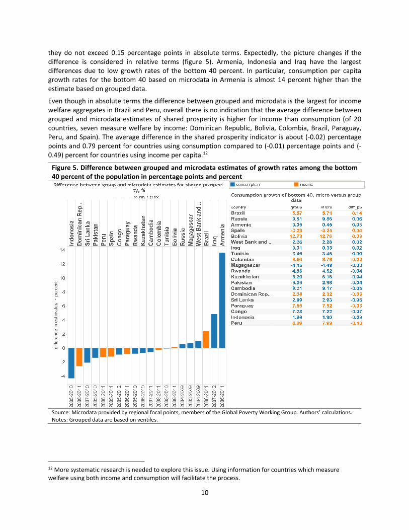
10
they do not exceed 0.15 percentage points in absolute terms. Expectedly, the picture changes if the difference is considered in relative terms (figure 5). Armenia, Indonesia and Iraq have the largest differences due to low growth rates of the bottom 40 percent. In particular, consumption per capita growth rates for the bottom 40 based on microdata in Armenia is almost 14 percent higher than the estimate based on grouped data.
Even though in absolute terms the difference between grouped and microdata is the largest for income welfare aggregates in Brazil and Peru, overall there is no indication that the average difference between grouped and microdata estimates of shared prosperity is higher for income than consumption (of 20 countries, seven measure welfare by income: Dominican Republic, Bolivia, Colombia, Brazil, Paraguay, Peru, and Spain). The average difference in the shared prosperity indicator is about (‐0.02) percentage points and 0.79 percent for countries using consumption compared to (‐0.01) percentage points and (‐0.49) percent for countries using income per capita.12
Figure 5. Difference between grouped and microdata estimates of growth rates among the bottom 40 percent of the population in percentage points and percent
Source: Microdata provided by regional focal points, members of the Global Poverty Working Group. Authors’ calculations. Notes: Grouped data are based on ventiles.
12 More systematic research is needed to explore this issue. Using information for countries which measure welfare using both income and consumption will facilitate the process.
11
3.2. Spatial Deflation versus Nominal
3.2.1Impactonsharedprosperity
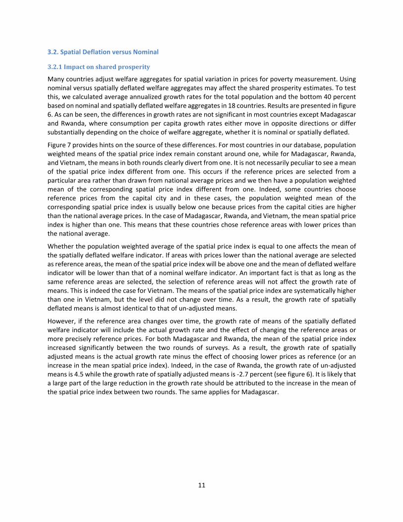
Many countries adjust welfare aggregates for spatial variation in prices for poverty measurement. Using nominal versus spatially deflated welfare aggregates may affect the shared prosperity estimates. To test this, we calculated average annualized growth rates for the total population and the bottom 40 percent based on nominal and spatially deflated welfare aggregates in 18 countries. Results are presented in figure 6. As can be seen, the differences in growth rates are not significant in most countries except Madagascar and Rwanda, where consumption per capita growth rates either move in opposite directions or differ substantially depending on the choice of welfare aggregate, whether it is nominal or spatially deflated.
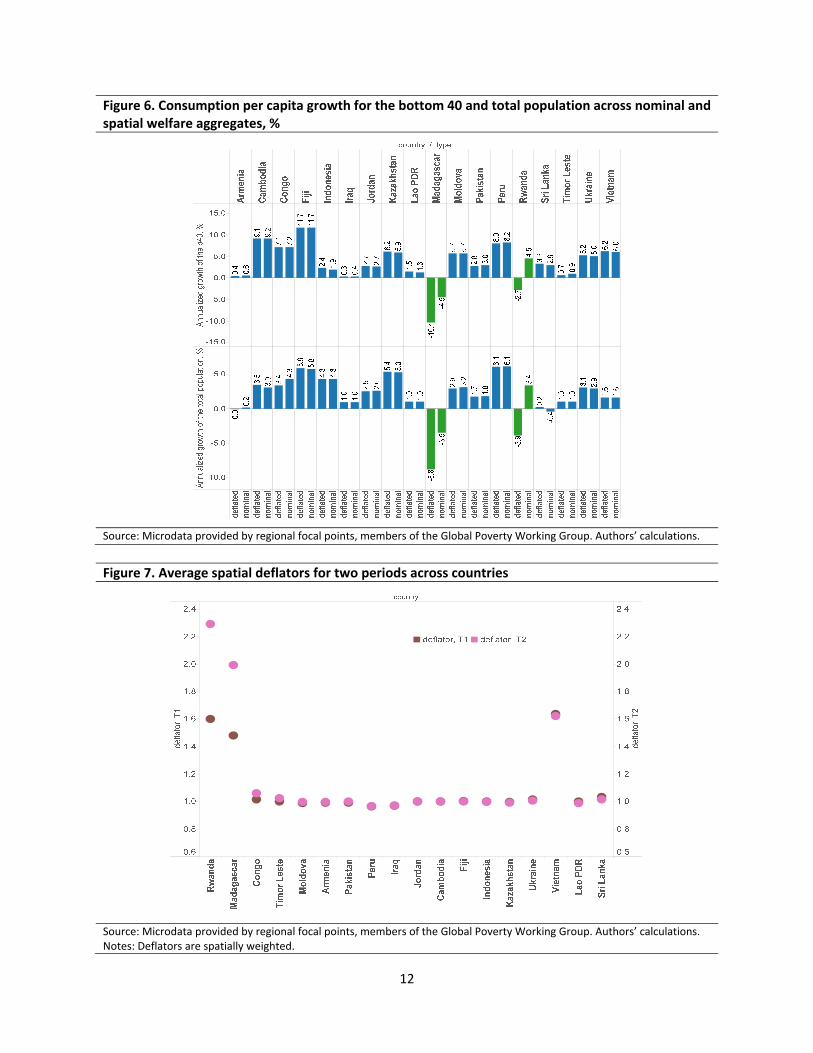
Figure 7 provides hints on the source of these differences. For most countries in our database, population weighted means of the spatial price index remain constant around one, while for Madagascar, Rwanda, and Vietnam, the means in both rounds clearly divert from one. It is not necessarily peculiar to see a mean of the spatial price index different from one. This occurs if the reference prices are selected from a particular area rather than drawn from national average prices and we then have a population weighted mean of the corresponding spatial price index different from one. Indeed, some countries choose reference prices from the capital city and in these cases, the population weighted mean of the corresponding spatial price index is usually below one because prices from the capital cities are higher than the national average prices. In the case of Madagascar, Rwanda, and Vietnam, the mean spatial price index is higher than one. This means that these countries chose reference areas with lower prices than the national average.
Whether the population weighted average of the spatial price index is equal to one affects the mean of the spatially deflated welfare indicator. If areas with prices lower than the national average are selected as reference areas, the mean of the spatial price index will be above one and the mean of deflated welfare indicator will be lower than that of a nominal welfare indicator. An important fact is that as long as the same reference areas are selected, the selection of reference areas will not affect the growth rate of means. This is indeed the case for Vietnam. The means of the spatial price index are systematically higher than one in Vietnam, but the level did not change over time. As a result, the growth rate of spatially deflated means is almost identical to that of un‐adjusted means.
However, if the reference area changes over time, the growth rate of means of the spatially deflated welfare indicator will include the actual growth rate and the effect of changing the reference areas or more precisely reference prices. For both Madagascar and Rwanda, the mean of the spatial price index increased significantly between the two rounds of surveys. As a result, the growth rate of spatially adjusted means is the actual growth rate minus the effect of choosing lower prices as reference (or an increase in the mean spatial price index). Indeed, in the case of Rwanda, the growth rate of un‐adjusted means is 4.5 while the growth rate of spatially adjusted means is ‐2.7 percent (see figure 6). It is likely that a large part of the large reduction in the growth rate should be attributed to the increase in the mean of the spatial price index between two rounds. The same applies for Madagascar.
12
Figure 6. Consumption per capita growth for the bottom 40 and total population across nominal and spatial welfare aggregates, %
Source: Microdata provided by regional focal points, members of the Global Poverty Working Group. Authors’ calculations.
Figure 7. Average spatial deflators for two periods across countries
Source: Microdata provided by regional focal points, members of the Global Poverty Working Group. Authors’ calculations. Notes: Deflators are spatially weighted.

13
3.2.2Profileofthebottom40percentofpopulation
In the previous section, we observed that if spatial deflators are measured consistently across two periods in time, the impact on shared prosperity indicators is rather minimal for most countries unless the spatial price adjustments were carried out inconsistently over time. Even if growth rates do not change, it is still important to adjust for spatial price differences because purchasing power of the same amount of expenditure or income differs significantly if the price level differs. Furthermore, the welfare ranking of people can change significantly based on spatial price adjustments. Spatially adjusted prices may change where certain people in the bottom 40 percent are located in the welfare distribution. We explore this concern empirically using a subsample of our database – data for Kazakhstan, Rwanda, Tajikistan and Iraq.
Table 3 shows the percentage of the population remaining in the same decile regardless of the choice of welfare aggregate: nominal or spatially deflated. Substantial reshuffling of people occurs starting from the second decile. In Rwanda for example, only 60 percent of the population in the fourth decile stays if the welfare aggregate is spatially deflated. A further 20 percent of those are found in the fifth decile if regional variation in prices is taken into account.
As a result of the change in rankings, the share of the population in the bottom 40 can shift across regions. This is illustrated in figure 8 using data for Kazakhstan. In ten of sixteen regions, the share of the population from the bottom 40 percent is significantly different depending on whether a nominal or spatially deflated welfare aggregate is used. For example, only 8 percent of the total population in Almaty was from the bottom 40 percent if nominal consumption per capita is used; however, the ratio increases to 14 percent if the welfare aggregate is spatially deflated (results for Iraq and Rwanda are provided in the annex).
Table 3. Percentage of population staying in the same decile regardless of welfare aggregate: spatially deflated or nominal Deciles Kazakhstan, 2010 Iraq, 2012 Rwanda, 2010
bottom 89 86 90 2 72 66 72
3 62 57 64
4 57 54 60
5 56 49 58
6 57 49 57
7 60 55 61
8 65 59 69
9 76 68 81
top 91 88 93
Source: Microdata provided by regional focal points, members of the Global Poverty Working Group. Authors’ calculations.

14
Figure 8. Share of population from bottom 40 percent across regions and type of welfare aggregate, Kazakhstan 2010
Source: Microdata provided by regional focal points, members of the Global Poverty Working Group. Authors’ calculations. Notes: * significant difference in proportions test at 10 percent, ** at 5 percent, *** at 1 percent level.
In addition to changes in the distribution of the population in the bottom 40 percent, the choice of welfare aggregate can also affect the individual profile of the population in the bottom 40. However, as shown in table 4, the difference is small using the example of individual characteristics in Tajikistan. The impact may be stronger if people are very different across the fourth, fifth and sixth deciles where the largest reshuffling takes place.
Table 4. Individual characteristics of bottom 40 percent in Tajikistan across type of welfare aggregate
b40, deflated welfare aggregate b40, nominal welfare aggregate
Education level, 15+ Basic education 22.2 21.9 General secondary education 54.4 55.2 Special secondary education 8.7 8.6 Tertiary education 6.5 6.3 None/less than primary education 8.2 8.1
Labor force status, 15+ Employed 17.1 16.7 Self‐employed 23.6 23.3 Unemployed 5.0 4.9 Retired 9.0 8.8 Student 7.8 7.6 Other labor force status 37.6 38.8
Source: Microdata provided by regional focal points, members of the Global Poverty Working Group. Authors’ calculations.
Theoretically, spatial price adjustments have an impact on the welfare ranking of households and on growth rates of household income and expenditure. However, according to our empirical analysis, unless spatial adjustments were conducted inconsistently over time, the impact of spatial price adjustments on growth rates including those of the bottom 40 percent is minimal. However, carrying out spatial price
0%
10%
20%
30%
40%
50%
60%
70%
Akm
ola
Aktobe
***A
lmaty
***A
tyrau
West_Kaz
**Jambyl
Karaganda
**Kostanay
***K
yzylorda
***M
angystau
***South_K
az
Pavlodar
North_kaz
**East_K
az
***A
stana_city
***A
lmaty_city
nominal deflated
15
adjustment has significant impact on the welfare ranking of households, individuals and areas. These rankings are important for designing policies to alleviate extreme poverty and promote shared prosperity. Unadjusted welfare indicators will likely misguide the identification of the extreme poor and the poorest 40 percent of the population.
3.3. Shared Prosperity Using Income Data
As mentioned, various factors in the poverty measurement literature point to consumption being a better proxy to measure welfare than income. Nevertheless, many countries in the world measure welfare using income. In particular, European countries measure welfare using income data from Eurostat on Income and Living Conditions (EUSILC) including negative and zero income. Countries from LAC also use income to measure social‐economic well‐being, but recode negative income to missing values. In this section, we test the impact of negative income data on shared prosperity using EUSILC data and the impact of zero incomes on shared prosperity using selected countries from the Latin American and Caribbean region.13
3.3.1Datawithnegativenumbers
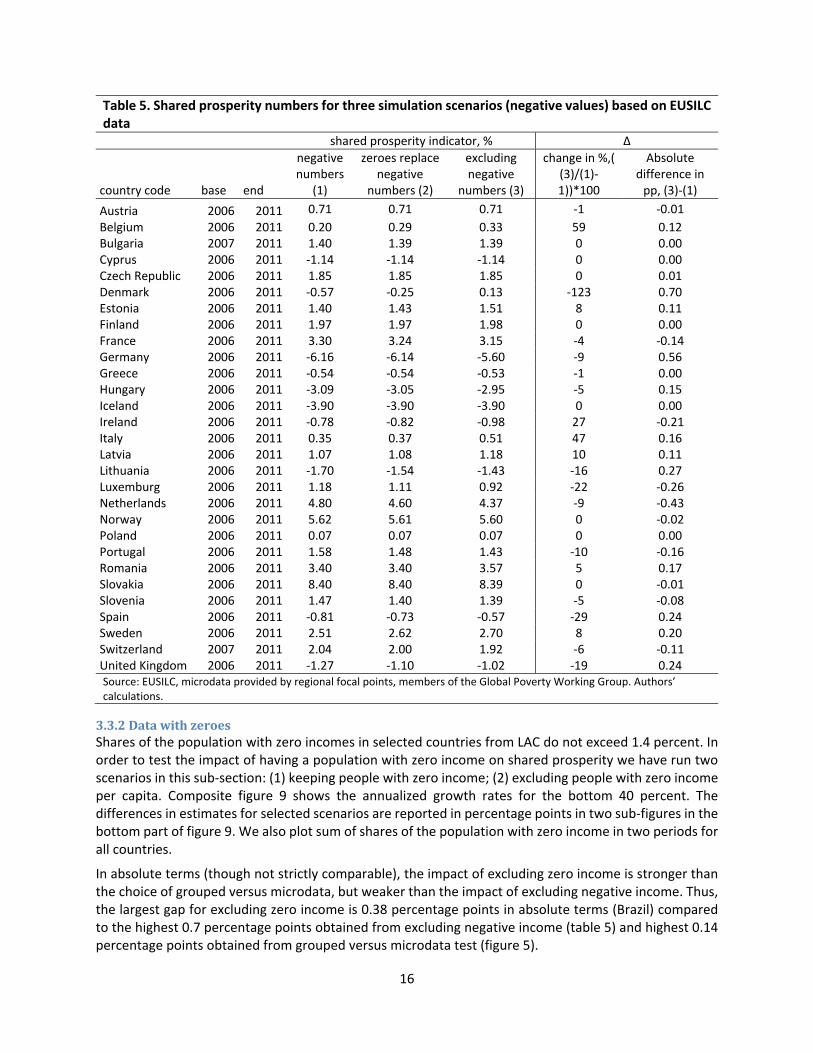
The shares of households with negative income across EUSILC surveys are minimal, with a maximum of 1.2 percent for Greece in 2011. For most countries collecting EUSILC data, the share is less than 0.5 percent. To observe the impact of negative numbers of income, we run three simulations: (1) keeping negative values; (2) replacing negative values with zero; and (3) excluding negative values. The results of the shared prosperity numbers using these three scenarios are reported in table 5. The differences in estimates for the proposed scenarios are reported in percent and percentage points. In relative terms, the difference in estimates can vary substantially reaching more than 100 percent; however, this is mainly for countries with low numbers on shared prosperity. In absolute terms, the differences are less dramatic ranging from 0 to 0.7 percentage points.
Though not strictly comparable (as different sets of countries are used), the magnitude of the change in shared prosperity estimates after excluding negative numbers seems to be higher compared to the results for grouped versus microdata. For example, exclusion of negative income can increase shared prosperity by 59 percent in the case of Belgium and reduce it by 123 percent in the case of Denmark, whereas the largest change in shared prosperity using microdata did not exceed 14 percent. In absolute terms, excluding negative incomes also has also a higher impact than the choice of grouped versus microdata. Thus, the largest gap for testing the effects of negative income on shared prosperity is 0.7 percentage points compared to 0.14 percentage points for grouped versus microdata (table of figure 5).
The largest absolute differences in estimates (in percentage points) are observed in countries with the highest shares of negative numbers (figure A3) and large negative numbers. For example, in Denmark (income year 2011), 25 percent out of 24 households (0.44 percent of the 5,355 household sample) with negative incomes (per capita per day in 2005 PPP terms) are very large, ranging from ‐20 to ‐400, while the weighted national average is 39 and the maximum is 541. This suggests that the frequency of negative numbers and their magnitude can seriously distort the shared prosperity indicator.
13 In addition, we use the opportunity that EUSILC data have both, negative and zero incomes, and compare impacts of dropping these observations. Results are shown in the annex. As one may expect, dropping negative observations has stronger impact than dropping observations with zero incomes on average.
16
Table 5. Shared prosperity numbers for three simulation scenarios (negative values) based on EUSILC data
shared prosperity indicator, % ∆
country code base end
negative numbers
(1)
zeroes replace negative
numbers (2)
excluding negative
numbers (3)
change in %,( (3)/(1)‐1))*100
Absolute difference in pp, (3)‐(1)
Austria 2006 2011 0.71 0.71 0.71 ‐1 ‐0.01
Belgium 2006 2011 0.20 0.29 0.33 59 0.12 Bulgaria 2007 2011 1.40 1.39 1.39 0 0.00 Cyprus 2006 2011 ‐1.14 ‐1.14 ‐1.14 0 0.00 Czech Republic 2006 2011 1.85 1.85 1.85 0 0.01 Denmark 2006 2011 ‐0.57 ‐0.25 0.13 ‐123 0.70 Estonia 2006 2011 1.40 1.43 1.51 8 0.11 Finland 2006 2011 1.97 1.97 1.98 0 0.00 France 2006 2011 3.30 3.24 3.15 ‐4 ‐0.14 Germany 2006 2011 ‐6.16 ‐6.14 ‐5.60 ‐9 0.56 Greece 2006 2011 ‐0.54 ‐0.54 ‐0.53 ‐1 0.00 Hungary 2006 2011 ‐3.09 ‐3.05 ‐2.95 ‐5 0.15 Iceland 2006 2011 ‐3.90 ‐3.90 ‐3.90 0 0.00 Ireland 2006 2011 ‐0.78 ‐0.82 ‐0.98 27 ‐0.21 Italy 2006 2011 0.35 0.37 0.51 47 0.16 Latvia 2006 2011 1.07 1.08 1.18 10 0.11 Lithuania 2006 2011 ‐1.70 ‐1.54 ‐1.43 ‐16 0.27 Luxemburg 2006 2011 1.18 1.11 0.92 ‐22 ‐0.26 Netherlands 2006 2011 4.80 4.60 4.37 ‐9 ‐0.43 Norway 2006 2011 5.62 5.61 5.60 0 ‐0.02 Poland 2006 2011 0.07 0.07 0.07 0 0.00 Portugal 2006 2011 1.58 1.48 1.43 ‐10 ‐0.16 Romania 2006 2011 3.40 3.40 3.57 5 0.17 Slovakia 2006 2011 8.40 8.40 8.39 0 ‐0.01 Slovenia 2006 2011 1.47 1.40 1.39 ‐5 ‐0.08 Spain 2006 2011 ‐0.81 ‐0.73 ‐0.57 ‐29 0.24 Sweden 2006 2011 2.51 2.62 2.70 8 0.20 Switzerland 2007 2011 2.04 2.00 1.92 ‐6 ‐0.11 United Kingdom 2006 2011 ‐1.27 ‐1.10 ‐1.02 ‐19 0.24 Source: EUSILC, microdata provided by regional focal points, members of the Global Poverty Working Group. Authors’ calculations.
3.3.2DatawithzeroesShares of the population with zero incomes in selected countries from LAC do not exceed 1.4 percent. In order to test the impact of having a population with zero income on shared prosperity we have run two scenarios in this sub‐section: (1) keeping people with zero income; (2) excluding people with zero income per capita. Composite figure 9 shows the annualized growth rates for the bottom 40 percent. The differences in estimates for selected scenarios are reported in percentage points in two sub‐figures in the bottom part of figure 9. We also plot sum of shares of the population with zero income in two periods for all countries.
In absolute terms (though not strictly comparable), the impact of excluding zero income is stronger than the choice of grouped versus microdata, but weaker than the impact of excluding negative income. Thus, the largest gap for excluding zero income is 0.38 percentage points in absolute terms (Brazil) compared to the highest 0.7 percentage points obtained from excluding negative income (table 5) and highest 0.14 percentage points obtained from grouped versus microdata test (figure 5).

17
Figure 9. Shared prosperity numbers for two scenarios including and excluding zero income
Source: SEDLAC, microdata provided by regional focal points, members of the Global Poverty Working Group. Authors’ calculations.
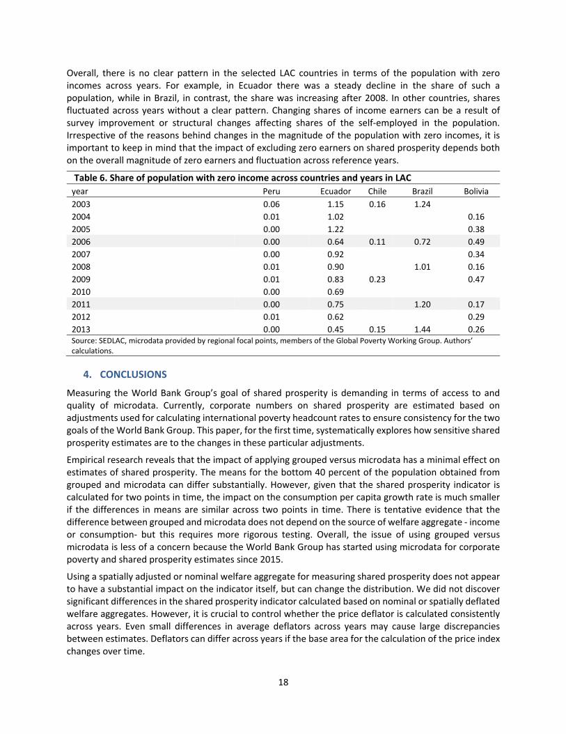
Expectedly, larger absolute differences in obtained estimates (in percentage points) are observed in countries with higher shares of the population with zero incomes. However, the magnitude of the population with zero income is not the only factor behind the impact of excluding zero income earners. For example, impact is stronger in Bolivia than in Ecuador (bars in figure 9) even though the share of zero earners is higher in Ecuador than in Bolivia (lines in figure 9). This is a result of the changes in shares across years and as a result, excluding zero earners affects means differently across time. This cannot be clearly observed in figure 9 because it sums up the shares across two years, but table 6 shows shares of the population with zero income by years. The impact of excluding households with zero income is higher in Bolivia than in Ecuador because the share of zero earners drops in Bolivia from 0.49 percent in 2006 to 0.17 percent in 2011. At the same time, the share of zero earners in Ecuador remains relatively stable ranging from 0.64 to 0.75 percent.
Bra
zil
Ho
nd
ura
s
Ecu
ado
r
Ch
ile
Par
agu
ay
Per
u
Do
min
ican
Rep
ub
lic
Bo
livia
-0.4
0.0
0.4
0.8
1.2
1.6
diffe
renc
e in
gro
wth
rat
e of
bot
tom
40,
pp
0.0
0.5
1.0
1.5
2.0
tota
l sha
re o
f zer
o in
com
e ea
rner
s
Difference in growth rate of bottom 40 and share of population with zero income
difference in growth rate of bottom 40, pp total share of zero income earners
Period Country with zeros without zeros
2006-2011 Bolivia
Peru
Paraguay
Brazil
Ecuador
Honduras
Chile
Dominican Repub.. 2.29
3.91
4.41
4.43
6.08
7.53
9.94
12.36
2.32
3.90
4.23
4.35
5.71
7.53
9.94
12.66
Shared prosperity growth rates in selected LAC countries including and excluding zero income, 2006-2011
18
Overall, there is no clear pattern in the selected LAC countries in terms of the population with zero incomes across years. For example, in Ecuador there was a steady decline in the share of such a population, while in Brazil, in contrast, the share was increasing after 2008. In other countries, shares fluctuated across years without a clear pattern. Changing shares of income earners can be a result of survey improvement or structural changes affecting shares of the self‐employed in the population. Irrespective of the reasons behind changes in the magnitude of the population with zero incomes, it is important to keep in mind that the impact of excluding zero earners on shared prosperity depends both on the overall magnitude of zero earners and fluctuation across reference years.
Table 6. Share of population with zero income across countries and years in LAC year Peru Ecuador Chile Brazil Bolivia
2003 0.06 1.15 0.16 1.24
2004 0.01 1.02 0.16
2005 0.00 1.22 0.38
2006 0.00 0.64 0.11 0.72 0.49
2007 0.00 0.92 0.34
2008 0.01 0.90 1.01 0.16
2009 0.01 0.83 0.23 0.47
2010 0.00 0.69
2011 0.00 0.75 1.20 0.17
2012 0.01 0.62 0.29
2013 0.00 0.45 0.15 1.44 0.26 Source: SEDLAC, microdata provided by regional focal points, members of the Global Poverty Working Group. Authors’ calculations.
4. CONCLUSIONS
Measuring the World Bank Group’s goal of shared prosperity is demanding in terms of access to and quality of microdata. Currently, corporate numbers on shared prosperity are estimated based on adjustments used for calculating international poverty headcount rates to ensure consistency for the two goals of the World Bank Group. This paper, for the first time, systematically explores how sensitive shared prosperity estimates are to the changes in these particular adjustments.
Empirical research reveals that the impact of applying grouped versus microdata has a minimal effect on estimates of shared prosperity. The means for the bottom 40 percent of the population obtained from grouped and microdata can differ substantially. However, given that the shared prosperity indicator is calculated for two points in time, the impact on the consumption per capita growth rate is much smaller if the differences in means are similar across two points in time. There is tentative evidence that the difference between grouped and microdata does not depend on the source of welfare aggregate ‐ income or consumption‐ but this requires more rigorous testing. Overall, the issue of using grouped versus microdata is less of a concern because the World Bank Group has started using microdata for corporate poverty and shared prosperity estimates since 2015.
Using a spatially adjusted or nominal welfare aggregate for measuring shared prosperity does not appear to have a substantial impact on the indicator itself, but can change the distribution. We did not discover significant differences in the shared prosperity indicator calculated based on nominal or spatially deflated welfare aggregates. However, it is crucial to control whether the price deflator is calculated consistently across years. Even small differences in average deflators across years may cause large discrepancies between estimates. Deflators can differ across years if the base area for the calculation of the price index changes over time.

19
Besides differences in the shared prosperity indicators per se, using a spatially deflated welfare aggregate affects the ranking of people. This can change the distribution of the population in the bottom 40 percent across locations and their characteristics. As an example, we show that in ten of the sixteen regions in Kazakhstan, the share of the population from the bottom 40 percent varies substantially depending on the type of welfare indicator chosen.
In many countries, shared prosperity is measured by income. Income tends to be more volatile than consumption and income may include zero and negative numbers. Empirical tests based on EUSILC data and data for LAC countries show that the shares of households with negative and zero incomes rarely exceed 1 percent. Nevertheless, excluding negative and zero numbers affects the estimates on shared prosperity. Even though the difference between estimates does not exceed one percentage point for any of the countries for each test, the impact depends on the shares of households with negative/zero income, its distribution across years and the magnitude of negative values.
This paper conducted a series of robustness tests of shared prosperity to different methodological assumptions. Further systematic analysis of such tests such as sensitivity to changes in reference periods, income versus consumption data, and revisions of microdata can be useful.

20
5. REFERENCES
Azevedo, J.P. & Mitra, S. (forthcoming). Global poverty estimation theoretical and empirical validity of parametric Lorenz curve estimates and revisiting nonparametric techniques. World Bank, Mimeo.
Beegle, K., Olinto, P., Sobrado, C., Uematsu, H., Kim, Y. S., & Ashwill, M. (2014). Ending Extreme Poverty and Promoting Shared Prosperity. Could There Be Trade‐offs Between These Two Goals? Inequality in Focus, 3(1). World Bank, Washington, DC.
Cruz, M., Foster, J., Quillin, B. and Schellekens, P. (2015). Ending Extreme Poverty and Sharing Prosperity: Progress and Policies. Policy Research Note 101740. World Bank, Washington, DC.
Datt, G. (1998), “Computational Tools for Poverty Measurement and Analysis,” FCND Discussion Paper No. 50.
Deaton, A. & Zaidi, S. (2002). "Guidelines for Constructing Consumption Aggregates for Welfare Analysis," World Bank Publications, The World Bank, number 14101, November.
Deaton, A. (1997). The Analysis of Household Surveys: A Microeconometric Approach to Development Policy. Baltimore, MD: Johns Hopkins University Press.
Dollar, D. T. Kleineberg, Kraay, A. (2013). “Growth Still is Good for the Poor.” Policy Research Working Paper 6568. World Bank, Washington, DC.
Global Poverty Working Group 2015. “Methodology for computing the indicator on Shared Prosperity for the Global Database of Shared Prosperity (GDSP) circa 2007–2012”, available at: http://www.worldbank.org/content/dam/Worldbank/poverty/GDSP_Methodology_Sep2015%20(2).docx.
Mitra, S. R. Katayama, and Yoshida, N. (2010). “A Short Note on International Poverty Estimation,” mimeo.
Narayan, A., Saavedra‐Chanduvi J. & Tiwari, S. (2013). “Shared Prosperity: Links to Growth, Inequality and Inequality of Opportunity”. Policy Research Working Paper 6649. The World Bank.
PovcalNet (2015). PovcalNet: an online analysis tool for global poverty monitoring, available at: http://iresearch.worldbank.org/PovcalNet/
Ravallion, M. (1992). "Poverty Comparisons ‐ A Guide to Concepts and Methods," Papers 88, World Bank ‐ Living Standards Measurement.
Ravallion, M. (1996). "Issues in Measuring and Modelling Poverty," Economic Journal, Royal Economic Society, vol. 106(438): 1328‐43.
Serajuddin, U., Uematsu, H., Wieser, C., Yoshida, N., and Dabalen, A. (2015). “Data Deprivation: another deprivation to end“. Policy Research Working Paper 7252. The World Bank.
World Bank. (2008). Poverty data: A supplement to the World Development Indicators, 2008. World Bank.
World Bank. (2015a). A Measured Approach to Ending Poverty and Boosting Shared Prosperity: Concepts, Data, and the Twin Goals. Policy Research Report. Washington, DC: World Bank. doi:10.1596/978‐1‐4648‐0361‐1.
World Bank Group. (2015b). Global Monitoring Report 2014/2015: Ending Poverty and Sharing Prosperity. Washington, DC: World Bank. doi:10.1596/978‐1‐4648‐0336‐9.

21
ANNEX
Box 1. Creation of the Global Database of Shared Prosperity (GDSP), circa 2007—2012
This box describes the dataset and methodology of the GDSP and draws heavily from the methodology note “Methodology for computing the indicator on Shared Prosperity for the Global Database of Shared Prosperity (GDSP) circa 2007–2012” published alongside the GDSP14 and a paper by Narayan, Saavedra‐Chanduvi and Tiwari (2013). The GDSP includes the most recent figures on annualized consumption or income growth of the bottom 40 percent and related indicators for 94 countries, which are roughly comparable in terms of time period and interval.
Choice of surveys, years and countries
The indicator on shared prosperity, measured as the average annualized growth rate of real per capita income or consumption of the bottom 40 percent of the population (or G40), relies on the availability of household income or consumption data provided in household surveys. While all countries are encouraged to estimate G40, the GDSP only includes a subset of countries that have data on income or consumption readily available and that meet certain considerations. The first important consideration for creating a global database is comparability across time and across countries. Given that these numbers would need to be compared within each country over time and across countries for (roughly) the same period, comparability along both dimensions will be critical. There are limits to such comparability since household surveys are infrequent in most countries and are not aligned across countries in terms of timing. Consequently, comparisons across countries or over time should be made with a high degree of caution.
The second consideration is the coverage of countries, with data that is as recent as possible. Since shared prosperity must be reported at the country level, there is good reason to obtain as wide a coverage of countries as possible, regardless of their population size. Moreover, as the utility of this database depends on how current the information is, using as recent data as possible for each individual country is important.
The criteria for selecting survey years and countries must be consistent and transparent, and should achieve a balance between competing considerations: (i) matching the time period as closely as possible across all countries, while including the most recent data; and (ii) ensuring the widest possible coverage of countries, across regions and income levels. Achieving any sort of balance between (i) and (ii) implies that periods will not perfectly match across countries. While this suggests that G40 across all countries in the database will not be “strictly” comparable, the compromise is worth making to create a database that includes a larger set of countries.
Construction of GDSP circa 2007–2012
Growth rates in the GDSP are computed as annualized average growth rate in per capita real consumption or income over a roughly 5‐year period. For the 2015 update, the rules for selecting the initial survey year (T0) and final survey year (T1) are as follows:
i. The most recent household survey available (year T1) is selected for a country, provided it is not before 2010.
ii. The initial year (year T0) is selected as close to (T1 ‐ 5) as possible, with a bandwidth of +/‐ 2 years; thus the gap between initial and final survey years ranges from 3 to 7 years.
14 The methodology note can be found at: http://www.worldbank.org/content/dam/Worldbank/poverty/GDSP_Methodology_Sep2015%20(2).docx
22
iii. If two surveys are equally distant from (T1 ‐ 5), ceteris paribus, the more recent survey year is selected as T0.
iv. The comparability of welfare aggregates (consumption or income) for the chosen years T0 and T1 is assessed for every country.15 If comparability across the two surveys is a major concern for a country, the earlier three criteria are re‐applied to select the next best survey year(s).
Countries that do not have surveys that meet rules (i) to (iv) above are excluded from the GDSP. Even though all countries are encouraged to estimate G40 using their available data, some countries may be excluded from the GDSP to maintain some degree of comparability of G40 across countries. For countries that do meet the rules above, G40 is computed by: (a) estimating the average real per capita household income of the bottom 40 percent of the consumption or income distribution in years T0 and T1; and (b) computing the annual average growth rate between these years.16 Growth of average per capita household income of the population is computed similarly, replacing the bottom 40 percent with the total population. The mean consumption or income figures are expressed in terms of purchasing power adjusted dollars per day at 2011 prices (2011 PPP dollars). Annualized growth rates are calculated between the survey years, using a compound growth formula.17
The GDSP is known as “GDSP circa 2007—2012” because when the GDSP database was created, 2012 was the middle of the range of the final survey years (2010 to 2015). Furthermore, the ideal interval of the two surveys used for estimating the shared prosperity index is five years and in the 2015 update was 2007—2012.
15 Strictly speaking there is no clear‐cut procedure or metric to assess comparability. Rather it is judged by poverty economists in each country who are most knowledgeable about household surveys in that country based on several criteria (data quality, survey questionnaire design, methodology used for constructing the welfare aggregate and poverty lines). 16 How exactly step (a) is carried out depends on whether micro or grouped data are used for the calculation. In 2015, PovcalNet changed to mainly using microdata but for some countries (15 out of 94) only grouped data are available and therefore used in the estimation of shared prosperity. With microdata the steps to calculate average consumption or income of the bottom 40 percent are simple: sort households by per capita household consumption or income to identify the bottom 40 percent, and compute the average per capita consumption or income of this group, weighting per capita consumption or income by household size and sample weights as appropriate. For a more detailed discussion on grouped vs. microdata, please refer to section 3.1.
17 The annualized growth rate is computed as
1

23
Box 2. Illustration of how to estimate a poverty rate from grouped data
This annex takes us through the step‐by‐step procedure for estimating poverty rates from grouped data by way of an example. This example is based on the estimated poverty rates from grouped data for rural India 1983 available in Datt (1998).
Grouped data need to include multiple expenditure (or income) ranges, which are ordered by size, percentage of individuals for each range, and mean household expenditure (or income). Table A1 has 13 different ranges of monthly household expenditure per capita for rural India for 1983, which are ordered by size. This table also includes the proportion of population and the mean household expenditure for each range. Note that these expenditure groups do not have the same population share.
The next step is to calculate cumulative proportions of population (p) as well as consumption expenditures (L) from the grouped data. The columns for p and L in Table A1 represent the results of this calculation, which include 13 data points of (p, L). From these data points, the Lorenz curve and its slope are estimated.
Selection of functional forms
To calculate the slope (or the first derivative) of the Lorenz curve, the Lorenz curve is estimated using one of the following two functional forms – the Beta Lorenz curve and the General Quadratic (GQ) Lorenz curve. Estimating the Lorenz curve means estimating parameters of a function. For example, if
the Beta Lorenz Curve 1 were used, three parameters , , and need to be estimated.
Calculating a poverty line
$1.90 and $3.10 poverty lines are valued in 2011 US dollars. These lines need to be converted to local currency for the particular year. For this, we first need to convert US dollars to local currency using PPP conversion factors. This will give us a poverty line in local currency of 2011. If the survey year is not 2011, the poverty line needs to be adjusted for inflation. Inflation rates are calculated from Consumer Price Index (CPI) data available in the World Development Indicators database (WDI).
Calculating a poverty rate from the formula
A poverty headcount rate (H) is calculated by solving the following equation:
/ at (1)
Table A1: An example of a grouped data – Monthly household expenditure per capita data in Rural India 1983
Ranges (Rs) Percentage
of individuals
Mean household expenditure per
capita (Rs) p L
0 – 30 0.92 24.84 0.92 0.00208
30 – 40 2.47 35.80 3.39 0.01013
40 – 50 5.11 45.36 8.50 0.03122
50 – 60 7.90 55.10 16.40 0.07083
60 – 70 9.69 64.92 26.09 0.12808
70 ‐85 15.24 77.08 41.33 0.23498
85 ‐ 100 13.64 91.75 54.97 0.34887
100 ‐ 125 16.99 110.64 71.96 0.51994
125 ‐ 150 10.00 134.9 81.96 0.64270
150 ‐ 200 9.78 167.76 91.74 0.79201
200 ‐ 250 3.96 215.48 95.70 0.86967
250 ‐ 300 1.81 261.66 97.51 0.91277 300 and above
2.49 384.97 100 1.00000
Source: Datt (1998) Notes: p = cumulative proportion of population; L = cumulative proportion of consumption expenditure
24
where ′ refers to the first derivative of the Lorenz curve, p is the cumulative proportion of population, z is the poverty line, and is the mean household expenditure (or income).
If the Beta Lorenz curve is adopted, the equation (1) becomes:
1 1 (2)
Equation (2) clearly indicates that if we have the three parameters of the Lorenz curve, the poverty line and the mean household expenditure (or income), we can solve this equation to get the estimate of the poverty headcount rate (H). Poverty gaps, severity of poverty, and Gini coefficients can also be calculated from specific equations derived from the Lorenz curves (see Datt [1998] to get the formulas).
Implications on the shared prosperity index
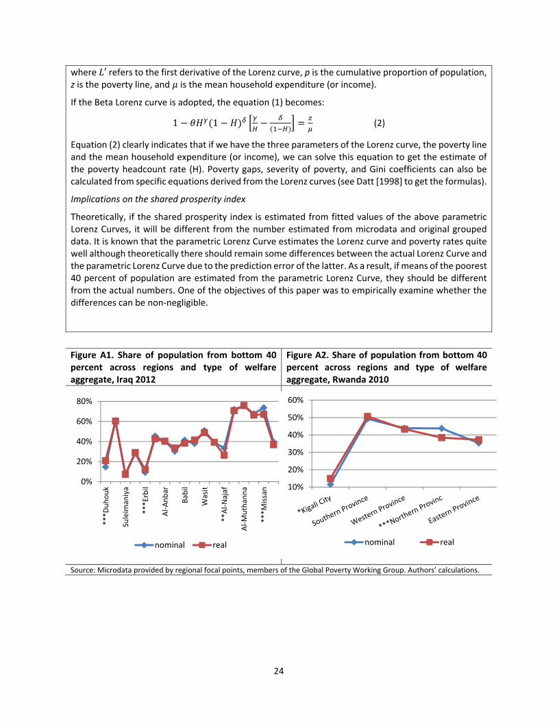
Theoretically, if the shared prosperity index is estimated from fitted values of the above parametric Lorenz Curves, it will be different from the number estimated from microdata and original grouped data. It is known that the parametric Lorenz Curve estimates the Lorenz curve and poverty rates quite well although theoretically there should remain some differences between the actual Lorenz Curve and the parametric Lorenz Curve due to the prediction error of the latter. As a result, if means of the poorest 40 percent of population are estimated from the parametric Lorenz Curve, they should be different from the actual numbers. One of the objectives of this paper was to empirically examine whether the differences can be non‐negligible.
Figure A1. Share of population from bottom 40 percent across regions and type of welfare aggregate, Iraq 2012
Figure A2. Share of population from bottom 40 percent across regions and type of welfare aggregate, Rwanda 2010
Source: Microdata provided by regional focal points, members of the Global Poverty Working Group. Authors’ calculations.
0%
20%
40%
60%
80%
***D
uhouk
Suleim
aniya
***Erbil
Al‐Anbar
Babil
Wasit
**Al‐Najaf
Al‐Muthanna
***M
issan
nominal real
10%
20%
30%
40%
50%
60%
nominal real

25
Figure A3. Correlation between shares of negative numbers and absolute difference in shared prosperity between income including and excluding negative numbers
Source: EUSILC, microdata provided by regional focal points, members of the Global Poverty Working Group. Authors’ calculations. Notes: The difference in shared prosperity is calculated using scenario 1 (including negative numbers) and scenario 3 (excluding negative numbers).

26
Table A2. Shared prosperity numbers for three simulation scenarios (negative values) based on EUSILC data Country period SP with
negatives and zero (1)
SP excluding negative income (2)
SP excluding zero income (3)
SP excluding negative and zero
income (4)
Absolute difference, (2)‐(1)
Absolute difference, (3)‐(1)
Absolute difference, (4)‐(1)
Austria 2006‐2011 0.71 0.71 0.72 0.72 0.0 0.0 0.0
Belgium 2006‐2011 0.20 0.33 0.18 0.31 0.1 0.0 0.1
Bulgaria 2007‐2011 1.40 1.39 1.54 1.53 0.0 0.1 0.1
Cyprus 2006‐2011 ‐1.14 ‐1.14 ‐1.13 ‐1.13 0.0 0.0 0.0
Czech Republic 2006‐2011 1.85 1.85 1.85 1.85 0.0 0.0 0.0
Denmark 2006‐2011 ‐0.57 0.13 ‐0.57 0.13 0.7 0.0 0.7
Estonia 2006‐2011 1.40 1.51 1.44 1.55 0.1 0.0 0.1
Finland 2006‐2011 1.97 1.98 1.95 1.95 0.0 0.0 0.0
France 2006‐2011 3.30 3.15 3.30 3.15 0.1 0.0 0.1
Greece 2006‐2011 ‐6.16 ‐5.60 ‐5.91 ‐5.35 0.6 0.3 0.8
Hungary 2006‐2011 ‐0.54 ‐0.53 ‐0.53 ‐0.53 0.0 0.0 0.0
Iceland 2006‐2011 ‐3.09 ‐2.95 ‐3.09 ‐2.95 0.1 0.0 0.1
Ireland 2006‐2011 ‐3.90 ‐3.90 ‐3.76 ‐3.76 0.0 0.1 0.1
Italy 2006‐2011 ‐0.78 ‐0.98 ‐0.64 ‐0.85 0.2 0.1 0.1
Latvia 2006‐2011 0.35 0.51 0.27 0.40 0.2 0.1 0.1
Lithuania 2006‐2011 1.07 1.18 1.08 1.19 0.1 0.0 0.1
Luxembourg 2006‐2011 ‐1.70 ‐1.43 ‐1.70 ‐1.43 0.3 0.0 0.3
Netherlands 2006‐2011 1.18 0.92 1.18 0.92 0.3 0.0 0.3
Norway 2006‐2011 4.80 4.37 4.78 4.35 0.4 0.0 0.5
Poland 2006‐2011 5.62 5.60 5.59 5.56 0.0 0.0 0.1
Portugal 2006‐2011 0.07 0.07 0.07 0.07 0.0 0.0 0.0
Malta 2007‐2011 1.58 1.43 1.58 1.43 0.2 0.0 0.2
Romania 2006‐2011 3.40 3.57 3.40 3.57 0.2 0.0 0.2
Slovak Republic 2006‐2011 8.40 8.39 8.40 8.39 0.0 0.0 0.0
Slovenia 2006‐2011 1.47 1.39 1.47 1.39 0.1 0.0 0.1
Spain 2006‐2011 ‐0.81 ‐0.57 ‐0.62 ‐0.39 0.2 0.2 0.4
Sweden 2006‐2011 2.51 2.70 2.50 2.70 0.2 0.0 0.2
Switzerland 2007‐2011 2.04 1.92 2.04 1.92 0.1 0.0 0.1
United Kingdom 2006‐2011 ‐1.27 ‐1.02 ‐1.17 ‐0.93 0.2 0.1 0.3
Source: EUSILC, microdata provided by regional focal points, members of the Global Poverty Working Group. Authors’
calculations.