Retail Ready Packaging 1 - Universiteit Twente
76
Retail Ready Packaging 1 Retail Ready Packaging and the Importance of Design Marieke Schrijver University of Twente August 21, 2013 Supervisors Dr. T.J.L. van Rompay, University of Twente Dr. M. Galetzka, University of Twente
Transcript of Retail Ready Packaging 1 - Universiteit Twente

Retail Ready Packaging 1
Retail Ready Packaging and
the Importance of Design
Marieke Schrijver
University of Twente
August 21, 2013
Supervisors
Dr. T.J.L. van Rompay, University of Twente
Dr. M. Galetzka, University of Twente

Retail Ready Packaging 2
Abstract
Due to the expanding and diversifying fast moving consumer goods market, the question has
arisen from the Smurfit Kappa Group how secondary packaging, Retail Ready Packaging
(RRP), can support the intended brand message and attract the attention of the consumer
through its design. RRP of Axe and Dove deodorants were used as examples for this
research. A pre-test was performed to determine how the design elements shape and color can
increase conspicuousness and how these design elements can match with the brand attributes.
In the main study a 2x2 design was used to test the stimuli on conspicuousness and matching
with the brand. The results indicate that design elements that match with the brand are
perceived as more appropriate, thus re-enforcing the brand message. To amplify
conspicuousness, the use of one differentiating color might be preferred over the use of
various colors. In addition, conspicuousness can decrease the credibility of the brand when
the design does not match with the brand attributes.
Retail Ready Packaging 3
Preface
Smurfit Kappa Group (SKG) is an international organization in the paper based
packaging industry, mainly operating in Europe and in Latin America. According to the
Smurfit Kappa Group it is a focused player in paper based packaging, with sales in 2012 in
excess of €7.3 billion and around 41,000 employees. Operating in 32 countries (21 in Europe
and 11 in Latin America), it is the European leader in containerboard, solid board, corrugated
and solid board packaging and has a key position in several other packaging and paper
market segments including graphic board and sack paper. It is the market leader in corrugated
board packaging in Latin America and also occupies the number two position in
containerboard packaging there (Who we are, 2013).
The Smurfit Kappa Group wants to be recognized as the most successful paper-based
packaging company in its chosen market sectors. To achieve that it means providing
innovative packaging solutions, outstanding customer service, maintaining low costs and
remaining fast, flexible and always ahead of changing demands - creating tangible value in
many different ways (Who we are, 2013).
One of the showpieces of Smurfit Kappa is Retail Ready Packaging (RRP). RRP has
been developed to get products from case to shelf in one smooth movement, rather than
decanting single units (see Figure 1). RRP takes a holistic approach and considers both shelf
replenishment and supply chain requirements, as well as the interaction with the consumer
whilst on the shelf. The attributes of RRP are described by Smurfit Kappa as follows;
- Easy to identify – clearly printed enabling store personnel to quickly find the product;
- Easy to open – easily opened in-store but robust enough to endure the supply chain;
- Easy to merchandise - simple shelf replenishment and optimization of shelf space;
- Easy to shop – consumers can easily identify the product to shop;
- Easy to dispose – uses minimum material and can be recycled

Retail Ready Packaging 4
Smurfit Kappa realizes that there is a lot more to gain from the use of RRP besides
efficiency and lower costs. When implemented in the right way, RRP may contribute to
communicating the brand message and help the product distinguish itself from competitors
and therefore being found more easily on the shelf. Shape and color are the main elements
used to achieve this, since these two aspects help categorize the product and evoke or
influence emotions. Also, these are the main elements Smurfit Kappa can manipulate. The
type of material cannot be manipulated, due to specific financial, environmental and practical
requirements.
Due to the fact that no research has been done on the marketing function of RRP,
information about shape and color will be obtained from literature regarding product
packaging and consumer behavior in general.
Figure 1. Retail Ready Packaging

Retail Ready Packaging 5
Introduction
The fast moving consumer goods market keeps expanding and diversifying, therefore
for a product to remain successful marketing tools are a necessity. Traditional and social
media are constantly used to persuade consumers to choose a specific product or brand,
however marketing does not stop there. The primary contact between the brand and the
consumer occurs in the stores and many purchases have been reported to be decided when
consumers are actually in the store (Connoly & Davison, 1996). Realizing this, it is not
surprising that there is increased attention for in-store marketing tools, such as displays and
of course the design of the product and its packaging.
Packaging design is all about functionality and visual aesthetics. Visual aesthetics
influence consumers’ perceptions in mainly three ways. Visual aesthetics can help
distinguish a product from competitors, can influence how a product is perceived or evaluated
and it is an important medium for providing information to the consumer (Bloch, Brunel &
Arnold, 2003). Since a majority of purchasing decisions are made in front of the shelves, the
importance of product and packaging design is increasingly gaining the attention of
manufacturers. In the context of food retailing, packaging is even seen as the last chance to
persuade consumers to buy the specific product before brand selection (McDaniel & Baker,
1977).
Unfortunately, stores are difficult places to catch a consumer’s attention. It can be
crowded and noisy and the shelves are filled with all sorts of different brands, communicating
their own brand messages. Many products do not survive the jungle fast moving consumer
goods compete in. For the manufacturers of these goods the question arises how a product
can increase conspicuousness while remaining true to its brand attributes.

Retail Ready Packaging 6
RRP
A significant amount of money and time is being spent, creating the most effective
marketing mix and the optimal primary packaging for the product, to ensure high sales.
However, although used in many large supermarkets worldwide such as Carrefour, Tesco and
Sainsbury’s, hardly any attention is paid to the marketing function of Retail Ready Packaging
(RRP). RRP is secondary packaging; it is the packaging where the actual products are being
shipped in from the manufacturer to the retailer, modified in such a way that it can be placed
on the shelves almost immediately after removing the top off the RRP. It is an easy, cheap
and efficient way for the staff in supermarkets to place products on the shelves.
Besides being optimized for in-store logistics, RRP is also another way to connect
with the consumer. For instance, it ensures product visibility. At the beginning of the day, all
the shelves are filled with products and all the products are visible. However during the day
consumers take products off the shelves, removing the front products and leaving the other
products, the brand name and the brand message of removed products, invisible in the back
of the shelf. Using RRP, this problem will not occur, since the front of the RRP will stay in
place in the front of the shelf, communicating whatever the marketer wants. It can also make
sure the first product is replaced by one of the rear products, when taken out of the RRP.
Also, the RRP is larger than the primary packaging, thus provides more space for
communication; more graphics, colors and verbal messages can be used without the
packaging becoming too dense with information. Since there is more room for all these
elements, the product will be more noticeable on the shelves.
Currently most RRP are corrugated boxes with only a simple print, e.g. the name of
the brand and some product information, but not optimized for marketing. Companies spend

Retail Ready Packaging 7
a lot of resources to create the optimal primary packaging. Ironically this does not include
RRP, even though this is the part of the packaging always visible to consumers.
In this study the feasibility of retail ready packaging as a marketing device is
investigated. A significant amount of research has been done on the effects of colors and
shapes on the human mind in the retail environment as well as the reaction to specific objects
or products, but no research has been done on the effect of RRP. Since RRP is a type of
packaging, the question arises if the same rules and functions of the primary packaging apply
to the secondary packaging; the RRP. Will colors and shapes used in RRP have the same
effect on consumers as the colors and shapes in the primary packaging and is RRP also able
to characterize a product and help sell the product, as the primary packaging is? From these
questions and the assignment described by The Smurfit Kappa Group the following research
question is formulated:
How can Retail Ready Packaging support the intended brand message and attract the
attention of the consumer through its design?
- What attributes can be described to the brand?
- What type of colors and shapes characterize these attributes, and therefore the
brand?
- What type of colors and shapes can be used to make the RRP conspicuous?
- How can the RRP be conspicuous, while communicating the brands’ attributes?
The Research
The focus of this study will be to establish whether RRP design can contribute to
conspicuousness and communicate the intended brand message. The brands used for this
study are Axe and Dove, since The Smurfit Kappa Group specifically asked to investigate
RRP options for these brands. To determine what the RRP designs should look like, first the

Retail Ready Packaging 8
brand attributes will be translated into design elements based on the literature review. These
design elements will then be used to develop the pre-test stimuli. This pre-test explores which
design elements make RRP (mis)match with the brand attributes and which ones make RRP
(in)conspicuous. Based on results from the pre-test, a 2x2 design will be used to create the
stimuli for the main study. In the main study four designs for both Axe and Dove will be
compared and evaluated on the variables conspicuousness and matching with the brand.
With the outcome of this research, Smurfit Kappa wants to make marketers aware of
the advantages RRP may provide for the brand and the product. In addition to this, Smurfit
Kappa hopes to gain a competitive advantage by pioneering in this field of research. Through
this research they want to show that they have resources and knowledge other competitors do
not have access to and thus gain the position of global market leader with their products.

Retail Ready Packaging 9
Literature Review
In this literature review the importance of design, conspicuousness and its effect on
consumers is being discussed. Furthermore, an insight concerning the two design elements
(color and shape) that are of most importance to the research is provided.
Importance of Design
In the mid to late 20th
century, manufacturers would simply produce a certain volume
of products, incorporate a push strategy for marketing and their products would sell (Floor &
Van Raaij, 2006). The product designers had their own vision and consumers had to buy the
products, regardless of their personal preferences. In the late 1990s the success of this
strategy diminished gradually. It is no longer a rule of thumb that a product is likely to be
successful just because it is marketed. Nowadays, consumers desire products that match their
own attitude towards design, function and price (Nagamachi, 1995). With the pressure from
globalization and introduction of more competition, the fast moving consumer goods market
keeps on expanding and diversifying. Therefore for a product to survive and be successful, it
has to be an expert at selling itself to the consumer. Add to this the rising influence of social
media, such as Twitter and Facebook, marketing and actively reaching out to consumers
seems more important than ever.
Some of the most common ways of marketing are advertisement through billboards,
commercials or websites. However, marketing through the different media types is not the
only way to attract customers. Research done by the Henley Centre shows that 73 percent of
purchase decisions are made at point of sale (Connoly & Davison, 1996). In some product
categories, the proportion of unplanned purchases is even higher, such as 85% for gum and
candy and 75% for oral-hygiene purchases (Meyer, 1988). Cobb and Heyer (as cited in
Philips & Bradshaw, 1993) support these findings and conclude that impulse buying
increased over time; around half of all grocery purchases are unplanned. Realizing that most

Retail Ready Packaging 10
of the purchase decisions are made in the supermarket, it is not surprising that there is
increased attention for the role of point-of-purchase marketing; e.g. discount banners, product
stands and product packaging.
Product packaging has some obvious technical functions like content protection and
facilitating distribution, but it also plays a very important role in attracting consumer attention
and influencing the purchase decision (Ares & Deliza, 2010). Certain studies state that
packaging might be the biggest marketing medium available. Their arguments are that it can
reach nearly all purchasers of the specific category, is present at the crucial moment of the
purchase decision and can provide information when actively being scanned by users
(Behaeghel, 1991; Peters, 1994). It has even been suggested that the design of product (and
its packaging) can be a key source of differentiating advantages (Schmitt & Simonson, 1997).
Additionally, Connolly and Davidson (1996) state that packaging might be the most
important element of branding.
Through analysis of these studies, it can be concluded that product packaging can be
regarded as the tool for differentiation, communication and marketing at point-of-purchase.
The question that follows is which characteristics increase the effectiveness of these roles of
product packaging.
The Importance of Conspicuousness
Standing in front of a shelf in the supermarket, product packaging is the very first
thing consumers see. As Pilditch (1972) states; the package design is the salesman on the
shelf. Bloch (1995) supports this and mentions that the visual appearance of products is an
important determinant of the consumer response and the success of the product. The design
of the packaging influences whether a brand is recognized, if it stands out and if it is a
suitable purchase option (Connolly & Davison, 1996).

Retail Ready Packaging 11
A consumer’s first impression will be based on the visual stimuli of the packaging,
including the form, color and material (Hsiao, Chiu & Chen, 2008). McDaniel and Baker
(1977) suggest that packaging might even be the last chance to persuade consumers to buy
the product, before considering other potentially interesting brands. The majority of
consumers buy the brand and the product they are familiar with, without considering other
brands or similar products. Product packaging provides an opportunity to achieve
conspicuousness and thus get the consumers’ attention (Berkowitz 1987; Dumaine 1991;
Jones 1991). Therefore when selling a product, you have to make sure it is seen by the
targeted consumers. The key to being seen is for a product to stand out.
These findings show conspicuousness is an important characteristic of product
packaging. To achieve conspicuousness visual stimuli, e.g. color and shape, play an
important role. The interesting part then is discovering how color and shape influence
consumer behavior.
The Importance of Visual Product Aesthetics
Visual product aesthetics can be seen as the characteristics that create the product’s
appearance and define the product’s personality (Noble & Kumar, 2010). Consumers acquire
their first impression of a product from the form, color and material used in the packaging
(Hsiao, 1997; Hao, Joel, & Vivianne, 2001). If these three stimuli are well coordinated, the
product is more greatly appreciated (Erik & Kwaku, 2000).
The Importance of Color
One of the visual stimuli mentioned by Hsiao, Chiu & Chen (2008) is color. Color is
one way to allow product packaging to communicate with the consumer. The first thing
consumers see, is the color of the packaging (Swientek, 2001). It can attract attention,
convey messages and create feelings which may increase purchase likelihood (Kotler, 1973),
but it can also influence the expectations and experiences from the consumers and users. In

Retail Ready Packaging 12
addition, color is an important medium for a product to obtain conspicuousness, because it
can be used as a differentiation element for products whose technical aspects are
standardized. Color can be a powerful design element, according to Piqueras-Fiszman and
Spence (2011) it might even be the most potent element in the design of packaging in the
food industry.
Matching with the brand attributes.
As said before, Kotler (1973) argues that color can influence experiences and
expectations consumers have. Piqueras-Fiszman and Spence (2011) take this a step further
and say consumers form expectations about a product based on nothing more than the color
of the packaging. Consumers, who want to make a quick purchase decision, focus on the
aspects of the packaging they need and recognize, e.g. the black label with red letters and
hourglass shape of a Coca Cola Zero bottle. The way consumers recognize and label such a
product, is called ‘categorization rules’. Color can be used as a cue to assist with the
categorization and evaluation of a product (Pantin-Sohier, Decrop & Bree, 2005), such as
consumers’ expectations regarding to flavor or scent (Marshall, Stuart & Bell, 2006). A
majority of the time consumers do not even read the verbal information on the packaging
(Charters, Lockshin, & Unwin, 1999). The use of a specific color may even be more
important than the specific brand when purchasing a product, especially in product categories
that are bought impulsively, e.g. crisps or snacks (Piqueras-Fiszman & Spence, 2011).
Considering the impact color usage has on human perception, it is logical that many
researchers have tried to capture the effect of specific colors on human emotions. Most of
these experiments examined the effect of atmospheric aspects (e.g. music, scents or colorful
interior) on consumers’ emotions and purchase likelihood. Unfortunately, little has been said
about the effect of packaging color on consumer behavior. Still, there is a lot that can be
learned from these experiments. For instance, bright colors (e.g. whites, light grey, or lighter

Retail Ready Packaging 13
colors) are less arousing, more pleasant and less dominance-inducing than the less-bright
colors (e.g., black, darker colors, and dark grey) (Valdez & Merhabian, 1994). These less
bright colors elicit emotions such as anger, hostility, or aggression. Warm colors, such as red,
are known to be physically and emotionally arousing, exciting and distracting. Whereas cool
colors, such as blue, are relaxing, peaceful, calm and pleasant (Bellizzi & Hite, 1992). Cool
colors are deemed to be favorable in retail environments, since warm colors can create too
much arousal and distract the consumer from absorbing information about a product and
decrease the purchase intention (Bellizzi & Hite, 1992). Although when the goal of the
retailer is to increase arousal, a red color could be the most suitable option. Pantin-Sohier et
al. (2005) mention a study about the attention attracting ability of colors, with orange (21,4%)
as the most attention attracting color. In comparison, red scored 18,6%, blue 17% and yellow
12%.
Assuming from these studies that emotions can be triggered through colors in retail
environments, it can be expected that colors used in packaging trigger similar responses.
Therefore, in the product packaging creation process, it is important to consider which brand
attributes should be communicated to the consumer and which colors match with these brand
attributes.
Color and conspicuousness.
As mentioned, color can be used as a differentiation element; a cue to assist with the
categorization and evaluation of a product (Pantin-Sohier et al., 2005). In general, yellow
yoghurt packaging means the yoghurt tastes like lemons, brown pudding packaging means
the pudding has a chocolate flavor, etcetera. In these cases the color matches with the content
and correct expectations are made about the product, due to the specific color. In practice,
this means most of the lemon flavored yoghurt packages are yellow, and all the chocolate
flavored pudding packages are brown. Yet, there are many different brands that want to sell a

Retail Ready Packaging 14
similar product in similar packaging, so the competition is strong. The dilemma that arises is
how a brand can differentiate itself from the competitors and achieve more purchases through
conspicuousness.
Consumers often use strategies, consciously or not, to reduce the time spent on buying
products, such as buying the cheapest brand or buying products or brands they are familiar
with (Burke, Harlam, Kahn & Lodish, 1992). When introducing a new product or when
dealing with an unsuccessful one, it can be hard to compete with the market leaders.
However, certain studies have shown ways to interrupt consumer’s buying strategies.
Packaging elements, such as color, size, complex stimuli or degree of novelty, can increase
the probability that consumers change or interrupt their existing choice patterns (Bettman,
1979). However, no brand or product will stand out when following the consumer’s
categorization rules. The use of novel packaging can be a good way to interrupt the shopping
routine and existing patterns (Garber, 1995). The question stands on what makes packaging
novel and how innovative it should be to interfere with all the customer strategies and
categorization rules.
To be perceived as innovative, a product goes through a categorization process in the
consumer’s head. Consumers categorize objects on the basis of perceived similarity and
resemblance. All these categories work as a framework that allows consumers to identify
novel products and to build expectations about the characteristics of the product, such as
quality or taste (Schoormans & Robben, 1997). Schoormans and Robben (1997) conducted
many experiments on this subject and the following important statements were made;
- The more typical a product is, the more quickly it can be categorized;
- Less representative products are being categorized less accurate;
- Consumers prefer products that are most typical for the specific category.

Retail Ready Packaging 15
Typicality might positively influence the communication of brand attributes, however it
does not increase conspicuousness. Also, these statements are not applicable to all consumer
groups. For those seeking variety, prestige or scarcity, typical products are evaluated less
positively, since typical products do not induce arousal or achieve these traits. In addition,
atypical products can be a form of self-expression (Coates, 2003). The downside to this is
when a product is too atypical and falls outside the regions of acceptability of that specific
product category, it can lead to unacceptable packaging (Schoormans & Robben, 1997). This
event can be explained by the ∩-shaped curve from Berlyne (1960). This curve shows a
relationship between the amount of arousal and the amount of congruency, i.e. typicality of
the product. A moderate amount of arousal will induce the preference for that specific
product. A high amount of incongruity (and therefore arousal) will induce high cognitive
elaboration which results in frustration and a less positive evaluation, because of the inability
to resolve the discrepancy (Schoormans & Robben, 1997). This principle is also known as the
MAYA principle, i.e. Most Advanced Yet Acceptable. As Hekkert (2006) states, it is
possible to increase a product’s novelty while remaining characteristic. Most consumers tend
to prefer products with an optimal combination of both aspects; conspicuous and arousing yet
remaining true to the brand attributes and not becoming too atypical.
In conclusion, typical product packaging will be categorized faster and preferred by
consumers over atypical product packaging, however atypical product packaging increases
conspicuousness. Nevertheless if the product packaging is too atypical it can lead to
unacceptable packaging, demonstrating that a balance between typical and atypical packaging
is preferable; i.e. Most Advanced Yet Acceptable packaging.
The Importance of Shape
Another visual stimulus mentioned by Hsiao, Chiu & Chen (2008) is form or shape.
This has always been a design element of much interest to scholars throughout history. In

Retail Ready Packaging 16
fact, Raghubir and Greenleaf (2006) mention that the preference for certain ratios for the
sides of rectangles is one of the oldest controversies in aesthetics, extending back to the
ancient Greeks. As mentioned before, the visual aesthetics of a product and its packaging are
important because they are the first aspect of a product that comes in contact with the
consumer. It can communicate information about the product, make a product stand out and
help the consumer with the categorization process. The question remains why consumers feel
more connected with certain designs and what associations do they have when they encounter
an object.
Matching with the brand attributes.
When consumers see an object, they immediately connect the object to their own
experiences in real life to interpret the meaning of the object. “In other words, the way we
understand objects around us is related to our bodily experiences arising in interacting with
the spatial world” (Van Rompay, Hekkert & Muller, 2005). When a certain object rises
above another object, that tall object is perceived as more successful since most humans
experience power and control over others in a higher position. This is also the case in
linguistic expressions such as ‘she’s always looking down on others or he looks up to most of
his colleagues’ (Van Rompay et al., 2005). A curved object is often evaluated as soft and
feminine, due to the curvy shaped feminine body, and therefore these objects will be more
attractive to female consumers. Round shapes induce associations with traits such as
friendliness, harmony and approachableness, whereas angular shapes induce associations
with traits such as toughness, strength and energy (Zhang, Feick & Price, 2006). Free-
flowing curves and forms are often used in organic designs to emphasize the human body,
mind and spirit. Noble and Kumar (2010) state that these design metaphors are product
forms that mimic something either subtly or overtly, often a creature or object found in nature
it is believed that these metaphors trigger cues in consumers that will lead to product choice.

Retail Ready Packaging 17
When implemented incorrectly, the product might be understood and categorized in
the wrong way, thus creating a mismatch between the packaging and the brand attributes. As
with color, it is important to consider which brand attributes should be communicated to the
target consumer group and which shapes match with these brand attributes.
Shape and conspicuousness.
As with color, the MAYA (Most Advanced Yet Acceptable) principle also applies for
shapes. According to Cox and Locander (1987) when a product's form is highly unusual or
novel, the categorization task becomes difficult and possibly frustrating for both seller and
consumer. A good example for the latter is found in the study by Schoormans and Robben
(1997). With their research, they wanted to investigate the effect of the degree of the
deviation of coffee packages on consumer’s attention and categorization. Their results show
that a packaging of coffee that deviates strongly from the typical packaging in that category
indeed succeeds to get the highest level of consumer attention. However, the strong deviation
also pushed the packaging outside the acceptability range. Although the packaging is highly
conspicuous due to the deviating shape, it decreases the purchase probability of the product
because of the mismatch with the brand attributes.
In summary, the deviating shape increased the conspicuousness of the product yet
decreased the purchase likelihood of the consumers, providing another example that a
balance between typical and atypical packaging is preferable. With the findings on the design
elements color and shape in mind, it is interesting to discover how much of this theory is
applicable to RRP.

Retail Ready Packaging 18
Research Design
In this study a pre-test and main test were conducted. The pre-test was utilized to
determine which design elements increase conspicuousness and which design elements match
with the brand attributes. From the pre-test results guidelines were formulated and used in the
creation of the main study stimuli. In the main study a 2x2 design was performed to test the
different RRP, with matching with the brand and conspicuousness as the two independent
variables.
Pre-test
Participants
Since the sole purpose of the pre-test was comparing the different RRP, the
demographical differences between the participants were not of value and thus not recorded.
In total, 38 participants took part in the pre-test which resulted in 26 completed
questionnaires. The participants were recruited through an online social networking service
and direct contact by e-mail.
Procedure
The pre-test was an explorative experiment, intended to determine which design
elements, in terms of color and shape, match or differ with the brand personality traits and
which design elements make the RRP (in)conspicuous. The designs elements deduced from
this pre-test were used as guidelines later on in the main study.
Each stimulus variation was placed individually on the shelf of Smurfit Kappa’s test-
shop and photographed (see Appendix A.). In an online questionnaire, three questions were
asked concerning the pictures;
- Does the RRP match with the brand?
- Does the RRP stand out of the shelf?
Retail Ready Packaging 19
- To what extent, from a scale on 1-5, does the RRP match with the following
attribute...
These attributes are the personality traits described to the brand and used in the framing
of the designs. For Axe, these are masculine, tough and defiant, and for Dove these are
feminine, pure and nursing.
Stimuli
Three design elements were manipulated; the shape of the RRP, the color of the
outside and the color of the inside of the RRP. The brand personality traits, further mentioned
as brand attributes, were translated into design elements based upon the literature review.
These design elements were used by the packaging designers of Smurfit Kappa while
designing the pre-test stimuli. To achieve conspicuousness, colors and shapes were used that
differed with those of competing brands as well as those used in the current RRP of Axe and
Dove.
This resulted in three variations for the design elements shape and outside color and
four variations for the design element inside color. These variations varied on a scale from 1
(not matching or inconspicuous) to 3 or 4 (matching or conspicuous), see Appendix B and
Appendix C.
Axe.
For Axe, matching translated into rectangular, dark colored designs. Inferior matching
resulted in curved and scent-based colored (similar to colors used in the primary packaging of
a particular deodorant scent) designs and superior matching resulted in angular black designs.
As for conspicuousness, competing brands used dark or silver colors and a rectangle shape.
Therefore to achieve conspicuousness, the RRP would either use scent-based colors on the
inside as well as on the outside or have a differentiating shape such as curved or angular (see

Retail Ready Packaging 20
Figure 2.). An inconspicuous design was similar to the currently used RRP; a black
rectangular RRP with either a brown or a white color on the inside.
Dove.
For Dove, matching translated into curved, soft colored designs. Inferior matching
resulted in angular and scent-based colored designs and superior matching resulted in curved,
white or blue designs (see Figure 3.). As for conspicuousness, competing brands used mainly
white and a rectangle shape. Therefore to achieve conspicuousness, the RRP would either use
scent-based colors on the inside as well as on the outside or have a differentiating curved
shape. An inconspicuous design was similar to the currently used RRP; a white rectangular
RRP with either a brown or a white color on the inside.
Figure 3. Outside color variations Dove
Figure 2. Shape variations Axe

Retail Ready Packaging 21
Results
For analyzing the pre-test results, a One-Way Anova analysis was conducted. An
alpha level of .05 was used for all statistical tests (see Appendix D).
For Axe, the data showed that a superior matching design was black with slight use of
color and had a very angular shape. The superior conspicuous design was colorful on the
inside, as well as on the outside, and was also very angular shaped. The defiant design was
white on the inside with the brand’s name printed on the inside as well, was very colorful on
the outside and again was very angular shaped. A tough design was black with some use of
color and very angular shaped. And the last one, the masculine design, was completely black
and was very angular shaped.
For data analysis of Dove, less significant results were found in comparison to Axe.
As far as the significant results show, a superior matching design was completely white on
the inside as well as on the outside and had a curvy shape. The superior conspicuous design
was very colorful on the inside with the brand name printed on the inside and the outside
completely blue or colorful. A feminine design was completely white on the inside and on the
outside.
Guidelines for the Main Study
The guidelines for the main study were based upon significant results as well as the
highest average scores when no significant results were available. These guidelines formed
the foundation in creating the stimuli used in the main study. See Table 1. and Table 2. for an
overview of the guidelines.
Retail Ready Packaging 22
Axe Conspicuousness Matching with brand
Yes - Colorful inside with brand
name
- Colorful outside
- Angular shaped
- Colorful inside with brand
name
- Black outside with some
colors
- Angular shaped
No - White inside
- Black outside
- Rectangular shape
- White inside
- Colorful outside
- Curved
Table 1. Guidelines Axe
Dove Conspicuousness Matching with brand
Yes - Colorful inside with brand name
- Blue or colorful outside
- Curved
- White inside
- White outside
- Curved
No - Brown inside
- White outside
- Rectangular shape
- Brown inside
- Blue or colorful outside
- Angular shaped
Table 2. Guidelines Dove
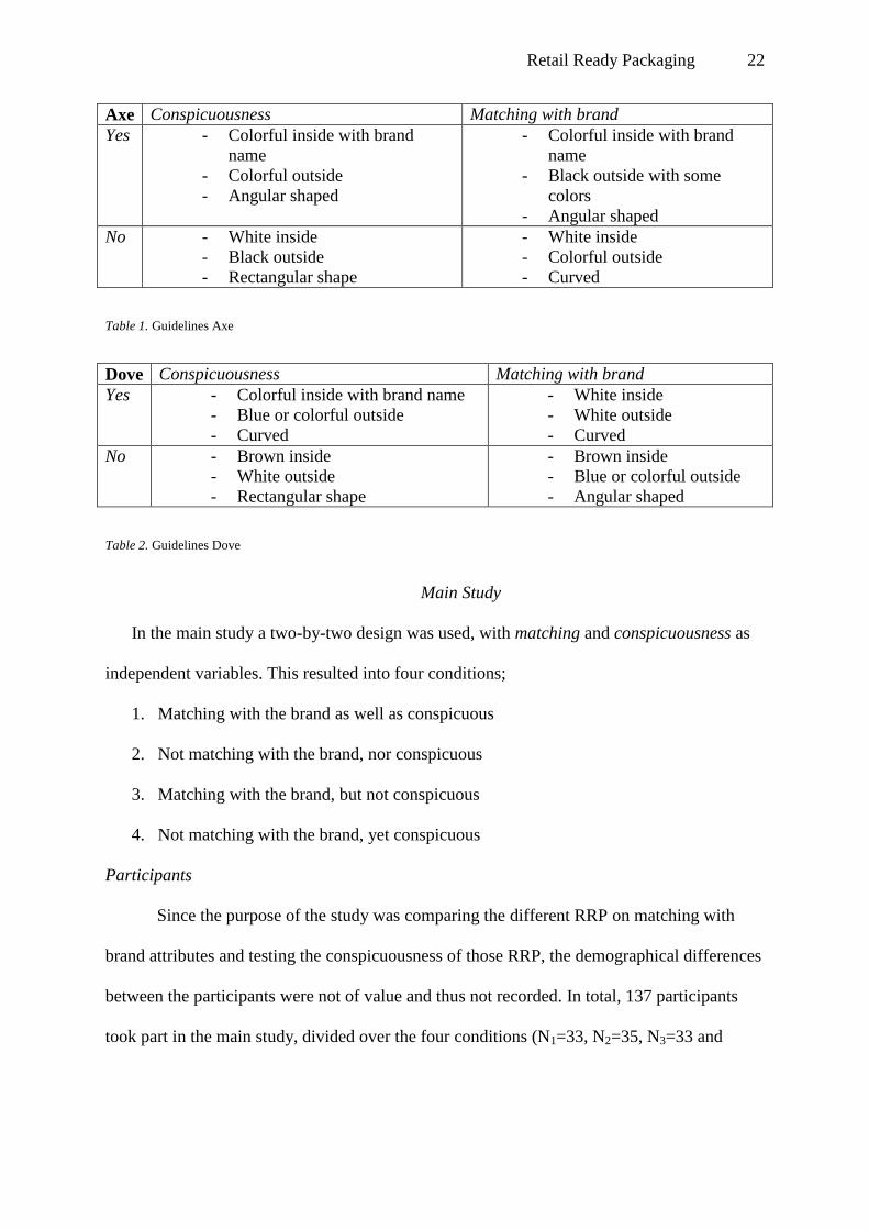
Main Study
In the main study a two-by-two design was used, with matching and conspicuousness as
independent variables. This resulted into four conditions;
1. Matching with the brand as well as conspicuous
2. Not matching with the brand, nor conspicuous
3. Matching with the brand, but not conspicuous
4. Not matching with the brand, yet conspicuous
Participants
Since the purpose of the study was comparing the different RRP on matching with
brand attributes and testing the conspicuousness of those RRP, the demographical differences
between the participants were not of value and thus not recorded. In total, 137 participants
took part in the main study, divided over the four conditions (N1=33, N2=35, N3=33 and

Retail Ready Packaging 23
N4=36).The participants were recruited through an online social networking service and
through direct contact by e-mail.
Procedure
From the guidelines previously developed, designs for each condition per brand were
produced. These designs were placed on a shelf in a Dutch drugstore, among RRP of
competing brands, and photographed. This was done for each separate RRP-condition. An
online Dutch survey was used to test the effects of the different conditions (see Appendix E).
Since there were four conditions, the main survey was divided into four separate
questionnaires. Each participant was randomly directed to one of these questionnaires.
At the beginning of the survey, the purpose of the study was explained to the
participants. Since the main research question involves testing the comparative
conspicuousness of the four conditions and the rest of the products on the shelf, the
participants were given a misdirecting purpose. The reason for this was that participants were
not supposed to pay more attention than normal to the specific RRP. Participants were told
that a Dutch drugstore wanted to know how the current interior of the shops is perceived and
that the feedback will be used for the creation of a new interior.
After this short introduction, a slideshow was shown with pictures of the specific
drugstore franchiser. The first three pictures were the same in all conditions; general pictures
of the interior of the drugstore (see Appendix F). The last two pictures in the slideshow
differed per condition. One picture showed the shelf with all the RRP displayed, including
the RRP of Axe and Dove for that particular condition, and the other picture showed a close-
up of that same shelf (see Appendix G). Each picture was shown for 20 seconds, before
moving to the next one.
After the slideshow, three conspicuousness related questions were asked. The first
question was about recalling brands, the second concerned brand recognition and the third

Retail Ready Packaging 24
was a scrutiny question on conspicuousness. This last question was necessary, because the
brands displayed in drugstores are commonly known and therefore participants might name
brands that were not seen in those specific pictures.
Subsequently, the specific RRP related questions followed. First, an image of the Axe
RRP was shown and subsequently an image of the Dove RRP that belonged to a randomly
assigned condition per participant (see Appendix H). The image showed a picture of the
specific RRP with the corresponding primary packaging on the shelf, as well as ‘schematics’
of the outside and inside of the RRP individually. The participants had to answer two
questions after seeing these pictures. The first question was a perceptibility question and the
second question concerned the participant’s attitude towards the RRP.
Stimuli
The designs for this test were based on the results of the pre-test and the guidelines
that resulted from the data analysis (see Table 1. And Table 2.). Complementary, the insight
of the author combined with the insight of a product designer were used in creating the
designs, which on occasion resulted in different design choices than formulated in the
guidelines.
Axe.
For Axe, matching could be achieved through the use of a black angular shaped RRP,
with some use of scent-based color on the outside as well as on the inside. Not-matching
could be achieved through a white inside, a completely scent-based outside and a curved
shape. Conspicuousness could be achieved through a scent-based angular shaped RRP with
an equally colorful inside (see Figure 4.). Inconspicuousness could be achieved through a
black rectangular RRP with a white inside.
These design elements were then used for the two-by-two design to create the four
RRP-combinations of Axe (see Appendix H).
Retail Ready Packaging 25
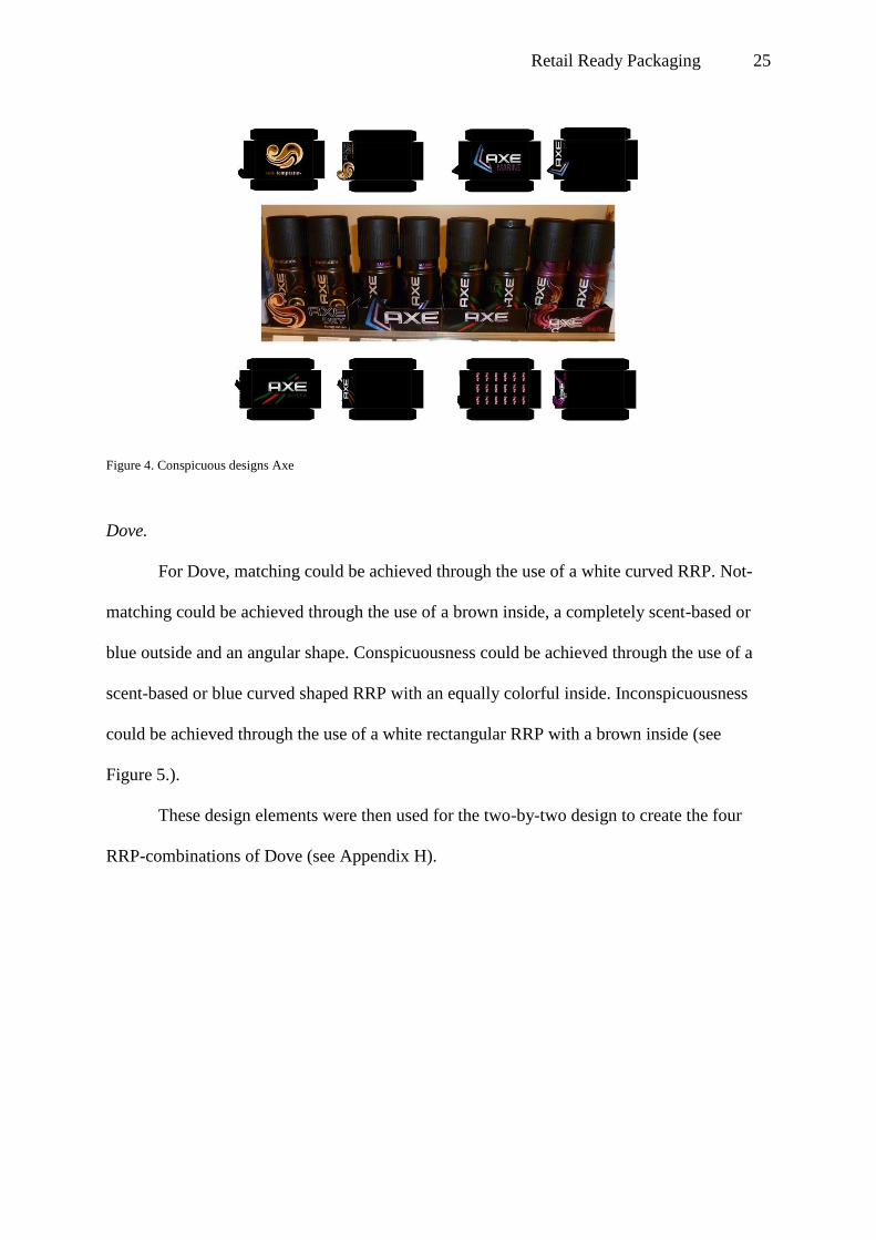
Dove.
For Dove, matching could be achieved through the use of a white curved RRP. Not-
matching could be achieved through the use of a brown inside, a completely scent-based or
blue outside and an angular shape. Conspicuousness could be achieved through the use of a
scent-based or blue curved shaped RRP with an equally colorful inside. Inconspicuousness
could be achieved through the use of a white rectangular RRP with a brown inside (see
Figure 5.).
These design elements were then used for the two-by-two design to create the four
RRP-combinations of Dove (see Appendix H).
Figure 4. Conspicuous designs Axe

Retail Ready Packaging 26
Measures
Before analyzing the results, the variable ‘Condition’ was divided into the two
variables ‘Matching’ and ‘Conspicuousness’. Participants scored a 1 (yes) or 0 (no) on these
two variables, depending on the assigned condition. For example a participant in condition 1,
matching and conspicuous, would score a 1 for both matching and conspicuousness. An alpha
level of .05 was used for all statistical tests. For all variables excluding Top of Mind, a 5-point
Likert scale was used.
Top of mind.
If Axe or Dove were mentioned first during the recall question, the specific brand
scored a 1 (yes) on Top of Mind versus 0 (no) if the brand was not mentioned first.
Brand recognition.
Brand recognition was measured using the following question: Did you notice the
following brands in the drugstore? This was done to measure whether participants
remembered the specific brands from the pictures of the drugstore.
Figure 5. Inconspicuous designs Dove

Retail Ready Packaging 27
Brand conspicuousness.
Brand conspicuousness was measured using this question: How conspicuous were the
following brands in this drugstore? This was done to determine how conspicuous the specific
brands in the drugstore were according to the participants.
RRP perceptibility.
The variable ‘RRP perceptibility’ measured whether the participants recalled if they
saw that specific RRP.
Shape appropriateness.
The variable ‘shape appropriateness’ measured whether the shape of the specific RRP
was appropriate for the brand.
Color appropriateness.
The variable ‘color appropriateness’ measured whether the color of the specific RRP
was appropriate for the brand.
Compatibility with brand attributes.
The compatibility of the design with the brand attributes was measured using the
attributes assigned to the brands before the pre-test (tough, masculine and defiant for Axe and
pure, feminine and nursing for Dove). For each of these attributes, a 5-point Likert scale was
used to determine the descriptiveness of each attribute concerning the RRP. A general
measure for the compatibility with the brand attributes was formed by summing and
averaging the scores on these items for Axe (α = .78) as well as for Dove (α = .80).
RRP conspicuousness.
This variable measured how conspicuous that specific RRP was to the participants,
instead of how conspicuous the overall brand was as in variable Brand conspicuousness.

Retail Ready Packaging 28
Attitude towards RRP.
This variable was measured using items indicative of participants’ attitude towards the
RRP (“This packaging is aesthetically pleasing” and “This packaging is original”). For each
statement, a 5-point Likert scale was used to determine their descriptiveness of the RRP. A
general measure for attitude towards RRP was formed by summing and averaging the scores
on these items for Axe (α = .70) as well as for Dove (α = .78).
Brand impression.
Brand impression was measured using items indicative of participants’ attitude
towards the brand (“The brand appeals to me” and “I have a positive impression about this
brand”). For each statement, a 5-point Likert scale was used to determine the descriptiveness
of the brand. A general measure for brand impression was formed by summing and averaging
the scores on these items for Axe (α = .76) as well as for Dove (α = .83).
Results of the Univariate Analysis
An Univariate analysis was executed with the variables Matching (yes versus no) and
Conspicuousness (yes versus no) as fixed factors and the variables Top of Mind (yes versus
no), Brand recognition (5-point Likert scale), Brand conspicuousness (5-point Likert scale),
RRP perceptibility (5-point Likert scale), Shape appropriateness (5-point Likert scale), Color
appropriateness (5-point Likert scale), RRP conspicuousness (5-point Likert scale),
Compatibility with brand attributes (5-point Likert scale), Attitude towards RRP (5-point
Likert scale) and Brand impression (5-point Likert scale) as the dependent variables. An
alpha level of .05 was used for all statistical tests.
Axe
Top of mind.
There was a marginal statistically significant main effect for conspicuousness, F (1,
133) = 2.93, p = .09 indicating that conspicuousness (M = 0.04, SD = 0.21) positively

Retail Ready Packaging 29
influences how well packaging is remembered in comparison to inconspicuousness (M =
0.00, SD = 0.00). The main effect for matching, F (1, 133) = .25, p = .62, did not reach
statistical significance. There was no statistically significant interaction effect between
matching and conspicuousness (F < 1).
RRP perceptibility.
There was a statistically significant main effect for conspicuousness, F (1, 133) =
6.87, p = .01, indicating that conspicuousness (M = 2.93, SD = 1.29) negatively influences
the perceptibility of packaging in comparison with inconspicuousness (M = 3.51, SD = 1.29).
There was no main effect found for matching (F < 1). Also, the interaction effect between
matching and conspicuousness was not statistically significant, F (1, 133) = 1.54, p = .22.
Color appropriateness.
There was a statistically significant main effect for matching, F (1, 133) = 7.64, p =
.01, indicating that matching (M = 4.20, SD = 0.61) positively influences how the packaging
color is perceived in comparison with not matching (M = 3.79, SD = 1.04). No main effect
was found for conspicuousness (F (1, 133) = 1.26, p = .26). The interaction effect between
matching and conspicuousness was not statistically significant, F (1, 133) = 1.77, p = .19.
Compatibility with brand attributes.
There was a statistically significant main effect for conspicuousness, F (1, 133) =
4.25, p = .04, indicating that conspicuousness (M = 3.20, SD = 0.86) negatively influences
how the brand attributes are perceived in comparison with inconspicuousness (M =3.48, SD =
0.66). There was no main effect found for matching (F (1, 133) = 1.49, p = .23).
The interaction effect between matching and conspicuousness was statistically
significant, F (1, 133) = 4.91, p = .03. Further analysis showed that the there is a significant
effect of conspicuousness in the “not matching” condition (F (1,133) = 9.49, p = 0.00). This
indicates that brand attributes of a not matching design are evaluated more positive when the

Retail Ready Packaging 30
design is inconspicuous (M = 3.54, SD = 0.75) versus conspicuous (M = 2.99, SD = 0.80)
(see figure 6.).
No main or interaction effects were obtained on the dependent variables brand
recognition, brand conspicuousness, shape appropriateness, RRP conspicuousness, attitude
towards RRP and brand impression (all p’s >0.10).
Dove
Shape appropriateness.
There was a statistically significant main effect for conspicuousness, F (1, 133) =
15.18, p = .00, indicating that conspicuousness (M = 3.88, SD = 0.76) positively influences
how the packaging shape is perceived in comparison with inconspicuousness (M = 3.26, SD
= 1.07). No main effect was found for matching (F < 1). The interaction effect between
matching and conspicuousness was not statistically significant (F < 1).
Figure 6. Interaction effect Compatibility with brand attributes Axe

Retail Ready Packaging 31
Color appropriateness.
There was no statistically significant main effect for matching (F < 1), nor for
conspicuousness (F < 1).
The interaction effect (see Figure 7.) between matching and conspicuousness was
statistically significant, F (1, 133) = 7.72, p = .01. Further analysis showed that the there is a
significant effect of conspicuousness in the “matching” condition (F (1,133) = 3.99, p =
0.05). This indicates that the colors of a matching design are evaluated more positive when
the design is conspicuous (M = 4.24, SD = 0.56) versus inconspicuous (M = 3.97, SD =
0.47).
Compatibility with brand attributes.
There was a statistically significant main effect for conspicuousness, F (1, 133) =
20.97, p = .00, indicating that conspicuousness (M = 3.70, SD = 0.68) positively influences
how brand attributes are perceived in comparison with inconspicuousness (M = 3.10, SD =
0.83). No main effect was found for matching (F < 1).
Figure 7. Interaction effect Color appropriateness Dove

Retail Ready Packaging 32
The interaction effect between matching and conspicuousness was not statistically
significant (F < 1).
Attitude towards RRP.
There was a statistically significant main effect for conspicuousness, F (1, 133) =
14.28, p = .00, indicating that conspicuousness (M = 3.17, SD = 0.83) positively influences
the attitude towards the packaging in comparison with inconspicuousness (M = 2.60, SD =
0.98). No main effect was found for matching (F < 1). No statistically significant interaction
effect was found between matching and conspicuousness F (1, 133) = 1.96, p = .16.
Brand impression.
No main effect was found for matching (F < 1) and conspicuousness (F (1, 133) =
1.22, p = .27). The interaction effect (see Figure 8.) between matching and conspicuousness
was marginal statistically significant, F (1, 133) = 2.78, p = .10, indicating that Dove scored
higher on brand impression when participants were shown an inconspicuous not matching
design (M = 3.93, SD = 0.82) than when participants were shown a conspicuous not matching
design (M = 3.56, SD = 0.82).
Figure 8. Interaction effect Brand impression Dove

Retail Ready Packaging 33
No main or interaction effects were obtained on the dependent variables top of mind,
brand recognition, brand conspicuousness, RRP perceptibility and RRP conspicuousness (all
p’s >0.10).
Retail Ready Packaging 34
Discussion
The main question of this study was “How can Retail Ready Packaging support the
intended brand message and attract the attention of the consumer through its design?” To
answer this question, the study focused on the following aspects:
- What attributes can be described to the brand?
- What type of colors and shapes characterize these attributes, and therefore the
brand?
- What type of colors and shapes can be used to make the RRP conspicuous?
- How can the RRP be conspicuous, while communicating the brands’ attributes?
The pre-test focused on the first three questions and the main study concentrated on
the final sub-question and answering the main question.
Axe
Brand Attributes and Corresponding Design Elements
The brand attributes ascribed to Axe were masculine, tough and defiant. The design
elements matching with those brand attributes were dark colors, e.g. black, and rectangular
shapes.
The results showed that the use of matching colors significantly influenced how the
packaging colors were perceived; the color appropriateness of a black RRP was evaluated
more positively in comparison with a completely scent-based colored RRP. This supports the
literature findings that the use of color that matches with the brand attributes is perceived to
be more appropriate, thus reinforcing the brand message.
Design Elements and Conspicuousness
To establish conspicuousness scent-based colors and contrasting shapes, e.g. curves or
angular shapes, were used since these design elements differed from the colors and shapes
used by competing brands.

Retail Ready Packaging 35
Top of mind awareness was marginal significantly influenced by the variable
conspicuousness, indicating that conspicuous designs positively influenced how well the
packaging was remembered in comparison to inconspicuous designs. This finding is in
contrast with the results for the variable RRP perceptibility. The perceptibility of the RRP
was significantly influenced by the conspicuousness of the RRP; however, a conspicuous
RRP negatively influenced the perceptibility of that RRP. One explanation for this might be
that the inconspicuous designs, black with a white logo, form a large black façade which
contrasts with the feminine products on the right part of the shelf in such a manner that it is
more conspicuous than the use of more vibrant colors. This same phenomenon was found in
results from the recall question, where Nivea was mentioned the most. Nivea was placed in a
completely blue RRP with white lettering, whereas the other feminine deodorant products
were placed in white RRP.
In conclusion, the use of one differentiating color might lead to greater perceptibility
in comparison with the use of various conspicuous colors. Nevertheless, it is important to
keep the brand attributes in mind when choosing the differentiating color; too atypical colors
might lead to unacceptable packaging, thus decreasing the purchase likelihood.
A Conspicuous and Matching RRP
The conspicuousness of the RRP had a negative influence on the evaluation of the
brand attributes, indicating that conspicuous designs negatively influenced how the brand
attributes were perceived in comparison with inconspicuous designs. Further analysis also
showed an interaction effect between conspicuousness and matching, which clarifies the
negative influence of conspicuousness; brand attributes of a not matching design were
evaluated more positive when the design was inconspicuous.
In conclusion, if the RRP design does not match with the brand attributes, thus
communicating the incorrect brand message, being conspicuous makes the intended brand

Retail Ready Packaging 36
attributes even less credible. Ergo before increasing the conspicuousness of RRP, it is
important to make sure the packaging communicates the intended brand message.
Dove
Brand Attributes and Corresponding Design Elements
The brand attributes ascribed to Dove were feminine, pure and nursing. The design
elements that match with those brand attributes were soft and light colors, e.g. white, and
curved shapes.
The results showed that the use of conspicuous shapes significantly influenced how
the packaging shapes were perceived; the shape appropriateness of a conspicuous RRP was
evaluated more positively in comparison with an inconspicuous RRP. The designs of the two
conspicuous RRP both followed the shape of the logo at the top of the RRP. This made the
design more curved and therefore matching with the brand attributes.
There was no main effect on the variable color appropriateness, however the results
did show an interaction effect indicating that the colors of a matching design were evaluated
more positive when the design was conspicuous. This leads to the conclusion that when the
colors used in RRP match with the brand, being conspicuous makes the colors more
appropriate.
As for the compatibility with the brand attributes, matching did not show a significant
effect. This might be due to the fact that one of the two matching conditions contained a
rather plain design; a white box with curved corners, and both conspicuous designs included
scent-based colors and a curve at the top of the RRP. This explains why conspicuousness
positively influenced the compatibility with the brand attributes, showing that a curved
design with soft scent-based colors matched with the brand attributes the most.

Retail Ready Packaging 37
Design Elements and Conspicuousness
To establish conspicuousness scent-based colors and curved designs were used, since
these design elements differentiated with the colors and shapes used by competing brands.
However, no significant effects were found of these design elements on the
conspicuousness of the RRP. This might be due to the fact that the designs of the two
conspicuous conditions also matched with the brand instead of solely being conspicuous.
A Conspicuous and Matching RRP
The conspicuousness of the RRP had a significant effect on the attitude towards the
RRP; a conspicuous design had a positive effect on the variable attitude towards RRP in
comparison with an inconspicuous design. The RRP was evaluated more positively if the
RRP was conspicuous which corresponds with the results on the variable compatibility with
brand attributes, reinforcing the statement that curves and soft scent-based colors match with
Dove the most.
As for brand impression, the results showed that there was an interaction effect for
matching and conspicuousness. When a not matching RRP was used, the brand impression
was more positive when the design was inconspicuous. This shows that if the RRP does not
match with the brand, thus communicating the incorrect brand message, being conspicuous
makes the intended brand less credible.
Design Guidelines for RRP
Although no exact design elements can be provided on how to ensure that RRP
supports the intended brand message while attracting the attention of the consumer, useful
guidelines can be derived from this study. The first guideline is in conformation with the
MAYA principle; the results showed that if a design does not match with the brand attributes,
conspicuousness made the design be even less appreciated. Secondly, colors and shapes
matching with the brand attributes were seen as more appropriate, thus enforcing the brand

Retail Ready Packaging 38
message. Ergo before increasing the conspicuousness of the product, ensure that the design
matches with the brand attributes. Finally, the use of one differentiating color might increase
the conspicuousness more than the use of various colors.
Limitations
There are certain limitations to this study that are important to discuss. First and
foremost, of the three visual stimuli influencing conspicuousness, only shape and color were
examined. The third one, material, was left out due to constraints within the Smurfit Kappa
Group to adapt this variable. Future research could investigate the role of material on
conspicuousness and matching with brand attributes.
Secondly, the guidelines used to design the main study stimuli would in some cases
lead to contradictory and unrealistic design requirements. For two conditions of Dove this
provided a dilemma. The first condition had to match with the brand attributes as well as
increase conspicuousness. Although conspicuousness can be increased through the use of
scent-based colors, these colors do not match with the brand attributes. The fourth condition
had to not match with the brand, yet be conspicuous. This could easily be achieved through
the use of scent-based colors, however this would be entirely unrealistic. Looking at the
current color scheme used by Dove, the use of entirely scent-based color designs would be
unsuitable. Due to these difficulties the designs of both conditions were close to identical,
which could account for the positive influence of conspicuousness in the case of Dove.
Thirdly, the environmental setting for the main test was not ideal. The shelf used to
display the RRP was not an accurate representation of the shelves the RRP would typically
stand on. Every shop organizes its shelves differently, therefore it was difficult to determine
what the ideal shelf should look like. In addition, it was not possible to re-arrange the entire
drugstore and put every product in RRP, to achieve product equality in appearance. This
could unintentionally result in more attention being drawn to the RRP-packed shelf in

Retail Ready Packaging 39
comparison to other shelves and thus influence the results on the conspicuousness of brands.
The specific positioning on the shelf might also have influenced overall conspicuousness.
Due to the relatively narrow shelf, the male deodorant RRP stood next to female deodorant
RRP. Therefore, the brands of opposite genders next to each other on the shelf were of bigger
contrast and thus more conspicuous than the brands farther apart on the shelf. Finally, the
main survey was conducted online and results from in-store questionnaires could vary from
these results. When conducting further research, it might be interesting to perform the
experiment in a store where RRP is fully implemented and potential interference from these
issues is reduced.
The last limitation concerns the deliberate exclusion of demographical, cultural and
gender differences. The focus of this study was to determine how RRP can attract attention,
but not what the ideal characteristics are for specific consumer groups. For example, males
could have different design preferences compared to females and Asians might interpret
colors and shapes differently from Europeans. In further research, distinction by target group
may produce more relevant data for each individual brand.

Retail Ready Packaging 40
References
Ares, G., & Deliza, R. (2010). Studying the influence of package shape and colour on
consumer expectations of milk desserts using word association and conjoint analysis.
Food Quality and Preference, 21, 930–937.
Behaeghel, J. (1991). Brand Packaging - the Permanent Medium. London: Architecture
Design and Technology Press.
Bellizzi, J. A., & Hite, R. E. (1992). Environmental Color, Consumer Feelings, and Purchase
Likelihood. Psychology & Marketing, 9(5), 347-363.
Berkowitz, M. (1987). Product Shape as a Design Innovation Strategy The Journal of
Product Innovation Management, 4(4), 274-283.
Berlyne, D.E. (1960). Conflict, Curiosity, and Arousal. New York: McGraw-Hill.
Bettman, J. R. (1979). An Information Processing Theory of Consumer Choice. Reading,
MA: Addison-Wesley.
Bloch, P. H. (1995). Seeking the Ideal Form: Product Design and Consumer Response.
Journal of Marketing, 59(3), 16-29.
Bloch, P.H., Brunel, F.F., & Arnold, T.J. (2003). Individual Differences in the Centrality of
Visual Product Aesthetics: Concept and Measurement. The Journal of Consumer
Research, 29 (4), 551-565.
Burke, R.E., Harlam, B. A., Kahn B. E., & Lodish, L. M. (1992). Comparing dynamic
consumer choice in real and computer-simulated environments. Journal of Consumer
Research, 19, 71-82.
Charters, S., Lockshin, L., & Unwin, T. (1999). Consumer responses to wine bottle back
labels. Journal of Wine Research, 10, 183–195.
Coates, D. (2003). Watches Tell More Than Time: Product Design, Information and the
Quest for Elegance. London: McGraw-Hill.

Retail Ready Packaging 41
Connolly, A. & Davison , L. (1996) . How does design affect decisions at point of sale?
Journal of Brand Management, 4 (2), 100-101.
Cox, D. S., & Locander, W. B. (1987). Product Novelty: Does it Moderate the Relationship
Between Ad Attitudes and Brand Attitudes? Journal of Advertising, 16(3), 39-44.
Dumaine, B. (1991, March 11). Design That Sells and Sells and ... Fortune, 86-94.
Erik, J. H., & Kwaku, A. G. (2000). The effects of sales force adoption on new product
selling performance. Journal of Product Innovation Management, 17 (6), 435-450.
Floor, J. M. G, & Van Raaij, W. F. (2006). Marketingcommunicatiestrategie
[Marketing communication strategy] (5th ed.).Groningen: Noordhoff Uitgevers.
Garber Jr, L. L. (1995). The Package Appearance in Choice. Advances in Consumer
Research, 22(1), 653-660.
Hao, S., Joel, P., & Vivanne, C. S. (2001). Control of the modulation of human
photoreceptors. International Journal of Supplement, 26, 69-75.
Hekkert, P. (2006). Design aesthetics: Principles of pleasure in product design. Psychology
Science, 48, 157-172.
Hsiao, S. W. (1997). A semantic and shape grammar based approach for product design.
Design Studies, 18 (3), 275-296.
Hsiao, S. W., Chiu, F. Y., & Chen, C. S. (2008). Applying aesthetics measurement to product
design. International Journal of Industrial Ergonomics, 38, 910–920.
Jones, P. L. (1991). Taste Today. New York: Pergamon Press.
Kotler, P. (1973). Atmospherics as Marketing Tool. Journal of Retailing, 49(4), 48-64.
Marshall, D., Stuart, M., & Bell, R. (2006). Examining the relationship between product
package colour and product selection in preschoolers. Food Quality and Preference,
17(7–8), 615-621.

Retail Ready Packaging 42
McDaniel, C., & Baker, R. C. (1977). Convenience Food Packaging and the Perception of
Product Quality. Journal of Marketing, 41 (4), 57-58.
Meyer, M. (1988). Attention shoppers! Marketing and Media Decisions, 23, 67.
Nagamachi, M. (1995). Kansei Engineering: A new ergonomic consumer-oriented
technology for product development. International Journal of Industrial Ergonomics,
15(1), 3-11.
Noble, C. H., & Kumar, M. (2010). Exploring the Appeal of Product Design: A Grounded,
Value-Based Model of Key Design Elements and Relationships. The Journal of
Product Innovation Management, 27, 640–657.
Pantin-Sohier, G., Decrop, A., & Brée, J. (2005). An Empirical Investigation of the Product's
Package as an Antecedent of Brand Personality. Innovative Marketing, 1(1), 69-80.
Peters, M. (1994, January). Good packaging gets through to fickle buyers.. Marketing, 20, 8.
Philips, H. & Bradshaw, R. (1993). How customers actually shop: customer interaction with
the point of sale. Journal of the Market Research Society, 35(1), 51-62.
Pilditch, J. (1972). The silent salesman. London: Business Books.
Piqueras-Fiszman, B., & Spence, C. (2011). Crossmodal correspondences in product
packaging. Assessing color–flavor correspondences for potato chips (crisps). Appetite,
57(3), 753-757.
Raghubir, P., & Greenleaf, E. A. (2006). Ratios in Proportion: What Should the Shape of the
Package Be? Journal of Marketing, 70(2), 95-107.
Schmitt, B. & Simonson, A. (1997). Marketing Aesthetics: The Strategic Management of
Brands, Identity, and Image. New York: Free Press.
Schoormans, J. P. L., & Robben, H. S. J. (1997). The effect of new package design on
product attention, categorization and evaluation. Journal of Economic Psychology, 18,
271-287.

Retail Ready Packaging 43
Swientek, B. (2001). Uncanny developments. Beverage Industry, 92(12), 38–39.
Valdez, P., & Mehrabian, A. (1994). Effects of Color on Emotions. Journal of Experimental
Psychology, 123(4), 394-409.
Van Rompay, T., Hekkert, P., & Muller, W. (2005). The bodily basis of product experience.
Design Studies, 26(4), 359-377.
Who we are (2013). Retrieved January 17, 2013, from
http://www.smurfitkappa.com/vhome/com/AboutUs/WhoWeAre/Pages/Default.aspx
Zhang, Y., Feick, L., & Price, L. J. (2006). The Impact of Self-Construal on Aesthetic
Preference for Angular Versus Rounded Shapes. Personality and Social Psychology
Bulletin, 32(6), 794-805.

Retail Ready Packaging 44
Appendix A
Actual shape stimuli Axe

Retail Ready Packaging 45
Actual outside stimuli Axe

Retail Ready Packaging 46
Actual inside color stimuli Axe

Retail Ready Packaging 47

Retail Ready Packaging 48
Actual shape stimuli Dove

Retail Ready Packaging 49
Actual outside color stimuli Dove

Retail Ready Packaging 50
Actual inside color stimuli Dove

Retail Ready Packaging 51

Retail Ready Packaging 52
Appendix B
Shape variations
Variation 1 Variation 2 Variation 3 Variation
4
Shape
Curved Rectangular Angular -
Outside color
Black,white
logo
Black, white
logo
Black,white
logo
-
Inside Color White White White -
Outside color variations Variation 1 Variation 2 Variation 3 Variation
4
Shape
Rectangular Rectangular Rectangular -
Outside color Black,white logo Black, scent-
based color logo
Scent-based
color ,white
logo
-
Inside Color White White White -
`
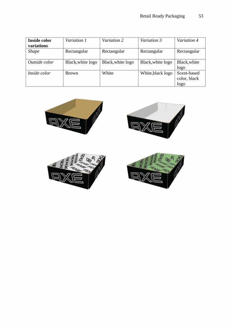
Retail Ready Packaging 53
Inside color
variations
Variation 1 Variation 2 Variation 3 Variation 4
Shape Rectangular
Rectangular Rectangular Rectangular
Outside color Black,white logo Black,white logo Black,white logo Black,white
logo
Inside color Brown White White,black logo Scent-based
color, black
logo

Retail Ready Packaging 54
Appendix C
Shape variations
Variation 1 Variation 2 Variation 3 Variation 4
Shape
Rectangular Rectangle, one curve Fully curved -
Outside color
White, blue logo White, blue logo White, blue logo -
Inside color
White White White -
Outside color
variations
Variation 1 Variation 2 Variation 3 Variation 4
Shape
Rectangular Rectangular Rectangular -
Outside color White, blue logo Blue, white logo Scent-based
color, blue logo
-
Inside color
-

Retail Ready Packaging 55
Inside color
variations
Variation 1 Variation 2 Variation 3 Variation 4
Shape
Rectangular Rectangular Rectangular Rectangular
Outside color White, blue logo White, blue logo White, blue logo White, blue
logo
Inside color Brown White White, blue logo Scent-based
color, white
logo

Retail Ready Packaging 56
Appendix D
Axe Inside color Outside color Shape
Match with brand - 1>3p=0,005
2>3p=0,002
3>1p=0,00
Conspicuousness 3>1p=0,04
,2p=0,026
4>1,2,3p=0,00
2>1p=0,00
3>1p=0,00
,2p=0,003
3>1=0,012
,2p=0,00
Defiant 3> 1p=0,00
,2p=0,002
4> 1,2p=0,00
2>1p=0,00
3>1p=0,00
3>1,2p=0,00
Tough - 2>3p=0,01
3>1p=0,00
,2p=0,01
Masculine - 1>3p=0,00
2>3p=0,001
2>1p=0,00
3>1p=0,001
Dove Inside color Outside color Shape
Match with brand 2>1p=0,046
1>2p=0,016
3>2p=0,076
Conspicuousness 4>1p=0,001
,2p=0,02
,3p=0,027
2>1p=0,00
3>1p=0,001
-
Pure - - -
Nursing - - -
Feminine 2>1p=0,002
,3p=0,025
1>2p=0,00
3>2p=0,00
-

Retail Ready Packaging 57
Appendix E
Beste proefpersoon,
Dit onderzoek heeft betrekking op het interieur, de schapindeling en de producten van een
drogisterij. Landelijk is bepaald dat het drogisterijconcern Etos een ander interieur krijgt. Om
te bepalen hoeveel invloed dit nieuwe interieur heeft op de shopervaring van de
consument, moet eerst achterhaald worden hoe het huidige interieur en de daarbij horende
schapindeling en producten ervaren worden.
Zo direct krijg je een voorbeeld te zien van het huidige interieur van één van de franchisers.
Graag wil ik je verzoeken de afbeeldingen goed in je op te nemen, zodat je op basis daarvan
een duidelijke mening kan vormen over het huidige interieur, de schapindeling en de
producten.
Na het zien van de foto’s zullen enkele vragen gesteld worden. Het onderzoek zal in totaal
ongeveer 10 minuten duren en de antwoorden zullen anoniem verwerkt worden.
Alvast hartelijk bedankt voor jouw deelname en veel succes!
Met vriendelijke groet,
Marieke Schrijver

Retail Ready Packaging 58
Je krijgt nu een slideshow te zien met afbeeldingen van een filiaal van het
drogisterijconcern Etos.
Je krijgt in totaal 5 foto's te zien en je hebt telkens 20 seconden de tijd om de foto goed in
je op te nemen.
Zorg ervoor dat je in die 20 seconden een goede indruk krijgt van hoe het interieur, de
schapindeling en de producten er uit zien.
Standaardafbeeldingen + 2 conditie-afhankelijke afbeeldingen

Retail Ready Packaging 59
1. Welke merken heb je allemaal in deze winkel zien staan?
Schrijf zoveel op als jij je kunt herinneren. Er zit geen minimum of maximum aan.
-
-
-
-
-
-
-
-
-
-

Retail Ready Packaging 60
2. Heb je de volgende merken ook in deze winkel zien staan? Kies het toepasselijk antwoord voor elk onderdeel:
1. Zeker
niet
2.
Waarschijnlijk
niet
3.
Neutraal
4.
Waarschijnlijk
wel
5. Zeker
wel
O O O O O
O O O O O
O O O O O
O O O O O
O O O O O
O O O O O
O O O O O
O O O O O
O O O O O
O O O O O
O O O O O
O O O O O

Retail Ready Packaging 61
3. Hoe opvallend vond je de volgende merken in deze winkel? Kies het toepasselijk antwoord voor elk onderdeel:
1. Helemaal
niet opvallend
2. Niet
opvallend
3. Neutraal 4. Wel
opvallend
5. Helemaal wel
opvallend
O O O O O
O O O O O
O O O O O
O O O O O
O O O O O
O O O O O
O O O O O
O O O O O
O O O O O
O O O O O
O O O O O
O O O O O

Je krijgt nu afbeeldingen van verpakkingen van Axe te zien. Eén afbeelding toont de
verpakkingen in het schap. De andere afbeeldingen zijn schetsen van de binnen- en
buitenkant van de verpakkingen.
Over deze verpakkingen zullen twee vragen gesteld worden. Let op: het gaat hierbij dus om
de doosjes, niet om de bussen. Kijk goed naar de verpakkingen bij het beantwoorden van de
vragen.

63
Conditie-afhankelijke afbeeldingen
4. Heb je deze verpakkingen van Axe voorbij zien komen? Kies het toepasselijk antwoord voor elk onderdeel:
1. Zeker niet 2. Waarschijnlijk niet 3. Neutraal 4. Waarschijnlijk wel 5. Zeker wel
O O O O O

64
Conditie-afhankelijke afbeeldingen
5. In hoeverre ben je het eens met de volgende stellingen; Kies het toepasselijk antwoord voor elk onderdeel:
1. Helemaal mee
onmee
2. Mee
oneens
3.
Neutraal
4. Mee
eens
5. Helemaal
mee eens
De vorm van de
verpakkingen past bij Axe
O O O O O
De kleur van de
verpakkingen past bij Axe
O O O O O
De verpakkingen zijn stoer
O O O O O
De verpakkingen zijn
mannelijk
O O O O O
De verpakkingen zijn
uitdagend
O O O O O
De verpakkingen zijn
opvallend
O O O O O
De verpakkingen zijn mooi
O O O O O
De verpakkingen zijn
origneel
O O O O O
Het merk Axe spreekt mij
aan
O O O O O
Ik heb een positieve indruk
van Axe
O O O O O

65
Je krijgt nu afbeeldingen van verpakkingen van Dove te zien. Eén afbeelding toont de
verpakkingen in het schap. De andere afbeeldingen zijn schetsen van de binnen- en
buitenkant van de verpakkingen.
Over deze verpakkingen zullen twee vragen gesteld worden. Let op: het gaat hierbij dus om
de doosjes, niet om de bussen. Kijk goed naar de verpakkingen bij het beantwoorden van de
vragen.

66
Conditie-afhankelijke afbeeldingen
6. Heb je deze verpakkingen van Dove voorbij zien komen? Kies het toepasselijk antwoord voor elk onderdeel:
1. Zeker niet 2. Waarschijnlijk niet 3. Neutraal 4. Waarschijnlijk wel 5. Zeker wel
O O O O O

67
Conditie-afhankelijke afbeeldingen
7. In hoeverre ben je het eens met de volgende stellingen; Kies het toepasselijk antwoord voor elk onderdeel:
1. Helemaal
mee onmee
2. Mee
oneens
3.
Neutraal
4. Mee
eens
5. Helemaal
mee eens
De vorm van de
verpakkingen past bij Dove
O O O O O
De kleur van de
verpakkingen past bij Dove
O O O O O
De verpakkingen zijn puur
O O O O O
De verpakkingen stralen
verzorging uit
O O O O O
De verpakkingen zijn
vrouwelijk
O O O O O
De verpakkingen zijn
opvallend
O O O O O
De verpakkingen zijn mooi
O O O O O
De verpakkingen zijn
origneel
O O O O O
Het merk Dove spreekt mij
aan
O O O O O
Ik heb een positieve indruk
van Dove
O O O O O
Je bent bij het einde aangekomen van mijn afstudeeronderzoek. Nogmaals hartelijk bedankt
voor jouw deelname!
Met vriendelijke groet,
Marieke Schrijver

68
Appendix F

69
Appendix G
Pictures condition 1.
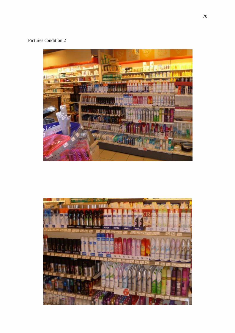
70
Pictures condition 2

71
Pictures condition 3.

72
Pictures condition 4.

73
Appendix H
Pictures condition 1.

74
Pictures condition 2.

75
Pictures condition 3.

76
Pictures condition 4.