TYPOGRAPHY BASICS Technical Foundations II. Typography Basics Baseline Apple.
Upload
clarissa-petersonCategory
view
100.018download
2
Clarissa Peterson@clarissa
ResponsiveTypography
v4
In Control - February 18, 2014MoDev East 2013, CSS Dev Conference 2013

Covered in these slides:
1. Font Size
2. Line Height (Leading)
3. Line Length (Measure)(those three things work together to make
text look good and easy to read)
4. Hyphenation
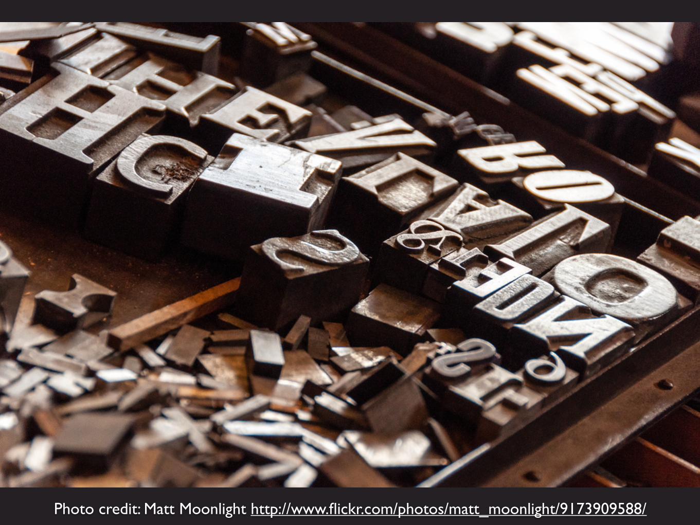
Photo credit: Matt Moonlight http://www.flickr.com/photos/matt_moonlight/9173909588/

Websites are about getting information to people, and that’s mostly done through text. So you need to make sure that your text is as easy to read as possible.
Why Typography?
A website can have as many media queries as you want. Add a media query where somethingneeds to change - even if it’s a small thing. Don’t think of responsive websites as being made
up of a few separate designs (one-column, two-column, etc.). Think of responsive websites as arange of changes across all viewport widths. Typography media queries
don’t need to happen at the same breakpoints as layout changes.
Media Queries

Good web typography starts with HTML, not with CSS.
Start with HTML
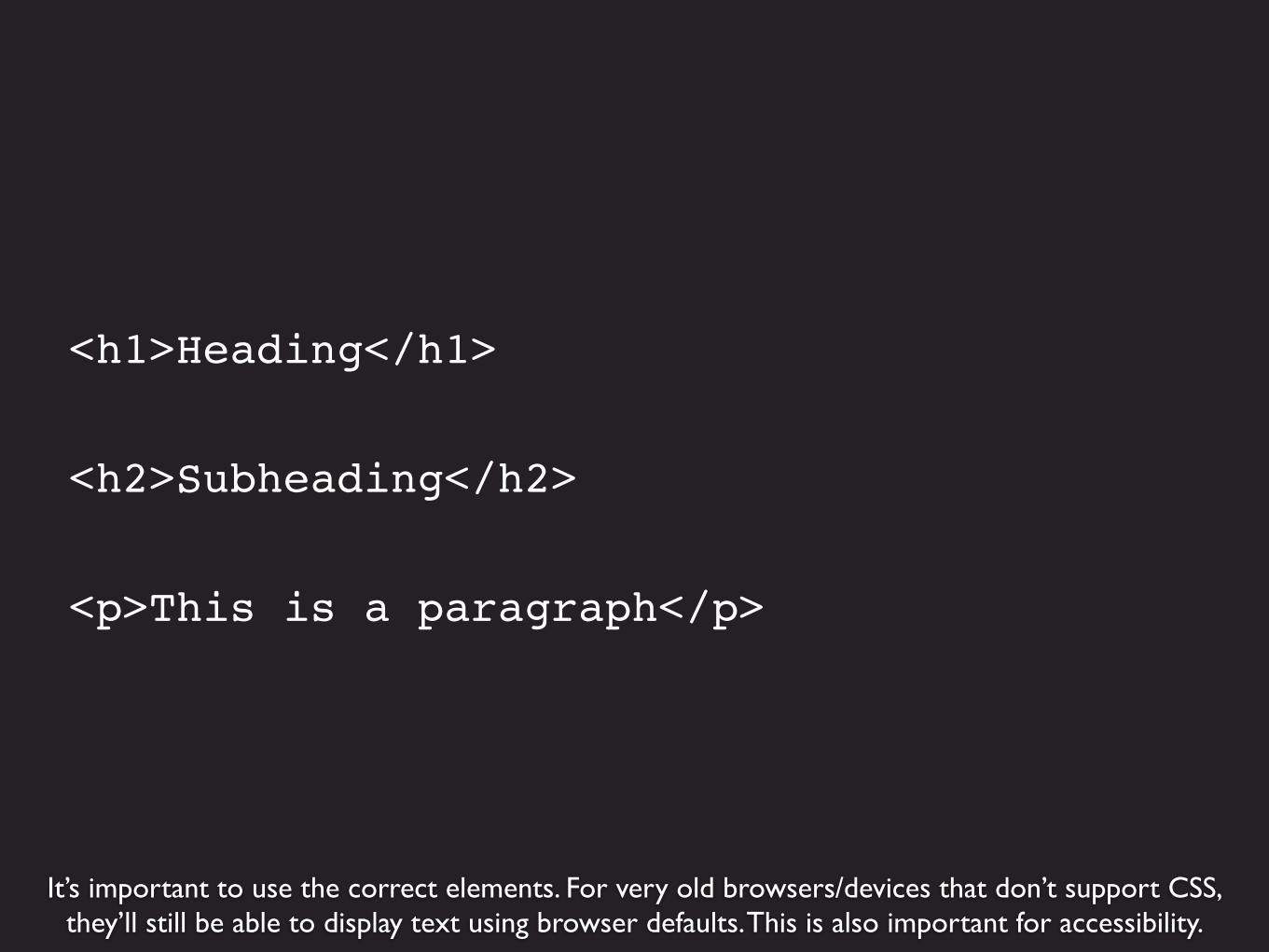
It’s important to use the correct elements. For very old browsers/devices that don’t support CSS,they’ll still be able to display text using browser defaults. This is also important for accessibility.
<h1>Heading</h1>
<h2>Subheading</h2>
<p>This is a paragraph</p>
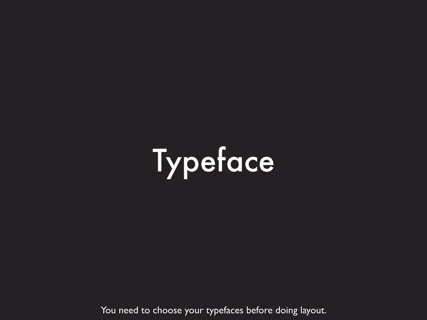
You need to choose your typefaces before doing layout.
Typeface
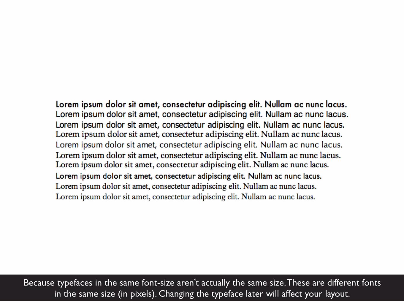
Because typefaces in the same font-size aren’t actually the same size. These are different fontsin the same size (in pixels). Changing the typeface later will affect your layout.

Pixels are inherently unresponsive. Don’t set font sizes in pixels.
Pixels

Reference pixels aren’t even the same size on every device. This is 320 pixels viewedon an iPhone and on a laptop screen, held next to each other. http://m.ew.com
Two alternatives for font size: ems and rems. You probably know these in the context of converting from pixels. But it’s also possible (and more responsive) to start with responsive units and not use pixels at all.
Setting Font Size
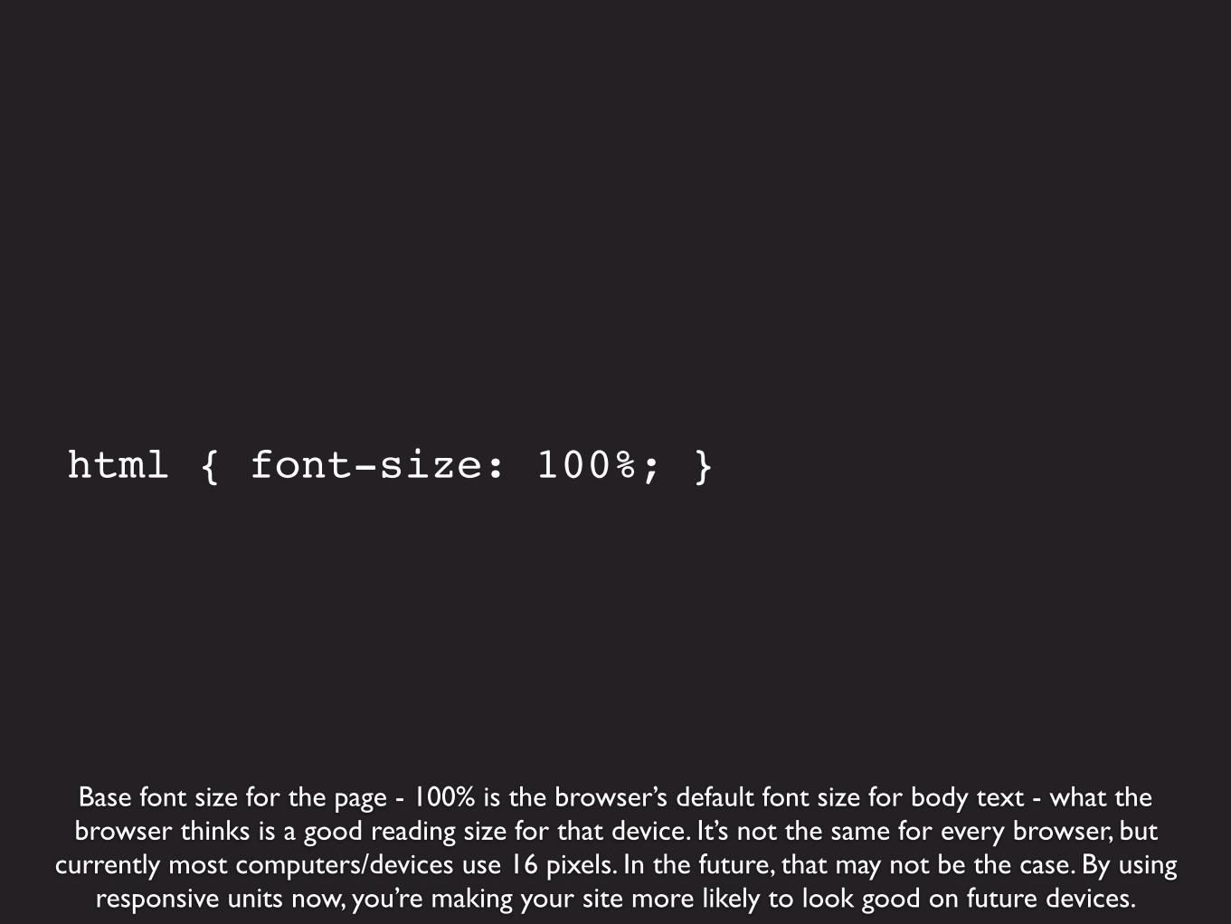
Base font size for the page - 100% is the browser’s default font size for body text - what thebrowser thinks is a good reading size for that device. It’s not the same for every browser, but
currently most computers/devices use 16 pixels. In the future, that may not be the case. By using responsive units now, you’re making your site more likely to look good on future devices.
html { font-size: 100%; }

Starting with the browser default base size makes the site more readable for everybody, even ifthe text may seem too large to some users (or to the designer). http://alistapart.com
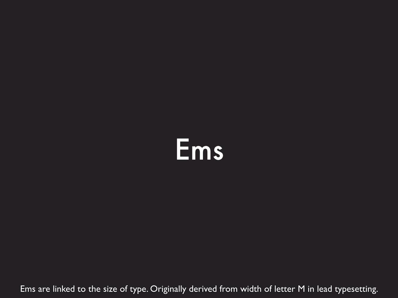
Ems are linked to the size of type. Originally derived from width of letter M in lead typesetting.
Ems

Ems are relative to the font size of the containing element.
1 em = default
2 em = twice as big
.5 em = half of default
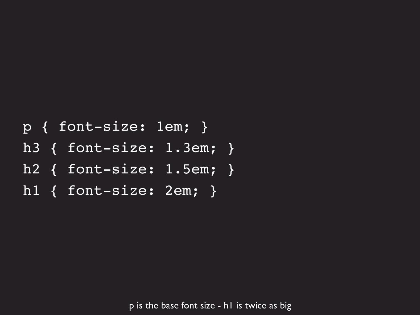
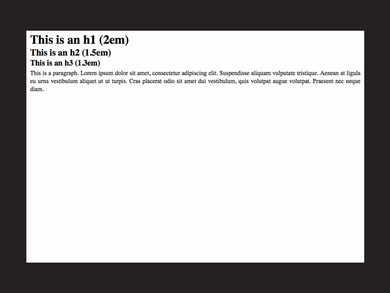
p is the base font size - h1 is twice as big
p { font-size: 1em; }h3 { font-size: 1.3em; }h2 { font-size: 1.5em; }h1 { font-size: 2em; }
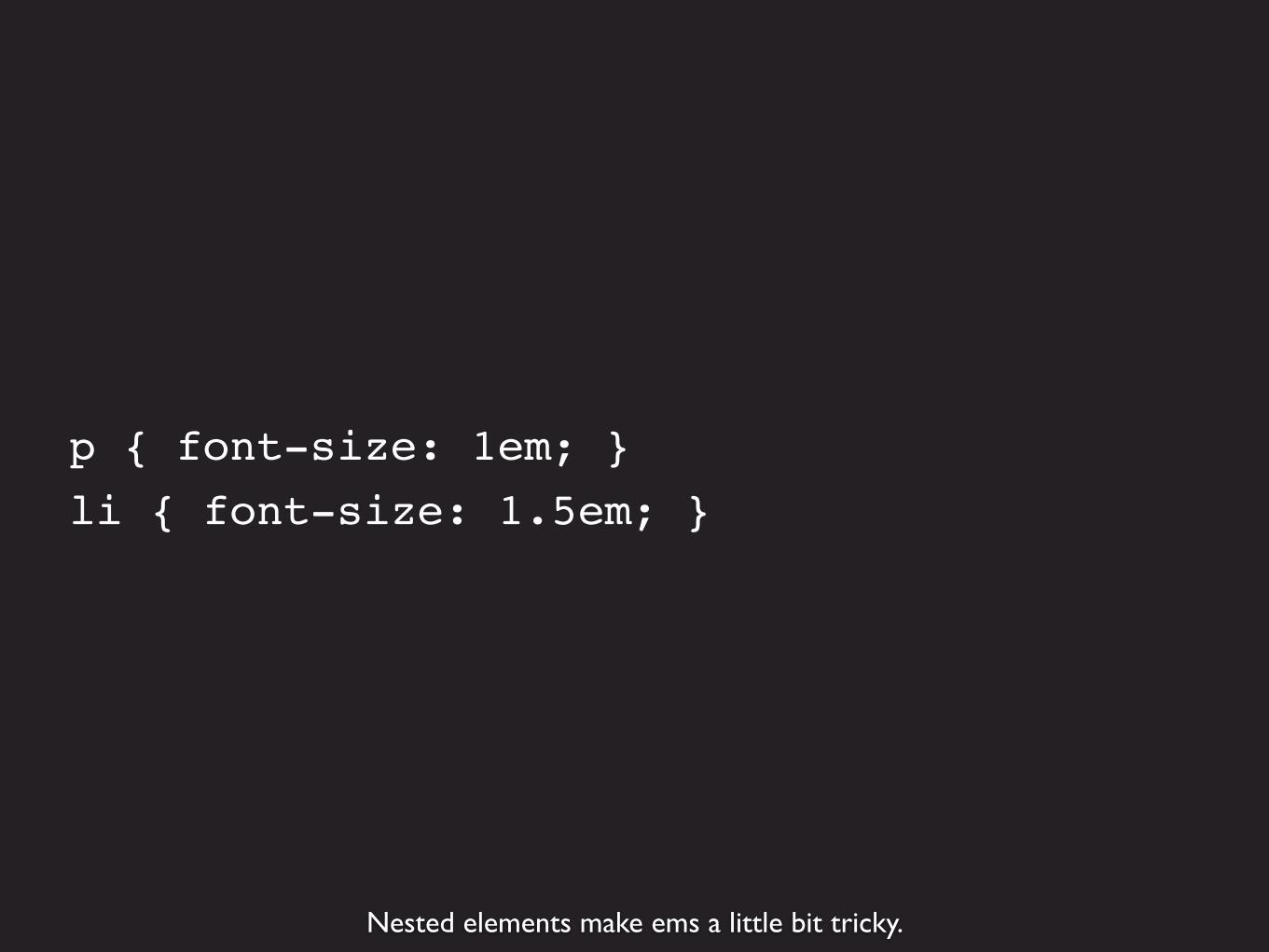
Nested elements make ems a little bit tricky.
p { font-size: 1em; }li { font-size: 1.5em; }


<ul><li>List item</li><li>List item <ul> <li>Sub item</li> <li>Sub item</li> </ul></li><li>List item</li></ul>

Since the <li>s are nested, the sub items are 2.25 (1.5x1.5) instead of 1.5.
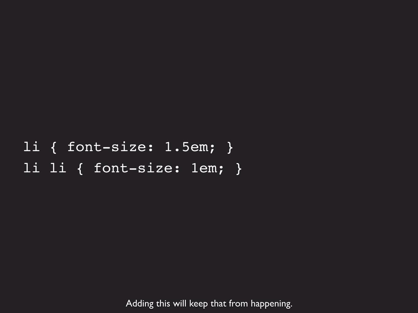
Adding this will keep that from happening.
li { font-size: 1.5em; }li li { font-size: 1em; }


Rems (root ems) are an alternative to ems. Relative to the document’sroot element (the html element), not the parent element.
Rems
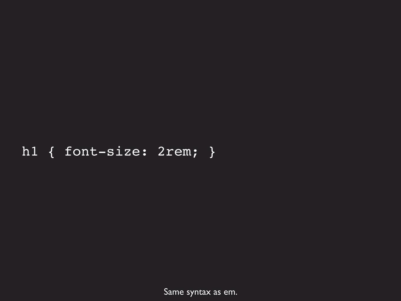
Same syntax as em.
h1 { font-size: 2rem; }

But not all browsers support it; you need fallback in pixels for IE8 and older.
h1 { font-size: 32px; font-size: 2rem; }

Responsive design doesn’t require converting pixels to ems (formulas). Just start with ems.
Pixels to ems
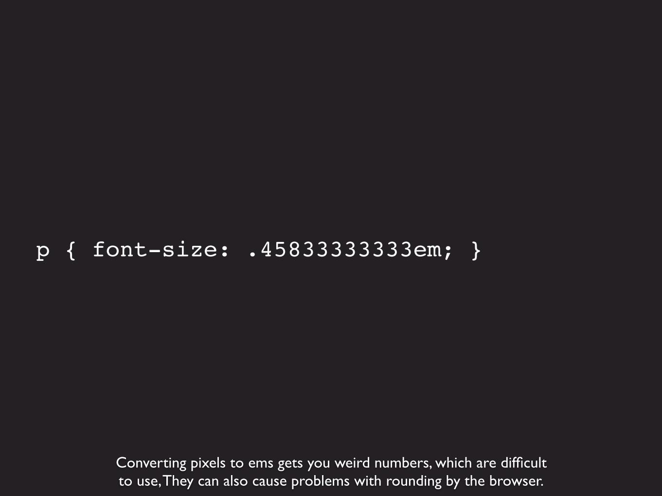
Converting pixels to ems gets you weird numbers, which are difficultto use, They can also cause problems with rounding by the browser.
p { font-size: .45833333333em; }

p { font-size: .46; }
And you don’t need so many decimal points.
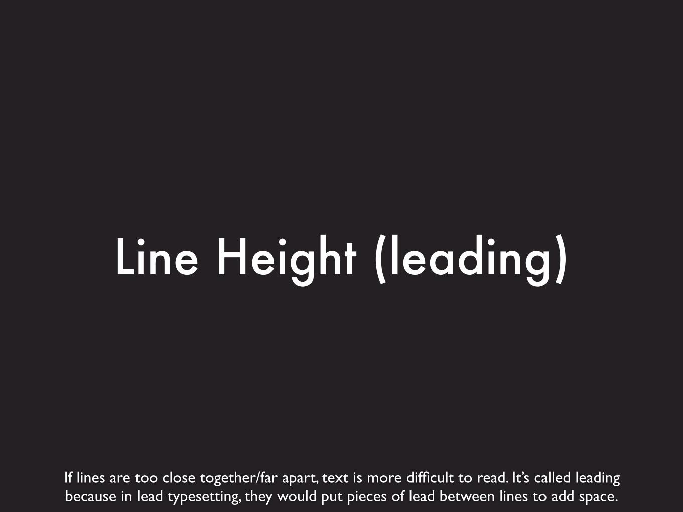
If lines are too close together/far apart, text is more difficult to read. It’s called leadingbecause in lead typesetting, they would put pieces of lead between lines to add space.
Line Height (leading)
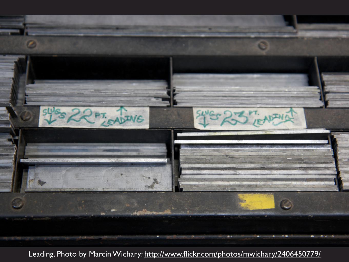
Leading. Photo by Marcin Wichary: http://www.flickr.com/photos/mwichary/2406450779/

For line-height, use unitless numbers, which are relative to the font size of the element. 1 is default.
p { line-height: 1 }

Default of 1 - lines are close together, it’s hard to focus on one line at a time.

line-height: 2 - the lines are too far apart, so it’s difficult and tiring to read
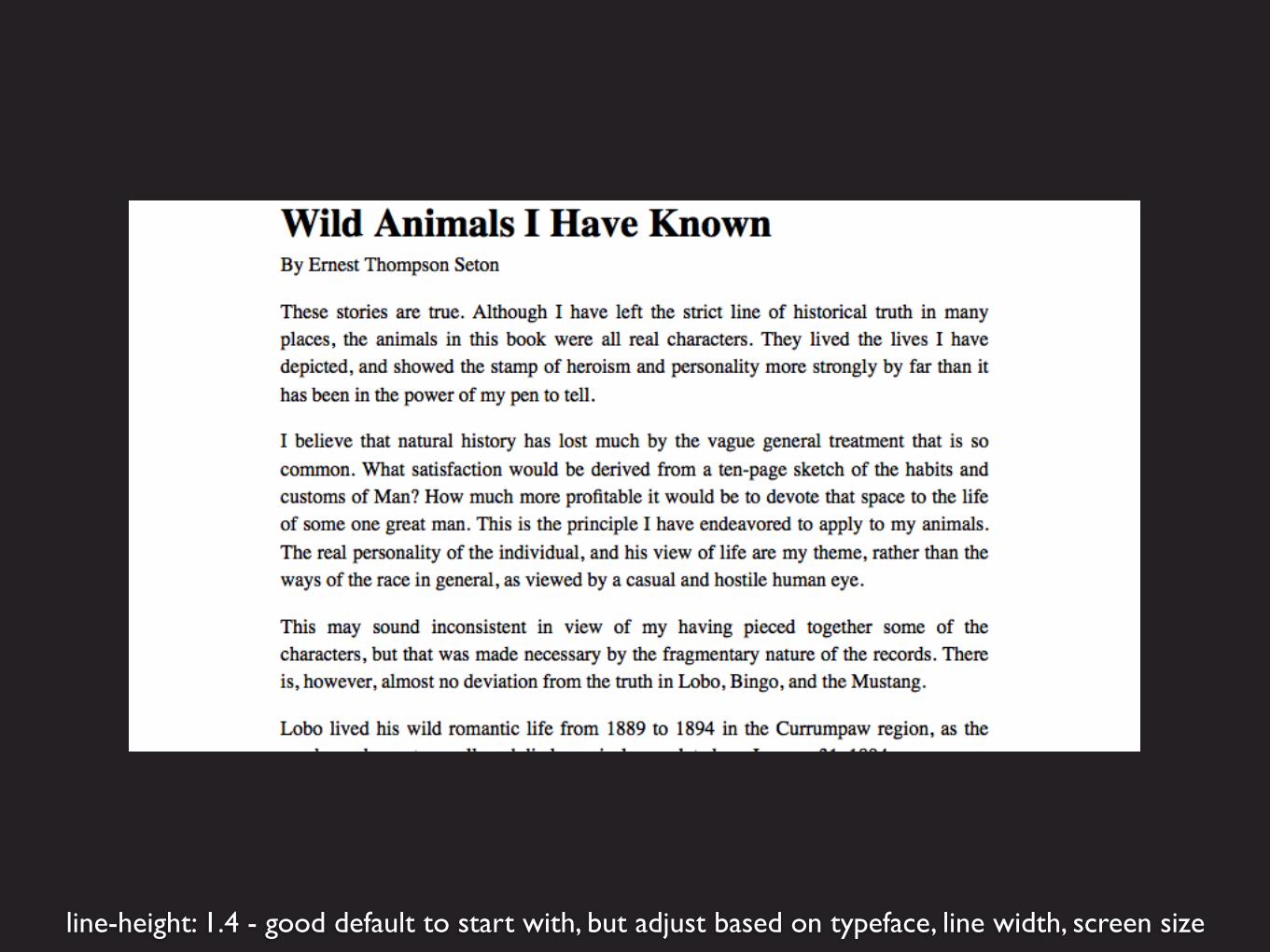
line-height: 1.4 - good default to start with, but adjust based on typeface, line width, screen size
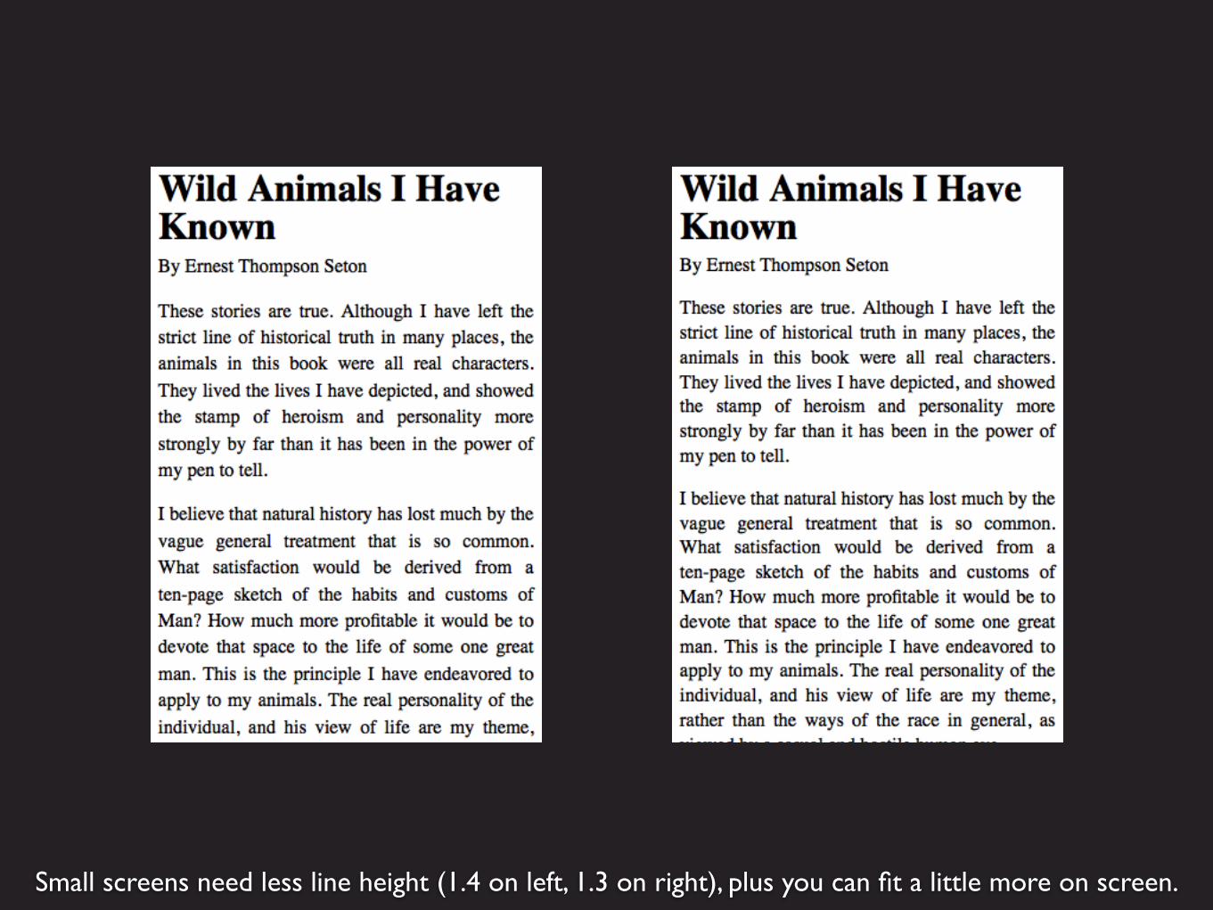
Small screens need less line height (1.4 on left, 1.3 on right), plus you can fit a little more on screen.

Media queries to increase line height as viewport gets wider.
p { line-height: 1.3 }
@media screen and (min-width: 30em) { p { line-height: 1.4 }}
@media screen and (min-width: 60em) { p { line-height: 1.5 }}

Characters per line is one of the most important qualities that makes type readable.
Line Length (Measure)

Obvious that super-long lines are hard to read. Difficult for eyes to move from one line to the next.

Lines that are too short interrupt the flow of reading. This makesit tiring to read because your eyes move back and forth more.
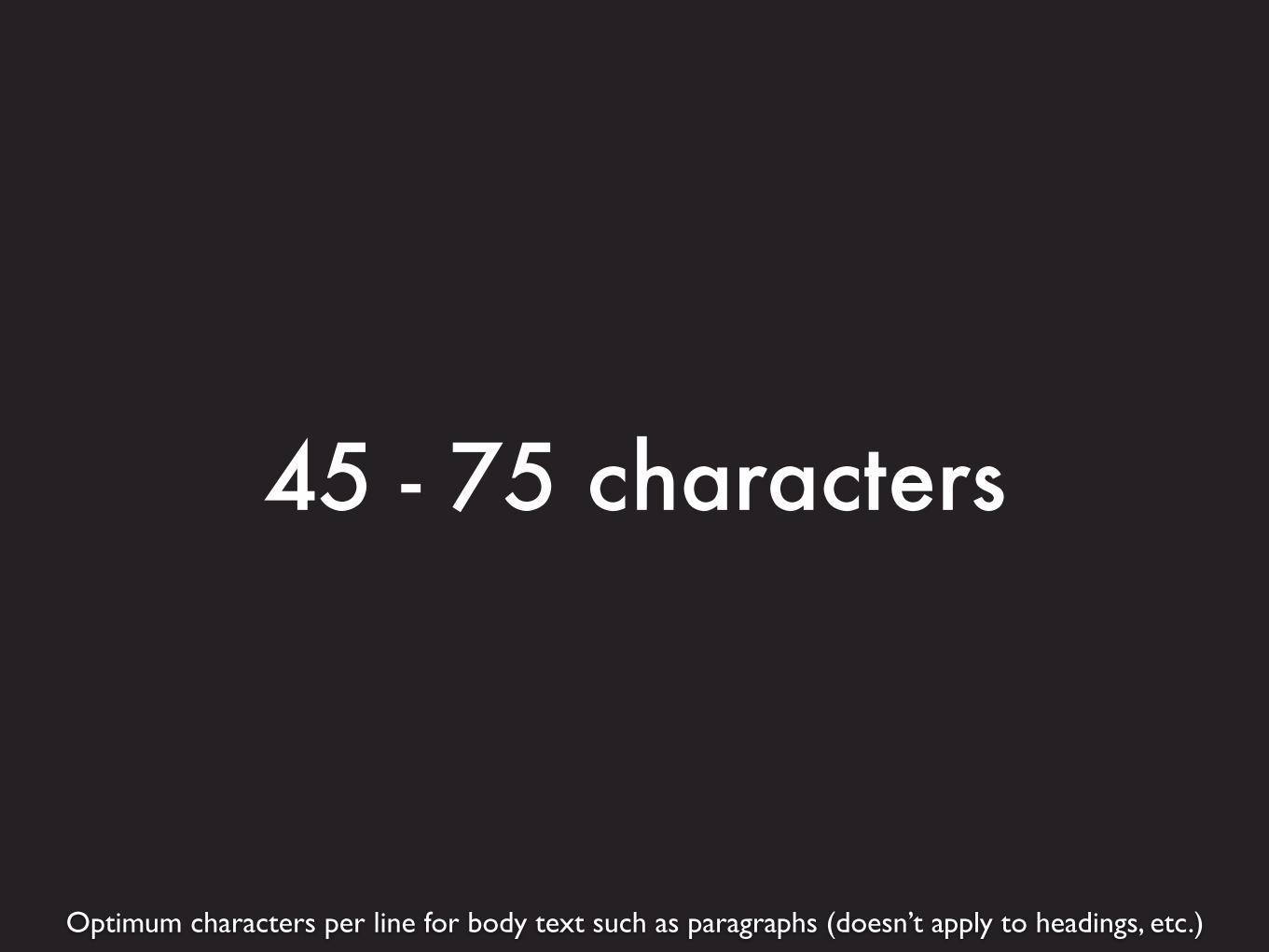
Optimum characters per line for body text such as paragraphs (doesn’t apply to headings, etc.)
45 - 75 characters

Remember: to design around line length, it’s important to select thetypeface first, because they’re different sizes.
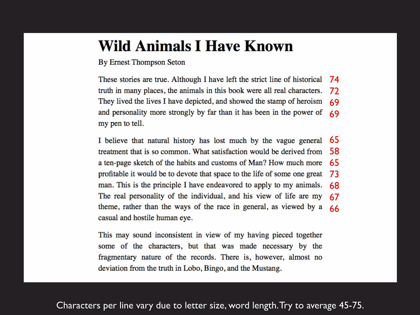
Characters per line vary due to letter size, word length. Try to average 45-75.
65586573686766
74726969

You should test line length as you’re designing a layout, to stay within the optimal range.
Testing Line Length

One easy way to test: count from 45th to 75th character on the first line, and use a span to color it.
45 75
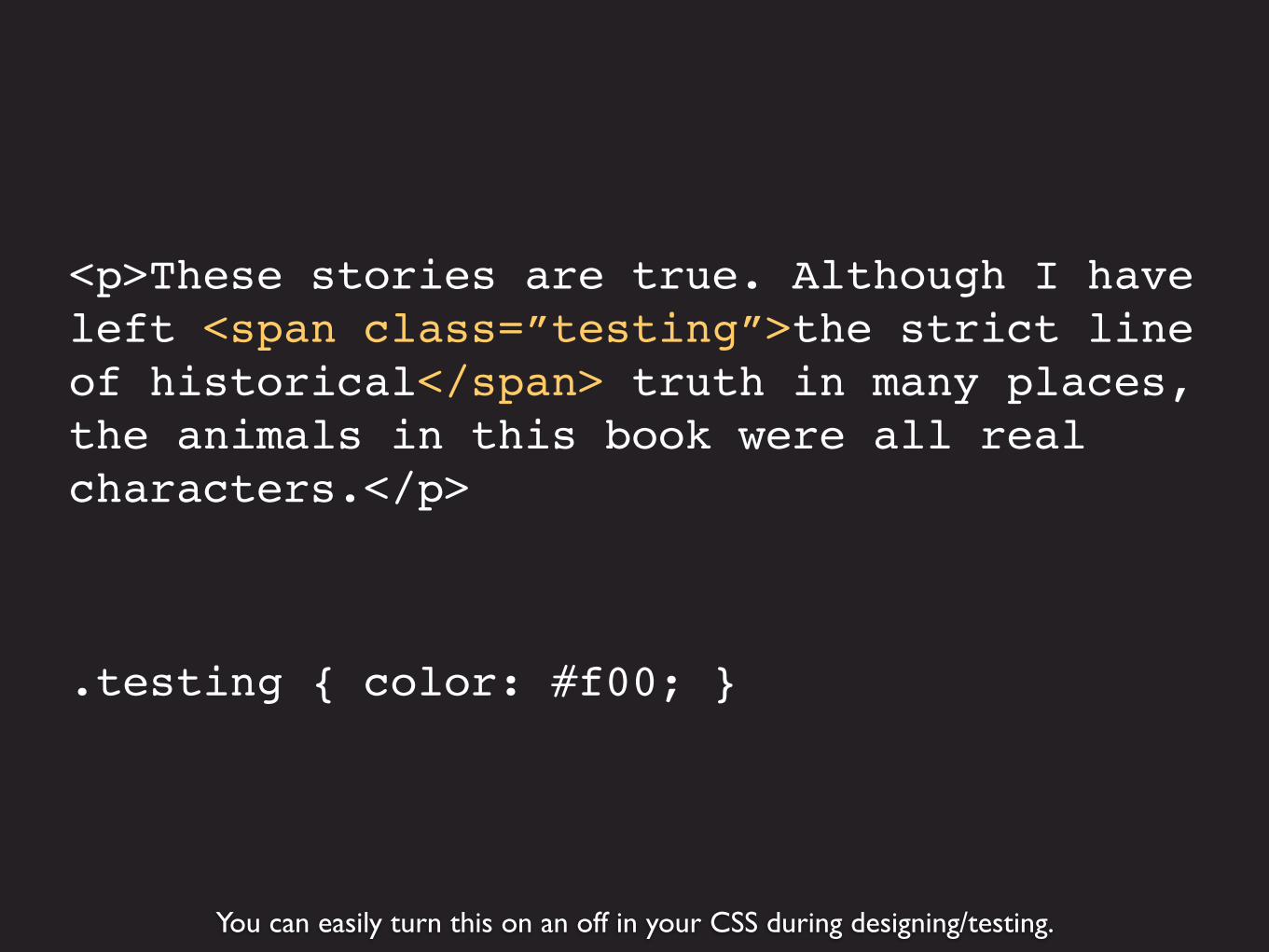
You can easily turn this on an off in your CSS during designing/testing.
<p>These stories are true. Although I have left <span class=”testing”>the strict line of historical</span> truth in many places, the animals in this book were all real characters.</p>
.testing { color: #f00; }
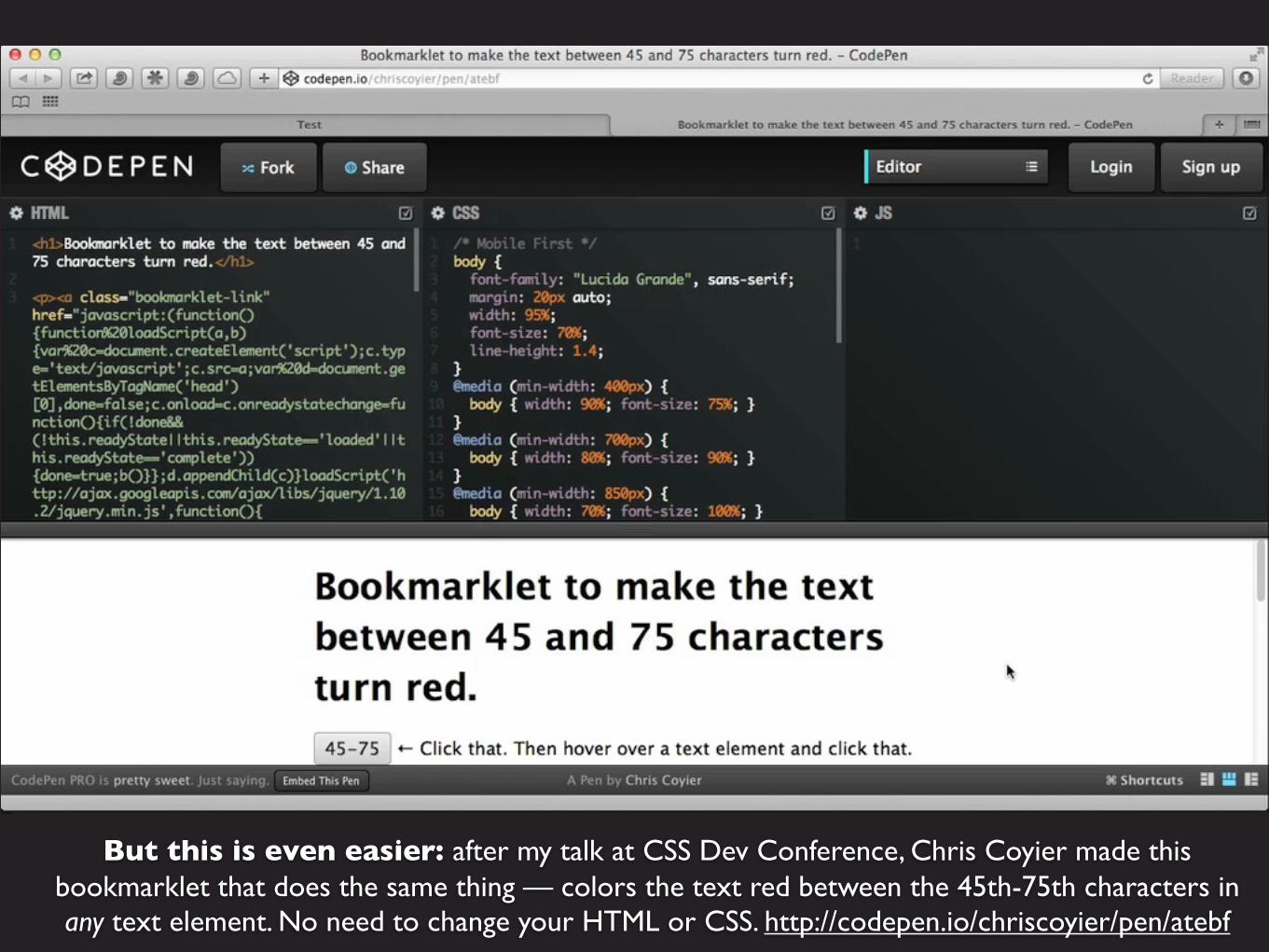
But this is even easier: after my talk at CSS Dev Conference, Chris Coyier made thisbookmarklet that does the same thing — colors the text red between the 45th-75th characters inany text element. No need to change your HTML or CSS. http://codepen.io/chriscoyier/pen/atebf

Add the bookmarklet to your browser’s bookmarks. Click it, then hoverover the element you want to select — it will be outlined in red...

And click to select that element. The 45th-75th characters will be colored red, and will stayred as you change the size of the browser window (unless you refresh the page.)

The main methods to adjust line length are changing the margins and changing the font size.
Margins & Font Size
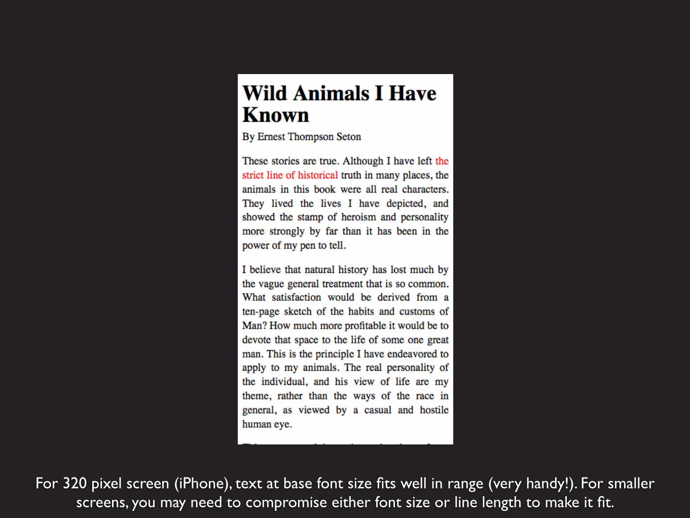
For 320 pixel screen (iPhone), text at base font size fits well in range (very handy!). For smallerscreens, you may need to compromise either font size or line length to make it fit.

Use narrow margins on small screens to not waste space, but don’t havemargins of zero. The example on the previous slide is 3% margin on each side.
article { margin: 15px 3%;}

article { margin: 15px auto; width: 94%;}
Using width also gives you margins.

You can use either percentage or margins to set the width of an element.

If you use percentage, the element width will change with the page width.

Using ems means the element width depends on the font size.
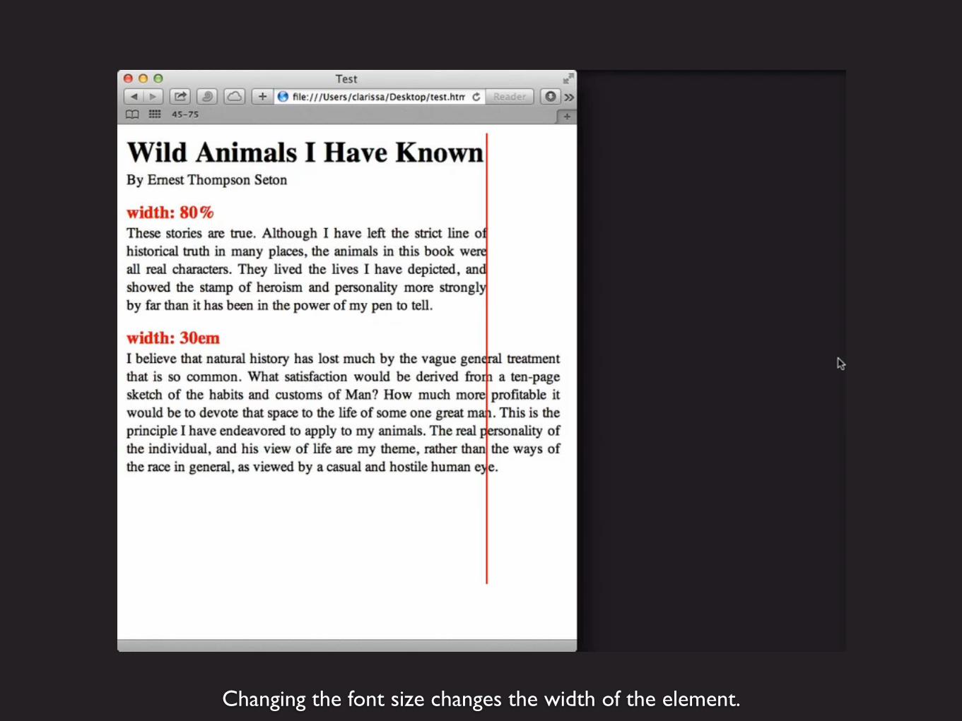
Changing the font size changes the width of the element.

On our example page, starting out with a good line length.
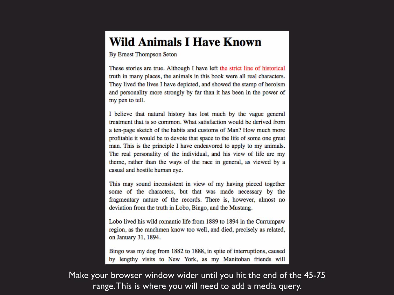
Make your browser window wider until you hit the end of the 45-75range. This is where you will need to add a media query.

Keep a tool like this open in another tab. Once the browser window is at the width where you need a media query, switch to this tab and easily see that window is now 31 ems. http://mqtest.io/
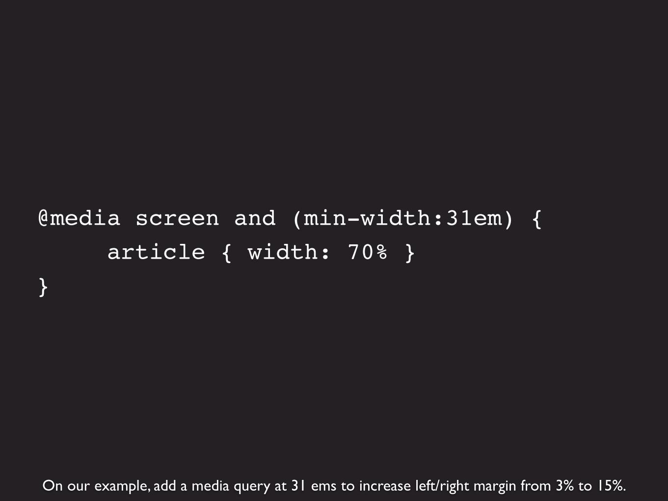
On our example, add a media query at 31 ems to increase left/right margin from 3% to 15%.
@media screen and (min-width:31em) { article { width: 70% } }

This is the page at a width of slightly less than 31 ems.

This is the page at slightly more than 31 ems. The media query has increased the margins.

Again expand the browser window to the end of the 45-75 character range. Now we’re at 40 ems.
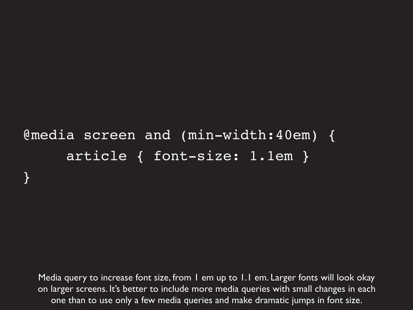
Media query to increase font size, from 1 em up to 1.1 em. Larger fonts will look okayon larger screens. It’s better to include more media queries with small changes in each
one than to use only a few media queries and make dramatic jumps in font size.
@media screen and (min-width:40em) { article { font-size: 1.1em }}

This is the page at slightly less than 40 ems.
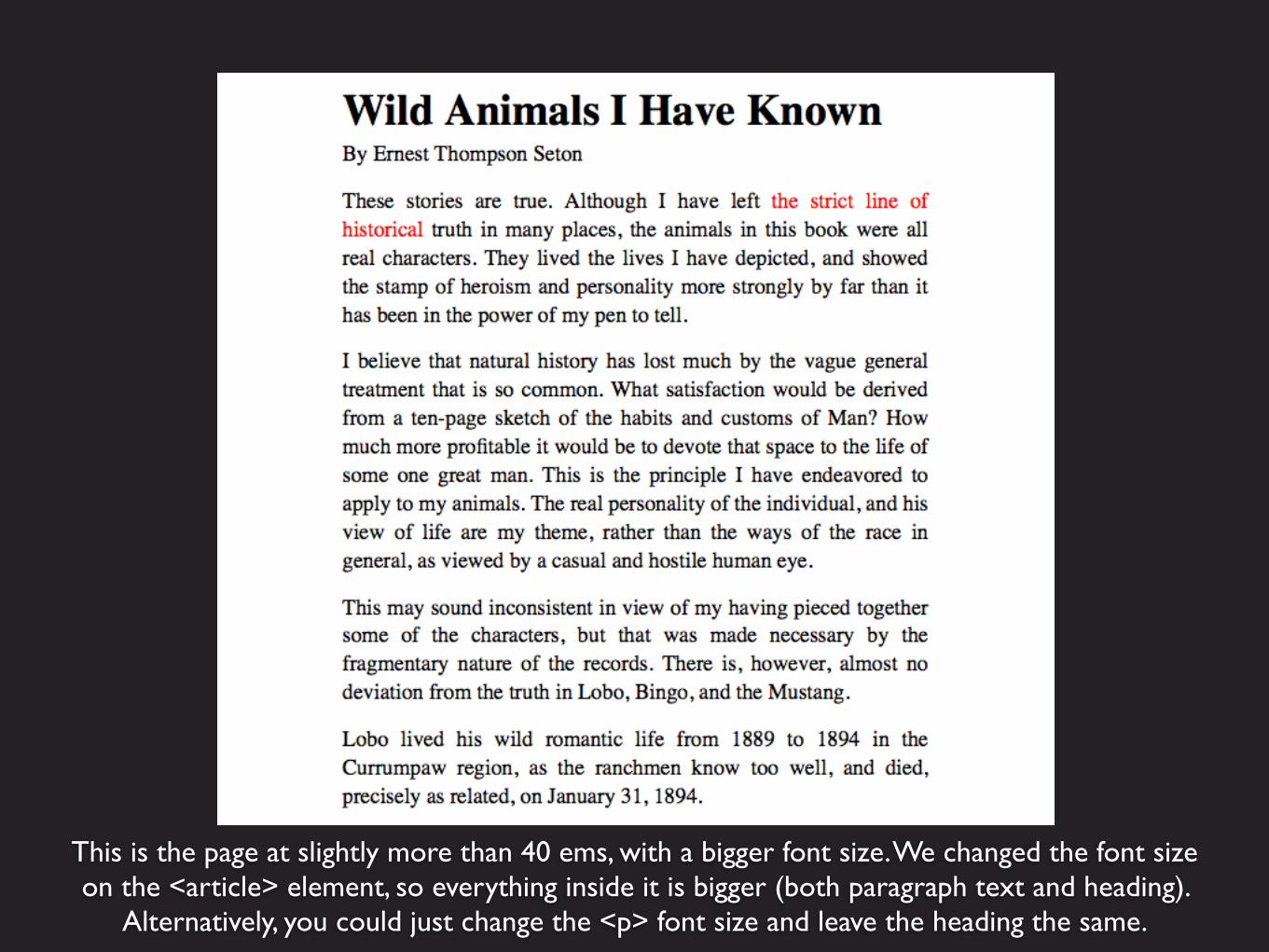
This is the page at slightly more than 40 ems, with a bigger font size. We changed the font sizeon the <article> element, so everything inside it is bigger (both paragraph text and heading).
Alternatively, you could just change the <p> font size and leave the heading the same.
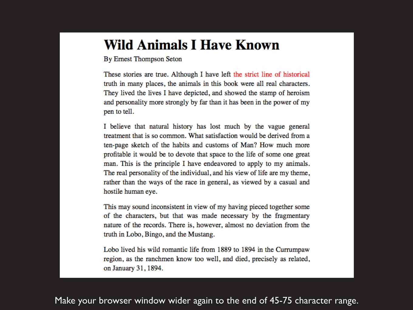
Make your browser window wider again to the end of 45-75 character range.

A media query here changed both the margins and the font size.
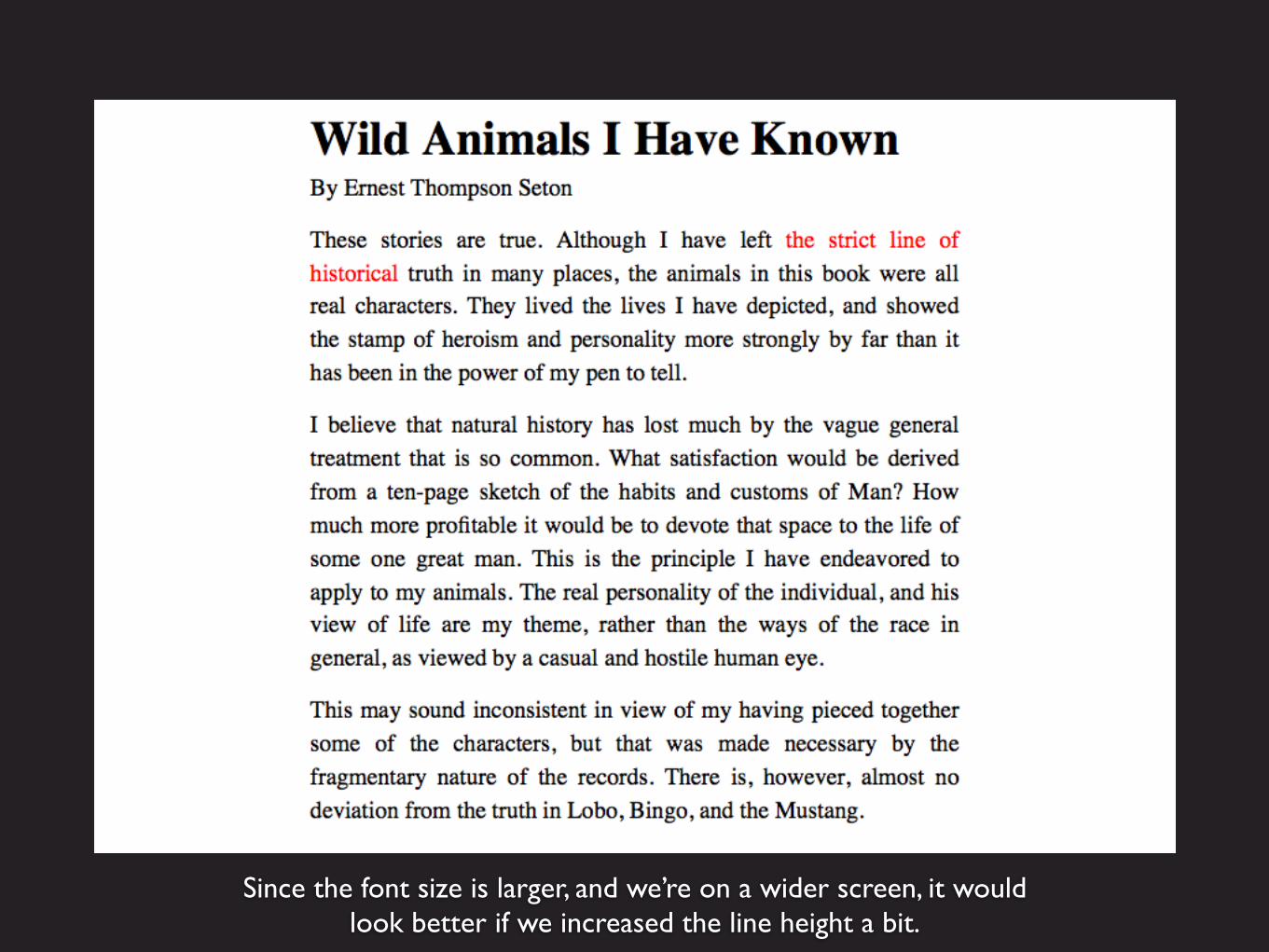
Since the font size is larger, and we’re on a wider screen, it would look better if we increased the line height a bit.

Add line height to the media query. Only increase the line height for the <p> (paragraph text), not everything in <article>, because the heading line height doesn’t need to change.
@media screen and (min-width:55em) { article { font-size: 1.2em } p { line-height: 1.5 }}
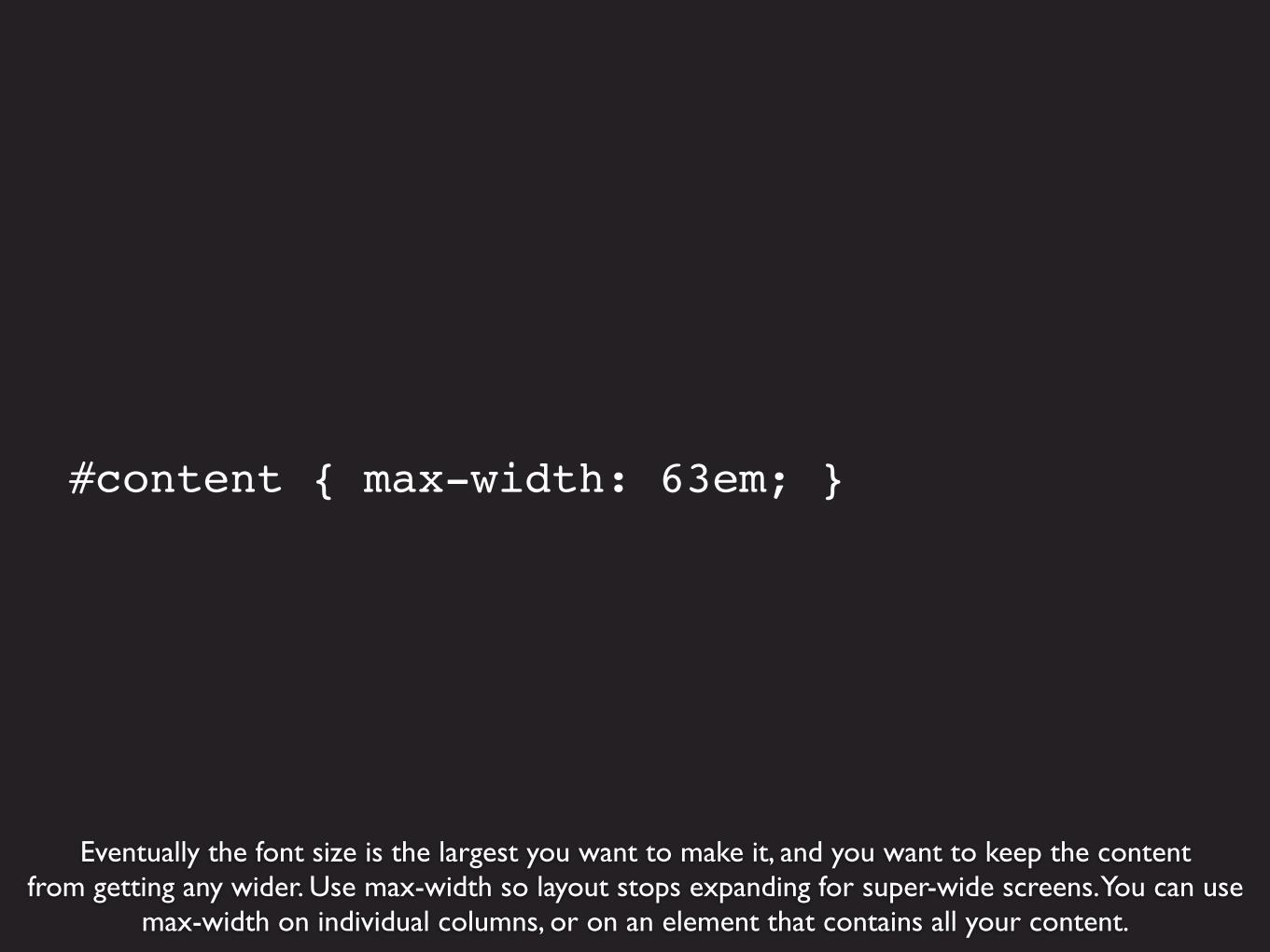
Eventually the font size is the largest you want to make it, and you want to keep the contentfrom getting any wider. Use max-width so layout stops expanding for super-wide screens. You can use
max-width on individual columns, or on an element that contains all your content.
#content { max-width: 63em; }

Real example, Trent Walton’s site. 45-75 characters highlighted. http://trentwalton.com

Starting at the most narrow width, the container is 88% (6% margin on each side).The font-isze starts at 100% (base font size for the browser).
body { font-size: 100%; }
.container { width: 88%; margin-left: auto; margin-right: auto; max-width: 1260px;}
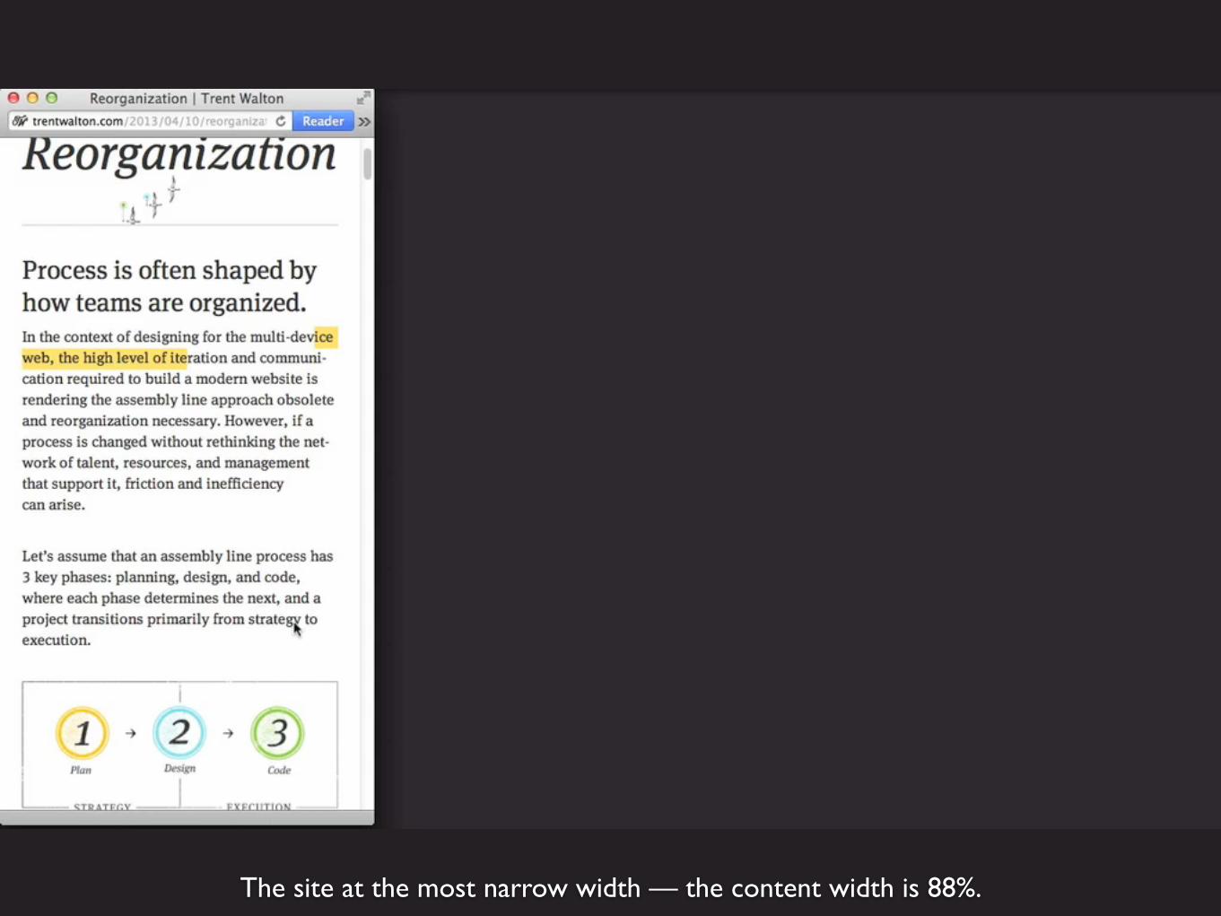
The site at the most narrow width — the content width is 88%.

As we make the browser window wider, the content is still 88% width.
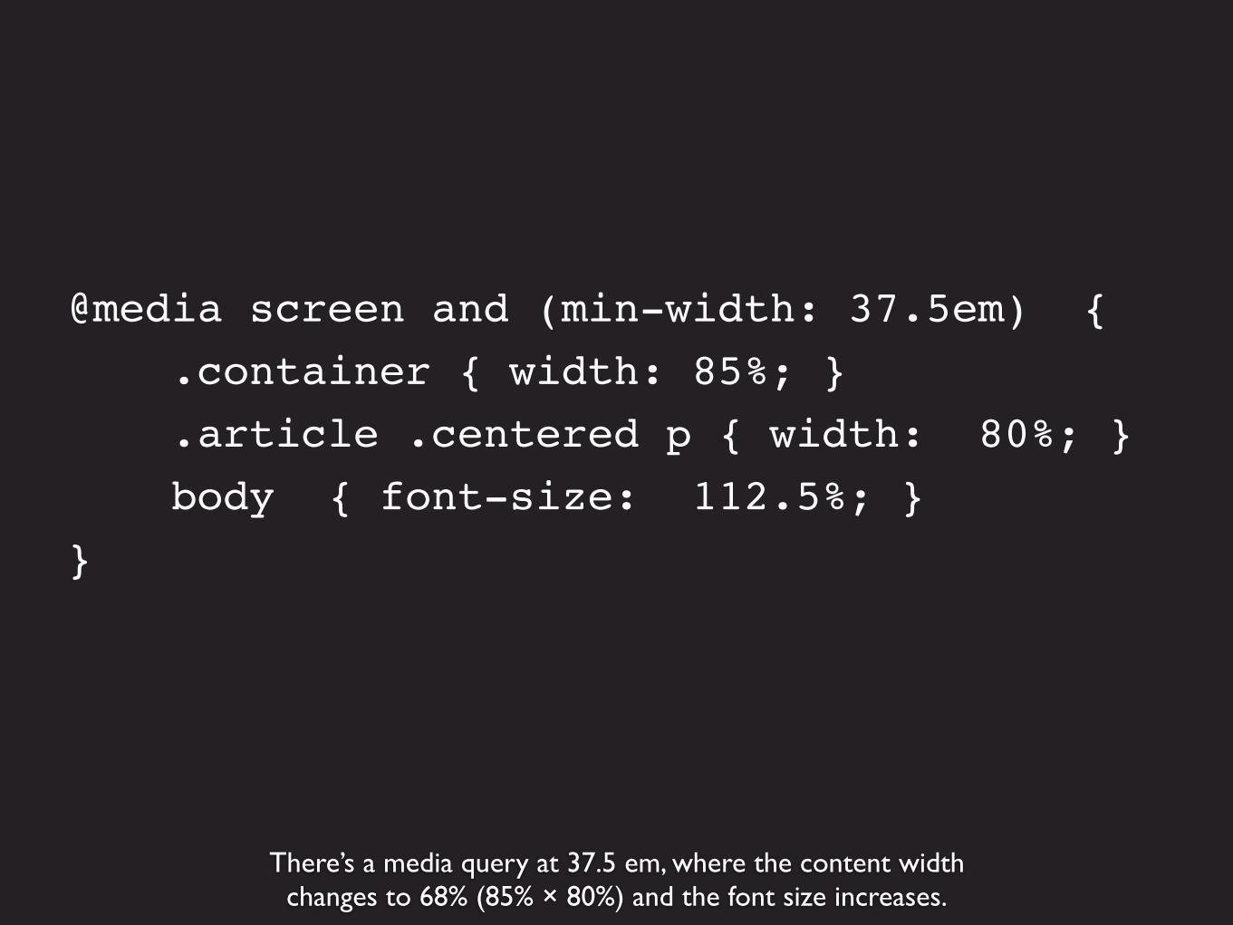
There’s a media query at 37.5 em, where the content widthchanges to 68% (85% × 80%) and the font size increases.
@media screen and (min-width: 37.5em) { .container { width: 85%; } .article .centered p { width: 80%; } body { font-size: 112.5%; }}
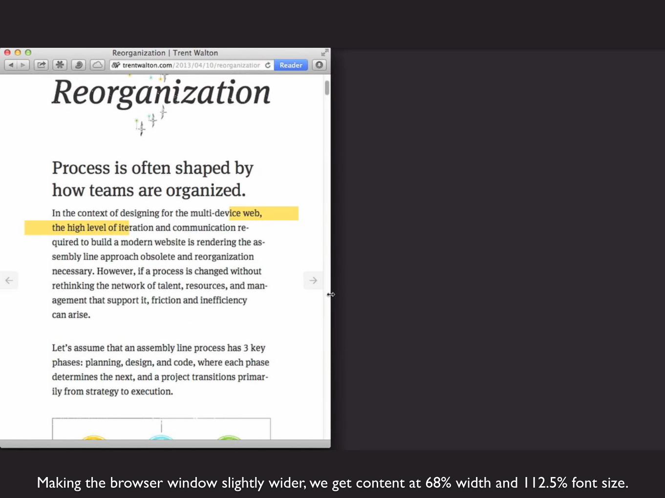
Making the browser window slightly wider, we get content at 68% width and 112.5% font size.
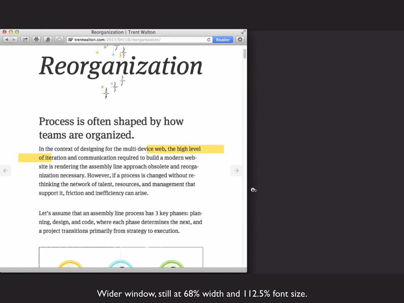
Wider window, still at 68% width and 112.5% font size.
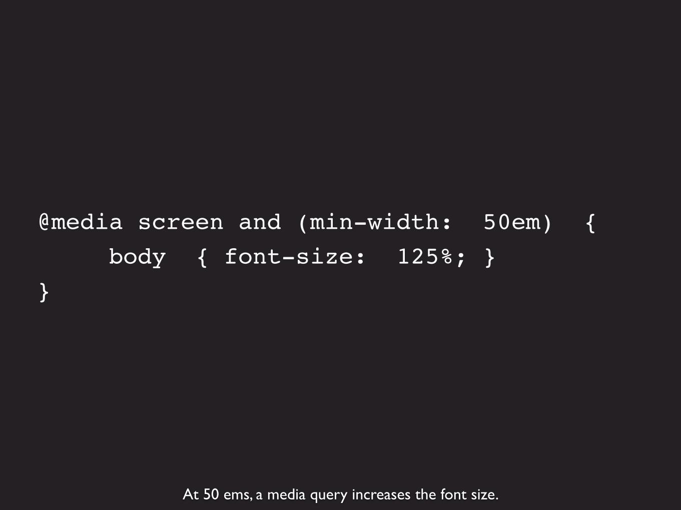
At 50 ems, a media query increases the font size.
@media screen and (min-width: 50em) { body { font-size: 125%; }}

Now we’re up to 125% font size.
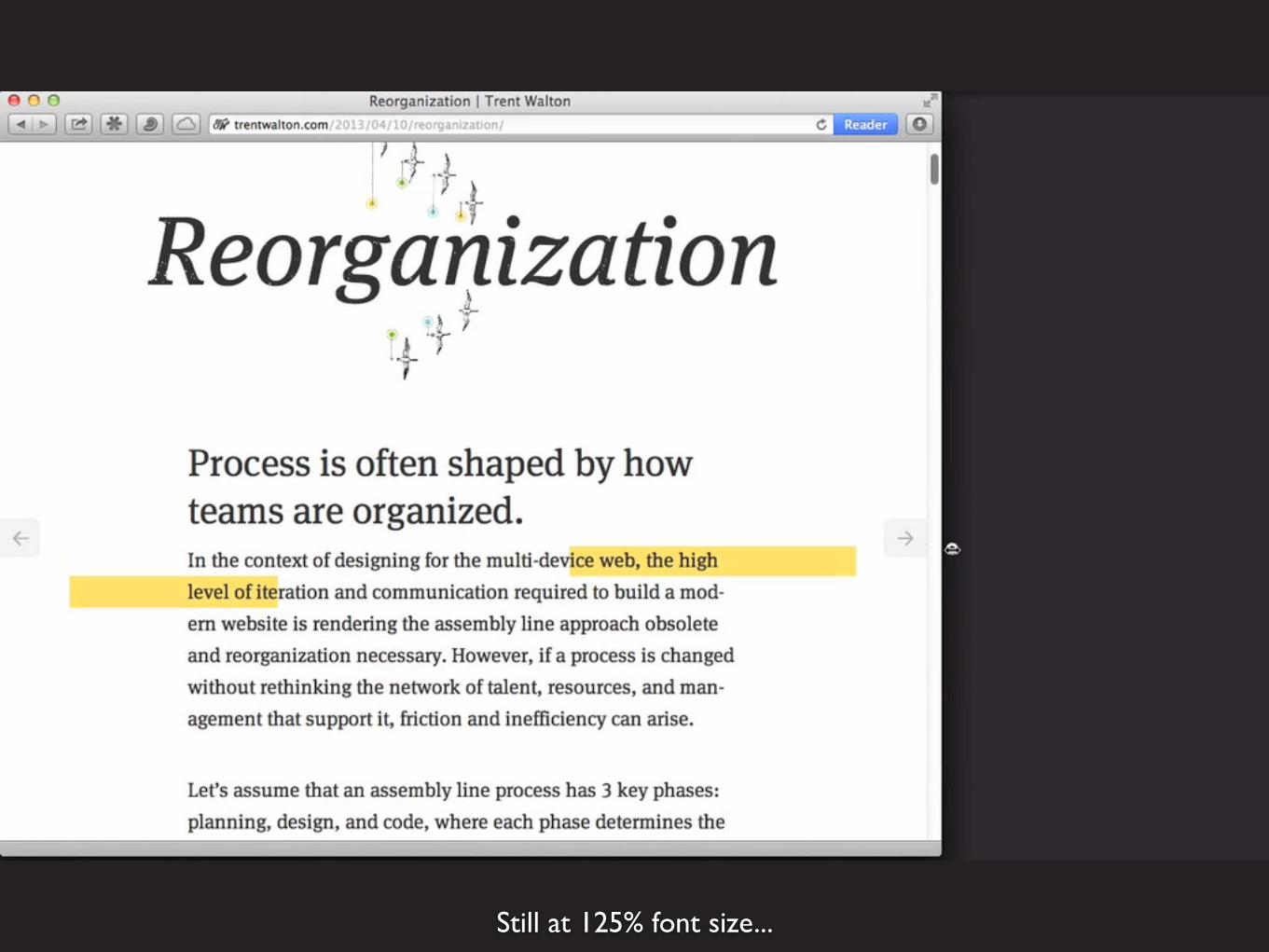
Still at 125% font size...
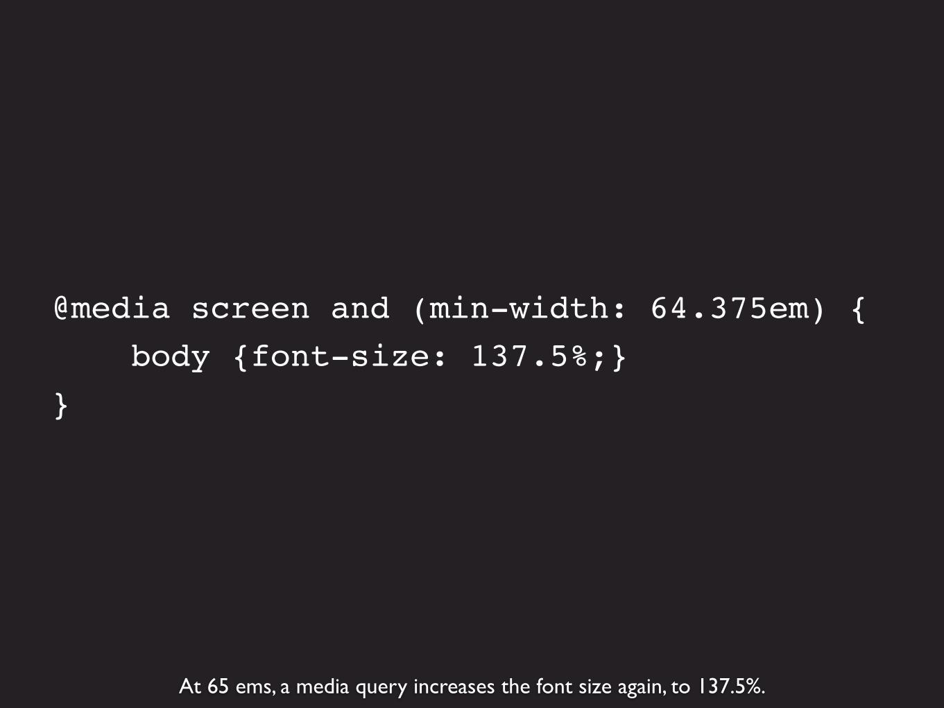
At 65 ems, a media query increases the font size again, to 137.5%.
@media screen and (min-width: 64.375em) { body {font-size: 137.5%;}}
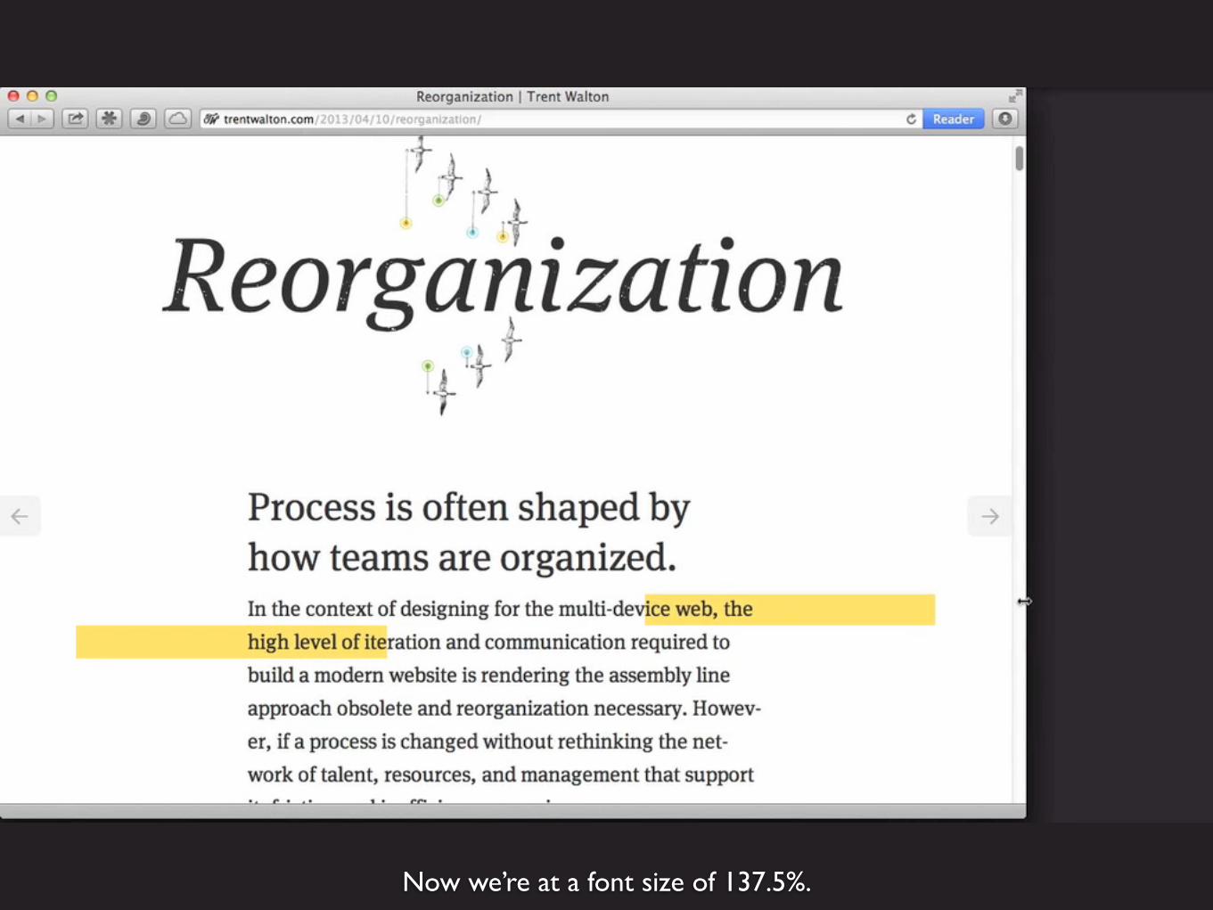
Now we’re at a font size of 137.5%.

At 75 ems, a media query increases the font size, but only if screen is tall enough (so not forwide laptop screens where the vertical space is taken up with lots of browser toolbars)
@media screen and (min-width: 75em) and (min-height: 31.25em) { body {font-size: 150%;}}

Here we’re up to a font-size of 150%. It looks good on a wide screen.

Using max-width to keep the layout from getting wider.
@media screen and (min-width: 106.875em) and (min-height: 50em) { body {font-size: 162.5%;} .container {max-width:1360px;}}
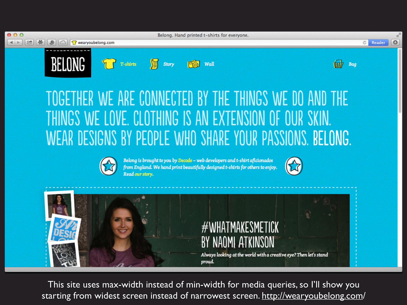
This site uses max-width instead of min-width for media queries, so I’ll show youstarting from widest screen instead of narrowest screen. http://wearyoubelong.com/

Start with 100% font size, then a media query takes it down to 90% at 800 pixels ornarrower, and 80% at 680 or narrower. (Yes, media queries should be in ems.)
body { font-size: 100%; }
@media screen and (max-width:800px) { body { font-size:90%; }}
@media screen and (max-width:680px) { body { font-size:80%; }}
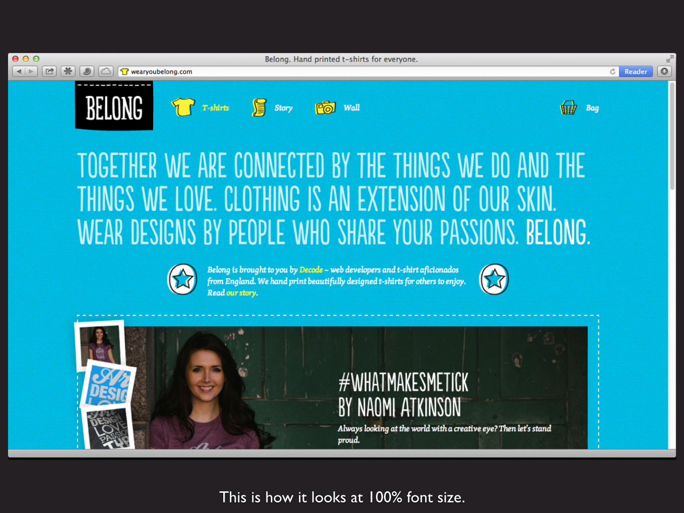
This is how it looks at 100% font size.
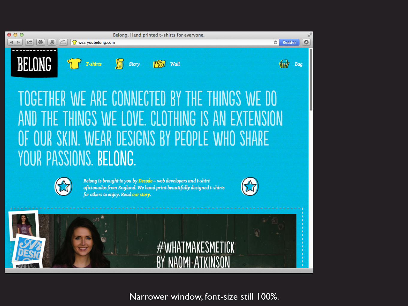
Narrower window, font-size still 100%.

As the window gets narrower, we’re down to 90%. The media querychanges the font size on the body element, so all of the text gets smaller.

At a width of 680 pixels, the font-size goes down to 80%.
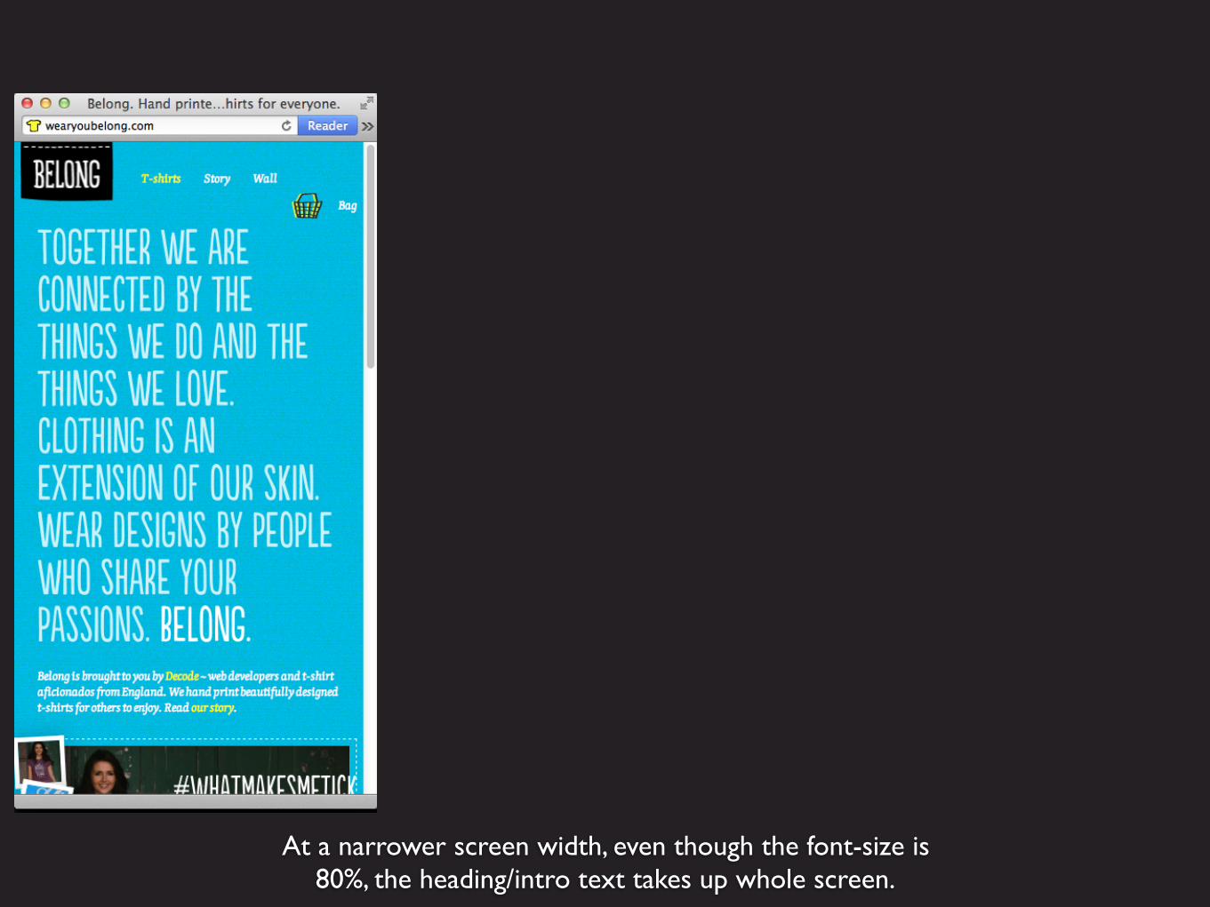
At a narrower screen width, even though the font-size is80%, the heading/intro text takes up whole screen.
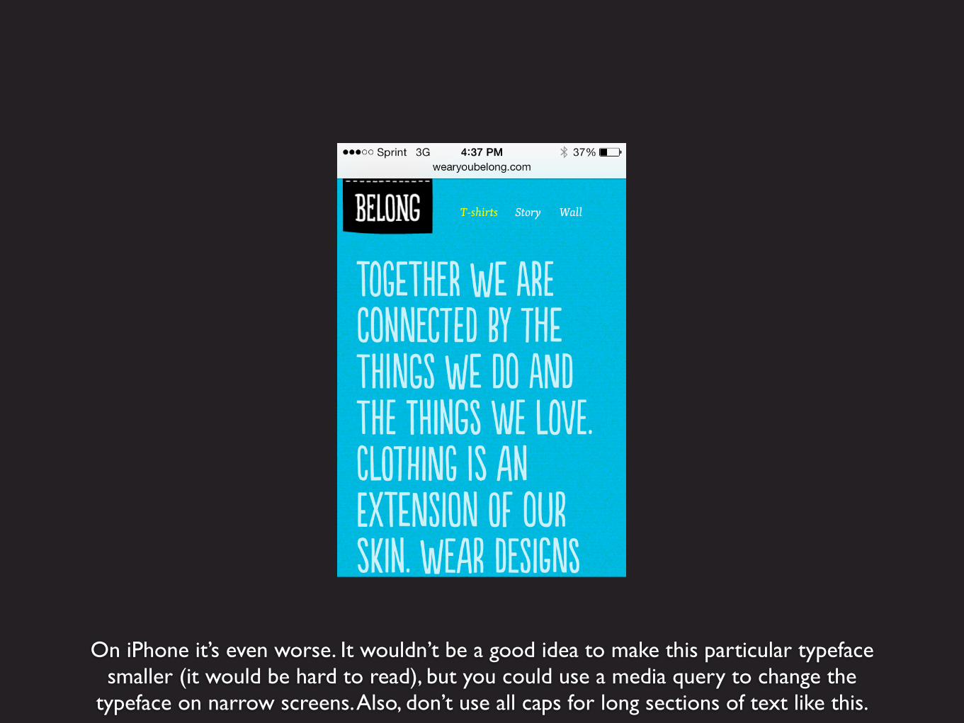
On iPhone it’s even worse. It wouldn’t be a good idea to make this particular typefacesmaller (it would be hard to read), but you could use a media query to change the
typeface on narrow screens. Also, don’t use all caps for long sections of text like this.
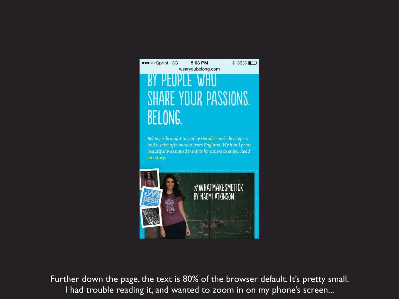
Further down the page, the text is 80% of the browser default. It’s pretty small.I had trouble reading it, and wanted to zoom in on my phone’s screen...

But they used maximum-scale=1.0, which takes away the ability to zoom. Don’t ever do this.
<meta name="viewport" content="width=device-width; initial-scale=1.0; maximum-scale=1.0;">
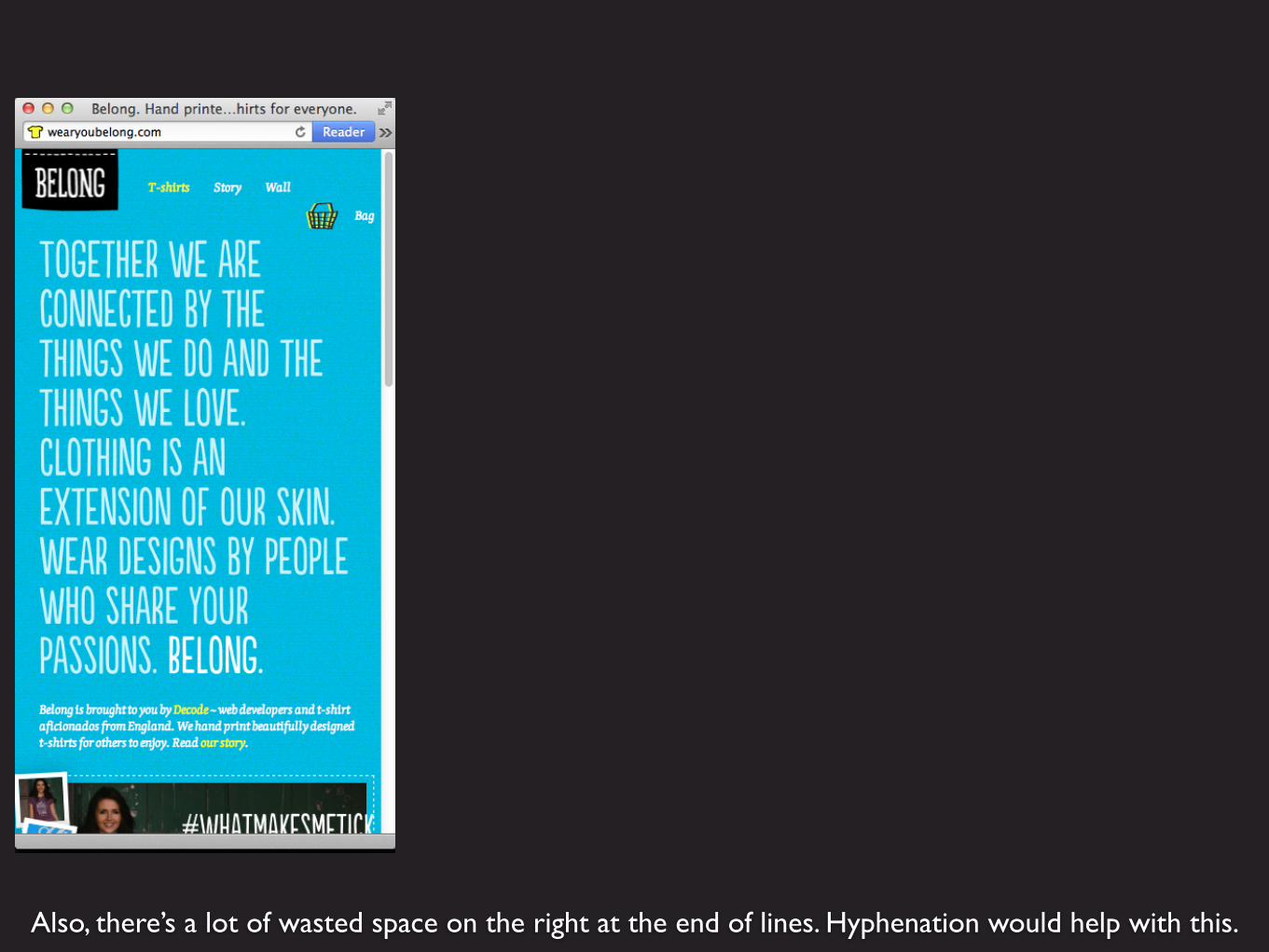
Also, there’s a lot of wasted space on the right at the end of lines. Hyphenation would help with this.
You can even out the length of lines by letting long words wrap onto next line.
Hyphenation
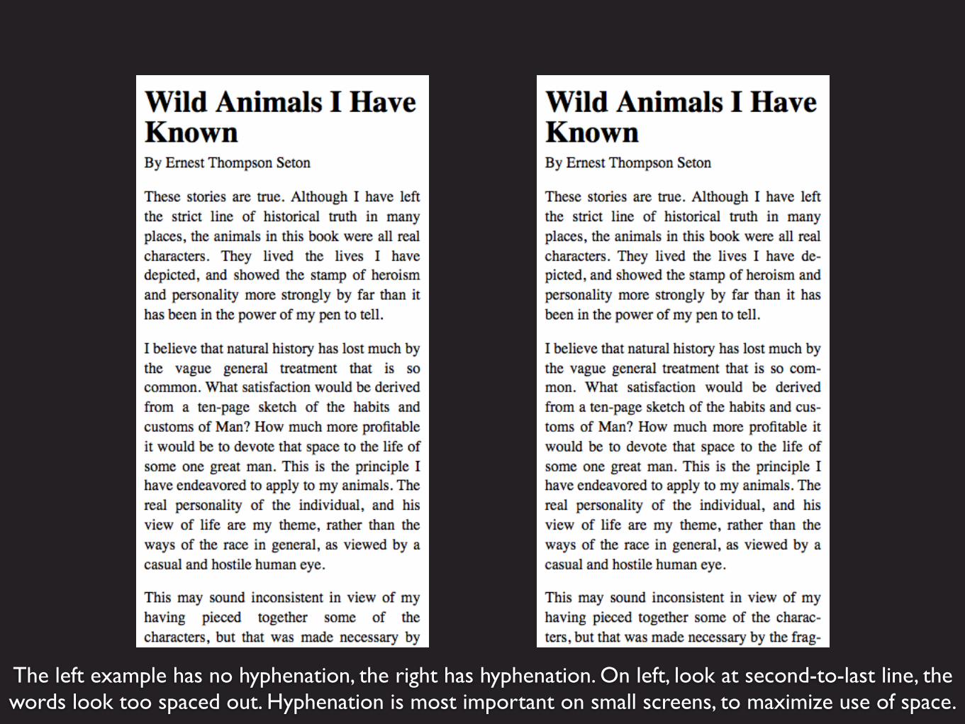
The left example has no hyphenation, the right has hyphenation. On left, look at second-to-last line, the words look too spaced out. Hyphenation is most important on small screens, to maximize use of space.
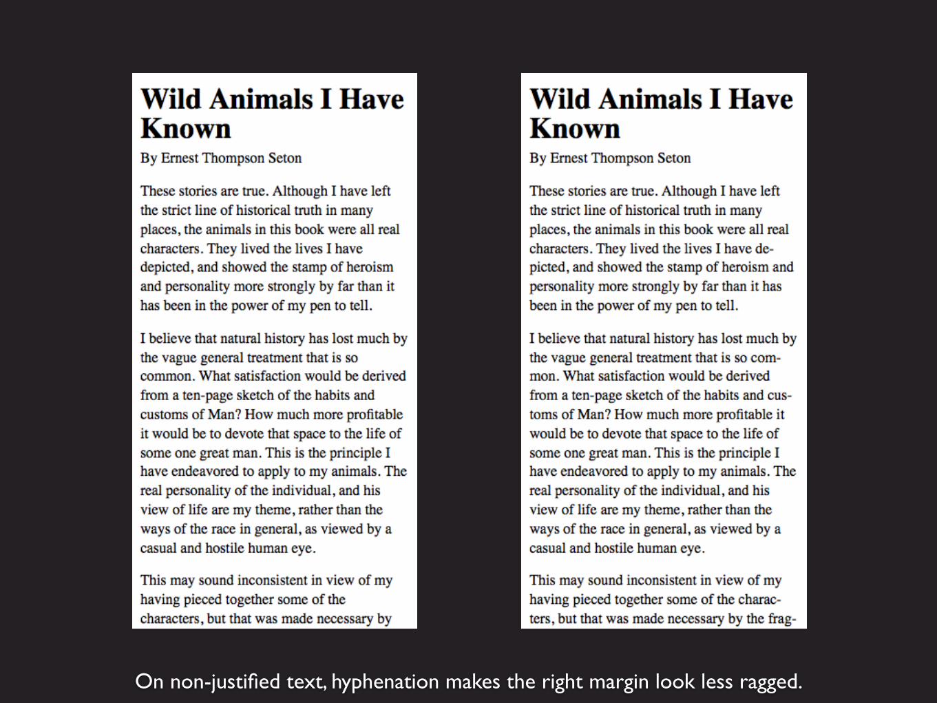
On non-justified text, hyphenation makes the right margin look less ragged.
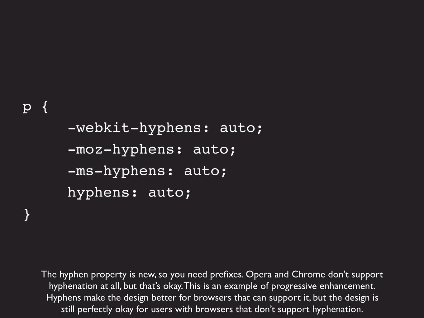
The hyphen property is new, so you need prefixes. Opera and Chrome don’t supporthyphenation at all, but that’s okay. This is an example of progressive enhancement.
Hyphens make the design better for browsers that can support it, but the design isstill perfectly okay for users with browsers that don’t support hyphenation.
p { -webkit-hyphens: auto; -moz-hyphens: auto; -ms-hyphens: auto; hyphens: auto;}
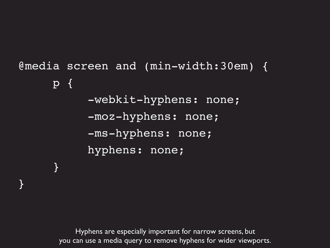
Hyphens are especially important for narrow screens, butyou can use a media query to remove hyphens for wider viewports.
@media screen and (min-width:30em) { p { -webkit-hyphens: none; -moz-hyphens: none; -ms-hyphens: none; hyphens: none; }}
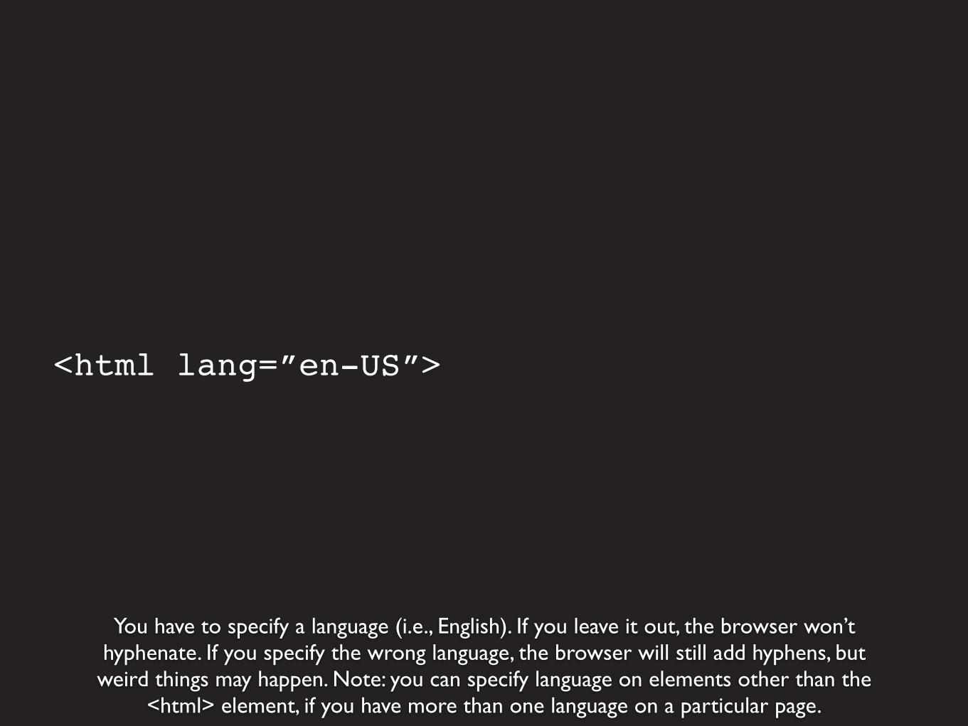
You have to specify a language (i.e., English). If you leave it out, the browser won’thyphenate. If you specify the wrong language, the browser will still add hyphens, butweird things may happen. Note: you can specify language on elements other than the
<html> element, if you have more than one language on a particular page.
<html lang=”en-US”>
Responsive Typography Resources
The Elements of Typographic Style Applied to the Web – Richard Rutterhttp://webtypography.net/toc/
Fluid Type – Trent Waltonhttp://trentwalton.com/2012/06/19/fluid-type/
Responsive Web Typography – Jason Cranford Teaguehttp://www.jasonspeaking.com/rwt/#/
Web Typography You Should Do Now – Richard Rutterhttp://webtypography.net/talks/sxsw2013/
Prototyping Responsive Typography – Viljami Salminenhttp://viljamis.com/blog/2013/prototyping-responsive-typography/
Responsive Web Design and Typography – Danny Caldersthttp://www.slideshare.net/dannycalders/typography-responsive-web-design
Clarissa Peterson
@clarissaclarissapeterson.com