Research opportunity for this quarter/summer Efthimis N. Efthimiadis.
78
-
date post
19-Dec-2015 -
Category
Documents
-
view
216 -
download
1
Transcript of Research opportunity for this quarter/summer Efthimis N. Efthimiadis.


Research opportunity for this quarter/summer
Efthimis N. Efthimiadis

INFO 424 Week 5
Take-home exam due WednesdayNo quiz this Friday (moved to next Friday)

Review

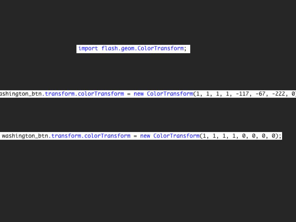
Analyze/emulate textPark-style mapMake info box appear & follow mouseMake info box text change

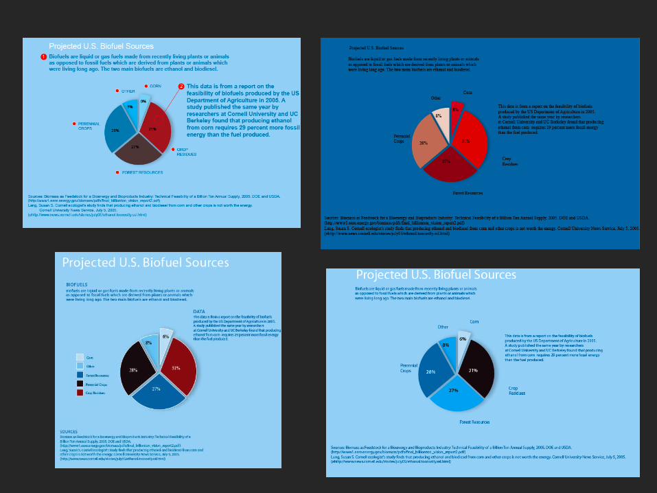
Nigel Holmes

There are 4 colors of text:
White, dark blue, black and red.

There are 4 colors of text:
White is used for the titleDark blue is used for almost everything elseBlack and Red are each used just once

There are 4 colors of text:
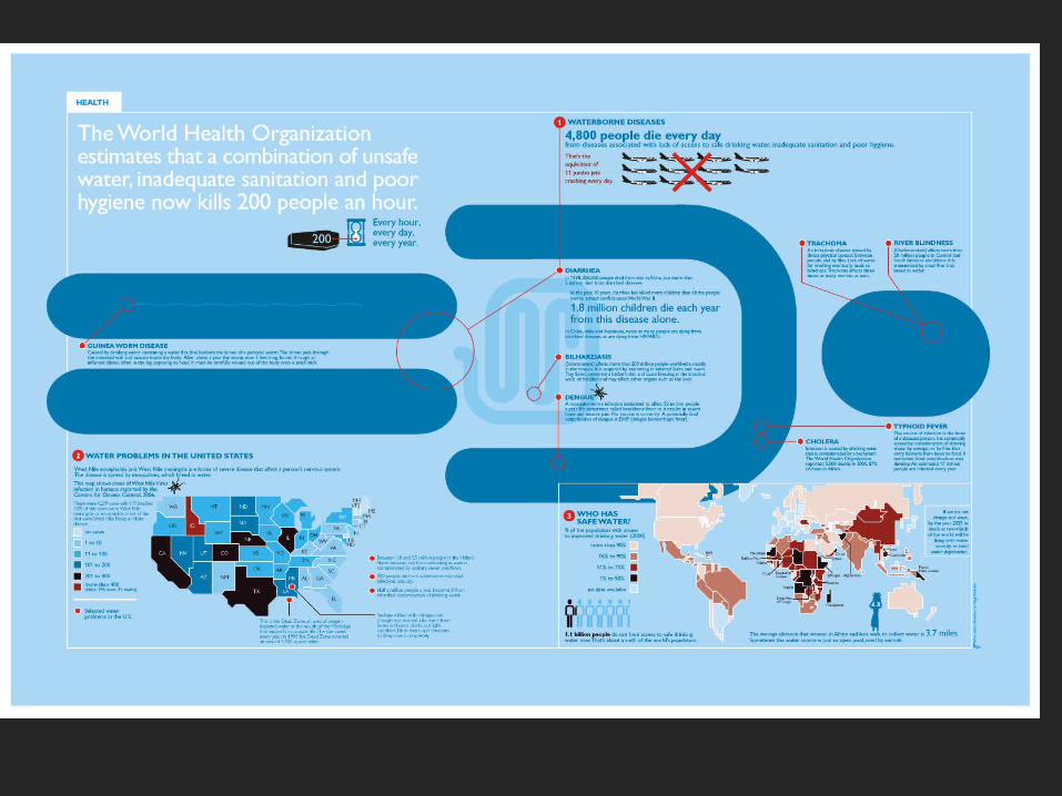
White is used for the title. Since it’s both the only white text and the largestText, it stands out.Dark blue is used for almost everything else including all of labels, sectionHeadings and annotations.Black and Red are each used just once, in both cases to add emphasis.
There are 4 colors of text:
White is used for the title which gives an overview of the topic of the visualDark blue is used for almost everything – the labels that name the diseases and pointTo where they occur in the body, the descriptions that explain the diseases in detail,The facts about how many people are affected and where they live.Black is used for ‘1.1 billion people’ and red for the sentence that compares numberof people to number of people who can fit in an airplane.

There are 4 colors of text:
White is used for the title. Since it’s both the only white text and the largesttext, it stands out immediately. In fact, it’s the only white element onthe page other than the the lines used to create border and a handful ofother minor spots (the background of the ‘tab’, the white sand in the hourglass,the names of states colored black, and the logo on the plane).

Dark blue against a pale blue background is used for almost everything else including most of labels which are consistently also bold, all caps, and of the same, medium sizemaking them easy to scan for and creating unity – the red circles next to each labelalso make them easy to scan for.

The three section headings also get essentially the same treatment, though they’re slightly larger and their red circles each have thesection number inside.
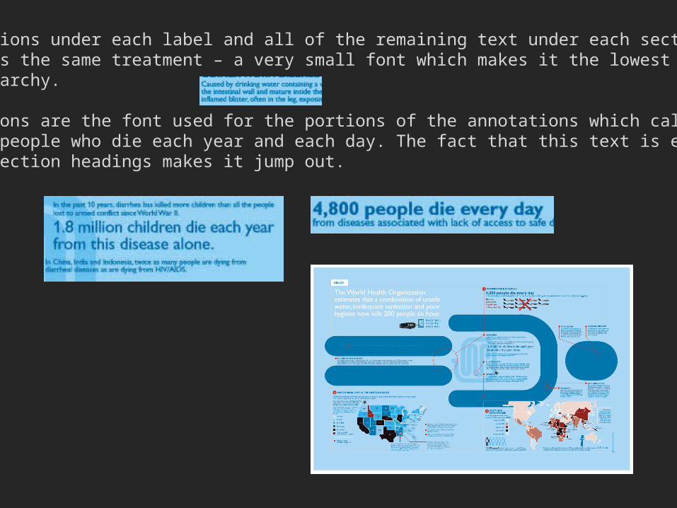
The annotations under each label and all of the remaining text under each section heading gets the same treatment – a very small font which makes it the lowest in the visual hierarchy.
Two exceptions are the font used for the portions of the annotations which call out the numbers of people who die each year and each day. The fact that this text is even larger than the section headings makes it jump out.

Black and Red are each used just once, in both cases to add emphasis andto associate those bits of text with a visual element which has the same color.

Association strategies

Precision labels

What do you see?


Analyze/emulate text
Park-style mapMake info box appear & follow mouseMake info box text change


Analyze/emulate textPark-style map
Make info box appear & follow mouseMake info box text change
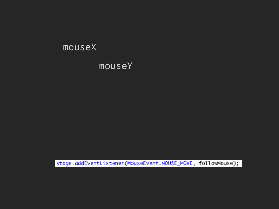
mouseX
mouseY


Preview

Choropleth mapStore data in XMLDraw with AS
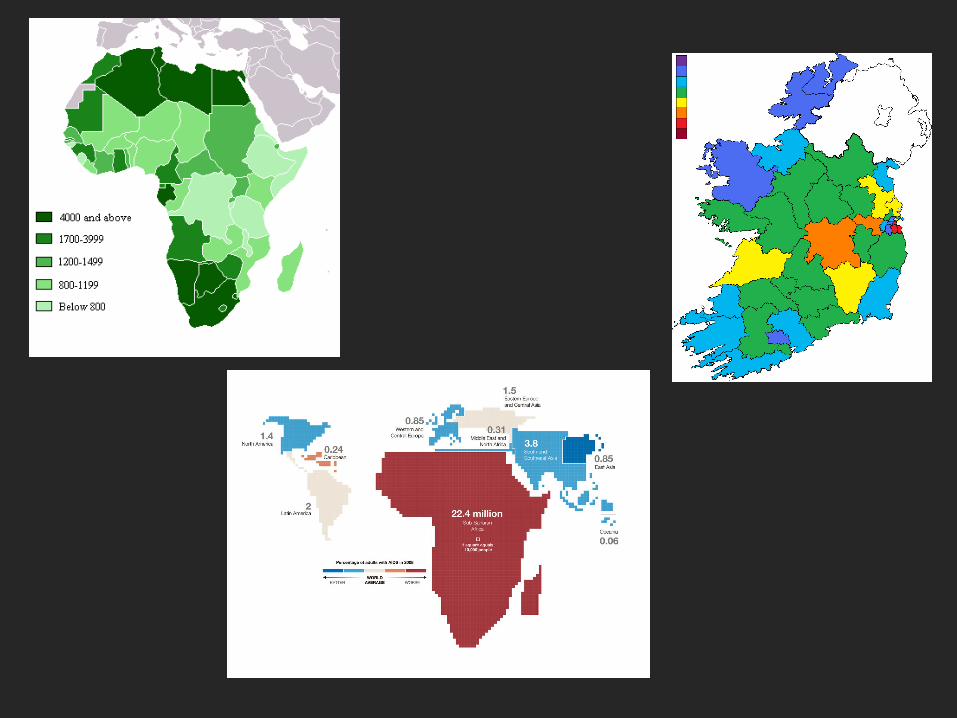

Choropleth map
Store data in XMLDraw with AS

<metadatas>
<item id="Book 1"><bookTitle>War and Peace</bookTitle><bookAuthor>Leo Tolstoy</bookAuthor>
</item>
<item id="Book 2"><bookTitle>Harry Potter</bookTitle><bookAuthor>JK Rowling</bookAuthor>
</item>
</metadatas>
titleText_txt.text = myXML.item.(@id=='Book 1').bookTitle;titleText_txt.text = myXML.item[0].bookTitle;
var myXML:XML;


Choropleth mapStore data in XML
Draw with AS

sprite graphics
textField
textFormat

mySprite.xmySprite.y
mySprite.graphics.drawCircle(0,0,60);

Thinking Perceptually


Effective visual perception
Jacque Bertin


Jacques BertinMatrix Theory of GraphicsInformation Design Journal 10(1)5-19, 2000/2001

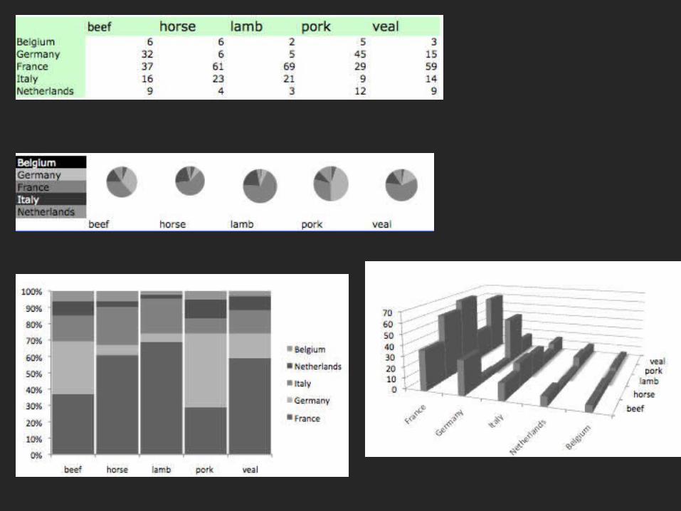
Small multiples


Once you have your central information, look for ways to create contextWHY?Helps answer the ‘so what’ question
HOW?Add comparable dataAdd other data

0
50,000
100,000
150,000
200,000
250,000
300,000
350,000
Size of Residence Halls, UW
gros
s squ
are
feet
Basic Information, without context

…add comparable data (the same type of data)


analysis: NY Times Emissions Graphic
http://www.nytimes.com/interactive/2009/12/05/world/climate-graphic-background.html

SUMMARY


![Warragul - Microsoft · 2020. 11. 19. · 6 OUR BOY BENNY [M] More than capable, threat with a clear passage Owner(s): Pup to Track Five (SYN), C Reynolds, R Efthimiadis, S Efthimiadis,](https://static.fdocuments.in/doc/165x107/60bfd38616751a48e6504e77/warragul-microsoft-2020-11-19-6-our-boy-benny-m-more-than-capable-threat.jpg)