Reengineering the eVM Mortality Surveilance Portal · Reengineering the eVM Mortality Surveilance...
82
Reengineering the eVM Mortality Surveilance Portal Information Collection, Analysis and Publication Filipe Alexandre Clemente Cardoso Thesis to obtain the Master of Science Degree in Biomedical Engineering Supervisor(s): Prof. Mário Jorge Costa Gaspar da Silva Dr. Cátia Sofia de Sousa Pinto Examination Committee Chairperson: Prof. João Miguel Raposo Sanches Supervisor: Prof. Mário Jorge Costa Gaspar da Silva Member of the Committee: Dr. Baltazar Emanuel Guerreiro Nunes Bravo Nunes November 2016
Transcript of Reengineering the eVM Mortality Surveilance Portal · Reengineering the eVM Mortality Surveilance...
Reengineering the eVM Mortality Surveilance PortalInformation Collection, Analysis and Publication
Filipe Alexandre Clemente Cardoso
Thesis to obtain the Master of Science Degree in
Biomedical Engineering
Supervisor(s): Prof. Mário Jorge Costa Gaspar da SilvaDr. Cátia Sofia de Sousa Pinto
Examination Committee
Chairperson: Prof. João Miguel Raposo SanchesSupervisor: Prof. Mário Jorge Costa Gaspar da Silva
Member of the Committee: Dr. Baltazar Emanuel Guerreiro Nunes Bravo Nunes
November 2016

ii

Wherever the art of medicine is loved, there is also a love of humanity.
Hippocrates of Kos
iii

iv

Acknowledgments
I want to present my deepest appreciation for everyone who supported me during the development
of this thesis.
Firstly, I would like to present my gratitude to both my supervisors, Professor Mário Silva and Dr.
Cátia Sousa Pinto, for their guidance and availability during this time. Their knowledge and input was
crucial for the quality of the dissertation here presented. I learned much from both of them.
Thank you to the department of Epidemiology and Vigilance at the DGS, for hosting me as one of
your own, as well as always being available for clearing any doubts I had about the SICO and the eVM.
I felt completely at home during these past months at the department.
I would also like to express my recognition to the SPMS personnel, who made themselves available
for any changes that would come with the new version of the eVM, especially to Cristiana Maia, the
responsible for the eVM, for sitting through countless meetings with us.
A very special and sincere acknowledgment to José Francisco Loff, who accompanied me from day
one, following my work very closely, and always being ready to help me in every question and doubt that
I had. I cannot thank him enough for all his input and support. This work would not have been the way it
is without him.
I can’t forget my friends and colleagues who made this academic journey by my side. Thanks for all
the support and the memories throughout these years. It would not have been the same without you.
Last but not least, to my family: my gratitude for your unconditional love and support during all my
life.
v

vi
Resumo
o eVM (vigilância electrónica da mortalidade) é uma aplicação informática do SICO (Sistema de
Informação dos Certificados de Óbito), da DGS (Direção Geral da Saúde), a autoridade nacional de
saúde pública. Fornece, em tempo quase-real, informação sobre várias características da mortalidade
portuguesa. Desta forma, entidades de saúde pública conseguem agir em conformidade e de forma
oportuna. Esta dissertação apresenta a reengenharia do eVM. Além da reestruturação da arquitectura
de sistema e reorganização do processo de desenvolvimento, o novo eVM adiciona funcionalidades de
análise e uma interface de visualização da informação de mortalidade renovada. Uma avaliação prelim-
inar da nova interface demonstrou uma satisfação do utilizador mais elevada, e testes de desempenho
indicam que os tempos de resposta do eVM melhoraram significativamente.
Palavras-chave: Vigilância de mortalidade, Informática de saúde pública, Vigilância em
tempo quase real
vii

viii
Abstract
The eVM (electronic Mortality Surveillance) is an informatic application of the SICO (Death certifi-
cates information system), from the DGS (Directionate-General of Health), the Portuguese public health
authority. It provides, in near-real-time, information on several characteristics of mortality in Portugal,
enabling public health stakeholders to respond timely. This dissertation presents the reengineering
of eVM. Besides the restructuring of the software architecture and reorganization of the development
process, the new eVM adds functionalities for analysis and a revamped interface for visualization of
mortality information. A preliminary evaluation of the new interface showed improved user satisfaction
and performance tests indicate that eVM response times improved significantly.
Keywords: Mortality Surveillance, Public Health Informatics, Near-real-time surveillance
ix

x
Contents
1 Introduction 1
1.1 Motivation . . . . . . . . . . . . . . . . . . . . . . . . . . . . . . . . . . . . . . . . . . . . . 1
1.2 Objectives . . . . . . . . . . . . . . . . . . . . . . . . . . . . . . . . . . . . . . . . . . . . . 2
1.3 Results . . . . . . . . . . . . . . . . . . . . . . . . . . . . . . . . . . . . . . . . . . . . . . 4
1.4 Methodology . . . . . . . . . . . . . . . . . . . . . . . . . . . . . . . . . . . . . . . . . . . 5
1.5 Thesis Outline . . . . . . . . . . . . . . . . . . . . . . . . . . . . . . . . . . . . . . . . . . 5
2 Background 7
2.1 Public Health Informatics . . . . . . . . . . . . . . . . . . . . . . . . . . . . . . . . . . . . 7
2.2 Public Health Surveillance Systems . . . . . . . . . . . . . . . . . . . . . . . . . . . . . . 8
2.2.1 Evaluation Key Factors of Surveillance Systems . . . . . . . . . . . . . . . . . . . 9
2.3 Mortality Surveillance Systems - State of the Art . . . . . . . . . . . . . . . . . . . . . . . 10
2.3.1 Mortality Surveillance Systems around the World . . . . . . . . . . . . . . . . . . . 10
2.3.2 Mortality Analysis Systems in Portugal . . . . . . . . . . . . . . . . . . . . . . . . . 14
2.4 International Classification of Diseases . . . . . . . . . . . . . . . . . . . . . . . . . . . . . 15
2.5 Summary and Conclusions . . . . . . . . . . . . . . . . . . . . . . . . . . . . . . . . . . . 16
3 eVM 1.0 17
3.1 eVM Functionalities and End-user Application . . . . . . . . . . . . . . . . . . . . . . . . . 17
3.1.1 Weekly Mortality and Daily Mortality Surveillance by Month . . . . . . . . . . . . . 17
3.1.2 Daily Mortality Surveillance by Year . . . . . . . . . . . . . . . . . . . . . . . . . . 19
3.1.3 Daily Mortality Surveillance by Age Group . . . . . . . . . . . . . . . . . . . . . . . 19
3.1.4 Regional Mortality Surveillance . . . . . . . . . . . . . . . . . . . . . . . . . . . . . 20
3.1.5 Mortality Surveillance by Manner of Death . . . . . . . . . . . . . . . . . . . . . . . 20
3.2 Behind the Curtains — the SICO and eVM Application . . . . . . . . . . . . . . . . . . . . 24
3.2.1 SPMS web applications infrastructure . . . . . . . . . . . . . . . . . . . . . . . . . 24
3.2.2 SICO Database Schema . . . . . . . . . . . . . . . . . . . . . . . . . . . . . . . . 25
3.3 Workflow for Updating eVM . . . . . . . . . . . . . . . . . . . . . . . . . . . . . . . . . . . 26
3.4 Summary and Conclusions . . . . . . . . . . . . . . . . . . . . . . . . . . . . . . . . . . . 28
xi
4 eVM 2.0 29
4.1 Requirements . . . . . . . . . . . . . . . . . . . . . . . . . . . . . . . . . . . . . . . . . . . 29
4.2 Environments and Workflow for Updating eVM . . . . . . . . . . . . . . . . . . . . . . . . 30
4.3 System Architecture . . . . . . . . . . . . . . . . . . . . . . . . . . . . . . . . . . . . . . . 31
4.3.1 eVM Architecture and Information Components . . . . . . . . . . . . . . . . . . . . 32
4.3.2 Accessing and Processing Data from SICO . . . . . . . . . . . . . . . . . . . . . . 34
4.4 eVM’s Front-End User Interface and Functional Features . . . . . . . . . . . . . . . . . . . 34
4.4.1 Navigation Interface . . . . . . . . . . . . . . . . . . . . . . . . . . . . . . . . . . . 35
4.4.2 Mortality Data Today . . . . . . . . . . . . . . . . . . . . . . . . . . . . . . . . . . . 36
4.4.3 Daily Mortality Surveillance Graphs . . . . . . . . . . . . . . . . . . . . . . . . . . 37
4.4.4 Influenza-like Illness Mortality Surveillance . . . . . . . . . . . . . . . . . . . . . . 37
4.4.5 One Week Mortality Predictions . . . . . . . . . . . . . . . . . . . . . . . . . . . . 39
4.4.6 Information Tables . . . . . . . . . . . . . . . . . . . . . . . . . . . . . . . . . . . . 39
4.4.7 Maps — Regional Analysis . . . . . . . . . . . . . . . . . . . . . . . . . . . . . . . 40
4.5 Caching Policies . . . . . . . . . . . . . . . . . . . . . . . . . . . . . . . . . . . . . . . . . 41
4.6 Summary . . . . . . . . . . . . . . . . . . . . . . . . . . . . . . . . . . . . . . . . . . . . . 43
5 Evaluation 45
5.1 User Satisfaction Survey . . . . . . . . . . . . . . . . . . . . . . . . . . . . . . . . . . . . . 45
5.2 System Performance . . . . . . . . . . . . . . . . . . . . . . . . . . . . . . . . . . . . . . . 52
5.2.1 eVM 1.0 vs. 2.0 . . . . . . . . . . . . . . . . . . . . . . . . . . . . . . . . . . . . . . 52
5.3 Accessment of Key Factors of Surveillance Systems – eVM 1.0 vs. 2.0 . . . . . . . . . . . 55
5.4 Summary . . . . . . . . . . . . . . . . . . . . . . . . . . . . . . . . . . . . . . . . . . . . . 56
6 Conclusions 59
6.1 Contributions . . . . . . . . . . . . . . . . . . . . . . . . . . . . . . . . . . . . . . . . . . . 59
6.2 Future Work . . . . . . . . . . . . . . . . . . . . . . . . . . . . . . . . . . . . . . . . . . . . 60
Bibliography 61
xii
List of Tables
2.1 Activation year and oldest available data of European Mortality Surveillance Systems . . 11
2.2 Coverage and data receipt delay for European Mortality Surveillance Systems . . . . . . 12
2.3 Variables collected by European Mortality Surveillance Systems . . . . . . . . . . . . . . 12
2.4 Mode and Frequency of data dissemination for European Mortality Surveillance Systems 12
4.1 ICD Codes and Keywords for eVM 2.0 Influenza Analysis . . . . . . . . . . . . . . . . . . 38
5.1 QUIS Factors and words of measure for Overall Satisfaction of a System . . . . . . . . . . 46
5.2 Factors to Evaluate eVM 2.0’s User Satisfaction . . . . . . . . . . . . . . . . . . . . . . . . 47
5.3 Response times and Successful Requests vs. Simultaneous Users Accessing eVM 2.0 . 53
xiii

xiv

List of Figures
1.1 System Environments for Version 1.0 and 2.0 of the eVM . . . . . . . . . . . . . . . . . . 3
1.2 Entry Page of eVM 2.0 . . . . . . . . . . . . . . . . . . . . . . . . . . . . . . . . . . . . . . 4
2.1 VDM’s Table of Alerts for Total Daily Deaths . . . . . . . . . . . . . . . . . . . . . . . . . . 15
3.1 Top of eVM 1.0 page and Daily Mortality Surveillance . . . . . . . . . . . . . . . . . . . . 18
3.2 eVM 1.0 Daily Mortality Surveillance by Year . . . . . . . . . . . . . . . . . . . . . . . . . 19
3.3 eVM 1.0 Mortality surveillance by Age Groups . . . . . . . . . . . . . . . . . . . . . . . . . 21
3.4 eVM 1.0 Mortality Surveillance by Region . . . . . . . . . . . . . . . . . . . . . . . . . . . 22
3.5 eVM 1.0 Surveillance by Manner and External Causes of Death . . . . . . . . . . . . . . . 23
3.6 System Architecture for SPMS Applications . . . . . . . . . . . . . . . . . . . . . . . . . . 25
3.7 SICO Database Schema of eVM 1.0 . . . . . . . . . . . . . . . . . . . . . . . . . . . . . . 26
3.8 eVM 1.0’s Environments and Workflow . . . . . . . . . . . . . . . . . . . . . . . . . . . . . 27
4.1 eVM 2.0 Environments and Workflow . . . . . . . . . . . . . . . . . . . . . . . . . . . . . . 31
4.2 Three-tier Architecture . . . . . . . . . . . . . . . . . . . . . . . . . . . . . . . . . . . . . . 32
4.3 eVM 2.0 Tier Architecture . . . . . . . . . . . . . . . . . . . . . . . . . . . . . . . . . . . . 33
4.4 SICO Database Schema of eVM 2.0 . . . . . . . . . . . . . . . . . . . . . . . . . . . . . . 34
4.5 Entry Page of eVM 2.0 . . . . . . . . . . . . . . . . . . . . . . . . . . . . . . . . . . . . . . 35
4.6 Yearly Total Mortality eVM 2.0 Page . . . . . . . . . . . . . . . . . . . . . . . . . . . . . . 37
4.7 Mortality by Age Groups eVM 2.0 page . . . . . . . . . . . . . . . . . . . . . . . . . . . . 38
4.8 eVM 2.0 Mortality Prediction . . . . . . . . . . . . . . . . . . . . . . . . . . . . . . . . . . 39
4.9 eVM 2.0 Table of Yearly Mortality . . . . . . . . . . . . . . . . . . . . . . . . . . . . . . . . 40
4.10 eVM 2.0 Map — Deaths/100.000 Inhabitants in Portuguese Health Regions . . . . . . . . 41
4.11 the Cache added to the eVM 2.0 . . . . . . . . . . . . . . . . . . . . . . . . . . . . . . . . 42
5.1 Overall Satisfaction with eVM 2.0 Questionnaire Results . . . . . . . . . . . . . . . . . . . 48
5.2 User Satisfaction of eVM 2.0 Questionnaire Results (Screen + Terminology Feedback) . . 49
5.3 User Satisfaction of eVM 2.0 Questionnaire Results (Learning + System Capabilities) . . 50
5.4 User Satisfaction of eVM 2.0 Questionnaire Results (Help) . . . . . . . . . . . . . . . . . . 51
5.5 Average Response Time of eVM Versions vs. Number of Simultaneous Users . . . . . . . 53
5.6 Response Times Over the Duration of eVM 1.0 Performance Tests . . . . . . . . . . . . . 54
xv

5.7 Response Times Over the Duration of eVM 2.0 Performance Tests . . . . . . . . . . . . . 55
xvi
Glossary
eVM Electronic Mortality Surveillance/Vigilância
Eletrónica da Mortalidade.
DGS Directorate-General of Health/Direção-Geral
da Saúde.
SPMS Shared Services of the Minstry of
Health/Serviços Partilhados do Ministério
da Saúde.
SICO Death Certificates Information System/Sistema
de Informação dos Certificados de Óbito.
DB Database/Base de dados.
ARS Regional Administration of
Health/Administração Regional de Saúde.
ACES Health Care Groupings/Agrupamento de Cen-
tros de Saúde.
WHO World Health Organization/Organização
Mundial de Saúde.
ICD International Classification of Dis-
eases/Classificação Internacional de Doenças.
INSA National Health Institute Dr. Ricardo
Jorge/Instituto Nacional de Saude Dr. Ri-
cardo Jorge.
EuroMOMO European Monitoring of Excess Mortal-
ity/Monitorização Europeia da Mortalidade
Excessiva.
NVSS National Vital Statistic System.
CDC Centers for Diseases Control and Prevention.
VDM Daily Mortality Surveillance/Vigilância Diária da
Mortalidade.
NCHS National Center for Health Statistics.
xvii

INE National Statistics Institute/Instituto Nacional
de Estatística.
NHS National Health Service/Serviço Nacional de
Saúde.
xviii
Chapter 1
Introduction
1.1 Motivation
Surveillance of the factors with highest negative impact on public health is a powerful tool in the
development of policies to increase health status. Mortality is the most serious and worst case scenario
outcome of a health malady: therefore the measurement of mortality and its causes can provide a robust
analysis of the general health status of a population.
Death certificates, for instance, have plenty of information which can be used to study mortality
causes. They have existed for a long time. However, they were registered on paper. Although a large
amount of data was available, their potential for analysis was wasted, as there was no way to properly
treat or analyze that information.
With the rise of information technology and data-processing algorithms, it is easier than ever to collect
mortality data in digital form. Furthermore, we can also derive useful information that could be used to
lower the incidence of diseases and circumstances that kill, through the application of national programs
of treatment and prevention. Ultimately, the health status of a population can be raised.
This potential was identified at the DGS (Direção Geral da Saúde), the Portuguese national public
health authority. Since 2013, DGS, together with the SPMS (Serviços Partilhados do Ministério da
Saúde) has focused on deploying SICO (Sistema de Informação de Certificados de Óbito), the death
certificates information system, and eVM (Vigilância Electrónica da Mortalidade) a client application for
electronic mortality surveilance. SICO and eVM complement each other to fill these surveillance needs
for the analysis of national mortality and its causes.
SICO enables doctors to register, in a central database, death certificates as soon as a person is
confirmed dead. The electronic submission of death certificates enables the automatic filling of the
data (name, address, date of birth...) of the deceased with just the person’s ID number. To guarantee
data completeness, the registration of deaths through SICO became mandatory by law since 2014. It
therefore covers the total of deaths in Portuguese territory.
SICO came to simplify the process of writing death certificates for the doctors and, at the same time,
obtain all data in the same format for easier computational analysis and study.
1
The eVM application was created to analyze these data. it provides information of deaths, organized
by different characteristics such as age, region and manner of death, and is displayed in a publicly
accessible webpage. The eVM is unique at a worldwide level as it accesses and processes the mortality
data in the SICO database in near real time (every 10 minutes). Some of the most advanced systems
in the world have a delay of at a least a day until the information on the death certificates is available for
analysis and research.
However, despite its unique characteristics, the initial SICO architecture presented a number of prob-
lems which made eVM a less-than-ideal tool for its intended use. Firstly, while the death certificates
data stored in SICO and shown in eVM are property of the DGS, all the information technology, servers
and programmers supporting them are headquartered at the SPMS. This created unnecessary bureau-
cracies that hindered its improvement. DGS had no way to access the SICO data directly and in an
"easy-to-read" mode, having instead to rely on SPMS every time they needed to perform a different
analysis, not available through the eVM user interface. Also, between e-mail exchanges, authorizations,
and validation, a simple change of the color of line in a graph or correction of small mistakes in data took
on average a week.
The application was also very limited in the analysis and visual displays made – it only presented a
small number of graphics counting the number of deaths in different conditions for every day. While use-
ful, its potential was far wider. Most users of the application accessed its performance as unnaceptable,
as it took around one minute to load a single webpage.
There was a need to not only facilitate the access and treatment of national mortality data, but also to
motivate their use by national public health authorities both in Portugal and around the world. This would
allow for better management and development of policies at regional and national levels. Hopefully, it
would also be of great help in raising life conditions and reducing mortality.
1.2 Objectives
This dissertation was proposed to overcome some of the above identified limitations of the existing
eVM application and development environment.
1. Reformulate the system architecture to support separate development and production environ-
ments;
2. Design and develop a new version of the eVM, eVM 2.0, with more analytical abilities and upgraded
interface;
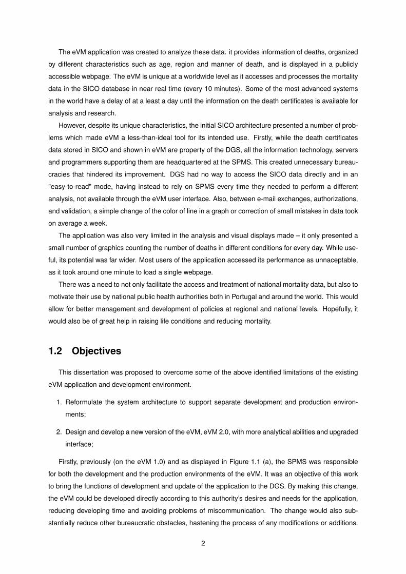
Firstly, previously (on the eVM 1.0) and as displayed in Figure 1.1 (a), the SPMS was responsible
for both the development and the production environments of the eVM. It was an objective of this work
to bring the functions of development and update of the application to the DGS. By making this change,
the eVM could be developed directly according to this authority’s desires and needs for the application,
reducing developing time and avoiding problems of miscommunication. The change would also sub-
stantially reduce other bureaucratic obstacles, hastening the process of any modifications or additions.
2
(a) eVM 1.0 Environments Descripition
(b) eVM 2.0 Environments Descripition
Figure 1.1: System Environments for Version 1.0 (a) and Version 2.0 (b) of the eVM
In the end, the schema of the environments is as displayed in Figure 1.1 (b).
Secondly, the eVM 2.0 needed to have more throughout and complete analytical abilities: in this way
to help fulfill not only the DGS’s but also other health authorities and public users’ research needs. A
better interface would complement these abilities, with more content and better organization than the
one existing previously.
3
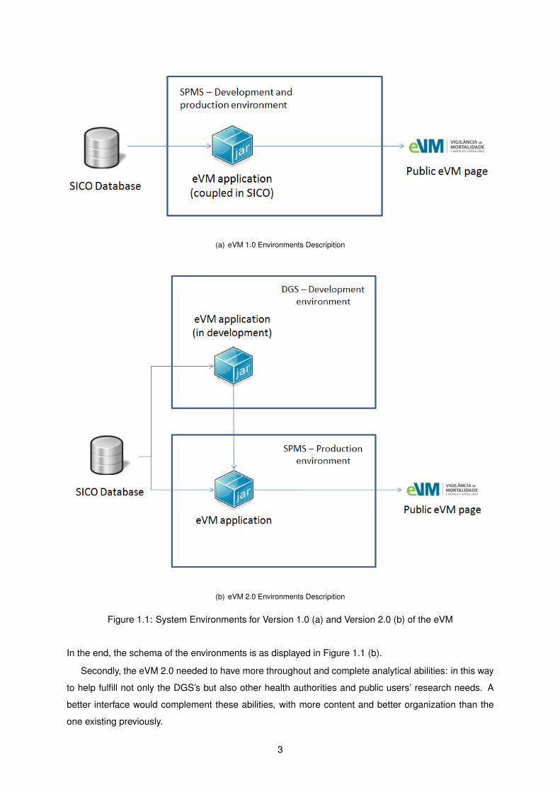
Figure 1.2: Entry Page of eVM 2.0
1.3 Results
The planned changes in the development environment were successfuly accomplished. The DGS is
now the responsible entity for the development of the eVM application, while the SPMS is still responsible
of providing its infrastructure.
A better interface, with more content and different ways to present the data from the eVM, was
developed. This includes not only graphs, but also maps and easily searchable data tables, which did
not exist in the 1.0 version of the application, with most of the information updated every 10 minutes
on a request. The result is that information can now be accessed more easily by the public, which may
use it for varied reasons (i.e. research or journalism), and internal users of the DGS and other health
authorities, which can use it for the development of new policies for health improvement. Figure 1.2
shows the entry page of the application, exhibiting the more striking interface.
In summary, I have developed a more throughout and complete version of the eVM application, as
well as made some critical changes to its integration with the SICO system. Namely:
• Change of the development environment of future updates to the eVM. Consequently, this hastens
internal processes both at the DGS and at the SPMS and reduces the resources needed for the
development of the eVM and its future updates;
• Fully automated pipeline for visualization of the SICO database, and its use in the generation of
more interactive and comprehensive data visualizations in the eVM. This is also accessible to the
public in the DGS website and other webpages which decide to integrate the eVM content;
I expect this tool to provide high utility for the study of mortality and will become widely used for
research and policy-making inside and outside national borders, as it allows surveillance of mortality at
a new level.
4

1.4 Methodology
The development of this dissertation entailed the following activities:
1. Identification of the requirements of the project, obtaining information from the DGS personnel, to
generate ideas and develop the eVM accordingly to their needs;
2. Bibliographic review of the relevant public health and mortality surveillance literature. By doing
this, I could better understand the needs of public health monitoring, and develop a more complete
work incorporating useful features already available in other systems.
3. Thorough analysis of the SICO/eVM and meetings with SPMS personnel to gain a more complete
understanding of its structure and find convergence points between the previous system and the
new one. It was also essential to know which elements of architecture and data structures could
or must be kept unchanged from version 1.0 to version 2.0.
4. Obtaining direct access to a read-only instance of the SICO database. Creation of the local and
development environment in the DGS.
5. Development of the new eVM at the DGS, where the whole new environment is. Work with the
SPMS to prepare their infrastructure for hosting the production environment of the eVM 2.0.
6. Functional testing and evaluation of eVM 2.0 by me and the personnel at the DGS and SPMS.
Performance tests on the development environment.
7. Preparation for deployment of the final eVM 2.0 at the SPMS production environment.
8. Performance tests of the application in the quality/production environments.
1.5 Thesis Outline
This dissertation is organized as follows:
• The second chapter provides theoretical background on public health and public health surveil-
lance systems, to better contextualize the latter’s importance in public health practice. It includes
an analysis of the state of the art of mortality surveillance systems. It also describes the Inter-
national Classification of Diseases codification, a medical terminology used in this project, and its
usefulness.
• The third chapter presents the previous version of the eVM, eVM 1.0, in detail, describing its
functionalities and a general overview of the national operationalization of the upload of death
certificates to the SICO database. It also describes the SICO database system and eVM 1.0’s
architecture.
5

• The fourth chapter goes in-depth about the eVM 2.0. It starts by giving an overview of the new
requirements for this version. Then it explains the development of the new system, its architecture,
and development environments. It then goes on to an in-depth analysis of the functionalities of the
application.
• The fifth chapter presents the evaluation of the user satisfaction of eVM 2.0 by various stakehold-
ers, and performance tests on both versions.
• The last chapter concludes the dissertation, presenting overall conclusions, contributions of this
thesis, and future work in mortality surveillance.
6
Chapter 2
Background
This chapter provides background on the topics discussed in this thesis. It starts by addressing Public
Health Informatics in Section 2.1. Then, in Section 2.2, it introduces the main features of surveillance
systems and explains the importance of mortality surveillance. Section 2.3 gives an insight to the state
of the art in mortality surveillance and mortality data analysis worldwide. Section 2.4 covers the ICD,
used in eVM to monitor mortality by influenza-like illness.
2.1 Public Health Informatics
A 1920 article, The Untilled Fields of Public Health, by Charles-Edward Amory, refers to public health
as the science and art of preventing disease, prolonging life and promoting health through organized
efforts and informed choices of society, organizations, public and private, communities and individuals.
[1]. In the WHO’s 1998 Health Promotion Glossary, public health refers to all organized measures
(whether public or private) to prevent disease, promote health, and prolong life among the population as
a whole [2]. Both visions, from different references in health distant in time, are in accordance with each
other.
Public health differs from clinical medicine in the sense that it does not focus only on the treatment of
an individual, but focuses instead on prevention of malady. It acts in regard to social and environmental
determinants of diseases which are known to influence the health status of a population. Thorough
knowledge of the health status of a population is a requirement for the development of good health
policies for that population. For instance, in Portugal, the Ministry of Health defined national priority
health programs according to the most incident causes of death in Portuguese population (available at
https://www.dgs.pt/programas-de-saude-prioritarios.aspx) [3].
The Comitee for the Study of the Future of Public Health of the Institute of Medicine defines the three
core public health functions as the following [4]:
• The assessment and monitoring of the health of communities and populations at risk to identify
health problems and priorities.
7

• The formulation of public policies designed to solve identified local and national health problems
and priorities.
• To assure that all populations have access to appropriate and cost-effective care, including health
promotion and disease prevention services.
Quality of health in general can nowadays be measured by various global health indicators, and
each indicator can be measured individually. WHO’s World Health Statistics yearly report has detailed
information for the study of these indicators [5]. Mortality, the main focus of this dissertation, is one of
such key indicators.
Quality public health practice does not require knowledge of one field only, but rather a multitude
of sciences and social studies. Varied specialists from different fields come together for a common
goal. Relevant fields go from epidemiology and biostatistics to community and behavioral health, health
economics, and informatics.
Nowadays, data science play a big role in public health practice. It has been defined as the systematic
application of information science, computer science, and technology to public health practice, research
and learning [6]. Most public health information systems are optimized for retrieval from very large record
databases, and to be able to quickly cross-tabulate, study secular trends, and look for patterns.
2.2 Public Health Surveillance Systems
Public heath surveillance is defined as ’the continuous, systematic collection, analysis and interpre-
tation of health-related data needed for the planning, implementation, and evaluation of public health
practice’ [7]. According to the WHO, health surveillance systems can prove useful by [8]:
• Serving as an early warning system for impending public health emergencies;
• Documenting the impact of an intervention, or track progress towards specified goals; and
• Monitoring and clarifying the epidemiology of health problems, to allow priorities to be set and to
inform public health policy and strategies.
In general, public health surveillance systems are authorized by legislators and maintained by pub-
lic health officials. They have been developed to address a range of public health needs. Systems
can go from a simple system collecting data from one or two sources, to complex electronic systems
which receive data from multiple sources and in multiple formats [9]. With the on-going development of
information technology, systems change and suffer updates, also adapting to new information needs.
Public health surveillance can be either active or passive – regardless, it is a dynamic process. In
passive surveillance systems, data is generally sent in report form to a central institution. Examples
are disease notification systems, where laboratory systems produce surveillance data when specimens
are passively received for diagnosis or microbiologial reference. Overall, passive surveillance systems
access trends in diseases and risk factors for disease prevention and control.
8
In active surveillance systems, groups or networks are put together for a specific purpose, generally
targetting a subset of the population. Examples include sentinel systems (sites, events, providers), serial
health surveys or database linkage. They can sometimes provide early assessments of certain ocur-
rences such as outbreaks. These systems are better suited for frequent ocurrences, such as influenza.
Both types of systems present advantages and disadvantages. Passive systems can suffer from
underreporting or low accuracy of reporting, and show selection bias depending on the source of reports.
They can however be effective in an acceptible timeframe. Active systems provide early, timely and
complete information, but methodology must be carefully developed. They are also generally more
expensive [10].
Any problem should be well-defined before it is solved. Using information obtained from public health
surveillance systems an entity can better understand which existing or emerging problems should be the
focus of its efforts (by knowing distribution, etiology, etc.) and how to intervene.
The collection of quality data is an essential step in the definition of any plan, and planning for public
health is no exception to this rule. It is of upmost importance that the information used is correct and up-
to-date, or the behavior of diseases may be misunderstood, health programs may not accomplish their
goals, and resources may be incorrectly allocated [11]. Without quality public health data, interventions
may be misguided and wasteful. In a time of financial and economic hardship, correct allocation of
resources in health may sometimes make the difference between life and death.
The Global Health Observatory (GHO), a division of the WHO, compiles data on the state of health
around the world [12]. They cross this data with the United Nations Millennium Development Goals –
which range from halving extreme poverty rates to halting the spread of HIV/AIDS [13] – in order to know
how their global health initiatives are progressing and which areas need intervention [14]. The analysis
made by the WHO can be read in their annual global health report [12].
2.2.1 Evaluation Key Factors of Surveillance Systems
By evaluating public health surveillance systems, stakeholders ensure that public health problems
are being monitored efficiently and effectively. There are some key factors for evaluating a surveillance
system, which refer to important features [9]. Firstly, the usefulness of the system is evaluated. A
surveillance system is useful if it contributes to the prevention and control of adverse health-related
events, including an improved understanding of the public health implications of such events.
Secondly, the evaluater studies the different system attributes. They are the following:
Simplicity: referring to both the structure and ease of operation;
Flexibility: a flexible system can adapt to changing information needs or operating conditions with little
additional time, personnel, or allocated funds;
Data quality: referring to the completeness and validity of the data recorded, as mentioned previously;
Acceptability: the willingness of persons and organizations to participate in the surveillance system;
9

Sensitivity: considered on two levels: a) case reporting, i.e. the proportion of events under surveillance
detected by the system [15]; and b) ability to monitor changes in the number of events over time
and, in the limit, detect occurrence above or below normal range;
Predicted Value Positive (PVP): proportion of reported cases that actually match the health-related
event under surveillance [15].
Representativeness: A public health surveillance system that is representative accurately describes
the occurrence of a health-related event over time and its distribution by place and person.
Timeliness: reflects the time between each iteration or update in the surveillance system.
Stability: answers the question of how reliable (i.e. does it collect, manage and provide data without
failure?) and availability (is it operational when necessary?) is the system.
Unfortunately, when designing a surveillance system, we often have to find a compromise between
the different factors. Developers must analyse the objectives specific to that surveillance system and
consult all stakeholders to establish priorities.
2.3 Mortality Surveillance Systems - State of the Art
2.3.1 Mortality Surveillance Systems around the World
There are various methods for the surveillance of mortality. Most European countries collect individ-
ual mortality data in order to annually monitor the impact of chronic diseases, plan and evaluate public
health interventions.
In Europe, the EuroMOMO project (European Monitoring of Excess Mortality), implemented in 2008,
provides weekly updates of all-cause mortality levels in up to 19 European countries/regions and pro-
vides useful insight into the state of mortality data in Europe. It was created to operationalize real-time
surveillance, as sharing international data is sometimes a prolonged process. It was a valuable tool
during the H1N1 influenza pandemic of 2009/2010, receiving more support ever since.
EuroMOMO processes the mortality data it receives and presents the general state of mortality
surveillance in Europe. Unfortunately, there is generally a delay that can go up to one week since the
death is confirmed to when it is submitted to EuroMOMO. Furthermore, it avoids using data that is
not ’all-mortality’ data, to avoid possible further delays, and to avoid risks of under-reporting of certain
diseases (important for epidemic vigilance, such as influenza and infections).
In 2008 the EuroMOMO team published a survey on existing and planned mortality surveillance
systems within 32 countries [16], in order to be aware of the existing resources and try to understand
whether the existing systems could have been integrated into the Europe-wide mortality monitoring
system. The information was obtained by the EuroMOMO Work Package 4 [17]. The survey concluded
that at the time:
10

System Activation year Oldest data
Belgium 2005 1985France-I 2004 Not availableFrance-II 2008 Not availableGermany 2007 2006Italy-I 2004 1995Italy-II 2005 2003Spain 2004 1981Switzerland 2006 1969Portugal (VDM) 2004 1955Portugal (eVM) 2014 2009
Table 2.1: Activation year and oldest available data of European Mortality Surveillance Systems
• Seven had functioning mortality systems → Belgium, France, Germany, Italy, Portugal, Spain and
Switzerland. France and Italy have two systems in place.
• Six countries had mortality systems in pilot phase → Denmark, Germany, Hungary, Ireland, the
Netherlands and Scotland.
• Three were in planning phase → Greece, Sweden and the United Kingdom.
Table 2.1 presents the activation year of the functioning mortality surveillance systems. It also
presents the year of their oldest data.
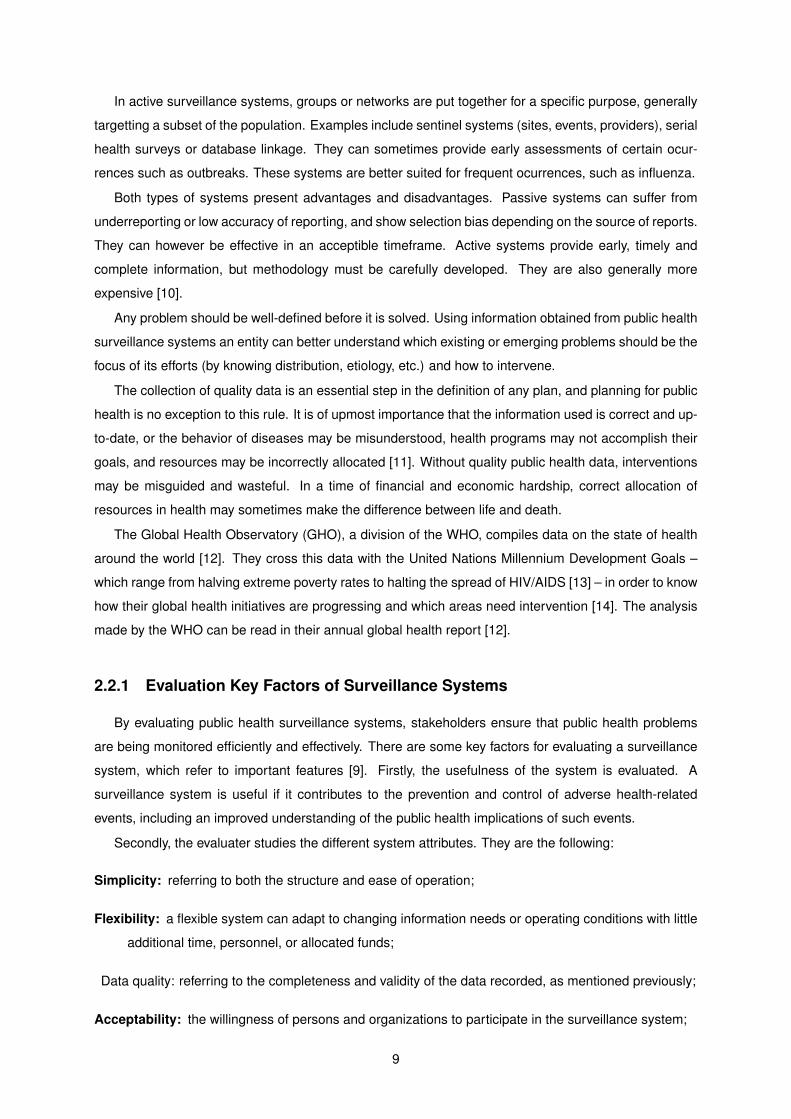
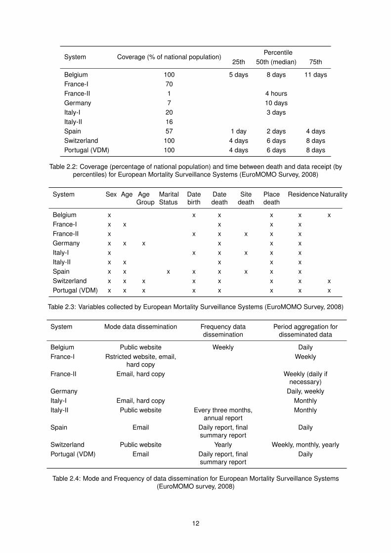
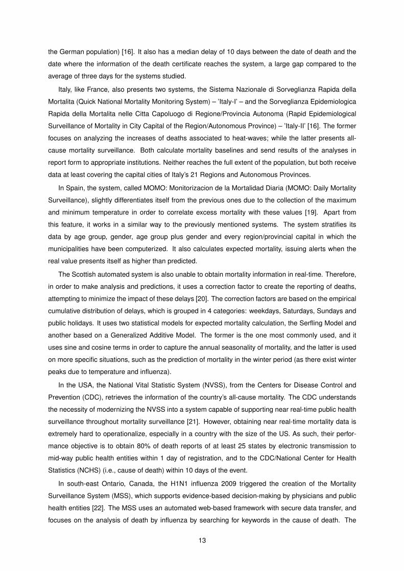
Tables 2.2 to 2.4 present information extracted from the survey about the systems which were func-
tional in 2008. Table 2.2 displays the coverage in percentage of national population of the different
systems, as well as the percentiles of time between a death ocurrs and it is integrated into said system.
Table 2.3 presents the variables collected by the different systems. Finally, Table 2.4 shows the mode
and frequency of data dissemination, and the period aggregation for disseminated data.
I was able to obtain the following detailed information for each functional system:
Belgium’s system, BE-MOMO, focuses on the early detection of outbreaks and mortality peaks,
by calculating baselines and setting thresholds to different mortality time series) [18]. It calculates by
gender, age group, and date (day and week. It has to extrapolate for recent dates, due to the delays in
information update to the system.
France operates two systems, the Surveillance de la Mortalite (Mortality Surveillance) – ’France-I’,
and the Surveillance de la Mortalite par Cause (Mortality by Cause Surveillance) – ’France-II’ [16]. The
first one focuses on all-cause mortality and was implemented in 2004 to help identification of changes
in mortality trends and to emit alerts. The latter was implemented in 2008 with a focus on the reduction
of the delay on obtaining the specific causes of mortality. It has smaller delay and more specificity (more
information) compared to the ’France-I’ system, but, for now, reaches a much lower percentage of the
population, as visible in Table 2.2.
As for the German surveillance system, the latest information about its population coverage is the
one obtained from the EuroMOMO survey, which refers the system covered the State of Hesse (7% of
11
System Coverage (% of national population)Percentile
25th 50th (median) 75th
Belgium 100 5 days 8 days 11 daysFrance-I 70France-II 1 4 hoursGermany 7 10 daysItaly-I 20 3 daysItaly-II 16Spain 57 1 day 2 days 4 daysSwitzerland 100 4 days 6 days 8 daysPortugal (VDM) 100 4 days 6 days 8 days
Table 2.2: Coverage (percentage of national population) and time between death and data receipt (bypercentiles) for European Mortality Surveillance Systems (EuroMOMO Survey, 2008)
System Sex Age AgeGroup
MaritalStatus
Datebirth
Datedeath
Sitedeath
Placedeath
Residence Naturality
Belgium x x x x x xFrance-I x x x x xFrance-II x x x x x xGermany x x x x x xItaly-I x x x x x xItaly-II x x x x xSpain x x x x x x x xSwitzerland x x x x x x x xPortugal (VDM) x x x x x x x x
Table 2.3: Variables collected by European Mortality Surveillance Systems (EuroMOMO Survey, 2008)
System Mode data dissemination Frequency datadissemination
Period aggregation fordisseminated data
Belgium Public website Weekly DailyFrance-I Rstricted website, email,
hard copyWeekly
France-II Email, hard copy Weekly (daily ifnecessary)
Germany Daily, weeklyItaly-I Email, hard copy MonthlyItaly-II Public website Every three months,
annual reportMonthly
Spain Email Daily report, finalsummary report
Daily
Switzerland Public website Yearly Weekly, monthly, yearlyPortugal (VDM) Email Daily report, final
summary reportDaily
Table 2.4: Mode and Frequency of data dissemination for European Mortality Surveillance Systems(EuroMOMO survey, 2008)
12
the German population) [16]. It also has a median delay of 10 days between the date of death and the
date where the information of the death certificate reaches the system, a large gap compared to the
average of three days for the systems studied.
Italy, like France, also presents two systems, the Sistema Nazionale di Sorveglianza Rapida della
Mortalita (Quick National Mortality Monitoring System) – ’Italy-I’ – and the Sorveglianza Epidemiologica
Rapida della Mortalita nelle Citta Capoluogo di Regione/Provincia Autonoma (Rapid Epidemiological
Surveillance of Mortality in City Capital of the Region/Autonomous Province) – ’Italy-II’ [16]. The former
focuses on analyzing the increases of deaths associated to heat-waves; while the latter presents all-
cause mortality surveillance. Both calculate mortality baselines and send results of the analyses in
report form to appropriate institutions. Neither reaches the full extent of the population, but both receive
data at least covering the capital cities of Italy’s 21 Regions and Autonomous Provinces.
In Spain, the system, called MOMO: Monitorizacion de la Mortalidad Diaria (MOMO: Daily Mortality
Surveillance), slightly differentiates itself from the previous ones due to the collection of the maximum
and minimum temperature in order to correlate excess mortality with these values [19]. Apart from
this feature, it works in a similar way to the previously mentioned systems. The system stratifies its
data by age group, gender, age group plus gender and every region/provincial capital in which the
municipalities have been computerized. It also calculates expected mortality, issuing alerts when the
real value presents itself as higher than predicted.
The Scottish automated system is also unable to obtain mortality information in real-time. Therefore,
in order to make analysis and predictions, it uses a correction factor to create the reporting of deaths,
attempting to minimize the impact of these delays [20]. The correction factors are based on the empirical
cumulative distribution of delays, which is grouped in 4 categories: weekdays, Saturdays, Sundays and
public holidays. It uses two statistical models for expected mortality calculation, the Serfling Model and
another based on a Generalized Additive Model. The former is the one most commonly used, and it
uses sine and cosine terms in order to capture the annual seasonality of mortality, and the latter is used
on more specific situations, such as the prediction of mortality in the winter period (as there exist winter
peaks due to temperature and influenza).
In the USA, the National Vital Statistic System (NVSS), from the Centers for Disease Control and
Prevention (CDC), retrieves the information of the country’s all-cause mortality. The CDC understands
the necessity of modernizing the NVSS into a system capable of supporting near real-time public health
surveillance throughout mortality surveillance [21]. However, obtaining near real-time mortality data is
extremely hard to operationalize, especially in a country with the size of the US. As such, their perfor-
mance objective is to obtain 80% of death reports of at least 25 states by electronic transmission to
mid-way public health entities within 1 day of registration, and to the CDC/National Center for Health
Statistics (NCHS) (i.e., cause of death) within 10 days of the event.
In south-east Ontario, Canada, the H1N1 influenza 2009 triggered the creation of the Mortality
Surveillance System (MSS), which supports evidence-based decision-making by physicians and public
health entities [22]. The MSS uses an automated web-based framework with secure data transfer, and
focuses on the analysis of death by influenza by searching for keywords in the cause of death. The
13
system provides a useful end-user application by retrieving, processing, classifying, and making statis-
tical analysis of mortality data, which allows the staff epidemiologist to spend only around 30 minutes
per week to review recent mortality activity. It also uses an anomaly detection method using a modidied
cumultative sum. However, the quality of data is very subject to the diligence of physicians when com-
pleting the death certificate; this is a limitation to this system, which is important to improve for optimized
mortality surveillance.
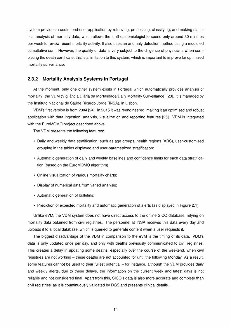
2.3.2 Mortality Analysis Systems in Portugal
At the moment, only one other system exists in Portugal which automatically provides analysis of
mortality: the VDM (Vigilância Diária da Mortalidade/Daily Mortality Surveillance) [23]. It is managed by
the Instituto Nacional de Saúde Ricardo Jorge (INSA), in Lisbon.
VDM’s first version is from 2004 [24]. In 2015 it was reengineered, making it an optimised and robust
application with data ingestion, analysis, visualization and reporting features [25]. VDM is integrated
with the EuroMOMO project described above.
The VDM presents the following features:
• Daily and weekly data stratification, such as age groups, health regions (ARS), user-customized
grouping in the tables displayed and user-parametrized stratification;
• Automatic generation of daily and weekly baselines and confidence limits for each data stratifica-
tion (based on the EuroMOMO algorithm);
• Online visualization of various mortality charts;
• Display of numerical data from varied analysis;
• Automatic generation of bulletins;
• Prediction of expected mortality and automatic generation of alerts (as displayed in Figure 2.1)
Unlike eVM, the VDM system does not have direct access to the online SICO database, relying on
mortality data obtained from civil registries. The personnel at INSA receives this data every day and
uploads it to a local database, which is queried to generate content when a user requests it.
The biggest disadvantage of the VDM in comparison to the eVM is the timing of its data. VDM’s
data is only updated once per day, and only with deaths previously communicated to civil registries.
This creates a delay in updating some deaths, especially over the course of the weekend, when civil
registries are not working – these deaths are not accounted for until the following Monday. As a result,
some features cannot be used to their fullest potential – for instance, although the VDM provides daily
and weekly alerts, due to these delays, the information on the current week and latest days is not
reliable and not considered final. Apart from this, SICO’s data is also more accurate and complete than
civil registries’ as it is countinuously validated by DGS and presents clinical details.
14
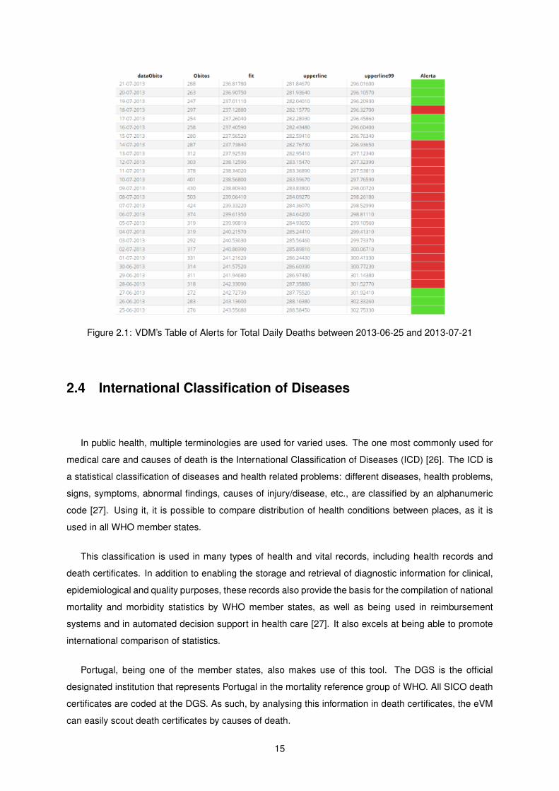
Figure 2.1: VDM’s Table of Alerts for Total Daily Deaths between 2013-06-25 and 2013-07-21
2.4 International Classification of Diseases
In public health, multiple terminologies are used for varied uses. The one most commonly used for
medical care and causes of death is the International Classification of Diseases (ICD) [26]. The ICD is
a statistical classification of diseases and health related problems: different diseases, health problems,
signs, symptoms, abnormal findings, causes of injury/disease, etc., are classified by an alphanumeric
code [27]. Using it, it is possible to compare distribution of health conditions between places, as it is
used in all WHO member states.
This classification is used in many types of health and vital records, including health records and
death certificates. In addition to enabling the storage and retrieval of diagnostic information for clinical,
epidemiological and quality purposes, these records also provide the basis for the compilation of national
mortality and morbidity statistics by WHO member states, as well as being used in reimbursement
systems and in automated decision support in health care [27]. It also excels at being able to promote
international comparison of statistics.
Portugal, being one of the member states, also makes use of this tool. The DGS is the official
designated institution that represents Portugal in the mortality reference group of WHO. All SICO death
certificates are coded at the DGS. As such, by analysing this information in death certificates, the eVM
can easily scout death certificates by causes of death.
15
2.5 Summary and Conclusions
There exists a consensus about the importance of public health surveillance in the practice of public
health, as it is the basis for public health prevention, planning and policy. It allows for the analysis of
trends, and easy understanding of variations which might reveal an epidemic or another situation which
might require quick action. The characteristics of each specific system depend on the necessities and
the stakeholders involved.
From the analysis of the state of mortality systems around the world and their end-user applications,
it is possible to identify some common characteristics that could be optimized. First and foremost, there
is in every functional system a considerable delay between the death of an individual and the upload
of data relative to that death to the systems. This delay can be over one week in some countries,
which is not useful time for the analysis of the information and trends and perform immediate action.
However, in the SICO system, this upload and processing time is insignificant, and the process almost
fully automatic. To benefit from these advantages, the eVM architecture must support near real-time
access to statistics computed with the latest SICO uploads.
Secondly, most systems only present the all-cause mortality levels. A few separate between gender,
age groups or regions; another uses the ICD-10 codification to separate between causes of death. Other
create baselines and thresholds in order to predict death levels and issue alerts: some focus this last
effort on separating/counting influenza and/or temperature deaths. Spain and Switzerland’s systems
correlate with temperature levels. However, most of these useful features are not common among the
different systems. This means that, individually, they present limited usefulness and analysis abilities.
The eVM 2.0 integrates some of these functionalities, such as the differentiation by different charac-
teristics of the death or deceased – age group, manner of death, and region. It also uses a prediction
model which creates intervals for expected mortality over the next days. I also use Canada’s MSS
keyword search method, together with search by ICD codes, to monitor death by influenza-like illness.
Other functionalities such as correlation with temperature levels, the creation of automatic alerts, or the
monitoring of other specific causes of death were not deemed as a priority for this version of the eVM.
16
Chapter 3
eVM 1.0
This chapter describes the different components and characteristics of the SICO system, the eVM
application and its software update workflow. Every mention to the eVM application always refers to the
eVM 1.0 version, except when explicitly stated otherwise.
When an individual dies in Portugal, a doctor fills the online death certificate on the SICO system.
The information is automatically stored in the SICO database. The eVM application accesses the SICO
database, processes the data and displays it in various graphs in near-real-time. The graphs and infor-
mation present useful information for public health practice or public health studies.
3.1 eVM Functionalities and End-user Application
The eVM end-user interface is wholly and publicly accessible from the DGS website or on the fol-
lowing page: https://servicos.min-saude.pt/sico/faces/estatisticas.jsp. There is no private
component, all displayed information is available both to professionals and the public. The application
focuses mostly on processing and displaying information. It creates a set of graphs that are laid out in a
single web page:
• The total number of deaths in Portuguese territory, every day of the year, since 2009;
• The total number of deaths of each different type (as in natural cause; non-natural cause, or subject
to investigation), for each day of the month;
• The number of deaths of different age groups;
• The number of deaths in the major regional areas of Portugal.
The rest of this section provides an in-depth description of each of the graphs of the eVM page.
3.1.1 Weekly Mortality and Daily Mortality Surveillance by Month
Figure 3.1 shows the top of the eVM page. The application presents an interface that enables the
user to select a month and year to visualize, a small table that summarizes information on the weeks of
17
Figure 3.1: Top of eVM 1.0 page and Daily Mortality Surveillance
the selected month, and the Daily Mortality Surveillance graph.
By default, the user will see information for the current month. After selecting a different month, the
table and the Daily Mortality Surveillance graph will update to display different information. The other
graphs of the eVM which also display the information of a month are also updated to show the data of
the selected month.
The summary table displays the number of the week (from the beginning of the year), the days it
covers, and the number of neonatal (< 28 days old), ≥ 28 days old, and total number of deaths in that
week. There is also an option to switch the website language between Portuguese and English.
The Daily Mortality Surveillance graph presents a monthly view of the absolute daily mortality. Every
year since 2009 has daily data in the SICO on the number of absolute deaths, so the data of these years
are shown for any given month. One particularity is that the application assumes null values (i.e., the
lack of available information for a day) as zero. This is for instance noticeable in the start of the red line
(2016) in Figure 3.1, as there is no data for December 2016, and can be confusing or lead to misleading
conclusions.
18
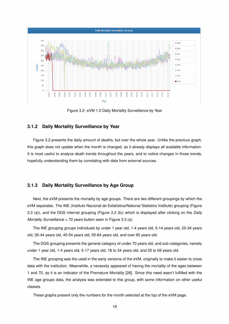
Figure 3.2: eVM 1.0 Daily Mortality Surveillance by Year
3.1.2 Daily Mortality Surveillance by Year
Figure 3.2 presents the daily amount of deaths, but over the whole year. Unlike the previous graph,
this graph does not update when the month is changed, as it already displays all available information.
It is most useful to analyze death trends throughout the years, and to notice changes in those trends,
hopefully understanding them by correlating with data from external sources.
3.1.3 Daily Mortality Surveillance by Age Group
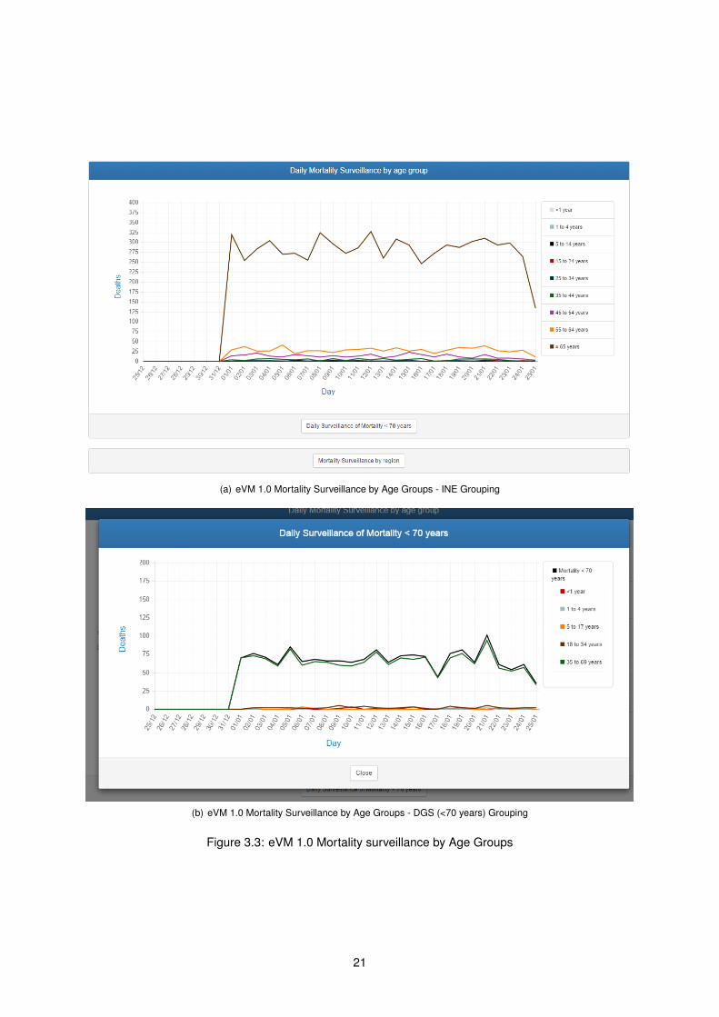
Next, the eVM presents the mortality by age groups. There are two different groupings by which the
eVM separates. The INE (Instituto Nacional de Estatística/National Statistics Institute) grouping (Figure
3.3 (a)), and the DGS internal grouping (Figure 3.3 (b)) which is displayed after clicking on the Daily
Mortality Surveillance < 70 years button seen in Figure 3.3 (a).
The INE grouping groups individuals by under 1 year old, 1-4 years old, 5-14 years old, 25-34 years
old, 35-44 years old, 45-54 years old, 55-64 years old, and over 65 years old.
The DGS grouping presents the general category of under 70 years old, and sub-categories, namely
under 1 year old, 1-4 years old, 5-17 years old, 18 to 34 years old, and 35 to 69 years old.
The INE grouping was the used in the early versions of the eVM, originally to make it easier to cross
data with the institution. Meanwhile, a necessity appeared of having the mortality of the ages between
1 and 70, as it is an indicator of the Premature Mortality [28]. Since this need wasn’t fulfilled with the
INE age groups data, the analysis was extended to this group, with some information on other useful
classes.
These graphs present only the numbers for the month selected at the top of the eVM page.
19

3.1.4 Regional Mortality Surveillance
Another button which is seen in Figure 3.3 (a) opens the mortality by ARS (health region) graphs.
There is one graph for every region, with the total number of deaths in each ARS over the year, with a
line for every year since 2014. Figure 3.4 displays one of these graphs. This allows analysis of numbers
and patterns in each region, to verify if a review of public health programs are necessary in a certain
area.
The data displayed is since 2014, the year the SICO system became only fully operational. This
information is not available for previous years.
At the bottom of the page the application displays the number of deaths in each ARS in each week
of the selected month. Furthermore, it also displays the number of people whose nationality or place of
birth is unknown, and the number of foreigners that died in national territory. Both are counted for the
absolute numbers, but can’t be counted for any specific region.
3.1.5 Mortality Surveillance by Manner of Death
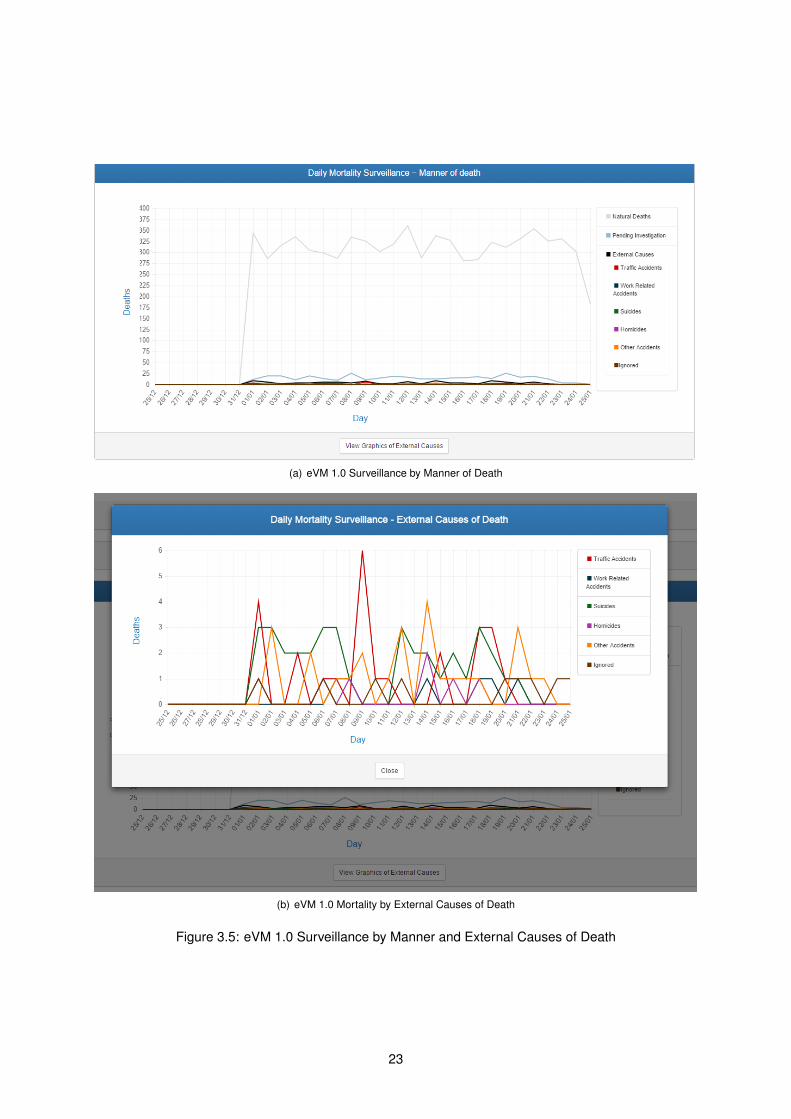
Finally, an analysis of the number of deaths by each manner of death is displayed (see Figure 3.5
(a)). The different manners of death are:
• Natural death – diseases, old age, etc. These are the most common.
• External causes – Non-natural causes of death, usually by violent means. This category includes
traffic accidents, work related accidents, suicides, homicides, other accidents, and ignored cases.
• Pending investigation – Deaths which are not yet classified in other categories.
Since the natural death numbers usually largely surpass the pending investigation and the external
values, an extra graph allows for a closer look at the external causes numbers (see Figure 3.5 (b)).
By analyzing these numbers in detail, users can note if some situation needs special attention (for in-
stance, an unusually high number of deaths by traffic accident or suicides), to reinforce policies deemed
necessary.
20
(a) eVM 1.0 Mortality Surveillance by Age Groups - INE Grouping
(b) eVM 1.0 Mortality Surveillance by Age Groups - DGS (<70 years) Grouping
Figure 3.3: eVM 1.0 Mortality surveillance by Age Groups
21
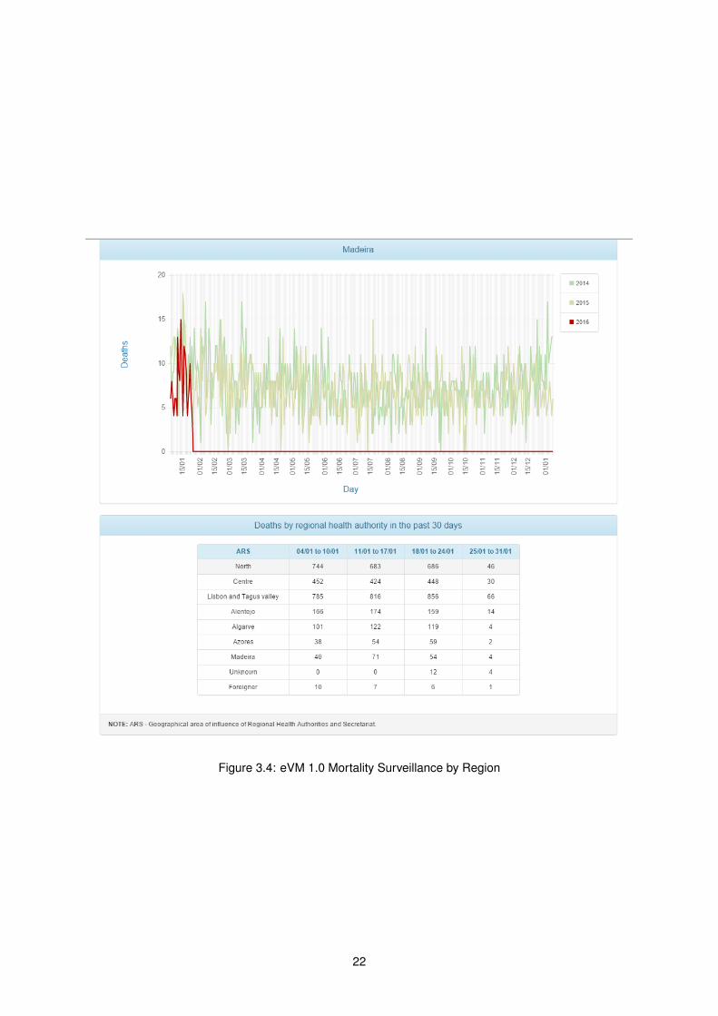
Figure 3.4: eVM 1.0 Mortality Surveillance by Region
22
(a) eVM 1.0 Surveillance by Manner of Death
(b) eVM 1.0 Mortality by External Causes of Death
Figure 3.5: eVM 1.0 Surveillance by Manner and External Causes of Death
23
3.2 Behind the Curtains — the SICO and eVM Application
The eVM application has a relatively simple structure and idea. A Java-based program queries the
SICO database, counts the number of cases which match certain criteria, and then collects these data
into tables. The ChartJS1 software is then used to create the graphs displayed on the webpage. Unfor-
tunately, I did not have access to any documentation explaining how the application works; therefore, it
was not possible to provide additional details about its internal organization.
3.2.1 SPMS web applications infrastructure
The SICO system, including the eVM application, is physically located at the SPMS. It includes the
SICO database where the death certificates information is, the machines where the application is run,
and all other intermediate components.
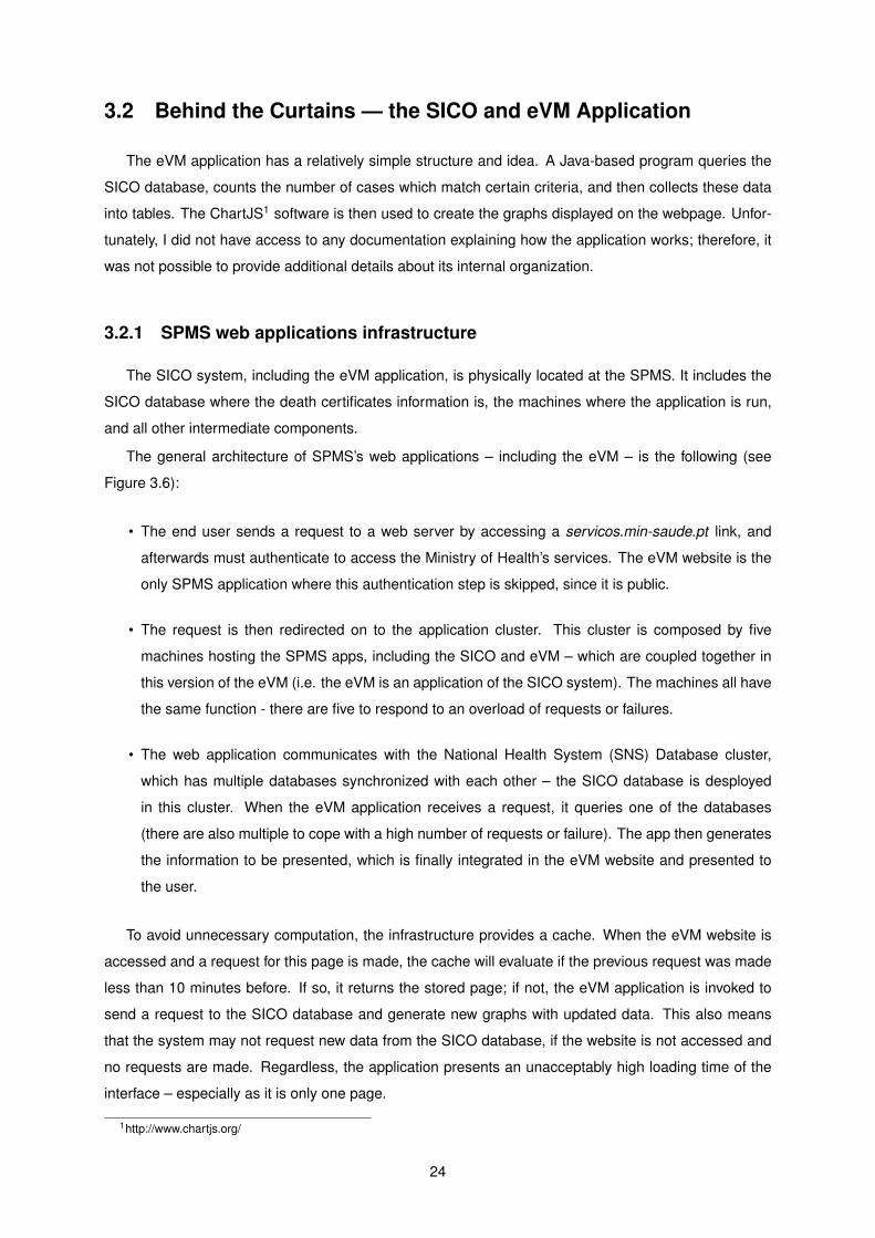
The general architecture of SPMS’s web applications – including the eVM – is the following (see
Figure 3.6):
• The end user sends a request to a web server by accessing a servicos.min-saude.pt link, and
afterwards must authenticate to access the Ministry of Health’s services. The eVM website is the
only SPMS application where this authentication step is skipped, since it is public.
• The request is then redirected on to the application cluster. This cluster is composed by five
machines hosting the SPMS apps, including the SICO and eVM – which are coupled together in
this version of the eVM (i.e. the eVM is an application of the SICO system). The machines all have
the same function - there are five to respond to an overload of requests or failures.
• The web application communicates with the National Health System (SNS) Database cluster,
which has multiple databases synchronized with each other – the SICO database is desployed
in this cluster. When the eVM application receives a request, it queries one of the databases
(there are also multiple to cope with a high number of requests or failure). The app then generates
the information to be presented, which is finally integrated in the eVM website and presented to
the user.
To avoid unnecessary computation, the infrastructure provides a cache. When the eVM website is
accessed and a request for this page is made, the cache will evaluate if the previous request was made
less than 10 minutes before. If so, it returns the stored page; if not, the eVM application is invoked to
send a request to the SICO database and generate new graphs with updated data. This also means
that the system may not request new data from the SICO database, if the website is not accessed and
no requests are made. Regardless, the application presents an unacceptably high loading time of the
interface – especially as it is only one page.
1http://www.chartjs.org/
24
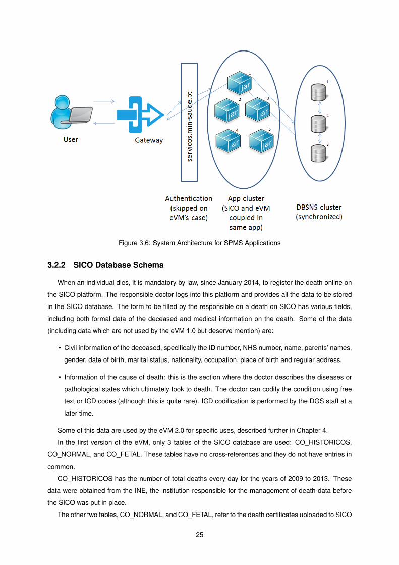
Figure 3.6: System Architecture for SPMS Applications
3.2.2 SICO Database Schema
When an individual dies, it is mandatory by law, since January 2014, to register the death online on
the SICO platform. The responsible doctor logs into this platform and provides all the data to be stored
in the SICO database. The form to be filled by the responsible on a death on SICO has various fields,
including both formal data of the deceased and medical information on the death. Some of the data
(including data which are not used by the eVM 1.0 but deserve mention) are:
• Civil information of the deceased, specifically the ID number, NHS number, name, parents’ names,
gender, date of birth, marital status, nationality, occupation, place of birth and regular address.
• Information of the cause of death: this is the section where the doctor describes the diseases or
pathological states which ultimately took to death. The doctor can codify the condition using free
text or ICD codes (although this is quite rare). ICD codification is performed by the DGS staff at a
later time.
Some of this data are used by the eVM 2.0 for specific uses, described further in Chapter 4.
In the first version of the eVM, only 3 tables of the SICO database are used: CO_HISTORICOS,
CO_NORMAL, and CO_FETAL. These tables have no cross-references and they do not have entries in
common.
CO_HISTORICOS has the number of total deaths every day for the years of 2009 to 2013. These
data were obtained from the INE, the institution responsible for the management of death data before
the SICO was put in place.
The other two tables, CO_NORMAL, and CO_FETAL, refer to the death certificates uploaded to SICO
25
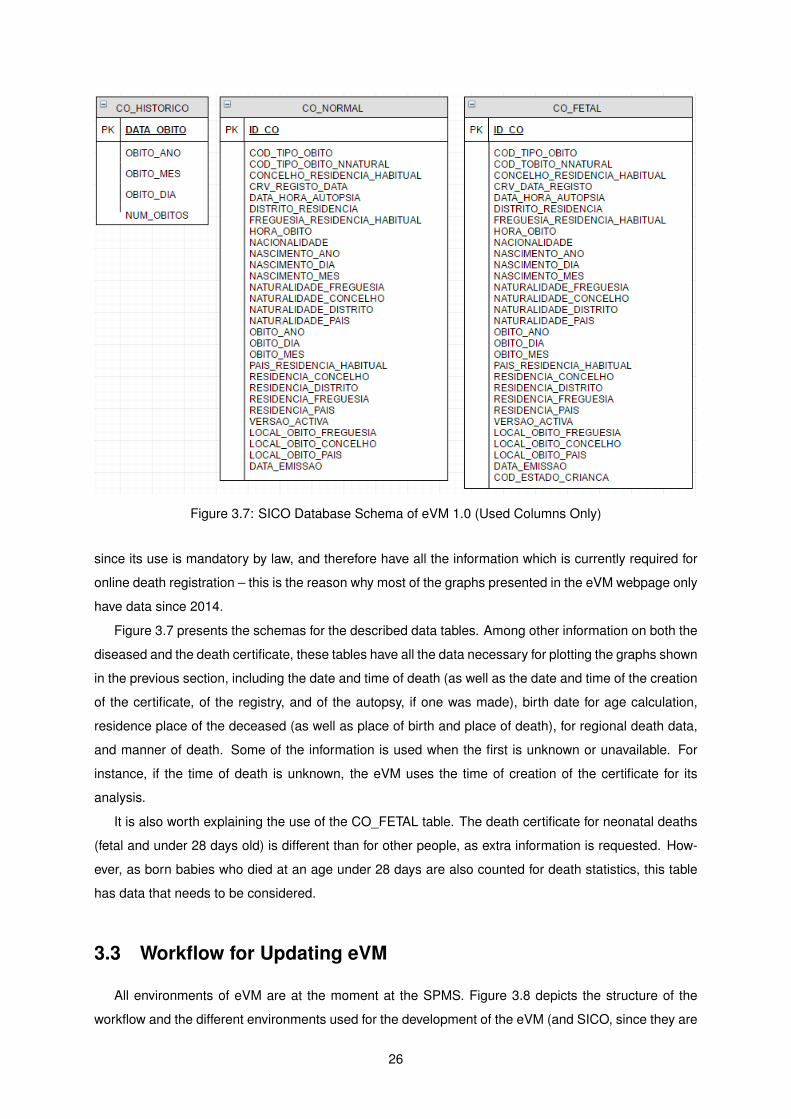
Figure 3.7: SICO Database Schema of eVM 1.0 (Used Columns Only)
since its use is mandatory by law, and therefore have all the information which is currently required for
online death registration – this is the reason why most of the graphs presented in the eVM webpage only
have data since 2014.
Figure 3.7 presents the schemas for the described data tables. Among other information on both the
diseased and the death certificate, these tables have all the data necessary for plotting the graphs shown
in the previous section, including the date and time of death (as well as the date and time of the creation
of the certificate, of the registry, and of the autopsy, if one was made), birth date for age calculation,
residence place of the deceased (as well as place of birth and place of death), for regional death data,
and manner of death. Some of the information is used when the first is unknown or unavailable. For
instance, if the time of death is unknown, the eVM uses the time of creation of the certificate for its
analysis.
It is also worth explaining the use of the CO_FETAL table. The death certificate for neonatal deaths
(fetal and under 28 days old) is different than for other people, as extra information is requested. How-
ever, as born babies who died at an age under 28 days are also counted for death statistics, this table
has data that needs to be considered.
3.3 Workflow for Updating eVM
All environments of eVM are at the moment at the SPMS. Figure 3.8 depicts the structure of the
workflow and the different environments used for the development of the eVM (and SICO, since they are
26
Figure 3.8: eVM 1.0’s Environments and Workflow
coupled).
A small development team programs locally, with access to a local copy of the application and a
model database. When they consider the program ready for production, they send it on to the devel-
opment environment, where small adjustments can be made while testing using a different database.
The program is re-validated, and it is sent to the quality environment for testing. Quality tests start on
Tuesday of the following week (week 2). Here, a program is tested with a connection to the DBSNS
cluster, using real data from the SICO application. If quality testing is finished by the end of the week
(Friday of week 2), it is sent to the production environment, and put online on Thursday the week after
(week 3).
Meanwhile, 2 weeks have gone by between the end of development and deployment on production.
Furthermore, it is worth mentioning that if quality testing, for instance, suffers a delay and is completed in
the beginning of week 3, it will only be put online on the Thursday of week 4. This may bring considerable
delays to updates, especially if the program needs to go back to a previous environment for any reason.
To further aggravate these difficulties with this time frame, the DGS and SPMS must be in commu-
nication during the development of the eVM application, since it is a program in which the client is the
27
DGS, developed by the SPMS. These contacts may take some time, further delaying the finishing of a
version.
3.4 Summary and Conclusions
It is of my opinion that the eVM and SICO were groundbreaking and unique at a worldwide level in
terms of timeliness of mortality information, especially thanks to the SICO national operational structure.
Being able to display for analysis, in an easily readable format, information of mortality in a near-real
time format is a huge capability, with plenty of potential for impact on public health. It has been proven
useful for internal DGS work and report.
However, the potential of thes system was not being explored to its maximum. eVM 1.0’s system
architecture brings considerable limitations to the application, such as a very high loading time, limited
interactivity, low intuitiveness, and unnecessary complications in the process of updating the application.
Furthermore, the analytical capabilities presented by the application fail to answer the DGS’s necessities
for in-real-time information.
To overcome these identified limitations, I propose as a solution a reengineering of the application
for the eVM 2.0. This reengineering includes remaking the interface, the addition of analysis capabilities
and functionalities to the application, and the migration of development environment to the DGS. The
next chapter presents in detail this proposed solution.
28
Chapter 4
eVM 2.0
eVM 2.0 presents a number of differences compared to the previous version, including a re-implementation
of existing features, as well as some new functionalities and a revamped, more interactive, user inter-
face. The major modifications were at the architecture level, which was completely changed. The SICO
database system providing data to eVM is, however, unchanged.
The chapter starts by reviewing, in section 4.1, the requirements identified for the eVM 2.0. Section
4.2 describes the development and production environments and section 4.3 details changes in the
application architecture. It then presents the end user interface of the application and its functionalities,
in section 4.4. Section 4.5 describes the policies for updating information, and section 4.6 concludes the
chapter.
This chapter always refers to the 2.0 version of the eVM, except when explicitly mentioned otherwise.
4.1 Requirements
As a result of the state of the art review and evaluation of the first version of eVM, I have identified,
together with the DGS personnel, the requirements for the new eVM, both non-functional and functional.
The most important non-functional requirement was that the environment for development, operation
and maintenance of eVM had to be changed. Instead of giving the SPMS full responsibility for both
the development and operation of the eVM, the development should move to DGS’s side. The transfer
would give the DGS more control of the software process, enabling a reduction of bureaucracy and
implementation time. It would also allow updating and implementing new features in the eVM more in
accordance to the needs of the DGS, as directions would start to be directly given from DGS staff to the
development team.
The functional requirements refer mostly to fulfilling information needs which eVM 1.0 did not provide,
or to present information in a more complete way. Firstly, the new version would have to display the
same information as version 1.0 did, but through a completely revamped interface, adding dynamism
and interactivity. This was of importance to show eVM’s unique characteristic of data completeness with
near real-time updates, motivating the use of the application by all stakeholders in mortality data.
29
Secondly, eVM needed much comprehensive capability to perform analyses by region, to increase
the understanding of how certain health events can be related to, or originate from, a certain area. This
would allow for more distinctive and objective public health action in certain cases, including analyses
of the number of deceased in smaller areas, such as municipalities and health centers, and interactive
maps in which the user could plot, in each region, the number of deceased over time.
Thirdly, the DGS needed a way to monitor the deaths by influenza (and related diseases). No sys-
tem existed in Portugal to automatically receive data and display information on the incidence of these
diseases. However, every death certificate on SICO has the information on the causes of death of the
individual. By using this information, the application could automatically identify these cases and make
this monitoring. We therefore decided to add this functionality to the eVM.
The DGS also wanted to model confidence intervals for the expected number of deaths in the near
future. This is a feature found in many mortality surveillance systems around the world, with high use-
fulness: it is a very simple way to have an understanding on whether the rate of death is higher than
expected, and if action is neccessary.
While validating data for eVM 2.0, I found that some information present in eVM 1.0 was in error,
in face of verified data present in detailed DGS internal reports on mortality. These DGS reports have
the highest accuracy of mortality data in Portugal, as they are checked in a case-by-case basis. Some
specific cases were wrongly processed by the eVM 1.0 algorithms (for instance, on the manner of death,
some cases that should be classified as ’Pending investigation’ were classified as ’Natural cause’).
We found that eVM 1.0 did not process all data as it was internally processed by the DGS. It was of
importance to fix these errors in the new version of the software to increase the accuracy of the data.
As such, and since the eVM 2.0 was to be completely re-implemented, all generated information was
cross-validated with these internal reports.
The above requirements were the ones deemed of highest priority for eVM 2.0. Some characteristics
found on some other mortality surveillance systems surveyed in Chapter 2 were not considered so critical
at this stage, and were postponed for a later revision of the eVM application.
4.2 Environments and Workflow for Updating eVM
Figure 4.1 presents the structure of environments of eVM 2.0. Unlike in the 1.0 version, the devel-
opment environment is now located on the DGS side. Programmers at the DGS have a better under-
standing of the medical context of the eVM, which makes them more suitable for the development of
new features to be included in the application. Furthermore, they are in direct contact with the authori-
ties who decide which upgrades or changes the eVM needs. This reduction of bureaucracy and better
understanding of needs accelerates the development process and brings more utility to new updates of
the appplication.
After coding and functional testing of new updates, a revised version of the application is submitted
to the SPMS. Tests are performed in a local quality assurance environment and, if the application is
working properly, it is then passed on to production.
30
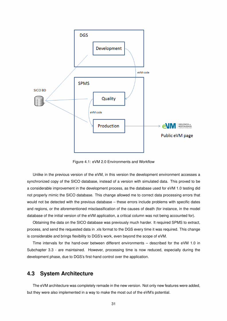
Figure 4.1: eVM 2.0 Environments and Workflow
Unlike in the previous version of the eVM, in this version the development environment accesses a
synchronized copy of the SICO database, instead of a version with simulated data. This proved to be
a considerable improvement in the development process, as the database used for eVM 1.0 testing did
not properly mimic the SICO database. This change allowed me to correct data processing errors that
would not be detected with the previous database – these errors include problems with specific dates
and regions, or the aforementioned misclassification of the causes of death (for instance, in the model
database of the initial version of the eVM application, a critical column was not being accounted for).
Obtaining the data on the SICO database was previously much harder. It required SPMS to extract,
process, and send the requested data in .xls format to the DGS every time it was required. This change
is considerable and brings flexibility to DGS’s work, even beyond the scope of eVM.
Time intervals for the hand-over between different environments – described for the eVM 1.0 in
Subchapter 3.3 - are maintained. However, processing time is now reduced, especially during the
development phase, due to DGS’s first-hand control over the application.
4.3 System Architecture
The eVM architecture was completely remade in the new version. Not only new features were added,
but they were also implemented in a way to make the most out of the eVM’s potential.
31
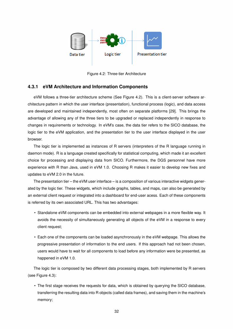
Figure 4.2: Three-tier Architecture
4.3.1 eVM Architecture and Information Components
eVM follows a three-tier architecture scheme (See Figure 4.2). This is a client-server software ar-
chitecture pattern in which the user interface (presentation), functional process (logic), and data access
are developed and maintained independently, most often on separate platforms [29]. This brings the
advantage of allowing any of the three tiers to be upgraded or replaced independently in response to
changes in requirements or technology. In eVM’s case, the data tier refers to the SICO database, the
logic tier to the eVM application, and the presentation tier to the user interface displayed in the user
browser.
The logic tier is implemented as instances of R servers (interpreters of the R language running in
daemon mode). R is a language created specifically for statistical computing, which made it an excellent
choice for processing and displaying data from SICO. Furthermore, the DGS personnel have more
experience with R than Java, used in eVM 1.0. Choosing R makes it easier to develop new fixes and
updates to eVM 2.0 in the future.
The presentation tier – the eVM user interface – is a composition of various interactive widgets gener-
ated by the logic tier. These widgets, which include graphs, tables, and maps, can also be generated by
an external client request or integrated into a dashboard for end-user acess. Each of these components
is referred by its own associated URL. This has two advantages:
• Standalone eVM components can be embedded into external webpages in a more flexible way. It
avoids the necessity of simultaneously generating all objects of the eVM in a response to every
client request;
• Each one of the components can be loaded asynchronously in the eVM webpage. This allows the
progressive presentation of information to the end users. If this approach had not been chosen,
users would have to wait for all components to load before any information were be presented, as
happened in eVM 1.0.
The logic tier is composed by two different data processing stages, both implemented by R servers
(see Figure 4.3):
• The first stage receives the requests for data, which is obtained by querying the SICO database,
transferring the resulting data into R objects (called data frames), and saving them in the machine’s
memory;
32
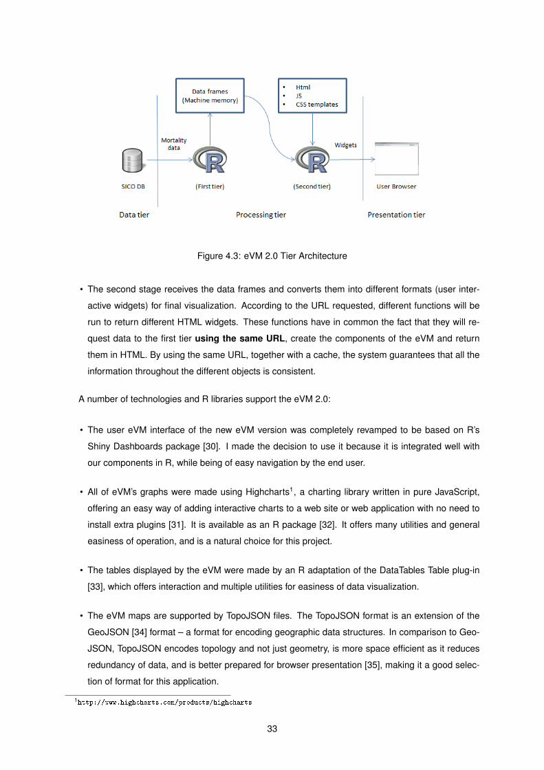
Figure 4.3: eVM 2.0 Tier Architecture
• The second stage receives the data frames and converts them into different formats (user inter-
active widgets) for final visualization. According to the URL requested, different functions will be
run to return different HTML widgets. These functions have in common the fact that they will re-
quest data to the first tier using the same URL, create the components of the eVM and return
them in HTML. By using the same URL, together with a cache, the system guarantees that all the
information throughout the different objects is consistent.
A number of technologies and R libraries support the eVM 2.0:
• The user eVM interface of the new eVM version was completely revamped to be based on R’s
Shiny Dashboards package [30]. I made the decision to use it because it is integrated well with
our components in R, while being of easy navigation by the end user.
• All of eVM’s graphs were made using Highcharts1, a charting library written in pure JavaScript,
offering an easy way of adding interactive charts to a web site or web application with no need to
install extra plugins [31]. It is available as an R package [32]. It offers many utilities and general
easiness of operation, and is a natural choice for this project.
• The tables displayed by the eVM were made by an R adaptation of the DataTables Table plug-in
[33], which offers interaction and multiple utilities for easiness of data visualization.
• The eVM maps are supported by TopoJSON files. The TopoJSON format is an extension of the
GeoJSON [34] format – a format for encoding geographic data structures. In comparison to Geo-
JSON, TopoJSON encodes topology and not just geometry, is more space efficient as it reduces
redundancy of data, and is better prepared for browser presentation [35], making it a good selec-
tion of format for this application.
1http://www.highcharts.com/products/highcharts
33
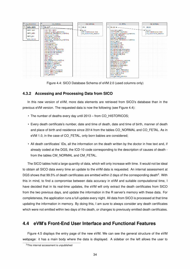
Figure 4.4: SICO Database Schema of eVM 2.0 (used columns only)
4.3.2 Accessing and Processing Data from SICO
In this new version of eVM, more data elements are retrieved from SICO’s database than in the
previous eVM version. The requested data is now the following (see Figure 4.4):
• The number of deaths every day until 2013 – from CO_HISTORICOS;
• Every death certificate’s number, date and time of death, date and time of birth, manner of death
and place of birth and residence since 2014 from the tables CO_NORMAL and CO_FETAL. As in
eVM 1.0, in the case of CO_FETAL, only born babies are considered;
• All death certificates’ IDs, all the information on the death written by the doctor in free text and, if
already coded at the DGS, the ICD-10 code corresponding to the description of causes of death -
from the tables CM_NORMAL and CM_FETAL.
The SICO tables hold a large quantity of data, which will only increase with time. It would not be ideal
to obtain all SICO data every time an update to the eVM data is requested. An internal assessment at
DGS shows that 99.5% of death certificates are emitted within 2 days of the corresponding death2. With
this in mind, to find a compromise between data accuracy in eVM and suitable computational time, I
have decided that in its real-time updates, the eVM will only extract the death certificates from SICO
from the two previous days, and update the information in the R server’s memory with these data. For
completeness, the application runs a full update every night. All data from SICO is processed at that time
updating the information in memory. By doing this, I am sure to always consider any death certificates
which were not emitted within two days of the death, or changes to previously emitted death certificates.
4.4 eVM’s Front-End User Interface and Functional Features
Figure 4.5 displays the entry page of the new eVM. We can see the general structure of the eVM
webpage: it has a main body where the data is displayed. A sidebar on the left allows the user to2This internal accessment is unpublished
34
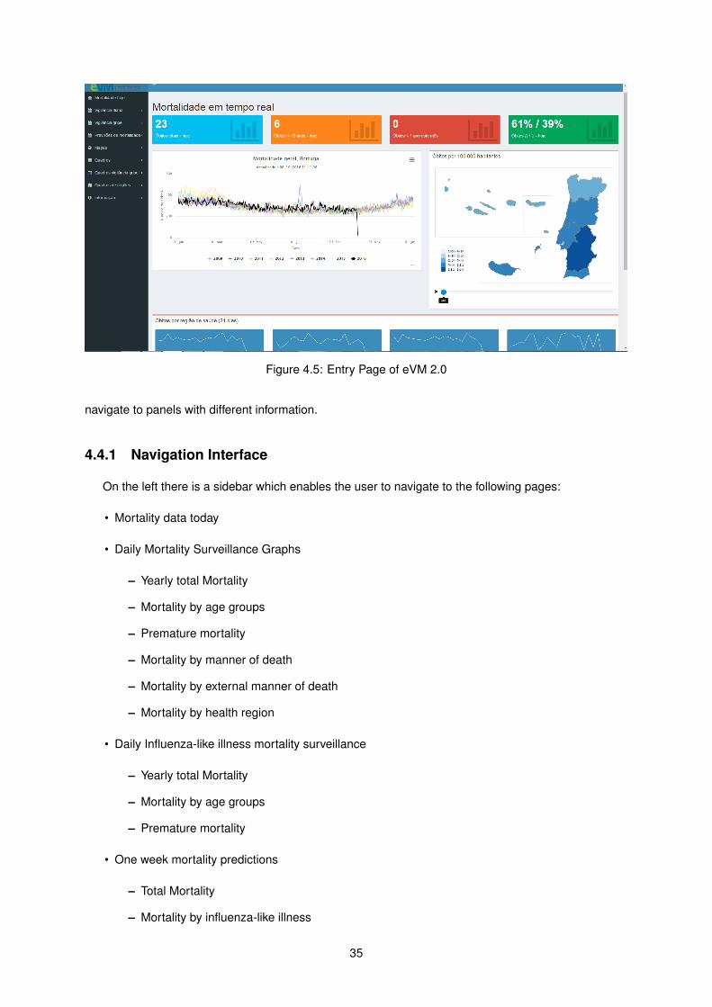
Figure 4.5: Entry Page of eVM 2.0
navigate to panels with different information.
4.4.1 Navigation Interface
On the left there is a sidebar which enables the user to navigate to the following pages:
• Mortality data today
• Daily Mortality Surveillance Graphs
– Yearly total Mortality
– Mortality by age groups
– Premature mortality
– Mortality by manner of death
– Mortality by external manner of death
– Mortality by health region
• Daily Influenza-like illness mortality surveillance
– Yearly total Mortality
– Mortality by age groups
– Premature mortality
• One week mortality predictions
– Total Mortality
– Mortality by influenza-like illness
35

• Maps
– Division by region
– Division by district
• Information tables
– Yearly total Mortality
– Mortality by age groups
– Premature mortality
– Mortality by manner of death
– Child mortality
• Daily Influenza-like illness mortality surveillance tables
– Yearly total Mortality
– Mortality by age groups
– Premature mortality
• Geographical tables
– Division by region
– Division by ACES
– Division by district
– Division by county
• Information
– SICO
– Metadata
The remainder of this section takes a closer look at each of the tab groups and the data and func-
tionalities they present. Rather than being exaustive, it presents a selected sample of the tables/charts
that can be visualized, to illustrate the implemented functionalities.
4.4.2 Mortality Data Today
Mortality Data Today shows the entry page of the eVM website (see 4.5). It is a simple page which
presents some interesting and easy-to-read data, showcasing the near-real-time abilities of SICO
The page displays a few boxes with varied information on mortality, the graph of total yearly mortality
and a map of the districts of Portugal, which provides mortality information in each district. Finally, it
presents a few simple lines informing about the absolute number of deaths in Portugal’s health regions
in the last 21 days, giving a quick impression of the trend.
36
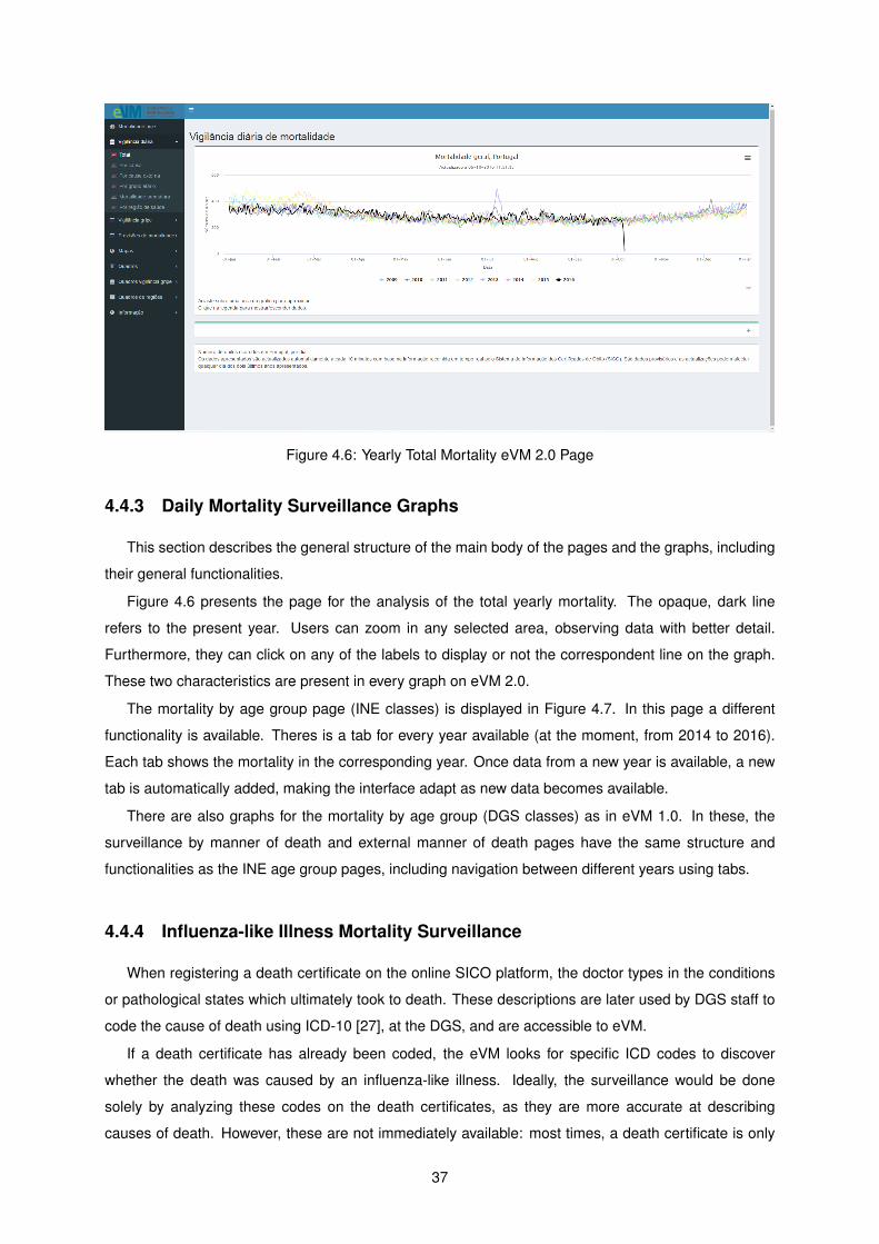
Figure 4.6: Yearly Total Mortality eVM 2.0 Page
4.4.3 Daily Mortality Surveillance Graphs
This section describes the general structure of the main body of the pages and the graphs, including
their general functionalities.
Figure 4.6 presents the page for the analysis of the total yearly mortality. The opaque, dark line
refers to the present year. Users can zoom in any selected area, observing data with better detail.
Furthermore, they can click on any of the labels to display or not the correspondent line on the graph.
These two characteristics are present in every graph on eVM 2.0.
The mortality by age group page (INE classes) is displayed in Figure 4.7. In this page a different
functionality is available. Theres is a tab for every year available (at the moment, from 2014 to 2016).
Each tab shows the mortality in the corresponding year. Once data from a new year is available, a new
tab is automatically added, making the interface adapt as new data becomes available.
There are also graphs for the mortality by age group (DGS classes) as in eVM 1.0. In these, the
surveillance by manner of death and external manner of death pages have the same structure and
functionalities as the INE age group pages, including navigation between different years using tabs.
4.4.4 Influenza-like Illness Mortality Surveillance
When registering a death certificate on the online SICO platform, the doctor types in the conditions
or pathological states which ultimately took to death. These descriptions are later used by DGS staff to
code the cause of death using ICD-10 [27], at the DGS, and are accessible to eVM.
If a death certificate has already been coded, the eVM looks for specific ICD codes to discover
whether the death was caused by an influenza-like illness. Ideally, the surveillance would be done
solely by analyzing these codes on the death certificates, as they are more accurate at describing
causes of death. However, these are not immediately available: most times, a death certificate is only
37
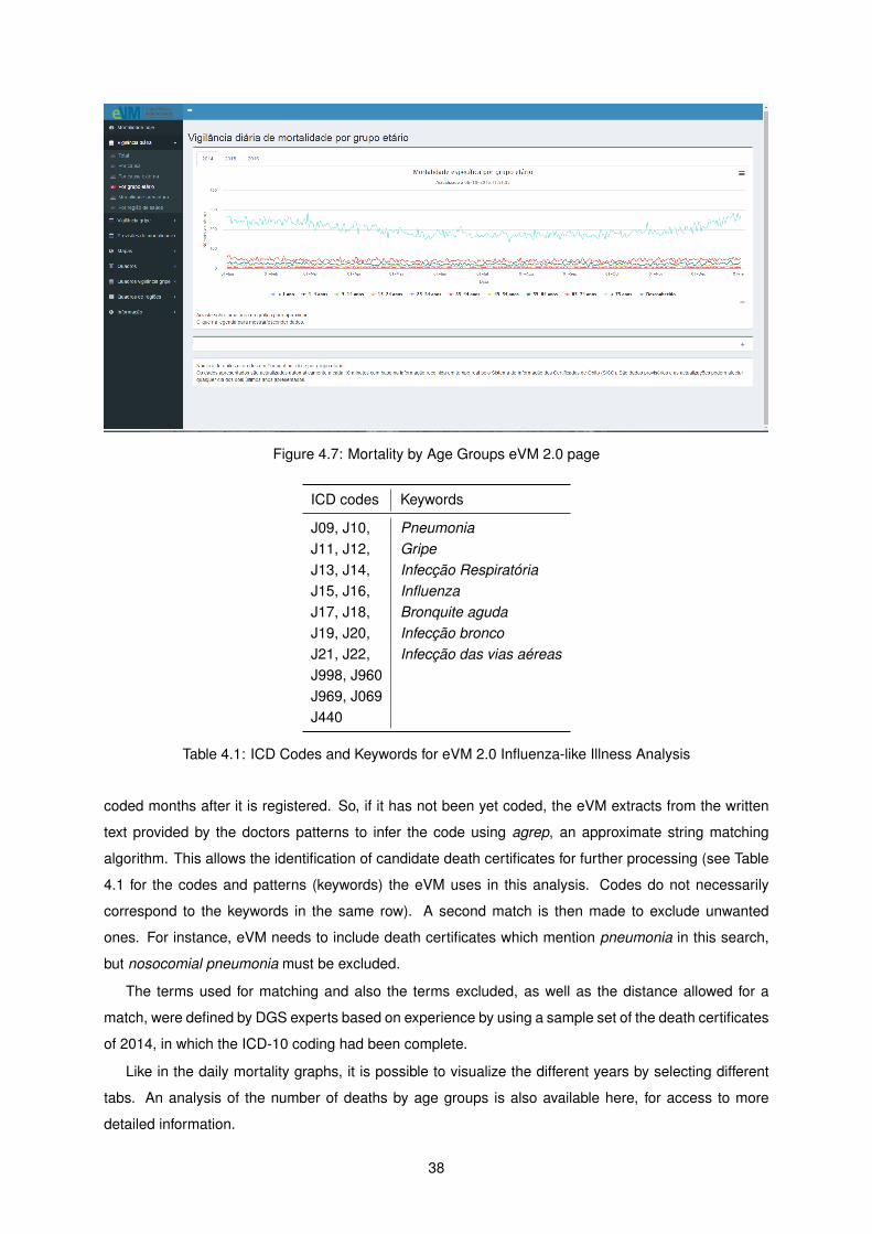
Figure 4.7: Mortality by Age Groups eVM 2.0 page
ICD codes Keywords
J09, J10, PneumoniaJ11, J12, GripeJ13, J14, Infecção RespiratóriaJ15, J16, InfluenzaJ17, J18, Bronquite agudaJ19, J20, Infecção broncoJ21, J22, Infecção das vias aéreasJ998, J960J969, J069J440
Table 4.1: ICD Codes and Keywords for eVM 2.0 Influenza-like Illness Analysis
coded months after it is registered. So, if it has not been yet coded, the eVM extracts from the written
text provided by the doctors patterns to infer the code using agrep, an approximate string matching
algorithm. This allows the identification of candidate death certificates for further processing (see Table
4.1 for the codes and patterns (keywords) the eVM uses in this analysis. Codes do not necessarily
correspond to the keywords in the same row). A second match is then made to exclude unwanted
ones. For instance, eVM needs to include death certificates which mention pneumonia in this search,
but nosocomial pneumonia must be excluded.
The terms used for matching and also the terms excluded, as well as the distance allowed for a
match, were defined by DGS experts based on experience by using a sample set of the death certificates
of 2014, in which the ICD-10 coding had been complete.
Like in the daily mortality graphs, it is possible to visualize the different years by selecting different
tabs. An analysis of the number of deaths by age groups is also available here, for access to more
detailed information.
38
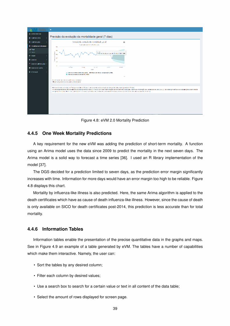
Figure 4.8: eVM 2.0 Mortality Prediction
4.4.5 One Week Mortality Predictions
A key requirement for the new eVM was adding the prediction of short-term mortality. A function
using an Arima model uses the data since 2009 to predict the mortality in the next seven days. The
Arima model is a solid way to forecast a time series [36]. I used an R library implementation of the
model [37].
The DGS decided for a prediction limited to seven days, as the prediction error margin significantly
increases with time. Information for more days would have an error margin too high to be reliable. Figure
4.8 displays this chart.
Mortality by influenza-like illness is also predicted. Here, the same Arima algorithm is applied to the
death certificates which have as cause of death influenza-like illness. However, since the cause of death
is only available on SICO for death certificates post-2014, this prediction is less accurate than for total
mortality.
4.4.6 Information Tables
Information tables enable the presentation of the precise quantitative data in the graphs and maps.
See in Figure 4.9 an example of a table generated by eVM. The tables have a number of capabilities
which make them interactive. Namely, the user can:
• Sort the tables by any desired column;
• Filter each column by desired values;
• Use a search box to search for a certain value or text in all content of the data table;
• Select the amount of rows displayed for screen page.
39
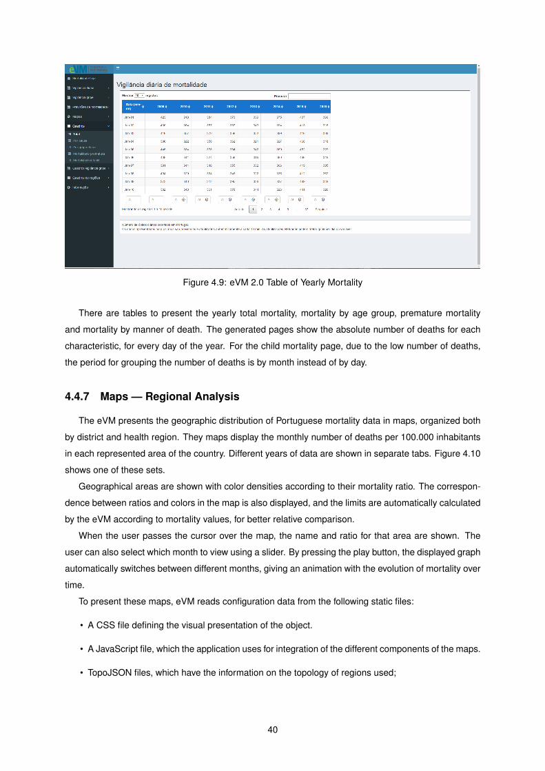
Figure 4.9: eVM 2.0 Table of Yearly Mortality
There are tables to present the yearly total mortality, mortality by age group, premature mortality
and mortality by manner of death. The generated pages show the absolute number of deaths for each
characteristic, for every day of the year. For the child mortality page, due to the low number of deaths,
the period for grouping the number of deaths is by month instead of by day.
4.4.7 Maps — Regional Analysis
The eVM presents the geographic distribution of Portuguese mortality data in maps, organized both
by district and health region. They maps display the monthly number of deaths per 100.000 inhabitants
in each represented area of the country. Different years of data are shown in separate tabs. Figure 4.10
shows one of these sets.
Geographical areas are shown with color densities according to their mortality ratio. The correspon-
dence between ratios and colors in the map is also displayed, and the limits are automatically calculated
by the eVM according to mortality values, for better relative comparison.
When the user passes the cursor over the map, the name and ratio for that area are shown. The
user can also select which month to view using a slider. By pressing the play button, the displayed graph
automatically switches between different months, giving an animation with the evolution of mortality over
time.
To present these maps, eVM reads configuration data from the following static files:
• A CSS file defining the visual presentation of the object.
• A JavaScript file, which the application uses for integration of the different components of the maps.
• TopoJSON files, which have the information on the topology of regions used;
40
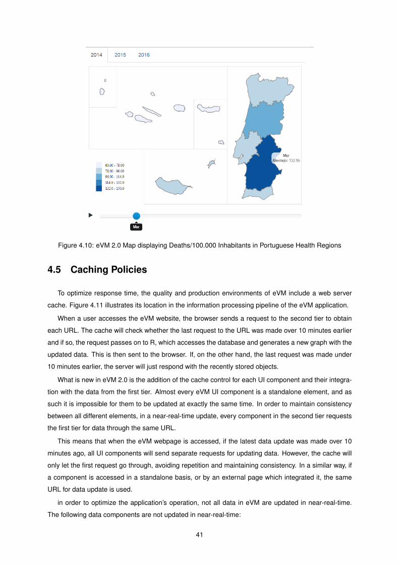
Figure 4.10: eVM 2.0 Map displaying Deaths/100.000 Inhabitants in Portuguese Health Regions
4.5 Caching Policies
To optimize response time, the quality and production environments of eVM include a web server
cache. Figure 4.11 illustrates its location in the information processing pipeline of the eVM application.
When a user accesses the eVM website, the browser sends a request to the second tier to obtain
each URL. The cache will check whether the last request to the URL was made over 10 minutes earlier
and if so, the request passes on to R, which accesses the database and generates a new graph with the
updated data. This is then sent to the browser. If, on the other hand, the last request was made under
10 minutes earlier, the server will just respond with the recently stored objects.
What is new in eVM 2.0 is the addition of the cache control for each UI component and their integra-
tion with the data from the first tier. Almost every eVM UI component is a standalone element, and as
such it is impossible for them to be updated at exactly the same time. In order to maintain consistency
between all different elements, in a near-real-time update, every component in the second tier requests
the first tier for data through the same URL.
This means that when the eVM webpage is accessed, if the latest data update was made over 10
minutes ago, all UI components will send separate requests for updating data. However, the cache will
only let the first request go through, avoiding repetition and maintaining consistency. In a similar way, if
a component is accessed in a standalone basis, or by an external page which integrated it, the same
URL for data update is used.
in order to optimize the application’s operation, not all data in eVM are updated in near-real-time.
The following data components are not updated in near-real-time:
41
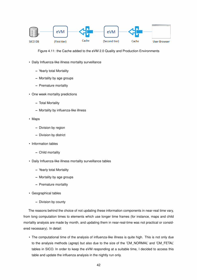
Figure 4.11: the Cache added to the eVM 2.0 Quality and Production Environments
• Daily Influenza-like illness mortality surveillance
– Yearly total Mortality
– Mortality by age groups
– Premature mortality
• One week mortality predictions
– Total Mortality
– Mortality by influenza-like illness
• Maps
– Division by region
– Division by district
• Information tables
– Child mortality
• Daily Influenza-like illness mortality surveillance tables
– Yearly total Mortality
– Mortality by age groups
– Premature mortality
• Geographical tables
– Division by county
The reasons behind the choice of not updating these information components in near-real time vary,
from long computation times to elements which use longer time frames (for instance, maps and child
mortality analysis are made by month, and updating them in near-real-time was not practical or consid-
ered necessary). In detail:
• The computational time of the analysis of influenza-like illness is quite high. This is not only due
to the analysis methods (agrep) but also due to the size of the ’CM_NORMAL’ and ’CM_FETAL’
tables in SICO. In order to keep the eVM responding at a suitable time, I decided to access this
table and update the influenza analysis in the nightly run only.
42
• Mortality predictions do not use the data of the current day in their calculations. The Arima model
we are using works on a full daily basis and not in partial units, and as such it is impossible to use
information from the current day.
• Maps, child mortality information and county information show information in larger time frames
than the two days which eVM gets its data from in the near-real time updates (they display infor-
mation with monthly and weekly time frames). It is not necessary, due to this fact, to update these
data more than once a day.
Having the cache work this way, with separate URLs for different elements, allows for more flexibility
when deciding on the time intervals for updating data. In the future, the timing for updating data of
different elements may be adjusted to fit performance to timeliness criteria.
4.6 Summary
The new eVM has a revamped user interface, and was reengineered to run over a new software
architecture.
The separation of the development and production environments brings more flexibility to the soft-
ware process and gives more control to DGS. It simplifies the application development workflow, while
maintaining the benefits of being hosted at the SPMS infrastructure, which offers technical support and
reliability to SNS applications.
The information processing architecture of the logic tier was reorganized, and now operates in two
stages. The first obtains and processes the data in SICO database. The second generates HTML con-
tent from these data and incorporates them into pages with a navigational interface. Every widget that
the eVM generates is presented as a standalone HTML block, with its own URL. This brings advantages,
such as the ability to incorporate them into external webpages.
The eVM webpage has been redesigned to accommodate the changes to the architecture and the
new functionalities supporting new interaction and easy navigation.
All data analysis is now performed in R which brings more statistical analysis power and informa-
tion visualization capacity to the application. This enabled the implementation of multiple new features
required by the DGS. The current version of the eVM now allows presentation of more diverse content
than the previous version, also in a more intuitive way for users. The accuracy of presented data in
the application is now also higher than before, as the errors in information identified on eVM 1.0 were
corrected.
The next chapter describes the evaluation work of eVM 2.0.
43

44
Chapter 5
Evaluation
This chapter describes the evaluation of the eVM application, which considered three dimensions:
• A survey of the users’ subjective satisfaction with the application;
• Comparison of the performance of the two versions of the application;
• Self-accessment of eVM on Key Factors of Surveillance Systems.
5.1 User Satisfaction Survey
An important aspect to be studied is the satisfaction of the target users of the application. To do
this, I have offered to a small set of users a parameterized questionnaire, which is an adaptation from
the Questionnaire for User Interaction Satisfaction (QUIS) [38]. The QUIS aims to access the end
user’s subjective satisfaction regarding some aspects of computer interface and usability. It originates
from a multi-disciplinary team of researchers in the Human-Computer Interaction Lab at the University
of Maryland, and is currently in version 7.0. The QUIS consists of two sections, one that measures
the overall satisfaction with a system, and another that measures the satisfaction in four specific user
interface aspects of the system.
The measure of overall satisfaction consists of 6 factors with a 9-points rating scale. For each factor,
the lowest and highest values on the scale are associated with a word to describe user assessment.
These factors and associated words can be seen in Table 5.1
Evaluation of satisfaction with the interface includes measures for five elements: screen components
(1), terminology and system feedback (2), learning factors (3), system capabilities (4) and on-screen
help (5). There is a section for each element, which measures factors regarding that element of the
interface. They are also measured using 9-point scales where values are associated with words to
ascertain user’s assessment.
It is important to mention that some specific elements – namely the eVM widgets, such as tables,
maps and charts – were not assessed by the original QUIS, as they are specific for the system. However,
45
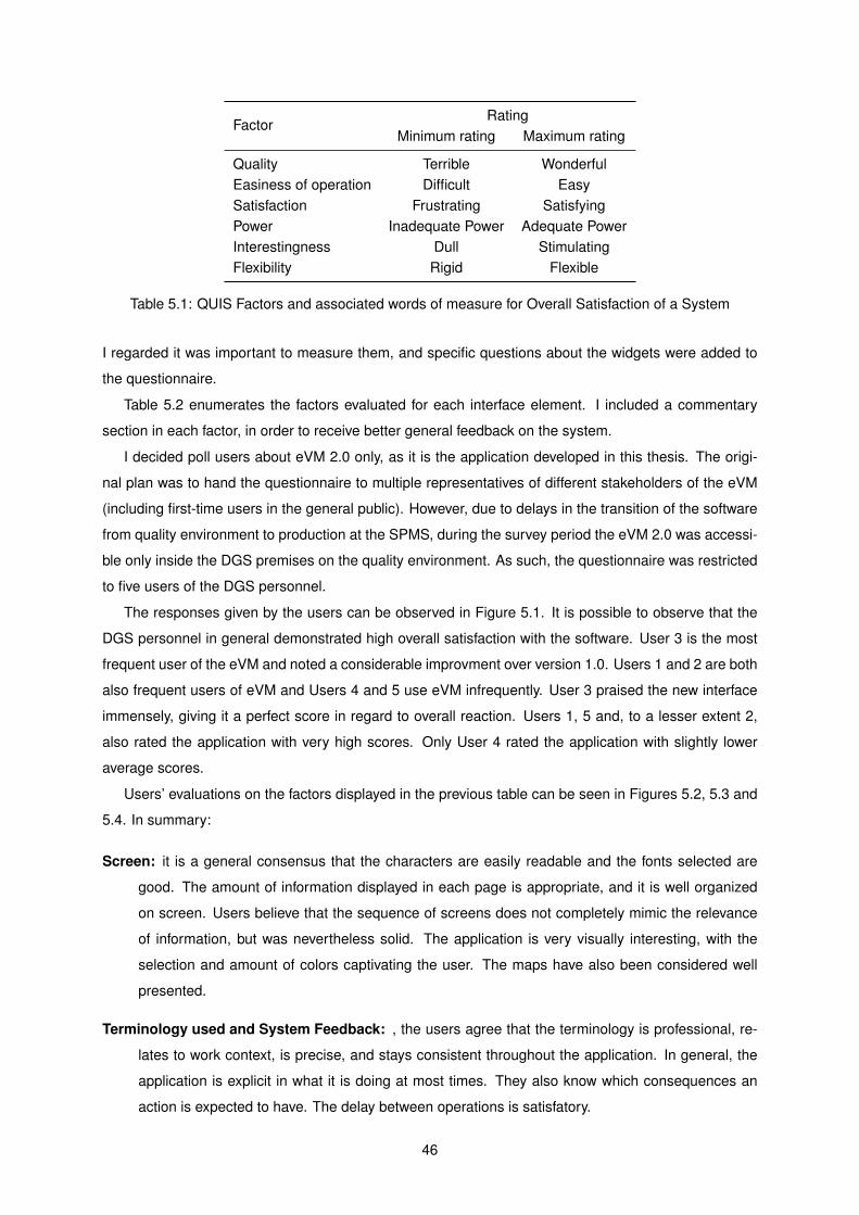
FactorRating
Minimum rating Maximum rating
Quality Terrible WonderfulEasiness of operation Difficult EasySatisfaction Frustrating SatisfyingPower Inadequate Power Adequate PowerInterestingness Dull StimulatingFlexibility Rigid Flexible
Table 5.1: QUIS Factors and associated words of measure for Overall Satisfaction of a System
I regarded it was important to measure them, and specific questions about the widgets were added to
the questionnaire.
Table 5.2 enumerates the factors evaluated for each interface element. I included a commentary
section in each factor, in order to receive better general feedback on the system.
I decided poll users about eVM 2.0 only, as it is the application developed in this thesis. The origi-
nal plan was to hand the questionnaire to multiple representatives of different stakeholders of the eVM
(including first-time users in the general public). However, due to delays in the transition of the software
from quality environment to production at the SPMS, during the survey period the eVM 2.0 was accessi-
ble only inside the DGS premises on the quality environment. As such, the questionnaire was restricted
to five users of the DGS personnel.
The responses given by the users can be observed in Figure 5.1. It is possible to observe that the
DGS personnel in general demonstrated high overall satisfaction with the software. User 3 is the most
frequent user of the eVM and noted a considerable improvment over version 1.0. Users 1 and 2 are both
also frequent users of eVM and Users 4 and 5 use eVM infrequently. User 3 praised the new interface
immensely, giving it a perfect score in regard to overall reaction. Users 1, 5 and, to a lesser extent 2,
also rated the application with very high scores. Only User 4 rated the application with slightly lower
average scores.
Users’ evaluations on the factors displayed in the previous table can be seen in Figures 5.2, 5.3 and
5.4. In summary:
Screen: it is a general consensus that the characters are easily readable and the fonts selected are
good. The amount of information displayed in each page is appropriate, and it is well organized
on screen. Users believe that the sequence of screens does not completely mimic the relevance
of information, but was nevertheless solid. The application is very visually interesting, with the
selection and amount of colors captivating the user. The maps have also been considered well
presented.
Terminology used and System Feedback: , the users agree that the terminology is professional, re-
lates to work context, is precise, and stays consistent throughout the application. In general, the
application is explicit in what it is doing at most times. They also know which consequences an
action is expected to have. The delay between operations is satisfatory.
46
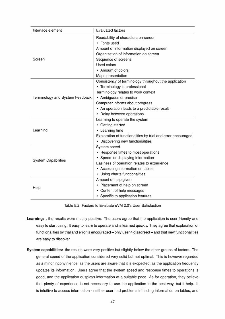
Interface element Evaluated factors
Screen
Readability of characters on-screen• Fonts usedAmount of information displayed on screenOrganization of information on screenSequence of screensUsed colors• Amount of colorsMaps presentation
Terminology and System Feedback
Consistency of terminology throughout the application• Terminology is professionalTerminology relates to work context• Ambiguous or preciseComputer informs about progress• An operation leads to a predictable result• Delay between operations
Learning
Learning to operate the system• Getting started• Learning timeExploration of functionalities by trial and error encouraged• Discovering new functionalities
System Capabilities
System speed• Response times to most operations• Speed for displaying informationEasiness of operation relates to experience• Accessing information on tables• Using charts functionalities
Help
Amount of help given• Placement of help on screen• Content of help messages• Specific to application features
Table 5.2: Factors to Evaluate eVM 2.0’s User Satisfaction
Learning: , the results were mostly positive. The users agree that the application is user-friendly and
easy to start using. It easy to learn to operate and is learned quickly. They agree that exploration of
functionalities by trial and error is encouraged – only user 4 disagreed – and that new functionalities
are easy to discover.
System capabilities: the results were very positive but slightly below the other groups of factors. The
general speed of the application considered very solid but not optimal. This is however regarded
as a minor inconvinience, as the users are aware that it is excpected, as the application frequently
updates its information. Users agree that the system speed and response times to operations is
good, and the application dusplays information at a suitable pace. As for operation, they believe
that plenty of experience is not necessary to use the application in the best way, but it help. It
is intuitive to access information - neither user had problems in finding information on tables, and
47
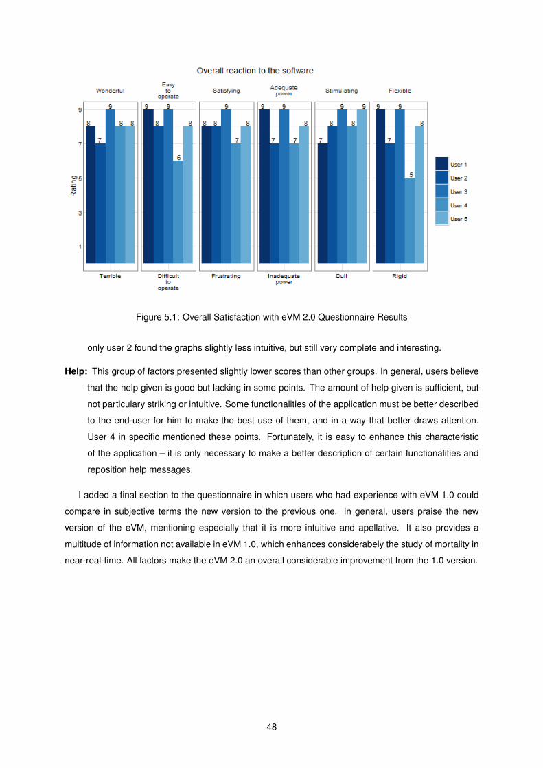
Figure 5.1: Overall Satisfaction with eVM 2.0 Questionnaire Results
only user 2 found the graphs slightly less intuitive, but still very complete and interesting.
Help: This group of factors presented slightly lower scores than other groups. In general, users believe
that the help given is good but lacking in some points. The amount of help given is sufficient, but
not particulary striking or intuitive. Some functionalities of the application must be better described
to the end-user for him to make the best use of them, and in a way that better draws attention.
User 4 in specific mentioned these points. Fortunately, it is easy to enhance this characteristic
of the application – it is only necessary to make a better description of certain functionalities and
reposition help messages.
I added a final section to the questionnaire in which users who had experience with eVM 1.0 could
compare in subjective terms the new version to the previous one. In general, users praise the new
version of the eVM, mentioning especially that it is more intuitive and apellative. It also provides a
multitude of information not available in eVM 1.0, which enhances considerabely the study of mortality in
near-real-time. All factors make the eVM 2.0 an overall considerable improvement from the 1.0 version.
48
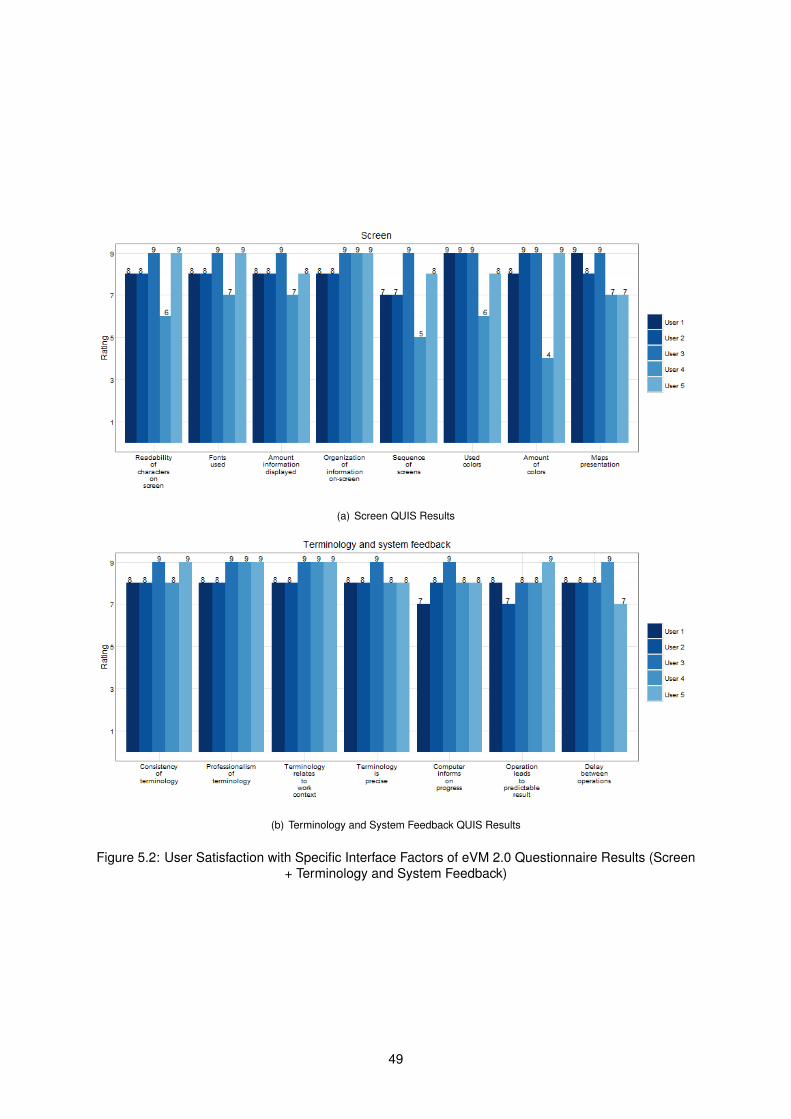
(a) Screen QUIS Results
(b) Terminology and System Feedback QUIS Results
Figure 5.2: User Satisfaction with Specific Interface Factors of eVM 2.0 Questionnaire Results (Screen+ Terminology and System Feedback)
49
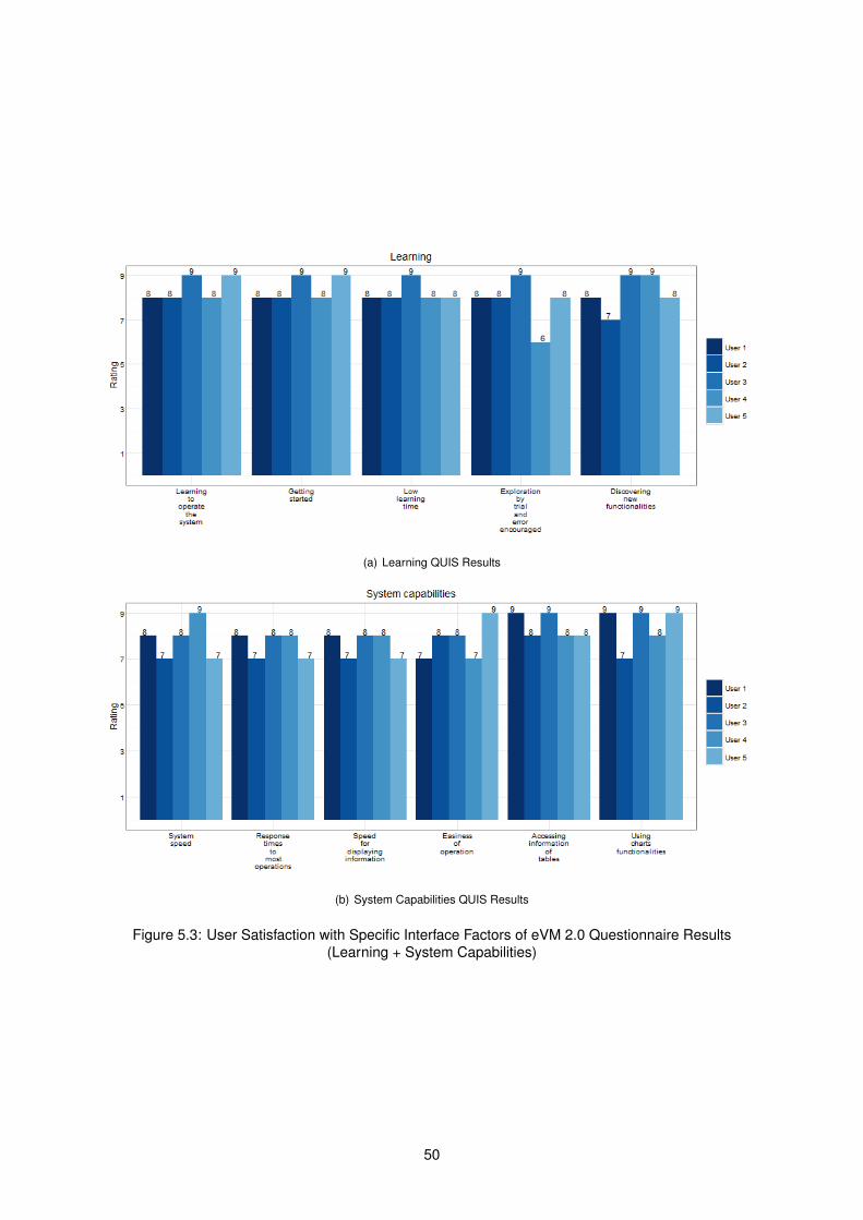
(a) Learning QUIS Results
(b) System Capabilities QUIS Results
Figure 5.3: User Satisfaction with Specific Interface Factors of eVM 2.0 Questionnaire Results(Learning + System Capabilities)
50
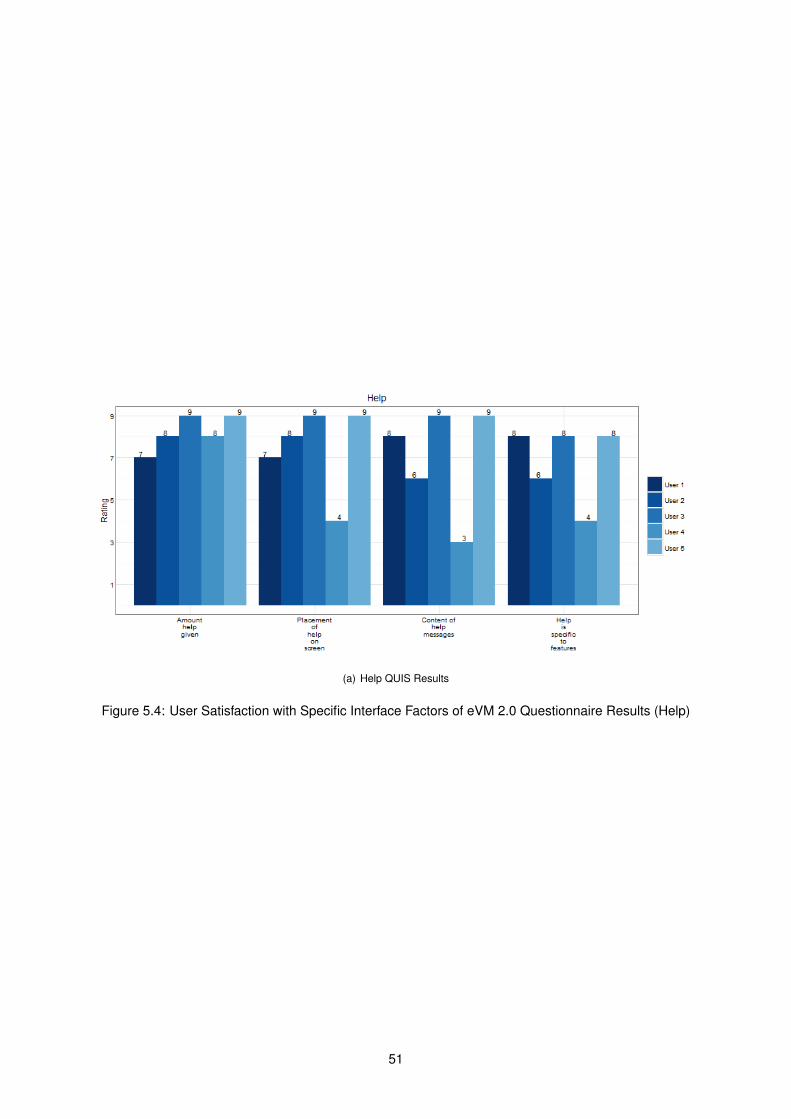
(a) Help QUIS Results
Figure 5.4: User Satisfaction with Specific Interface Factors of eVM 2.0 Questionnaire Results (Help)
51
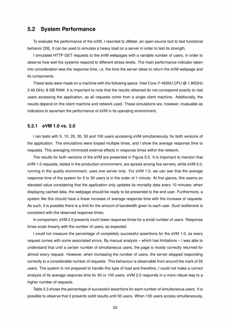
5.2 System Performance
To evaluate the performance of the eVM, I resorted to JMeter, an open-source tool to test functional
behavior [39]. It can be used to simulate a heavy load on a server in order to test its strength.
I simulated HTTP GET requests to the eVM webpages with a variable number of users, in order to
observe how well the systems respond to different stress levels. The main performance indicator taken
into consideration was the response time, i.e. the time the server takes to return the eVM webpage and
its components.
These tests were made on a machine with the following specs: Intel Core i7-4500U CPU @ 1.80GHz
2.40 GHz; 8 GB RAM. It is important to note that the results obtained do not correspond exactly to real
users accessing the application, as all requests come from a single client machine. Additionally, the
results depend on the client machine and network used. These simulations are, however, invaluable as
indicators to ascertain the performance of eVM in its operating environment.
5.2.1 eVM 1.0 vs. 2.0
I ran tests with 5, 10, 20, 30, 50 and 100 users accessing eVM simultaneously, for both versions of
the application. The simulations were looped multiple times, and I show the average response time to
requests. This averaging minimized external effects in response times within the network.
The results for both versions of the eVM are presented in Figure 5.5. It is important to mention that
eVM 1.0 requests, tested in the production environment, are spread among five servers, while eVM 2.0,
running in the quality environment, uses one server only. For eVM 1.0, we can see that the average
response time of the system for 5 to 30 users is in the order of 1 minute. At first glance, this seems an
elevated value considering that the application only updates its mortality data every 10 minutes; when
displaying cached data, the webpage should be ready to be presented to the end user. Furthermore, a
system like this should have a linear increase of average response time with the increase of requests.
As such, it is possible there is a limit for the amount of bandwidth given to each user. Such bottleneck is
consistent with the observed response times.
In comparison, eVM 2.0 presents much lower response times for a small number of users. Response
times scale linearly with the number of users, as expected.
I could not measure the percentage of completely successful assertions for the eVM 1.0, as every
request comes with some associated errors. By manual analysis – which has limitations – I was able to
understand that until a certain number of simultaneous users, the page is mostly correctly returned for
almost every request. However, when increasing the number of users, the server stopped responding
correctly to a considerable number of requests. This behaviour is observable from around the mark of 50
users. The system is not prepared to handle this type of load and therefore, I could not make a correct
analysis of its average response time for 50 or 100 users. eVM 2.0 responds in a more robust way to a
higher number of requests.
Table 5.3 shows the percentage of successful assertions for each number of simultaneous users. It is
possible to observe that it presents solid results until 50 users. When 100 users access simultaneously,
52
Figure 5.5: Average Response Time of both eVM Versions vs. Different Number of Simultaneous Users
# simultaneous usersResponse times (ms) Successful requests (%)
eVM 1.0 eVM 2.0 eVM 2.0
5 60273 6448 100
10 62488 12853 100
20 60297 22878 98
30 60305 25754 98
50 Not available 57461 94
100 Not available 130371 78
Table 5.3: Response Times (in ms) and Successful Requests (in %) vs. Different Amount ofSimultaneous Users Accessing eVM 2.0
it starts presenting some instability. However, near 4 in 5 requests are successful with a single server,
which is a very considerable updgrade from eVM 1.0.
I analyzed more in-depth the details of the requests with 30 and 50 users for eVM 1.0. The response
times obtained during the simulation period can be seen in Figure 5.6 1. It is noticeable that for 30 users
the results are consistent throughout the test, with response times deviating very little. In comparison,
for 50 users some requests present a response time near 0ms. These correspond to the requests which
were not successful, and the page was not properly returned.
It is possible to derive the following conclusions:
1. There is likely a bandwidth limit for each user that accesses the servicos.min-saude.pt server. This
would explain the constant response times for 30 users.
2. The server at servicos.min-saude.pt does not respond well to many users accessing at the same
time, blocking their access. This would explain the response times near null values after some
time when testing with a higher number of users.1Unfortunately, JMeter does not allow for visualization of multiple test results in the same graph.
53
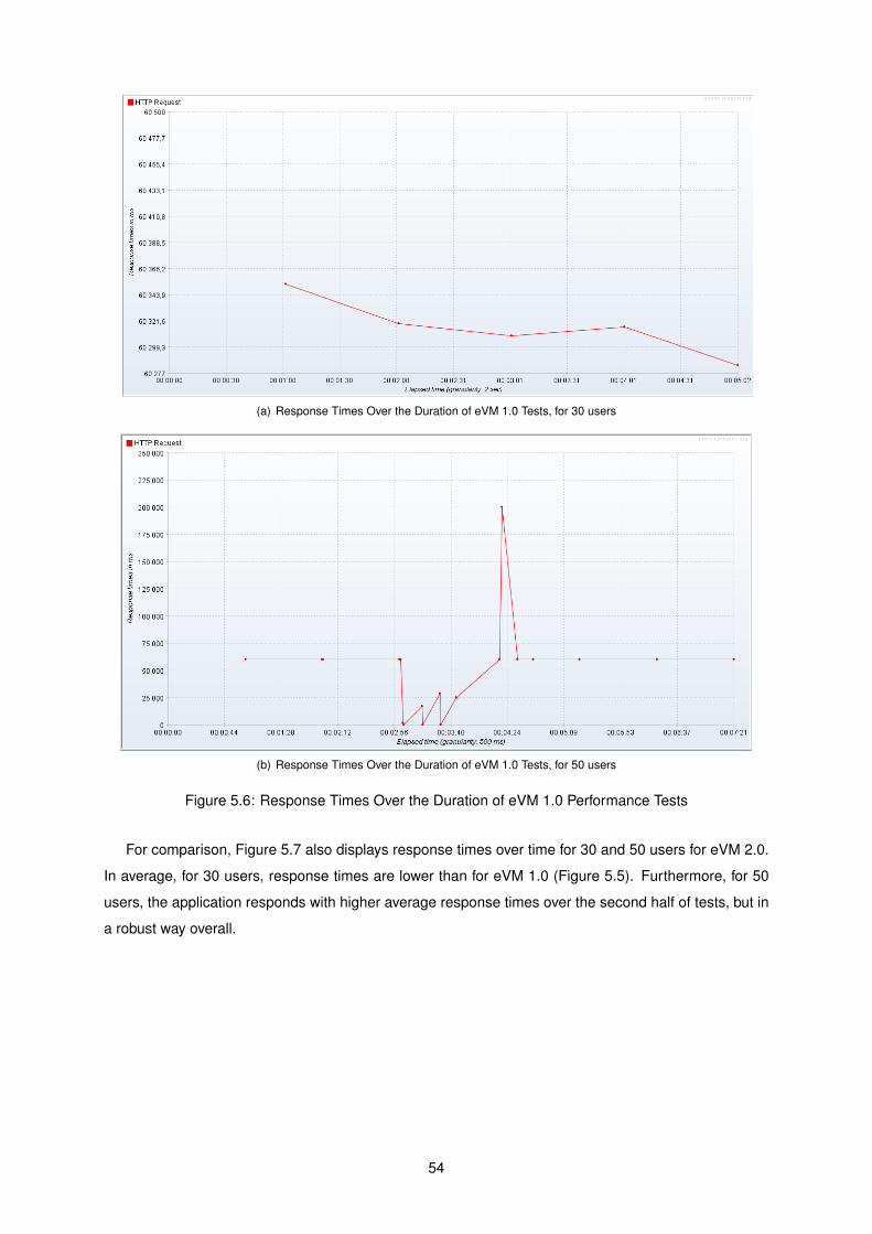
(a) Response Times Over the Duration of eVM 1.0 Tests, for 30 users
(b) Response Times Over the Duration of eVM 1.0 Tests, for 50 users
Figure 5.6: Response Times Over the Duration of eVM 1.0 Performance Tests
For comparison, Figure 5.7 also displays response times over time for 30 and 50 users for eVM 2.0.
In average, for 30 users, response times are lower than for eVM 1.0 (Figure 5.5). Furthermore, for 50
users, the application responds with higher average response times over the second half of tests, but in
a robust way overall.
54
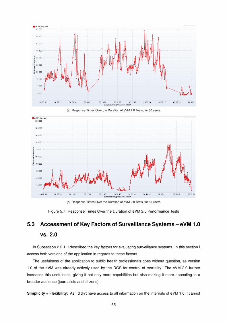
(a) Response Times Over the Duration of eVM 2.0 Tests, for 30 users
(b) Response Times Over the Duration of eVM 2.0 Tests, for 50 users
Figure 5.7: Response Times Over the Duration of eVM 2.0 Performance Tests
5.3 Accessment of Key Factors of Surveillance Systems – eVM 1.0
vs. 2.0
In Subsection 2.2.1, I described the key factors for evaluating surveillance systems. In this section I
access both versions of the application in regards to these factors.
The usefulness of the application to public health professionals goes without question, as version
1.0 of the eVM was already actively used by the DGS for control of mortality. The eVM 2.0 further
increases this usefulness, giving it not only more capabilities but also making it more appealing to a
broader audience (journalists and citizens).
Simplicity + Flexibility: As I didn’t have access to all information on the internals of eVM 1.0, I cannot
55
fully access the simplicity and flexibility of its software. However, the arrangement with the SPMS
limited flexibility for developing updates to the application. The three-tier architecture of eVM 2.0,
together with the fact that the development environment is now at the DGS, introduces a significant
increase of flexibility of the system.
Data quality: The quality of the system data – in eVM’s case, from SICO – is continuously being
checked and corrected. The data in SICO has therefore very high quality. As both versions of
the eVM use the same source for data, it is not increased from 1.0 to 2.0.
Acceptability + Sensitivity: It is mandatory by law for the doctors to register the death certificates on
the SICO application. This means very few deaths are not considered in the eVM data, resulting
in very high acceptability. This applies to sensitivity as well, as every known death is considered in
the eVM. These variables do not suffer differences between eVM versions.
Predicted Value Positive: This is a variable which is hard to measure. It is highly dependable on what
is registered in the SICO itself by its users. There will not be an increase on this variable on the
change to the eVM 2.0. However, DGS personnel and other entities constantly check and update
the data on death certificates, making sure the value is high.
Representativeness The representativeness of the eVM is limited only to the specificity of the anal-
ysis and displayed information. In the 2.0 version, more groups, areas, and circumstances are
represented, implying a higher representativeness of mortality.
Timeliness: This is the characteristic at which the eVM strives to be unique at. In 1.5 days over 99%
of deaths are registered in SICO2. The eVM makes the most out of these numbers by generating
summarized data in near-real time. For now, the eVM 2.0 maintains the same time intervals for
update as its previous version. However, since each element has its specific URL, it allows for the
update time for each element to be chosen individually in the future.
Stability: eVM 1.0 was not stable as intended. Not only was the application slower than expected,
nut crashes were also a common occurrence. It was built on more static code than it should,
which creates problems when new situations arise (for instance, there were frequent bugs when
uploading and processing data from a new year). These problems were identified and taken into
consideration in the development of the 2.0 version. Furthermore, the cache keeps the last version
of generated data presentation if the application is unable to update them from the SICO database,
increasing the application availability.
5.4 Summary
Users evaluated their satisfaction on the new eVM version, using an adapted version of QUIS for
measuring user satisfaction. Users praised the new interface, especially in comparison to eVM 1.0.
2Information obtained from an unpublished internal DGS accessment
56

The system terminology, feedback, learning curve, capabilities were all rated very positively, and only
specific points of screen and help messages need reformulation. In general, users reacted very well
to the application, considering it very intuitive and much more informative, expecting it to be an useful
asset in their work.
I also measured the average response times and percentage of successful requests of the application
for different numbers of simultaneous users, in both eVM 1.0 and eVM 2.0. eVM 2.0 presented much
better results than its previous version, with a linear curve which predicts how well the system scales
with number of users and a much more solid response to an increase of requests.
Finally, I compared both versions of the application by the key factors of surveillance systems. I
reached the conclusion that eVM 2.0 is a considerable upgrade to its previous version, as it presents
improvements in multiple factors.
57

58
Chapter 6
Conclusions
The stated objectives of this work were:
1. Reformulate the system architecture to support separate development and production environ-
ments;
2. Design and development a new version of the eVM, with more analytical abilities and upgraded
interface;
both have been achieved. The new eVM application is in place, implemented in SPMS’s infrastructure
providing the services it was designed for. The development of updates and new versions is, in the future,
of the responsibility of the DGS.
The other main focus of this project was to update the eVM with new data analysis capabilities. Users
of the application can visualize data which they could not beforehand in the eVM 1.0. Furthermore,
special attention was given to the user interface of the application for intuitive display of information. As
a public application, it is in my view important that the general public can easily find and analyze the
information they need.
The information which was chosen to be presented in the application was decided by staff at the
DGS. It was selected based on their experience, to be of highest relevance and priority both for public
users and policy-making health professionals in Portugal. I aimed at fulfilling all of the medium-term
needs for information, and the feedback I received after conducting a survey was positive.
6.1 Contributions
The eVM allows for an in-depth analysis on the mortality of the population of an entire country in
almost real-time. It is unique in the world in this sense. It aggregates this information by several useful
dimensions of analysis.
Although the eVM was a previously existing application, the work developed in this project introduces
new capabilities and much more to offer – both to professionals in health and the general public. It allows
59
to easily identify trends in mortality, both general and specified. This ability to display mortality in near-
real-time can go past health and extend to other fields. For instance, individuals connect to law can
study homicide rates in near-real-time, understanding trends of potential criminalization.
The fact that this system is unique and innovative can also motivate other countries to start using the
same "in-real time" model as the eVM + SICO use, since it is a powerful tool. The tool has already been
presented publicly by the media and to international health entities such as the WHO [40].
6.2 Future Work
The new eVM is a considerable upgrade from the previous version. There are, however, some ways
in which I believe it can be improved in the future.
There is some information which can be added in future versions which might prove useful, as the
necessities of the users become more specific. The eVM is prepared to easily accommodate new
information: simply, a new tab has to be added to the dashboard and the content to its correspondent
body, in the fashion that the existing ones work.
I designed the eVM with its use by regional and health-center health policy makers in mind. There-
fore, as they become more accustomed to the application, it will be useful for them if they can see, at
their level of action, the same variables which the eVM now presents for the whole Portuguese popu-
lation. This would mean to separate, within each division, deaths by age groups, causes and external
causes, influenza-like illness, and others which might be found relevant.
The integration of analysis and/or algorithms used by other applications or entities is something which
is also planned. For instance, applying the EuroMOMO algorithm or the generation of mortality alerts
in real-time analysis can be another breakthrough in mortality analysis. Another example of a feature,
which is planned for the future, is the correlation between mortality and external variables. A partnership
with INSA in order to use its ICARO data on heat-waves and correlate it with the accurate mortality data
from SICO would, in my opinion, be very advantegous to the portuguese National Health System.
Another point to work on in the future is the data visualization interface/eVM webpage. The Shiny
Dashboard was originally chosen as it integrated well with R objects, without demanding expert knowl-
edge and plenty of experience in HTML and JavaScript. However, with the development of the project,
to add features deemed necessary for the eVM 2.0, I found the need to integrate these languages into
my code. Albeit the application does well its desired purpose, it does not make the most optimal use of
these languages and the utilities they provide. As such I recommend that, in the long-term future, the
DGS considers re-integrating the data originated from R into a different end-user application. This end-
user application could be developed by a user experience specialist in developing interactive information
visualization applications. This could be enhanced with a personalization of the eVM, for example in the
form of user accounts.
60

Bibliography
[1] C.-E. A. Winslow. The untitled fields of public health. Science (51), 1920.
[2] Health Promotion Glossary. World Health Organization, Geneva, 1998.
[3] Despacho n.º 6401/2016. Diário da República, 2ª série - Nº94, May 2016.
[4] Committee for the Study of the Future of Public Health, Division of Health Care Services, Institute of
Medicine. The Future of Public Health. National Academy Press, 1988. ISBN:978-0-309-03830-0.
[5] World Health Organization. World health statistics 2014. Technical report, World Health Organiza-
tion, 2014. ISBN 978 92 4 069267 1.
[6] A. F. William Yasnoff, Patrick W. O’Carroll. Biomedical Informatics: Computer Applications in Health-
care and Medicine. Spinger-Verlag, third edition, 2006.
[7] B. C. K. Choi. The past, present, and future of public health surveillance. Scientifica, 2012, 2012.
Article ID 875253.
[8] World Health Organization. Public health surveillance, 2010. URL http://www.who.int/topics/
public_health_surveillance/en/. Visited March 2016.
[9] R. R. German and D. W. et al. Updated guidelines for evaluating public health surveillance systems
recommendations from the guidelines working group. MMWR Recommendations and Reports,
2001.
[10] J. Z. Losos. Routine and sentinel surveillance methods. La Revue de Santé de la Méditerranée
orientale, 2(1), 1996.
[11] Unite For Sight. Module 1: Importance of surveillance and detection in public health initiatives, .
URL http://www.uniteforsight.org/surveillance/module1. Visited March 2016.
[12] World Health Organization. Global health observatory data. URL http://www.who.int/gho/en/.
Visited March 2016.
[13] J. W. McArthur. The origins of the millennium development goals. The SAIS Review of International
Affairs, XXXIV(2), 2014.
[14] Unite For Sight. Module 2: WHO and CDC global surveillance systems, . URL http://www.
uniteforsight.org/surveillance/module2. Visited March 2016.
61
[15] F. H. Weinstein MC. Clinical decision analysis, chapter 3, pages 84–94. Saunders, 1980.
[16] M. Kanieff, G. Rago, and G. M. et al. The potencial for a concerted system for the rapid monitoring
of excess mortality throughout europe. Eurosurveillance, 15(43), October 2010.
[17] B. Gergonne, A. Mazick, J. O’Donnell, A. Oza, B. Cox, and F. Wuillaume. Work package 7 report.
Technical report, European monitoring of excess mortality for public health action, 2011. Visited
March 2016.
[18] B. Cox, F. Wuillaume, H. Van Oyen and S. Maes. Monitoring of all-cause mortality in Belgium (Be-
MOMO): a new and automated system for the early detection and quantification of the mortality
impact of public health events. Int J Public Health, August 2010. 55(4):251-259.
[19] Plan Nacional de actuaciones preventivas de los efectos del exceso de temperaturas so-
bre la salude, May 2014. Servicios Sociales e Igualdad Ministerio de Sanidad. URL
http://msssi.gob.es/ciudadanos/saludAmbLaboral/planAltasTemp/2014/Plan_nacional_
actuaciones_preventivas.htm. Visited April 2016.
[20] A. P. Wagner, E. McKenzie, C. Robertson, J. McMenamin, A. Reynolds and H. Murdoch. Automated
mortality monitoring in Scotland from 2009. Eurosurveillance, 18(15), April 2013.
[21] Centers for disease control and prevention. Surveillance strategy - a strategy for improving the
centers for disease control and prevention’s activities in public health surveillance.
[22] C. Fan, A. van Dijk, and D. F. et al. Automated mortality surveillance in south-eastern ontario for
pandemic influenza preparedness. Canadian Journal of Public Health, 2010.
[23] S. N. de Saúde – Instituto Nacional de Saúde Ricardo Jorge. VDM. URL http:
//www.insa.pt/sites/INSA/Portugues/AreasCientificas/Epidemiologia/Unidades/
UnInstrObser/Paginas/VDM.aspx. Visited March 2016.
[24] P. Nogueira, A. Machado, E. Rodrigues et al. The new automated daily mortality surveillance
system in Portugal. Eurosurveillance, 15(13), April 2010.
[25] T. Chaves. Automated daily mortality surveillance systems. Master’s thesis, Instituto Superior
Técnico, 2015.
[26] M. Figueiral. Codegom: A governance model for clinical ontologies. Master’s thesis, Instituto
Superior Técnico, 2015.
[27] World Health Organization, editor. International Statistical Classification of Diseases and Related
Health Problems, volume 2. World Health Organization, 4th edition, 2010. ISBN 978-92-4-154834-
2.
[28] J. R. M. J-M Romeder. Potential years of life lost between ages 1 and 70: An indicator of premature
mortality for health planning. International Journal of Epidemiology, 1977.
62
[29] W. Eckerson. Three tier client/server architecture: Achieving scalability, performance, and efficiency
in client server applications. Open Information Systems 10, 1995.
[30] W. Chang, RStudio, Almasaeed Studio, and Adobe Systems Incorporated. Package ‘shinydash-
board’. CRAN, September 2016. Version 0.5.3.
[31] J. Kuan. Learning Highcharts. Packt Publishing, December 2012. ISBN 978-1-84951-908-3.
[32] R. Vaidyanathan. rCharts Documentation. CRAN, February 2016. Release 0.1.0.
[33] Y. Xie, J. Cheng, and J. A. et al. Package ‘DT’. CRAN, August 2016. Version 0.2.
[34] H. Butler, Hobu Inc., M. Daly et al. The geojson format. Technical report, Internet Engineering Task
Force (IETF), August 2016. ISSN: 2070-1721.
[35] N. Minar. Topojson - a smaller geojson with some neat tricks. Some Bits Weblog, June 2013.
[36] R. Nau. Arima model. URL http://people.duke.edu/~rnau/411arim.htm. Visited April 2016.
[37] R. Hyndman. Package ‘forecast’. CRAN, October 2016. Version 7.3.
[38] J. P. Chin, V. A. Diehl, and K. L. Norman. Development of an instrument measuring user satisfaction
of the human-computer interface. In Proceedings of the SIGCHI Conference on Human Factors in
Computing Systems, CHI ’88, pages 213–218, New York, NY, USA, 1988. ACM. ISBN 0-201-
14237-6. doi: 10.1145/57167.57203. URL http://doi.acm.org/10.1145/57167.57203.
[39] The Apache Software Foundation. Apache jmeter. URL http://jmeter.apache.org/. Visited
June 2016.
[40] M. F. Reis. "Um centro destes na Libéria teria sido decisivo no combate ao ébola". Jornal i. 7th
October 2016.
63

64