Real music magazines
10
IN WHAT WAYS DOES YOUR MEDIA PRODUCT USE, DEVELOP OR CHALLENGE FORMS AND CONVENTIONS OF REAL MEDIA PRODUCTS Chris Carey
-
Upload
chriscarey20 -
Category
Documents
-
view
47 -
download
0
Transcript of Real music magazines
IN WHAT WAYS DOES YOUR MEDIA PRODUCT USE, DEVELOP OR CHALLENGE FORMS AND CONVENTIONS OF REAL MEDIA PRODUCTS
Chris Carey
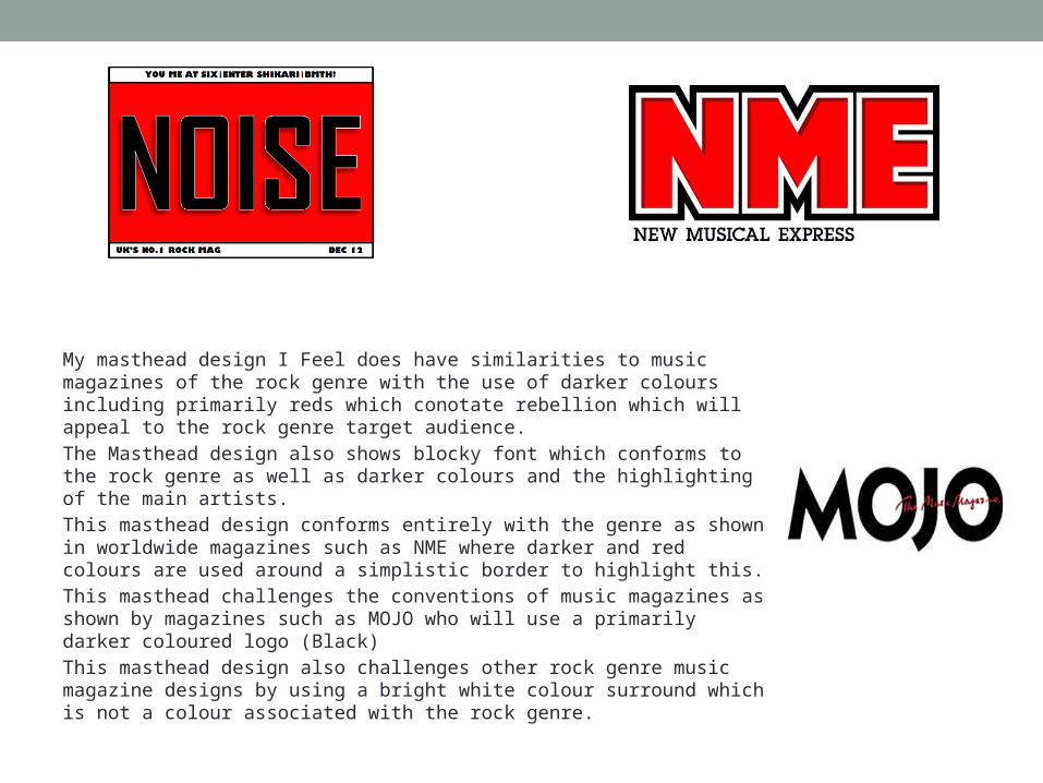
My masthead design I Feel does have similarities to music magazines of the rock genre with the use of darker colours including primarily reds which conotate rebellion which will appeal to the rock genre target audience.
The Masthead design also shows blocky font which conforms to the rock genre as well as darker colours and the highlighting of the main artists.
This masthead design conforms entirely with the genre as shown in worldwide magazines such as NME where darker and red colours are used around a simplistic border to highlight this.
This masthead challenges the conventions of music magazines as shown by magazines such as MOJO who will use a primarily darker coloured logo (Black)
This masthead design also challenges other rock genre music magazine designs by using a bright white colour surround which is not a colour associated with the rock genre.
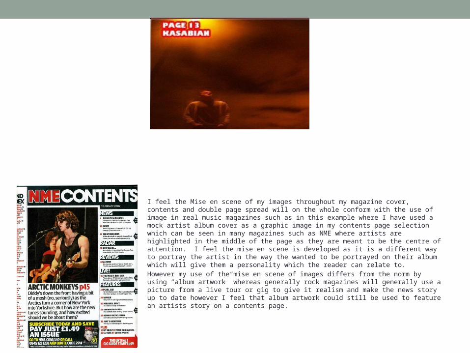
I feel the Mise en scene of my images throughout my magazine cover, contents and double page spread will on the whole conform with the use of image in real music magazines such as in this example where I have used a mock artist album cover as a graphic image in my contents page selection which can be seen in many magazines such as NME where artists are highlighted in the middle of the page as they are meant to be the centre of attention. I feel the mise en scene is developed as it is a different way to portray the artist in the way the wanted to be portrayed on their album which will give them a personality which the reader can relate to.
However my use of the mise en scene of images differs from the norm by using “album artwork” whereas generally rock magazines will generally use a picture from a live tour or gig to give it realism and make the news story up to date however I feel that album artwork could still be used to feature an artists story on a contents page.
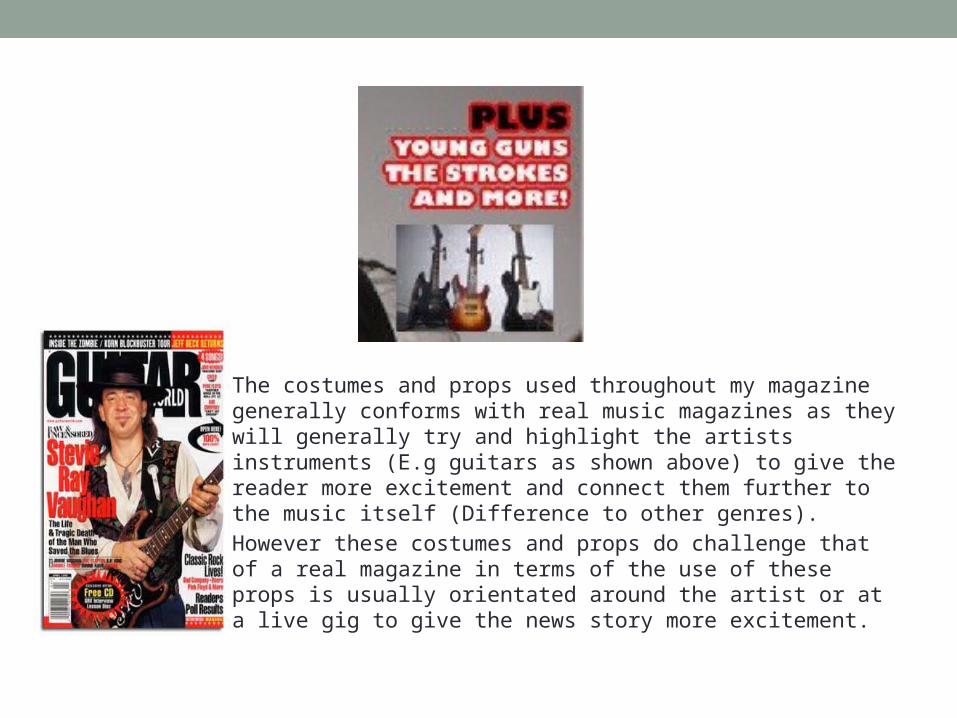
The costumes and props used throughout my magazine generally conforms with real music magazines as they will generally try and highlight the artists instruments (E.g guitars as shown above) to give the reader more excitement and connect them further to the music itself (Difference to other genres).
However these costumes and props do challenge that of a real magazine in terms of the use of these props is usually orientated around the artist or at a live gig to give the news story more excitement.
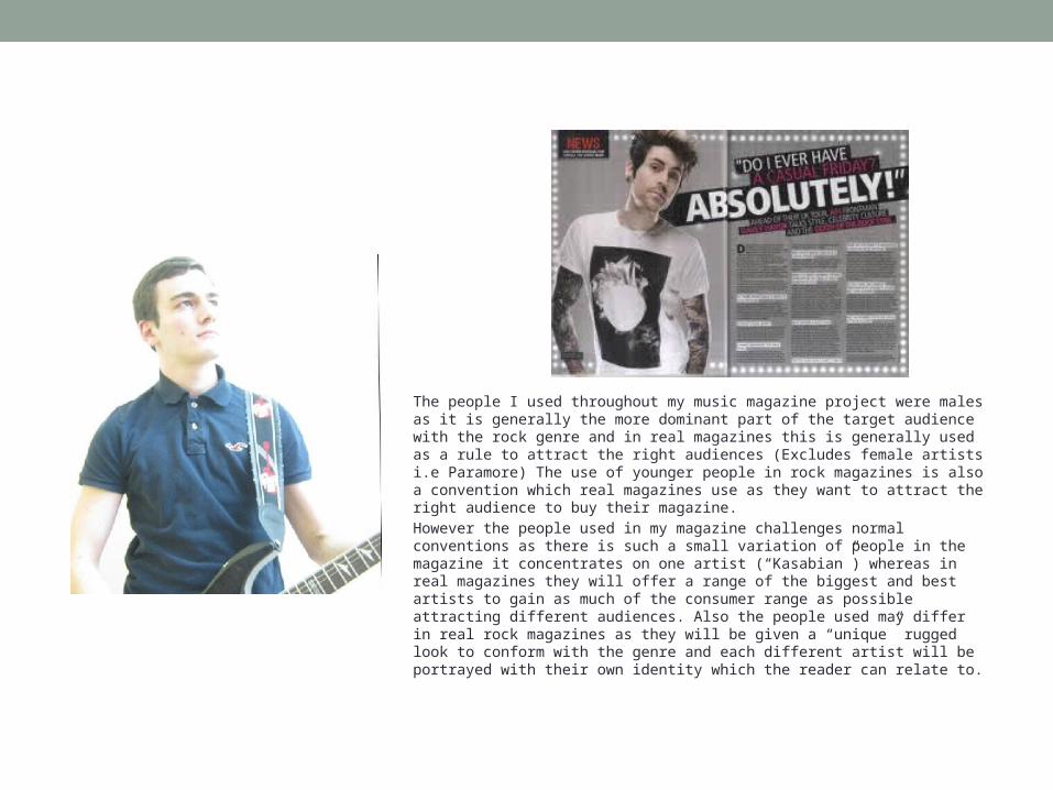
The people I used throughout my music magazine project were males as it is generally the more dominant part of the target audience with the rock genre and in real magazines this is generally used as a rule to attract the right audiences (Excludes female artists i.e Paramore) The use of younger people in rock magazines is also a convention which real magazines use as they want to attract the right audience to buy their magazine.
However the people used in my magazine challenges normal conventions as there is such a small variation of people in the magazine it concentrates on one artist (“Kasabian”) whereas in real magazines they will offer a range of the biggest and best artists to gain as much of the consumer range as possible attracting different audiences. Also the people used may differ in real rock magazines as they will be given a “unique” rugged look to conform with the genre and each different artist will be portrayed with their own identity which the reader can relate to.
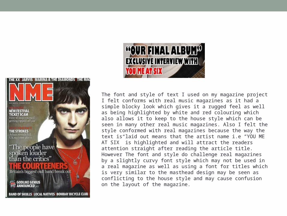
The font and style of text I used on my magazine project I felt conforms with real music magazines as it had a simple blocky look which gives it a rugged feel as well as being highlighted by white and red colouring which also allows it to keep to the house style which can be seen in many other real music magazines. Also I felt the style conformed with real magazines because the way the text is laid out means that the artist name i.e “YOU ME AT SIX” is highlighted and will attract the readers attention straight after reading the article title. However The font and style do challenge real magazines by a slightly curvy font style which may not be used in a real magazine as well as using a font for titles which is very similar to the masthead design may be seen as conflicting to the house style and may cause confusion on the layout of the magazine.
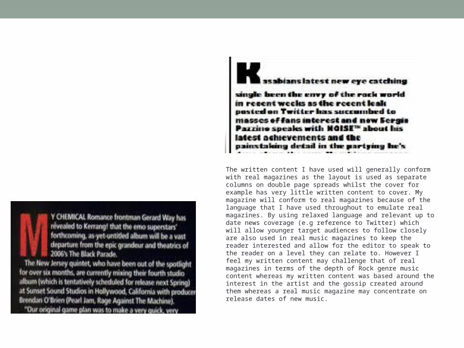
The written content I have used will generally conform with real magazines as the layout is used as separate columns on double page spreads whilst the cover for example has very little written content to cover. My magazine will conform to real magazines because of the language that I have used throughout to emulate real magazines. By using relaxed language and relevant up to date news coverage (e.g reference to Twitter) which will allow younger target audiences to follow closely are also used in real music magazines to keep the reader interested and allow for the editor to speak to the reader on a level they can relate to. However I feel my written content may challenge that of real magazines in terms of the depth of Rock genre music content whereas my written content was based around the interest in the artist and the gossip created around them whereas a real music magazine may concentrate on release dates of new music.
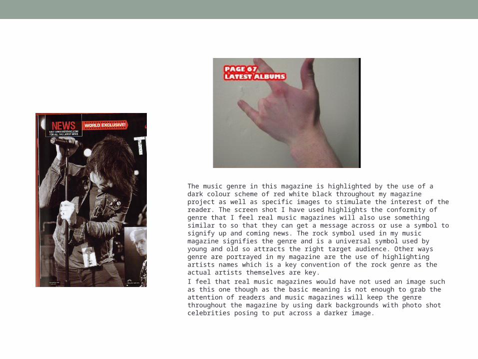
The music genre in this magazine is highlighted by the use of a dark colour scheme of red white black throughout my magazine project as well as specific images to stimulate the interest of the reader. The screen shot I have used highlights the conformity of genre that I feel real music magazines will also use something similar to so that they can get a message across or use a symbol to signify up and coming news. The rock symbol used in my music magazine signifies the genre and is a universal symbol used by young and old so attracts the right target audience. Other ways genre are portrayed in my magazine are the use of highlighting artists names which is a key convention of the rock genre as the actual artists themselves are key.
I feel that real music magazines would have not used an image such as this one though as the basic meaning is not enough to grab the attention of readers and music magazines will keep the genre throughout the magazine by using dark backgrounds with photo shot celebrities posing to put across a darker image.
Layout
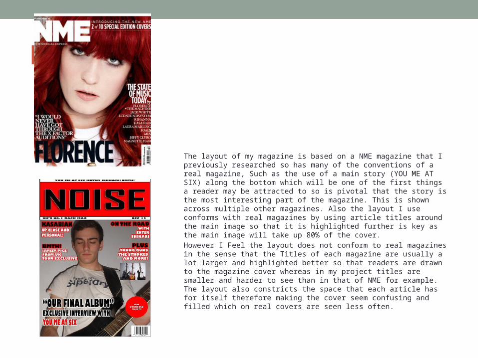
The layout of my magazine is based on a NME magazine that I previously researched so has many of the conventions of a real magazine, Such as the use of a main story (YOU ME AT SIX) along the bottom which will be one of the first things a reader may be attracted to so is pivotal that the story is the most interesting part of the magazine. This is shown across multiple other magazines. Also the layout I use conforms with real magazines by using article titles around the main image so that it is highlighted further is key as the main image will take up 80% of the cover.
However I Feel the layout does not conform to real magazines in the sense that the Titles of each magazine are usually a lot larger and highlighted better so that readers are drawn to the magazine cover whereas in my project titles are smaller and harder to see than in that of NME for example. The layout also constricts the space that each article has for itself therefore making the cover seem confusing and filled which on real covers are seen less often.
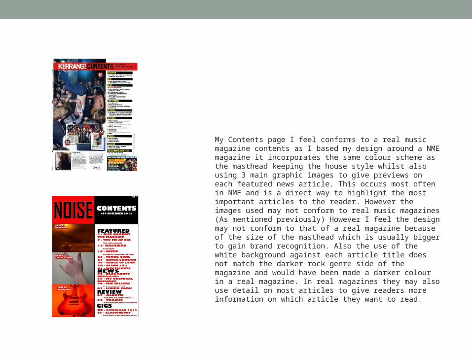
My Contents page I feel conforms to a real music magazine contents as I based my design around a NME magazine it incorporates the same colour scheme as the masthead keeping the house style whilst also using 3 main graphic images to give previews on each featured news article. This occurs most often in NME and is a direct way to highlight the most important articles to the reader. However the images used may not conform to real music magazines (As mentioned previously) However I feel the design may not conform to that of a real magazine because of the size of the masthead which is usually bigger to gain brand recognition. Also the use of the white background against each article title does not match the darker rock genre side of the magazine and would have been made a darker colour in a real magazine. In real magazines they may also use detail on most articles to give readers more information on which article they want to read.