Questions about front covers
9
Music Magazine Front Covers By Shafiqur Rahman
-
Upload
shaf-rahman -
Category
News & Politics
-
view
1.163 -
download
0
description
Transcript of Questions about front covers
Music Magazine Front Covers
By Shafiqur Rahman

Identify the features/characte
ristics 4 front covers all have
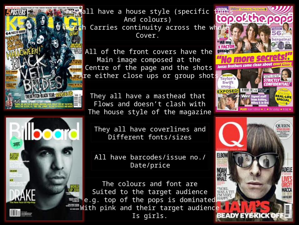
They all have a house style (specific fontsAnd colours)
which Carries continuity across the wholeCover.
All of the front covers have theMain image composed at the
Centre of the page and the shotsAre either close ups or group shots
They all have a masthead that Flows and doesn’t clash with
The house style of the magazine
They all have coverlines andDifferent fonts/sizes
All have barcodes/issue no./Date/price
The colours and font areSuited to the target audience
e.g. top of the pops is dominatedWith pink and their target audience
Is girls.

Why are these features
present on all of the
magazines? Why are they important?
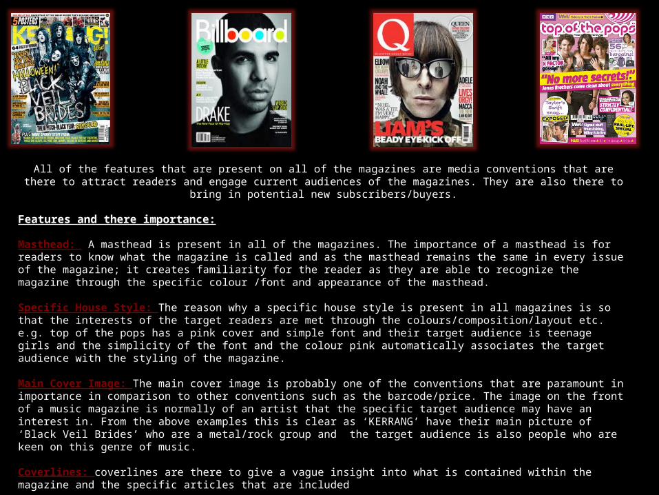
All of the features that are present on all of the magazines are media conventions that are there to attract readers and engage current audiences of the magazines. They are also there to bring in potential new subscribers/buyers.
Features and there importance:
Masthead: A masthead is present in all of the magazines. The importance of a masthead is for readers to know what the magazine is called and as the masthead remains the same in every issue of the magazine; it creates familiarity for the reader as they are able to recognize the magazine through the specific colour /font and appearance of the masthead.
Specific House Style: The reason why a specific house style is present in all magazines is so that the interests of the target readers are met through the colours/composition/layout etc. e.g. top of the pops has a pink cover and simple font and their target audience is teenage girls and the simplicity of the font and the colour pink automatically associates the target audience with the styling of the magazine.
Main Cover Image: The main cover image is probably one of the conventions that are paramount in importance in comparison to other conventions such as the barcode/price. The image on the front of a music magazine is normally of an artist that the specific target audience may have an interest in. From the above examples this is clear as ‘KERRANG’ have their main picture of ‘Black Veil Brides’ who are a metal/rock group and the target audience is also people who are keen on this genre of music.
Coverlines: coverlines are there to give a vague insight into what is contained within the magazine and the specific articles that are included
Barcode/Issue No/Date/Price: these are all essential as the reader knows they are buying the latest/most up to date issue and these are needed in order to sell copies of the magazine
Rule of thirds: This is a photography term for the image on the front cover and is used to create a more interesting visual perspective to the magazine cover/image and this is also a way to attract more readers. Sometimes the rule of thirds is also challenged
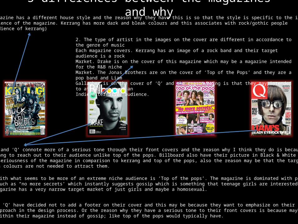
5 differences between the magazines and why1. Each magazine has a different house style and the reason why they have this is so that the style is specific to the intendedTarget audience of the magazine. Kerrang has more dark and bleak colours and this associates with rock/gothic people (target audience of kerrang)
2. The type of artist in the images on the cover are different in accordance to the genre of musicEach magazine covers. Kerrang has an image of a rock band and their target audience is a rock Market. Drake is on the cover of this magazine which may be a magazine intended for the R&B nicheMarket. The Jonas Brothers are on the cover of ‘Top of the Pops’ and they are a pop band and Liam Gallagher is on the cover of ‘Q’ and the reason being is that they may intended to attract more of an Indie/alternative audience.
3. Both ‘Billboard’ and ‘Q’ connote more of a serious tone through their front covers and the reason why I think they do is because they use minimalColours and less slang to reach out to their audience unlike top of the pops. Billboard also have their picture in Black & White and this may also Emphasise the more seriousness of the magazine in comparison to kerrang and top of the pops, also the reason may be that the target market is an olderAudience and various colours are not needed to attract them.
4. The only magazine with what seems to be more of an extreme niche audience is ‘Top of the pops’. The magazine is dominated with pink and bright Colours and by lines such as “no more secrets’ which instantly suggests gossip which is something that teenage girls are interested in. The colour pink Also shows that the magazine has a very narrow target market of just girls and maybe a homosexual.
5.Both Billboard and ‘Q’ have decided not to add a footer on their cover and this may be because they want to emphasize on their simplistic and more Serious theme and approach in the design process. Or the reason why they have a serious tone to their front covers is because maybe they have more Informative things within their magazine instead of gossip; like top of the pops would typically have.
Take one of the magazine covers
and say what type of music magazine it is and provide 4 specific examples
from the magazine that supports your
claim that It belongs to this
particular genre.

TOP OF THE POPSThe genre of ‘top of the pops’ is that it is a pop magazine
The name of the Magazine is a clearIndication of the Genre of music itBelongs to
Gossip stories are thereAnd gossip is normallyAssociated with popmagazines
Picture of boyband and boybands are normallyAssociated with the genre of pop.
Fashion and shoppingAdvice and tips that areNormally in pop Magazines.
Bright colours connote funAnd so does pop music,Therefore the use of bright Colours links in with the genreOf pop.
TARGET AUDIENCE
The target audience of this magazine (top of the pops) is obviously teenage girls, the reason whyI make this judgement is because there are many aspects of the magazine which associatesGirls with the style and conventions the magazine includes. For example
- The colour pink is the main colour of the magazine and this automatically links to girls
- -the use of ‘the jonas brothers’; a band which many girls are attracted to because of theirLooks etc and music. With them being the main image, this emphasises the fact that this Magazine is aimed at teenage girls. Also the cover has cheryl cole on it and she is a personMany girls aspire to be like; because she is flawless and a successful woman
- Fashion and shopping advice is present in the magazine and this links to the target audienceOf teenage girls as teenage girls are very image conscious and there is the stereotypeThat girls love shopping and looking good.