Civil War Trivia. Question 1 Question 2 Question 3 Question 4 Question 5.
#5) in what way does your media magazine use, develop or challenge form and conventions of real media products?
To ensure that I was going to create a decent magazine I knew the best thing to do was a long with my research and planning, I also had to look up already professional magazines to see how they produced their magazines, so I am able to see how others are created. So the first thing I did was look up on the internet and see the front covers, contents pages and double page spreads. After this I went out to as many magazine shops as well to see even more examples of professionally made magazines. The main two that I saw where NME and Q Magazine. These two both fitted my magazine theme best I felt and this is why I chose them two. On the following slides I will show you what I have took from the other magazines and used them to make mine as professionally as I can.
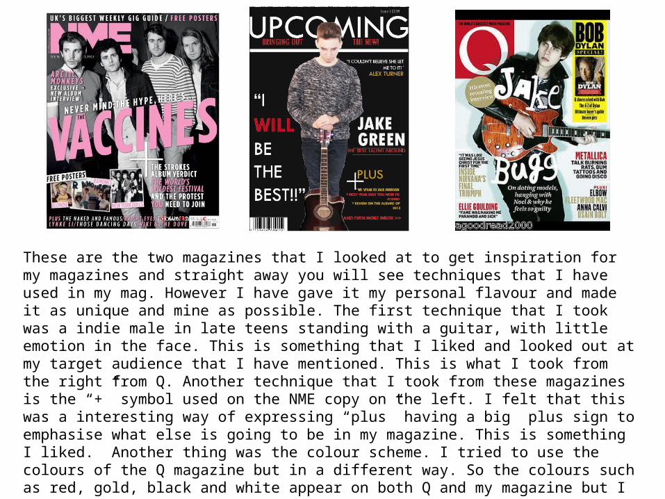
These are the two magazines that I looked at to get inspiration for my magazines and straight away you will see techniques that I have used in my mag. However I have gave it my personal flavour and made it as unique and mine as possible. The first technique that I took was a indie male in late teens standing with a guitar, with little emotion in the face. This is something that I liked and looked out at my target audience that I have mentioned. This is what I took from the right from Q. Another technique that I took from these magazines is the “+” symbol used on the NME copy on the left. I felt that this was a interesting way of expressing “plus” having a big plus sign to emphasise what else is going to be in my magazine. This is something I liked. Another thing was the colour scheme. I tried to use the colours of the Q magazine but in a different way. So the colours such as red, gold, black and white appear on both Q and my magazine but I did want to approach I in a different way. Finally is the blank space used by both magazines is something I liked, so it wasn’t too clammy or filled with information I felt that it was just a right amount information to space ratio.

I liked the look of the Q magazines contents page a lot so this is something that I have put to my work. As you can probably see, my magazine contents is very similar to that of Q and I have used the same types of techniques. The first thing I took was the Q in the top left corner but changed it round to make it a U for Upcoming. I did this because your eyes are drawn to the only white on the page which was an interesting technique used in my eyes. Also I liked that there where two sections on the contents page as if its split in 2. the left hand side, the bigger part, has all the main segments that make up the mag with a small description of what to expect and of course the page number. Then on the left hand side I used that space to talk about albums and a reviewing of it. Finally again I really liked the colour scheme of the bright red and white , so this is something that I wanted to put into my magazine.


On the previous slide was the double page spread that I took my research from, on Q magazine with both of my double page spreads. Again I liked how Jake Bugg was presented by Q magazine. The first thing I took from my magazine research was the little side bar with “Q: Cover Story Jake Bugg” this is something I liked because it makes you think that this is what the magazine is about, this is the main story, that’s why I liked it. So I chose to put that in with Jake Green (my star). Another technique that I took which I found unusual was the 2 column technique that was used. I felt that this was better because it looked more spread out and easy to read than three so this is something that I chose to but into my magazine as well, along with the drop cap of the A in Q I used a H. Finally I used the technique of my star looking directly into that camera as I felt it makes it more direct as if you are friendly with that character, and he looks innocent. This is something that I liked from Q and I wanted to take and put it into my magazine for good effect.