
Question 2 - Evaluation
13
QUESTION 2 – EVALUATION How effective is the combination of your main product and ancillary texts?
-
Upload
brad-white -
Category
Design
-
view
223 -
download
2
Transcript of Question 2 - Evaluation

QUESTION 2 – EVALUATION How effective is the combination of your main product and ancillary texts?

Music Video
https://www.youtube.com/watch?v=UwsFexTfpJk

The Digi - Pack - (Front/Back)
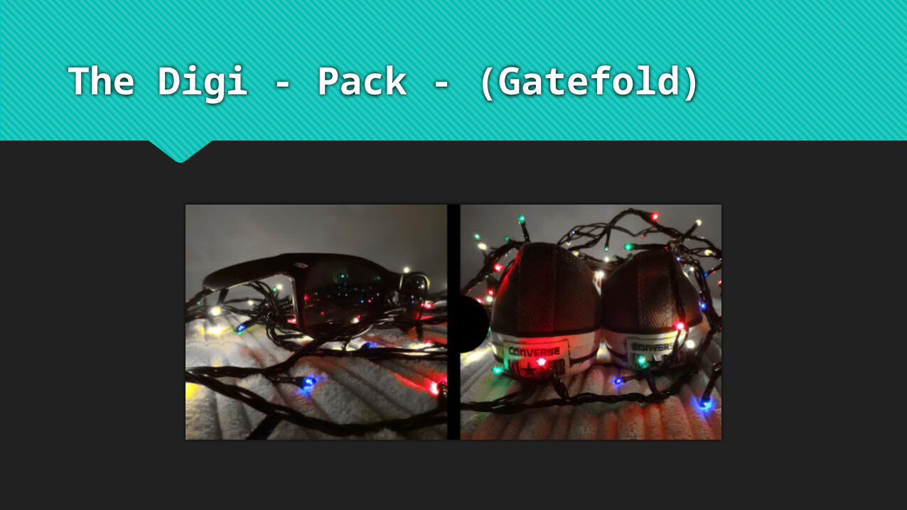
The Digi - Pack - (Gatefold)

Poster

Synergy
I have used synergy throughout my video, Digi pack and poster to keep a consistent theme and the audience can tell it’s all from the same package. My album cover has a picture of the main artist “Brad White” and behind him you can see the bamboo from which Brad performed in front of in the performance part of the Bones music video. This also links to the back of the album cover with the lights again with the bamboo. Furthermore I kept the album black and white like I kept most of the music video performance aspects to keep consistent theme. Also the gatefold of my album had two images, one of converse and ray bands which is what the main artist wears in the album, poster and wears the converse in the music video which links them all together.

Genre – Music Video Signifiers
My genre I believe was very clear to be pop rock. I know this because it had a mixture of bright happy, go lucky scenes mixed in with some darker more indie rock type of scenes, the majority of which was in the chorus. The memories were seen as more pop because of the bright colours and I tried to make the audience feel happy with the brightness reflecting how Sam, the main actor for the narrative felt about these memories.

Genre – Digi Pack Signifiers
My signifiers on my pop rock Digi pack came from influences from other pop and pop rock music genres. I tried to follow forms and conventions and the other albums general style and I came up with pack that in my opinion was very close to pop rock genre.

Comparison – Front Cover
NAMETITLE
BOLD IMAGEBLACK / WHITECONSISTENT
FONT

Comparison – Back Of Album
NAME & TITLETRACKS
BAR CODECOPYRIGHT
BLACK & WHITELABELS

Communicating Genre
I believe my package as a whole is very effective in communicating the genre and artists image within the genre as it follows conventions for the pop rock genre as shown in the previous slides. I compared my album to another other album and actually the song took to use for my video James Bunt's “Moon Landing”. As you can see it has followed forms and conventions and therefore is very effective in creating an effective package that follows genre and showing my artists style.

Star Iconography
The star iconography is spread across my whole promo package and is shown very clearly who my star is, “Brad White” through the performance aspect of the video and also being predominately shown on the front cover of my Digi pack and also on the poster. It is obvious that Brad White is the main star as he is presented as the artist across the promotion package as a whole. In the Digi pack Brad White is clearly shown as the artist as on the cover it says his name and the image is large and central on it. For the poster I used a image of Brad White faded in the back ground and also included the album cover so again it is obvious who my star is and presented in a pop star way. For my video I used him in the performance which the main artist will usually perform in video if it follows conventions so again it confirms star iconography.
How does it target the audience?
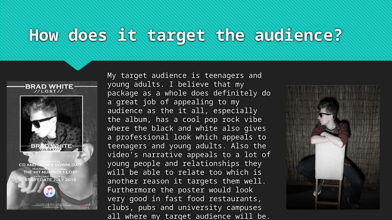
My target audience is teenagers and young adults. I believe that my package as a whole does definitely do a great job of appealing to my audience as the it all, especially the album, has a cool pop rock vibe where the black and white also gives a professional look which appeals to teenagers and young adults. Also the video’s narrative appeals to a lot of young people and relationships they will be able to relate too which is another reason it targets them well. Furthermore the poster would look very good in fast food restaurants, clubs, pubs and university campuses all where my target audience will be.


