Question 2
11
HOW EFFECTIVE IS THE COMBINATION OF YOUR MAIN PRODUCT WITH ANCILLARY TEXTS?
-
Upload
fraser-white -
Category
Education
-
view
30 -
download
0
Transcript of Question 2

HOW EFFECTIVE IS THE COMBINATION OF YOUR MAIN
PRODUCT WITH ANCILLARY TEXTS?
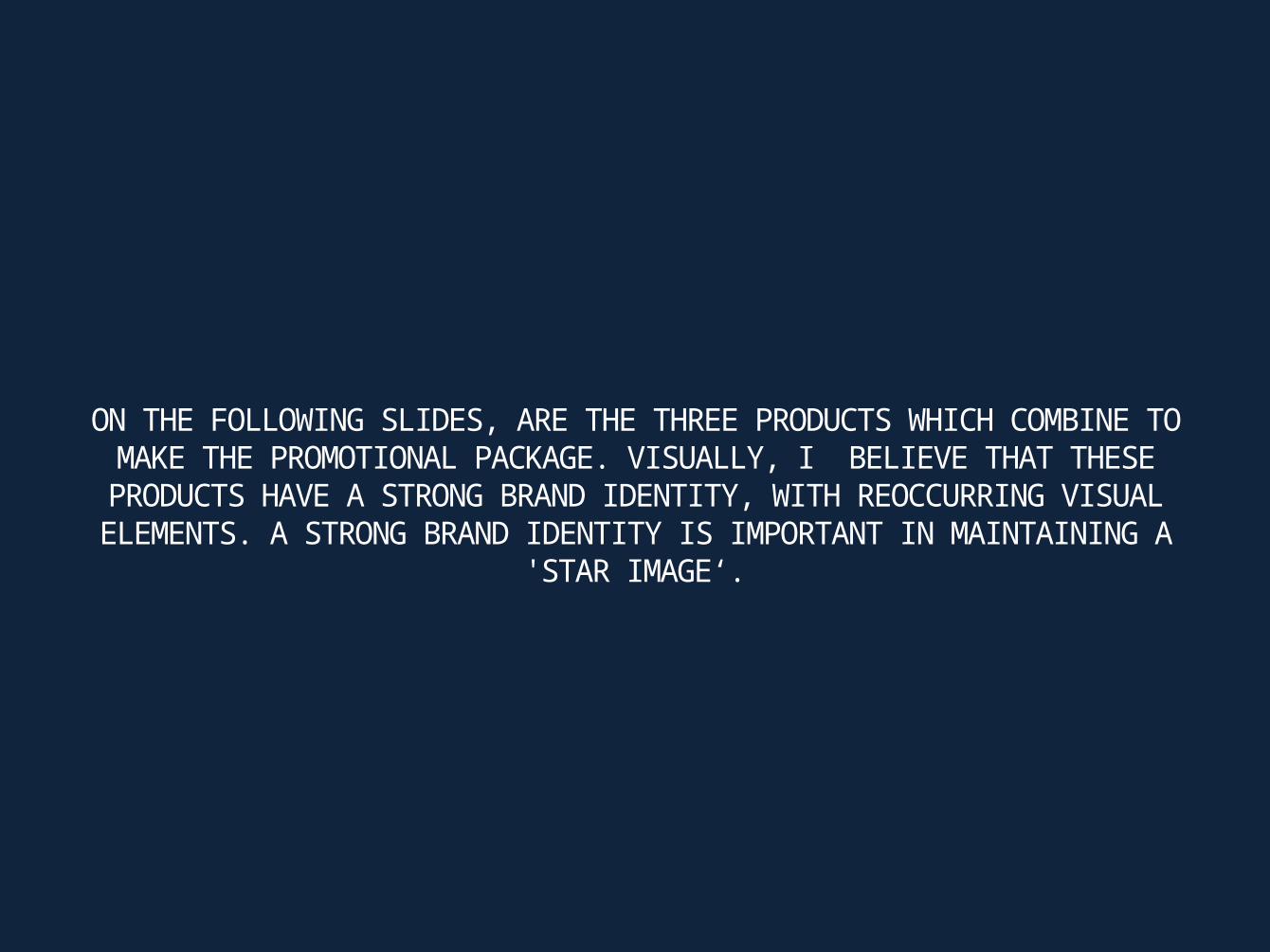
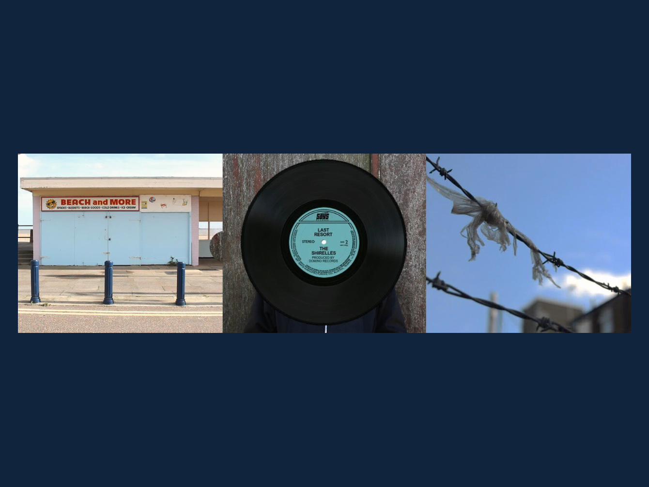
ON THE FOLLOWING SLIDES, ARE THE THREE PRODUCTS WHICH COMBINE TO MAKE THE PROMOTIONAL PACKAGE. VISUALLY, I BELIEVE THAT THESE PRODUCTS
HAVE A STRONG BRAND IDENTITY, WITH REOCCURRING VISUAL ELEMENTS. A STRONG BRAND IDENTITY IS IMPORTANT IN MAINTAINING A 'STAR IMAGE‘.
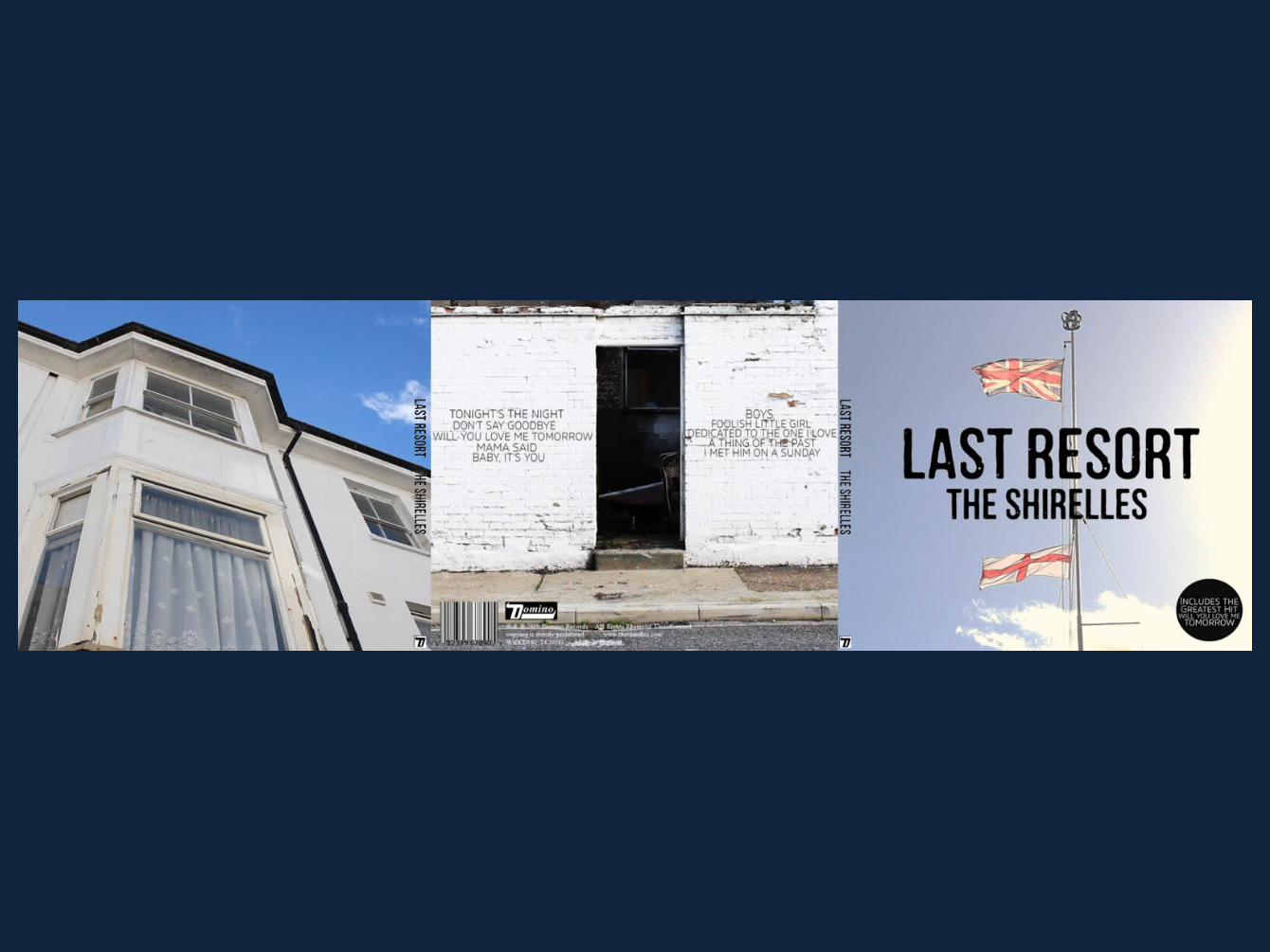
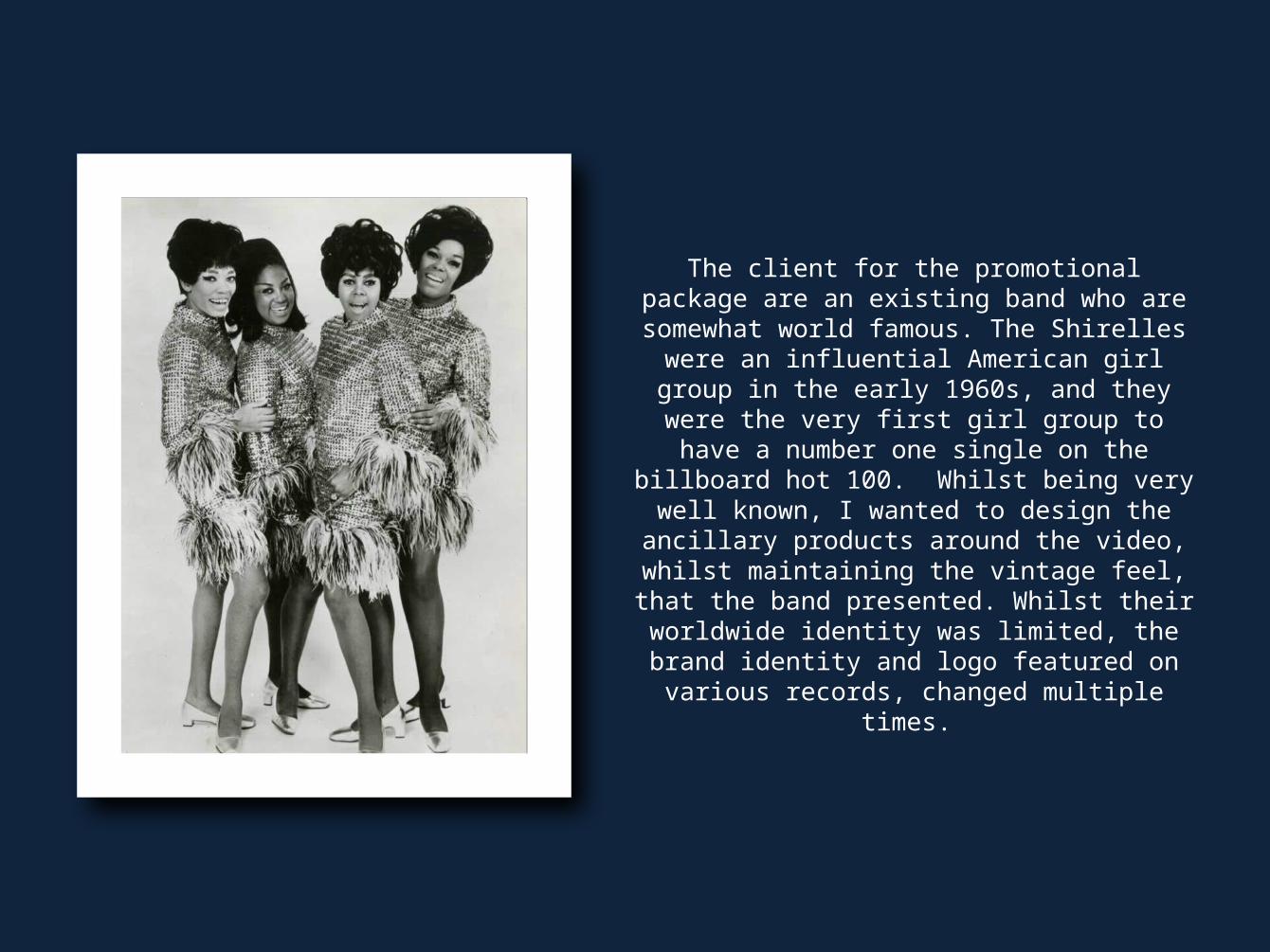
The client for the promotional package are an existing band who are somewhat world famous. The Shirelles were an influential American girl
group in the early 1960s, and they were the very first girl group to have a number one single on the billboard hot 100. Whilst being very well known, I wanted to design the ancillary products around the video, whilst maintaining the vintage feel, that the
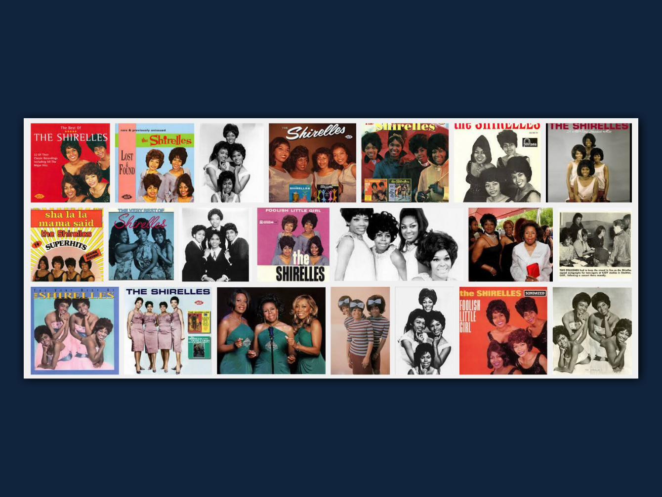
band presented. Whilst their worldwide identity was limited, the brand identity and logo featured
on various records, changed multiple times.
TARGET AUDIENCE
I created a brand style that my target audience and fan base would recognise and identify with. I have used colour to promote my brand identity in two different ways 1. How I've edited the colouring of the shots in my music video and 2. The colours that I've used throughout my media products. The colouring on my music video needed to be quite vintage/retro looking. I made sure it was consistent throughout. I also left the bright colours in, similar to Martin Parr’s work. I carried this through onto my ancillary products when
editing theme so that my target audience (young mods) will identify with and they will recognise these effects throughout my media products.
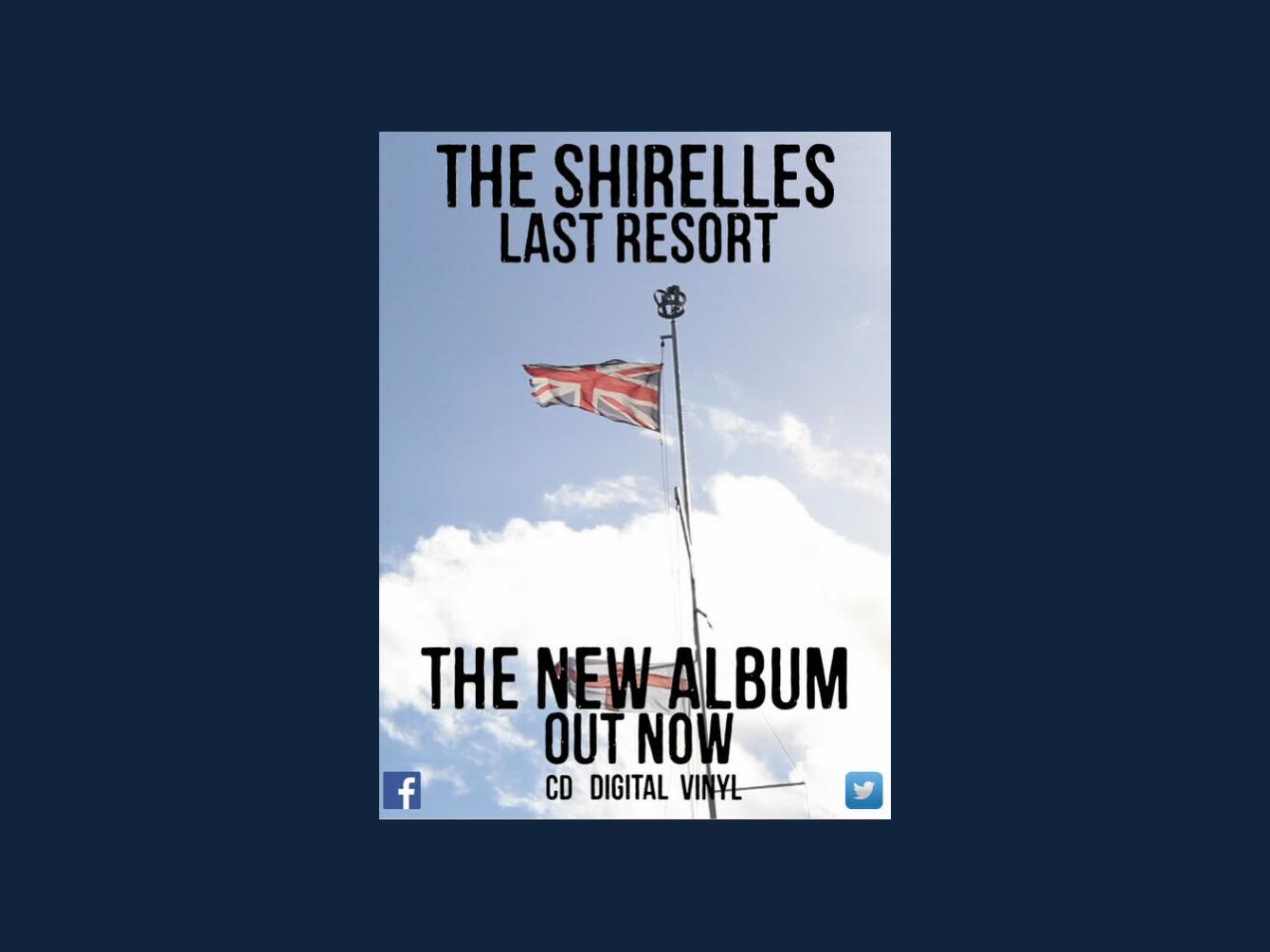
Different blues are used, not only as it is in the union jack, but it goes with the bleak, rundown town. Using different shades of blue can symbolise the different stages of sadness and loss of regional identity. Also, on the digipak, there is a single iconic image of the flag, which my target audience will identify with this and they will understand, because with my target audience, there is a sense of patriotism. I have also
used a vintage theme to promote my brand identity. I have done this through things such as miss en scene and through forms like props, costume and the actors in my video. I did this because I wanted to make it
clear about when the time was present and when it was in the past.

EFFECTIVITY AND COHERENCY
Overall, I feel that my digipak is very effective in that it covers everything that needs to be covered within promoting the media package. My media package attracts the target audience with the conventions of an
indie/60s revival video whilst still introducing and building up the brand identity through the ancillary products. My promotion package works because I have identified my primary and main target audience:
young mods who favour vintage movements. My media product is also effective in the way that I've designed a message to appeal to my target audience; the loss of regional identity, and the underlying
patriotism that lies beneath.
The elderly people represent the target audience of the Shirelles, and the young people represent my audience today. This fusion I feel even though isn’t instantly clear, can be dissected and analysed up to
the interpretation of the viewer. I've made sure I've bought this into each part of the promotional package, this way there’s coherence and constancy throughout. With digipaks and adverts, it's conventional to have the image on the front cover of your digipak to be the same as your advert, and also to carry the same font
colour and style between both products. I also made sure that the artist’s name and album name; Last Resort (taken from an photo collection of rundown England by Martin Parr) were present on both products
so there was a definite strong brand identity.
My media products are links thematically through things like genre, message, feeling and emotions and this is shown through colour, text placement, font and positioning. For
instance, the audience get the message of loss by the shots subject matter, and through the colours that are present
throughout the promotional package and the gritty, British theme through the font style. I wanted to link this in with the
patriotic, target audience who enjoyed the Shirelles and other 60s music. I feel all these examples have coherence, showing
thematic links throughout the promotional package.