Category 2 (2p) Question 1 Question 2 Question 3 Question 4 Question 5 Question 6 Question 7
Upload
rosieandjimCategory
view
229download
0
How effective is the combination of your main
product and ancillary texts?
CD CoverMagazine Advert
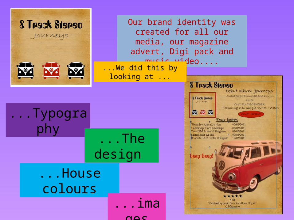
Our brand identity was created for all our media, our magazine advert,
Digi pack and music video....
...We did this by looking at ...
...Typography
...House colours
...The design
...images

...House colours
Red is the main colour used throughout all the aspects of the tasks...
It is seen on the campervan , on the Beep! Beep! In the video and in aspects of both the magazine advert and digi pack.
...TypographyThe album name is the same on both ancillary tasks and the bands name is the same font in both tasks.
We made sure that a clear link was made between the typography because it could be used in any
future branding, and this was a key element in linking both tasks.

...The design The main focus of the tasks is the bands name. No actual images of the band appear o either of the tasks so the band have to sell it
through their name.
Even though no image of the band actually appears, the image of the
VW is a constant feature in ever part, and so the band can use this image for branding and an image
to sell on.
...imagesThe image of the VW is the
main image across the tasks. This image is the strongest
thing that unifies the different media.
The vw is really the only image used. This creates a strong brand identity
and helps the band become established as having a niche.