Q5 EVALUATION
4
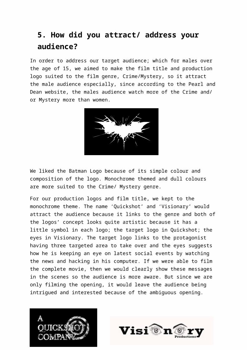
5. How did you attract/ address your audience? In order to address our target audience; which for males over the age of 15, we aimed to make the film title and production logo suited to the film genre, Crime/Mystery, so it attract the male audience especially, since according to the Pearl and Dean website, the males audience watch more of the Crime and/ or Mystery more than women. We liked the Batman Logo because of its simple colour and composition of the logo. Monochrome themed and dull colours are more suited to the Crime/ Mystery genre. For our production logos and film title, we kept to the monochrome theme. The name ‘Quickshot’ and ‘Visionary’ would attract the audience because it links to the genre and both of the logos’ concept looks quite artistic because it has a little symbol in each logo; the target logo in Quickshot; the eyes in Visionary. The target logo links to the protagonist having three targeted area to take over and the eyes suggests how he is keeping an eye on latest social events by watching the news and hacking in his computer. If we were able to film the complete movie, then we would clearly show these messages in the scenes so the audience is more aware. But since we are only filming the opening, it would leave the audience being intrigued and interested because of the ambiguous opening.
-
Upload
anishaaa96 -
Category
Education
-
view
45 -
download
0
Transcript of Q5 EVALUATION
5. How did you attract/ address your audience?
In order to address our target audience; which for males over the age of 15, we aimed to make the film title and production logo suited to the film genre, Crime/Mystery, so it attract the male audience especially, since according to the Pearl and Dean website, the males audience watch more of the Crime and/ or Mystery more than women.
We liked the Batman Logo because of its simple colour and composition of the logo. Monochrome themed and dull colours are more suited to the Crime/ Mystery genre.
For our production logos and film title, we kept to the monochrome theme. The name ‘Quickshot’ and ‘Visionary’ would attract the audience because it links to the genre and both of the logos’ concept looks quite artistic because it has a little symbol in each logo; the target logo in Quickshot; the eyes in Visionary. The target logo links to the protagonist having three targeted area to take over and the eyes suggests how he is keeping an eye on latest social events by watching the news and hacking in his computer. If we were able to film the complete movie, then we would clearly show these messages in the scenes so the audience is more aware. But since we are only filming the opening, it would leave the audience being intrigued and interested because of the ambiguous opening.

This is our film title, Paulina found a font online, and then I downloaded the font, so it can be used for any designing software that has the font tool; so in this case, the Motion software.
The style of the links to Crime/Mystery because the font’s base colour is white, then it has little messy silhouettes of numbers, faces and letters, which links to the hacking scene in the film opening, the font attracts the audience because it gives a impression that the film is about crime or social events revolving around crime, because of the silhouettes.
The monochrome them would attract an audience who is into Crime or Mystery because the colours black and white is expected in that genre. The font colours would attract males more because stereotypically men wouldn’t be interested in a film, if the first they saw was the title looking feminine - floral or lace print and pink and purple themed. So black and white is more suited for the target audience. The Motion software lets font be animated, but only the fonts in the software, so that’s why I had to download the font so it can be used in the software, I added the fade in then out animation to the font.
The film title should attract the audience; the title is the numerical initials of the Shard. But this would not be obvious or clearly stated to the audience, because we are only introducing the protagonist and his house briefly. So the audience will be curious by the name of the film title, they would wonder why is the title named after these specific numbers.
We also filmed three locations to then edit them to be our time-lapses. One in Greenwich Park, one by the London Bridge and last one near the Shard. This tells the audience that it is filmed in London, which would interest them as it is filmed in a cosmopolitan city, with crime revolving around it.
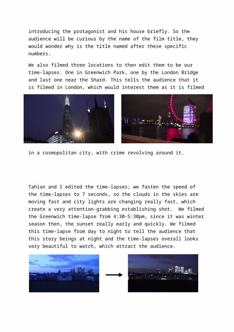
Tahian and I edited the time-lapses; we fasten the speed of the time-lapses to 7 seconds, so the clouds in the skies are moving fast and city lights are changing really fast, which create a very attention-grabbing establishing shot. We filmed the Greenwich time-lapse from 4:30-5:30pm, since it was winter season then, the sunset really early and quickly. We filmed this time-lapse from day to night to tell the audience that this story beings at night and the time-lapses overall looks very beautiful to watch, which attract the audience.
Moreover, we filmed the protagonist to be faceless and anonymous by filming him from his back in the opening, to put the audience at the edge of the seat and curious as to whom could it be? How does he look? Young or old? Also, he also wore a suit and to walk a smooth, suave yet suspicious way to make the protagonist to remain as a mystery because you tell someone’s age at times by the way they dress and their body language and walking. E.g. an stereotypical teenage street boy would walk with a hunchback, with a hoodie or hat and baggy pants.
Also, we thought it would be a good idea to make the protagonist to also be the antagonist. The plot twist would interest the audience because it creates an entertaining confusion and it builds the tension up, if we carried on film the rest of the movie, then we include scenes were he is showing his good side and bad acting with dialogue, not just by what we saw in the opening, which was the scar and tattoo, the news report, hacking screen, map with targeted areas pointed out and deck of cards, all these clues are not enough to prove he is a full on villan, but it does give an understanding to the audience that this protagonist has got a very dark life, in his past (the scar and tattoo and map) and still in the present tense (card suggests gambler or scammer, hacking screen shows hacker and illegal crime and the news report suggest how he likes to stay up to date with latest news oe he worries that the new report will be talking about him someday, portraying his guilt or he is anxious under that emotional benhaviour from the actor.