Q2 of evaluation media a2
5
Q2: How effective is the combination of your main product and ancillary texts?
-
Upload
mohammed-aboobakar -
Category
Design
-
view
42 -
download
1
Transcript of Q2 of evaluation media a2
Q2: How effective is the combination of your main product and ancillary texts?
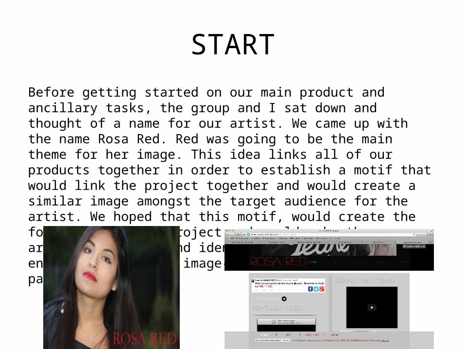
STARTBefore getting started on our main product and ancillary tasks, the group and I sat down and thought of a name for our artist. We came up with the name Rosa Red. Red was going to be the main theme for her image. This idea links all of our products together in order to establish a motif that would link the project together and would create a similar image amongst the target audience for the artist. We hoped that this motif, would create the foundation of our project and would make the artist’s fan base and identity stronger and encourage their pop image- a relaxed, cool and passionate image.
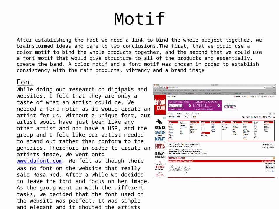
MotifAfter establishing the fact we need a link to bind the whole project together, we brainstormed ideas and came to two conclusions.The first, that we could use a color motif to bind the whole products together, and the second that we could use a font motif that would give structure to all of the products and essentially, create the band. A color motif and a font motif was chosen in order to establish consistency with the main products, vibrancy and a brand image.
FontWhile doing our research on digipaks and websites, I felt that they are only a taste of what an artist could be. We needed a font motif as it would create an artist for us. Without a unique font, our artist would have just been like any other artist and not have a USP, and the group and I felt like our artist needed to stand out rather than conform to the generics. Therefore in order to create an artists image, We went onto www.dafont.com. We felt as though there was no font on the website that really said Rosa Red. After a while we decided to leave the font and focus on her image. As the group went on with the different tasks, we decided that the font used on the website was perfect. It was simple and elegant and it shouted the artists persona. After going through a few we decided to use a font called Lobster. It was different, it was sharp and had an edge to it unlike the other fonts
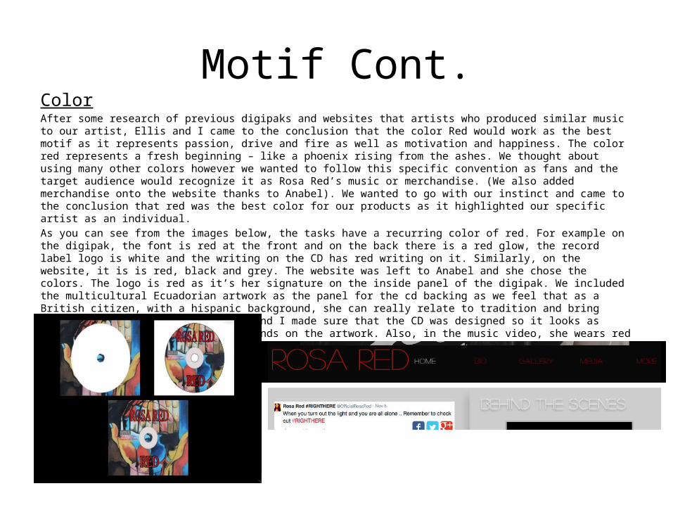
Motif Cont.ColorAfter some research of previous digipaks and websites that artists who produced similar music to our artist, Ellis and I came to the conclusion that the color Red would work as the best motif as it represents passion, drive and fire as well as motivation and happiness. The color red represents a fresh beginning – like a phoenix rising from the ashes. We thought about using many other colors however we wanted to follow this specific convention as fans and the target audience would recognize it as Rosa Red’s music or merchandise. (We also added merchandise onto the website thanks to Anabel). We wanted to go with our instinct and came to the conclusion that red was the best color for our products as it highlighted our specific artist as an individual.As you can see from the images below, the tasks have a recurring color of red. For example on the digipak, the font is red at the front and on the back there is a red glow, the record label logo is white and the writing on the CD has red writing on it. Similarly, on the website, it is is red, black and grey. The website was left to Anabel and she chose the colors. The logo is red as it’s her signature on the inside panel of the digipak. We included the multicultural Ecuadorian artwork as the panel for the cd backing as we feel that as a British citizen, with a hispanic background, she can really relate to tradition and bring something new to the table. Ellis and I made sure that the CD was designed so it looks as though the CD fit right into the hands on the artwork. Also, in the music video, she wears red lipstick and kisses the audience goodbye as the video comes to a close.
Success of Failure?SUCCESS:I think that the combination of our main product and ancillary tasks was ultimately effective because it created a link between all of our products and created a successful artist image. Without the font and color link, our products would have been fragmented and all over the place with no direction. One member of our target audience stated they would expect to see our products in a record shop store which implies that our products are appealing to the target audience. The binding of the music video, digipak website enables our audience to recognize the artist and associate certain themes with her. For example the color red is now associated with the our artist along with the simple fonts- this combination is what makes our artist stand out from the generic popstar for example, Rita Ora, who on her album had quite crazy writing.
MINOR HICCUP:At first the video was meant to just be about American Football and a young male athlete trying to make his mark on the sport. However after careful consideration, I decided as a debut video, we needed to add shots of our artist singing. After that I figured there were way too many shots of her and that people were becoming confused between what the video was about and what was happening so I condensed her parts in the video to only singing and it got a clearer message across about the male athlete, while still